Introducing SW 7660 Earl Grey by Sherwin Williams, a versatile paint color that offers a fresh and modern take on classic grey. This shade strikes a perfect balance between cool and warm tones, making it a fantastic choice for any space in your home.
Whether you’re looking to refresh your living room, bedroom, or even your kitchen, Earl Grey provides a smooth, refined backdrop that complements a wide range of decor styles and color palettes.
This color isn’t just about aesthetics; it’s also about quality. Like all Sherwin Williams products, Earl Grey promises excellent coverage and durability, ensuring your walls look great for years to come. If you’re thinking about giving your home a new look, consider how Earl Grey can fit into your vision.
It’s easy to apply and works well with other colors, helping you create a space that feels both cozy and stylish. Whether you’re a DIY enthusiast or planning to hire professionals, Earl Grey is a reliable and attractive choice that’s likely to meet your decorating needs.
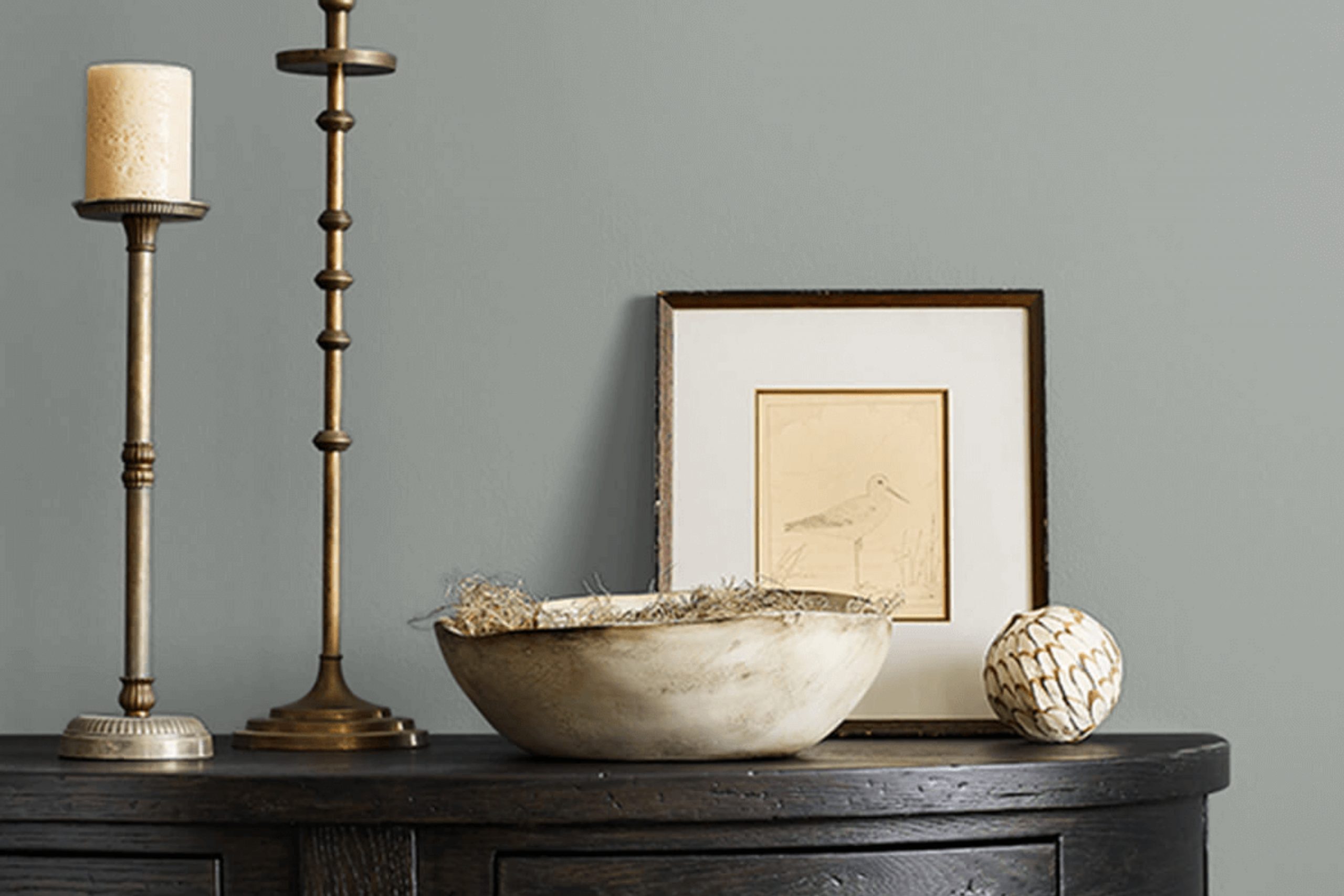
What Color Is Earl Grey SW 7660 by Sherwin Williams?
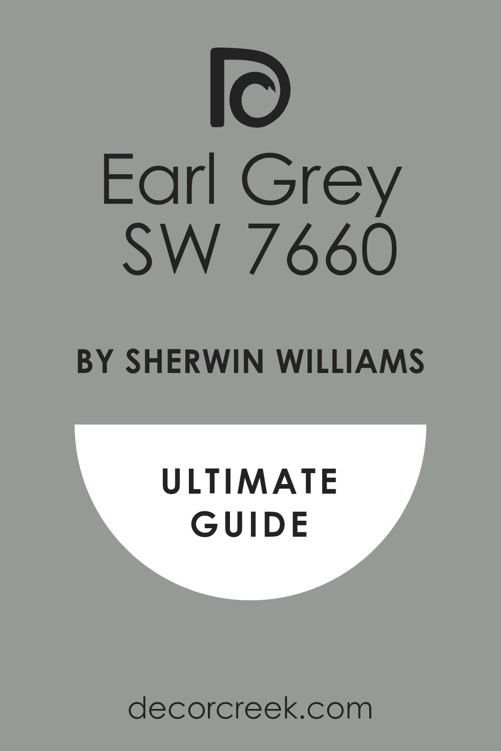
Earl Grey by Sherwin Williams is a versatile color that strikes a perfect balance between warm and cool tones. This mid-toned grey offers a soothing backdrop that’s neither too bold nor too muted, making it a reliable choice for various interior spaces. The subtle blue undertones in this grey give it a unique edge, setting it apart from more traditional greys.
Earl Grey works exceptionally well in modern and contemporary settings due to its clean and crisp nature. It also fits beautifully in industrial interiors, complementing exposed beams, metal fixtures, and raw, unfinished textures. This color can create a cozy yet sleek atmosphere in minimalist styled homes as well, where the focus is on simplicity and function.
When it comes to pairing materials, this color complements natural wood tones from light to dark, adding warmth to the space. It also looks stunning with metallic finishes like brushed nickel or chrome, enhancing the modern vibe of the room. Textiles in rich textures, such as velvet or wool, also pair well with Earl Grey, providing a touch of luxury and comfort.
In terms of accents, incorporating elements in white, black, or even pops of vibrant colors can add interest and contrast to interiors featuring Earl Grey.
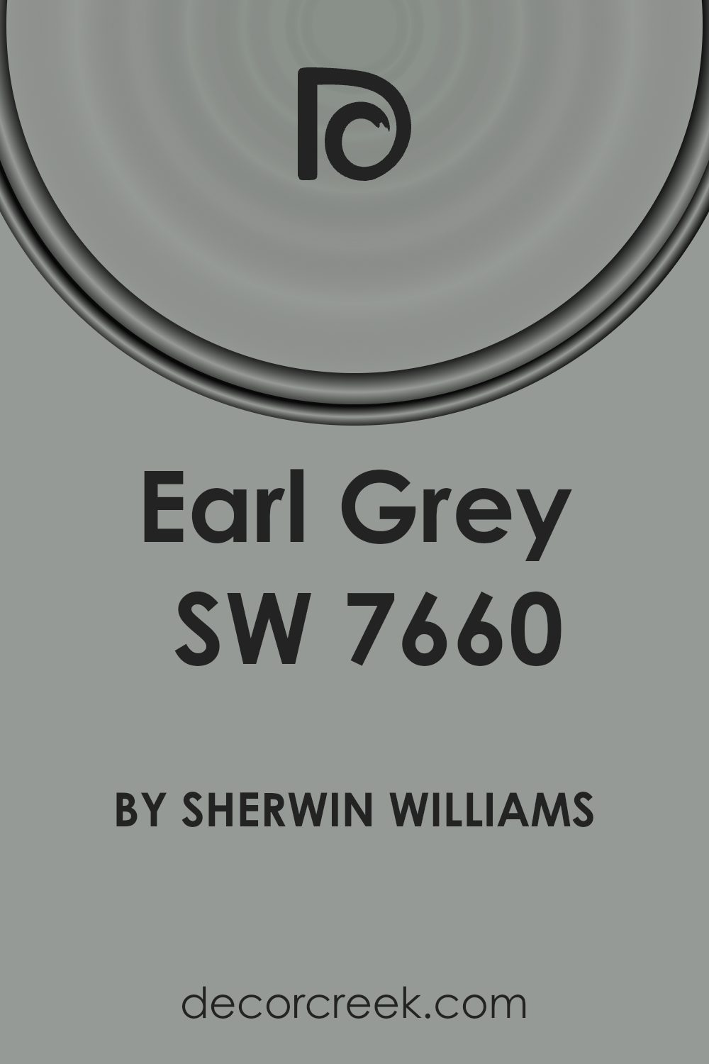
Is Earl Grey SW 7660 by Sherwin Williams Warm or Cool color?
Earl Grey by Sherwin Williams is a unique shade of gray that brings a cozy and modern feel to any home. This color is versatile, making it suitable for various spaces, from living rooms to bedrooms. Its neutral tone means it matches well with many other colors, allowing homeowners to use it as a base for creative decorating schemes.
This shade is especially effective in rooms that get a lot of natural light, as it reflects the sunlight softly, enhancing the overall brightness of the space without overpowering it.
In smaller or dimly-lit rooms, Earl Grey can help create the illusion of more space, making the room feel larger and more open. Additionally, this color is timeless, meaning it won’t go out of style quickly, which is great for anyone looking for a long-lasting look. Overall, Earl Grey is a practical choice for adding a touch of modernity and warmth to any home.
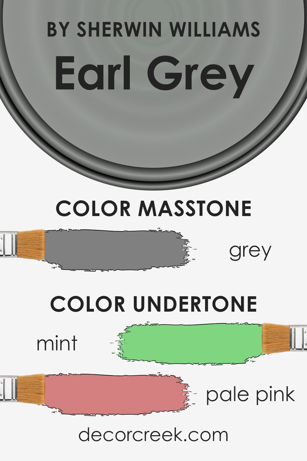
Undertones of Earl Grey SW 7660 by Sherwin Williams
When you look at a paint color like Earl Grey, it’s not just about the main shade you see but also the subtle colors mixed into it, called undertones. These undertones can make a big difference in how the color looks depending on the light and what’s around it. For example, Earl Grey might have a hint of mint or pale pink, which can make the gray seem cooler or warmer.
In the case of Earl Grey, its undertones such as mint, pale pink, or light blue could make the walls look slightly different under natural daylight compared to artificial lighting. This is important to consider when choosing paint for your home because it affects the mood and feel of the room.
Cool undertones like lilac or light blue give a calm, fresh vibe, making the room feel more open and airy. On the other hand, a hint of orange or brown can give the Earl Grey a warmer feel, making a space more cozy and inviting.
Using Earl Grey on interior walls can create a neutral backdrop that works well with many colors and decor styles. It’s versatile because the different undertones help it blend with other colors in your furniture or decorations. For example, pairing it with blues or greens can enhance the feeling of harmony, or using contrasts like yellows or pinks can add a lively pop to the space.
Overall, understanding undertones in paint like Earl Grey helps make sure you get just the right shade for your walls that complements your home’s style and lighting conditions.
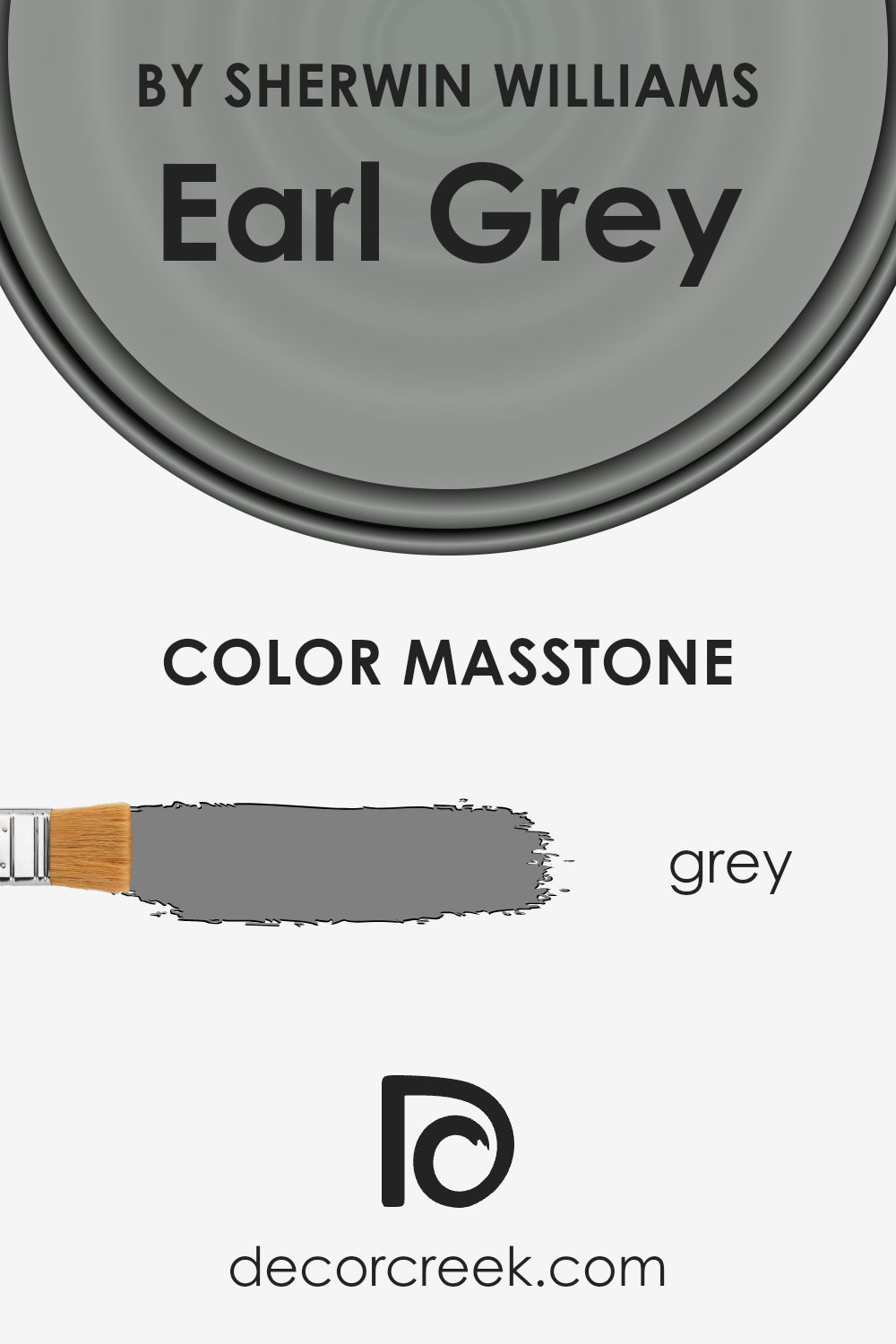
What is the Masstone of the Earl Grey SW 7660 by Sherwin Williams?
Earl Grey SW 7660 by Sherwin Williams has a masstone that is a classic grey color, much like the Grey (#808080) you see in color selectors. This neutral hue is versatile, making it an excellent choice for various spaces in a home. Because this shade doesn’t lean too heavily towards either warm or cool tones, it pairs well with a wide range of other colors.
Whether used in a living room, bedroom, or kitchen, it creates a calming backdrop that doesn’t overpower the space or the furnishings within it. This simplicity in color also means that as trends change, the color remains a constant, reliable choice that doesn’t require frequent updating.
It’s a practical choice for walls because it hides minor imperfections well and maintains a clean look, even in high-traffic areas of a home.
How Does Lighting Affect Earl Grey SW 7660 by Sherwin Williams?
Lighting has a profound influence on the way colors appear in a space. The same color can look dramatically different under natural light compared to artificial light, and even different qualities or directions of natural light can affect a shade’s appearance.
For example, Earl Grey by Sherwin Williams is a nuanced shade that may present different aspects depending on the lighting conditions. In natural light, this color tends to look truer to its swatch, revealing subtle depth and variance. The purity of natural daylight often enhances the true character of a color, making Earl Grey look rich and vibrant.
When viewed under artificial lighting, the perception of Earl Grey can change depending on the type of bulbs used. LED or fluorescent lighting can bring out cooler tones in the paint, while incandescent lighting, which is warmer, might push it towards a softer, slightly more muted appearance. It’s important to consider the color temperature of artificial lights when choosing your color palette.
The orientation of the room also plays a crucial role in how Earl Grey appears:
- North-Faced Rooms: Light in north-facing rooms is generally cooler and may cast a slightly bluish tone on the walls. Earl Grey might appear slightly darker and more profound in these rooms.
- South-Faced Rooms: These rooms enjoy abundant light for most of the day, which can make Earl Grey look lighter and more lively, enhancing its dynamic subtleties.
- East-Faced Rooms:Morning light in east-facing rooms is warm and yellow, making Earl Grey feel warm and welcoming in the morning. As the day progresses, the color might lose some of this warmth and return to a more balanced neutral.
- West-Faced Rooms: In west-facing rooms, the color will experience the inverse of east-facing rooms with dimmer light in the morning and warm, bright light in the evening. This means Earl Grey will shift from looking more subdued in the morning to vibrant and warm in the evening.
Understanding how different types of light affect color can help in making decisions about paint and decor, ensuring that the colors behave as desired in their intended environment.
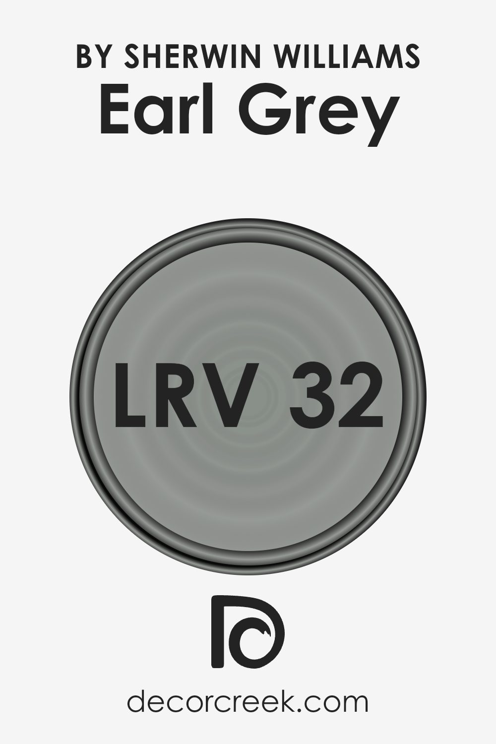
What is the LRV of Earl Grey SW 7660 by Sherwin Williams?
LRV stands for Light Reflectance Value, an important measure used to determine how much light a paint color reflects or absorbs. Essentially, it’s a percentage that tells you how bright or dark a color will appear on your walls.
When you look at LRV, a higher number means the paint will reflect more light, making the room feel airier and brighter. On the contrary, a lower LRV indicates that the paint absorbs more light, which can make a space appear cozier but also smaller and darker. This is something crucial to consider when choosing a paint color, especially in terms of how it will interact with the natural and artificial lighting in your room.
The Earl Grey color, with an LRV of 31.822, falls on the darker end of the scale, meaning it absorbs more light than it reflects. As a result, this color might make a room feel more enclosed and intimate. This particular shade, being a deeper tone, can be an excellent choice for creating a striking and cozy atmosphere in a space, particularly if used in well-lit areas or as an accent wall.
It’s important to balance it with lighter colors or reflective surfaces like mirrors to help bounce light around the room and prevent it from feeling too heavy.
Coordinating Colors of Earl Grey SW 7660 by Sherwin Williams
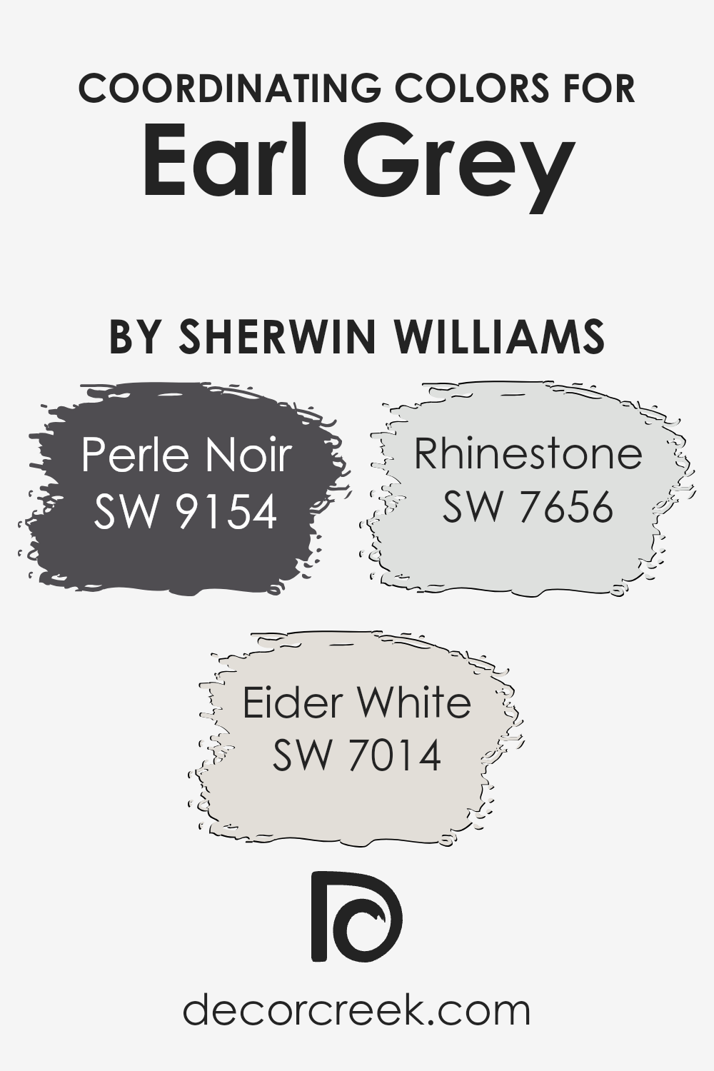
Coordinating colors are shades that harmonize well with a primary color to create a balanced and visually appealing color scheme. For instance, when working with a neutral base like Earl Grey from Sherwin Williams, choosing the right coordinating colors can enhance the aesthetic of any space by adding depth and contrast or maintaining a subtle elegance.
These complementary shades work together to support the main color, ensuring that the overall look is cohesive and thoughtfully designed.
One of the coordinating colors for Earl Grey is Perle Noir, a deep, almost black shade that adds a strong, grounding contrast to the softer grey. It’s ideal for creating a dramatic focal point or for use in accents that need to stand out. Eider White is another coordinating color, offering a very light grey that almost appears white.
This color is perfect for brightening spaces and works well on trim or in rooms that get plenty of natural light. Lastly, Rhinestone is a lighter grey that provides a subtle contrast to Earl Grey. It works beautifully for creating a gentle, layered look in rooms, blending well while still giving a hint of differentiation. These shades all work together to create a cohesive palette that’s versatile and appealing.
You can see recommended paint colors below:
- SW 9154 Perle Noir (CHECK A SAMPLE)
- SW 7014 Eider White (CHECK A SAMPLE)
- SW 7656 Rhinestone (CHECK A SAMPLE)
What are the Trim colors of Earl Grey SW 7660 by Sherwin Williams?
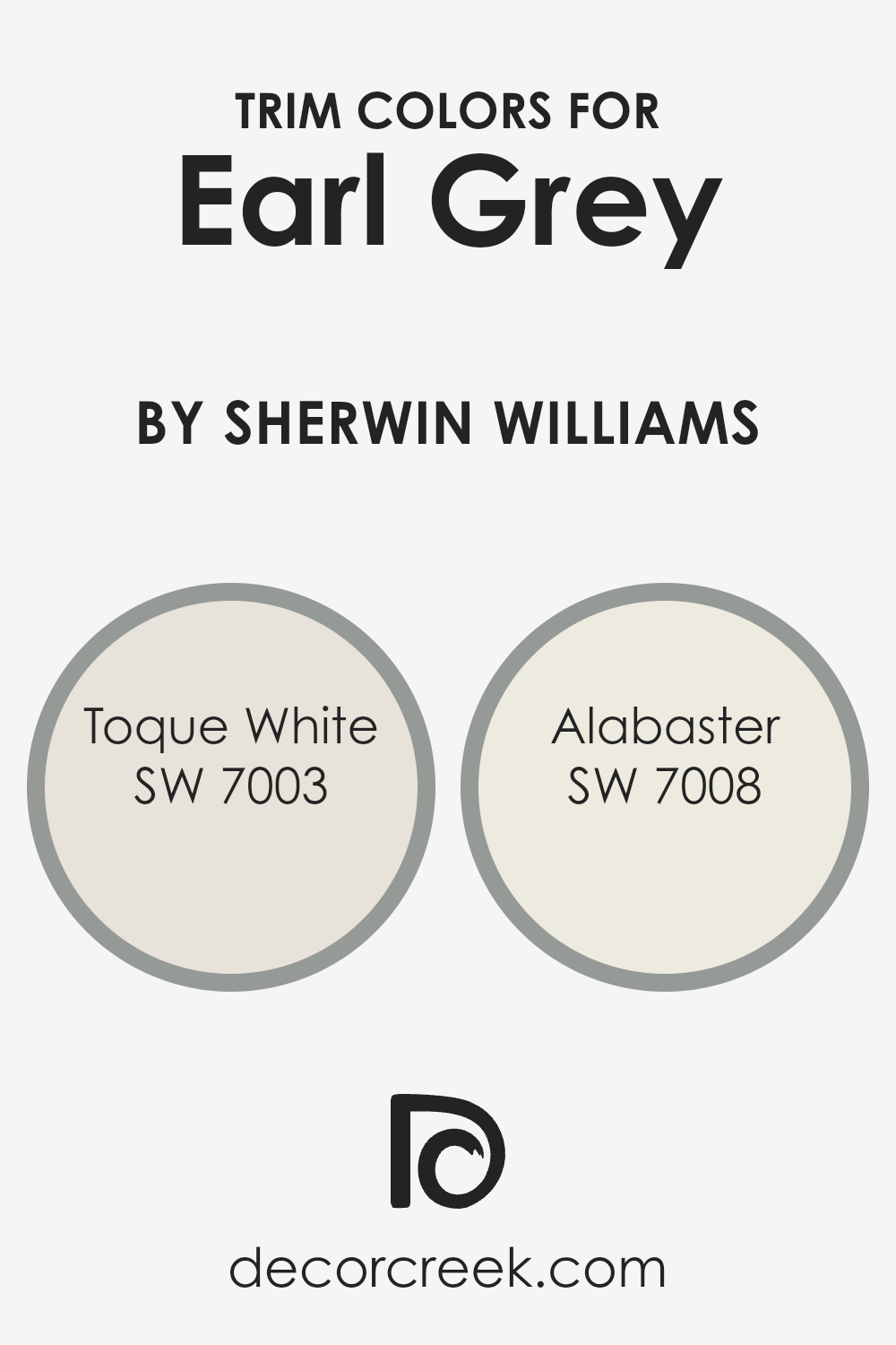
Trim colors, such as SW 7003 – Toque White and SW 7008 – Alabaster, are selected to complement the main colors on walls, thereby enhancing the overall aesthetic of a room. Specifically, when paired with a color like Earl Grey by Sherwin Williams, trim colors play a crucial role in defining the boundaries and architectural details of the space.
Choosing the right trim color can accentuate the features of the room, making architectural details pop and provide a crisp finish to the edges where walls meet door frames, ceilings, and floors.
Toque White is a neutral white with a hint of warmth, making it a versatile choice that softens the boldness of stronger hues without causing a stark contrast. Alabaster, on the other hand, offers a slightly creamier tone that provides a soft, gentle backdrop that can help in creating a more cohesive look throughout the space. Both colors work well as trim options, offering a subtle variation that complements without overshadowing the main color theme of a room.
You can see recommended paint colors below:
- SW 7003 Toque White (CHECK A SAMPLE)
- SW 7008 Alabaster (CHECK A SAMPLE)
Colors Similar to Earl Grey SW 7660 by Sherwin Williams
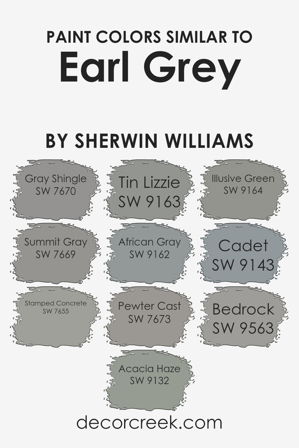
Choosing similar colors can have a significant impact on creating a cohesive and harmonious look in any space. Colors that are similar in hue, saturation, or lightness can visually expand an area, making it appear larger and more connected. These colors work well together because they share a base tone that allows them to blend seamlessly, even though each one possesses unique characteristics that add depth and interest to the decor. For example, using a palette that includes hues like gray and subtle green can provide a smooth transition between spaces or design elements.
Earl Grey by Sherwin Williams has several similar colors that can be beautifully coordinated in interior design. Gray Shingle is a mid-tone gray that gives a steady and neutral backdrop, ideal for those who prefer understated elegance. Summit Gray, slightly lighter, offers a soft, calming effect that is versatile enough for any room.
Stamped Concrete has a deeper, bolder feel, suitable for making a statement or accentuating specific areas. Acacia Haze introduces a touch of green, which pairs wonderfully with natural elements like wood or stone. Tin Lizzie is another gray that leans towards a cooler undertone, fantastic for modern spaces.
African Gray is closely aligned with a warmer spectrum, providing a cozy yet fresh look. Pewter Cast showcases a splash of blue, making it perfect for spaces that aim for a cooler color scheme. Illusive Green delicately balances between gray and green, giving a unique twist to traditional neutral palettes.
Cadet offers a deeper blue-gray, excellent for creating focal points or adding visual weight to a design scheme. Lastly, Bedrock closes the loop with its solid, earthy gray that anchors and defines the space effectively. Each of these colors supports the others, creating endless possibilities for stylish, cohesive interiors.
You can see recommended paint colors below:
- SW 7670 Gray Shingle (CHECK A SAMPLE)
- SW 7669 Summit Gray (CHECK A SAMPLE)
- SW 7655 Stamped Concrete (CHECK A SAMPLE)
- SW 9132 Acacia Haze (CHECK A SAMPLE)
- SW 9163 Tin Lizzie (CHECK A SAMPLE)
- SW 9162 African Gray (CHECK A SAMPLE)
- SW 7673 Pewter Cast (CHECK A SAMPLE)
- SW 9164 Illusive Green (CHECK A SAMPLE)
- SW 9143 Cadet (CHECK A SAMPLE)
- SW 9563 Bedrock (CHECK A SAMPLE)
Colors that Go With Earl Grey SW 7660 by Sherwin Williams
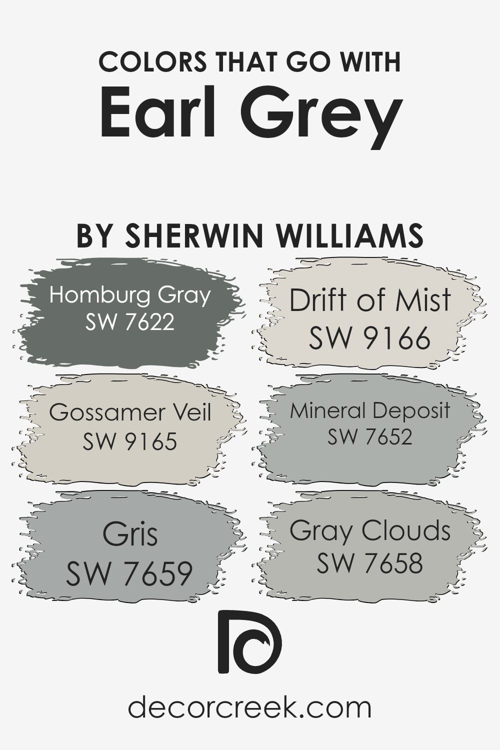
Choosing the right colors to complement Earl Grey SW 7660 by Sherwin Williams is crucial for creating a harmonious and pleasant space. When coordinated well, these colors can enhance the atmosphere of a room, making it feel more cohesive and well-balanced. Earl Grey is a versatile neutral shade that serves as a perfect backdrop for various color combinations, allowing for flexibility in decor choices and personal styles.
Colors like Homburg Gray SW 7622 provide a slightly darker tone that can add depth to spaces when used with Earl Grey. It’s a great option for accent walls or furniture to give a richer touch. Gossamer Veil SW 9165 is lighter, offering a subtle contrast that keeps the room feeling airy and open without a stark contrast.
Gris SW 7659 leans towards a soft grey with subtle blue undertones, perfect for creating a calming effect in areas like bedrooms or studies.
Drift of Mist SW 9166 is another gentle shade, bringing in an almost ethereal feel which is ideal for modern and minimalistic designs. Mineral Deposit SW 7652 is unique, with hints of green, adding a touch of nature-inspired freshness to the environment. Lastly, Gray Clouds SW 7658 offers a mid-tone grey that bridges the light and dark shades in the palette, supporting a seamless flow of color throughout the space.
By considering these accompanying shades, one can effortlessly enhance the aesthetic appeal and functionality of any room painted with Earl Grey SW 7660.
You can see recommended paint colors below:
- SW 7622 Homburg Gray
- SW 9165 Gossamer Veil (CHECK A SAMPLE)
- SW 7659 Gris (CHECK A SAMPLE)
- SW 9166 Drift of Mist (CHECK A SAMPLE)
- SW 7652 Mineral Deposit (CHECK A SAMPLE)
- SW 7658 Gray Clouds (CHECK A SAMPLE)
How to Use Earl Grey SW 7660 by Sherwin Williams In Your Home?
Earl Grey SW 7660 by Sherwin Williams is a versatile and stylish gray paint color that can be used in various ways around your home. It is a soft, warm gray that adds a clean and modern touch to any space. You can use it in your living room for a cozy and welcoming atmosphere, which is great for relaxing and spending time with family. In the bedroom, this color works well too, providing a calm, soothing backdrop that can help you unwind after a long day.
This color also excels in a home office, where it keeps the environment neutral and distraction-free, helping you concentrate on your work. If you’re interested in making a small room feel larger, painting it in Earl Grey can help, because light colors open up spaces.
Additionally, Earl Grey pairs well with a wide range of decor, so you can easily match it with your existing furniture and accessories. Whether you’re looking to freshen up a single room or redo your entire home, this color might just be the perfect choice for you.
Earl Grey SW 7660 by Sherwin Williams vs Tin Lizzie SW 9163 by Sherwin Williams
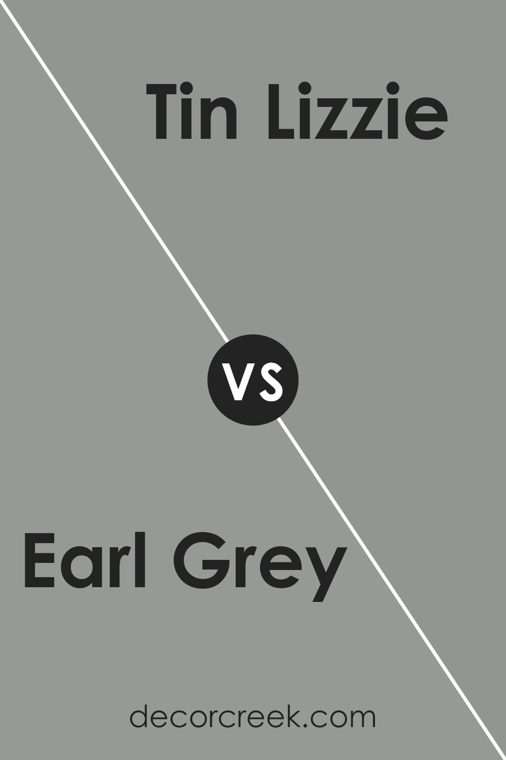
Earl Grey and Tin Lizzie, both by Sherwin Williams, are subtle shades of gray, but they have different undertones and vibes. Earl Grey has a warmer tone, leaning slightly towards taupe, which makes a room feel cozy and welcoming. It’s a great choice if you want a color that brings a soft, comforting presence.
On the other hand, Tin Lizzie is cooler and has a hint of blue in it, giving it a more modern and clean look. This shade works well in spaces that aim for a fresher, more contemporary feel. When comparing the two, think about the atmosphere you want to create in your space. Earl Grey adds warmth and is more traditional, while Tin Lizzie feels cooler and aligns with more modern aesthetics.
You can see recommended paint color below:
Earl Grey SW 7660 by Sherwin Williams vs Cadet SW 9143 by Sherwin Williams
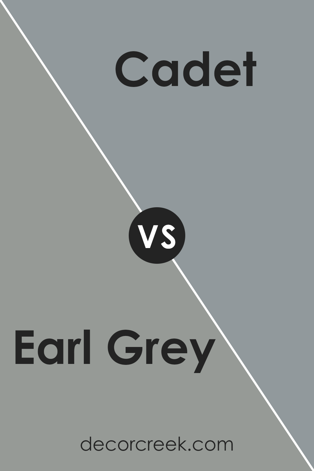
Earl Grey and Cadet are two distinct colors by Sherwin Williams. Earl Grey is a light gray shade that feels soft and calming, perfect for creating a relaxing atmosphere in any room. It has a subtle warmth to it that makes spaces feel cozy and welcoming. On the other hand, Cadet is a deeper, blue-gray hue. It’s a bit bolder than Earl Grey and brings a strong sense of grounding and stability to a space.
Where Earl Grey shines in brightness and lightness, Cadet offers depth and a sense of solidity, making it great for accent walls or spaces where you want a more pronounced color impact. Both colors work well in modern decor but serve different visual purposes. Earl Grey is better for those who want a gentle, airy feel, while Cadet suits those looking for a stronger, more dramatic touch.
You can see recommended paint color below:
- SW 9143 Cadet (CHECK A SAMPLE)
Earl Grey SW 7660 by Sherwin Williams vs Stamped Concrete SW 7655 by Sherwin Williams
Earl Grey by Sherwin Williams is a rich gray paint with subtle blue undertones that give it a cool and calm appearance. It’s versatile for use in various areas of a home, making rooms feel cozy yet modern. On the other hand, Stamped Concrete is another gray shade but leans towards a warmer, more neutral gray without the noticeable blue hues found in Earl Grey.
Stamped Concrete provides a soft, inviting feel, making it ideal for creating a welcoming atmosphere in spaces. Both colors share a gray base, yet their different undertones could influence the mood and style of a room. Earl Grey, with its cooler tones, might be suited for a more contemporary or minimalist style, while Stamped Concrete could be better for those who prefer a traditional or rustic look.
You can see recommended paint color below:
- SW 7655 Stamped Concrete (CHECK A SAMPLE)
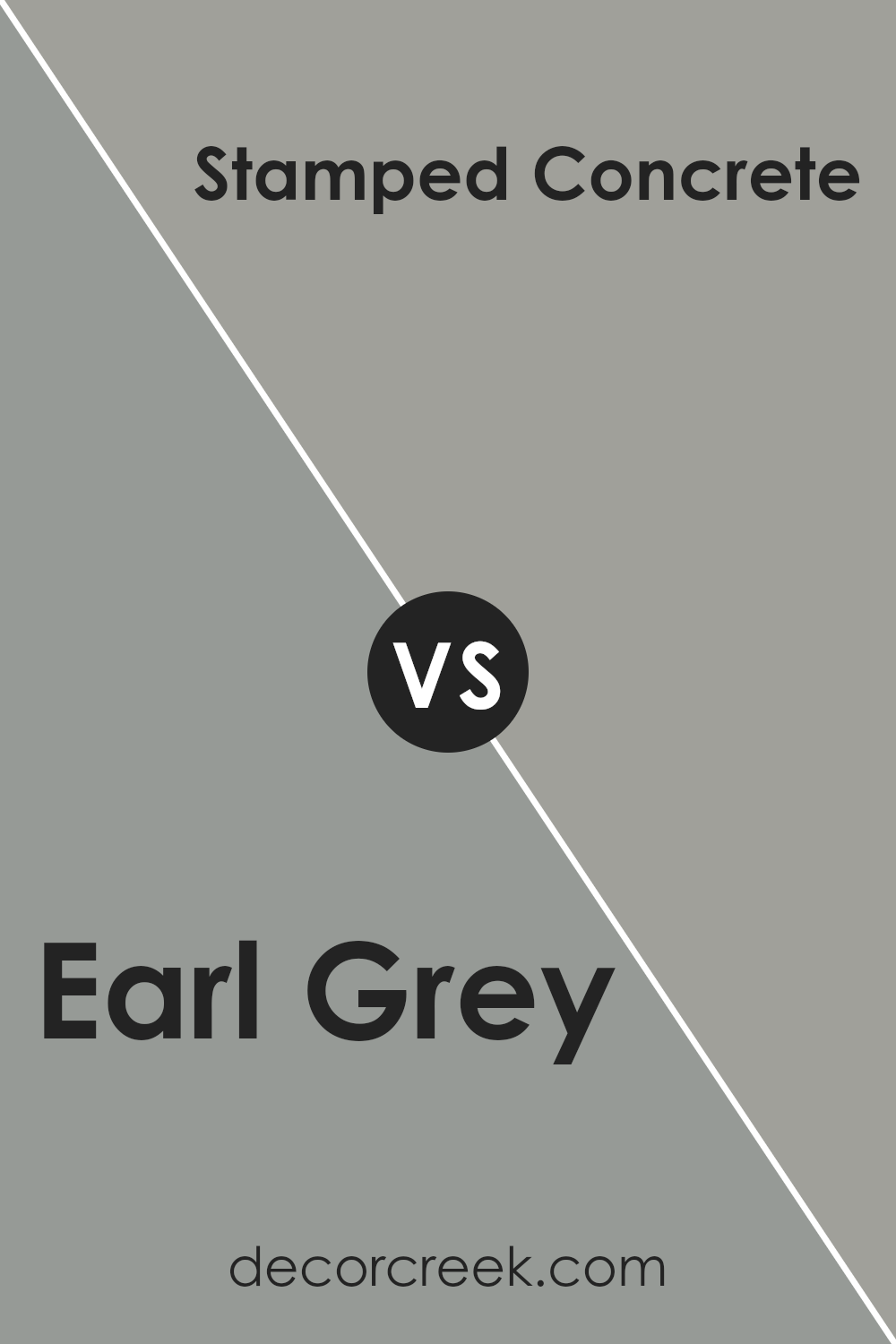
Earl Grey SW 7660 by Sherwin Williams vs Pewter Cast SW 7673 by Sherwin Williams
Earl Grey and Pewter Cast by Sherwin Williams are both shades of gray, but they have distinct undertones that set them apart. Earl Grey has soft, warm undertones that can make spaces feel inviting and cozy. It’s a versatile color that works well in many areas of a home, blending seamlessly with both bright and muted decor styles.
On the other hand, Pewter Cast is a cooler gray with noticeable blue undertones, giving it a more distinct and slightly bolder appearance. This color tends to stand out more, making it a good choice for accent walls or spaces where you want to add a touch of drama.
When comparing these two, think about the mood you want to create. Earl Grey’s warmth is perfect for a relaxed, comfortable setting, while Pewter Cast’s cooler tones offer a fresh, modern feel that can make spaces appear more striking and pronounced.
You can see recommended paint color below:
- SW 7673 Pewter Cast (CHECK A SAMPLE)
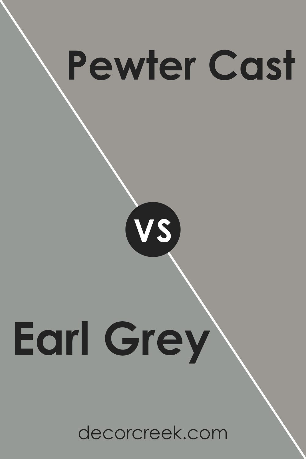
Earl Grey SW 7660 by Sherwin Williams vs Gray Shingle SW 7670 by Sherwin Williams
Earl Grey and Gray Shingle, both by Sherwin Williams, are two distinctive shades of gray that offer subtle differences in mood and style for your space. Earl Grey has a light, soft quality that can make a room feel open and airy. It leans slightly towards a warm tone, making it cozy and welcoming for any room in your home.
On the other hand, Gray Shingle is a deeper shade that can give a stronger, more grounded feel. This color is cooler and more neutral, making it ideal for creating a balanced and understated look. Both colors are versatile and can work well in various settings, whether you want to achieve a gentle brightness with Earl Grey or a more solid, calming presence with Gray Shingle.
When choosing between the two, think about the atmosphere you want to create and how much natural light your room gets, as these factors can influence how the colors appear in your space.
You can see recommended paint color below:
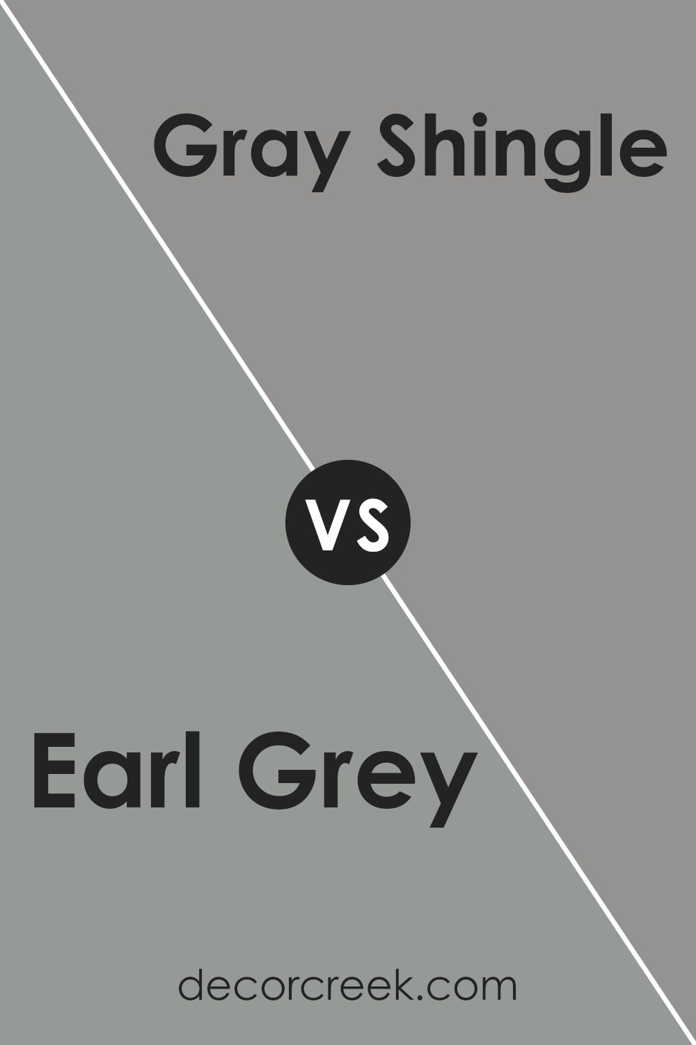
Earl Grey SW 7660 by Sherwin Williams vs Summit Gray SW 7669 by Sherwin Williams
Earl Grey and Summit Gray are two distinct shades of gray from Sherwin Williams that offer subtle variations to suit different tastes and design needs. Earl Grey is a lighter gray that brings a soft and fresh atmosphere to a room. Its gentle tone makes it perfect for creating a cozy and inviting space, whether in a living room, bedroom, or kitchen.
On the other hand, Summit Gray is a bit darker and has a stronger presence. This color is great for adding a bit more depth and character to a space. It works well in areas that benefit from a more pronounced shade, such as accent walls or cabinetry.
While both colors are versatile and can blend well with various decor styles, Earl Grey fits better in settings where a lighter, airier feel is desired. Summit Gray, with its deeper tone, is ideal for making a bolder statement or anchoring a room with a bit more weight. Both are excellent choices depending on the effect you want to achieve in your decorating project.
You can see recommended paint color below:
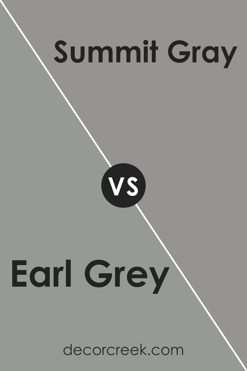
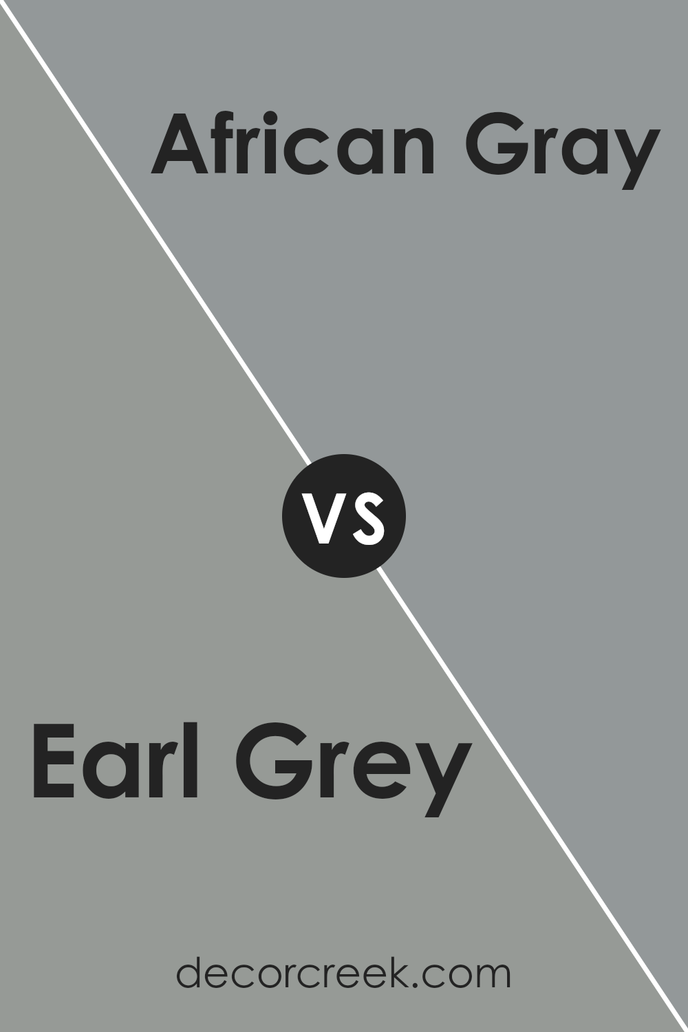
Earl Grey SW 7660 by Sherwin Williams vs African Gray SW 9162 by Sherwin Williams
“Earl Grey” and “African Gray” are both gray paint colors from Sherwin Williams, but they present distinct tones that can set different moods in a room. “Earl Grey” has a cooler undertone, which gives it a fresh and modern appeal. It’s a great choice if you want a space to feel more open and airy. This shade can work well in a living room or a bathroom where you might want a clean, crisp look.
On the other hand, “African Gray” leans towards a warmer, more inviting gray with subtle hints of brown. This warmer quality makes it ideal for creating a cozy and welcoming atmosphere, perfect for bedrooms or family rooms where comfort is key.
Both colors offer versatility and work well with various decor styles, but your choice might depend on the kind of mood and aesthetic you aim to achieve in your space. Whether you go for the coolness of “Earl Grey” or the warm, inviting tone of “African Gray,” both shades are stylish choices that can beautifully enhance your home.
You can see recommended paint color below:
- SW 9162 African Gray (CHECK A SAMPLE)
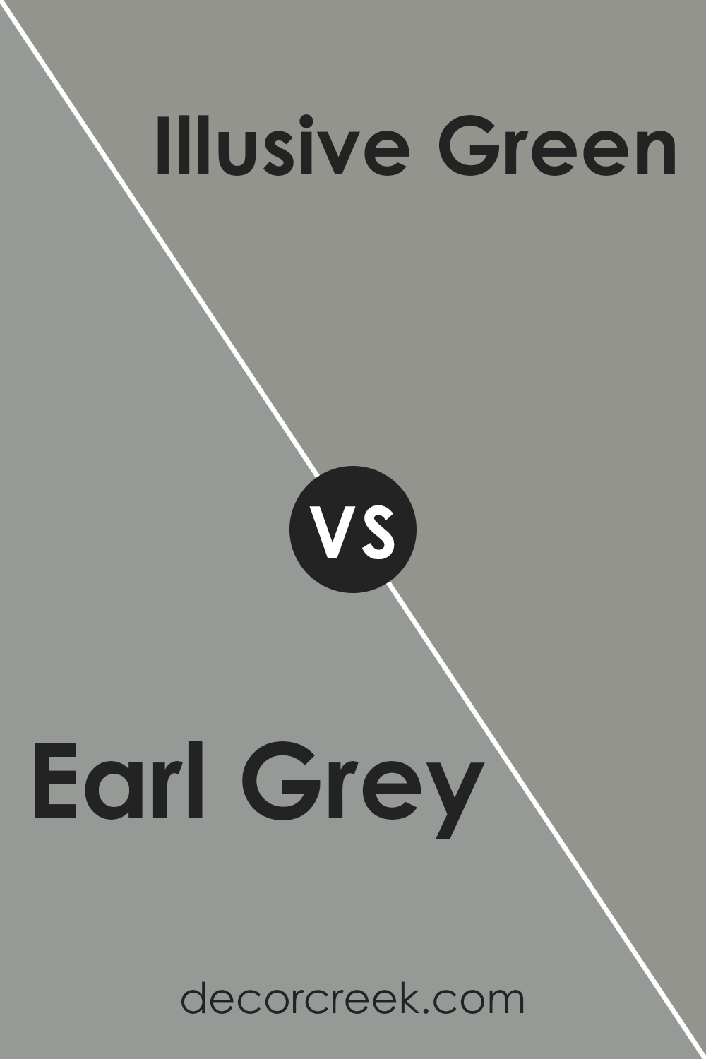
Earl Grey SW 7660 by Sherwin Williams vs Illusive Green SW 9164 by Sherwin Williams
Earl Grey and Illusive Green are both intriguing paint colors by Sherwin Williams, each bringing its unique feel to a space. Earl Grey is a deep, calming gray with hints of blue. It provides a solid and subtle backdrop in a room, working well in spaces that aim for a reserved but stylish tone. It pairs beautifully with brighter colors or works as a standalone shade for a muted, clean look.
On the other hand, Illusive Green has a more dynamic character. This color is a soft, muted green with gray undertones, giving it a cool, natural vibe. It’s perfect for bringing a touch of the outdoors inside, creating a fresh and inviting atmosphere. Illusive Green works well in areas that receive a lot of natural light, enhancing the feeling of space and calm.
Both colors are versatile, but while Earl Grey leans more towards a timeless neutrality, Illusive Green offers a hint of earthiness and nature. Whether to choose one over the other would depend on the mood and style you want for your room.
You can see recommended paint color below:
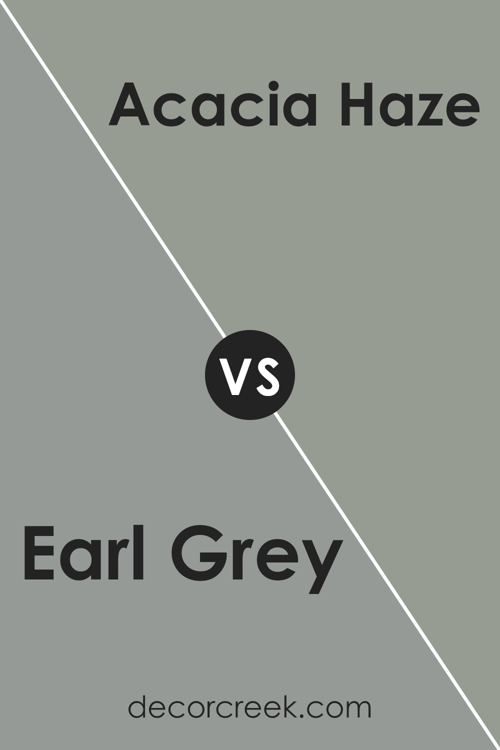
Earl Grey SW 7660 by Sherwin Williams vs Acacia Haze SW 9132 by Sherwin Williams
Earl Grey and Acacia Haze are both popular colors by Sherwin Williams, but they offer distinct vibes for interior spaces. Earl Grey is a soft, light gray that provides a clean and simple look. It works well in spaces that aim for a minimalistic and fresh aesthetic, creating a backdrop that makes room colors pop.
On the other hand, Acacia Haze paints a more substantial feel with its deeper, greenish-gray tone. This color is perfect for adding a touch of nature and depth to any room. It pairs beautifully with wood finishes and natural fibers, giving a grounded and cozy atmosphere.
While both colors maintain a certain neutrality, Earl Grey leans towards an airy, open sense, ideal for making small rooms appear larger. In contrast, Acacia Haze offers a warmer, more enclosed feeling that works well in larger spaces or areas where a sense of intimacy is desired. Depending on what ambiance you want to achieve, you might choose the uplifting simplicity of Earl Grey or the richer, earthy tones of Acacia Haze.
You can see recommended paint color below:
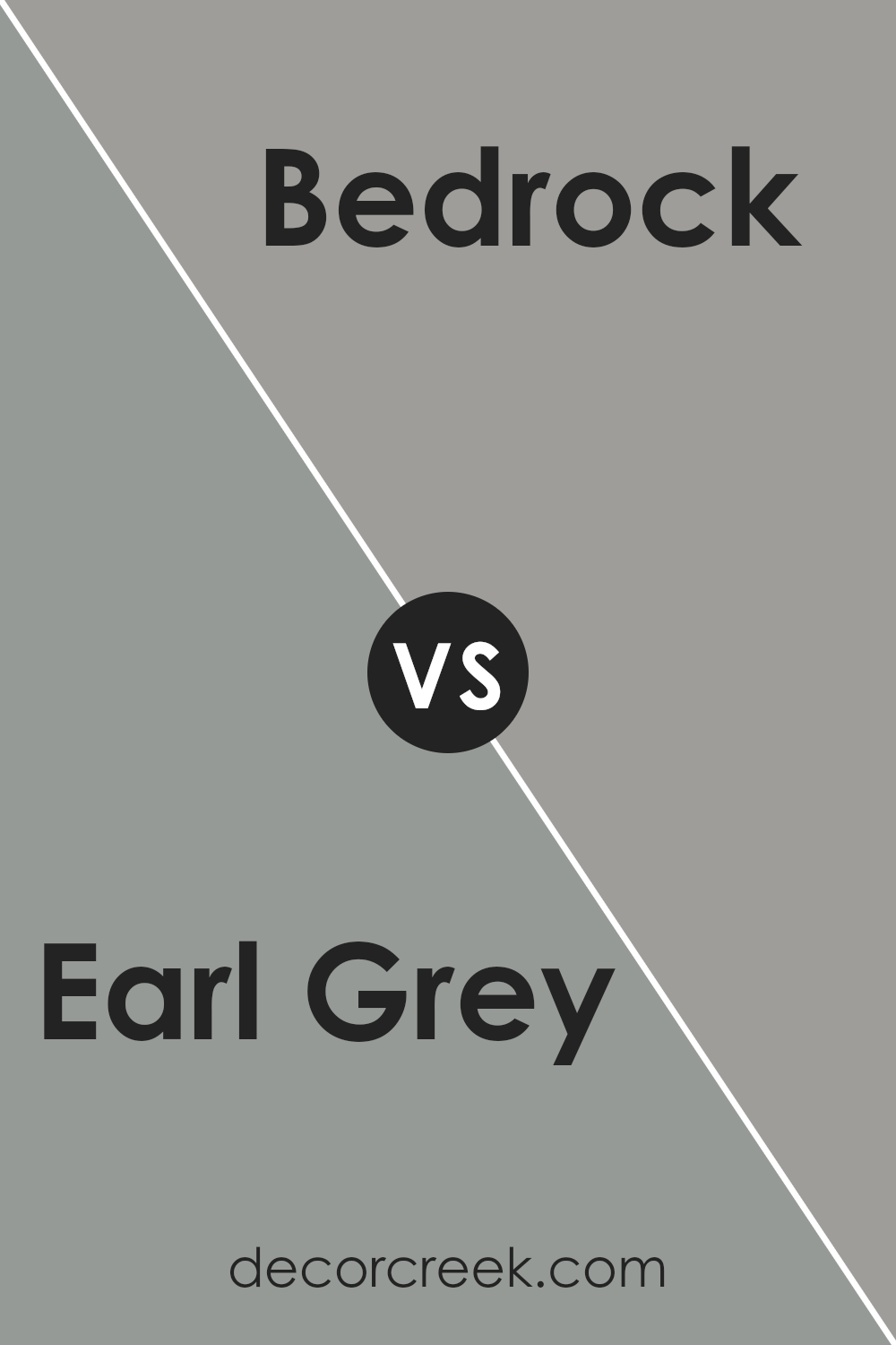
Earl Grey SW 7660 by Sherwin Williams vs Bedrock SW 9563 by Sherwin Williams
Earl Grey and Bedrock by Sherwin Williams are both neutral colors, but they have different undertones and depths that set them apart. Earl Grey is a lighter grey with a soft, subtle feel to it. It gives a clean and airy look to a space, making it a great choice for making small rooms appear larger or for brightening up a space without being too stark.
On the other hand, Bedrock is a darker, warmer grey. It leans slightly towards brown, giving it a cozier and more inviting feel compared to the cooler tones of Earl Grey. This color works well in areas where you want to create a more grounded and comforting atmosphere, like living rooms or bedrooms.
Both colors are versatile and can work well in various decor styles, but the choice between them depends on the mood you want to set in your space and how much natural light the room receives.
You can see recommended paint color below:
Conclusion
Earl Grey SW 7660 is a unique shade that offers a quiet, understated elegance to any space it graces. This color is versatile enough to work well in various settings, from living rooms and bedrooms to kitchens and home offices. Its balanced hue pairs beautifully with both modern and traditional decor, providing a backdrop that complements a wide range of furniture styles and accessories.
Homeowners looking to enhance their living environment will find that Earl Grey SW 7660 is practical yet attractive. It has the perfect blend of warmth and neutrality, making it a reliable choice for those looking to refresh their walls without going too bold.
This color doesn’t just cover walls; it adds a subtle charm and a professional finish to any room it is applied to, setting a pleasant mood and visual comfort.
Ever wished paint sampling was as easy as sticking a sticker? Guess what? Now it is! Discover Samplize's unique Peel & Stick samples.
Get paint samples


