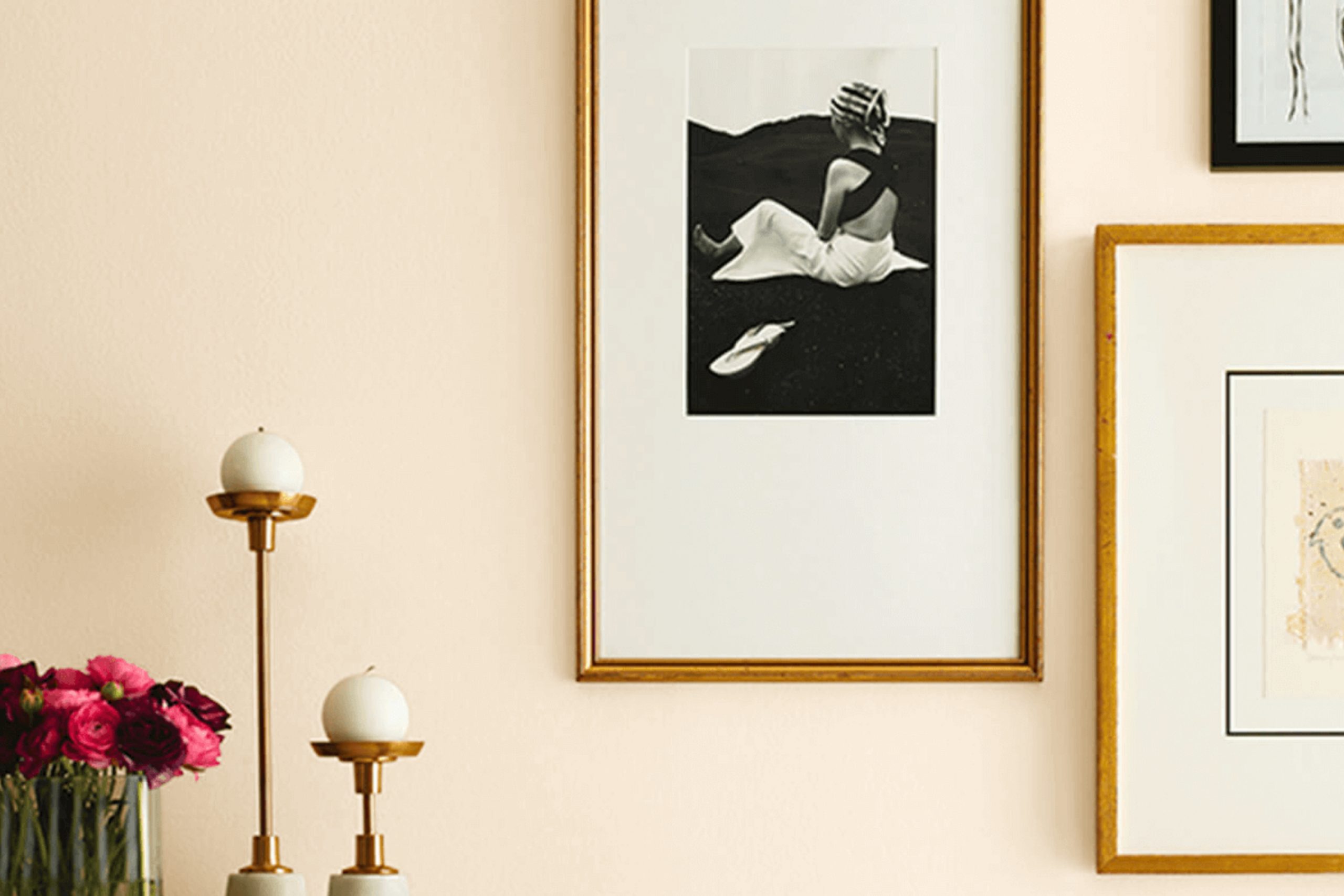
When you’re considering a fresh color for your home, SW 6644 Champagne by Sherwin Williams is an uplifting option. This warm, inviting hue has a subtle elegance that can brighten any room without overpowering it. It’s an adaptable color that works beautifully whether you’re looking to add a touch of refinement to your living room or a cozy vibe to your bedroom.
This gentle yellow with a hint of gold offers a cheerful backdrop that compliments a wide range of decor styles. From modern minimalism to rustic charm, Champagne adjusts easily, enhancing the surroundings without demanding center stage. If you’re worried about making your area feel too bold or explosive, this color maintains a quiet presence, offering warmth and light in a soft, understated manner.
Perfect for anyone looking to refresh their walls with something light, airy, and subtly vibrant, Champagne by Sherwin Williams might just be the change you’re looking for. It promises to lift the ambiance of your home while keeping things simple and elegant.
I found that it particularly shines in well-lit areas, where natural light can enhance its gentle glow, making the room feel more expansive and welcoming.
What Color Is Champagne SW 6644 by Sherwin Williams?
Champagne by Sherwin Williams is a warm, inviting hue that has a gentle depth to it, offering a cozy yet light feel that can brighten up an area while adding a touch of richness. It’s an adaptable color that sits beautifully between beige and yellow, giving it a soft, welcoming vibe that isn’t overpowering. This subtle shade works especially well in living rooms, kitchens, and bedrooms where the goal is to create a relaxed, airy atmosphere.
This color pairs wonderfully with natural materials such as wood, which enhances its warm undertones. Fabrics like linen or soft cotton also go well with Champagne, creating a calm, comfortable setting. Accents in leather or suede can add a touch of luxury without overshadowing the gentle charm of the base color.
As for interior styles, Champagne is particularly suited for modern farmhouse, rustic, and Scandinavian designs due to its earthy, minimalistic undertones. It provides a perfect backdrop for these decor styles, complementing natural furniture elements and simple, clean lines. In more traditional or classic settings, this color adds a fresh twist without straying too far from the style’s inherent coziness and appeal.
In summary, Champagne is a flexible color choice that works in various environments, uplifting the area with its warm, inviting tone.
Is Champagne SW 6644 by Sherwin Williams Warm or Cool color?
Champagne SW 6644 by Sherwin Williams is a warm, inviting shade that adds a subtle touch of elegance to any room. Its soft, beige hue can make areas feel more welcoming and cozy. This paint color works beautifully as a neutral backdrop, allowing for a wide range of decor styles and color schemes to stand out.
Because it is not overly bold or dominating, it helps other elements in the room, like furniture and art, to really shine. Using Champagne in a home can also make areas appear larger and brighter, as its light-reflecting properties cast a gentle glow. This makes it a great choice for smaller rooms or areas with limited natural light.
Its adaptability extends to various rooms, from living areas and kitchens to bedrooms, proving to be effective in creating a harmonious and warm environment. Overall, Champagne is a reliable and flexible color choice for anyone looking to enhance the appeal of their home.
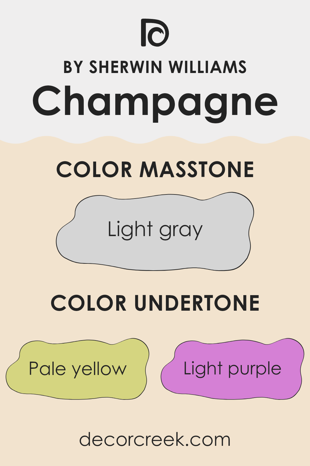
Undertones of Champagne SW 6644 by Sherwin Williams
Champagne SW 6644 by Sherwin Williams is a unique color that can subtly shift its appearance depending on the lighting and surrounding colors due to its complex undertones. Undertones are the colors lurking beneath the surface of the paint that influence how it looks in different settings.
This particular shade has a variety of undertones, including pale yellow, light purple, light blue, pale pink, mint, lilac, and grey. These undertones can make the color appear more vibrant or muted, depending on other colors in the room and the lighting conditions.
For example:
- Pale yellow and mint undertones can make the color feel warmer and more inviting in sunlight.
- Light blue and light purple undertones might make the walls look cooler, which can be refreshing in well-lit or naturally bright rooms.
- Pale pink can gently soften the look, giving the room a more gentle and softer vibe.
- Lilac and grey can bring depth and a sense of calmness, making the area feel grounded.
On interior walls, the appearance of this paint can change throughout the day. Morning light might emphasize its warmer tones, while evening light might draw out its cooler or gray aspects. This makes Champagne SW 6644 an adaptable choice that can fit with various decor styles and preferences in changing light conditions. The way this paint’s color shifts subtly with its undertones can make a room feel more dynamic and visually interesting.
decorcreek.com
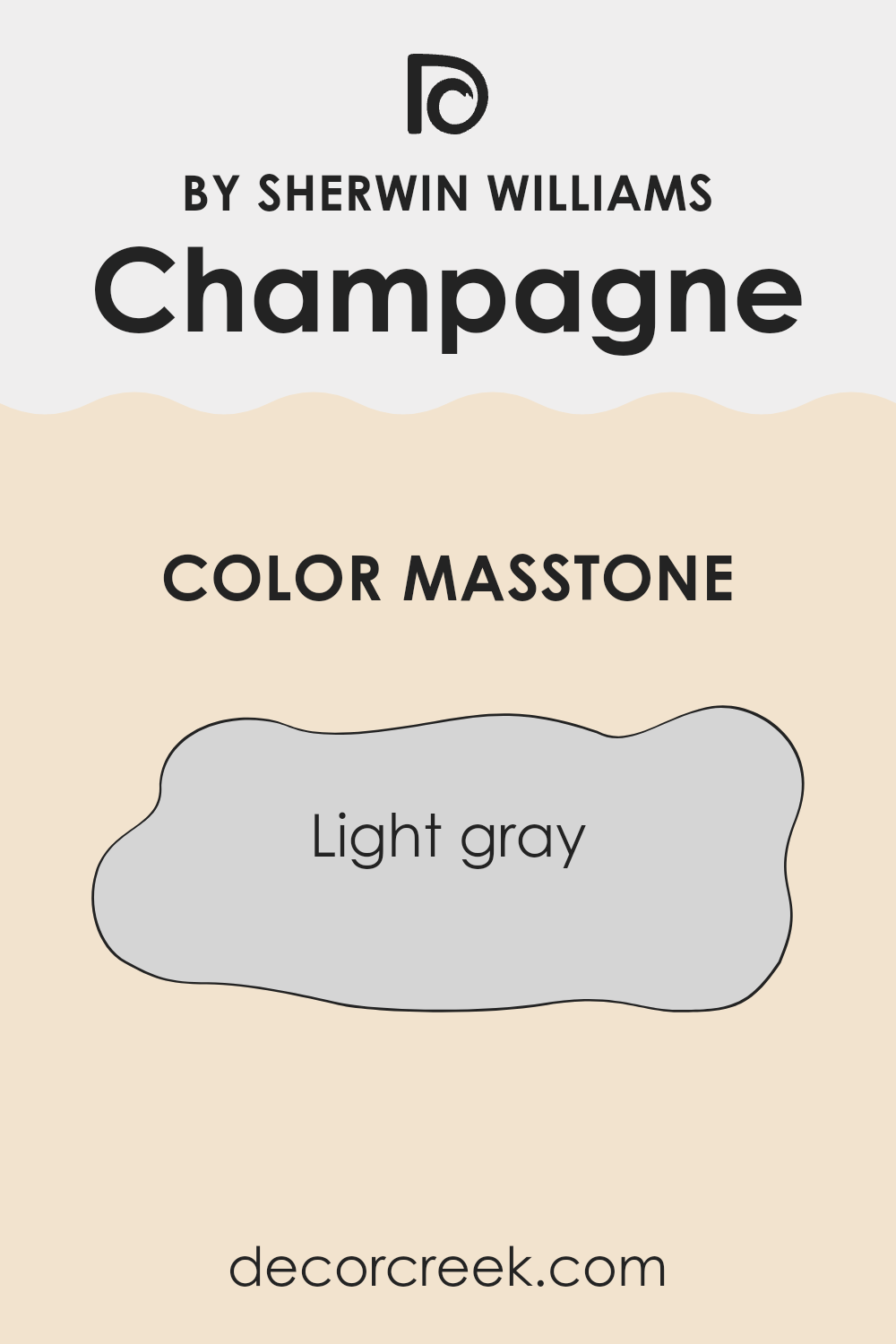
What is the Masstone of the Champagne SW 6644 by Sherwin Williams?
Champagne SW 6644 by Sherwin Williams, with a masstone of Light Gray (#D5D5D5), is an adaptable choice for home interiors. This light gray shade brings a clean and open feel to any room, making areas appear larger and more inviting.
Because of its neutral tone, it pairs easily with various decor styles and colors, from bright accents to more subdued hues. This flexibility allows homeowners to play around with different accessories and furniture pieces without the color clashing.
It’s great for areas that receive a lot of traffic like living rooms or hallways as it hides minor imperfections well and maintains a fresh look. Furthermore, in homes with less natural light, its reflective qualities can help brighten rooms, enhancing the overall ambiance. Thus, this shade is not only functional but also enhances the aesthetic appeal of a home effortlessly.
How Does Lighting Affect Champagne SW 6644 by Sherwin Williams?
Lighting plays a vital role in how colors appear in different environments. The type of light and the direction from which it comes can significantly change the perception of a color. The Sherwin Williams paint color Champagne is a subtle shade that can look quite different depending on the lighting conditions.
In artificial light, Champagne tends to take on a warmer, richer tone. This is because most artificial lights, like incandescent bulbs, have a yellowish tint that enhances warmer hues. In a room lit by LED or fluorescent lights, which can have cooler tones, Champagne might appear slightly more muted and less warm.
In natural light, the appearance of Champagne can vary throughout the day. Morning light is often softer and can bring out the creamy qualities of this color, making it appear gentle and inviting. As the day progresses and the light becomes brighter, the color may look more vivid and dynamic.
The orientation of a room also affects how Champagne looks. North-facing rooms receive less direct sunlight, which can make colors appear cooler and slightly shadowed. In a north-facing room, Champagne might lose some of its warmth and look more subdued.
South-facing rooms, however, get plenty of bright, direct light throughout the day, which can make Champagne look vibrant and lively. The warm light enhances its cozy, welcoming qualities.
East-facing rooms enjoy bright morning light, which can make Champagne look soft and fresh. As the day goes on and the light diminishes, the color can take on a calmer, more subtle appearance. Conversely, west-facing rooms get the most intense light in the late afternoon, which can cause Champagne to glow warmly as the sun sets. This can create a cozy, inviting atmosphere in the evening.
Overall, Champagne is an adaptable color that can work beautifully in many settings, shifting its character based on lighting conditions and room orientation, offering a range of atmospheres from calm and subdued to warm and vibrant.
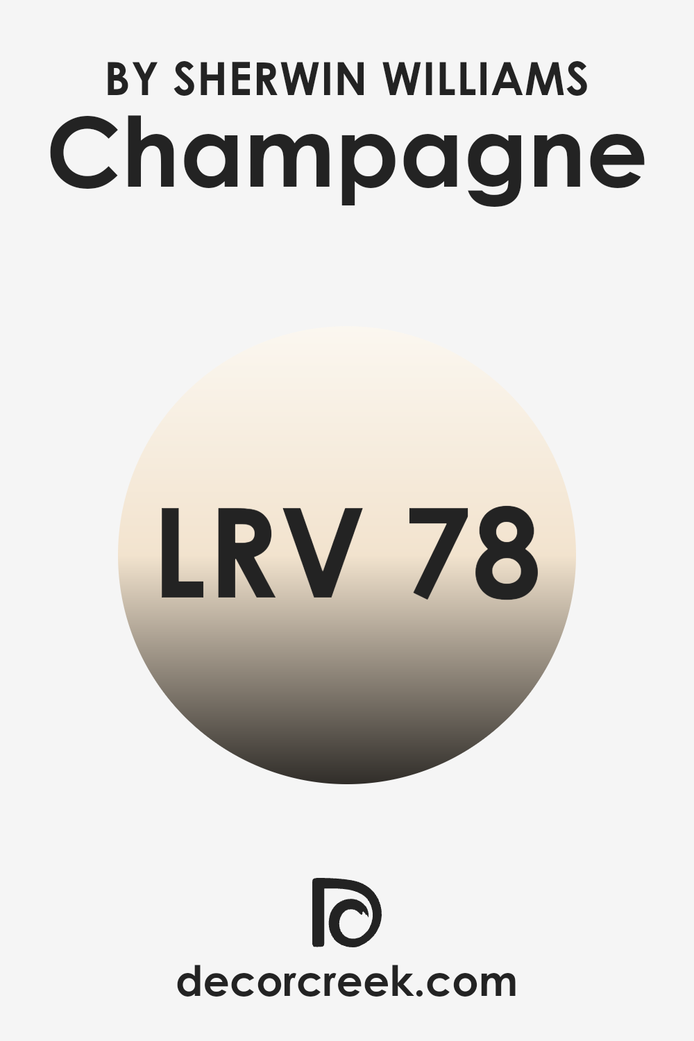
What is the LRV of Champagne SW 6644 by Sherwin Williams?
LRV, or Light Reflectance Value, is a measurement used to describe the amount of visible and usable light that reflects from a surface when light shines upon it. The scale for LRV runs from a pure black, which reflects no light and has a LRV of zero, to a pure white, which reflects all light and has a LRV close to the maximum on the scale.
The higher the LRV, the more light that surface reflects. So, when deciding on paint colors, considering the LRV can help you understand how light or dark a color will look once applied to your walls. It is especially important in rooms where the amount of natural light is a consideration, affecting how the color is perceived at different times of the day.
With a LRV of 78.115, the Champagne SW 6644 reflects a significant amount of light, making it a lighter shade that brightens up a room. In areas with less natural light, using a color with a high LRV can make the environment appear larger and more open, as more light is bounced around. Conversely, in very brightly lit areas, this high LRV might make the color seem even lighter, possibly leading to a washed-out look if not balanced correctly with other colors or decorative elements. Thus, this particular LRV value indicates that the paint is an excellent choice for creating a light, airy feel in a variety of settings.
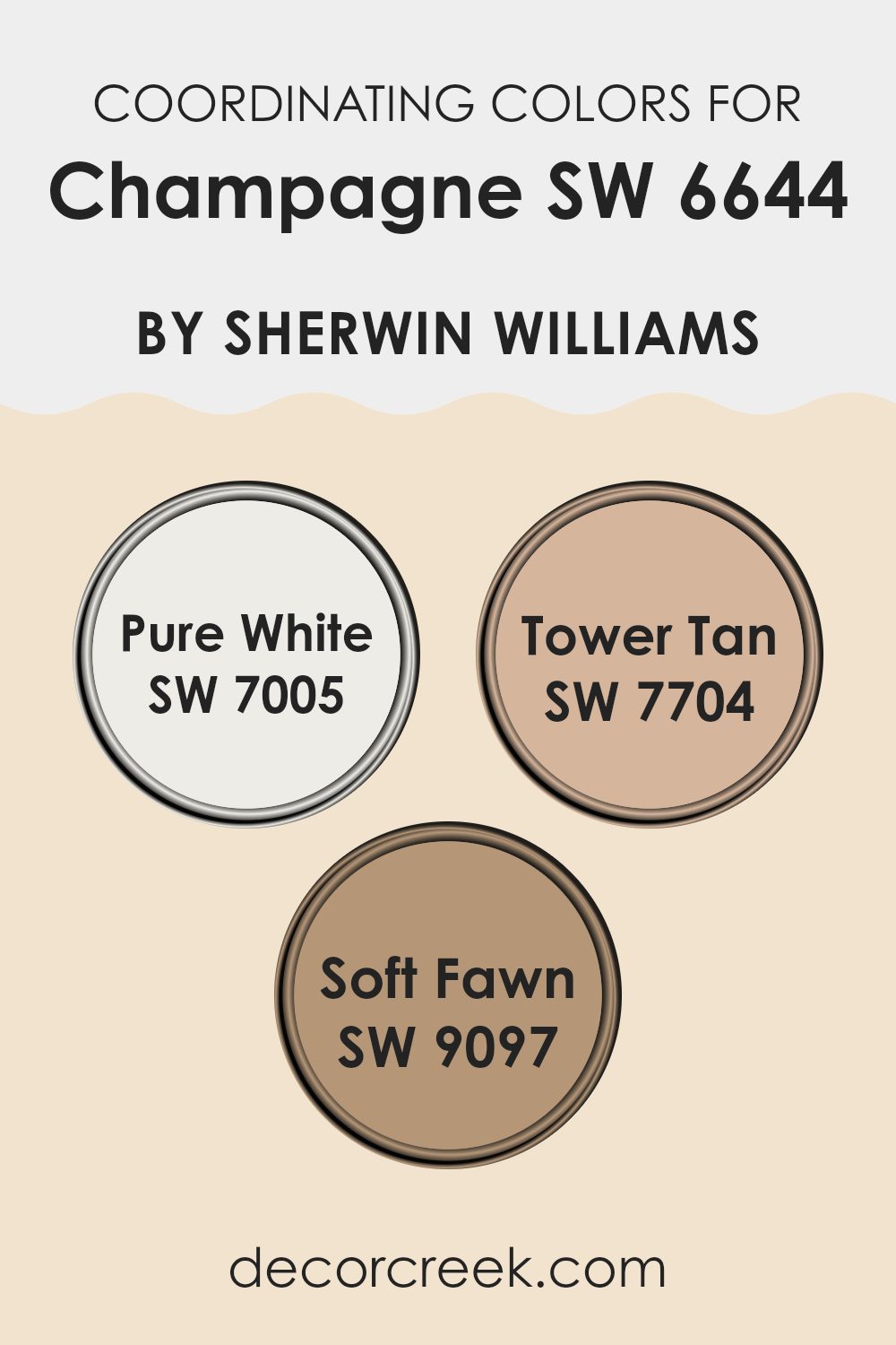
Coordinating Colors of Champagne SW 6644 by Sherwin Williams
Coordinating colors are complementary hues that pair well with a main color, enhancing the overall aesthetic of an environment without clashing. When used effectively, these colors create a cohesive and visually appealing color scheme. For example, if the main color is a muted hue like a subtle beige or soft tan, coordinating colors might include variations of white or richer shades, creating a balanced and harmonious look. These tones work together to support the dominant color, highlighting its beauty without overpowering it.
In the case of a gentle and adaptable shade like Champagne by Sherwin Williams, colors such as Pure White, Tower Tan, and Soft Fawn serve as excellent coordinating options. Pure White is a crisp and clean shade that brings a fresh brightness to a room, making it feel more open and airy.
It contrasts gently with warmer tones, providing a sharp, clear boundary that can make other colors pop while still maintaining a unified look. Tower Tan is a warmer, deeper shade that offers a comforting earthiness, which complements richer and lighter colors alike. Soft Fawn, with its soothing muted brown tone, provides a neutral backdrop that works well with both vibrant and subtle palettes, rounding out the design with a smooth finish. These colors together can enhance a living environment, creating a welcoming and stylish atmosphere.
You can see recommended paint colors below:
- SW 7005 Pure White
- SW 7704 Tower Tan
- SW 9097 Soft Fawn
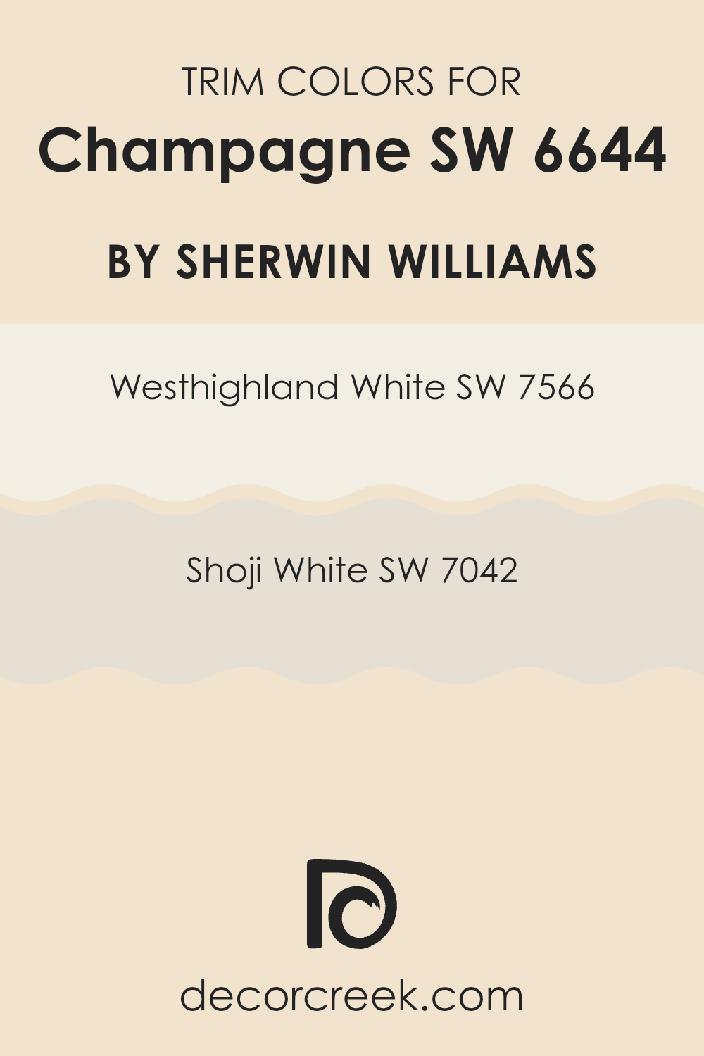
What are the Trim colors of Champagne SW 6644 by Sherwin Williams?
Trim colors, like SW 7566 Westhighland White and SW 7042 Shoji White, play a crucial role in interior design by defining and accentuating the architectural details of a room. When paired with a base color such as Champagne by Sherwin Williams, trim colors can enhance the overall aesthetic by creating a crisp, clean boundary that highlights the shape and edge of walls, doors, and windows.
By carefully choosing a trim color that complements the main wall color, homeowners can achieve a harmonious look that adds depth and character to their environment. SW 7566 Westhighland White is a bright and creamy white that brings a fresh and airy feel to any room, making it a fantastic choice for trim, as it contrasts well with richer and darker hues.
On the other hand, SW 7042 Shoji White offers a slightly warmer tone, providing a subtle contrast that is ideal for areas where a soft and gentle ambiance is desired. Both these colors are adaptable and work beautifully with Champagne, ensuring that the interiors feel interconnected and polished.
You can see recommended paint colors below:
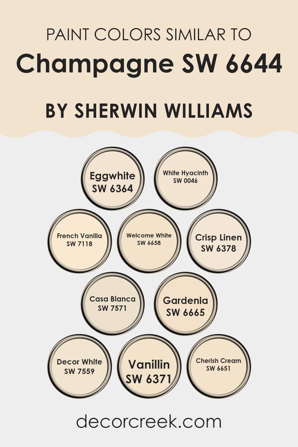
Colors Similar to Champagne SW 6644 by Sherwin Williams
In interior design, using similar colors can create a harmonious and visually pleasing environment. Choosing paint colors that are similar to Champagne, like SW 6364 – Eggwhite and SW 0046 – White Hyacinth, works wonderfully to cultivate a subtle yet coherent aesthetic.
These shades are all about adding lightness without overpowering the senses. For instance, Eggwhite is a soft, creamy white that brings warmth to an area while White Hyacinth offers a slightly more crisp, clean feel. When rooms are painted with close shades such as these, the flow from room to room is smooth, promoting a sense of unity throughout the home.
Colors like SW 7118 – French Vanilla and SW 6658 – Welcome White reinforce a calm and welcoming atmosphere. French Vanilla has a gentle, buttery tone that envelops a room in comfort, whereas Welcome White is a more straightforward, inviting white. Using colors adjacent on the color wheel or within the same color family, like SW 6378 – Crisp Linen, SW 7571 – Casa Blanca, and SW 6665 – Gardenia helps in achieving a cohesive look.
Crisp Linen has a hint of freshness, perfect for creating a clean, airy feel, while Casa Blanca is an off-white with a hint of warmth, and Gardenia offers a touch of softness. Utilizing these various shades together ensures each room maintains individuality yet feels part of a larger, unified scheme.
You can see recommended paint colors below:
- SW 6364 Eggwhite
- SW 0046 White Hyacinth
- SW 7118 French Vanilla
- SW 6658 Welcome White
- SW 6378 Crisp Linen
- SW 7571 Casa Blanca
- SW 6665 Gardenia
- SW 7559 Decor White
- SW 6371 Vanillin
- SW 6651 Cherish Cream
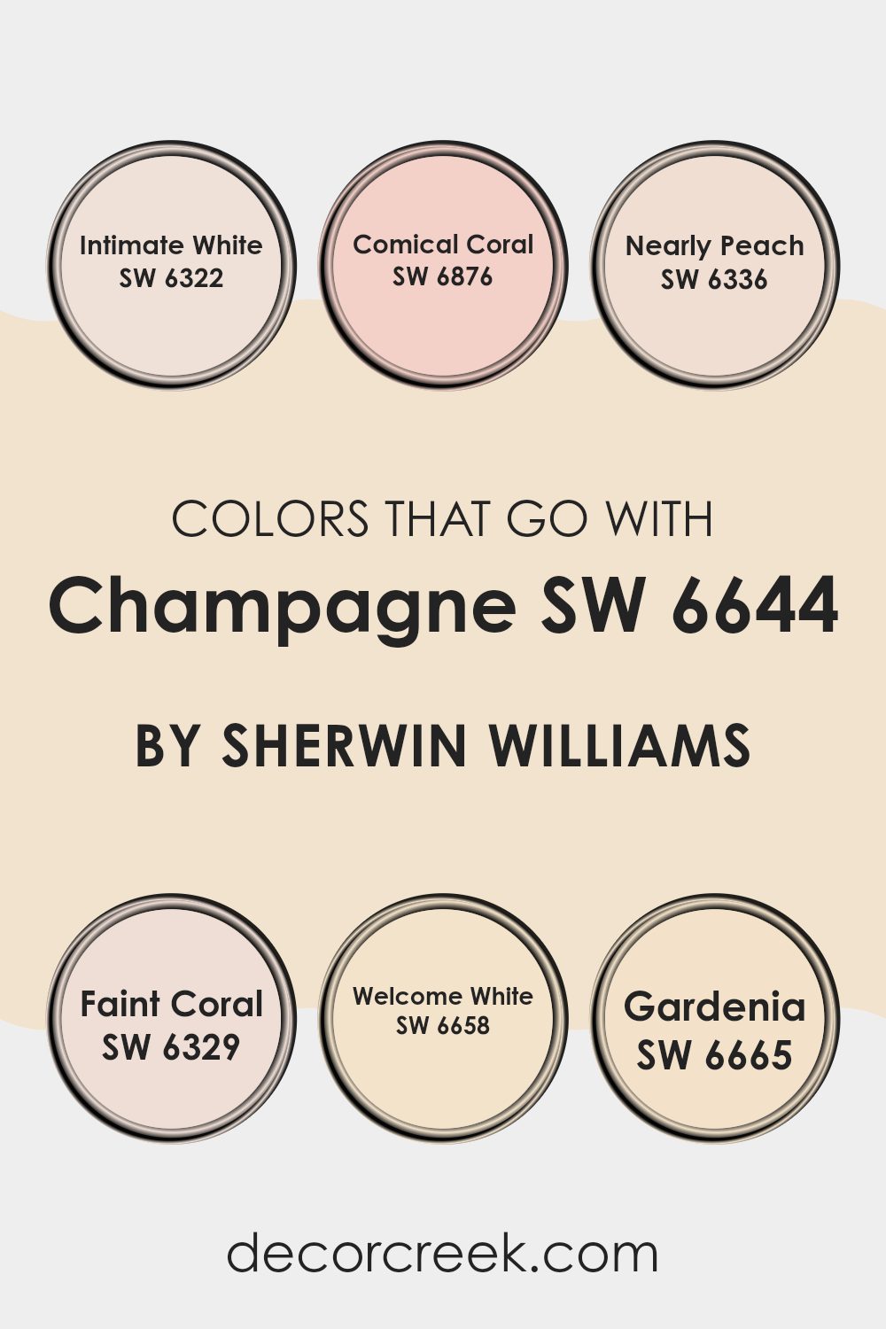
Colors that Go With Champagne SW 6644 by Sherwin Williams
Choosing the right colors to accompany Champagne SW 6644 by Sherwin Williams is essential in creating a harmonious and appealing area. Each complementary color enhances the subtle undertones in Champagne SW 6644, either by contrasting or coordinating shades, thus offering a balanced and aesthetically pleasing look. By pairing it with thoughtful color selections, it helps create a visually stunning setting that speaks to personal style and decor tastes.
For example, Intimate White is a soft and gentle hue that provides a slight contrast to Champagne SW 6644, making it ideal for creating a calm and inviting atmosphere. It works well in rooms meant for relaxation and casual gatherings.
Comical Coral, with its lively and cheerful pinkish-orange tone, adds a splash of energy and fun to the subdued nature of Champagne SW 6644, perfect for vibrant, dynamic areas like playrooms or creative studios. Nearly Peach has a muted peachy tone, complementing Champagne SW 6644 with its warm and cozy appeal, ideal for rooms that aim for a soft and comforting feel.
Faint Coral offers a hint more saturation than Nearly Peach, giving a fresh look without overpowering, great for adding subtle vibrancy. Welcome White stands as a clean and pure choice, ensuring that the warmth of Champagne SW 6644 shines through, perfect for rooms that aim for a crisp, minimalistic aesthetic.
Lastly, Gardenia brings a traditional creamy touch that enriches the environment, offering a classic backdrop that works well in any setting where you want an enduring look. By selecting these colors, you can effectively set the tone and mood for any room.
You can see recommended paint colors below:
- SW 6322 Intimate White
- SW 6876 Comical Coral
- SW 6336 Nearly Peach
- SW 6329 Faint Coral
- SW 6658 Welcome White
- SW 6665 Gardenia
How to Use Champagne SW 6644 by Sherwin Williams In Your Home?
Champagne SW 6644 by Sherwin Williams is a lovely, warm neutral color that adds a gentle touch of elegance to any area without overpowering it. This hue has a soft golden undertone, making it an adaptable choice for many rooms in a home.
It can refresh living rooms when paired with soft whites or earthy accents, creating a cozy and inviting atmosphere. In a bedroom, it can help set a calm, soothing mood when used on walls and paired with crisp linens and soft lighting.
Champagne is also ideal for bathrooms or smaller rooms, where it can make the area feel brighter and more open. For those looking to update their kitchen, this color works beautifully on cabinets or as a wall color, complementing both wood tones and modern finishes. It’s an easy-to-use shade that fits well with many decorating styles, from modern to traditional, making it a practical choice for anyone looking to add a touch of warmth to their interiors.
Champagne SW 6644 by Sherwin Williams vs Crisp Linen SW 6378 by Sherwin Williams
Champagne by Sherwin Williams is a warm, muted yellow with a softness that can make an area feel cozy and inviting. Its subtlety blends well in rooms where a touch of warmth is desired, without overpowering other design elements.
On the other hand, Crisp Linen is a fresh and clean white with a slight warmth, making it very adaptable for various rooms. It can help make a small room appear larger and brighter, providing a neutral backdrop that allows other colors or decor elements to stand out.
When comparing the two, Champagne adds a gentle warmth with its yellow undertones, while Crisp Linen offers a brighter, more neutral canvas. Each color has its unique appeal depending on the atmosphere you want to create in your room.
You can see recommended paint color below:
- SW 6378 Crisp Linen
Champagne SW 6644 by Sherwin Williams vs Gardenia SW 6665 by Sherwin Williams
Champagne SW 6644 and Gardenia SW 6665 are both inviting shades that bring warmth and a welcoming vibe to any room, but they have distinct tones that set them apart. Champagne is a muted yellow with a soft, creamy base that gives off a subtle, cozy feel.
It’s perfect for creating a gentle and warm atmosphere in areas like living rooms and bedrooms. On the other hand, Gardenia is a vibrant, creamy yellow that’s a bit bolder and brighter.
This shade adds cheer and a more lively energy to a room, making it well-suited for kitchens, dining areas, or any area that benefits from a sunny lift. Both colors reflect light beautifully, but Gardenia might appear somewhat more vivid and energetic due to its slightly richer hue, while Champagne provides a calmer, more understated ambiance.
You can see recommended paint color below:
- SW 6665 Gardenia
Champagne SW 6644 by Sherwin Williams vs French Vanilla SW 7118 by Sherwin Williams
Champagne and French Vanilla are two warm and inviting colors by Sherwin Williams, each offering a unique ambiance. Champagne is a richer, deeper hue with a golden undertone that gives a cozy yet lively vibe to the area.
It works well in living rooms or any place where you want a welcoming feel. On the other hand, French Vanilla is lighter and creamier, offering a softer and more subtle touch. This color is great for smaller areas or rooms that aim for a gentle and calm atmosphere, such as bedrooms or bathrooms.
While both colors create a warm environment, Champagne provides a bit more energy and brightness, whereas French Vanilla lends a more relaxed and subtle elegance. They can be used effectively together to balance vibrant and calm moods throughout the home.
You can see recommended paint color below:
- SW 7118 French Vanilla
Champagne SW 6644 by Sherwin Williams vs Cherish Cream SW 6651 by Sherwin Williams
Champagne and Cherish Cream are two neutral colors from Sherwin Williams that offer subtle differences in their appeal. Champagne is a soft, muted yellow with a warm undertone, resembling the gentle glow of its namesake beverage. It’s an adaptable shade that brings a cozy, inviting feel to a room, making it an excellent choice for living rooms and bedrooms where a touch of warmth is desired.
On the other hand, Cherish Cream leans more towards a creamy, off-white shade that is incredibly neutral. This color is perfect for those looking to create a calm and welcoming environment without the yellow undertone of Champagne. Cherish Cream works well in almost any area, particularly places that benefit from a brighter, more open appearance.
While both colors are understated, they each offer unique qualities: Champagne adds warmth with its golden tones, whereas Cherish Cream provides a clean, fresh backdrop that pairs easily with other colors and decor styles. Choosing between them depends on the desired mood and the specific characteristics of the area.
You can see recommended paint color below:
- SW 6651 Cherish Cream
Champagne SW 6644 by Sherwin Williams vs White Hyacinth SW 0046 by Sherwin Williams
Sure! When looking at the colors Champagne and White Hyacinth by Sherwin Williams, there are noticeable differences. Champagne has a warm, creamy tone that gives off a cozy and inviting feel, making it ideal for living rooms or bedrooms where you want a welcoming atmosphere. It’s an adaptable neutral that pairs well with many other colors.
On the other hand, White Hyacinth is a much lighter and cleaner white with subtle blue undertones. It gives off a fresh and crisp vibe, which can make small rooms appear bigger and brighter. It’s great for bathrooms or kitchens, where a clean, sharp look is often desired.
Champagne offers a depth and warmth, making areas feel more intimate, whereas White Hyacinth provides a sense of openness and purity, helping lighten up any room. Each color serves its own unique purpose depending on the room’s function and the mood you want to achieve.
You can see recommended paint color below:
Champagne SW 6644 by Sherwin Williams vs Vanillin SW 6371 by Sherwin Williams
Champagne and Vanillin are two distinct colors from Sherwin Williams with unique characteristics. Champagne is a warm, muted beige with a soft yellow undertone, making it light and airy. It is quite adaptable, fitting well in rooms where a comforting and welcoming atmosphere is desired. It works well in living rooms, bedrooms, and other areas where a gentle, soothing feel is important.
On the other hand, Vanillin is a lighter and more straightforward creamy white. It doesn’t have the same depth as Champagne, having a more neutral appeal that gives it a clean and crisp look. This makes it great for rooms needing brightness without overpowering warmth, like kitchens or bathrooms.
Comparing the two, Champagne provides a hint of warmth and subtle color, offering a cozy vibe, while Vanillin offers a clear and sharp backdrop, perfect for a fresh, open feel. Both work well in different types of areas depending on the mood you want to create.
You can see recommended paint color below:
- SW 6371 Vanillin
Champagne SW 6644 by Sherwin Williams vs Welcome White SW 6658 by Sherwin Williams
Champagne SW 6644 by Sherwin Williams is a warm, subtle hue that slightly reflects golden tones, resembling the soft glow from a glass of its namesake. Its understated elegance makes it highly adaptable for various rooms, providing a cozy backdrop that complements both vibrant and soft color accents.
On the other hand, Welcome White SW 6658 is a bright, fresh color with a clean appeal. It reflects more light, making rooms appear larger and more open. This shade is closer to pure white, providing a crisp, neutral canvas that pairs well with nearly any color for trims, furnishings, or decor.
While Champagne offers a gentle warmth perfect for creating a welcoming, intimate atmosphere, Welcome White is ideal for achieving a clear, airy feel. These distinctions make each color well-suited for different purposes, depending on the desired effect in a room.
You can see recommended paint color below:
- SW 6658 Welcome White
Champagne SW 6644 by Sherwin Williams vs Eggwhite SW 6364 by Sherwin Williams
Champagne and Eggwhite by Sherwin Williams are two subtle but distinctly different colors. Champagne is a soft, muted shade with a blend of beige and yellow, giving it a warm, welcoming feel. It is reminiscent of the gentle tones of the bubbly beverage after which it is named. This color works well in rooms where you want a cozy and inviting atmosphere because it adds a touch of soft warmth to the walls.
On the other hand, Eggwhite is lighter than Champagne, leaning more towards a creamy white with hints of yellow. This color is perfect for making a room look brighter and more open. It mimics the light, pale shade of an eggshell, providing a clean and fresh look.
Eggwhite is ideal for smaller rooms or areas with less natural light, as it helps to reflect light and makes rooms appear larger. Both colors offer a gentle aesthetic but serve different purposes based on the mood and size of the room.
You can see recommended paint color below:
Champagne SW 6644 by Sherwin Williams vs Casa Blanca SW 7571 by Sherwin Williams
Champagne is a warm, inviting shade that resembles the soft, pale tones of the bubbly beverage. It casts a cozy glow in a room, making it feel welcoming and relaxed. This color is adaptable enough to work in different rooms, whether you want to achieve a gentle backdrop or a harmonious accent.
In contrast, Casa Blanca is a gentle off-white color that offers a clean and airy feel to rooms. It’s slightly cooler compared to Champagne, making it a great choice for those who prefer a more subtle and understated look. Casa Blanca can brighten rooms without feeling stark, maintaining a soft warmth that’s easy on the eyes.
Both colors can be used to create a soothing atmosphere but achieve slightly different effects due to their undertones and warmth. While Champagne adds a touch of warmth, Casa Blanca keeps things light and open, making both excellent choices for creating a relaxed and cozy environment.
You can see recommended paint color below:
Champagne SW 6644 by Sherwin Williams vs Decor White SW 7559 by Sherwin Williams
Champagne is a warm, inviting hue from Sherwin Williams with subtle yellow tones that give it a slightly golden feel. It’s an adaptable color that brings a cozy and welcoming atmosphere to any room. This shade works well in living areas or bedrooms, adding a soft and gentle ambiance.
On the other hand, Decor White is a clean and bright white, also by Sherwin Williams. This color is fresh and crisp, providing a perfect backdrop for more vibrant colors or acting as a standalone shade for a minimalist design.
Decor White is excellent for making rooms appear larger and more open, suitable for kitchens and bathrooms or any area where you want a clear, clean look. While both colors offer their unique charm, Champagne adds warmth and coziness, whereas Decor White offers a straightforward brightness that can help other colors stand out or simplify a design scheme.
You can see recommended paint color below:
In wrapping up my thoughts about SW 6644 Champagne by Sherwin Williams, I have to say, it’s a really warm and welcoming color that feels like sunshine mixed with a touch of cream. This color is super cozy and it can really make a room feel like a sunny day, even when it’s raining outside. It’s not too bright and not too soft, which makes it perfect for almost any room, whether it’s your kitchen, living room, or even your bedroom.
I think it’s also a great choice if you’re thinking of painting your room for the first time because it goes so well with many other colors. Whether you have furniture that is dark or light, this paint can be a wonderful background. Plus, it makes your room feel happy and calm, which is great for when you want to relax or play.
From using it myself, I noticed that this color not only adds warmth to the walls but also brings out the best in the room, showing off the area in a really positive light. If you or your family are thinking about picking a new color for a room, SW 6644 Champagne is definitely worth considering.
It’s simple, pretty, and makes every day feel a bit brighter!
Ever wished paint sampling was as easy as sticking a sticker? Guess what? Now it is! Discover Samplize's unique Peel & Stick samples.
Get paint samples

