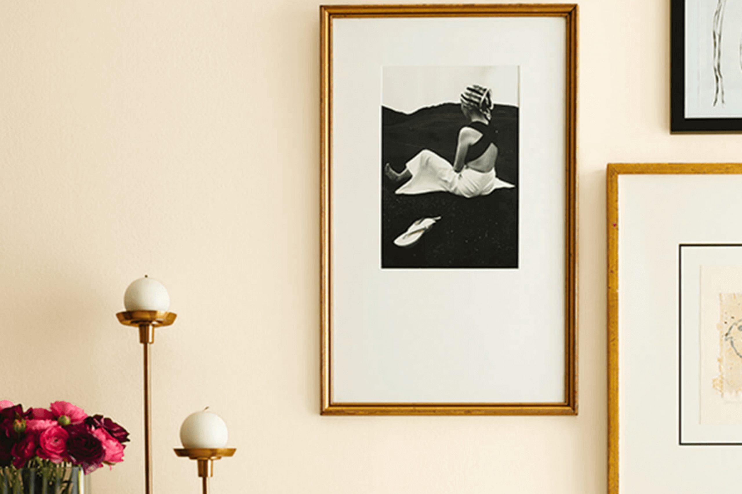
SW 7559 Decor White by Sherwin Williams caught my attention right away with its gentle and airy feel. It’s a crisp, clean shade that brightens up any space effortlessly. What I love about this color is its versatility. Whether you’re considering a modern, sleek look or a cozy, traditional atmosphere, Decor White fits seamlessly into any design plan. It provides a neutral backdrop that allows other elements in a room to stand out, yet it holds its own subtle charm.
In my experience, Decor White offers a sense of openness and light, making small spaces feel bigger and giving larger rooms a nice, clean finish. It pairs well with both bold colors and other neutrals, so you can easily switch up your decor or accent pieces without worrying about clashing with the walls.
This shade also has a warmth that some whites lack, making it inviting rather than stark. It works beautifully in living rooms, bedrooms, and even kitchens.
For anyone who appreciates simplicity without sacrificing style, Decor White is a reliable choice that won’t disappoint. Whenever I use it in a project, it brings a fresh, timeless quality that enhances the entire space.
What Color Is Decor White SW 7559 by Sherwin Williams?
Decor White by Sherwin Williams is a soft, warm white that brings a sense of calm and light to any room. It’s a versatile color that can fit well with various interior styles, including modern, traditional, and Scandinavian designs. The warm undertones in Decor White make it cozy, preventing spaces from feeling too sterile, unlike some cooler whites.
This shade pairs beautifully with natural materials and textures. Consider using it alongside light oak or other pale woods for a harmonious, organic look. It also complements rich textures like linen or cotton, adding a touch of comfort to the space. In a modern setting, pair Decor White with clean lines and metallic accents, such as brushed nickel or matte black, for a balanced, contemporary appearance.
With its understated charm, Decor White works well as a wall color, offering a neutral backdrop that allows furniture and art to shine. It also serves as an excellent trim or ceiling color, providing a subtle contrast when paired with more vibrant hues on the walls.
Whether looking to brighten a small room or unify an open-concept space, Decor White provides versatility and warmth that suit many settings.
Is Decor White SW 7559 by Sherwin Williams Warm or Cool color?
Decor White SW 7559 by Sherwin Williams is a versatile paint color that works well in many home settings. It is a soft, warm white that adds a clean and fresh look to any room. This color is often used to make spaces feel larger and brighter. Because it’s not too stark, it blends well with various styles and décor, from modern to traditional.
In living rooms, Decor White provides a neutral backdrop that allows furniture and artwork to stand out. In kitchens and bathrooms, it gives a crisp, polished appearance that enhances natural and artificial lighting. It can also highlight architectural features, such as moldings and trim.
When paired with other colors, Decor White complements both bold and muted tones, anchoring the overall color scheme. Its flexibility makes it a popular choice for those wanting a timeless, clean appearance in their interiors.
Undertones of Decor White SW 7559 by Sherwin Williams
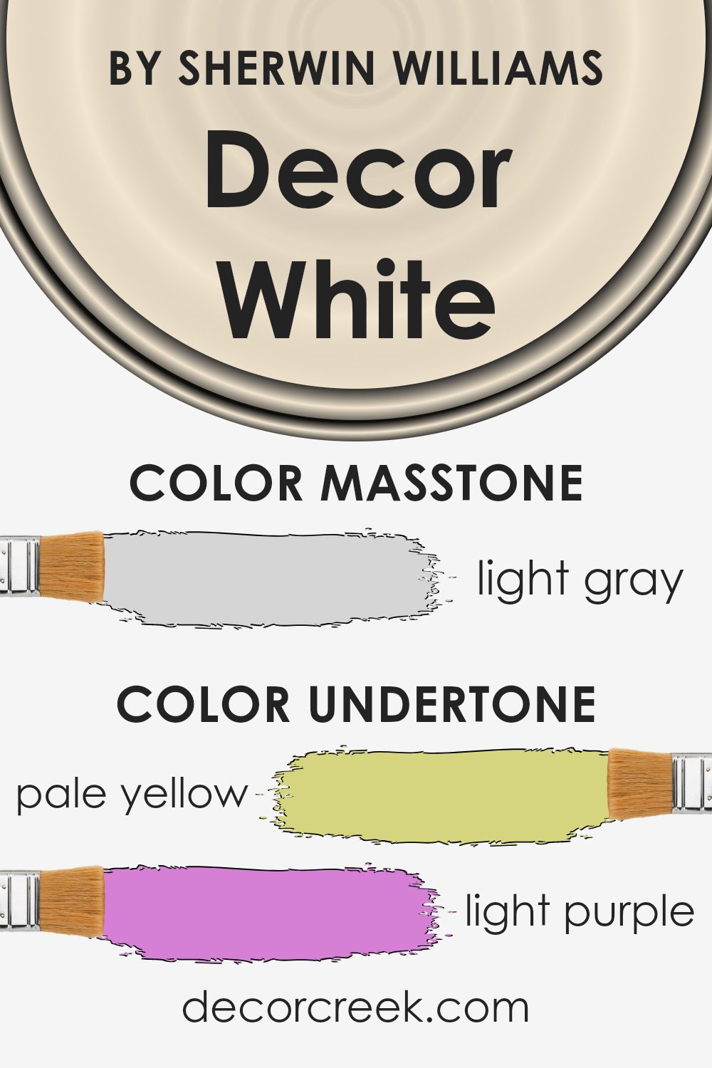
Decor White SW 7559 by Sherwin Williams is a versatile white paint with various undertones that subtly influence its appearance. When examining these undertones individually, you can better understand how they contribute to the overall look of the paint on interior walls.
The pale yellow undertone can add a touch of warmth, making the room feel cozier without overwhelming brightness. Light purple and lilac undertones provide a subtle hint of elegance, while still maintaining the neutral quality of the white. The light blue and mint undertones bring a sense of freshness and can make a room feel airy and open. Pale pink adds a gentle touch of warmth, while grey grounds the color, preventing it from feeling too stark or cold.
Together, these undertones balance each other to create a neutral shade that can adapt to different settings. In a room with plenty of natural light, the cooler tones might become more apparent, whereas in artificial light, warmer tones can emerge, adding a sense of coziness.
The adaptability of Decor White allows it to complement various design elements, from furniture to decor, making it a popular choice for versatile and welcoming spaces.
What is the Masstone of the Decor White SW 7559 by Sherwin Williams?
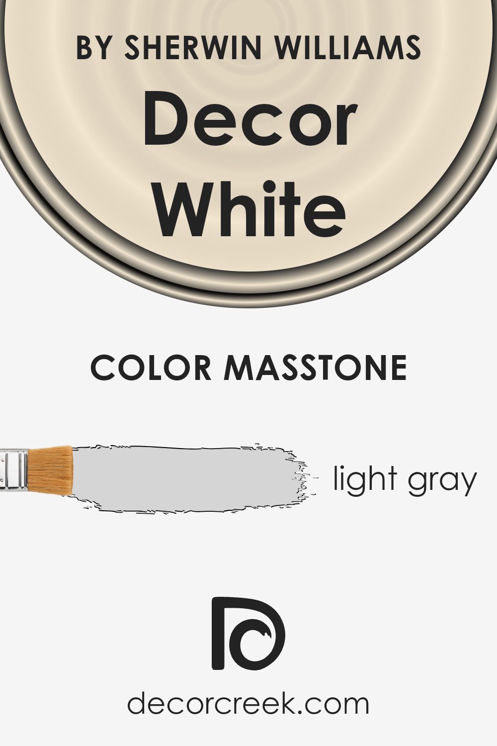
Decor White SW 7559 by Sherwin Williams presents a light gray masstone, specifically noted as #D5D5D5. This subtle hue can brighten and open up spaces due to its soft, neutral tone. Because it’s a light gray, it reflects natural and artificial light effectively, making rooms feel larger and more welcoming. The versatility of this color also means it can be paired well with various decor styles and color schemes.
In living spaces, this neutral shade provides a calming backdrop that does not overpower other design elements, allowing furniture and accents to stand out.
In kitchens and bathrooms, Decor White can enhance the feeling of cleanliness and freshness, making these areas appear more inviting. Moreover, because it maintains a perfect balance between brightness and warmth, it’s an excellent choice for those who want a neutral yet stylish look. Whether it’s used on walls, ceilings, or furniture, this color can create a cohesive and modern aesthetic throughout the home.
How Does Lighting Affect Decor White SW 7559 by Sherwin Williams?
Lighting plays a crucial role in how we perceive colors. The appearance of a color can change dramatically depending on the type of light it is under. Decor White SW 7559 by Sherwin Williams is no exception to this rule.
In natural light, this color can look quite different depending on where the light is coming from. In a north-facing room, where the light tends to be cooler and dimmer, Decor White can take on a subtle grayish hue, making it appear a bit more muted. This is because north light doesn’t bring out the warm undertones in the color, making it seem slightly cooler.
In contrast, south-facing rooms receive a lot of bright, warm light throughout the day. This can make Decor White appear brighter and warmer, highlighting any soft undertones the color might have. The abundant sunlight enhances the white, making the room feel inviting and cheerful.
East-facing rooms get the strongest light in the morning, which can add a warm glow to Decor White. As the day progresses and the sun moves, the light becomes cooler, especially in the afternoon and evening. This change can make the color appear different throughout the day, starting off warm and transitioning to a cooler tone.
West-facing rooms, conversely, receive warm light in the late afternoon and evening. In these rooms, Decor White can appear very warm and welcoming during those times, as the sunlight enhances its warm qualities. In the morning, however, the light is cooler, which might make the color seem a bit subdued and less vibrant.
Under artificial lighting, the type of lighting used can greatly affect Decor White as well. Incandescent bulbs, which emit a warmer light, can help bring out warm tones in the color, while fluorescent lighting, which is cooler, might make it appear more stark and clinical. LED lighting varies, so choosing a bulb with a warm tone can help achieve the desired effect.
What is the LRV of Decor White SW 7559 by Sherwin Williams?
The Light Reflectance Value, or LRV, is a measurement that tells us how much light a color will reflect or absorb. It is measured on a scale from 0 to 100, where 0 means the color absorbs all light (like black), and 100 means it reflects all light (like a bright white). When a color has a higher LRV, it reflects more light, making rooms appear brighter and more open.
On the other hand, colors with lower LRV values absorb more light, which can make spaces feel cozier or sometimes even smaller. The LRV can also impact how light or dark a color appears; higher values might make a color appear lighter than you’d expect.
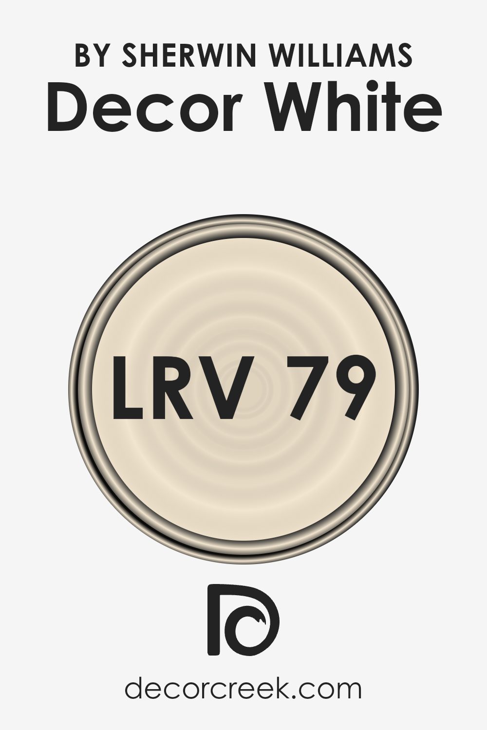
For Décor White by Sherwin-Williams, which has an LRV of 79.367, this means the color is very reflective and absorbs little light. This makes it a bright choice for rooms where you want to maximize natural light or make a space feel larger and airier. With its high reflectance, Décor White can help illuminate a room, bouncing light around to reduce shadows.
This quality is particularly beneficial in darker areas of your home. However, it’s important to consider how this level of light reflectance might interact with other elements in your space, like furniture or flooring, as the light can shift how these other colors appear throughout the day.
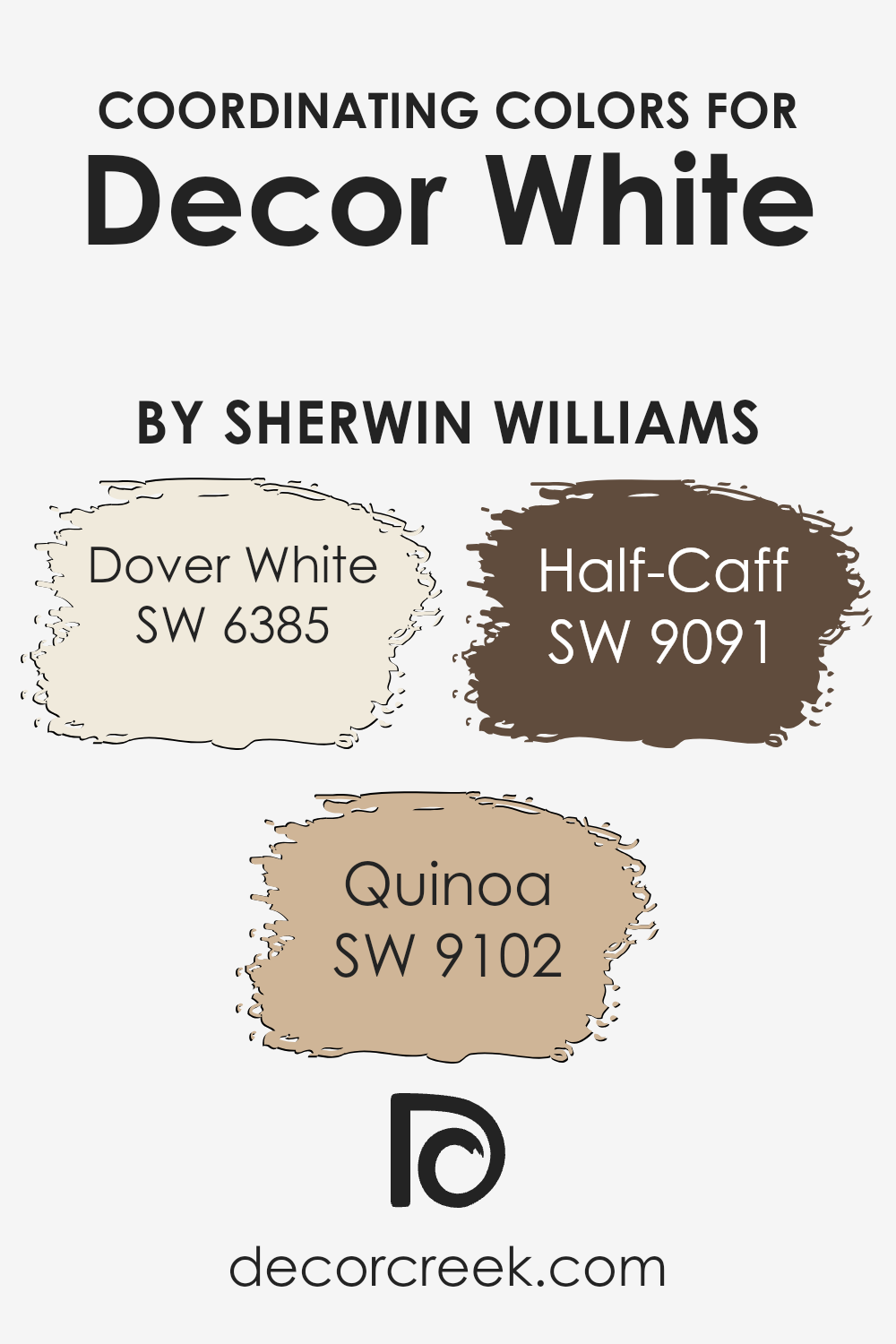
Coordinating Colors of Decor White SW 7559 by Sherwin Williams
Coordinating colors are shades that complement each other when used together in a space, creating a harmonious and balanced look. They work by enhancing each other’s attributes, whether it’s warmth, brightness, or depth, to bring cohesion to a room’s color scheme. When choosing coordinating colors for a base like Decor White, which is a clean and soft white by Sherwin Williams, it’s about selecting colors that enhance its brightness while adding warmth and character to your space.
Dover White, for instance, is a warm, creamy white that offers a touch of softness, making it the perfect companion for the crispness of Decor White. Quinoa adds an earthy, golden-beige tone that brings warmth and depth, enhancing the neutral tone palette.
Half-Caff introduces a medium, warm brown that provides a cozy contrast, adding richness and grounding the overall color scheme. Together, these colors create a balanced and inviting atmosphere that allows each shade to shine without overpowering the others. Using these coordinating colors ensures a well-rounded, pleasant look that feels both fresh and welcoming.
You can see recommended paint colors below:
- SW 6385 Dover White
- SW 9102 Quinoa
- SW 9091 Half-Caff
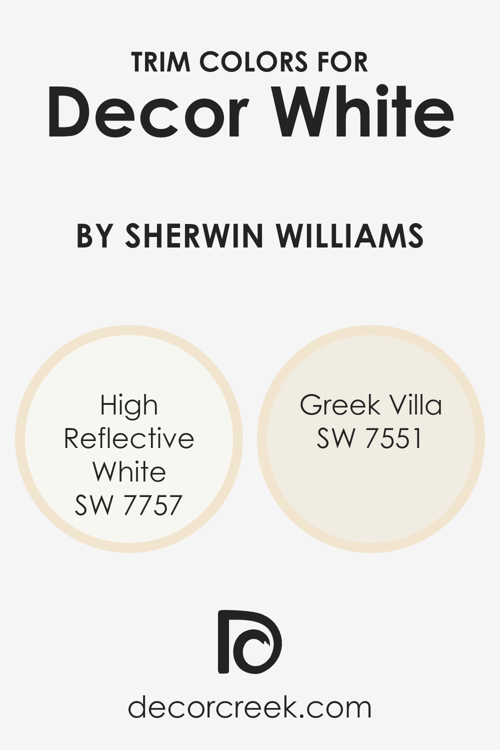
What are the Trim colors of Decor White SW 7559 by Sherwin Williams?
Trim colors are the shades used on the edges or borders of walls, doors, and windows to highlight or frame these areas, making the main wall color stand out more. When using Decor White, a soft, warm white, for your walls, choosing the right trim color can enhance the overall look of a room by adding contrast or continuity.
Trim colors help in defining spaces, making the interiors look cleaner and more finished. In addition to aesthetics, a good trim color can also protect edges from scuff marks, keeping them looking fresh for longer. Selecting a complementary trim can make the Decor White feel even cozier and more inviting in a room.
One popular trim color choice to pair with Decor White is SW 7757, High Reflective White. This bright, crisp white creates a clear, bold outline against the softer Decor White, making the spaces look open and luminous. Another great option is SW 7551, Greek Villa, which is a creamy, soft white that blends seamlessly with Decor White.
This color combination creates a subtle and harmonious look, adding warmth and a gentle touch to the room. Both trim colors ensure that Decor White retains its inviting appeal while providing the desired depth and definition to a room’s interior.
You can see recommended paint colors below:
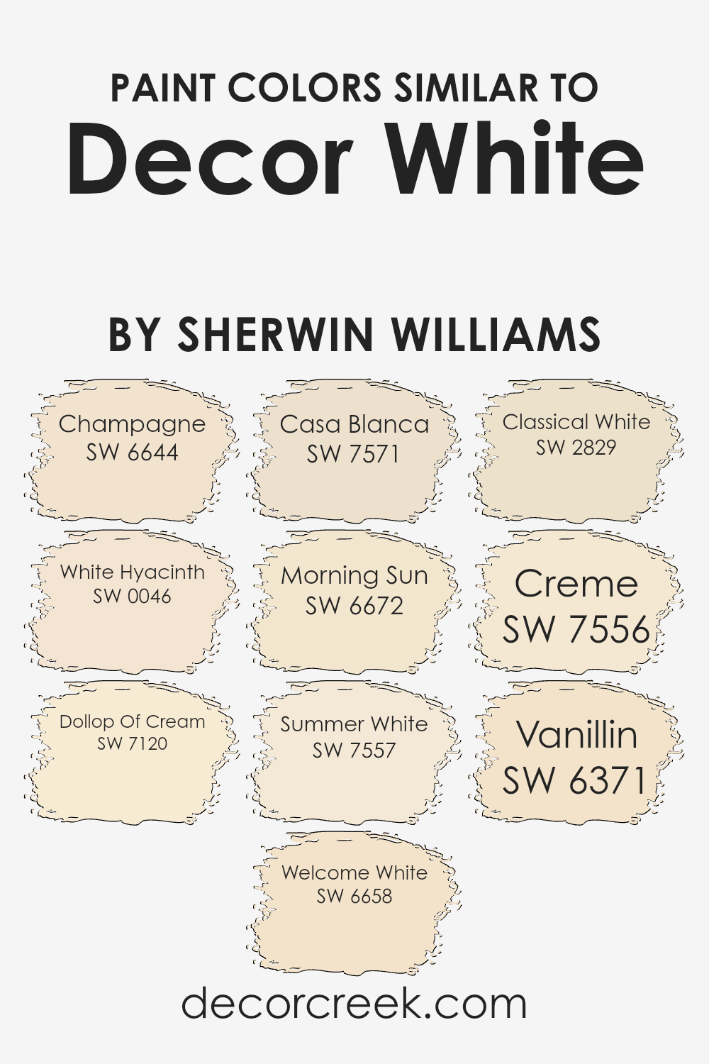
Colors Similar to Decor White SW 7559 by Sherwin Williams
Colors similar to Decor White, such as Champagne, White Hyacinth, Dollop Of Cream, and Welcome White, work together to create a harmonious and gentle space due to their subtle variations in hue and warmth. Champagne offers a soft, warm tone with a touch of peach that can add a cozy glow to any room.
White Hyacinth is a delicate shade that brings a hint of freshness and lightness, perfect for brightening up spaces without overwhelming them. Dollop Of Cream adds a creamy and soft feel, making interiors look inviting. Welcome White, with its welcoming warmth, can be a comforting choice for any living area.
Casa Blanca and Morning Sun introduce a slightly stronger hint of color while maintaining a light and airy feel. Casa Blanca is elegant with a creamy warmth that pairs well with many decorative styles. In contrast, Morning Sun brings a gentle touch of sunshine, ideal for spaces that need a little more cheerfulness. Summer White continues this theme with its fresh and bright essence, perfect for making rooms appear more open and airy.
Classical White, Creme, and Vanillin complete the palette by offering variations in warmth and depth, with Classical White providing a timeless touch, Creme offering a rich buttery texture, and Vanillin bringing a subtly sweet undertone. Together, these colors create a seamless and calming environment that feels both welcoming and serene.
You can see recommended paint colors below:
- SW 6644 Champagne
- SW 0046 White Hyacinth
- SW 7120 Dollop Of Cream
- SW 6658 Welcome White
- SW 7571 Casa Blanca
- SW 6672 Morning Sun
- SW 7557 Summer White
- SW 2829 Classical White
- SW 7556 Creme
- SW 6371 Vanillin
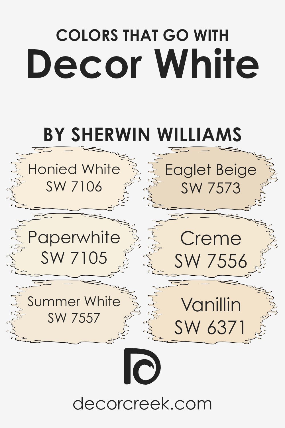
Colors that Go With Decor White SW 7559 by Sherwin Williams
Decor White (SW 7559) by Sherwin Williams is a versatile shade that pairs beautifully with a range of colors, creating harmony in your space. Colors that go with Decor White help to enhance and complement its brightness and pure tone, providing balance and interest in your room design.
For instance, SW 7106 Honied White is a warm, creamy shade that adds a touch of coziness when used alongside Decor White. It provides a comforting glow without overpowering the space. SW 7105 Paperwhite is perfect for creating contrast; its cool undertones balance the warm notes of Decor White, resulting in a fresh, clean look.
SW 7557 Summer White fits well with Decor White as both share warm, inviting undertones, perfect for a soft, subtle palette. SW 7573 Eaglet Beige offers a bit more depth and warmth and complements Decor White by adding a subtle contrast that can bring an added dimension to a room’s decor. The creaminess of SW 7556 Creme insists on keeping the color scheme warm and soft, adding a gentle backdrop that pairs well with both light and more saturated accents.
SW 6371 Vanillin is inspired by the comforting tones of vanilla, offering a pleasant note that can warm up any space while keeping it light and airy. Together, these colors create a cohesive, comforting environment, enriching the simplicity of Decor White without overpowering it.
You can see recommended paint colors below:
- SW 7106 Honied White
- SW 7105 Paperwhite
- SW 7557 Summer White
- SW 7573 Eaglet Beige
- SW 7556 Creme
- SW 6371 Vanillin
How to Use Decor White SW 7559 by Sherwin Williams In Your Home?
Decor White (SW 7559) by Sherwin Williams is a versatile paint color perfect for any home. It’s a soft, light white with a hint of warmth, making it an excellent choice for creating a cozy and inviting space. This color works well in almost any room, from living rooms to kitchens and bathrooms.
In living areas, Decor White provides a clean and fresh backdrop that makes other colors pop, whether you’re using bold furniture or colorful artwork. In the kitchen, it gives a crisp and clean appearance that pairs beautifully with wooden or metal accents.
In bathrooms and bedrooms, the warm undertones contribute to a comfortable atmosphere, making it a great choice for walls or ceilings. Decor White also complements various styles, from traditional to modern. It pairs well with neutral tones, pastels, and even brighter shades, allowing for great flexibility in your home decor choices.
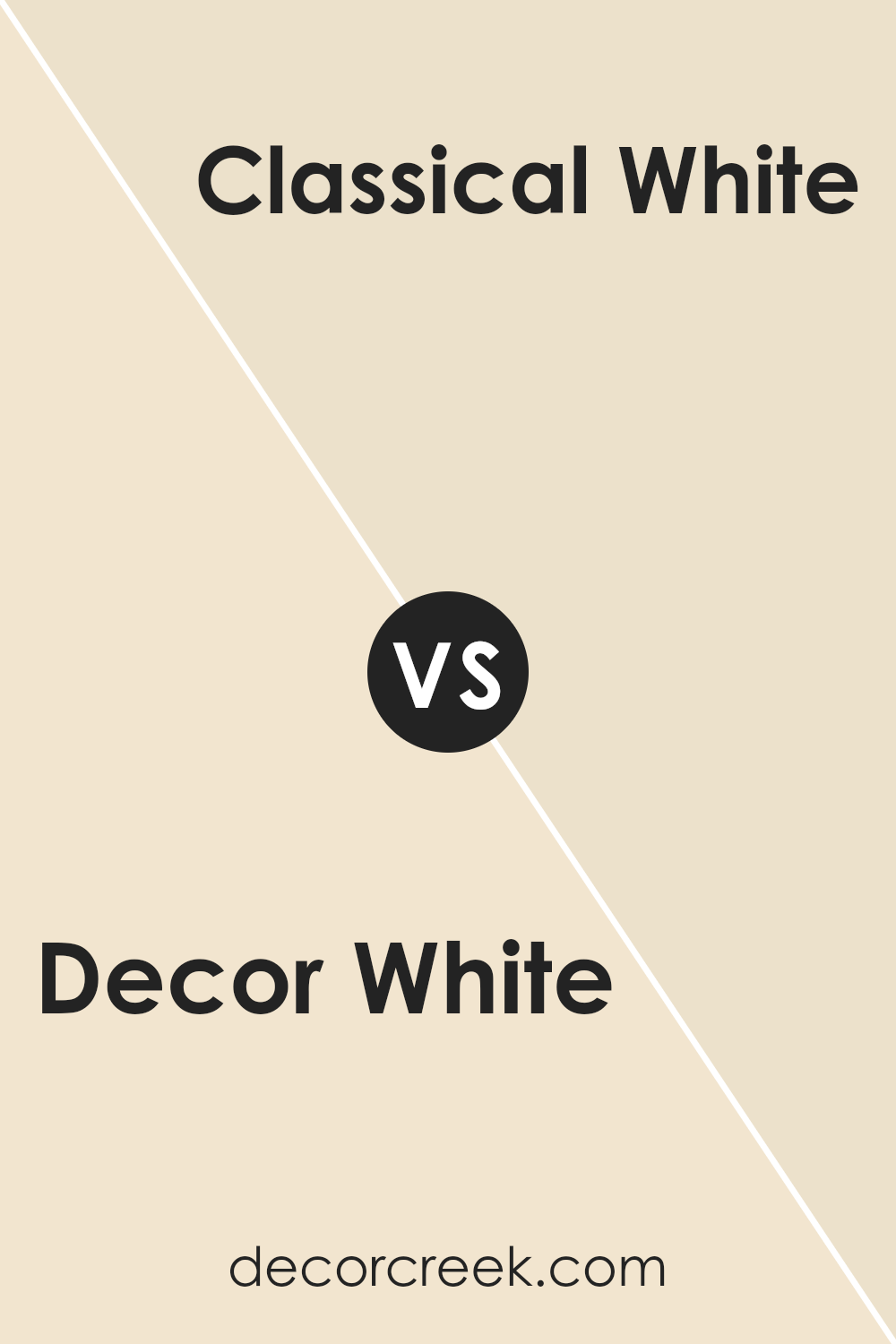
Decor White SW 7559 by Sherwin Williams vs Classical White SW 2829 by Sherwin Williams
Decor White (SW 7559) and Classical White (SW 2829) by Sherwin Williams are both white paints, but they have different tones and uses. Decor White is a warm white with subtle brown undertones, making it cozy and inviting. It works well in living rooms or bedrooms for a snug feel.
Classical White, on the other hand, is more of an off-white with gray undertones. It feels cooler and more neutral, suited for spaces that need a clean and classic look, like bathrooms or kitchens. While Decor White can add warmth, Classical White provides a crisp and timeless backdrop. Both can pair well with other colors, but the undertones will set a different mood in the room.
In summary, the choice between the two depends on whether you prefer a warmer or cooler white for your space.
You can see recommended paint color below:
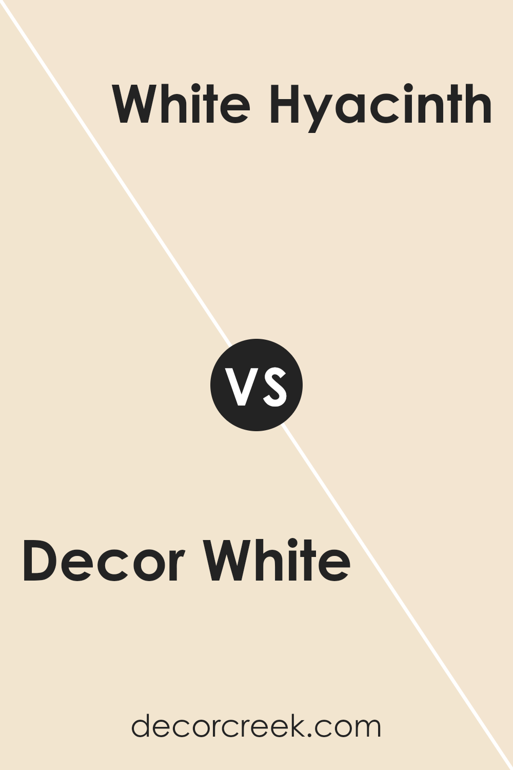
Decor White SW 7559 by Sherwin Williams vs White Hyacinth SW 0046 by Sherwin Williams
Decor White SW 7559 and White Hyacinth SW 0046 by Sherwin Williams are both shades of white, but they have distinct differences. Decor White is a soft, warm white with subtle beige undertones. This makes it cozy and versatile, fitting into various settings without feeling stark or overwhelming. It’s a great choice for creating a welcoming and comfortable space.
On the other hand, White Hyacinth is a cooler white with a hint of gray and blue undertones. This gives it a crisper and more modern feel compared to Decor White’s warmth. White Hyacinth can make spaces feel fresh and airy, bringing a sense of clarity and openness.
While both colors work well as neutral backgrounds, the choice depends on the atmosphere you want. If you’re aiming for warmth and coziness, Decor White might be the better pick. For a fresh and modern look, White Hyacinth would be more suitable.
You can see recommended paint color below:
Decor White SW 7559 by Sherwin Williams vs Morning Sun SW 6672 by Sherwin Williams
Decor White SW 7559 by Sherwin Williams is a classic, clean white. It provides a fresh, crisp look, perfect for modern spaces or as a backdrop for colorful decor. This shade of white reflects light beautifully and creates an airy feel, making rooms appear larger and more open.
On the other hand, Morning Sun SW 6672 is a cheerful yellow that brings a sense of warmth and positivity to any room. It’s a sunny color that can brighten up a space, making it feel inviting and cozy. This color works well in kitchens, living rooms, or any area where you want to add a burst of energy.
When comparing the two, Decor White offers a neutral and versatile background, while Morning Sun adds a splash of cheerful color. They can complement each other well, with Decor White providing a calming balance to the vibrant Morning Sun.
You can see recommended paint color below:
- SW 6672 Morning Sun
Decor White SW 7559 by Sherwin Williams vs Dollop Of Cream SW 7120 by Sherwin Williams
Decor White SW 7559 by Sherwin Williams is a soft, warm white color that has a clean and fresh look. It’s versatile and works well in many different settings, providing a bright and airy feel. This color is often used in spaces where a light, neutral backdrop is desired. It can make small rooms feel bigger and more open, and it pairs well with a variety of other colors.
Dollop Of Cream SW 7120 by Sherwin Williams, on the other hand, is a creamier, slightly warmer white. It has a hint of yellow, which gives it a cozy and inviting feel. Dollop Of Cream is great for creating a welcoming atmosphere in living spaces like kitchens or living rooms. It’s more soothing compared to the crispness of Decor White.
Overall, while both colors are light and neutral, Decor White offers a cleaner and more modern feel, whereas Dollop Of Cream adds warmth and coziness.
You can see recommended paint color below:
- SW 7120 Dollop Of Cream
Decor White SW 7559 by Sherwin Williams vs Vanillin SW 6371 by Sherwin Williams
Decor White SW 7559 by Sherwin Williams is a crisp, clean white that offers a neutral backdrop suitable for any room. It’s versatile and creates a bright, airy feel in spaces, making them look larger and more open. On the other hand, Vanillin SW 6371, also by Sherwin Williams, is a warm, creamy off-white with subtle yellow undertones. This color adds coziness and a soft, inviting ambiance to a room.
While Decor White is often chosen for its ability to highlight other colors and decor, Vanillin can provide a gentle contrast, giving spaces a sense of warmth without overwhelming them.
Decor White is often used in modern designs for its simplicity, whereas Vanillin is popular in traditional or rustic settings where warmth is desired. Both colors are easy to pair with a variety of decor styles but offer different moods: one is fresh and crisp, while the other is soft and warm.
You can see recommended paint color below:
- SW 6371 Vanillin
Decor White SW 7559 by Sherwin Williams vs Welcome White SW 6658 by Sherwin Williams
Decor White SW 7559 by Sherwin Williams is a soft, neutral white with a subtle warmth to it. It works well as a backdrop, providing a clean and fresh feel to spaces without being too stark or clinical. This makes it versatile for various settings, be it modern or traditional.
On the other hand, Welcome White SW 6658 is slightly warmer and creamier. Its gentle warmth can create a cozy and inviting atmosphere, making spaces feel more intimate and welcoming. While Decor White offers a more crisp and airy vibe, Welcome White adds a touch of softness and warmth.
Decor White is perfect when you want a neutral that doesn’t stand out but supports a variety of colors. Meanwhile, Welcome White, with its warmer undertone, is great for spaces where you want a comforting and friendly feel. Both colors work well in different lighting situations, but the slight tone difference can affect the mood.
You can see recommended paint color below:
- SW 6658 Welcome White
Decor White SW 7559 by Sherwin Williams vs Creme SW 7556 by Sherwin Williams
Decor White (SW 7559) by Sherwin Williams is a soft, clean white that adds a crisp and fresh feel to any space. It’s a versatile color, perfect for creating a bright and airy environment. On the other hand, Creme (SW 7556) by Sherwin Williams offers a warm, yellowish undertone, giving it a cozy and inviting appearance.
While Decor White provides a neutral backdrop, making it ideal for modern or minimalist designs, Creme’s gentle warmth is more suited for creating a cozy or traditional setting. Decor White reflects light beautifully, making spaces feel larger, whereas Creme adds a touch of warmth that can make rooms feel snug and comfortable.
When choosing between the two, consider whether you want the bright, pure feel of Decor White or the creamy, soft ambiance of Creme. Both colors have their charm and can be used effectively in different settings.
You can see recommended paint color below:
Decor White SW 7559 by Sherwin Williams vs Summer White SW 7557 by Sherwin Williams
Decor White SW 7559 and Summer White SW 7557 by Sherwin Williams are two soft, warm whites that are similar but have distinct differences. Decor White is a warm, creamy white, ideal for creating a cozy and inviting space. It works well with both warm and cool tones, providing flexibility in interior design.
On the other hand, Summer White is slightly brighter and crisper. It has a subtle warmth but leans more towards a clean, fresh feel compared to Decor White. Summer White can open up spaces, adding lightness and a sense of airiness.
Both colors are versatile and can be used in various rooms, from living areas to bedrooms. While Decor White brings a more subdued, cozy ambiance, Summer White offers a brighter, more refreshing vibe. Your choice between the two will depend on whether you prefer a softer warmth or a cleaner brightness in your space.
You can see recommended paint color below:
Decor White SW 7559 by Sherwin Williams vs Casa Blanca SW 7571 by Sherwin Williams
Decor White (SW 7559) and Casa Blanca (SW 7571) by Sherwin Williams are both light, neutral shades, but they each bring a unique feel to a room. Decor White is a crisp, bright white that works well to create a clean, fresh look. It’s versatile and pairs nicely with almost any accent color, making it a solid choice for walls, trim, and ceilings.
Casa Blanca, on the other hand, is a warm, creamy off-white. It has a soft, slightly yellow undertone that adds warmth and coziness to a space. Casa Blanca is ideal for creating a more inviting atmosphere without losing the airy quality of a light color.
While Decor White is great for modern spaces that benefit from a sleek, minimalist look, Casa Blanca is perfect for traditional or rustic settings where warmth is desired. Both colors are easy to work with, making them popular choices for various styles and purposes.
You can see recommended paint color below:
Decor White SW 7559 by Sherwin Williams vs Champagne SW 6644 by Sherwin Williams
Decor White SW 7559 by Sherwin Williams is a soft, clean shade that works well as a neutral backdrop. It’s perfect for brightening spaces and can make a room feel open and airy. This color is versatile and pairs beautifully with many other shades, making it a popular choice for walls, ceilings, and trim.
On the other hand, Champagne SW 6644 by Sherwin Williams offers a warm touch with its light golden hue. It adds a sense of coziness and elegance to a room. Champagne is perfect for those who want a bit of color without going too bold. It can create a welcoming and inviting atmosphere in living rooms or bedrooms.
Together, Decor White and Champagne complement each other nicely. Decor White’s simplicity balances Champagne’s gentle warmth, allowing them to harmonize well in the same space. This pairing can brighten up a room while adding a touch of warmth.
You can see recommended paint color below:
- SW 6644 Champagne
Conclusion
After spending time learning about Sherwin Williams’ SW 7559 Decor White, here’s what I think. This paint color is a bright and clean white that works really well in lots of different rooms and styles. It makes any room look fresh and neat, which can help make your home feel more welcoming and cheerful.
I like how Decor White is simple yet pretty. It’s a great choice if you’re not sure about bold colors because it doesn’t stand out too much but still adds a touch of brightness. It’s like wearing a classic white shirt that goes with everything.
Decor White also helps to make rooms look bigger and more open. So if you have a small room, using this color might help it feel a little larger. It’s also a good background if you want to hang colorful pictures or have bold furniture because it doesn’t clash with anything.
If you’re thinking about painting or re-painting, I believe Decor White is a safe and charming choice. It brings a happy and clean feel to your home which seems to be what a lot of us want, don’t you agree?
Ever wished paint sampling was as easy as sticking a sticker? Guess what? Now it is! Discover Samplize's unique Peel & Stick samples.
Get paint samples

