If you enjoy the subtle elegance of neutral colors, then let me introduce you to SW 6113 Interactive Cream by Sherwin Williams. As someone who constantly keeps an eye out for inviting and warm hues, I appreciate how this particular shade provides a cozy backdrop to any room. Interactive Cream isn’t just any off-white; it has a creamy richness that adds a soft and serene atmosphere, perfect for spaces where comfort is key.
The beauty of Interactive Cream lies in its versatility. It works well in various settings, whether you’re aiming for a rustic look in your kitchen or a calming vibe in your bedroom. Its ability to pair effortlessly with different decors is something I find very useful.
If you’re thinking about refreshing your walls or starting a new painting project, this color could be a great choice. It helps create a welcoming space without being too stark or overwhelming.
As you plan your next home improvement project, keep SW 6113 Interactive Cream in consideration.
Its warm undertone ensures that it can complement natural light in a room beautifully, enhancing the overall ambiance with a gentle and inviting glow.
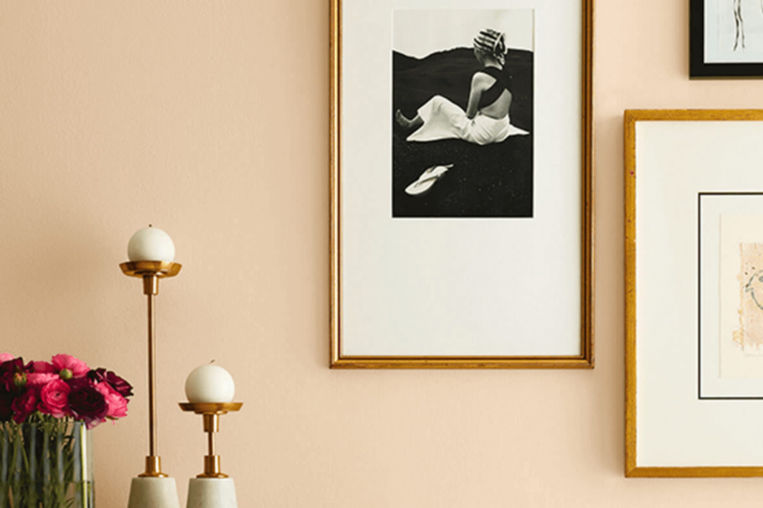
What Color Is Interactive Cream SW 6113 by Sherwin Williams?
Interactive Cream by Sherwin Williams is a warm and inviting shade of beige that brings a cozy and comfortable feel to any room. This color has a creamy richness that makes it adaptable, allowing it to merge seamlessly with various decor styles and color palettes. Its subtlety ensures that it won’t overpower your space but will instead create a soft, welcoming ambiance.
This shade works exceptionally well in traditional and rustic interior styles, where its earthy undertones can complement natural materials like wood and linen. It’s also a great choice for shabby chic decor, adding a touch of gentle warmth that pairs beautifully with distressed furniture and soft pastel accents.
When it comes to materials and textures, Interactive Cream pairs wonderfully with leather, adding a touch of luxury without being too imposing. It also looks fantastic with woven textiles, such as baskets and rugs, which enhance its organic feel. For a more polished look, incorporating metallic elements like brass or gold can add a lovely contrast that highlights the depth of the color.
Overall, Interactive Cream is a versatile and inviting color that can help create a space that feels both comfortable and stylish. Whether it’s through plush furniture, soft textiles, or rich wood accents, this color can help to create a space that feels like home.
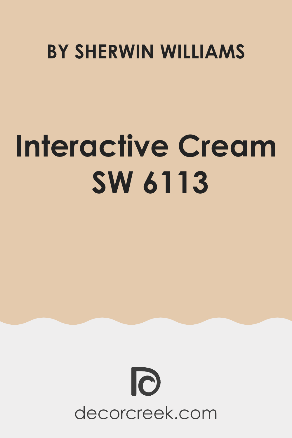
Is Interactive Cream SW 6113 by Sherwin Williams Warm or Cool color?
Interactive Cream SW 6113 by Sherwin Williams is a warm, inviting shade that brings a cozy feel to any room in the home. This color is great for spaces where you want a relaxed atmosphere, such as living rooms or bedrooms. Its creamy tone pairs well with a wide range of other colors, making it very versatile for decorating. It can also help to brighten darker areas when used on walls or ceilings.
Because of its neutral nature, Interactive Cream can act as a base color, allowing furniture and decor items to stand out, or it can complement bolder colors by offering a soothing backdrop.
This makes it easy to use when you want to refresh your space without committing to a dramatic color change. Homeowners often find that this shade helps in creating a welcoming space that feels open and airy. Additionally, it’s a practical choice for common areas, as it hides everyday wear and tear well.
Undertones of Interactive Cream SW 6113 by Sherwin Williams
Interactive Cream is a warm, inviting paint color with a complex mix of undertones. These undertones include pale yellow, light purple, pale pink, light blue, mint, lilac, and gray. Each undertone plays a role in altering our perception of the color, depending on the lighting and surroundings. For instance, in a room with ample sunlight, the pale yellow undertone may become more dominant, giving the walls a sunnier, brighter feel. On the other hand, in rooms with less natural light, gray or lilac tones might stand out, offering a cooler impression.
The presence of these varied undertones makes Interactive Cream a versatile choice for different spaces and styles. It also means that this color can shift appearance throughout the day as the natural light changes. In morning light, it might look cheerful and light, while by evening, it may appear more subdued and reserved.
On interior walls, this color’s complexity lends itself to a dynamic yet cozy atmosphere. It can complement a range of furnishings, from modern to classical, due to its subtle yet multihued base. The mint and light blue undertones can evoke a sense of freshness, ideal for bathrooms and kitchens, while the warmer pink and purple can make living spaces feel welcoming.
Overall, the mix of undertones in Interactive Cream offers a flexible backdrop for many interior design schemes, adapting and reflecting different moods and styles based on lighting and decor.

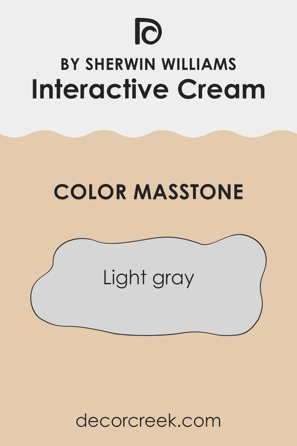
What is the Masstone of the Interactive Cream SW 6113 by Sherwin Williams?
The masstone of Interactive Cream (SW 6113) by Sherwin Williams is a light gray, which is a versatile color that can be used in various ways in homes. This shade of gray provides a subtle backdrop that can complement almost any décor style, whether modern, traditional, or eclectic.
Its lightness helps to make smaller rooms appear larger and more open, while also enhancing the natural light that comes into the space. This color is especially useful for living areas and bedrooms where a calm and relaxed atmosphere is desired. It pairs well with brighter colors, allowing them to stand out, or with other neutral tones for a more cohesive look.
The light gray masstone is also forgiving when it comes to marks and smudges, making it a practical choice for busy households. It creates a clean and fresh look, providing a simple yet effective way to update any room.
How Does Lighting Affect Interactive Cream SW 6113 by Sherwin Williams?
Lighting plays a critical role in how colors are perceived. Depending on the type of light, a paint color can appear dramatically different. This is important to consider when choosing paint colors for a room.
When evaluating a color like Interactive Cream, a light warm beige by Sherwin Williams, its appearance will change based on the lighting conditions. Under artificial light, such as LED or incandescent bulbs, the color may look warmer and richer. This warm glow can make a room feel cozy and inviting during evening hours or in spaces without natural light.
In contrast, under natural sunlight, the same color can appear brighter and more true to the original hue seen on a swatch. Natural light tends to provide the most accurate representation of color, so during the daytime, Interactive Cream will give off a fresh and clean look, especially in spaces that receive a lot of sunlight.
The direction a room faces also impacts how this color appears:
- 1. North-Faced Rooms: These rooms get less direct sunlight, which can make colors appear cooler. Interactive Cream in a north-facing room may look slightly more muted and cooler, giving off a soft, subtle vibe.
- 2. South-Faced Rooms: These rooms benefit from abundant sunlight throughout the day. Here, Interactive Cream will look warmer and brighter, enhancing its creamy quality and making the space feel light and airy.
- 3. East-Faced Rooms: With morning light, this color will start the day with a bright, warm appearance, becoming cooler as the day progresses and the natural light diminishes.
- 4. West-Faced Rooms: Evening light is warm, so the paint will reflect a warm, inviting hue in the afternoon and evening, perfect for living spaces used mostly later in the day.
Choosing the right lighting and considering room orientation is crucial in making sure colors like Interactive Cream work beautifully in any space.
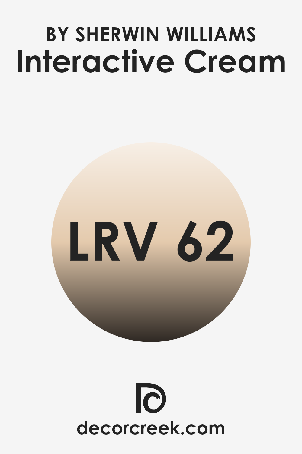
What is the LRV of Interactive Cream SW 6113 by Sherwin Williams?
LRV stands for Light Reflectance Value, which measures the percentage of light a paint color reflects back into a room. Simply put, the higher the LRV number, the lighter the paint appears when it’s on your walls because it reflects more light. Colors with higher LRV can make a room feel brighter and more open, while colors with lower LRV can make a space feel cozier but darker.
For the shade Interactive Cream, which has an LRV near 62, this means the color is fairly light and reflective. It will brighten up a space effectively by bouncing a good amount of light around the room.
This makes it a great choice for spaces that might not get a lot of natural sunlight, helping to make the room feel lively and airy even without much external light. However, because it’s not extremely high on the LRV scale, it still offers some warmth, providing a cozy yet light atmosphere perfect for living spaces or bedrooms.
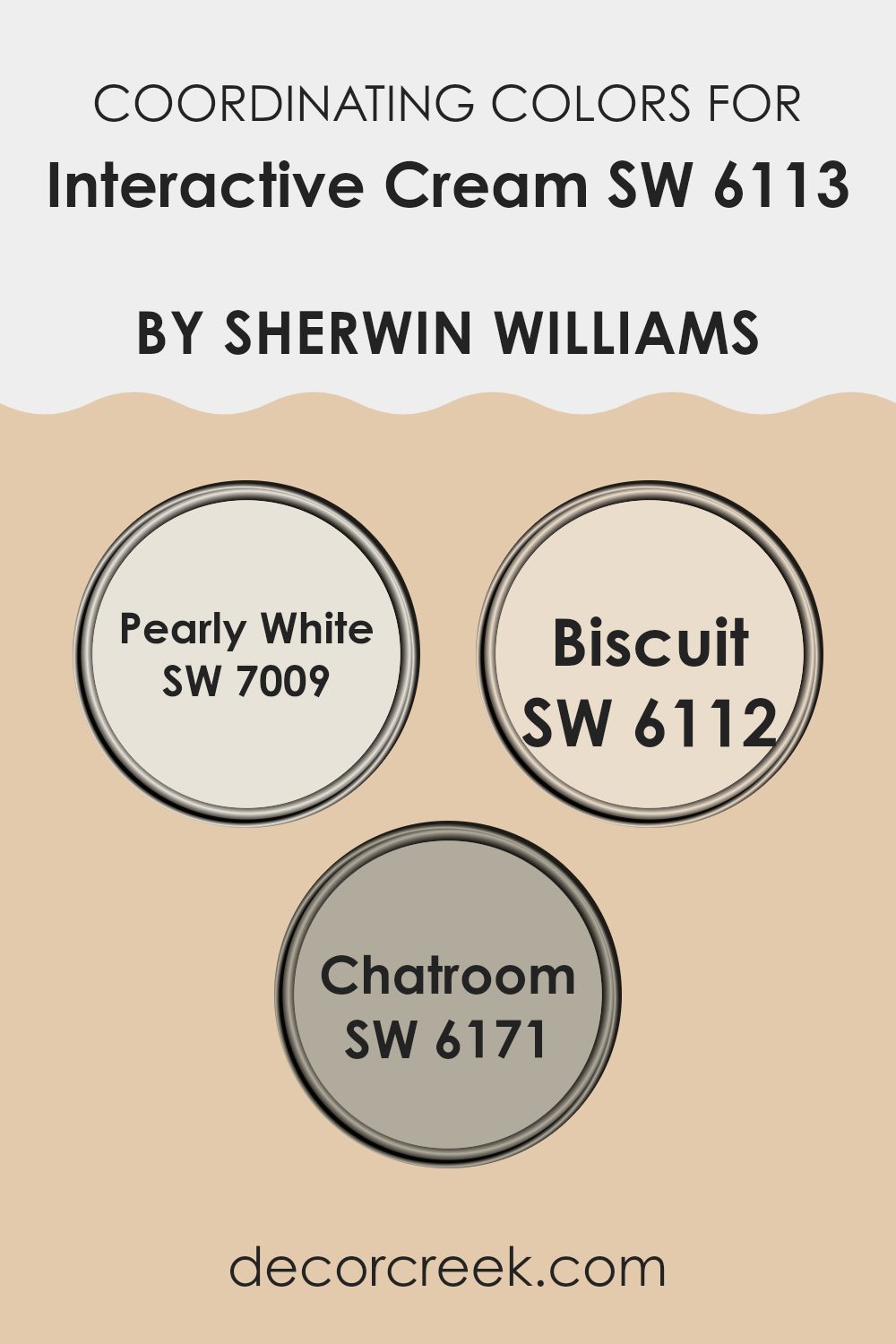
Coordinating Colors of Interactive Cream SW 6113 by Sherwin Williams
Coordinating colors are chosen to complement the primary paint color in a room to create a harmonious aesthetic. For example, using different shades that work well with a mainstream color like Interactive Cream can enhance the overall vibe of the space without overwhelming it. This approach helps balance color temperatures and intensities to achieve a visually pleasing environment.
For instance, Pearly White SW 7009 offers a soft, reflective ambiance that works exceptionally well to brighten rooms and give a light, airy feel. It contrasts subtly with the creaminess of a warmer primary color, providing a gentle uplift to cozy spaces.
Biscuit SW 6112 is a warmer tone that pairs beautifully, supporting the primary color with its rich, welcoming earthy hue that adds depth and warmth to the design. Lastly, Chatroom SW 6171 introduces a darker, more muted gray-green that can act as an excellent accent or feature wall; it provides a modern twist to the setting without clashing with the softer tones of the main color. Using these coordinating colors strategically around spaces ensures a cohesive and inviting look.
You can see recommended paint colors below:
- SW 7009 Pearly White (CHECK A SAMPLE)
- SW 6112 Biscuit (CHECK A SAMPLE)
- SW 6171 Chatroom (CHECK A SAMPLE)
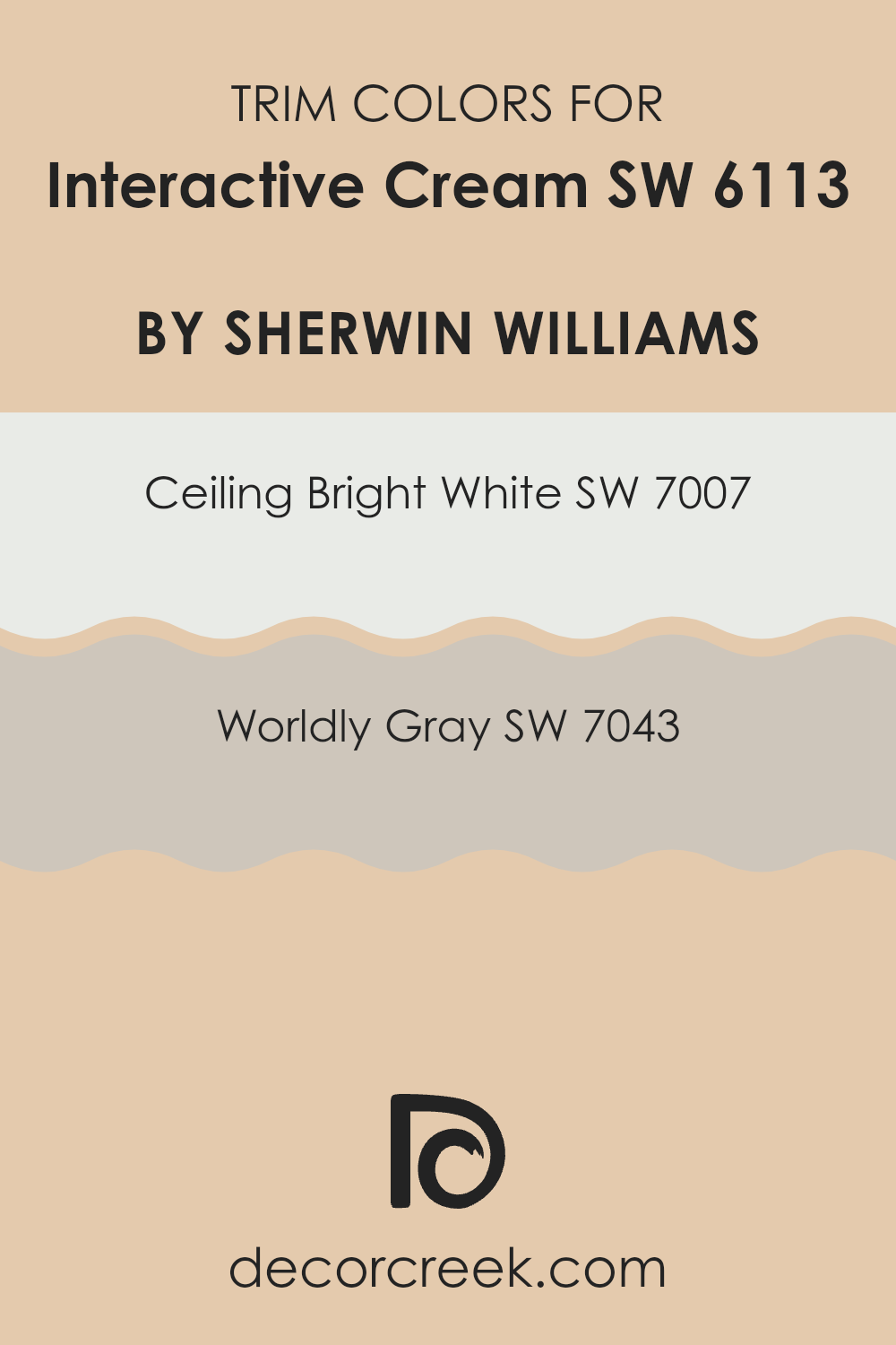
What are the Trim colors of Interactive Cream SW 6113 by Sherwin Williams?
Trim colors are used on the edges, corners, door frames, and baseboards of a room to accent and define the spaces, creating boundaries that differentiate sections or features from the rest of the walls. When paired with a main color like Interactive Cream by Sherwin Williams, trim colors such as Ceiling Bright White and Worldly Gray can enhance the overall aesthetic by providing contrast or soft transitions that highlight the room’s architecture. Using trim colors effectively can bring a space together, adding depth and clarity to the design.
Ceiling Bright White, SW 7007, is a clean and clear white that has a refreshing quality, making it ideal for ceiling trim to give a crisp edge to the ceiling, thus making the room appear larger and more open.
Worldly Gray, SW 7043, on the other hand, is a subtle gray with warm undertones that offers a gentle contrast and is versatile enough to complement a variety of decor styles. This color works well on door frames and baseboards, adding a refined touch without overpowering the main wall color. By choosing these trim colors, the charm and coziness of Interactive Cream are enhanced, making the space inviting and neatly framed.
You can see recommended paint colors below:
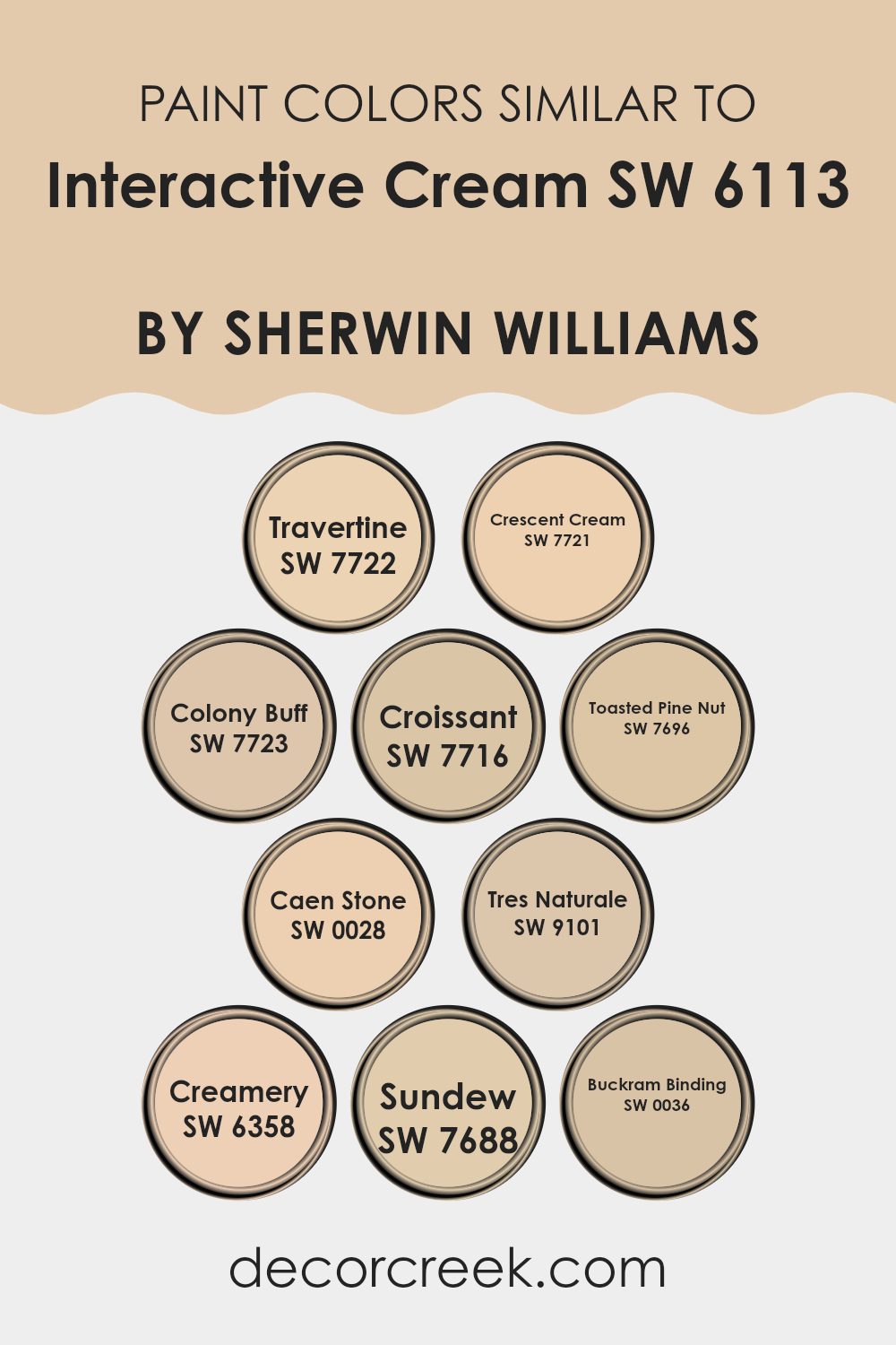
Colors Similar to Interactive Cream SW 6113 by Sherwin Williams
Similar colors play a crucial role in creating a harmonious and aesthetically pleasing color scheme. When decorating or designing a space, using shades that complement each other, like those similar to Sherwin Williams’ Interactive Cream, ensures that the environment feels cohesive and balanced. These tones share a warm, inviting quality that can make a room feel welcoming and comfortable. Such similarities in color help to subtly blend the elements of a room, supporting a unified look without harsh contrasts.
For instance, Travertine is a gentle beige that exudes a calm and cozy ambiance, perfect for living rooms and bedrooms. Crescent Cream offers a slightly lighter touch, giving spaces an airy feel. Colony Buff has a hint of sun-washed color, reminiscent of a quiet, sunny retreat.
Croissant provides a deeper beige, introducing a sense of warmth and depth to any corner of the home. Toasted Pine Nut adds a bit of zest with its nutty tones, ideal for adding character to a kitchen or dining area. Caen Stone boasts a rustic charm with its grayish undertone, suitable for spaces aiming for a naturalistic feel.
Tres Naturale is pure and understated, allowing for a versatile backdrop in minimalistic designs. Creamery is a soft, almost milky color, bringing a gentle light to smaller or darker rooms. Sundew offers a unique touch with its muted, almost sandy appearance, which can enhance a peaceful, laid-back vibe.
Lastly, Buckram Binding, with its subtle yellow tint, creates a soothing but bright effect, great for energizing a study or home office. These colors, all reminiscent of Interactive Cream, work together to create a warm, inviting palette that allows design elements to flow seamlessly.
You can see recommended paint colors below:
- SW 7722 Travertine (CHECK A SAMPLE)
- SW 7721 Crescent Cream (CHECK A SAMPLE)
- SW 7723 Colony Buff (CHECK A SAMPLE)
- SW 7716 Croissant (CHECK A SAMPLE)
- SW 7696 Toasted Pine Nut (CHECK A SAMPLE)
- SW 0028 Caen Stone (CHECK A SAMPLE)
- SW 9101 Tres Naturale (CHECK A SAMPLE)
- SW 6358 Creamery (CHECK A SAMPLE)
- SW 7688 Sundew (CHECK A SAMPLE)
- SW 0036 Buckram Binding (CHECK A SAMPLE)
Colors that Go With Interactive Cream SW 6113 by Sherwin Williams
Choosing the right colors to pair with Interactive Cream SW 6113 by Sherwin Williams is essential because it sets the tone and atmosphere of a space. Interactive Cream is a warm, soft hue, and when paired with complementary colors, it creates a cohesive and inviting environment. The selected complementary colors can influence the mood, make the space appear larger or cozier, and highlight architectural features.
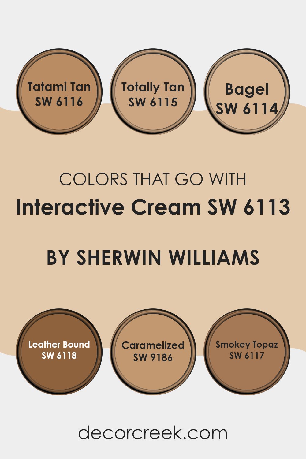
Tatami Tan SW 6116 is a gentle tan that offers a soothing touch, similar to the calming effect of a warm, sandy beach. This color works seamlessly with Interactive Cream, providing a subtle contrast that enhances the richness of both shades. Totally Tan SW 6115 takes a slightly deeper approach, embodying the warmth of baked clay.
This earthy tone grounds spaces when used alongside Interactive Cream, lending a stable and comforting feel to the environment. Bagel SW 6114, a rich, toasty beige, acts almost like a shadow to Interactive Cream, enriching spaces with its depth and warmth.
On the more intense side, Leather Bound SW 6118 is a bold, dark brown that injects a sense of drama and contrast, perfect for accentuating details or for creating focal points. Caramelized SW 9186 has a sweet, golden tone that radiates warmth, making any room feel more welcoming and cheerful.
Lastly, Smokey Topaz SW 6117, with its muted, smoky hue, offers an elegant backdrop, setting a peaceful mood that enhances the creamy softness of Interactive Cream. Choosing these colors together ensures that each room feels harmonious and beautifully balanced, allowing for a variety of design choices and modifications in the decor over time.
You can see recommended paint colors below:
- SW 6116 Tatami Tan (CHECK A SAMPLE)
- SW 6115 Totally Tan (CHECK A SAMPLE)
- SW 6114 Bagel (CHECK A SAMPLE)
- SW 6118 Leather Bound (CHECK A SAMPLE)
- SW 9186 Caramelized (CHECK A SAMPLE)
- SW 6117 Smokey Topaz (CHECK A SAMPLE)
How to Use Interactive Cream SW 6113 by Sherwin Williams In Your Home?
Interactive Cream SW 6113 by Sherwin Williams is a warm, inviting paint color that can bring a cozy feel to any room in your home. Its creamy hue makes it versatile enough to work in various spaces, from living rooms to kitchens, and it pairs beautifully with different decors, whether you’re aiming for a modern look or something more classic.
Using Interactive Cream in your home can help make spaces feel more welcoming and comfortable. It’s particularly effective in areas where natural light is abundant, as the sunlight enhances the paint’s warm tones. If you have a small room or a space that doesn’t get much light, painting it this light cream color can also help it appear brighter and more open.
Additionally, Interactive Cream goes well with a wide range of other colors. You can pair it with bold shades like navy or dark green for a striking contrast, or keep things subtle with soft pastels or neutral tones. Whether you’re painting an entire room or just an accent wall, this color can help you create a pleasant and stylish environment.
Interactive Cream SW 6113 by Sherwin Williams vs Sundew SW 7688 by Sherwin Williams
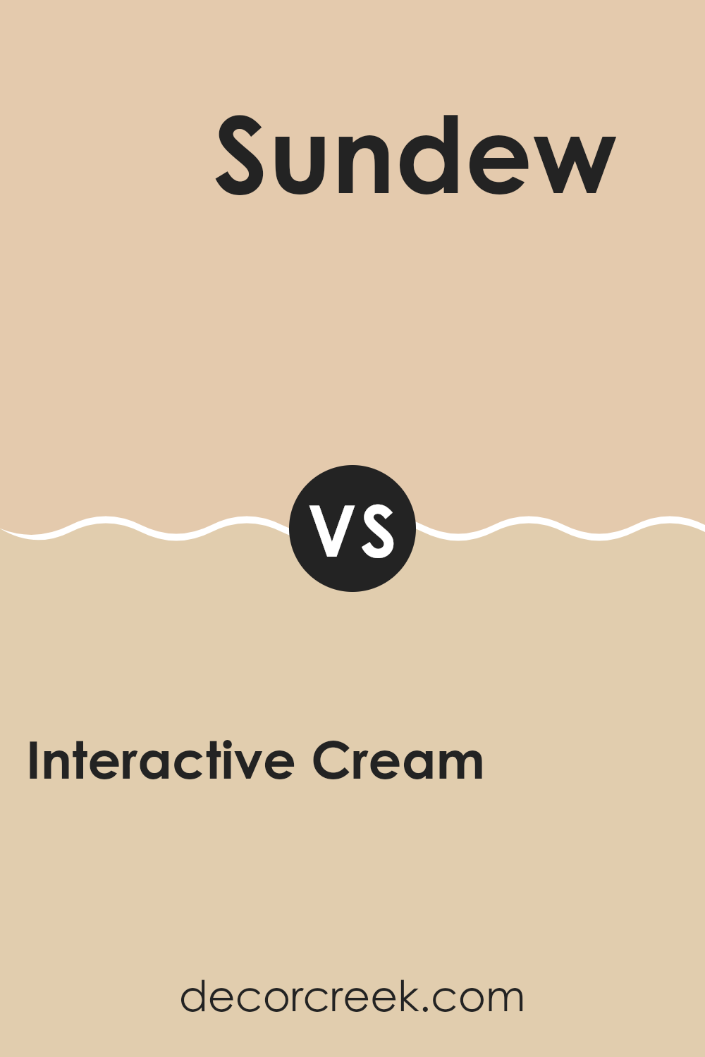
Interactive Cream and Sundew are two distinctive colors from Sherwin Williams. Interactive Cream is a soft, warm beige with a welcoming feel. It’s a versatile shade that pairs well with a variety of decor styles, adding a cozy and comfortable vibe to any room.
On the other hand, Sundew is a lighter color, with a more subtle yellow tone. It brings a gentle brightness to spaces, making it perfect for creating a relaxed and airy atmosphere. While Interactive Cream leans towards a classic richness due to its deeper hue, Sundew offers a fresher look that can help open up smaller spaces.
Both colors are great choices for anyone looking to refresh their home with a natural and understated look. Together, these colors can complement each other beautifully in a space, allowing for a harmonious blend of warmth and light.
You can see recommended paint color below:
- SW 7688 Sundew (CHECK A SAMPLE)
Interactive Cream SW 6113 by Sherwin Williams vs Toasted Pine Nut SW 7696 by Sherwin Williams
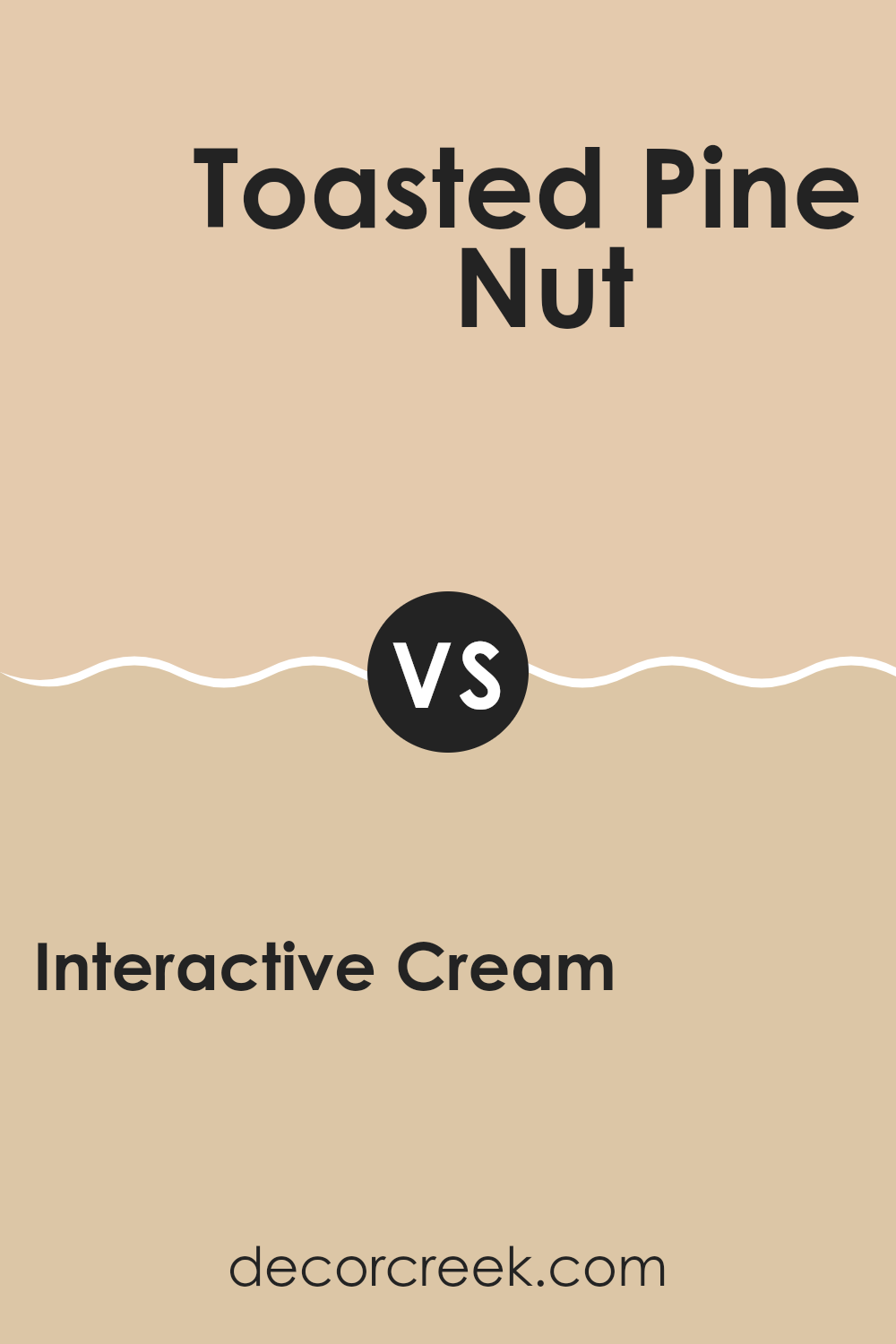
Interactive Cream is a soft, warm beige with a cozy vibe, perfect for creating a welcoming atmosphere in any room. It has a gentle brightness that makes spaces feel airy and light without being too stark. On the other hand, Toasted Pine Nut is a deeper, richer beige with a touch of gold.
It offers a slightly more grounded feel and can be ideal for areas where you want a bit more warmth and depth. While Interactive Cream works well in spaces that get a lot of light, making them feel bigger, Toasted Pine Nut is perfect for adding a touch of warmth to smaller or cooler rooms.
Together, these colors can complement each other beautifully in a home, with Interactive Cream lifting the space and Toasted Pine Nut adding a cozy, comforting touch.
You can see recommended paint color below:
- SW 7696 Toasted Pine Nut (CHECK A SAMPLE)
Interactive Cream SW 6113 by Sherwin Williams vs Colony Buff SW 7723 by Sherwin Williams
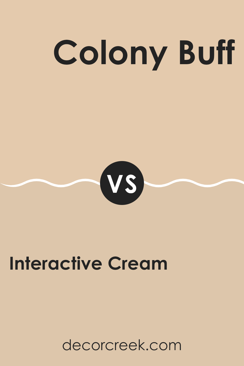
Interactive Cream and Colony Buff are two warm and inviting colors by Sherwin Williams, but they have distinct tones that set them apart. Interactive Cream is a soft, gentle beige that gives a light and airy feel to any space. It leans slightly towards a yellow undertone, making it a cozy choice for living areas and bedrooms where a touch of warmth is desirable.
On the other hand, Colony Buff stands out with its richer, deeper golden beige hue. This color has an earthy vibe and is a bit more intense compared to Interactive Cream. It’s excellent for creating a welcoming atmosphere in spaces like dining rooms or entryways where you might want a stronger presence and a bit of a statement.
Overall, while both hues provide a warm base, Interactive Cream is lighter and more subtle, ideal for creating a relaxed environment. Colony Buff, with its bolder and earthier tones, is perfect for more dynamic and lively areas.
You can see recommended paint color below:
- SW 7723 Colony Buff (CHECK A SAMPLE)
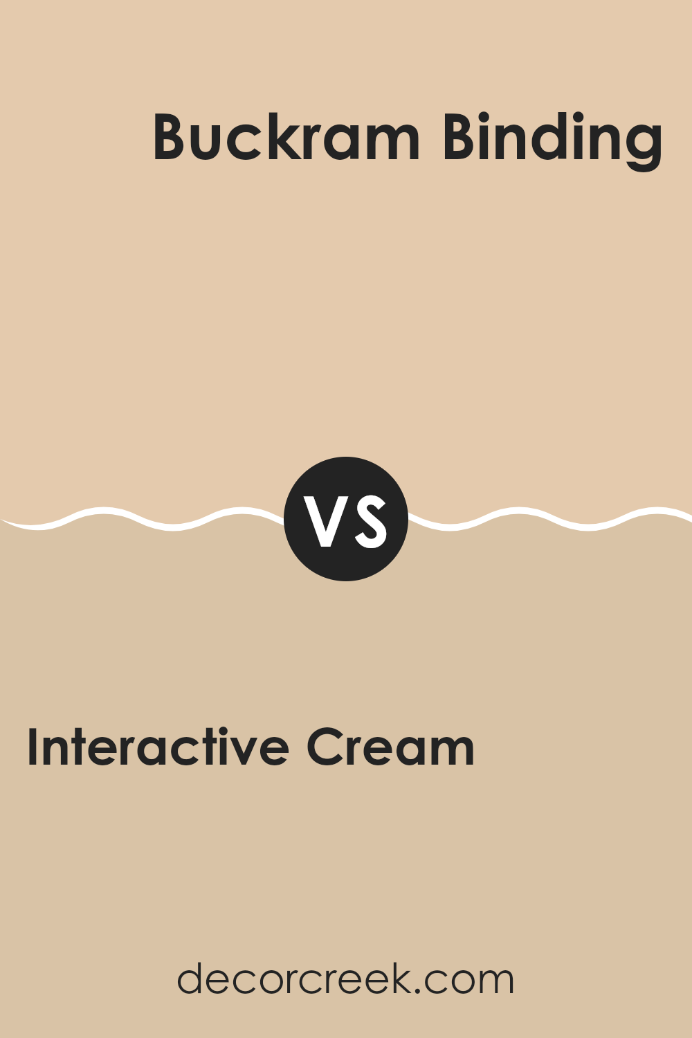
Interactive Cream SW 6113 by Sherwin Williams vs Buckram Binding SW 0036 by Sherwin Williams
Interactive Cream is a warm and inviting shade, leaning towards a soft beige. It has a creamy texture in appearance, giving any room a cozy and welcoming feel. On the other hand, Buckram Binding is a rich taupe, a bit deeper and grayer compared to Interactive Cream.
This color adds a subtle depth to spaces, making it ideal for areas where a slightly more muted, yet inviting tone is desired. While Interactive Cream brings a light and airy feel to interiors, perfect for making smaller spaces appear larger, Buckram Binding offers a grounding effect, excellent for adding warmth without overpowering a room.
These two colors, though both neutral, serve different moods and functions in home decor, with Interactive Cream being more about brightness and Buckram Binding about creating a calm, restrained backdrop. Both are versatile, but the choice between them would depend on the desired atmosphere and the room’s function.
You can see recommended paint color below:
- SW 0036 Buckram Binding (CHECK A SAMPLE)
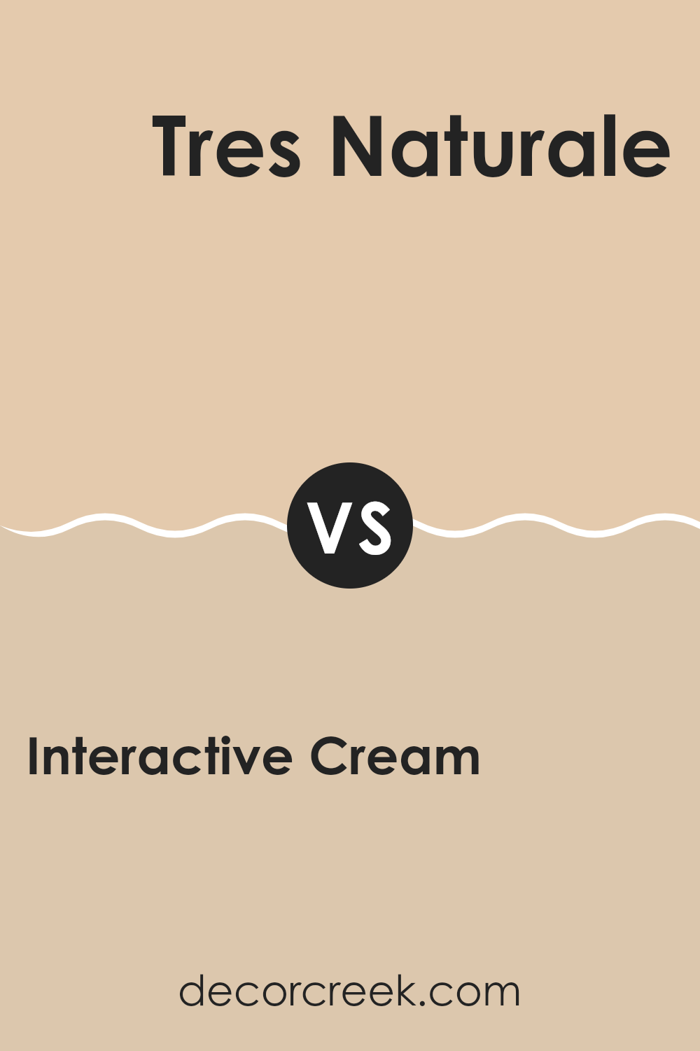
Interactive Cream SW 6113 by Sherwin Williams vs Tres Naturale SW 9101 by Sherwin Williams
Interactive Cream by Sherwin-Williams is a soft, warm beige with a cozy, inviting quality. Its creamy undertone makes it a versatile choice for spaces where a gentle, welcoming atmosphere is desired. It pairs well with a variety of décor styles and adds a touch of warmth to rooms that receive less natural light.
In contrast, Tres Naturale by Sherwin-Williams leans more towards a neutral, earthy green, giving it a fresh and organic feel. It subtly brings the outdoors inside, offering a sense of calm and groundedness to any space. This color is excellent for those looking to add a natural element to their interiors without overwhelming them with bold colors.
Both colors are quite neutral, but while Interactive Cream floods a space with warmth, Tres Naturale offers a cooler, leafy hue that can make a room feel more open and airy. The choice depends on the mood you’re aiming to create: cozy and warm or fresh and natural.
You can see recommended paint color below:
- SW 9101 Tres Naturale (CHECK A SAMPLE)
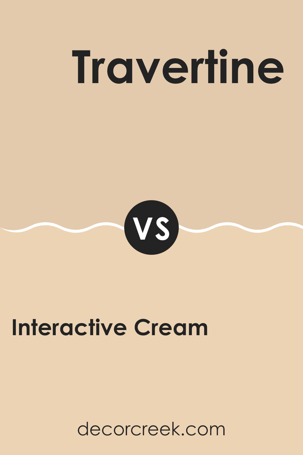
Interactive Cream SW 6113 by Sherwin Williams vs Travertine SW 7722 by Sherwin Williams
Interactive Cream and Travertine, both from Sherwin Williams, offer unique touches for interior spaces. Interactive Cream is a soft, warm beige that exudes a gentle and inviting vibe. It’s perfect for creating a cozy and comfortable atmosphere in living rooms or bedrooms, offering a neutral backdrop that pairs well with a variety of decor styles and colors.
Travertine, on the other hand, is a deeper green with grey undertones, bringing a sense of nature and grounding to any space it inhabits. This color works well in areas that benefit from a touch of calmness and a connection to the outdoors, such as bathrooms or offices.
While Interactive Cream is lighter and tends to brighten spaces, Travertine provides a more intense and earthy feel. Choosing between the two depends on the mood and function you want for your room. Interactive Cream uplifts and lightens, whereas Travertine anchors and defines. Both colors are versatile but serve different aesthetic goals.
You can see recommended paint color below:
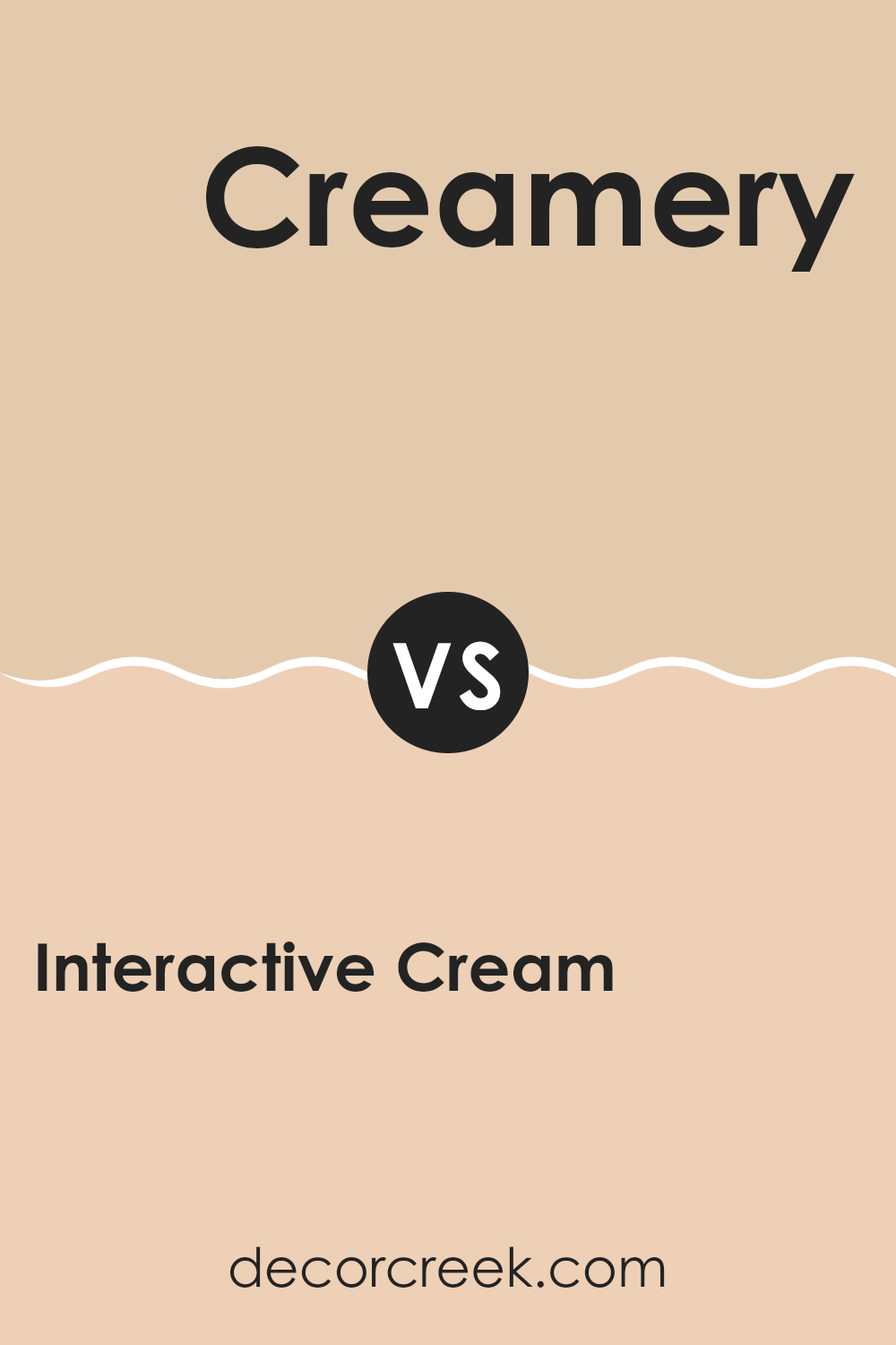
Interactive Cream SW 6113 by Sherwin Williams vs Creamery SW 6358 by Sherwin Williams
Interactive Cream and Creamery are both shades by Sherwin Williams. Interactive Cream is a soft, muted beige with a warm base, making it a cozy choice for any space. It reflects light beautifully, which can make a room feel more open and airy. This color works well in living areas and bedrooms where a calm, inviting atmosphere is desired.
On the other hand, Creamery is also a warm color but with a slightly yellower tone compared to Interactive Cream. This hue is reminiscent of rich cream, adding a cheerful and sunny vibe to spaces. It’s especially great in kitchens and dining areas where its bright, welcoming nature helps stimulate friendly conversations and gatherings.
Both colors are versatile and blend well with various decor styles, but Interactive Cream offers a subtler warmth, while Creamery provides a brighter, more vibrant feel. Depending on the mood you want to set, either could be a perfect choice.
You can see recommended paint color below:
- SW 6358 Creamery (CHECK A SAMPLE)
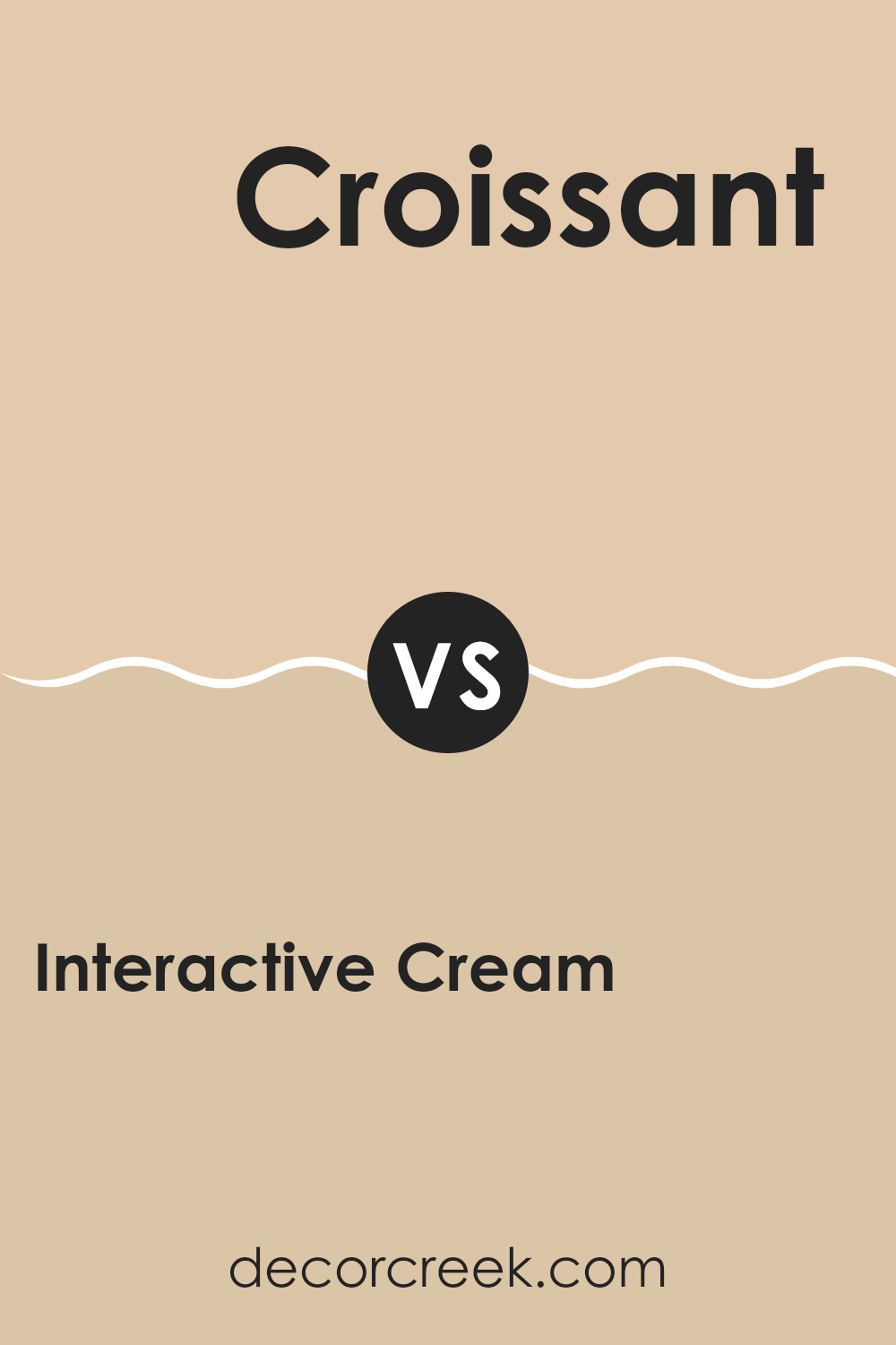
Interactive Cream SW 6113 by Sherwin Williams vs Croissant SW 7716 by Sherwin Williams
Interactive Cream and Croissant by Sherwin Williams are both warm, neutral colors, but they have distinct differences in their tones and depth. Interactive Cream is a soft, muted beige that has a hint of yellow, making it feel cozy and welcoming. It’s great for spaces where you want a touch of warmth without overwhelming brightness.
On the other hand, Croissant takes a step towards a richer, darker shade that resembles the buttery, flaky surface of its namesake pastry. This color has a deeper, more pronounced beige tone that can add a sense of grounding and warmth to a room. It’s an excellent choice for creating a cozy, inviting atmosphere, particularly in living areas and bedrooms.
Both colors work well in various lighting conditions, complementing each other if used in the same space. While Interactive Cream is lighter and can make a small room feel larger, Croissant offers depth, perfect for accent walls or in larger, well-lit spaces.
You can see recommended paint color below:
- SW 7716 Croissant (CHECK A SAMPLE)
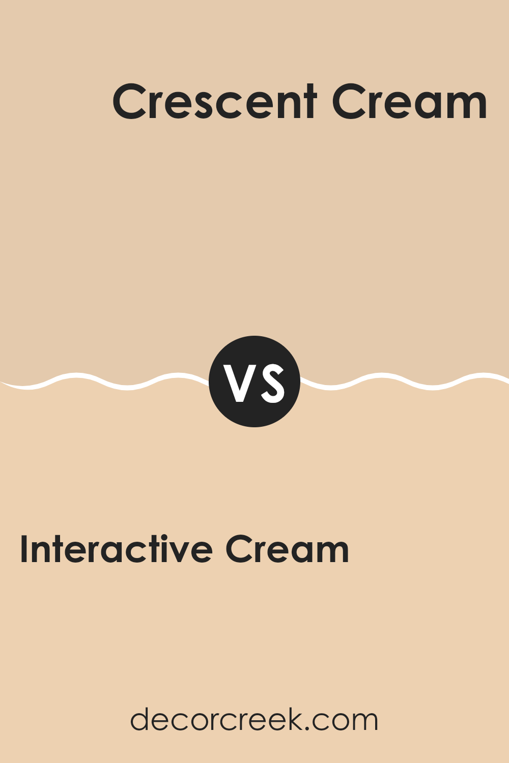
Interactive Cream SW 6113 by Sherwin Williams vs Crescent Cream SW 7721 by Sherwin Williams
Interactive Cream and Crescent Cream are two inviting shades from Sherwin Williams, though each brings its own unique vibe to spaces. Interactive Cream is a warm, soft beige with a subtle hint of yellow, making it cozy and welcoming. It’s perfect for living areas and bedrooms where you want a gentle backdrop that makes the room feel comfortable and naturally bright.
On the other hand, Crescent Cream leans more towards a true creamy hue with an even blend of yellow and orange undertones. It’s slightly richer compared to Interactive Cream and offers a cheerful boost to any room. This color is ideal if you’re looking for something that feels fresh yet warm.
Both colors are versatile and work well in various settings, enhancing the space without overpowering it. While Interactive Cream might pair better with neutral, earthy accents, Crescent Cream welcomes a broader palette of complementary colors due to its depth. Ultimately, your choice between the two can depend on the specific warmth and richness you want to infuse into your space.
You can see recommended paint color below:
- SW 7721 Crescent Cream (CHECK A SAMPLE)
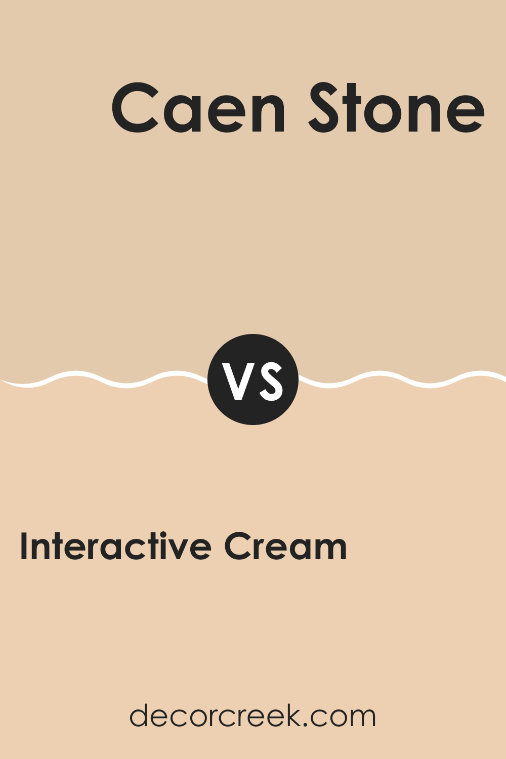
Interactive Cream SW 6113 by Sherwin Williams vs Caen Stone SW 0028 by Sherwin Williams
Interactive Cream and Caen Stone are both colors by Sherwin Williams. Interactive Cream is a soft, gentle beige with a warm undertone that makes spaces feel cozy and inviting. It is versatile and works well in rooms that get a lot of natural light, enhancing the light, airy feel.
On the other hand, Caen Stone has a deeper, stony hue that resembles natural sandstone. It is a bit cooler than Interactive Cream and offers a sturdy, more grounded look. This color is great for adding a touch of nature and depth to a room, pairing well with both dark and light furniture.
While Interactive Cream is ideal for creating a light, welcoming atmosphere, Caen Stone is better for those looking to add a subtle, earthy element to their space. Both colors can beautifully complement a variety of decor styles and preferences.
You can see recommended paint color below:
Conclusion
Interactive Cream is a warm and welcoming shade of yellow, which seems like it can make any room feel cozy and cheerful. It’s a kind of color that reminds me of soft sunlight on a lazy afternoon. What’s great about it is that it isn’t too bright or flashy, making it really easy to fit into most homes without causing a big fuss.
From what I’ve read, using this color can make spaces feel more open and friendly. Whether you are painting a living room or just a little corner for reading, Interactive Cream could be a perfect choice. This color goes well with many other colors, whether you choose dark furniture or lighter curtains, making it a handy paint color to have around.
In conclusion, I think that SW 6113 Interactive Cream could be a wonderful pick for anyone looking to give their home a warm, fresh, and welcoming update. It’s simple yet effective, and I can’t wait to recommend it to someone who wants to freshen up their room without getting too bold or flashy.
It seems to create just the right balance of warmth and light in any room it’s used in.

Ever wished paint sampling was as easy as sticking a sticker? Guess what? Now it is! Discover Samplize's unique Peel & Stick samples.
Get paint samples


