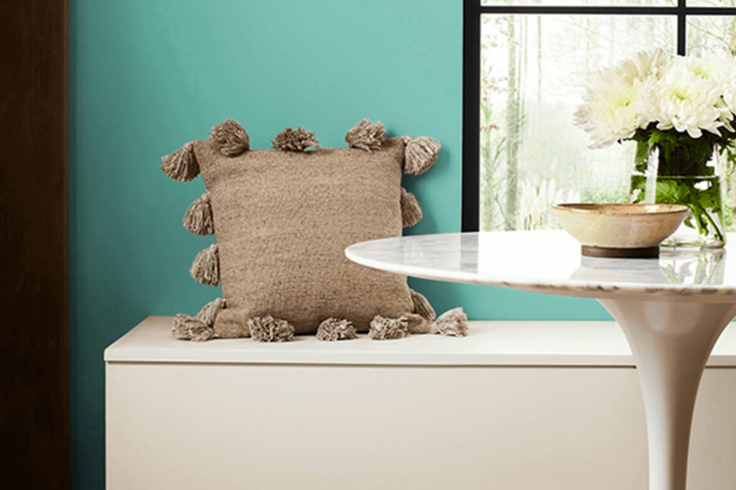
If you’re hunting for a paint color that breathes life into any room without overpowering it, you might really appreciate SW 6759 Cooled Blue by Sherwin Williams. This unique shade is like a breath of fresh air; it has a soothing quality that strikes a perfect balance between vibrant and calm. It’s like looking up at a cloudless sky on a bright, sunny day or gazing out over a peaceful sea first thing in the morning.
Using SW 6759 Cooled Blue on your walls can give them a fresh look, making your room feel open and airy. It’s a shade that plays wonderfully with both natural light and the softer glow of lamps.
So, if you’re considering giving a room—or perhaps even your whole home—an aesthetic update, this color can offer a subtle yet refreshing change. Whether paired with bold colors for a dynamic contrast or kept within a palette of pastels for gentleness, Cooled Blue adjusts beautifully.
It’s a choice that speaks of understated elegance and a desire for peace and simplicity in your surroundings.
What Color Is Cooled Blue SW 6759 by Sherwin Williams?
Cooled Blue by Sherwin Williams is a fresh and lively shade that brings to mind the clear skies of a perfect sunny day. It has a vibrant, yet calming presence that makes it ideal for creating a relaxing atmosphere in any room. This particular shade of blue falls on the cooler side of the spectrum, evoking a sense of crispness and cleanliness.
This color is incredibly adaptable when it comes to interior design styles. It works particularly well in modern and coastal-themed rooms. The brightness of Cooled Blue pairs beautifully with minimalist designs, where its refreshing hue can stand out against neutral backdrops like white, gray, or beige.
In a coastal setting, it complements natural materials like light woods, wicker, and linen, enhancing the airy, beachy feel of the room. Cooled Blue is also a great choice for pairing with various materials and textures. It looks stunning with metallic accents like silver or brushed nickel, which add a modern touch to the surroundings.
Textures such as soft cottons, plush velvets, or smooth ceramics also work well with this color, creating a delightful contrast that is pleasing to the eyes and touch. Overall, Cooled Blue is a dynamic and cheerful choice that can brighten up rooms while maintaining a cool, clean feel.
Is Cooled Blue SW 6759 by Sherwin Williams Warm or Cool color?
Cooled Blue SW 6759 by Sherwin Williams is a unique shade of light blue that has a fresh and lively vibe, making it a great choice for adding a touch of color to a home without overpowering the room. This color works particularly well in rooms that get a lot of natural light, as the brightness highlights its vibrant yet soft hue, creating an inviting and comfortable atmosphere.
In a living room, Cooled Blue can be paired with neutral furniture to maintain a light and airy feel. It’s also excellent for bathrooms where it enhances a clean and refreshing look. For bedrooms, this color contributes to a calm and restful environment, perfect for relaxing at the end of the day.
Additionally, Cooled Blue is adaptable in its compatibility with various decor styles, from modern minimalism to rustic charm, adjusting easily to the homeowner’s taste. This makes it not just a paint color but a smart choice for anyone looking to refresh their home.
Undertones of Cooled Blue SW 6759 by Sherwin Williams
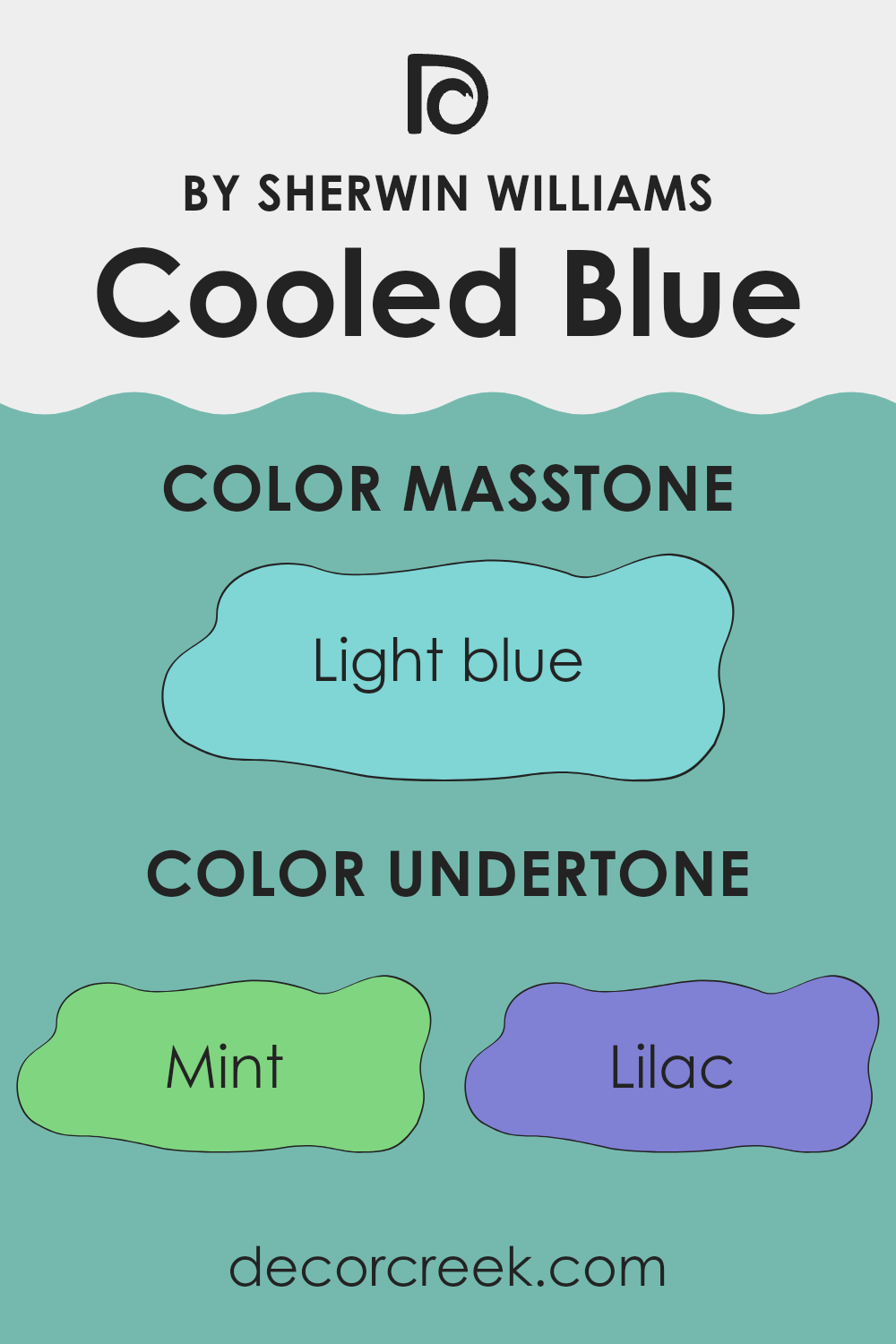
The paint color Cooled Blue has a dynamic blend of undertones that can subtly change how its main hue is perceived. Undertones are the hidden qualities of a color that may become more noticeable under different lighting conditions or when combined with other shades. For Cooled Blue, these undertones include hints of mint, lilac, gray, several shades of turquoise, light gray, pale yellow, light purple, and pale pink.
Each undertone affects how the color appears. For instance, mint and light turquoise bring a fresh and lively touch, enhancing the sense of openness in a room. Lilac and light purple add gentle warmth, creating a more inviting feel. Gray and light gray provide a balanced foundation, making the color adaptable across various design styles.
On interior walls, these undertones influence how Cooled Blue interacts with lighting and decor. Natural light can highlight the cooler tones like turquoise, giving the walls a pleasant and calming effect. Under artificial lighting, warmer undertones such as pale yellow or pale pink might become more visible, resulting in a cozier atmosphere.
Because of this, both lighting and decor choices can significantly affect how these undertones appear, shaping the overall mood of the room. Understanding these effects helps plan the design better, ensuring that wall colors work harmoniously with furniture and other elements.
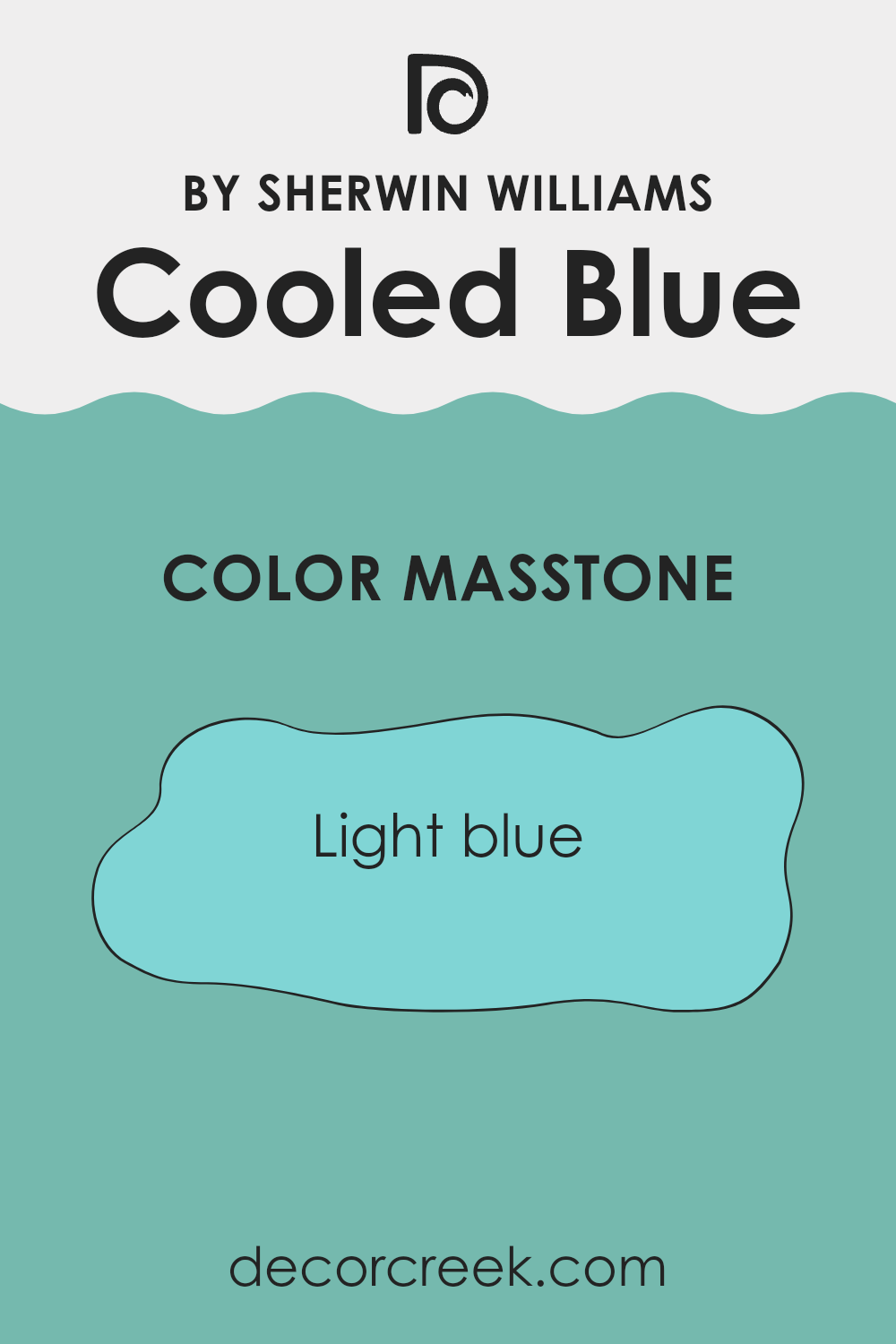
What is the Masstone of the Cooled Blue SW 6759 by Sherwin Williams?
Cooled Blue (#80D5D5) is a light blue shade that has a fresh and calm feel, making it a great choice for many homes. When applied to walls, this color can make rooms appear more open and airy.
Its light tone pairs well with both dark and light furniture, giving homeowners flexibility in designing their rooms. Due to its friendly and appealing nature, Cooled Blue is suitable for areas like the living room or bedroom where a relaxing atmosphere is often desired.
This color also reflects natural light well, which can help reduce the need for artificial lighting during the day, potentially lowering energy use. Whether used as a main wall color or for accent features, Cooled Blue’s light and crisp hue works beautifully to create a welcoming home environment.
How Does Lighting Affect Cooled Blue SW 6759 by Sherwin Williams?
Lighting plays a crucial role in how we perceive colors in a room. The type, intensity, and direction of light can all dramatically change the appearance of a paint color on the wall. For instance, the color Cooled Blue by Sherwin Williams may look different under various lighting conditions. In natural light, Cooled Blue will change its appearance throughout the day depending on the sunlight’s direction and intensity.
In a north-facing room, which receives less direct sunlight, Cooled Blue will appear in a truer, more consistent shade throughout the day, but it might feel slightly cooler and more subdued. This cooler tone reinforces the crispness of the hue, making it a good choice for creating a calm and consistent atmosphere.
In south-facing rooms, which are bathed in plentiful sunlight, Cooled Blue might take on a lighter, brighter appearance, losing some of its depth but gaining a vibrant energy that can make the room feel more lively and inviting. The abundant light can make the color look slightly washed out during peak daylight hours.
East-facing rooms get most of their light in the morning when the sun rises. Here, Cooled Blue will start the day looking soft and gently vibrant, then shift toward a cooler, more shadowed tone as the day progresses and the natural light diminishes. This can make the color feel refreshing in the morning and more reserved by the afternoon.
In west-facing rooms, the situation reverses; the color remains muted during the morning and gains intensity as the afternoon sunlight pours in. Cooled Blue will warm up a bit in the late afternoon and can create a more dynamic and energetic feel as it reflects the warmer tones of the setting sun.
Artificial light, meanwhile, brings its own variations. Warm artificial lights, such as incandescent bulbs, can make Cooled Blue appear softer and warmer, enhancing its welcoming feel. Cooler lights, like some LEDs, can maintain or even emphasize the color’s natural coolness, keeping it crisp and vibrant.
In essence, the way Cooled Blue interacts with light makes a significant difference in its presentation and the atmosphere it creates in a room. It is important to consider both the room’s orientation and the type of artificial lighting used to fully appreciate and anticipate how this color will behave.

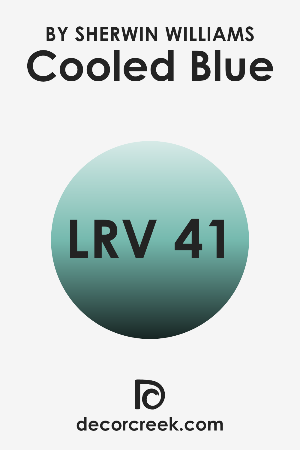
What is the LRV of Cooled Blue SW 6759 by Sherwin Williams?
LRV, or Light Reflectance Value, is a measure that indicates how much light a color reflects and how much it absorbs. It’s given as a percentage and tells you how light or dark a paint color will look once it’s on your walls. A higher LRV means the color reflects more light, making it appear lighter, while a lower LRV means it absorbs more light, making it appear darker.
Understanding LRV can help you choose the right paint color for your room, depending on how bright or moody you want the area to feel. It’s especially important in rooms where the amount of natural light varies throughout the day.
For the color with LRV of 41.426, such as the one discussed, it sits in the middle range of the LRV scale. This means it doesn’t reflect light as much as lighter colors do but isn’t too dark either. In effect, it can make a room feel cozy and well-balanced, without making it feel overly bright or too dim.
This moderate reflection capacity ensures that the color will provide a consistent look under different lighting conditions, making it an adaptable choice for many rooms. Whether the room gets a lot of sunlight or relies on artificial lighting, this shade will manage to maintain its true hue without significant changes.
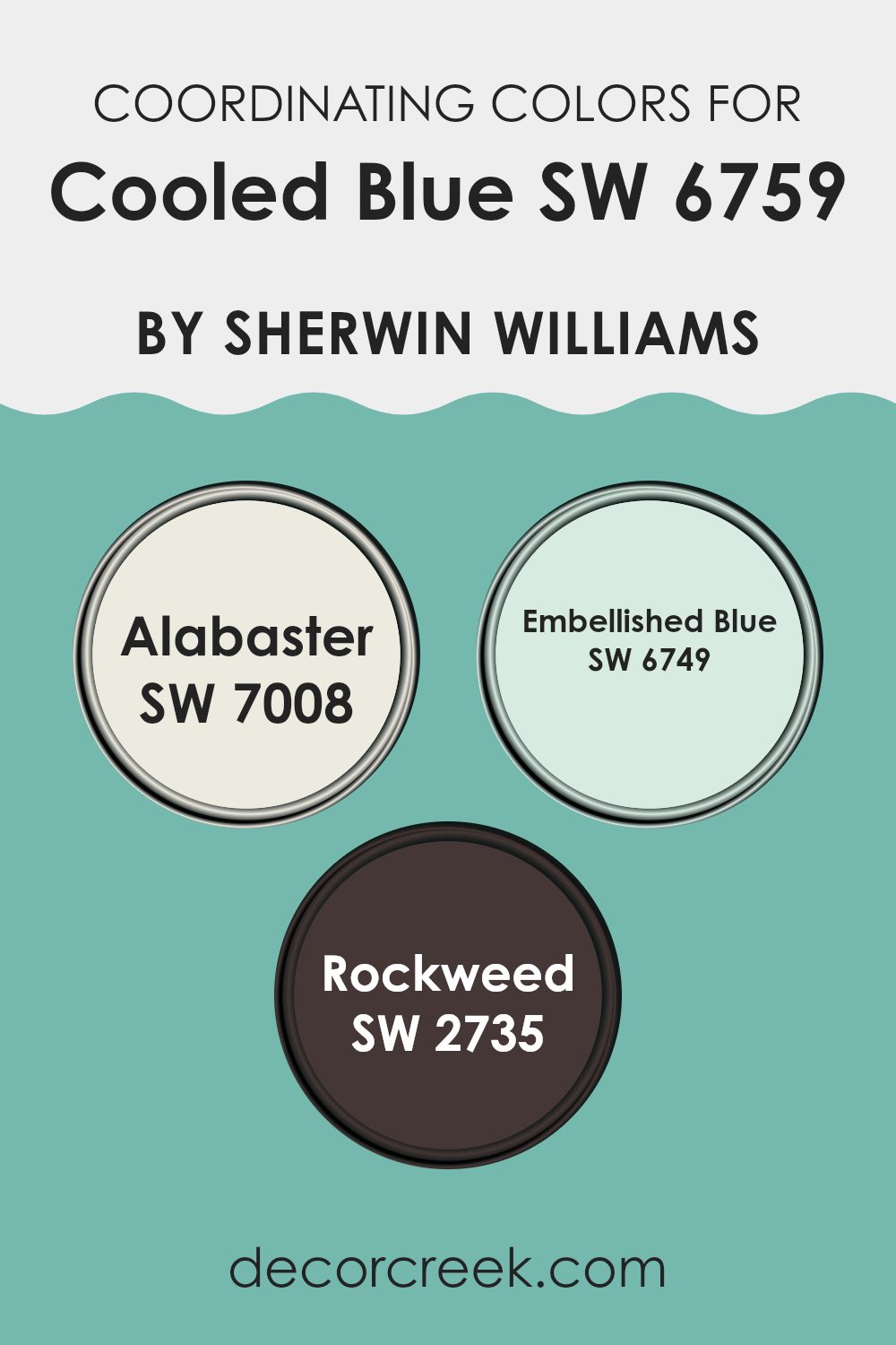
Coordinating Colors of Cooled Blue SW 6759 by Sherwin Williams
Coordinating colors are essentially hues that complement each other well when used in combination within a room, allowing for a harmonious and balanced aesthetic. These colors should work well together without overpowering each other, helping to create a cohesive look. When dealing with a specific paint shade such as Cooled Blue by Sherwin Williams, it’s essential to select coordinating colors that enhance its qualities without competing for attention.
The color Alabaster SW 7008 is a soft, warm white that acts as a neutral backdrop, making it an excellent choice for balancing the cooler tones of Cooled Blue. It is light and airy, providing a subtle contrast that helps to brighten and open up rooms.
Embellished Blue SW 6749, a deeper and slightly more vibrant blue than Cooled Blue, brings depth and interest to an interior, making it a great option for accents like doors or furniture. It enriches the overall palette without overpowering the senses.
Lastly, Rockweed SW 2735 offers a dark, earthy green-brown that complements the blue shades, grounding the color scheme with its natural, subdued tone. This color is particularly useful for adding a touch of warmth and nature-inspired calm to rooms.
You can see recommended paint colors below:
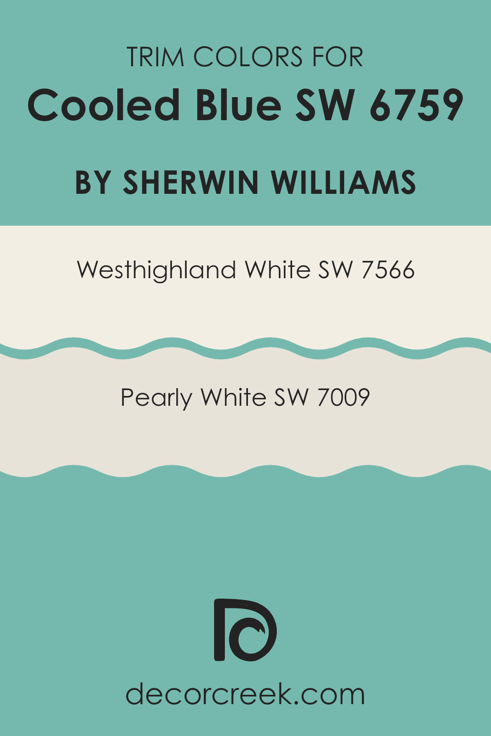
What are the Trim colors of Cooled Blue SW 6759 by Sherwin Williams?
Trim colors are contrasting or complementary shades used to highlight architectural details and frame the primary colors on walls, like windows, skirtings, doors, and moldings. Choosing the right trim colors can enhance the overall aesthetic appeal and detail of a room or exterior, helping to define and accentuate the area.
For a color like Cooled Blue by Sherwin Williams, trim colors need to be carefully selected to ensure they complement the main hue without overpowering it. This is why colors such as Westhighland White and Pearly White are ideal choices; they are subtle yet effective in making the main wall color stand out nicely.
Westhighland White by Sherwin Williams is a clean and bright shade that provides a crisp contrast to Cooled Blue, bringing a fresh and light feel to the room. It’s a great choice for creating a sharp, defined look around the edges, which can help make the room appear larger and more open.
On the other hand, Pearly White offers a softer approach with its warm undertones, which harmonizes well with Cooled Blue by adding a gentle, welcoming vibe. This color is excellent for rooms that aim for a cozy atmosphere without sacrificing a neat and polished appearance. Both of these shades support and enhance the main color without competing with it, ensuring a balanced and cohesive palette.
You can see recommended paint colors below:
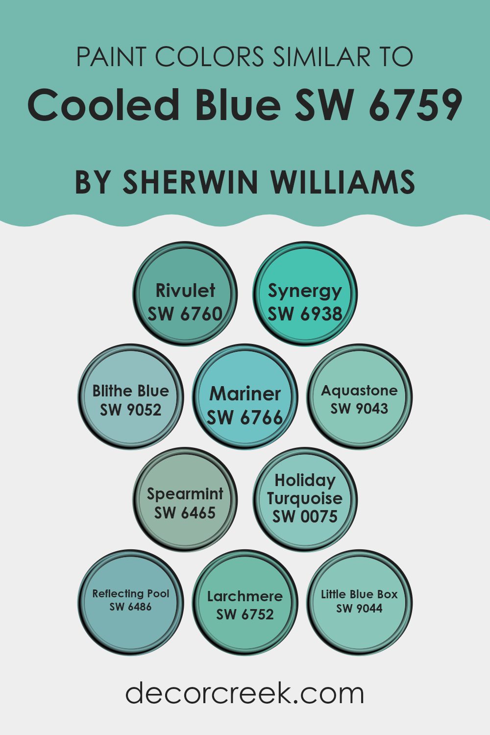
Colors Similar to Cooled Blue SW 6759 by Sherwin Williams
Similar colors are crucial when designing a room because they create a sense of harmony and cohesion. When colors are alike, they blend naturally with one another, making the environment feel balanced and visually appealing. Using similar shades, such as variations of blue inspired by Cooled Blue by Sherwin Williams, can unify different elements of a decor and give the area a coherent, put-together look that is pleasing to the eye.
For instance, Rivulet is a lighter, airy blue that adds a fresh, open sense to rooms, much like a gentle stream under the morning sky. In contrast, Synergy stands out as a vibrant, energetic blue that injects life and brightness, akin to a summer sky at noon.
Blithe Blue has a soft, subtle tone that works wonderfully in calming, peaceful areas, giving a room a gentle touch of color. Mariner, with its deeper, nautical blue shade, brings the reminiscent strength and depth of the ocean to interiors.
Aquastone borrows hues from seafoam and vivid oceanic minerals, providing a unique, refreshing twist. Spearmint introduces a minty hue that blends green and blue to achieve a crisp, fresh look. Holiday Turquoise offers a joyful burst of aqua that reminds one of festive, tropical waters.
Reflecting Pool has a soothing effect, mimicking the calm sight of water in a peaceful garden pond. Larchmere is vivid yet inviting, giving rooms a lively but comfortable atmosphere. Lastly, Little Blue Box is delightful and charming, bringing a whimsical note to the palette, similar to the iconic teal of beloved jewelry boxes. Together, these colors build a palette that is adaptable yet cohesive, perfect for creating friendly and inviting rooms.
You can see recommended paint colors below:
- SW 6760 Rivulet
- SW 6938 Synergy
- SW 9052 Blithe Blue
- SW 6766 Mariner
- SW 9043 Aquastone
- SW 6465 Spearmint
- SW 0075 Holiday Turquoise
- SW 6486 Reflecting Pool
- SW 6752 Larchmere
- SW 9044 Little Blue Box
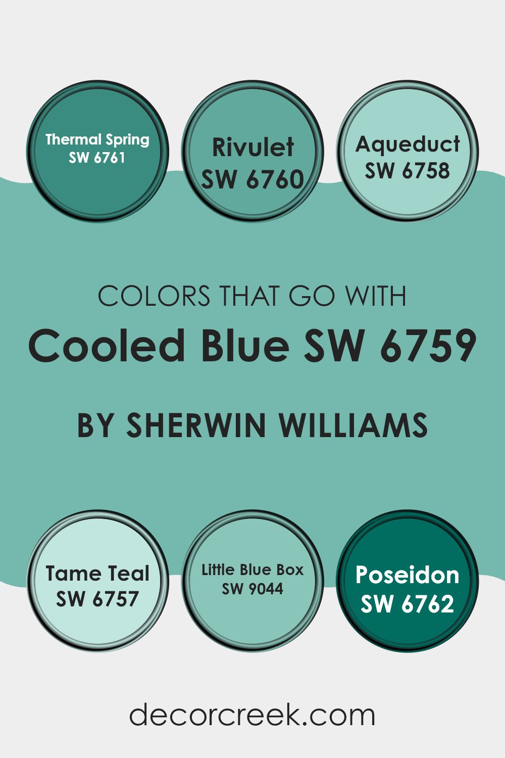
Colors that Go With Cooled Blue SW 6759 by Sherwin Williams
When decorating with Cooled Blue SW 6759 from Sherwin Williams, it’s crucial to select complementary colors that create a harmonious look. Colors that pair well, such as SW 6761 – Thermal Spring, SW 6760 – Rivulet, SW 6758 – Aqueduct, SW 6757 – Tame Teal, SW 9044 – Little Blue Box, and SW 6762 – Poseidon, work together to enhance the environment without overpowering it.
These colors have unique abilities to balance or accentuate Cooled Blue, depending on the atmosphere you’re aiming to create in your room. Using a coordinated color scheme helps in achieving a cohesive and inviting aesthetic.
Thermal Spring is a gentle green that adds a fresh, lively touch, contrasting nicely with the cooler undertones of Cooled Blue. Rivulet, another calm blue shade, supports a seamless transition between colors, reinforcing a gentle aquatic theme without contrasting too sharply.
Aqueduct steps up as a deeper blue, giving depth and focus to rooms, offering a sturdier companion to Cooled Blue. Tame Teal provides a subtle green-blue that is adaptable in various decorating styles, linking the indoors with the natural world outside.
Little Blue Box is a vibrant, playful turquoise that introduces a dash of energy and youthfulness. Lastly, Poseidon is a bold, deep blue that makes a strong statement, perfect for accent walls or decor items to catch the eye. Each of these colors enhances the appearance of Cooled Blue, ensuring your room feels well-rounded and thoughtfully styled.
You can see recommended paint colors below:
- SW 6761 Thermal Spring
- SW 6760 Rivulet
- SW 6758 Aqueduct
- SW 6757 Tame Teal
- SW 9044 Little Blue Box
- SW 6762 Poseidon
How to Use Cooled Blue SW 6759 by Sherwin Williams In Your Home?
Cooled Blue SW 6759 by Sherwin Williams is a refreshing light blue paint color that is gentle on the eyes. It’s great for creating a calm and friendly atmosphere in any room. You can use Cooled Blue in different ways around your house.
For example, painting your bathroom with this color gives it a clean and fresh feel, making it a perfect escape for relaxation time. In your bedroom, using Cooled Blue for one accent wall or throughout the room can make it feel like a cozy, peaceful retreat, ideal for resting.
The color is also an excellent choice for a living room or entryway, providing a welcoming touch that isn’t overpowering. It pairs beautifully with other neutrals like whites or soft grays, allowing you to add more colorful decor items without the room feeling too busy. Whether you apply it to walls, use it on furniture pieces, or incorporate it through accessories, Cooled Blue can freshen up your home with its light, airy vibe.
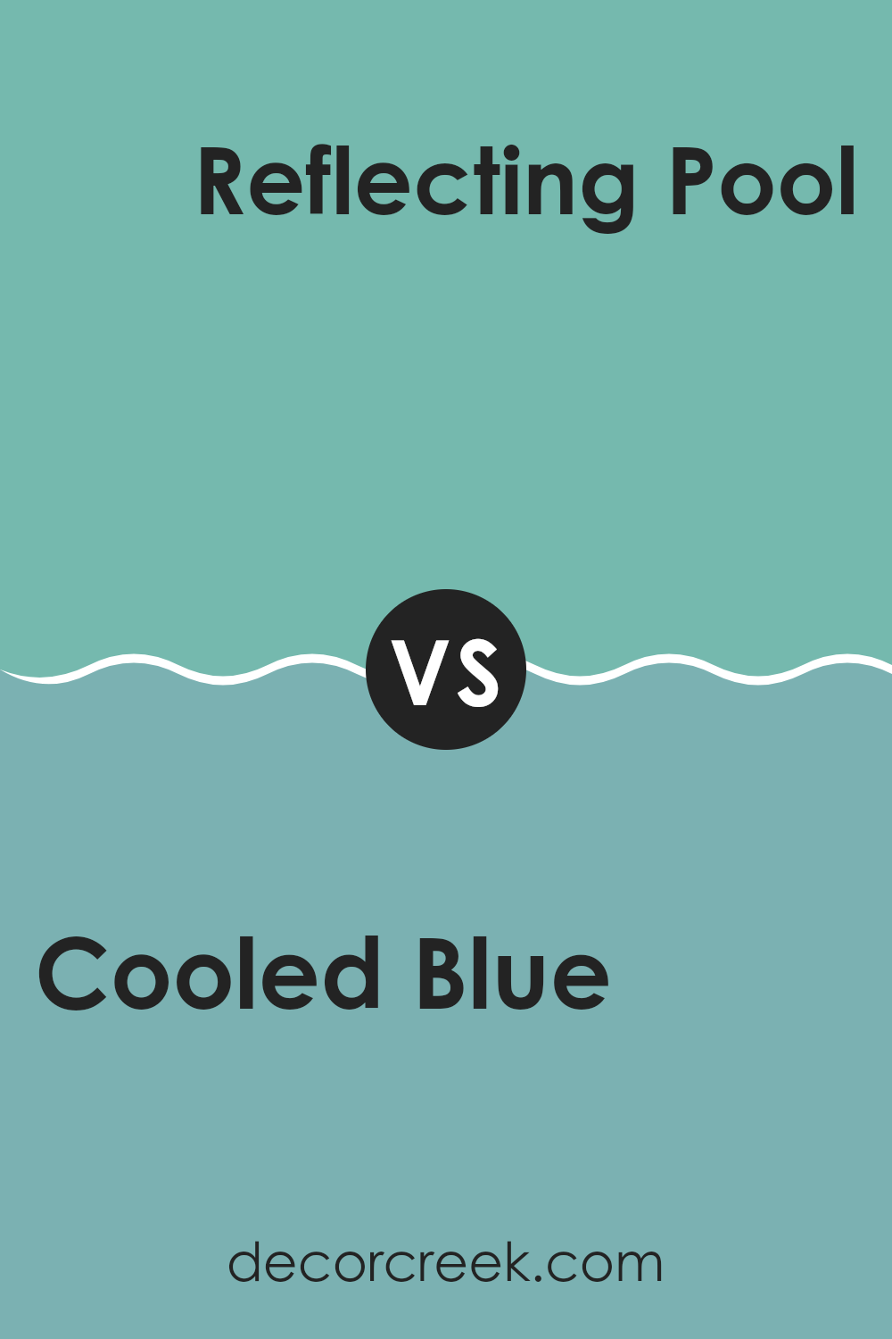
Cooled Blue SW 6759 by Sherwin Williams vs Reflecting Pool SW 6486 by Sherwin Williams
Cooled Blue and Reflecting Pool are two interesting shades from Sherwin Williams. Cooled Blue is lighter, offering a calm, fresh look similar to a clear sky. It brings a breezy feel to any room, making it great for creating a relaxed area.
On the other hand, Reflecting Pool is deeper with greenish tones, resembling a peaceful body of water. This color gives a room a cooler, slightly more vibrant energy, perfect for adding a bit of personality without overpowering the room.
While both colors share a soothing cool palette, Cooled Blue leans towards a simple, airy vibe, whereas Reflecting Pool adds a touch of depth and energy, making it ideal for those wanting a bit more punch. Both colors can refresh a room but in subtly different ways.
You can see recommended paint color below:
Cooled Blue SW 6759 by Sherwin Williams vs Holiday Turquoise SW 0075 by Sherwin Williams
The two shades from Sherwin Williams, Cooled Blue and Holiday Turquoise, offer distinct vibes. Cooled Blue is a soft, gentle blue with a subtle gray undertone that gives it a calm and soothing feel, making it perfect for creating a relaxed atmosphere in rooms like bedrooms or bathrooms.
On the other hand, Holiday Turquoise is a brighter and more vibrant color. It is closer to a true turquoise, leaning towards a light, playful aqua. This color is more energetic and is great for adding a splash of cheerfulness to any area, particularly in kitchens or kids’ rooms.
While both colors bring their own unique styles to the table, Cooled Blue tends to be more muted and understated, whereas Holiday Turquoise stands out more with its lively tone.
You can see recommended paint color below:
- SW 0075 Holiday Turquoise

Cooled Blue SW 6759 by Sherwin Williams vs Synergy SW 6938 by Sherwin Williams
Cooled Blue is a light and breezy shade, ideal for creating a relaxed atmosphere in any room. This color has a subtle, airy quality, almost like a soft morning sky, making it perfect for rooms where you want to encourage calm and peaceful vibes. It pairs beautifully with both bright and muted accents, providing flexibility in decor.
On the other hand, Synergy is a vibrant and energetic green that injects liveliness into a room. This shade is much bolder and can act as a focal point or complement other dynamic colors. It works particularly well in rooms that aim for a fresh, lively feel, such as kitchens or playrooms.
In comparison, while both colors come from the same brand, they serve very different purposes due to their distinct tones; Cooled Blue for a gentle and soothing environment and Synergy for a more active and upbeat atmosphere. Each brings its unique character to a room, allowing for personalized style choices.
You can see recommended paint color below:
- SW 6938 Synergy

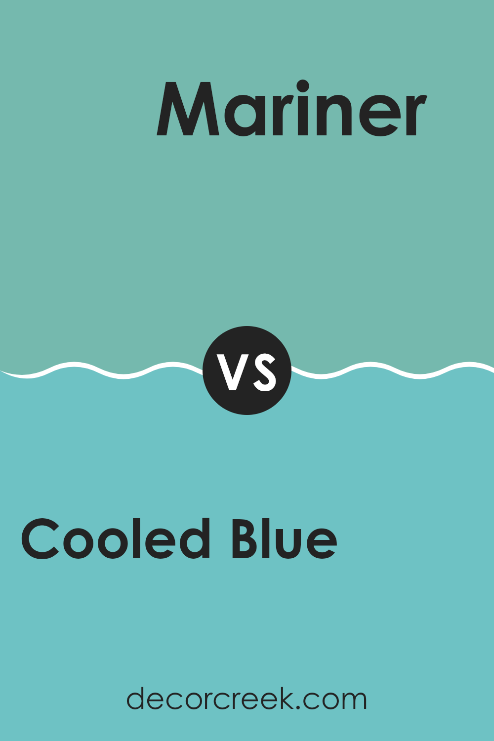
Cooled Blue SW 6759 by Sherwin Williams vs Mariner SW 6766 by Sherwin Williams
Cooled Blue and Mariner are two distinct shades by Sherwin Williams. Cooled Blue is a soft, light blue with a calming effect, which makes it perfect for creating a peaceful and soothing atmosphere in a room. It pairs well with soft neutrals and can make small rooms appear larger.
On the other hand, Mariner is a vibrant, deeper blue with a more energetic feel. This color stands out and can add a splash of brightness to any room, making it ideal for accent walls or areas where you want to draw attention.
While Cooled Blue lends a lighter, airier feel to a room, Mariner provides a bold and dynamic presence. Depending on your room’s needs, both colors offer unique advantages—Cooled Blue for a gentle backdrop and Mariner for a striking focal point. This makes them suitable for different moods and styles in home décor.
You can see recommended paint color below:
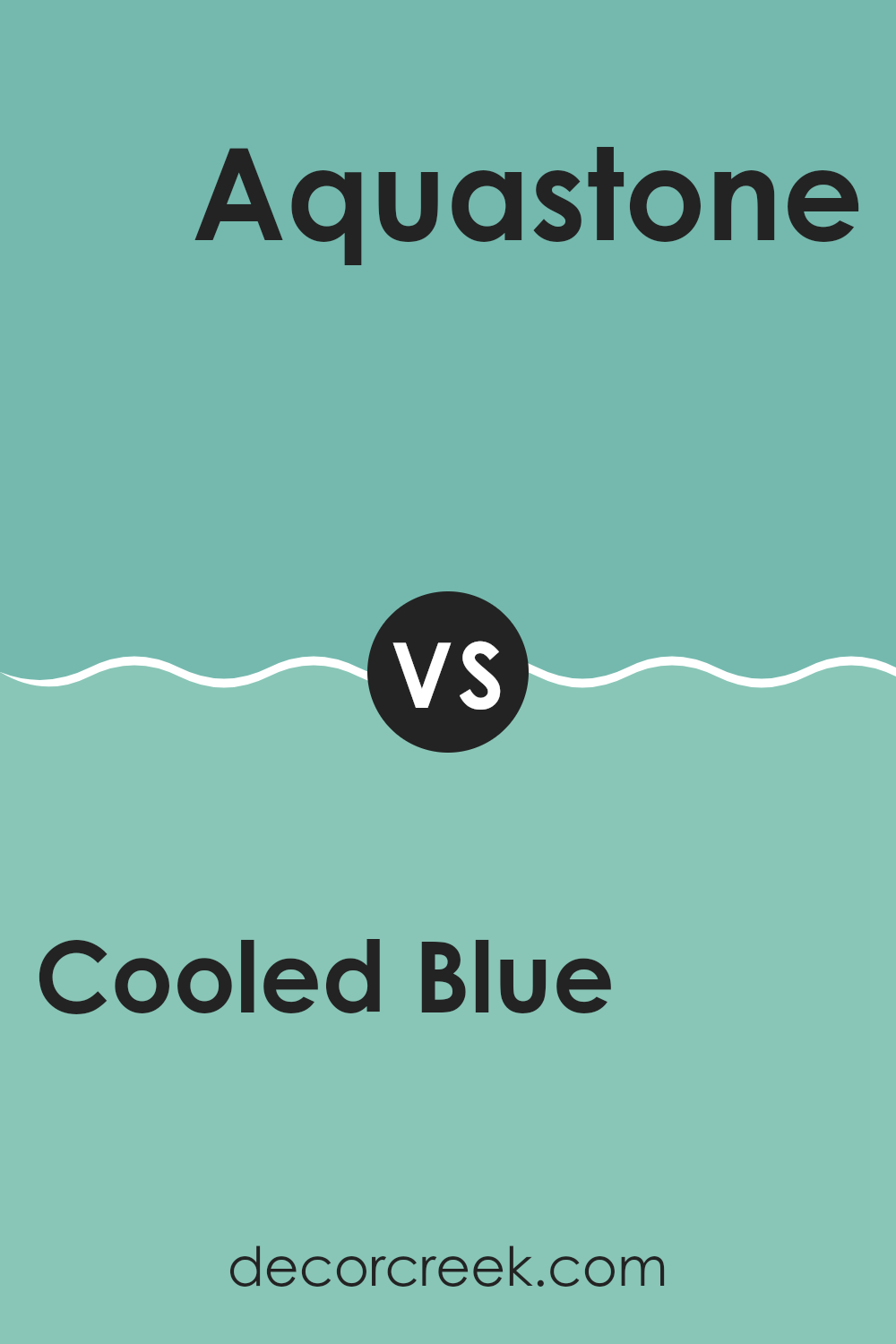
Cooled Blue SW 6759 by Sherwin Williams vs Aquastone SW 9043 by Sherwin Williams
Cooled Blue and Aquastone by Sherwin Williams are two distinct shades with unique vibes. Cooled Blue has a fresh, crisp feel to it, somewhat resembling the clear sky on a bright day. This hue is airy and can make rooms feel open and light. It’s an excellent choice for creating a relaxed, soothing environment in a room.
On the other hand, Aquastone offers a deeper, more oceanic tone that leans towards teal. This color is richer and can add a touch of drama or intensity to any area. While still maintaining a calming influence, it provides a stronger presence compared to the more understated Cooled Blue.
Using Cooled Blue is like adding a breath of fresh air to interiors, whereas Aquastone brings in a wave of depth and interest. Depending on the mood or atmosphere you want to achieve, each color offers its own benefits. Cooled Blue is great for a light, breezy feel, while Aquastone works well for a more profound, impactful aesthetic.
You can see recommended paint color below:
- SW 9043 Aquastone
Cooled Blue SW 6759 by Sherwin Williams vs Rivulet SW 6760 by Sherwin Williams
Cooled Blue and Rivulet are two distinct colors by Sherwin Williams, each offering a unique vibe to any room. Cooled Blue is a calming, soft blue with a slight gray tint, making it very gentle and soothing for the eyes. This color is excellent for creating a peaceful, relaxed atmosphere in a room. It’s particularly suitable for bedrooms or bathrooms where calming effects are desired.
On the other hand, Rivulet is a brighter and more vibrant blue. It has a refreshing, lively feel that adds a dash of cheerfulness to any room. Rivulet can energize a room’s aesthetic, making it a perfect choice for more active areas like kitchens or kids’ rooms.
While both are blues, Cooled Blue leans towards a muted tone, providing a subtle and low-key background. Rivulet, with its brighter appeal, stands out more and can make a strong visual impact. Choosing between the two depends on the mood you want to create and the room you’re designing.
You can see recommended paint color below:
- SW 6760 Rivulet

Cooled Blue SW 6759 by Sherwin Williams vs Larchmere SW 6752 by Sherwin Williams
Cooled Blue and Larchmere are two distinct shades by Sherwin Williams that can give a room very different feels. Cooled Blue is a soft, gentle blue with a subtle hint of gray. It has a calming effect, making it perfect for bedrooms or bathrooms where you want a peaceful atmosphere. The color has a cool tone that can open up a small room, making it feel larger and more airy.
On the other hand, Larchmere is a vibrant turquoise that leans toward green. It’s brighter and more energetic compared to Cooled Blue. Larchmere works beautifully in rooms where you want to add a touch of cheerfulness, like kitchens or playrooms. It’s also a great choice for an accent wall because of its ability to draw attention and brighten up a room.
In summary, if you’re looking for a color that is quiet and calming, Cooled Blue is the way to go. If you prefer something lively that makes a bold statement, Larchmere is your color.
You can see recommended paint color below:
- SW 6752 Larchmere
Cooled Blue SW 6759 by Sherwin Williams vs Blithe Blue SW 9052 by Sherwin Williams
Cooled Blue is a vibrant and lively color that stands out with its deep, rich tones. It’s a perfect choice for making a strong statement in any room, especially in areas where you want to add a touch of drama and boldness.
On the other hand, Blithe Blue presents a softer and lighter shade, offering a more subtle and calm appearance. This color is ideal for creating a relaxing and inviting atmosphere, suitable for bedrooms or bathrooms where you’re looking to create a gentle and peaceful vibe.
Both colors hold their unique charm, with Cooled Blue being more striking and dramatic, while Blithe Blue leans toward a calm and gentle ambiance. Together, they can work beautifully in different areas of a home depending on the mood you wish to create.
You can see recommended paint color below:
Cooled Blue SW 6759 by Sherwin Williams vs Spearmint SW 6465 by Sherwin Williams
Cooled Blue and Spearmint by Sherwin Williams are both calm and refreshing colors, but they have distinct tones and moods. Cooled Blue is a gentle, light blue with a very soft and muted feel to it. It’s almost like looking at a clear sky on a bright sunny day. This color brings a fresh and airy look to any room, making rooms feel more open and clean.
On the other hand, Spearmint is a vibrant, light green that reminds one of fresh mint leaves. It has a lively and youthful vibe that can energize a room and give it a natural, refreshing feel. Spearmint tends to add a bit more personality and brightness compared to the subtler Cooled Blue.
While both colors are light and can help make a small room appear larger, their different hues can set varied moods. Cooled Blue is more calming and might be better suited for a bedroom or bathroom, where you often seek relaxation. Spearmint, with its freshness, could be ideal for kitchens or rooms where you want a burst of energy.
You can see recommended paint color below:
- SW 6465 Spearmint
Cooled Blue SW 6759 by Sherwin Williams vs Little Blue Box SW 9044 by Sherwin Williams
Cooled Blue is a bright and vibrant shade that has a lively feel to it. It’s quite a strong color, which makes it a great choice for adding a pop of freshness to any room. It carries a clean and crisp atmosphere, which can instantly uplift an environment.
On the other hand, Little Blue Box is also a cheerful color, but it’s softer and more subdued compared to Cooled Blue. The gentle quality of Little Blue Box gives off a more relaxed vibe, making it perfect for creating a calm corner in a home or office.
It’s a lighter shade that feels soothing to look at, which works well in a bedroom or a bathroom where comfort is key. Both colors are shades of blue that offer distinct moods and can suit different preferences or room purposes, depending on what feeling one wants to create.
You can see recommended paint color below:
- SW 9044 Little Blue Box

In conclusion, SW 6759 Cooled Blue by Sherwin Williams is a wonderful paint color that can make any room look fresh and inviting. This shade of blue has a gentle and calming effect, making it perfect for bedrooms where you need to relax or for bathrooms that feel like a personal spa.
When I used this color in my own living room, it made the room feel cooler during the summer, which was really nice. It’s also a color that blends easily with others, so you can pair it with many decorating styles and furniture pieces.
Whether you’re refreshing a single room or repainting your entire home, Cooled Blue is a great choice if you want something that looks clean and calm without feeling plain. Everyone who visits my house always comments on how nice the color feels.
So, if you’re considering trying a new paint shade, think about SW 6759 Cooled Blue by Sherwin Williams — it might be just what your home needs to feel a bit more welcoming and peaceful.

Ever wished paint sampling was as easy as sticking a sticker? Guess what? Now it is! Discover Samplize's unique Peel & Stick samples.
Get paint samples

