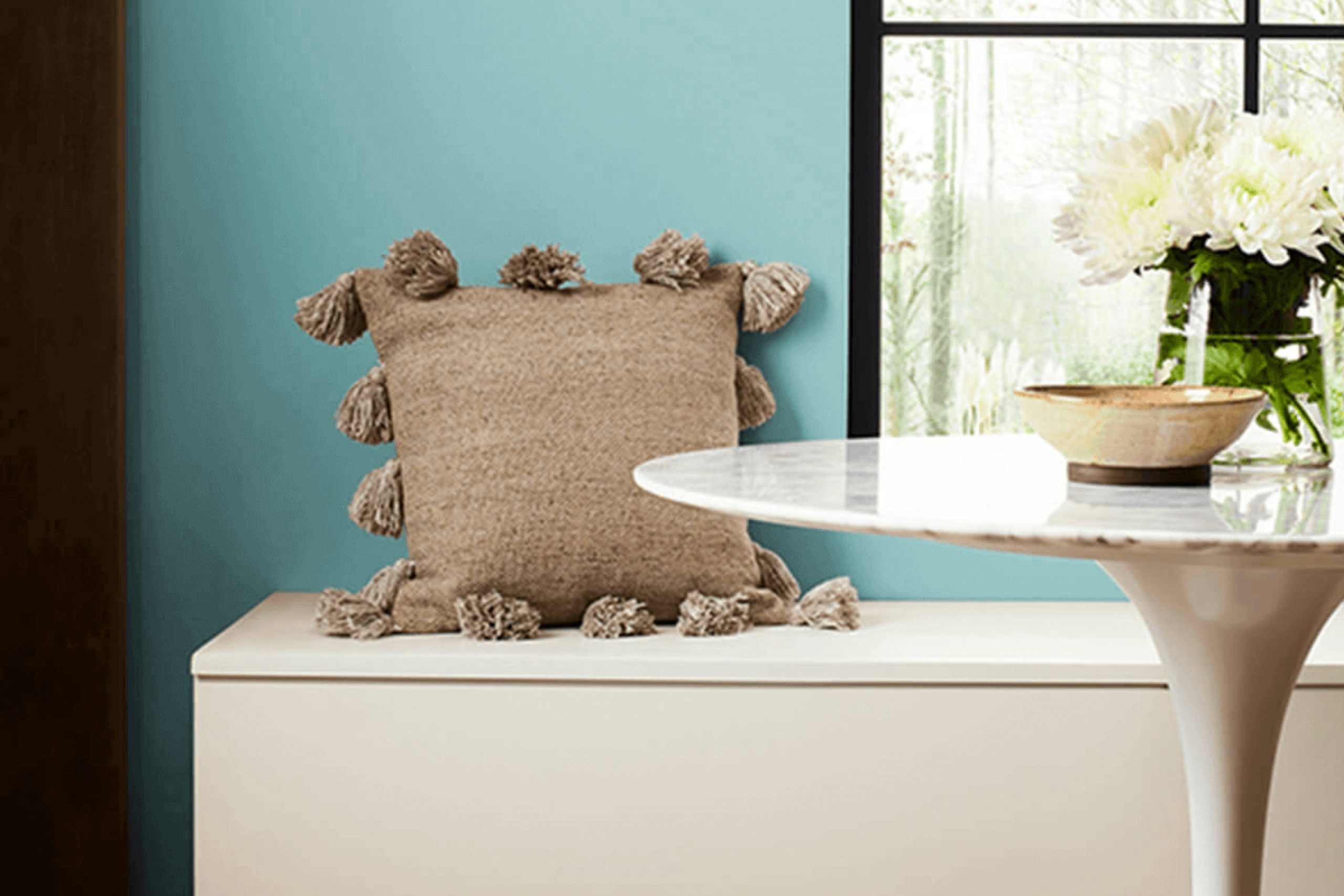
Have you ever walked into a room and instantly felt calm and relaxed? SW 9052 Blithe Blue by Sherwin Williams has that effect. It’s a soft, soothing blue that’s not too overpowering, perfect for creating a tranquil room.
Whether you’re looking to repaint your bedroom to turn it into a peaceful retreat or want to freshen up your living area, Blithe Blue could be the ideal choice. It’s subtle enough to serve as a backdrop for bolder colors or to blend seamlessly with a more neutral palette.
In my experience, this shade brings a fresh, airy feel to any room, making it feel more open and inviting. The versatility of Blithe Blue also means that it’s not just limited to walls; it works beautifully on cabinets or furniture, giving old pieces a new lease on life.
So, if you’re thinking about giving your home a new look, consider how Blithe Blue might help you achieve the right atmosphere.
What Color Is Blithe Blue SW 9052 by Sherwin Williams?
The color Blithe Blue from Sherwin Williams is a soft, gentle blue that brings a sense of calm and lightness to any room. Its subtle brightness provides a fresh look, making it an excellent choice for creating an airy and open atmosphere. This hue has a hint of warmth that keeps it from feeling too cold, making it inviting and comfortable.
Blithe Blue works beautifully in a variety of interior styles. It is perfect for coastal themes where its light blue tones mirror the natural elements of the sea and sky. In a country or farmhouse-style setting, this color pairs well with rustic woods and mixed textiles, adding a touch of freshness to the traditional decor.
For a modern or minimalist home, Blithe Blue serves as a soothing backdrop against sleek furniture and metallic accents.
When it comes to materials, Blithe Blue goes well with natural wood, from pale beech to richer oak, enhancing the organic feel of a room. It also looks stunning when combined with white or gray marble, offering a clean and classic aesthetic.
Texturally, this color complements both soft fabrics like linen and cotton and harder materials like glass and metal, providing versatility in design choices.
Altogether, Blithe Blue is a flexible shade that works well in many environments, adding a plush, welcoming vibe wherever it is used.

Is Blithe Blue SW 9052 by Sherwin Williams Warm or Cool color?
Blithe Blue SW 9052 by Sherwin Williams is a gentle and soft shade of blue that adds a fresh and airy feel to any room in a house. This color works especially well in rooms that aim to be relaxing and calm, like bedrooms and bathrooms.
Due to its light tone, Blithe Blue reflects plenty of natural light, making smaller or darker rooms appear more spacious and brighter. It’s also an ideal color for living areas or kitchens where a touch of color is needed without overpowering the room.
Blithe Blue pairs nicely with other neutrals such as white, gray, or light wood tones, allowing for a variety of decorating styles from more modern looks to rustic or coastal themes. This flexibility makes it a user-friendly color for homeowners who like to update their interiors without drastic changes. Its soft presence in a home can subtly enhance the mood and aesthetic of the living area, providing a light, clean background to everyday living.
Undertones of Blithe Blue SW 9052 by Sherwin Williams
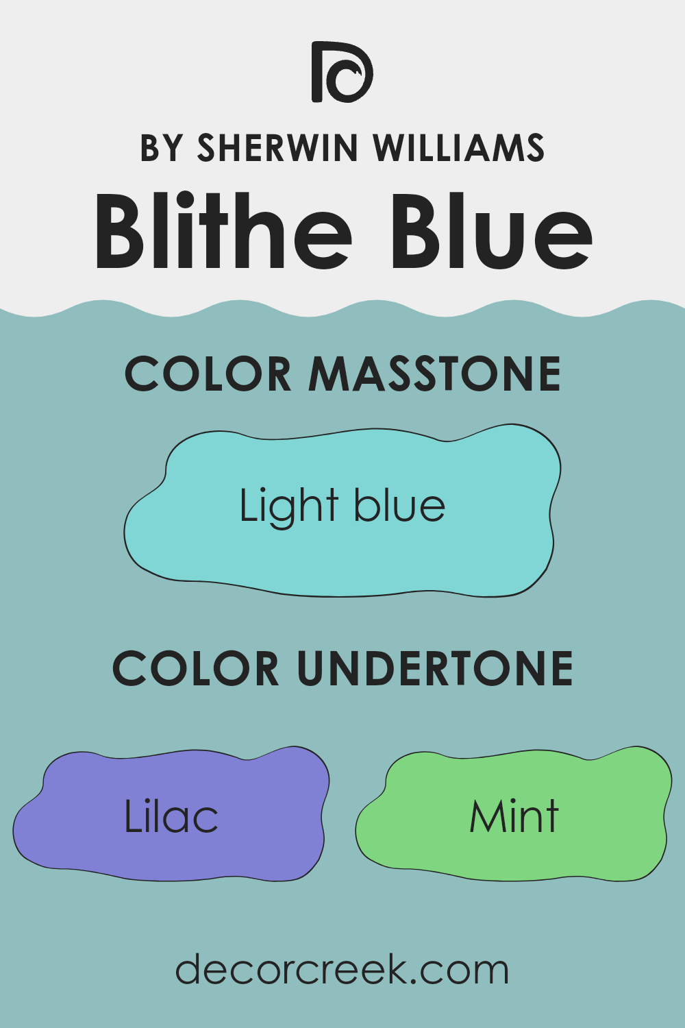
Blithe Blue is a unique shade that incorporates a variety of subtle colors affecting its overall tone. These undertones, including lilac, mint, light gray, grey, light purple, pale yellow, turquoise, pale pink, blue, light turquoise, and dark turquoise, blend to create a flexible backdrop in any room.
Undertones are secondary colors that influence the main hue of a paint color and can change its appearance under different lighting conditions. They play a crucial role in how we perceive color. For example, a blue paint with a lilac undertone might look slightly more purple in certain lights, while a mint undertone could give the blue a cooler, fresher feel.
When applied to interior walls, the variety of undertones in Blithe Blue makes it adapt well to different lighting scenarios and decor styles. The lilac and light purple undertones add a gentle warmth, making the room feel inviting. On the other hand, hints of mint, turquoise, and light turquoise introduce a refreshing vibe that can make a room feel more spacious and airy. Light gray and grey add neutrality, making the color easy to pair with a wide range of furniture and accent colors, from bold blacks to soft whites.
In rooms with ample natural light, the pale yellow and pale pink undertones can become more noticeable, adding a subtle cheerfulness to the room. The presence of blue and dark turquoise keeps the color grounded with a hint of depth, preventing it from feeling too light.
Overall, the undertones of Blithe Blue make it a flexible choice for any room, enhancing the area without overpowering it, and allowing for a wide range of decorating options.
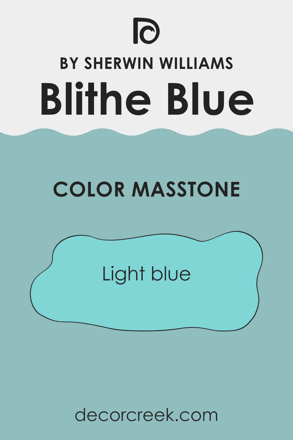
What is the Masstone of the Blithe Blue SW 9052 by Sherwin Williams?
Blithe Blue, with a masstone of Light Blue (#80D5D5), is a gentle and pleasing choice for many homes. The light blue shade brings a fresh and airy feel to any room, making areas appear larger and more open.
This color is particularly effective in bedrooms and bathrooms, where a light, soothing palette can create a peaceful atmosphere. It pairs beautifully with both bright whites and soft neutrals, allowing for flexible color schemes that adapt to various styles and tastes.
Additionally, Light Blue keeps rooms feeling cool, which can be a great benefit in warmer climates or sun-filled areas. Its subtle vibrancy adds just enough color to liven up a room without overpowering the senses. Homeowners will find it easy to match this hue with furniture and decor, making it a practical choice for those looking to refresh their interiors with a look that’s both inviting and stylish.
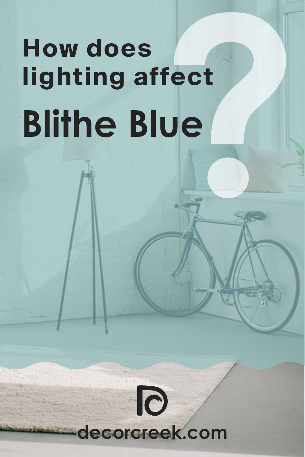
How Does Lighting Affect Blithe Blue SW 9052 by Sherwin Williams?
Lighting plays a crucial role in how colors are perceived in any room. The way a color appears can dramatically change depending on whether it is viewed under natural or artificial light. This concept is particularly significant when considering paint colors for rooms, such as the light blue shade offered by a popular brand.
In artificial light, this light blue tends to appear slightly brighter and more vibrant. This is because most artificial lighting, such as LED or incandescent bulbs, often has a yellowish tint that warms up colors.
On the other hand, under natural light, especially in a well-lit room with ample sunlight, the blue can look more subdued and true to its swatch. The natural light tends to reveal more of the true color, provided there isn’t any color distortion from surrounding decor or reflections.
The appearance of this light blue shade also varies depending on the direction the room faces:
1. North-facing rooms – These rooms receive less direct sunlight, which can make the blue look more shadowy and muted. The cooler, indirect light enhances the depth of the blue, making it appear slightly darker than it would in a brightly lit room.
2. South-facing rooms – These rooms benefit from abundant sunlight for most of the day, which can make the blue paint look lighter and more vibrant. The warmth of the sun complements the cool blue, creating a balanced and refreshing aesthetic.
3. East-facing rooms – These rooms get plenty of light in the morning when the sun rises. The morning light is usually softer and can make the blue appear bright and cheerful. As the day goes on, the intensity of the blue might decrease as natural light fades.
4. West-facing rooms – Sunlight in these rooms is most intense in the late afternoon to evening. During this time, the blue can appear warmer and more welcoming owing to the golden hues of the setting sun.
Whether you’re painting a room or just adding accents, considering how lighting affects colors like this light blue is essential for achieving the desired look and feel of your home.
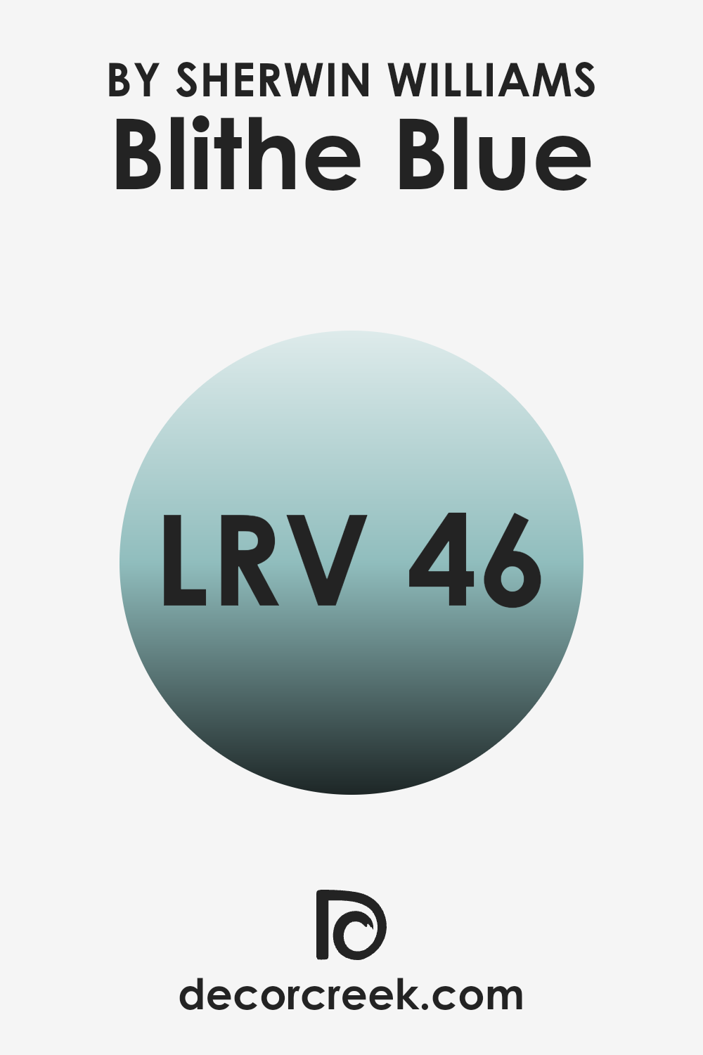
What is the LRV of Blithe Blue SW 9052 by Sherwin Williams?
LRV, or Light Reflectance Value, is a measure used to indicate how much light a paint color reflects or absorbs. Essentially, it’s a percentage scale; the higher the LRV, the more light the color reflects, and the brighter the room will appear. Conversely, lower LRV values mean that the color absorbs more light, making the room appear darker.
Understanding LRV can be crucial when choosing paint colors for a room because it helps predict how light or dark a color will look on the walls depending on the available lighting. Blithe Blue, with an LRV of 46.023, sits in the middle of the scale.
This means it is not excessively bright nor overly dark. In practical terms, in a room with average lighting, Blithe Blue will appear as a balanced, moderate blue, providing a calming backdrop without making the room feel closed in or dim. However, in a poorly lit room, this same color might look slightly darker, emphasizing more of its depth.
Conversely, in a very well-lit area, such as a room with lots of windows and natural light, the color could look lighter and more airy.
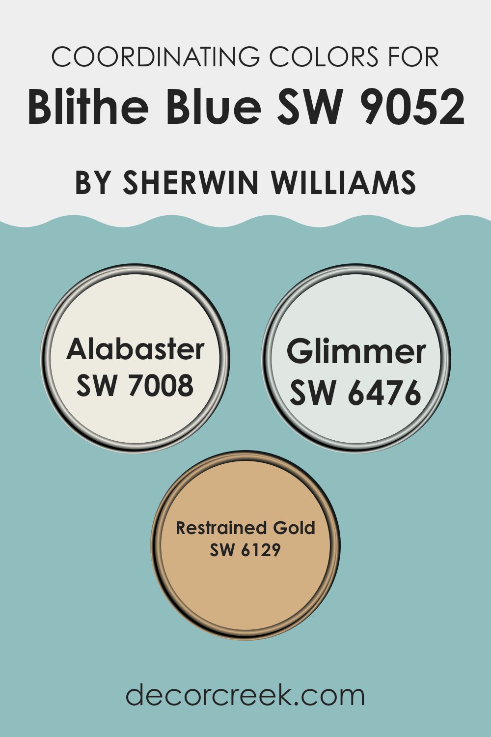
Coordinating Colors of Blithe Blue SW 9052 by Sherwin Williams
Coordinating colors are those that harmonize well together within a color scheme, either by complementing or providing a pleasing contrast to each other. These combinations can create a balanced and visually appealing look in any room. For example, Blithe Blue by Sherwin Williams can be effectively coordinated with Alabaster, Glimmer, and Restrained Gold to enhance the overall aesthetics of a room. Each of these colors contributes in a unique way to the mood and atmosphere desired.
Alabaster is a soft, warm white that adds a sense of brightness and openness when paired with Blithe Blue’s cooler tone. It is perfect for trim or as an all-over room color to create a neutral backdrop. Glimmer is a pale, shimmering aqua that mirrors some of the lightness and calmness of Blithe Blue, providing a subtle transition between colors without overpowering the senses.
Restrained Gold, a rich golden yellow, offers a striking contrast that draws out the vibrancy of Blithe Blue, adding warmth and a radiant energy to the overall palette. These colors together offer a variety of moods and effects, ensuring that any decorating style can achieve a harmonious and inviting atmosphere.
You can see recommended paint colors below:
- SW 7008 Alabaster
- SW 6476 Glimmer
- SW 6129 Restrained Gold
What are the Trim colors of Blithe Blue SW 9052 by Sherwin Williams?
Trim colors are used to accentuate and frame the main color of a room, enhancing architectural features and providing a crisp, finished look to an area. When paired with Blithe Blue by Sherwin Williams, trim colors like Eider White and White Snow serve to highlight and complement the subtle beauty of the blue hue, creating a harmonious and visually appealing contrast.
Trims painted in these lighter shades effectively outline doors, windows, and baseboards, drawing attention to the soft tones of Blithe Blue and making the room feel more defined and put-together.
Eider White, with its calm and neutral essence, works beautifully as a trim color. It subtly frames the soothing blue, without overpowering it, offering a gentle transition from the walls to the trim that suits a variety of decor styles. White Snow, a brighter and purer white, provides a sharper contrast, which makes the blue stand out more vibrantly. This choice is perfect for adding a fresh and clean edge to the room’s overall aesthetics, giving a neat and tidy finish around each architectural element.
You can see recommended paint colors below:

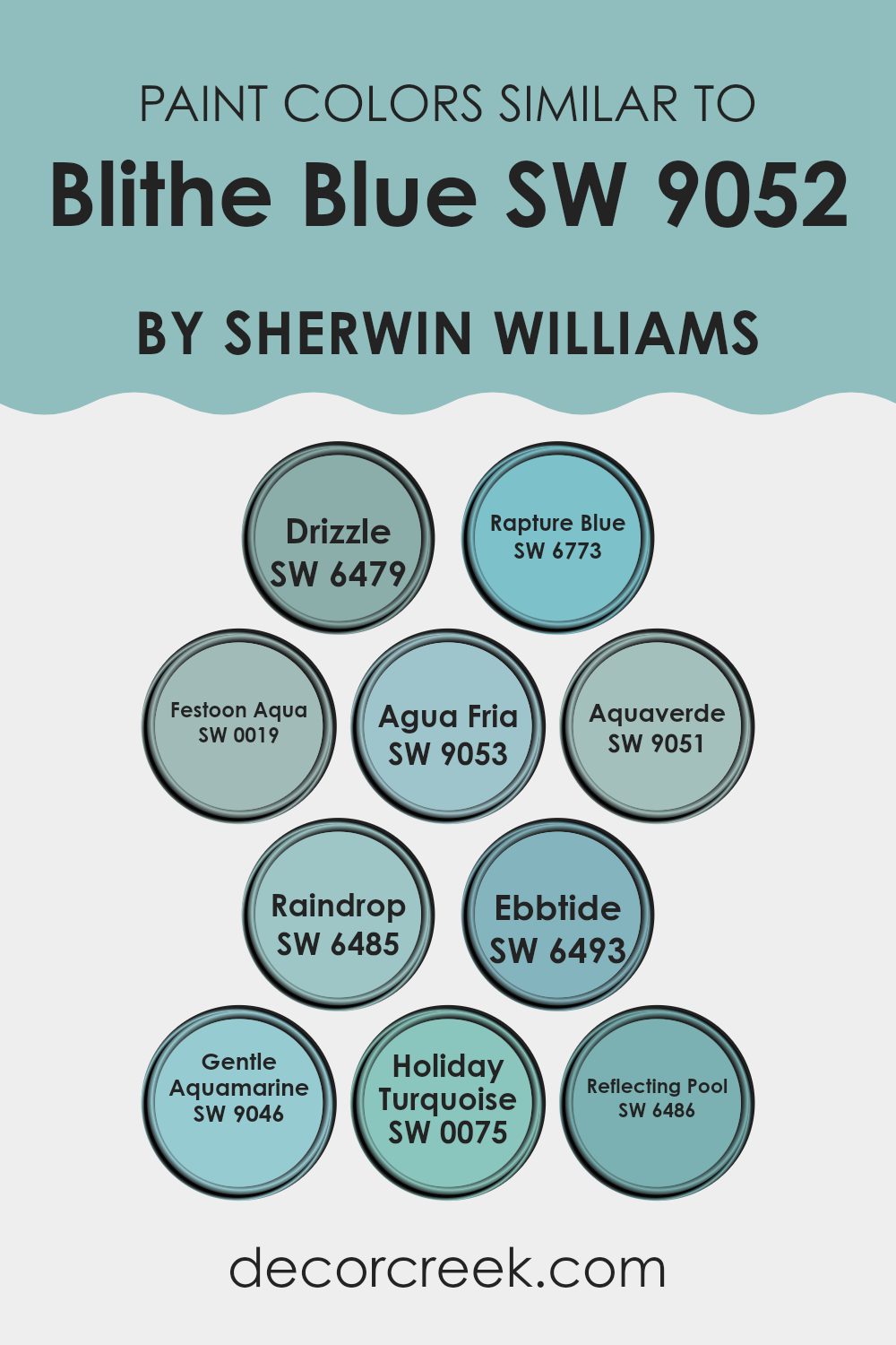
Colors Similar to Blithe Blue SW 9052 by Sherwin Williams
Using similar colors in a design scheme creates a harmonious and balanced visual experience. Similar colors, such as those closely related to Blithe Blue, have the ability to enhance a room subtly without creating a stark contrast. These colors work well together because they share common undertones that provide a smooth transition from one hue to another, making them ideal for creating a cohesive look throughout a room.
For instance, Drizzle is a muted gray-blue that offers a gentle, soothing presence, much like a light rain. Rapture Blue has a lively, vibrant touch, bringing a more pronounced blue hue that is still soft on the eyes. Festoon Aqua introduces a slightly more aqua tone, providing a refreshing splash of color that is both uplifting and light.
Agua Fria and Aquaverde lean more towards green, lending a cool, refreshing feel that is reminiscent of water and nature. Raindrop captures the essence of a peaceful sky after a storm, with a touch of blue and a hint of gray. Ebbtide is a deeper blue that hints at the depths of the ocean, yet it remains gentle and inviting.
Gentle Aquamarine lives up to its name by offering a soft, gentle blue with a hint of green, ideal for rooms aiming for a calm atmosphere. Holiday Turquoise is bolder, evoking thoughts of festive, tropical waters, yet it keeps the soothing properties of its lighter companions.
Lastly, Reflecting Pool has a deeper resonance, ideal for adding a bit more intensity while still adhering to the calming nature of its color family. Each of these colors supports and complements the others, creating a palette that is easy on the eyes and perfect for bringing a natural, airy feel to any interior.
You can see recommended paint colors below:
- SW 6479 Drizzle
- SW 6773 Rapture Blue
- SW 0019 Festoon Aqua
- SW 9053 Agua Fria
- SW 9051 Aquaverde
- SW 6485 Raindrop
- SW 6493 Ebbtide
- SW 9046 Gentle Aquamarine
- SW 0075 Holiday Turquoise
- SW 6486 Reflecting Pool
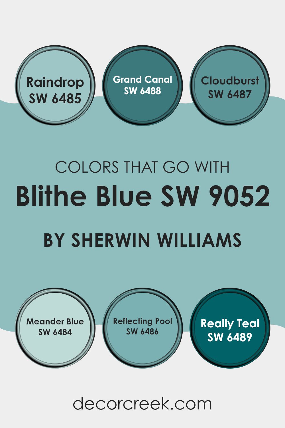
Colors that Go With Blithe Blue SW 9052 by Sherwin Williams
Understanding the colors that can beautifully complement Blithe Blue SW 9052 by Sherwin Williams is essential in creating balanced and visually attractive rooms. When choosing coordinating shades, like Raindrop or Grand Canal, the goal is to achieve harmony and enhance the aesthetic appeal of the room.
Raindrop SW 6485 provides a soothing light blue that mimics the softness of a gentle drizzle, adding a fresh feel when paired with Blithe Blue. On the other hand, Grand Canal SW 6488 offers a deeper teal-like tone, bringing a lively burst of color that contrasts nicely without overpowering.
Additional hues such as Cloudburst, Meander Blue, Reflecting Pool, and Really Teal also offer unique ways to complement Blithe Blue. Cloudburst SW 6487 is a more intense, stormy gray-blue hue that adds drama and depth, making it perfect for accent walls or furniture.
Meander Blue SW 6484 has a muted, dusty quality, ideal for creating a soft, cozy vibe in a room. Reflecting Pool SW 6486 reveals a clear, refreshing aqua that brings brightness and light, while Really Teal SW 6489 stands out with its rich, deep color, injecting energy and vibrancy into the environment.
Each color provides its own distinctive touch, allowing for flexible design choices that meet diverse decorative needs.
You can see recommended paint colors below:
- SW 6485 Raindrop
- SW 6488 Grand Canal
- SW 6487 Cloudburst
- SW 6484 Meander Blue
- SW 6486 Reflecting Pool
- SW 6489 Really Teal
How to Use Blithe Blue SW 9052 by Sherwin Williams In Your Home?
Blithe Blue by Sherwin Williams is a gentle and soothing shade of blue that can add a refreshing touch to any home. This color is flexible, making it perfect for a variety of rooms. In the living room, Blithe Blue can create a calm and welcoming atmosphere, ideal for relaxing or entertaining guests. When painted in the bedroom, it helps set a peaceful tone, promoting restful sleep.
This shade also works well in bathrooms, where it can pair nicely with white tiles or fixtures to give a clean and airy feel. For those who like a bit of creativity, using Blithe Blue on kitchen cabinets combined with neutral walls can brighten the room beautifully.
Additionally, it’s easy to match with different decor styles, from modern to traditional. Whether you’re looking to repaint a single room or refreshing your whole house, Blithe Blue is a lovely choice that brings a light and fresh vibe into your home.
Blithe Blue SW 9052 by Sherwin Williams vs Ebbtide SW 6493 by Sherwin Williams
Blithe Blue is a gentle, soft blue that gives off a calm and quiet vibe, similar to a clear sky on a sunny day. In contrast, Ebbtide is a sharper, more vibrant blue with a hint of teal, reminiscent of the ocean depths.
While Blithe Blue is lighter and more subdued, making it ideal for creating a relaxed and airy atmosphere, Ebbtide stands out more and can bring a lively burst of color to a room. Blithe Blue works well in environments where you want a peaceful and simple look, such as bedrooms or bathrooms.
Ebbtide, on the other hand, might be better suited for areas where a more dynamic and cheerful effect is desired, like in a kitchen or a playroom. Each color has its unique appeal and can be chosen based on the mood you’re aiming to achieve in your home.
You can see recommended paint color below:
Blithe Blue SW 9052 by Sherwin Williams vs Drizzle SW 6479 by Sherwin Williams
Blithe Blue and Drizzle, both from Sherwin Williams, offer distinct shades for different decorating styles. Blithe Blue is a light, airy shade that brings a fresh and clean feel to any room. It’s perfect for creating a bright and inviting atmosphere, particularly good in small rooms or areas with less natural light.
In contrast, Drizzle is a deeper, grey-toned blue that gives a more grounded, calm feeling. Drizzle works well in larger rooms or areas where you want to make a statement with a more impactful color. While Blithe Blue reflects more light, making rooms appear larger, Drizzle can add depth and interest, enhancing cozy vibes.
In terms of usage, Blithe Blue is great for bedrooms and bathrooms, while Drizzle could be an excellent choice for living rooms or accent walls. Both colors are flexible and can be paired with various decor styles, from modern to traditional.
You can see recommended paint color below:
- SW 6479 Drizzle
Blithe Blue SW 9052 by Sherwin Williams vs Agua Fria SW 9053 by Sherwin Williams
Blithe Blue and Agua Fria are two beautiful colors by Sherwin Williams, each carrying its unique vibe. Blithe Blue gives off a fresh, airy feel, like a bright, clear sky on a sunny day. It’s light and can really open up a room, making it feel more spacious, clean, and welcoming.
On the other hand, Agua Fria is slightly deeper and tends to bring a cool, calming effect to rooms. It resembles the color of shallow seawater and is perfect for creating a relaxed atmosphere in any room. While Blithe Blue is more about brightness and airiness, Agua Fria leans towards providing a soothing and composed look.
Both colors work well in various settings but serve slightly different moods and themes. Blithe Blue might be better suited for energizing a room, while Agua Fria could be ideal for settling down and enjoying some peace.
You can see recommended paint color below:
- SW 9053 Agua Fria
Blithe Blue SW 9052 by Sherwin Williams vs Holiday Turquoise SW 0075 by Sherwin Williams
Blithe Blue and Holiday Turquoise are two distinct colors by Sherwin Williams that each bring their unique charm. Blithe Blue is a gentle, soft blue with a calming lightness that makes it perfect for creating a peaceful atmosphere in rooms like bedrooms or bathrooms. It has a hint of gray which cools its tone, providing a soothing backdrop, especially in well-lit areas.
On the other hand, Holiday Turquoise is a vibrant and lively color that leans more towards a bright, cheerful aesthetic. It is noticeably bolder than Blithe Blue, embodying a dynamic character that can really make a room pop. Ideal for accent walls or decor elements, Holiday Turquoise draws the eye and injects energy into any area.
Although both colors share a blue base, Blithe Blue is subtler and more reserved, while Holiday Turquoise is outgoing and zestful, making each suitable for different design needs and moods. Whether looking for quiet calmness or energetic vibrancy, these colors offer great choices.
You can see recommended paint color below:
- SW 0075 Holiday Turquoise
Blithe Blue SW 9052 by Sherwin Williams vs Aquaverde SW 9051 by Sherwin Williams
Blithe Blue and Aquaverde by Sherwin Williams are both appealing shades, each bringing its unique charm to the table. Blithe Blue is a calm, soft light blue hue that gives a fresh and airy feel to any room. It is reminiscent of a clear sky on a sunny day, making it perfect for creating a relaxed and inviting atmosphere. It pairs well with light neutrals and can brighten up rooms that need a touch of lightness.
On the other hand, Aquaverde is a more vibrant, teal-inspired color. It leans towards green with a hint of blue, offering a bolder and more energetic vibe compared to Blithe Blue. Aquaverde is great for adding a splash of color and personality to an area, particularly in rooms that seek to invigorate and inspire. Its richer tone contrasts well with both dark and light furnishings, making it flexible for various decor styles.
These two colors can work wonderfully together in a room, with Blithe Blue providing a calm background and Aquaverde adding dynamic accents.
You can see recommended paint color below:
Blithe Blue SW 9052 by Sherwin Williams vs Festoon Aqua SW 0019 by Sherwin Williams
Blithe Blue and Festoon Aqua are both eye-catching colors made by Sherwin Williams, though they offer different vibes. Blithe Blue is a soothing, light blue shade that carries a fresh and airy feel, perfect for creating a calm and inviting atmosphere in rooms like bedrooms or bathrooms. It reflects the sky on a clear, sunny day, bringing a sense of openness and light to any room.
On the other hand, Festoon Aqua is a deeper, more vibrant turquoise that resembles the lively hues of tropical seas. This color has a lively, cheerful quality to it that can brighten up any room. It works well in areas where you want to add a dash of energy or a playful touch, such as kitchens or kids’ rooms.
While both colors can refresh a room’s look, Blithe Blue leans towards a gentler, lighter blue, and Festoon Aqua stands out with its vivid, energizing turquoise tones. Both can be used effectively to create beautiful, lively interiors, depending on the mood you want to set.
You can see recommended paint color below:
- SW 0019 Festoon Aqua
Blithe Blue SW 9052 by Sherwin Williams vs Gentle Aquamarine SW 9046 by Sherwin Williams
Blithe Blue and Gentle Aquamarine, both by Sherwin Williams, have distinct vibes even though they are from the same color family. Blithe Blue is a soft, light blue that has an airy and open feel, making it a great choice for bringing in a sense of freshness into any room. It mimics the clear blue sky on a sunny day, which can help make a small area feel bigger or brighten a room that doesn’t get much natural light.
On the other hand, Gentle Aquamarine is a shade that leans more towards the green side of blue, resembling the shallow, crystal-clear waters of a tropical beach. This color has a mild and soothing effect, creating a more relaxed atmosphere in a room. It’s ideal for areas where you want to feel calm and refreshed, like bathrooms or bedrooms.
Both colors are flexible and can blend easily with different decor styles, but the choice between them depends on the mood you want to set. Blithe Blue offers a crisp and clean look, while Gentle Aquamarine brings a gentle and calming vibe.
You can see recommended paint color below:
- SW 9046 Gentle Aquamarine
Blithe Blue SW 9052 by Sherwin Williams vs Raindrop SW 6485 by Sherwin Williams
Blithe Blue and Raindrop by Sherwin Williams are two distinct colors with unique tones. Blithe Blue is a soft, light blue with a calm and gentle feel. It works well in rooms where a peaceful and airy atmosphere is desired, perhaps in a bedroom or a quiet nook.
In contrast, Raindrop is a livelier shade of blue with a hint of green, resembling the color of a vibrant sea or a clear sky just after a rain shower. This makes it a great choice for rooms that could use a splash of energizing color, like bathrooms or kitchens.
While Blithe Blue is subtle and soothing, Raindrop is more dynamic and cheerful, offering a refreshing vibe to any room. Both colors can refresh an area, but the choice between them depends on the mood you want to set.
You can see recommended paint color below:
Blithe Blue SW 9052 by Sherwin Williams vs Reflecting Pool SW 6486 by Sherwin Williams
Blithe Blue and Reflecting Pool, both by Sherwin Williams, are distinct shades of blue with unique vibes. Blithe Blue is a soft, airy blue that brings a light and fresh feel to any room, making it feel more open and calming. It’s a subtle color that works well in bedrooms or living areas where a gentle, soothing atmosphere is desired.
On the other hand, Reflecting Pool is a deeper, more vibrant blue. This color has a more lively and energetic feel, adding a pop of brightness that can make a statement in a room. It’s great for accent walls or bathrooms where you want a little more personality and cheer.
Both colors are blue, but where Blithe Blue offers a whisper of color, Reflecting Pool speaks a bit louder. Depending on the mood you want to create, you could choose the lighter Blithe Blue for a gentle touch, or Reflecting Pool for a bolder, more dynamic impact.
You can see recommended paint color below:
Blithe Blue SW 9052 by Sherwin Williams vs Rapture Blue SW 6773 by Sherwin Williams
Blithe Blue and Rapture Blue, both by Sherwin Williams, are two distinct shades that can set quite different moods in a room. Blithe Blue is subtle and understated. It’s a soft, pale blue that can make small areas appear larger and more open. This color works well in rooms that aim for a calm and gentle vibe, like bedrooms or bathrooms.
On the other hand, Rapture Blue is much more vibrant and bold. It’s a bright, lively blue that stands out and grabs attention. This makes it a great choice for rooms where you want to add a splash of energy or cheerfulness, such as a kids’ room or a creative workspace.
In sum, if you’re going for a mild and quiet feel, Blithe Blue is the way to go. But if you want a room that pops with color and excitement, Rapture Blue might be the better pick. Both colors offer their unique charms depending on how you intend to style a room.
You can see recommended paint color below:
- SW 6773 Rapture Blue
Writing about SW 9052 Blithe Blue by Sherwin Williams has been really fun! This color is like the sky on a clear, sunny morning. It’s soft and calm, and it makes you feel happy and relaxed, just like when you’re lying on the grass looking up at the sky.
Blithe Blue is a great choice if you’re thinking about adding a new color to your room. It’s not too bright and not too dark, so it fits well in most places like bedrooms or living rooms. This color has a gentle vibe, which means it’s perfect for places where you want to unwind and feel at ease.
I found out that this color also works well with many other colors. Whether you pair it with whites for a clean look, grays for a modern twist, or even with bold colors for some fun contrasts, it holds up nicely. It can help other colors stand out more and can blend in without getting lost.
Blithe Blue can make a room look fresh and airy, almost like bringing a little bit of the outside sky into your home. If you’re planning to repaint or just looking to freshen up your home, consider SW 9052 Blithe Blue. It’s a lovely choice that can make your home feel a bit more comforting and cheerful.

Ever wished paint sampling was as easy as sticking a sticker? Guess what? Now it is! Discover Samplize's unique Peel & Stick samples.
Get paint samples

