Colors are more than just a visual experience; they have a profound psychological impact on our emotions and moods. They play a significant role in the ambiance and character of our living spaces.
One such compelling color is the SW 6766 Mariner by Sherwin-Williams, a popular choice among homeowners and interior designers. This comprehensive guide to SW 6766 Mariner will help you understand its appeal and how to incorporate it into your spaces effectively.

What Color Is SW 6766 Mariner?
SW 6766 Mariner is a charming mid-tone blue color that strikes a balance between a serene sky and the tranquil sea. It exudes a sense of calm and relaxation, transporting you to a coastal landscape even when you are miles away from the shore.
This color has a wonderful clarity that is uplifting and refreshing. It’s the embodiment of peace, tranquility, and the wide-open expanses of the ocean.
With its clear blue hue, SW 6766 Mariner has an unambiguous connection with nature. This blue communicates reliability, trust, and responsibility. SW Mariner captures the essence of breezy beach days, adding a splash of vacation vibes to your daily life. It is reminiscent of beautiful marine landscapes and summer skies, making it a captivating choice for your home interiors.

Ever wished paint sampling was as easy as sticking a sticker? Guess what? Now it is! Discover Samplize's unique Peel & Stick samples.
Get paint samples

Is It a Warm Or Cool Color?
As a variant of blue, SW 6766 Mariner falls into the cool color category. Cool colors are known for their calming and soothing properties, creating an ambiance of tranquility and relaxation.
Undertones of SW 6766 Mariner
Undertones are subtle colors that emerge from beneath the primary color, influencing how we perceive the overall shade. They can add depth, complexity, and character to a color, and have a significant impact on how a color interacts with other colors and lighting conditions. SW Mariner has the following undertones:
- Light Gray Undertone: A slight hint of light gray gives Mariner a softer, subdued look, adding depth and sophistication to the color.
- Subtle Green Undertone: The green undertone adds a hint of natural freshness, reinforcing the connection with nature and the outdoors.
- Teal Undertone: A faint teal undertone gives Mariner a hint of warmth and prevents the color from looking overly cold or stark.

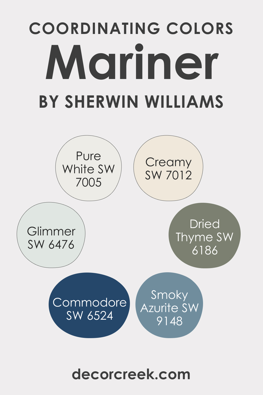
Coordinating Colors of SW 6766 Mariner
Coordinating colors are those that work harmoniously together, creating a visually appealing color scheme. They can enhance the primary color, create contrast, and balance the overall color palette. To coordinate SW Mariner, use the following colors:
- SW 6476 Glimmer : A soothing, soft blue-green shade, Glimmer provides a peaceful contrast to Mariner’s depth, creating a balanced color scheme.
- SW 7012 Creamy : This warm off-white color works beautifully as a neutral companion to Mariner, keeping the ambiance light and airy.
- SW 9148 Smoky Azurite : A darker shade of blue, Smoky Azurite complements Mariner by adding depth and drama to the color palette.
Additional coordinating colors:
- SW 6524 Commodore : A dark, navy-blue hue, Commodore enhances the marine theme and adds a touch of sophistication.
- SW 6186 Dried Thyme : This green shade introduces a hint of earthiness, grounding the color scheme and adding an organic touch.
- SW 7005 Pure White : Pure White provides a crisp and clean contrast, accentuating the beautiful blue of SW Mariner.
How Does Lighting Affect SW 6766 Mariner?
Like all colors, SW 6766 Mariner is subject to variations under different lighting conditions. Natural daylight brings out the pure, vibrant blue of Mariner, making it appear brighter and more vivid. Under artificial light, Mariner may lean towards its subtle undertones, appearing slightly grayer or teal-like, depending on the light’s warmth or coolness. So, when choosing this color, consider the lighting in the room to ensure it fits your desired aesthetic.

LRV of SW 6766 Mariner
The Light Reflectance Value (LRV) of color indicates how much light it reflects. SW 6766 Mariner has an LRV of 46, placing it in the mid-tone range. This means it reflects a moderate amount of light, striking a balance between the brightness of high-LRV colors and the depth of low-LRV ones.
With an LRV of 46, Mariner can make a room feel airy without being overwhelmingly bright. It is versatile enough to be used in various room sizes and light conditions. Moreover, with a mid-range LRV, Mariner provides a refreshing depth that adds character to the space without making it feel small or cramped.

LRV – what does it mean? Read This Before Finding Your Perfect Paint Color
Trim Colors of SW 6766 Mariner
Trim colors are used on baseboards, window frames, door frames, and other architectural details. They can provide contrast, define spaces, and enhance the main wall color. Choosing the right trim color can have a significant impact on the overall look and feel of the room.
White is a traditional trim color that works with most hues due to its versatility, and it will work for SW 6766 Mariner too. Check out what white colors can be used:
- SW 7005 Pure White : Pure White trim gives a crisp, clean edge to Mariner, creating a classic nautical feel.
- SW 7008 Alabaster : A subtle, creamy white, Alabaster offers a warmer contrast to Mariner, softening its cool undertones.
- SW 7551 Greek Villa : This off-white with a hint of beige adds a hint of warmth and pairs well with Mariner’s cooler hues.

Colors Similar to SW 6766 Mariner
Recognizing similar colors to SW 6766 Mariner can help you refine your color selection process. If SW Mariner doesn’t perfectly meet your needs, you may find an alternative color that offers a slightly different hue, undertone, or saturation level that is more to your liking. For example, you might want to consider the following colors:
- Behr Turquoise Blue
- BM Burbank Blue
- PPG Tropical Splash
- Valspar Aqua Ocean

Colors That Go With SW 6766 Mariner
Each of these colors harmonizes well with Mariner, creating different moods and effects. It’s essential to use colors that look good together in the same room to create a harmonious and cohesive atmosphere.
A well-coordinated color scheme can enhance the overall aesthetic and contribute to a pleasing visual experience.
- SW 6217 Topsail
- SW 9178 Inky Blue
- SW 6250 Granite Peak
- SW 7012 Creamy
- SW 7005 Pure White
- SW 7008 Alabaster

How to Use SW 6766 Mariner In Your Home?
SW 6766 Mariner is a versatile color that can be used in various rooms and interior design styles. Its soothing blue hue is ideal for creating a relaxing and peaceful atmosphere in bedrooms and bathrooms. At the same time, its vibrant energy can add a lively touch to living rooms, kitchens, and exteriors.
Regarding interior design styles, Mariner fits perfectly with coastal, modern, and traditional styles. Its nature-inspired hue works well with the earthy and natural elements of rustic and farmhouse styles, and its clean and bright quality complements minimalist and contemporary interiors.
Mariner SW 6766 In the Bedroom
A bedroom with SW 6766 Mariner can become your very own peaceful oasis. The blue hue brings serenity and calm, perfect for promoting restful sleep. It works particularly well in a coastal-themed bedroom, evoking images of deep seas. You can pair it with crisp whites for a classic look or add pops of coral or yellow for a lively contrast.
To add depth to your bedroom, you could also opt to paint just one wall with Mariner, creating a stunning feature wall. For a more contemporary feel, mix Mariner with metallic accents and minimalist furniture. The contrast between the cool blue and the warm metallic tones creates a balanced, harmonious space.

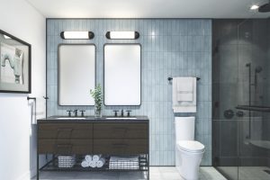
Mariner SW 6766 In the Bathroom
In the bathroom, SW 6766 Mariner can create a spa-like ambiance. The cool blue hue pairs well with white fixtures and natural stone or tile. The color encourages relaxation and tranquility, turning your bathroom into a private retreat.
If you’re striving for a nautical theme in your bathroom, Mariner is a great base color. Pair it with white and navy accents, rope accessories, and marine-themed decor. However, if a modern style is more to your taste, SW Mariner will work perfectly with chrome fixtures, clear glass, and a minimalist aesthetic.

Mariner SW 6766 In the Living Room
In the living room, Mariner can offer a unique and refreshing change from the usual neutrals. The color infuses a sense of peace and calmness, making the living room a perfect place to relax and unwind. Coupling this color with lighter shades of blue, grey, or white for your furniture and accessories can create a well-balanced space.
Mariner also suits a bold, contemporary living room. Pair it with bright contrasting colors like orange or yellow for a vibrant, energizing space. You can also introduce patterned rugs and curtains with a touch of Mariner to create a cohesive look.

Mariner SW 6766 For the Exterior
SW 6766 Mariner can be an excellent choice for the exterior of your home, especially if you’re aiming for a coastal or cottage-style appearance. The deep blue echoes the sea, offering a refreshing and inviting look. Combine it with white trims and natural wood accents to complete the seaside aesthetic.
For a more traditional look, use Mariner as an accent color. For instance, paint the front door or shutters with Mariner and keep the rest of the exterior in neutral tones. This will create a stylish contrast and make your home stand out.

Mariner SW 6766 In the Kitchen
In the kitchen, SW 6766 Mariner can help create a soothing and harmonious atmosphere. You could paint all the walls or use it on a feature wall. Coupled with white countertops and stainless-steel appliances, Mariner brings a nautical feel to the space, creating a light and airy kitchen.
If you prefer a more modern kitchen, Mariner pairs well with dark countertops and sleek appliances. Add some open shelving with white or light wood dishes to contrast the blue and maintain a balanced, stylish look.

Mariner SW 6766 For the Kitchen Cabinets
Using Mariner on your kitchen cabinets can add a pop of color to an otherwise neutral kitchen. This is especially effective with an open-plan kitchen, as the color will draw the eye and act as a focal point. Pair the blue cabinets with brass or gold hardware for a chic, contemporary look.
If your style is more traditional, Mariner cabinets can still fit perfectly. Pair them with a white or light grey marble countertop and white subway tiles for the backsplash. The end result will be a classic, timeless kitchen with a distinctive touch.

Comparing SW 6766 Mariner With Other Colors
Color comparison is a crucial step in the design process, particularly in interior design, for various reasons. When you choose a color palette for a room or a whole home, it’s important that the colors work together harmoniously. Comparing colors allows you to see how they interact and ensure that they create the mood and visual effect you’re aiming for.
Also, colors can influence the mood and atmosphere of a room. Comparing colors allows you to curate the mood you want to evoke carefully. Finally, comparing colors allows you to select the ones that best match your personal taste and lifestyle. Below, we compare SW MAriner with several other colors to see how the uniqueness of this blue hue.
SW 6766 Mariner vs. SW 7006 Extra White
SW Extra White is a pure, clean shade of white that is often used to create a crisp, bright feel in a room. When compared to Mariner, the starkness of Extra White creates a vivid contrast, making Mariner’s depth and richness stand out even more. If used together, these two shades can create a classic nautical theme or a striking contemporary design, depending on the other elements in the room.

SW 6766 Mariner vs. SW 7036 Accessible Beige
SW Accessible Beige is a warm, neutral beige that brings a soft, inviting feel to any space. Compared to Mariner, Accessible Beige is a more subdued and versatile shade that can seamlessly blend with various other colors. When used together, Mariner can act as a vibrant accent color against the muted backdrop of Accessible Beige, adding a splash of cool contrast to the warm undertones of the beige.

SW 6766 Mariner vs. SW 6258 Tricorn Black
SW Tricorn Black is a deep, saturated black that is often used for dramatic effect or to create high contrast in a room. When compared to Mariner, Tricorn Black is bolder and more dramatic, but the two colors can work well together. The combination of Mariner and Tricorn Black can create a sophisticated and modern look with a touch of boldness and drama.

SW 6766 Mariner vs. SW 6204 Sea Salt
SW Sea Salt is a light, soft green with subtle grey undertones, often used to create a serene, spa-like atmosphere. When compared to Mariner, Sea Salt is much lighter and has a soothing quality. Using these two colors together can create a balanced look, with Mariner providing depth and Sea Salt offering a calming, light counterpoint.

SW 6766 Mariner vs. SW 7008 Alabaster
SW Alabaster is a warm, creamy white that’s often used to create a cozy, inviting space. When compared to Mariner, Alabaster’s warm undertones contrast with Mariner’s cool, calming vibe. If used together, Alabaster can soften the boldness of Mariner, creating a balanced, harmonious space.

SW 6766 Mariner vs. SW 6049 Gorgeous White
SW Gorgeous White is a light neutral with a hint of green undertone, creating a fresh and airy feel. When compared to Mariner, Gorgeous White is significantly lighter and less saturated, but the two can complement each other well. Mariner can bring depth and interest to a room painted in Gorgeous White, while the lightness of Gorgeous White can make a room with Mariner accents feel open and bright.

Conclusion
SW 6766 Mariner is a versatile and sophisticated hue that can bring depth, tranquility, and richness to any space. Whether used as a primary color or as an accent, its cool blue tone can evoke feelings of peace and calm, making it a wonderful choice for bedrooms, bathrooms, and living spaces.
Its versatility extends to various design styles, from coastal and traditional to contemporary. Paired with the right colors, Mariner can create a striking contrast, a harmonious blend, or a soothing monochromatic scheme, depending on the desired effect.
Furthermore, its suitability for exterior use, kitchens, and even kitchen cabinetry, reinforces its adaptability and wide-ranging appeal. Whether you’re looking for a bold statement or a subtle touch, SW 6766 Mariner can help you create a space that’s both beautiful and uniquely yours.

Ever wished paint sampling was as easy as sticking a sticker? Guess what? Now it is! Discover Samplize's unique Peel & Stick samples.
Get paint samples
Frequently Asked Questions
⭐What styles of decor does SW 6766 Mariner best suit?
Mariner is a versatile color that can complement a variety of decor styles. It's particularly suited to coastal, traditional, and contemporary styles, but its soothing blue tone can work well in many settings.
⭐What colors pair well with SW 6766 Mariner?
Mariner pairs beautifully with a range of colors. For a classic look, consider pairing it with crisp whites or neutrals. For a vibrant contrast, consider pairing it with bright colors such as coral or yellow. Dark colors, such as black or navy, can also create a sophisticated contrast.
⭐Is SW 6766 Mariner suitable for exteriors?
Yes, Mariner is a great choice for exterior use. Its deep blue tone can bring a fresh and inviting look to your home's exterior, particularly when paired with white trims or natural wood accents.
⭐Can SW 6766 Mariner be used in a kitchen?
Absolutely, Mariner can be an excellent choice for a kitchen. Whether applied to walls or cabinets, its rich blue hue can add depth and interest to your kitchen, especially when complemented with light countertops and stainless-steel appliances.
⭐ Is SW 6766 Mariner a good choice for a bedroom?
Yes, Mariner is an ideal choice for a bedroom. Its calming and tranquil tone promotes restful sleep and relaxation, making it perfect for creating a peaceful bedroom oasis.