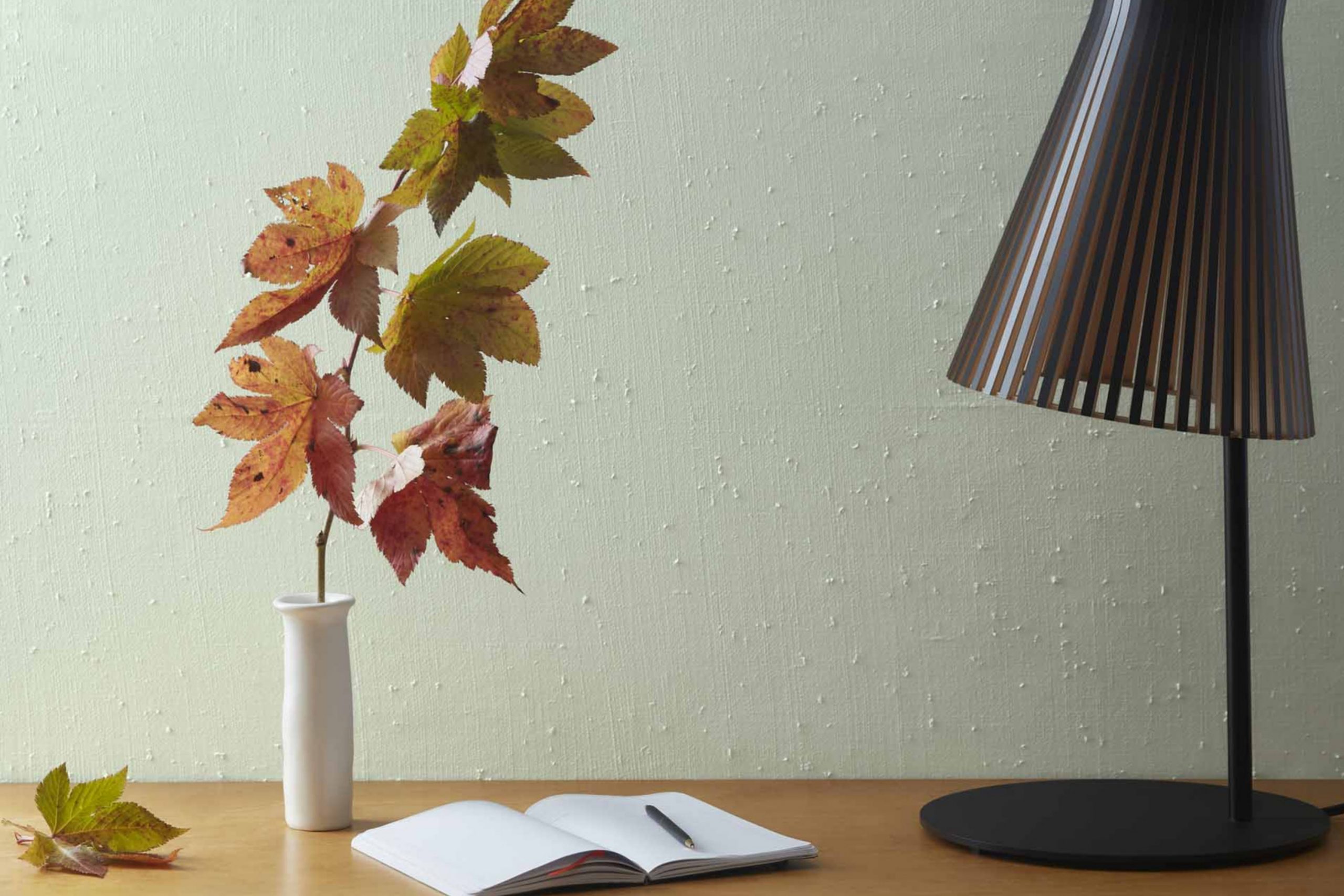
If you’re considering giving your area a fresh coat of paint, you might find yourself drawn to AF-485 Crystalline by Benjamin Moore. This particular shade can refresh any room with its calming presence. As you look more closely at AF-485 Crystalline, you’ll notice it has a unique vibrancy that brings airy backgrounds to life, perfect for a peaceful living area or to brighten a dim hallway.
The adaptability of this color extends beyond just wall paint. It’s also ideal for adding subtle accents to trim or furniture, lending a cohesive look throughout your home without making your existing decor too strong.
Whether you’re repainting a bedroom to create a peaceful retreat or updating your kitchen, AF-485 Crystalline offers a balance of warmth and lightness that adjusts beautifully to different lighting conditions, ensuring your room always looks its best.
Choosing the right paint color can be a simple way to update your home, and AF-485 Crystalline could be the fresh start your area needs.
What Color Is Crystalline AF-485 by Benjamin Moore?
Crystalline AF-485 by Benjamin Moore is a refreshing pale green with a subtle hint of blue, evoking the clarity and crispness of sea glass. This light and airy color is adaptable, providing a soothing backdrop that complements a wide range of interior styles and design tastes.
The gentle hue works exceptionally well in casual coastal interiors, where it mirrors the natural colors of the seaside. It’s also a fantastic choice for Scandinavian decor, enhancing the style’s clean lines and preference for light colors that create an open, airy feeling in any area.
When it comes to pairing materials and textures, Crystalline complements natural wood tones brilliantly, from light beech to rich walnut, bringing out the warmth in the wood. Linen and cotton fabrics in white or neutral tones also go well with this color, reflecting light and adding to the breezy feel of a room. For a bit of contrast, incorporate elements of matte black or deep navy, which can act as grounding elements against the lightness of Crystalline.
This color also works beautifully in areas that use a lot of glass and metal for a clean, modern vibe. Chrome fixtures, glass tables, and metallic frames enhance the crisp, fresh quality of this shade without making it too strong. Using Crystalline in your home can help create a bright, refreshing environment that feels both comfortable and stylish.
Is Crystalline AF-485 by Benjamin Moore Warm or Cool color?
Crystalline AF-485 by Benjamin Moore is a refreshing green paint color that can brighten up any home. With its hint of softness, this shade is particularly good at creating a cozy atmosphere while still keeping the area feeling open and airy.
The color is adaptable enough to be used in various rooms, whether you want to add a touch of nature to your living room or make your bathroom feel fresh and clean. Being a light color, Crystalline helps to make small areas appear larger and more inviting.
It pairs well with both light and dark furniture, making it easy to incorporate into existing decor. Homeowners often choose this color for bedrooms as well, due to its ability to add a gentle, soothing touch to the sleeping area. Overall, this green hue from Benjamin Moore is excellent for anyone looking to refresh their home with a natural and lively vibe.
Undertones of Crystalline AF-485 by Benjamin Moore
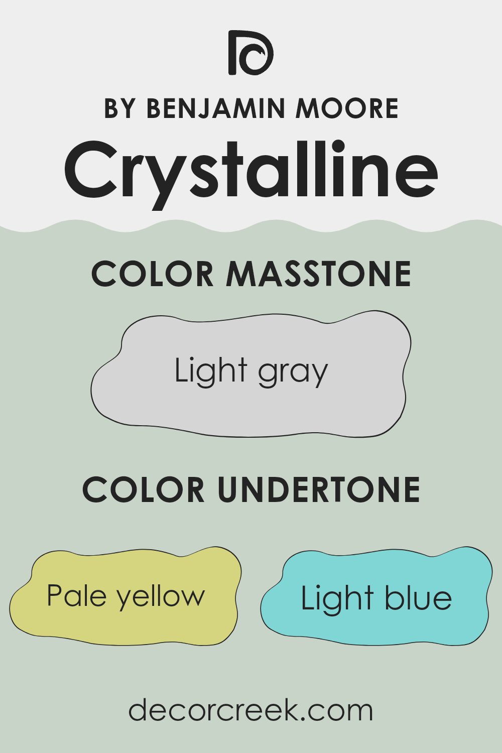
The color Crystalline AF-485, by Benjamin Moore, is complex due to its variety of undertones. Undertones are subtle colors that lie beneath the surface of the main color, influencing how it appears in different lighting and settings. This specific color includes undertones of pale yellow, light blue, light purple, mint, pale pink, lilac, and grey.
Undertones play a significant role in how we perceive color. They can make a color feel warmer or cooler and can significantly affect the mood and style of a room. For example, a color with a grey undertone might look more muted and calm, while a pale yellow undertone could give a sense of lightness and airiness.
When used on interior walls, the undertones of Crystalline AF-485 add depth and interest, making it an adaptable choice for various rooms. Depending on the lighting, the walls might lean more towards a cool or warm hue, allowing the color to interact dynamically with different furnishings and decor.
For instance, in a room with ample natural light, the pale yellow and light blue undertones might become more pronounced, creating a fresh and inviting atmosphere. In contrast, in a room with less natural light, the grey and lilac undertones might dominate, giving the area a cozy feel.
Using a color like this can subtly influence the ambiance of a room, making it flexible enough to adjust to both vibrant and subdued decorating styles, directly affecting the overall look and atmosphere of any area.
What is the Masstone of the Crystalline AF-485 by Benjamin Moore?
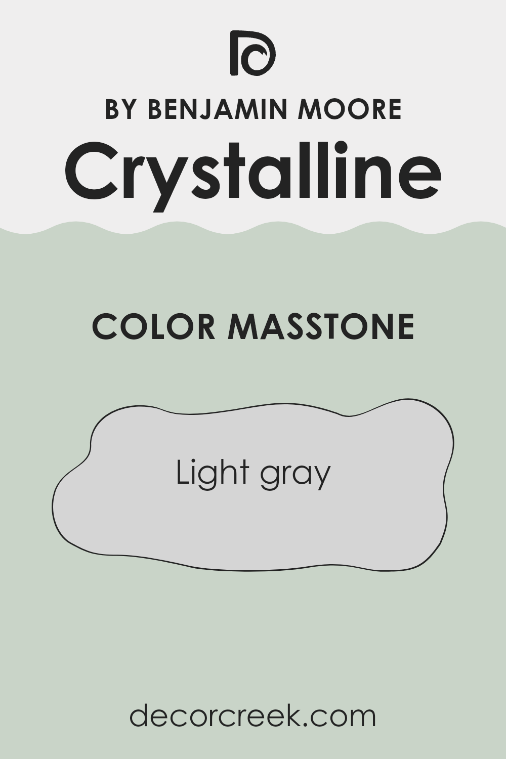
Crystalline AF-485 by Benjamin Moore is a light gray shade that offers a fresh and clean look to any room in your home. When used on walls, this color brings a bright and airy feel to areas, making them appear more open and spacious.
Its light gray tone is subtle, which means it easily pairs with a wide range of other colors and decor styles. Whether your home has a modern flair or a rustic charm, this shade can seamlessly integrate into the environment. Because of its neutral nature, Crystalline AF-485 is also very adaptable.
It works well in rooms that get a lot of sunlight as well as in darker areas, where it can help reflect whatever light is available, making the room feel larger. Furthermore, its simplicity allows you to add bold furniture pieces or colorful artwork without worrying about clashing styles, giving you the freedom to personalize your home. Overall, it’s a practical and stylish choice for anyone looking to refresh their interior.
How Does Lighting Affect Crystalline AF-485 by Benjamin Moore?
Lighting plays a crucial role in how we perceive colors in our environment. The same paint color can appear differently based on the light it’s exposed to. Crystalline AF-485 by Benjamin Moore is one such color that can vary significantly under different lighting conditions.
In natural light, Crystalline AF-485 has a vibrant quality. It tends to reflect light, making the room feel brighter and more open. However, the specific characteristics of natural light can alter its appearance throughout the day.
In rooms facing south, where sunlight is abundant for most of the day, this color appears lighter and can have a lively, cheerful quality. It captures the full spectrum of daylight, enhancing the room’s overall warmth.
In contrast, north-facing rooms receive less direct sunlight, causing Crystalline AF-485 to look slightly more subdued and cooler. This cooler light can make the color appear a bit more muted, giving the area a calm and steady feel.
Rooms that face east or west present a unique interaction with this color, due to the changing quality of light throughout the day. East-facing rooms highlight Crystalline AF-485 beautifully in the morning light, making the color look soft and fresh.
As the sun moves, the intensity of the color fades, maintaining a gentle appearance. Conversely, in west-facing rooms, the color stays relatively neutral during the morning and becomes dynamically brighter in the late afternoon and evening as it catches the warm sunset hues.
Artificial lighting brings another dimension to Crystalline AF-485. Under warm artificial light, such as from incandescent bulbs, the color can appear more intimate and cozier. On the other hand, cooler artificial lights, like LED or fluorescent bulbs, make it look more crisp and vivid.
Understanding how Crystalline AF-485 interacts with light helps in deciding where to use this color effectively to achieve the desired ambiance in an area. Whether using it in a living room, bedroom, or kitchen, considering the lighting and the room’s orientation can help in maximizing the beauty of this adaptable shade.
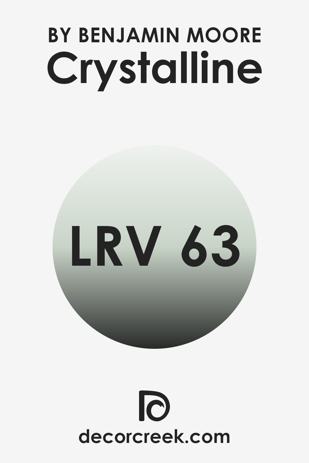
What is the LRV of Crystalline AF-485 by Benjamin Moore?
Light Reflectance Value (LRV) measures the percentage of light a paint color reflects compared to how much it absorbs. This value is used to help determine how light or dark a color will appear when painted on a wall. A higher LRV means the color reflects more light, making it appear brighter and making the room feel more open and airy.
Conversely, a lower LRV indicates the color absorbs more light, creating a denser and cozier atmosphere in an area. With an LRV of 62.81, Crystalline AF-485 by Benjamin Moore is on the lighter side, reflecting a good amount of light back into the room. This light reflection can make small areas appear larger and can brighten rooms that do not receive a lot of natural sunlight.
The color will have a lively presence, illuminating walls while retaining enough saturation to add character to an area without making it too bright. This LRV range is adaptable for various lighting conditions, maintaining its integrity both in well-lit rooms and in areas with less natural light.
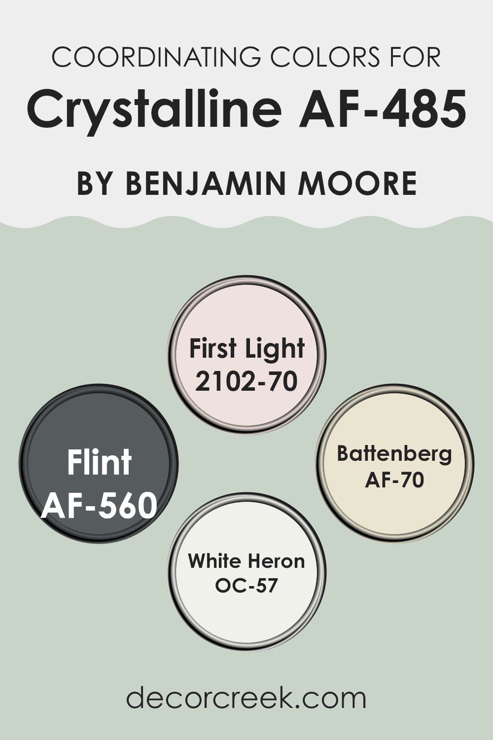
Coordinating Colors of Crystalline AF-485 by Benjamin Moore
Coordinating colors create a harmonious and pleasing palette that works well together to enhance the overall aesthetic of an area. Benjamin Moore’s Crystalline AF-485 can be beautifully complemented by a set of coordinating colors that vary in shades and intensities but together create a cohesive look. These coordinating colors are chosen to balance visual appeal, ensuring that each shade supports and enhances the others without taking too much attention.
The color First Light 2102-70 offers a gentle blush pink that provides a soft, almost airy feel to the surroundings, making it ideal for adding a touch of gentle warmth. Then there is Flint AF-560, a deep, robust gray that grounds the scheme and adds a solid, enduring character to any room.
Battenberg AF-70, with its creamy lightness, acts almost like a neutral, offering a clean backdrop that allows other colors to stand out softly. Lastly, White Heron OC-57 is a crisp, clean white that brings sharpness and clarity, setting off the other colors for a fresh and polished finish. Together, these shades complement Crystalline AF-485 beautifully, each contributing to an atmosphere that is inviting and unified.
You can see recommended paint colors below:
- 2102-70 First Light
- AF-560 Flint
- AF-70 Battenberg
- OC-57 White Heron
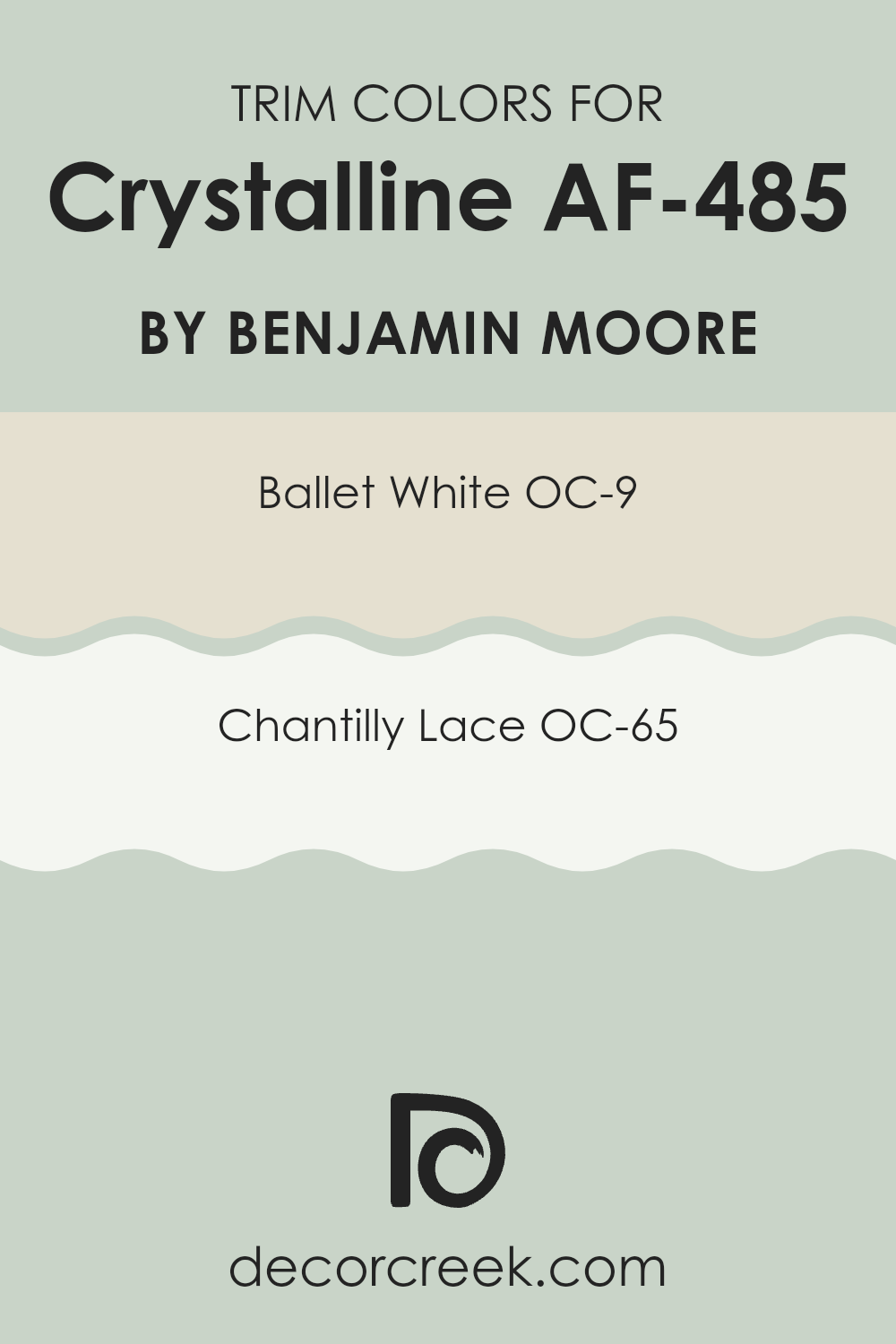
What are the Trim colors of Crystalline AF-485 by Benjamin Moore?
Trim colors, such as OC-9 Ballet White and OC-65 Chantilly Lace by Benjamin Moore, play a crucial role in interior design by providing a visual frame that enhances the overall appearance of the walls. Specifically, when paired with a color like Crystalline AF-485, trim colors help define the edges of a room, highlight architectural details, and create a clean, finished look.
Choosing the right trim color can also help in making the main wall color stand out, adding depth and contrast to the area. Ballet White OC-9 is a subtle and warm white that offers a soft backdrop, ideal for creating a gentle contrast with richer hues like Crystalline AF-485.
This color is adaptable, giving a calm and cohesive look to any area. Chantilly Lace OC-65, on the other hand, is a pure and bright white that provides a sharper contrast, making it perfect for more striking delineations. This crisp white works beautifully to make features stand out and adds a fresh clarity to the room, enhancing the brightness and visual appeal.
You can see recommended paint colors below:
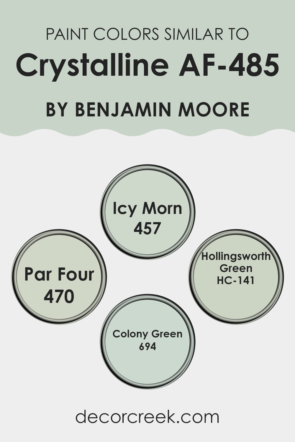
Colors Similar to Crystalline AF-485 by Benjamin Moore
Choosing similar colors can effectively enhance the overall aesthetics of an area, making it feel harmonious and well-planned. Colors akin to AF-485 Crystalline by Benjamin Moore, such as 457 Icy Morn, 470 Par Four, HC-141 Hollingsworth Green, and 694 Colony Green, work seamlessly together because they share common undertones that provide a subtle yet impactful consistency throughout a room.
These colors complement each other without making the area feel too strong, allowing for a gentle transition from one hue to another that is pleasing to the eye. For instance, 457 Icy Morn brings a light, frosty blue that adds a fresh, airy feel to the atmosphere, making it an excellent choice for creating a calm and inviting environment.
Then there is 470 Par Four, a soft gray-green that echoes the hues of nature, perfect for rooms where you want a touch of natural elements without going too bold. HC-141 Hollingsworth Green offers a more classic vibe with its deeper, richer green tone, ideal for accentuating areas that need a bit more depth. Lastly, 694 Colony Green is a muted, earthy green with lasting appeal, great for lending a subtle elegance to any decor. By integrating these shades, one can achieve a cohesive look that enhances the aesthetics without the need for sharp contrasts.
You can see recommended paint colors below:
- 457 Icy Morn
- 470 Par Four
- HC-141 Hollingsworth Green
- 694 Colony Green
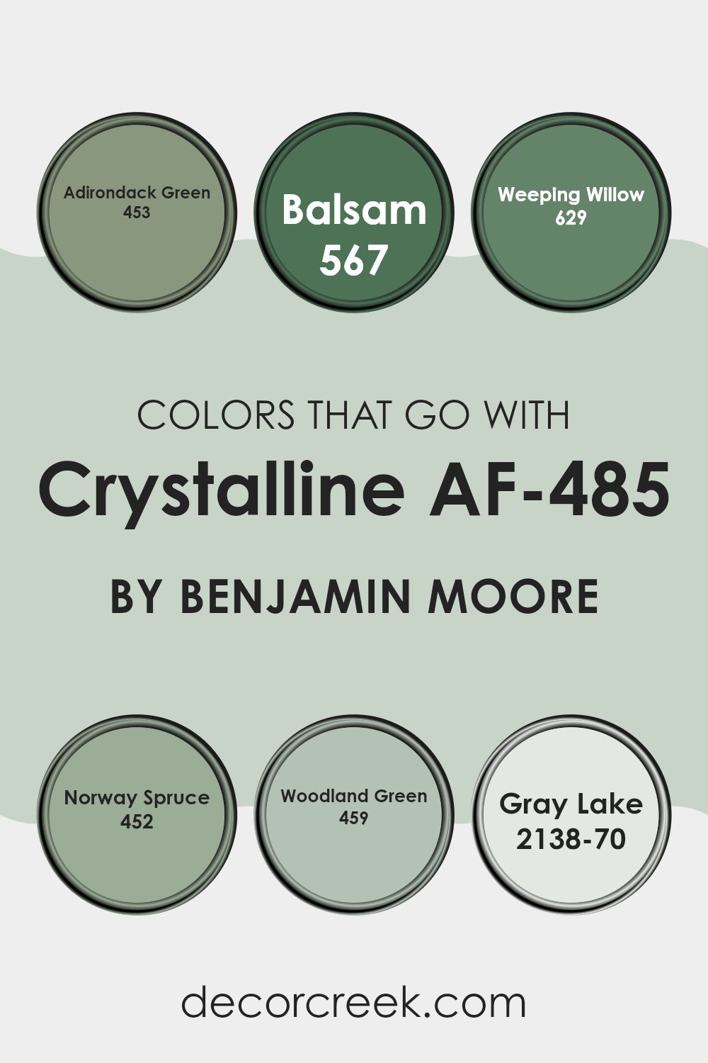
Colors that Go With Crystalline AF-485 by Benjamin Moore
Selecting colors that complement Crystalline AF-485 by Benjamin Moore is crucial because it helps create a cohesive look and feel in your home. Colors like 453 – Adirondack Green, 567 – Balsam, 629 – Weeping Willow, 452 – Norway Spruce, 459 – Woodland Green, and 2138-70 – Gray Lake work harmoniously with Crystalline AF-485 to enhance its beauty and adaptability in various areas.
This approach allows you to create environments that are both visually appealing and comfortably aligned with your design goals. These complementary colors offer flexibility in design schema, from creating contrasts that stand out to forming gentle transitions that are pleasing to the eye.
Adirondack Green is a deep, lush green that resembles the dense foliage of mountainous landscapes, providing a grounding, earthy base that pairs well with the lighter tones of Crystalline AF-485. Balsam has a touch of freshness, reminiscent of new sprouts in spring, which brightens areas when used alongside the cool tones of Crystalline AF-485.
Weeping Willow is a muted green with a hint of gray, blending naturally with softer decor elements. Norway Spruce, a slightly darker green shade, invokes the feeling of dense, evergreen woods and works great for adding depth. Woodland Green has a vibrant, leafy character that injects life into any room, especially effective in areas needing a touch of nature.
Lastly, Gray Lake is a soft, airy gray that seamlessly matches with virtually any color, serving as a perfect subtle contrast to Crystalline AF-485. By using these colors, you can easily achieve a balanced and harmonious look that feels both fresh and comforting.
You can see recommended paint colors below:
- 453 Adirondack Green
- 567 Balsam
- 629 Weeping Willow
- 452 Norway Spruce
- 459 Woodland Green
- 2138-70 Gray Lake
How to Use Crystalline AF-485 by Benjamin Moore In Your Home?
Crystalline AF-485 by Benjamin Moore is a beautiful and adaptable paint color that can add a fresh look to any home. Its light green hue provides a soft, calming atmosphere that is perfect for creating a relaxing area. You can use it in several ways around your house.
For example, painting your living room walls with Crystalline AF-485 can make the area feel more welcoming and cozy, perfect for gathering with family or relaxing after a long day. It’s also a great choice for bedrooms, where its calming effect can help you unwind and get a good night’s sleep.
Additionally, this color works well in bathrooms, offering a clean and refreshing look. It complements white fixtures and wood accents beautifully, bringing a natural, earthy feel to the room. Overall, Crystalline AF-485 is a great choice if you’re looking to refresh your home with a new paint color that feels both fresh and calming.
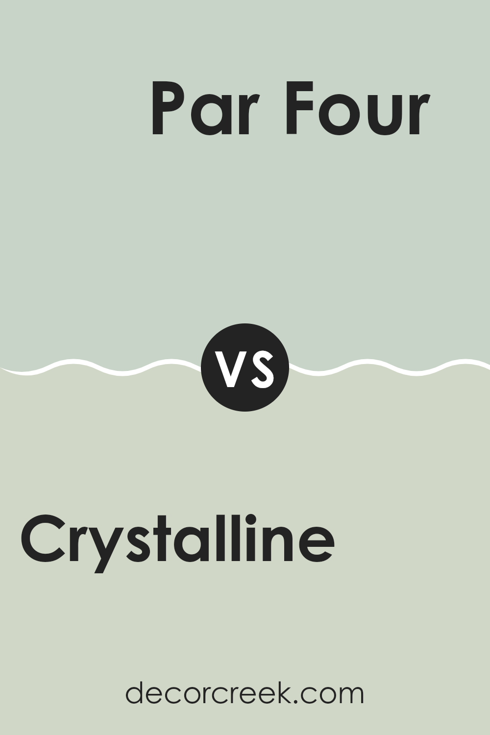
Crystalline AF-485 by Benjamin Moore vs Par Four 470 by Benjamin Moore
Crystalline AF-485 and Par Four 470 by Benjamin Moore are both unique shades, but they create different moods. Crystalline AF-485 is a soft, pale sea green that brings a light and airy feel to a room, making areas seem more open and fresh. This color works well in places where you want a calm, gentle atmosphere like bedrooms or bathrooms.
On the other hand, Par Four 470 is a deeper, richer shade of green with a noticeable influence of blue. This color is more bold and assertive compared to Crystalline AF-485. It suits areas where a touch of depth and richness is needed, like accent walls in living rooms or dining rooms.
Both colors offer a natural feel but in different intensities. Crystalline AF-485 is more subtle, while Par Four 470 stands out more, making it suitable for those who want a stronger visual impact. Depending on the room and the desired effect, each color has its place in home decorating.
You can see recommended paint color below:
- 470 Par Four
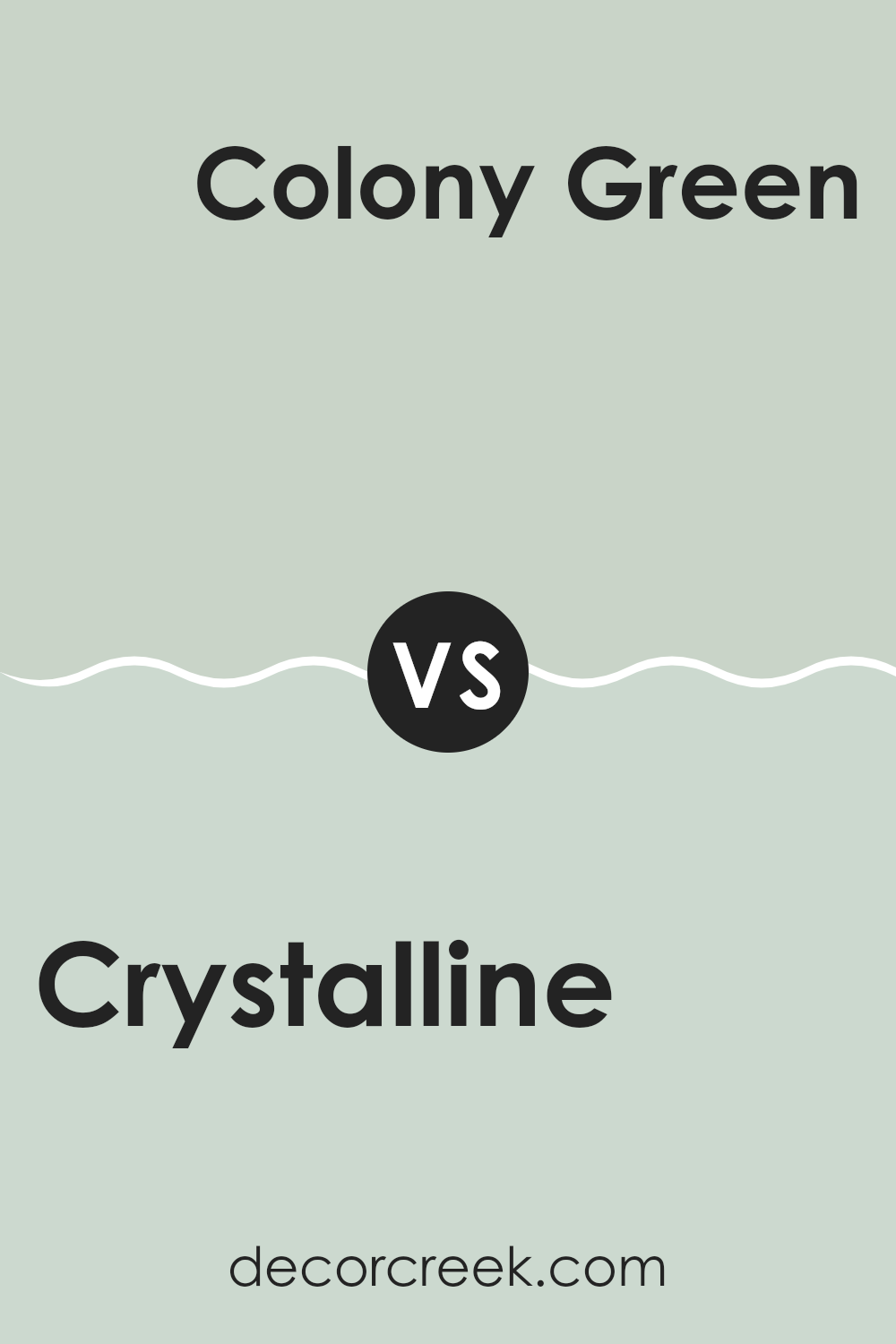
Crystalline AF-485 by Benjamin Moore vs Colony Green 694 by Benjamin Moore
Crystalline AF-485 and Colony Green 694 are both paint colors from Benjamin Moore, but they offer distinct vibes. Crystalline is a soft, soothing blue with a hint of gray. It gives off a calm and gentle feeling, making it great for a peaceful room environment.
On the other hand, Colony Green 694 is a muted green with a bit of depth and warmth. This color feels more grounded and earthy, ideal for areas where you want a natural and cozy atmosphere. When choosing between these two, consider the mood you want to create.
Crystalline is perfect for achieving a light, airy feel, perhaps in a bedroom or bathroom. Meanwhile, Colony Green works well in areas where you want a touch of nature, like a kitchen or living area. Both colors are adaptable, yet each brings its unique flair to interiors.
You can see recommended paint color below:
- 694 Colony Green
Crystalline AF-485 by Benjamin Moore vs Hollingsworth Green HC-141 by Benjamin Moore
Crystalline AF-485 and Hollingsworth Green HC-141 by Benjamin Moore are two distinct shades that can set different moods in an area. Crystalline is a light green with a hint of blue, giving it a refreshing and calm feel. It’s a color that makes a room look airy and open, excellent for living areas or bathrooms where a peaceful vibe is desired.
On the other hand, Hollingsworth Green is a deeper, traditional green that leans more toward a natural forest tone. It offers a grounding and familiar atmosphere, perfect for areas like studies or dining rooms where a touch of formality and comfort is needed.
Both colors reflect light differently. Crystalline tends to brighten an area more, while Hollingsworth Green absorbs light, providing a cozier feeling. Depending on your room’s function and the atmosphere you want to achieve, either color could be a great choice, offering their unique characteristics.
You can see recommended paint color below:
Crystalline AF-485 by Benjamin Moore vs Icy Morn 457 by Benjamin Moore
Crystalline AF-485 and Icy Morn 457 are both colors by Benjamin Moore that offer a refreshing feel, but they have some distinct differences. Crystalline is a soothing pale green shade that has a more noticeable hint of green.
This gives it a natural, lively vibe, well-suited for areas meant to have a fresh and inviting atmosphere, such as kitchens or living rooms. On the other hand, Icy Morn is lighter with a subtle blue undertone, giving it a cooler, almost neutral appearance. This color is excellent for creating a calm and soft backdrop in places like bathrooms or bedrooms.
Both colors are adaptable and can help make a room look light and airy. They work well in areas that get plenty of natural light, enhancing their brightness and subtle color differences. Whether choosing the gentle green of Crystalline or the frosty tint of Icy Morn, each shade can uniquely refresh an area.
You can see recommended paint color below:
After reading about the AF-485 Crystalline paint color by Benjamin Moore, I feel really excited about it! This unique shade of blue-green is like a breath of fresh air in any room. I learned that it doesn’t just make the area look prettier; it also adds a bright and cheerful feel, which is great for any place needing a dash of joy.
The way AF-485 Crystalline matches with different styles and furniture is really nice because it means you can use it in many ways. Whether you want your room to be calm or lively, this color can help you achieve the right look. I think it’s a smart pick for anyone wanting to add a new touch to their home without making everything feel too different.
Finally, I appreciate how Benjamin Moore provides options that are tested to make sure they are safe and lasting, so when you choose a color like AF-485 Crystalline, you know you’re getting good quality. All in all, learning about this paint color makes me eager to see it on walls, giving rooms a fresh face with a joyful vibe.
What a great way to make your home more welcoming!
Ever wished paint sampling was as easy as sticking a sticker? Guess what? Now it is! Discover Samplize's unique Peel & Stick samples.
Get paint samples

