When I decided to refresh my living space, I knew the right color could make all the difference. I wanted something that felt both vibrant and calming, a shade that would energize while also providing a sense of balance. That’s when I found SW 9544 Dashing by Sherwin-Williams. This particular color struck a chord with me immediately. It’s a remarkable blend that manages to capture both boldness and serenity.
As I imagined painting my walls with Dashing, I could almost feel the transformation in the room’s atmosphere. The rich, refined hue seemed perfect for creating a lively yet cozy environment.
It’s the kind of color that grabs your attention without overwhelming the senses, offering just the right amount of character and warmth.
Choosing a color for your home is never easy, but I was drawn to Dashing’s unique ability to infuse energy into a space while maintaining an inviting aura. I realized that a simple change in color could redefine my surroundings, turning them into a more expressive and welcoming place.
The vibrancy and balance offered by SW 9544 Dashing seemed ideal for what I had in mind, transforming my vision of a refreshed home into reality.
What Color Is Dashing SW 9544 by Sherwin Williams?
Dashing by Sherwin Williams is a rich, earthy green that brings a touch of the outdoors inside. It’s like having a hint of nature right on your walls. This color is perfect for those who love a cozy and inviting atmosphere, as it can make spaces feel warm and grounded.
In terms of interior styles, Dashing works particularly well in rustic, farmhouse, or traditional settings where natural elements are a focus. It can also fit nicely into modern spaces when paired correctly.
Pairing this green with the right materials and textures is key to achieving the best look. Natural wood, whether light or dark, complements Dashing beautifully, adding depth and warmth. Mixing in materials like leather and woven baskets can add interesting texture. Soft textiles like linen or cotton in neutral tones can help balance the richness of the green, making the space feel more inviting.
Brass or gold accents can add a touch of elegance without being too overpowering, while matte black fixtures lend a modern touch. Adding plants in the room can also enhance the natural feel. Overall, Dashing is a versatile color that can add a natural, comforting vibe to any home.
Is Dashing SW 9544 by Sherwin Williams Warm or Cool color?
DashingSW 9544 by Sherwin Williams is a vibrant and dynamic color that can add energy and warmth to any space in a home. With its bold and lively tone, this color is perfect for creating an inviting and cheerful atmosphere. It works particularly well in living rooms, dining areas, and kitchens, where people gather and interact. The color’s energetic quality can make these spaces feel more lively and engaging.
When used in smaller spaces, such as bathrooms or study areas, DashingSW 9544 can make the area feel more cozy and welcoming. Pairing it with neutral colors or softer shades can balance its intensity, creating harmony in the room.
Additionally, this color can highlight certain architectural features, drawing attention to them and making them stand out. Its versatility allows it to be used in both modern and traditional settings, giving homeowners plenty of options for incorporating it into their home décor.
Undertones of Dashing SW 9544 by Sherwin Williams
Dashing SW 9544 by Sherwin Williams has a rich blend of undertones that can influence how it appears in various settings. Undertones like pale yellow, light blue, light purple, mint, pale pink, lilac, and grey mix to create a complex, adaptable color. These undertones can shift the mood of the paint appearance depending on lighting and surrounding decor.
Undertones affect our perception by adding subtle hints that can change the main color’s feel. For example, a pale yellow might make a color appear warmer, while a light blue can add a cooler tint. These shifts can either complement or contrast with other colors in a room.
For Dashing SW 9544, the pale yellow and mint lend a fresh, lively feel, while the light blue and lilac contribute a soft, relaxed vibe. Light purple and pale pink add a touch of warmth and elegance. Finally, grey acts as a neutral base, providing balance.
When used on interior walls, these undertones can make a space feel vibrant yet soothing. Depending on the time of day, light might emphasize different undertones, altering the room’s mood.
This makes the color versatile, ideal for a variety of rooms, from living spaces to bedrooms, adapting well to changing light.
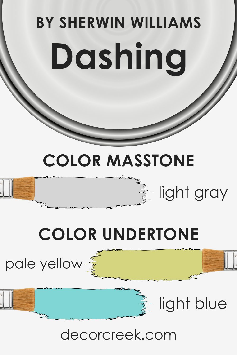
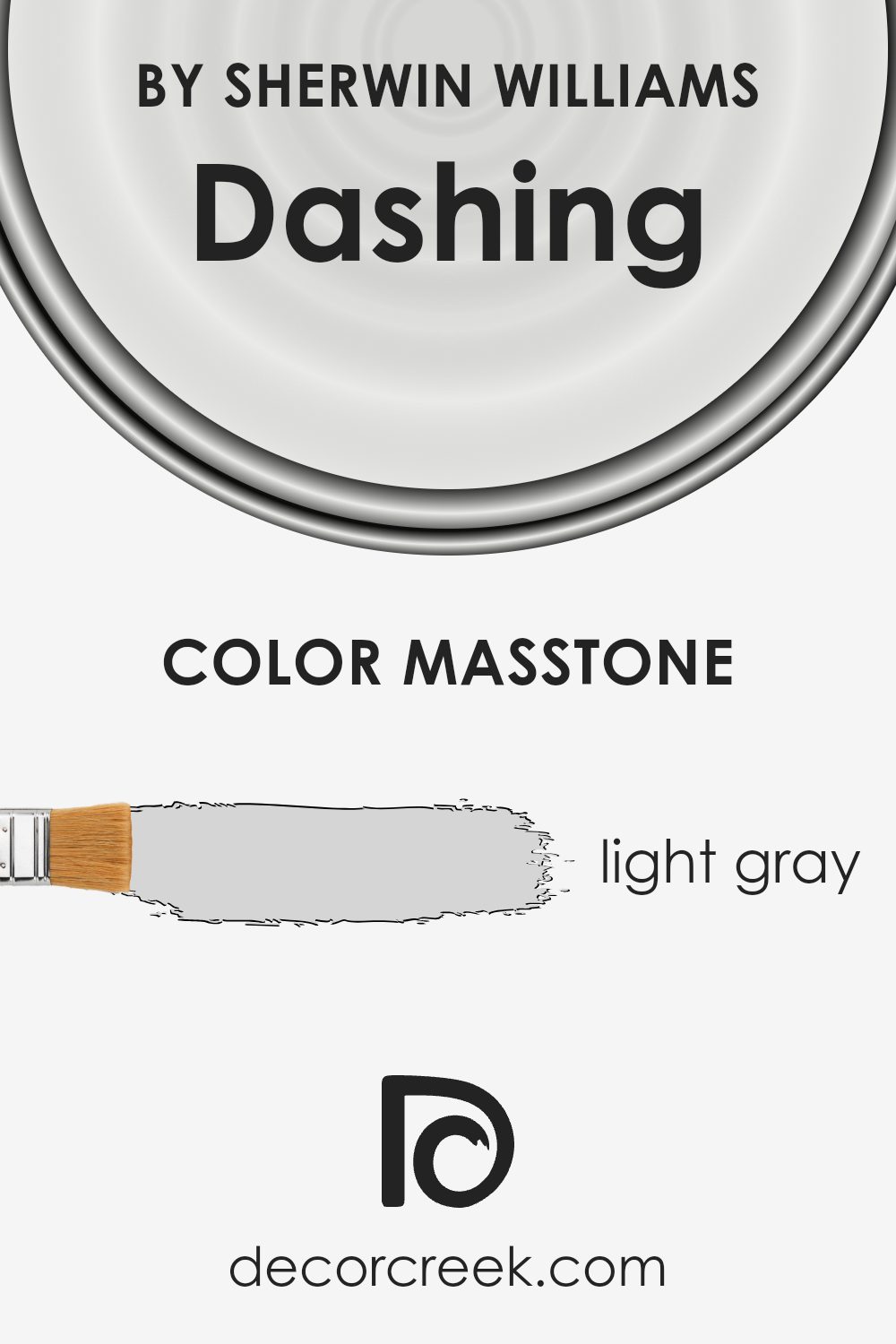
What is the Masstone of the Dashing SW 9544 by Sherwin Williams?
Dashing SW 9544 by Sherwin Williams is a light gray color (#D5D5D5) that can significantly influence a home’s atmosphere. This soft shade of gray offers a clean and crisp look that suits various styles and settings. Its neutral tone makes it versatile, easily complementing different decor and furnishings.
In well-lit rooms with lots of natural light, Dashing SW 9544 maintains its gentle hue without appearing overly bright, creating a bright and open feeling.
This light gray works well in living rooms, bedrooms, or kitchens, providing a backdrop that allows other colors in the room to stand out. It can make spaces feel larger and more airy, which is particularly beneficial for smaller rooms. Also, Dashing SW 9544 pairs well with both warm and cool accent colors, making it easy to change decor or textiles without clashing. Overall, this color offers a fresh and modern touch to any home, adding lightness and balance.
How Does Lighting Affect Dashing SW 9544 by Sherwin Williams?
Lighting plays a crucial role in how colors appear in our homes. Different types of light can change the look of a color dramatically. Sherwin Williams’ Dashing SW 9544 is a deep blue color with gray undertones, and it responds uniquely to various lighting conditions.
In natural light, Dashing SW 9544 will show its true undertones more clearly. In a north-facing room, the light tends to be cooler and softer. This can make the color appear a bit more muted and cooler, enhancing its gray undertones. This quality can create a calming and cozy atmosphere, as the natural light in these spaces often casts a consistent, even light that manages intense colors well.
In south-facing rooms, natural light tends to be warmer and more yellow, especially during midday. This warmth can make Dashing SW 9544 appear slightly lighter, and the sun’s natural brightness can bring out the blue tones more vibrantly. This gives the room a more cheerful and bright look even though the color is inherently deep.
East-facing rooms receive warm, yellow light in the morning and cooler light later in the day. Early sunlight will enhance the warm aspects of the color, making it look a bit more vibrant and lively in the morning, whereas in the afternoon, its cooler elements might appear more pronounced.
West-facing rooms are the opposite, with cooler light in the morning and warm, rich light in the afternoon and evening. This means that in the early part of the day, Dashing SW 9544 might look a bit cooler and flatter. However, in the afternoon and evening, this color will come to life with the warmer sun, enhancing its vibrant blue hue.
Artificial lighting, such as LED or incandescent bulbs, can also affect this color. Incandescent bulbs have a warm yellow tone that can highlight the blue in Dashing SW 9544, while cooler LED lights may emphasize its gray undertones.
Understanding how lighting affects this color will help you use it effectively in your living space.

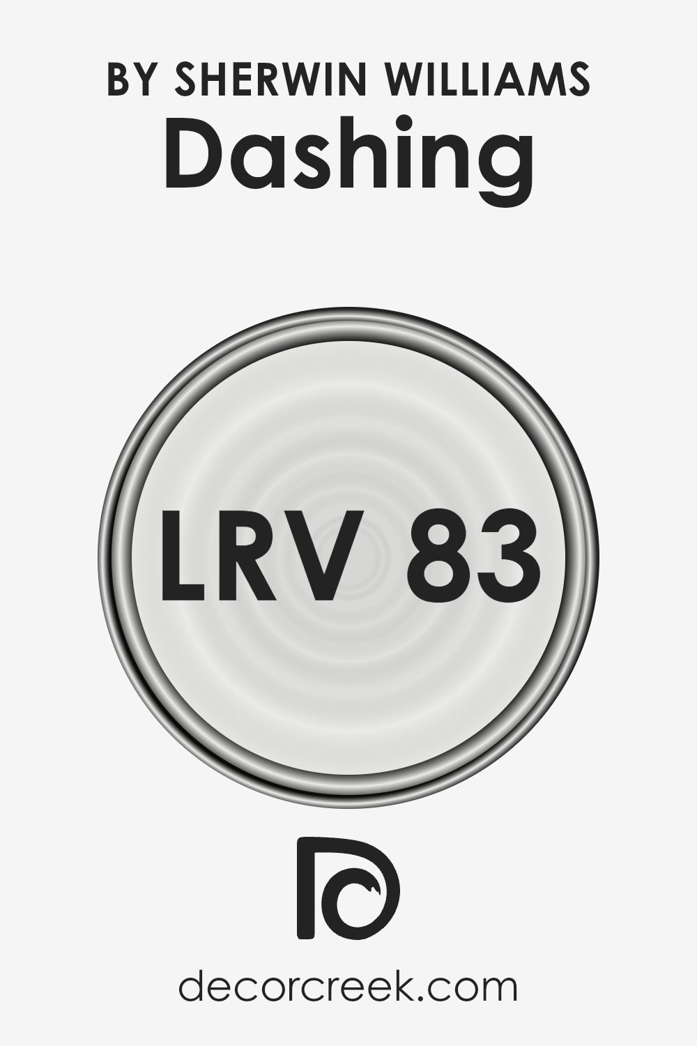
What is the LRV of Dashing SW 9544 by Sherwin Williams?
Light Reflectance Value (LRV) is a measure that indicates how much light a color reflects. It operates on a scale from 0 to 100, where 0 means the color absorbs all light (like black) and 100 means it reflects all light (like white). Colors with high LRV values reflect more light, making spaces feel brighter and larger, while those with low LRV values can make a room feel cozier and more intimate.
When choosing a paint color, understanding LRV helps predict how the color will interact with light in a space.
For Dashing SW 9544, the LRV of 82.896 means it’s quite reflective. This suggests the color will help make a room feel open and airy, especially in spaces with limited natural light. This level of reflectance ensures that the color maintains its brightness throughout the day, even in areas with little direct sunlight.
It’s ideal for small rooms or areas you want to feel more spacious without being overwhelming. In essence, the high LRV ensures that Dashing SW 9544 will contribute to a light and lively atmosphere in any room.
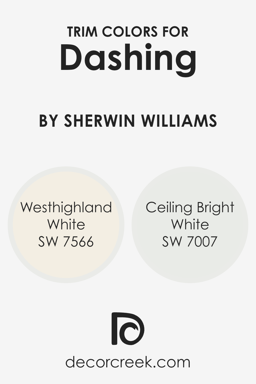
What are the Trim colors of Dashing SW 9544 by Sherwin Williams?
Trim colors refer to the shades used to paint the edges, moldings, or accents of a room or building. They play a crucial role in framing the main wall color and adding depth or contrast to the space. For the main color, Sherwin Williams’ DashingSW 9544 makes a bold choice with its rich, lively tone.
To ensure that this vibrant color stands out and maintains balance, using trim colors like Westhighland White and Ceiling Bright White can be very effective. Westhighland White offers a warm, creamy undertone that softens the transitions and brings a subtle coziness to the room.
In contrast, Ceiling Bright White provides a crisp, clean look that enhances the brightness of the space and sharpens the room’s lines, making the DashingSW 9544 pop even more.
Using the right trim color is essential for highlighting architectural details and complementing the main wall color.
Westhighland White’s warm undertones can subtly blend with DashingSW 9544, creating a harmonious flow, while Ceiling Bright White lends a refreshing clarity that draws attention to the room’s features without overshadowing the boldness of the main color.
Each trim color has a unique effect: Westhighland White wraps the space in a gentle embrace with its soft hue, and Ceiling Bright White brings an invigorating sense of freshness and light. Together, these trim colors work in tandem with DashingSW 9544 to craft a balanced and visually appealing environment.
You can see recommended paint colors below:
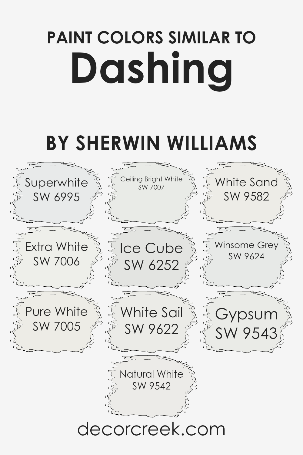
Colors Similar to Dashing SW 9544 by Sherwin Williams
Similar colors are important because they create harmony and balance in design. When used together, they can produce a cohesive and calming environment. For instance, Sherwin Williams offers several shades that pair well with Dashing: Superwhite (SW 6995) is a bright, clean shade that adds crispness to the space, while Extra White (SW 7006) provides a slightly cooler tone, making it versatile for both modern and classic settings.
Pure White (SW 7005) is a soft, warm hue that adds subtle depth without being overpowering, whereas Natural White (SW 9542) offers a gentle touch of warmth, perfect for creating a cozy atmosphere. Ceiling Bright White (SW 7007) does exactly what its name suggests; it enhances the brightness of ceilings, giving rooms an airy feel.
Ice Cube (SW 6252) introduces a hint of sophisticated gray, creating a subtle contrast that blends well with lighter shades. White Sail (SW 9622) brings in a light, sandy tone, adding a touch of warmth that feels like a sunlit day. For a slightly earthier option, White Sand (SW 9582) offers a blend of beige and cream tones; this adds an organic feel to interiors.
Winsome Grey (SW 9624) is a light gray with a slight blue undertone, providing a modern touch that complements other whites perfectly. Gypsum (SW 9543), with its soft, off-white shade, creates a neutral foundation that works well in any room, enhancing the overall aesthetic while ensuring a soothing ambience.
You can see recommended paint colors below:
- SW 6995 Superwhite
- SW 7006 Extra White
- SW 7005 Pure White
- SW 9542 Natural White
- SW 7007 Ceiling Bright White
- SW 6252 Ice Cube
- SW 9622 White Sail
- SW 9582 White Sand
- SW 9624 Winsome Grey
- SW 9543 Gypsum
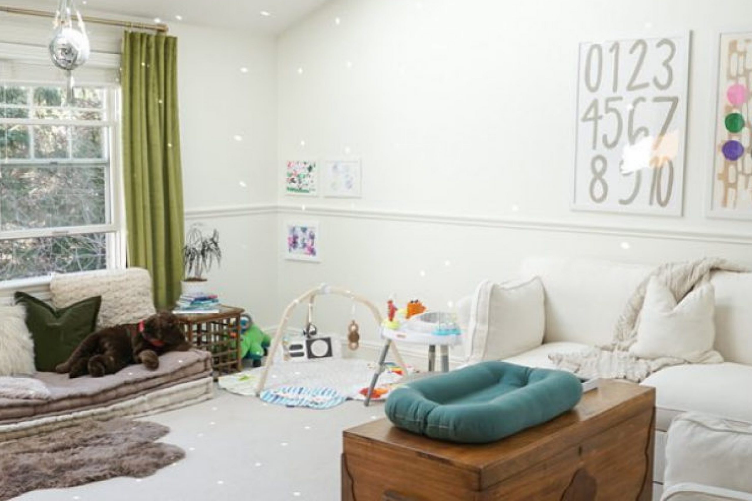
How to Use Dashing SW 9544 by Sherwin Williams In Your Home?
Dashing SW 9544 by Sherwin Williams is a versatile paint color that can bring a fresh and lively feel to any home. It’s a vibrant yet balanced shade, making it perfect for those who want to add a pop of color without going overboard. You can use Dashing in various rooms to create different effects.
For instance, if you paint a single accent wall in your living room with this hue, it can become a focal point and add energy to the space. Paired with neutral furniture, the color stands out beautifully. In a bedroom, Dashing can create a warm and welcoming atmosphere, helping to uplift the mood.
It also works well in kitchens, especially when combined with white or light-colored cabinetry, as it adds a cheerful touch. Overall, Dashing SW 9544 is a great choice for anyone looking to add color and personality to their home in a simple way.
Dashing SW 9544 by Sherwin Williams vs Ceiling Bright White SW 7007 by Sherwin Williams
Dashing SW 9544 by Sherwin Williams is a bold, deep color that can add warmth and richness to a room. It’s a strong color choice that can make a space feel cozy and inviting. On the other hand, Ceiling Bright White SW 7007 is a crisp, clean white that reflects light and makes spaces feel open and airy.
When compared, Dashing creates a dramatic effect, while Ceiling Bright White offers simplicity and freshness.
These two colors can complement each other well. Dashing can be used on walls to create depth and contrast, while Ceiling Bright White can be used on the ceiling or trim to balance out the intensity and add brightness to the space. This combination brings out the best in both colors and can create a harmonious look.
Choosing between them depends on whether you want a bold, warm atmosphere or a light, refreshing environment.
You can see recommended paint color below:
Dashing SW 9544 by Sherwin Williams vs Natural White SW 9542 by Sherwin Williams
Dashing SW 9544 and Natural White SW 9542 by Sherwin Williams offer distinct looks to suit different tastes. Dashing is a bold and striking hue, with a rich personality that can add energy and drama to any space. It’s suitable for those who want a color that makes a statement. On the other hand, Natural White is a gentle, versatile color with a light and airy feel.
It promotes a sense of openness and is perfect for creating a peaceful atmosphere. Natural White is more adaptable and can complement various styles and color palettes. It can brighten spaces and serve as a neutral backdrop.
Dashing works well as an accent color or in spaces where you want to add depth, while Natural White is ideal for making rooms feel larger and more inviting. Both colors offer unique opportunities for styling, but each serves a different purpose in home design.
You can see recommended paint color below:
Dashing SW 9544 by Sherwin Williams vs Extra White SW 7006 by Sherwin Williams
Dashing SW 9544 and Extra White SW 7006 are two distinct colors by Sherwin Williams. Dashing is a warm, bold color that grabs attention. It has deep undertones that make it feel rich and inviting. Perfect for a cozy room, it adds warmth and character.
On the other hand, Extra White is a classic, bright white. It’s clean and crisp, giving any space a fresh, airy feel. Extra White is versatile; it pairs well with most colors and enhances natural light.
When you use Dashing and Extra White together, they can create a striking contrast. Dashing offers depth while Extra White provides balance, making rooms feel both warm and open. While Dashing draws you in, Extra White ensures things stay bright. Together, they provide a dynamic, balanced look that can be modern yet timeless.
You can see recommended paint color below:
Dashing SW 9544 by Sherwin Williams vs Superwhite SW 6995 by Sherwin Williams
Dashing (SW 9544) and Superwhite (SW 6995) by Sherwin Williams offer two very distinct looks. Dashing is a rich, deep blue that brings a bold, confident vibe to a space. It adds warmth and depth, making it great for creating a comfortable and inviting atmosphere. On the other hand, Superwhite is a pure, crisp white that exudes cleanliness and openness.
This shade is perfect for achieving a bright, airy feel. It works well in small spaces, making them appear larger and more open. While Dashing can make a strong statement, Superwhite offers versatility and can be paired with almost any color for a fresh look.
Together, they can create a striking contrast, with Dashing providing depth and Superwhite adding brightness. Choosing between them depends on the mood you want to set: cozy and bold, or bright and clean.
You can see recommended paint color below:
- SW 6995 Superwhite
Dashing SW 9544 by Sherwin Williams vs White Sail SW 9622 by Sherwin Williams
Dashing (SW 9544) by Sherwin Williams is a bold, dramatic color with deep undertones, perfect for making a statement in any room. It’s a strong and confident choice that can add depth and richness to a space. On the other hand, White Sail (SW 9622) is a crisp, clean white that brings a sense of freshness and simplicity.
It’s versatile and can be used in almost any setting to create an open and airy feel. While Dashing is ideal for creating a focal point or highlighting specific areas, White Sail is excellent for backgrounds and as a canvas to showcase other design elements
. Together, these colors can complement each other well; Dashing adds character and White Sail balances it with calm neutrality. This combination allows you to have both drama and subtlety in your interior design, catering to different moods and styles.
You can see recommended paint color below:
- SW 9622 White Sail
Dashing SW 9544 by Sherwin Williams vs White Sand SW 9582 by Sherwin Williams
Dashing SW 9544 by Sherwin Williams is a bold and striking color that can create a dynamic atmosphere in any space. It has depth and richness, often described as having a dark, moody quality. In contrast, White Sand SW 9582 offers a softer, more subtle presence. It’s a light, neutral shade that provides a sense of calm and openness, brightening up a room without overwhelming it.
Pairing Dashing with White Sand creates a balanced look, with Dashing adding drama and White Sand offering a soft, gentle contrast. This combination works well in many rooms, where White Sand can be used on larger surfaces to keep the space feeling open, while Dashing can provide accents or feature walls for interest.
Both colors have their unique appeal but work beautifully together, allowing for a harmonious design that appeals to various tastes and styles.
You can see recommended paint color below:
Dashing SW 9544 by Sherwin Williams vs Winsome Grey SW 9624 by Sherwin Williams
Dashing (SW 9544) and Winsome Grey (SW 9624) are both popular colors by Sherwin Williams, each offering unique qualities. Dashing is a bold, rich shade with a mix of red and brown undertones, giving it a warm and cozy feel. It works well in spaces where you want a strong, dramatic effect or a cozy atmosphere.
On the other hand, Winsome Grey is a softer, more neutral color. It features a balanced blend of grey with subtle hints of warmth, making it versatile and soothing. This color is great for areas where a calm and understated backdrop is desired.
When you use Dashing, expect a statement-making color that injects energy and richness into a room. Meanwhile, Winsome Grey provides a peaceful and neutral alternative that’s easy to match with various other colors and decor, ideal for creating a gentle, classic look.
Both colors are beautiful in their own way and can complement different styles and preferences.
You can see recommended paint color below:
- SW 9624 Winsome Grey
Dashing SW 9544 by Sherwin Williams vs Gypsum SW 9543 by Sherwin Williams
Dashing SW 9544 is a rich, deep blue that creates a bold statement in any room. It’s perfect for adding depth and drama to a space, making it feel cozy and intimate. This color works well as an accent wall or in spaces where you want to create a moody atmosphere.
In contrast, Gypsum SW 9543 is a soft, warm off-white. This color is light and airy, which helps make a room feel larger and more open. It’s a versatile neutral that pairs well with a variety of other colors, making it suitable for walls, trim, or ceilings.
When comparing the two, Dashing offers a more intense, dramatic look, whereas Gypsum provides a clean, fresh backdrop. Dashing is ideal for making a bold focal point, while Gypsum is perfect for those who prefer a minimalist, understated aesthetic. Together, they can balance each other well, combining depth with spaciousness.
You can see recommended paint color below:
Dashing SW 9544 by Sherwin Williams vs Pure White SW 7005 by Sherwin Williams
Dashing (SW 9544) and Pure White (SW 7005) by Sherwin Williams each offer distinct aesthetics. Dashing is a rich, deep shade with warm, earthy undertones, creating a cozy and inviting atmosphere. It’s bold and stands out, making it a great choice for accent walls or rooms where you want to make a statement.
In contrast, Pure White is, as the name suggests, a clean and classic white. It has a crisp, neutral quality that makes spaces feel open and airy. Pure White is versatile and can complement any décor, providing a fresh and timeless backdrop.
When paired together, Dashing can add warmth and dimension, while Pure White balances it by maintaining brightness and simplicity. This combination can create a harmonious yet dynamic look, perfect for modern and traditional settings alike. Each color brings its own character, allowing for creativity in home design without overwhelming a space.
You can see recommended paint color below:
Dashing SW 9544 by Sherwin Williams vs Ice Cube SW 6252 by Sherwin Williams
Dashing SW 9544 is a warm, earthy hue that offers a sense of comfort and coziness. It’s a versatile shade that can create a welcoming atmosphere in any room, making it ideal for living areas or bedrooms where you want a cozy, inviting feel. Its warmth can be paired with natural wood tones and other warm colors to create a harmonious space.
On the other hand, Ice Cube SW 6252 is a cool, light gray with a crisp, clean appearance. It provides a refreshing and modern vibe, making it suitable for spaces that desire a bright, airy feel. Ice Cube works well in kitchens or bathrooms, where its coolness can enhance cleanliness and simplicity.
When compared, Dashing brings warmth and comfort, while Ice Cube offers freshness and lightness. Both colors have their unique appeal and can set the tone for different ambiances depending on the desired effect in a space.
You can see recommended paint color below:
Conclusion
Dashing is a warm and rich color that can bring a cozy feeling to any room. It’s bold but not too bright, which makes it perfect for lots of different areas in a home. Imagine your living room or bedroom feeling warm and inviting just by using this shade on the walls.
The color can make a room feel like a big hug from a friend, offering comfort and a touch of elegance. It’s strong and confident, much like wearing your favorite sweater on a chilly day.
You know how some colors might make you feel too excited or too calm?
Well, Dashing is right in that sweet spot—it makes rooms feel just right.
Using this color is like having a secret superpower for your home. It’s the kind of paint that can make all your furniture and decorations look better. Whether your home is full of modern things or classic items, Dashing can fit right in and make everything look pulled together.
Overall, SW 9544 Dashing feels like a great choice if you want your home to be warm, friendly, and a place where everyone loves to hang out.

Ever wished paint sampling was as easy as sticking a sticker? Guess what? Now it is! Discover Samplize's unique Peel & Stick samples.
Get paint samples

