If you’re considering refreshing your room with a new paint color, you might want to consider SW 6541 Daydream by Sherwin Williams. Choosing a paint color can be a big decision—after all, it sets the tone for your entire room. SW 6541 Daydream is a soft, subtle hue that offers a soothing backdrop for all sorts of decor styles.
Whether you’re looking to create a peaceful bedroom environment or a calming home office room, this color can be a fantastic choice. I’ll help you understand the key aspects of SW 6541 Daydream, like how its undertones can affect the feel of a room and what lighting conditions bring out its best qualities.
You’ll also learn which color combinations can blend beautifully with it, making your decorating process a bit easier. Keep in mind, since paint colors can look different depending on your surroundings, it’s always a good idea to test them in your specific environment.
Let’s take a closer look at what makes SW 6541 Daydream a smart pick for your home projects.
Is Daydream SW 6541 Right for My Home?
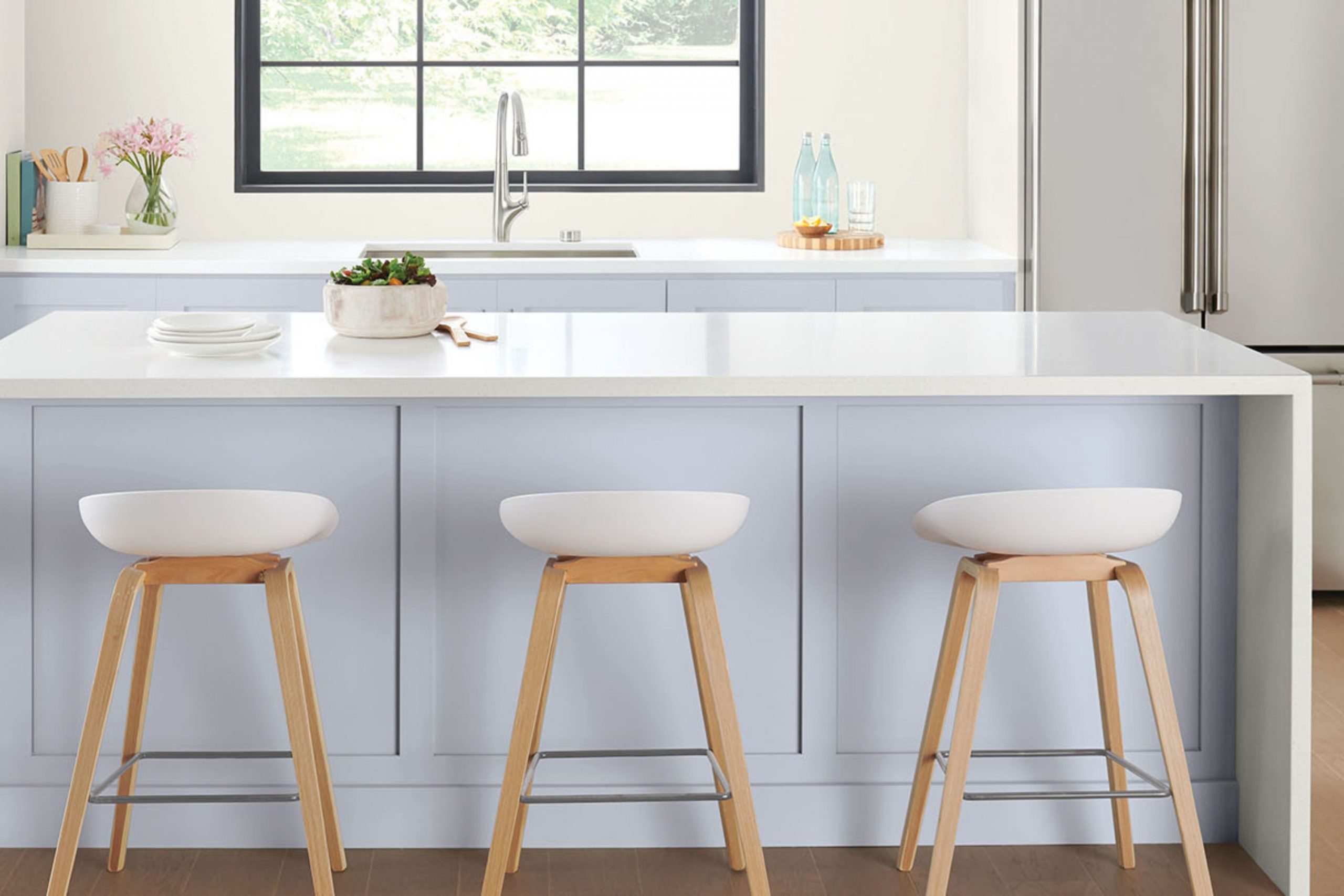
The color Daydream by Sherwin Williams is a soft, airy blue that instantly brightens up any room. It reminds me of a clear sky on a sunny morning. This shade is light and has a very gentle feel to it, making it perfect for creating a calm and welcoming room.
In terms of interior styles, Daydream is incredibly adaptable. It works exceptionally well in modern and minimalist designs because of its clean and subtle quality. However, it’s also a fantastic choice for coastal or beach-themed rooms due to its breezy and light characteristics that evoke feelings of being near the sea.
When it comes to pairing materials and textures, I find that Daydream goes beautifully with natural wood tones, from light maples to rich walnuts. The contrast between the organic warmth of wood and the coolness of the blue is really pleasing to the eye.
Additionally, pairing it with white trims or moldings can make the walls stand out and look even fresher. Textures like linen, cotton, and ceramic also go well with this color, helping to create a relaxed and airy atmosphere in the home. Overall, Daydream is a great choice for anyone looking to refresh their room with a color that’s easy to work with and blends well with numerous design elements.
decorcreek.com
What are the right undertones of Daydream SW 6541 ?
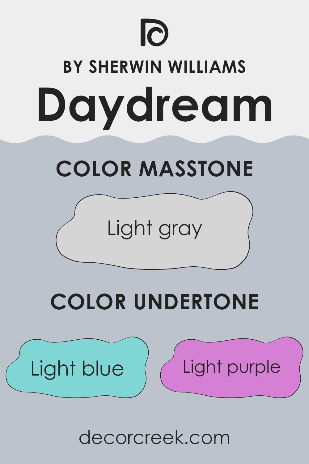
Daydream SW 6541 is a unique paint color that carries a mix of subtle undertones which can significantly influence the appearance and vibe of a room. This color has hints of light blue, light purple, pale yellow, lilac, mint, pale pink, and gray. Each undertone plays a role in how the color is perceived under different lighting conditions and in different rooms.
Undertones are like the color’s hidden tone that isn’t immediately obvious until it’s compared with other colors or observed in various lighting conditions. They can make a color appear cooler or warmer and can be particularly noticeable in natural light.
For instance, in a room with ample sunlight, the pale yellow or mint undertones of Daydream SW 6541 might make the walls seem brighter and fresher. In contrast, in a room with less natural light, the gray or lilac undertones might become more pronounced, giving the room a more subdued feel.
When used on interior walls, the complexity of Daydream SW 6541’s undertones allows it to adapt easily to different styles and palettes. In a bedroom, the light purple and pale pink might promote a soft, welcoming atmosphere, while in a living room, the touch of light blue and mint can keep things airy and light.
Whether you’re aiming for a gentle backdrop or a dynamic accent wall, understanding and using these undertones can help achieve the desired effect. The color’s adaptability makes it a practical choice for those who wish to add depth and interest to their room while maintaining a harmonious environment.
decorcreek.com
Best Coordinating Colors to use with Daydream SW 6541 by Sherwin Williams this year.
Coordinating colors are shades that complement a primary color, enhancing the overall aesthetic without overpowering the senses. These are chosen to create a harmonious look in any room, helping to balance or accentuate the main color, which in this case is similar to Daydream SW 6541 by Sherwin Williams. When selected thoughtfully, these coordinating hues can highlight architectural features or unify different elements within a room.
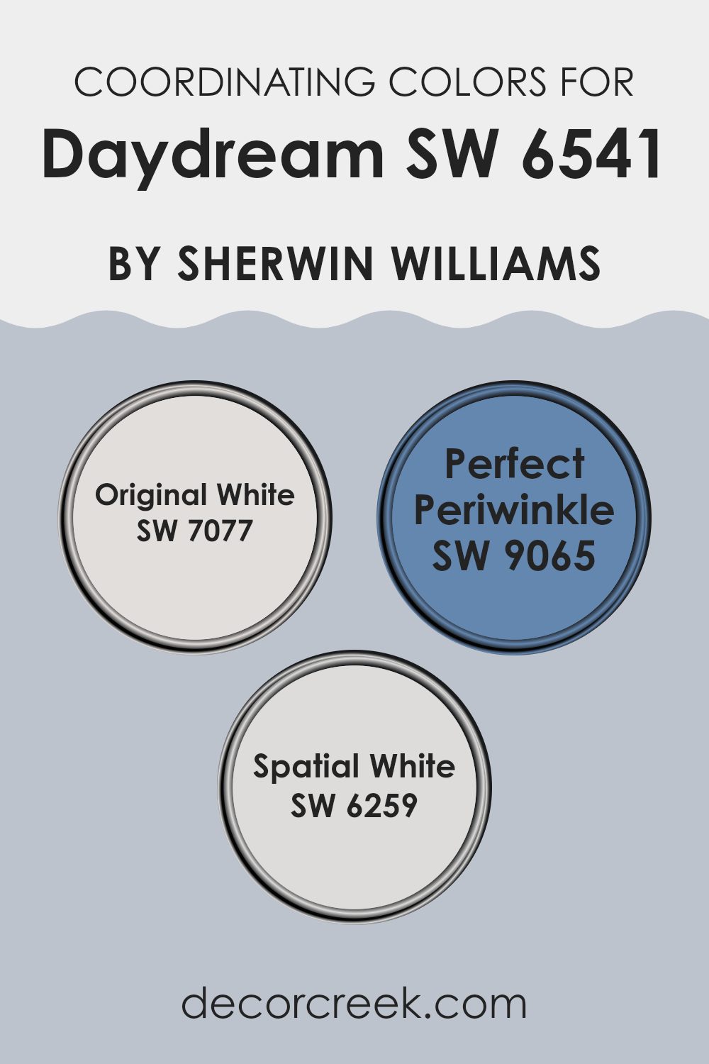
For instance, SW 7077 – Original White is a crisp and clean shade that offers a refreshing contrast to richer tones, making it great for trim or ceilings to provide a fresh, neat appearance. SW 9065 – Perfect Periwinkle, meanwhile, provides a subtle hint of color with its soft blue with violet undertones, perfect for creating a gentle, soothing effect in a bedroom or bathroom.
Lastly, SW 6259 – Spatial White has a slightly warmer undertone compared to Original White, offering a soft, inviting glow that works well in rooms that require a touch of warmth without the saturation of stronger colors. These coordinating colors ensure a visually appealing palette that complements the beauty of a room subtly and effectively.
You can see recommended paint colors below:
Trendy Trim Colors of Daydream SW 6541 by Sherwin Williams to use this year.
Trim colors are crucial when it comes to interior design, as they help to define and accentuate the architectural details of a room. For a color like Daydream SW 6541 by Sherwin Williams, selecting the right trim color can make all the difference in highlighting its unique tone while maintaining harmony throughout the room. Trim colors such as Extra White SW 7006 and Agreeable Gray SW 7029 are excellent choices because they offer a crisp, clean contrast that can enhance the overall aesthetic, ensuring the walls stand out and the room feels well-coordinated.
Extra White SW 7006 is a bright and pure white that provides a stark, refreshing contrast to Daydream SW 6541. It’s perfect for making other colors stand out and can give a sense of freshness and cleanliness to any room.
Meanwhile, Agreeable Gray SW 7029 has a warm and subtle quality, offering a softer contrast to the vibrant Daydream SW 6541. This shade can add a touch of warmth and is adaptable enough to blend with various decor styles, ensuring a smooth visual transition from the walls to the trim. Both colors are flexible choices that can tie a room together, making Daydream SW 6541 really shine while supporting an inviting atmosphere.
You can see recommended paint colors below:
- SW 7006 Extra White
- SW 7029 Agreeable Gray

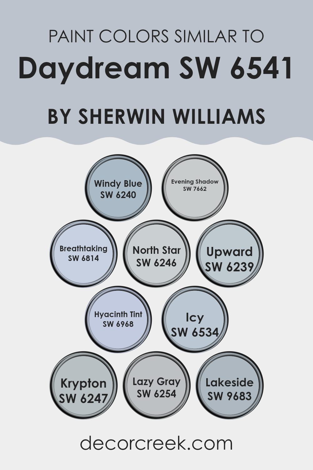
Evergreen Colors Similar to Daydream SW 6541 by Sherwin Williams
Similar colors are essential in design because they help create a cohesive and harmonious look, particularly when trying to achieve a subtle and soothing atmosphere. Colors that are near each other on the color wheel can be paired effectively, allowing a room to flow smoothly without harsh contrasts. For example, using various shades of blues and grays can provide a seamless color transition, enhancing the aesthetic appeal without overpowering the room with bold color contrasts.
Among similar colors to Daydream by Sherwin Williams, Windy Blue offers a gentle blue hue reminiscent of a breezy day and is quite soft yet inviting. Evening Shadow has a deeper tone, providing a muted backdrop that works well in reflective rooms.
Breathtaking is another hue, slightly lighter and airy, perfect for creating a refreshing vibe. North Star presents a muted gray with hints of blue, adaptable in various settings, while Upward is a lighter gradient that offers a subtle lift to any room. Hyacinth Tint gives a unique, very light violet touch, adding a hint of color without overpowering.
Icy echoes the fresh touch of a frosty morning, suitable for a modern, cool tone. Krypton and Lazy Gray both lean toward neutral gray tones with subtle blue undertones, ideal for those seeking a minimalist or industrial theme. Lastly, Lakeside is a deeper blue, reminiscent of a calm lake, perfect for a focal point or accent wall in a more subdued design layout. Together, these colors work naturally to create an environment that feels coherent and visually appealing.
You can see recommended paint colors below:
- SW 6240 Windy Blue
- SW 7662 Evening Shadow
- SW 6814 Breathtaking
- SW 6246 North Star
- SW 6239 Upward
- SW 6968 Hyacinth Tint
- SW 6534 Icy
- SW 6247 Krypton
- SW 6254 Lazy Gray
- SW 9683 Lakeside
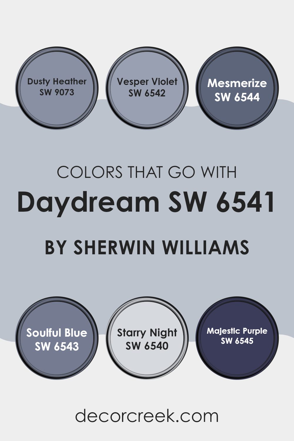
Colors that Go With Daydream SW 6541 by Sherwin Williams
Choosing colors to complement Daydream SW 6541 by Sherwin Williams is crucial because it ensures a visually harmonious room. Colors such as Dusty Heather, Vesper Violet, Mesmerize, Soulful Blue, Starry Night, and Majestic Purple not only enhance the overall aesthetic of the room but also create an atmosphere that reflects the desired mood. For instance, pairing Daydream with the right shades can turn an ordinary room into a cozy and welcoming setting.
Dusty Heather is a soft, muted purple that adds a touch of gentle warmth to the surroundings, making it a great match for the mellowness of Daydream. Vesper Violet, a deeper purple, provides a rich contrast that can highlight areas of a room or bring forward certain decor elements. Mesmerize is a captivating shade of deep blue that, in combination with Daydream, can produce a striking effect, great for creating a focal point.
Soulful Blue has a calm, reflective quality that pairs beautifully with Daydream to set a relaxed vibe in any room. Starry Night, the darkest of blues, offers a dramatic flair that can anchor lighter tones like Daydream, perfect for balancing out bright rooms. Lastly, Majestic Purple, vibrant and bold, works wonderfully with Daydream for those looking to add some energetic color accents in their interiors. Together, these colors create diverse options for designing a room that is both beautiful and functional.
You can see recommended paint colors below:
- SW 9073 Dusty Heather
- SW 6542 Vesper Violet
- SW 6544 Mesmerize
- SW 6543 Soulful Blue
- SW 6540 Starry Night
- SW 6545 Majestic Purple
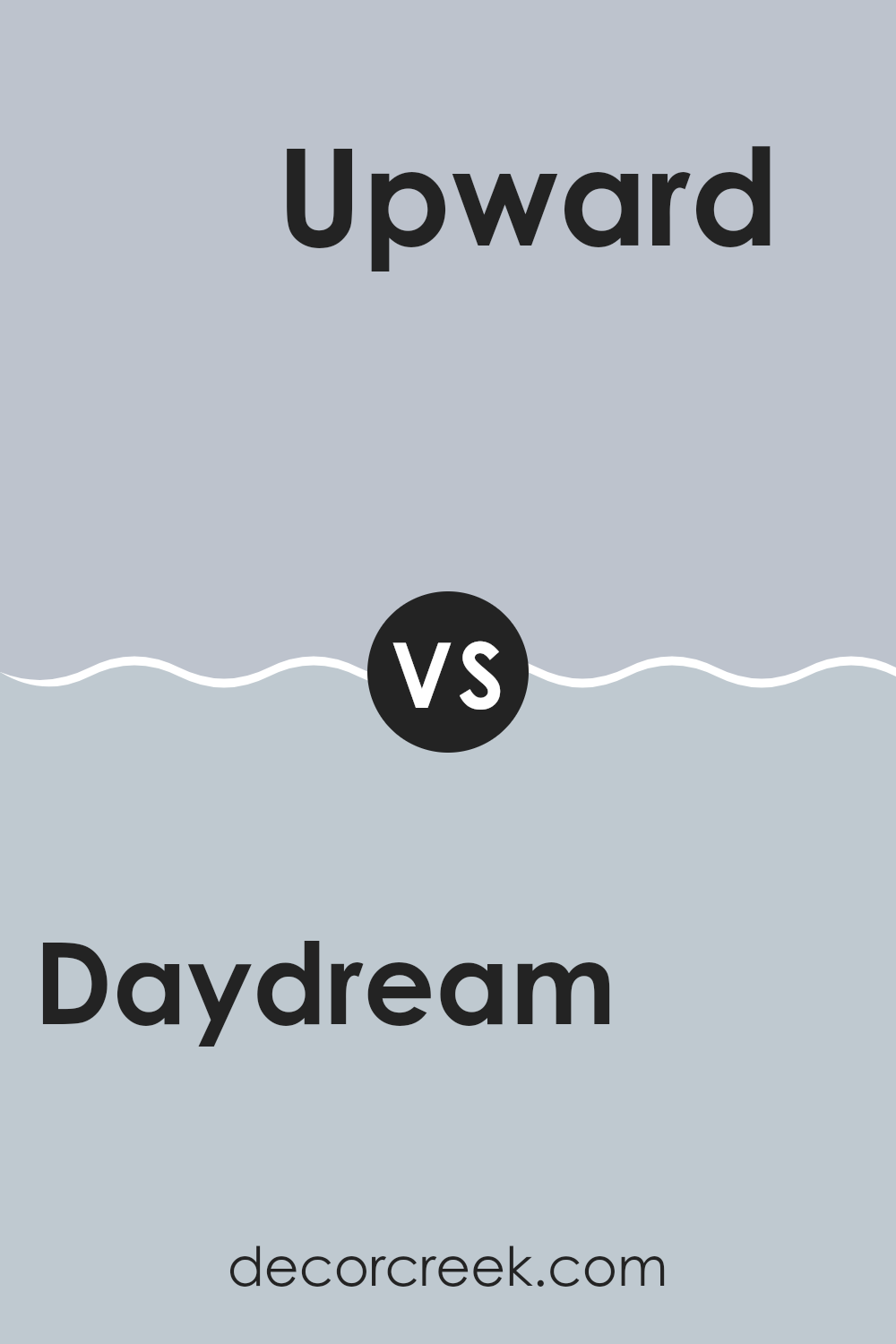
Daydream SW 6541 by Sherwin Williams vs Upward SW 6239 by Sherwin Williams
Daydream SW 6541 and Upward SW 6239, both from Sherwin Williams, present distinct tones that can significantly affect the mood and style of a room. Daydream is a soft, gentle blue with a calming presence, making it perfect for creating a relaxed atmosphere in places like bedrooms or bathrooms. It’s light enough to make small rooms feel more spacious yet has enough color to add personality.
On the other hand, Upward SW 6239 is a slightly darker shade of blue compared to Daydream. It carries a cooler undertone, which could make it ideal for a modern look or to provide a crisp background in an office or a study room.
This color can also help to define areas effectively when paired with brighter colors or used in a monochromatic color scheme. Both colors offer unique vibes and can be used effectively depending on what feeling you want to achieve in your room.
You can see recommended paint color below:
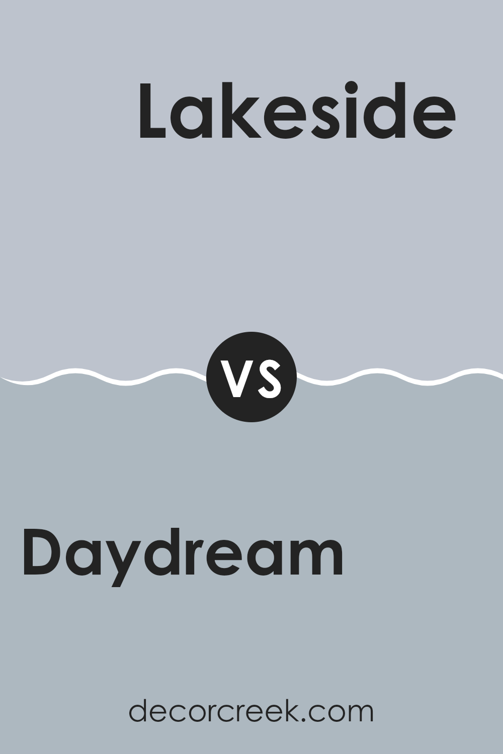
Daydream SW 6541 by Sherwin Williams vs Lakeside SW 9683 by Sherwin Williams
Daydream and Lakeside are two distinct colors by Sherwin Williams, offering unique vibes for interior rooms. Daydream is a soft and dreamy blue with a touch of gray, creating a calming effect suitable for bedrooms or bathrooms.
It gives a light and airy feel, making small rooms appear more open. In contrast, Lakeside is a deeper, more intense blue with a vibrant tone that brings energy to a room. This color works well in active areas like kitchens or living rooms where a pop of color can add life and personality.
While Daydream provides a gentle and refreshing backdrop, Lakeside offers a bold statement, ideal for feature walls or accent pieces. Together, these colors can complement each other in a home, balancing soft calmness with dynamic energy.
You can see recommended paint color below:
- SW 9683 Lakeside
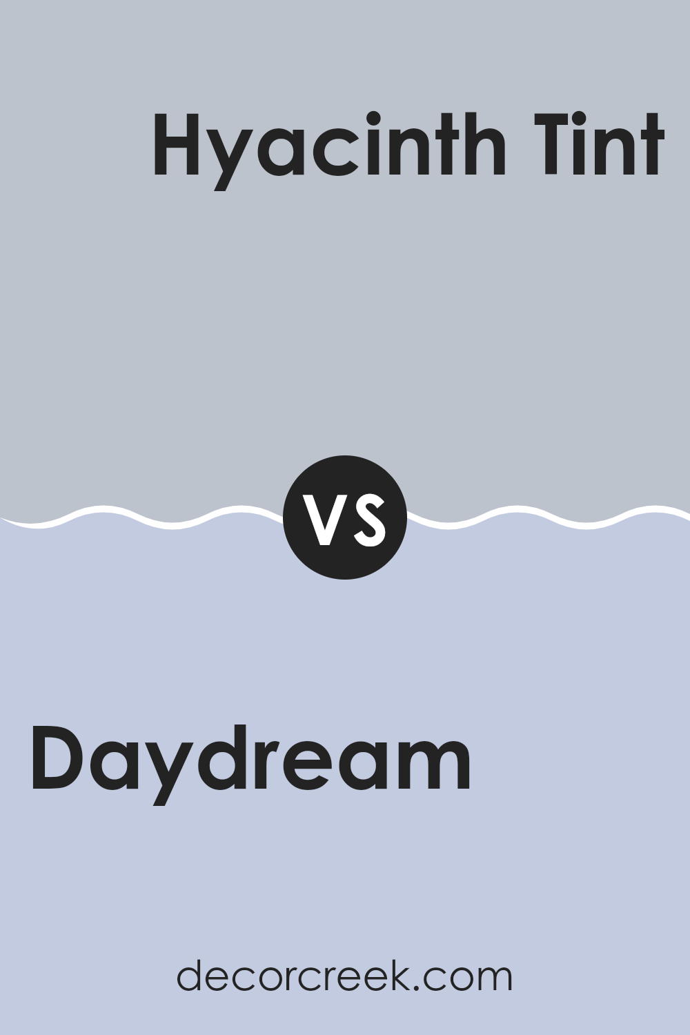
Daydream SW 6541 by Sherwin Williams vs Hyacinth Tint SW 6968 by Sherwin Williams
Daydream SW 6541 and Hyacinth Tint SW 6968, both by Sherwin Williams, offer distinct visual experiences. Daydream is a soft, gentle blue with a hint of gray, giving it a peaceful and airy feel which makes it ideal for creating a relaxed setting in any room. It pairs well with light, neutral furnishings or can be contrasted with darker colors for a dynamic look.
In contrast, Hyacinth Tint SW 6968 is a vibrant, rich purplish-blue, much bolder and more striking. This color definitely stands out more and is perfect when you want to add a splash of energy to a room. It works well in areas like accent walls or when used in creative projects where a strong, memorable color is needed.
Both colors offer unique possibilities for decorating. Daydream works well as a soothing background, while Hyacinth Tint is great for adding a strong, cheerful pop of color.
You can see recommended paint color below:
- SW 6968 Hyacinth Tint
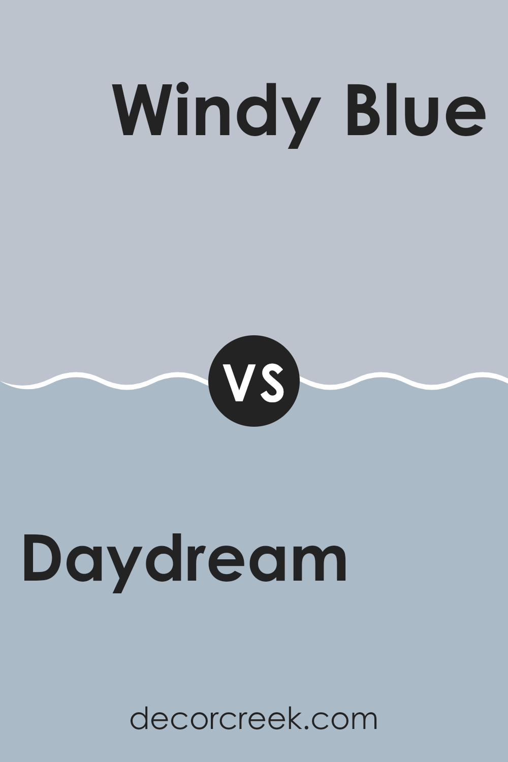
Daydream SW 6541 by Sherwin Williams vs Windy Blue SW 6240 by Sherwin Williams
Daydream and Windy Blue, both by Sherwin Williams, showcase unique hues that can significantly impact the ambiance of a room. Daydream offers a soothing, muted teal that feels airy and light. It’s subtle enough to apply in large areas without overpowering the room and pairs well with soft whites and grays for a gentle, inviting look.
On the other hand, Windy Blue leans toward a cooler, softer blue with a hint of gray. This color is perfect for creating a calm, subdued atmosphere. It works beautifully in bedrooms or bathrooms where a touch of coolness can make the room feel more refreshing and clean.
Although both colors share a sense of calmness, Daydream carries a warmth that can make a room feel cozy and welcoming, while Windy Blue offers a crisp freshness that brightens up a room. These qualities make each suitable for different design goals and personal preferences.
You can see recommended paint color below:
- SW 6240 Windy Blue
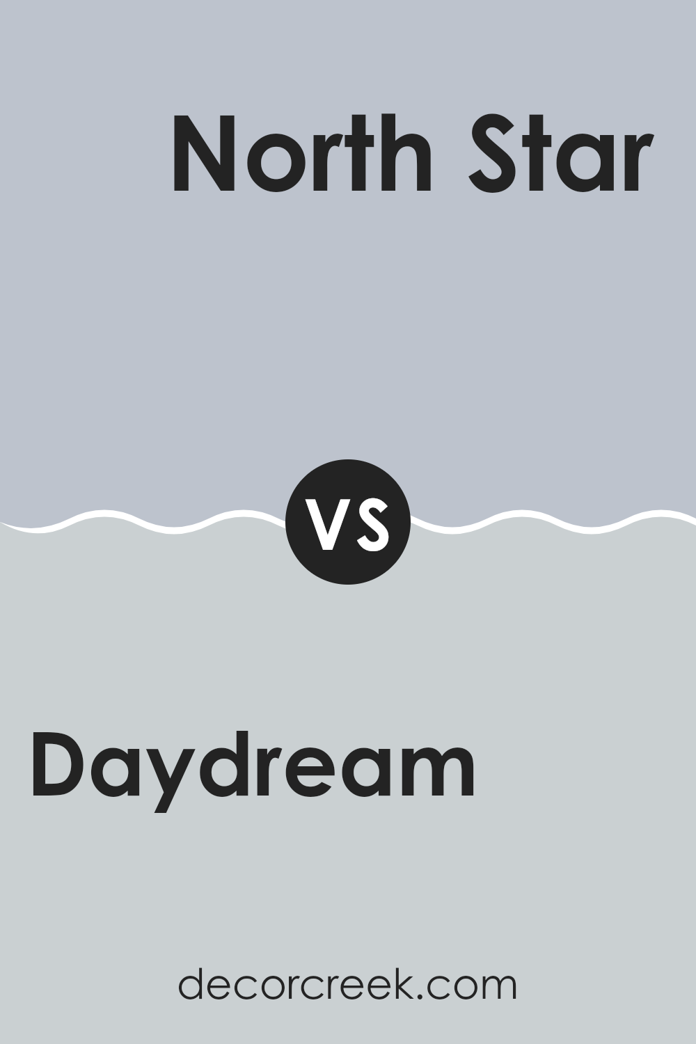
Daydream SW 6541 by Sherwin Williams vs North Star SW 6246 by Sherwin Williams
Daydream SW 6541 and North Star SW 6246 by Sherwin Williams are both soft, calming colors, but they have different tones that set them apart. Daydream has a gentle aqua hue that feels light and airy, making it a great choice for creating a soothing, cheerful atmosphere in a room. It’s the sort of color that can refresh a room, giving it a clean, dreamy vibe.
On the other hand, North Star is a cool gray that leans slightly toward a soft blue under certain lighting. It’s more neutral and adaptable, fitting well in many decor styles without dominating the room. This color is ideal for those who prefer something less bold but still want to maintain a sense of calm and order.
Both colors work well in rooms that aim for a relaxed feel, but their different undertones mean they each bring a unique mood to an interior. Whether you choose the breezy aqua of Daydream or the subtle gray-blue of North Star, both offer a clean, refreshing look.
You can see recommended paint color below:
- SW 6246 North Star
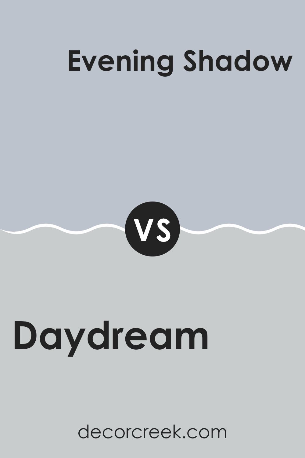
Daydream SW 6541 by Sherwin Williams vs Evening Shadow SW 7662 by Sherwin Williams
Daydream and Evening Shadow, both by Sherwin Williams, offer unique vibes for any room. Daydream is a light, airy blue that adds a gentle, refreshing touch. It’s calming, like a clear, sunny day and works well in rooms meant for relaxation and light activity.
On the other hand, Evening Shadow is a deeper gray with a hint of blue. This color brings a more grounded, subtle atmosphere that pairs well with modern decor. It’s ideal for creating a cozy, understated feel in a room.
While Daydream brightens a room with its soft, cheerful hue, Evening Shadow provides a more muted, cozy backdrop, great for more reflective, quiet areas. Both colors work beautifully in their own right, offering distinct moods and aesthetic effects depending on what you’re looking for in a room.
You can see recommended paint color below:
- SW 7662 Evening Shadow
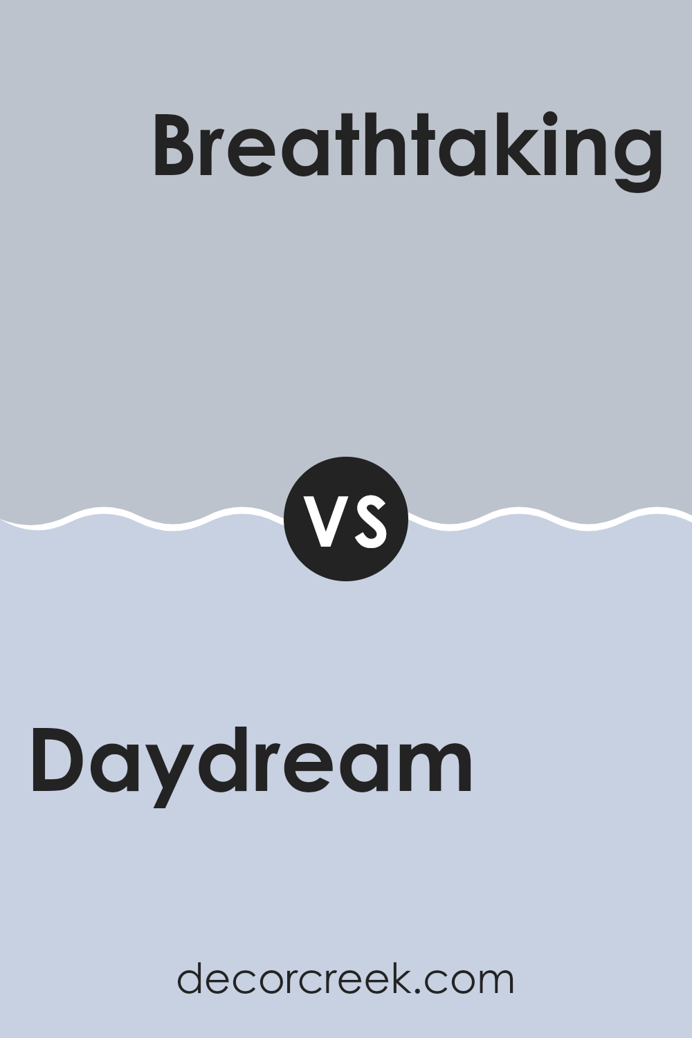
Daydream SW 6541 by Sherwin Williams vs Breathtaking SW 6814 by Sherwin Williams
Daydream is a gentle blue that brings a light, airy feel to any room, perfect for creating a relaxed atmosphere. It has a soft tone that can make rooms appear bright and welcoming without being too striking.
On the other hand, Breathtaking is a more intense shade of teal, offering a vibrant look that adds a touch of drama and energy to a room. Because of its richer hue, Breathtaking stands out more and can serve as an excellent focal color for an accent wall or furnishings.
If you’re looking to create a cozy yet cheerful vibe, Daydream is ideal, whereas Breathtaking works well when you want a splash of color that makes a statement. Both colors can complement a modern decor style, but the choice between them depends on whether you prefer a subtler backdrop or a more dynamic setting.
You can see recommended paint color below:
- SW 6814 Breathtaking
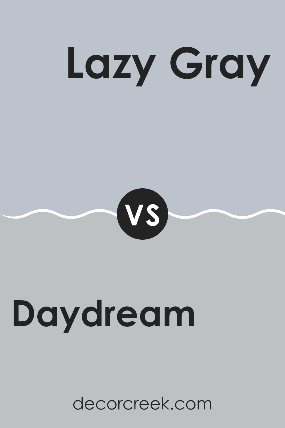
Daydream SW 6541 by Sherwin Williams vs Lazy Gray SW 6254 by Sherwin Williams
Daydream SW 6541 and Lazy Gray SW 6254 are both paints by Sherwin Williams, and they offer distinct vibes for interior rooms. Daydream is a light, soft blue that feels airy and calming, making it ideal for creating a relaxed atmosphere in a room. It’s perfect for rooms where you want a touch of color without overpowering the senses, such as bedrooms or bathrooms.
On the other hand, Lazy Gray is a neutral gray that carries a slightly cooler tone compared to Daydream. Despite being categorized as gray, it has hints of blue, which can give a room a modern and fresh look. This color works well in areas that receive a lot of natural light, as the light reveals the subtle blue undertones.
When paired, Daydream adds a delicate splash of color while Lazy Gray provides a sleek, contemporary backdrop. This combination can be effective for creating a balanced and welcoming environment in your home.
You can see recommended paint color below:
- SW 6254 Lazy Gray
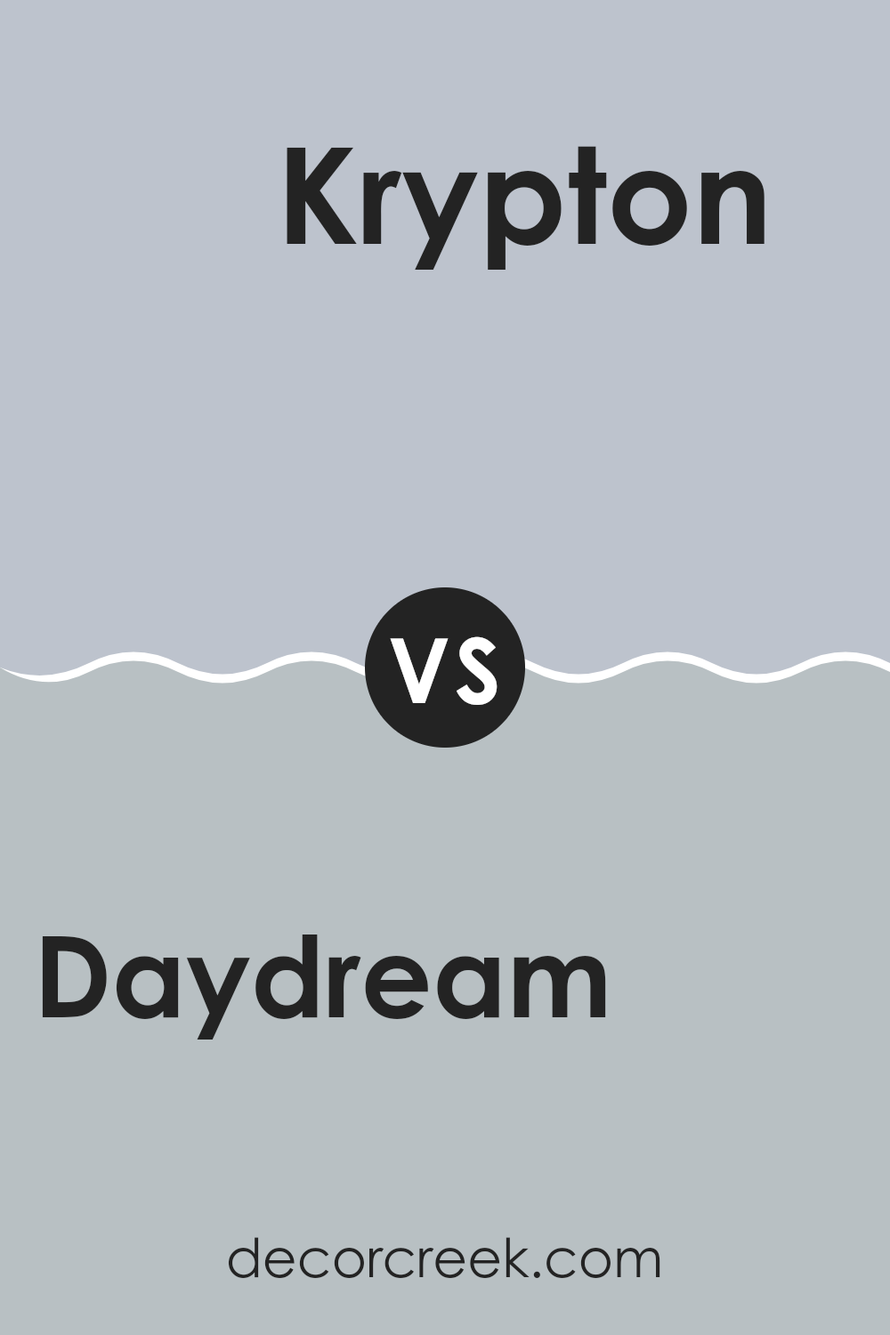
Daydream SW 6541 by Sherwin Williams vs Krypton SW 6247 by Sherwin Williams
The main color, Daydream, and the second color, Krypton, both offered by Sherwin Williams, have distinct tones that set them apart. Daydream has a soothing light blue shade that feels airy and open, making it a perfect choice for creating a relaxed atmosphere in any room. It’s bright enough to give a feeling of spaciousness yet soft enough to keep the ambiance gentle and inviting.
On the other hand, Krypton is a deeper, more muted blue-gray. This color is great for adding a touch of understatement and modernity to a room. It works well in rooms that aim for a subtle, contemporary look without overt brightness. Krypton’s gray undertones make it adaptable for pairing with various decor styles and colors, enhancing its usefulness as a neutral but stylish backdrop.
Overall, while both colors share a blue base, Daydream is lighter and cheerier, whereas Krypton leans toward a sleeker, cooler vibe with its gray influences.
You can see recommended paint color below:
- SW 6247 Krypton
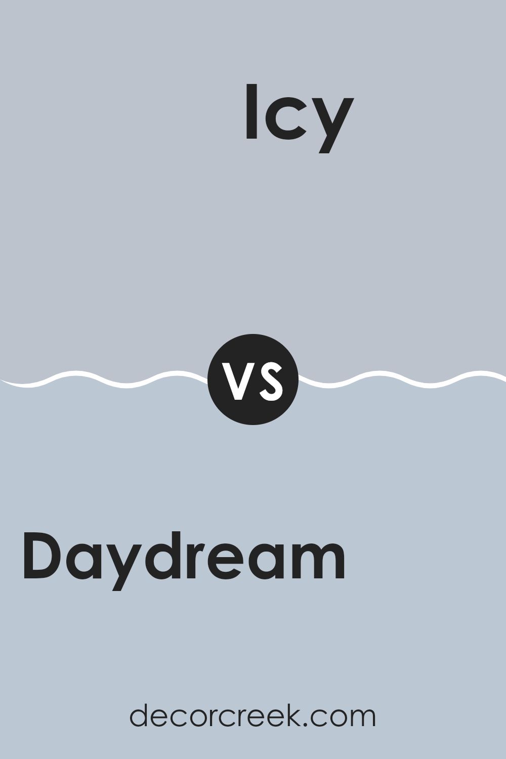
Daydream SW 6541 by Sherwin Williams vs Icy SW 6534 by Sherwin Williams
Daydream and Icy, both by Sherwin Williams, are distinct shades of blue that serve different decorating needs. Daydream is a soft, light blue with a hint of aqua that feels airy and soothing. This color is ideal for creating a relaxed atmosphere in rooms like bedrooms or bathrooms, where comfort is key. Its gentle hue pairs nicely with soft whites or light grays to maintain a light, refreshing vibe.
On the other hand, Icy is cooler and slightly brighter. It stands out more than Daydream, bringing with it a crisper, more vibrant energy. This color might be better suited for areas where a fresh, clean look is desired, such as kitchens or modern living rooms. The balance of blue and a touch of green in Icy makes it a good match with sharper whites or contrasting dark colors to create a more dynamic look.
Overall, Daydream offers a calm, soothing aesthetic, while Icy provides a crisp, refreshing feel, making each suitable for different moods and settings.
You can see recommended paint color below:
- SW 6534 Icy
After reading about SW 6541 Daydream by Sherwin Williams, I’ve learned a lot about this cool paint color! Daydream is a pretty light blue that reminds me of the sky on a clear, sunny day. This color is unique because it is calming and makes rooms look cheerful and bright. It’s perfect for a bedroom or a playroom where you spend a lot of time and want to feel relaxed and happy.
Some people might worry that light blue could be too childish, but Daydream is a mature kind of blue that looks good in grown-up rooms too, like living rooms or kitchens. It can go well with different styles, whether you like things simple or more elegant. For example, it looks great with white or gray, and you can even pair it with darker colors for a sharp contrast.
One neat thing about Daydream is that it reflects light in a room. This means it can make small rooms appear bigger and more open. Also, if you have a room that doesn’t get much sunlight, painting it Daydream might brighten it up.
So, if someone is thinking about adding a new splash of color to their home, SW 6541 Daydream is a wonderful choice. It’s pretty, calming, and goes well with many different colors and styles. It makes every room feel happier and more welcoming. It’s amazing how a simple can of paint can do so much!

decorcreek.com
Ever wished paint sampling was as easy as sticking a sticker? Guess what? Now it is! Discover Samplize's unique Peel & Stick samples.
Get paint samples

