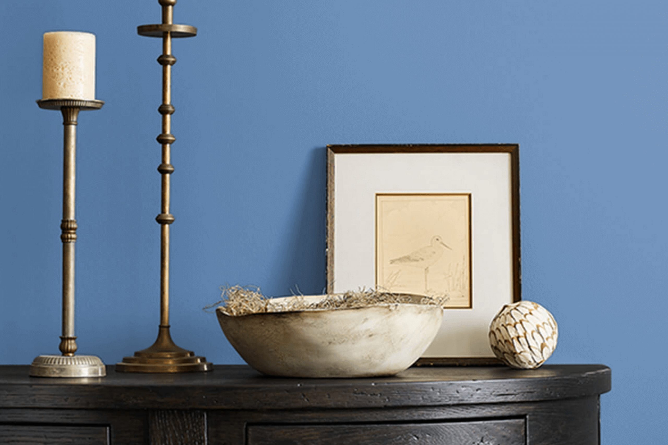
Imagine the gentle touch of a refreshing spring morning or the calming horizon of a quiet seashore – these images may come to mind when you see SW 9065 Perfect Periwinkle by Sherwin-Williams. There’s something subtly enchanting about this hue that makes it both lively and calming. It strikes a wonderful balance between blue and purple, offering a peaceful yet invigorating feel.
This color creates an atmosphere that feels both modern and enduring. It can add a sense of peace to a chaotic room or bring a gentle splash of character to a minimalist one. Perfect Periwinkle is incredibly flexible, able to complement an array of palettes and themes.
Imagine it in a living room where it adds a breath of fresh air, making the room feel open and inviting. Or in a bedroom, where its soothing vibe turns the area into a restful retreat after a long day. There’s an inherent adaptability in this shade, making it an excellent choice for different design aspirations.
With Perfect Periwinkle, you can create an environment that feels thoughtful and harmonious. It invites a sense of calm and creativity, potentially making every corner of your home more welcoming.
What Color Is Perfect Periwinkle SW 9065 by Sherwin Williams?
Perfect Periwinkle by Sherwin Williams is a gentle and calming shade of light blue with a hint of purple, giving it a soft, powdery appearance. This color creates a fresh and refreshing atmosphere, making it a perfect choice for bedrooms, bathrooms, or living areas needing a light and airy touch.
Perfect Periwinkle works beautifully in coastal or cottage-style interiors, where its subtle color complements natural elements and soft, breezy aesthetics. This hue fits well in modern or Scandinavian designs, adding a touch of calm without overpowering the minimalist approach.
In terms of materials, Perfect Periwinkle pairs nicely with natural woods, such as light oak or pine, which enhance its warmth. It also goes well with white or cream, offering a clean and crisp contrast that highlights the color’s blue undertones. For textiles, choosing soft cottons or linens can complement the gentle nature of Perfect Periwinkle, while incorporating textures like woven baskets or jute rugs adds an element of coziness.
Metallic accents in silver or brushed nickel can give a modern edge to the room, balancing the softness with a bit of shine. Overall, Perfect Periwinkle is a flexible color that brings a lovely touch to various home styles and settings.
Is Perfect Periwinkle SW 9065 by Sherwin Williams Warm or Cool color?
Perfect Periwinkle SW 9065 by Sherwin Williams is a soft, calming shade of blue with a hint of purple. This gentle color can create a peaceful atmosphere in homes, making it ideal for bedrooms or living rooms where relaxation is important.
Its cool tone can help make a room feel larger and more open, adding a refreshing touch to any room. Pairing this color with white or light-colored furniture and accessories can enhance its calming effect. In kitchens or bathrooms, Perfect Periwinkle can bring a clean, fresh feeling, especially when combined with silver or chrome fixtures.
It works well with natural elements like wood or stone, adding a touch of subtle elegance without dominating the room. Overall, Perfect Periwinkle is a flexible color that can suit various styles, from modern to traditional, providing a soothing backdrop that encourages comfort and relaxation within the home.
Undertones of Perfect Periwinkle SW 9065 by Sherwin Williams
Perfect Periwinkle by Sherwin Williams is a unique paint color with various undertones that influence how we perceive it. This light shade of blue has a hint of gray, giving it a soft, neutral base. The blue undertones are most apparent, providing a cool and calming effect. However, depending on the lighting and surrounding colors, different undertones can stand out.
For example, the turquoise and mint undertones give it a fresh and lively feel. These hints can add a bit of cheerfulness to a room, making it feel more vibrant. The violet and purple undertones lend a touch of richness and depth, which can make the color appear more dynamic. In rooms with warmer lighting, the pink and pale yellow undertones might become more visible, adding warmth and softness to the walls.
On interior walls, Perfect Periwinkle changes with light conditions and the colors it is paired with. It can look more gray and subdued in shadowy areas, while under bright light, the blue and light turquoise undertones can make it pop. This versatility means Perfect Periwinkle can work in a variety of areas, from calm bedrooms to lively living areas, offering a subtle yet ever-changing backdrop.
What is the Masstone of the Perfect Periwinkle SW 9065 by Sherwin Williams?
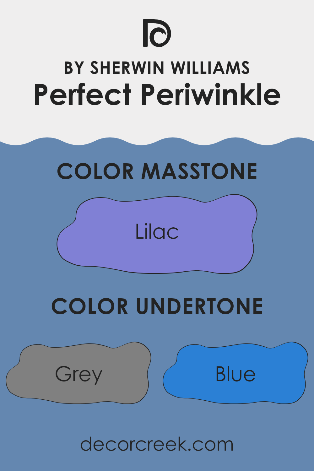
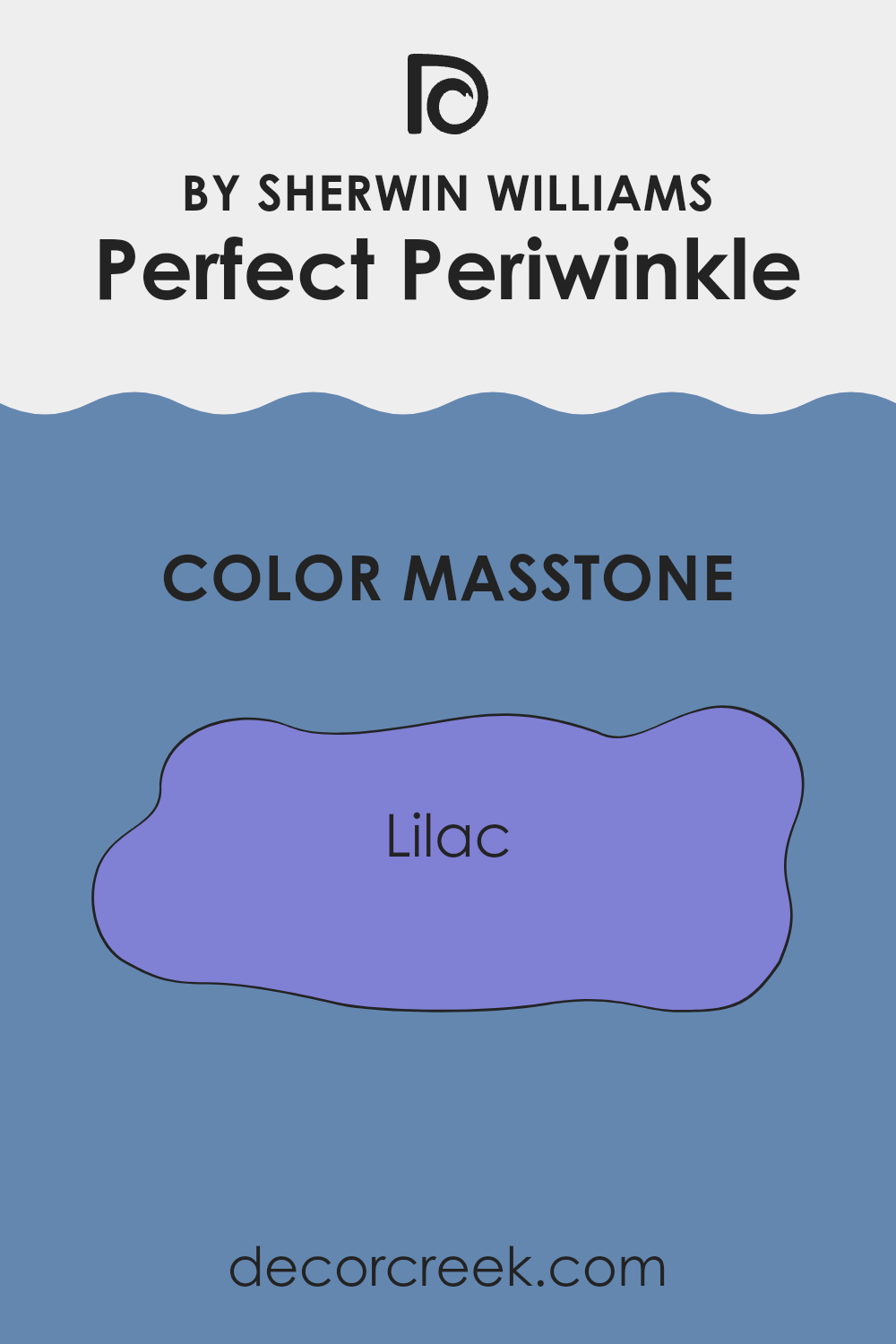
Perfect Periwinkle (SW 9065) by Sherwin Williams is a soft and calming color with a lilac masstone, similar to #8080D5. The lilac undertone gives the color a subtle warmth and character, making it a flexible choice for various rooms in a home.
This shade can brighten a room without making it feel too intense, making it suitable for living rooms, bedrooms, or bathrooms. It pairs well with both neutral and bold colors, allowing homeowners to experiment with different decor styles.
In homes, Perfect Periwinkle can create a gentle and welcoming atmosphere. The lilac hue brings a touch of freshness and lightness, helping to open up smaller rooms and add an airy feel. When used alongside soft whites or light grays, it can enhance the overall brightness of a room. In contrast, pairing it with deeper shades like navy or charcoal can create cozy, intimate areas . The color’s adaptability makes it a popular choice for various interior design schemes.
How Does Lighting Affect Perfect Periwinkle SW 9065 by Sherwin Williams?
Lighting can dramatically change how we see colors in a room. Different types of light can make colors look brighter, duller, warmer, or cooler.
Perfect Periwinkle, a shade of periwinkle by Sherwin Williams, is a blend of blue and violet that looks different depending on the light. In natural light, it can seem more vibrant and clear. In artificial light, its appearance changes based on the type of bulbs used. Under warm incandescent light, it might look a bit warmer and bring out more of the purple tones. Under cooler LED or fluorescent lights, it might appear bluer.
In a north-facing room, natural light tends to be cooler and a bit muted. Colors like Perfect Periwinkle might look cooler and slightly grayer in these conditions, emphasizing the blue undertones. This can create a calm and clean atmosphere, though the color may seem less vibrant.
In contrast, a south-facing room gets bright, warm sunlight throughout the day. Here, Perfect Periwinkle will appear warmer and more lively. The natural light will enhance its purple undertones, making the room feel bright and welcoming.
East-facing rooms receive bright light in the morning that softens by afternoon. The morning light will make Perfect Periwinkle appear brighter and might enhance its bluer side. As the day goes on and the light warms, it may look slightly warmer.
West-facing rooms, which get the warm afternoon and evening light, will see Perfect Periwinkle take on a warmer, softer hue later in the day. The color might look more muted in the morning when the light is indirect and cooler.
Overall, how Perfect Periwinkle appears will change throughout the day as the light shifts and depends heavily on the direction the room faces and the type of artificial lighting used.
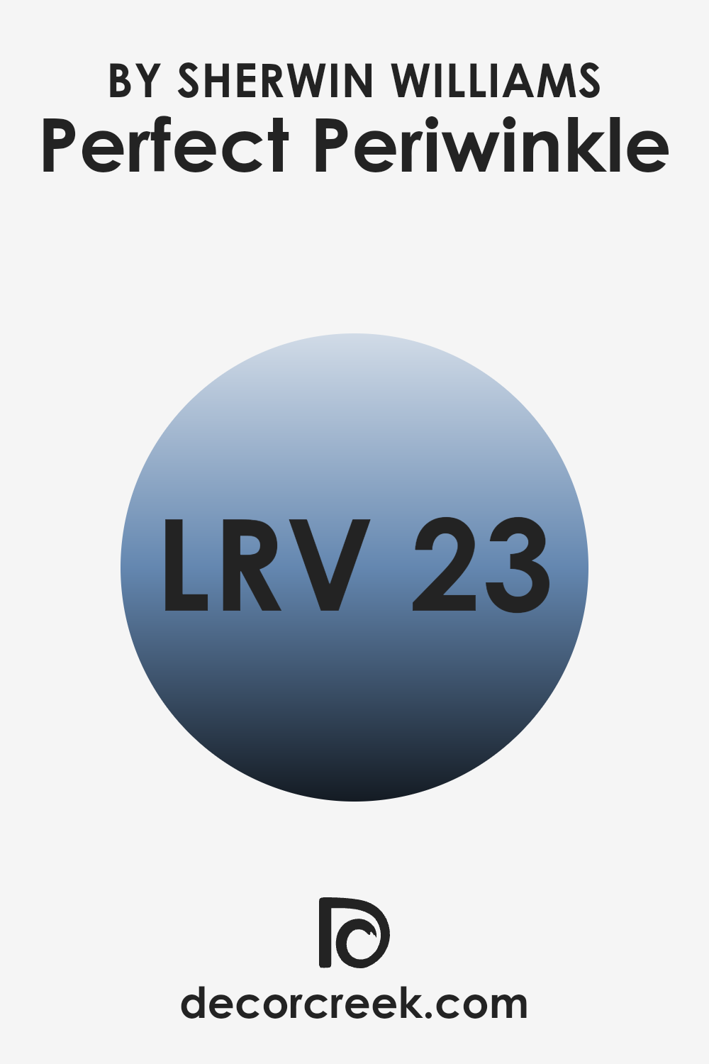
What is the LRV of Perfect Periwinkle SW 9065 by Sherwin Williams?
The Light Reflectance Value (LRV) is a measure of how much light a color reflects when illuminated. It’s on a scale from 0 to 100, where 0 is pure black, absorbing all light, and 100 is pure white, reflecting all light. The LRV of a color can greatly influence how it appears on walls. A color with a high LRV will reflect more light, making a room feel brighter and more spacious.
Conversely, a color with a low LRV absorbs more light, which can make a room feel cozier and more intimate. When choosing a paint color, understanding its LRV helps predict how it will interact with various lighting conditions in a room.
Perfect Periwinkle by Sherwin Williams has an LRV of 23.071, indicating it’s on the darker side of the spectrum. This means that, when used on walls, it will absorb a fair amount of light and not reflect much back. As a result, the room may feel more enclosed and dramatic, especially in areas with limited natural light.
If used in a bright, well-lit room, this color can provide a pleasing contrast against lighter elements and add depth to the overall design. Its relatively low LRV also suggests that it can create a cozy and intimate atmosphere, making it suitable for enhancing warmth and character in personal rooms.
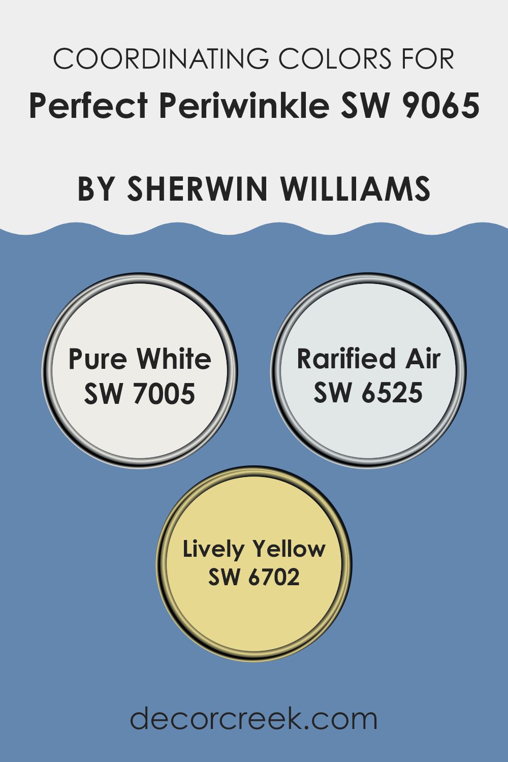
Coordinating Colors of Perfect Periwinkle SW 9065 by Sherwin Williams
Coordinating colors are hues that work together to create a harmonious look in a room. When choosing coordinating colors, it’s important to select those that complement the main color, enhancing its beauty rather than clashing with it. For Perfect Periwinkle by Sherwin Williams, which is a soft and soothing purplish-blue, choosing the right coordinating colors can enhance its charm.
An excellent choice is Pure White (SW 7005), which adds freshness and simplicity. This clean white can highlight the subtle undertones of Perfect Periwinkle, offering a crisp contrast and providing a neutral backdrop.
Another great option is Rarified Air (SW 6525), a light and airy blue that complements the cool vibe of Perfect Periwinkle. It creates a gentle flow and adds to the breezy feeling in any room. For a bit of contrast and warmth, Lively Yellow (SW 6702) works well alongside these cooler tones.
Its sunny disposition injects energy and warmth, creating a vibrant yet balanced atmosphere. Together, these colors can form a calm and inviting room, each playing its part in enhancing the other’s qualities without making the senses feel too intense.
You can see recommended paint colors below:
- SW 7005 Pure White
- SW 6525 Rarified Air
- SW 6702 Lively Yellow
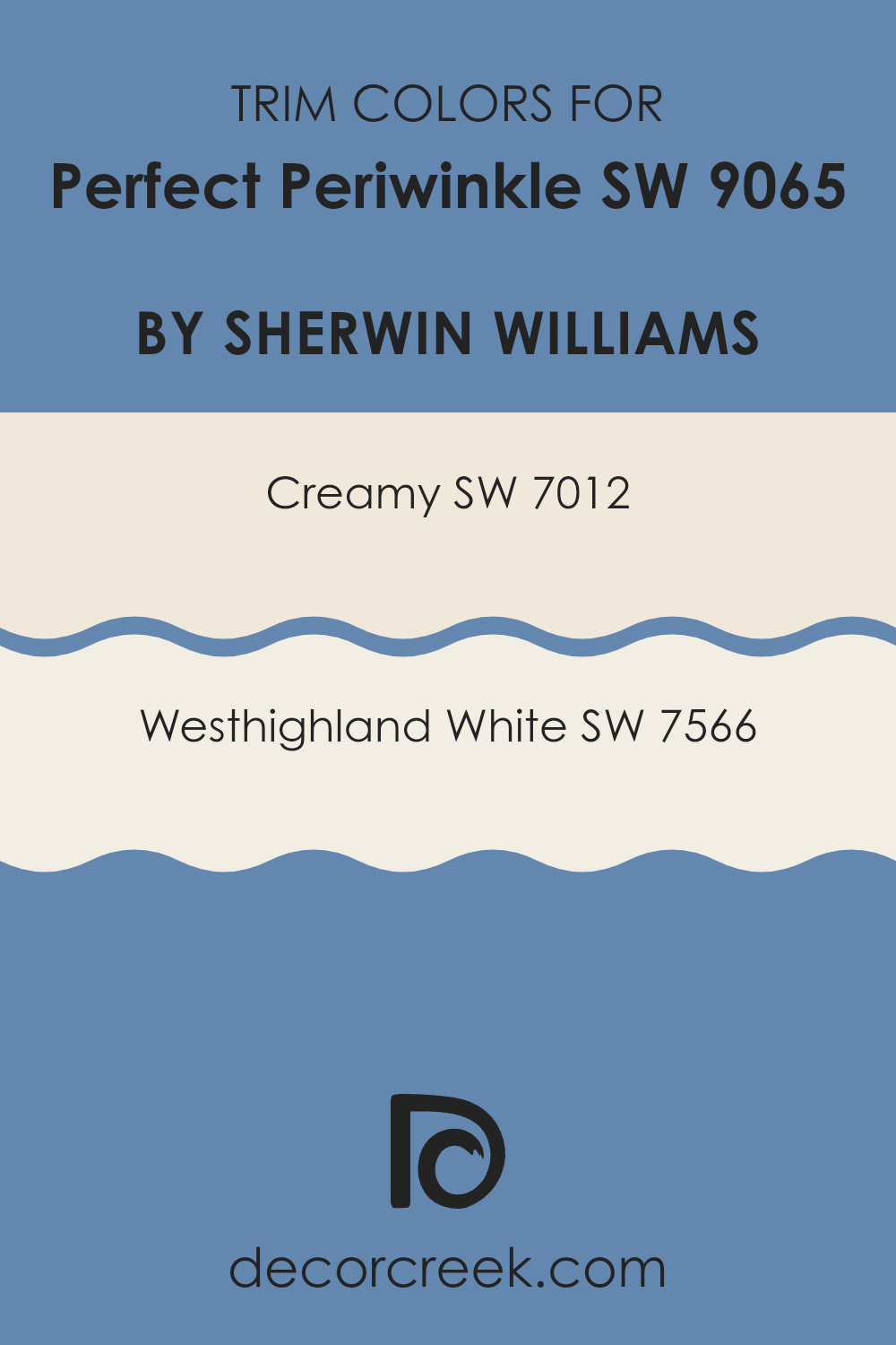
What are the Trim colors of Perfect Periwinkle SW 9065 by Sherwin Williams?
Trim colors are essential for highlighting and defining rooms, and they play a crucial role when using a primary wall color like Perfect Periwinkle by Sherwin Williams. Trim colors like SW 7012 – Creamy and SW 7566 – Westhighland White can frame the periwinkle hue, enhancing its charm and presence. Creamy is a soft, warm off-white that provides a gentle contrast without overpowering the main color.
Meanwhile, Westhighland White is a light, crisp white with a hint of warmth, which pairs seamlessly with the calming essence of Perfect Periwinkle. These trim colors are important because they add depth, create visual interest, and ensure that the main color stands out beautifully without clashing with other design elements.
Choosing the right trim color can accentuate the elegance and beauty of the main wall color. Creamy and Westhighland White serve this function well by offering subtle distinction without being too bold. Creamy brings a touch of warmth that can make a room feel more inviting, while Westhighland White provides a clean, fresh border that highlights the soft blue-purple tones of Perfect Periwinkle.
By opting for these specific trim colors, you can ensure that the overall visual appeal of the room remains harmonious and balanced, all while allowing Perfect Periwinkle to shine as the central theme.
You can see recommended paint colors below:
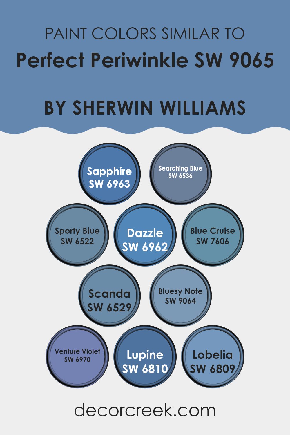
Colors Similar to Perfect Periwinkle SW 9065 by Sherwin Williams
Similar colors play a vital role in design, providing a harmonious and cohesive look. Perfect Periwinkle is a lovely shade of blue with a touch of purple, commonly paired with similar hues to create a balanced and appealing color scheme. This is where colors like SW 6963 – Sapphire, a rich and deep blue, come into play, offering depth and elegance.
SW 6536 – Searching Blue brings a soft, muted quality, adding a gentle touch to the palette. SW 6522 – Sporty Blue, with its lively and vibrant tone, injects a sense of energy and fun. SW 6962 – Dazzle adds a bright, eye-catching blue that can uplift any room.
In addition, SW 7606 – Blue Cruise offers a calm, oceanic vibe that complements these shades well. SW 6529 – Scanda introduces a cool and refreshing light blue, while SW 9064 – Bluesy Note comes through with a more soulful, darker blue. SW 6970 – Venture Violet introduces a subtle hint of purple, enhancing the palette’s depth, while SW 6810 – Lupine and SW 6809 – Lobelia add gentle purples that harmonize perfectly with the blues.
These similar colors work together seamlessly, creating a visually pleasing arrangement that is flexible and soothing. By carefully selecting and combining these colors, you can design areas that feel well-coordinated and inviting.
You can see recommended paint colors below:
- SW 6963 Sapphire
- SW 6536 Searching Blue
- SW 6522 Sporty Blue
- SW 6962 Dazzle
- SW 7606 Blue Cruise
- SW 6529 Scanda
- SW 9064 Bluesy Note
- SW 6970 Venture Violet
- SW 6810 Lupine
- SW 6809 Lobelia
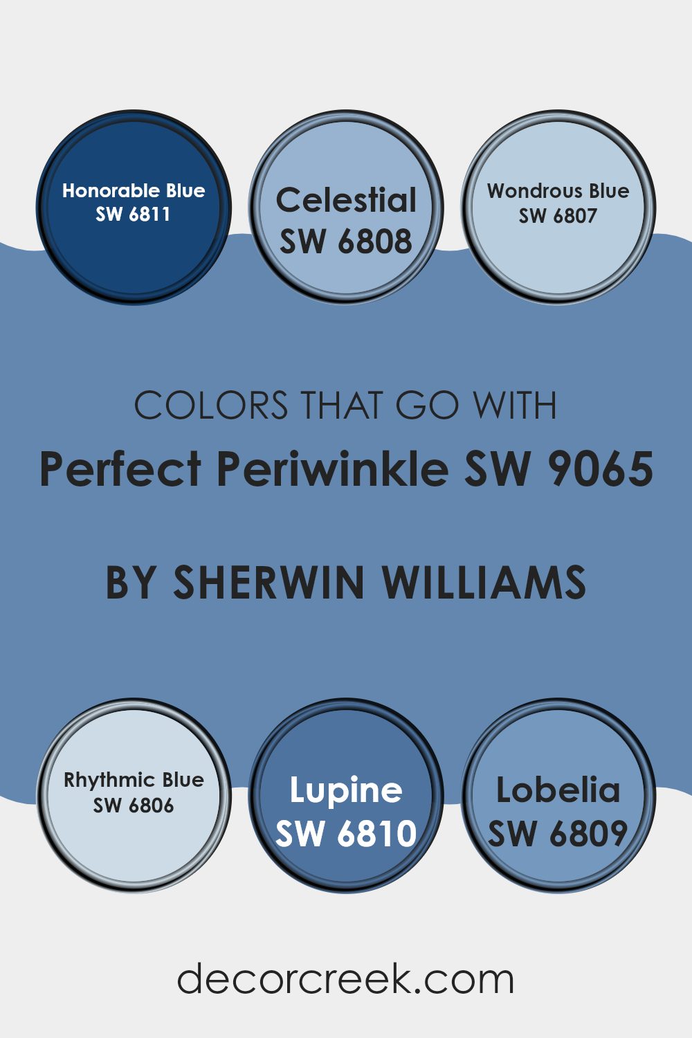
Colors that Go With Perfect Periwinkle SW 9065 by Sherwin Williams
Choosing colors that pair well with Perfect Periwinkle SW 9065 by Sherwin Williams is crucial for creating a harmonious and visually appealing room. Perfect Periwinkle is a soft, calming shade of blue with a touch of purple, which works wonderfully as a base color. Complementing it with other colors can enhance its charm and balance its tone in any room.
Honorable Blue SW 6811, with its rich and deep blue hue, can add a touch of elegance and strength, while Celestial SW 6808, a lighter and airier blue, provides a sense of openness and area. Wondrous Blue SW 6807, a slightly vibrant shade, can add a splash of energy to the mix.
Meanwhile, Rhythmic Blue SW 6806 brings a steady and peaceful vibe, perfectly complementing the playful yet gentle tone of Perfect Periwinkle. Lupine SW 6810, with its bluish-purple tinge, adds depth and richness. Lobelia SW 6809, is a more muted tone, offering a soft and refined touch, rounding out the palette.
Using these colors together can create a dynamic and pleasant environment, where each shade plays off the other, resulting in a balanced and appealing atmosphere. They work together effortlessly, enhancing the soothing quality of Perfect Periwinkle while adding individual character and flair to the decor.
You can see recommended paint colors below:
- SW 6811 Honorable Blue
- SW 6808 Celestial
- SW 6807 Wondrous Blue
- SW 6806 Rhythmic Blue
- SW 6810 Lupine
- SW 6809 Lobelia
How to Use Perfect Periwinkle SW 9065 by Sherwin Williams In Your Home?
Perfect Periwinkle SW 9065 by Sherwin Williams is a gentle, soft shade of blue. It’s light and calming, making it a great choice for any room where you want to create a peaceful atmosphere. In a bedroom, this color can help promote relaxation and rest, setting the stage for a soothing night’s sleep. In a bathroom, it can complement white tiles or fixtures, giving a clean and fresh look.
For a living room, pair Perfect Periwinkle with neutral furniture like beige or gray to create a welcoming room for family and friends. Add accents in darker blues or greens for a bit of contrast. In a kitchen, this color can brighten up walls, especially when paired with white cabinets or stainless steel appliances.
Overall, it’s a flexible color that works well in most areas. Perfect Periwinkle brings a soft touch to a home without being intense.
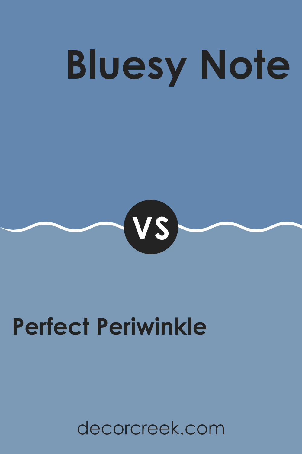
Perfect Periwinkle SW 9065 by Sherwin Williams vs Bluesy Note SW 9064 by Sherwin Williams
Perfect Periwinkle SW 9065 and Bluesy Note SW 9064 by Sherwin Williams are two distinct yet related shades of blue. Perfect Periwinkle is a soft, gentle blue with a hint of periwinkle purple, providing a calming and airy feel.
It can give a room a light and refreshing atmosphere, making it a great choice for bedrooms or areas where relaxation is key. Bluesy Note, on the other hand, is a slightly darker and more subdued blue. It carries a richer, more traditional feel, yet still maintains a sense of calmness.
This color is well-suited for living rooms or study areas, where it can add depth and warmth without being overpowering. Both shades can complement each other well, with Perfect Periwinkle bringing brightness and Bluesy Note adding depth, making them flexible options for different rooms within a home.
You can see recommended paint color below:
- SW 9064 Bluesy Note
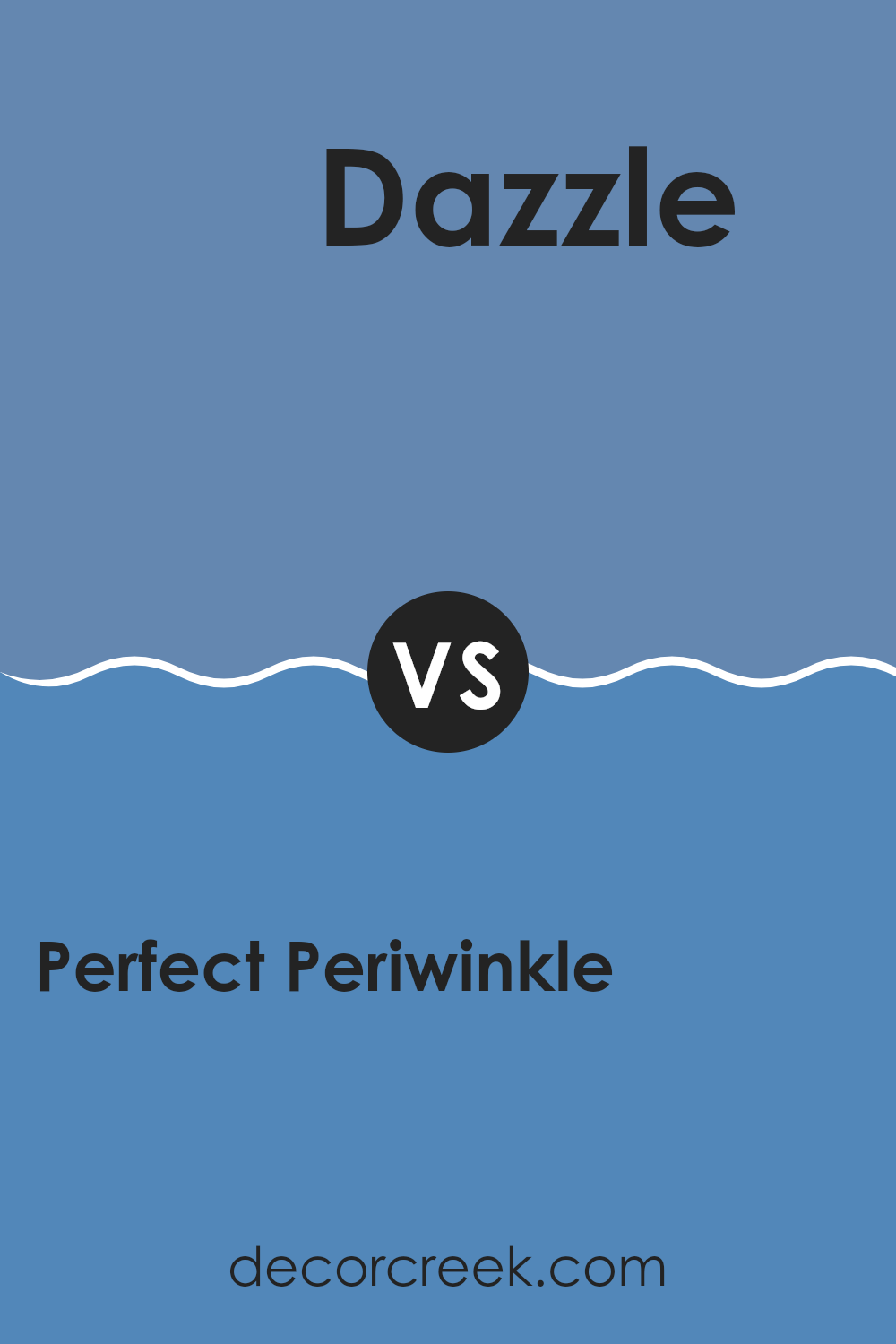
Perfect Periwinkle SW 9065 by Sherwin Williams vs Dazzle SW 6962 by Sherwin Williams
Perfect Periwinkle SW 9065 and Dazzle SW 6962 are two distinct colors by Sherwin Williams that each bring unique moods to a room. Perfect Periwinkle is a gentle, soft shade of purple with blue undertones.
It has a calming vibe, making it a good match for areas where you want to relax, like bedrooms or living rooms. This color works well with neutrals and can add a touch of subtle elegance without being overpowering. On the other hand, Dazzle is a bold, vibrant shade of pink that is lively and energetic.
It stands out and can make a strong statement, perfect for areas where you want to create excitement, such as a playroom, accent wall, or creative workspace. Dazzle pairs well with other bold colors and can bring a lot of energy to a room. While Perfect Periwinkle is soothing and gentle, Dazzle is bright and invigorating, giving each its own special place in interior design.
You can see recommended paint color below:
- SW 6962 Dazzle
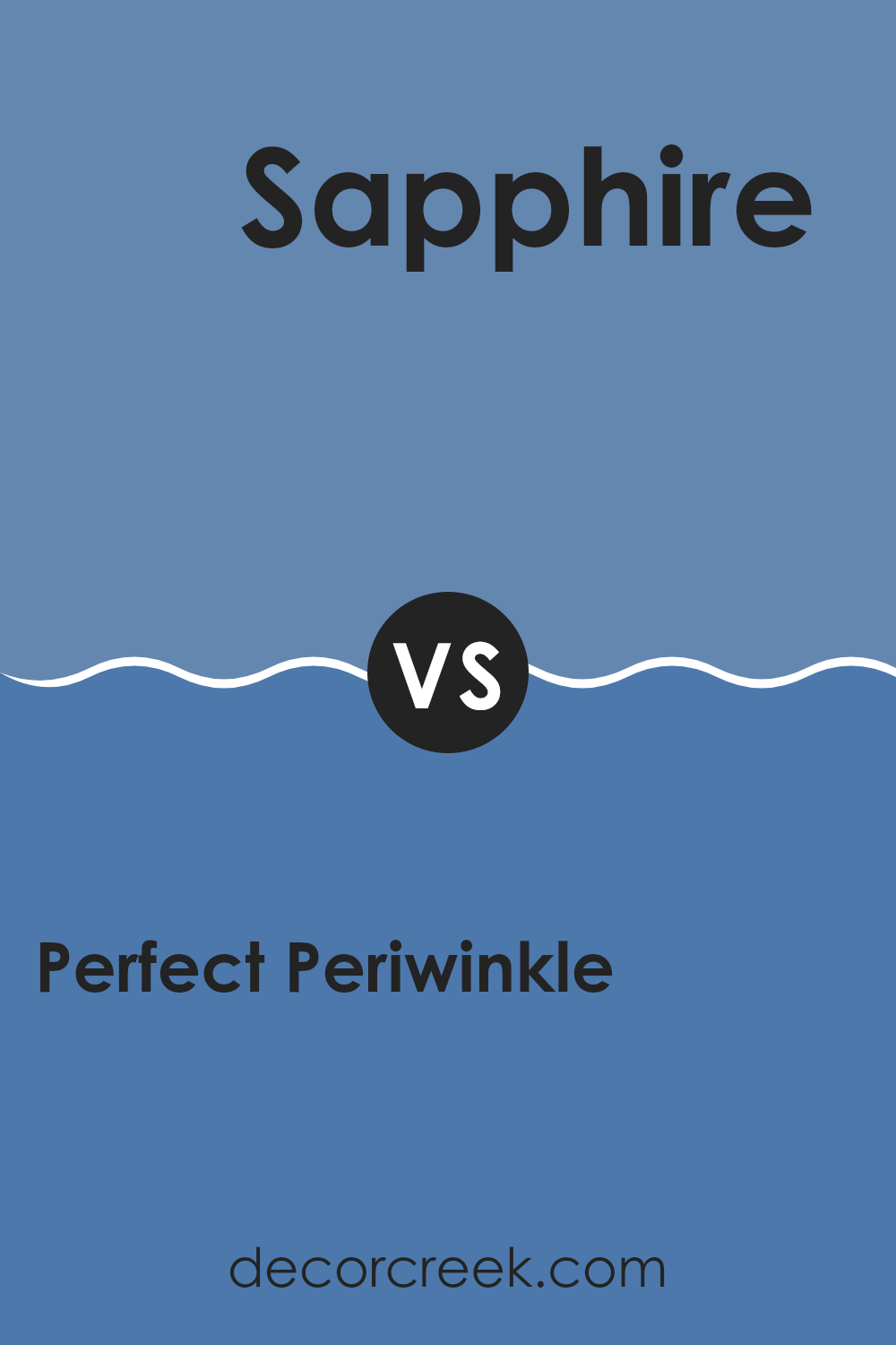
Perfect Periwinkle SW 9065 by Sherwin Williams vs Sapphire SW 6963 by Sherwin Williams
Perfect Periwinkle SW 9065 and Sapphire SW 6963 by Sherwin Williams are two beautiful shades of blue with distinct personalities. Perfect Periwinkle is a soft, soothing hue that combines gentle blue with hints of purple.
It feels calm and inviting, making it a great choice for bedrooms or areas where relaxation is key. On the other hand, Sapphire SW 6963 is a bold, vibrant blue that stands out with its rich, jewel-like quality. This color demands attention and adds energy to any room, making it suitable for feature walls or areas where you want to make a statement.
While Perfect Periwinkle creates a sense of calm and subtle elegance, Sapphire brings drama and vibrancy. When choosing between these two, consider the mood you want to set in your room: peaceful and understated with Perfect Periwinkle, or lively and dynamic with Sapphire.
You can see recommended paint color below:
- SW 6963 Sapphire
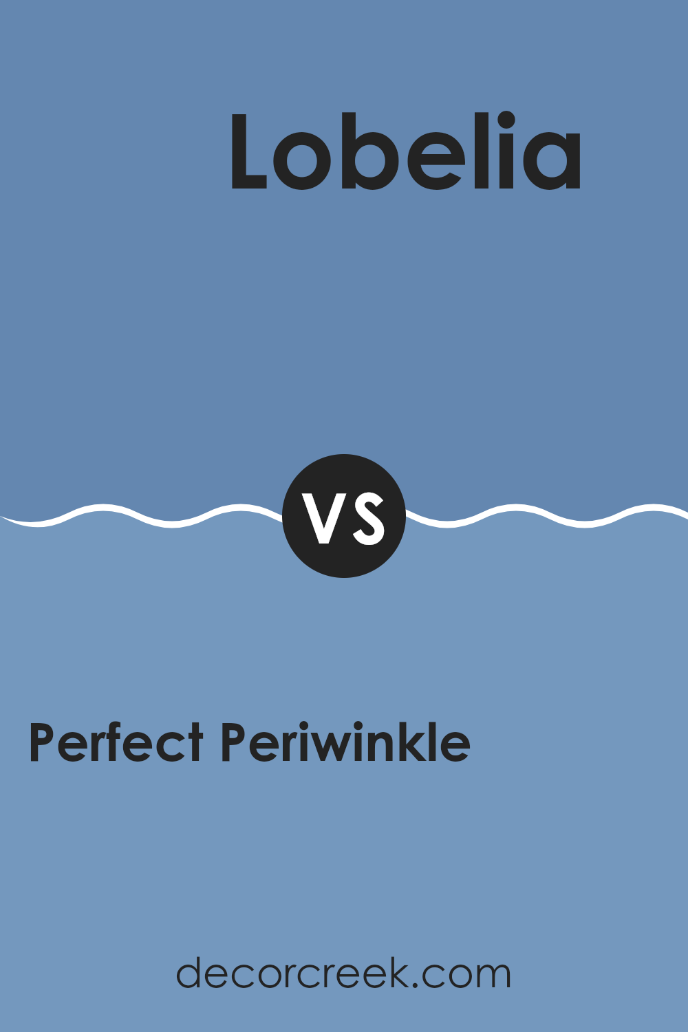
Perfect Periwinkle SW 9065 by Sherwin Williams vs Lobelia SW 6809 by Sherwin Williams
Perfect Periwinkle (SW 9065) by Sherwin Williams is a gentle, pastel shade of blue with hints of lavender. It provides a soft, calming effect that can make areas feel airy and open. It’s flexible and can be used in bedrooms, bathrooms, or any room where a peaceful atmosphere is desired.
Its light tone pairs well with whites and other pastel colors, creating a harmonious and delicate palette. Lobelia (SW 6809) by Sherwin Williams, on the other hand, is a deeper and more vibrant shade of blue. It has a rich, bold presence that can add a dramatic touch to a room.
It works well in areas where you want to make a statement, such as accent walls or focused areas. Lobelia pairs beautifully with neutral tones and metallic accents, giving rooms a modern and energetic feel. Both colors offer different moods, allowing for varied design approaches.
You can see recommended paint color below:
- SW 6809 Lobelia
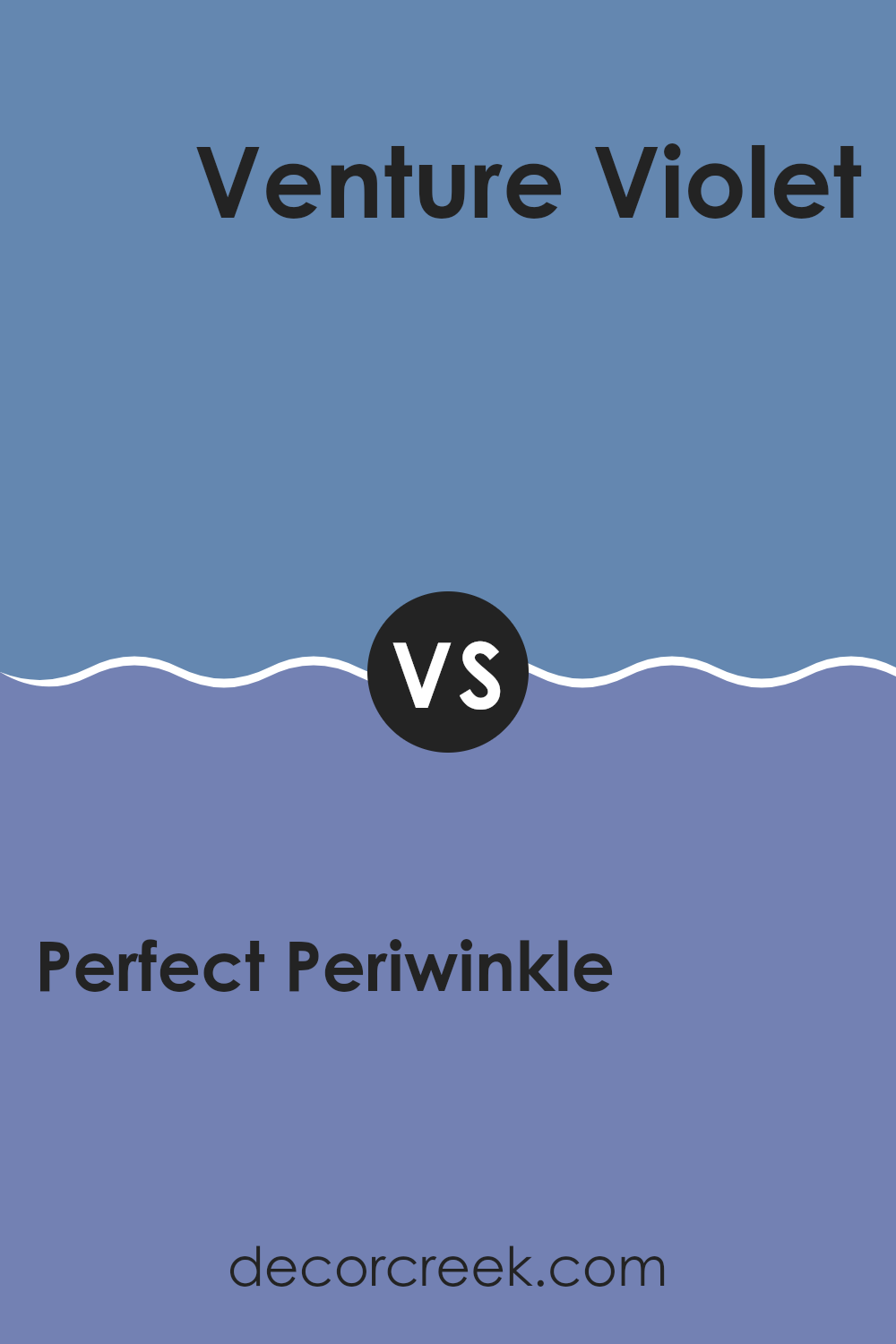
Perfect Periwinkle SW 9065 by Sherwin Williams vs Venture Violet SW 6970 by Sherwin Williams
Perfect Periwinkle SW 9065 and Venture Violet SW 6970 by Sherwin Williams are both shades of purple, but they have distinct characteristics. Perfect Periwinkle is a softer, more muted lavender. It has a calming presence, with hints of blue that make it feel clean and airy. This color works well in areas where a peaceful atmosphere is desired, such as bedrooms or living rooms.
In contrast, Venture Violet is bolder and more vibrant. It leans towards a deep, rich purple with red undertones, making it feel more energetic and striking. This color can add drama and depth to a room, making it suitable for accent walls or artistic rooms.
While Perfect Periwinkle offers a gentle touch, Venture Violet makes a strong statement. Choosing between them depends on whether you want a room that feels cozy and calm or one that is lively and eye-catching.
You can see recommended paint color below:
- SW 6970 Venture Violet
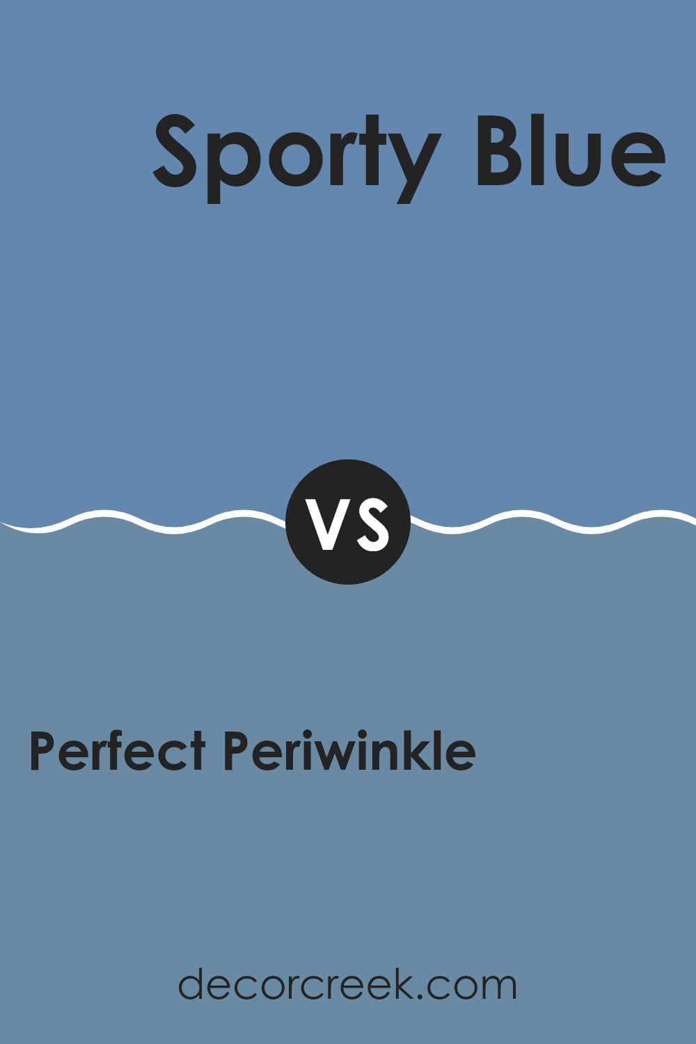
Perfect Periwinkle SW 9065 by Sherwin Williams vs Sporty Blue SW 6522 by Sherwin Williams
Perfect Periwinkle SW 9065 and Sporty Blue SW 6522 by Sherwin Williams are both calming shades of blue, but they bring different vibes to a room. Perfect Periwinkle is a soft, muted periwinkle that leans towards lavender.
It’s gentle and soothing, making it a good choice for creating a relaxed atmosphere in bedrooms or living rooms. On the other hand, Sporty Blue is a brighter, more energetic blue with hints of aqua. It feels refreshing and lively, ideal for areas where you want to encourage activity and creativity, like home offices or playrooms.
While Perfect Periwinkle can create a calm, relaxing room with its subtlety, Sporty Blue adds a pop of color and invigorates the room. Both colors can be used in different settings to achieve various moods—Perfect Periwinkle for a peaceful vibe and Sporty Blue for a more vibrant feel.
You can see recommended paint color below:
- SW 6522 Sporty Blue
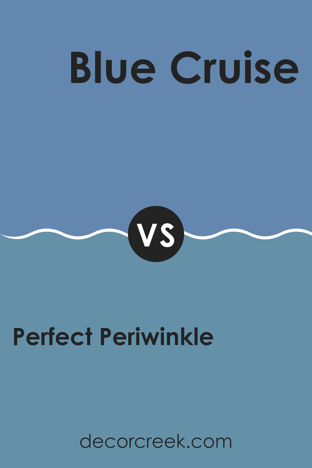
Perfect Periwinkle SW 9065 by Sherwin Williams vs Blue Cruise SW 7606 by Sherwin Williams
Perfect Periwinkle (SW 9065) and Blue Cruise (SW 7606) by Sherwin Williams are two distinct shades of blue that offer unique atmospheres to any room. Perfect Periwinkle is a soft, gentle shade of blue with lavender undertones.
This gives it a calming and lighthearted feel, making it ideal for bedrooms or living rooms where relaxation is key. In contrast, Blue Cruise is a deeper, more vivid blue with a hint of gray. This creates a bold and dramatic look, perfect for areas like an accent wall or a study that might benefit from a stronger color statement.
Both colors can be combined with whites or neutrals to create a balanced palette. While Perfect Periwinkle adds a touch of gentle whimsy, Blue Cruise brings depth and richness, allowing you to create different moods in different parts of your home.
You can see recommended paint color below:
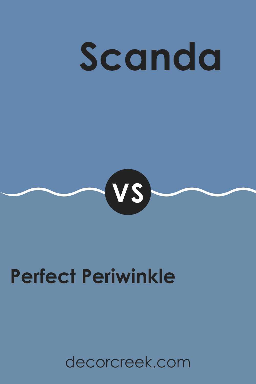
Perfect Periwinkle SW 9065 by Sherwin Williams vs Scanda SW 6529 by Sherwin Williams
Perfect Periwinkle SW 9065 and Scanda SW 6529 by Sherwin Williams are both beautiful shades of blue, but they have different vibes. Perfect Periwinkle is a soft, gentle blue with a hint of purple. It feels calm and soothing, making it great for areas where you want to relax. It’s good for bedrooms or anywhere you want a peaceful atmosphere.
On the other hand, Scanda is a brighter, more lively shade of blue. It has a bolder, more vibrant feel, which can add energy to a room. Scanda can be a fun choice for areas where you want a bit more excitement, like a playroom or a lively kitchen.
Both colors can be used to create different moods, so choosing between them depends on the atmosphere you want in your room. Perfect Periwinkle is softer and more calming, while Scanda is bold and energizing.
You can see recommended paint color below:
- SW 6529 Scanda
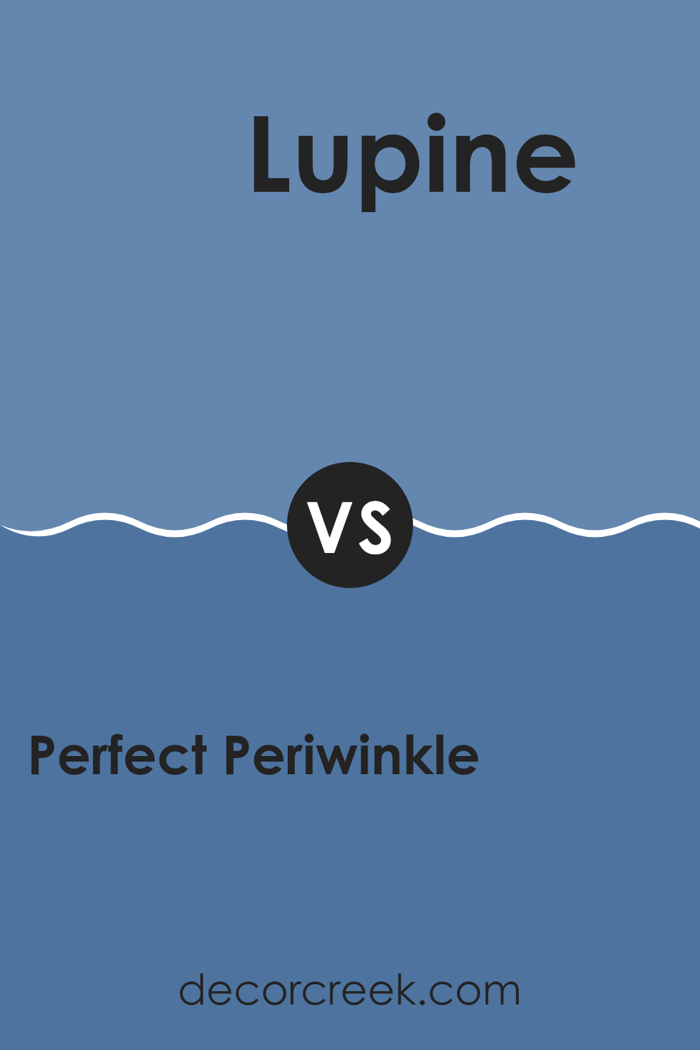
Perfect Periwinkle SW 9065 by Sherwin Williams vs Lupine SW 6810 by Sherwin Williams
Perfect Periwinkle SW 9065 and Lupine SW 6810 by Sherwin Williams are two different shades of blue. Perfect Periwinkle is a soft, muted blue with a hint of purple, which makes it feel calm and gentle. It can create a relaxing atmosphere in any room, making it great for bedrooms or living rooms where you want a peaceful vibe.
On the other hand, Lupine is a more vibrant and rich purple-blue. It has a bolder presence, adding a splash of color and energy to a room. This color is ideal for making a statement in a dining room or an accent wall in a living room.
While both colors have blue undertones, Perfect Periwinkle leans more towards a subtle, quiet tone, whereas Lupine is more daring and vibrant. Depending on the mood you want to set in your home, you can choose between the subtle calm of Perfect Periwinkle or the striking hue of Lupine.
You can see recommended paint color below:
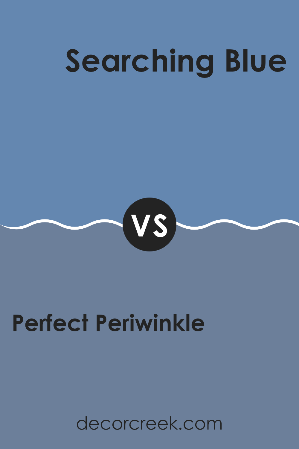
Perfect Periwinkle SW 9065 by Sherwin Williams vs Searching Blue SW 6536 by Sherwin Williams
Perfect Periwinkle SW 9065 by Sherwin Williams is a soft, gentle shade of purple with blue undertones. It has a calming and soothing effect, making it ideal for areas like bedrooms or reading nooks. The color can create a peaceful and welcoming atmosphere, and it pairs well with neutral tones like gray and white for a balanced look.
On the other hand, Searching Blue SW 6536 by Sherwin Williams is a deeper, richer shade of blue. It has more intensity and vibrancy compared to Perfect Periwinkle. It’s a strong color that can make a bold statement in any room, ideal for accent walls or areas where you want to add some depth and character.
Searching Blue pairs nicely with lighter shades or metallic accents to create a dynamic contrast. Both colors offer unique vibes: Perfect Periwinkle is soft and subtle, while Searching Blue is bold and dynamic.
You can see recommended paint color below:
After looking at SW 9065 Perfect Periwinkle by Sherwin Williams, I understand why this color can be a great choice for many people. It’s a really nice mix of blue and purple, creating a calming effect. Imagine the color of the sky just after the sun sets. It feels peaceful and makes me think of being outside on a comfy evening.
When I think about painting a room with Perfect Periwinkle, I realize it brings a sense of comfort. If I used it in a bedroom, it might help me sleep better at night. For a kid’s playroom, it can make playtime more fun and relaxing, unlike bright reds or yellows that might feel too wild.
What I also appreciate about this color is how it matches different types of furniture and decorations. Whether I have wooden shelves or bright-colored toys, Perfect Periwinkle blends nicely, nothing seems out of place. It works in many parts of the house, from bathrooms to study areas, which is awesome.
In short, SW 9065 Perfect Periwinkle is a fantastic color that makes any room feel cozy and welcoming. It’s a good choice if you want a nice feel in your home without being too loud or too plain. I think it’s a great way to bring both calm and liveliness into any room.

Ever wished paint sampling was as easy as sticking a sticker? Guess what? Now it is! Discover Samplize's unique Peel & Stick samples.
Get paint samples

