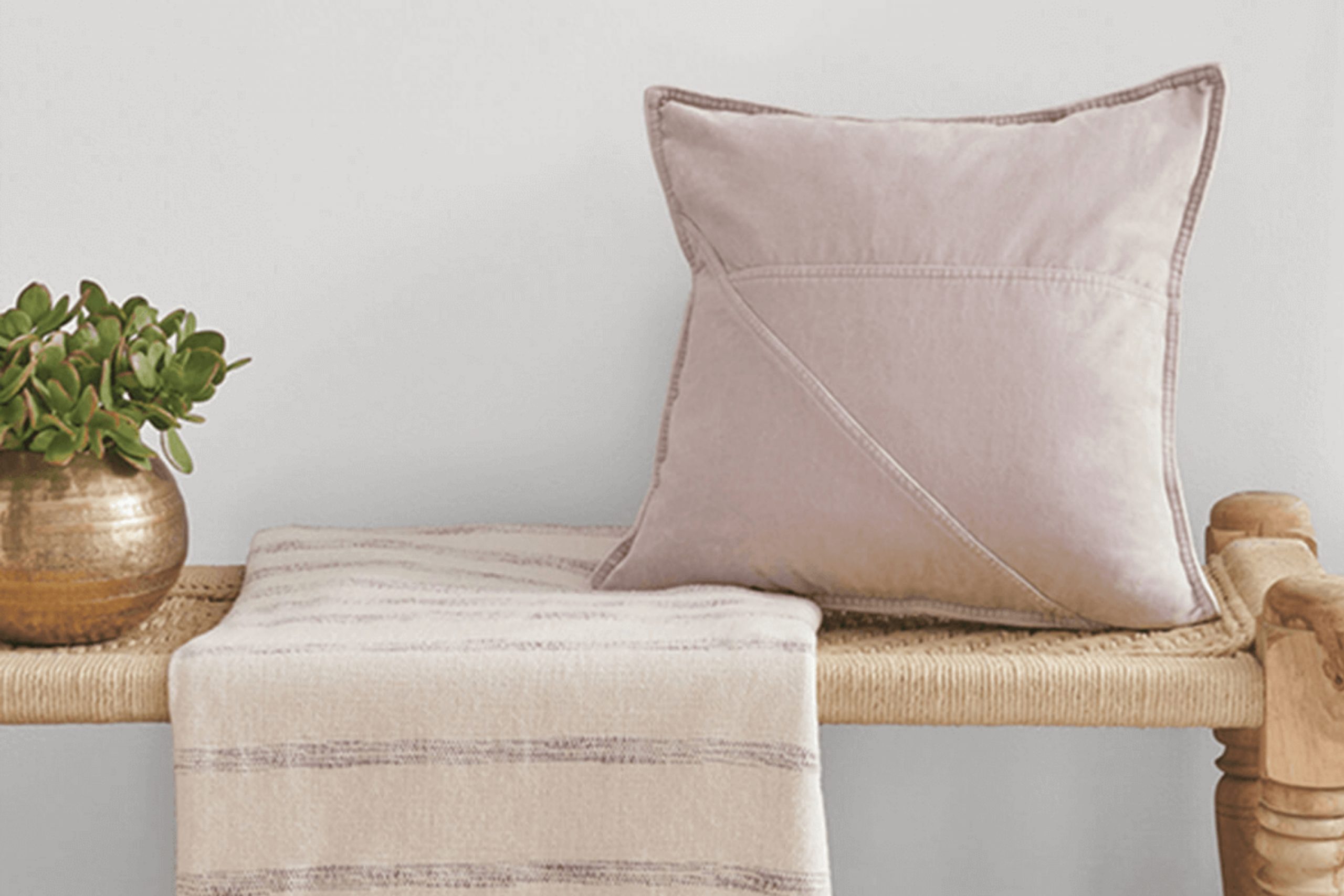
SW 6259 Spatial White by Sherwin Williams has become a popular choice for those seeking a soft, neutral shade for their homes. This color offers a calm and adaptable backdrop, ideal for any room in your house. Spatial White manages to balance warmth and coolness, making it suitable for a variety of lighting conditions and decor styles. Its subtle undertones allow it to blend effortlessly with both modern and traditional aesthetics.
Whenever I use Spatial White, I notice how it enhances the natural light, creating a sense of openness. It’s a hue that doesn’t overpower, yet it adds a layer of sophistication to the room. I find that it pairs beautifully with bolder colors, acting as an anchor while allowing other elements to shine.
Whether in a living room or a cozy bedroom, Spatial White creates a soothing environment that promotes relaxation and clarity. With its understated elegance, this color has a way of unifying a room, making it feel both inviting and refreshing.
For those looking to refresh their interior with a classic yet contemporary shade, Spatial White proves to be a remarkable choice. It offers an effortless way to achieve a harmonious and stylish look without being overly bold or dramatic.
What Color Is Spatial White SW 6259 by Sherwin Williams?
Spatial White by Sherwin Williams is a light, adaptable shade that leans towards a cool, soft white with subtle gray undertones. This makes it a great choice for rooms that aim for a calm, clean, and airy feel. It’s a neutral color that doesn’t overwhelm, allowing it to complement various design styles.
This color works well in modern, contemporary, and minimalist interiors, where its understated presence can enhance the overall aesthetic without distracting from other design elements. It can also be used in traditional settings to provide a crisp background for more ornate furnishings and decor.
Spatial White pairs beautifully with natural materials and textures, such as light wood floors or furniture, which add warmth and contrast. It also looks great next to sleek metals like stainless steel or chrome, making it a good fit for kitchens or bathrooms. For soft furnishings, consider incorporating textiles in shades of blue or gray to emphasize its cool tones, or use beige and taupe for added warmth.
Pairing Spatial White with various textures, such as chunky knit throws, woven baskets, or linen curtains, can add depth to any room, making it feel inviting while maintaining a sense of spaciousness and light.
Is Spatial White SW 6259 by Sherwin Williams Warm or Cool color?
Spatial White by Sherwin Williams is a gentle, muted white that creates a soft and inviting atmosphere in any room. This color is neutral, making it an adaptable choice for various interior styles. It works well in open, bright rooms by reflecting natural light, which can make a room feel larger and more airy.
When used on walls, Spatial White provides a clean, calm backdrop that pairs nicely with different colors and textures. It can complement both warm and cool tones, offering flexibility in choosing furniture and decor. This color is particularly effective in living rooms and bedrooms, where a relaxed and comfortable environment is desired.
In kitchens and bathrooms, Spatial White enhances cleanliness and freshness without feeling stark or clinical. It’s a perfect choice for those looking to maintain simplicity while allowing other elements like colorful artwork or accessories to stand out. Overall, Spatial White is a practical and subtle option for creating a harmonious and welcoming home.
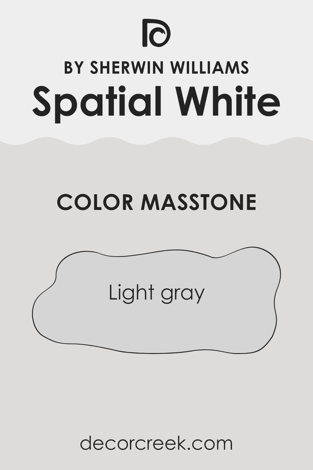
What is the Masstone of the Spatial White SW 6259 by Sherwin Williams?
Spatial White (SW 6259) by Sherwin Williams features a light gray masstone (#D5D5D5), which gives it an adaptable and calming appearance. This shade can work well in many home settings due to its neutral tone. The light gray color creates a soft backdrop, allowing other design elements, like furniture or artwork, to stand out.
In rooms with plenty of natural light, Spatial White can make a room feel bright and airy. Its neutrality also helps it blend seamlessly with both warm and cool color schemes. Whether in a bedroom, living room, or kitchen, this shade can add a clean and fresh look without feeling sterile.
Moreover, Spatial White can complement various materials such as wood, metal, and stone. Overall, it’s an excellent choice for those looking for a subtle yet engaging color that provides flexibility in decorating and matches a wide range of styles.
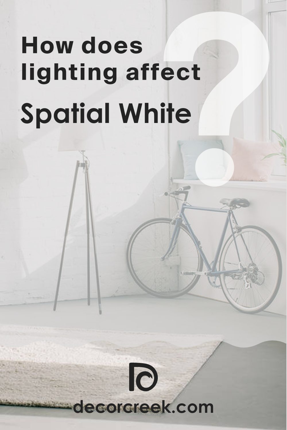
How Does Lighting Affect Spatial White SW 6259 by Sherwin Williams?
Lighting plays a crucial role in how we perceive color. Different types of light can change the appearance of a color, such as Spatial White SW 6259 by Sherwin Williams. This shade, a soft and subtle white with a hint of gray, can look different depending on the lighting conditions.
In natural light, colors tend to appear more accurate and vibrant. In a room with lots of natural light, Spatial White may look brighter and cooler. The source of natural light can change this too. In north-facing rooms, which typically have softer and cooler light, Spatial White might appear more blue or gray. This can result in a more subdued version of the color, with its undertones becoming prominent.
In contrast, south-facing rooms receive more direct sunlight throughout the day. This means Spatial White could look warmer and more inviting. The light is usually stronger and often has a yellowish tint, which enhances the warmth in the color and makes it appear creamier.
East-facing rooms get soft, warm light in the morning, and the light turns cooler by afternoon. In the morning, Spatial White will seem warmer and cozier, while in the afternoon, it might look cooler as the bluish tones surface.
West-facing rooms have a different lighting dynamic. They receive cooler light in the morning and warmer light in the afternoon as the sun sets. In the morning, Spatial White may appear a bit gray with the cool light, but it will warm up considerably in the afternoon and evening.
In artificial light, the color of Spatial White will depend on the type of bulbs you use. Incandescent and warm LEDs add more yellow tones, warming up Spatial White considerably, while cool LEDs or fluorescent lights can bring out its cooler, grayer tones. Therefore, choosing the right type of lighting is essential to achieve your desired look with Spatial White.
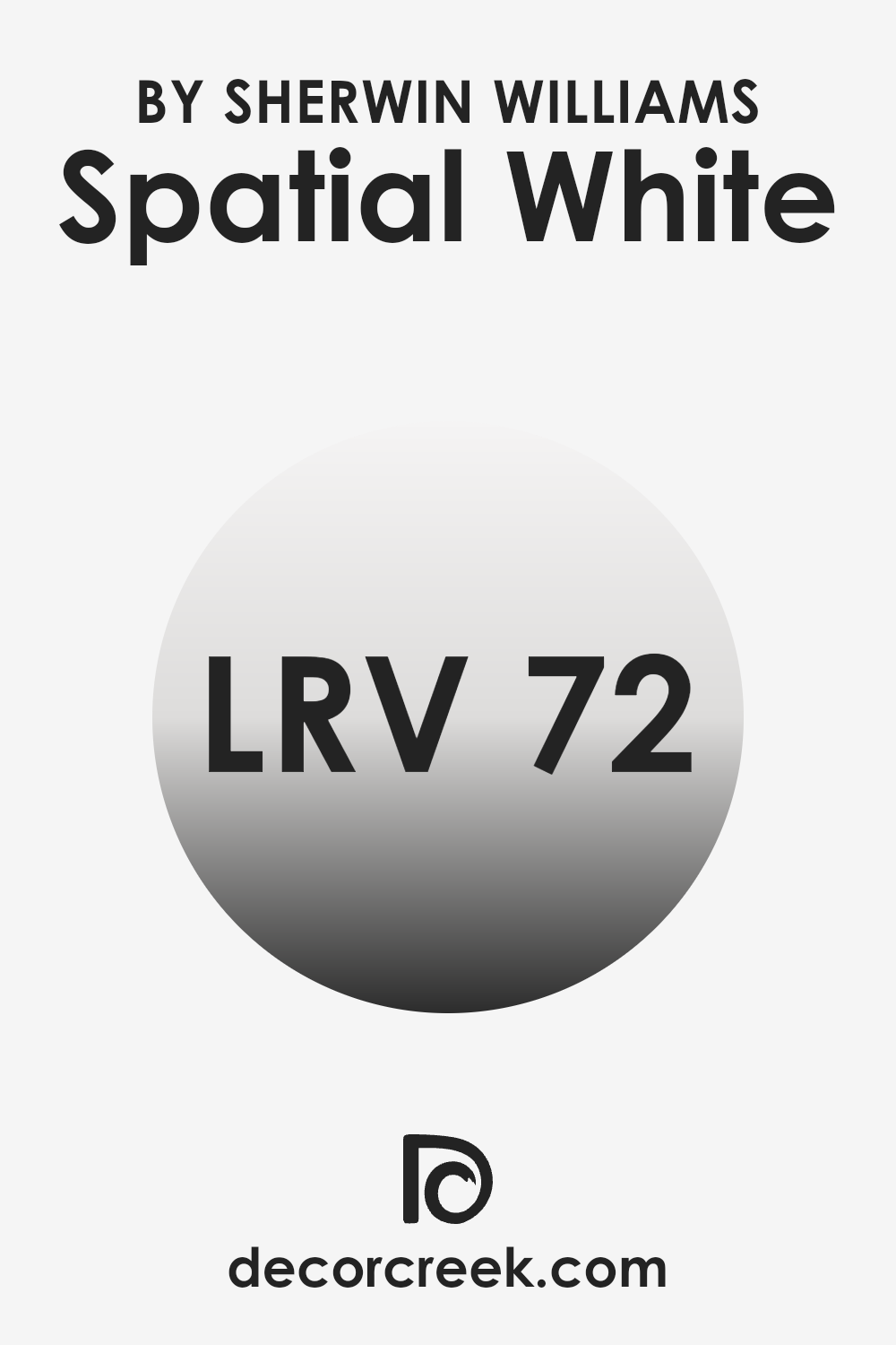
What is the LRV of Spatial White SW 6259 by Sherwin Williams?
The Light Reflectance Value, or LRV, is a measurement used to determine how much light a color reflects or absorbs. On a scale of 0 to 100, pure black has an LRV of 0, as it absorbs all light, while pure white has an LRV of 100, reflecting all light. When it comes to paint colors, LRV helps us understand how light or dark a color will look once applied to a surface.
A higher LRV means the color will reflect more light, making an area feel brighter and more open. On the other hand, a lower LRV indicates the color will absorb more light, potentially making an area feel more intimate or cozy.
Spatial White, with an LRV of 71.866, is considered a light color. This means it will reflect a significant amount of light, making any room feel brighter and more spacious. It’s a good choice for smaller rooms or areas that lack natural light, as it can help to open up the area and create an airy feel.
Because of its high LRV, Spatial White can help balance out darker elements in a room, such as furniture or flooring, without overpowering the room. Its ability to reflect light means it can adapt to lighting changes throughout the day, maintaining a consistent and appealing appearance.
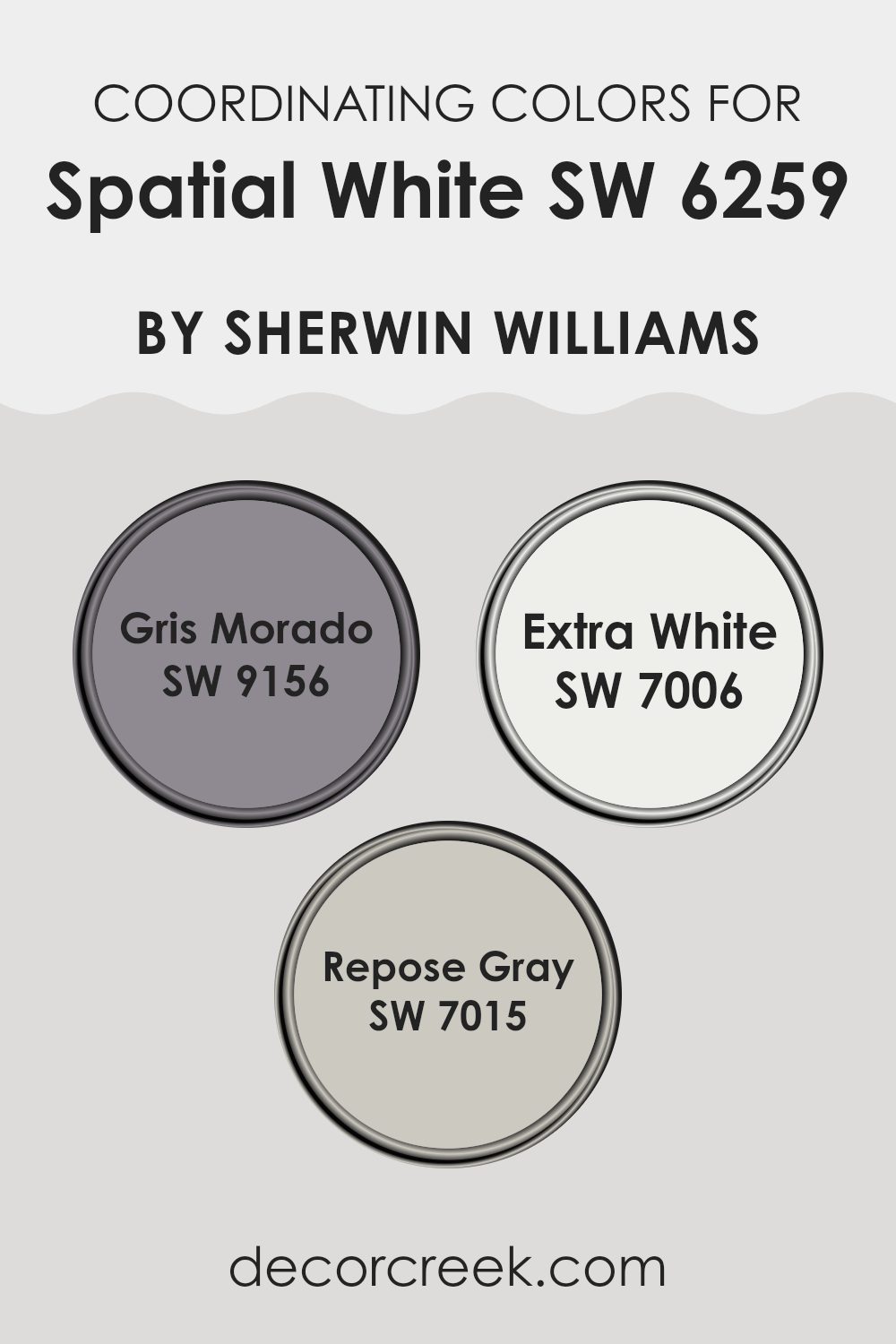
Coordinating Colors of Spatial White SW 6259 by Sherwin Williams
Coordinating colors are hues that complement each other well and create a harmonious look when used together in an area. When selecting coordinating colors for Spatial White, a popular choice by Sherwin Williams, the aim is to enhance its subtlety with colors that balance its light and airy vibe.
Spatial White is known for its ability to bring a fresh and clean feel to any room. By pairing it with coordinating shades like Gris Morado, Extra White, and Repose Gray, each offers a unique balance and contrast, resulting in a pleasing aesthetic.
Gris Morado, which is a rich grayish-purple, adds depth and intrigue without overshadowing the subtlety of Spatial White. Extra White, on the other hand, is a pure, bright white that enhances the lightness of Spatial White, making areas feel more open and expansive. Lastly, Repose Gray stands out with its soft, warm undertones, offering a gentle contrast that adds warmth and coziness to a room. Together, these colors work seamlessly to craft a visually appealing environment, each complementing the others while enhancing the overall design.
You can see recommended paint colors below:
- SW 9156 Gris Morado
- SW 7006 Extra White
- SW 7015 Repose Gray
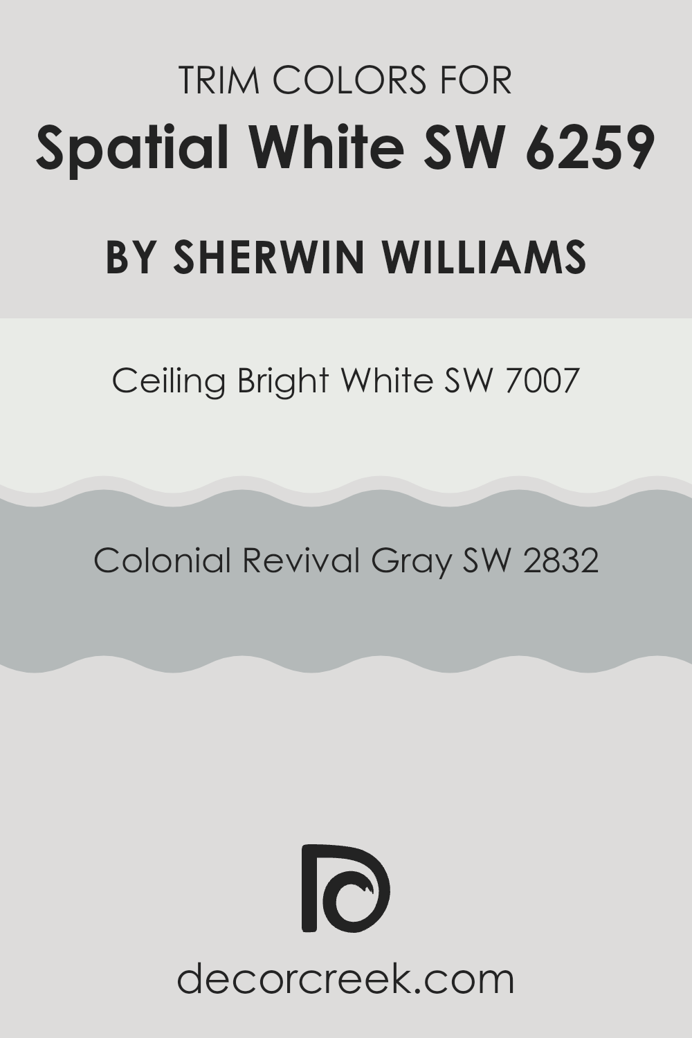
What are the Trim colors of Spatial White SW 6259 by Sherwin Williams?
Trim colors are the finishing touch in a room, highlighting architectural details and creating a polished look. When painting an area with Spatial White SW 6259 by Sherwin Williams, selecting the right trim colors can enhance and complement the overall aesthetic. Ceiling Bright White SW 7007 is a crisp, clean white that brings clarity and simplicity, making it perfect for ceilings and trim, especially in areas painted with subtle hues like Spatial White. This combination maintains a fresh and light atmosphere, providing a seamless transition between walls and trim.
Colonial Revival Gray SW 2832, on the other hand, is a refined gray with a hint of warmth, adding depth without overpowering. Using it as a trim color with Spatial White creates a gentle contrast that emphasizes the architecture of a room, such as window frames and baseboards.
The importance of choosing the right trim color lies in its ability to define the edges of a room, making the main wall color stand out while ensuring a cohesive look throughout the area. These carefully chosen colors work together to create an environment that’s inviting and well-coordinated.
You can see recommended paint colors below:
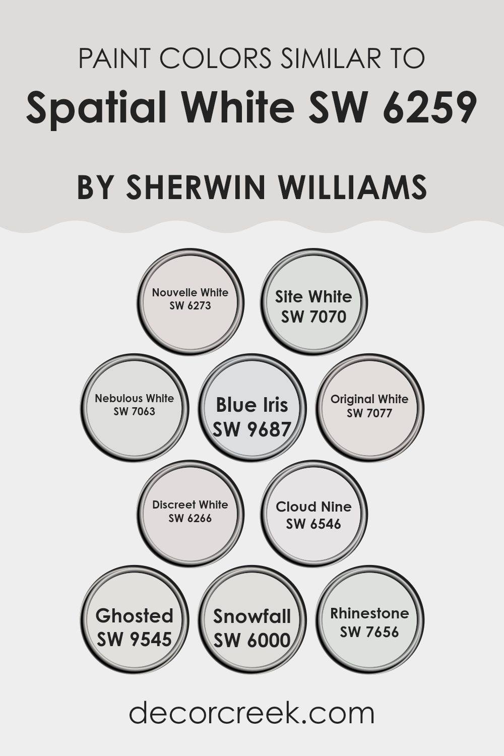
Colors Similar to Spatial White SW 6259 by Sherwin Williams
Similar colors are essential in design because they create a harmonious and cohesive look. Colors like those matching Spatial White by Sherwin Williams can subtly shift a room’s mood by adding depth and nuance. SW 6273 Nouvelle White is a soft, warm white that adds a comforting glow to any room.
SW 7070 Site White offers a clean and fresh appearance, making rooms feel open and inviting. Meanwhile, SW 7063 Nebulous White is a cool shade with a hint of gray, perfect for creating a calm backdrop. The gentle blue tint of SW 9687 Blue Iris can bring a touch of freshness and a pop of color without overpowering the senses.
SW 7077 Original White maintains a classic, lasting appeal that pairs well with almost any design scheme. For those seeking a soft touch of character, SW 6266 Discreet White with its gentle warmth works beautifully. SW 6546 Cloud Nine has a light, airy quality that can lift a room’s look.
A delicate gray, SW 9545 Ghosted provides subtle refinement without feeling too stark. Lastly, SW 6000 Snowfall offers a crisp, bright feel, while SW 7656 Rhinestone introduces a cooler tone with a hint of blue, making rooms calm and refreshing. Together, these colors provide adaptable options while ensuring a pleasing visual experience.
You can see recommended paint colors below:
- SW 6273 Nouvelle White
- SW 7070 Site White
- SW 7063 Nebulous White
- SW 9687 Blue Iris
- SW 7077 Original White
- SW 6266 Discreet White
- SW 6546 Cloud Nine
- SW 9545 Ghosted
- SW 6000 Snowfall
- SW 7656 Rhinestone
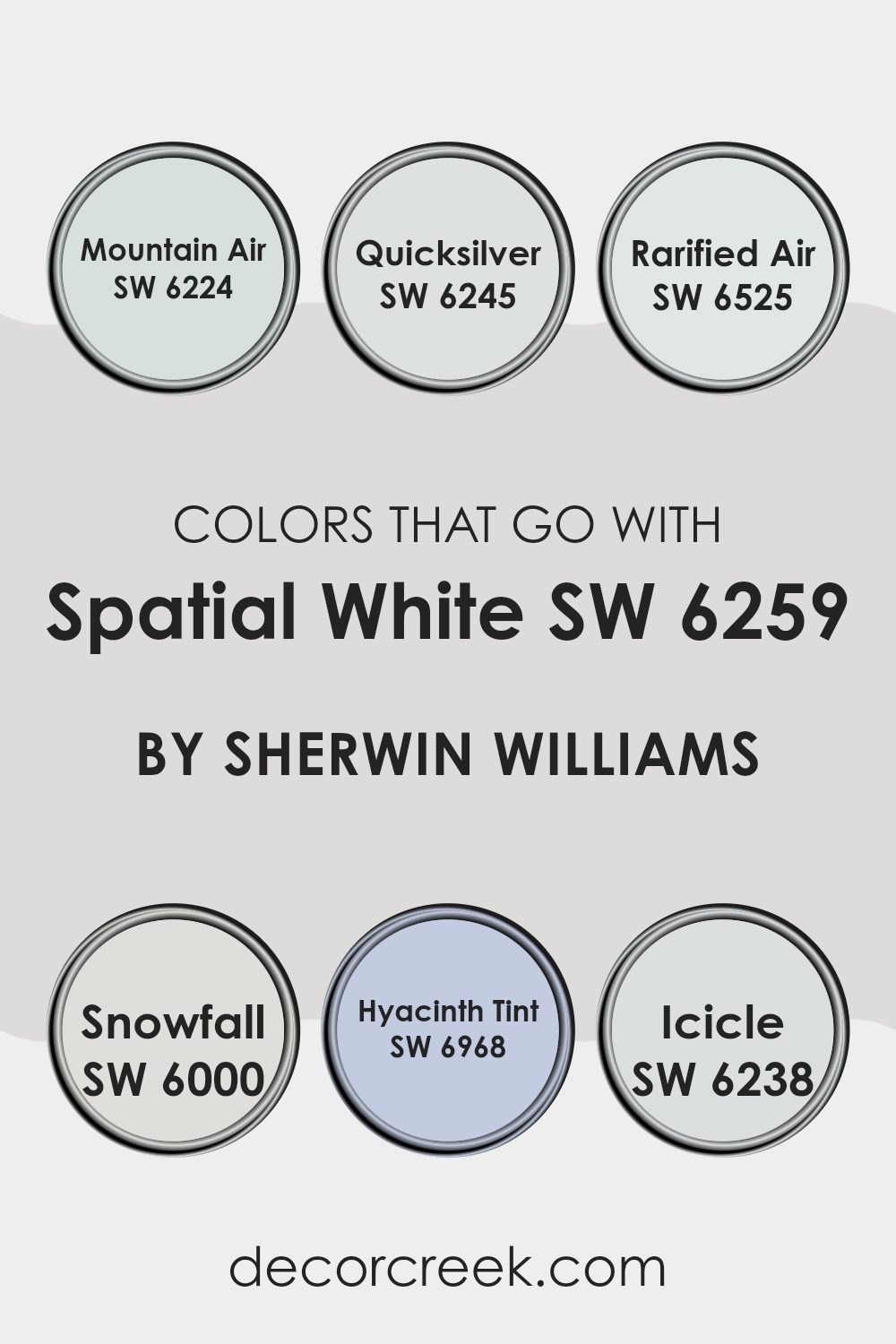
Colors that Go With Spatial White SW 6259 by Sherwin Williams
Colors that go well with Spatial White SW 6259 by Sherwin Williams play a vital role in creating a harmonious and inviting area. Spatial White is a soft, neutral shade that acts as a perfect backdrop, allowing other colors to stand out while maintaining a cohesive look. Pairing it with SW 6224 Mountain Air introduces a light, airy blue that adds a touch of freshness and calm, making rooms feel more open. Meanwhile, SW 6245 Quicksilver, a gentle gray with a hint of coolness, complements Spatial White beautifully, adding depth and interest without overpowering the area.
SW 6525 Rarified Air is a delicate sky blue that brings a sense of calm and openness, perfect for bedrooms or living areas. For a more crisp and clean feel, SW 6000 Snowfall offers a pure white that enhances brightness and provides a lasting contrast.
SW 6968 Hyacinth Tint presents a subtle lavender hue that introduces a hint of color, offering a modern twist that works well in accent pieces or smaller rooms. Lastly, SW 6238 Icicle, a soft and icy blue, effortlessly adds a cool touch, making it ideal for bathrooms or kitchens that need a refreshing feel. Together, these colors work with Spatial White to create balanced and stylish environments.
You can see recommended paint colors below:
- SW 6224 Mountain Air
- SW 6245 Quicksilver
- SW 6525 Rarified Air
- SW 6000 Snowfall
- SW 6968 Hyacinth Tint
- SW 6238 Icicle
How to Use Spatial White SW 6259 by Sherwin Williams In Your Home?
Spatial White SW 6259 is a gentle, clean color by Sherwin Williams that is perfect for creating a fresh and open feeling in any home. It’s a soft white with a hint of warmth, making it adaptable for different rooms and styles. You can use this color on your walls to make areas look larger and brighter.
It’s great for living rooms, bedrooms, or kitchens, especially if you want a simple, uncluttered look. Spatial White works well with both modern and traditional decor. You can pair it with darker colors for contrast or keep everything light by matching it with pastel shades.
It also complements natural materials like wood and stone, adding a touch of coziness. If you want to create a welcoming and airy environment in your home, Spatial White might be a good choice, providing a perfect backdrop for art and decorative pieces.
Spatial White SW 6259 by Sherwin Williams vs Nebulous White SW 7063 by Sherwin Williams
Spatial White SW 6259 and Nebulous White SW 7063 by Sherwin Williams are both soft white shades, but they have unique characteristics that make them stand out. Spatial White is a cool white with subtle gray undertones, making it crisp and modern, perfect for a clean, minimalist look. It works well in rooms that get a lot of natural light.
On the other hand, Nebulous White is a bit warmer with its gentle undertones. It has a hint of greige, meaning it can adjust to different lighting conditions. This makes it adaptable for various rooms, providing a cozy and inviting feel.
When choosing between the two, consider the atmosphere you want to create. Spatial White is great for a fresh, contemporary vibe, while Nebulous White offers a softer, more welcoming appearance. Both colors are adaptable, but your choice should depend on the mood and style you prefer for your area.
You can see recommended paint color below:
Spatial White SW 6259 by Sherwin Williams vs Ghosted SW 9545 by Sherwin Williams
Spatial White and Ghosted are both soft, neutral colors offered by Sherwin Williams, but they have distinct differences.
Spatial White is a light gray with a hint of warmth. It works well in creating a clean and airy feel, making it a popular choice for modern and minimalist rooms. Its subtle warmth can add a cozy touch to a room without overpowering it.
Ghosted, on the other hand, is a true neutral gray with a cooler undertone. It brings a calm and balanced look, ideal for rooms where you want a simple yet refined atmosphere. Its cooler tone can be great for contemporary designs, offering a sleek and polished finish.
Both colors are great for creating neutral backdrops, but your choice depends on whether you prefer the warmer hint of Spatial White or the cooler tone of Ghosted. They both have versatility in home decor, suiting various styles and lighting conditions.
You can see recommended paint color below:

Spatial White SW 6259 by Sherwin Williams vs Snowfall SW 6000 by Sherwin Williams
Spatial White SW 6259 and Snowfall SW 6000 by Sherwin Williams are both appealing neutral colors, yet they offer different moods. Spatial White is a soft gray with subtle warmth that creates a clean and modern look. It is adaptable and works well with both warm and cool accents, making it a good choice for a variety of settings.
On the other hand, Snowfall SW 6000 is a warmer off-white color with beige undertones. It gives a cozy and inviting feel to rooms, making areas look comfortable and welcoming. While both colors are neutral and pair well with other colors, Spatial White tends to feel more contemporary, whereas Snowfall, with its softer tone, could be better suited for traditional or cozy areas.
Together, they offer a nice contrast: Spatial White’s modern vibe can balance well with the warmth of Snowfall, allowing for a harmonious design that suits different preferences and styles.
You can see recommended paint color below:
- SW 6000 Snowfall
Spatial White SW 6259 by Sherwin Williams vs Discreet White SW 6266 by Sherwin Williams
Spatial White (SW 6259) and Discreet White (SW 6266) by Sherwin Williams are two subtle yet distinct shades of white. Spatial White is a cool-toned white with a slight gray undertone, making it perfect for a modern and sleek look. It works well in a room with plenty of natural light, as it maintains its crisp appearance without feeling too stark or cold.
On the other hand, Discreet White also has a cool undertone but leans slightly more towards blue. This gives it a softer feel compared to Spatial White, making it suitable for creating a calming atmosphere in bedrooms or living areas.
Although both colors belong to the same family of cool whites, the difference in undertones can influence the mood of a room, with Spatial White appearing more neutral and contemporary, while Discreet White offers a touch of subtle elegance.
You can see recommended paint color below:
- SW 6266 Discreet White
Spatial White SW 6259 by Sherwin Williams vs Nouvelle White SW 6273 by Sherwin Williams
Spatial White SW 6259 by Sherwin Williams and Nouvelle White SW 6273 by Sherwin Williams are both light, neutral colors, but they have subtle differences that set them apart. Spatial White is a soft, cool white that carries a hint of gray. It provides a clean, fresh look, making it adaptable for various areas, and it works well with both modern and traditional designs.
On the other hand, Nouvelle White is slightly warmer. It’s an off-white with a touch more warmth, which can add coziness to a room without losing the brightness that whites generally offer. This makes it a more inviting choice for living areas or bedrooms where a bit of warmth is desired.
While both colors can make areas feel open and airy, the choice between them may depend on the lighting in the room and the mood you want to create. Spatial White is perfect for a crisp, modern feel, while Nouvelle White offers warmth and comfort.
You can see recommended paint color below:
- SW 6273 Nouvelle White
Spatial White SW 6259 by Sherwin Williams vs Site White SW 7070 by Sherwin Williams
Spatial White SW 6259 and Site White SW 7070 by Sherwin Williams are both popular paint colors, but they each have unique qualities. Spatial White is a warm off-white that gives a cozy and inviting look. It has subtle beige undertones, making it adaptable for various areas. This color is excellent for creating a soft and welcoming atmosphere in living rooms or bedrooms.
Site White, on the other hand, is a cool-toned white with slight gray undertones. It provides a modern and clean look, perfect for contemporary rooms or areas that need a fresh, airy feel. Site White works well in kitchens, bathrooms, or any area where a crisp and clear appearance is desired.
While both are neutrals, Spatial White leans towards warmth and comfort, while Site White offers a cooler, more minimalist vibe. Choosing between them depends on the mood and style you want for your area.
You can see recommended paint color below:
Spatial White SW 6259 by Sherwin Williams vs Rhinestone SW 7656 by Sherwin Williams
Spatial White SW 6259 by Sherwin Williams is a soft, neutral white. It’s clean and crisp, making rooms feel bright and airy. It’s adaptable, fitting any room style, from modern to traditional.
Rhinestone SW 7656 is another neutral but is a cooler white with a hint of gray. It gives rooms a calm, soothing feel and works well in contemporary settings. While still light, this color can create a more relaxed vibe.
In comparing these two, Spatial White is warmer, which can make a room feel cozier, while Rhinestone’s cooler tone lends a more modern and minimalist touch. Both are excellent for creating a fresh and open look, with Spatial White adding a bit more warmth and Rhinestone offering a subtle hint of sophistication due to its gray undertone. Your choice between them may depend on whether you want an inviting warmth or a sleek, calm appearance.
You can see recommended paint color below:
Spatial White SW 6259 by Sherwin Williams vs Blue Iris SW 9687 by Sherwin Williams
Spatial White SW 6259 and Blue Iris SW 9687 by Sherwin Williams are two distinct colors that create different moods. Spatial White is a soft, neutral shade that brings a clean and airy feel to any area. It’s adaptable and can easily work as a backdrop that complements other colors and styles. Its subtle warmth makes it suitable for creating a cozy and inviting atmosphere in your home.
On the other hand, Blue Iris is a rich and bold shade of blue that adds a touch of depth and vibrancy. This color can make rooms feel more energetic and lively, serving as an excellent choice for accent walls or adding a pop of color to a room.
While Spatial White is more understated and neutral, Blue Iris stands out and can become a focal point in a room, creating a striking contrast when used alongside Spatial White. Both colors have unique qualities that can enhance your area in different ways.
You can see recommended paint color below:
Spatial White SW 6259 by Sherwin Williams vs Original White SW 7077 by Sherwin Williams
Spatial White SW 6259 and Original White SW 7077 are both whites by Sherwin Williams, but they have distinct differences. Spatial White is a softer, warm white with subtle gray undertones, making it more adaptable for various environments. It adds a touch of warmth to a room without being overpowering, which can make areas feel cozy and inviting.
Original White SW 7077, on the other hand, is a more neutral, clean white. It has a crisp, straightforward appearance, which makes it perfect for a fresh, modern look. This color is often used in rooms where a clean and bright effect is desired, such as kitchens and bathrooms.
While both colors are whites, Spatial White is better suited for areas where warmth is needed, while Original White excels in rooms requiring a clean, sharp look. Your choice would depend on whether you want a cozy vibe or a sleek, fresh ambiance.
You can see recommended paint color below:
Spatial White SW 6259 by Sherwin Williams vs Cloud Nine SW 6546 by Sherwin Williams
Spatial White SW 6259 by Sherwin Williams is a soft, neutral white with subtle gray undertones. It’s a flexible color that works well as a backdrop in various settings due to its understated elegance. Its muted tone can make areas feel open and airy without being too stark or clinical.
In contrast, Cloud Nine SW 6546 is a soft blue by Sherwin Williams, which introduces a cooler, more refreshing vibe. While it maintains a gentle presence, it’s distinct enough to bring a touch of color to a room. This color can evoke a calm and quiet atmosphere, making it ideal for bedrooms or relaxed living areas.
While both colors are light and gentle, Spatial White leans towards neutrality and lasting appeal, offering flexibility in decorating. Cloud Nine, with its pastel blue hue, provides a hint of color while still maintaining a sense of calm. Both can harmonize well together, balancing warmth and coolness.
You can see recommended paint color below:
- SW 6546 Cloud Nine
After learning about SW 6259 Spatial White by Sherwin Williams, I’ve come to appreciate its simple yet powerful beauty. Imagine this color as a great friend for your walls, bringing a sense of calm and openness to any room. It’s like when you open a window and let the fresh air and sunshine in. This color feels clean and bright, almost like a blank canvas where you can add your unique touches.
SW 6259 is really good at working well with other colors. Whether your furniture is colorful or you prefer soft shades, Spatial White can make everything look better without taking over. It’s like having a helpful team player who makes sure everyone gets along and shines.
Using this color in your home seems to make everything feel more cheerful and airy. It helps rooms look bigger and more inviting, like a friendly hug that makes you feel welcome right away.
In my view, Spatial White is like a magic trick – it helps your home feel fresh and organized, but still warm and cozy. It’s a wonderful choice for anyone who wants their living area to feel both simple and special. I can’t wait to see how this color can brighten up people’s homes!
Ever wished paint sampling was as easy as sticking a sticker? Guess what? Now it is! Discover Samplize's unique Peel & Stick samples.
Get paint samples

