When it comes to choosing the perfect white paint, Sherwin Williams’ SW 7557 Summer White is my go-to. This shade has a warm undertone that adds a soft, inviting feel to any space. I’ve always found that it creates a fresh and welcoming atmosphere, making it ideal for transforming both large and small areas.
In my experience, Summer White possesses a subtle elegance that pairs well with a variety of colors and design elements. Whether you’re updating a room or starting from scratch, this versatile shade can be the perfect backdrop for personal touches.
It has a way of enhancing natural light, making rooms feel more open and airy without overpowering other design choices.
For those who love neutral tones, Summer White holds its own against brighter colors while still maintaining its gentle warmth. It provides a clean canvas that allows me to express my style, whether through bold artwork, colorful furnishings, or minimalist decor.
This paint color balances sophistication and comfort, and I always find myself returning to it whenever I want a fresh look that doesn’t compromise on coziness.
What Color Is Summer White SW 7557 by Sherwin Williams?
Summer White by Sherwin Williams is a light, warm white that exudes a gentle softness, making it a versatile choice for home interiors. This shade offers a subtle touch of warmth, creating a cozy and inviting atmosphere without overwhelming a space.
Its gentle undertones can work wonderfully in various interior styles, including farmhouse, coastal, and modern minimalist designs. With its simplicity, Summer White complements these styles by enhancing the natural light and making spaces feel airy and open.
This color pairs beautifully with natural materials such as light wood, offering a harmonious blend that highlights the grain and texture of the material. Textures like linen and cotton in soft furnishings can enhance its warm qualities, providing a relaxed and comfortable environment. It also goes well with soft grays and muted blues, adding depth and interest without clashing.
When used alongside metals such as brushed nickel or matte black fixtures, Summer White can bring a chic contrast that highlights the clean lines in a more contemporary setting.
It’s an excellent backdrop for spaces meant to feel light and welcoming, allowing furniture and accessories to stand out while remaining cohesive with the overall design theme.
Is Summer White SW 7557 by Sherwin Williams Warm or Cool color?
Summer White by Sherwin Williams is a warm, inviting color that creates a cozy and welcoming atmosphere in any home. This shade of white has a subtle undertone that adds depth, making it more than just a plain white. It brightens up spaces, reflecting natural light beautifully and making rooms feel airy and open.
This color works well in various parts of the home, from living rooms to kitchens. It pairs nicely with both bold and neutral accents, offering flexibility in decoration.
In living spaces, Summer White can make the area feel more spacious and comfortable, encouraging relaxation and togetherness. In kitchens, it provides a clean and fresh look, working well with different countertop and cabinet finishes. This color adapts to many styles, whether modern or traditional. It also complements wood tones and metallic finishes, enhancing the overall warmth and appeal of the home. Overall, Summer White adds a touch of coziness without overwhelming a space.
Undertones of Summer White SW 7557 by Sherwin Williams
Summer White (SW 7557) by Sherwin Williams is a versatile paint color with subtle undertones that can change its appearance based on lighting and surrounding colors. The undertones include pale yellow, light purple, light blue, pale pink, mint, lilac, and grey. These undertones influence how the color is perceived on walls, making it appear warmer or cooler.
Under different lighting conditions, these undertones can become more noticeable. For example, in a room with plenty of natural light, the pale yellow undertone might make the color feel warmer and more inviting. On the other hand, in a room with cooler lighting, the light blue or grey undertones might become more prominent, giving the color a cooler and more calming effect.
These subtle undertones allow Summer White to work well with a variety of different color schemes. In a room with mint or pale pink accents, the paint can pick up these hues, making the space feel cohesive and harmonized. If paired with grey or lilac soft furnishings, the wall color can reflect these tones, enhancing the overall mood of the room.
Overall, the undertones in Summer White provide a subtle complexity, helping it adapt to its surroundings for a unique visual experience.
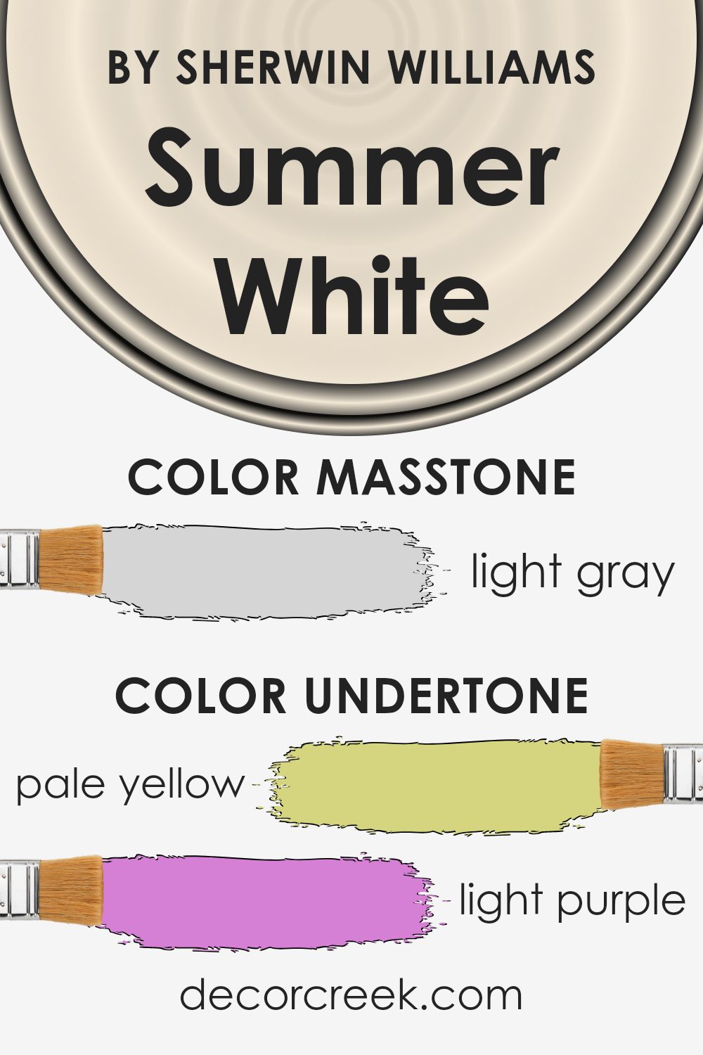
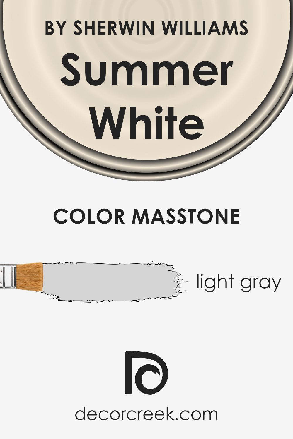
What is the Masstone of the Summer White SW 7557 by Sherwin Williams?
Summer White (SW 7557) by Sherwin Williams is a light gray with a masstone of #D5D5D5. This light gray acts as a versatile and neutral backdrop, making it easy to pair with a range of other colors and styles in a home. Its gentle hue can make rooms feel more open and airy, enhancing natural light and creating a welcoming atmosphere.
In living spaces, Summer White brings a soft touch that can balance bold furniture or vibrant artwork without clashing. In kitchens and bathrooms, it pairs well with stainless steel or chrome accents, adding a clean and fresh feel. Bedrooms painted in this light gray promote a calm environment, perfect for relaxation.
Overall, Summer White works well in both traditional and modern settings. Its understated elegance allows homeowners to change other elements like textiles and accessories easily, ensuring that the room stays versatile and timeless. The light gray masstone connects spaces with a cohesive and harmonious look.
How Does Lighting Affect Summer White SW 7557 by Sherwin Williams?
Lighting plays a crucial role in how we perceive colors. It can change the way colors appear on a wall by influencing their shade and tone. Natural and artificial lights have different effects on paint colors, including Sherwin Williams’ Summer White SW 7557.
In natural light, the time of day and the direction of the room can significantly alter the way this color is seen. In north-facing rooms, natural light tends to be cooler and softer, which can make Summer White appear darker and slightly muted. The cool light may emphasize any underlying cool tones in the paint, giving it a more subdued feel.
In contrast, south-facing rooms receive a lot of direct sunlight throughout the day, which tends to be warmer. This warm, bright light can make Summer White appear lighter and warmer. The direct sun brings out the paint’s warmth, making it look rich and inviting.
East-facing rooms get direct sunlight in the mornings, making the light appear warmer during these hours. Summer White will appear softer and slightly warmer in the morning, which can be quite pleasant. However, as the day progresses and the light becomes less direct, the color may look a bit cooler and more muted in the afternoon.
West-facing rooms receive the strongest light in the late afternoon and evening. During these hours, the light is warm and often gives everything a golden hue. Summer White will appear warmer and more vibrant in the late afternoon sun. In the morning, these rooms receive indirect, cooler light, which might make the color look a bit less lively.
In artificial light, the color of the bulbs will affect how Summer White looks. Warm bulbs can enhance its warmth, while cool bulbs might bring out cooler tones, influencing the overall ambiance of the space. Thus, the choice of lighting can significantly impact this versatile color’s appearance in various environments.
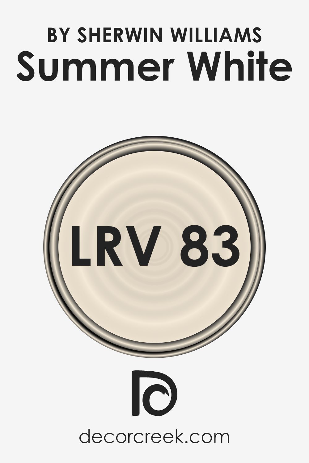
What is the LRV of Summer White SW 7557 by Sherwin Williams?
LRV, or Light Reflectance Value, measures the amount of light a color reflects and absorbs. It ranges from 0, representing absolute black, to 100, indicating pure white. A higher LRV means a color reflects more light, making it appear lighter, while a lower LRV means the color absorbs more light, thus appearing darker.
This value helps you predict how a paint color will look in different lighting conditions and how it can affect the mood of a room. Understanding LRV is particularly important when considering how colors can make spaces feel bigger or smaller, brighter or cozier, based on how they interact with both natural and artificial light.
For the color Summer White, which has an LRV of 82.542, you can expect it to be quite reflective, meaning it will brighten up a space significantly. Because it reflects a lot of light, Summer White can make rooms feel larger and more open. This makes it an excellent choice for areas that you want to feel airy and spacious.
The high LRV also means it can help enhance natural light, making it ideal for rooms with limited sunlight.
However, it’s important to remember that this strong reflectance can also make the color slightly vary depending on the surrounding colors and lighting conditions, sometimes taking on subtle tones from the environment.
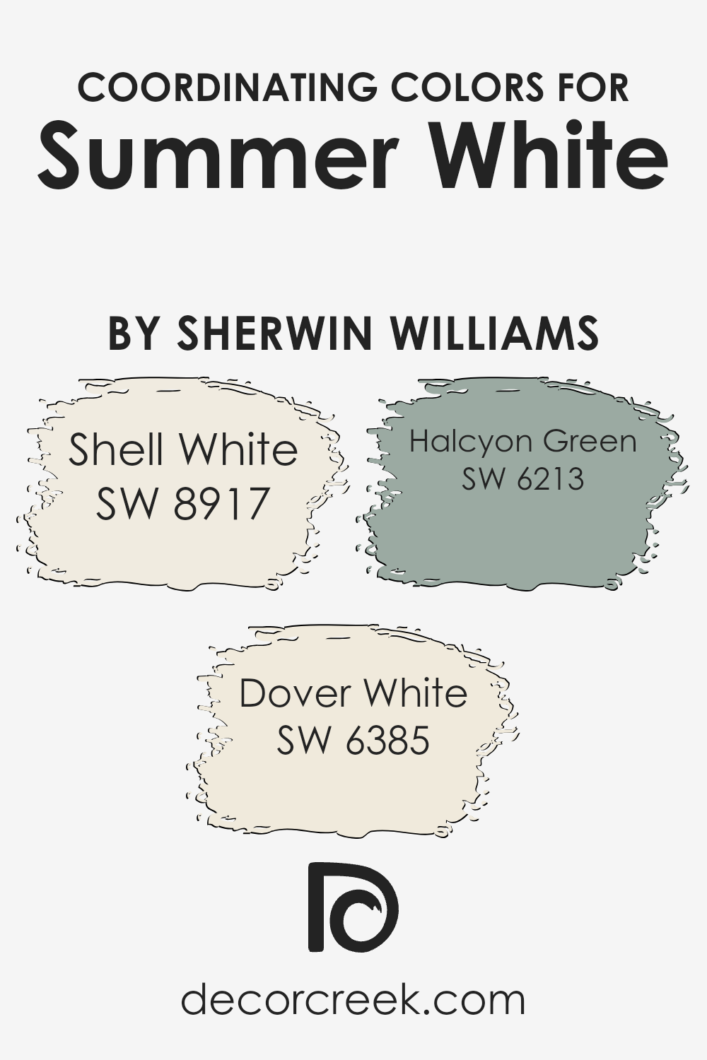
Coordinating Colors of Summer White SW 7557 by Sherwin Williams
Coordinating colors are hues that complement a primary color, enhancing the overall look by creating harmony in a space. They work together in a palette to offer visual balance and cohesion, making rooms feel thoughtfully designed. When paired with Sherwin Williams’ Summer White (SW 7557), coordinating colors such as Shell White (SW 8917), Dover White (SW 6385), and Halcyon Green (SW 6213) can create varying moods and enrich any decor.
Summer White serves as a soft, neutral backdrop perfect for adding warmth or contrast with these complementary shades.
Shell White is a gentle, warm tone with subtle creamy hints, ideal for adding a touch of softness to a space. Dover White offers a more classic and creamy appearance, lending both elegance and warmth that can beautifully highlight architectural features or trim. Meanwhile, Halcyon Green provides a refreshing contrast with its muted blue-green shade, introducing a calming and balanced vibe.
Together, these colors bring out the best in Summer White, offering versatility to play with textures and styles, whether in a modern kitchen or a cozy living room.
By using these coordinating colors in tandem, one can create spaces that are inviting, comfortable, and visually appealing.
You can see recommended paint colors below:
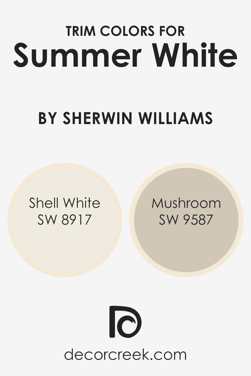
What are the Trim colors of Summer White SW 7557 by Sherwin Williams?
Trim colors are the extra colors you use on the edges or borders of something, like around doors, windows, or baseboards, to make the main color look better. They help define spaces and give a nice look to the room. When Summer White by Sherwin Williams is your main color, using trim colors can make it stand out even more.
Trim colors add a little extra style and make things look finished and neat. They catch the eye and can change the whole mood of a room just by being a different color than the walls.
For a cool look with Summer White, you could use Shell White and Mushroom for the trim. Shell White is a soft, warm white that has a gentle and inviting vibe. It’s great for adding warmth without being too bright. Mushroom, on the other hand, is a calm taupe with earthy tones.
This color adds depth and contrasts nicely with Summer White, giving a sense of coziness and natural feel. Together, these trim colors work well to highlight the room’s features while ensuring the walls with Summer White look sophisticated and complete.
You can see recommended paint colors below:
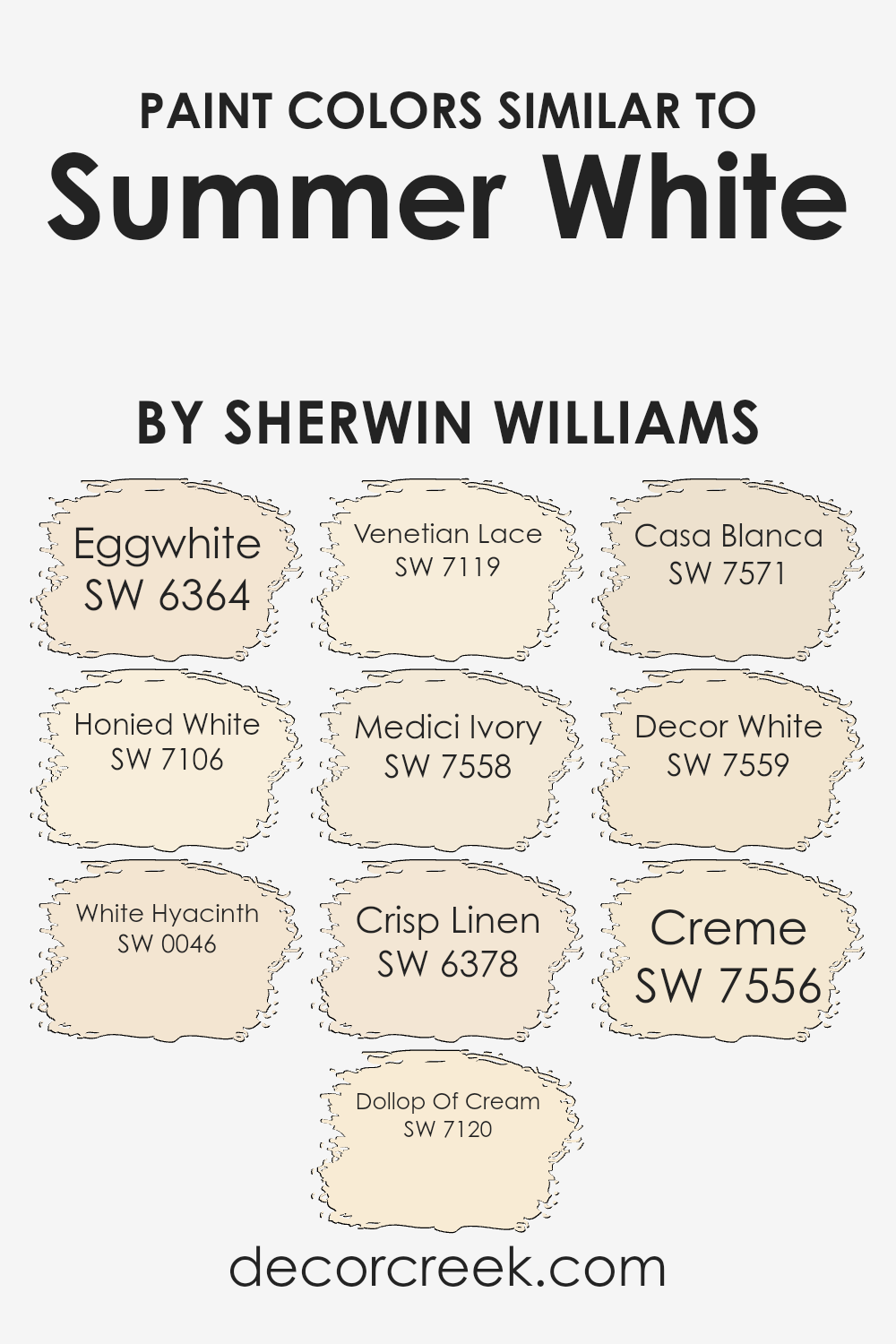
Colors Similar to Summer White SW 7557 by Sherwin Williams
Colors that are similar to Summer White, by Sherwin Williams, carry a gentle warmth and subtle charm, offering a cohesive, inviting feel to any space. These shades, like eggshell tones, create a harmonious, cozy atmosphere when used together, enhancing the light and openness in a room.
Eggwhite brings a soft, creamy hue that connects beautifully with Honied White, adding a touch of warmth. White Hyacinth offers a delicate hint of green that freshens up the palette, while Dollop Of Cream has a warm, inviting feel, making spaces feel larger and more comfortable.
Venetian Lace combines a classic elegance with its crisp, clean appearance, blending seamlessly with Medici Ivory’s rich, warm tone that adds depth. Crisp Linen delivers a fresh, airy look, perfect for a welcoming environment, while Casa Blanca introduces a creamy, soft element with a slightly more vibrant undertone. Decor White offers a timeless, versatile shade that complements any style, while Creme rounds out the selection with its milky, inviting ambiance.
Together, these colors were chosen to reflect a sunlit warmth, making any space feel expansive and welcoming. By using these similar shades, you can create a balanced and visually appealing environment that underscores the simplicity and elegance of Summer White.
You can see recommended paint colors below:
- SW 6364 Eggwhite
- SW 7106 Honied White
- SW 0046 White Hyacinth
- SW 7120 Dollop Of Cream
- SW 7119 Venetian Lace
- SW 7558 Medici Ivory
- SW 6378 Crisp Linen
- SW 7571 Casa Blanca
- SW 7559 Decor White
- SW 7556 Creme
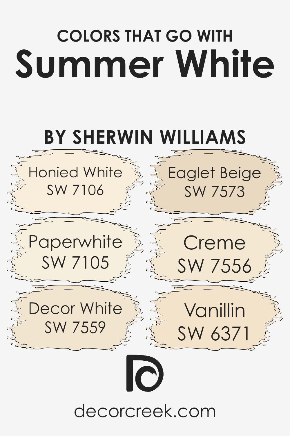
Colors that Go With Summer White SW 7557 by Sherwin Williams
Choosing colors that complement Summer White SW 7557 by Sherwin Williams is essential because they enhance the overall appearance of a space, giving it harmony and style. Summer White, with its soft and warm tone, serves as an ideal base color that can be paired with various other shades to create a balanced look.
SW 7106 Honied White, for instance, is a warm white with a hint of yellow that works well as an accent, providing a gentle contrast but still maintaining a cohesive feel. Meanwhile, SW 7105 Paperwhite offers a slightly cooler undertone, adding a fresh and airy element to the room.
SW 7559 Decor White can complement interiors with its crisp, clean look. It helps to create a bright atmosphere, especially in areas with good natural light. SW 7573 Eaglet Beige brings warmth and coziness to a room, making it a lovely match for comfort-invoking spaces like living rooms or bedrooms.
SW 7556 Creme is a creamy off-white that blends seamlessly with Summer White, offering a primed canvas that lends versatility to any design plan.
Lastly, SW 6371 Vanillin, with its subtle golden undertones, adds a touch of elegance and can carry through an effortless flow of color throughout your space, bringing everything together beautifully.
You can see recommended paint colors below:
- SW 7106 Honied White
- SW 7105 Paperwhite
- SW 7559 Decor White
- SW 7573 Eaglet Beige
- SW 7556 Creme
- SW 6371 Vanillin
How to Use Summer White SW 7557 by Sherwin Williams In Your Home?
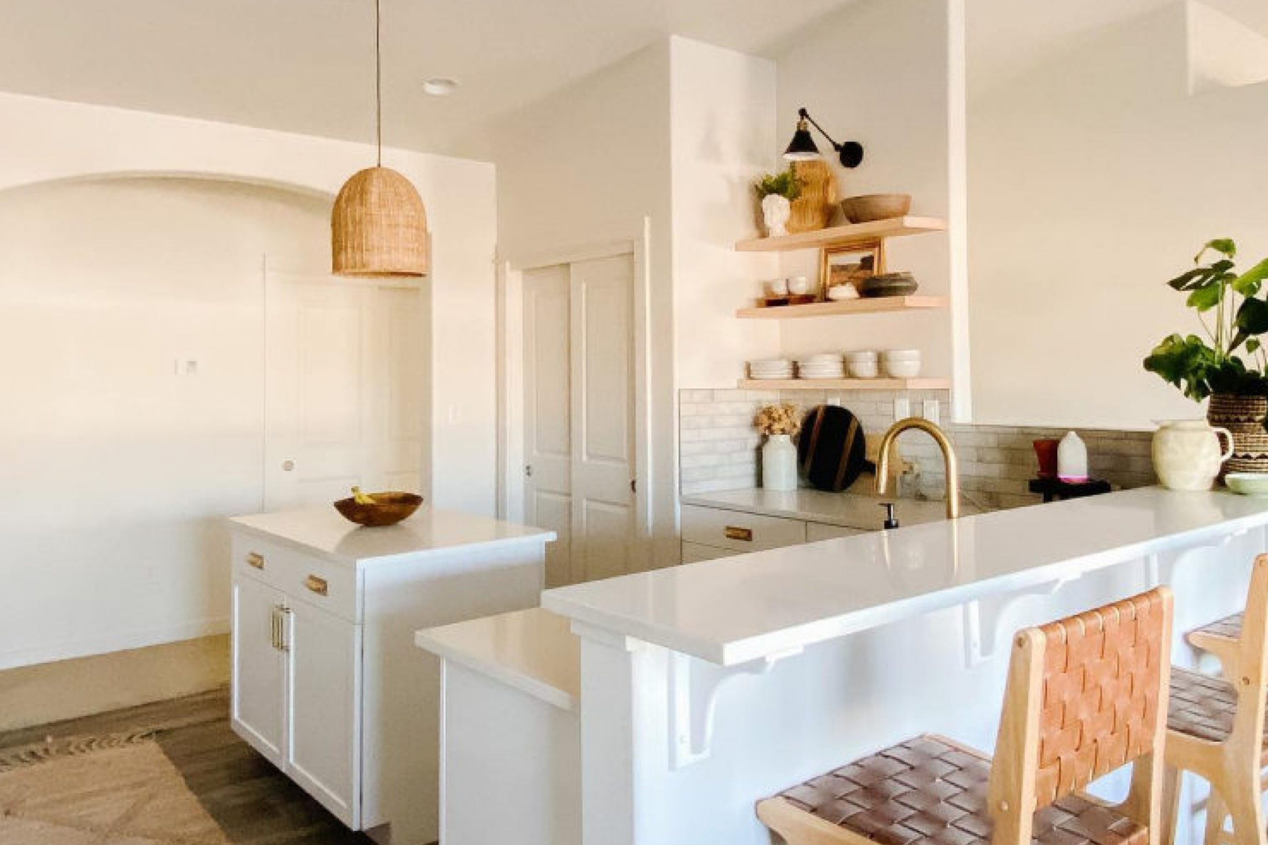
Summer White (SW 7557) by Sherwin Williams is a soft, warm white paint color that works well in various spaces around your home. Its gentle hue makes it a versatile choice, providing a cozy and welcoming atmosphere. You might consider using it in the living room to create a bright, open space that feels both inviting and comfortable.
In the bedroom, Summer White can promote a calming environment, ideal for rest. Pair it with light-colored furnishings and soft textiles to enhance the relaxed feeling. In the kitchen, this paint color can help reflect light, making the space appear bigger and more cheerful.
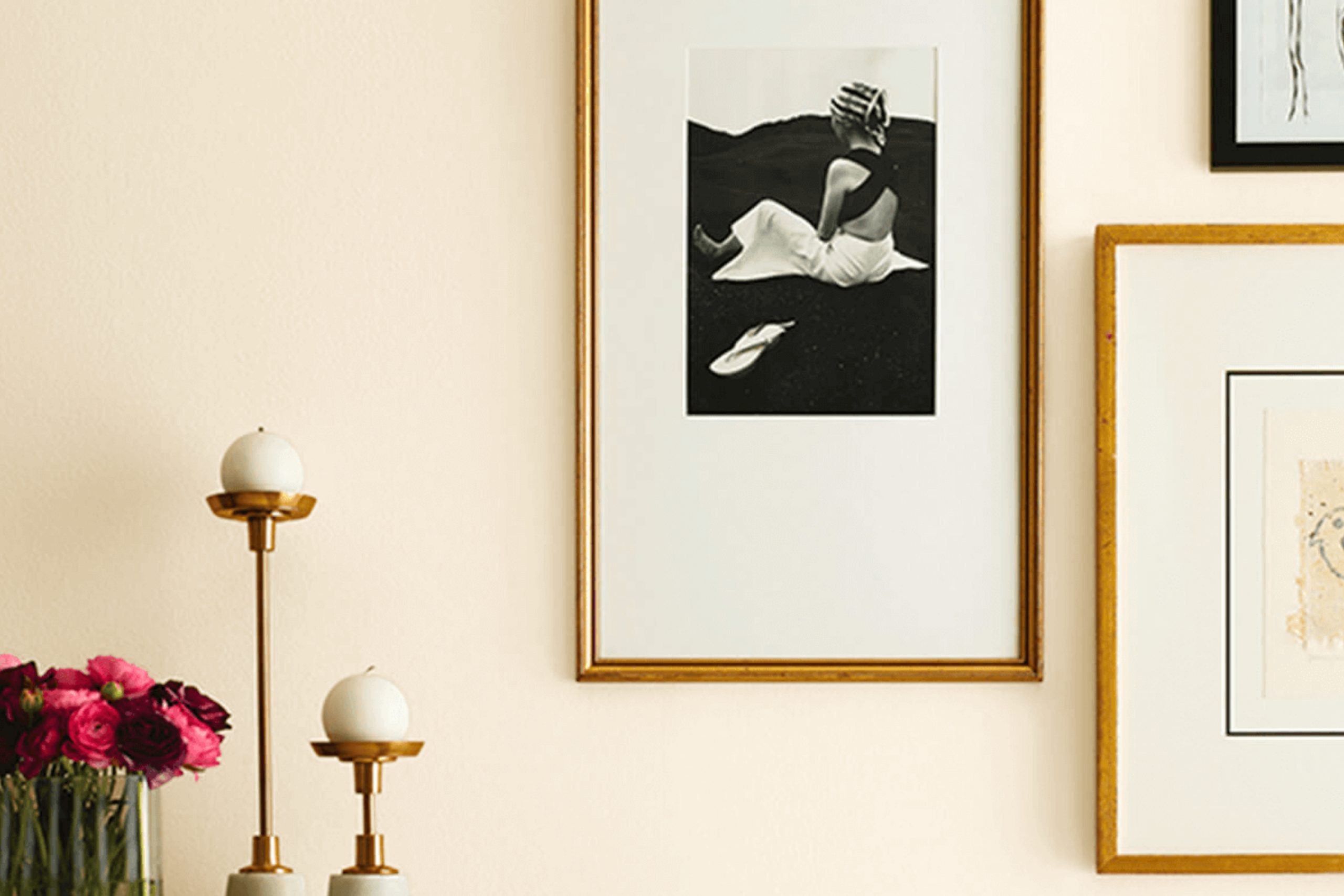
Summer White also serves as a great backdrop for other colors, allowing artwork, furniture, and decor to pop without overwhelming the space. It’s perfect for hallways and entryways, offering a pleasant transition from room to room. This paint color’s adaptability makes it a great choice for any room in your home.
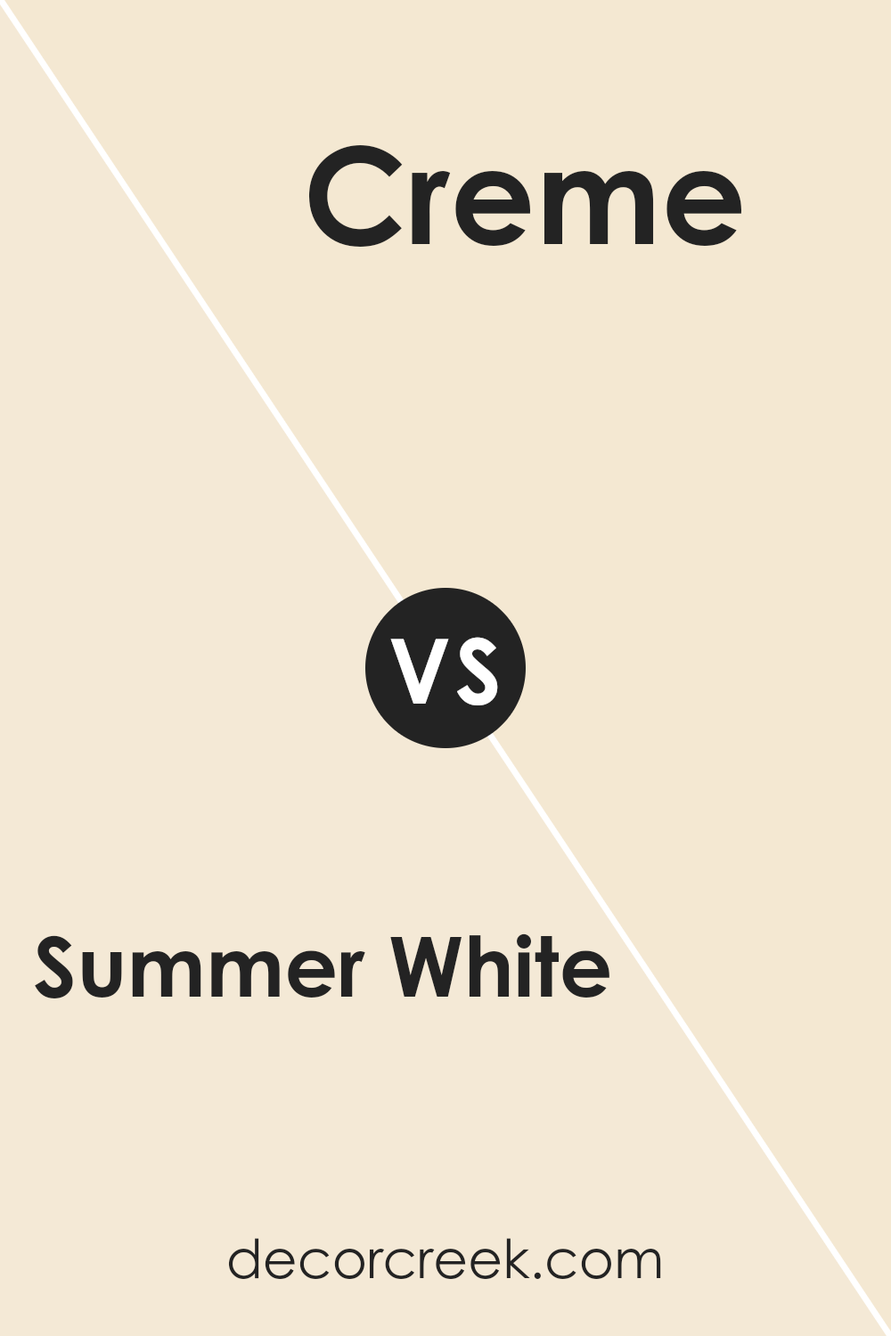
Summer White SW 7557 by Sherwin Williams vs Creme SW 7556 by Sherwin Williams
Summer White SW 7557 and Creme SW 7556 by Sherwin Williams are two warm, inviting shades. Summer White is a soft off-white color with a touch of creaminess. It’s bright enough to open up a space but also warm enough to create a cozy atmosphere. It’s versatile and can match various styles and decors, making it a popular choice for living areas and bedrooms.
Creme, on the other hand, is slightly darker and richer than Summer White. It has a creamy, beige undertone that gives it a bit more depth and warmth. While Summer White can almost look like a light, airy white, Creme leans more towards a comfortable beige.
Both colors can be used effectively to create a welcoming space, but the choice between them often depends on how much warmth and depth you want in the room. Summer White is brighter, while Creme adds a touch more warmth.
You can see recommended paint color below:
Summer White SW 7557 by Sherwin Williams vs Crisp Linen SW 6378 by Sherwin Williams
Summer White SW 7557 and Crisp Linen SW 6378 are both light, neutral colors, but they have distinct personalities. Summer White is a soft, warm white with subtle beige undertones, providing a cozy, inviting feel to spaces. It’s versatile and works well in various settings, making rooms feel open and bright.
On the other hand, Crisp Linen is a bit warmer with more noticeable yellow undertones, which can bring a touch of sunny warmth to a room. It feels slightly richer and can create a soft glow, especially in natural light.
When used together, Summer White can serve as the main, clean backdrop, while Crisp Linen adds warmth and depth.
Choosing between the two often depends on whether you want a more neutral, adaptable base (Summer White) or a hint of warmth (Crisp Linen) to your decor. Both are excellent for creating comfortable, welcoming environments.
You can see recommended paint color below:
- SW 6378 Crisp Linen
Summer White SW 7557 by Sherwin Williams vs Venetian Lace SW 7119 by Sherwin Williams
Summer White SW 7557 by Sherwin Williams and Venetian Lace SW 7119 are both soft, neutral shades that work well for creating a light and airy atmosphere in a space.
Summer White is a warm, creamy white with subtle yellow undertones. It brings warmth to a room without being overpowering, making it a versatile choice for various spaces. It’s particularly good for creating a cozy yet elegant feel, making it suitable for living rooms or bedrooms.
On the other hand, Venetian Lace is a slightly cooler white compared to Summer White. It has gentle pink undertones, which lend a delicate and calming effect to a room. This color is great for spaces where you want a touch of softness and a light, refreshing ambiance, like bathrooms or bedrooms.
While both colors can brighten up a space, Summer White leans towards a warm and inviting feel, whereas Venetian Lace offers a cooler, more delicate touch. Both are excellent choices for creating a subtle and welcoming environment.
You can see recommended paint color below:
- SW 7119 Venetian Lace
Summer White SW 7557 by Sherwin Williams vs Eggwhite SW 6364 by Sherwin Williams
Summer White SW 7557 and Eggwhite SW 6364 by Sherwin Williams are both light, neutral colors that bring a sense of brightness and ease to a space. Summer White is a soft, creamy white with a hint of warmth. It is bright and versatile, ideal for creating a calm and inviting atmosphere in any room.
Eggwhite, on the other hand, carries a slightly stronger yellow undertone, giving it a warmer and cozier feel compared to Summer White. While both colors work well in providing a neutral backdrop, Eggwhite leans more towards a subtle buttery hue, making it suitable for spaces where you want a touch more warmth.
Summer White fits perfectly with both cool and warm color schemes, while Eggwhite complements earthy tones beautifully. Both are great choices if you’re aiming for a light and airy look, but Eggwhite offers a tad more warmth than Summer White.
You can see recommended paint color below:
Summer White SW 7557 by Sherwin Williams vs White Hyacinth SW 0046 by Sherwin Williams
Summer White SW 7557 by Sherwin Williams is a warm, soft white that feels cozy and inviting. It has subtle beige undertones, which add a gentle warmth to any room. This makes it a perfect choice for spaces where you want a comfortable and welcoming atmosphere.
In contrast, White Hyacinth SW 0046 by Sherwin Williams is a cooler white with a hint of green undertone. This gives it a crisp, fresh look. White Hyacinth feels clean and bright, making it a good option for spaces where you want a refreshing and airy vibe.
When choosing between the two, think about the mood you want to create in your space.
Summer White is better for adding warmth and softness, while White Hyacinth will offer a cooler, more vibrant feel. Both options are versatile, but their subtle differences in undertone can have a big impact on the overall ambiance of your room.
You can see recommended paint color below:
- SW 0046 White Hyacinth
Summer White SW 7557 by Sherwin Williams vs Honied White SW 7106 by Sherwin Williams
Summer White SW 7557 by Sherwin Williams is a soft, warm off-white color that has a clean and bright appearance. It’s versatile and works well in a variety of spaces, creating a light and airy feel. It pairs nicely with a range of colors, adding a touch of warmth without being too creamy or yellow.
Honied White SW 7106, also by Sherwin Williams, is another warm white, but it has a subtle hint of yellow or honey tones. This gives it a slightly richer and cozier appearance compared to the more straightforward Summer White. Honied White can add a bit more warmth to a room, making it feel inviting and comfortable.
Both colors are excellent choices for a neutral setting but achieve slightly different effects due to their undertones. While Summer White leans more towards a crisp, airy look, Honied White offers a touch more depth with its gentle warmth.
You can see recommended paint color below:
- SW 7106 Honied White
Summer White SW 7557 by Sherwin Williams vs Medici Ivory SW 7558 by Sherwin Williams
Summer White SW 7557 and Medici Ivory SW 7558, both by Sherwin Williams, are soft and warm colors that can create a cozy and inviting atmosphere.
Summer White is a light, creamy shade that feels airy and fresh. It’s a versatile color that works well in many different areas of the home, providing warmth without being overpowering. It’s ideal for creating a bright, neutral backdrop that pairs well with other colors and various decor styles.
Medici Ivory, on the other hand, has a slightly deeper and more yellow undertone compared to Summer White. It offers a richer warmth that adds a touch of elegance while still maintaining a soft appearance. This color can bring out a subtle, classic feel to a room and works particularly well in spaces where you want a bit more color depth while keeping the atmosphere warm and welcoming.
Both colors offer unique warmth but differ in their intensity and undertones, allowing for different uses depending on the desired look and feel of a space.
You can see recommended paint color below:
- SW 7558 Medici Ivory
Summer White SW 7557 by Sherwin Williams vs Decor White SW 7559 by Sherwin Williams
Summer White SW 7557 and Decor White SW 7559, both from Sherwin Williams, are light and versatile colors, but they have subtle differences. Summer White is a warm white with slight beige undertones, giving it a cozy and welcoming feel. It works well in spaces where you want a hint of warmth without committing to stronger beige or cream tones.
Decor White, on the other hand, is a cooler and more neutral white. It has a clean and crisp appearance, making it a good choice for modern, minimalistic settings or for areas where you want a refreshing and airy touch.
When deciding between the two, consider the lighting and overall color scheme in your space.
If you want a warmer, more inviting atmosphere, Summer White might be the better choice. For a cooler, brighter look that complements a modern style, Decor White is an excellent option. Both colors add a touch of elegance and are easy to match with other hues.
You can see recommended paint color below:
- SW 7559 Decor White
Summer White SW 7557 by Sherwin Williams vs Dollop Of Cream SW 7120 by Sherwin Williams
Summer White SW 7557 and Dollop Of Cream SW 7120 by Sherwin Williams are two soft, neutral paint colors. Summer White leans slightly warm with subtle yellow undertones, making spaces feel cozy and inviting. It’s a flexible choice, pairing well with a variety of styles and colors, which makes it a popular choice for living rooms or bedrooms where a calm backdrop is desired.
Dollop Of Cream, on the other hand, also carries warm undertones but is richer and deeper compared to Summer White. This creamier shade can add more warmth and depth to a room, making it suitable for areas where a bit more color is welcome, such as kitchens or dining rooms.
Both colors are versatile and give a clean, fresh look to any room. Summer White is ideal if you prefer a softer, more understated feel, while Dollop Of Cream offers a bit more presence without being overpowering.
You can see recommended paint color below:
- SW 7120 Dollop Of Cream
Summer White SW 7557 by Sherwin Williams vs Casa Blanca SW 7571 by Sherwin Williams
Summer White SW 7557 by Sherwin Williams is a light, warm shade of white that has a soft, inviting feel. It’s perfect for spaces where you want a hint of warmth without going too far into beige. This color works well in sunlit rooms, helping to reflect natural light and brighten the space.
Casa Blanca SW 7571, on the other hand, has a richer tone. It leans more towards a creamy beige, offering a slightly deeper and warmer feel compared to Summer White. Casa Blanca is a great choice for creating a cozy, welcoming atmosphere, especially in larger rooms where you want a bit more color without overwhelming the senses.
Both colors can serve as excellent neutrals, but Summer White offers a fresh, bright look, while Casa Blanca provides a bit more warmth and depth. Depending on the feel you want to achieve, you can choose the one that best suits your home.
You can see recommended paint color below:
Conclusion
After learning about SW 7557 Summer White by Sherwin Williams, I feel like I have a new appreciation for this paint color. It’s amazing how a simple shade like Summer White can make such a big difference in a room. This color is soft and bright, almost like a warm hug from the sun on a pleasant day. It’s perfect for making any room feel light and welcoming.
I think what’s cool about Summer White is how it can go well with almost anything. Whether you have colorful furniture or more neutral tones, this paint will look great. It’s like having a nice, blank canvas that makes every other color in the room stand out even more.
Choosing Summer White could be an easy way to make changes in your home without needing to do anything complicated. Just by painting the walls, everything feels fresh and new. I also like how this color can work in any room—whether it’s the kitchen, living room, or bedroom. It’s bright enough to keep things lively, but soft enough to help you feel relaxed.
Overall, reading about SW 7557 Summer White has shown me that the right paint color can really make a house feel more like home. It’s fun to see how something as simple as paint can make such a big difference in our everyday lives.

Ever wished paint sampling was as easy as sticking a sticker? Guess what? Now it is! Discover Samplize's unique Peel & Stick samples.
Get paint samples

