If you’re searching for a paint color that blends seamlessly with any style, consider Sherwin Williams’ SW 2829 Classical White. It’s a versatile hue that enhances the ambiance of any room. This elegant white offers a perfect balance of warmth and brightness, making it an excellent choice for both modern and traditional settings.
SW 2829 Classical White pairs well with a wide palette of colors, providing a sophisticated backdrop or a subtle contrast. Its timeless appeal offers a sense of comfort and simplicity, allowing other decor elements to shine while maintaining its own grace.
In terms of versatility, this shade is suitable for any space in your home. Whether you’re applying it to walls, trim, or ceilings, its adaptability ensures that your area feels cohesive and inviting. It’s a color that harmonizes with natural light, adding depth and dimension to each room.
Additionally, this paint is particularly appealing for those who appreciate a clean, uncluttered aesthetic. Its smooth and refined finish creates an atmosphere of calm and clarity, allowing you to enjoy your surroundings without distraction. With Sherwin Williams’ SW 2829 Classical White, each space can effortlessly achieve a sense of timeless beauty and understated elegance.

What Color Is Classical White SW 2829 by Sherwin Williams?
Classical White (SW 2829) by Sherwin Williams is a timeless and versatile shade of white. It has a slight warmth, which helps it feel inviting rather than stark.
This warm undertone makes it a suitable choice for a variety of interior settings, adding depth and a cozy ambiance to any space. Classical White works exceptionally well in traditional and transitional home styles, where its gentle and welcoming nature can enhance the overall aesthetic.
This shade is an excellent backdrop for both muted and bold color schemes. It pairs beautifully with natural materials like wood, stone, and metal, allowing their textures to stand out. Wooden furniture with rich grains or distressed finishes will complement this shade, adding warmth to the room. Textiles such as linen, wool, and cotton in neutral tones or warm colors will also enhance the inviting quality of Classical White.
In a modern interior, Classical White can serve as a soft foundation that doesn’t overwhelm the space. It works well with sleek surfaces like glass and polished metals, offering a balance between warmth and the clean lines typical of modern design.
used on walls, ceilings, or even cabinetry, Classical White offers endless possibilities for creating a cozy and stylish home.

Is Classical White SW 2829 by Sherwin Williams Warm or Cool color?
Classical White SW 2829 by Sherwin Williams is a versatile paint color that works well in many home settings. This soft, warm white has a gentle appearance that can create a welcoming and cozy atmosphere. It complements both modern and traditional styles, making it a popular choice for homeowners.
This color is particularly effective in brightening up darker spaces, as its warm undertones reflect light, giving rooms an airy feel. It serves as an excellent backdrop for colorful furniture and decor, allowing bold colors to stand out without being overwhelming.
In kitchens and living rooms, Classical White can make spaces feel larger and more open. In bedrooms and bathrooms, it helps create a restful and calming environment. Its neutral tone pairs well with a variety of other colors, making it easy to coordinate with existing furnishings. Overall, it’s a flexible choice that adds a touch of warmth and simplicity to any room.
Undertones of Classical White SW 2829 by Sherwin Williams
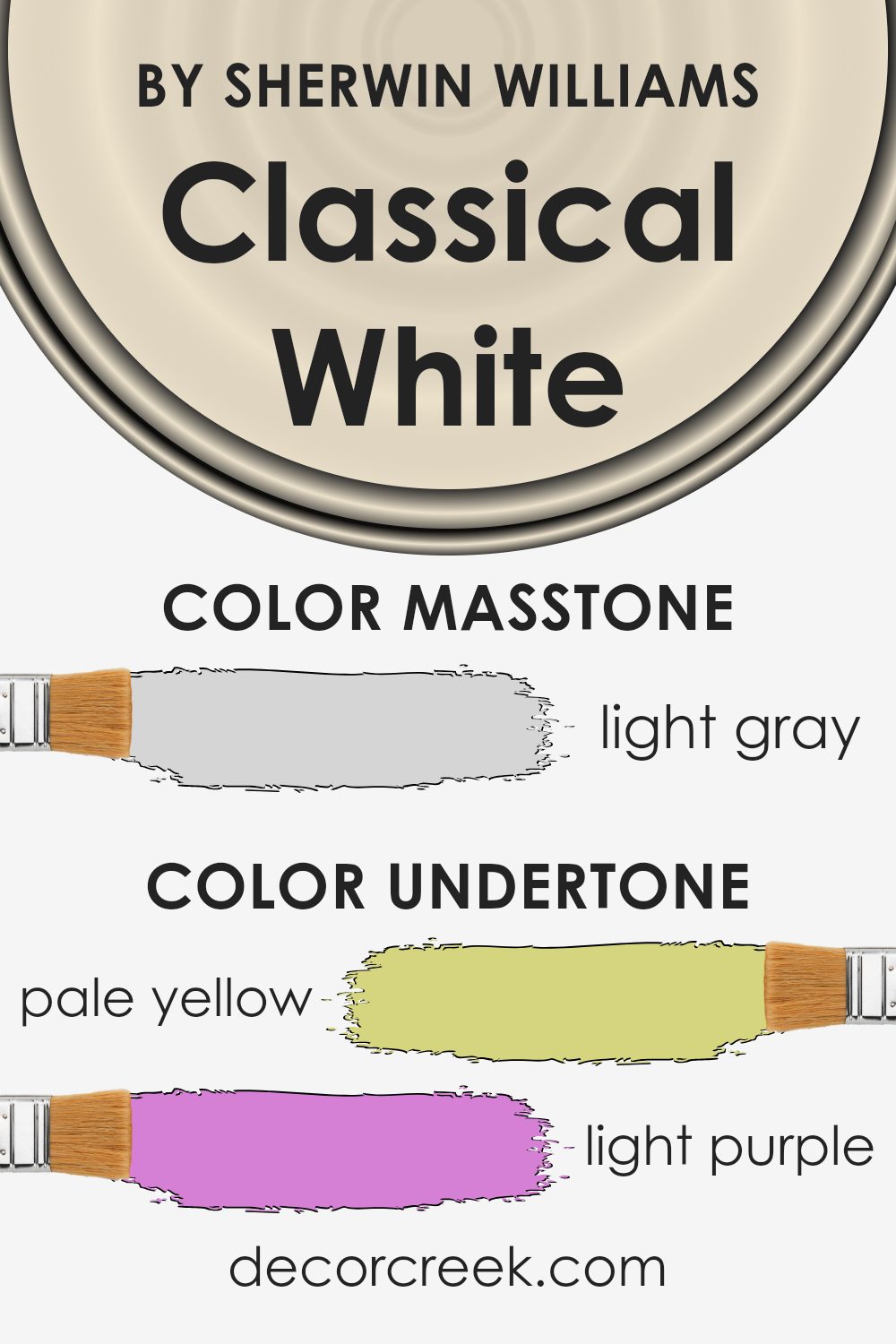
Classical White by Sherwin Williams is a versatile paint color. It may look like a simple white, but it holds various subtle undertones that can change your perception of it. Undertones are like hidden colors within the main color. When light hits the paint, these subtle hints can alter how we see the main color.
For Classical White, its undertones include pale yellow, light purple, light blue, pale pink, mint, lilac, and grey. These can all affect how the paint appears in a room, creating warmth or coolness depending on the lighting or surrounding colors. A room with more natural light may bring out the yellow or mint hints, making the space feel warm and fresh.
On the other hand, in a room with less natural light or cooler colors, the paint might show more of its lilac, grey, or light purple undertones. This can create a calm and subtle background.
Additionally, the light blue and pale pink can lend a soft, inviting touch without being overwhelming. These undertones make the color versatile, allowing it to adapt to various interior designs and settings while still maintaining a neutral and harmonious appearance.
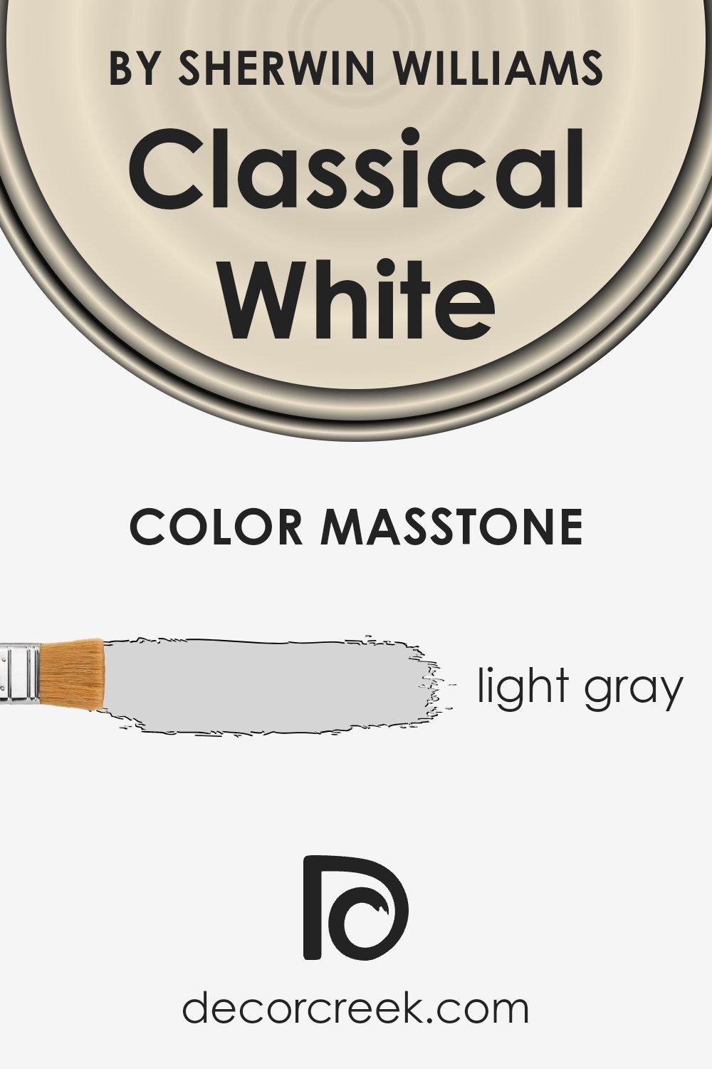
What is the Masstone of the Classical White SW 2829 by Sherwin Williams?
Classical White SW 2829 by Sherwin Williams is a light gray color (#D5D5D5) that brings softness and versatility to home interiors. When used in a room, this shade of light gray provides a neutral and calming backdrop, allowing other colors in the space to stand out. It works well in many settings, whether it’s in a living room, bedroom, or kitchen, because it complements a variety of styles and color schemes.
The masstone of this color brings out warm undertones that make spaces feel cozy and inviting, without being too stark or cold. It’s a perfect choice for smaller rooms, as the lightness of the color can help the space appear larger and more open.
This color is also a great match for both contemporary and traditional décor, adding a touch of elegance to the overall aesthetic without overwhelming the space. Families and homeowners often find it an excellent base for their homes.
How Does Lighting Affect Classical White SW 2829 by Sherwin Williams?
Lighting can really change how a color looks on walls. The color Classical White by Sherwin Williams is a great example of this. It can look different depending on whether the light comes from a bulb or from the sun.
In artificial light, such as from bulbs, Classical White might take on a warmer or cooler tone based on the type of bulb used. Incandescent bulbs, which have a warm glow, can make the color look a bit more yellow or creamy. LED bulbs, which can be cooler, might make it look a bit more stark or crisp. The type of artificial lighting is important when picking such a soft white color.
In natural sunlight, Classical White can look very different during the day. It will usually appear more true to its actual color compared to artificial light.
When you put Classical White in a north-facing room, the light is usually cooler and sometimes a bit dim. This can cause the color to look a bit more muted or even slightly gray. In a south-facing room, where the light is warmer and more abundant, the color can look brighter and might take on a creamier tone. This sunlight makes the room feel cozy and inviting.
East-facing rooms get a lot of light in the morning. Here, Classical White can appear very bright at the start of the day, but as the day goes on and the sun moves away, the color can look a bit cooler. West-facing rooms have the opposite effect, with the light being softer in the morning and much warmer in the evening, which can give Classical White a more golden tone later in the day.
Overall, Classical White is a versatile color, but it’s worth testing how it looks in your specific space due to how much lighting can impact it.

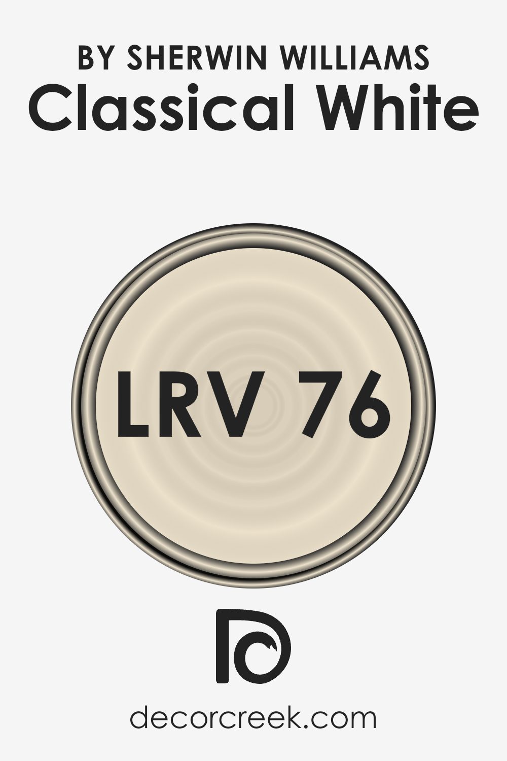
What is the LRV of Classical White SW 2829 by Sherwin Williams?
LRV stands for Light Reflectance Value, which tells you how much light a paint color will reflect. It is measured on a scale from 0 to 100, where 0 means the color absorbs all light (pure black) and 100 means it reflects all light (pure white). When you choose a paint color, the LRV can help you understand how the color might look in your space.
A higher LRV means the color is lighter and will reflect more light, making a room feel more open and bright. In contrast, a lower LRV means the color is darker and absorbs more light, which can make a space feel more intimate and cozy.
For Classical White with an LRV of 76.23, it reflects a lot of light compared to many other colors. This means when you use Classical White on your walls, the room will likely feel bright and airy. It’s a good choice for rooms that need more light or feel a bit small, as it can help open them up.
The high LRV also means that this color can make other design elements in the room stand out, as the light background enhances contrast. It’s an excellent choice if you’re looking for a fresh, versatile backdrop that makes spaces feel larger and more welcoming.
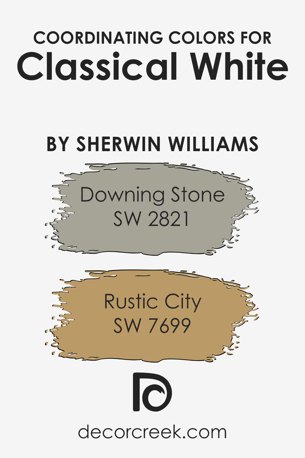
Coordinating Colors of Classical White SW 2829 by Sherwin Williams
Coordinating colors are hues that work well together in a space, enhancing one another and creating a balanced, cohesive look. They are chosen based on their ability to complement a primary color, in this case, Classical White by Sherwin Williams. This coordination ensures that the colors do not clash and instead produce a pleasant and harmonious atmosphere.
Downing Stone (SW 2821) is a warm and inviting neutral with a subtle hint of gray. It provides a gentle contrast to Classical White, giving depth without overpowering the space. Rustic City (SW 7699), on the other hand, is a rich, earthy brown that adds warmth and grounding to the palette.
Together, these colors create a soothing environment, balancing light and dark elements that make the space feel both welcoming and sophisticated. The combination of Classical White with Downing Stone and Rustic City provides a timeless look that feels both fresh and classic, perfect for any room in your home.
By bringing these colors together, you achieve a coordinated style that feels put-together and inviting, ensuring that your space feels like a well-thought-out extension of your personality.
You can see recommended paint colors below:
- SW 2821 Downing Stone
- SW 7699 Rustic City
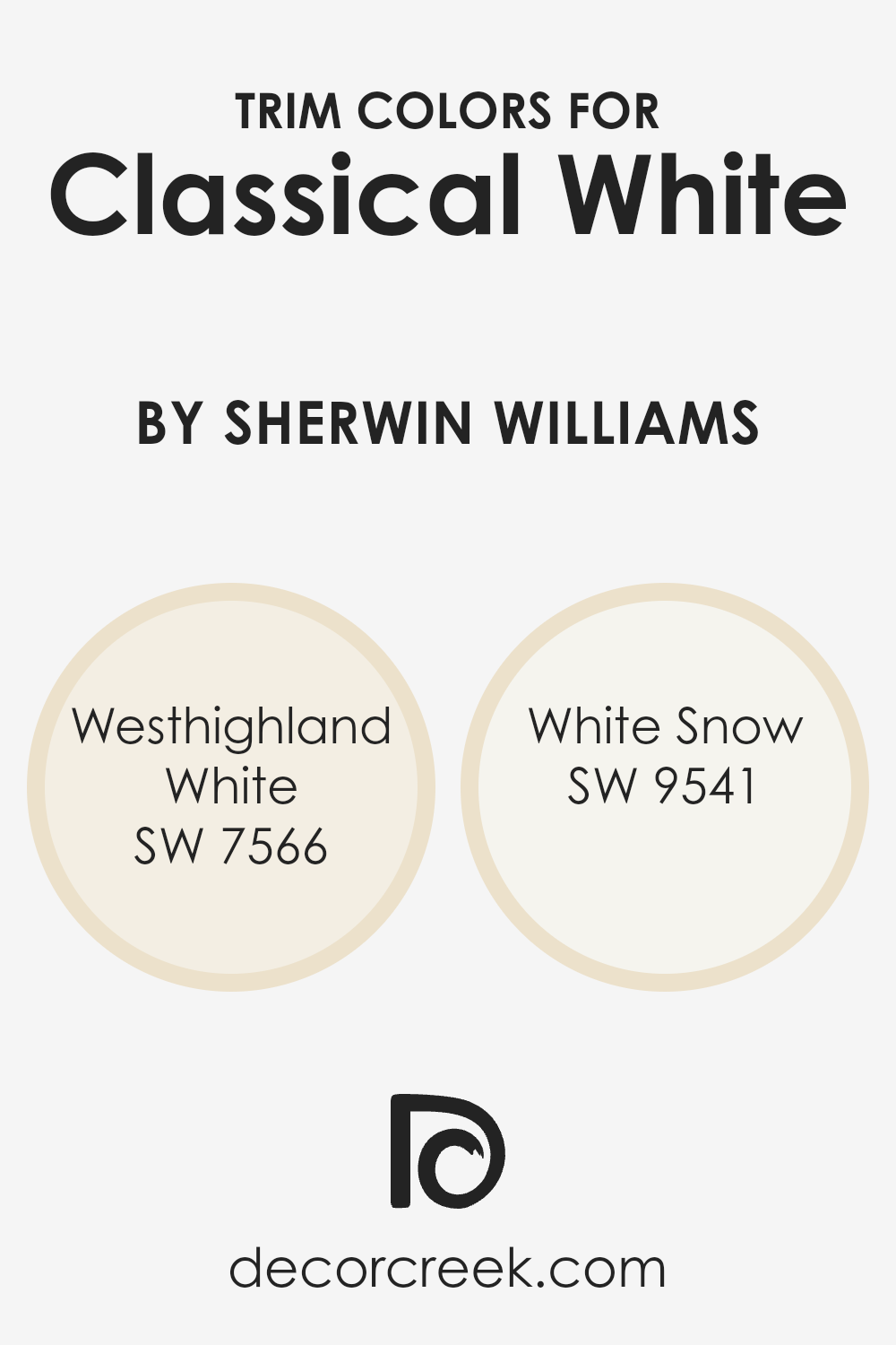
What are the Trim colors of Classical White SW 2829 by Sherwin Williams?
Trim colors are the finishing touches that border walls, ceilings, and other architectural elements, helping give a room a complete look. When using a color like Classical White by Sherwin Williams, a soft off-white with warm undertones, choosing the right trim color is essential to highlight or complement the main color’s nuances.
Using a slightly different shade for the trim can make the walls stand out more and give the space a more refined and polished appearance. Trim colors highlight the architecture of a room and bring attention to elements like moldings, window frames, and doors, making them pop against the main wall color.
Westhighland White (SW 7566) is a creamy white with a gentle warmth, adding a subtle contrast without overpowering the soft nature of Classical White. It creates a harmonious blend that is perfect for a cozy and inviting space. White Snow (SW 9541), on the other hand, offers a crisp and cleaner look.
This cooler white color provides a modern touch, balancing the warmth of Classical White with a fresh, clear edge. Both these trim colors can substantially impact how a room feels, whether it is traditional with Westhighland White or more contemporary with White Snow.
You can see recommended paint colors below:
- SW 7566 Westhighland White
- SW 9541 White Snow
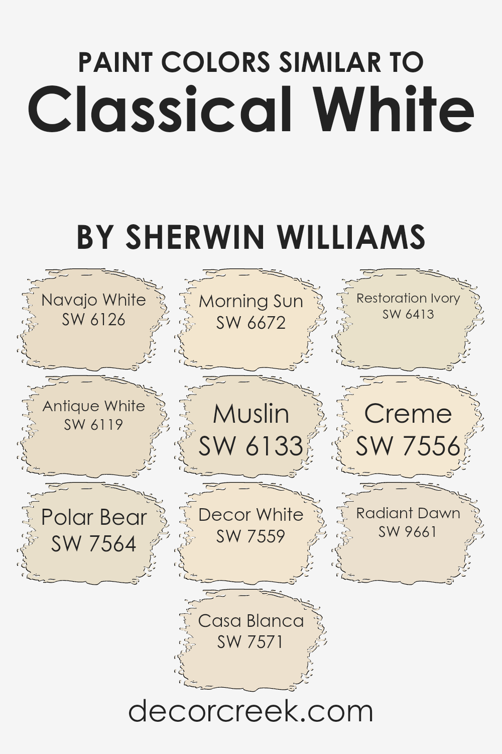
Colors Similar to Classical White SW 2829 by Sherwin Williams
Selecting similar colors to Classical White can add harmony and depth to a space, creating a cohesive look. These colors often share similar undertones, which means they complement one another beautifully and provide versatility in design. For instance, Navajo White has a warm and creamy tone that echoes the softness of Classical White, adding a cozy feel. Antique White offers a touch of nostalgia with its subtle warmth, adding comfort to any room.
Polar Bear has a gentle crispness that brings a fresh, airy quality, perfect for brightening spaces. Casa Blanca’s creamy hue casts a warm glow, offering a welcoming atmosphere. Morning Sun reflects a hint of sunny warmth, providing energy without overpowering a space.
Muslin’s earthy tone offers a soothing natural quality, crafting a grounded atmosphere. Decor White is bright and clean, ideal for creating the perception of larger spaces. Restoration Ivory is soft yet slightly rich, offering a touch of elegance. Creme delivers a soft buttery tone, perfect for adding warmth without being too bold.
Radiant Dawn holds a subtle peachy hue, imparting a gentle and uplifting effect. These colors harmoniously work together, providing flexibility in decorating while maintaining a unified look, making them suitable companions to the timeless elegance of Classical White.
You can see recommended paint colors below:
- SW 6126 Navajo White
- SW 6119 Antique White
- SW 7564 Polar Bear
- SW 7571 Casa Blanca
- SW 6672 Morning Sun
- SW 6133 Muslin
- SW 7559 Decor White
- SW 6413 Restoration Ivory
- SW 7556 Creme
- SW 9661 Radiant Dawn
How to Use Classical White SW 2829 by Sherwin Williams In Your Home?
Classical White SW 2829 by Sherwin Williams is a soft, warm white that can bring a sense of calm and comfort to a home. This versatile color works well in many spaces, offering a clean and bright look without feeling stark or cold. In living rooms, it can make the space feel open and welcoming, providing a perfect backdrop for both modern and traditional furnishings.
Kitchens painted in Classical White appear fresh and airy, enhancing natural light while complementing a variety of cabinet styles and countertop materials. In bedrooms, this gentle white can create a peaceful, restful atmosphere, ideal for relaxation. Bathrooms painted in this shade can feel more spacious, making them great for unwinding.
With its subtle warmth, Classical White pairs beautifully with other colors, allowing homeowners to add accents or decor in bold or pastel shades. Whether used throughout the home or in specific rooms, it brings a timeless and inviting touch.
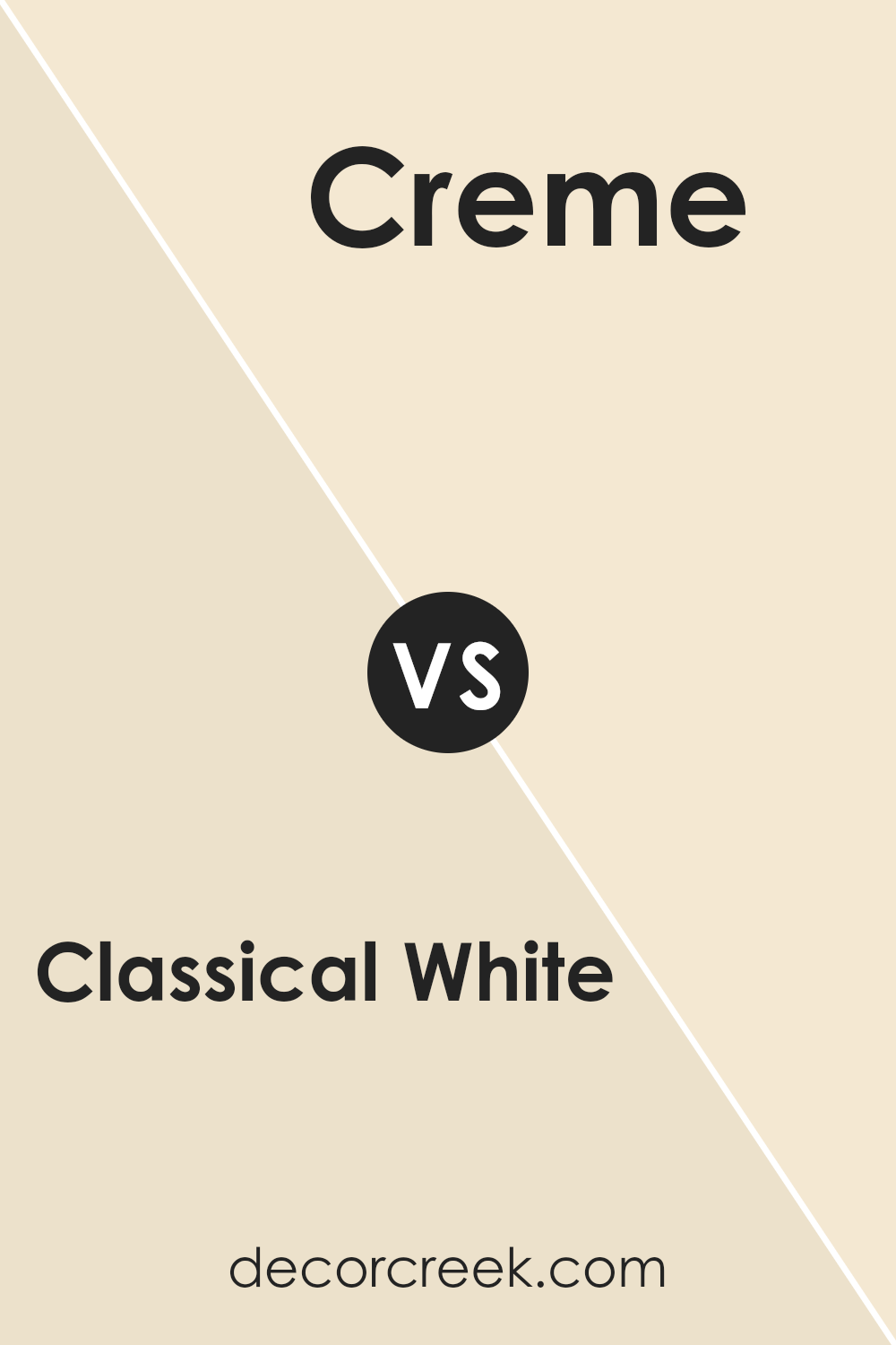
Classical White SW 2829 by Sherwin Williams vs Creme SW 7556 by Sherwin Williams
Classical White SW 2829 by Sherwin Williams is a pure and clean shade of white that provides a neutral background. It has a crisp quality, making it versatile for various styles, whether modern or traditional. It’s bright and fresh, reflecting light well and making spaces feel open.
On the other hand, Creme SW 7556 by Sherwin Williams is a soft off-white with a warm undertone. It’s a creamy color that adds a touch of coziness and warmth to a room. Unlike the starkness of Classical White, Creme feels more inviting and comforting.
When compared, Classical White is more about clean lines and clarity, offering a blank canvas. Creme, however, adds more character and warmth, which can make a room feel more intimate. Both colors work well in different settings—Classical White for a timeless vibe and Creme for a softer, more relaxed atmosphere.
You can see recommended paint color below:
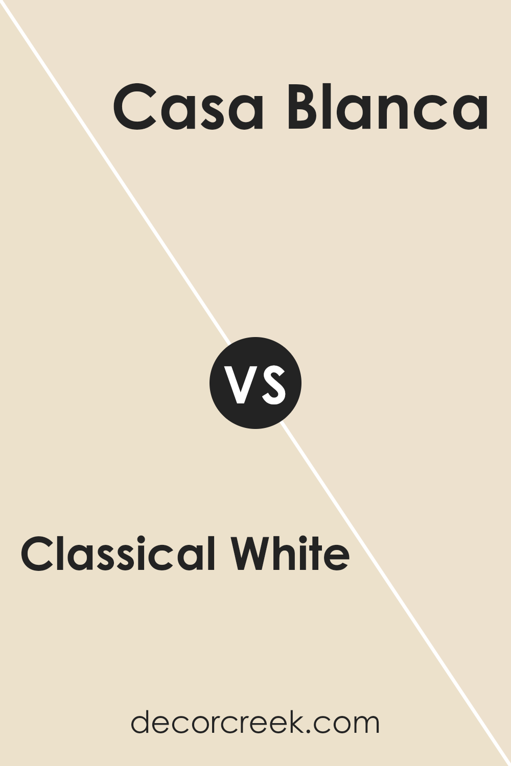
Classical White SW 2829 by Sherwin Williams vs Casa Blanca SW 7571 by Sherwin Williams
Classical White SW 2829 and Casa Blanca SW 7571 from Sherwin Williams are two popular white shades. Classical White SW 2829 is a soft, warm white with a hint of cream, making it versatile and suitable for various spaces. It tends to create a clean and classic look without being too stark or cold. This color is great for adding brightness to a room while maintaining a cozy feel.
On the other hand, Casa Blanca SW 7571 is also a warm white but leans slightly more towards a beige undertone. This gives it a richer and slightly more golden hue compared to Classical White. Casa Blanca can provide a more earthy and inviting atmosphere, making it a good choice for spaces where you want to create warmth and comfort.
Both colors work well as neutrals and can complement a variety of home styles, but the choice between them will ultimately depend on the desired ambiance and the other colors in the room.
You can see recommended paint color below:
Classical White SW 2829 by Sherwin Williams vs Morning Sun SW 6672 by Sherwin Williams
Classical White SW 2829 and Morning Sun SW 6672 by Sherwin Williams offer different vibes for a room. Classical White is a soft, neutral shade that provides a clean and timeless look. It is perfect for spaces where you want a straightforward, versatile backdrop that can match various decor styles.
On the other hand, Morning Sun is a warm, inviting yellow. This color can add energy and brightness to a room, making it feel cheerful and lively.
While Classical White gives a calm, understated effect, Morning Sun creates a more vibrant atmosphere. Choosing between them depends on the mood you want to set. Classical White is great for a minimalist or classic style, while Morning Sun can highlight areas like kitchens or playrooms where a lively feel is desired. Both colors have distinct roles and can be used effectively depending on the aesthetic goals of a space.
You can see recommended paint color below:
- SW 6672 Morning Sun
Classical White SW 2829 by Sherwin Williams vs Decor White SW 7559 by Sherwin Williams
Classical White SW 2829 by Sherwin Williams is a warm, soft white with a hint of creaminess. It gives a cozy and inviting feel to spaces, making it a popular choice for traditional or classic interiors. It pairs well with earthy tones and can add a touch of warmth to a room without overwhelming it.
On the other hand, Decor White SW 7559 is a cooler white. It appears clean and crisp, which can brighten up a space and make it look modern and fresh. It’s a great choice for contemporary interiors or spaces where you want a clear, bright look.
In summary, if you want a warm and comforting atmosphere, Classical White might be your pick. But if you prefer a clean and modern vibe, Decor White could be the way to go. Both colors have their own charm and can be used to achieve different effects in a room.
You can see recommended paint color below:
- SW 7559 Decor White
Classical White SW 2829 by Sherwin Williams vs Radiant Dawn SW 9661 by Sherwin Williams
Classical White SW 2829 by Sherwin Williams is a timeless shade of white. It has a warm base, making it cozy and inviting. This color works well in various settings, providing a clean and simple backdrop that can complement any style of decor, from traditional to modern.
On the other hand, Radiant Dawn SW 9661 by Sherwin Williams is a soft, gentle hue with a hint of peachy-pink undertones. It brings a touch of warmth and subtle color to a space, making it feel cheerful and welcoming. Radiant Dawn is a great choice for rooms where you want a bit of color without it being overpowering.
In summary, while Classical White is neutral and versatile, Radiant Dawn offers a bit more personality and warmth. Both can brighten a room, but their effects differ; Classical White is understated, whereas Radiant Dawn introduces a touch of liveliness.
You can see recommended paint color below:
- SW 9661 Radiant Dawn
Classical White SW 2829 by Sherwin Williams vs Antique White SW 6119 by Sherwin Williams
Classical White (SW 2829) and Antique White (SW 6119) by Sherwin Williams are both warm whites, but they offer different vibes for a space. Classical White is a crisp, clean white with minimal undertones, making it feel fresh and bright. It’s perfect for creating a timeless look and works well in modern or traditional settings.
On the other hand, Antique White has a creamier tone with a hint of warmth due to its yellow undertones. This gives it a cozy and inviting feel, which is perfect for spaces where you want to create a welcoming atmosphere. Antique White can add a touch of softness and comfort to a room.
While both colors are versatile, Classical White might be better suited for spaces where you want a clear, pure white effect, whereas Antique White is ideal if you’re aiming for a warmer, more classic look. Both can beautifully complement different furniture and decor styles.
You can see recommended paint color below:
Classical White SW 2829 by Sherwin Williams vs Navajo White SW 6126 by Sherwin Williams
Classical White SW 2829 is a pure and clean color. It’s a bright white that works well in spaces where you want a crisp, clean look. This color is versatile and can be used as a neutral background, making it ideal for both modern and traditional rooms. It reflects light beautifully, adding brightness to any space.
On the other hand, Navajo White SW 6126 has a warm, creamy feel. It’s not a stark white but rather leans towards a soft, pale beige. This makes it cozy and inviting, perfect for creating a warm and welcoming atmosphere. It adds subtle color to a room without being overwhelming.
When comparing the two, Classical White is cooler and more stark, ideal for spaces where you want a clear, fresh look. Navajo White, with its warmer undertones, is suited for spaces where a comfortable, lived-in feel is desired. Both are excellent choices depending on the mood you wish to create.
You can see recommended paint color below:
Classical White SW 2829 by Sherwin Williams vs Muslin SW 6133 by Sherwin Williams
Classical White SW 2829 and Muslin SW 6133 from Sherwin Williams are two popular colors with distinct characteristics. Classical White is a soft, timeless white, ideal for creating a clean and fresh look in any room. It reflects light well, making spaces feel brighter and more open. It’s versatile, working beautifully as a wall color or trim.
On the other hand, Muslin SW 6133 offers a warm, beige tone. It brings a cozy, inviting feel to a space. Muslin has earthy undertones that can make a room feel more grounded and comfortable, contrasting the brightness of Classical White.
When paired together, Classical White can highlight architectural features and provide a crisp backdrop, while Muslin can add warmth and depth. Whether used separately or together, these shades can accommodate a range of styles, from modern to traditional, and help achieve different atmospheres at home.
You can see recommended paint color below:
Classical White SW 2829 by Sherwin Williams vs Restoration Ivory SW 6413 by Sherwin Williams
Classical White (SW 2829) by Sherwin Williams is a bright, clean white with a slight warmth, perfect for creating a fresh and airy space. It’s versatile and works well in both traditional and modern settings. It reflects light beautifully, making rooms feel more open and inviting.
On the other hand, Restoration Ivory (SW 6413) by Sherwin Williams adds a touch of warmth with its soft yellow undertones. This color brings a cozy and welcoming feel to any room. It works particularly well in spaces where you want to add a bit of warmth without going too bold.
Comparing the two, Classical White offers a more neutral backdrop, helping to highlight other colors and features in a room. In contrast, Restoration Ivory adds subtle color, enhancing a room’s warmth and comfort. Both colors are great choices but serve different moods and styles depending on the feel you want for your space.
You can see recommended paint color below:
- SW 6413 Restoration Ivory
Classical White SW 2829 by Sherwin Williams vs Polar Bear SW 7564 by Sherwin Williams
Classical White SW 2829 by Sherwin Williams and Polar Bear SW 7564 both offer unique takes on white. Classical White has a soft, warm tone with subtle undertones of yellow or beige. This makes it suitable for creating cozy, inviting spaces. It tends to complement traditional and antique-looking designs well.
In contrast, Polar Bear is a bright, crisp white that feels clean and fresh. Its cooler undertones make it a good match for modern or minimalist spaces. The stark nature of Polar Bear brings more vibrancy and light into a room, making it seem more open and airy.
While Classical White leans towards a warm, comfortable feel, Polar Bear provides a brighter, more invigorating atmosphere. Choosing between the two depends on the vibe you’re aiming to create. For warmth and coziness, go with Classical White; for a clean, contemporary look, Polar Bear is a great choice.
You can see recommended paint color below:
- SW 7564 Polar Bear
Conclusion
After looking at SW 2829 Classical White by Sherwin Williams, I feel like I now understand why it’s such a popular paint color. Classical White is a solid choice if you’re looking for something that feels simple and fresh. It’s like a blank canvas. This means you can add different colors with pillows, rugs, or pictures. The white goes well with everything!
What’s cool is that Classical White isn’t too bright or too dull—it’s just right. So, if you want your room to feel bigger or brighter, this white does the job pretty well. It makes the room light and happy.
When you paint a room this color, you’re giving it a new look without doing something too drastic. It’s like changing your shirt—a nice change but not a wild one. Parents might use this color because it’s safe and easy to match with other things in your home.
If you ever want to choose a white color for your walls, remember Classical White. It’s friendly, clean, and ready to help make your room feel just the way you want. I think you’d like how simple and neat your room could look with it!

Ever wished paint sampling was as easy as sticking a sticker? Guess what? Now it is! Discover Samplize's unique Peel & Stick samples.
Get paint samples

