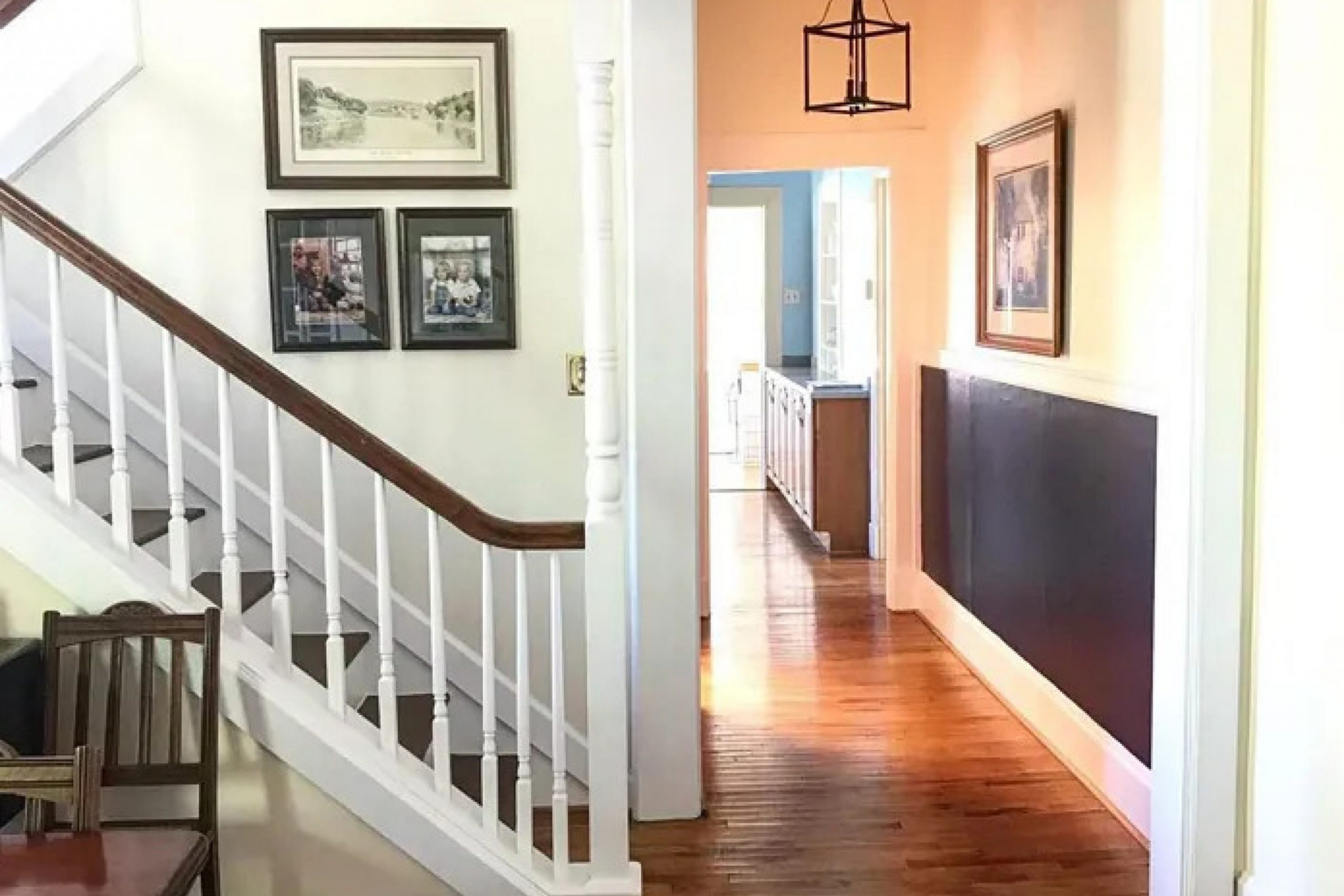
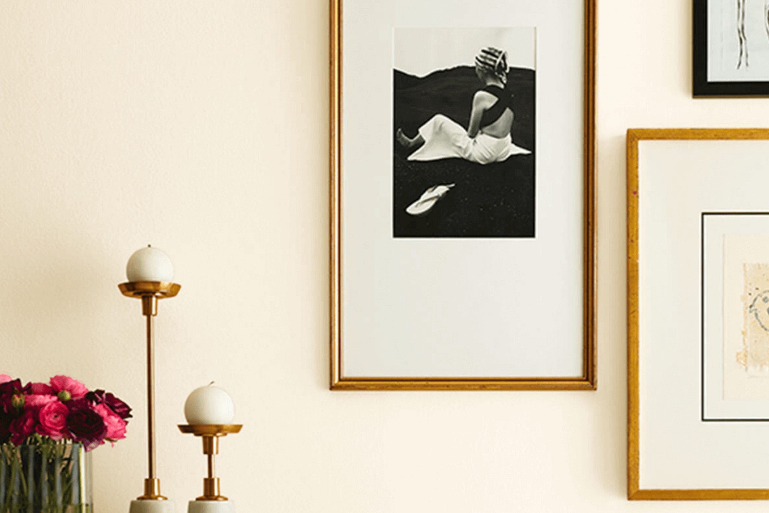
Whenever you’re looking for a fresh, clean backdrop for your space, you might find that Sherwin Williams’ SW 7105 Paperwhite is just what you need. This paint color brings a serene and subtle atmosphere to any room, whether it be your busy kitchen or a quiet bedroom.
What stands out about SW 7105 Paperwhite is its ability to act almost like a chameleon. Due to its neutral yet warm tones, it complements various styles and colors, enhancing the room without taking over.
It’s like giving your walls a gentle nudge towards elegance without overwhelming the senses.
As you think about your next project around your home, consider how SW 7105 Paperwhite could enhance your existing décor.
This color not only looks bright and airy in a room full of sunlight but also offers a soothing presence in dimmer, cozier areas.
It’s a versatile choice—a blank canvas for your personal touches.
So, if you’re looking for a change that feels both refreshingly new and comfortably familiar, SW 7105 Paperwhite might be the perfect shade for you.
What Color Is Paperwhite SW 7105 by Sherwin Williams?
The color Paperwhite by Sherwin Williams is a clean and subtle off-white shade. It possesses just a hint of warmth, making it flexible for use in various lighting conditions and room settings. This soft white is far from stark or cold, which in interior design, makes it an excellent foundation color that can either calm lively elements or enhance minimalist spaces.
Paperwhite works fantastically in modern and Scandinavian interiors due to its neutral base and welcoming undertone. It’s perfect for creating a light, airy feel that these styles often emphasize. Additionally, it matches well with the rustic aesthetic where natural materials like wood, stone, and linen feature heavily.
This color pairs harmoniously with natural textures, enhancing their depth and appeal without overwhelming their inherent beauty.
Ideal materials to combine with Paperwhite include unfinished wood, which maintains a feeling of nature and simplicity, or soft, plush textures in furnishings such as wool or cotton throws that invite relaxation.
For a bit of contrast, consider pairing it with metals like brushed nickel or matte black, which will stand out against its subtle backdrop without clashing.
Overall, this color is wonderfully versatile for anyone looking to create a space that feels both open and cozy. Whether used on walls, trim, or cabinets, it provides a refreshing canvas that supports a variety of decor choices.
Is Paperwhite SW 7105 by Sherwin Williams Warm or Cool color?
Paperwhite by Sherwin Williams is a gentle off-white color with a soft, warm undertone, making it a versatile choice for nearly any room in a home. Its subtle warmth means it can complement different lighting conditions, looking inviting in rooms with natural sunlight or cozy in spaces with softer artificial light.
This color doesn’t overpower, which makes it great for small rooms, helping to make them appear more spacious and open.
When paired with bold colors, Paperwhite acts as a calming background, allowing brighter furniture or decor pieces to stand out. In contrast, when used in a monochromatic color scheme, it adds a touch of softness and warmth, creating a cohesive and inviting space.
Because it is so neutral, it’s easy to match with various styles, from modern and minimalistic to traditional. It’s also practical, as it can easily hide small imperfections on walls and is forgiving when it comes to maintenance and touch-ups.
Undertones of Paperwhite SW 7105 by Sherwin Williams
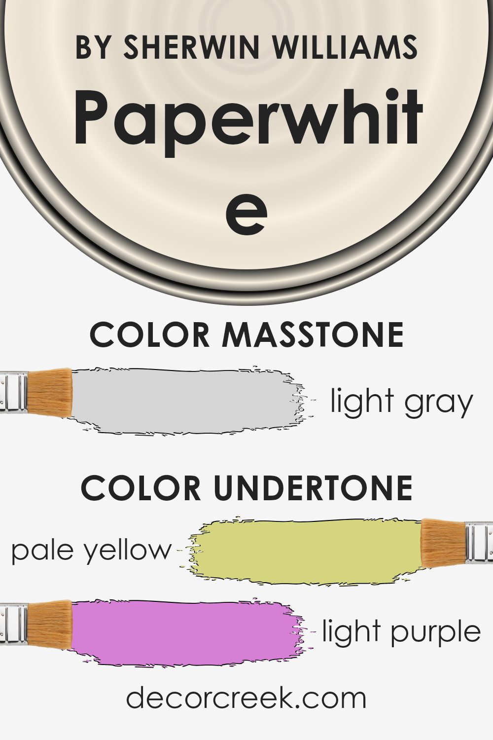
Paperwhite is a versatile paint color with a complex mix of undertones that can subtly change its appearance depending on lighting and surrounding colors. The undertones in this paint include pale yellow, light purple, light blue, pale pink, mint, lilac, and grey. These undertones are critical because they can influence the overall feel and look of a room.
For example, the pale yellow undertone adds a subtle warmth to the color, making a room feel cozy and inviting. On the other hand, light blue and mint undertones bring a fresh and airy feel, which can make a space seem more open and bright.
The light purple and lilac undertones add a touch of softness, which can help in creating a soothing environment. The grey undertone ensures that the color maintains a neutral base, making it flexible to style with a wide range of decor colors and accessories.
When applied to interior walls, the complex undertones of this paint color allow it to adapt to different lighting conditions beautifully. In natural light, the cooler undertones might become more pronounced, giving the room a crisp, clean look. In artificial lighting, warmer undertones might stand out, providing a cozy, welcoming vibe.
Overall, the mix of undertones in this color makes it a great choice for anyone looking to add a subtle depth and complexity to their space without overwhelming it with color. Whether you’re painting a bedroom, living room, or kitchen, this color can offer a delightful backdrop that complements various decorating styles and preferences.
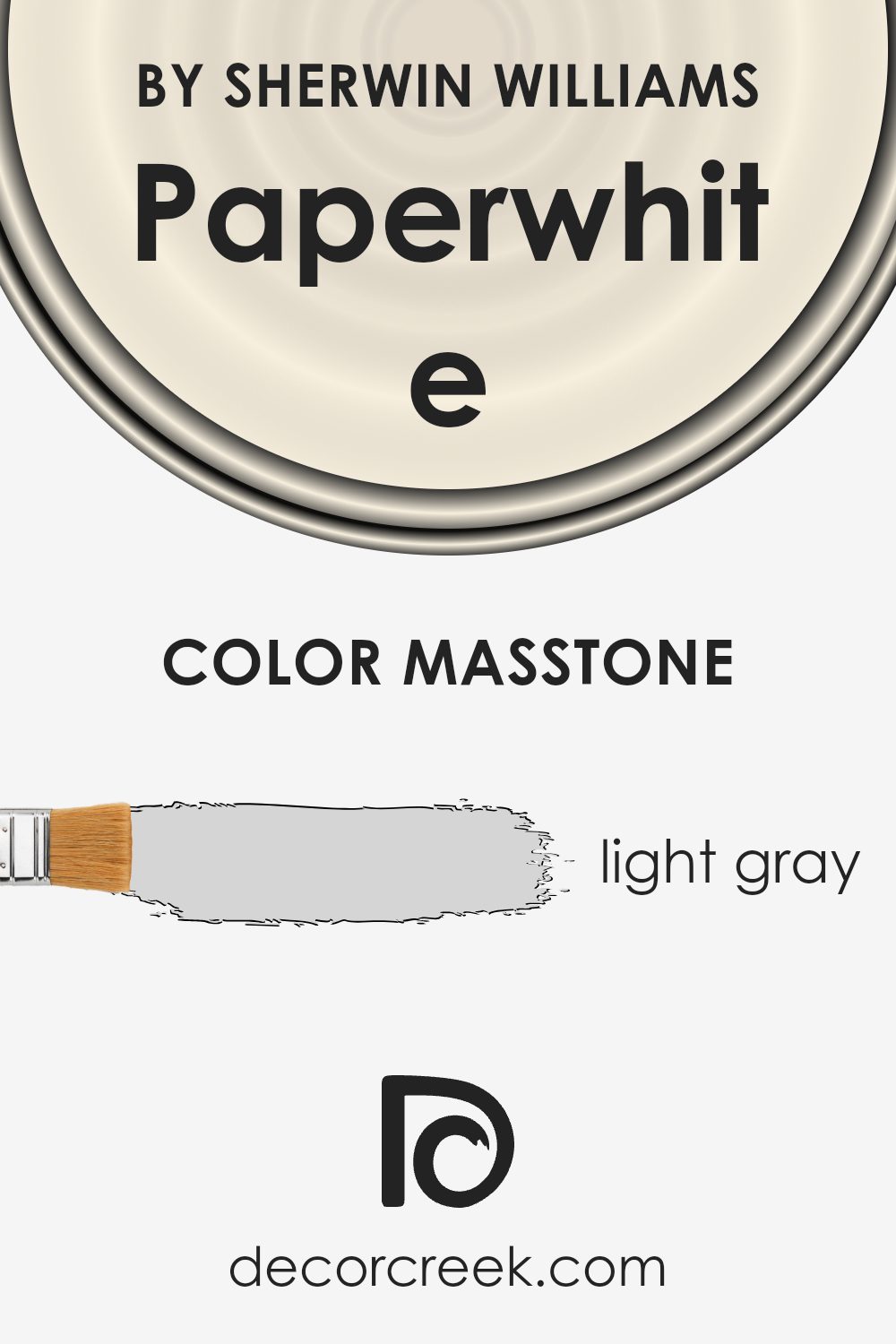
What is the Masstone of the Paperwhite SW 7105 by Sherwin Williams?
Paperwhite is a light gray color (#D5D5D5) that is simple yet effective for creating a clean and open feeling in various home spaces. This gray does a great job at catching natural light which helps to make rooms look bigger and more inviting without being too bold or overpowering.
It’s an excellent choice for living rooms, bedrooms, and kitchens, where a gentle backdrop is necessary to set a calm, pleasant atmosphere.
This shade of gray is versatile enough to work well with many other colors, so decorating around it is easy. You can pair it with both bright colors for a vibrant effect or keep things muted with other shades of gray or soft whites for a more streamlined look. The subtlety of Paperwhite ensures that it blends seamlessly into any style of decor, allowing furniture and artwork to stand out.
Overall, this color is great for anyone looking to create a light and airy feel in their home.
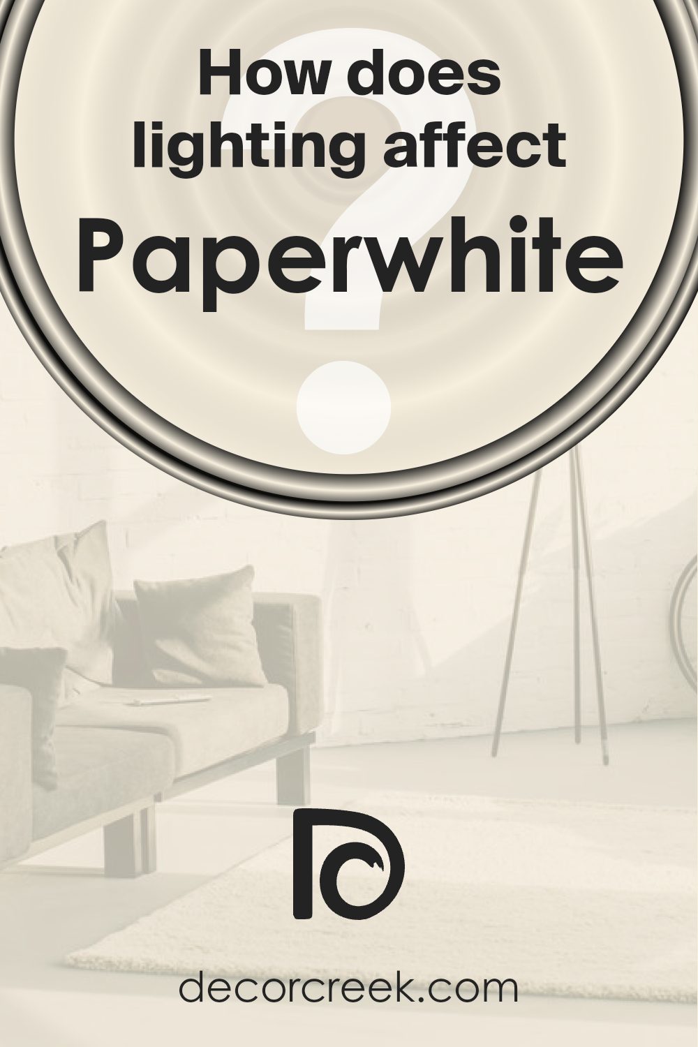
How Does Lighting Affect Paperwhite SW 7105 by Sherwin Williams?
Lighting significantly affects how we perceive the colors around us, as different light sources can change the appearance of a color. When examining a specific paint color like Paperwhite by Sherwin Williams, the type of light under which the color is viewed—whether natural or artificial—plays a crucial role in how it is ultimately perceived.
Artificial Light: In artificial lighting, which varies from warm incandescent light to cooler fluorescent light, “Paperwhite” can appear differently. Under warm lights, such as incandescent bulbs, this color tends to look softer and creamier. It adds a cozy and a slightly yellowish tint enhancing the warmth of the space.
On the other hand, under the harsher, bluish tinge of fluorescent lamps, the same color might look brighter and slightly cooler, pulling out more of its subtle gray undertones.
Natural Light: Natural lighting provides the truest representation of “Paperwhite.” However, the direction of the room concerning natural light can distort this pure shade. In north-faced rooms, where light tends to be cooler and more even throughout the day, “Paperwhite” maintains a consistent and neutral look, very true to its original swatch. It doesn’t shift much in color, staying crisp and bright.
When it comes to rooms that face south, which receive more intense, warmer sunlight throughout the day, “Paperwhite” may appear warmer and more inviting. This exposure especially in the daytime can make the walls look very lively as it interacts with the natural light.
In east-facing rooms, the morning light is bright and warm, making “Paperwhite” appear softer and slightly warm in the mornings, but it may lose some warmth and revert to a more neutral tone as the day progresses.
Conversely, in west-faced rooms, the color is subjected to the more dramatic, golden tones of a setting sun. This evening light can make “Paperwhite” look softer and warmer towards the end of the day, creating a cozy atmosphere.
Understanding these nuances of lighting can help in making informed decisions on where to apply colors for desired effects within a home.
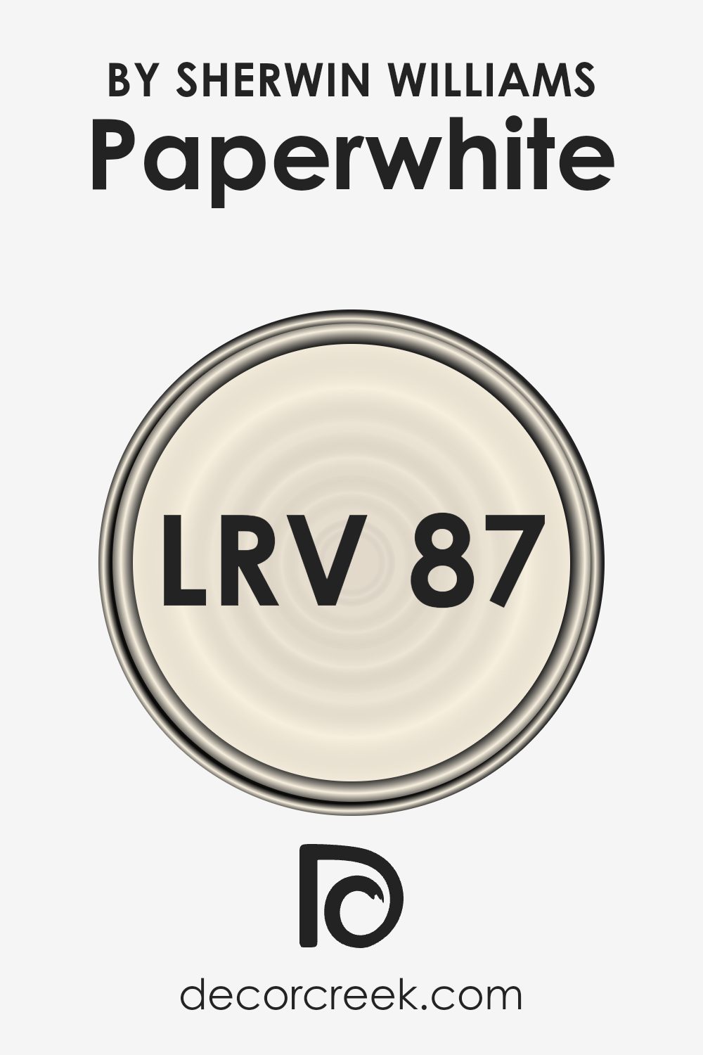
What is the LRV of Paperwhite SW 7105 by Sherwin Williams?
LRV stands for Light Reflectance Value, which measures the percentage of light a paint color reflects back into a room. It’s a scale from zero, where no light is reflected and the surface appears black, to one hundred, indicating a perfect reflection of all light, looking almost white.
This value helps you understand how light or dark a color will appear once it’s on your wall. A higher LRV means the color will reflect more light, making spaces appear brighter and larger. Conversely, a lower LRV absorbs more light, potentially making a room feel smaller and darker.
With an LRV of 86.702, the color we’re looking at is quite light, nearly approaching the high end of the scale. This means it is capable of reflecting a lot of light, contributing significantly to making a space feel open and airy. It’s an excellent choice for smaller or darker rooms, as it can help make them appear more spacious and well-lit.
Since it’s very light, it also offers flexibility in terms of decor, allowing for both subtle, understated styles and the opportunity to pair with bolder, contrasting colors for more dynamic interior schemes.
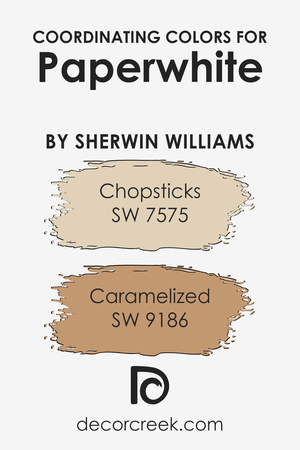
Coordinating Colors of Paperwhite SW 7105 by Sherwin Williams
Coordinating colors are chosen to complement a primary paint color in a room, creating a balanced and harmonious look. For instance, if you are using a neutral shade like Paperwhite from Sherwin Williams as your primary color, you can enhance its appearance with coordinating colors such as Chopsticks (SW 7575) and Caramelized (SW 9186).
These coordinating shades are selected for their ability to work well together, ensuring that no single color overwhelms the others, but rather they all contribute to a cohesive design.
Chopsticks is a gentle brown that offers a down-to-earth warmth to spaces, making it a superb choice for adding depth and comfort when used alongside lighter colors like Paperwhite. Its earthly hue gives a welcoming vibe, perfect for living rooms or bedrooms looking to maintain a cozy atmosphere.
On the other hand, Caramelized sports a richer, more golden-brown tone that brings a sense of warmth and subtle brightness to any space. This color works exceptionally well in areas like the kitchen or dining room, where a cheerful and inviting ambiance is often desired.
Together, these colors create an appealing palette that complements the clean, crisp base of Paperwhite, enhancing the overall aesthetic of the room without being overly bold or jarring.
You can see recommended paint colors below:
- SW 7575 Chopsticks
- SW 9186 Caramelized
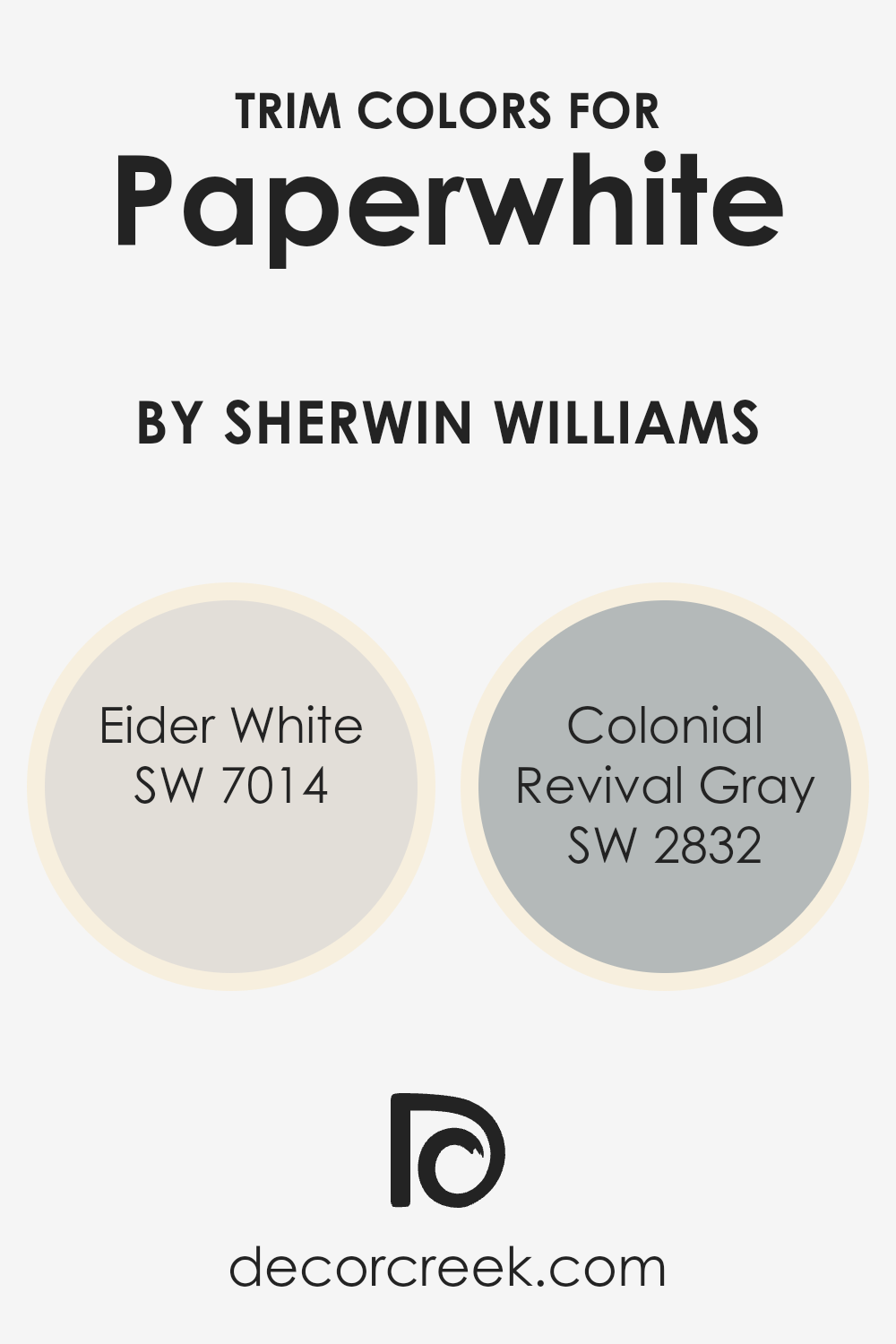
What are the Trim colors of Paperwhite SW 7105 by Sherwin Williams?
Trim colors are complementary shades that are used to accentuate and define the architectural details of a room, such as baseboards, moldings, window and door frames. Using trim colors effectively enhances the overall character and aesthetic balance of the space.
For instance, when used with a base color like SW 7105 Paperwhite by Sherwin Williams, choosing the right trim color can highlight the subtleties of the primary color and add a clear definition to the room’s features.
SW 7014 – Eider White is a pale gray with a warm undertone that softly blends with lighter wall colors such as Paperwhite, providing a gentle contrast that isn’t too stark but still visually appealing.
SW 2832 – Colonial Revival Gray, on the other hand, is a deeper, mid-toned gray that offers a more pronounced contrast against lighter shades like Paperwhite, allowing for a stronger delineation of spaces and architectural elements. Both colors lend themselves to creating a cohesive look that enhances the room’s dimensions and augments its overall charm.
You can see recommended paint colors below:
- SW 7014 Eider White
- SW 2832 Colonial Revival Gray
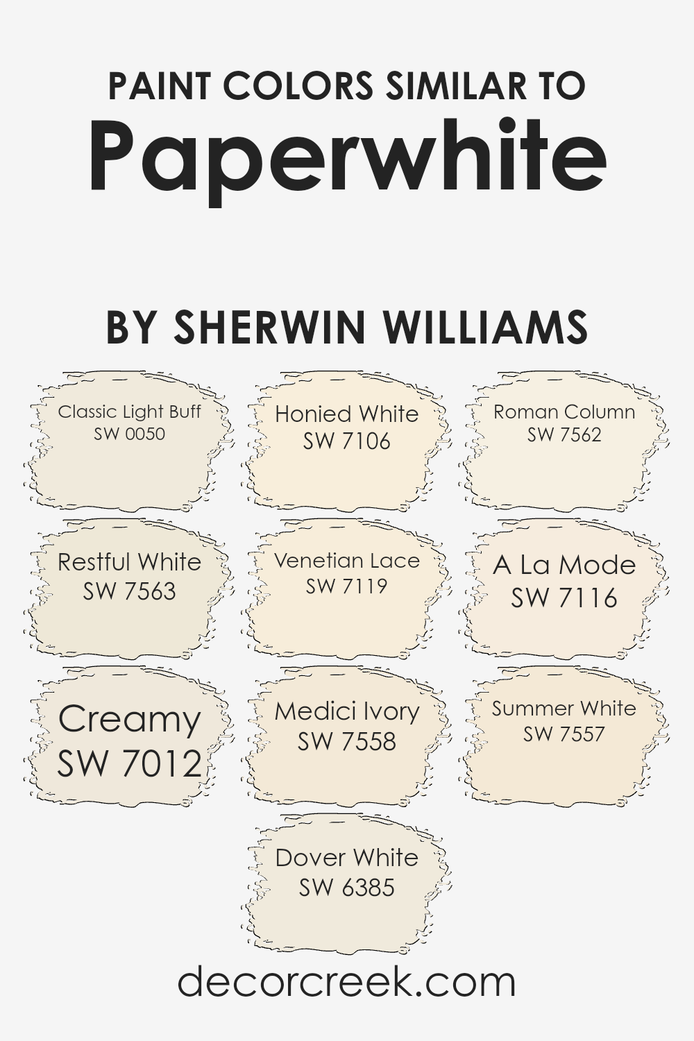
Colors Similar to Paperwhite SW 7105 by Sherwin Williams
Choosing similar colors for a room or home decor is essential because it creates a cohesive and harmonious visual appeal. When colors are closely related on the color spectrum, they naturally complement each other, supporting a balanced and soothing environment.
Colors like Classic Light Buff and Restful White are great examples of subtle tones that go well together, each adding a touch of light warmth without overpowering the space. Classic Light Buff is a warm beige that offers a soft backdrop, ideal for living areas or hallways, whereas Restful White is a muted off-white, perfect for creating a calm and gentle ambiance in any room.
Furthermore, colors such as Creamy and Dover White lean towards mellow yellow undertones, which work beautifully to introduce a sense of sunlight and cheeriness into spaces that might not receive a lot of natural light. Creamy is a richer, buttery color, contrasting slightly more with subtle hues, while Dover White has a lighter, airier feel to it.
On a similar note, Honied White and Venetian Lace provide a touch of elegance without being too striking, where Honied White has a hint of gold for a soft glow, and Venetian Lace offers a discreetly creamy feel.
Not to forget, Medici Ivory and Roman Column enhance the timeless charm with their slight old-world flair; Medici Ivory brings a duskey ivory tone, and Roman Column offers a classic off-white.
Wrapping up the palette with A La Mode and Summer White provides versatile options; A La Mode is clean and understated for a sophisticated neutrality, and Summer White adds a slightly warmer tone, resembling the gentle touch of the summer sun.
Thus, pairing similar colors strategically enriches the environment, making spaces feel more thoughtfully curated and pleasantly inviting.
You can see recommended paint colors below:
- SW 0050 Classic Light Buff
- SW 7563 Restful White
- SW 7012 Creamy
- SW 6385 Dover White
- SW 7106 Honied White
- SW 7119 Venetian Lace
- SW 7558 Medici Ivory
- SW 7562 Roman Column
- SW 7116 A La Mode
- SW 7557 Summer White
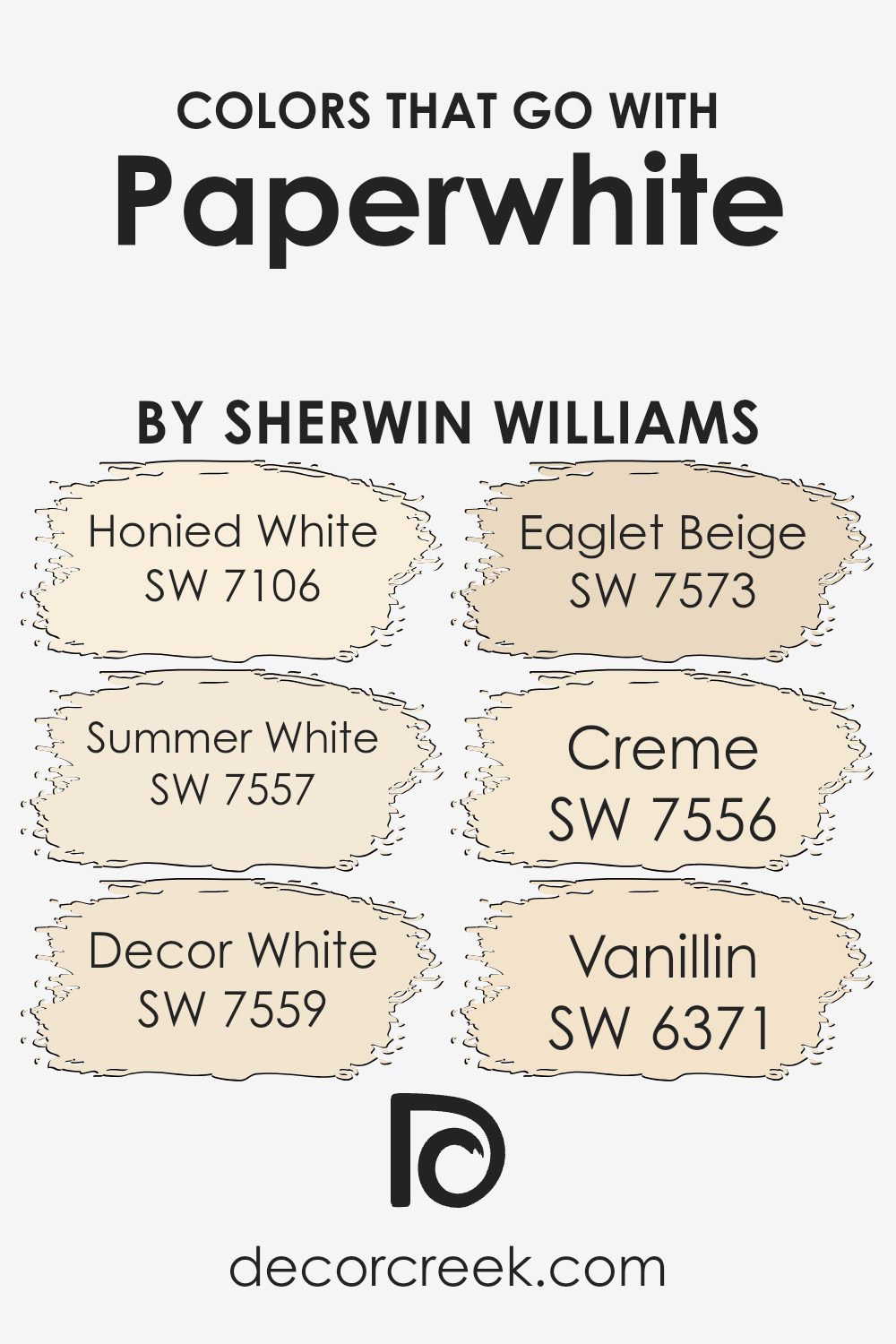
Colors that Go With Paperwhite SW 7105 by Sherwin Williams
Choosing the right colors that complement Paperwhite SW 7105 by Sherwin Williams can significantly enhance the aesthetics of any space. The closely related shades, like Honied White and Summer White, offer subtle differences that contribute to a soft, harmonious look.
Honied White SW 7106 has a warm, inviting glow that pairs wonderfully with the gentle hue of Paperwhite, creating a cozy and approachable atmosphere. On the other hand, Summer White SW 7557, with its slightly more pronounced warmth, complements Paperwhite by adding a hint of sunny brightness to the room.
Further enriching the palette, Decor White SW 7559 provides a neutral backdrop that allows other elements in the room to stand out without overwhelming the senses. It works perfectly, setting a slightly more defined contrast against the softer tones of Paperwhite.
Eaglet Beige SW 7573, with its earthy subtlety, and Creme SW 7556, which offers a soft, creamy texture to surfaces, blend naturally with Paperwhite, fostering an environment of warmth and comfort.
On a delightful note, Vanillin SW 6371 adds a touch of creamy yellow, subtly brightening any space and providing a gentle yet cheerful complement to the muted elegance of Paperwhite.
These color combinations work beautifully together, providing versatile options that can enhance a room’s appeal by creating depth and interest through well-thought-out color harmony.
You can see recommended paint colors below:
- SW 7106 Honied White
- SW 7557 Summer White
- SW 7559 Decor White
- SW 7573 Eaglet Beige
- SW 7556 Creme
- SW 6371 Vanillin
How to Use Paperwhite SW 7105 by Sherwin Williams In Your Home?
Paperwhite SW 7105 by Sherwin Williams is a versatile paint color ideal for those looking to brighten up their spaces. Its clean and fresh shade of white works perfectly in almost any room of your house. You can use it in your living room or bedroom to make the space feel bigger and more open.
This color reflects natural light beautifully, making it ideal for smaller rooms or areas with limited sunlight.
In the kitchen, Paperwhite can give your cabinets a clean and updated look without overwhelming the space. It pairs well with many accent colors, allowing you to customize your room according to your taste. In bathrooms, this shade provides a crisp, clean backdrop that complements both modern and traditional designs.
Because it’s so neutral, Paperwhite is also great for hallways and ceilings, helping to connect rooms seamlessly. It helps disguise small imperfections and can be a quick fix for sprucing up your home before entertaining guests or just refreshing your surroundings.
Whether you want a classic or modern feel, Paperwhite can fit your style and make your home look fresh and inviting.
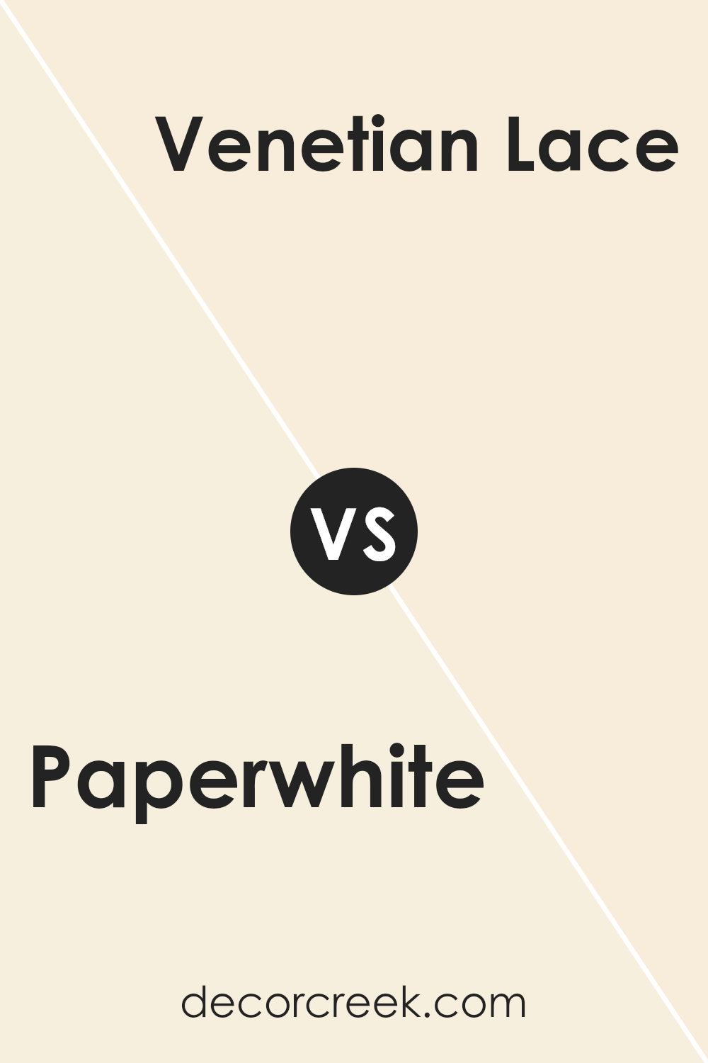
Paperwhite SW 7105 by Sherwin Williams vs Venetian Lace SW 7119 by Sherwin Williams
Paperwhite and Venetian Lace by Sherwin Williams are two distinct shades. Paperwhite is a clean white with minimal undertones, making it very clear and bright. This makes it great for creating a fresh, open feel in any space, ideal for modern or minimalist decor.
On the other hand, Venetian Lace has a slightly creamy undertone, giving it a warmer, more welcoming vibe compared to Paperwhite. This warmth makes Venetian Lace perfect for spaces where you want a cozy atmosphere, like living rooms or bedrooms.
While both colors bring lightness to a room, the choice between them depends on whether you prefer a stark or a softer, warmer white.
You can see recommended paint color below:
- SW 7119 Venetian Lace
Paperwhite SW 7105 by Sherwin Williams vs Honied White SW 7106 by Sherwin Williams
The main color, Paperwhite, is a crisp, clean shade. It gives off a pure and bright feel, perfect for making small spaces appear larger and more open. This stark quality makes it great for modern or minimalist decor, offering a backdrop that really highlights other colors or features in a room.
On the other hand, Honied White has a warm, cozy vibe due to its slightly creamy tone. This color is softer and more inviting, providing a comforting presence in any space. It works well in areas where you want to create a cozy, welcoming atmosphere, like living rooms or bedrooms.
When comparing these two, Paperwhite has a sharper, more vivid quality, while Honied White leans towards a gentler, warmer appearance. Both colors can brighten up a room, but your choice would depend on the mood you’re aiming to achieve; crisp and striking with Paperwhite, or warm and soothing with Honied White.
You can see recommended paint color below:
- SW 7106 Honied White
Paperwhite SW 7105 by Sherwin Williams vs Dover White SW 6385 by Sherwin Williams
The main color, Paperwhite, and the second color, Dover White, are both popular choices from Sherwin Williams, yet they offer distinct tones. Paperwhite is a clean, bright white that brings a crisp and fresh look to any space. It has a slight cool undertone, making it great for modern rooms seeking a sharp, clear appearance.
In contrast, Dover White has a warmer, creamier base. This warmer tone provides a cozy, inviting feel, making it ideal for living spaces or areas where a softer ambiance is desired. While Paperwhite suits settings that demand a stark, neat presence, Dover White works best where a gentle and welcoming atmosphere is preferred.
Both colors are versatile, but the choice between them depends on the mood and style you want to achieve in your space.
You can see recommended paint color below:
Paperwhite SW 7105 by Sherwin Williams vs Medici Ivory SW 7558 by Sherwin Williams
Paperwhite and Medici Ivory, both by Sherwin Williams, offer subtle differences that can impact the feel of a space. Paperwhite is a very light, almost pure white that brightens spaces effectively. It’s great for creating a clean and clear look, making rooms appear larger and more open. This color reflects most of the light, providing a crisp ambiance.
In contrast, Medici Ivory has a warmer tone, leaning more toward a creamy white. This hue offers a cozy and welcoming feel, perfect for spaces where you want a more inviting atmosphere without going too far from white.
Medici Ivory is excellent for rooms that get a lot of light, as it softens the brightness without darkening the room, providing a gentler visual comfort compared to the starkness of Paperwhite.
Both colors are versatile, but your choice might depend on whether you prefer a cooler or warmer undertone in your decor.
You can see recommended paint color below:
- SW 7558 Medici Ivory
Paperwhite SW 7105 by Sherwin Williams vs Restful White SW 7563 by Sherwin Williams
Paperwhite SW 7105 and Restful White SW 7563, both by Sherwin Williams, are two subtle shades of white that offer distinct vibes for any space. Paperwhite leans towards a clean, bright white without seeming too stark. It reflects light well, making it a great choice for areas that could use a sense of openness and brightness.
In contrast, Restful White has a slightly warmer tone, providing a cozy and welcoming feel. This color can make a room feel more inviting and comfortable, ideal for living spaces or bedrooms where you want to relax.
While both colors are versatile, Paperwhite is better suited for modern themes requiring sharp, clear whites, while Restful White works well where a softer, more gentle ambiance is desired. Each color has its unique charm, contributing differently to the atmosphere depending on your decorating goals.
You can see recommended paint color below:
Paperwhite SW 7105 by Sherwin Williams vs Summer White SW 7557 by Sherwin Williams
Paperwhite SW 7105 and Summer White SW 7557, both by Sherwin Williams, offer unique takes on white paint, each with its own subtle nuances. Paperwhite is a clean and bright white with a crisp finish, giving a refreshing feel to any space. It reflects light beautifully, making rooms look larger and more open.
On the other hand, Summer White has a warmer tone, with creamy and soft hues that bring a cozy warmth to interiors, making it perfect for creating a welcoming atmosphere in living spaces.
While Paperwhite works well in spaces that get a lot of natural light or where a sharp, modern look is desired, Summer White is ideal for spaces where comfort and a relaxed vibe are priorities. It pairs well with natural elements and soft textures.
Thus, choosing between them depends on the mood and functional needs of your space. Paperwhite is more about vibrancy and freshness, whereas Summer White leans towards comfort and warmth.
You can see recommended paint color below:
- SW 7557 Summer White
Paperwhite SW 7105 by Sherwin Williams vs Roman Column SW 7562 by Sherwin Williams
Paperwhite and Roman Column by Sherwin Williams are two shades that both belong to the neutral palette, yet they offer subtle distinctions in their appearance. Paperwhite is a very light, almost pure white color. It is clean and crisp, providing a bright and airy feel to any space.
This makes it an excellent choice for small rooms or areas that don’t get much natural light, as it helps make the space appear larger and more open.
On the other hand, Roman Column has a slightly warmer tone. It carries a soft, creamy beige hue that adds a hint of warmth to spaces, making it perfect for creating a cozy and inviting atmosphere. While still neutral, Roman Column can help soften sharper design elements and works well in rooms that aim for a more relaxed and comfortable feel.
Both colors are versatile, but the choice between them would depend on the effect you want to achieve in your space – brighter and more refreshing with Paperwhite or warmer and comforting with Roman Column.
You can see recommended paint color below:
Paperwhite SW 7105 by Sherwin Williams vs Creamy SW 7012 by Sherwin Williams
Paperwhite and Creamy by Sherwin Williams are two subtle shades that often appear in discussions about neutral paint options. Paperwhite is a clean and clear white with a pure, almost crisp look, making it perfect for creating a bright and open feeling in any space. It reflects light beautifully, which can make smaller rooms look larger and more inviting.
On the other hand, Creamy is a soft white with a warm undertone. This color can add a gentle coziness to a room, making it feel more homely and welcoming compared to the cooler tones of Paperwhite.
The warmth of Creamy can help soften the edges of a space that receives a lot of natural light, preventing the room from feeling stark while still maintaining a fresh and airy vibe.
In essence, while both colors are excellent choices for those looking to refresh their interiors with neutral tones, your choice between them might hinge on the desired warmth and atmosphere of the space. Paperwhite leans towards a cleaner, brighter look, whereas Creamy offers a softer, cozier appeal.
You can see recommended paint color below:
Paperwhite SW 7105 by Sherwin Williams vs A La Mode SW 7116 by Sherwin Williams
Paperwhite and A La Mode are both light, soft colors from Sherwin Williams, but they have different tones. Paperwhite is a very light, neutral white. It’s almost like a pure white but has a slight warmth to it, making it cozy for any room, and it fits well with various decor styles.
On the other hand, A La Mode is also a light color but leans towards a soft beige or very light taupe. It’s a bit warmer than Paperwhite because of its creamy undertone. This makes A La Mode a great option if you want a white that’s not too stark and has a hint of warmth.
Both colors reflect light well, brightening up spaces beautifully, but your choice between them might depend on how warm or neutral you want your space to feel.
You can see recommended paint color below:
- SW 7116 A La Mode
Paperwhite SW 7105 by Sherwin Williams vs Classic Light Buff SW 0050 by Sherwin Williams
Paperwhite and Classic Light Buff, both by Sherwin Williams, offer subtle yet distinct tones suitable for various spaces. Paperwhite is a soft, clean white that provides a pure and fresh look. This color is great for creating a bright and airy feel in rooms, making smaller spaces appear larger. It pairs well with almost every other color, serving as a versatile backdrop for both bold and muted decor styles.
On the other hand, Classic Light Buff is a warm beige that adds a touch of coziness to any area. It’s more inviting than stark whites, offering a comforting hue that works exceptionally well in living areas and bedrooms where you want a relaxed atmosphere. It coordinates well with warm tones and natural materials, such as wood and leather.
Both colors are neutral, but while Paperwhite leans toward a crisp, vibrant finish, Classic Light Buff brings warmth and a soothing presence into the space. The choice between them would depend on the mood you’re aiming to achieve and how much warmth you want in your color palette.
You can see recommended paint color below:
Paperwhite is quite a unique paint, offering a bright and clean shade of white, which seems almost pure and clear, making it a wonderful choice for anyone wanting to freshen up their room.
It works well in many places in a house, like in the kitchen, living room, or bedrooms because it makes these areas feel open and inviting.
What’s special about Paperwhite is that it fits with many decorations and furniture styles. Whether you have a modern style with lots of black and metallic colors, or a more cozy look with soft blues and greens, Paperwhite can really add to the room’s charm without taking over the look.
It’s also a practical color because it brings in more reflected light, making rooms look bigger and brighter. This quality can be particularly helpful in smaller spaces that you want to feel bigger.
So, if anyone asks me about choosing a white paint, I would surely suggest considering Paperwhite by Sherwin Williams. Its clean and bright feel, combined with the way it complements various decorating styles and enhances small spaces, makes it a great choice for many homes.
Ever wished paint sampling was as easy as sticking a sticker? Guess what? Now it is! Discover Samplize's unique Peel & Stick samples.
Get paint samples

