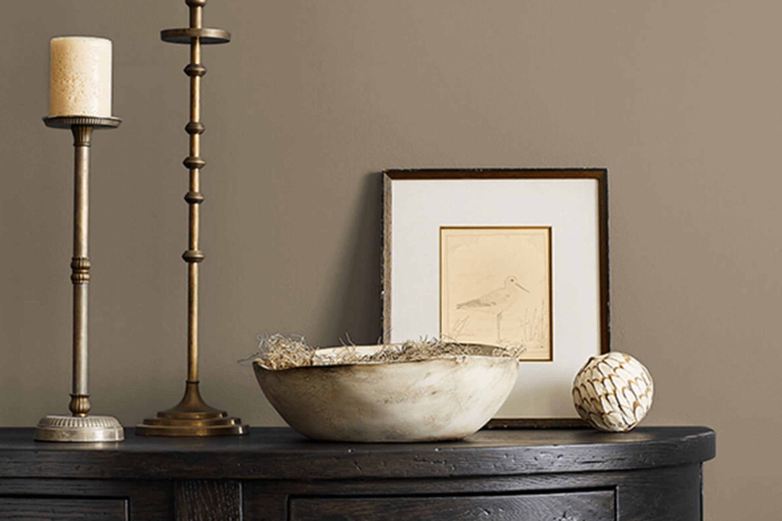
When thinking about refreshing client’s living space, I stumbled upon SW 2820 Downing Earth by Sherwin Williams. This color drew me in with its warm, earthy tones that seemed to whisper of calm landscapes and cozy corners. It’s not just a color; it’s an experience that makes a room feel like a soothing retreat.
Downing Earth has a way of balancing sophistication with comfort. It’s versatile enough to work in several settings, whether in a living room, a bedroom, or even a home office. Paired with natural wood finishes and soft textiles, it brings an inviting atmosphere that welcomes you to relax.
I found myself imagining how it could transform my space into a haven of relaxation. This color offers depth without overwhelming the senses, creating a serene environment where I could unwind after a long day. It’s a timeless choice, fitting both modern aesthetics and more classic designs.
Using SW 2820 Downing Earth allowed me to create a space that reflects my personality and offers a peaceful escape from the everyday hustle. It’s amazing how a simple change in color can make such a difference, turning the ordinary into something that feels truly special.
What Color Is Downing Earth SW 2820 by Sherwin Williams?
Downing Earth, known by its code SW 2820, is a charming and warm brown hue from Sherwin Williams. It provides a cozy, inviting atmosphere and is reminiscent of natural earth tones. This shade has undertones of clay and a hint of red, giving it depth and richness.
Downing Earth works well in traditional and rustic interior styles, where warmth and a sense of grounding are desired. It complements classic wooden furniture and is particularly effective in living rooms, reading nooks, or dining areas, creating a comfortable and welcoming environment.
In terms of materials, Downing Earth pairs beautifully with natural woods, leather, and stone, enhancing its warmth and earthy quality. Textiles like wool, cotton, or linen in neutral or muted colors work well alongside this paint color, providing a harmonious and textured look. Metal accents, such as wrought iron or aged brass, also fit nicely, adding a touch of contrast and sophistication without overshadowing the warmth of the brown.
The versatility of Downing Earth makes it a suitable backdrop for artworks and decorative elements, allowing them to stand out while maintaining a cohesive feel. Overall, this color is an excellent choice for anyone looking to introduce a timeless and cozy feel to their home.
Is Downing Earth SW 2820 by Sherwin Williams Warm or Cool color?
Downing Earth (SW 2820) by Sherwin-Williams is a warm, earthy paint color that adds a cozy and inviting feel to homes. It’s a medium brown shade with subtle undertones that make it versatile for various spaces.
This color works well in living rooms and bedrooms, creating a comfortable and grounded atmosphere. Its natural tone pairs nicely with neutral colors like creams, beiges, and soft whites, adding depth without being overwhelming.
In kitchens and dining areas, Downing Earth can complement wooden furniture and floors, enhancing the natural elements in the room. This paint color also works well as an exterior choice, bringing a sense of warmth to a home’s facade. Its ability to blend with both light and dark accents makes it a flexible option for homeowners looking to update their spaces. Whether on walls or trim, Downing Earth provides a warm backdrop that harmonizes with various styles and decors.
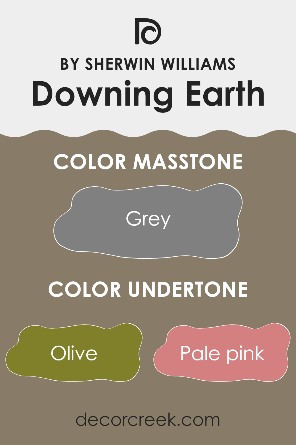
Undertones of Downing Earth SW 2820 by Sherwin Williams
Downing Earth by Sherwin Williams is a complex color that has a range of undertones, affecting how we perceive it in a room. Undertones are the subtle hues underneath the main color that can influence its appearance based on lighting and surroundings.
Downing Earth has undertones of olive, pale pink, and purple, adding warmth and softness while providing a grounded feeling. The mint, dark turquoise, and orange undertones can introduce freshness and vibrancy, making the color feel lively in well-lit spaces. Undertones like brown, dark green, and light green contribute to an earthy and natural vibe, making it ideal for rooms where you want a connection to nature.
On another note, the lilac and navy shades add a touch of elegance, offering a hint of sophistication without overwhelming the viewer. Dark grey and light blue undertones can be calming and balance the warmth from the red and orange tones. This helps in creating a harmonious and balanced look. In interior walls, Downing Earth can appear different depending on the time of day.
Under natural light, mint and light turquoise shades might be more prominent, giving a cool feeling. In artificial light, the warmer shades like orange and browns can become more noticeable, creating a cozy atmosphere. Overall, these undertones make the color versatile, allowing it to adapt to various settings and moods.
What is the Masstone of the Downing Earth SW 2820 by Sherwin Williams?
Sherwin Williams’ Downing Earth SW 2820 features a calm grey as its masstone, offering a neutral foundation perfect for home interiors. This particular shade of grey (#808080) provides a versatile and balanced backdrop that works well with a variety of decor styles.
Its neutrality allows it to complement both warm and cool color palettes, making it suitable for any room in the house. In living rooms and bedrooms, it can create a cozy, inviting atmosphere without overwhelming the space. It’s particularly effective in kitchens and bathrooms, where a clean, fresh look is often desired.
Additionally, grey shades like Downing Earth can make smaller spaces feel more expansive, as they typically reflect light better than darker colors. This color tends to hide imperfections on walls, too, making it a practical choice for high-traffic areas. Overall, the grey masstone in Downing Earth serves as an adaptable and timeless choice for homeowners seeking a modern yet classic look.

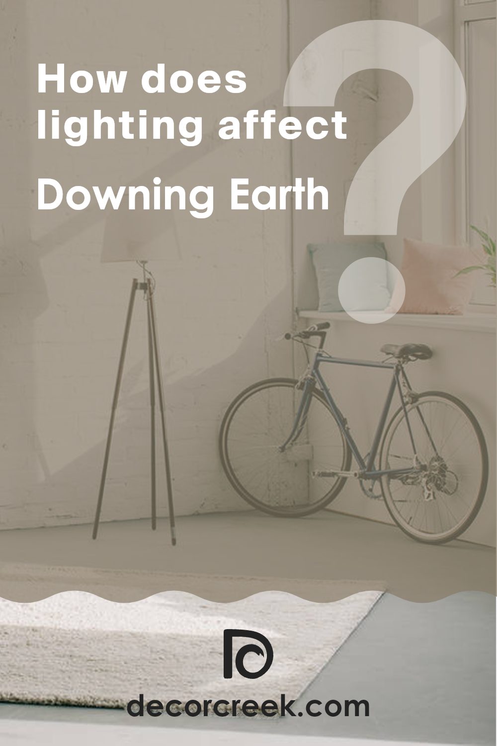
How Does Lighting Affect Downing Earth SW 2820 by Sherwin Williams?
Lighting plays a crucial role in how we perceive colors. Different types of lighting can make a color appear warmer, cooler, darker, or lighter. The color “Downing Earth” (SW 2820) by Sherwin Williams is a rich, earthy shade of brown. How it looks can vary greatly depending on whether you’re in natural or artificial light.
In artificial light, the color may appear slightly warmer or cooler based on the bulb’s color temperature. Incandescent bulbs tend to bring out warmer tones, giving “Downing Earth” a richer, more golden hue. On the other hand, fluorescent lights, which often have a cooler tone, might make the color appear a bit more muted or neutral.
In natural light, the appearance of “Downing Earth” changes with the direction the room faces. In north-facing rooms, which typically receive cooler, indirect light, the color may look a bit lighter and subdued. In these spaces, the natural light can give the color a more neutral appearance.
In south-facing rooms, which benefit from bright, direct sunlight for most of the day, “Downing Earth” can appear richer and warmer. The strong natural light enhances the color’s depth, bringing out its warmer undertones.
In east-facing rooms, the morning light is strong and warm, enhancing the color’s richness in the early part of the day. However, as the day progresses and the light becomes cooler and less direct, “Downing Earth” may seem more muted.
West-facing rooms receive the warm, golden light of the afternoon and early evening. In these spaces, the sunlight can make “Downing Earth” appear warmer and more inviting, deepening its earthy quality.
Overall, the way “Downing Earth” is perceived varies significantly with lighting conditions, affecting its warmth and depth. Understanding these changes can help in choosing the right environment for this color.
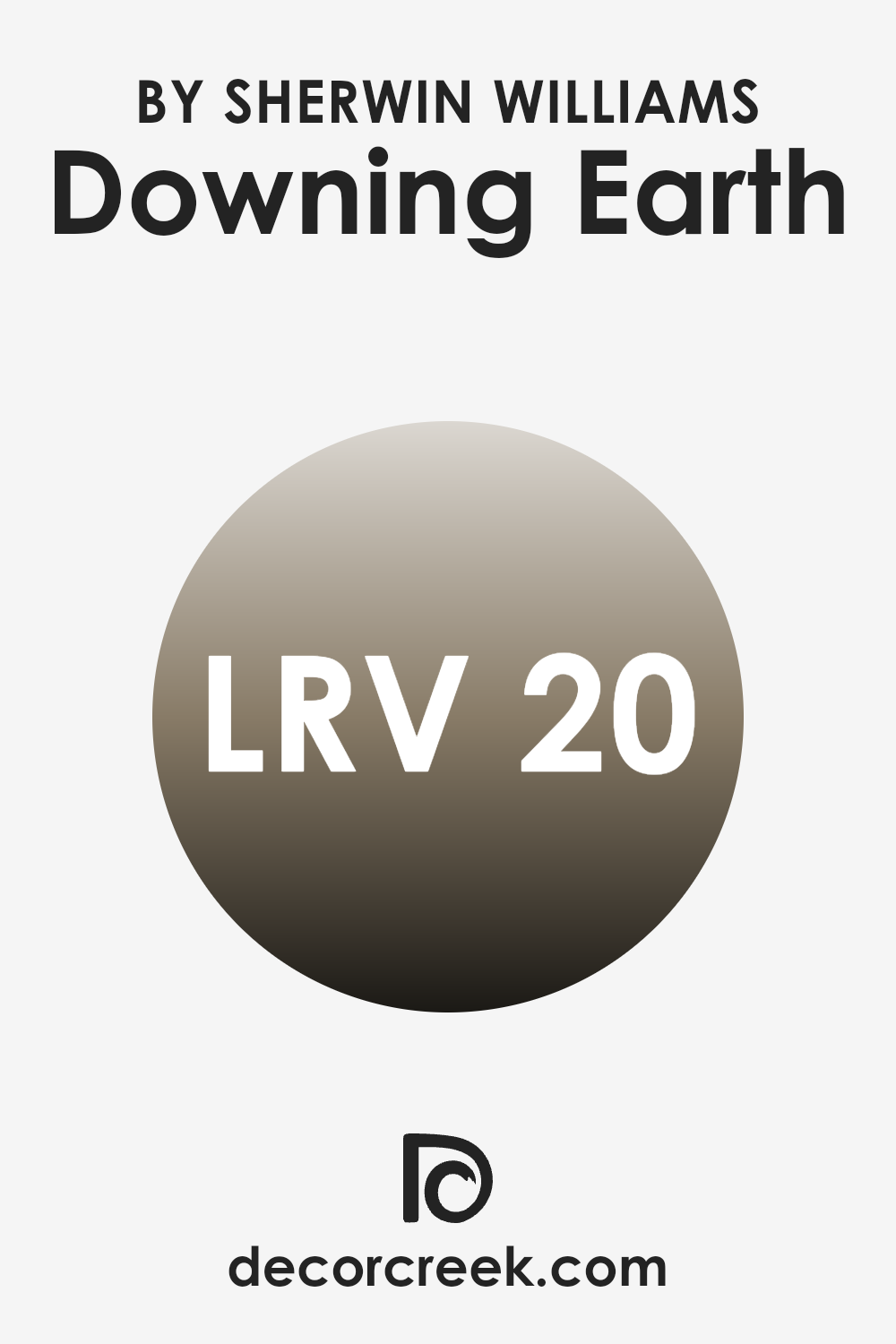
What is the LRV of Downing Earth SW 2820 by Sherwin Williams?
Light Reflectance Value, or LRV, is a measure of how much light a color reflects or absorbs when it is applied to a surface. It is measured on a scale from 0 to 100, where 0 is absolute black (absorbing all light) and 100 is pure white (reflecting all light).
The LRV of a color can significantly influence how the color looks in a room. Colors with higher LRV tend to make spaces feel brighter and more open because they reflect more light, while colors with lower LRV absorb more light, which can make a room feel cozier or more intimate.
For Downing Earth, which has an LRV of 20.443, this means that the color is quite dark and will absorb a fair amount of light. When used on walls, it will create a deep, warm atmosphere that can make a space feel more enclosed and cozy.
It’s a rich, earthy tone which, despite its lower reflectance, can create an elegant look in a room. However, because it absorbs more light, it is important to consider the amount of natural and artificial light in the space to avoid making the room feel too dark. It works best in rooms with ample lighting or in areas where you desire a more intimate and comfortable setting.
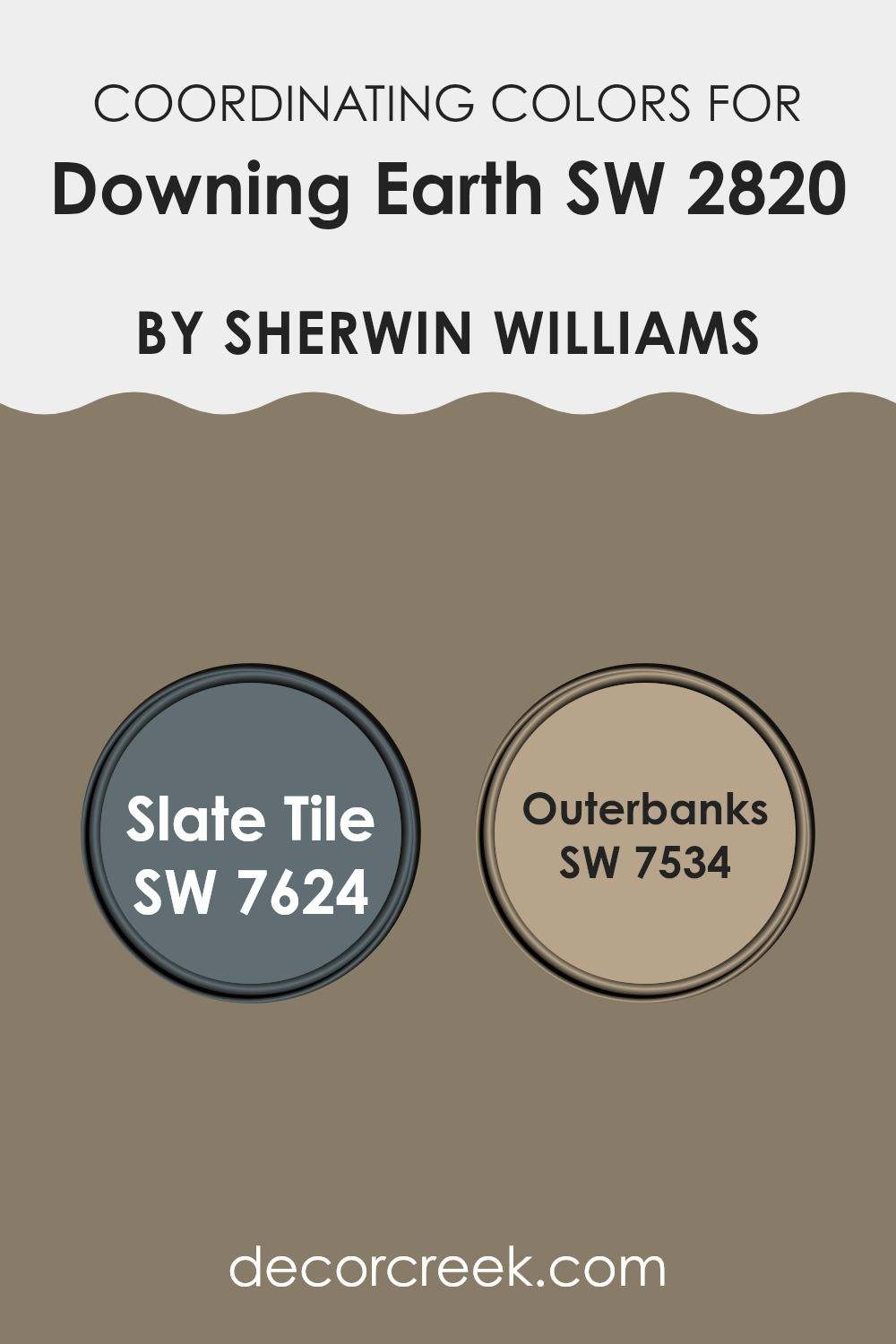
Coordinating Colors of Downing Earth SW 2820 by Sherwin Williams
Coordinating colors are shades that work well together in a color scheme, creating a harmonious and pleasing look. When choosing colors like Slate Tile and Outerbanks to complement Downing Earth by Sherwin Williams, it’s about finding hues that naturally blend and enhance each other.
Downing Earth is a warm, earthy brown that sets a grounded and welcoming tone. When paired with coordinating colors, it helps bring out the unique characteristics of each shade while maintaining a balanced look.
Slate Tile is a deep, rich blue-gray that adds a touch of depth and drama to any room. It pairs nicely with Downing Earth, as its cool undertones contrast with the warmer brown, providing an eye-catching balance. On the other hand, Outerbanks is a soft, muted beige that offers a light and airy feel. Its gentle hue complements Downing Earth by softening the overall palette and adding a sense of calm. Together, these colors create a cohesive look that’s both stylish and inviting, allowing each color to shine without overpowering the space.
You can see recommended paint colors below:
- SW 7624 Slate Tile
- SW 7534 Outerbanks
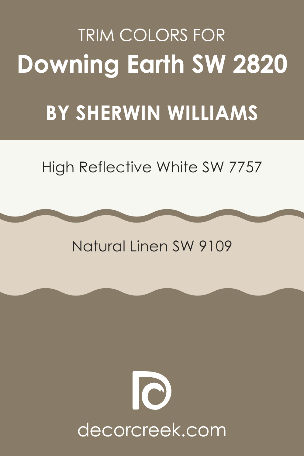
What are the Trim colors of Downing Earth SW 2820 by Sherwin Williams?
Trim colors are the paint colors used for moldings, window frames, door frames, and other detailing elements around a room. They are important because they help define and highlight architectural features, and they can create a visual transition between the walls and the space around it. When you pair Downing Earth with the right trim colors, it creates a completed look that can enhance the living space.
Choosing the right trim color can brighten up the room or add a subtle contrast that brings warmth and charm. Using trim colors like SW 7757 – High Reflective White can give the space a fresh, clean liner with its bright, crisp white tone. Such a color can amplify natural light, making spaces seem larger and more inviting.
Alternatively, SW 9109 – Natural Linen could be used for a softer approach, with its warm and subtle beige tone that introduces a touch of coziness without overpowering the main wall color. Natural Linen blends smoothly with many colors, providing a gentle shift that doesn’t draw too much attention yet complements Downing Earth beautifully.
This choice adds a natural feel, offering a pleasing balance that harmonizes with earthy tones in particular. When incorporated thoughtfully, these trim colors not only enhance the aesthetic but also set the tone for the atmosphere of the entire space.
You can see recommended paint colors below:
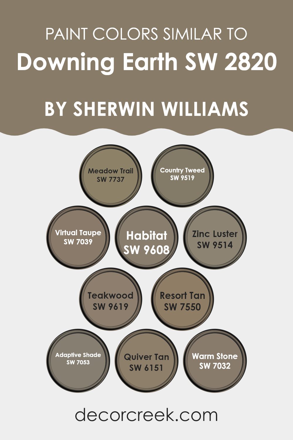
Colors Similar to Downing Earth SW 2820 by Sherwin Williams
Using similar colors is essential in design because they create a harmonious and cohesive look. They blend well together, promoting a sense of balance and calmness. Downing Earth is a warm, earthy hue, and its similar colors offer a range of complementary tones that enhance its natural appeal. Meadow Trail is a soft green that brings a fresh, grassy feel, while Country Tweed adds a warm, muted vibe with its brown undertones.
Virtual Taupe is a versatile neutral that provides a grounding effect, similar to Habitat, which also offers a warm, earthy foundation with a touch of elegance. Zinc Luster offers a chic, deep gray that complements natural elements, and Teakwood brings a warm, rich brown that suggests coziness.
Resort Tan is a sandy shade, adding warmth and comfort, much like Quiver Tan, which has a slightly richer, earthy tone. Warm Stone is a strong medium brown, adding depth and solidity, while Adaptive Shade introduces a darker, versatile tone that can enhance surrounding colors.
Together, these colors work in harmony to create a unified and pleasing environment, drawing on the natural and stable qualities of earth tones. Their variations provide enough contrast to highlight different elements, making spaces feel connected yet distinct.
You can see recommended paint colors below:
- SW 7737 Meadow Trail
- SW 9519 Country Tweed
- SW 7039 Virtual Taupe
- SW 9608 Habitat
- SW 9514 Zinc Luster
- SW 9619 Teakwood
- SW 7550 Resort Tan
- SW 7053 Adaptive Shade
- SW 6151 Quiver Tan
- SW 7032 Warm Stone
How to Use Downing Earth SW 2820 by Sherwin Williams In Your Home?
Downing Earth SW 2820 by Sherwin Williams is a warm, earthy shade that adds a cozy feeling to any room. This soft brown color can be used throughout the house to create a comfortable and inviting atmosphere.
It works well in living rooms, where it brings a sense of warmth that makes conversations feel personal and engaging. In the bedroom, the calming tone helps create a restful space, perfect for unwinding at the end of the day.
For those with an open-plan living area, Downing Earth can tie different spaces together seamlessly. Its natural hue pairs well with both neutral and vibrant accents, allowing homeowners to mix and match decor styles easily. Consider painting an accent wall with Downing Earth for a bit of character without overwhelming the space. This versatile shade can be balanced with cream or beige trim to enhance its warm feel, or with deeper woods and metallics for a more modern look.
Downing Earth SW 2820 by Sherwin Williams vs Habitat SW 9608 by Sherwin Williams
Downing Earth (SW 2820) by Sherwin Williams is a deep, rich brown with warm undertones, reminiscent of natural earth tones. It’s a strong, grounded color that can bring coziness and depth to a space. This color is versatile and pairs well with other natural colors, making it suitable for traditional or rustic settings.
On the other hand, Habitat (SW 9608) by Sherwin Williams is a lighter, more muted tone. It has a soft, subtle appearance that feels calm and gentle. Habitat brings openness and lightness to a room, unlike the dense feel of Downing Earth. This shade works well in contemporary or minimalist designs where a touch of light earthiness is desired.
When comparing the two, Downing Earth offers warmth and richness, creating a snug environment. In contrast, Habitat provides a more airy and breezy feel, making spaces seem more open and inviting.
You can see recommended paint color below:
Downing Earth SW 2820 by Sherwin Williams vs Resort Tan SW 7550 by Sherwin Williams
Downing Earth SW 2820 by Sherwin Williams is a deep, warm brown that exudes a cozy and rich feel, while Resort Tan SW 7550 is a lighter, more neutral tan with a cheerful touch. Downing Earth has a grounded, earthy quality, making it ideal for creating an intimate and inviting environment. It’s a versatile color that works well in living rooms or libraries, where warmth and comfort are desired.
On the other hand, Resort Tan adds brightness with its airy and versatile nature, making it suitable for areas you want to feel open and welcoming, like entryways or living spaces. It pairs well with various accent colors due to its neutral tone, allowing for flexibility in design choices.
Together, these colors can create a balanced space, with the darker Downing Earth adding depth and the lighter Resort Tan providing contrast and lightness. They complement each other, offering a harmonious and engaging palette.
You can see recommended paint color below:
- SW 7550 Resort Tan
Downing Earth SW 2820 by Sherwin Williams vs Adaptive Shade SW 7053 by Sherwin Williams
Downing Earth SW 2820 by Sherwin Williams is a warm, earthy brown that brings a rich and grounded feel to any space. It has subtle red undertones, creating a cozy and inviting atmosphere. This color is great for adding warmth to a room and works well in living areas, bedrooms, or even kitchens.
On the other hand, Adaptive Shade SW 7053 is a cool, darker gray with a hint of warmth. It’s a versatile color that can complement various design styles and provides a sophisticated backdrop without feeling too stark or cold. Adaptive Shade is excellent for spaces where you want a calm and neutral look that still feels modern.
When comparing the two, Downing Earth brings warmth and coziness, while Adaptive Shade offers a cooler, more neutral ambiance. Both have their unique charm and can be used to set different moods in your home, depending on your style preferences.
You can see recommended paint color below:
Downing Earth SW 2820 by Sherwin Williams vs Teakwood SW 9619 by Sherwin Williams
Downing Earth SW 2820 by Sherwin Williams is a rich, warm brown that brings a cozy and inviting feel to any space. It has deep earth tones that make a room feel grounded and secure. It’s great for creating a snug atmosphere, perfect for living rooms or bedrooms where relaxation is key.
Teakwood SW 9619, on the other hand, is a lighter and more neutral brown with a hint of gray. It offers a subtle, natural look that works well in both traditional and modern settings. Teakwood is versatile and easy to coordinate with other colors, making it a good choice for spaces where you want a neutral backdrop.
While Downing Earth creates a more intimate and warm environment, Teakwood provides a calm and versatile base. Both colors are excellent choices, depending on whether you want to highlight warmth and coziness or prefer a more subdued and adaptable look.
You can see recommended paint color below:
Downing Earth SW 2820 by Sherwin Williams vs Virtual Taupe SW 7039 by Sherwin Williams
Downing Earth SW 2820 by Sherwin Williams is a rich, warm brown that brings a cozy and grounded feel to any space. It’s a deep shade with earthy undertones, making it ideal for creating a welcoming and intimate atmosphere. This color can be paired with natural materials like wood or brick to enhance its warm qualities.
On the other hand, Virtual Taupe SW 7039 is a softer taupe with a more balanced mix of brown and gray. This makes it a versatile neutral that can blend well with various styles and color schemes. Virtual Taupe is lighter and less intense than Downing Earth, providing a more subdued backdrop that complements other colors and textures in a room.
While both colors are earthy, Downing Earth is bolder and more dramatic, whereas Virtual Taupe offers subtlety and flexibility. They each bring a different mood, with Downing Earth cozy and intimate, and Virtual Taupe calm and understated.
You can see recommended paint color below:

Downing Earth SW 2820 by Sherwin Williams vs Warm Stone SW 7032 by Sherwin Williams
Downing Earth SW 2820 and Warm Stone SW 7032 are two distinct colors by Sherwin Williams that offer different vibes for interior spaces. Downing Earth is a rich brown with warm undertones, providing a cozy and grounding atmosphere. It works well in traditional or rustic settings, offering a sense of stability and comfort.
On the other hand, Warm Stone is a taupe color with a blend of gray and brown, making it versatile and neutral. It fits easily into modern or contemporary designs, providing a soft backdrop that allows other elements in the room to shine.
While Downing Earth exudes warmth and depth, making spaces feel inviting and intimate, Warm Stone is more subdued and calm, perfect for creating a balanced and peaceful environment. Both colors are excellent choices but cater to different moods depending on the style and feel you wish to achieve in your space.
You can see recommended paint color below:
Downing Earth SW 2820 by Sherwin Williams vs Meadow Trail SW 7737 by Sherwin Williams
Downing Earth SW 2820 by Sherwin Williams is a warm, rich brown color that brings a cozy and grounded feel to a room. It is an earthy shade that evokes the warmth and depth of natural elements like soil or tree bark. This color works well in spaces where you want a sense of comfort and stability, such as living rooms or bedrooms.
Meadow Trail SW 7737 by Sherwin Williams, on the other hand, is a green shade reminiscent of fresh grass or leafy plants. It feels refreshing and lively, adding a touch of nature to your indoor spaces. This color can brighten a room and create a pleasant, invigorating atmosphere. Meadow Trail can be used in kitchens, bathrooms, or any space where you want a lively and rejuvenating vibe.
When compared, Downing Earth provides warmth and coziness, while Meadow Trail offers freshness and energy. Together, they can balance each other well in a complementary design.
You can see recommended paint color below:
- SW 7737 Meadow Trail
Downing Earth SW 2820 by Sherwin Williams vs Zinc Luster SW 9514 by Sherwin Williams
Downing Earth (SW 2820) by Sherwin Williams is a warm, earthy brown that provides a cozy and inviting atmosphere. It’s a versatile color that pairs well with various design styles, from traditional to modern. Its rich tone creates a grounded feel, making it perfect for living rooms or bedrooms where comfort is a priority.
In contrast, Zinc Luster (SW 9514) is a soft, muted gray with a hint of metallic sheen. This color adds a touch of contemporary elegance to any space. It works well in kitchens or bathrooms, offering a sleek and polished look without being overpowering. Zinc Luster’s subtle shimmer can reflect light, adding depth and dimension to walls.
While Downing Earth gives off a warm and comforting vibe, Zinc Luster offers a cooler, more modern aesthetic. Together, they can create a balanced and harmonious palette that combines warmth with sleek sophistication in any room.
You can see recommended paint color below:
Downing Earth SW 2820 by Sherwin Williams vs Quiver Tan SW 6151 by Sherwin Williams
Downing Earth SW 2820 is a rich, deep brown color from Sherwin Williams. It brings a warm, earthy tone to any space, creating a cozy and inviting atmosphere. Its dark hue can make a room feel snug and intimate, making it perfect for a living room or bedroom where comfort is key.
On the other hand, Quiver Tan SW 6151 is a lighter, neutral tan color. It offers a warmer shade than a plain beige and works well as a backdrop in any room. Quiver Tan has a versatile and soft look that pairs easily with many other colors, making it a great choice for areas needing a light and open feel.
When comparing these two, Downing Earth provides depth and richness, ideal for accent walls or rooms where a darker tone is desired. Quiver Tan, however, is a great choice for maintaining brightness while adding a touch of warmth. Together, they can create a balanced and inviting home environment.
You can see recommended paint color below:
- SW 6151 Quiver Tan
Downing Earth SW 2820 by Sherwin Williams vs Country Tweed SW 9519 by Sherwin Williams
Downing Earth (SW 2820) and Country Tweed (SW 9519) by Sherwin Williams are two distinct colors that can bring different moods to a room. Downing Earth is a rich, earthy brown with warm undertones. It creates a cozy and grounded atmosphere, making it ideal for spaces where you want to feel relaxed and comfortable. This color pairs well with rustic or traditional decor.
On the other hand, Country Tweed is a light, subtle tan. It’s brighter and has a softer, more airy feel compared to Downing Earth. This color works well in spaces where you want to create an open and inviting environment. It’s versatile and can fit with many styles, from modern to classic.
When comparing them, Downing Earth provides depth and warmth, while Country Tweed offers lightness and neutrality. Choosing between them depends on whether you prefer a warm, enveloping space or a light and breezy one.
You can see recommended paint color below:
Conclusion
After reading about SW 2820 Downing Earth by Sherwin Williams, I can say that this color is quite special. It’s like having a piece of the earth in your home. The color reminds me of rich soil or clay; it’s warm and feels very grounded. When you paint a room with this color, it can make the space feel cozy and inviting. It’s not too bright and not too dark—just right for making a room feel comfy.
This color can work well in different parts of the house, whether it’s the living room, bedroom, or even the kitchen. It’s friendly and works nicely with other colors too. Imagine pairing it with soft blues or greens, or even with white for a fresh look.
What’s great is that Downing Earth can fit many styles. Whether your house looks old-fashioned or modern, this color can make it better. I think it’s a color that people of all ages will like, from kids to grown-ups. It feels like a hug from nature, making wherever it’s used feel more welcoming.
In short, SW 2820 Downing Earth has a special way of bringing warmth and comfort to our homes. It’s like bringing a bit of nature inside, and who wouldn’t like that?
Ever wished paint sampling was as easy as sticking a sticker? Guess what? Now it is! Discover Samplize's unique Peel & Stick samples.
Get paint samples

