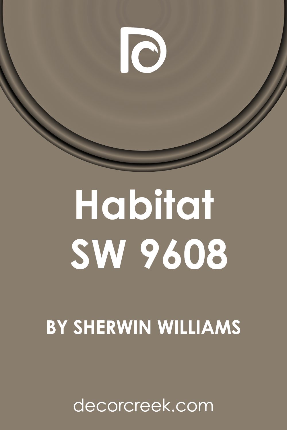
If you’re considering giving your space a fresh update, you might want to consider SW 9608 Habitat by Sherwin Williams. I’ve found that selecting the right paint color is a crucial step in setting the mood and overall feel of a room, and Habitat is one color that seems to work wonders. It’s a blend of earthy tones that offer a sense of calm and comfort, providing a backdrop that compliments various decor styles, from modern minimalist to rustic.
One of the joys of using Habitat is how versatile it is. Whether you’re looking to create a focal point in your living room or seeking a soothing ambiance in your bedroom, this color manages to align perfectly with different lighting and furnishings. This adaptability makes it a great choice if you enjoy updating your decor frequently without wanting to repaint each time.
As someone who values a welcoming home environment, I appreciate how Habitat contributes to a warm and inviting atmosphere. Its neutral yet distinct shade has the power to unify your space while adding character.
Let me walk you through some styling ideas and potential applications to help you envision how SW 9608 Habitat by Sherwin Williams might just be the ideal choice for your next home project.
What Color Is Habitat SW 9608 by Sherwin Williams?
The color Habitat SW 9608 by Sherwin Williams is a unique and versatile shade. It lands between a muted green and a soft gray, making it a perfect choice for those seeking a soothing yet grounded atmosphere in their home. The subtlety of this color allows it to blend seamlessly with various decor styles, especially those that lean towards a natural aesthetic.
Habitat SW 9608 works beautifully in Scandinavian and modern minimalist interiors, where clean lines and light wood tones are predominant. It also suits the rustic charm of farmhouse-style spaces, enhancing features like exposed wooden beams and distressed wood finishes.
When used in a coastal setting, it pairs well with crisp whites and sandy tones to create a fresh, airy feel. In terms of materials, Habitat SW 9608 complements natural textures such as linen, wool, and jute. These materials help to create a cozy and inviting space.
For a more elegant look, pairing it with polished marble or metallic accents in bronze or copper can add a touch of luxury. Additionally, this color works well with both light and dark woods, providing flexibility in furniture and flooring choices to either contrast or complement the wall color.
Is Habitat SW 9608 by Sherwin Williams Warm or Cool color?
HabitatSW 9608 by Sherwin Williams is a versatile paint color popular in many homes. This shade is a balanced mix between green and gray, making it easy to use in various rooms, from kitchens to bedrooms.
The green hints in the color bring a natural, peaceful feeling to spaces, ideal for creating a comfortable, welcoming atmosphere. On the other hand, the gray tones make it a solid choice for modern and minimalist decor, as it pairs well with a wide range of other colors and furniture styles.
This color is particularly effective in rooms with plenty of natural light, where the subtle green can be brought out, enhancing the connection to the outdoors. In darker spaces, the gray aspects become more dominant, providing a neutral backdrop that works well with artificial lighting. Overall, HabitatSW 9608 is a great choice for anyone looking to add a fresh, yet understated touch to their home.
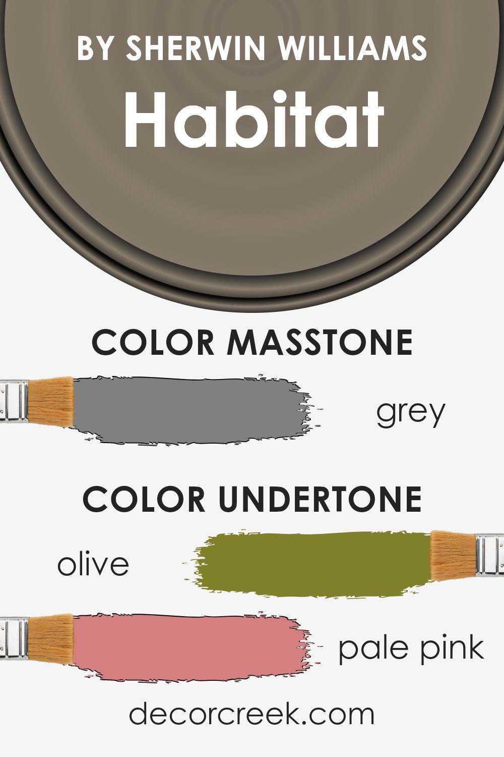
Undertones of Habitat SW 9608 by Sherwin Williams
Habitat is a complex color with an array of undertones that influence how it appears in different settings. Undertones are subtle colors that lurk beneath the surface of the main color, affecting the overall hue and how it interacts with light and surrounding colors.
The variety of undertones in Habitat, such as olive, pale pink, purple, and mint, contribute to its versatility and complexity. For instance, the olive and dark green undertones bring a touch of nature and depth, making the color appear more grounded and rich.
On the other hand, lighter undertones like pale pink and mint can make the color feel lighter and slightly more vibrant, especially in well-lit areas. When used on interior walls, the undertones of Habitat create a dynamic but harmonious look. In natural light, the lighter undertones might make the walls feel more open and airy, while in artificial lighting, the darker undertones could provide a sense of warmth and coziness.
The undertones also affect how Habitat interacts with other colors and decor. For example, pairing it with furnishings or decorations that highlight its olive or dark green undertones could enhance a nature-inspired theme. Meanwhile, elements that complement its pale pink or lilac undertones could create a softer, more subtle aesthetic.
Overall, the undertones in Habitat make it a multifaceted color that can adapt to various decors and moods, depending on the lighting and the colors it is paired with. This makes it a practical choice for walls, as it can easily accommodate changes in decor or furniture over time.
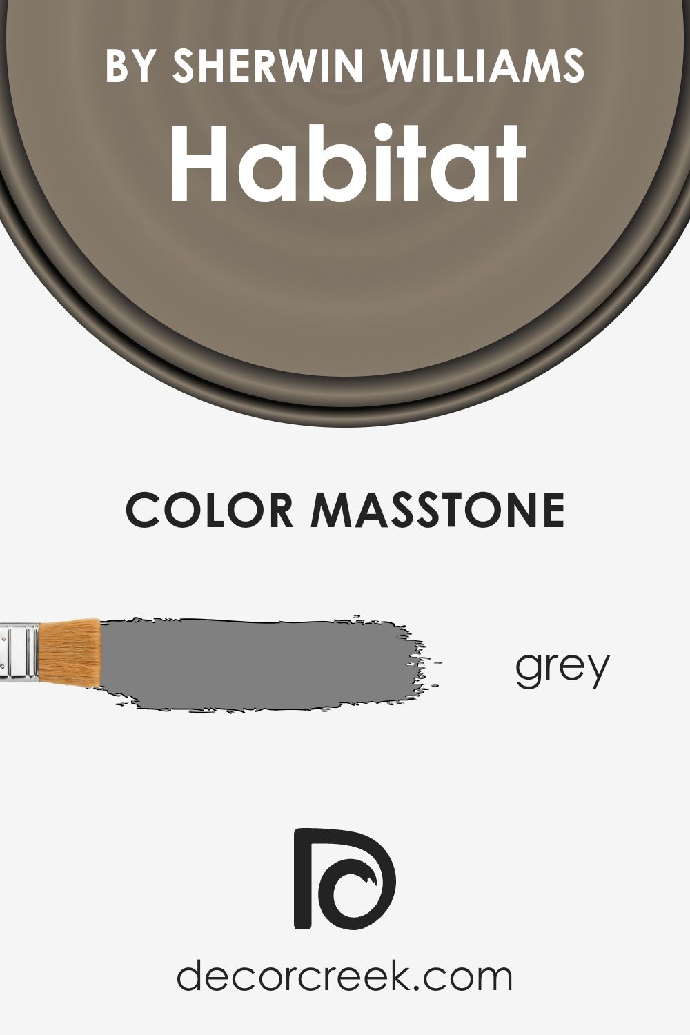
What is the Masstone of the Habitat SW 9608 by Sherwin Williams?
HabitatSW 9608 by Sherwin Williams is a paint color with a masstone of grey, officially recognized by the color code #808080. This particular shade of grey serves as a neutral base, making it extremely versatile for home decorating. Because of its neutral tone, it seamlessly complements a wide array of other colors, from soft pastels to bold hues, allowing it to fit into virtually any decor style.
Using a grey like this in homes can help to create a calm and grounded atmosphere. It’s ideal for rooms where you want a soothing background that doesn’t clash with your furniture or art pieces. Additionally, this shade of grey can help to hide imperfections on walls better than lighter colors, which means it could be a practical choice as well.
Overall, this grey can act as a foundational color in a room, setting a neutral scene that can then be personalized with different textures and color splashes to reflect individual styles and preferences.
How Does Lighting Affect Habitat SW 9608 by Sherwin Williams?
Lighting plays a crucial role in how we perceive colors. The type of light and its intensity can significantly alter the appearance of a color. This fact is especially notable with paint colors, as the illumination in a room can change how the paint looks on the walls.
Taking the color Habitat from Sherwin Williams as an example, we can see various effects under different lighting conditions. This shade is a soft, muted green with hints of gray, versatile enough to shift its tone depending on the light source.
In artificial lighting, such as LED or incandescent bulbs, the green tones in Habitat might become more pronounced, giving a warmer and cozier feel. This is because artificial light often enhances warm tones. The gray undertone might be more subdued, creating a rich look that adds character to indoor spaces.
Under natural light, the appearance of Habitat can vary throughout the day. The quality and angle of natural light exposure dramatically affect the color visibility. In rooms facing north, which receive less direct sunlight, Habitat will appear truer to its cool undertone, providing a subtle, calming effect on the room. This can make small spaces appear larger and more open.
In south-facing rooms, where sunlight is abundant for most of the day, the color might look lighter and brighter. This enriches the space, making it feel lively and vibrant, ideal for living areas or kitchens.
East-facing rooms see bright light in the morning, which warms up the color, making it appear slightly more welcoming and pleasant during breakfast times. As the day progresses, the intensity diminishes, returning the color closer to its original muted tones.
Conversely, west-facing rooms gain the most intense light in the late afternoon, which can dramatically shift the color’s appearance. During this time, Habitat might take on a very dynamic character—more glowing and vivid—before settling into a softer hue towards the evening.
In summary, the color Habitat by Sherwin Williams adapts differently according to the lighting conditions. Whether it’s the room orientation or the type of lightbulb used, each factor influences how this paint color is expressed, adding a flexible charm to any interior space.
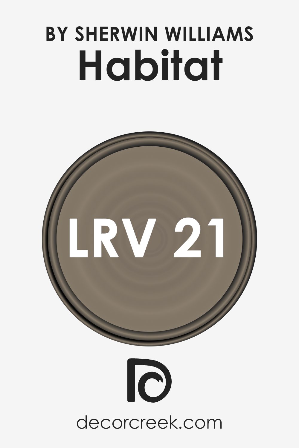
What is the LRV of Habitat SW 9608 by Sherwin Williams?
LRV stands for Light Reflectance Value, a measure used to describe how much light a color reflects or absorbs. Measured on a scale that typically ranges higher to lower, LRV helps to understand how light or dark a paint color will appear once applied to a wall. A higher LRV means the color reflects more light, making it appear brighter and making the space feel more open and airy. Conversely, a lower LRV means the color absorbs more light, which can make a room feel cozier but smaller.
The LRV of HabitatSW 9608 is 21.204, indicating it is on the darker side, as it absorbs more light than it reflects. This characteristic will influence how it will look in a space, potentially making a room feel more intimate or enclosed.
When using such a color, lighting becomes crucial. Without adequate artificial or natural light, the color may make the room feel even smaller or darker. However, in a well-lit area, this color can add a warm and comfortable ambiance to the room.
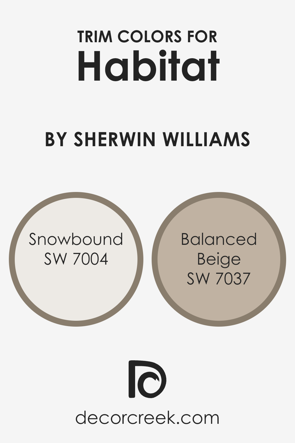
What are the Trim colors of Habitat SW 9608 by Sherwin Williams?
Trim colors are specific shades used to accentuate and define the architectural details of a room or exterior, such as baseboards, window frames, and crown molding. When chosen carefully, trim colors can significantly enhance the overall aesthetic of a space by providing contrast or harmony with the wall colors. For the paint Habitat SW 9608 by Sherwin Williams, selecting the right trim colors is crucial because it helps in creating a cohesive look that complements the primary shade used on the walls.
Snowbound (SW 7004) is a clean, bright white with a subtle hint of gray that creates a crisp, neat finish. It’s particularly effective for making darker colors like Habitat SW 9608 stand out, providing a fresh and light boundary that makes rooms appear more open and airy.
Balanced Beige (SW 7037), on the other hand, is a warm beige color that offers a soft and gentle contrast, ideal for creating a cozy and welcoming environment. This color works well with lighter wall colors, lending an understated elegance without overwhelming the primary hue. Together, Snowbound and Balanced Beige offer flexible options for enhancing the base color and can be used to fine-tune the ambiance of a space depending on the desired effect.
You can see recommended paint colors below:
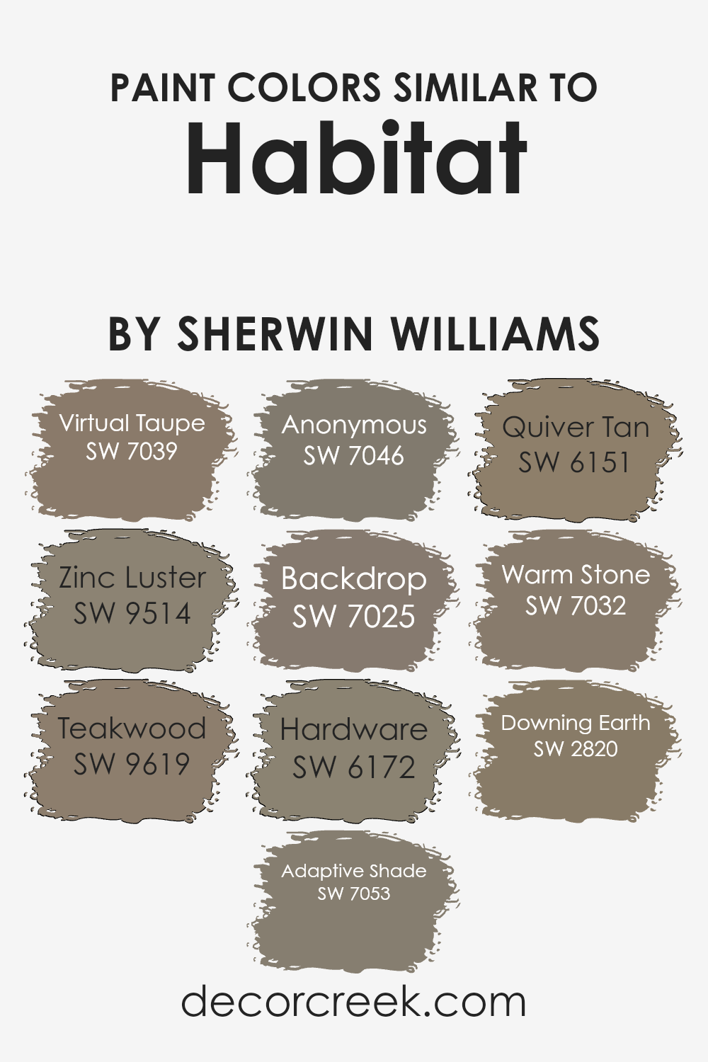
Colors Similar to Habitat SW 9608 by Sherwin Williams
Choosing similar colors, such as those related to Habitat by Sherwin Williams, is crucial in design because it allows for a seamless visual flow, creating a coherent and pleasing aesthetic. Similar shades help in maintaining a balanced color scheme, ensuring that no single element in the décor stands out as jarring or out of place. These hues work together to enhance the overall mood of a space, taking into consideration the lighting, size, and function of the room.
Starting off with SW 7039 Virtual Taupe, this color provides a neutral, grounding base that pairs beautifully with both brighter and deeper tones. It’s a versatile shade that adds a subtle depth to spaces.
Next, SW 9514 Zinc Luster, a soothing gray, offers a hint of metallic flair that works well in modern settings. SW 9619 Teakwood brings warmth with its rich, wooded brown, perfect for creating a cozy ambiance. SW 7053 Adaptive Shade, another gray, shifts subtly based on the surrounding light, providing an adaptive backdrop to any setting.
SW 7046 Anonymous is a deeper gray that suggests stability and can anchor a space with its strong presence. SW 7025 Backdrop is a dark, almost charcoal gray that gives an elegant yet understated feel to any room. SW 6172 Hardware is a darker neutral that resembles aged bronze, ideal for adding a touch of antique charm.
SW 6151 Quiver Tan has a soft, earthy feel that mimics natural clay, offering a warm, inviting presence. SW 7032 Warm Stone, as the name suggests, draws inspiration from stonework with its robust and rustic tones. Finally, SW 2820 Downing Earth is a deep, rich brown, perfect for creating an enveloping sense of warmth and security in a space.
Together, these colors harmonize to create environments that are both inviting and visually cohesive.
You can see recommended paint colors below:
- SW 7039 Virtual Taupe
- SW 9514 Zinc Luster
- SW 9619 Teakwood
- SW 7053 Adaptive Shade
- SW 7046 Anonymous
- SW 7025 Backdrop
- SW 6172 Hardware
- SW 6151 Quiver Tan
- SW 7032 Warm Stone
- SW 2820 Downing Earth
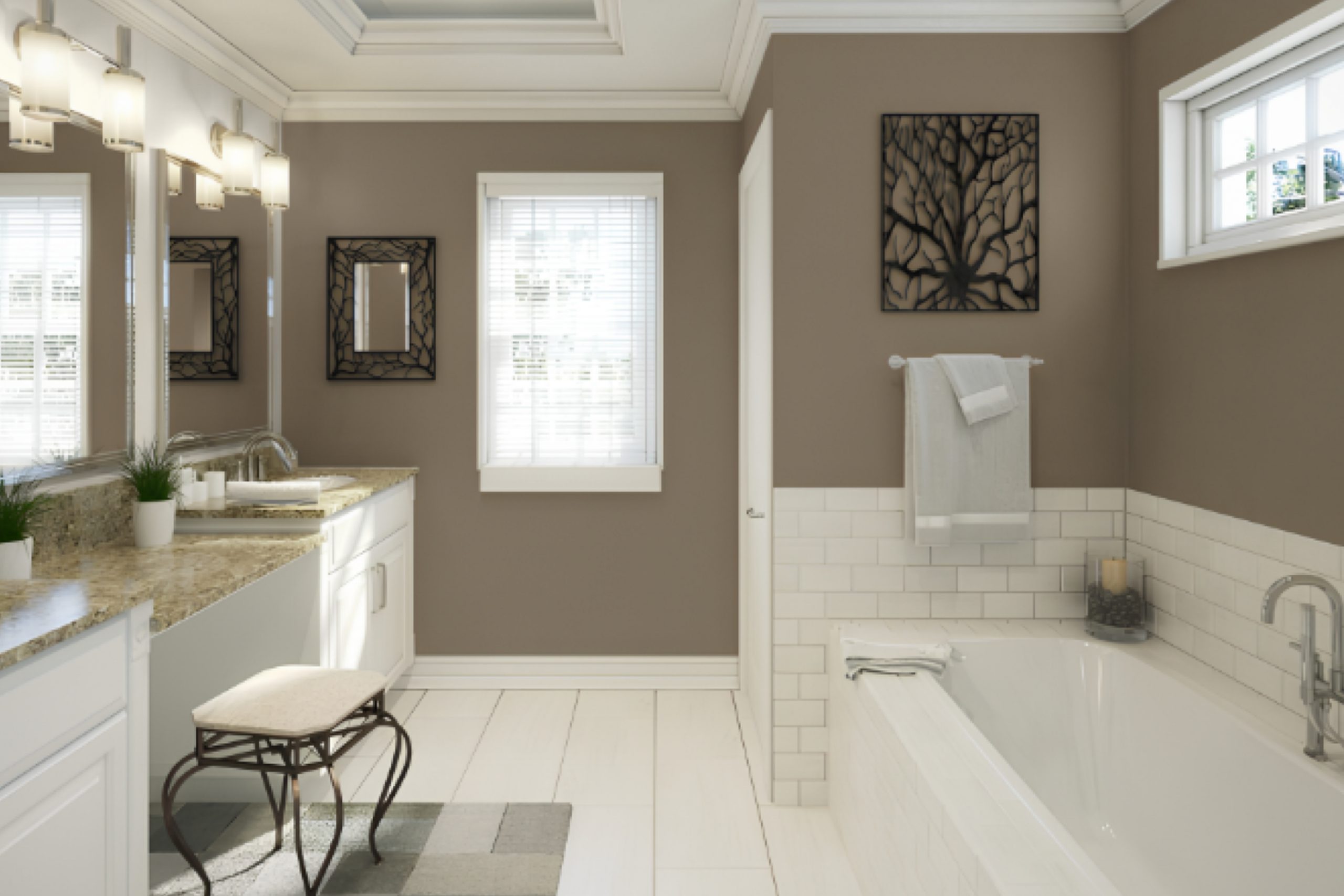
How to Use Habitat SW 9608 by Sherwin Williams In Your Home?
Habitat SW 9608 by Sherwin Williams is a popular paint color that adds a warm and inviting feel to any room. Its rich tone works well in both modern and traditional settings. You can use Habitat in many different ways in your home. For example, it can create a cozy atmosphere in a living room when applied to walls. This shade also pairs nicely with light-colored furniture and décor, helping to balance the ambiance of the space.
In a bedroom, Habitat can help set a calm and comfortable mood, perfect for relaxing after a long day. It can be the main color on all walls or just one accent wall for a more subtle effect. In kitchens, this color contrasts beautifully with white cabinets or stainless-steel appliances.
Habitat also works well in smaller areas like bathrooms or hallways, providing a splash of color without overwhelming the space. Overall, Habitat is a versatile paint choice that can help make your home more welcoming and stylish.
Habitat SW 9608 by Sherwin Williams vs Backdrop SW 7025 by Sherwin Williams
Habitat SW 9608 by Sherwin Williams is a warm, earthy beige that gives off a cozy and inviting feel. It has a softness that’s perfect for living spaces where comfort is key. This color tends to make rooms feel open but intimate, great for family rooms or dens.
On the other hand, Backdrop SW 7025 is a cooler, more neutral gray. It provides a modern and streamlined look, making it a great choice for more contemporary spaces or for adding a subtle, refined touch to a room’s decor. This gray works well in spaces that aim for a minimalistic or modern vibe, from kitchens to home offices.
While Habitat adds warmth to a space, Backdrop introduces a clean, crisp backdrop that doesn’t overwhelm. Both colors are quite versatile, but your choice would depend on the atmosphere you want to create—warm and earthy or cool and sleek.
You can see recommended paint color below:
Habitat SW 9608 by Sherwin Williams vs Warm Stone SW 7032 by Sherwin Williams
Both Habitat and Warm Stone are colors by Sherwin Williams, but they offer distinct tones that could influence the mood of a room. Habitat is a deep, earthy green with a touch of gray, giving it a natural, grounding feel. It’s a color that might remind you of a lush, dense forest, offering a sense of calm and connection to nature.
Warm Stone, on the other hand, is a much softer color. It is a cozy beige with hints of gray, creating a neutral and welcoming atmosphere. This color can work well in any space, providing a versatile backdrop that complements various decor styles and colors.
While Habitat brings in more depth and a hint of drama due to its darker and richer hue, Warm Stone keeps things light and airy, making spaces feel more open and relaxed. Choosing between them would depend on the desired ambiance and the room’s function, whether you want a cozy, subtle setting with Warm Stone or a bold, nature-inspired vibe with Habitat.
You can see recommended paint color below:
Habitat SW 9608 by Sherwin Williams vs Teakwood SW 9619 by Sherwin Williams
Habitat and Teakwood by Sherwin Williams are distinct yet complimentary colors. Habitat is a soft and neutral beige with a warm undertone, making it versatile for any room, creating a cozy and inviting atmosphere.
It pairs well with both bright and dark colors, giving you flexibility in decorating. In contrast, Teakwood is a darker, richer shade of brown with an earthy base. This color adds depth and warmth to spaces, ideal for creating a focal point or accentuating details like trim or cabinetry.
While Habitat provides a subtle backdrop, Teakwood offers a strong presence, making it more suited for bold design choices. Together, these colors can work beautifully to balance light and dark tones in home decor.
You can see recommended paint color below:
Habitat SW 9608 by Sherwin Williams vs Anonymous SW 7046 by Sherwin Williams
The main color, Habitat, and the second color, Anonymous, both by Sherwin Williams, offer unique tones that could compliment various design styles. Habitat is a rich, deep green that adds a bold and grounding touch to spaces. It pairs well with natural elements and can make large rooms feel cozier. This color works great in spaces that aim for a more connected-to-nature vibe.
On the other hand, Anonymous is a much subtler gray, offering a neutral backdrop that is very versatile. This color can be used in any room without overwhelming the space, making it easy to pair with brighter colors or various decor styles. It’s perfect for those looking to achieve a balanced and modern look in their home.
Together, these colors could work well if you wish to create a room with a strong presence (using Habitat) while keeping other areas more understated (using Anonymous). This combination allows for flexibility in design while maintaining a cohesive look in your home.
You can see recommended paint color below:
Habitat SW 9608 by Sherwin Williams vs Virtual Taupe SW 7039 by Sherwin Williams
Habitat SW 9608 by Sherwin Williams is a warm and earthy green with hints of olive, making it a cozy and welcoming choice for any space. It brings a natural, outdoor vibe inside, perfect for creating a laid-back atmosphere where relaxation is key. Its depth makes it suitable for use in living areas or bedrooms, where you want to introduce a bit of nature’s calm.
On the other hand, Virtual Taupe SW 7039 is a more subdued and neutral shade. This taupe is a blend of brown and gray, providing a versatile backdrop that complements a wide array of designs and decorations. It’s especially great in spaces where you want a timeless look, as it pairs well with a variety of colors and textures.
Overall, both colors offer unique appeals – Habitat introduces a more distinct, nature-inspired feel while Virtual Taupe serves as a subtle, flexible foundation in a room. Each creates its own special atmosphere and can be used effectively depending on your style and the mood you want to achieve.
You can see recommended paint color below:
Habitat SW 9608 by Sherwin Williams vs Hardware SW 6172 by Sherwin Williams
The main color, Habitat, is a rich, deep teal shade that brings a sense of coziness and comfort to spaces. It has blue-green hues that make it adaptable to various decorating styles, enhancing a modern or traditional look.
On the other hand, Hardware is a much subtler color, leaning towards a soft gray with hints of green. This color is incredibly versatile and works well in areas where you want a neutral backdrop that also offers a touch of warmth and interest.
When you place Habitat and Hardware next to each other, Habitat stands out as the more vibrant and impactful choice. It can create a strong visual statement and works particularly well as an accent wall or in decorative elements throughout a room.
Conversely, Hardware is ideal for larger surfaces like walls in rooms where a calming, understated effect is desired. Together, they could complement each other well, with Hardware balancing the intensity of Habitat to create a harmonious look.
You can see recommended paint color below:
- SW 6172 Hardware
Habitat SW 9608 by Sherwin Williams vs Quiver Tan SW 6151 by Sherwin Williams
Habitat (SW 9608) and Quiver Tan (SW 6151) are both colors by Sherwin Williams, each offering a distinct vibe for room decoration. Habitat is a deep, earthy green with subtle brown undertones. It evokes a sense of nature and is great for spaces where you want to add a touch of the outdoors. This color works well in areas that benefit from a cozy and grounding atmosphere, such as living rooms or studies.
On the other hand, Quiver Tan is a lighter and warmer shade, leaning towards a soft, sandy beige. It’s a neutral color that provides a calm and inviting feel, making it suitable for almost any room. It’s particularly effective in smaller spaces or rooms that don’t get a lot of natural light, as it helps to brighten the area.
When comparing the two, Habitat offers a bolder, more dramatic look, while Quiver Tan is more understated and versatile, easily pairing with a wide range of decor styles.
You can see recommended paint color below:
- SW 6151 Quiver Tan
Habitat SW 9608 by Sherwin Williams vs Adaptive Shade SW 7053 by Sherwin Williams
Habitat by Sherwin Williams is a rich, deep teal color with a hint of green. It’s quite bold and vibrant, making it a great choice for anyone wanting to add a strong pop of color to their space. It can make smaller spaces feel cozy and large rooms feel more intimate, and it works well in a variety of lighting conditions.
On the other hand, Adaptive Shade by Sherwin Williams is a soft grey with cool blue undertones. This color is much more subtle and muted compared to Habitat. It’s an excellent choice for creating a calm and quiet atmosphere in a room. Adaptive Shade can help to make a space feel more open and airy, and it pairs well with a wide range of decor styles and colors.
Overall, Habitat is the more dramatic and eye-catching color, while Adaptive Shade offers a gentle and unobtrusive backdrop. Each has its unique appeal depending on what you’re aiming for in your decorating project.
You can see recommended paint color below:
Habitat SW 9608 by Sherwin Williams vs Zinc Luster SW 9514 by Sherwin Williams
Habitat SW 9608 and Zinc Luster SW 9514, both by Sherwin Williams, present a soothing palette but with distinct vibes. Habitat is a rich, deep green that seems to pull in elements of nature and warmth into any space, making it cozy and welcoming. It’s perfect for creating a standout wall or space where comfort and relaxation are key.
On the other hand, Zinc Luster is a softer, muted gray with a hint of blue that gives it a cooler tone. This color works well in areas where you want to achieve a calm and understated look, making rooms appear more open and airy while still retaining a touch of modern elegance.
Pairing these colors in a room can provide a beautiful contrast—Habitat’s earthiness grounding the space, while Zinc Luster adds a light touch that can make smaller rooms seem larger. This combination is ideal for anyone looking to balance a strong color presence with gentler highlights in their decor.
You can see recommended paint color below:
- SW 9514 Zinc Luster
Habitat SW 9608 by Sherwin Williams vs Downing Earth SW 2820 by Sherwin Williams
Habitat by Sherwin Williams is a rich, vibrant shade that brings a warm and inviting tone to any space. It has an earthy feel but with a more energetic punch, making it perfect for areas where you want a cozy yet lively atmosphere. This color leans towards a green that mimics the lushness of nature, offering a refreshing vibe to interiors.
On the other hand, Downing Earth, also by Sherwin Williams, is a deeper and more muted hue. It suggests a more grounded feeling, as it is closer to a traditional brown. This color is ideal for spaces where a calming, stable, and more subtle presence is desired.
It’s excellent for creating a strong foundation in a room, particularly where you want to promote a sense of quietness and solidity.Both colors provide warmth, but Habitat does so with a touch of brightness, while Downing Earth offers a soothing, understated elegance.
You can see recommended paint color below:
- SW 2820 Downing Earth
Conclusion
This color, which is kind of a green mixed with blue-gray, seems perfect for making a place feel more like home. It’s not too bright or too dark, so it feels just right. Sherwin Williams suggests using it in places where you relax like the living room or your bedroom. They also think it works well with other colors that can make it stand out even more.
I liked learning how this color can go well with different styles, whether you want something that looks a bit old-fashioned or something more modern. It’s great that no matter how you decorate your room, this color can still fit in. They also talked about how this color could make you feel calm and happy.
To sum it up, SW 9608 Habitat is more than just a paint color. It’s a choice that could make your room feel exactly how you want it to—comfortable, happy, and just right. If you’re thinking about changing up your room, this might be a great color to pick!
Ever wished paint sampling was as easy as sticking a sticker? Guess what? Now it is! Discover Samplize's unique Peel & Stick samples.
Get paint samples

