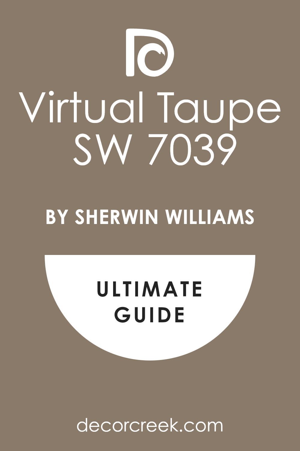
If you’re looking for a paint color that can add a sense of sophistication and warmth to your living spaces, you might want to consider SW 7039 Virtual Taupe by Sherwin Williams. I got introduced to this unique shade when I was revamping my living room, and I was amazed by the cozy yet elegant vibe it offered. Virtual Taupe stands out as a versatile color that can fit beautifully in various rooms, whether you’re painting your bedroom, kitchen, or study.
This neutral shade falls somewhere between brown and gray, providing a perfect backdrop for both vibrant and subdued accent colors. In my experience, it pairs wonderfully with soft whites or deep blues, offering flexibility in decor choices and room themes.
Moreover, Virtual Taupe works well in different lighting conditions, maintaining its rich tone whether bathed in natural sunlight or under cozy artificial lighting.
If you’re thinking about giving your home a fresh look without going too bold, Virtual Taupe is a great choice. It has a way of making spaces feel more grounded and inviting, creating a stylish yet comfortable atmosphere that you and your guests will appreciate.
So, from my journey of transforming homes, I highly recommend considering SW 7039 Virtual Taupe for your next painting project.
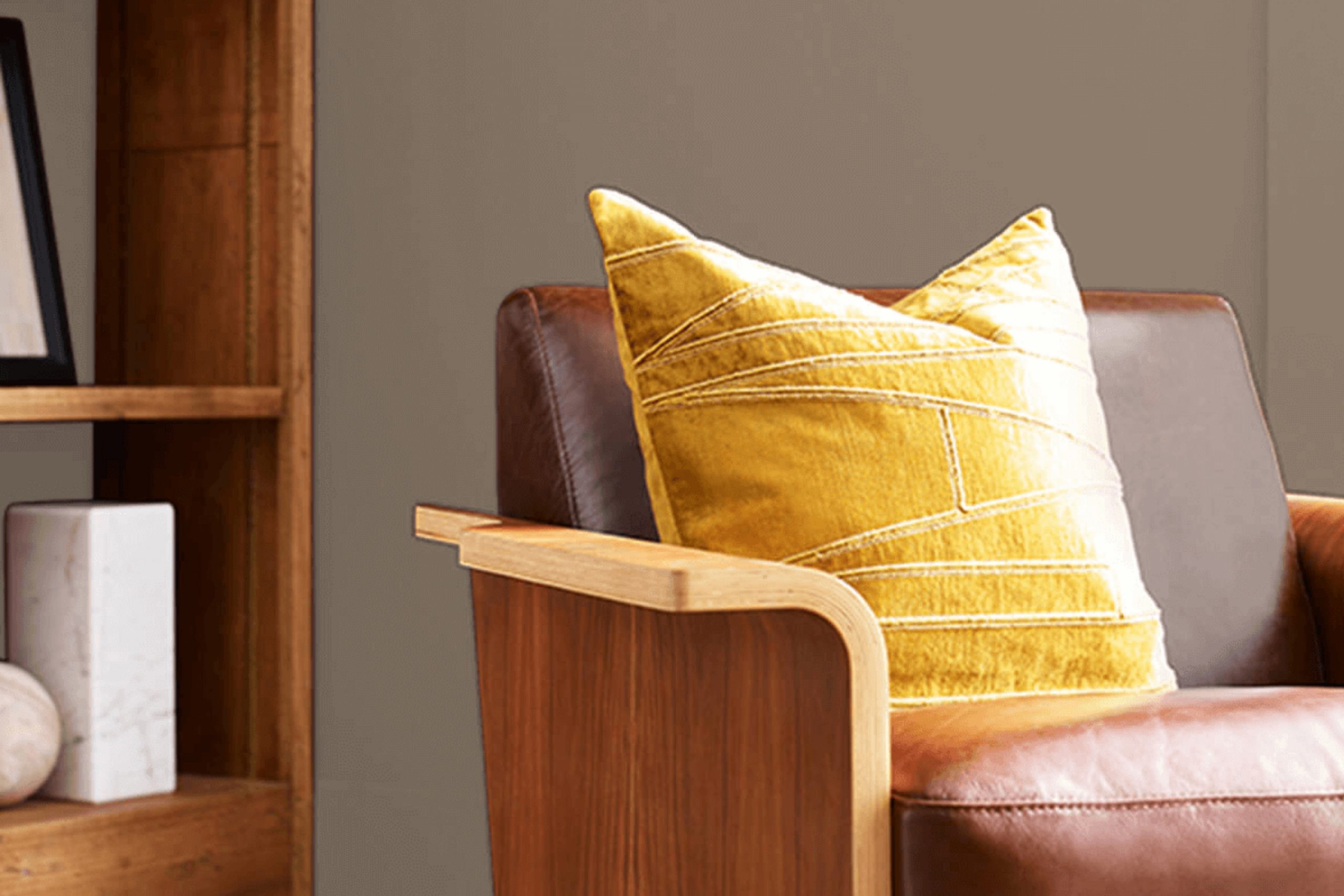
What Color Is Virtual Taupe SW 7039 by Sherwin Williams?
Virtual Taupe is a versatile paint color with a balanced mix of gray and brown tones, making it an excellent neutral choice for home interiors. This shade can bring warmth and depth to a room, creating a cozy, welcoming atmosphere. Its muted quality allows it to seamlessly blend with various design styles, especially rustic, modern farmhouse, and minimalist interiors.
In a rustic setting, Virtual Taupe works well with natural elements like exposed wood beams, stone accents, and distressed leather, enhancing the earthy feel of the space. For a modern farmhouse look, pairing this color with crisp white trims and reclaimed wood furniture can create a fresh yet traditional appearance.
In minimalist spaces, Virtual Taupe serves as a warm backdrop to bold, black accents and streamlined furnishings, providing a soft contrast to enhance the simple elegance of the room.
This color also pairs beautifully with different materials and textures. It complements rich wooden textures, enhancing the grains and natural patterns of the wood. When combined with metallic finishes like brass or copper, it adds a touch of understated luxury.
Soft textiles in lighter colors such as creams and beiges can soften the look, making the space more inviting. Virtual Taupe is truly flexible, adapting to various decor elements to create a harmonious interior.
Is Virtual Taupe SW 7039 by Sherwin Williams Warm or Cool color?
Virtual Taupe SW 7039 by Sherwin Williams is a warm, versatile color that adds a cozy feel to any room in a home. This shade is a mix of brown and gray, providing a neutral base that is perfect for pairing with a wide range of other colors. Whether you’re looking to create a welcoming living room or a cozy bedroom, Virtual Taupe can be the right choice. It works well with both bright and muted tones, allowing you to either keep things calm or add pops of color for a more dynamic space.
This color is particularly effective in rooms that get natural light, as the light brings out the subtle nuances of the taupe, making the space feel more open and inviting. In artificial lighting, it contributes to a warm and intimate atmosphere, great for evenings at home.
Additionally, its neutrality means it can complement various decor styles, from modern to traditional, making it a practical choice for many homeowners.
Undertones of Virtual Taupe SW 7039 by Sherwin Williams
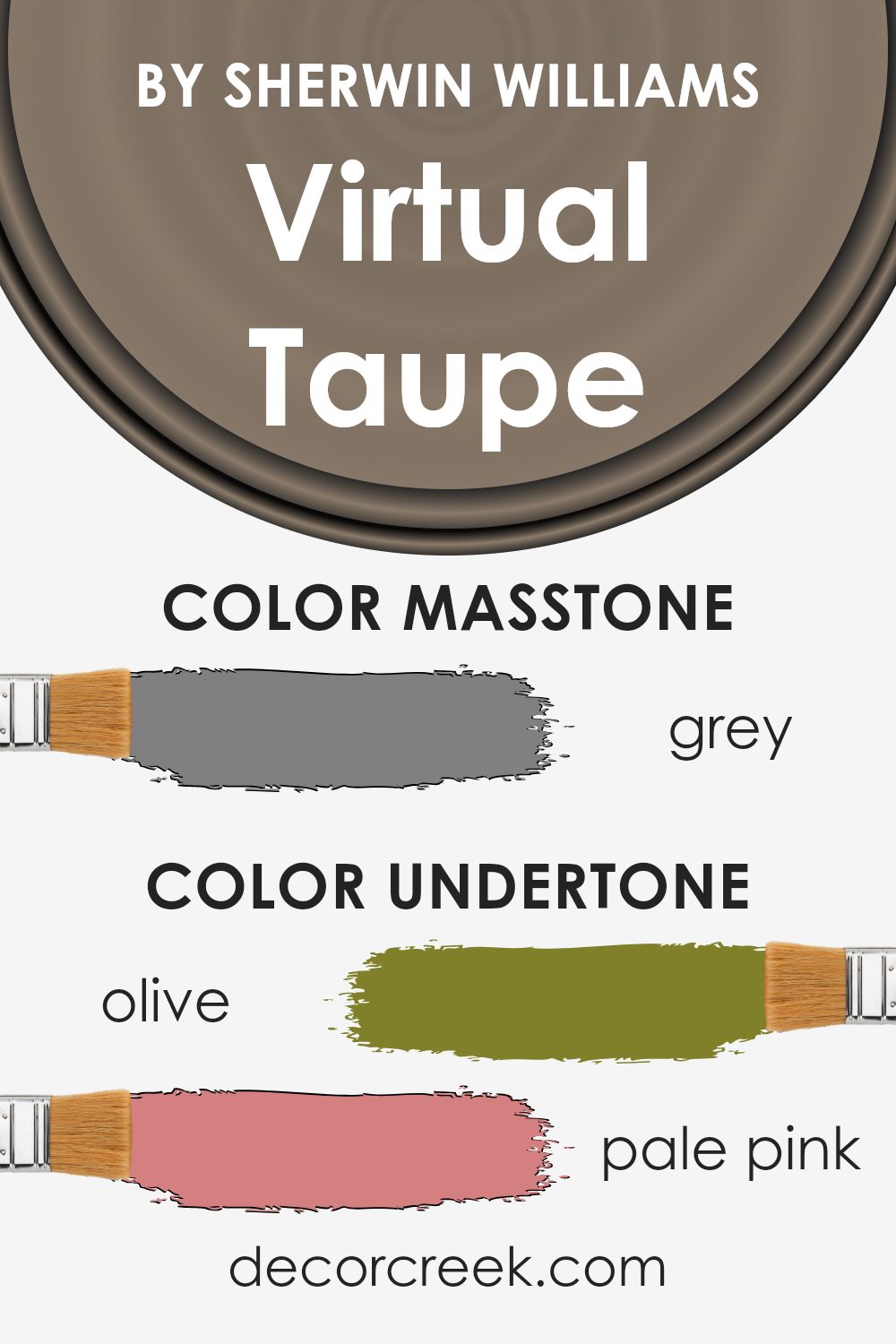
Virtual Taupe is a complex neutral paint color that can subtly shift in appearance depending on its surrounding elements, such as lighting and decor. This shade has a mixture of undertones varying from greens to darker grays, making it a versatile choice for interior walls.
Undertones of a color are subtle hues mixed into the main color, affecting how it behaves in different settings. For example, in a room with lots of natural light, Virtual Taupe might appear slightly lighter and bring out soft olive or pale pink hues, creating a warm ambiance.
In contrast, in a space with less light or during the evening, it might pull more from its darker gray or brown undertones, giving the room a more grounded feel.
When used on interior walls, the variety of undertones in Virtual Taupe allows it to adapt to various themes and decorations. This adaptability can create a cozy environment in a living room or add a sense of depth in a bedroom.
Moreover, the color’s ability to match with diverse accessories and furniture makes it a practical choice for anyone looking to refresh their space without committing to a bold color change.
Its blend of undertones—from greens and pinks to grays—helps it to interact interestingly with other colors in furnishings and artwork, pulling the room together in a cohesive yet dynamic way.
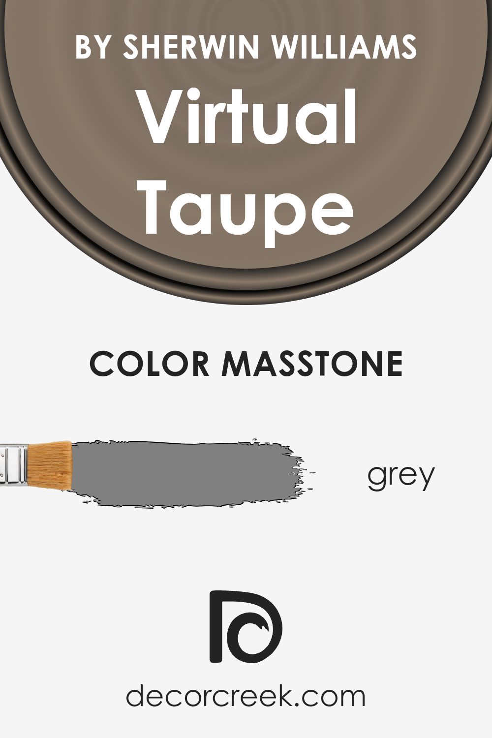
What is the Masstone of the Virtual Taupe SW 7039 by Sherwin Williams?
Virtual Taupe SW 7039, a color created by Sherwin Williams, has a base tone often described as grey. The color’s mass tone is similar to what you see in the classic grey shade, which offers a balanced and neutral backdrop for any room. This neutral quality makes Virtual Taupe incredibly versatile as it pairs well with a variety of color palettes and can fit into numerous decor styles, from modern to traditional.
In home environments, this touch of grey means Virtual Taupe acts as a soothing presence, not overpowering other elements in the room. It can help smaller spaces appear larger since the light reflective quality of grey can make spaces feel more open and airy.
Practical for use in high-traffic areas like living rooms and hallways, this color is effective at hiding imperfections on walls due to its mid-tone depth. Overall, Virtual Taupe’s grey masstone allows for easy integration into homes, enhancing the space with its understated yet warm presence.
How Does Lighting Affect Virtual Taupe SW 7039 by Sherwin Williams?
Lighting plays a crucial role in how we perceive colors in our environment. Different types of light can change the way a color looks, often making it appear differently than it does on a paint swatch.
Taking the color Virtual Taupe as an example, it shifts significantly depending on the kind of lighting it is under. Under artificial light, such as incandescent or LED light bulbs, this taupe shade will typically look warmer.
This is because most artificial lighting casts a yellow hue, enriching the brown tones in Virtual Taupe, making it appear more inviting and cozy.
In contrast, natural light reveals the true essence of this color. During the daylight hours, when sunlight is the main source of illumination, Virtual Taupe presents more of its true color balance. It can appear lighter and might reveal subtle undertones that are not as noticeable under artificial lighting.
The orientation of a room can also affect how Virtual Taupe looks. In north-facing rooms, which often receive less direct sunlight and can feel cooler, Virtual Taupe might appear slightly more muted and darker. This effect is due to the cooler, blue-tinted light often found in these rooms.
South-facing rooms enjoy abundant, warm sunlight throughout the day, making Virtual Taupe look lighter and warmer, bringing out any peachy or yellow tones in the paint. This can make the room feel more lively and bright.
For rooms facing east, where the morning light is bright and warm, Virtual Taupe will also appear warmer and lighter in the morning but might lose some of its liveliness as the day progresses and the light dims.
Finally, in west-facing rooms, the color will experience the reverse of east-facing rooms. It starts off more subdued in the morning and gains warmth and depth in the afternoon and evening as sunlight fills the room.
Understanding these nuances can greatly assist in choosing the right paint for a room, ensuring that the color behaves as desired throughout the day.
What is the LRV of Virtual Taupe SW 7039 by Sherwin Williams?
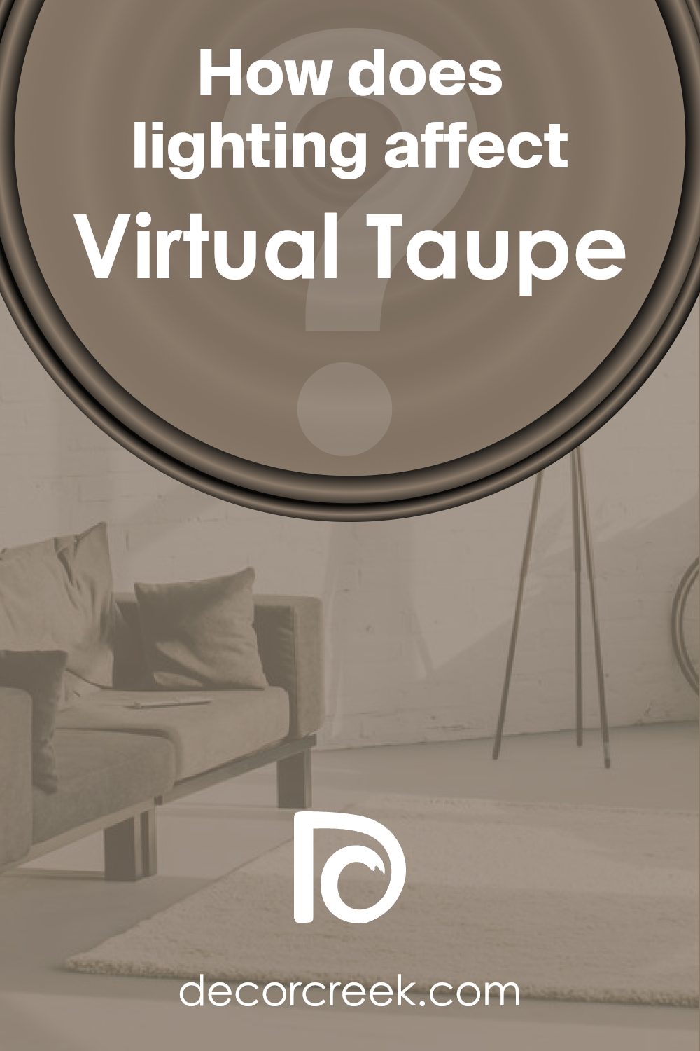
LRV, or Light Reflectance Value, is a measurement used to indicate how much light a paint color reflects back into a room. It is expressed as a percentage, and it provides a good clue about the brightness a color will bring to a space. Higher values mean the color reflects more light, contributing to a brighter feel, while lower values mean the color absorbs more light, making a room feel cozier or smaller.
Understanding LRV can help in choosing the right paint color for your desired room ambiance.
Virtual Taupe has an LRV of 20.32, which is on the lower end of the scale. This means it is a relatively dark color that absorbs more light than it reflects. In spaces with less natural light, using a color like Virtual Taupe can make the room appear quite dark and rich, enhancing a cozy and intimate atmosphere.
However, in a well-lit room with plenty of natural or artificial light, this color can add depth and warmth without making the space feel too enclosed.
Coordinating Colors of Virtual Taupe SW 7039 by Sherwin Williams
Coordinating colors are selected to complement the main color in a room or design scheme, enhancing the overall aesthetics. By using colors that coordinate, such as those suggested for Virtual Taupe by Sherwin Williams, you create a visually appealing environment.
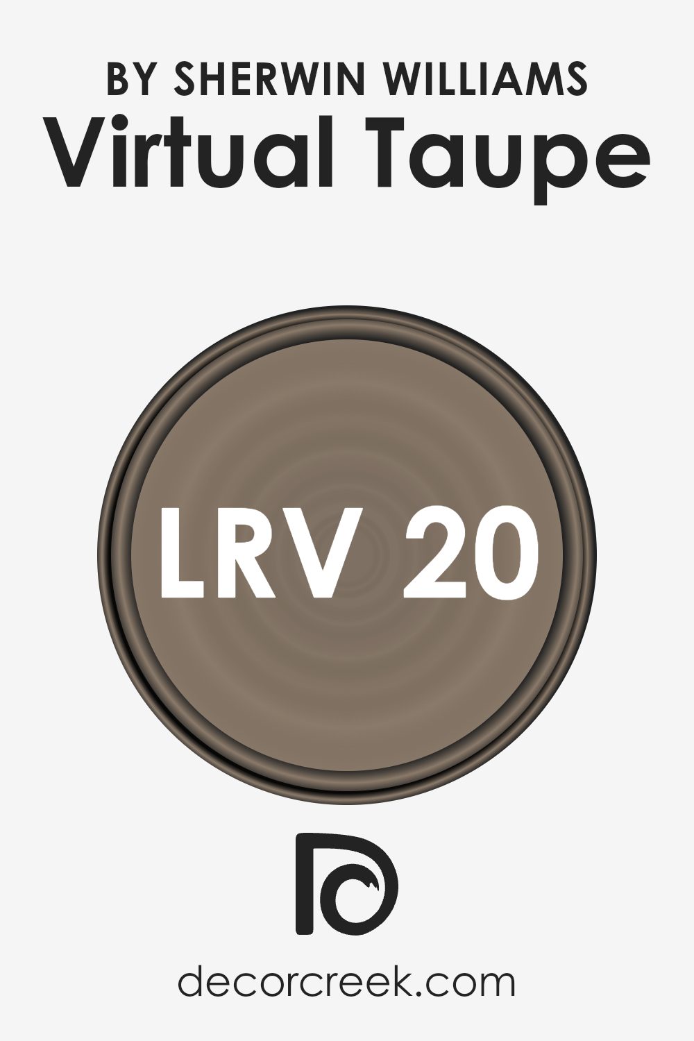
Aesthetic White (SW 7035) is subtly vibrant and versatile, acting as a neutral backdrop that can brighten rooms without overwhelming the senses. Greek Villa (SW 7551) offers a slightly off-white tone with warm undertones, making it perfect for spaces where a soft, inviting feel is desired.
Another coordinating color, Vintage Vessel (SW 9050), is a deeper, muted shade that provides a beautiful contrast to the lighter tones of Aesthetic White and Greek Villa, adding depth and interest to the color palette. This synergy between the colors can help in achieving a balanced and harmonious look.
The blend of these coordinating colors can enhance the aesthetic value of any space, making it look well-thought-out and pleasing to the eye.
By carefully selecting such complementary shades, one can easily refresh their living space without the need for an extensive makeover.
You can see recommended paint colors below:
- SW 7035 Aesthetic White (CHECK A SAMPLE)
- SW 7551 Greek Villa (CHECK A SAMPLE)
- SW 9050 Vintage Vessel (CHECK A SAMPLE)
What are the Trim colors of Virtual Taupe SW 7039 by Sherwin Williams?
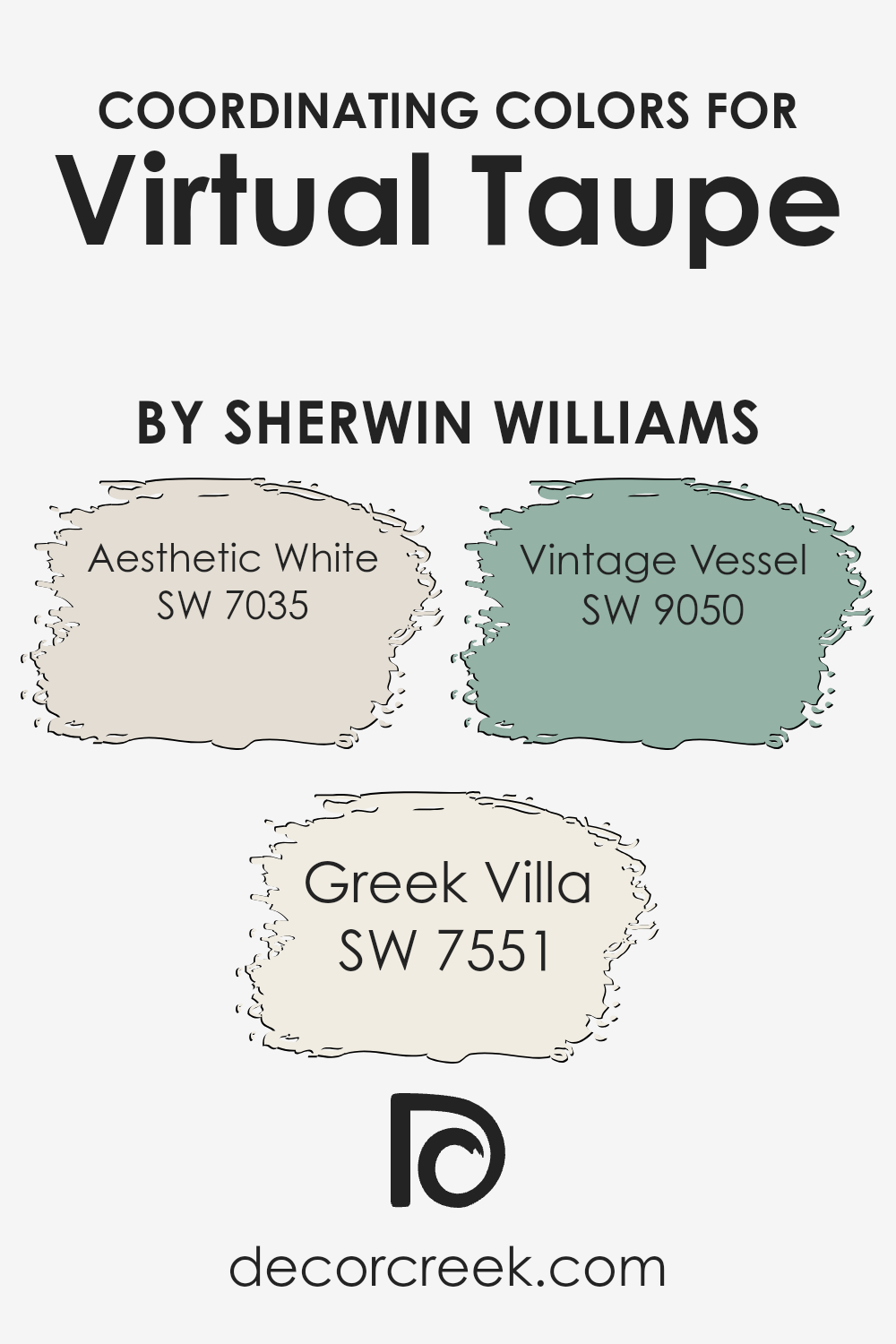
Trim colors play a pivotal role in enhancing the overall appearance of a wall color, acting as a defining frame that complements and contrasts the main hue. In the case of a neutral, versatile shade like Virtual Taupe by Sherwin Williams, trim colors such as Shoji White and Wool Skein can significantly influence the mood and spatial perception of a room.
Shoji White offers a crisp, clean contrast that highlights Virtual Taupe’s richness without overpowering it, making the space feel more open and airy. On the other hand, Wool Skein, with its subtle, warm tones, pairs harmoniously with Virtual Taupe, creating a cozy, welcoming ambiance that softens the room’s edges and adds a touch of warmth.
Shoji White is a light, nearly off-white color with a hint of warmth that prevents it from feeling too stark or cold. This makes it an excellent choice for trim, as it can brighten up spaces while maintaining a soft, subtle presence. Wool Skein, on the other hand, is a soft beige with undertones of yellow and green, offering a gentle contrast that enriches the depth of taupe walls without clashing or distracting.
Using these colors as trims provides a balanced, visually appealing framework that enhances the natural beauty of Virtual Taupe, allowing it to stand out while ensuring the room feels harmoniously put together.
You can see recommended paint colors below:
- SW 7042 Shoji White (CHECK A SAMPLE)
- SW 6148 Wool Skein (CHECK A SAMPLE)
Colors Similar to Virtual Taupe SW 7039 by Sherwin Williams
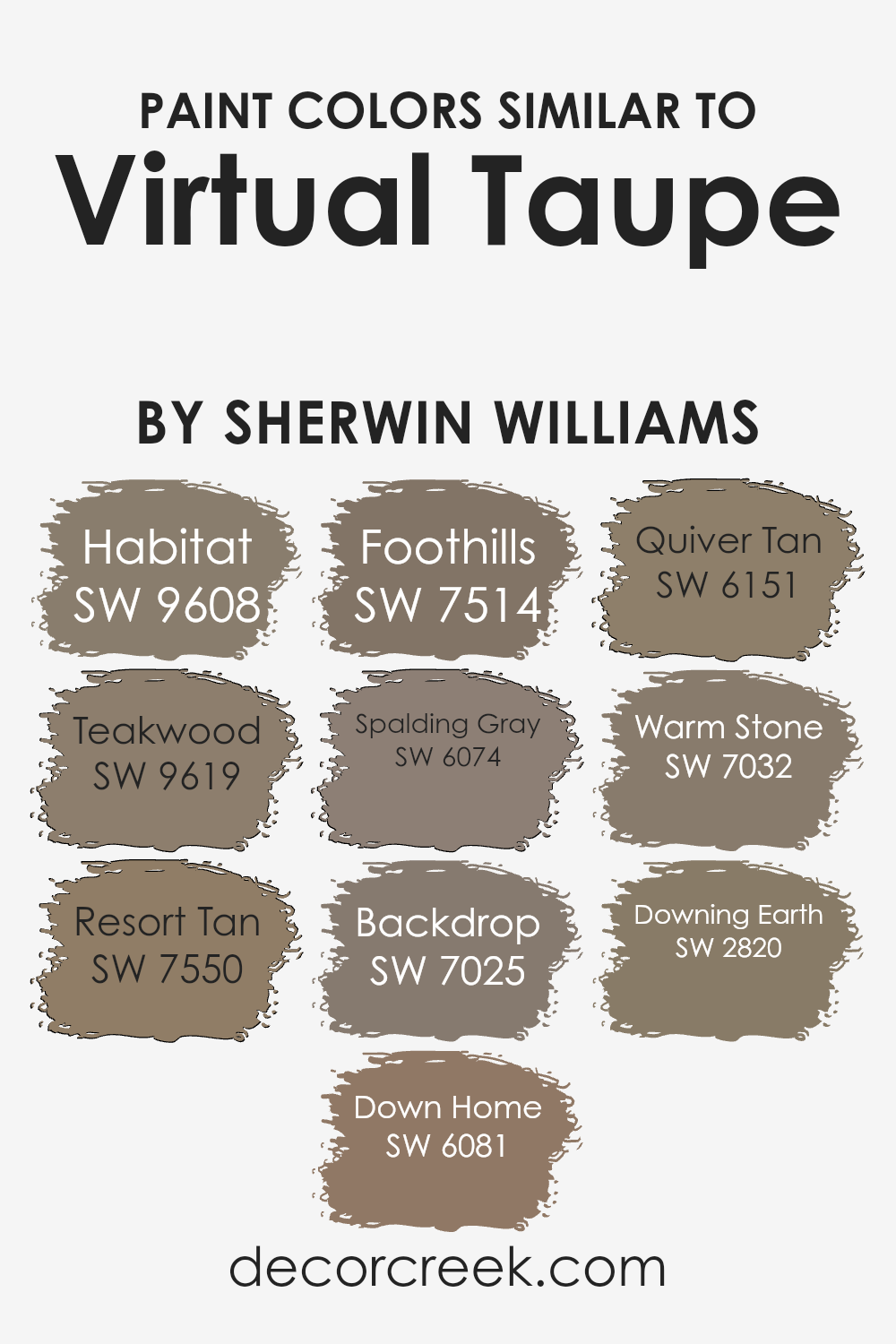
Using similar colors like those that resemble Virtual Taupe from Sherwin Williams is an effective way to create a seamless visual flow in a space. Colors such as Habitat, Teakwood, Foothills, and Warm Stone possess tones that evoke a naturally warm environment, which helps in producing a cohesively designed room without sharp contrasts.
Incorporating these similar shades maintains a subtle yet impactful ambiance that enhances the aesthetics without overpowering the senses.
For instance, colors like Resort Tan and Quiver Tan bring about a soothing earthy feel, matching well with a broad range of interiors and decors. Similarly, shades like Spalding Gray and Backdrop offer depth and are versatile enough to pair beautifully with brighter or darker accents.
Colors like Down Home and Downing Earth provide a rich and welcoming atmosphere, rounding out the surroundings with a grounded touch. Therefore, using similar colors ensures that all elements in a space work harmoniously together, creating an inviting and pleasant environment without dramatic shifts in tone.
You can see recommended paint colors below:
- SW 9608 Habitat (CHECK A SAMPLE)
- SW 9619 Teakwood (CHECK A SAMPLE)
- SW 7550 Resort Tan (CHECK A SAMPLE)
- SW 6081 Down Home (CHECK A SAMPLE)
- SW 7514 Foothills (CHECK A SAMPLE)
- SW 6074 Spalding Gray (CHECK A SAMPLE)
- SW 7025 Backdrop (CHECK A SAMPLE)
- SW 6151 Quiver Tan (CHECK A SAMPLE)
- SW 7032 Warm Stone (CHECK A SAMPLE)
- SW 2820 Downing Earth
Colors that Go With Virtual Taupe SW 7039 by Sherwin Williams
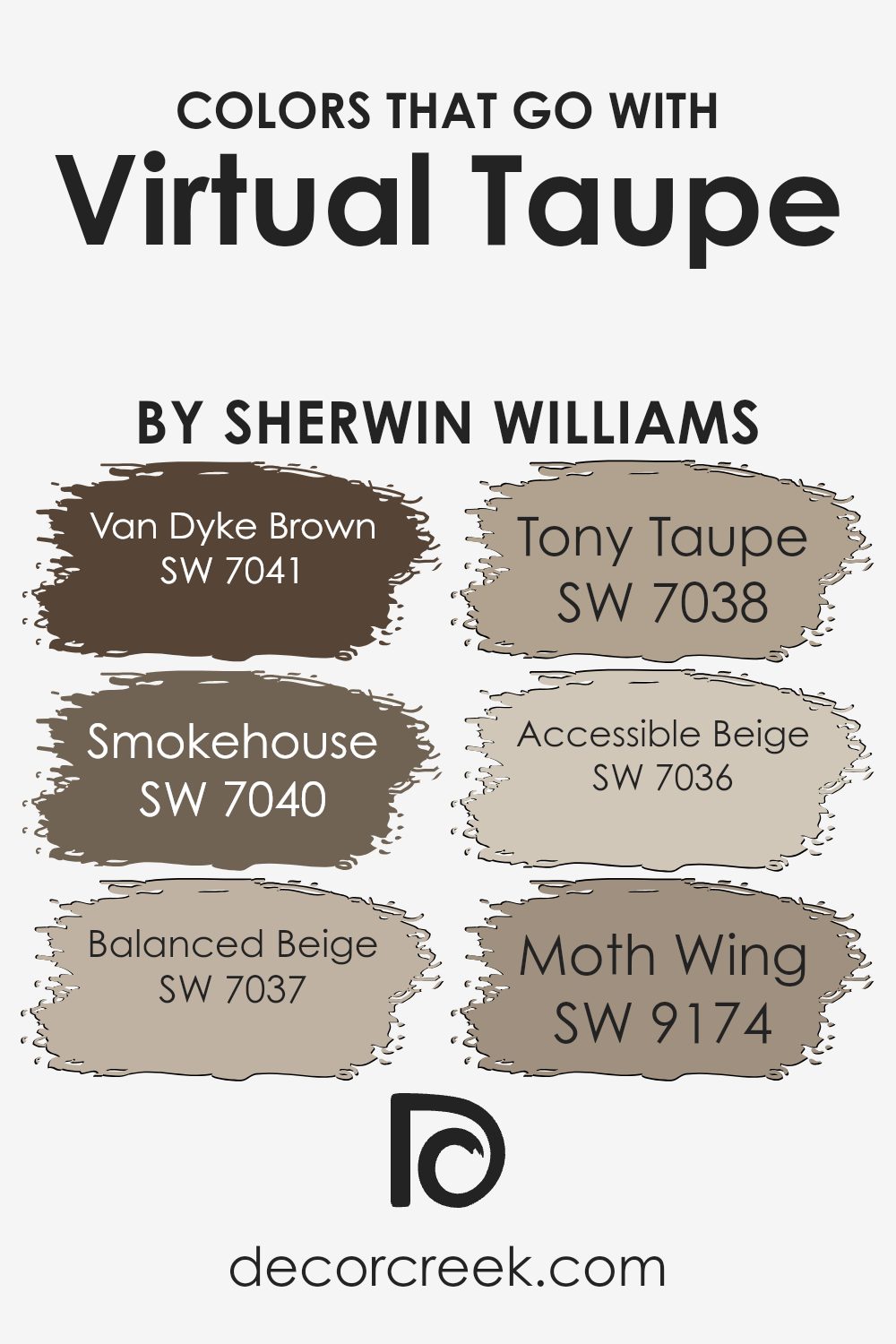
Choosing the right colors to accompany Virtual Taupe SW 7039 by Sherwin Williams is crucial for creating a harmonious and appealing color scheme in any space. Whether you’re painting a home or a commercial area, the complementary colors need to blend well while providing just enough contrast to enhance the overall aesthetic.
Colors like Van Dyke Brown SW 7041 and Smokehouse SW 7040 lend a robust and comforting feel when paired with the soft neutrality of Virtual Taupe. These darker shades work well in providing depth and warmth, making the environment cozy and welcoming.
On the lighter side, Balanced Beige SW 7037 and Tony Taupe SW 7038 offer subtle variations that keep the palette interesting yet cohesive. They are ideal for those looking to maintain a muted but inviting decor style. Accessible Beige SW 7036 is close enough to act as a brightening element without clashing, while Moth Wing SW 9174 introduces a touch of muted sophistication, ensuring the space feels well-rounded and thoughtfully designed.
These combinations ensure that the color scheme remains fluid and versatile, adapting effortlessly to various design elements and personal styles.
You can see recommended paint colors below:
- SW 7041 Van Dyke Brown (CHECK A SAMPLE)
- SW 7040 Smokehouse (CHECK A SAMPLE)
- SW 7037 Balanced Beige (CHECK A SAMPLE)
- SW 7038 Tony Taupe (CHECK A SAMPLE)
- SW 7036 Accessible Beige (CHECK A SAMPLE)
- SW 9174 Moth Wing (CHECK A SAMPLE)
How to Use Virtual Taupe SW 7039 by Sherwin Williams In Your Home?
Virtual Taupe is a versatile paint color from Sherwin Williams that’s perfect for giving any room in your home a fresh, cozy feel. This shade of taupe strikes a fantastic balance between warm and cool tones, making it a great choice, whether you want to paint a whole room or just a feature wall. It can make large spaces feel more inviting and small rooms look bigger.
If you’re thinking about using Virtual Taupe in your living room, it pairs beautifully with soft whites or light grays for a calm and welcoming atmosphere.
It’s also a fantastic choice for bedrooms, as its neutral tone helps create a relaxing backdrop that works well with different color schemes, like blues and greens for a nature-inspired look.
For those who like DIY projects, you could also use Virtual Taupe to repaint cabinets or furniture. This can give old pieces a modern look without being too dark. With Virtual Taupe, you can easily refresh and update the look of your home.
Virtual Taupe SW 7039 by Sherwin Williams vs Down Home SW 6081 by Sherwin Williams
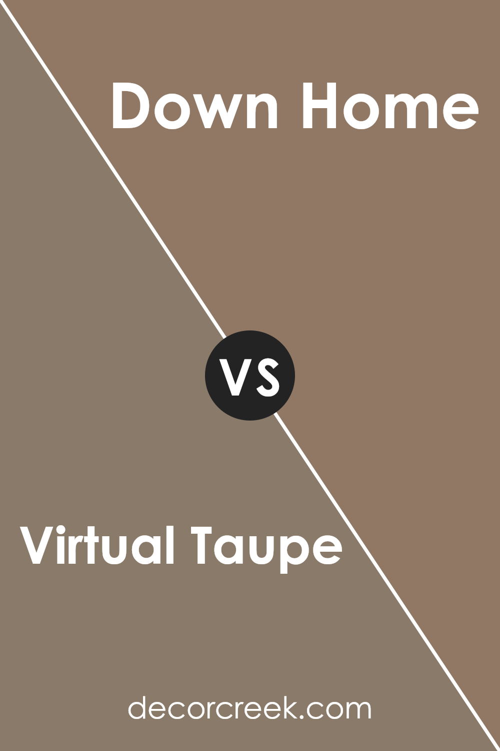
Virtual Taupe and Down Home are both warm, inviting colors from Sherwin Williams, but they bring different vibes to a space. Virtual Taupe is a soft, mid-toned gray with a touch of brown, making it a versatile choice that works well in many different settings. It’s gentle and neutral, providing a subtle backdrop that complements a variety of decor styles.
On the other hand, Down Home is a much deeper, richer shade that leans more towards a dark brown with reddish undertones. This color is perfect for creating a cozy, welcoming atmosphere. It’s ideal for accent walls or rooms where you want to add a bit of drama and warmth.
Both colors are great for creating a comfortable, homely feel, but the choice between them depends on how light or bold you want the room to appear. Virtual Taupe is better for keeping things light and airy, while Down Home suits a bolder, more intimate approach.
You can see recommended paint color below:
- SW 6081 Down Home (CHECK A SAMPLE)
Virtual Taupe SW 7039 by Sherwin Williams vs Teakwood SW 9619 by Sherwin Williams
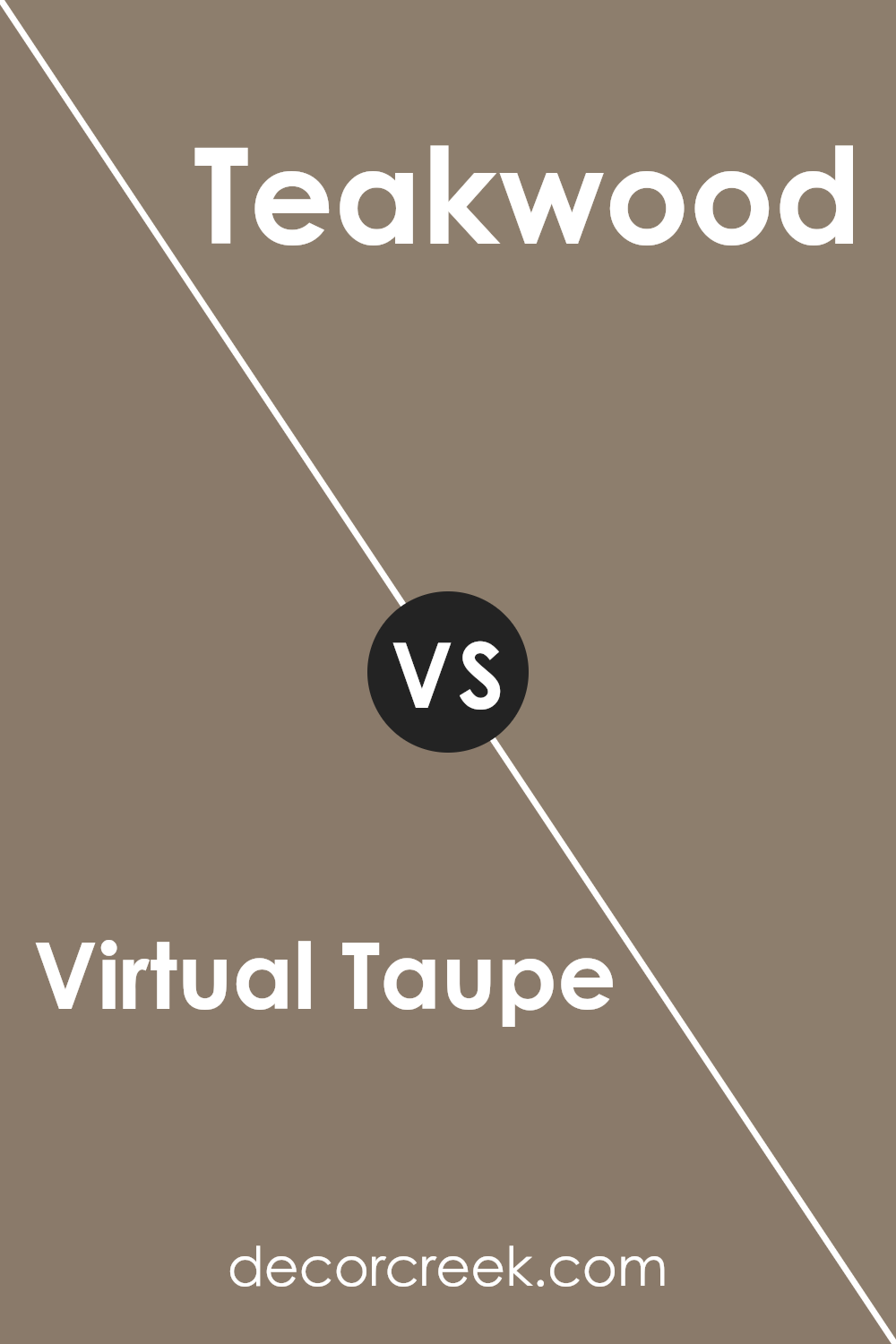
Virtual Taupe and Teakwood, both by Sherwin Williams, are two distinct colors that offer unique vibes for any space. Virtual Taupe is a soft, warm gray that presents a clean and versatile backdrop, suitable for any room. It’s a neutral color that blends well with other hues and works great in spaces where you want a subtle, understated look.
On the other hand, Teakwood is a much darker, rich brown. It has the warmth of wood and provides a strong presence, making it perfect for accents or features like a statement wall. Teakwood works particularly well in areas where you might want to add a bit of drama or a cozy, inviting atmosphere.
Together, these two colors could complement each other nicely in a room. Virtual Taupe could serve as the main color for walls, creating a light and airy feel, while Teakwood could be used for trim or furniture, adding depth and interest to the space.
You can see recommended paint color below:
- SW 9619 Teakwood (CHECK A SAMPLE)
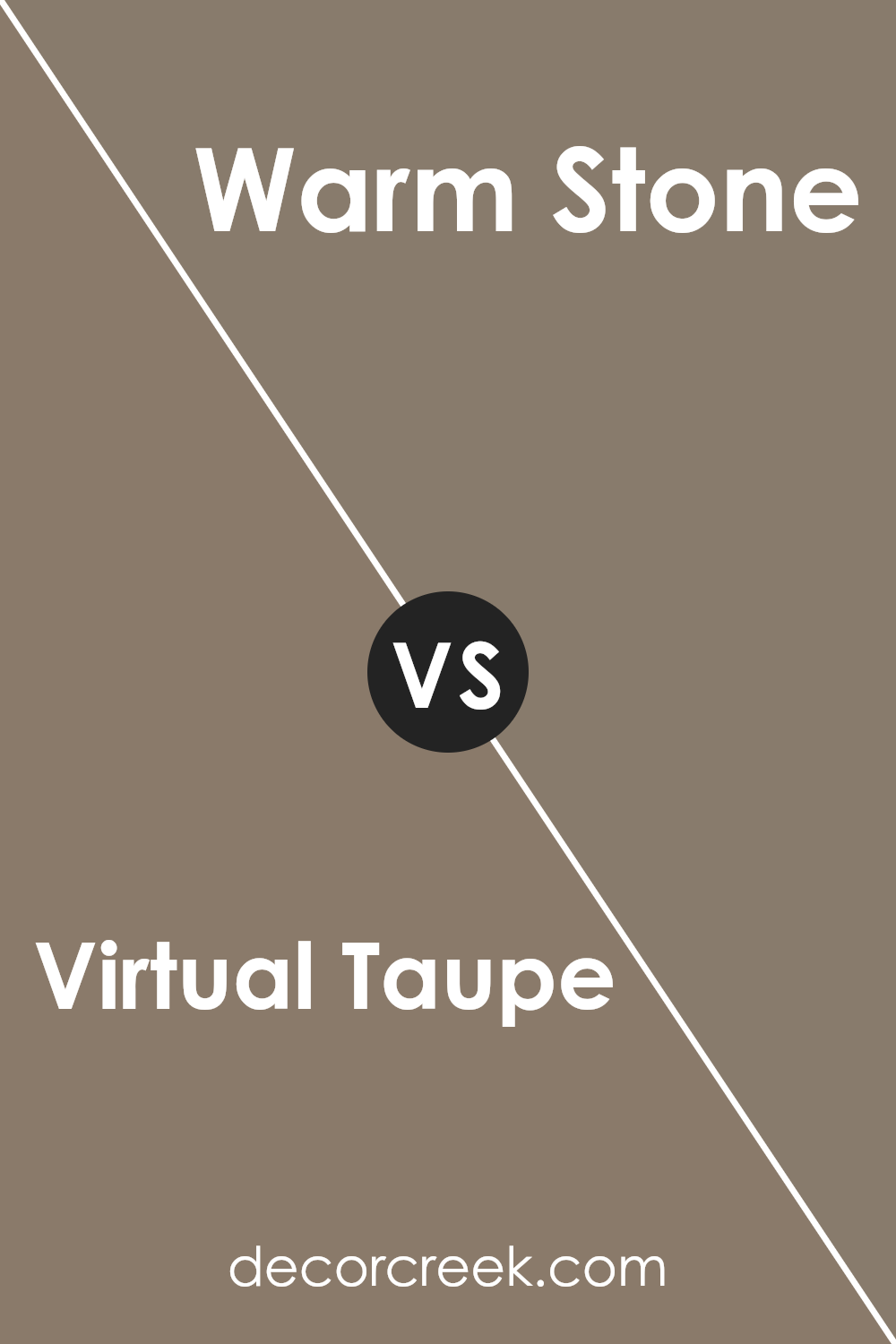
Virtual Taupe SW 7039 by Sherwin Williams vs Warm Stone SW 7032 by Sherwin Williams
Virtual Taupe and Warm Stone are both neutral colors by Sherwin Williams, but they set different moods. Virtual Taupe is a medium gray with a strong taupe influence, which gives a subtle, cozy feel to a room. It’s a versatile color that works well in spaces where you want a touch of warmth but maintain a neutral background.
Warm Stone, on the other hand, leans more towards a beige-brown tone. It is a bit darker compared to Virtual Taupe, offering a warmer, more inviting quality that can make large spaces feel more intimate and grounded.
Both colors pair well with a variety of decor styles and can be used in multiple spaces like living rooms, bedrooms, and offices. Virtual Taupe might be better suited for those who prefer their spaces to feel more open and airy, while Warm Stone is ideal for creating a cozy, welcoming environment.
Choosing between these depends on the atmosphere you want to achieve and other colors and elements you plan to incorporate in your space.
You can see recommended paint color below:
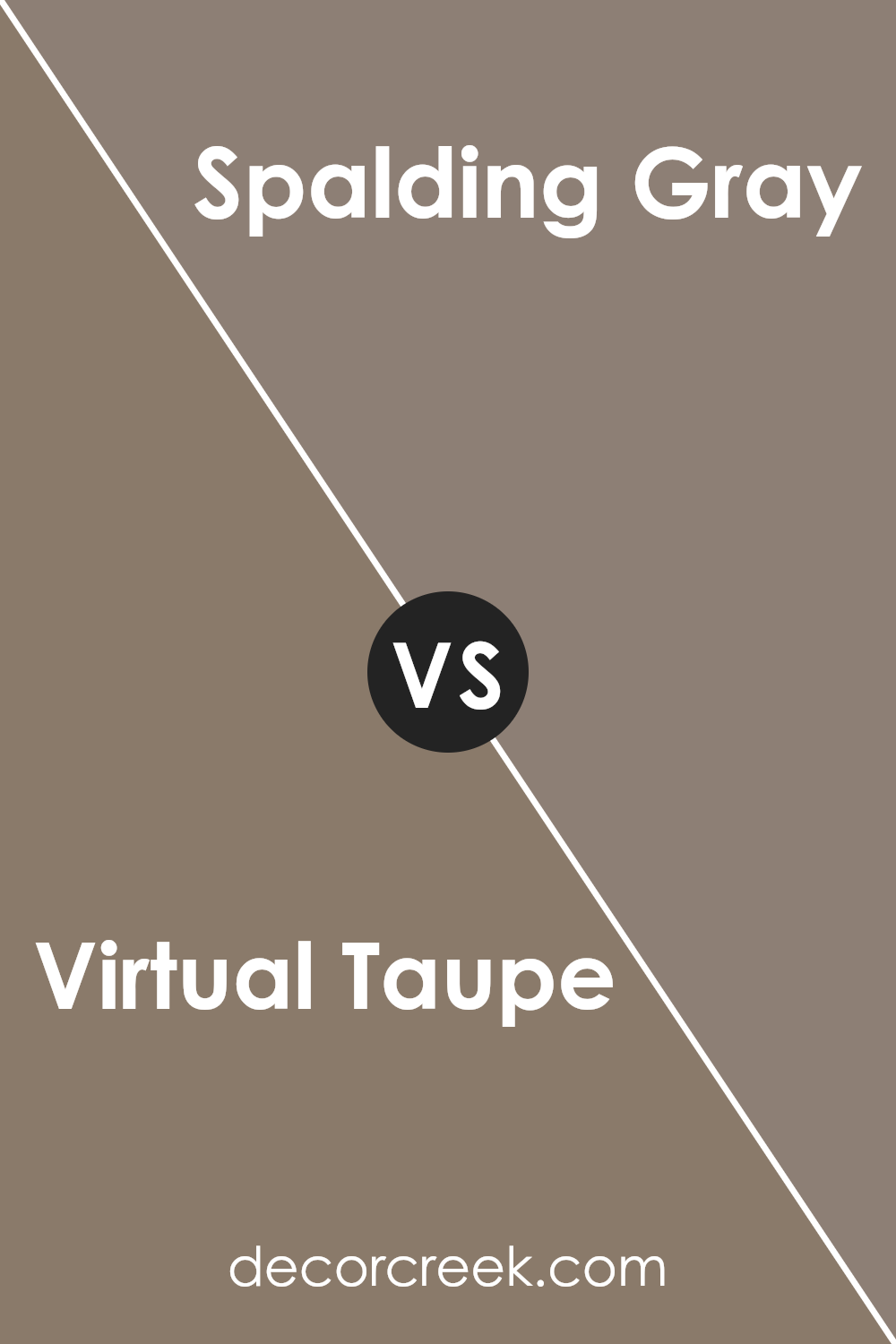
Virtual Taupe SW 7039 by Sherwin Williams vs Spalding Gray SW 6074 by Sherwin Williams
Virtual Taupe and Spalding Gray are two distinctive shades offered by Sherwin Williams. Virtual Taupe is a warm, inviting neutral with a balanced mix of brown and gray. Its earthy tone makes it a great choice for creating a cozy and welcoming atmosphere in any room.
On the other hand, Spalding Gray is darker, leaning more toward a solid, deep gray with subtle hints of brown. This color provides a more pronounced and bold statement, making it ideal for accent walls or areas where a stronger visual impact is desired. Both colors offer a versatile palette but serve different moods and settings.
While Virtual Taupe suits softer, lighter spaces, Spalding Gray is perfect for adding depth and intensity to a space.
You can see recommended paint color below:
- SW 6074 Spalding Gray (CHECK A SAMPLE)
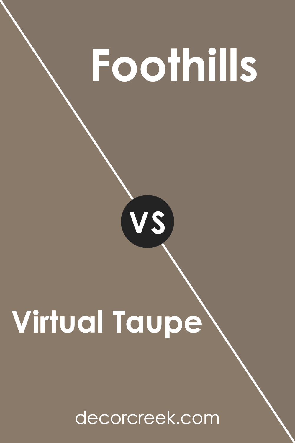
Virtual Taupe SW 7039 by Sherwin Williams vs Foothills SW 7514 by Sherwin Williams
Virtual Taupe and Foothills, both Sherwin Williams colors, offer warm, inviting tones, but they have distinct differences. Virtual Taupe is a balanced, warm gray-brown. It’s a versatile shade that creates a cozy, welcoming atmosphere in any space. It pairs beautifully with both bright and subdued colors, making it a great backdrop for various design styles.
On the other hand, Foothills is a deeper, richer brown with a subtle gray undertone. It’s a bit more intense than Virtual Taupe, providing a strong presence that can make rooms feel more grounded and snug. Foothills works well in areas where you want to establish a sense of warmth and depth, such as living rooms or dining areas.
Both colors provide a sense of warmth, but Foothills, being darker, offers a stronger anchor for a room, while Virtual Taupe is lighter and more flexible in blending with other hues.
You can see recommended paint color below:
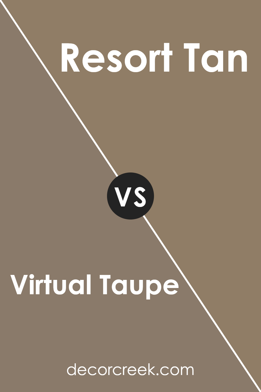
Virtual Taupe SW 7039 by Sherwin Williams vs Resort Tan SW 7550 by Sherwin Williams
Virtual Taupe and Resort Tan are both from Sherwin Williams and belong to natural color palettes, offering a grounded, peaceful look to any space. Virtual Taupe has a subdued, darker hue, leaning slightly into gray tones, making it perfect for creating a cozy and comforting atmosphere in areas like living rooms or bedrooms. Its richness adds depth and can serve as a beautiful backdrop for both modern and traditional settings.
On the other hand, Resort Tan is lighter, with a warmer undertone that gives it a more relaxed and inviting feel. This color works exceptionally well in spaces meant for rejuvenation and light, such as sunrooms, casual living spaces, and bedrooms where you want a softer touch.
Resort Tan’s warmth makes it versatile for pairing with a variety of decor styles, enhancing the overall aesthetic without overwhelming it.
Together, these colors could complement each other well in a home, with Resort Tan lighting up a space and Virtual Taupe adding a grounding effect.
You can see recommended paint color below:
- SW 7550 Resort Tan (CHECK A SAMPLE)
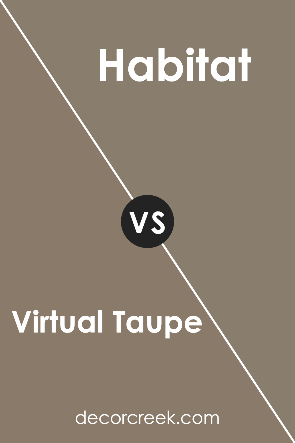
Virtual Taupe SW 7039 by Sherwin Williams vs Habitat SW 9608 by Sherwin Williams
The main color, Virtual Taupe, and the second color, Habitat, both from Sherwin Williams, have unique tones that can significantly influence the mood and style of a room. Virtual Taupe is a classic shade that leans on the cooler side of taupe colors. It provides a subtle and neutral backdrop, making it versatile for various living spaces. On the other hand, Habitat brings a warmer, more robust touch to interiors. It’s an earthier tone that can add a sense of coziness and comfort to any area.
When comparing them, Virtual Taupe offers more flexibility because of its neutrality, fitting well in modern and minimalistic designs. Habitat, with its richer and warmer hue, is ideal for creating a welcoming and inviting environment, excellent in spaces where you want to add a bit of energy and warmth.
Depending on your decor style and the atmosphere you want to set, both colors have their advantages. For a calm and open feel, go with Virtual Taupe; for a hearty and homey vibe, Habitat is the better choice.
You can see recommended paint color below:
- SW 9608 Habitat (CHECK A SAMPLE)
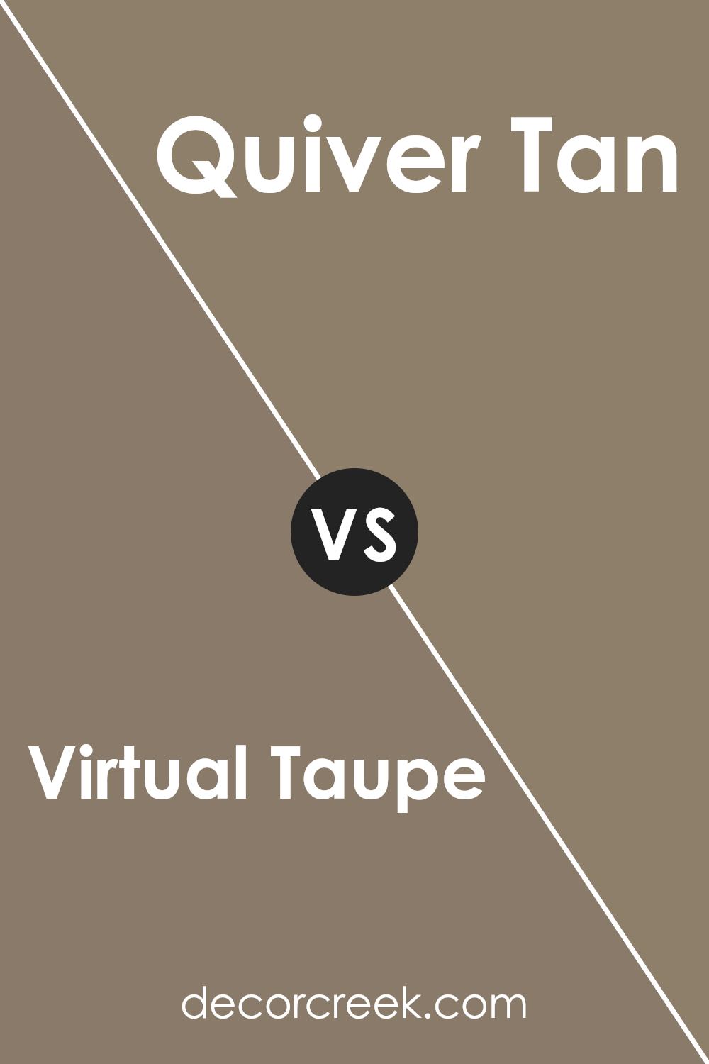
Virtual Taupe SW 7039 by Sherwin Williams vs Quiver Tan SW 6151 by Sherwin Williams
Virtual Taupe and Quiver Tan by Sherwin Williams are both neutral shades, but they have distinct tones that set them apart. Virtual Taupe is a darker, richer color resembling a blend of grey and brown. This shade is versatile and can create a cozy and inviting atmosphere in a room, making it appear more enclosed and snug.
Quiver Tan, on the other hand, is lighter and leans more towards a soft, sandy brown. It offers a fresher look that can make spaces feel more open and airy. Because of its lighter tone, Quiver Tan can also help to brighten a room, making it feel more spacious and relaxed.
Both colors can be used effectively to create warm, welcoming spaces, but the choice between them would depend on the desired effect in the room. Virtual Taupe works well in areas where a more intimate feel is desired, whereas Quiver Tan is ideal for spaces where you want a lighter, more open vibe.
You can see recommended paint color below:
- SW 6151 Quiver Tan (CHECK A SAMPLE)
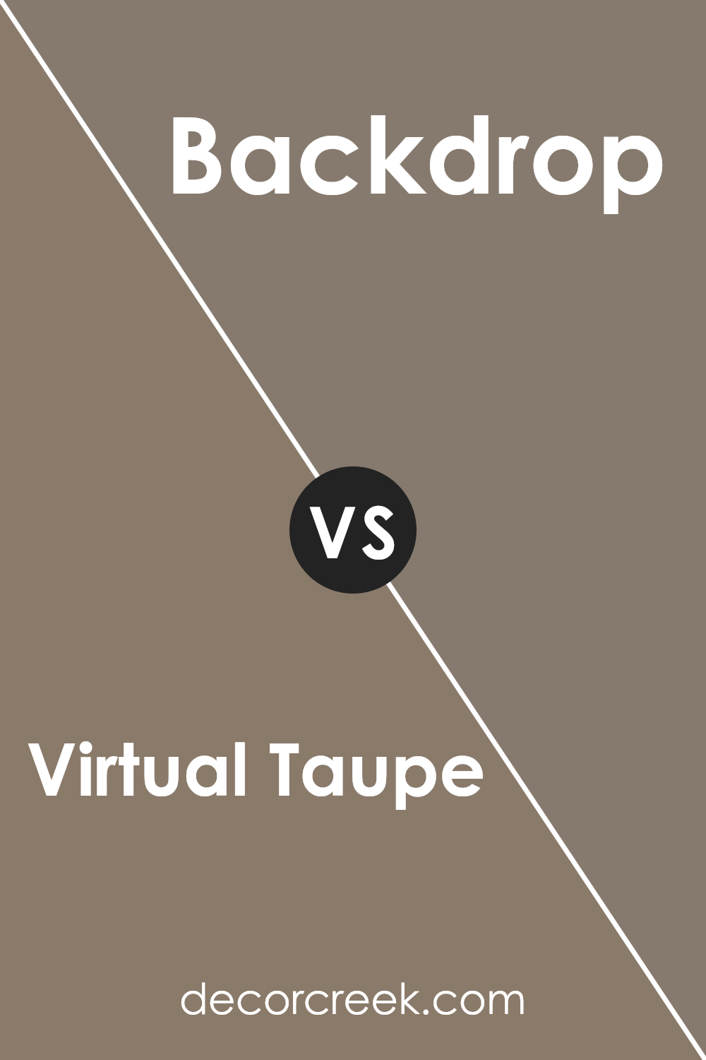
Virtual Taupe SW 7039 by Sherwin Williams vs Backdrop SW 7025 by Sherwin Williams
Virtual Taupe and Backdrop are two popular paint colors by Sherwin Williams. Virtual Taupe has a warm, earthy feel to it, blending gray and brown tones effectively. This color suits a range of spaces and adds a cozy, welcoming vibe to rooms. On the other hand, Backdrop is a slightly darker shade of gray compared to Virtual Taupe.
It offers a neutral backdrop that goes well with almost anything, making it perfect for anyone looking to create a stylish yet understated look.
Both colors are versatile and can be used in various decor styles, but Virtual Taupe tends to add a bit of warmth due to its brownish undertones, while Backdrop keeps things cool and neutral. Depending on the mood you want to set in your space, either color could be a great choice.
You can see recommended paint color below:
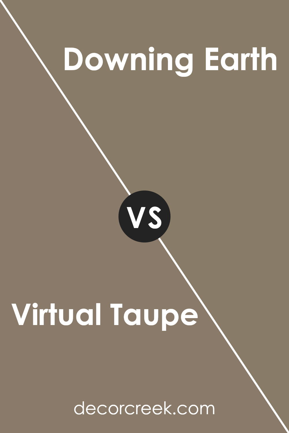
Virtual Taupe SW 7039 by Sherwin Williams vs Downing Earth SW 2820 by Sherwin Williams
Virtual Taupe and Downing Earth are both warm, inviting colors from Sherwin Williams but they set different moods. Virtual Taupe is a soft, grayish-brown that gives a gentle and muted appearance, making it perfect for creating a cozy and understated feel in a space.
On the other hand, Downing Earth is a deeper, richer color, resembling a dark brown with a hint of olive green, providing a more pronounced and earthy tone to rooms.
This color might be more suited for spaces where you want a touch of nature and warmth. Both colors will pair nicely with various decor styles, but while Virtual Taupe offers a more neutral backdrop, perfect for minimalist or Scandinavian interiors, Downing Earth works well where a stronger, more defined aesthetic is desired, such as in traditional or rustic designs.
You can see recommended paint color below:
- SW 2820 Downing Earth
Conclusion
SW 7039 Virtual Taupe by Sherwin Williams is a paint color that really makes any room look great. It’s like the perfect shade of brown that isn’t too dark or too light. When I used it in my living room and bedroom, it made both spaces feel warm and cozy, like a big hug. This color works well with lots of other colors, so you can easily mix and match decorations or furniture. It’s also really calming, kind of like the soft brown you see in delicious hot chocolate.
I found that Virtual Taupe was super easy to paint with, and it covered the walls smoothly. It doesn’t show dirt easily, which is great if you have kids or pets. It also stays looking nice for a long time.
For anyone thinking about giving their room a new look, I would definitely recommend giving SW 7039 Virtual Taupe a try. It’s a color that looks good in any type of room, whether you want it to be cozy, stylish, or just different from what you had before.
It’s a decision you’ll be happy with every time you walk into your refreshed, beautiful room!
Ever wished paint sampling was as easy as sticking a sticker? Guess what? Now it is! Discover Samplize's unique Peel & Stick samples.
Get paint samples


