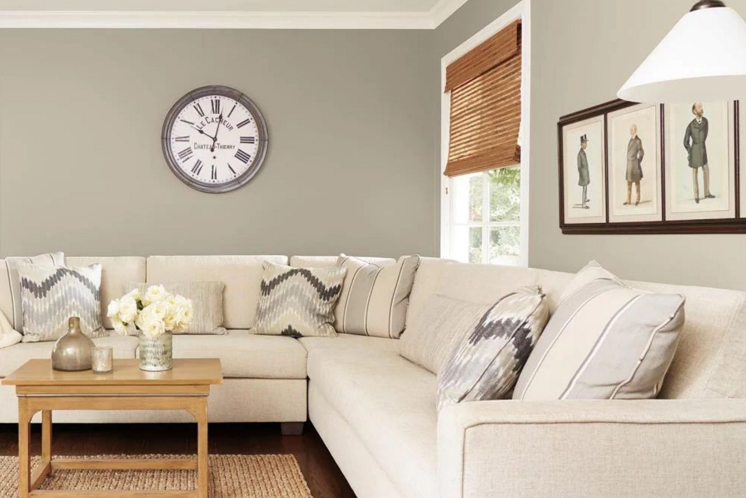
Have you ever noticed how certain colors have the ability to completely change the mood of a room? SW 7639 Ethereal Mood by Sherwin Williams is one of those shades that seems to carry a gentle air of sophistication while maintaining a soft, inviting warmth. When I think about its subtle charm, I picture a perfect balance between modern and timeless elegance.
This color is more than just a pleasant neutral; it offers a cozy backdrop that can effortlessly adapt to different styles and spaces. Whether you’re painting a living room, a bedroom, or even a hallway, Ethereal Mood provides a serene foundation that highlights other design elements without overshadowing them. The magic of this shade lies in its subtle ability to wash a wall with warmth, creating a welcoming atmosphere.
What I appreciate most is its adaptability. It pairs beautifully with a variety of hues, from deep, bold colors to light, pastel shades, making it a versatile choice for any color scheme. Its muted tone doesn’t scream for attention, but instead whispers elegance and comfort.
Ethereal Mood has become a favorite for those seeking an understated yet sophisticated touch to their homes, providing a feeling of calm and balance in every space it graces.
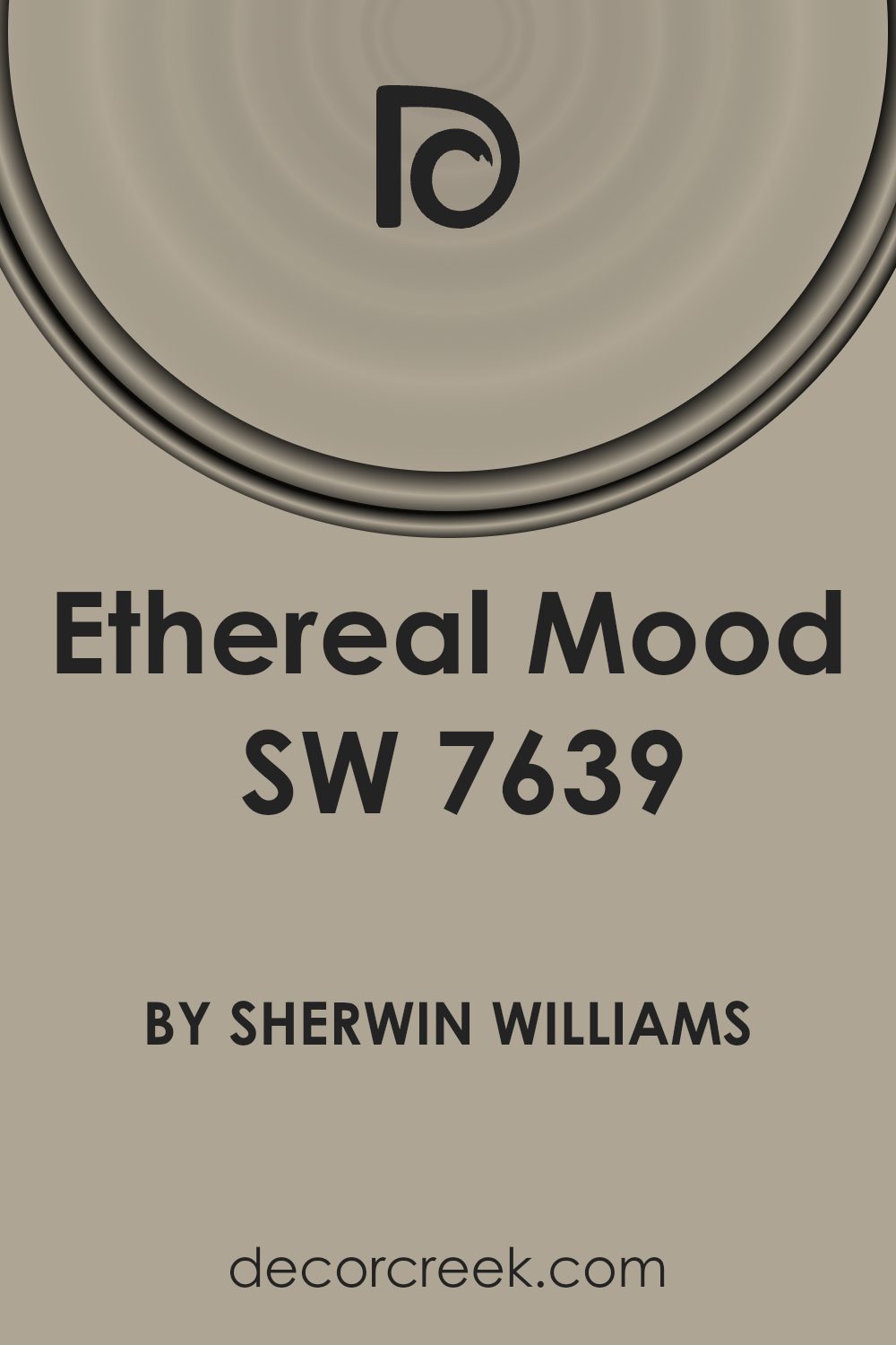
What Color Is Ethereal Mood SW 7639 by Sherwin Williams?
Ethereal Mood by Sherwin Williams is a soft grey with a hint of warmth that adds depth without overpowering a space. This versatile color can adapt to various interior styles, making it a favorite among homeowners and designers. Its gentle, inviting shade works beautifully in modern and minimalist settings, providing a calm backdrop that allows other design elements to shine. In traditional or rustic interiors, Ethereal Mood complements natural materials like wood and stone, enhancing their textures with its subtle presence.
This color works well in spaces that aim to feel cozy yet modern. Pair it with clean white trim for a fresh look, or combine it with darker greys and charcoals for a more dramatic effect. In a modern farmhouse interior, Ethereal Mood pairs nicely with rough-hewn beams and vintage metal fixtures, creating a harmonious balance between old and new.
For materials, consider using soft linens, natural cottons, and light wood finishes, which will enhance its understated elegance. Metallic accents in brushed nickel or matte black add a touch of contrast and interest. Ethereal Mood is perfect for living rooms, bedrooms, and even kitchens, where its subtle warmth can enhance any decor style without dominating.
Is Ethereal Mood SW 7639 by Sherwin Williams Warm or Cool color?
Ethereal Mood (SW 7639) by Sherwin Williams is a soft, calming gray with a subtle hint of blue, making it a versatile choice for home interiors. This color works well in spaces where you want to create a peaceful and airy feel. The gentle hue has the ability to make rooms feel larger and more open, as it reflects light well without being too bright.
In living rooms, Ethereal Mood provides a neutral backdrop that pairs beautifully with both modern and traditional furnishings. It allows colorful art and decor to stand out while maintaining a cohesive look. In bedrooms, its soothing nature encourages relaxation and restful sleep. Using this shade in bathrooms can give the space a spa-like atmosphere, making it feel fresh and clean.
Ethereal Mood complements a wide range of colors, from deep blues to soft pastels, enhancing your home’s style without overwhelming your existing decor.
Undertones of Ethereal Mood SW 7639 by Sherwin Williams
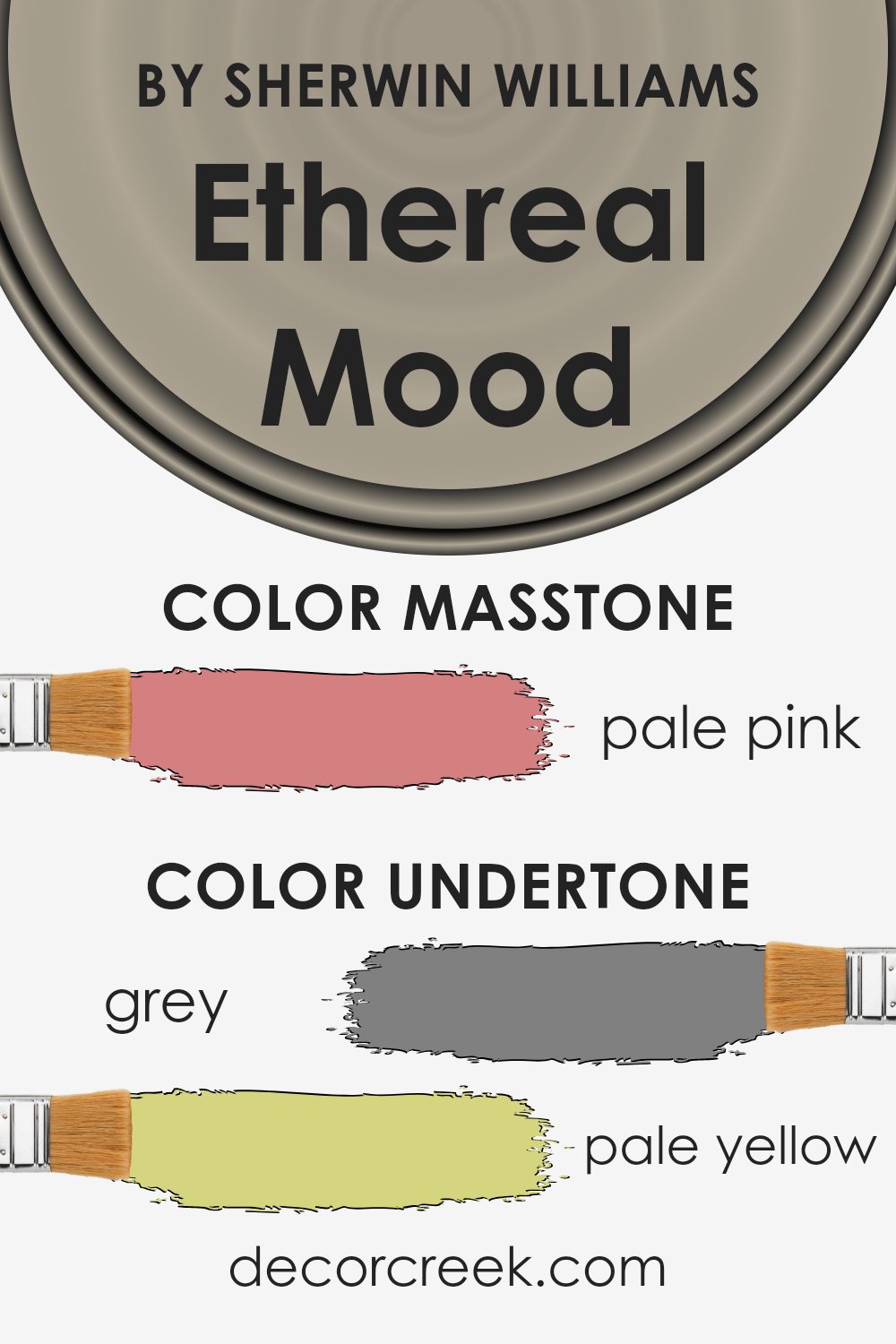
Ethereal Mood by Sherwin-Williams is a unique shade that carries various undertones, which influence how the color appears on walls. Undertones are subtle hints of other colors contained within the main color, and they can significantly alter the mood of a room. In Ethereal Mood, the undertones of gray, pale yellow, mint, and light purple add a soft and soothing quality. These undertones help create a gentle and calming atmosphere, making it a versatile choice for different spaces.
The light gray gives the color a neutral base, allowing it to blend well with other colors in a room. The pale yellow and light green undertones add warmth, preventing the color from feeling too cold or stark. The hints of mint and light blue offer a refreshing touch, making it an excellent choice for areas where you want to feel relaxed, like bedrooms or bathrooms.
Meanwhile, the subtle hints of light purple and lilac provide a delicate, slightly romantic feel. This balance of undertones means Ethereal Mood can work in both modern and classic interiors. Whether paired with darker colors like red or brown, or lighter hues like pink or fuchsia, Ethereal Mood can adapt and complement a variety of palettes, changing subtly as the light in the room changes.
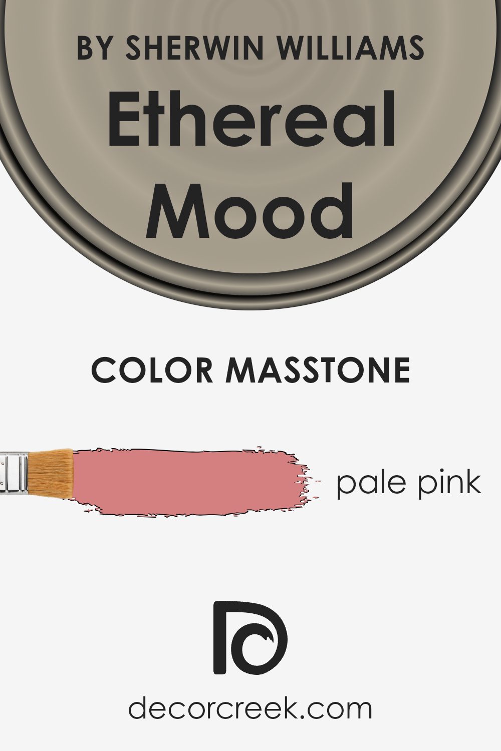
What is the Masstone of the Ethereal Mood SW 7639 by Sherwin Williams?
Ethereal Mood (SW 7639) by Sherwin-Williams is a captivating paint color choice with a masstone of pale pink (#D58080). This soft hue can make a room feel welcoming and cozy. The pale pink undertone adds a sense of warmth and comfort, which can be particularly appealing in living rooms or bedrooms.
This color has the ability to subtly brighten up a space without being overwhelming. It complements natural light beautifully, creating a gentle, soothing atmosphere during the day. In artificial lighting, Ethereal Mood can add a touch of elegance and coziness to any room.
Its versatility allows it to pair well with neutral shades, soft grays, and even richer colors for a more striking contrast. Overall, this shade is ideal for homeowners looking for a subtle touch of color that maintains a neutral and harmonious environment, making spaces feel more inviting and relaxed.
How Does Lighting Affect Ethereal Mood SW 7639 by Sherwin Williams?
Lighting plays a crucial role in how we perceive colors, as it can change the appearance of paint in different environments. The color Ethereal Mood SW 7639 by Sherwin Williams is a soft, muted gray with a hint of warmth, making it quite versatile. When placed under artificial light, such as incandescent bulbs, this color may appear slightly warmer, perhaps even leaning towards a beige or taupe. Under fluorescent lighting, which tends to have a cooler tone, Ethereal Mood might appear a bit more blue-gray.
In natural light, the direction in which your room faces significantly affects how Ethereal Mood appears. In north-facing rooms, where light is typically cooler and more consistent throughout the day, the color might seem more subdued and can bring out the gray tones, possibly making the space feel cozier and more relaxed.
In contrast, south-facing rooms get more direct sunlight, especially in the middle of the day when light is at its warmest. Here, Ethereal Mood could take on a warmer hue, enhancing its gentle undertones and adding a welcoming glow to the room.
East-facing rooms experience changing light, starting with warm sunlight in the morning that cools as the day progresses. In the morning, Ethereal Mood might exhibit a warmer shade, complementing the morning sun. As the day continues, it can take on a cooler tone.
West-facing rooms, on the other hand, have cooler light in the morning and warmer light in the afternoon and evening. Early in the day, Ethereal Mood might appear more neutral or cool, whereas later in the day, it could appear warmer due to the afternoon sun.
Overall, Ethereal Mood is a versatile color choice that can adapt well to varying light conditions, providing a neutral backdrop that can subtly change with the light, enhancing the mood of any space.
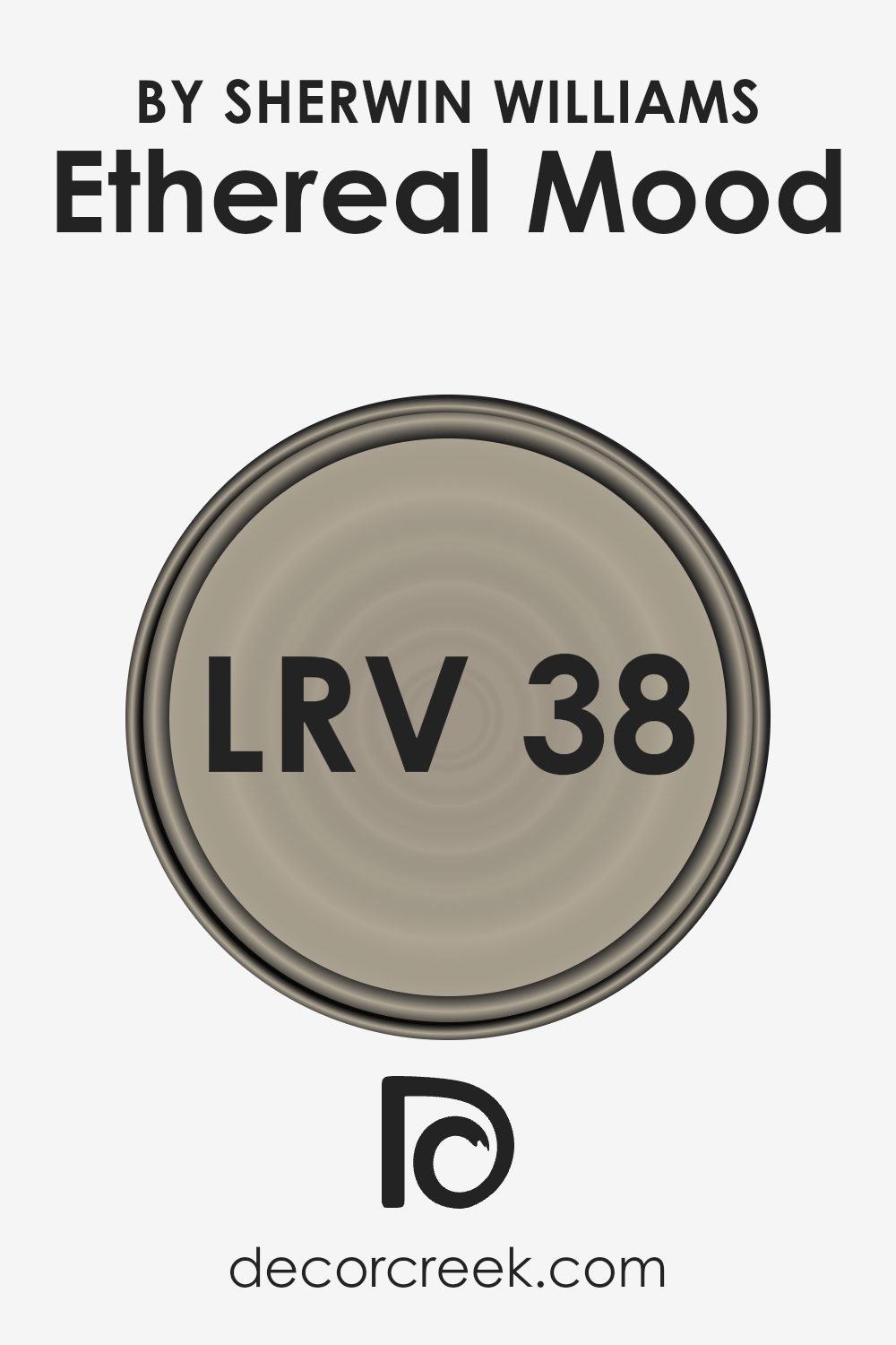
What is the LRV of Ethereal Mood SW 7639 by Sherwin Williams?
LRV, or Light Reflectance Value, measures the amount of visible light a paint color reflects. It is a scale from 0 to 100, where 0 means the color absorbs all light and can appear very dark, while 100 reflects all light and can appear very bright or white.
In simple terms, LRV helps you understand how bright or dark a color will look once it’s on your walls. This can make a big difference in how a room feels; colors with high LRV can make a room feel more open and spacious, whereas colors with low LRV can give a room a cozy, intimate feeling.
For the color Ethereal Mood by Sherwin Williams, the LRV value is 38.219. This means it sits on the mid-to-low range of the scale, reflecting a moderate amount of light. Colors like this tend to make a room feel warm and inviting without being too overpowering or dark. It won’t make a room feel too bright, which is perfect if you want a comfortable, relaxed atmosphere.
Ethereal Mood can work well in rooms where you want a subtle hue that doesn’t overwhelm but still provides depth and character. Its balance allows for versatility in various lighting conditions, neither absorbing too much light nor reflecting excessively.
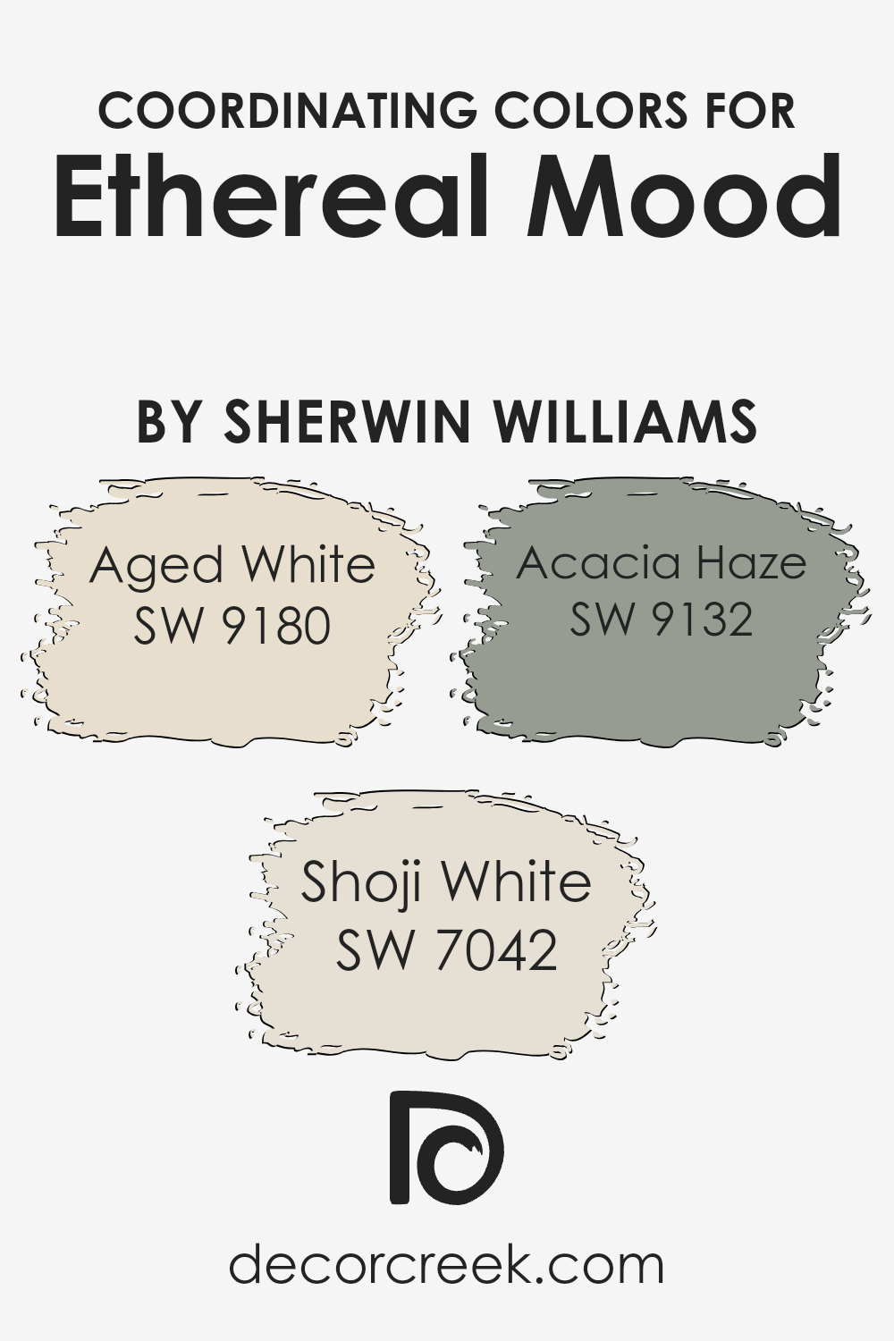
Coordinating Colors of Ethereal Mood SW 7639 by Sherwin Williams
Coordinating colors are hues that complement one another to create a pleasing aesthetic. They work together to enhance a space, ensuring the different elements don’t clash but rather harmonize. Ethereal Mood by Sherwin Williams is a soft, grounded hue that serves as an excellent starting point in a color scheme.
Coordinating it with colors like Aged White, Shoji White, and Acacia Haze can add depth and interest to any room. Aged White is a warm off-white shade that brings a sense of coziness and acts as a gentle backdrop, tying various elements together without overwhelming a space.
Shoji White, on the other hand, is a creamy, warm white that is versatile and subtle. It can effortlessly lighten up a room while adding a touch of warmth. Meanwhile, Acacia Haze introduces a hint of nature with its muted green tone. It adds a fresh yet calming feel, balancing the warmth of the other colors.
, these shades create a cohesive and inviting environment where Ethereal Mood remains a central theme. When used in coordination, these colors can define and enhance different areas of a home, creating a space that feels unified yet dynamic.
You can see recommended paint colors below:
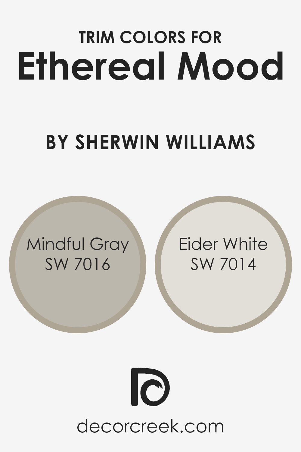
What are the Trim colors of Ethereal Mood SW 7639 by Sherwin Williams?
Trim colors play a crucial role in enhancing the overall look of a room, as they help define architectural features and provide a contrast to the main wall color. For Ethereal Mood SW 7639 by Sherwin-Williams, choosing the right trim colors can make all the difference in creating an appealing and harmonious space. Ethereal Mood, with its gentle and calming gray-blue hue, benefits from a well-chosen trim color to either highlight its understated nature or provide a crisp, clean frame. For this, Mindful Gray SW 7016 and Eider White SW 7014 are excellent options.
Mindful Gray, a warm and neutral gray with a balanced tone, can complement Ethereal Mood by adding a soft and cohesive touch. Eider White, being a light and subtle off-white, offers a crisp and traditional look that brightens and frames the walls elegantly.
Mindful Gray brings a warm undertone that pairs beautifully with the cooler shades of Ethereal Mood, adding depth without overpowering the serene vibe. On the other hand, Eider White offers a clean and bright option, which can make doors and baseboards stand out against the main wall color while keeping the look fresh and modern.
Each of these trim colors plays a distinct role in enhancing the Ethereal Mood and bringing in different characteristics to a room’s interior design. Whether one goes for the warmth of Mindful Gray or the brightness of Eider White, these choices help create a room that is both pleasing to the eye and well-defined in its style.
You can see recommended paint colors below:
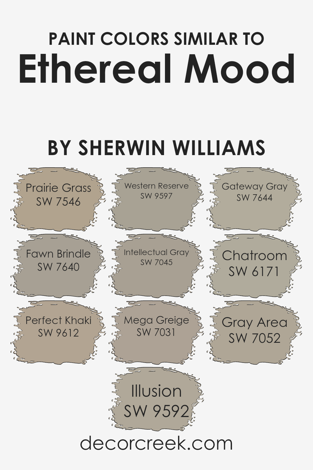
Colors Similar to Ethereal Mood SW 7639 by Sherwin Williams
Similar colors are important in design because they create a harmony that is pleasing to the eye. Colors like prairie grass and fawn brindle complement each other, adding warmth and depth to a space. Prairie Grass offers a soft, earthy feel, capturing the essence of a sunlit field. Fawn Brindle, on the other hand, gives a touch of subtle elegance with its muted brown undertones.
Perfect Khaki is an ideal neutral that blends effortlessly, providing a solid foundation for more vibrant accents. Illusion offers a whisper of color that softly enhances any environment without overwhelming it.
Each of these shades works together to create a balanced palette, offering versatility for various design needs. Western Reserve brings a hint of vintage charm, reminiscent of an aged wood finish. Intellectual Gray presents itself as a refined mid-tone that can ground a room. Mega Greige offers a sturdy, neutral look, appealing to those who enjoy classic styles. Gateway Gray, aptly named, stands between subtlety and boldness, offering an agreeable middle ground.
Chatroom, with its hint of green, brings a gentle freshness, while Gray Area sits comfortably at the intersection of cool and warm tones, allowing for seamless integration with other colors. Together, these hues enrich spaces with their subtle depth and comfort, making them ideal companions in design.
You can see recommended paint colors below:
- SW 7546 Prairie Grass
- SW 7640 Fawn Brindle
- SW 9612 Perfect Khaki
- SW 9592 Illusion
- SW 9597 Western Reserve
- SW 7045 Intellectual Gray
- SW 7031 Mega Greige
- SW 7644 Gateway Gray
- SW 6171 Chatroom
- SW 7052 Gray Area
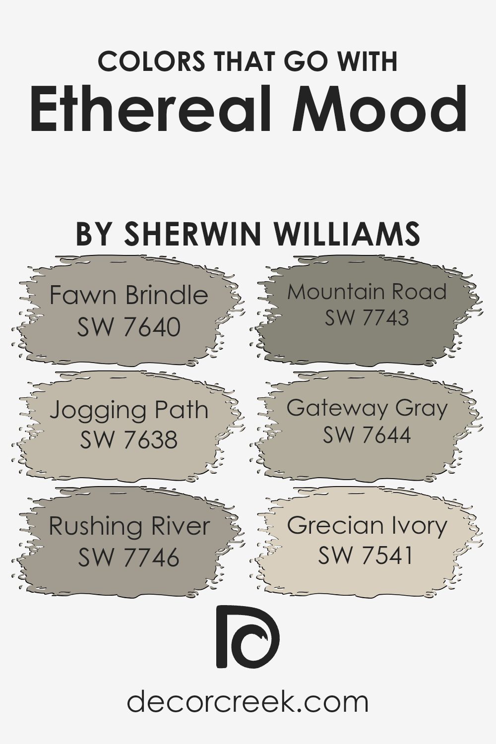
Colors that Go With Ethereal Mood SW 7639 by Sherwin Williams
Choosing colors that complement Ethereal Mood SW 7639 by Sherwin-Williams is important because these colors can enhance the overall feel and appearance of a space. Ethereal Mood, with its soft and muted tones, works well with other soothing colors to create a cohesive and calming environment. For example, Fawn Brindle SW 7640 is a warm, earthy brown that adds a cozy feeling when paired with Ethereal Mood.
It grounds the lighter hue and offers a comforting backdrop. Jogging Path SW 7638, with its green-gray undertone, brings a natural element to any room. This color can create an inviting space that feels balanced and harmonious with Ethereal Mood.
Rushing River SW 7746 introduces a deeper, robust green that adds depth. When combined with Ethereal Mood, it evokes a sense of earthiness and balance. Mountain Road SW 7743 offers a deeper, more intense option with its rich, muted green, perfect for accent walls or focal points, without overwhelming the relaxed atmosphere ensured by Ethereal Mood.
Gateway Gray SW 7644 has a soft, neutral tone that pairs seamlessly and can enhance the subtle and peaceful atmosphere of a space. Lastly, Grecian Ivory SW 7541 adds a touch of warmth and light. Its creaminess beautifully uplifts the soft tone of Ethereal Mood, giving rooms an open and inviting feeling. These colors combined result in a space that feels cohesive yet dynamic, where each hue supports the calming effect of Ethereal Mood.
You can see recommended paint colors below:
- SW 7640 Fawn Brindle
- SW 7638 Jogging Path
- SW 7746 Rushing River
- SW 7743 Mountain Road
- SW 7644 Gateway Gray
- SW 7541 Grecian Ivory
How to Use Ethereal Mood SW 7639 by Sherwin Williams In Your Home?
Ethereal Mood SW 7639 by Sherwin Williams is a soft, light gray paint color that adds a sense of calm to any room. It’s a versatile shade that fits well in various spaces, from living rooms to bedrooms and even kitchens. This gentle gray can create a cozy atmosphere, making it a great choice for people looking to create a welcoming home.
To use Ethereal Mood in your home, consider pairing it with white trim for a clean, classic look. This pairing can make your space feel open and airy. If you want more contrast, try using darker furniture or accents. Adding colorful accessories like pillows or artwork can also bring warmth and personality into the room.
Overall, Ethereal Mood is an excellent choice for anyone wanting a fresh and calming color palette. Its soothing tone makes it perfect for creating a peaceful environment where you can relax and unwind.
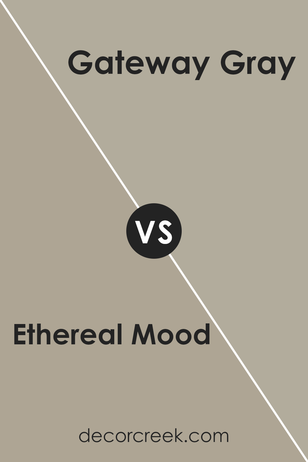
Ethereal Mood SW 7639 by Sherwin Williams vs Gateway Gray SW 7644 by Sherwin Williams
Ethereal Mood SW 7639 and Gateway Gray SW 7644 are two neutral colors by Sherwin Williams, each bringing its own presence to a space. Ethereal Mood is a soft, warm beige that creates a cozy and inviting atmosphere. It’s subtle and tends to blend well with a variety of other colors, making it versatile for different rooms and styles.
On the other hand, Gateway Gray is a cooler gray with a hint of blue-green. It feels a bit more crisp and modern compared to the warmth of Ethereal Mood. This shade can provide a fresh, clean look and pairs well with contemporary designs.
Both colors are easy to match with other shades but offer different vibes: Ethereal Mood is warm and comforting, while Gateway Gray gives a cooler, more refined look. Choosing between them depends on whether you prefer a warmer or cooler space.
You can see recommended paint color below:
- SW 7644 Gateway Gray
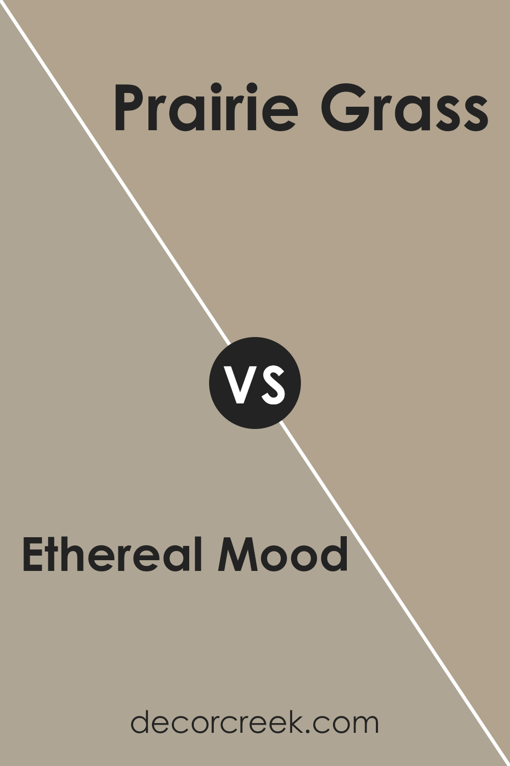
Ethereal Mood SW 7639 by Sherwin Williams vs Prairie Grass SW 7546 by Sherwin Williams
Ethereal Mood SW 7639 and Prairie Grass SW 7546 are two distinct colors from Sherwin Williams. Ethereal Mood is a soft, muted gray with a hint of warmth and blue undertones. It provides a gentle and calming backdrop, suitable for creating a peaceful atmosphere in any space. This color works well in rooms where you want a quiet and restful feel, like bedrooms or living rooms.
On the other hand, Prairie Grass is a warm, earthy tan that brings a touch of nature indoors. It has a slightly yellow undertone, evoking the feel of sunlit fields. Prairie Grass adds warmth and a cozy feeling to spaces, making it ideal for kitchens, family rooms, or any area where you want a welcoming and inviting look.
When comparing the two, Ethereal Mood is cooler and more understated, while Prairie Grass offers a warmer and more rustic vibe. Both can be used effectively, but your choice will depend on the mood and style you wish to achieve.
You can see recommended paint color below:
Ethereal Mood SW 7639 by Sherwin Williams vs Gray Area SW 7052 by Sherwin Williams
Ethereal Mood (SW 7639) and Gray Area (SW 7052) are both appealing colors by Sherwin Williams, but they offer different vibes. Ethereal Mood is a soft, muted greige that combines the warmth of beige with the coolness of gray. It creates a calm and versatile backdrop, working well in a variety of spaces and with many other colors.
Gray Area, on the other hand, is a more straightforward medium gray. It leans slightly cooler and has a more modern and sleek feel. Gray Area doesn’t have the beige undertone that Ethereal Mood does, so it might appear a bit crisper and more refined.
Both colors are neutral, allowing them to complement other colors well, but Ethereal Mood is cozier and more inviting, whereas Gray Area feels more contemporary. Depending on the atmosphere you want in a room, you might choose the soft warmth of Ethereal Mood or the cool, clean look of Gray Area.
You can see recommended paint color below:
- SW 7052 Gray Area
Ethereal Mood SW 7639 by Sherwin Williams vs Perfect Khaki SW 9612 by Sherwin Williams
Ethereal Mood and Perfect Khaki are both colors offered by Sherwin Williams, but they bring different vibes to a space. Ethereal Mood is a soft gray with a subtle hint of warmth, creating a hushed and gentle backdrop.
It works well in rooms where you want a neutral feel with a touch of coziness. On the other hand, Perfect Khaki is a warm beige with earthy undertones. This color adds a sense of natural comfort and richness, ideal for spaces that aim for a warm and welcoming environment.
While Ethereal Mood provides a muted canvas that fits well with modern minimalist or contemporary settings, Perfect Khaki delivers a timeless, classic warmth, making it versatile for both traditional and modern home styles.
Mood excels at creating calmness without overwhelming a space, while Perfect Khaki offers a homely vibe that pairs nicely with wood tones and natural textures. Both colors are versatile, but each has its unique appeal based on desired atmospheres.
You can see recommended paint color below:
- SW 9612 Perfect Khaki
Ethereal Mood SW 7639 by Sherwin Williams vs Intellectual Gray SW 7045 by Sherwin Williams
Ethereal Mood SW 7639 and Intellectual Gray SW 7045, both by Sherwin Williams, offer distinct atmospheres for any space. Ethereal Mood is a soft, muted greige with a hint of warmth, creating a gentle and calm environment. It works well in spaces where you want a light, airy feeling without being too stark like a white.
On the other hand, Intellectual Gray is a darker, more grounding color. It’s a medium-depth gray with a touch of warmth, allowing it to comfortably sit between traditional and modern aesthetics. While Ethereal Mood is more subtle and light, Intellectual Gray provides a richer tone that can add depth and sophistication to a room.
Together, these colors can complement each other beautifully. Ethereal Mood can be used to brighten a space, while Intellectual Gray can ground it, adding contrast and interest. Each color brings its own vibe, catering to different moods and design preferences.
You can see recommended paint color below:
Ethereal Mood SW 7639 by Sherwin Williams vs Western Reserve SW 9597 by Sherwin Williams
Ethereal Mood (SW 7639) by Sherwin Williams is a soft, light gray with subtle green undertones. It’s a calming, neutral color that works well in various spaces, offering a gentle and airy feel. It’s versatile and pairs nicely with both warm and cool tones, making it an excellent choice for creating a peaceful atmosphere.
Western Reserve (SW 9597), on the other hand, is a deeper, richer color. It’s a dark gray with strong green undertones, providing a more dramatic and cozy vibe. This color adds a sense of depth and can make a space feel intimate and sophisticated. It works beautifully as an accent wall or in rooms where you want to create a more enclosed and moody ambiance.
While Ethereal Mood brings lightness to a room, Western Reserve offers warmth and depth. Choosing between them depends on whether you prefer a bright and airy look or a bold, intimate feel.
You can see recommended paint color below:
- SW 9597 Western Reserve
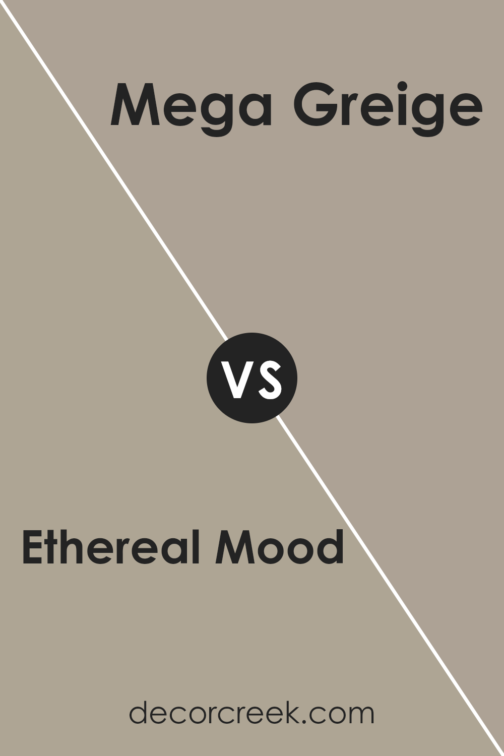
Ethereal Mood SW 7639 by Sherwin Williams vs Mega Greige SW 7031 by Sherwin Williams
Ethereal Mood (SW 7639) and Mega Greige (SW 7031) are both neutral shades by Sherwin Williams that offer distinct vibes to a space. Ethereal Mood is a soft, light gray with a hint of warmth that brings an airy and calming feel to a room. It’s versatile, allowing it to blend well with various color schemes, and it’s especially good at enhancing natural light in a space, making rooms feel open and spacious.
On the other hand, Mega Greige is a deeper, warmer greige tone, combining gray and beige. This color provides a cozy and inviting atmosphere, adding depth and richness to a room. It’s ideal for creating a warm backdrop and pairs beautifully with both traditional and modern décor.
While Ethereal Mood suits spaces aiming for a light, delicate feel, Mega Greige gives rooms a more grounded, warm appearance. Both colors are excellent choices but cater to different moods and styles.
You can see recommended paint color below:
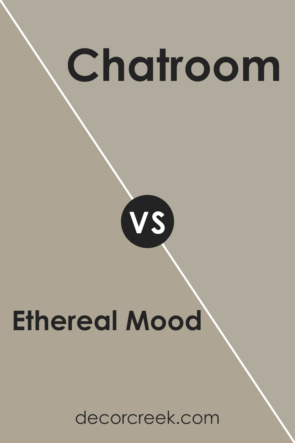
Ethereal Mood SW 7639 by Sherwin Williams vs Chatroom SW 6171 by Sherwin Williams
Ethereal Mood (SW 7639) and Chatroom (SW 6171) by Sherwin Williams are two distinctive paint choices. Ethereal Mood is a soft gray with subtle blue undertones, giving it a cool, airy appearance. It’s a versatile neutral that fits well in spaces where you want a calm and gentle atmosphere. It works nicely with other soft colors and can make a room feel open and relaxing.
Chatroom, on the other hand, is a warmer greenish-gray. It has a cozy, earthy feel, which can make a room feel more inviting and grounded. This color pairs well with natural elements like wood and can give a space a welcoming vibe.
While Ethereal Mood has a more modern and light feel, Chatroom brings more warmth and comfort. Both colors are flexible and can be used in various settings, but the choice depends on whether you prefer the cool, airy quality of Ethereal Mood or the warm, cozy nature of Chatroom.
You can see recommended paint color below:
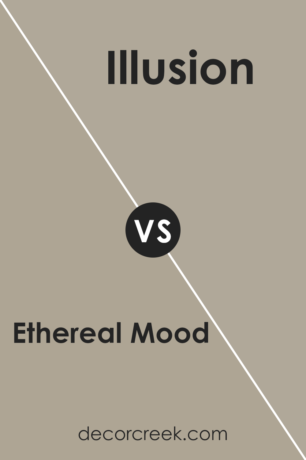
Ethereal Mood SW 7639 by Sherwin Williams vs Illusion SW 9592 by Sherwin Williams
Ethereal Mood SW 7639 by Sherwin Williams is a soft, muted gray that brings a calming and neutral presence to a room. It’s versatile enough to be paired with different colors and suitable for various spaces. This color feels gentle and peaceful, providing a sense of balance and simplicity.
On the other hand, Illusion SW 9592 by Sherwin Williams is a light, pastel shade with a subtle blue tint. It offers a fresh and airy feel, ideal for spaces where you want a touch of color without overwhelming brightness. This shade is light and uplifting, adding a bit of softness.
When comparing the two, Ethereal Mood is a more grounded and stable color, while Illusion is brighter and more playful. Ethereal Mood can work well in living areas or bedrooms for a neutral background, whereas Illusion can be used in spaces that need a light, airy feel, like bathrooms or kitchens.
You can see recommended paint color below:
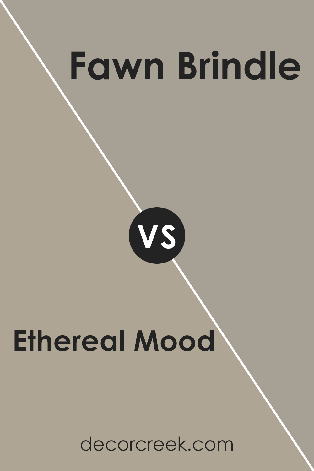
Ethereal Mood SW 7639 by Sherwin Williams vs Fawn Brindle SW 7640 by Sherwin Williams
Ethereal Mood SW 7639 and Fawn Brindle SW 7640 by Sherwin Williams are two beautiful, nature-inspired colors that create different feels in a space. Ethereal Mood is a soft, muted gray with subtle green undertones. It gives a room a calm and light atmosphere, making it feel airy and spacious. It’s a versatile color that can pair well with both warm and cool tones, making it a flexible choice for various design styles.
On the other hand, Fawn Brindle is a warm taupe with a bit of a green undertone. It feels more grounded and earthy compared to Ethereal Mood. While both colors are neutral, Fawn Brindle has a cozy and inviting quality, making it perfect for spaces where you want to create a sense of warmth and comfort.
Both colors have their own charm, but Ethereal Mood leans towards a fresher, lighter feel, while Fawn Brindle offers warmth and coziness.
You can see recommended paint color below:
Conclusion
After reading about SW 7639 Ethereal Mood by Sherwin Williams, I think it’s a really cool color. It’s a neat shade because it isn’t too bright and isn’t too dull – it’s just right. Imagine a soft gray mixed with a bit of greenish magic. This color can make any room look fresh and peaceful, almost like a gentle hug from your favorite blanket.
What I like most about Ethereal Mood is how it can fit in any room. Whether it’s the living room where you hang out with your family, the kitchen where you eat your favorite snacks, or even your bedroom where you dream away, this color seems to play well everywhere. It doesn’t clash with things. Instead, it helps everything look calm and nice.
For people who like decorating, Ethereal Mood offers a great way to change how things look, without going wild with colors. Imagine it as a friendly helper that makes things prettier, without stealing the show. You can use it on walls, or maybe on some furniture too. It also matches with any decorations you love, whether they are bright and fun or calm and cozy.
Overall, Ethereal Mood by Sherwin Williams seems like that perfect color buddy to make any room feel just nice and comfy.

Ever wished paint sampling was as easy as sticking a sticker? Guess what? Now it is! Discover Samplize's unique Peel & Stick samples.
Get paint samples

