Discover the subtle charm and elegance of SW 9592 Illusion, a captivating paint color from Sherwin-Williams that embodies the perfect blend of sophistication and versatility. This unique shade stands out in Sherwin-Williams’ expansive palette, offering a hue that is both enigmatic and profoundly graceful.
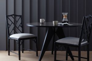
Illusion lends itself to a wide range of interior spaces, adding depth and character to walls, cabinets, and accents alike.
The allure of SW 9592 Illusion lies in its ability to harmonize with various decor styles and color schemes. Whether you’re looking to create a serene retreat in a bedroom or aiming for an impactful statement in a living area, Illusion adapts effortlessly, reflecting subtle shifts in lighting and ambiance throughout the day.
This quality makes it an exemplary choice for those seeking a color that marries the timeless with the contemporary, bringing a layer of tranquil sophistication to any room.
Design professionals and homeowners alike praise Illusion for its unmatched versatility and stunning aesthetic. As part of Sherwin-Williams’ array of colors, it stands out for its depth and complexity, offering an inviting backdrop that enhances both minimalistic and richly decorated spaces.
Exploring SW 9592 Illusion by Sherwin-Williams opens up a world of design possibilities, where elegance and warmth convene to create truly captivating environments.

What Color Is Illusion SW 9592 by Sherwin Williams?
Illusion, marked by its code SW 9592, is a captivating hue from Sherwin Williams that effortlessly balances between a serene backdrop and a statement maker in various interior spaces. This versatile color exhibits a subtle interplay of light and shadow, morphing from a muted lavender to a soft, dusky violet under different lighting conditions.
Its understated elegance makes it a perfect candidate for creating soothing environments that invite relaxation and introspection.
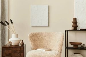
In terms of interior styles, Illusion seamlessly complements contemporary, modern minimalism, as well as more traditional and transitional decors. This color’s soft neutrality provides a sophisticated canvas against which bold textures and patterns can stand out or, conversely, can create a harmonious blend with more understated design elements.
When considering materials, Illusion pairs exquisitely with natural wood grains, from light oak to richer walnuts, enhancing their warmth. Metal accents in brushed nickel or soft gold tones further elevate this color, introducing a touch of luxury and refinement.
For textures, think of pairing Illusion with plush velvets or soft linens to maximize its cozy yet elegant vibe. The color also works well with matte finishes on walls or furniture, which contrast beautifully against the silky sheens of satin draperies or glossy ceramics.
Whether applied as a primary palette or as an accent feature, Illusion brings a depth and sophistication to interiors, proving its versatility and timeless appeal.
Ever wished paint sampling was as easy as sticking a sticker? Guess what? Now it is! Discover Samplize's unique Peel & Stick samples.
Get paint samples

Is Illusion SW 9592 by Sherwin Williams Warm or Cool color?
Illusion, a captivating hue by Sherwin Williams, holds the unique ability to infuse spaces with a sense of mystery and depth. This particular shade navigates the delicate balance between a calming presence and an engaging backdrop in home interiors. Its versatility is one of its most charming attributes, as it can effortlessly adapt from being a focal point in a room to a subtle complementary background for other elements.
In home settings, this color plays with natural and artificial light in an enchanting way, shifting subtly throughout the day to create a dynamic and ever-changing atmosphere. Depending on the room’s orientation and the amount of light it receives, Illusion can appear to morph, offering various faces of its underlying character.
It particularly thrives in spaces that aim for a serene, sophisticated aura yet wish to steer clear of feeling too austere or cold.
This color’s impact on a home is multifaceted. It can expand the perceived size of a space when used liberally, thanks to its ability to blur boundaries and corners. Simultaneously, when applied in smaller doses or as an accent, it introduces a layer of depth and intrigue, perfect for creating points of interest.
Its adaptability makes it an excellent choice for those aiming for a design that feels both timeless and momentous.
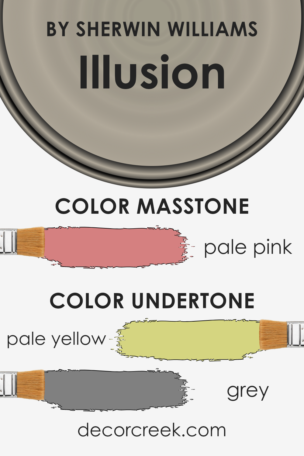
Undertones of Illusion SW 9592 by Sherwin Williams
The color Illusion is a unique hue known for its versatility and subtle complexity. One of its defining features is the presence of pale yellow and grey undertones, which significantly influence its appearance under different lighting conditions and when paired with various decor elements.
Undertones are essentially subtle colors that lurk beneath the surface of the primary color, affecting its warmth, coolness, and the overall mood it conveys. They play a crucial role in how we perceive color, often acting as a chameleon that can subtly shift in appearance.
Pale yellow undertones bring a touch of warmth and brightness to Illusion, infusing spaces with a soft, inviting glow. This warmth makes it particularly appealing for living spaces, where a cozy and welcoming atmosphere is desired. The grey undertones, on the other hand, introduce a sense of balance and neutrality.
They ensure that the color remains sophisticated and versatile, without veering too far into the realm of being overly warm or cold.
When applied to interior walls, the interplay of these undertones with natural and artificial light becomes evident. In rooms with abundant daylight, the pale yellow undertones can make the walls seem brighter and more vibrant, enhancing the feeling of openness and airiness.
In contrast, in spaces with limited natural light or during the evening when artificial lighting takes over, the grey undertones can emerge more prominently, lending a tranquil and grounded feel to the room.
This dynamic ability to shift mood makes Illusion an exceptional choice for those seeking a paint color that adapts to different settings and times of day, ensuring the space remains engaging and harmonious.
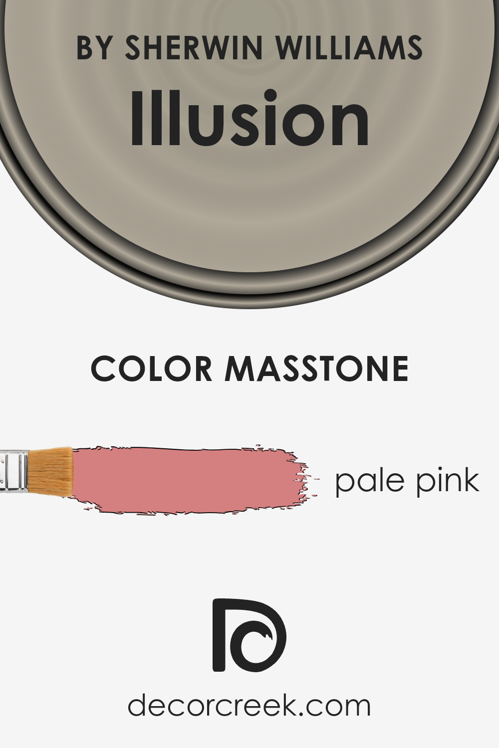
What is the Masstone of the Illusion SW 9592 by Sherwin Williams?
IllusionSW 9592 by Sherwin Williams, showcasing a masstone of Pale Pink (#D58080), introduces a distinctly warm and inviting aura into home interiors.
This particular hue transcends the typical restrictions of color, blending seamlessly into a variety of design themes from modern minimalism to cozy cottage and even vintage glamour.
Its inherent softness makes it an ideal backdrop for spaces aiming to evoke a sense of calm and serenity, such as bedrooms and bathrooms.
Moreover, its understated elegance allows for versatile pairing with both bold and subtle color palettes, ensuring that it can adapt easily as decor trends evolve.
When applied to walls, this pale pink shade creates an illusion of spaciousness, making it particularly effective in smaller rooms or areas lacking in natural light.
The psychology behind this color choice also plays a significant role; pink tones are often associated with nurturing and comforting feelings, making a home feel more welcoming and secure.
This color works to subtly enhance the emotional well-being of inhabitants, contributing to a harmonious living environment. Its adaptability and positive psychological impact make it a wise choice for those looking to infuse their homes with a gentle and inviting atmosphere.
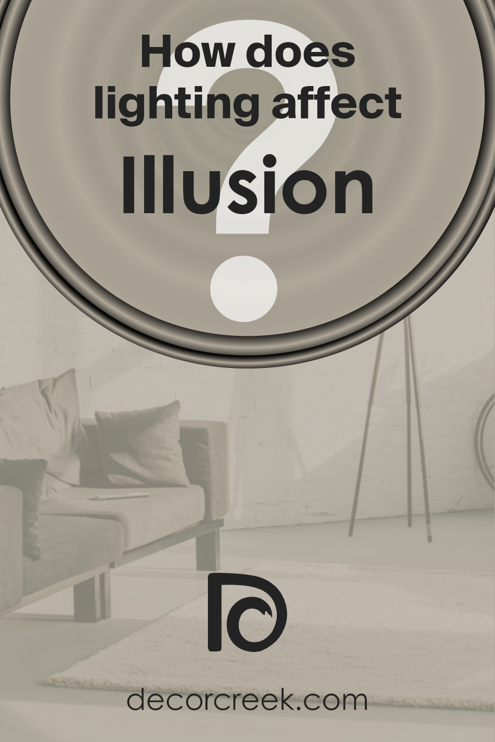
How Does Lighting Affect Illusion SW 9592 by Sherwin Williams?
Lighting plays a pivotal role in how we perceive colors, profoundly influencing the appearance and ambiance of a space. This phenomenon can be clearly observed with paint colors, and understanding the intricate relationship between light and color can greatly enhance interior design decisions.
Natural light, emanating from the sun, changes in quality and intensity throughout the day. It ranges from the warm hues of sunrise and sunset to the bright, cooler midday light. Artificial light, on the other hand, comes in various forms such as fluorescent, LED, and incandescent, each casting different hues and intensities.
The type of lighting can either warm up or cool down a color, affecting how it is perceived.
A thoughtful example of how lighting impacts color perception is the paint color Illusion. This sophisticated hue can transform under different lighting conditions due to its unique undertones.
In spaces bathed in natural light, Illusion radiates warmth and depth, showcasing its complex interplay with the varying qualities of sunlight throughout the day.
In north-facing rooms, which receive cooler, softer light, Illusion may appear more subdued, with its subtle undertones becoming more pronounced, lending the room a serene and tranquil ambiance.
South-facing rooms, awash with warmer, more intense light, will make the color appear brighter and more vibrant, exuding warmth and energy.
East-facing rooms enjoy the gentle warmth of morning light, which highlights the color’s warmth, making it look inviting in the morning and cooler as the day progresses.
In contrast, west-facing rooms are flooded with the golden hues of the setting sun, intensifying the color’s warmth and depth in the afternoon and evening.
In artificial lighting, the impression of Illusion varies: under warm, incandescent light, it may appear richer and more dynamic, while fluorescent lighting can bring out its cooler undertones, showcasing the color’s versatility and adaptability to different lighting conditions.
This ability of Illusion to morph under various lights makes it an intriguing choice for interior spaces, demonstrating the profound impact of lighting on color perception.
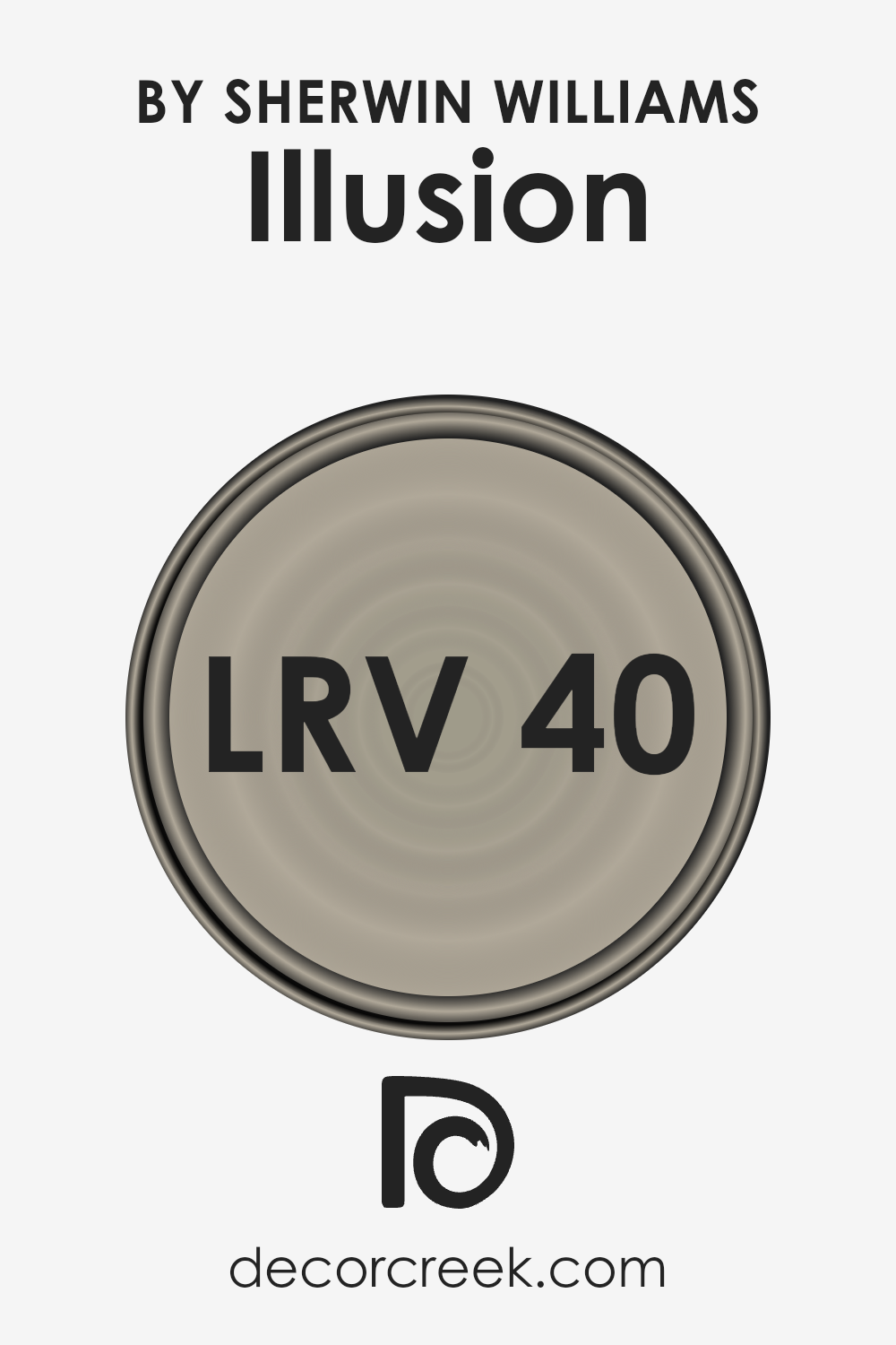
What is the LRV of Illusion SW 9592 by Sherwin Williams?
LRV, which stands for Light Reflectance Value, is a crucial measure used to determine how much light a paint color reflects or absorbs in a given space.
Essentially, it’s a scale ranging from 0 to 100, with 0 being completely absorptive (meaning it reflects no light and is typically a deep, pure black) and 100 being entirely reflective (akin to a perfect, bright white).
This value helps designers, painters, and homeowners make informed decisions about how a particular paint color will behave under different lighting conditions.
For instance, colors with higher LRVs make rooms feel more spacious and airy as they reflect more light, improving the overall illumination of the space. Conversely, colors with lower LRVs create a cozier, more intimate atmosphere by absorbing more light.
Regarding the specific color in question, with an LRV of 39.612, it occupies a middle ground on the spectrum. This means it has a balance of light absorption and reflection properties.
In practical terms, this moderate LRV allows the color to bring warmth and depth to a space without making it feel enclosed or overly dark.
It possesses the versatility to adapt well to various lighting conditions, although its perception can significantly change from day to night and under artificial lighting.
During the day, natural light can enhance its depth, making the color appear more vivid and dynamic. In contrast, under artificial lighting, it may present a softer, more muted quality.
This level of LRV is particularly beneficial in rooms needing a balance between coziness and spaciousness, allowing for a wide range of design flexibility.
LRV – what does it mean? Read This Before Finding Your Perfect Paint Color
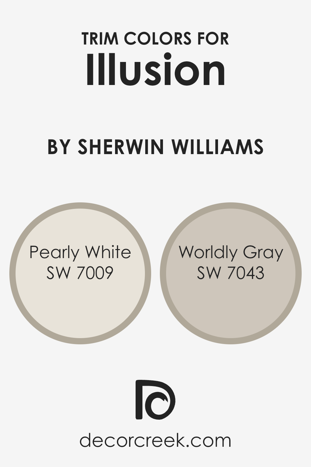
What are the Trim colors of Illusion SW 9592 by Sherwin Williams?
Trim colors are an essential aspect of interior and exterior design, serving as a defining line that accentuates architectural details, frames features like windows and doors, and can even alter the perception of a space’s size and shape.
When used thoughtfully, trim colors can add depth, contrast, and harmony to a room.
For a color like Illusion, a sophisticated and nuanced hue, selecting the right trim color is crucial to either softly complement or boldly define the transitions between walls and other surfaces.
Using trim colors effectively can transform a room from ordinary to captivating, elevating the overall aesthetic and enhancing the visual appeal of the paint like Illusion.
Pearly White, with its gentle and airy quality, offers a subtle contrast that can make Illusion feel more grounded without overpowering its unique charm.
This trim color adds a soft, almost ethereal frame to rooms, enhancing natural light and creating a seamless transition between wall colors and architectural elements.
On the other hand, Worldly Gray presents a sturdier, more defined boundary for Illusion, adding depth and sophistication to the space.
Its earthy undertones provide a solid foundation that allows Illusion to stand out, enriching the room’s palette and adding a layer of complexity.
Together, Pearly White and Worldly Gray as trim colors offer versatile options to either soften or define spaces painted with Illusion, ultimately affecting the room’s mood and perceived dimensions.
You can see recommended paint colors below:
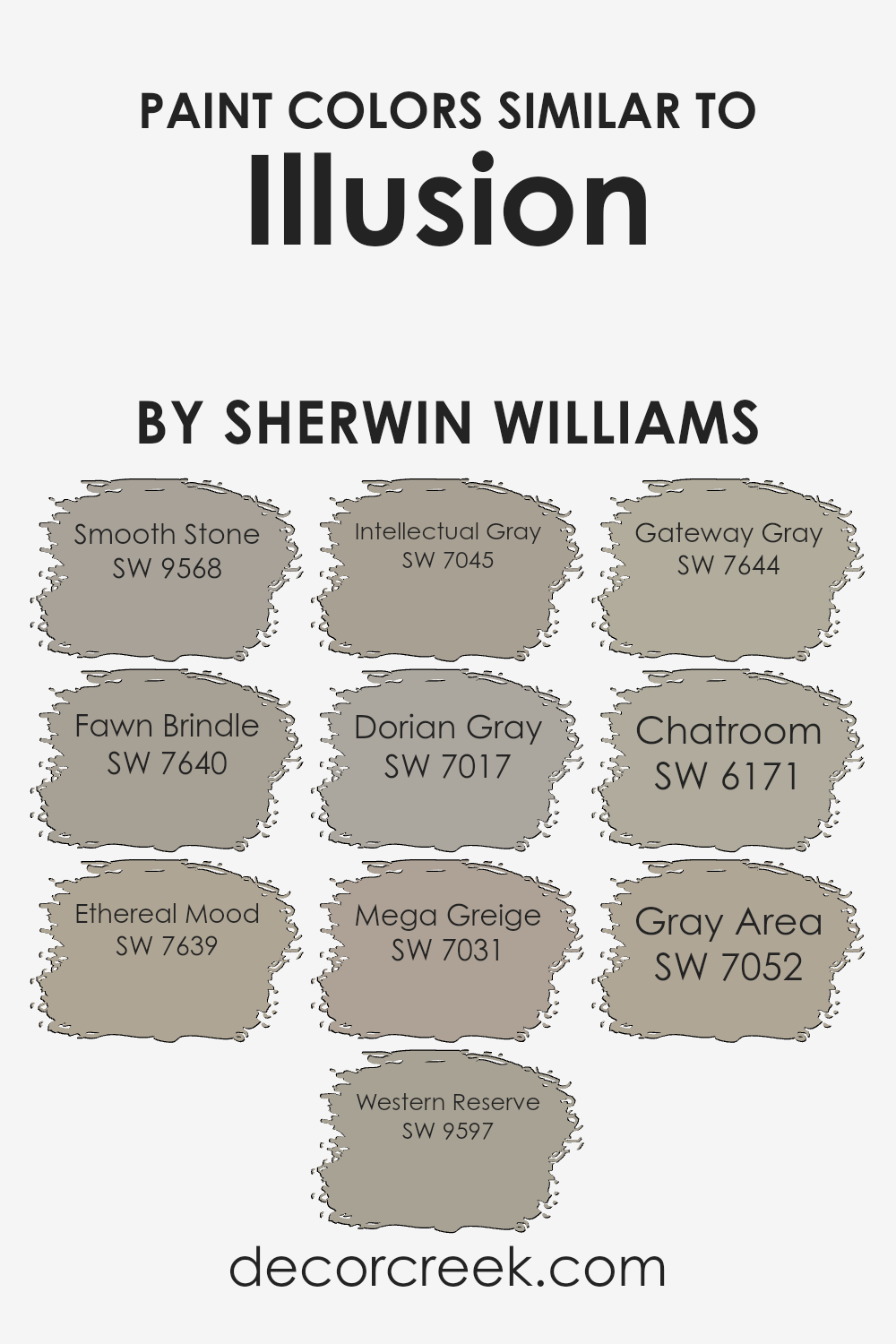
Colors Similar to Illusion SW 9592 by Sherwin Williams
Similar colors play a vital role in creating a harmonious and visually cohesive space, especially when drawing inspiration from a specific hue like Illusion by Sherwin Williams. These colors, although distinct, share a commonality in tone or undertone that allows them to blend seamlessly with one another, providing a sophisticated and layered look.
For instance, Smooth Stone offers a soft, warm backdrop that exudes tranquility, making it an ideal base or companion to richer shades.
Fawn Brindle, on the other hand, introduces a deeper, more complex alternative that echoes the natural world, adding depth and interest without overwhelming. Ethereal Mood, as its name suggests, brings a light, airy quality to spaces, acting as a subtle nod to elegance and serenity.
Western Reserve and Intellectual Gray are more grounded, offering a muted sophistication that anchors a room while still playing nicely with lighter or darker shades. Dorian Gray, with its timeless appeal, provides a perfect balance between light and dark, making it versatile for various decorating styles.
Mega Greige and Gateway Gray stand out for their ability to bridge the gap between greys and beiges, offering warmth and neutrality, respectively. These shades are particularly adept at creating a cozy, inviting atmosphere that feels both modern and timeless.
Chatroom adds an element of conversation to the mix, with its hint of green undertone that works well in spaces seeking a touch of uniqueness without straying too far from the familiar.
Finally, Gray Area is the quintessential middle ground, embodying the balance between shadow and light, making it an excellent choice for those seeking a soft, neutral canvas that is both elegant and effortlessly adaptable.
Together, these colors demonstrate how variations on a theme can enhance the beauty and cohesion of a space, allowing for creative expression that is both unified and distinct.
You can see recommended paint colors below:
- SW 9568 Smooth Stone
- SW 7640 Fawn Brindle
- SW 7639 Ethereal Mood
- SW 9597 Western Reserve
- SW 7045 Intellectual Gray
- SW 7017 Dorian Gray
- SW 7031 Mega Greige
- SW 7644 Gateway Gray
- SW 6171 Chatroom
- SW 7052 Gray Area
How to Use Illusion SW 9592 by Sherwin Williams In Your Home?
Illusion by Sherwin Williams is a captivating paint color renowned for its ability to infuse spaces with a sense of sophistication and depth. This unique hue embodies an elegant blend of tones, making it a versatile choice for a wide range of design styles and home décor themes.
Its subtle charisma can transform any room, creating a backdrop that complements both contemporary and traditional furnishings.
Homeowners can leverage the beauty of Illusion to craft inviting living areas, serene bedrooms, or dynamic workspaces. In the living room, it pairs exquisitely with natural light and soft textiles, crafting an environment that’s both welcoming and chic.
For bedrooms, its soothing essence promotes relaxation and tranquility, making it an ideal choice for creating a peaceful retreat.
Moreover, Illusion’s adaptability means it excels in accentuating architectural details such as molding, trim, and wainscoting, adding a layer of sophistication.
Whether used as a statement wall or enveloping an entire room, this color promises to elevate any interior with its captivating allure.
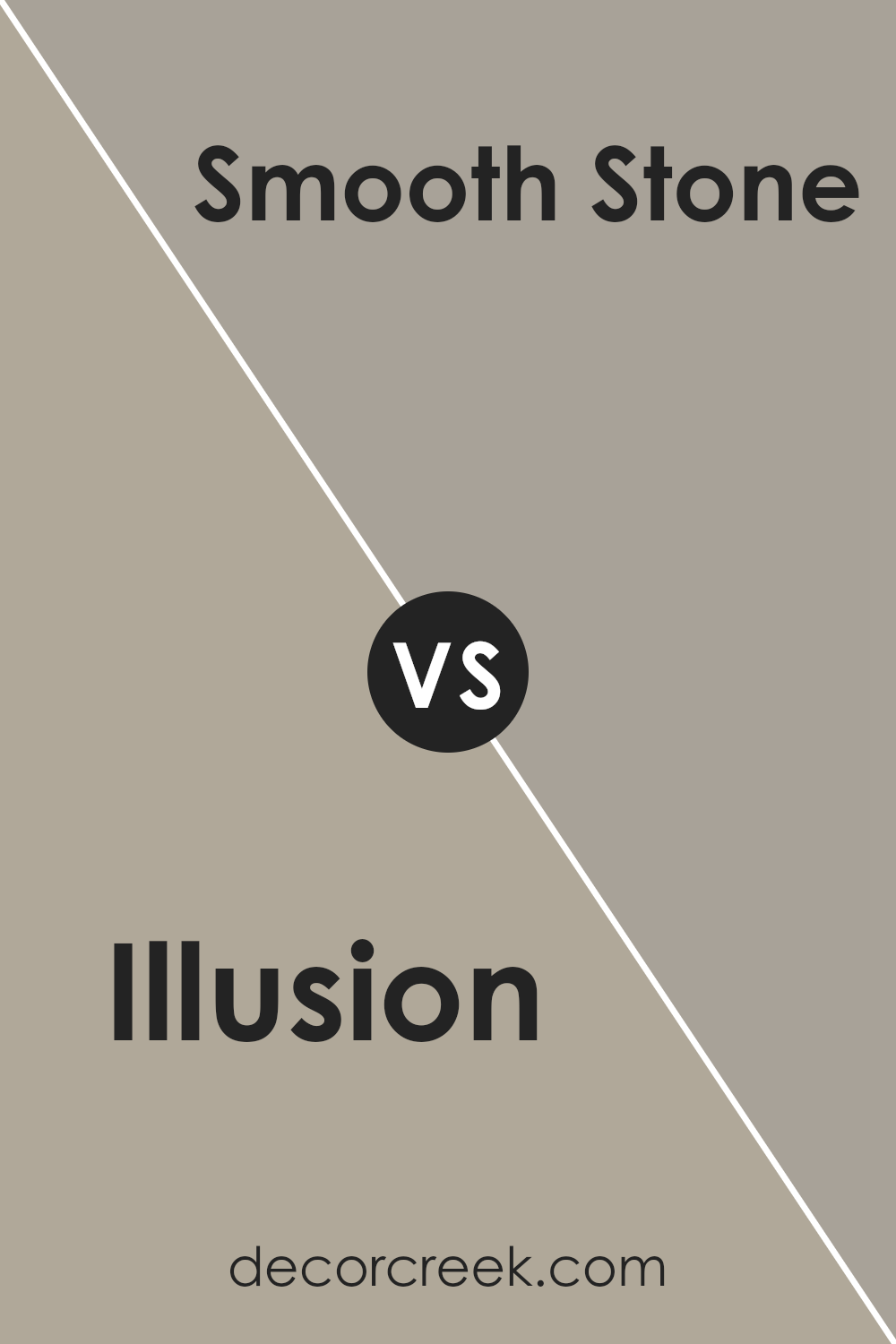
Illusion SW 9592 by Sherwin Williams vs Smooth Stone SW 9568 by Sherwin Williams
Illusion and Smooth Stone , both by Sherwin Williams, present an intriguing comparison, each embodying a unique character. Illusion steps into the space with a subtle, ethereal presence, often perceived as a delicate, nearly translucent hue.
Its lightness brings a dreamy, airy quality to spaces, making it excellent for creating a sense of openness and serenity. In contrast, Smooth Stone, as its name suggests, offers a solid, grounded feel.
This color has a slightly warmer tone, reminiscent of natural stone, providing a comforting and stable atmosphere. Its earthy essence makes it particularly adept at adding a touch of understated elegance to any room.
When comparing the two, it becomes evident that Illusion is suited for achieving a lighter, more whimsical ambiance, whereas Smooth Stone leans towards a cozy, more inviting warmth.
Both colors offer versatility, but the choice between them hinges on the desired emotional and aesthetic impact in a space.You can see recommended paint color below:
- SW 9568 Smooth Stone
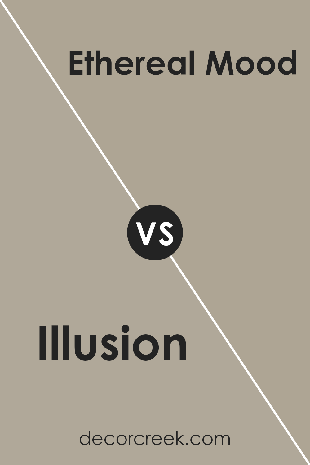
Illusion SW 9592 by Sherwin Williams vs Ethereal Mood SW 7639 by Sherwin Williams
Illusion and Ethereal Mood , both from Sherwin Williams, provide distinct yet complementary aesthetics for interior spaces. Illusion is a deeper, more assertive color.
It embodies a sense of mystique and depth, making it an excellent choice for areas in need of a strong, captivating visual focus.
Its richness can add a layer of sophistication and warmth to rooms, lending them an enveloping, cozy feel.
On the other hand, Ethereal Mood stands out for its soft, airy quality. This color, with its light and neutral undertone, brings a tranquil and serene atmosphere to any space. It is particularly well-suited for creating a relaxed environment, perfect for bedrooms or living areas where calmness is prized.
Ethereal Mood can serve as a subtle backdrop, enhancing decor without overwhelming it.
When comparing these two, the contrast lies primarily in their intensity and emotional impact. Illusion invites depth and drama, while Ethereal Mood promotes a sense of openness and peace, making them suitable for different moods and settings.
You can see recommended paint color below:
- SW 7639 Ethereal Mood
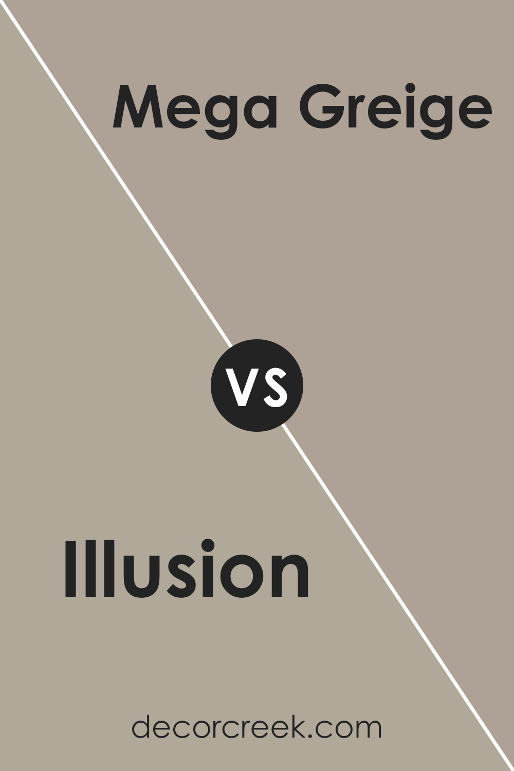
Illusion SW 9592 by Sherwin Williams vs Mega Greige SW 7031 by Sherwin Williams
Illusion and Mega Greige , both from Sherwin Williams, present a captivating study in contrast and harmony.
Illusion, a soft, airy hue, embodies an almost ethereal quality, suggesting a lightness and an uplifting spaciousness in spaces it adorns. Its understated elegance is reminiscent of the early morning sky, offering a backdrop that both soothes and inspires.
In contrast, Mega Greige brings a robust depth to interiors, with its blend of gray and beige offering a warm, grounding presence. This color is adept at creating a cozy, inviting atmosphere, making it ideal for living areas where comfort is key.
While Illusion offers a breath of fresh air and opens up a room, Mega Greige anchors and defines, providing a sophisticated counterbalance.
Together, these colors can create a dynamic and harmonious space, where the lightness of Illusion uplifts, and the solidity of Mega Greige comforts.
You can see recommended paint color below:
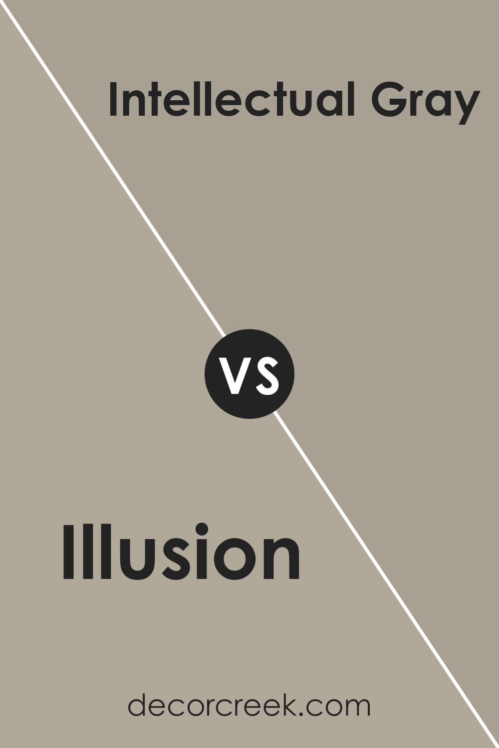
Illusion SW 9592 by Sherwin Williams vs Intellectual Gray SW 7045 by Sherwin Williams
Illusion and Intellectual Gray , both from Sherwin Williams’ color palette, present an intriguing comparison. “Illusion” embodies a light, airy feel with a soft, almost mystical quality to it. Its gentle tone can illuminate a room, offering a sense of calmness and serenity.
This color leans towards a nuanced, lighter spectrum, making it ideal for spaces intended to feel open and refreshing.
On the other hand, “Intellectual Gray” moves towards a more sophisticated and grounded essence. This hue carries a deeper, more refined gray showing versatility in its application. It is perfect for creating an elegant, thoughtful atmosphere in any room.
Intellectual Gray’s subtle warmth allows for a sophisticated backdrop, facilitating a range of decor styles from modern to traditional.
Comparing the two, “Illusion” offers a lighter, more ethereal touch, promoting a sense of spaciousness. In contrast, “Intellectual Gray” serves more as a statement of depth and complexity, providing a solid foundation for styling and decoration. The choice between them depends on the intended ambiance: one is uplifting and the other, deeply grounding.
You can see recommended paint color below:
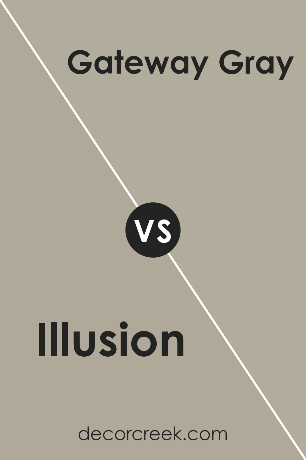
Illusion SW 9592 by Sherwin Williams vs Gateway Gray SW 7644 by Sherwin Williams
Illusion and Gateway Gray , both colors from Sherwin Williams, present subtle yet distinguishing characteristics that make them unique. Illusion is a lighter, more nuanced color that carries a soft, ethereal quality.
It’s almost like a whisper of gray, imbued with a hint of lavender or pink, giving it a delicate, airy feel.
This color can illuminate and expand spaces, making it ideal for creating a serene, inviting environment.
In contrast, Gateway Gray is a deeper, more pronounced shade. It embodies a robust, earthy gray with warm undertones, suggesting a sense of stability and grounding.
Unlike the ethereal nature of Illusion, Gateway Gray offers a strong foundation, making it perfect for spaces that aim to convey sophistication and depth.
When comparing the two, the distinction lies in their lightness and mood. Illusion brings a lightness and subtle vibrancy, enhancing spaces with a gentle, uplifting aura.
Gateway Gray, conversely, provides depth and warmth, lending a comforting, enveloping feel to interiors.
Both colors offer unique aesthetic benefits, allowing them to cater to different design preferences and atmosphere desires.
You can see recommended paint color below:
- SW 7644 Gateway Gray
Illusion SW 9592 by Sherwin Williams vs Chatroom SW 6171 by Sherwin Williams
The main color, Illusion, is a gentle and ethereal hue that carries a soft, almost dreamlike quality. Its subtle undertones offer a soothing backdrop, making it an excellent choice for creating a serene and inviting environment.
The delicacy of Illusion lends itself well to spaces seeking a touch of elegance and tranquility.
In contrast, Chatroom is a deeper, more grounded color. It exudes a sense of calm and stability, with its earthy tones grounding any space it inhabits. Chatroom’s richness provides a strong anchor, making it ideal for areas in need of depth and character.
When comparing the two, Illusion and Chatroom offer different atmospheres due to their contrasting intensities and undertones.
Illusion brings a light, airy feel, perfect for imbuing a space with an open and light-hearted ambiance. Chatroom, on the other hand, offers solidity and warmth, creating cozy and inviting environments with its richer, more robust shade.
Together, they can harmonize within a design scheme, offering a balanced interplay between ethereal lightness and comforting depth.
You can see recommended paint color below:
- SW 6171 Chatroom
Illusion SW 9592 by Sherwin Williams vs Dorian Gray SW 7017 by Sherwin Williams
Illusion and Dorian Gray , both from Sherwin Williams, offer distinctive hues, each encapsulating a unique appeal. Illusion presents a light, airy quality, almost ethereal, with a subtle hint of pastel that brings a soft, welcoming touch to any space.
Its delicate nature complements natural light beautifully, making it an excellent choice for creating a serene, uplifting atmosphere.
On the other hand, Dorian Gray embodies a more grounded, sophisticated essence. This mid-tone gray carries a warm, earthy undertone that adds a layer of cozy elegance to interiors.
The shadowy depth of Dorian Gray makes it incredibly versatile, fitting seamlessly into modern, minimalistic designs or traditional settings, adding richness and character.
While Illusion invites openness and light, enhancing spaces with a whisper of color, Dorian Gray offers a sturdy, refined backdrop, anchoring spaces with its stately presence.
Together, they cater to diverse aesthetic preferences, from airy and delicate to robust and sophisticated.
You can see recommended paint color below:
Illusion SW 9592 by Sherwin Williams vs Western Reserve SW 9597 by Sherwin Williams
Illusion and Western Reserve , both from Sherwin Williams, present a fascinating comparison in their hues. Illusion, a muted tone, whispers of soft, airy spaces, imbuing them with a serene, almost ethereal quality.
It is the kind of color that plays well with light, changing subtly from dawn to dusk, and lends itself to creating a calm, restful environment.
Its understated elegance makes it ideal for living spaces or bedrooms where a peaceful atmosphere is desired.
Western Reserve, on the other hand, offers a bolder statement. It’s a color with a bit more depth and richness, evoking the robust character of natural landscapes.
This color brings a sense of groundedness and stability, perfect for areas in a home that crave a touch of sophistication without overwhelming the senses.
When used in interior design, it can offer a striking contrast to lighter hues or work in harmony with other deep, rich colors to create a warm, inviting space.
Together, these colors can complement each other very well, with Illusion providing a soft, luminous backdrop to the more assertive and earthy tones of Western Reserve.
This pairing can create a dynamic yet balanced aesthetic, suitable for those looking to blend tranquility with a touch of drama in their décor.
You can see recommended paint color below:
- SW 9597 Western Reserve
Illusion SW 9592 by Sherwin Williams vs Gray Area SW 7052 by Sherwin Williams
The main color, Illusion, and the second color, Gray Area , both from Sherwin Williams, present intriguing nuances when compared.
Illusion is a captivating, light shade that exerts a soft and ethereal presence. It suggests a sense of serenity and openness, making it perfect for creating a calm and inviting space.
Its subtle undertones can gracefully enhance the natural light in a room, evoking an airy and refreshing ambiance.
On the other hand, Gray Area stands as a more assertive color. This medium-toned gray harbors a robust character that adds depth and sophistication to any space.
It’s a versatile shade that can serve as a strong foundation for various color schemes, bridging lighter and darker hues with ease.
The inherent strength of Gray Area lies in its adaptability—it can anchor a room while maintaining a harmonious balance with other elements.
When comparing the two, the difference in lightness and mood is apparent. Illusion brings a lighter, more delicate touch, ideal for a peaceful retreat, while Gray Area offers a grounded, steadier feel, suitable for creating a statement or fostering a sense of gravitas.
Both shades embody the quality and versatility Sherwin Williams is known for, allowing for creative staging and personal expression in interior spaces.
You can see recommended paint color below:
- SW 7052 Gray Area
Illusion SW 9592 by Sherwin Williams vs Fawn Brindle SW 7640 by Sherwin Williams
Illusion and Fawn Brindle , both from Sherwin Williams, present a fascinating study in muted elegance, albeit through different shades.
Illusion, on one hand, is a light, airy hue that delicately balances between a soft lavender and a serene grey, offering a hint of whimsy and sophistication to any space.
It reflects a certain ethereality and lightness, making it perfect for creating a soothing and slightly imaginative atmosphere.
Conversely, Fawn Brindle anchors itself in a more grounded, organic aesthetic. This color is a rich blend of grey and brown, evoking the natural beauty of aged wood or stone. It’s a color that speaks of stability, reliability, and an understated strength, bringing a sense of calm and solidity to interiors.
When comparing the two, Illusion appears more as a breath of fresh air—light and dreamy, ideal for spaces seeking a touch of softness. In contrast, Fawn Brindle provides depth and warmth, perfect for creating cozy, welcoming environments.
Together, they can complement each other beautifully, blending the ethereal with the earthy, allowing for a diverse yet harmonious color palette.
You can see recommended paint color below:
- SW 7640 Fawn Brindle

Conclusion
The article on Sherwin Williams’ color, Illusion SW 9592, provides an insightful exploration into this unique shade’s aesthetics and application potential.
Illusion stands out as a versatile hue, capable of adding depth and intrigue to various spaces. This particular shade embodies the balance between boldness and subtlety, making it suitable for both accent pieces and larger surface areas.
Its ability to transform spaces, adapting to different lighting conditions and complementing an array of decor styles, underscores its versatility.
Whether aiming for a statement wall or a cohesive color scheme, Illusion proves to be a compelling choice for designers and homeowners alike.
Moreover, the discussion on its practical applications demonstrates how this color can enhance the ambiance of a room, influencing perceptions and emotions.
By leveraging Illusion, spaces can be curated to feel more inviting, expansive, or cozy, depending on the desired effect. The article concludes that, beyond its aesthetic appeal, Illusion offers a dynamic tool for creative expression within interior design.
Its capacity to evoke and transform makes it more than just a color choice; it’s an integral component in crafting atmospheres that resonate on a personal level.
This depth of potential cements Illusion’s standing as a noteworthy option in the palette of interior design solutions.
Ever wished paint sampling was as easy as sticking a sticker? Guess what? Now it is! Discover Samplize's unique Peel & Stick samples.
Get paint samples