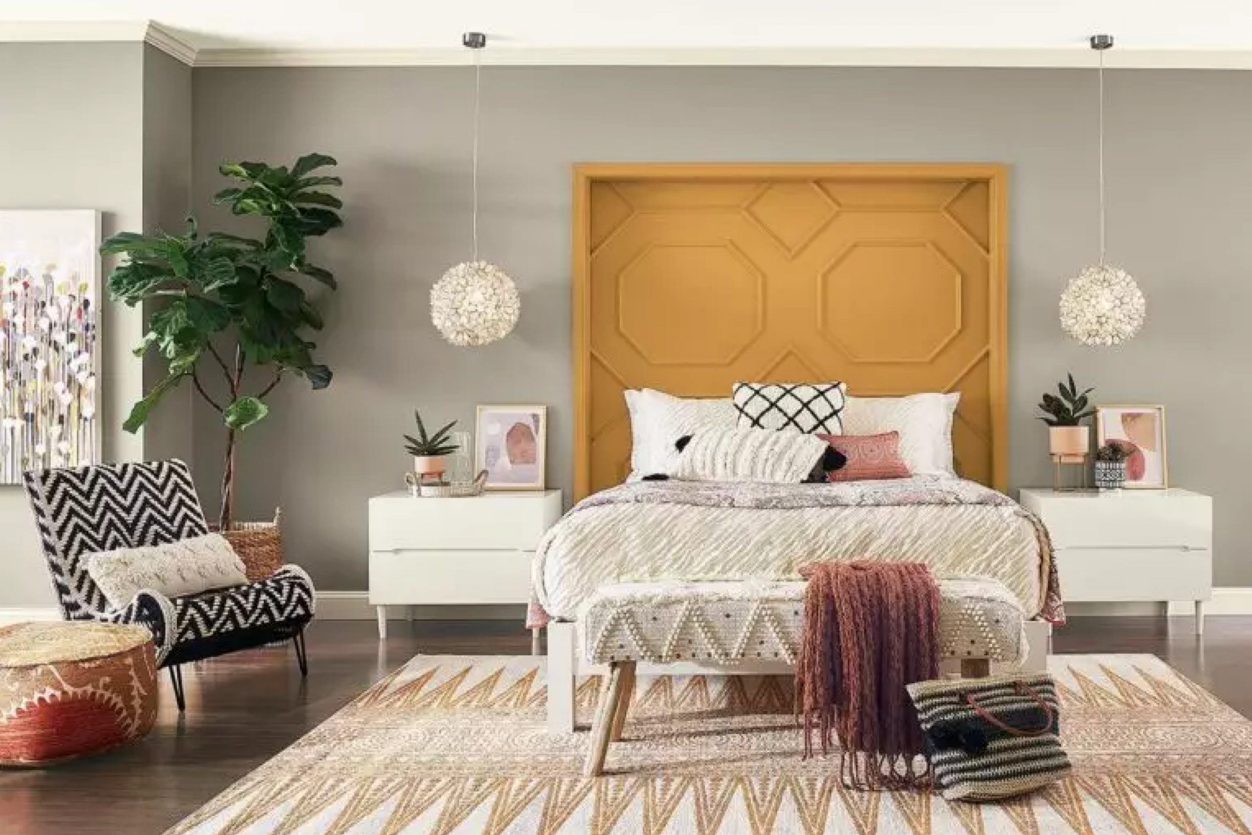
What I love about Fawn Brindle is its versatility—it can effortlessly suit both modern and traditional settings.
In my experience, it works well as a backdrop, adding depth without overwhelming the space. Whether I’m refreshing a living room or updating a cozy bedroom, this color gently complements my furniture and decor. It somehow manages to feel both grounding and elegant, making any space feel inviting.
One of my favorite aspects of Fawn Brindle is how it adapts to different lighting conditions.
During the day, it reflects light beautifully, adding warmth to the room. In the evening, it deepens in tone, creating a cozy and relaxed atmosphere. Each time I use this color, it brings a sense of calm and balance to my surroundings. It’s become a go-to choice for bringing a natural, subdued elegance to my home.
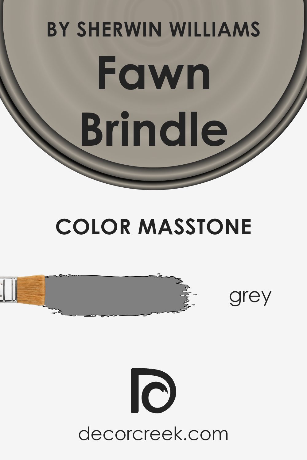
What Color Is Fawn Brindle SW 7640 by Sherwin Williams?
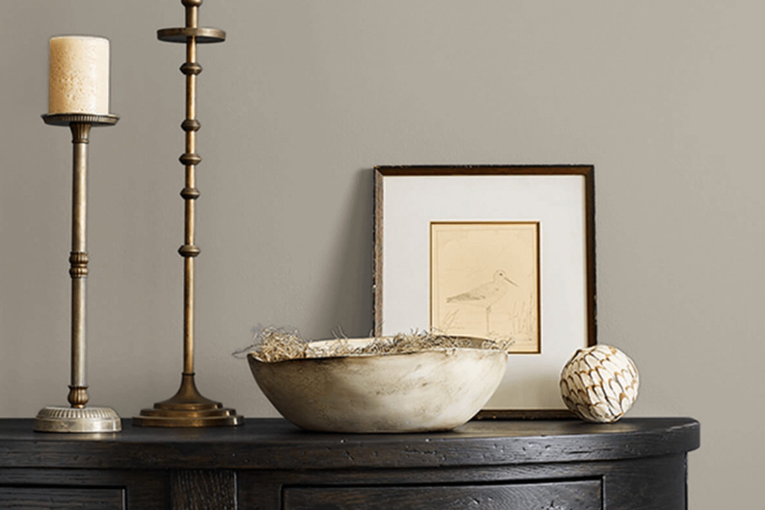
Fawn Brindle is a charming color from Sherwin Williams, identified by the code SW 7640. It is a warm, earthy tone that sits comfortably between grey and brown, making it incredibly versatile for many home interiors. The subtlety of this color offers a cozy and inviting feel, working particularly well in styles such as rustic, farmhouse, or contemporary. It brings a sense of warmth to a room without overwhelming it.
In terms of pairing, Fawn Brindle complements natural materials and textures beautifully. Consider pairing it with wooden furniture or floors, as the earthy tones will harmonize well with the natural grain and color variations of wood.
Textured fabrics like linen or cotton in neutral hues can also work nicely, creating a layered and comfy atmosphere. Additionally, Fawn Brindle contrasts strikingly with white trim, allowing architectural details to stand out.
For accents, metals in warm undertones such as bronze or brushed gold can enhance its rich feel without clashing, while greenery can add a fresh, lively touch.
Whether used in living rooms, bedrooms, or even kitchens, this color proves to be a flexible option, offering warmth and elegance to any space.
Is Fawn Brindle SW 7640 by Sherwin Williams Warm or Cool color?
Fawn Brindle by Sherwin Williams is a warm, earthy paint color that brings a sense of coziness and comfort to any room. With its blend of soft brown and gray undertones, it pairs well with a variety of other colors and styles. This versatility makes it a great choice for living rooms, bedrooms, and even kitchens.
It provides a neutral backdrop that allows other elements in the room, like furniture and artwork, to stand out. The color also works well in both natural and artificial lighting, maintaining its warmth throughout the day.
When used in a space, Fawn Brindle can make a room feel inviting and lived-in, without being too dark or overpowering. Its subtle hue can add depth to walls while still feeling fresh and modern. Overall, it’s a popular color choice for those looking to create a warm and welcoming environment in their home.
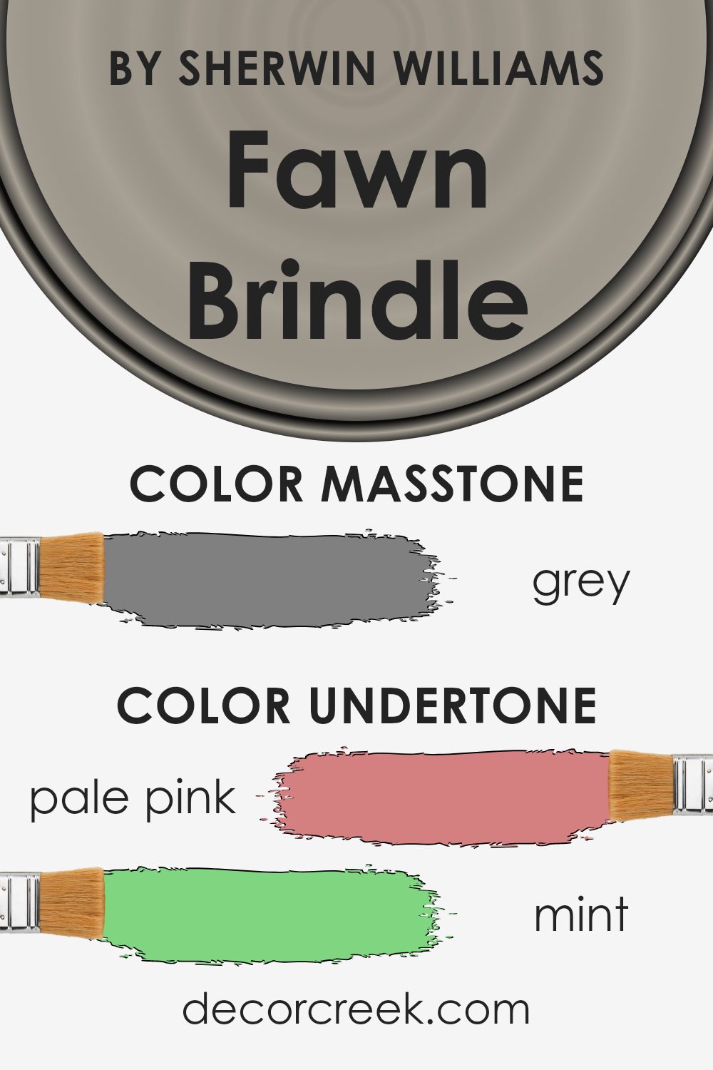
Undertones of Fawn Brindle SW 7640 by Sherwin Williams
Fawn Brindle by Sherwin Williams is a complex color that can change depending on the lighting and surroundings. Its undertones include a mix of pale pink, mint, and other subtle colors, which can affect how it’s perceived.
For instance, in a room with warm lighting, Fawn Brindle may appear slightly warmer or more yellowish because of the pale pink and pale yellow undertones. In contrast, under cooler lighting, the mint, light blue, and light gray undertones might make it look cooler or more muted.
When used on interior walls, Fawn Brindle’s undertones can greatly influence the mood of the room. The pale pink and light purple hints can add a touch of warmth and coziness, making a space feel more inviting. Meanwhile, the mint and light blue tones contribute a refreshing quality that can help in creating a calming environment.
The presence of undertones like olive or dark turquoise might give it an earthy or grounded vibe, which can be very appealing in living rooms or bedrooms.
Overall, the interplay of these undertones means Fawn Brindle can suit a variety of settings. It pairs well with both warm and cool color schemes, adapting to different styles while maintaining a sophisticated and well-balanced appearance.
What is the Masstone of the Fawn Brindle SW 7640 by Sherwin Williams?
Fawn Brindle by Sherwin Williams is a warm gray paint color with a masstone that closely resembles the pure gray color, #808080. This neutral tone makes Fawn Brindle versatile and easy to use in various rooms around the house. The gray masstone gives the color a balanced look, which means it doesn’t lean too heavily towards blue, green, or purple undertones, making it suitable for both modern and traditional interiors.
In homes, this color can make spaces feel calm and neutral, making it a great choice for living rooms, bedrooms, or hallways. Its neutral nature allows it to pair well with both light and dark furnishings, artwork, and accessories, providing a backdrop that can highlight these elements without overwhelming them.
Additionally, Fawn Brindle has just enough warmth to create a cozy atmosphere, making rooms feel welcoming and comfortable. Its flexibility allows homeowners to easily update or change decor without needing to repaint.
How Does Lighting Affect Fawn Brindle SW 7640 by Sherwin Williams?
Lighting can have a big impact on how colors look. Different light sources emit different colors of light, which can change how paint looks on your walls. Fawn Brindle by Sherwin Williams is a soft, neutral color that can look quite different depending on the lighting conditions in a room.
In natural light, Fawn Brindle tends to show its true color, which is a warm, earthy gray with a hint of brown. However, the direction a room faces can change how the color appears.
In north-facing rooms, which generally have cooler light, the color can appear more muted and slightly cooler, taking on a more grayish tone. This kind of light might make Fawn Brindle look less warm but still cozy and inviting.
In south-facing rooms, the light is warmer and more intense. This kind of lighting can bring out the warmer, browner tones in Fawn Brindle, making it look much warmer and sometimes even slightly golden. The intensity of the light can make the color appear brighter and more vibrant.
East-facing rooms have soft, morning light that is slightly cooler, similar to north-facing rooms, but it is generally more direct early in the day. This can make Fawn Brindle seem fresher and cooler in the morning, but warmer and more muted as the day progresses.
West-facing rooms get the warm, golden light of the afternoon and evening. This warm light can make Fawn Brindle look richer and warmer, with the warm tones more pronounced later in the day.
Under artificial light, Fawn Brindle’s appearance can vary widely depending on the type of bulbs used. Incandescent bulbs tend to bring out warm tones, making the paint look cozier and more inviting, while fluorescent or LED lighting might keep it more neutral or even cooler. It’s always a good idea to test colors in your space with the lighting you have.

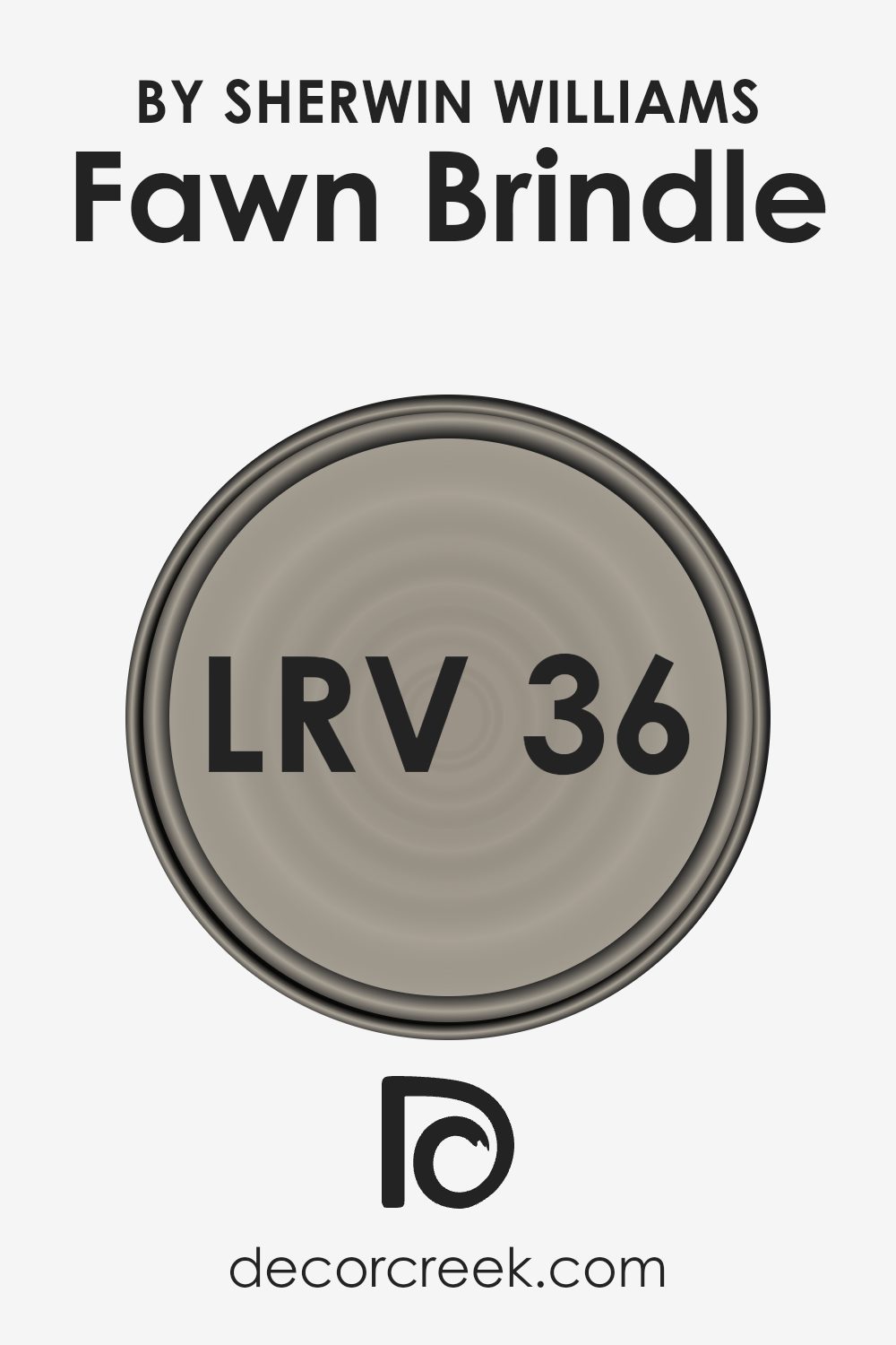
What is the LRV of Fawn Brindle SW 7640 by Sherwin Williams?
Light Reflectance Value, or LRV, is a measure that tells us how much light a color reflects. The scale ranges from 0, which is completely black and reflects no light, to 100, which is pure white and reflects all the light. The higher the LRV, the more light a color will reflect back into the room, making it appear brighter and more open.
On the other hand, colors with lower LRV values reflect less light, resulting in a darker appearance and creating a cozier or more intimate space.
For the color Fawn Brindle by Sherwin Williams, which has an LRV of 35.53, this means it falls on the darker side of the scale. With this lower LRV, the color absorbs more light than it reflects. This can make a room feel warm and inviting, but also slightly dimmer, especially if the space doesn’t get much natural light.
Additionally, in a room that is smaller or lacks windows, this color might make the walls seem closer. It’s important to consider how lighting and room size interact with Fawn Brindle to make sure the space has the desired feel and ambiance.
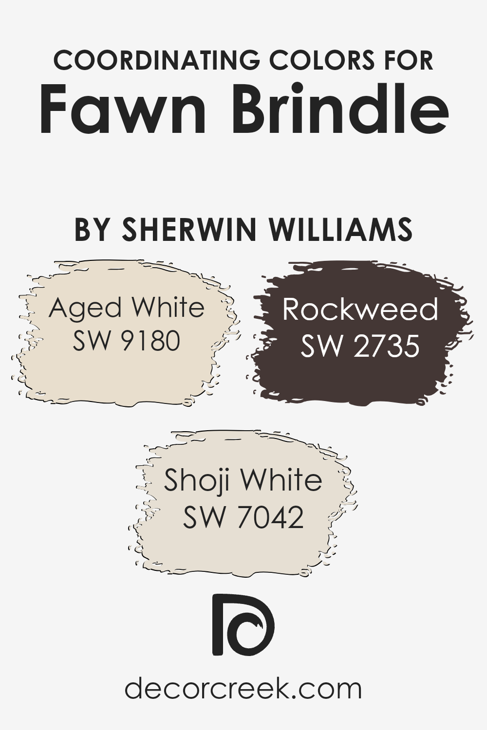
Coordinating Colors of Fawn Brindle SW 7640 by Sherwin Williams
Coordinating colors are hues that complement and enhance each other when used together in a space or design. When paired with Fawn Brindle by Sherwin Williams, the warm and versatile neutral, these colors work together to create a harmonious and pleasing environment.
The subtle tones of Aged White, Shoji White, and Rockweed can provide contrast and cohesion, making spaces feel balanced and inviting.
Aged White is a creamy, soft beige that adds warmth and lightness to a room, perfect for creating an airy and welcoming atmosphere. Shoji White is a gentle off-white with a slight grey undertone, giving it a clean and modern feel that can brighten up any area while maintaining a touch of sophistication
. Rockweed introduces a deeper, earthy green that offers a grounding element, building a rich, natural contrast that can anchor the entire palette.
Together, these colors can enhance the beauty of Fawn Brindle, providing a seamless flow throughout a room or home, making it inviting and stylish.
You can see recommended paint colors below:
- SW 9180 Aged White
- SW 7042 Shoji White
- SW 2735 Rockweed
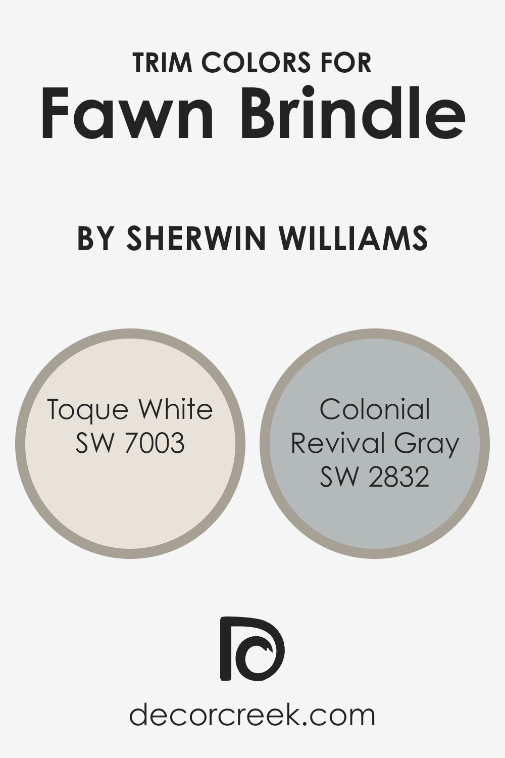
What are the Trim colors of Fawn Brindle SW 7640 by Sherwin Williams?
Trim colors are the finishing touch to any room or building, giving it definition and highlighting architectural details. They play a crucial role in complementing and framing the main color, making it stand out while ensuring a balanced look.
When paired with Fawn Brindle, a soft, warm grayish-brown by Sherwin Williams, choosing the right trim colors helps create harmony between the walls and accents. Trim colors like SW 7003 – Toque White and SW 2832 – Colonial Revival Gray add depth and a sense of completion to the space, highlighting the unique qualities of Fawn Brindle.
Toque White is a warm, creamy white that brings a gentle contrast to Fawn Brindle, enhancing its warmth without overpowering it. Its subtle undertones provide a soft, welcoming feel that wraps the room in comfort. On the other hand, Colonial Revival Gray is a muted gray with a classic appeal, offering a touch of elegance and depth.
Its restrained coolness provides a gentle counterbalance to Fawn Brindle’s warmth, creating a sophisticated yet approachable atmosphere.
Both trim colors enhance the overall aesthetic, helping to highlight architectural features and adding a polished finish.
You can see recommended paint colors below:
- SW 7003 Toque White
- SW 2832 Colonial Revival Gray
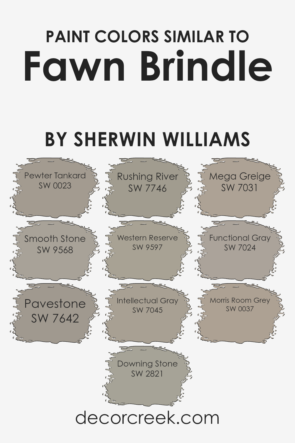
Colors Similar to Fawn Brindle SW 7640 by Sherwin Williams
Similar colors are important in design because they create a sense of harmony and cohesion. When working with a color like Fawn Brindle, choosing colors with similar tones helps in creating a consistent and connected look. Pewter Tankard offers a deep, earthy gray that enhances natural themes, while Smooth Stone adds a softer, more muted touch to any palette.
Pavestone provides a balanced, neutral gray that works well in both modern and traditional settings, while Downing Stone brings in a classic old-world charm with warmer undertones.
Rushing River delivers a soothing, light brownish-green shade that complements outdoor-inspired designs. Western Reserve offers a more grounded and rich gray-green that pairs beautifully with natural textures. Intellectual Gray presents a reliable medium-toned gray that suits a range of styles.
Mega Greige brings warmth with its beige undertones, fitting for cozy spaces. Functional Gray is a versatile mid-tone gray that adapts easily to different decors, and Morris Room Grey introduces a historical feel with its deeper, true gray hue.
These colors work together with Fawn Brindle to create soothing and unified environments, making them invaluable in both home and professional settings.
You can see recommended paint colors below:
- SW 0023 Pewter Tankard
- SW 9568 Smooth Stone
- SW 7642 Pavestone
- SW 2821 Downing Stone
- SW 7746 Rushing River
- SW 9597 Western Reserve
- SW 7045 Intellectual Gray
- SW 7031 Mega Greige
- SW 7024 Functional Gray
- SW 0037 Morris Room Grey
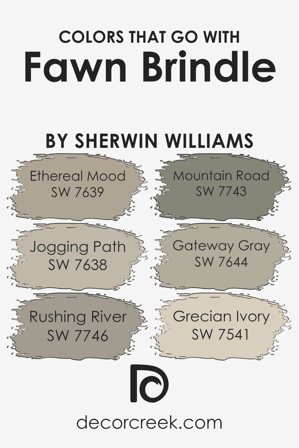
Colors that Go With Fawn Brindle SW 7640 by Sherwin Williams
When selecting colors to accompany Fawn Brindle SW 7640 by Sherwin Williams, it’s essential to choose shades that complement its warm and earthy tones. Fawn Brindle is a versatile color with a natural, neutral base that pairs well with a variety of hues, creating a cohesive and inviting atmosphere in any room.
SW 7639 – Ethereal Mood brings a gentle gray tone that harmonizes beautifully with Fawn Brindle, offering a subtle contrast that enhances the cozy feel of the space.
On the other hand, SW 7638 – Jogging Path presents a slightly darker shade, leading to a balanced and grounded environment when paired with Fawn Brindle.
Meanwhile, SW 7746 – Rushing River introduces a touch of deep green, adding depth and a natural feel to the palette.
SW 7743 – Mountain Road carries a muted earthy tone, offering a subtle richness that complements Fawn Brindle’s warmth. SW 7644 – Gateway Gray incorporates a deeper gray that accentuates Fawn Brindle’s neutral qualities without overwhelming the space.
Finally, SW 7541 – Grecian Ivory provides a light, creamy touch that softens the palette, adding a hint of brightness while keeping the overall look cohesive. Together, these colors create a harmonious blend, making any room feel warm and inviting.
You can see recommended paint colors below:
- SW 7639 Ethereal Mood
- SW 7638 Jogging Path
- SW 7746 Rushing River
- SW 7743 Mountain Road
- SW 7644 Gateway Gray
- SW 7541 Grecian Ivory
How to Use Fawn Brindle SW 7640 by Sherwin Williams In Your Home?
Fawn Brindle (SW 7640) by Sherwin Williams is a versatile and warm paint color that blends taupe and gray tones. This makes it a great choice for a variety of home settings. It can be used in living rooms to create a cozy and inviting atmosphere, providing a neutral backdrop that complements both vibrant and muted furnishings alike.
In a bedroom, Fawn Brindle offers a calming feel, ideal for relaxation. It pairs elegantly with whites and creams, contributing to a peaceful resting space. The color works well for exteriors too, providing a natural and subtle look that blends nicely with outdoor surroundings.
In kitchens, it harmonizes with wood tones and stainless steel, creating a balanced and modern look. Whether used on walls or as an accent color, Fawn Brindle can add warmth and depth to any room, making it an excellent choice for those who enjoy neutral palettes.
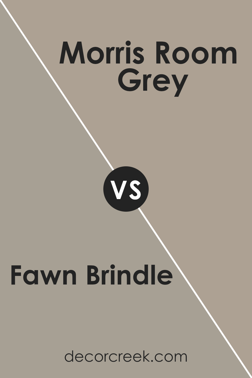
Fawn Brindle SW 7640 by Sherwin Williams vs Morris Room Grey SW 0037 by Sherwin Williams
Fawn Brindle (SW 7640) and Morris Room Grey (SW 0037) are both popular paint colors by Sherwin Williams, but they offer different vibes.
Fawn Brindle is a warm, earthy tone that blends brown and gray, creating a cozy and inviting atmosphere. It’s versatile and works well in living spaces, giving them a grounded and natural feel.
On the other hand, Morris Room Grey has a cooler undertone with a hint of blue. It’s more traditional and can bring a touch of elegance to a room. This color is great for spaces where you want a calm and classic look, such as dining rooms or studies.
While Fawn Brindle makes a room feel warm and welcoming, Morris Room Grey offers a more formal and composed feeling. Both colors are neutral, making them easy to pair with other shades, but they each provide a unique character to the space they enhance.
You can see recommended paint color below:
- SW 0037 Morris Room Grey
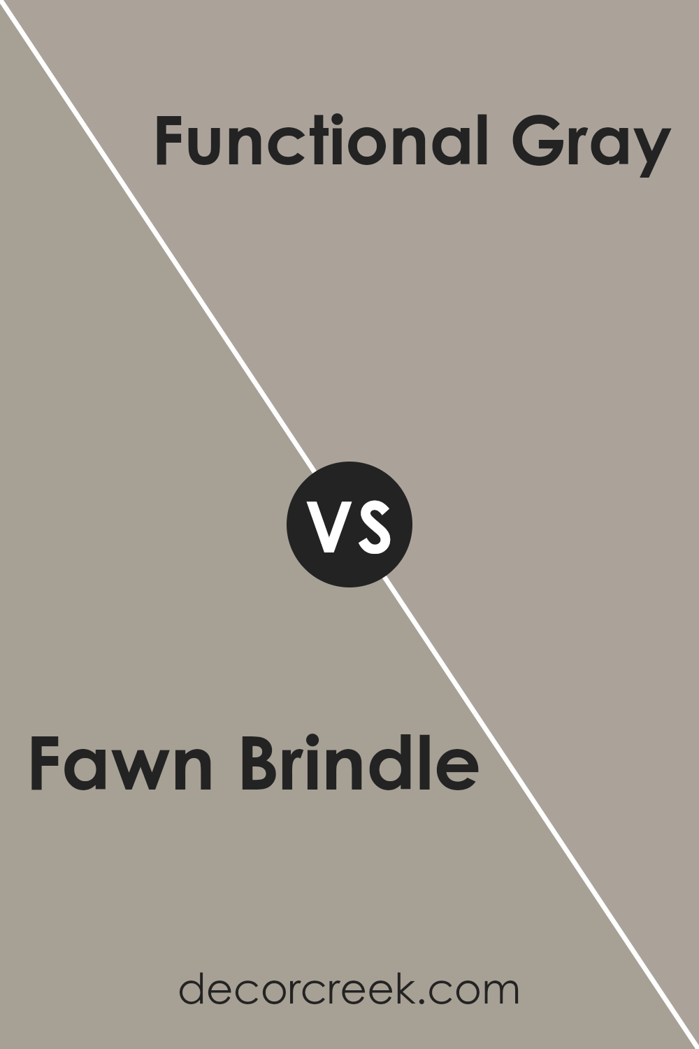
Fawn Brindle SW 7640 by Sherwin Williams vs Functional Gray SW 7024 by Sherwin Williams
Fawn Brindle SW 7640 and Functional Gray SW 7024 by Sherwin Williams are both neutral colors, but they offer different vibes. Fawn Brindle is a warm brownish-gray with subtle undertones that make spaces feel cozy and inviting. It pairs well with natural elements, adding a sense of earthiness to a room.
On the other hand, Functional Gray is a cooler, more straightforward gray. It has a crisp, clean appearance that suits modern and minimalist designs. This color can make a room feel more spacious and bright, especially in areas with ample natural light.
While Fawn Brindle radiates warmth, Functional Gray leans more towards a classic, understated look. Both can work as a base for different styles, but choosing between these two depends on whether you want a warmer, comforting space or a cooler, more refined environment.
You can see recommended paint color below:
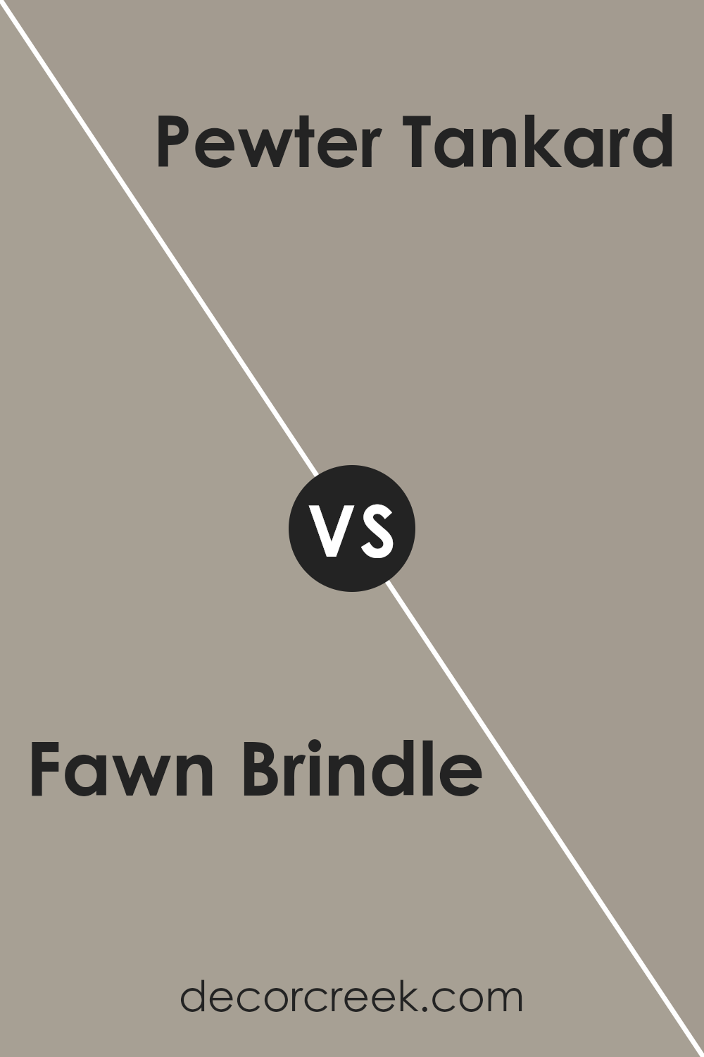
Fawn Brindle SW 7640 by Sherwin Williams vs Pewter Tankard SW 0023 by Sherwin Williams
Fawn Brindle (SW 7640) and Pewter Tankard (SW 0023) are both neutral colors offered by Sherwin Williams, yet they provide distinct looks. Fawn Brindle is a warm, earthy tone with a blend of brown and gray, making it versatile and cozy. It often brings a sense of comfort to a room, ideal for living spaces that aim for a welcoming atmosphere.
On the other hand, Pewter Tankard is a cooler, more classic gray with subtle undertones of green. This color offers a sophisticated and calming feel, suited for areas like bedrooms or offices where a relaxing vibe is desired. While Fawn Brindle adds warmth, Pewter Tankard leans towards a cool, elegant aesthetic.
Both colors can be paired with whites, but Fawn Brindle could match well with warmer accents, while Pewter Tankard might shine with cooler complementary shades. Their unique characteristics make them suitable for different design preferences.
You can see recommended paint color below:
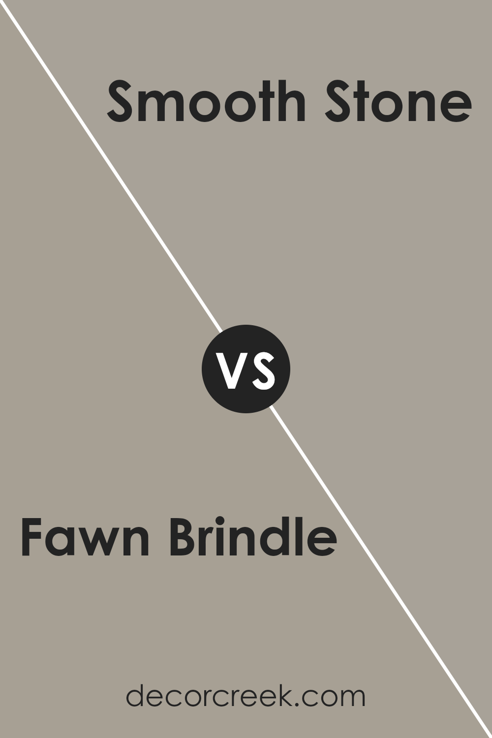
Fawn Brindle SW 7640 by Sherwin Williams vs Smooth Stone SW 9568 by Sherwin Williams
Fawn Brindle (SW 7640) by Sherwin Williams is a warm, earthy taupe with a gentle undertone of gray. It brings a cozy and inviting feel to any room, making it a great choice for living spaces or bedrooms. In contrast, Smooth Stone (SW 9568) is a lighter, neutral shade with a balanced mix of beige and gray. Its subtle tone offers a calming and airy ambiance, perfect for creating an open and uncluttered look.
When paired together, Fawn Brindle can act as an excellent accent color against the softer backdrop of Smooth Stone, adding depth and interest. Both colors are versatile and work well with a variety of design styles, from traditional to modern.
Fawn Brindle’s warmth adds richness, while Smooth Stone’s lightness lends a sense of space and openness. This combination offers a pleasing balance of warmth and coolness, suited for various rooms in a home.
You can see recommended paint color below:
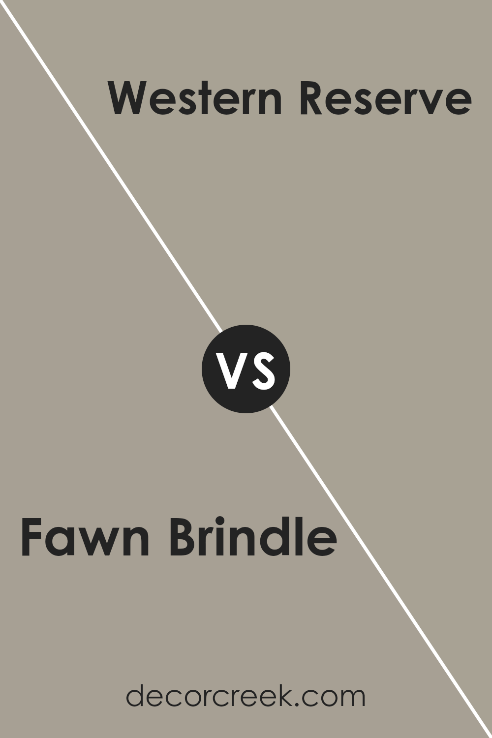
Fawn Brindle SW 7640 by Sherwin Williams vs Western Reserve SW 9597 by Sherwin Williams
Fawn Brindle (SW 7640) and Western Reserve (SW 9597) by Sherwin Williams each offer unique aesthetics. Fawn Brindle is a versatile gray-brown tone with warm undertones. It’s ideal for creating a cozy, inviting atmosphere, suitable for any room. This shade works well with various design styles, from traditional to contemporary, and pairs beautifully with lighter colors or bold accents.
On the other hand, Western Reserve is a lighter, more muted hue. It features soft, cool gray tones that can make spaces feel airy and open. This color is excellent for adding a sense of calm and can help smaller rooms appear larger.
Western Reserve complements minimalist and modern designs and works well with both neutral and colorful schemes.
While Fawn Brindle adds warmth and depth, Western Reserve brings lightness and freshness. Depending on your preference, each can enhance your living space’s mood and harmony differently.
You can see recommended paint color below:
- SW 9597 Western Reserve
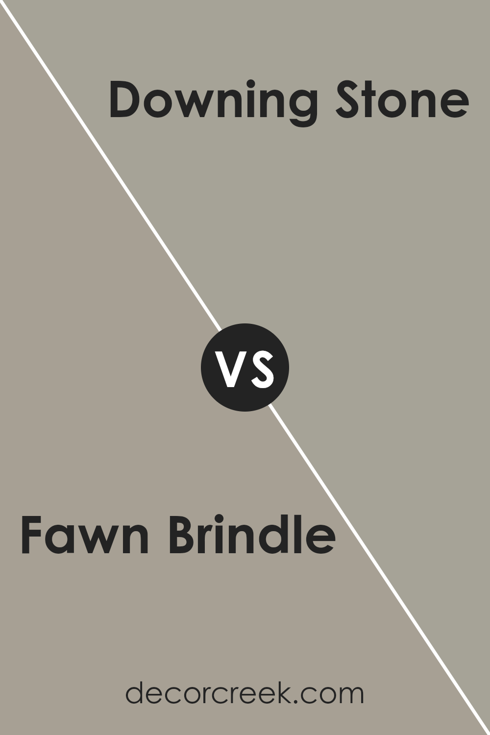
Fawn Brindle SW 7640 by Sherwin Williams vs Downing Stone SW 2821 by Sherwin Williams
Fawn Brindle SW 7640 by Sherwin Williams is a soft, warm neutral color that carries undertones of beige and gray. It provides a comforting and cozy feel, making it versatile for various spaces in a home. It often pairs well with lighter colors, giving a balanced and soothing appearance to a room.
Downing Stone SW 2821, on the other hand, is a bit deeper and richer. It leans more towards a classic gray with subtle earthy undertones. This color offers a warmer feel, giving rooms a sense of depth and character without being too overwhelming.
It’s excellent for creating a cozy atmosphere, especially in living or dining areas.
While both colors are neutral and warm, Fawn Brindle is lighter and softer compared to the deeper and slightly more traditional tone of Downing Stone. Together, they can be used to create a harmonious yet dynamic color scheme in any home.
You can see recommended paint color below:
Fawn Brindle SW 7640 by Sherwin Williams vs Rushing River SW 7746 by Sherwin Williams
Fawn Brindle SW 7640 by Sherwin Williams is a warm, earthy tone with a hint of brown, giving it a cozy, natural feel. It’s versatile enough to work in both traditional and modern settings, bringing a sense of comfort and groundedness to any room. This color is great for creating an inviting atmosphere, making it well-suited for living rooms or bedrooms where a calming yet elegant backdrop is desired.
On the other hand, Rushing River SW 7746 is a softer, cooler color with hints of green and gray. It evokes a sense of freshness and calmness, reminiscent of nature’s gentle hues. This makes it an excellent choice for areas where you want a relaxed, airy vibe, like kitchens or bathrooms.
The color can help make a space feel open and breezy, adding a subtle chic touch without being overpowering.
Both colors provide a different ambiance but can complement each other well. Fawn Brindle brings warmth, while Rushing River offers a crisp, refreshing counterpoint.
You can see recommended paint color below:
- SW 7746 Rushing River
Fawn Brindle SW 7640 by Sherwin Williams vs Mega Greige SW 7031 by Sherwin Williams
Fawn Brindle (SW 7640) and Mega Greige (SW 7031) by Sherwin Williams are two popular paint colors that offer distinct yet subtle differences. Fawn Brindle is a warm, earthy tone with a brownish-gray appearance, making it a versatile choice for many spaces. It can add a cozy and natural feel to a room, working well in living areas or bedrooms.
On the other hand, Mega Greige is a deeper, richer shade with a more pronounced greige tone. It leans slightly more toward gray, with undertones that give it a sophisticated look.
Mega Greige can provide a more contemporary feel and works beautifully in spaces where you want to add a touch of modernity without being too bold.
Both colors are neutral and can complement a variety of other hues, but Fawn Brindle leans warmer, while Mega Greige has a cooler, more muted vibe. Each can enhance the overall atmosphere depending on the desired mood.
You can see recommended paint color below:
Fawn Brindle SW 7640 by Sherwin Williams vs Pavestone SW 7642 by Sherwin Williams
Fawn Brindle SW 7640 and Pavestone SW 7642, both by Sherwin Williams, are popular neutral colors that can add warmth and comfort to a space. Fawn Brindle is a medium-toned, warm beige with subtle gray undertones, giving it a soft, inviting look. It works well in living rooms or bedrooms for a cozy atmosphere.
On the other hand, Pavestone is a slightly darker and cooler gray with brown undertones. This hue is well-suited for creating a modern, sleek look in any room. It pairs nicely with whites and other neutrals for a clean, contemporary feel.
When comparing the two, Fawn Brindle is better for spaces where you want a hint of warmth, while Pavestone is ideal for areas where you aim for a more refined, modern edge. Both colors complement each other well and can be used together to create a balanced, harmonious environment.
You can see recommended paint color below:
Fawn Brindle SW 7640 by Sherwin Williams vs Intellectual Gray SW 7045 by Sherwin Williams
Fawn Brindle SW 7640 and Intellectual Gray SW 7045 by Sherwin Williams are both versatile, neutral shades that work well in many spaces. Fawn Brindle is a warm, earthy color with a hint of brown that can add a cozy touch to a room. It pairs well with natural materials and creates a welcoming atmosphere.
On the other hand, Intellectual Gray leans cooler, with more of a green undertone. It’s a bit darker and adds depth to a space without being too bold. Both colors are suitable for living rooms, bedrooms, or even offices, adding a subtle sophistication without overshadowing other elements in the decor.
While Fawn Brindle brings warmth, Intellectual Gray can add a touch of calm with its coolness. Both can be used as main colors or as accents, offering flexibility depending on the desired mood and existing decor elements in the room.
You can see recommended paint color below:
Conclusion
I’ve really enjoyed writing about SW 7640 Fawn Brindle by Sherwin Williams. It’s a soft, neutral paint color that reminds me of the gentle color of a deer’s fur. This paint color is really good at making a room feel cozy and warm, like when you wrap yourself in a favorite blanket.
What makes Fawn Brindle special is how it fits anywhere. Whether you use it in the living room, kitchen, or even a hallway, it brings a nice, comforting feeling. It also works well with lots of other colors. You can pair it with bright colors for a fun look or with other neutral colors to keep things calm.
I think Fawn Brindle is a great choice because it isn’t too bright or too dark. So, it can make rooms in your house feel comfortable and welcoming. Imagine coming home after a long day and feeling relaxed because your home feels just right. That’s what Fawn Brindle can do.
In the end, Fawn Brindle is a terrific paint color choice for anyone who wants a home that feels peaceful and cozy. It’s a color that always makes you feel good and never goes out of style.
Ever wished paint sampling was as easy as sticking a sticker? Guess what? Now it is! Discover Samplize's unique Peel & Stick samples.
Get paint samples

