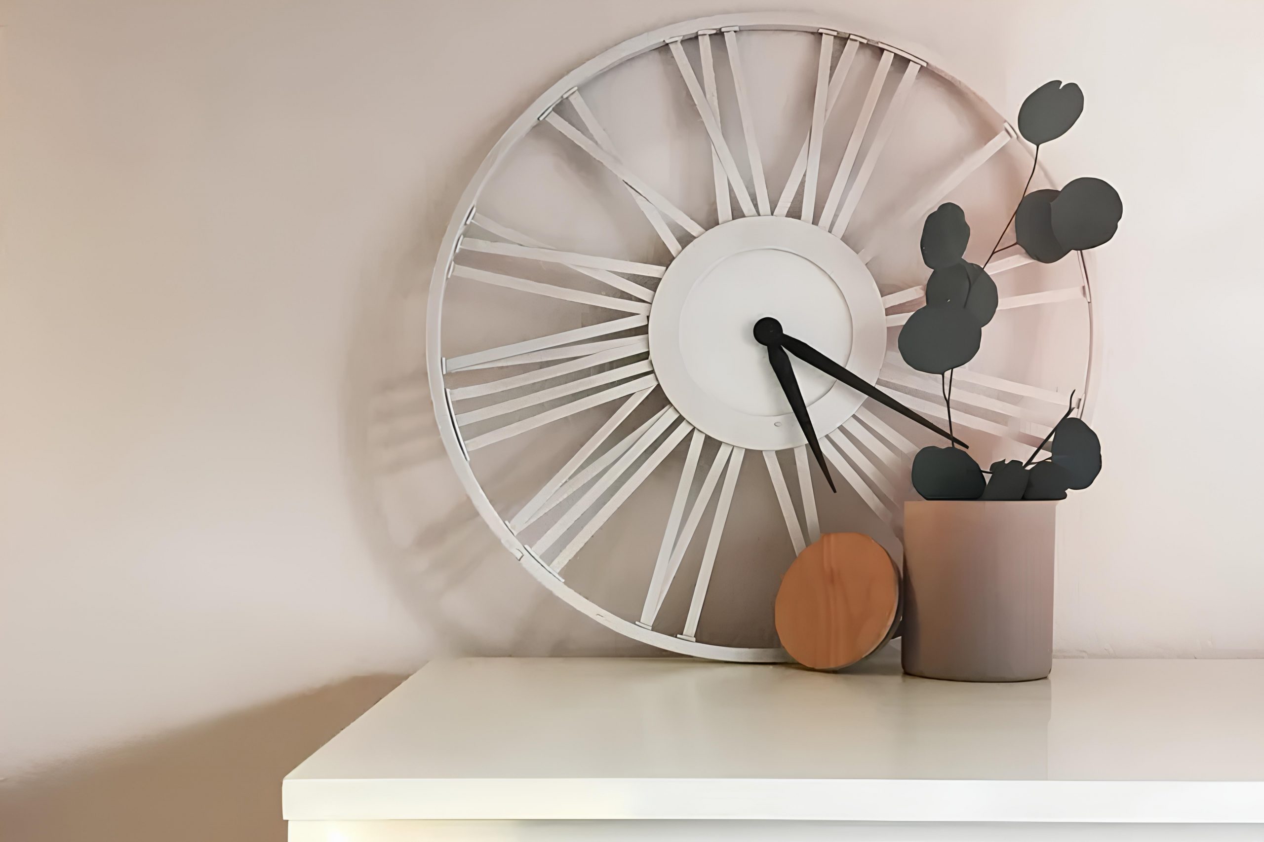
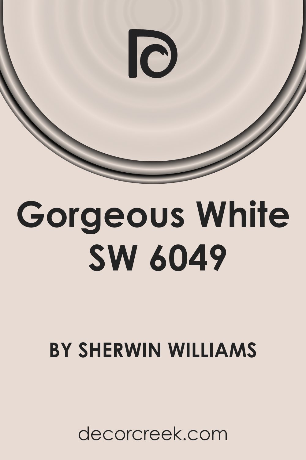
When I came across SW 6049 Gorgeous White by Sherwin Williams, I immediately noticed how it balances simplicity and elegance. This color isn’t just a basic white; it has a depth and warmth that I find perfect for creating a welcoming atmosphere in any room. Whether it’s used on walls, ceilings, or trims, Gorgeous White offers a versatile backdrop that enhances everything around it.
When I incorporate this shade into my space, I appreciate its soothing quality. It’s more than just a paint choice; it becomes a canvas for my personal style. It pairs well with various colors, allowing flexibility in decorating.
With Gorgeous White, I don’t feel limited to a particular theme; it gives me the freedom to express myself while maintaining a cohesive and harmonious environment.
In addition, this color reflects light beautifully, making rooms appear brighter and more spacious. No matter the size of my room, Gorgeous White works wonders in enhancing the overall feel and look of the space.
It never goes out of fashion, standing as a timeless choice for those who appreciate both comfort and sophistication.
As I consider different shades for my home, I know this classic choice will always be at the top of my list.
What Color Is Gorgeous White SW 6049 by Sherwin Williams?
Gorgeous White SW 6049 by Sherwin Williams is a warm, off-white color with subtle undertones that give it depth and versatility. This shade offers a creamy backdrop that works beautifully in various interior styles, most notably traditional, farmhouse, and coastal themes. Its warm undertones complement natural materials like wood, making it an excellent choice for spaces with hardwood floors or wooden ceiling beams.
In a traditional setting, Gorgeous White pairs well with rich fabrics like velvet or linen, creating a cozy and inviting atmosphere. It’s also ideal for farmhouse interiors, where it can highlight the rustic charm of shiplap walls or vintage furniture.
In coastal designs, this soft white serves as a perfect base for accents of blue or soft green, adding to a relaxed and airy feel.
Texturally, this color works seamlessly with the smoothness of glass or the natural, rugged look of wicker and rattan. Its warmth allows it to balance well with metal accents, such as brushed nickel or aged brass, providing a subtle contrast that enhances the overall aesthetic.
Whether used on walls, trim, or cabinetry, Gorgeous White serves as a versatile and adaptable color choice in any home.
Is Gorgeous White SW 6049 by Sherwin Williams Warm or Cool color?
Gorgeous White SW 6049 by Sherwin Williams is a versatile and elegant paint color. It is a soft white with a hint of warmth, which helps it create a welcoming and cozy atmosphere in any room. This color works well in a variety of settings, from modern to traditional homes.
In living rooms or bedrooms, Gorgeous White provides a clean and airy backdrop that can make spaces feel larger and more open. It pairs beautifully with both light and dark furniture, allowing homeowners to play with different textures and accents without clashing.
In kitchens, this color offers a fresh and bright look, reflecting natural light and making the space feel inviting. It’s also great for bathrooms, where it can add a sense of cleanliness and purity.
Overall, Gorgeous White SW 6049 is an excellent choice for those seeking a neutral, yet warm and inviting color that can adapt to different styles and settings.
Undertones of Gorgeous White SW 6049 by Sherwin Williams
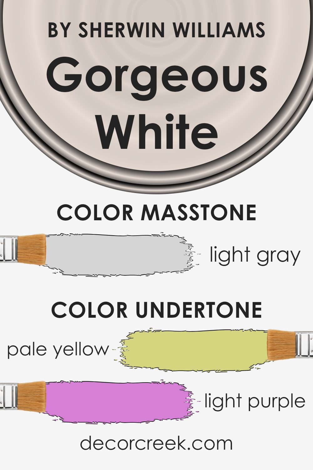
Gorgeous White by Sherwin Williams is a paint color with a complex mix of undertones. Undertones are the subtle colors that can appear beneath the surface color, affecting how we perceive the overall hue. In this case, Gorgeous White features pale yellow, light purple, light blue, pale pink, mint, lilac, and grey.
These undertones can change how the color looks, depending on lighting and surrounding colors. In natural light, the pale yellow undertone might make the color appear warmer. In rooms with less daylight, the light blue or grey undertones can create a cooler feel. The varied undertones mean Gorgeous White can look different at different times of the day or under different artificial lights.
In interior spaces, these undertones allow the paint to work well with a range of color schemes. The pale yellow and mint can complement green or earth tones, while light purple and lilac offer a nice contrast against deeper shades. The grey undertone gives it a neutral quality, making it versatile and adaptable to many settings. Each undertone brings out a different aspect of the room, so the overall effect is that of a dynamic and flexible color choice.
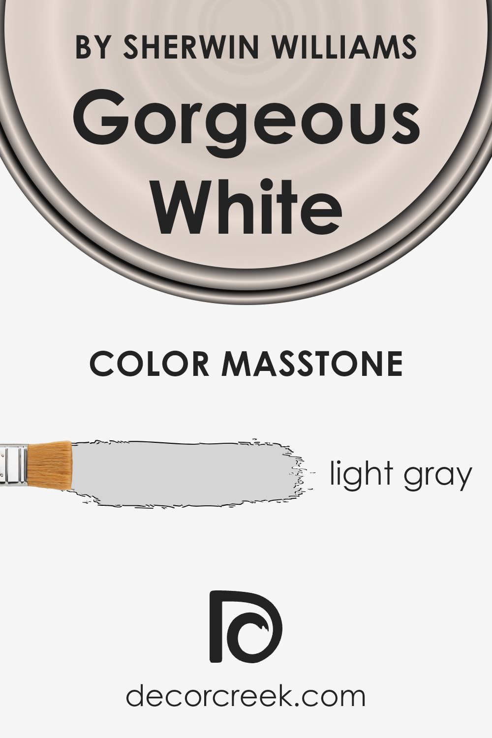
What is the Masstone of the Gorgeous White SW 6049 by Sherwin Williams?
Gorgeous White (SW 6049) by Sherwin Williams features a light gray masstone, appearing as a gentle and soft shade. This light gray (#D5D5D5) works well in homes by creating a calm and inviting atmosphere. It reflects light easily, making spaces feel bigger and more open. This makes it perfect for small rooms or areas that don’t get a lot of natural light.
Because it is a neutral color, Gorgeous White pairs nicely with a variety of other colors. You can match it with bold colors to add contrast or with other neutrals for a more cohesive look. It works in any room, from living rooms to bedrooms and even kitchens, providing a versatile backdrop that suits many styles.
This shade’s understated presence doesn’t overpower a space, allowing for flexibility in decor. It can play a supporting role, letting your furnishings and accessories stand out, while keeping the overall look balanced and pleasant.
How Does Lighting Affect Gorgeous White SW 6049 by Sherwin Williams?
Lighting has a big impact on how we see colors, and this is true for any paint, including colors like Gorgeous White SW 6049 by Sherwin-Williams. The type and direction of light can make a color look different from one room to another.
In natural light, Gorgeous White can appear brighter and more vibrant. The time of day also affects its appearance. In artificial light, the color can look warmer or cooler depending on the lightbulbs used. For example, soft white bulbs might make the color look warmer and slightly yellow, while cool white bulbs can give it a bluish tint.
In north-facing rooms, the lighting is cooler because these rooms get less direct sunlight. This can make Gorgeous White take on a slightly cooler, bluish appearance. This is because northern light is often more diffused and indirect, which enhances cooler tones in paint.
South-facing rooms, on the other hand, get a lot of natural light, especially during midday. This light is warm and can make Gorgeous White look brighter and even a bit warmer, highlighting any subtle undertones it might have.
East-facing rooms get bright, warm light in the morning, which can enhance any warm undertones in the paint. Later in the day, the light becomes cooler, which can change the perception of the color, making it appear slightly different from the morning.
West-facing rooms receive warm light in the late afternoon and evening. This light can cast a golden glow, intensifying any warm tones in Gorgeous White, making it look much warmer as the day ends.
In conclusion, Gorgeous White changes with the light. When choosing this or any color, consider the light your room gets during different parts of the day, as it will change how the color looks on your walls.
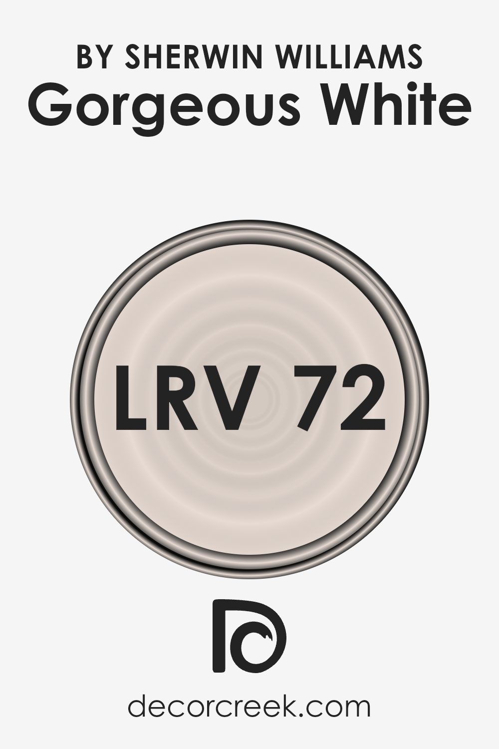
What is the LRV of Gorgeous White SW 6049 by Sherwin Williams?
Light Reflectance Value, or LRV, is a measurement that indicates how much light a paint color will reflect. It is on a scale from 0 to 100, where 0 means the color absorbs all light (completely black), and 100 means it reflects all light (completely white). Colors with higher LRV values reflect more light, making spaces feel brighter and more open. They are often used to make smaller rooms feel larger or to increase natural light in darker areas. On the other hand, lower LRV values are typical of darker colors that absorb more light, creating a cozier and more intimate atmosphere.
With an LRV of 72.233, the color Gorgeous White by Sherwin Williams reflects a substantial amount of light. This means it will make rooms look brighter and more spacious compared to colors with a lower LRV. It is well-suited for areas where homeowners want to maximize the effect of natural or artificial light, such as in hallways, small rooms, or spaces with limited windows. The higher reflection also means it can help distribute light evenly across a room, reducing shadows and creating a more unified look.
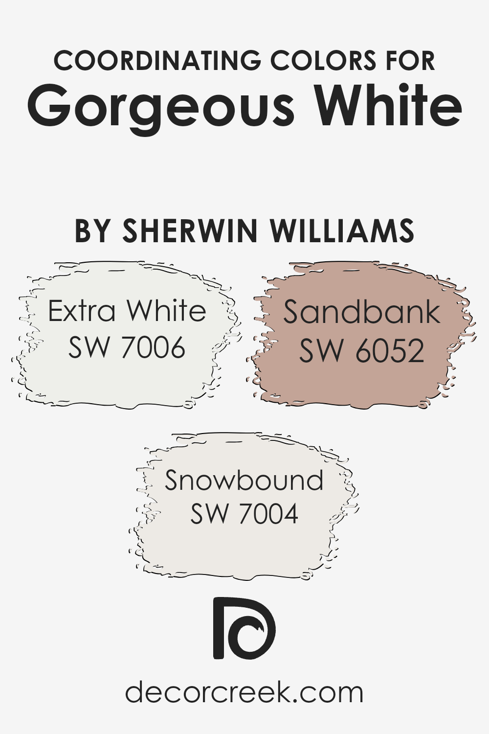
Coordinating Colors of Gorgeous White SW 6049 by Sherwin Williams
Coordinating colors are hues that pair well together, creating a cohesive and visually appealing palette in a space. When choosing coordinating colors for a room, you want to consider shades that complement your main color and enhance its features. For example, if you’re using Gorgeous White by Sherwin Williams as your main color, a great coordinating choice is SW 7006 – Extra White. It is a bright and crisp white, giving a clean and modern touch that can highlight the softer tones of Gorgeous White. Another good companion is SW 7004 – Snowbound. It offers a warmer, more subdued white that adds a gentle contrast without overpowering the main color.
Additionally, including a color like SW 6052 – Sandbank can introduce a natural, earthy element to the scheme. Sandbank is a light, warm beige that can add depth and comfort to a room when used alongside Gorgeous White. Together, these colors work harmoniously to create an environment that feels both balanced and inviting. By carefully selecting coordinating colors, you can define the mood of a space and guide the overall style, ensuring that it feels cohesive and thoughtfully designed.
You can see recommended paint colors below:
- SW 7006 Extra White
- SW 7004 Snowbound
- SW 6052 Sandbank
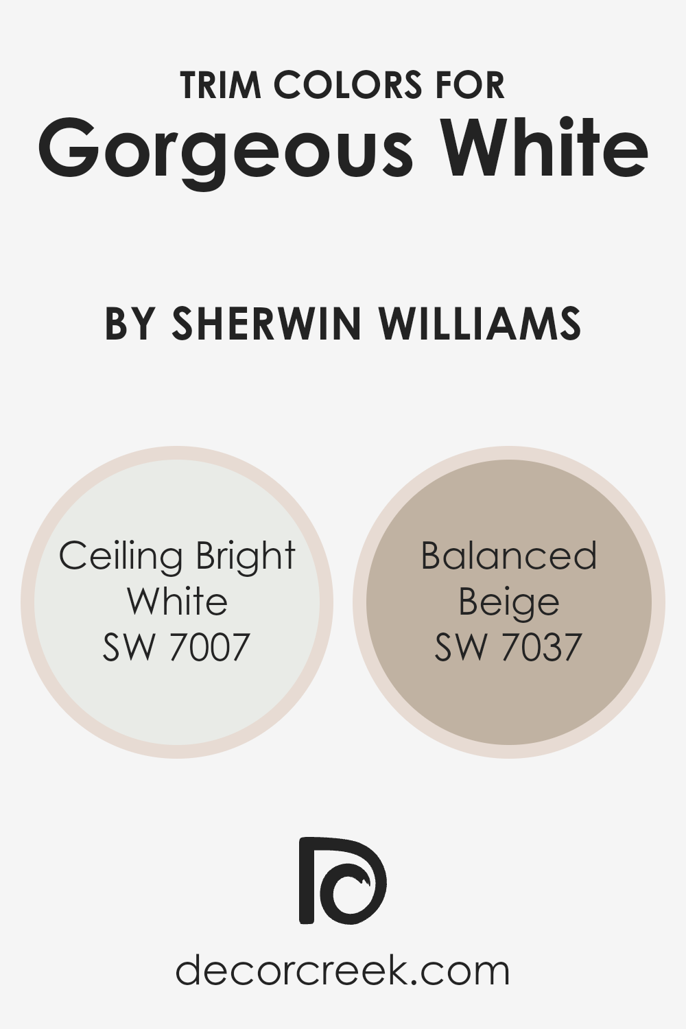
What are the Trim colors of Gorgeous White SW 6049 by Sherwin Williams?
Trim colors are the finishing touch to a room, providing contrast or harmony with the primary wall color. When using a base color like Gorgeous White, trim colors can greatly enhance the room’s overall look. Ceiling Bright White, for example, is a fresh and clean color often used on ceilings to create a sense of height and openness. When used as a trim color, it draws a crisp outline around the Gorgeous White, making the walls stand out and adding a touch of refinement. Balanced Beige, on the other hand, brings warmth and a sense of coziness as a trim color. It can soften the brightness of Gorgeous White, creating a welcoming and comfortable space that feels grounded without being overpowering.
Choosing the right trim colors is important because they play a vital role in defining the edges and corners of a room, adding depth and interest. Ceiling Bright White offers a modern and classic feel, and it maintains a neutral and clean look when paired with Gorgeous White walls. This pairing is especially effective in creating a bright and airy atmosphere. Balanced Beige adds dimension by offering a subtle contrast without clashing, complementing Gorgeous White naturally. It provides an earthy tone that works well with both warm and cool colors, making it versatile for different room aesthetics. These trim colors ensure that Gorgeous White maintains its beauty while the room as a whole feels cohesive and thoughtfully designed.
You can see recommended paint colors below:
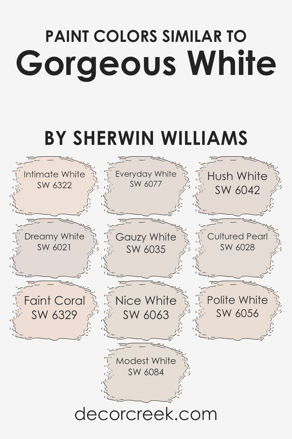
Colors Similar to Gorgeous White SW 6049 by Sherwin Williams
Using similar colors in home design creates a sense of harmony and balance. These colors can subtly complement each other, making a space feel cohesive and relaxed. For instance, Intimate White is a soft hue with a touch of warmth, while Dreamy White has a cool undertone that can brighten up any room. Faint Coral adds a hint of pink, perfect for creating a gentle and inviting atmosphere. Modest White is understated and blends seamlessly with natural elements. Everyday White offers a neutral backdrop, providing versatility in various settings.
Gauzy White feels light and airy, making spaces appear larger. Nice White has a simple charm that can adapt to traditional or modern styles alike. If you’re looking for something with a subtle whisper of color, Hush White provides a gentle touch. Cultured Pearl brings in a slight sheen, adding a delicate layer of interest. Finally, Polite White offers a classic look that’s both timeless and elegant. Incorporating these similar shades alongside Gorgeous White allows for a blend of colors that can make a room look thoughtfully put together while still keeping it interesting and engaging. Together, these hues create a lovely palette that can beautifully enhance any living area.
You can see recommended paint colors below:
- SW 6322 Intimate White
- SW 6021 Dreamy White
- SW 6329 Faint Coral
- SW 6084 Modest White
- SW 6077 Everyday White
- SW 6035 Gauzy White
- SW 6063 Nice White
- SW 6042 Hush White
- SW 6028 Cultured Pearl
- SW 6056 Polite White
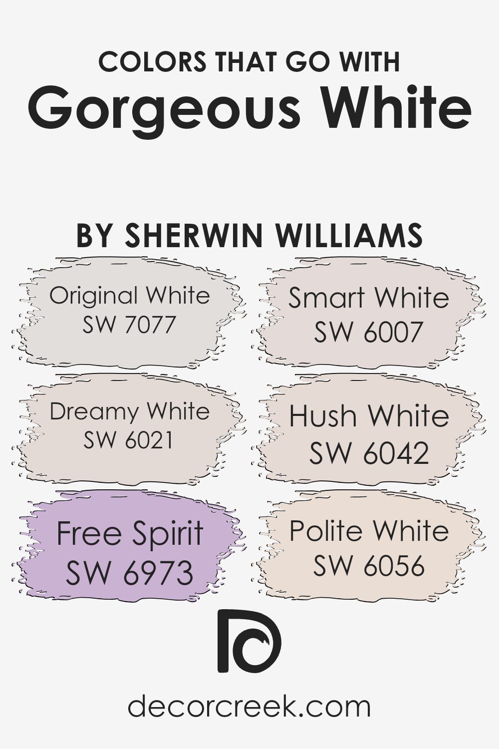
Colors that Go With Gorgeous White SW 6049 by Sherwin Williams
Choosing colors that complement Gorgeous White SW 6049 by Sherwin Williams can enhance the overall look of a space. These colors work together to create a harmonious and balanced atmosphere. One such color is SW 7077 – Original White, which has a clean and fresh feel, making it perfect for adding brightness without overwhelming the space. SW 6021 – Dreamy White introduces a soft and subtle tone that lends a gentle, calming touch, ideal for bedrooms or cozy reading nooks.
SW 6973 – Free Spirit brings an energetic and lively vibe with its bold undertones, making it a great choice for accent walls or lively areas of the home. Meanwhile, SW 6007 – Smart White offers a modern and crisp appearance, which pairs well with the other whites to provide contrast without starkness. Then, there’s SW 6042 – Hush White, which adds warmth with its slightly beige undertones, making the environment inviting and comfortable for gatherings. Lastly, SW 6056 – Polite White presents an elegant, creamy hue that brings a touch of sophistication, perfect for formal dining areas or living rooms. Together, these colors not only accentuate Gorgeous White but also create a versatile and inviting ambiance.
You can see recommended paint colors below:
- SW 7077 Original White
- SW 6021 Dreamy White
- SW 6973 Free Spirit
- SW 6007 Smart White
- SW 6042 Hush White
- SW 6056 Polite White
How to Use Gorgeous White SW 6049 by Sherwin Williams In Your Home?
Gorgeous White SW 6049 by Sherwin Williams is a versatile paint color perfect for creating a fresh and bright atmosphere in any home. This shade of white adds a clean and welcoming feel without being too stark or clinical. It works well in living rooms, kitchens, and bedrooms, providing a neutral backdrop that complements various styles and color schemes.
In rooms with lots of natural light, Gorgeous White can enhance the brightness, making spaces feel larger and more open. It pairs beautifully with both warm and cool accents, allowing for flexibility in decorating. For a cozy vibe, combine it with soft textiles and wooden furniture. In modern settings, you can accentuate it with metallic finishes for a crisp look.
Overall, Gorgeous White is an excellent choice for those seeking a timeless and adaptable color that works well throughout the home, providing a sense of balance and harmony.
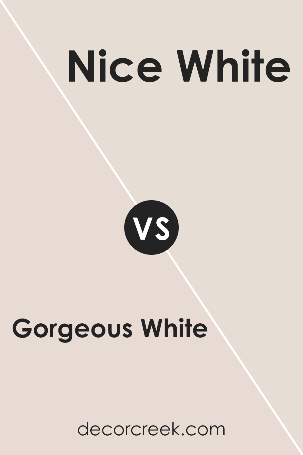
Gorgeous White SW 6049 by Sherwin Williams vs Nice White SW 6063 by Sherwin Williams
Gorgeous White SW 6049 and Nice White SW 6063 by Sherwin Williams are both beautiful shades of white, but they have their differences. Gorgeous White SW 6049 is a rich, creamy white with warm undertones. It provides a cozy and inviting feel to a room, making it perfect for living spaces or bedrooms where you want a sense of comfort.
On the other hand, Nice White SW 6063 has a slightly cooler tone. It is still a warm white, but leaning more towards a pure, clean appearance. This makes it a good option for kitchens and bathrooms, where a fresher, brighter look is often desired.
Both colors are versatile and can work well with various accent colors and decor styles. However, the choice between them depends on whether you prefer a warmer, creamier white for a cozy atmosphere or a crisp, clean white for a fresh look.
You can see recommended paint color below:
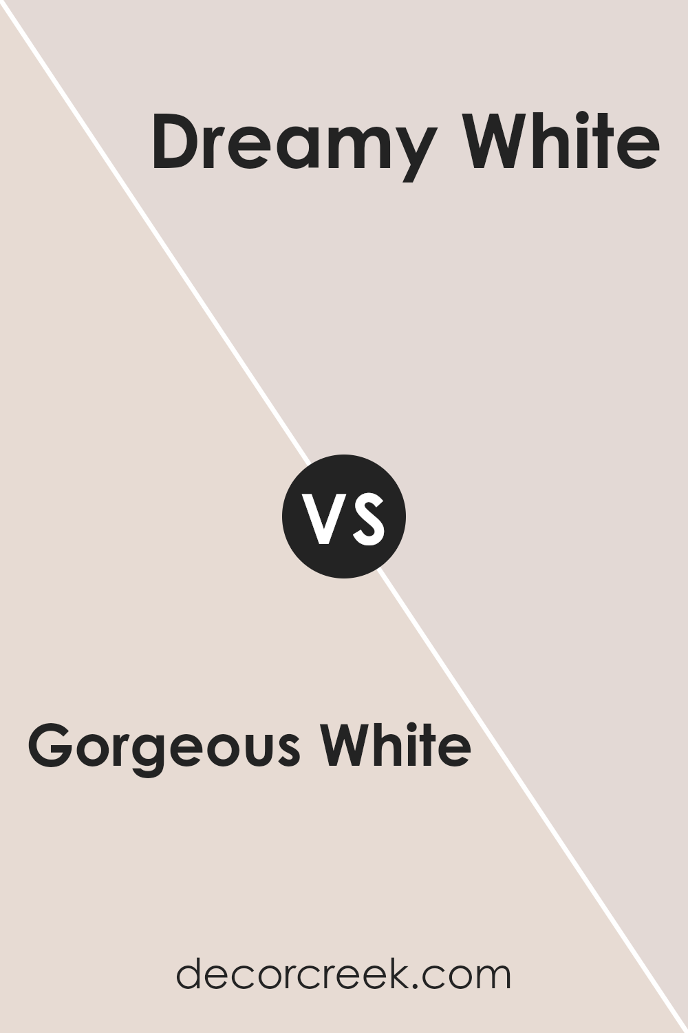
Gorgeous White SW 6049 by Sherwin Williams vs Dreamy White SW 6021 by Sherwin Williams
Gorgeous White SW 6049 and Dreamy White SW 6021 by Sherwin Williams are both soft and versatile colors. Gorgeous White is a warm, creamy shade. It has a subtle hint of warmth, making it cozy and inviting. This makes it excellent for spaces where you want a comfortable atmosphere.
Dreamy White, on the other hand, is a cooler shade. It carries a more neutral vibe, which can make a room feel cleaner and more modern. It’s great for areas where you want a fresh and airy look.
Both colors are good choices for different reasons. If you aim for a warm, welcoming feel, Gorgeous White is ideal. If you prefer a clean, understated look, Dreamy White is better. Both whites are versatile, pairing well with various other colors, whether you want to create contrast or complement other design elements in your space.
You can see recommended paint color below:
Gorgeous White SW 6049 by Sherwin Williams vs Gauzy White SW 6035 by Sherwin Williams
Gorgeous White (SW 6049) and Gauzy White (SW 6035) are both lovely shades from Sherwin Williams, offering different vibes. Gorgeous White is a soft and warm white, with a slight hint of pink that adds coziness to a space. It works well in rooms where you want a gentle, inviting atmosphere. On the other hand, Gauzy White is a lighter, more neutral white with subtle gray undertones. This makes it perfect for creating a brighter, airy feel in a room while still maintaining a touch of warmth.
When comparing the two, Gorgeous White might be preferable for spaces where you want warmth to be more noticeable, while Gauzy White can be ideal for areas where you want a clean and fresh look. Both colors are versatile and can complement various design styles, but they will give different impressions based on the undertones they carry.
You can see recommended paint color below:
- SW 6035 Gauzy White
Gorgeous White SW 6049 by Sherwin Williams vs Everyday White SW 6077 by Sherwin Williams
Gorgeous White SW 6049 and Everyday White SW 6077 by Sherwin Williams are two popular shades of white, each offering a unique look. Gorgeous White has a soft pink undertone, which gives it a warm and inviting feel. It adds a touch of softness to any space, making it a great choice for living rooms or bedrooms where you want a cozy atmosphere.
On the other hand, Everyday White is more neutral, with a slight beige undertone. This makes it more versatile, fitting well in different settings and pairing easily with various colors and decor styles. Everyday White can create a clean and subtle backdrop, ideal for kitchens, bathrooms, or any area you want to feel fresh and bright.
Choosing between the two depends on the mood you want to set. For warmth and coziness, go with Gorgeous White. For a more neutral and adaptable option, Everyday White is a solid choice.
You can see recommended paint color below:
Gorgeous White SW 6049 by Sherwin Williams vs Polite White SW 6056 by Sherwin Williams
Gorgeous White SW 6049 and Polite White SW 6056 by Sherwin Williams are both warm whites that can enhance different spaces. Gorgeous White has a soft, warm undertone that can make spaces feel cozy and inviting. It often works well in living areas or bedrooms where a relaxed atmosphere is desired. On the other hand, Polite White is slightly creamier, giving it a gentle, welcoming presence. It can be a great choice for hallways or entryways where you want a touch of warmth without dominating the space. While both are subtle and versatile, Gorgeous White tends to offer a bit more warmth compared to the slightly more neutral tone of Polite White. When choosing between them, consider the lighting of your room and the other colors in your decor to see which shade complements best. Both provide a backdrop that’s easy to match with various styles and accents.
You can see recommended paint color below:
- SW 6056 Polite White
Gorgeous White SW 6049 by Sherwin Williams vs Hush White SW 6042 by Sherwin Williams
Gorgeous White SW 6049 and Hush White SW 6042 by Sherwin Williams are two different white shades with unique characteristics. Gorgeous White has a clean and bright appearance, making it ideal for spaces that aim for a crisp and fresh look. It’s versatile and works well in modern settings, bringing light and clarity to a room. On the other hand, Hush White is softer and warmer. It has a slight beige undertone, which makes it feel more inviting and cozy. This color is perfect for creating a comforting and relaxed atmosphere. While both are neutral and can be paired with various colors, the choice between them depends on the desired ambiance. Choose Gorgeous White for a clear and bright feel, and Hush White when warmth and comfort are the focus. They both have their own appeal based on the mood you wish to create.
You can see recommended paint color below:
Gorgeous White SW 6049 by Sherwin Williams vs Intimate White SW 6322 by Sherwin Williams
Gorgeous White SW 6049 by Sherwin Williams is a soft white color with a warm undertone that gives it a cozy feel. It is perfect for spaces where you want to create a neutral backdrop but still want the space to feel inviting and comfortable. It’s versatile and pairs well with many other colors, making it a great choice for walls, trim, or even furniture.
On the other hand, Intimate White SW 6322 by Sherwin Williams has a pinkish hue that adds a subtle hint of color to a room. This shade is ideal when you want a gentle, blushing tint that adds warmth and a touch of personality without being overpowering.
While both colors are warm and light, Gorgeous White leans more towards a creamy tone, whereas Intimate White introduces soft pink notes. Choosing between them depends on whether you prefer a more neutral cream shade or a blush-toned glow in your space.
You can see recommended paint color below:
Gorgeous White SW 6049 by Sherwin Williams vs Cultured Pearl SW 6028 by Sherwin Williams
Gorgeous White SW 6049 and Cultured Pearl SW 6028 are both neutral colors by Sherwin Williams, each bringing its own touch to interior spaces. Gorgeous White is a soft and versatile white with a slight warmth, making it cozy and welcoming. It’s a great choice if you need a clean and gentle backdrop that brightens without being stark.
On the other hand, Cultured Pearl has a subtle gray undertone, giving it a cooler appearance compared to Gorgeous White. This gives Cultured Pearl a slightly more modern feel, making it suitable for spaces where you want a gentle and airy look without the creaminess of pure whites.
Both colors work well in minimalistic or contemporary settings. Gorgeous White tends to blend seamlessly in warm color palettes, while Cultured Pearl can complement cooler tones. Choosing between them depends largely on whether you want a warmer, inviting atmosphere or a more modern, understated environment.
You can see recommended paint color below:
- SW 6028 Cultured Pearl
Gorgeous White SW 6049 by Sherwin Williams vs Modest White SW 6084 by Sherwin Williams
Gorgeous White SW 6049 by Sherwin Williams and Modest White SW 6084 are two beautiful shades of off-white. Gorgeous White has a slight pink undertone, giving it a warm, inviting feel. It brings a touch of charm to a room, making spaces feel cozy yet bright. In contrast, Modest White leans more towards a creamy off-white with subtle beige undertones, offering a more understated and neutral appearance. This makes Modest White versatile, working well in various settings and with different color palettes.
Both colors are excellent for creating a neutral backdrop, but Gorgeous White adds a hint of warmth and personality, while Modest White remains classic and unobtrusive. If you’re looking for a softly tinted white that adds warmth, Gorgeous White might be your pick. However, if you prefer a more neutral, adaptable shade, Modest White could be the better choice. Both colors enhance the light in a room, brightening and opening up spaces.
You can see recommended paint color below:
Gorgeous White SW 6049 by Sherwin Williams vs Faint Coral SW 6329 by Sherwin Williams
Gorgeous White SW 6049 by Sherwin Williams is a warm, soft white that can create a cozy and inviting atmosphere. It acts as a versatile backdrop, making it easy to pair with various other colors and styles. This color is perfect for giving spaces a clean, fresh feel without feeling stark or cold.
On the other hand, Faint Coral SW 6329 by Sherwin Williams is a light, muted pink with a hint of warmth. It adds a subtle touch of color that brings a gentle and cheerful vibe to any room. This color is great for adding personality and liveliness without being overwhelming.
When paired together, Gorgeous White can highlight the warmth in Faint Coral, making it stand out gently. These two colors work well in spaces like bedrooms or living areas, where a soft and inviting look is desired. Their combination offers a nice balance between warmth and minimalism.
You can see recommended paint color below:
- SW 6329 Faint Coral
Conclusion
I can say that it’s a color that brings freshness and light into any room and it’s like a blank canvas that makes everything seem brighter and bigger, which means it works well even in small rooms. I appreciate how this color can be used with so many different styles. It blends well with both bright colors and darker shades, making it easy to change the look of a space with simple adjustments in decor or furniture.
SW 6049 Gorgeous White feels like it has a gentle touch. It brings a calming vibe and makes rooms feel inviting and warm. This paint is not boring either; it has depth and character. It’s suitable both for modern homes looking for clean lines and for cozy places needing a fresh look.
I’ve realized that choosing the right paint can do a lot for how a room feels without much effort. Gorgeous White by Sherwin Williams is like a secret ingredient that helps create wonderful rooms where people enjoy spending their time. It’s a simple yet effective choice for anyone looking for a change, adding charm to every corner it touches.
Ever wished paint sampling was as easy as sticking a sticker? Guess what? Now it is! Discover Samplize's unique Peel & Stick samples.
Get paint samples

