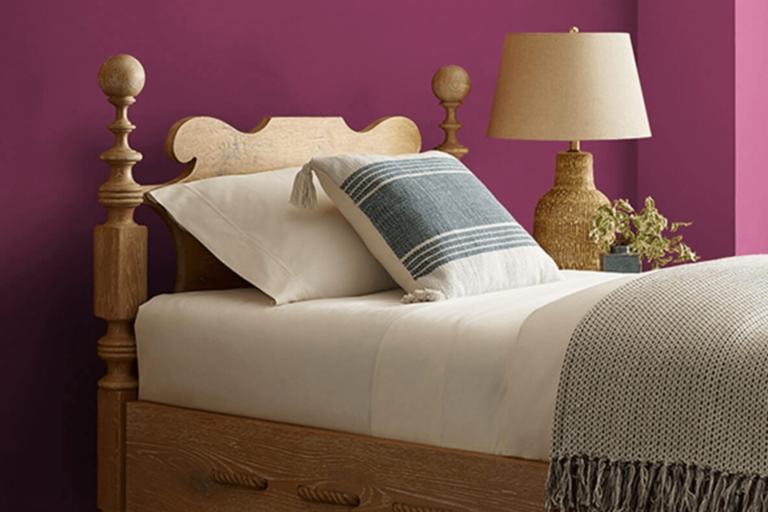
I recently stumbled upon a color that intrigued me, SW 6566 Framboise by Sherwin Williams. It’s a charming shade that closely resembles the vibrant color of ripe raspberries.
As someone who appreciates the impact a gorgeous hue can have on a room, this discovery was quite exciting. The color exudes a bold and lively energy that can really liven up a room. It’s perfect for anyone looking to add a splash of vitality to their home without making it feel too intense with a palette that’s too bright.
This particular shade could brighten up corners that need a little zest or serve as an excellent accent wall that draws the eye and becomes a conversation starter. In quieter, more subdued settings, Framboise acts as a pleasant burst of color, bringing an element of joy and creativity.
From my perspective, it’s an ideal choice for those who enjoy a bit of daring in their decor while maintaining a sense of elegant charm.
I can confidently suggest it to anyone looking to refresh their living area with a tasteful yet impactful tone.
What Color Is Framboise SW 6566 by Sherwin Williams?
The color Framboise is a vibrant shade of raspberry that brings a lively and warm ambiance to any room. This hue is notably energetic, drawing in the eye with its rich, saturated tone. It has a certain boldness that works well as an accent wall or when applied in smaller decorative touches like throw pillows or vases.
Framboise is particularly effective in interior styles that lean towards the bold and expressive, such as bohemian, modern, and eclectic designs. Its vivid nature allows it to stand out and create a strong feature within a room, adding a pop of color that is both warm and inviting.
In terms of pairing with materials and textures, Framboise goes beautifully with natural wood finishes, from light oak to dark walnut, which helps ground its intensity. It also pairs well with metallic accents such as gold or copper, enhancing its warm undertones. Textural fabrics like velvet or silk can add a layer of luxury when presented in this rich color, providing a tactile contrast that enhances its depth.
Combining it with soft, neutral tones such as grey, beige, or creamy whites can balance out its potency, making it more adaptable to work with across various design elements.
Is Framboise SW 6566 by Sherwin Williams Warm or Cool color?
Framboise SW 6566 by Sherwin Williams is a vibrant, rich raspberry pink color. This bold shade can add a lively and playful touch to any room in a home. It’s particularly great for creating a focal point in a room, whether it’s a full wall, an accent area, or just on some key pieces of furniture.
Because of its strong presence, it pairs well with neutral tones like whites, grays, and creams, which help balance out its intensity and keep the room from feeling too intense.
Using Framboise in a home also brings a sense of energy and brightness. It’s a perfect choice for areas where you want to add some cheerfulness and warmth, such as a kitchen, dining area, or a child’s bedroom. In rooms used for relaxation like bedrooms and living rooms, using it on smaller elements (like pillows or decor items) can add just the right amount of pop without overpowering the calming feel of these areas.
Undertones of Framboise SW 6566 by Sherwin Williams
FramboiseSW 6566 is a vibrant and adaptable paint color that can create different moods in a room, depending on the lighting and surrounding colors. This particular shade has a complex mix of undertones that can influence the overall look and feel of a room.
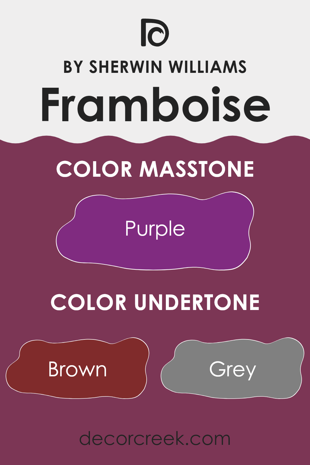
Undertones are subtle colors that sit beneath the surface of the main color. In the case of FramboiseSW 6566, the undertones include an array of shades like brown, gray, olive, navy, dark grey, red, pink, dark green, dark turquoise, orange, pale pink, violet, lilac, dark blue, fuchsia, blue, and light purple. These underlying colors can subtly change how the main color appears under different lighting conditions.
For instance, in a room with lots of natural light, the red or pink undertones might become more apparent, giving the walls a warmer feel. In artificial lighting, the gray or dark grey undertones might dominate, making the color appear more muted and cool. This makes FramboiseSW 6566 a great choice for those looking to add depth and interest to their interior walls without committing to a solid, single color.
When this paint is used on interior walls, the variety of undertones ensures that it can complement a wide range of decor styles and preferences. It pairs well with different types of furniture and can adjust to most rooms, whether you’re aiming for a bold or a more subdued look. The mix of undertones also means that it can interact attractively with various accent colors, enhancing the overall feel of a room.
What is the Masstone of the Framboise SW 6566 by Sherwin Williams?
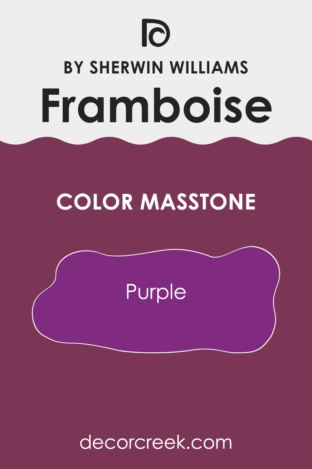
FramboiseSW 6566 by Sherwin Williams has a deep purple masstone, giving it a unique and bold look. When used in homes, this rich shade can create a strong visual impact, making it an excellent choice for feature walls or accent areas.
The intensity of the purple adds a touch of drama and can help define areas within a house. However, due to its depth, using it on all walls of a room might make the room feel smaller or darker. Therefore, it pairs well with lighter colors like soft grays or creams, which help balance its dominance and brighten the area.
Furniture and decor in neutral or metallic shades also complement this color beautifully, allowing it to stand out without feeling too intense. Overall, this shade can bring a lively and dynamic character to any home environment, making it perfect for those looking to add a bit of personality to their living areas.
decorcreek.com
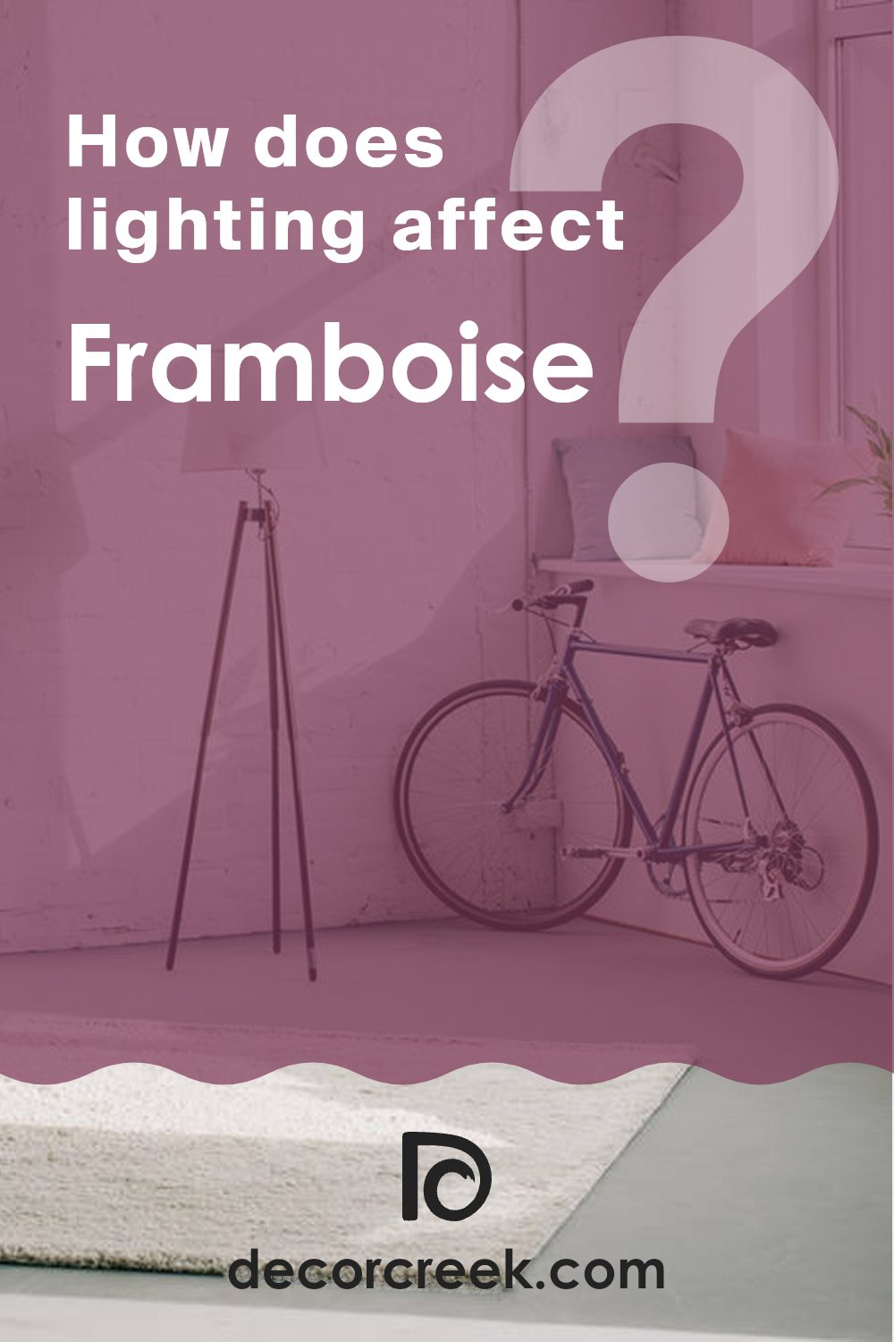
How Does Lighting Affect Framboise SW 6566 by Sherwin Williams?
Lighting significantly impacts how we perceive colors. A painted wall might look different throughout the day depending on the type of light it’s exposed to. This is crucial to remember when choosing a color like Framboise from Sherwin Williams, a vivid raspberry hue.
In artificial light, the nuances of Framboise might appear richer and more intense. This is due to artificial lighting, such as LED or fluorescent bulbs, offering more consistent and controllable light compared to the variable nature of natural sunlight.
Artificial light can either warm up or cool down a color depending on the bulb used. Warm bulbs can make Framboise feel cozier and more vibrant, whereas cool bulbs might bring out a slightly sharper tone in the color.
When it comes to natural light, the appearance of Framboise can change dramatically depending on the room’s orientation:
- North-Faced Rooms: These rooms receive less direct sunlight, which tends to cast a cooler, bluer light that can make colors appear slightly muted. Framboise might look more subdued and less intense in a north-facing room.
- South-Faced Rooms: These rooms benefit from plentiful sunlight most of the day, which can make colors look brighter and more true to their in-store swatch. Here, Framboise will likely appear vivid and dynamic, truly popping against well-lit walls.
- East-Faced Rooms: Sunrise light is warm and welcoming, making Framboise look bright and cheerful in the morning. As the day progresses and natural light decreases, the color may become more subdued.
- West-Faced Rooms: Evening light in these rooms is warm and golden, which can make Framboise look rich and warm, especially in the late afternoon.
Understanding these effects can help you decide where to apply this particular color to achieve the desired effect in your home, enhancing the mood and style of your room.
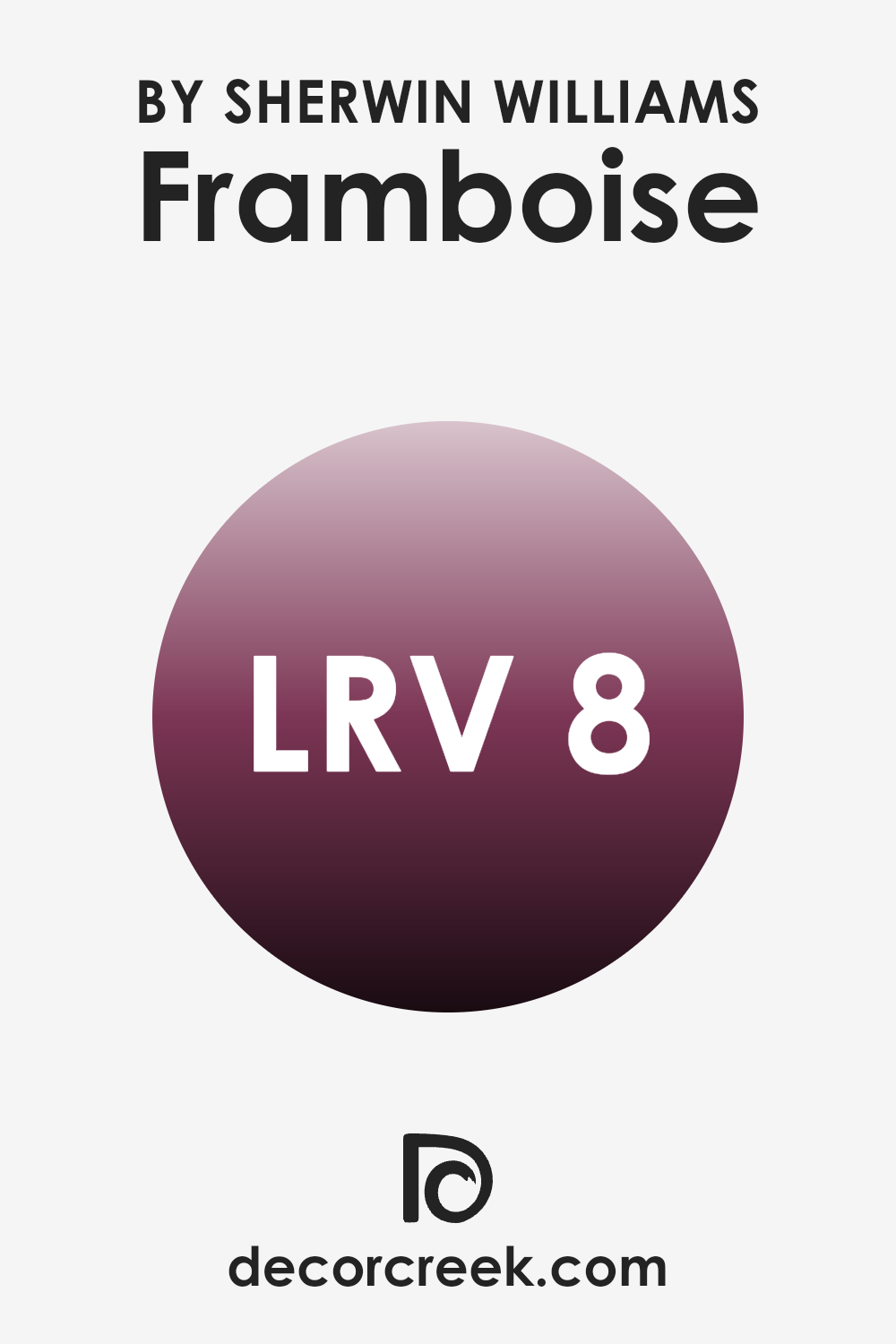
What is the LRV of Framboise SW 6566 by Sherwin Williams?
LRV stands for Light Reflectance Value, a measure used to indicate how much light a paint color reflects or absorbs once applied to a wall. This value is expressed on a scale from 1 to 99, with higher numbers reflecting more light and making the color appear lighter.
On the other hand, colors with lower values absorb more light, causing them to look darker. Understanding the LRV of a paint can help you make better choices about which colors will work best in your room, depending on how much natural or artificial light the room receives.
The LRV for the Framboise color from Sherwin Williams is 7.589, which is relatively low. This means it is a dark color that absorbs a lot of light rather than reflecting it. When used on walls, this color will create a more pronounced, deeper effect, making rooms feel cozier or more enclosed. This characteristic can be beneficial in larger or well-lit rooms where you want to bring in some depth and warmth. However, in smaller or darker rooms, it might make the room feel even smaller or dimmer, so it is important to consider the amount of light a room receives before deciding on this deep hue.
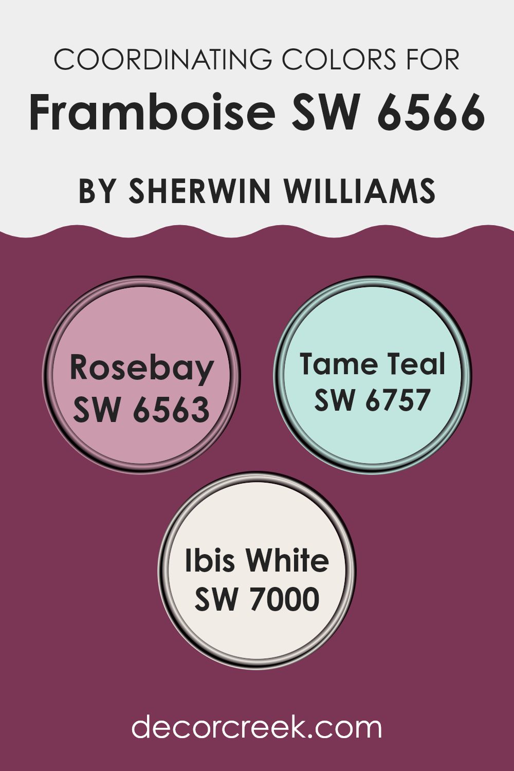
Coordinating Colors of Framboise SW 6566 by Sherwin Williams
Coordinating colors are selected to create a harmonious color scheme that complements a main color, enhancing the overall look of a room. In the case of Framboise SW 6566 by Sherwin Williams, which is a vibrant shade, its coordinating colors are chosen to balance its intensity and add visual interest to the palette.
Among these coordinating colors, one such color is Rosebay SW 6563, a soft pink that offers a gentle contrast to the boldness of Framboise. It brings a subtle, calming touch that can soften a room while still maintaining a connection to the lively main hue.
Another coordinating color, Tame Teal SW 6757, provides a refreshing splash of coolness, acting as a complementary counterpart to the warm tones of Framboise. This teal helps in breaking up the dominance of warmer shades and is perfect for creating a lively yet balanced atmosphere. Lastly, Ibis White SW 7000 serves as a neutral backdrop that can unify the more vivid shades. It acts like a blank canvas, allowing other colors to stand out more prominently.
This white is clean and pure, perfect for highlighting areas of interest or toning down an otherwise vibrant room. Together, these coordinating colors work smoothly to create a visually appealing palette that enhances and complements the beauty of Framboise.
You can see recommended paint colors below:
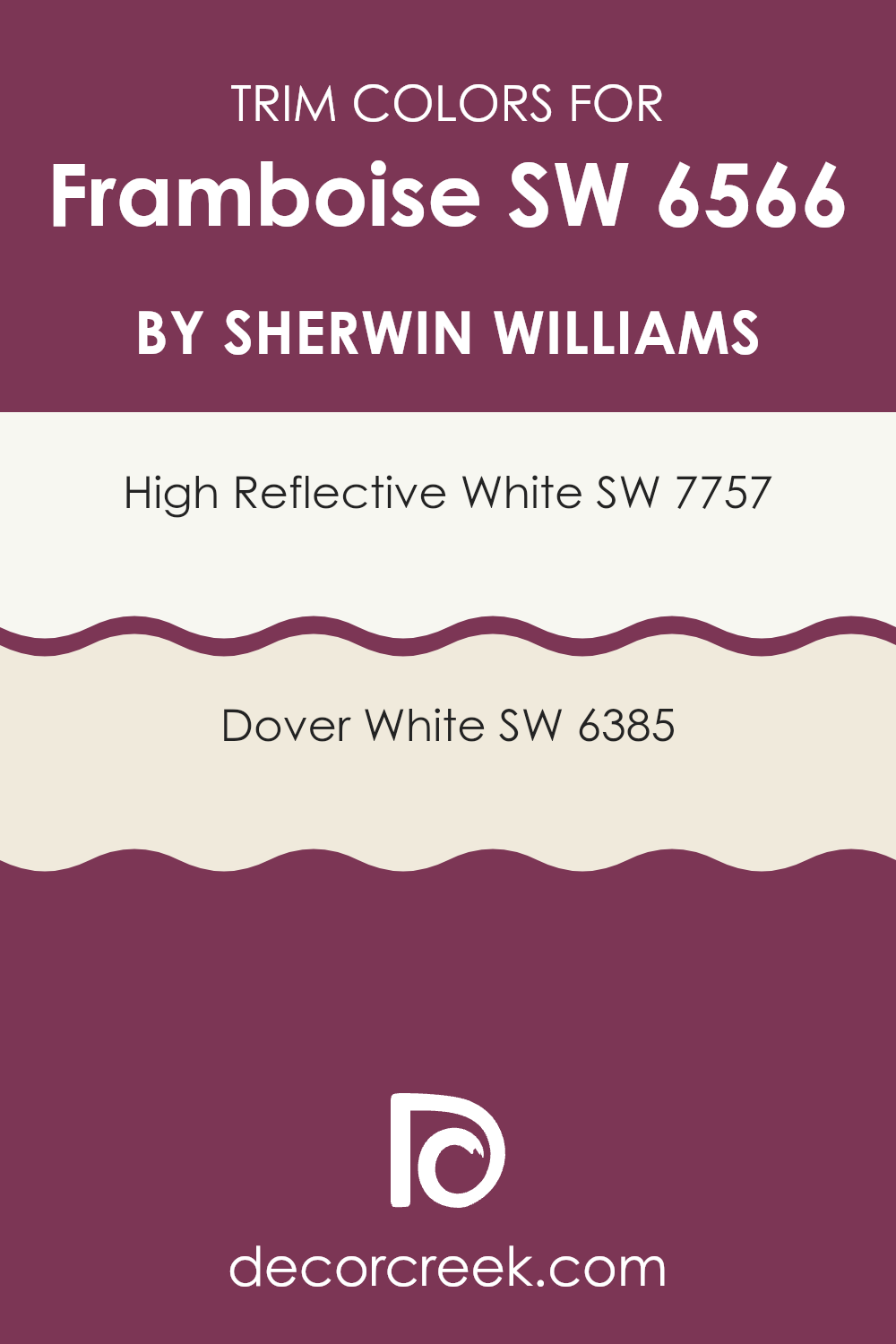
What are the Trim colors of Framboise SW 6566 by Sherwin Williams?
Trim colors, such as SW 7757 – High Reflective White and SW 6385 – Dover White, play a crucial role in enhancing the visual appeal and architecture of a room by creating a crisp contrast with the main paint color.
When paired with a vibrant shade like Framboise SW 6566 by Sherwin Williams, these trim colors help to outline and highlight the architectural features of a room, such as door frames, window sills, and baseboards. This contrast not only adds aesthetic depth but also defines the layout, enriching the overall feel.
High Reflective White SW 7757 is a very bright, almost pure white color that is perfect for making vibrant hues stand out more vividly. It is particularly effective in rooms where natural light is abundant, as it reflects light, enhancing the brightness of the room. Dover White SW 6385, on the other hand, offers a softer, warmer tone of white that provides a gentle transition between bold wall colors and the surrounding framework. Its creamy undertone adds a subtle warmth, making it ideal for rooms that aim for a cozy but distinct look.
You can see recommended paint colors below:
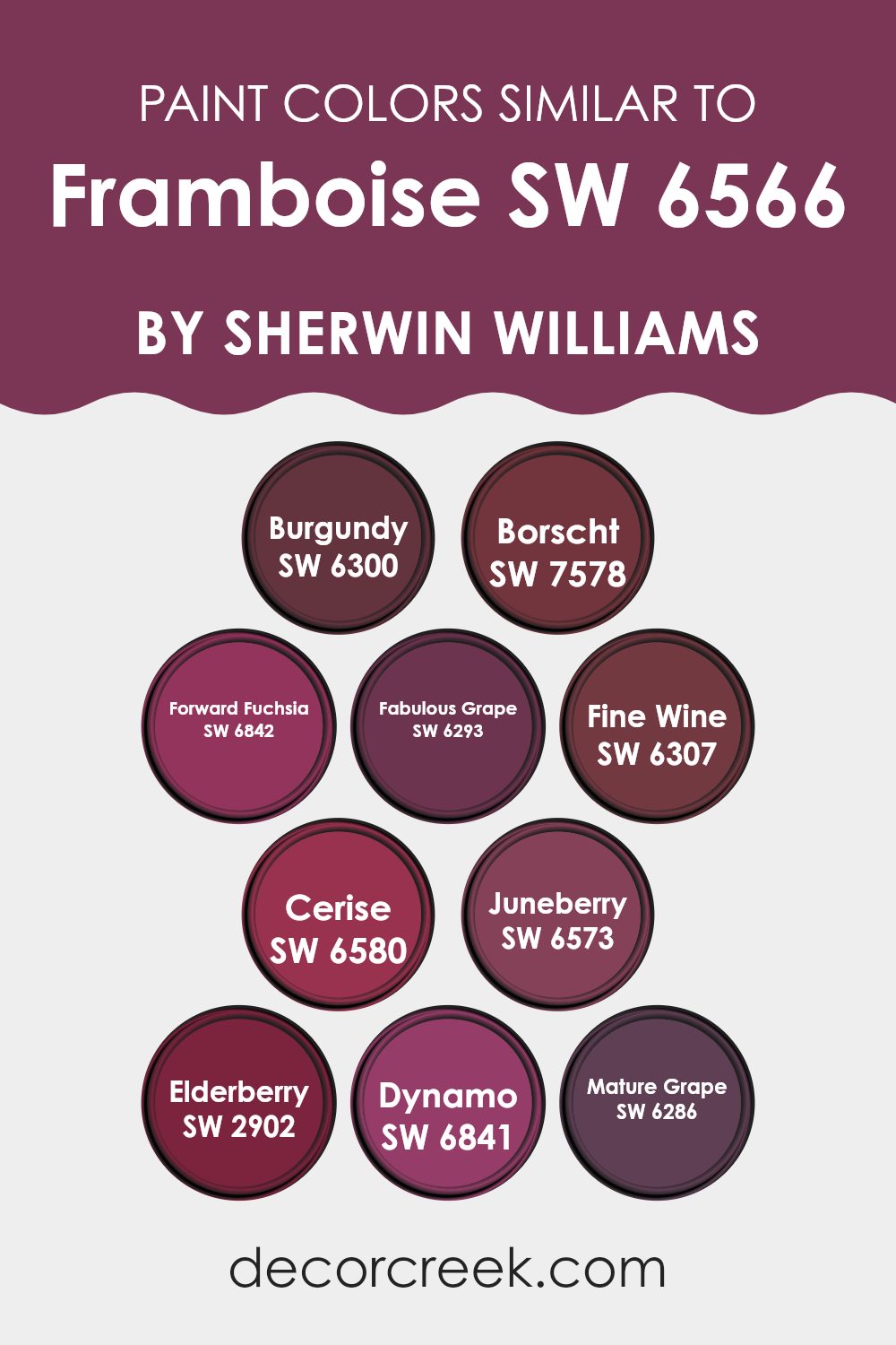
Colors Similar to Framboise SW 6566 by Sherwin Williams
Choosing similar colors to a primary shade, such as Framboise by Sherwin Williams, holds numerous benefits, particularly in crafting a room with aesthetic cohesion and visual depth. Similar colors, like SW 6300 Burgundy and SW 7578 Borscht, each offer distinct but harmonizing elements to a design palette, reinforcing the base color yet bringing their own unique qualities.
Burgundy, a deep, rich red that feels refined, provides a classic depth, making it ideal for rooms that aim for a polished yet inviting feel. In contrast, Borscht, with its slightly lighter and subtly vibrant tones, adds a lively and fresh feel without losing the refined look of deep reds.
The use of these similar shades fosters a layered environment where each color enhances the qualities of the others. For example, SW 6842 Forward Fuchsia introduces a playful touch with its brighter hue, while SW 6293 Fabulous Grape lends a more moody, dusky character to rooms.
On the other hand, SW 6307 Fine Wine and SW 6580 Cerise bring a sense of richness and warmth, each adding depth and cheer respectively. SW 6573 Juneberry features a muted berry tone that softens a room, making it feel cozy and welcoming, whereas SW 2902 Elderberry deepens the mood with its intense, almost dramatic hue that draws in depth and focus.
Together, these colors create a layered and beautifully complex palette that enhances decorative elements, making them feel connected and intentional. This thoughtfully selected array of similar colors ensures that each room carries a character that is both unified and distinct, making the choice of colors an essential part of interior design.
You can see recommended paint colors below:
- SW 6300 Burgundy
- SW 7578 Borscht
- SW 6842 Forward Fuchsia
- SW 6293 Fabulous Grape
- SW 6307 Fine Wine
- SW 6580 Cerise
- SW 6573 Juneberry
- SW 2902 Elderberry
- SW 6841 Dynamo
- SW 6286 Mature Grape
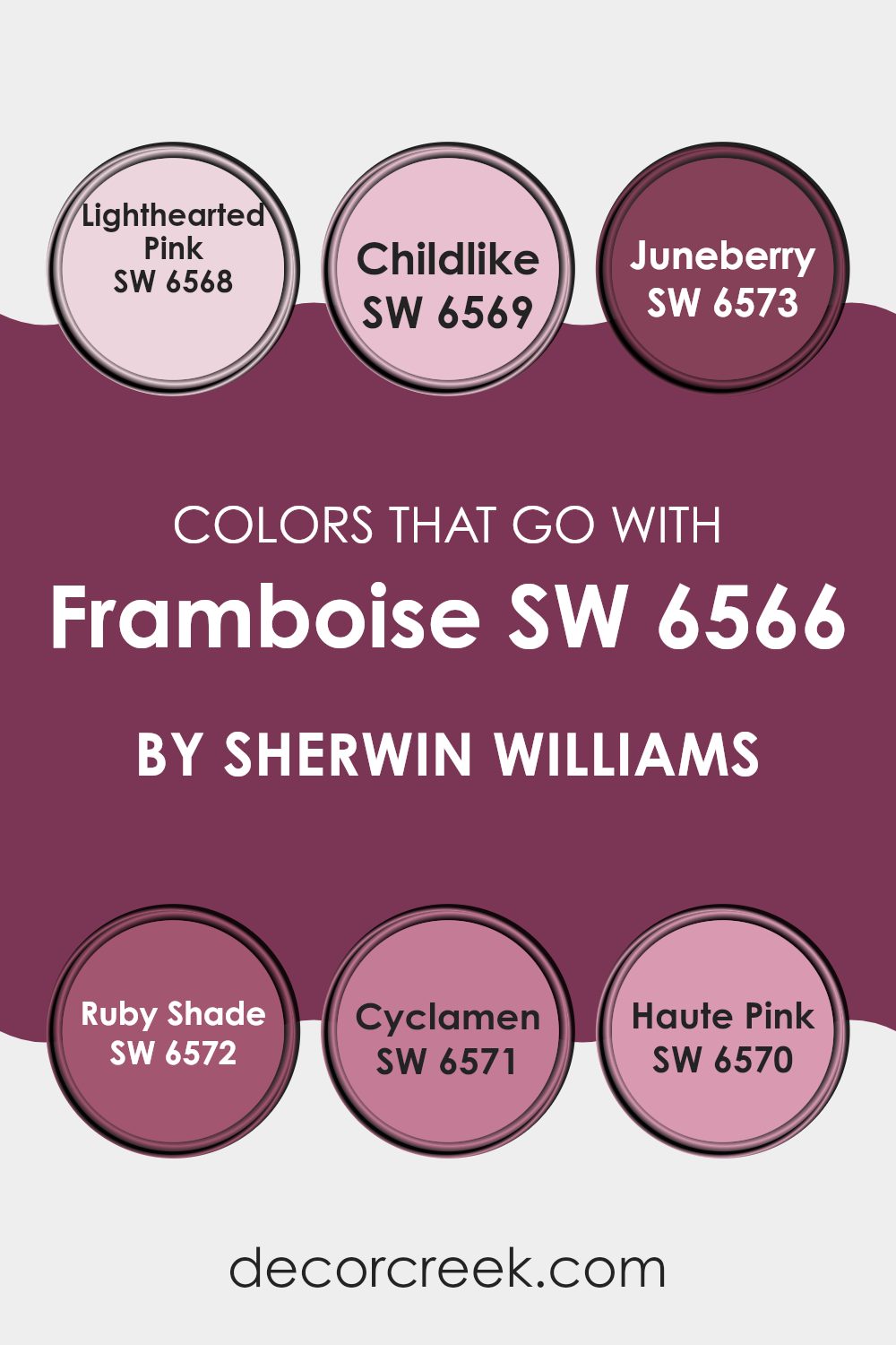
Colors that Go With Framboise SW 6566 by Sherwin Williams
Choosing the right colors to complement Framboise SW 6566 by Sherwin Williams is important because it ensures cohesive and harmonious interior design. When colors like Lighthearted Pink, Childlike, Juneberry, Ruby Shade, Cyclamen, and Haute Pink are paired with Framboise, they create a balanced and visually appealing palette. These compatible colors help in enhancing the overall look of a room by providing contrast or continuity, which is key in achieving a pleasing and consistent feel.
Lighthearted Pink is a gentle, inviting color that adds a soft, cheerful touch when combined with the bold Framboise. It’s particularly effective in creating a relaxed atmosphere. Childlike, a subtle yet playful hue, brings a sense of fun and simplicity, making it perfect for rooms meant to feel upbeat and welcoming.
Juneberry offers a deeper, richer tone that pairs beautifully with the intensity of Framboise, perfect for adding depth to your decor. Ruby Shade is a strong color that enriches the surroundings with its deep, warm undertones, giving a room a more grounded feeling.
Cyclamen, with its vibrant energy, contrasts beautifully with Framboise, bringing brightness and life to any room. Lastly, Haute Pink, full of boldness and brightness, matches the energy of Framboise, creating rooms full of movement and charm, ideal for areas meant to make a statement. These colors when used together with Framboise, ensure a dynamic interior that’s both attractive and cohesive.
You can see recommended paint colors below:
- SW 6568 Lighthearted Pink
- SW 6569 Childlike
- SW 6573 Juneberry
- SW 6572 Ruby Shade
- SW 6571 Cyclamen
- SW 6570 Haute Pink
How to Use Framboise SW 6566 by Sherwin Williams In Your Home?
Framboise SW 6566 by Sherwin Williams is a vibrant and bold paint color, perfect for adding a splash of energy to any room in your home. This rich raspberry red can bring warmth and cheer to areas that need a little more life. It’s an excellent choice for an accent wall in a living room or dining area, adding a sense of fun and personality without making the room feel too intense.
For those who love creative interiors, Framboise can also be used on furniture pieces like a bookshelf or a side table, instantly making them stand-out features of a room. In bedrooms, consider using it for a headboard wall to create a cozy, inviting backdrop, or in a bathroom to give it a unique, stylish look.
Pairing this color with neutral tones such as grays, whites, or soft creams ensures that it stands out while still maintaining harmony in your decor. Lighting plays a crucial role too; with natural light, Framboise shines brightly, enhancing the cheerful feel of your home.
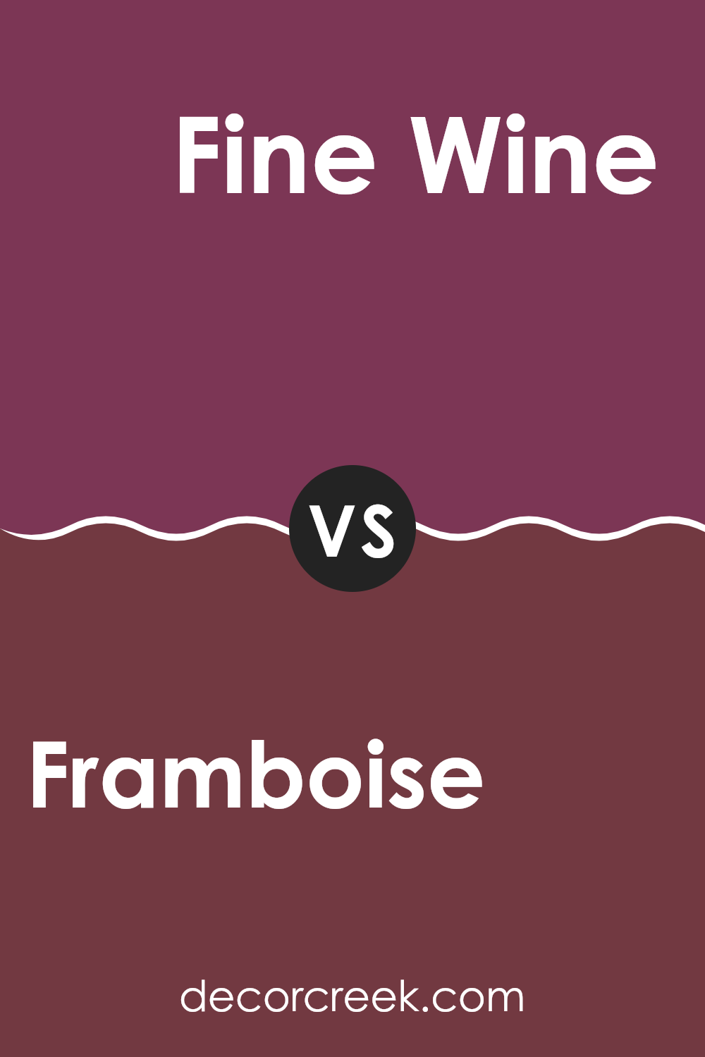
Framboise SW 6566 by Sherwin Williams vs Fine Wine SW 6307 by Sherwin Williams
Framboise and Fine Wine are both rich, deep colors from Sherwin Williams but they have different tones that set them apart. Framboise is a vibrant, cheerful raspberry pink that really pops and draws attention. It’s a great choice if you’re looking to add a splash of brightness and fun to a room.
In contrast, Fine Wine leans towards a deeper, more muted burgundy, which offers a feeling of warmth and coziness, ideal for creating a more relaxed and inviting feel.
Where Framboise might be more suited to lively areas like a playroom or a creative room, Fine Wine would work well in a dining room or bedroom where a more subdued and comforting vibe is desired. The choice between them depends heavily on the mood you want to set in the room and personal color preference.
You can see recommended paint color below:
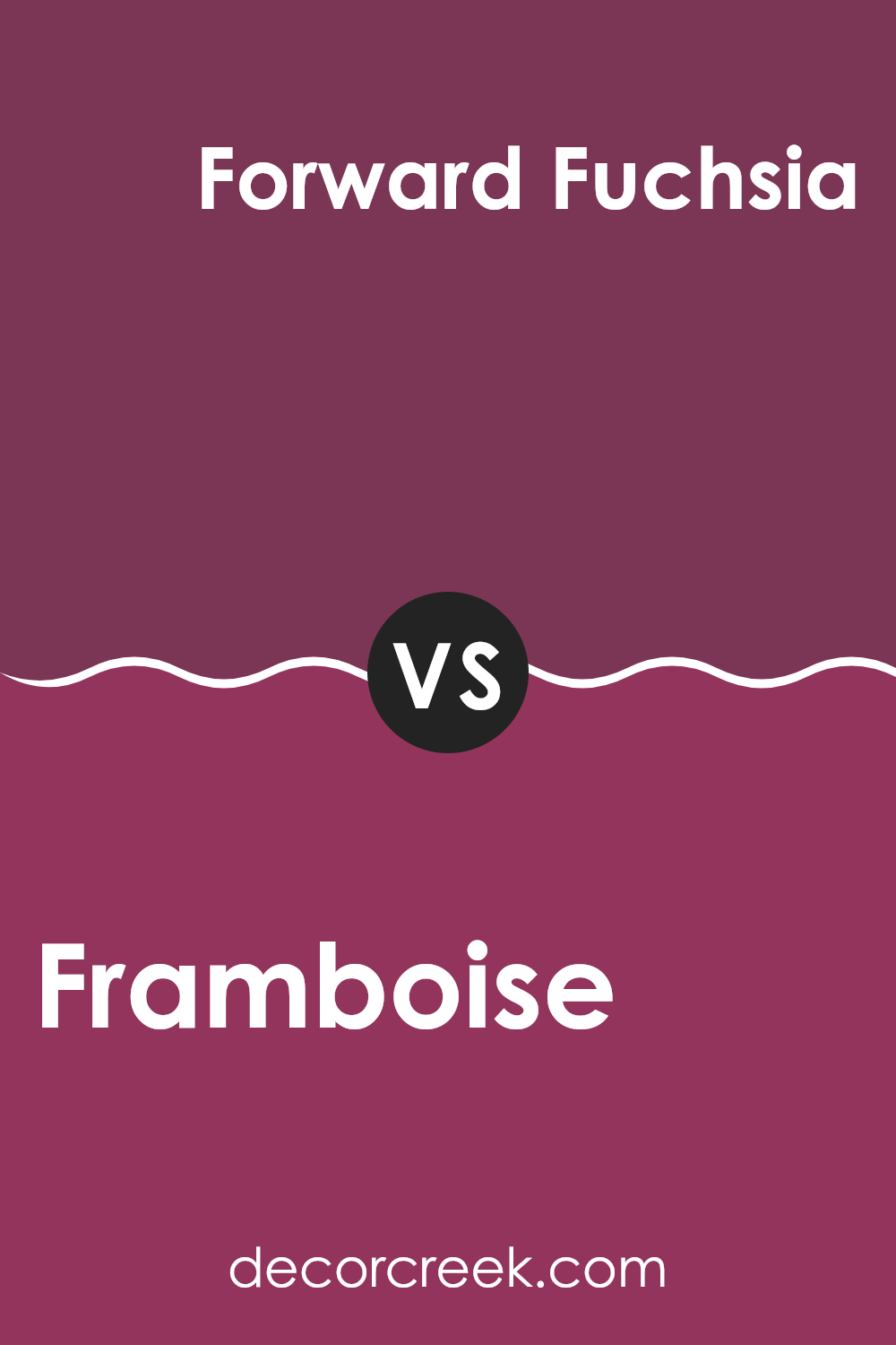
Framboise SW 6566 by Sherwin Williams vs Forward Fuchsia SW 6842 by Sherwin Williams
Framboise SW 6566 and Forward Fuchsia SW 6842 are both vibrant shades offered by Sherwin Williams, but they present their boldness in different ways. Framboise leans towards a raspberry red, giving it a warm and welcoming vibe that’s perfect for areas where you want a pop of color that feels inviting and cozy.
On the other hand, Forward Fuchsia is a deeper pink with a hint of purple, making it a little more striking and perfect for areas where you want to make a strong style statement. These shades, although similar in their vibrancy, suit different moods and settings.
Whether you’re looking to cheer up a living area with the cheerful warmth of Framboise or give a room a touch of bold drama with Forward Fuchsia, each color has its unique charm and potential impact on the feel of a room.
You can see recommended paint color below:
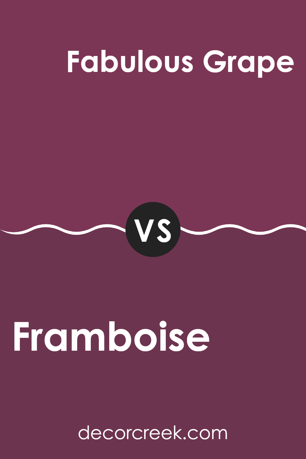
Framboise SW 6566 by Sherwin Williams vs Fabulous Grape SW 6293 by Sherwin Williams
Framboise SW 6566 from Sherwin Williams is a vibrant, pinkish-red hue that adds a lively burst of color to any room. This shade resembles the color of ripe raspberries, offering a fresh and playful feeling that can brighten up your interiors beautifully. It works wonderfully in areas like dining rooms or children’s rooms where you want to add a sense of fun and energy.
In contrast, Fabulous Grape SW 6293 is a deep, rich purple color that brings a strong presence to walls where it’s applied. This darker tone is ideal for creating a more dramatic effect, perhaps in a bedroom or a cozy reading nook. It gives off a moody and deep feel, balancing well with neutrals or serving as a standout feature wall color.
These two colors complement each other well, one being lively and bright, and the other deep and moody. Depending on your room’s purpose and the feeling you want to achieve, either color offers unique possibilities for creating an inviting room.
You can see recommended paint color below:
- SW 6293 Fabulous Grape
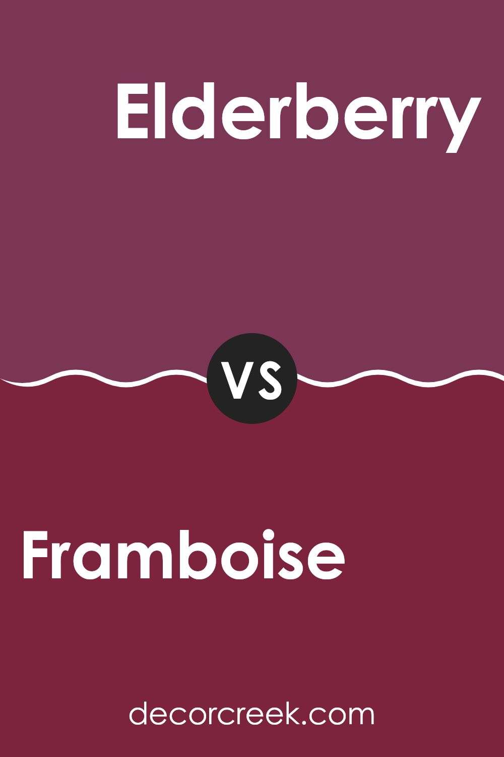
Framboise SW 6566 by Sherwin Williams vs Elderberry SW 2902 by Sherwin Williams
Framboise and Elderberry by Sherwin Williams are two distinct shades that can really change the feel of a room. Framboise is a bright, eye-catching pink with a lively vibe. It’s bold and playful, great for adding a pop of color in rooms that need a cheerful boost. This shade works well in areas like kids’ rooms or creative rooms where you want to inspire energy and fun.
On the other hand, Elderberry is a deeper, muted purple. It gives off a more calm and reserved feel, making it suitable for areas where you want a touch of drama without making things feel too intense. Elderberry is excellent for creating a cozy nook or adding depth to a more formal area, like a dining room or entryway.
Both colors are highly adaptable but serve very different purposes in interior design due to their unique tones and the atmospheres they create. Whether you’re looking for vibrancy or a more refined feel, choosing between these would depend on the mood you’re aiming to achieve in your room.
You can see recommended paint color below:
- SW 2902 Elderberry
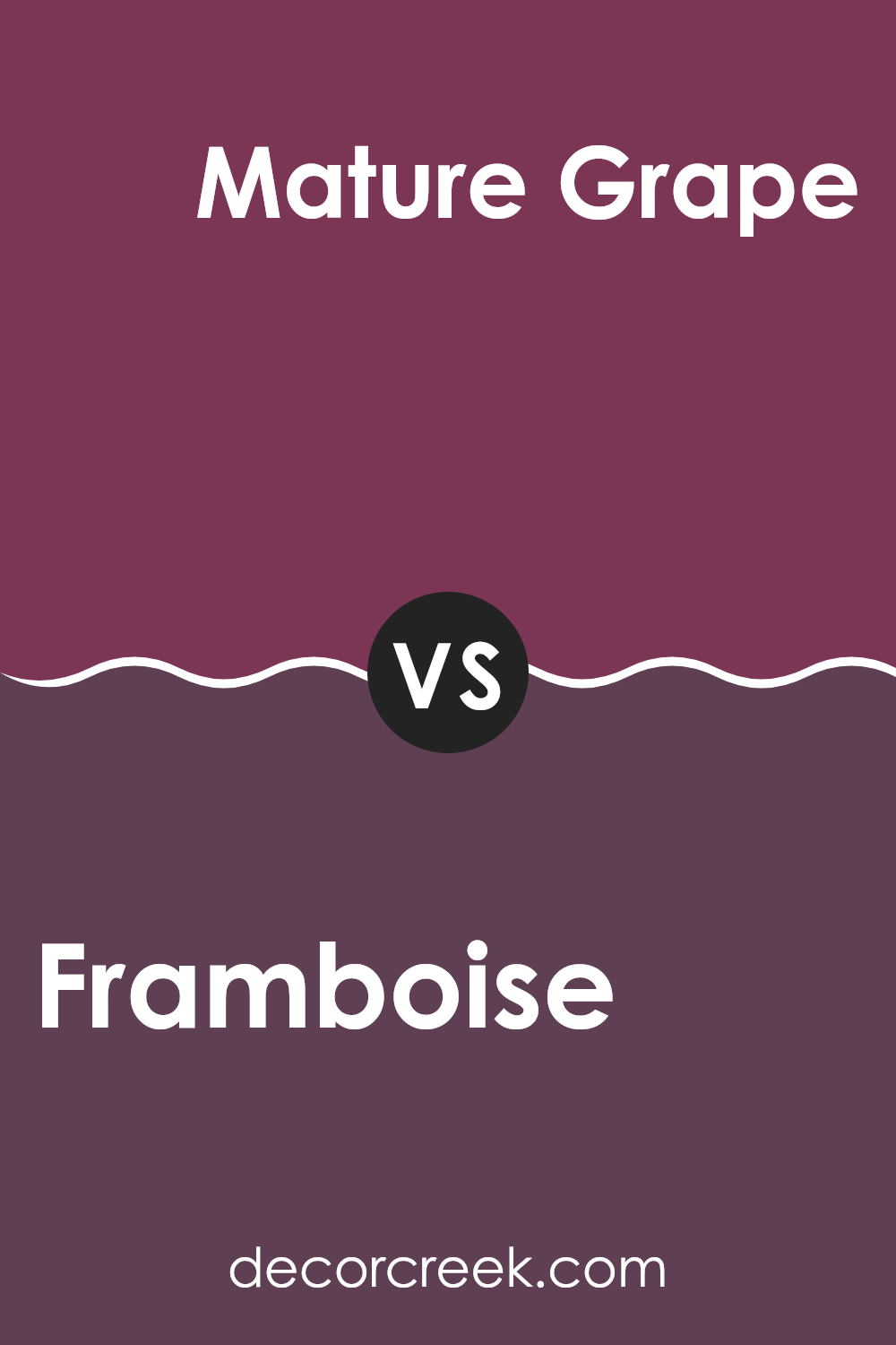
Framboise SW 6566 by Sherwin Williams vs Mature Grape SW 6286 by Sherwin Williams
Framboise and Mature Grape are both interesting shades offered by Sherwin Williams. Framboise is a vibrant raspberry pink with a noticeable amount of boldness that easily draws attention. It has a youthful energy and works well in areas that aim to have a cheerful and lively feel.
In contrast, Mature Grape is a deeper, muted purple that leans more towards a subdued, mature look. It’s a color that provides depth and warmth, making it ideal for areas intended to feel cozy and inviting. While Framboise is striking and fun, Mature Grape offers a sense of refined warmth, suitable for creating a cozy retreat.
Although both colors are rich and have their unique appeal, their different tones suit different decorating needs: Framboise for a splash of freshness and energy, and Mature Grape for a calming, cozy atmosphere.
You can see recommended paint color below:
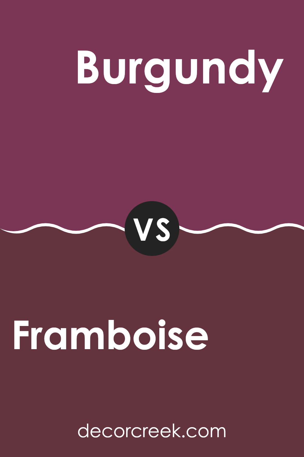
Framboise SW 6566 by Sherwin Williams vs Burgundy SW 6300 by Sherwin Williams
Framboise and Burgundy by Sherwin Williams are two distinct yet related colors, each bringing its unique flair to rooms. Framboise is a vibrant and playful pink-red shade, adding a fresh and lively appeal to any room. This color tends to brighten a room with its cheerful vibe. It’s great for those looking to add some personality and fun into their decor.
On the other hand, Burgundy offers a deeper, more reserved red with a hint of purple. It creates a feeling of richness and warmth, making it ideal for areas where a more relaxed and cozy feel is desired. This color works well in living areas or bedrooms where a calming effect is preferred.
Both colors are bold and can make a strong statement. However, while Framboise might be more suited for energizing a room, Burgundy is likely the go-to for creating a more grounded and warm feel. Whether used independently or together, these colors can beautifully enhance the character of any room.
You can see recommended paint color below:
- SW 6300 Burgundy
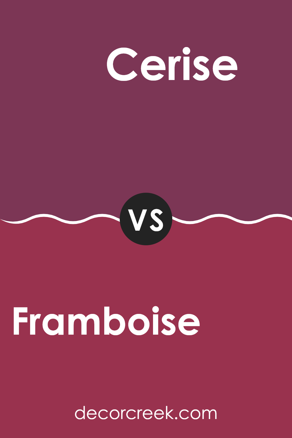
Framboise SW 6566 by Sherwin Williams vs Cerise SW 6580 by Sherwin Williams
The two colors, Framboise and Cerise by Sherwin Williams, are both vibrant and lively shades, but they have distinct differences. Framboise is a bright raspberry pink that has a playful and energetic feel. It’s a color that stands out and can make a statement in a room, great for adding a cheerful touch.
On the other hand, Cerise is a deeper, rich cherry red. It offers a bold and dramatic look, making it ideal for areas where you want to add some depth and intensity. While Framboise brings lightness and fun, Cerise adds a sense of passion and strength.
Both colors can create unique moods and atmospheres in rooms, depending on how they are used and what they are paired with. Whether for an accent wall or a full room, each color has its charm and effect.
You can see recommended paint color below:
- SW 6580 Cerise
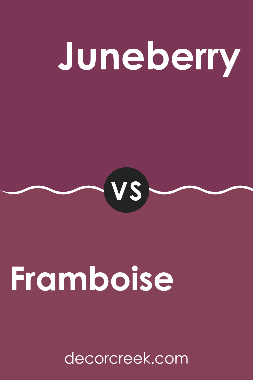
Framboise SW 6566 by Sherwin Williams vs Juneberry SW 6573 by Sherwin Williams
Framboise SW 6566 and Juneberry SW 6573, both by Sherwin Williams, offer unique shades suitable for adding distinct personalities to rooms. Framboise is a vibrant raspberry pink with a lively feel, great for areas where you want a fun, energetic vibe. It catches the eye easily and can make a bold statement when used in larger areas or as an accent.
On the other hand, Juneberry is a deeper berry tone, closer to a mix of plum and red. This color adds a touch of mystery and depth, ideal for creating more intimate and cozy environments. While it’s also bold, Juneberry’s darker hue gives it a slightly more muted presence compared to the brightness of Framboise.
Both colors are great for bringing warmth and vitality to a room but suit different aesthetic preferences and moods. Framboise stands out more, while Juneberry draws you in for a closer look.
You can see recommended paint color below:
- SW 6573 Juneberry
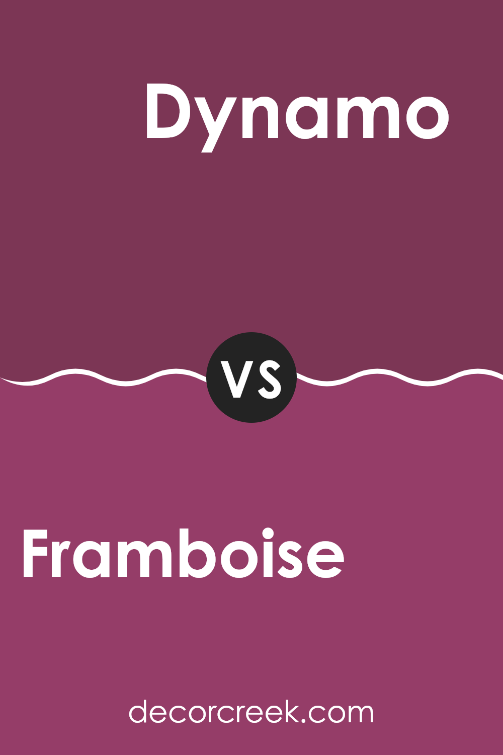
Framboise SW 6566 by Sherwin Williams vs Dynamo SW 6841 by Sherwin Williams
Framboise and Dynamo are both vibrant colors from Sherwin Williams but they offer distinct vibes. Framboise is a deep, raspberry pink that adds a warm and cheerful splash of color to any room. It’s bright and lively, perfect for creating a playful, welcoming feel.
On the other hand, Dynamo is a bold and dynamic shade of magenta-leaning purple. It brings an energetic punch, which can make any area stand out and feel more alive.
While Framboise has a softer, more inviting tone that could be great for living rooms or bedrooms, Dynamo carries more intensity and might be best suited for accent walls or creative areas that benefit from a stronger, more stimulating color presence. Together, these colors could pair well if you’re aiming for a room full of personality and vibrancy.
You can see recommended paint color below:
- SW 6841 Dynamo
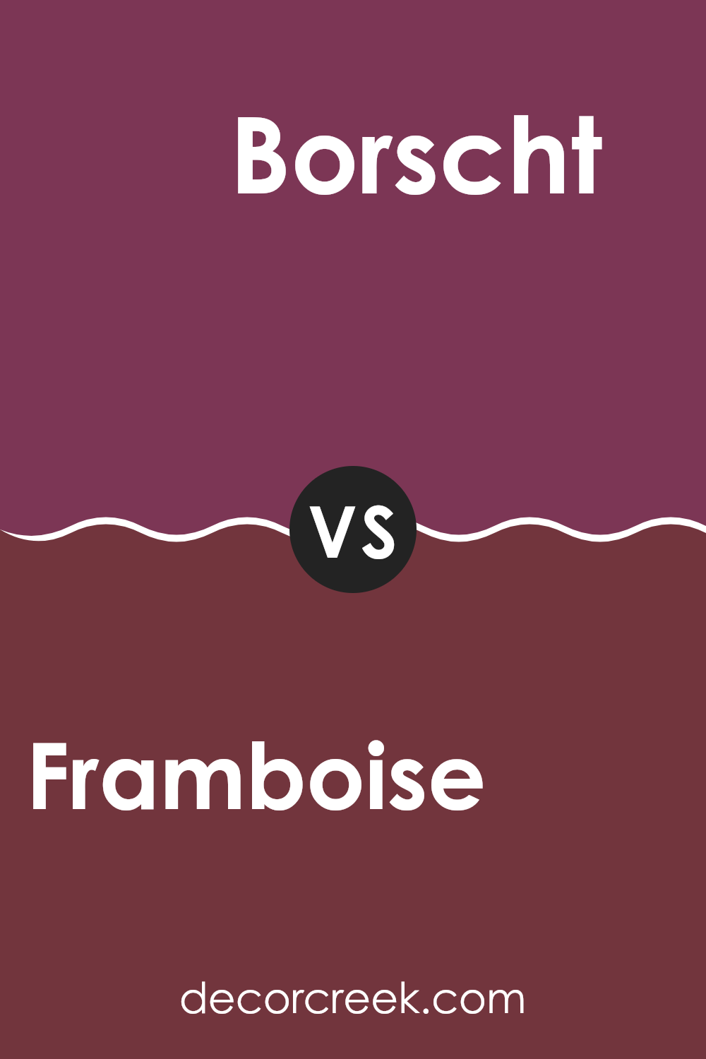
Framboise SW 6566 by Sherwin Williams vs Borscht SW 7578 by Sherwin Williams
Framboise and Borscht, both by Sherwin Williams, are two distinct colors. Framboise is a bright, vivid pink with a playful and youthful vibe. It catches the eye and brings a lot of energy to any room, making it great for areas like children’s rooms or creative rooms where you want to inspire joy and creativity.
On the other hand, Borscht is a deeper shade, resembling a rich beet or maroon color. This color lends a more grounded and warm feeling, suitable for areas where you want to create a cozy and inviting atmosphere, like living rooms or dining areas. It pairs well with earth tones and can add a touch of elegance without being too bold.
Both colors offer unique atmospheres and can be chosen based on the mood you wish to set in a room. While Framboise adds a splash of fun and liveliness, Borscht brings warmth and depth to a room, making each appropriate for different purposes and preferences.
You can see recommended paint color below:
- SW 7578 Borscht
In conclusion, SW 6566 Framboise by Sherwin Williams is a paint color that really stands out. It is a sort of raspberry pink, which makes any room feel bright and fun. It’s perfect if you want to make a bedroom or playroom feel extra cheerful. When I used this color in my own home, it instantly made the room feel warmer and more welcoming, which is great when friends and family come over.
What’s also great about Framboise is that it goes well with many other colors. You can pair it with whites for a sharp and clean look, or with grays to make it feel a bit more grown-up. This means you can use it in many different ways depending on what you like or how your room looks already.
So, if you are thinking about adding a splash of color to your home, SW 6566 Framboise is a fun pink color to try. It’s not just for kids’ rooms; it can also add a lively touch to living rooms or even kitchens if you’re adventurous with colors. Plus, it’s easy to find other colors that match well with it, making decorating feel enjoyable.
Ever wished paint sampling was as easy as sticking a sticker? Guess what? Now it is! Discover Samplize's unique Peel & Stick samples.
Get paint samples

