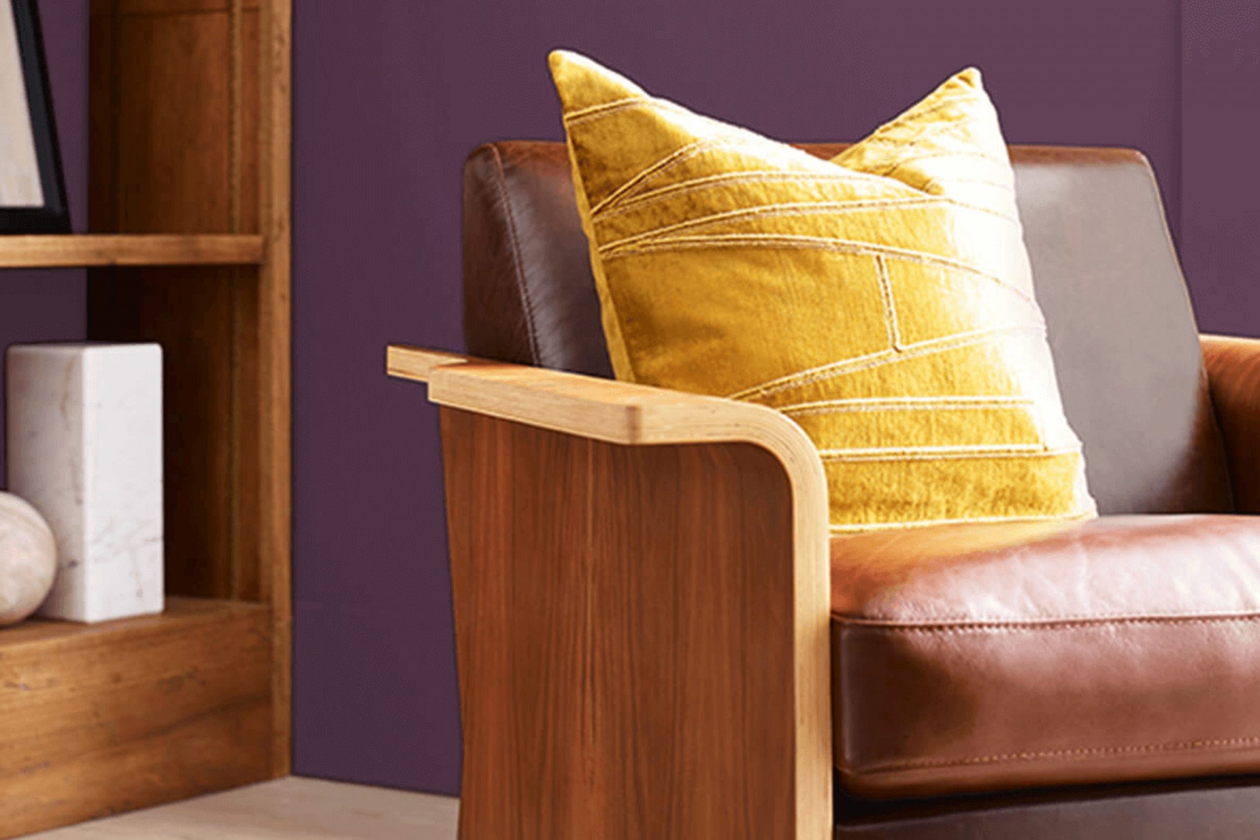
As you look into the vibrant world of colors, SW 6286 Mature Grape by Sherwin Williams is sure to catch your eye. This color is a deep, complex purple that can add a touch of refinement and depth to any room. Whether you’re thinking about a bold statement wall in your living room or looking for an elegant backdrop in your dining area, Mature Grape offers a unique blend of warmth and richness that enhances the environment without overpowering it.
In rooms that need a more grounded, contemplative atmosphere, this shade works beautifully to provide just that. Also, if you are considering updating your furniture or accent pieces, this robust hue could serve as an excellent choice for a refreshing paint job.
As you think about your next home improvement project, consider how this intriguing shade might enhance the aesthetic of your living areas.
From improving mood to complementing various decor styles, Mature Grape has the flexibility to blend smoothly and boldly.
What Color Is Mature Grape SW 6286 by Sherwin Williams?
Mature Grape by Sherwin Williams is a deep, rich purple hue that brings a sense of luxury and warmth to any room. This color has a velvety depth that works exceptionally well in personal rooms like bedrooms and living rooms where a touch of drama can enhance the overall ambiance. Its lush tone pairs beautifully with soft, plush textures such as velvet or silk, adding a layer of coziness and comfort.
When it comes to interior styles, Mature Grape is very flexible. It shines in modern and contemporary settings when used as an accent wall or in unique decorative touches. However, it’s also right at home in more traditional or even eclectic decors due to its classic appeal. This color looks stunning when contrasted with lighter neutrals like soft grays, creamy whites, or muted beiges, which help to balance its intensity.
For materials, Mature Grape goes well with natural wood, which can soften its impact and add a natural, earthy feel to the decor. Metallic elements in gold or brass can also complement this rich purple by adding a touch of luxury and elegance.
Whether used in large areas or in smaller decorative elements, Mature Grape adds a cozy yet dramatic flair to any room.
Is Mature Grape SW 6286 by Sherwin Williams Warm or Cool color?
Mature Grape by Sherwin Williams is a deep, rich purple shade that adds a bold touch to any room. This color is perfect for those looking to create a statement wall or bring some depth to their room. Because of its strong hue, it works well in larger rooms or areas with plenty of natural light to ensure the color doesn’t make the room feel too dark or cramped.
When used in a home, Mature Grape can set a cozy and warm atmosphere, making it ideal for living rooms or bedrooms where a touch of drama can improve the mood. It pairs beautifully with softer, neutral colors such as light grays or creamy whites, which help balance its intensity.
This color can also be a stunning backdrop for metallic accents like gold or silver, adding a modern twist to the decor. Overall, Mature Grape is a great choice for anyone looking to add some personality to their interiors with a powerful, standout color.
Undertones of Mature Grape SW 6286 by Sherwin Williams
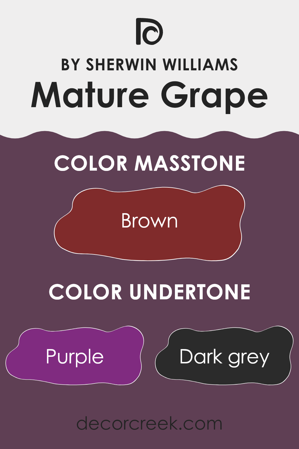
Mature Grape is a unique paint color that carries a blend of multiple undertones, making it flexible and dynamic as it reacts to different lighting conditions and surrounding colors. The primary undertone of this color is a deep purple, which provides a rich and vibrant base. However, it’s the combination with other undertones that adds complexity and depth to the color.
This color also has hints of dark grey and navy, which can make the color appear more muted and subtle in dimly lit rooms. On the other hand, undertones like olive and dark green bring a touch of warmth and natural feel to the room, balancing the cooler blues and grays. Similarly, the presence of dark turquoise adds a slightly aquatic vibe, giving a refreshing twist to the overall appearance.
Red, pink, and pale pink undertones introduce a soft, slightly playful aspect to Mature Grape, which can make the walls feel less imposing and more inviting. The inclusion of orange adds a slight vibrancy, subtly lifting the overall mood of the room.
In an interior setting, these undertones collectively influence how Mature Grape is perceived. In natural daylight, the purples and blues might stand out more, making the walls feel bold and lively. In artificial or dim lighting, the grays and greens might become more pronounced, making the room feel cozy and grounded.
The choice of furnishings and decor can also accent certain undertones, further affecting the room’s ambiance. For instance, pairing this color with silver or blue accents may highlight its cooler tones, while wooden or golden elements might enhance its warmer tones.
The multifaceted nature of Mature Grape therefore offers a lot of room for creative decoration, allowing for a personalized room that can feel both dynamic and harmoniously balanced.
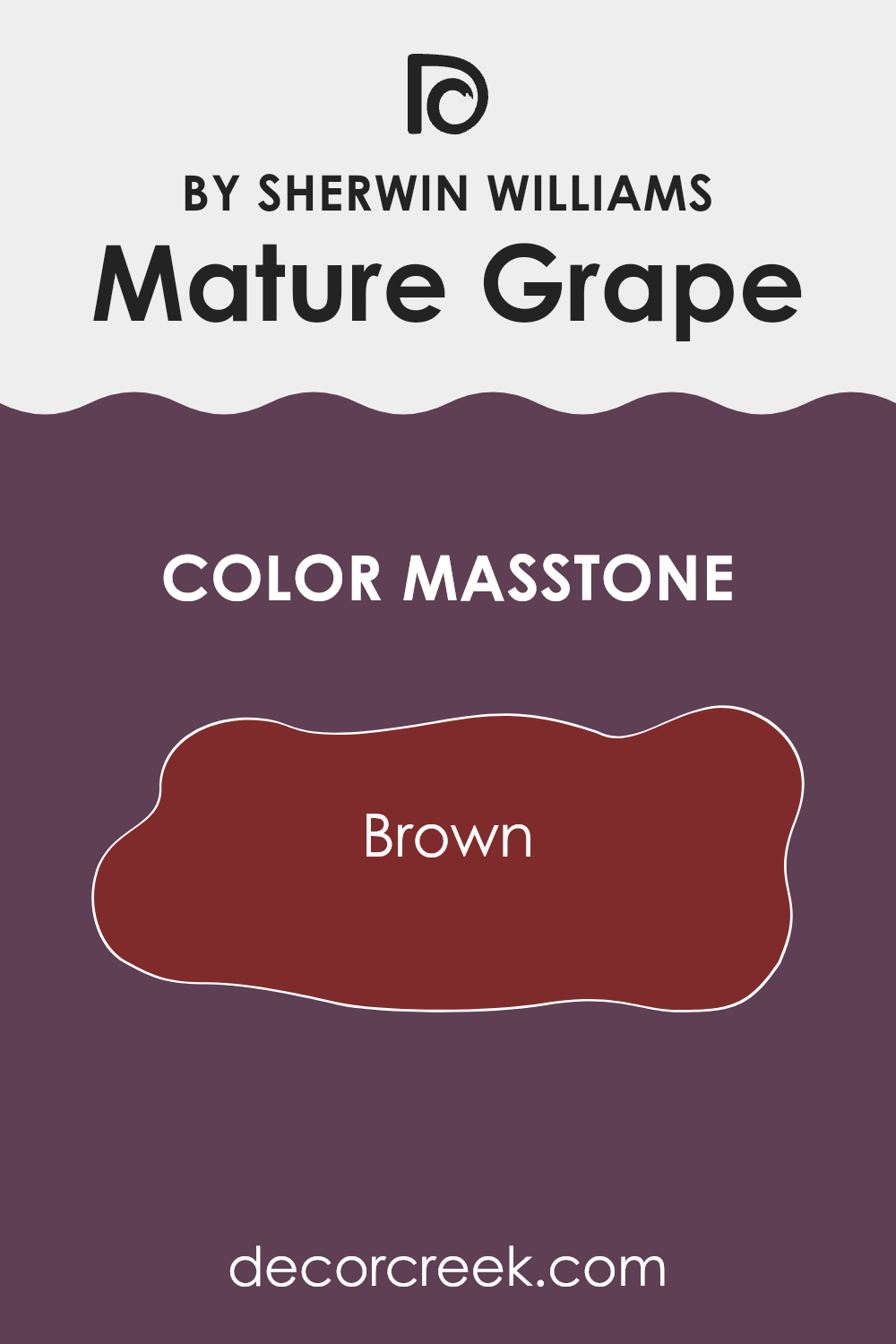
What is the Masstone of the Mature Grape SW 6286 by Sherwin Williams?
Mature Grape SW 6286 by Sherwin Williams has a masstone of Brown (#802B2B), a deep, rich shade similar to the skin of a ripe grape. This distinct color brings warmth and coziness to any room, making it ideal for creating inviting rooms.
When used in homes, this shade of brown adds depth and comfort, perfect for living areas, dining rooms, or bedrooms where you want a more relaxed atmosphere. It pairs well with softer, lighter colors like creams or light grays, which help to balance the darkness of the brown.
This flexibility means it can fit smoothly into various design styles, from rustic to more modern looks. Applying this color can also help to hide marks or stains, making it a practical choice for high-traffic areas or family homes where durability is key. The warmth of Mature Grape can make large rooms feel more intimate and smaller rooms feel cozier, improving the overall appeal of the home.
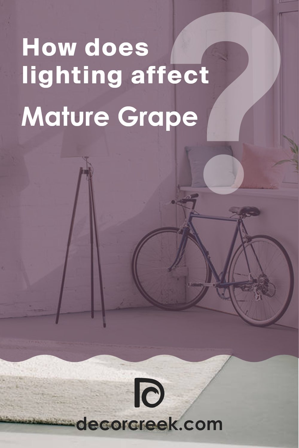
How Does Lighting Affect Mature Grape SW 6286 by Sherwin Williams?
Lighting plays a critical role in how colors appear in any room. A particular shade can look quite different under various types of light due to how each lighting condition affects the way we perceive color. Mature Grape, a deep, rich shade by Sherwin Williams, serves as an excellent example to illustrate these effects.
Artificial Light vs. Natural Light:In artificial light, Mature Grape may appear warmer and more inviting because artificial lighting, like incandescent bulbs, tends to give off a yellowish hue, enhancing the cozy facets of deeper colors.
In contrast, under natural light, especially that which is bright and direct, the same color can look a bit cooler and more vivid. This is because natural daylight usually has a balanced spectrum that can bring out the true richness and depth of darker shades.
Room Orientation:
- North-Faced Rooms: North-facing rooms often get less direct sunlight, which can make a color like Mature Grape look somewhat shadowy and more subdued. In these rooms, it might seem deeper and cooler, potentially producing a more somber atmosphere.
- South-Faced Rooms: South-facing areas benefit from ample sunlight for most of the day, which can make the Mature Grape look lively and dynamic. The ample light can soften the intensity of the color, making it look a bit lighter and less overpowering.
- East-Faced Rooms: These rooms receive a lot of light in the morning and less in the afternoon. In the morning light, Mature Grape will appear bright and cheerful. As the day progresses and the natural light diminishes, the color might transition to a deeper and richer tone.
- West-Faced Rooms: West-facing rooms have the opposite light pattern to east-facing ones, with subdued tones in the morning and more vibrancy in the afternoon and evening as the sun sets. The color can shift from being somewhat flat in the morning to vibrant and warm in the evening.
Understanding these nuances helps in making informed decisions about paint colors based on the orientation of rooms and the lighting they receive. This ensures that you can enjoy the true beauty of the color throughout the day.
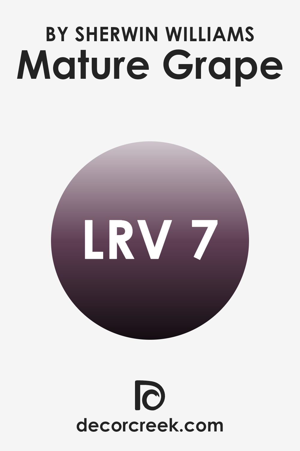
What is the LRV of Mature Grape SW 6286 by Sherwin Williams?
LRV stands for Light Reflectance Value, which is a measurement used to express the percentage of light a paint color reflects. Think of it as a scale to determine how light or dark a paint color will look on your walls.
Colors with higher LRV numbers reflect more light, making them appear lighter, while colors with lower LRV numbers absorb more light, making them look darker. This is an important factor to consider when choosing paint colors for your room because it influences the mood and the perceived size of the room.
Lighter colors make a room feel more open and airy, whereas darker colors tend to create a more cozy and intimate atmosphere.
With an LRV of 6.655, the color we are discussing is quite dark, meaning it absorbs much of the light that hits it rather than reflecting it.
This characteristic could make a room painted in this color appear smaller and more enclosed. It is ideal for creating a dramatic or cozy feel in a room and could work well in a room that you want to feel warm and enveloping. However, if used in a small room or a room without much natural light, it might be overpowering.
To balance the darkness of this color, you might consider using it on one accent wall or pairing it with lighter furnishings and decor to bring more balance and prevent the room from feeling too closed in.
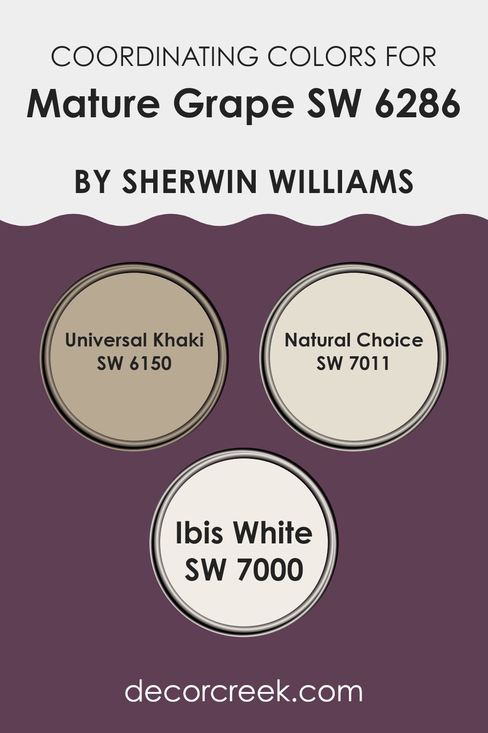
Coordinating Colors of Mature Grape SW 6286 by Sherwin Williams
Coordinating colors are chosen to complement each other, creating a balanced and harmonious look in any room. They work by enhancing the main color, in this case, Mature Grape, by adding colors that offer contrast or maintain the color scheme without overpowering the senses. For instance, when Mature Grape—a deep, rich purple—is used as the primary color, its intensity is neatly balanced with lighter or neutral shades that add variety and interest to the overall design.
Universal Khaki is a soft, muted beige that brings warmth to the boldness of Mature Grape. It provides a calm background that does not compete with the primary color but rather supports it, allowing for a relaxing and grounded environment. Natural Choice and Ibis White, on the other hand, are lighter options that offer a fresh, clean look.
Natural Choice is a very light, almost off-white shade that provides a subtle contrast, making it an excellent choice for creating a gentle, calming feel. Ibis White is a pure, bright white that acts like a blank canvas, giving any room a crisp and airy quality. These colors together coordinate beautifully to create a cohesive interior design palette that is both pleasant and appealing.
You can see recommended paint colors below:
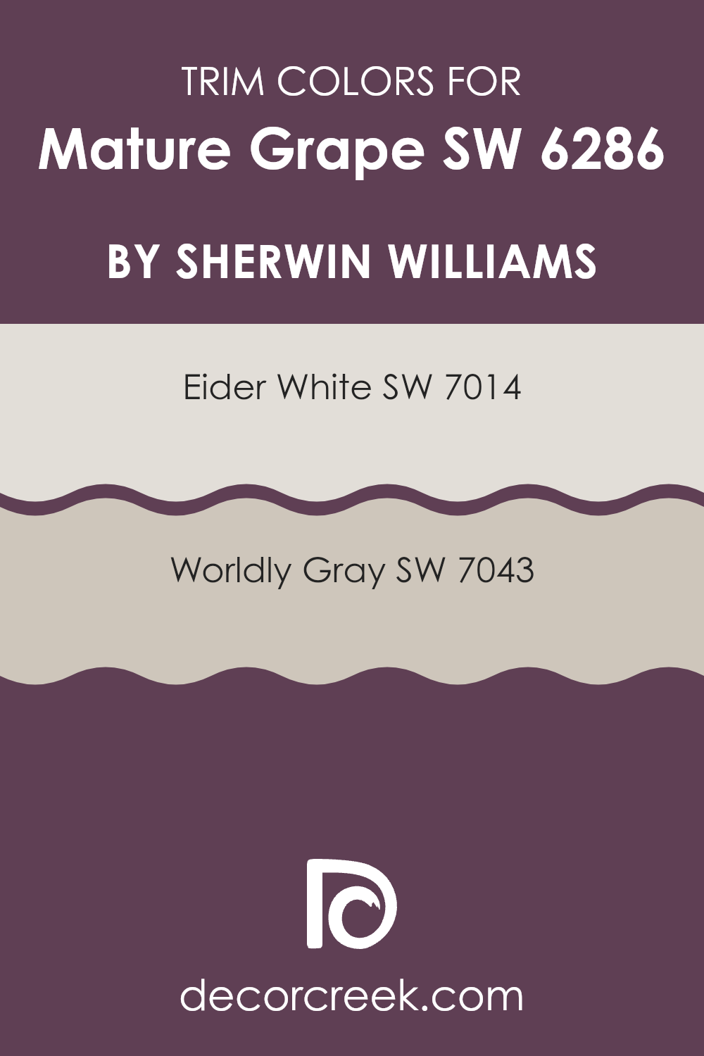
What are the Trim colors of Mature Grape SW 6286 by Sherwin Williams?
Trim colors are crucial accents that highlight the unique architectural features of a home by creating a visual framework that complements the main wall colors. For instance, when painting walls with a deep color like Mature Grape by Sherwin Williams, choosing lighter trim colors can create a striking contrast that outlines windows, doors, and moldings, enhancing the overall appearance of the room.
Eider White SW 7014 is a soft, pale gray that provides a subtle contrast when used as a trim color with darker shades such as Mature Grape. Its light touch brightens areas, making rooms appear larger and more open, which is particularly effective in areas with less natural light.
Worldly Gray SW 7043, on the other hand, is a warmer gray that blends smoothly with deeper hues, ensuring that transitions between the wall and its trim are smooth while still defining the room clearly. These trim options are ideal for balancing the intensity of Rich Grape with a refined visual appeal.
You can see recommended paint colors below:
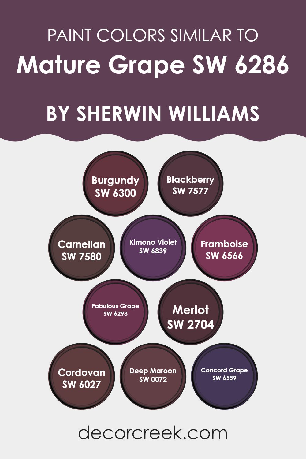
Colors Similar to Mature Grape SW 6286 by Sherwin Williams
Similar colors, like varying shades of burgundy and purple, are crucial in creating a cohesive and appealing aesthetic in design, as they naturally complement each other. By sticking to a specific color palette, such as the ones close to Mature Grape SW 6286 by Sherwin Williams, designers and decorators can ensure a harmonious look that is pleasing to the eye, without the risk of clashing hues. These subtle variations within a single color family can add depth and interest to a room, making it feel more put together and intentional.
For example, Burgundy SW 6300 brings a rich, deep red that evokes a sense of warmth and comfort, making it perfect for cozy, intimate rooms. Blackberry SW 7577 offers a darker, more intense touch, ideal for accentuating areas that require a bit of drama. Carnelian SW 7580, on the other hand, adds a lively, ruby-red sparkle that can energize a room.
Kimono Violet SW 6839 presents a softer side of purple, providing a gentle backdrop that’s easy on the eyes. If looking for something a little more vibrant, Framboise SW 6566 has a playful, raspberry tone that brightens rooms wonderfully. Fabulous Grape SW 6293 deepens the mood with its dusky, mysterious hue, perfect for creating a focal point in a room.
Merlot SW 2704 mimics the wine it’s named after with a luxurious and mature reddish-purple. Cordovan SW 6027 offers a unique blend of burgundy tinged with brown, adding a touch of earthiness to the palette.
Deep Maroon SW 0072 gives a classic, enduring vibe, great for traditional rooms, while Concord Grape SW 6559 finishes off with a dark, almost black purple that adds an excellent anchor color for any design theme focused on depth. By utilizing these similar colors, one can achieve a visually engaging room that has both unity and variety.
You can see recommended paint colors below:
- SW 6300 Burgundy
- SW 7577 Blackberry
- SW 7580 Carnelian
- SW 6839 Kimono Violet
- SW 6566 Framboise
- SW 6293 Fabulous Grape
- SW 2704 Merlot
- SW 6027 Cordovan
- SW 0072 Deep Maroon
- SW 6559 Concord Grape
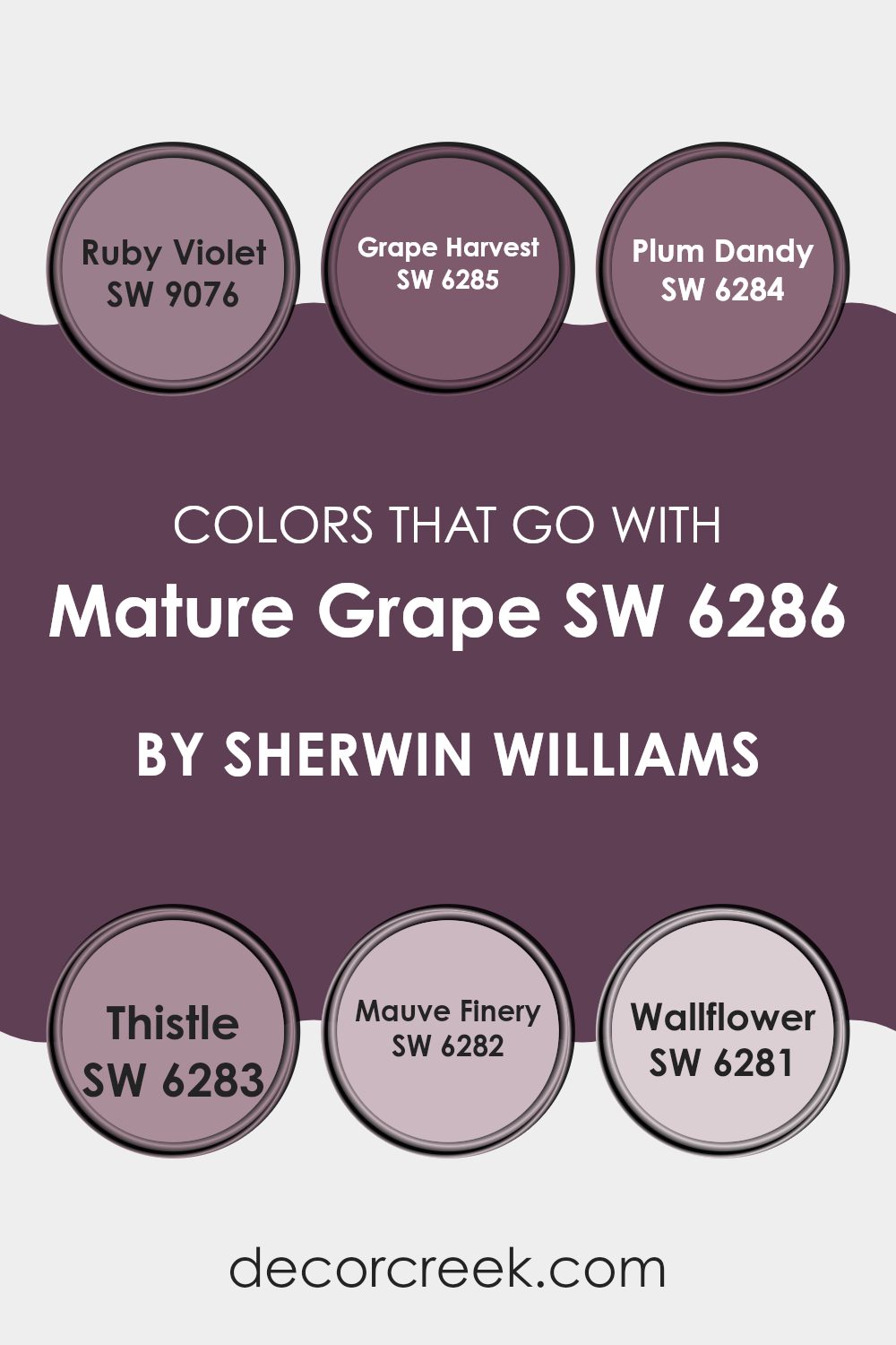
Colors that Go With Mature Grape SW 6286 by Sherwin Williams
Choosing the right colors to complement Mature Grape SW 6286 by Sherwin Williams is crucial in achieving a cohesive and appealing design. The importance lies in creating an inviting atmosphere where each color works harmoniously with others, enhancing the overall aesthetic of a room. By carefully selecting shades that pair well, such as Ruby Violet, Grape Harvest, and others, designers can craft rooms that are both visually appealing and mood-enhancing.
Ruby Violet SW 9076 brings a rich, deep tone, much like the jewel it’s named after, adding a luxurious feel to interiors. Grape Harvest SW 6285, a slightly lighter and softer purple, provides a gentle contrast that complements the depths of Mature Grape. Plum Dandy SW 6284 offers a dusty purple that can be a subtle backdrop or an accent, depending on how it’s used.
Thistle SW 6283 brings a lighter, airier purple, providing a fresher feel that lightens darker color schemes. Mauve Finery SW 6282 introduces a touch of pinkish-purple elegance, adding light and refinement without overpowering the senses. Lastly, Wallflower SW 6281 offers a muted earthy tone that grounds the more vibrant purples, creating a balanced, harmonious palette. These carefully selected colors enhance each other, making any room feel more polished and visually coordinated.
You can see recommended paint colors below:
- SW 9076 Ruby Violet
- SW 6285 Grape Harvest
- SW 6284 Plum Dandy
- SW 6283 Thistle
- SW 6282 Mauve Finery
- SW 6281 Wallflower
How to Use Mature Grape SW 6286 by Sherwin Williams In Your Home?
Mature Grape is a rich, vibrant purple paint from Sherwin Williams that adds a pop of color to any room. This shade can create a cozy, inviting atmosphere, making it perfect for living rooms or bedrooms. If you’re hesitant to cover all four walls with such a bold color, consider using it for an accent wall. This can be an exciting backdrop for artworks or a flat-screen TV.
This purple hue also works nicely in a bathroom, giving it a fresh, modern feel. Pair it with soft white towels and a white shower curtain for a clean, balanced look.
For those who enjoy DIY projects, Mature Grape can refresh old furniture. A dresser or a nightstand painted in this color could stand out beautifully against more neutral tones in your bedroom. Overall, Mature Grape offers a fun yet tasteful way to bring some personality into your living room.
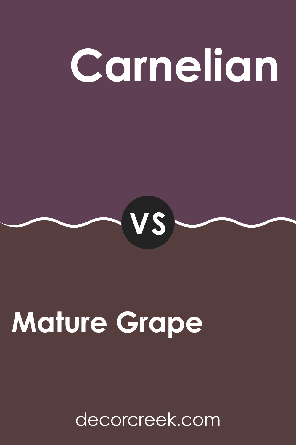
Mature Grape SW 6286 by Sherwin Williams vs Carnelian SW 7580 by Sherwin Williams
Mature Grape by Sherwin Williams is a deep, rich purple with strong blue undertones, giving it a bold yet cozy feel perfect for creating a comforting and inviting atmosphere in any room. It leans towards a regal appearance, ideal for accent walls or for rooms where a touch of drama is desired.
Carnelian by Sherwin Williams, on the other hand, is a vibrant, deep red with a slightly rusty tone that adds warmth and energy to a room. This color is striking and can immediately draw attention, making it a great choice for areas where you want to make a strong impression, like a dining room or an entryway.
Both colors are bold and can define a room’s character, but while Mature Grape adds a certain mystery and depth, Carnelian offers a feeling of warmth and vibrancy. Choosing between them depends on the mood and atmosphere you want to achieve: calming and thoughtful with Mature Grape, or lively and welcoming with Carnelian.
You can see recommended paint color below:
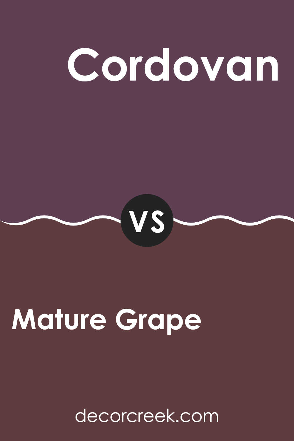
Mature Grape SW 6286 by Sherwin Williams vs Cordovan SW 6027 by Sherwin Williams
Mature Grape and Cordovan by Sherwin Williams are two distinct shades that each bring their own unique flair to a room. Mature Grape is a deep, rich purple with a hint of moody darkness that makes it perfect for creating a cozy and inviting atmosphere. It tends to add a dramatic touch and works well in personal rooms like bedrooms or reading nooks.
On the other hand, Cordovan is a robust, reddish-brown color resembling the hue of fine leather. It offers a warm and welcoming vibe, making it ideal for lively areas like living rooms or dining areas. This color pairs well with natural materials and can add a rustic charm to any setting.
Both colors are quite bold and can define the character of a room quite significantly. While Mature Grape leans towards a cooler, more introspective vibe, Cordovan pulls in a warmer, more social atmosphere. These colors can be used effectively to highlight architectural features or to make large rooms feel more intimate and cozy.
You can see recommended paint color below:
- SW 6027 Cordovan
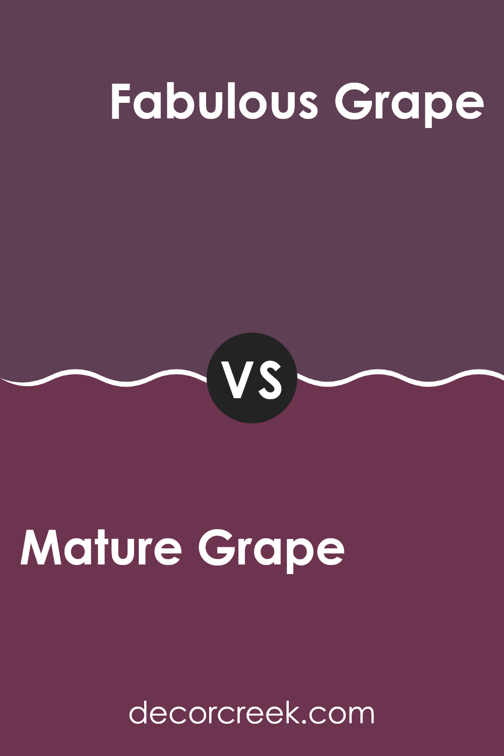
Mature Grape SW 6286 by Sherwin Williams vs Fabulous Grape SW 6293 by Sherwin Williams
Mature Grape and Fabulous Grape by Sherwin Williams are two distinct shades of purple that offer unique vibes for any room. Mature Grape has a deeper, more muted tone that leans towards a classic, calming purple.
It’s a color you might want in a place where you want a touch of elegance but still keep things low-key and relaxing. On the other hand, Fabulous Grape is brighter and more vivid. It has a playful, energetic feel, perfect for adding a pop of color in a fun area like a game room or a creative room.
While both colors share a purple base, Mature Grape gives a more understated and enduring look, whereas Fabulous Grape stands out more and can make a statement in a room. These colors can work well on their own or even together if you’re looking for a layered purple theme.
You can see recommended paint color below:
- SW 6293 Fabulous Grape
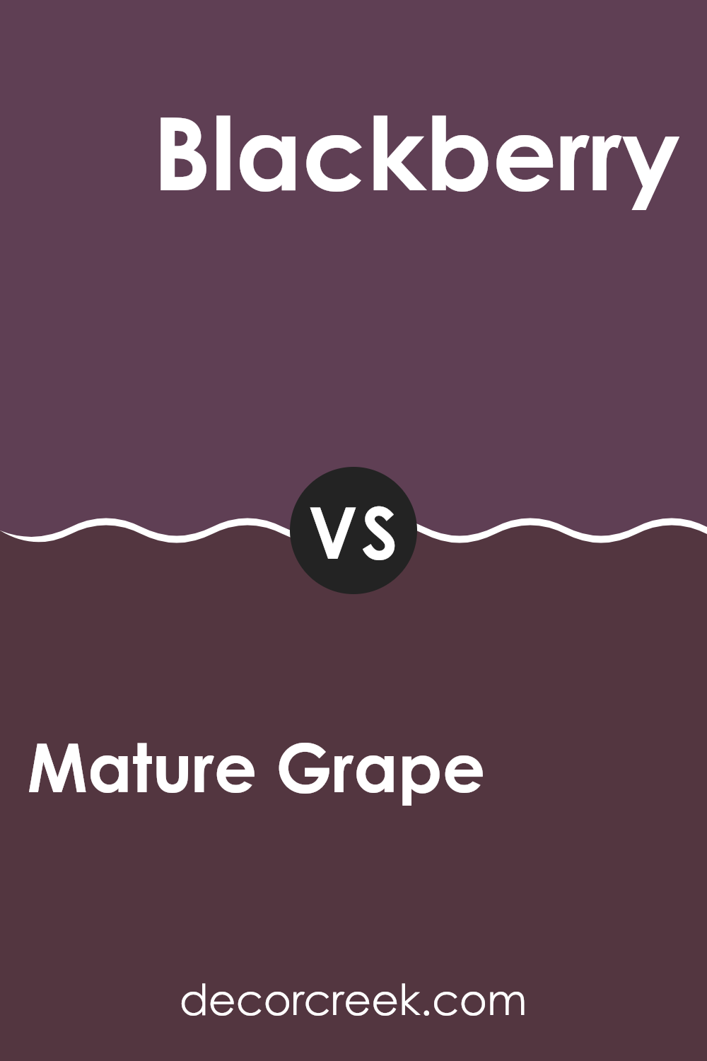
Mature Grape SW 6286 by Sherwin Williams vs Blackberry SW 7577 by Sherwin Williams
Mature Grape and Blackberry by Sherwin Williams are both deep, rich colors, but they have distinct tones that set them apart. Mature Grape has a more understated vibe with a blend of purple and gray, giving it a muted, subtle feel. It’s a great color for those who want a hint of color without it being too bright or overpowering.
On the other hand, Blackberry is a deeper, more intense shade. It leans closer to a true dark purple with a stronger presence. This color is perfect if you’re looking for something that stands out more and can act as a focal point in a room.
Both colors are excellent for adding depth to a room, but your choice depends on the impact you want. Mature Grape works well for a softer, more conservative look, while Blackberry is ideal for making a bolder statement.
You can see recommended paint color below:
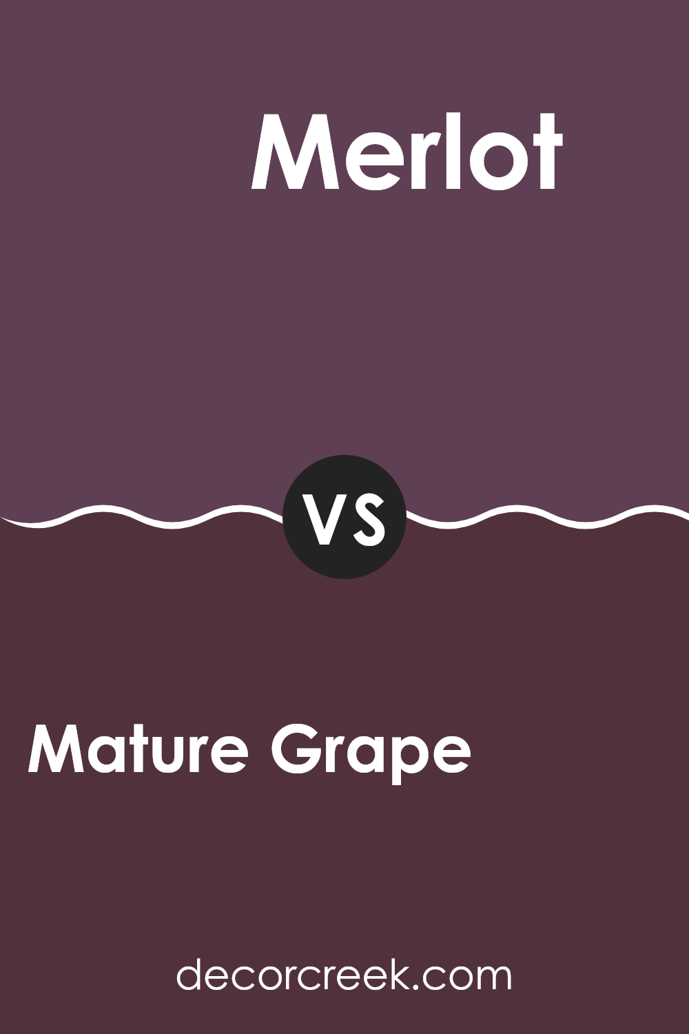
Mature Grape SW 6286 by Sherwin Williams vs Merlot SW 2704 by Sherwin Williams
Mature Grape and Merlot, both from Sherwin Williams, offer unique shades of deep red, but each has its own distinctive tone and mood. Mature Grape, a deeper, almost plum-like color, has a rich and cozy feel, making it perfect for creating a warm, welcoming room.
It leans towards a darker, more intense hue, which works well in areas meant for relaxation like living rooms or bedrooms. On the other hand, Merlot carries a brighter, more vibrant red, reminiscent of the wine it’s named after.
This color can add a lively touch to a room, ideal for places where you entertain guests or enjoy lively conversations. While both colors are deep and bold, Mature Grape offers a more subdued elegance, whereas Merlot brings an energetic presence into a room.
You can see recommended paint color below:
- SW 2704 Merlot
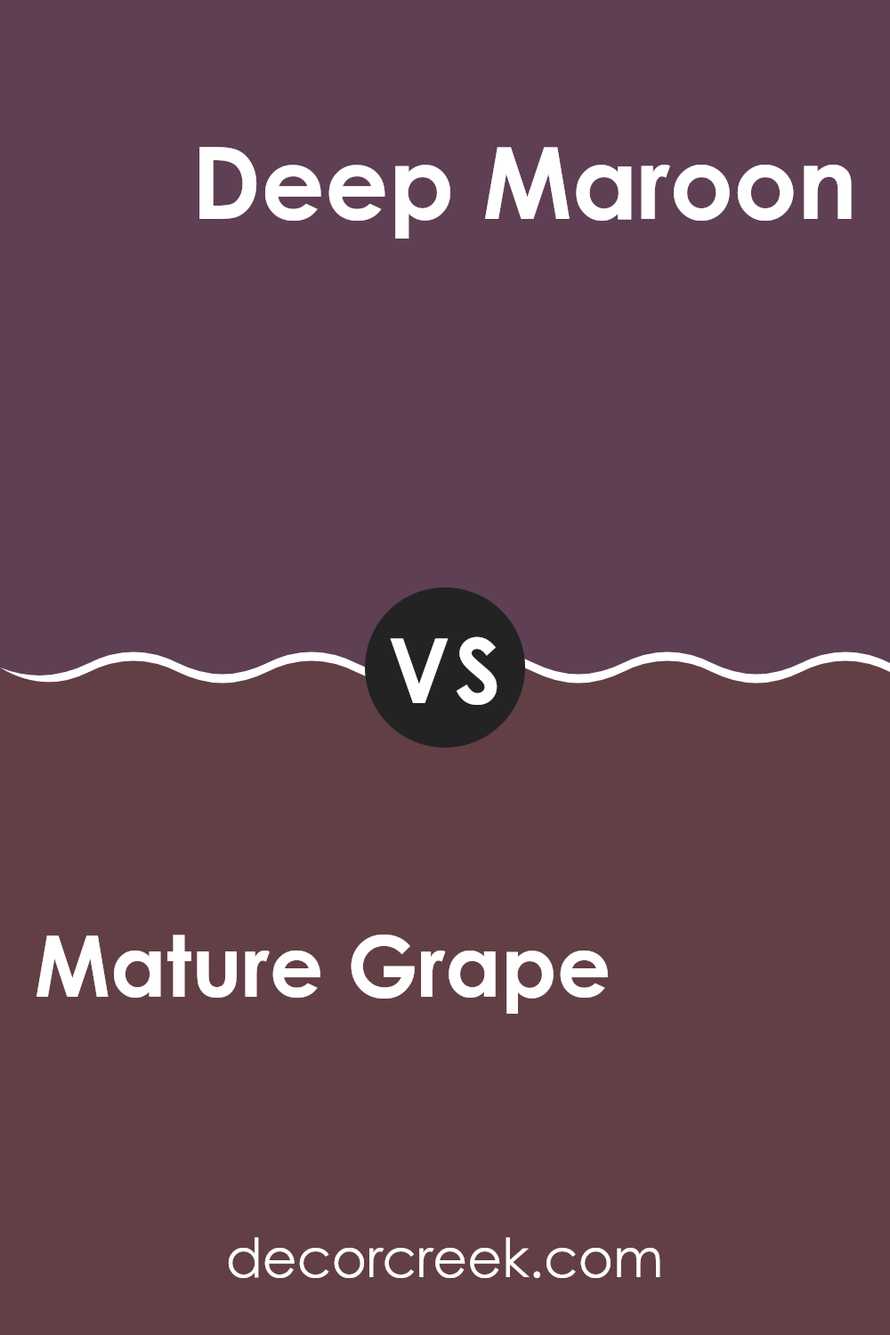
Mature Grape SW 6286 by Sherwin Williams vs Deep Maroon SW 0072 by Sherwin Williams
Mature Grape and Deep Maroon, both from Sherwin Williams, present two distinct vibes in a room. Mature Grape is a vivid, lively purple that can add a cheerful and dynamic touch. It tends to brighten rooms with its boldness, making it a great choice for areas where you want an energetic feel, like a playroom or creative room.
On the other hand, Deep Maroon is a darker, more subdued color. It leans towards a rich, red-brown tone, giving it an air of warmth and coziness. This color works well in rooms where you’re looking to create a more relaxed and welcoming atmosphere, such as living rooms or dining areas.
Both colors are strong in their own right but serve different purposes based on the mood you want to set. Whether you choose the playful pop of Mature Grape or the comforting depth of Deep Maroon, each color can make a unique statement in your home.
You can see recommended paint color below:
- SW 0072 Deep Maroon
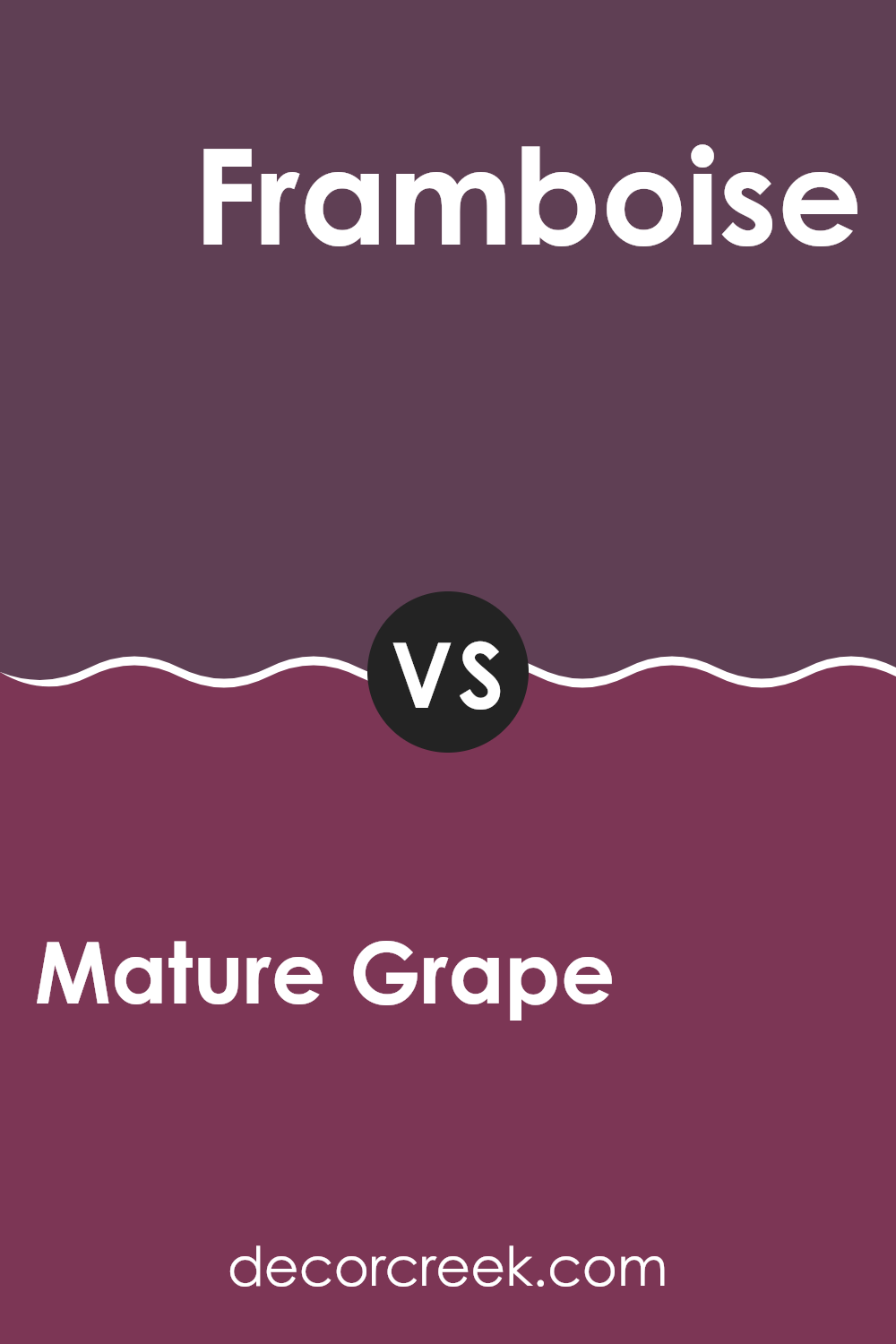
Mature Grape SW 6286 by Sherwin Williams vs Framboise SW 6566 by Sherwin Williams
Mature Grape and Framboise by Sherwin Williams are both vibrant, playful shades that can add a lot of personality to a room. Mature Grape is a deep, rich purple with hints of dark berry. It has a somewhat muted quality that makes it flexible for rooms that require a bit of depth and warmth without becoming too overpowering.
On the other hand, Framboise is a bright, bold raspberry pink. It’s a more energetic color, packed with cheerfulness and perfect for creating a statement. Whereas Mature Grape offers a more subdued and cozy vibe, suitable for dens or bedrooms, Framboise is lively and would be excellent in a more active area, like a playroom or a creative room.
Both colors pair well with neutrals but lead to very different aesthetic outcomes due to their individual tones.
You can see recommended paint color below:
- SW 6566 Framboise
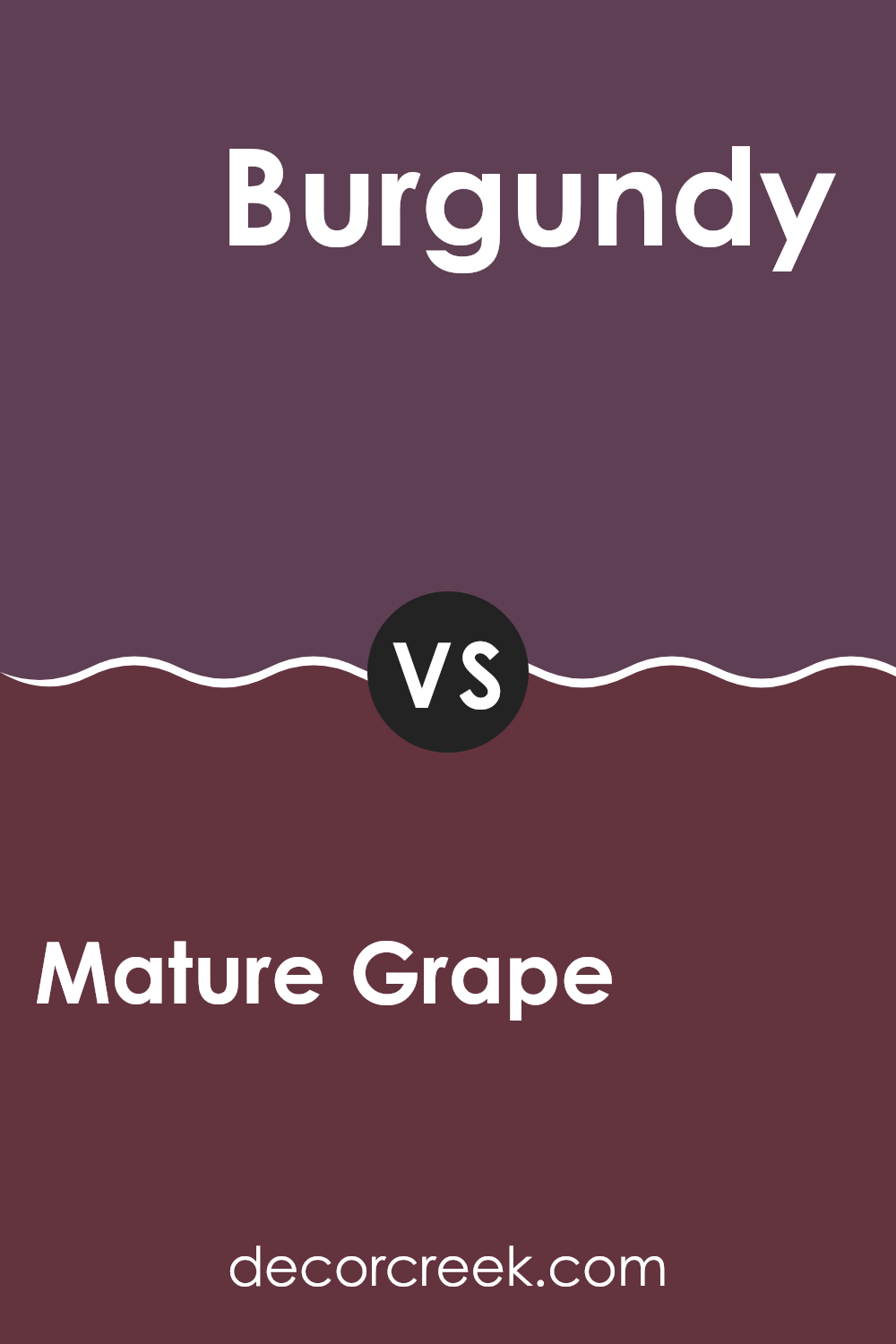
Mature Grape SW 6286 by Sherwin Williams vs Burgundy SW 6300 by Sherwin Williams
Mature Grape and Burgundy, both by Sherwin Williams, present rich and dusky hues that give rooms a cozy, inviting atmosphere. Mature Grape leans closer to a deep, dusky purple with a slightly gentler touch, which can make a room feel calm yet still vibrant. It pairs well with soft lights and neutral decor to bring out its unique purple shade.
On the other hand, Burgundy is a darker, red wine color that offers a bold and traditional feel. Its deeper red tone is perfect for making a strong statement in a room, whether it’s used on an accent wall or throughout a room. Due to its intensity, Burgundy works well in larger rooms or rooms with plenty of natural light to prevent it from feeling too enclosed.
Both colors are great for adding depth and interest to interiors, but the choice between them depends on the mood you want to set: calm and subtle with Mature Grape or bold and striking with Burgundy.
You can see recommended paint color below:
- SW 6300 Burgundy
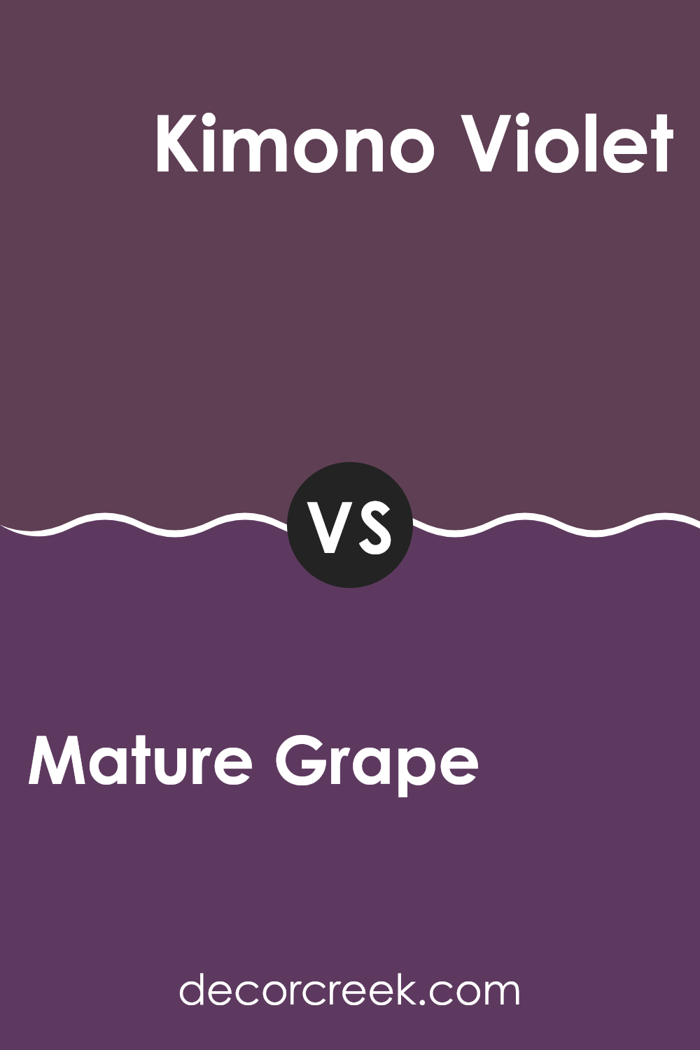
Mature Grape SW 6286 by Sherwin Williams vs Kimono Violet SW 6839 by Sherwin Williams
Mature Grape and Kimono Violet are both vivid colors by Sherwin Williams, but they offer distinct tones that could suit different tastes or room atmospheres. Mature Grape is a deep, muted purple that has a subdued and calming feel, making it great for rooms where you want a touch of color without overpowering brightness. It’s an ideal choice if you’re aiming for a more relaxed and classic vibe in areas like living rooms or bedrooms.
On the other hand, Kimono Violet stands out with its brighter, more striking hue. This color is bolder and leans towards a vibrant violet that can add a pop of color and energy to a room. It’s perfect for adding a lively touch to creative rooms or an accent wall that needs to catch the eye.
In summary, while Mature Grape brings a muted elegance, Kimono Violet offers a lively punch, making them suitable for different purposes and rooms depending on the mood you’re looking to create.
You can see recommended paint color below:
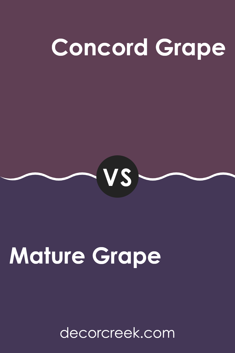
Mature Grape SW 6286 by Sherwin Williams vs Concord Grape SW 6559 by Sherwin Williams
“Mature Grape” and “Concord Grape” by Sherwin-Williams are two distinct shades of purple. “Mature Grape” is a deeper purple, leaning more towards a dusky, muted tone. This color has an understated vibe, making it great for creating a cozy and warm atmosphere in rooms like living rooms or bedrooms. It pairs well with soft lighting and can complement dark wood furniture nicely.
On the other hand, “Concord Grape” is a more vivid purple. It’s brighter and has a more energetic feel, perfect for areas where you want to add a dash of vibrancy. This shade can really stand out in a room, making it ideal for accent walls or places that benefit from a splash of color, like a children’s play area or a creative room.
Overall, while both colors share a purple base, “Mature Grape” offers a more reserved and subtle look, whereas “Concord Grape” provides a lively and striking option. Both can be great depending on the mood and function of the room you’re looking to paint.
You can see recommended paint color below:
- SW 6559 Concord Grape
As I wrap up my thoughts on Sherwin Williams’ SW 6286 Mature Grape, I’m left with a strong impression of this unique paint color. Mature Grape is a bold, deep purple that brings a lot of character and warmth to a room. It’s perfect for someone who wants to make a statement without being too loud. This color can work really well in a bedroom, a cozy reading nook, or even a dining area, giving these rooms a cozy yet distinctive feel.
From testing it out, I noticed that this color pairs beautifully with lighter shades like soft whites or even lighter purples, which helps to balance its depth. Lighting plays a big part in how Mature Grape looks in a room; under natural light, it has a vibrant quality, while artificial light brings out its richer, darker tones.
Overall, choosing SW 6286 Mature Grape is a great way to add personality and warmth to your home. It’s more than just a paint color; it’s a way to make your room feel more like you. Whether you’re redoing a single room or thinking about a bigger project, Mature Grape could be the perfect choice to create a cozy, inviting atmosphere.
Ever wished paint sampling was as easy as sticking a sticker? Guess what? Now it is! Discover Samplize's unique Peel & Stick samples.
Get paint samples

