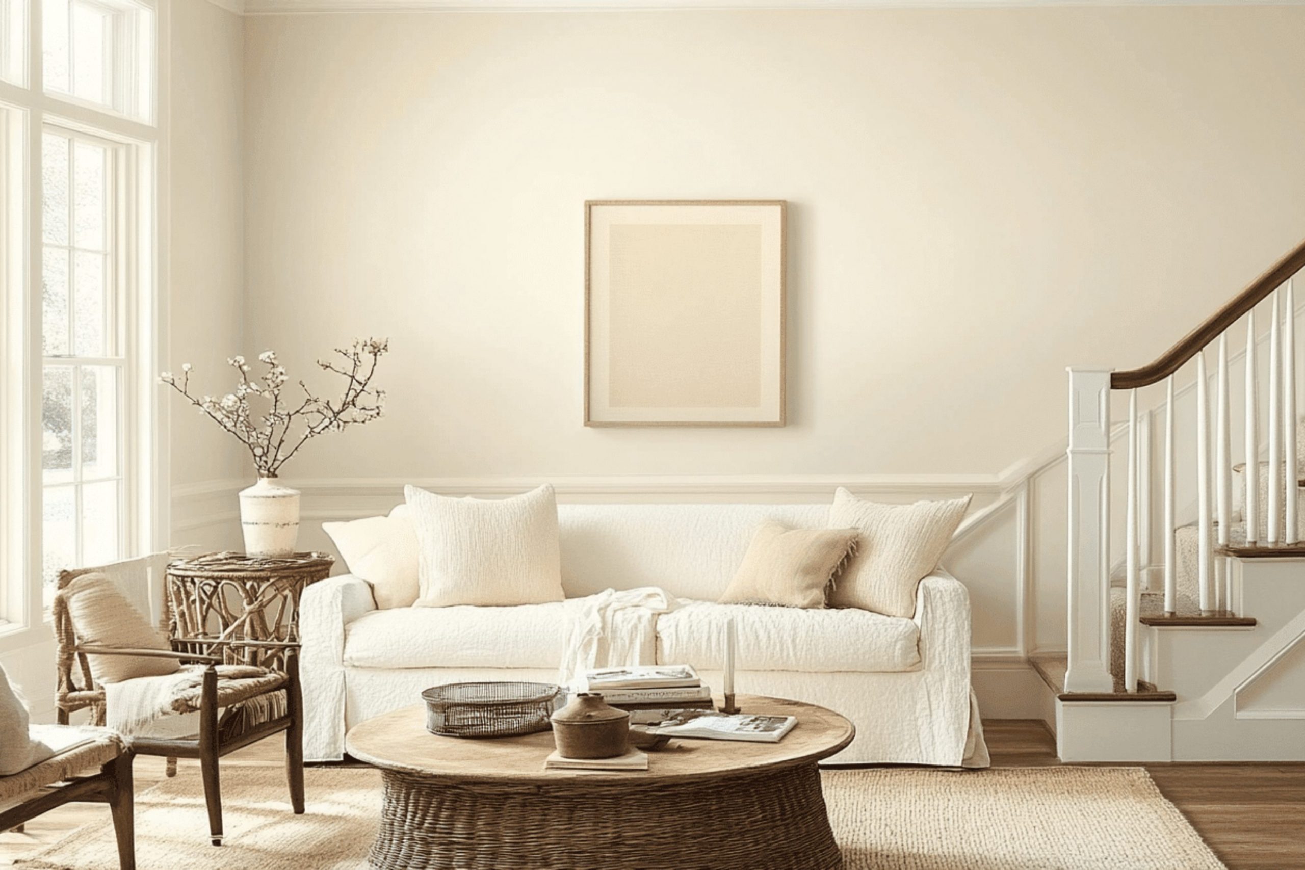
Choosing the perfect paint color for your home can feel like a big decision, and SW 6385 Dover White by Sherwin Williams is one option you might be considering. As you weigh your choices, there are several key aspects of Dover White to keep in mind.
Firstly, Dover White has a warm undertone that makes it highly flexible. It can create a cozy atmosphere in a room that doesn’t get much natural light or complement a brightly lit room with its subtle warmth. Despite its name, Dover White isn’t a stark white. Its creamy hue can add a touch of softness to your walls, making them feel less harsh than a pure white might.
Moreover, it’s important to consider the existing elements in your room. Dover White pairs beautifully with a wide range of colors and materials, from rustic wood finishes to modern metals, which makes it a safe choice if you’re looking for a color that can harmonize with various decors over time
. Last, but not least, lighting plays a crucial role in how this color will ultimately appear in your home.
I recommend testing a sample in different areas of your room at various times of the day to see how the color changes with the light, ensuring the final look meets your expectations.
Is Dover White SW 6385 Right for My Home?
Dover White is a warm, creamy white color that feels very welcoming in any room. I find it to be vibrant and inviting, making rooms feel cozy and bright. With its slightly yellow undertones, this color adds a touch of warmth and can make a room feel more alive and homely.
I usually recommend Dover White for traditional and rustic interiors, as it perfectly complements natural elements and soft textures. It’s particularly stunning when paired with rich wood finishes, woven fabrics, and soft leather, which help balance its brightness while maintaining an earthy, grounded vibe. Additionally, it works really well in farmhouse-style homes, where a gentle and airy atmosphere is often desired.
In kitchens, Dover White looks great on cabinets or walls, especially when combined with natural stone countertops or terracotta tiles. The color also shines in living areas and bedrooms when paired with linen drapery and plush wool rugs, creating a cozy, layered effect that feels instantly welcoming.
All in all, I find Dover White to be a flexible paint color that brings a cheerful warmth to interiors, pairing beautifully with many different materials and textures to create a soft, cohesive look. It’s a color that truly makes a house feel like a home.
decorcreek.com
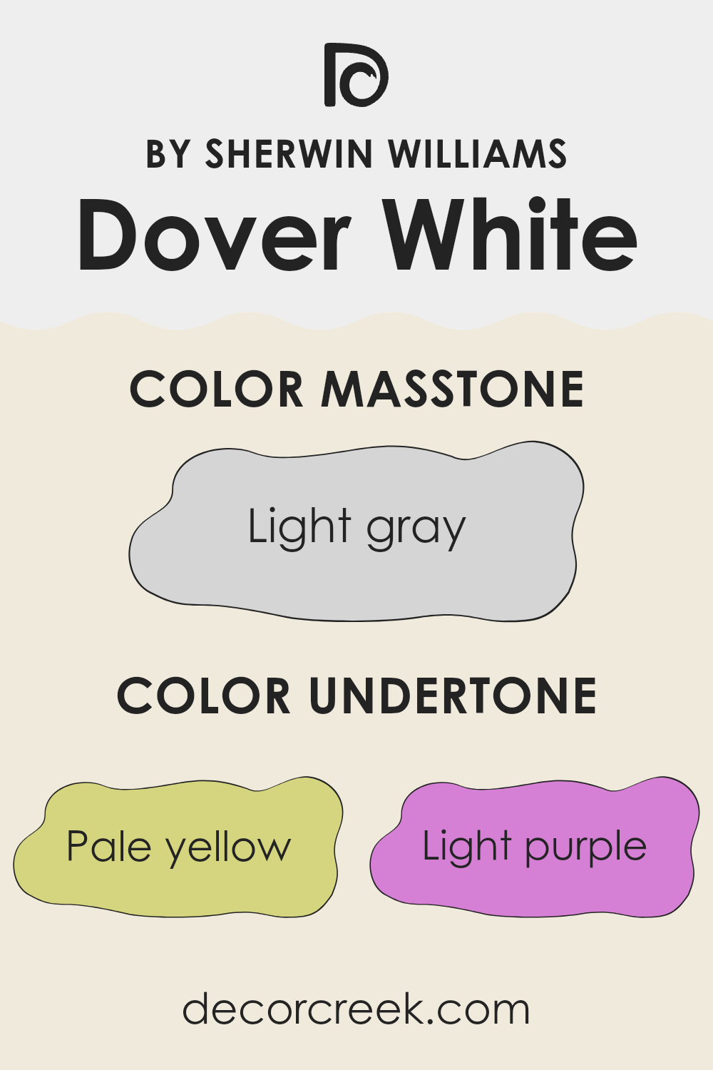
What are the right undertones of Dover White SW 6385 ?
Dover White by Sherwin Williams is a popular paint color often praised for its warm, inviting hue that leans toward a soft, creamy white. However, what truly influences how we perceive this color are its subtle undertones. These undertones can include shades of pale yellow, light purple, light blue, pale pink, mint, lilac, and grey.
Understanding undertones is crucial because they can strongly affect the appearance of the color depending on the lighting and surrounding colors. For instance, the pale yellow undertone in Dover White can make a room feel sunnier and more welcoming under natural light, while the grey undertone might be more noticeable in areas with less sunlight, giving a cooler feel to the room.
When used on interior walls, these varying undertones of Dover White contribute to the color’s adaptability. It can look soft and gently vibrant in a sunlit kitchen, or calm and grounded in a poorly lit hallway. The light purple or lilac undertones subtly influence the atmosphere, bringing a touch of warmth that prevents the white from appearing too stark. Similarly, the mint undertone can give a refreshing feel without feeling too strong with color. In essence, the undertones of Dover White allow it to blend smoothly with various decor styles and color schemes, making it a flexible choice for improving the overall look of any room.
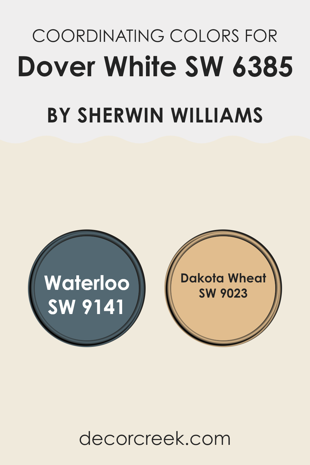
Best Coordinating Colors to use with Dover White SW 6385 by Sherwin Williams this year.
Coordinating colors work by complementing each other to create a harmonious color scheme that can improve the look and feel of any room. By selecting colors that coordinate with Dover White, for instance, you can create a balanced and aesthetically pleasing environment. Dover White itself is a warm, inviting shade that provides a subtle backdrop, ideal for featuring accent colors or serving as a standalone base. By pairing it with colors like SW 9141 – Waterloo and SW 9023 – Dakota Wheat, you ensure that each room feels coherent and designed with intention.
Waterloo, by Sherwin Williams, is a deep, rich blue that provides a striking contrast to the softer hues of Dover White. This color brings a sense of depth and boldness to the room, making it a great choice for areas like accent walls or furniture pieces, which can act as focal points in a room.
On the other hand, Dakota Wheat is a soft, warm beige that complements Dover White by adding a touch of warmth to the palette. It works well in rooms that aim for a friendly and welcoming atmosphere, perfect for common areas and bedrooms where you want a cozy vibe. Each color interacts with Dover White in a way that allows for flexibility in design while maintaining a cohesive look.
You can see recommended paint colors below:
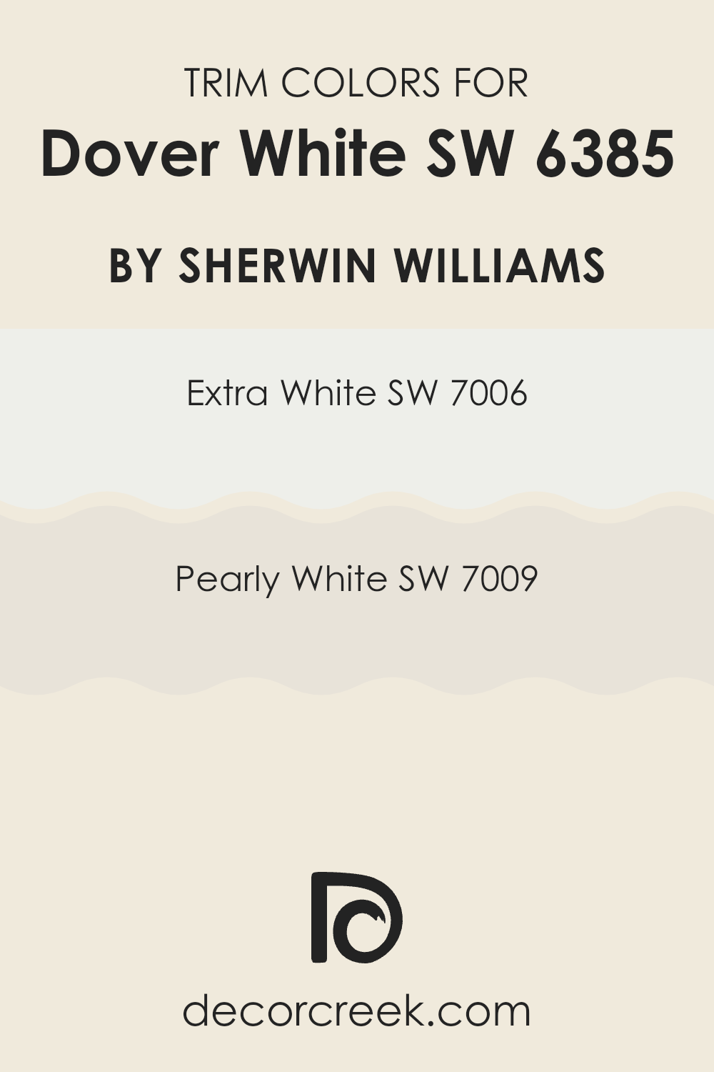
Trendy Trim Colors of Dover White SW 6385 by Sherwin Williams to use this year.
Trim colors, such as SW 7006 – Extra White and SW 7009 – Pearly White, play a crucial role in defining and highlighting the architectural details of a room, especially when paired with a base color like Dover White by Sherwin Williams. These trim colors help create a clean and distinct boundary that improves the overall look of the wall color.
By using a contrasting trim color, homeowners can accentuate features like crown moldings, door frames, and baseboards, making these elements stand out and adding visual interest and depth to the room.
Extra White SW 7006 is a crisp, clean white that brings a fresh and clear look to any room. It offers a sharp contrast to Dover White, making it ideal for a bolder separation between different areas or features. On the other hand, Pearly White SW 7009 has a warmer undertone that provides a softer transition from the Dover White walls. This color is perfect for those aiming for a subtle yet effective distinction, improving the room without creating overly sharp contrasts.
You can see recommended paint colors below:
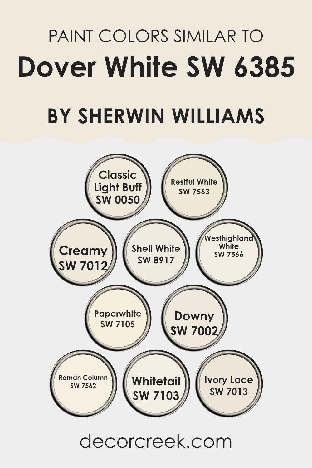
Evergreen Colors Similar to Dover White SW 6385 by Sherwin Williams
When decorating a room, choosing similar colors can create a harmonious and cohesive look that feels balanced and pleasing to the eye. Colors like Dover White, Classic Light Buff, and Restful White by Sherwin Williams are close in spectrum, which means they blend well together without creating strong contrast.
This is especially helpful when aiming for a subtle and calming environment. Similar shades, such as Creamy and Shell White, add just enough variation to keep the design engaging without feeling too heavy. Using shades like Westhighland White and Paperwhite together can also improve the brightness of a room, making it feel larger and more inviting.
Furthermore, gentle tones like Downy and Roman Column offer a soft backdrop that allows other elements of the room, such as furniture and artwork, to stand out. Colors like Whitetail and Ivory Lace have a gentle charm that complements wood finishes and natural textiles beautifully. By using these closely related colors, one achieves a refined yet understated look that is flexible and long-lasting. Such a palette is perfect for those looking to create a warm and welcoming room with a unified appearance, as these colors work together smoothly to create a sense of continuity and ease in any setting.
You can see recommended paint colors below:
- SW 0050 Classic Light Buff
- SW 7563 Restful White
- SW 7012 Creamy
- SW 8917 Shell White
- SW 7566 Westhighland White
- SW 7105 Paperwhite
- SW 7002 Downy
- SW 7562 Roman Column
- SW 7103 Whitetail
- SW 7013 Ivory Lace
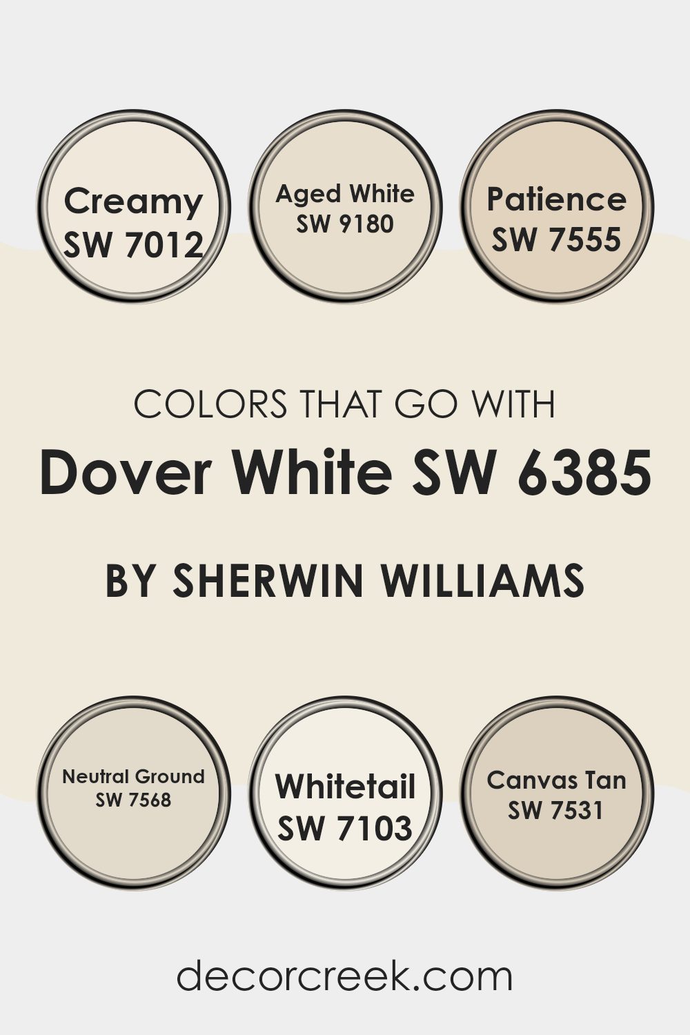
Colors that Go With Dover White SW 6385 by Sherwin Williams
Choosing the right colors that coordinate with Dover White SW 6385 by Sherwin Williams is essential because it ensures that the overall design feels harmonious and visually pleasing. The right combination can enhance the sense of openness, add warmth, and create a welcoming atmosphere. Colors like SW 7012 – Creamy, a soft off-white, have a subtle richness that adds depth while maintaining a clean and open feel. Similarly, SW 9180 – Aged White offers a hint of warmth with its creamy beige tone, making it perfect for creating a cozy atmosphere without feeling too heavy.
Colors such as SW 7555 – Patience, a gentle greige, blend beautifully with Dover White as they provide a slight contrast while keeping the color scheme grounded. SW 7568 – Neutral Ground, another neutral, supports this by offering a beige shade that enriches the room subtly.
For lighter accents, SW 7103 – Whitetail is ideal, as this very light, almost pure white, can brighten areas without creating harsh contrasts. Lastly, SW 7531 – Canvas Tan works well by adding a stronger dose of color through its warmer tan hue, which pairs nicely with the understated elegance of Dover White. Together, these colors work smoothly to create a cohesive and inviting environment.
You can see recommended paint colors below:
- SW 7012 Creamy
- SW 9180 Aged White
- SW 7555 Patience
- SW 7568 Neutral Ground
- SW 7103 Whitetail
- SW 7531 Canvas Tan
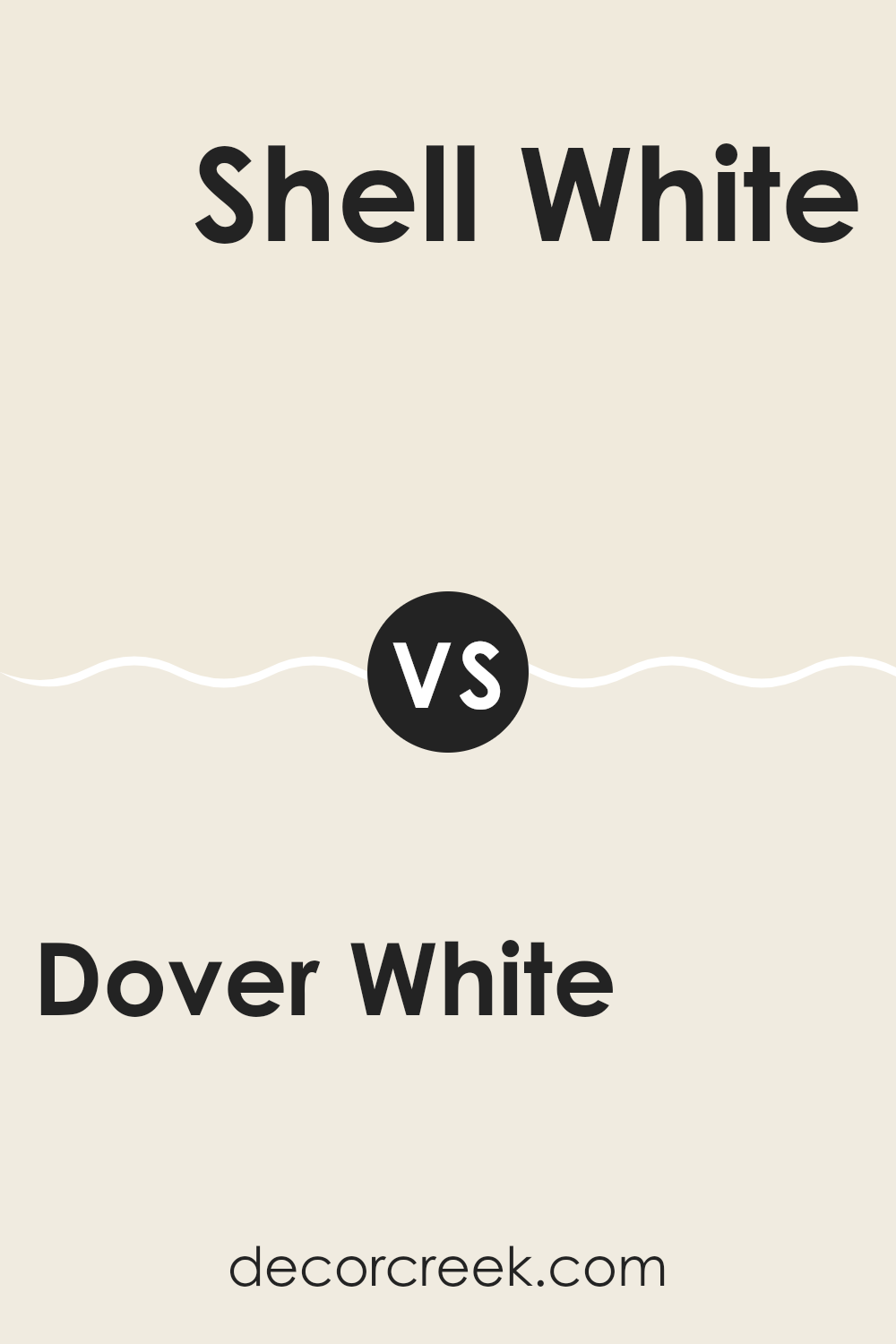
Dover White SW 6385 by Sherwin Williams vs Shell White SW 8917 by Sherwin Williams
Dover White and Shell White are both popular paint colors made by Sherwin Williams, but they have subtle differences. Dover White has a warm, creamy tone that gives a cozy and soft appearance to walls. It’s great for creating a welcoming feel in living rooms or bedrooms.
In contrast, Shell White leans more toward a pure white with just a hint of warmth. This makes it excellent for those who want a cleaner, crisper look, ideal for modern interiors or highlighting trims and moldings. Both colors reflect light well, making rooms appear brighter and more open.
However, Dover White can add a touch of richness due to its slightly deeper tone, whereas Shell White provides a fresh, neat backdrop, suitable for various decorating styles. When deciding between the two, consider the mood and function of your room to see whether a cozy warmth or crisp clarity fits best.
You can see recommended paint color below:
Dover White SW 6385 by Sherwin Williams vs Classic Light Buff SW 0050 by Sherwin Williams
Dover White and Classic Light Buff are two popular paint colors by Sherwin Williams that offer subtly different tones for home interiors. Dover White is a soft, warm white that carries a hint of cream, making it a cozy choice for walls in almost any room. It’s particularly good at making rooms feel welcoming and bright without being stark.
On the other hand, Classic Light Buff is a bit deeper than Dover White, leaning toward a beige tone. This color is great for those looking to add a bit more warmth and character to their rooms. It pairs well with a variety of decor styles and brings a gentle, soothing presence to any room.
Both colors work well in rooms that get a lot of natural light or areas that need a bit of a brightness boost. They are flexible and easy to match with different furnishings and accents, making either a reliable choice for creating a comfortable and inviting atmosphere.
You can see recommended paint color below:
Dover White SW 6385 by Sherwin Williams vs Paperwhite SW 7105 by Sherwin Williams
Dover White and Paperwhite are both warm, white paint colors by Sherwin Williams, but they have some distinct differences. Dover White has a creamy undertone that gives it a softer, more inviting feel, making it a great choice for cozy rooms like living rooms and bedrooms. It offers a classic look that pairs well with various decor styles.
On the other hand, Paperwhite leans toward a cleaner white with subtle gray undertones. This makes it a bit cooler compared to Dover White. Paperwhite is excellent for areas where you want a fresh, crisp look, such as in kitchens and bathrooms. It reflects light well, which can help make smaller rooms appear larger.
In summary, while both colors provide a neat and tidy backdrop, Dover White’s creaminess adds warmth, and Paperwhite’s slight gray touch offers a more modern and sharp appearance.
You can see recommended paint color below:
Dover White SW 6385 by Sherwin Williams vs Whitetail SW 7103 by Sherwin Williams
Dover White and Whitetail by Sherwin Williams are two popular shades of white, each offering a distinct tone. Dover White has a warm, creamy presence, making it ideal for interiors where you want a cozy feel.
This color has a slight yellow undertone that adds softness and warmth, perfect for living areas or bedrooms. On the other hand, Whitetail is lighter and brighter, leaning toward a more neutral white without strong undertones.
This shade is excellent for creating a clean, crisp look, suitable for modern interiors or small rooms you want to appear more open. While both colors are flexible, Dover White’s creamy nature pairs well with earthy, warm colors, whereas Whitetail is a great match for cooler tones and contemporary decor.
You can see recommended paint color below:
Dover White SW 6385 by Sherwin Williams vs Westhighland White SW 7566 by Sherwin Williams
Dover White and Westhighland White are two popular white shades from Sherwin Williams, and they offer subtle differences that could affect the mood and feel of a room. Dover White has a warm, creamy undertone, making it feel cozy and welcoming. It’s ideal for rooms where you want a soft, inviting atmosphere without the starkness that some whites can bring.
On the other hand, Westhighland White stands out because it too is warm but with a slightly cleaner appearance compared to Dover White. It contains less yellow and reads a bit more neutral, making it flexible for various rooms and lighting conditions. Westhighland White is an excellent choice for someone who prefers a white that’s not too stark but still wants to maintain a fresh, clean look.
Both colors work well in different settings, whether traditional or modern, but the choice between them depends on the desired warmth and neutrality in the room.
You can see recommended paint color below:
Dover White SW 6385 by Sherwin Williams vs Ivory Lace SW 7013 by Sherwin Williams
Dover White is a warm and inviting shade with a slight creamy tone, making it perfect for creating a cozy and comfortable atmosphere in any room. This paint color reflects light beautifully, which can make small rooms appear larger and more open. It pairs well with a wide range of other colors, from bright and bold hues to more muted tones, offering flexibility in design choices.
Ivory Lace is a slightly cooler shade than Dover White, offering a clean and airy feel to rooms. It’s great for those who prefer a subtle elegance without stark brightness, which can feel too intense in some interiors. This color works well in rooms with plenty of natural light, or areas where a calm and gentle ambiance is desired.
Both colors are flexible and can be used in many styles of decor, depending on the accompanying design elements and personal preferences. Whether you are looking to create an inviting home environment or simply refresh a particular room, either Dover White or Ivory Lace can be a great choice.
You can see recommended paint color below:

Dover White SW 6385 by Sherwin Williams vs Roman Column SW 7562 by Sherwin Williams
Dover White and Roman Column by Sherwin Williams are two light neutral shades, each with its unique characteristics. Dover White is a soft, warm white with a slightly creamy undertone. It’s an ideal choice for creating a cozy and welcoming feel in any room. It pairs well with other warm colors, adding a touch of brightness without being stark or cold.
On the other hand, Roman Column is a cooler shade of white with subtle gray undertones. It gives off a cleaner and crisper appearance, which makes it great for a more modern, minimalistic look in a home. Roman Column works beautifully in rooms that aim for a more polished, fresh vibe.
Both colors are flexible, but your choice between Dover White and Roman Column can depend on the mood and style you want to achieve. Dover White leans toward a warmer, homier atmosphere, while Roman Column suits a sleeker, more contemporary setting.
You can see recommended paint color below:
Dover White SW 6385 by Sherwin Williams vs Restful White SW 7563 by Sherwin Williams
Dover White and Restful White by Sherwin Williams are both popular white paint choices, but they have distinct differences. Dover White has a warm undertone, making it a creamy, soft white. This warmth gives a cozy feeling to a room and is very flexible, fitting well with various decor styles. It can brighten rooms without feeling too stark, which is perfect for living areas or bedrooms.
On the other hand, Restful White leans closer to a true neutral white. It doesn’t carry the same creamy warmth as Dover White, making it more suitable for modern settings where a clean, straightforward look is desired. It’s particularly effective in rooms that aim for a minimalistic or contemporary feel.
Both Dover White and Restful White work well in many homes; however, your choice between the two would depend on the mood and style you wish to create. Dover White adds warmth, while Restful White offers a cleaner, crisper backdrop.
You can see recommended paint color below:
Dover White SW 6385 by Sherwin Williams vs Downy SW 7002 by Sherwin Williams
Dover White and Downy, both by Sherwin Williams, offer distinct tones for varying preferences in decor. Dover White has a warm, creamy quality that brings a cozy and inviting feel to rooms. It’s perfect for creating a soft, comforting ambiance.
On the other hand, Downy is a lighter, cooler shade that leans toward a gentle gray. This makes it an excellent choice for those who want a subtle touch of modernity without the starkness of pure gray. Downy can help make a room feel more open and airy, which is ideal for smaller or darker rooms.
Whether you prefer the warmth of Dover White or the crisp, fresh look of Downy, each offers unique possibilities for enhancing home interiors. Both colors work well as bases, allowing for easy matching with a variety of decor elements.
You can see recommended paint color below:
Dover White SW 6385 by Sherwin Williams vs Creamy SW 7012 by Sherwin Williams
Dover White is a warm, soft shade of white that brings a cozy and welcoming feel to any room. It has a touch of creaminess which makes it more inviting than a stark, pure white. This color works well in areas that receive a lot of natural light, as it reflects the light beautifully without being too bright.
On the other hand, Creamy is slightly richer and deeper compared to Dover White. It leans more toward a beige tone, giving it a slightly yellowish hue that adds warmth to the surroundings. This color is ideal for those looking to create a gentle, cozy atmosphere in rooms like living rooms or bedrooms where you want a more closed, intimate feeling.
Both colors are great for creating a relaxed and homely interior, but while Dover White is better for enhancing light and adding a breezy feel, Creamy offers a bit more warmth and depth, making rooms feel more enclosed and cozy.
You can see recommended paint color below:
In conclusion, SW 6385 Dover White by Sherwin Williams is a fantastic paint choice for anyone looking to brighten up their home. It’s a very soft white color that does a great job of making rooms look bigger and more welcoming. This paint color is not just pretty but also quite practical. It goes well with so many other colors, which makes it easy for you to mix and match with different items in your room like curtains, sofas, or carpets.
Dover White is especially good for bedrooms, living rooms, and kitchens because it creates a warm and cozy feel. Whether you are thinking of selling your house and want to give it a fresh look, or just want to change things up for yourself, this color is reliable and looks clean. Plus, it does not show dirt quickly, which is a bonus, especially if you have kids or pets.
If you’re thinking about giving your home a new paint job and want something that is pretty, easy to match, and keeps your house looking clean, then you should consider Dover White SW 6385 by Sherwin Williams.
It’s simple and attractive, a perfect backdrop for whatever decorations or style you love.
Ever wished paint sampling was as easy as sticking a sticker? Guess what? Now it is! Discover Samplize's unique Peel & Stick samples.
Get paint samples

