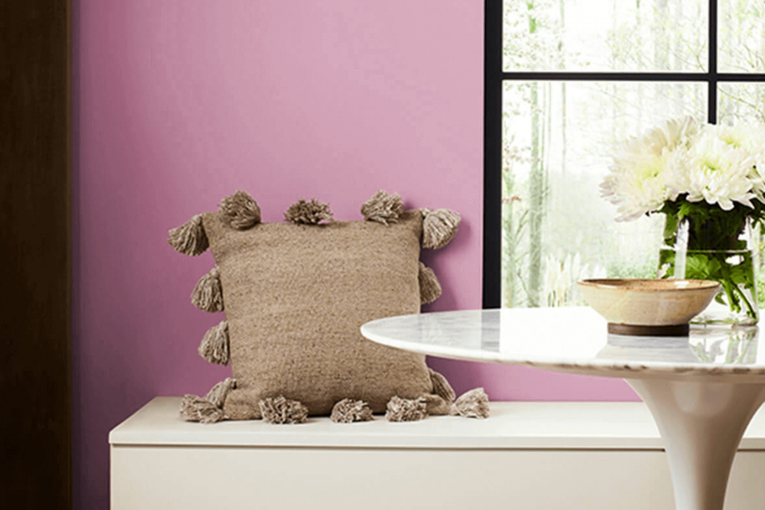
As you plan your next room refresh, consider the understated charm of SW 6563 Rosebay by Sherwin Williams. This unique paint color offers a subtle blend of dusty rose that adds a warm and inviting touch to any room without overpowering it. Whether you’re looking to repaint your living room, bedroom, or even a kitchen, Rosebay provides a soft, cozy feel that makes your room feel more like home.
Its adaptability also means it pairs beautifully with a wide range of decor styles and colors. Imagine soft, white linens or rich, dark woods against this gentle rose backdrop—it’s the kind of harmony in design that brings quiet satisfaction. If you’re someone who appreciates a touch of vintage or rustic influence in their home, Rosebay will seamlessly enhance those elements.
What’s more, the calming quality of this color can be a great backdrop for areas meant for relaxation. Using Rosebay in areas where you unwind could help in creating a soothing sanctuary right in your own home.
If bringing warmth and softness into your decorating scheme sounds like what you’re looking for, then SW 6563 Rosebay could be the perfect choice for you.
What Color Is Rosebay SW 6563 by Sherwin Williams?
Rosebay by Sherwin Williams is a soft and inviting shade of pink with a subtle hint of peach, giving it a warm and cozy feel. This color is adaptable enough to work beautifully in a variety of interior styles, especially those seeking a gentle and welcoming atmosphere. Ideal for areas like living rooms, bedrooms, and nurseries, it helps create a calming environment while still adding a touch of cheer.
Rosebay pairs well with natural materials and soft textures. Think of combining it with light woods like birch or maple to maintain a breezy and light feel in the room. It also works wonderfully with white trim or moldings, which enhance its warmth without overpowering the room. For textiles, consider soft linens, chunky knit throws, or velvet cushions in neutral or complementary shades to add depth and interest.
This color fits perfectly in interior styles such as contemporary, Scandinavian, and shabby chic due to its subtle and inviting nature. In a contemporary setting, it adds a splash of warmth, while in Scandinavian and shabby chic interiors, it complements the often used pastels and whites, contributing to a cohesive and cozy look. The key to making Rosebay work is balancing it with simple and clean elements to let its gentle nature shine.
Is Rosebay SW 6563 by Sherwin Williams Warm or Cool color?
Rosebay by Sherwin Williams is a vibrant pink hue that adds a lively touch to any room. This color works great for bringing a cheerful and warm atmosphere to rooms that need a bit more personality.
When used in a home, it can make areas such as a child’s bedroom or a creative workspace feel more inviting and stimulating. The brightness of Rosebay is best balanced with neutral tones like whites, grays, or soft browns, which help keep the pink from feeling too strong in a room.
This pink shade is also perfect for accent walls or furniture pieces, providing a pop of color that is both fun and stylish. In smaller doses, Rosebay can work well in accessories like cushions, curtains, or art pieces, making it flexible for different design tastes and easy to incorporate into various home styles.
Undertones of Rosebay SW 6563 by Sherwin Williams
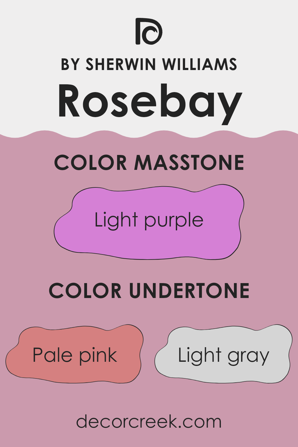
Rosebay is a unique paint color that can subtly change its appearance based on its undertones and different lighting conditions. Undertones are the colors hidden beneath the surface of the paint that can influence how it looks on your walls. For Rosebay, the undertones include shades like pale pink, light gray, pale yellow, lilac, grey, light blue, mint, fuchsia, pink, violet, and purple.
These undertones are not always clearly visible, but they can affect the mood and feel of a room. For instance, pale pink and lilac undertones add a gentle, warm touch, making the room feel cozy and welcoming. On the other hand, undertones like light gray and grey can give a more neutral look, helping the walls blend smoothly with different decor styles.
The presence of brighter undertones like fuchsia and violet adds a dash of vibrancy, which can influence the energy of a room. For a calm atmosphere, undertones like mint and light blue are perfect as they tend to give a sense of freshness and calm.
When used on interior walls, the undertones of Rosebay can greatly affect the perception of the room. In a room with plenty of natural light, the paler or brighter undertones might become more pronounced, altering the room’s ambiance. In contrast, in a dimly lit room, the darker undertones may stand out more, giving the room a different character.
Overall, the unique blend of undertones in Rosebay makes it a flexible color choice, adaptable to various decorating styles and personal tastes. The way these undertones interact with light and room can really define the feeling of the room.
What is the Masstone of the Rosebay SW 6563 by Sherwin Williams?
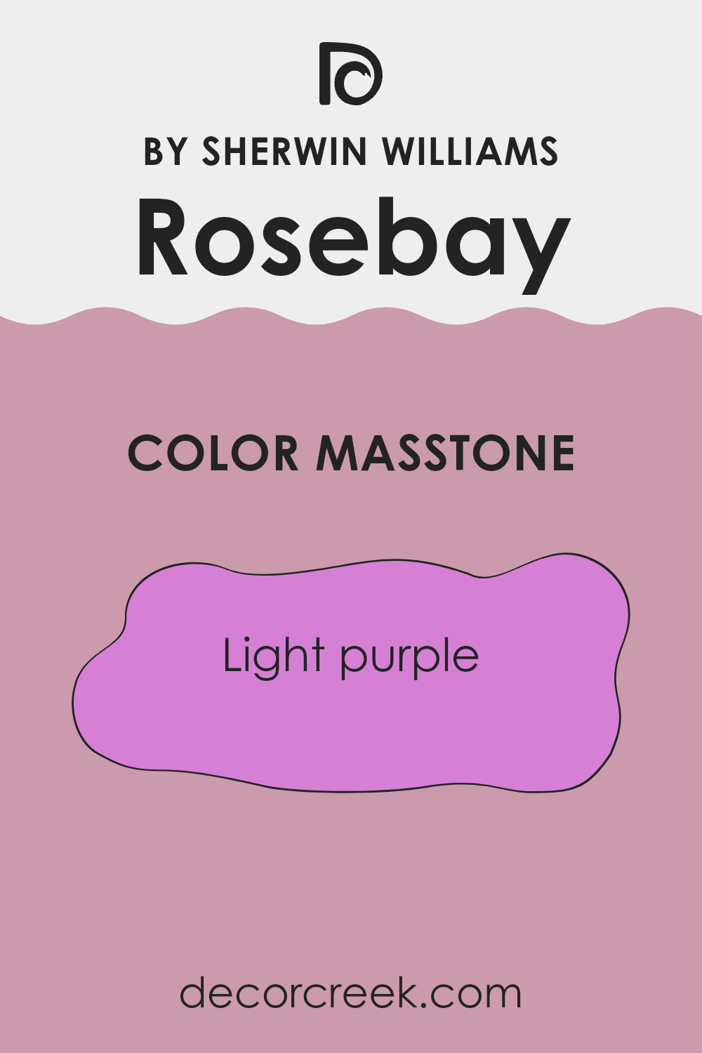
Rosebay SW 6563 by Sherwin Williams is a light purple shade with the masstone code #D580D5. This gentle purple hue brings a soft and inviting feel to any room. It stands out as an excellent choice for areas where you want a touch of color without overpowering the senses.
This shade of purple can also add a playful vibe to children’s rooms or a calming effect in a home office or bedroom. Its adaptability means it can pair well with both light neutrals like creams and grays, or bolder colors like deep blues and greens, offering plenty of options for home decor.
In well-lit areas, Rosebay SW 6563 brightens the room further, while in dimmer rooms, it can bring warmth. This makes it a practical choice for various home settings, ensuring that it can fit smoothly into your existing decor or inspire a new design project.
How Does Lighting Affect Rosebay SW 6563 by Sherwin Williams?
Lighting plays a crucial role in how we perceive colors. The same paint can appear different under various lighting conditions due to the light’s color and intensity. For example, consider a color like Rosebay by Sherwin Williams, which features a lively yet soothing hue.
In artificial light, the impact on Rosebay’s appearance can vary based on the type of bulb used. Warm white bulbs tend to enhance the red and pink tones, making the paint look more vibrant and cozy. In contrast, cool white bulbs might bring out more subtle, bluish undertones, giving the color a slightly paler appearance.
Natural light also significantly affects how Rosebay looks. As daylight changes from dawn to dusk, so might the perception of this color. In the morning, the paint might look bright and cheerful, while it could appear more muted in the afternoon or on a cloudy day.
Room orientation further influences Rosebay’s visual impact:
- North-Faced Rooms: These rooms get less direct sunlight, resulting in cooler, more consistent light throughout the day. Here, Rosebay may appear more subdued, reflecting a gentle, soft look that can make the room feel relaxed.
- South-Faced Rooms: With plentiful sunlight, Rosebay can truly shine in these areas. The natural brightness brings out the warm undertones of the color, making the room appear lively and inviting.
- East-Faced Rooms: These rooms enjoy bright morning light, which can make Rosebay look very dynamic and bright in the morning, then returning to a calmer shade as the day progresses.
- West-Faced Rooms: Here, the afternoon and evening light can turn Rosebay into a warm, welcoming color, perfect for areas used later in the day.
Understanding how lighting interacts with paint colors like Rosebay can help you achieve the desired mood and aesthetic in your room, whether seeking a cheerful, soothing, or dynamic atmosphere.
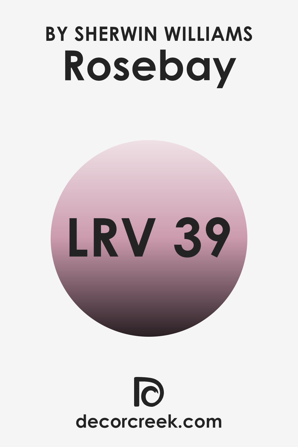
What is the LRV of Rosebay SW 6563 by Sherwin Williams?
LRV stands for Light Reflectance Value, which is a measure of the amount of visible and usable light that gets reflected from a surface when light shines on it. The scale for LRV runs from a base value up to a top value, where the lowest figures represent darker shades that reflect less light, and the highest figures, lighter shades that reflect more light.
Understanding LRV helps in making informed decisions about paint colors since it affects how light or dark a color will look in a specific environment. This is important because the appearance of your paint can significantly alter the atmosphere of your room, depending on how much light it reflects.
The LRV of Rosebay (38.899) is in the mid-range, meaning it neither reflects a large amount of light nor absorbs too much. This particular value indicates that Rosebay will appear as a moderate shade that provides a balanced hue — not too bright, but not overly dark, making it adaptable for many rooms, especially where a balanced nuance is needed.
In rooms with limited natural light or smaller rooms, Rosebay might appear slightly darker. Conversely, in well-lit or larger areas, it may look somewhat lighter. This moderate LRV makes it a practical choice for those looking to achieve a warm and inviting feel without the color dominating the room.
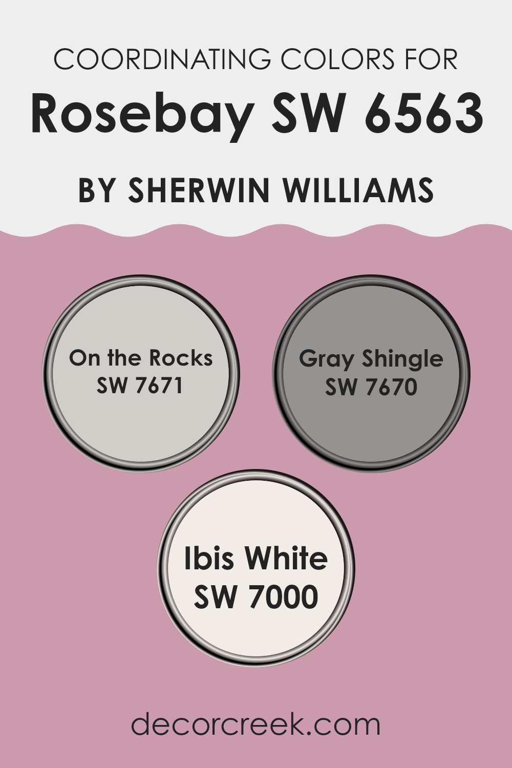
Coordinating Colors of Rosebay SW 6563 by Sherwin Williams
Coordinating colors are those that complement each other well when used together in a design. They are selected to bring harmony and balance to a room, enhancing the overall aesthetic without overpowering the primary color. For example, when working with a vibrant shade like pink from Rosebay by Sherwin Williams, choosing the right coordinating colors is crucial to achieving a pleasing decor. Colors such as On the Rocks, Gray Shingle, and Ibis White are excellent companions for Rosebay due to their subtle and neutral tones that can help ground the brightness of the pink.
On the Rocks is a soft, gentle gray with a hint of warmth that makes it adaptable for pairing with both cool and warm hues, providing a quiet backdrop that allows bolder colors to stand out. Gray Shingle is a deeper gray that offers a bit more depth and contrast, which works particularly well in adding dimension when used along with lighter shades like Rosebay.
Ibis White is a clean and crisp white that serves as an excellent counterpoint to more saturated colors. It helps in creating a fresh and open feel, which can be particularly appealing in areas that aim to maintain a light and airy atmosphere. These coordinating colors work together to create a cohesive look that feels balanced and pleasing to the eye.
You can see recommended paint colors below:
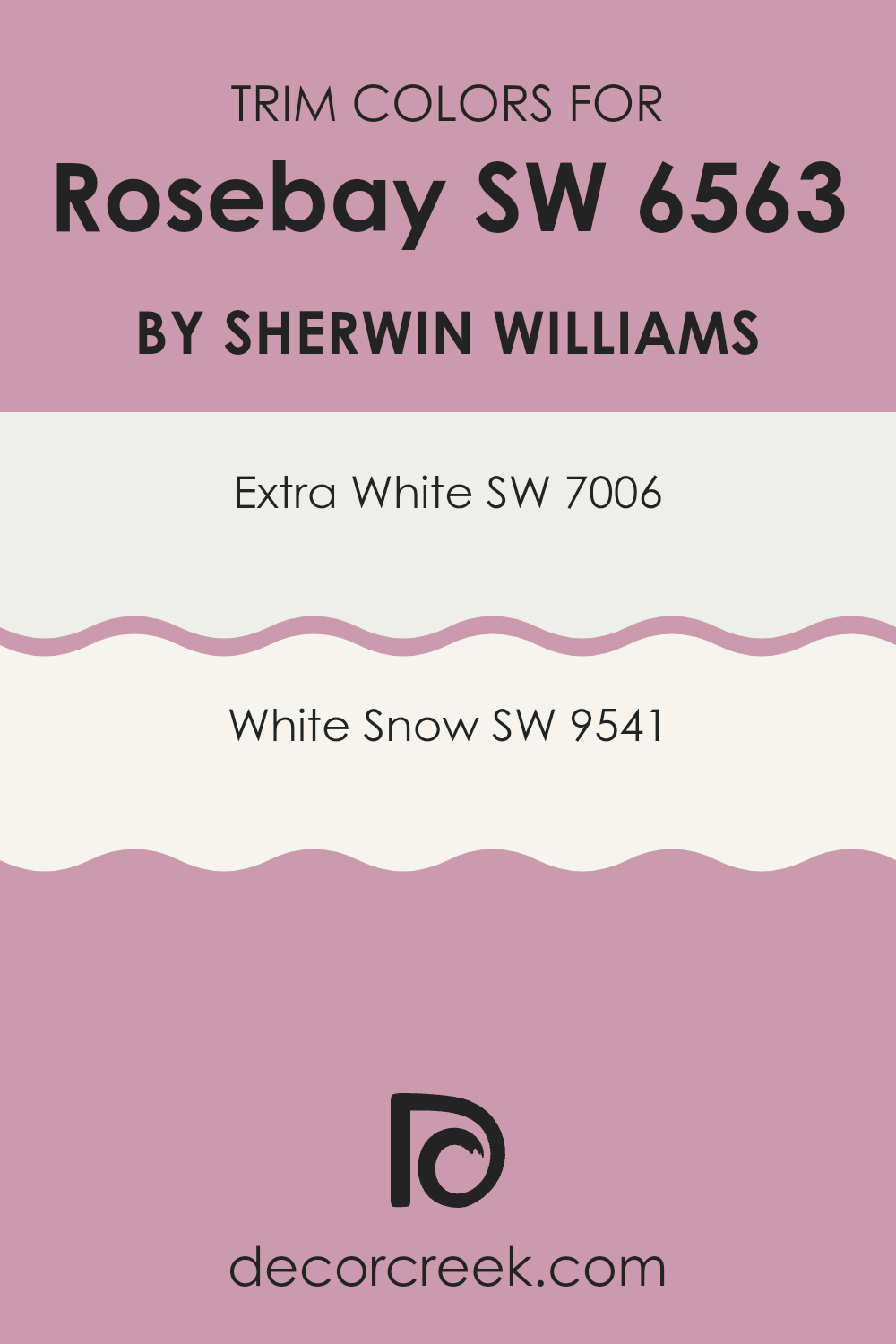
What are the Trim colors of Rosebay SW 6563 by Sherwin Williams?
Trim colors refer to the hues selected for elements such as door frames, window frames, baseboards, and molding in buildings. These colors are crucial because they distinguish these details from the rest of the walls, often enhancing and defining the architectural features of a room.
For a color like Rosebay by Sherwin Williams, choosing the right trim color can accentuate its unique tone and create a clean, cohesive appearance throughout the room. For Rosebay, trim colors such as SW 7006 – Extra White and SW 9541 – White Snow are ideal options.
SW 7006 – Extra White is a crisp, clean white that can help make Rosebay pop, giving a fresh and bright look to any room. On the other hand, SW 9541 – White Snow offers a slightly softer approach with a warm undertone that complements Rosebay nicely, enhancing the overall warm feel without dominating the main color. These shades work well in various lighting conditions, ensuring a flexible and appealing look.
You can see recommended paint colors below:
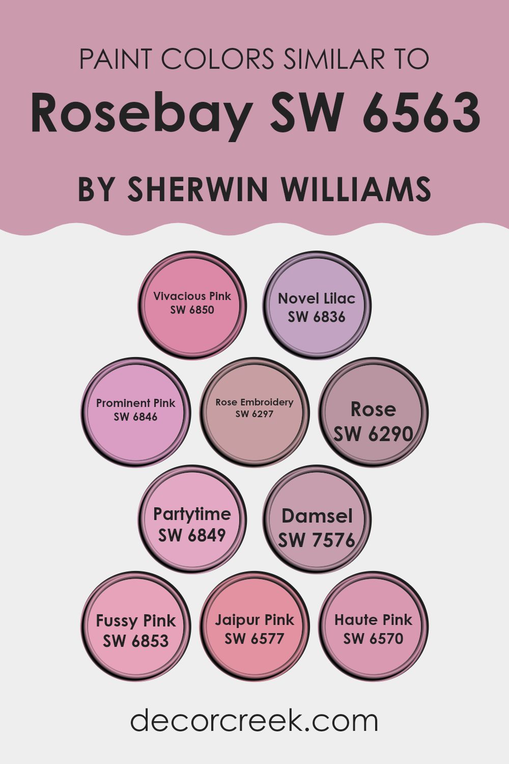
Colors Similar to Rosebay SW 6563 by Sherwin Williams
Similar colors play a crucial role in creating visually harmonious and aesthetically pleasing rooms. When it comes to interior design, using shades like Vivacious Pink or Novel Lilac can help in designing a cohesive room atmosphere.
These colors, which relate closely to rose hues, blend smoothly with one another, allowing for subtle transitions and gentle contrasts within a decor scheme. This palette can be particularly effective in areas where a calming yet cheerful ambiance is desired, such as bedrooms and living areas.
Vivacious Pink brings a vibrant, cheerful touch while Novel Lilac offers a softer, muted look that can make rooms feel gently inviting. Prominent Pink lends a more dominant, striking feel, making it great for accenting areas or as a bold statement wall.
Rose Embroidery offers a refined depth with its richer, almost vintage tone. Rose is elegant and understated, excellent for creating a polished looking room. Partytime is a festive color, apt for areas that aim to be lively and energetic. Damsel, a darker shade, provides a grounding effect, offering a nice contrast against lighter tones.
Fussy Pink is playful and light, perfect for adding a touch of soft warmth. Jaipur Pink carries a worldly charm, ideal for an eclectic style. Lastly, Haute Pink is bright and exuberant, introducing a burst of energy into any room. Utilizing these colors in conjunction with each other can make a room appear more balanced and put together, bringing a pleasant flow that ties different elements and room in unison.
You can see recommended paint colors below:
- SW 6850 Vivacious Pink
- SW 6836 Novel Lilac
- SW 6846 Prominent Pink
- SW 6297 Rose Embroidery
- SW 6290 Rose
- SW 6849 Partytime
- SW 7576 Damsel
- SW 6853 Fussy Pink
- SW 6577 Jaipur Pink
- SW 6570 Haute Pink
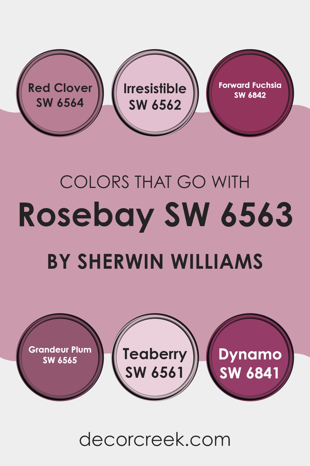
Colors that Go With Rosebay SW 6563 by Sherwin Williams
Choosing the right complementary colors for RosebaySW 6563 by Sherwin Williams is crucial for creating harmonious and appealing rooms. These colors, which range from soft pinks to bold fuchsias, support each other to make interiors feel balanced and lively. The use of a varied palette ensures that there is depth and character in design, allowing each color to enhance the qualities of the others.
Rosebay SW 6563 pairs wonderfully with Red Clover SW 6564, a deep, vibrant shade that adds a punch of energy to any room. Irresistible SW 6562, as its name suggests, offers a subtle charm with its delicate pink hue that softens and soothes. Forward Fuchsia SW 6842 is a vivid color that provides a beautiful contrast, making Rosebay look more grounded.
Grandeur Plum SW 6565 brings a luxurious and rich dimension, perfect for adding a sense of drama. Teaberry SW 6561 offers a lighter and more youthful vibe, great for playful areas. Meanwhile, Dynamo SW 6841, with its energetic and striking tone, creates a dynamic environment that highlights the elegance of Rosebay. Collectively, these colors help achieve a well-rounded and inviting atmosphere, ensuring all elements of the design are visually engaging and thoughtfully integrated.
You can see recommended paint colors below:
- SW 6564 Red Clover
- SW 6562 Irresistible
- SW 6842 Forward Fuchsia
- SW 6565 Grandeur Plum
- SW 6561 Teaberry
- SW 6841 Dynamo
How to Use Rosebay SW 6563 by Sherwin Williams In Your Home?
Rosebay SW 6563 by Sherwin Williams is a lovely pink hue that can add a warm and welcoming touch to any room in your home. It works particularly well in bedrooms, bathrooms, or any areas meant for relaxation. This color is soft enough to cover all the walls without overpowering the senses, yet vibrant enough to make a statement if used on just one wall as an accent.
Complementing Rosebay with colors like light gray or creamy whites can create a harmonious look. For furnishings, natural wood tones or white pieces would stand out beautifully against this pink backdrop. Adding accessories in colors like gold or bronze can also enrich the overall feel of the room.
In addition to walls, Rosebay can be used on furniture or doors for a playful splash of color. It’s also ideal for nurseries due to its gentle and warm appeal, making the room cozy and cheerful for little ones.
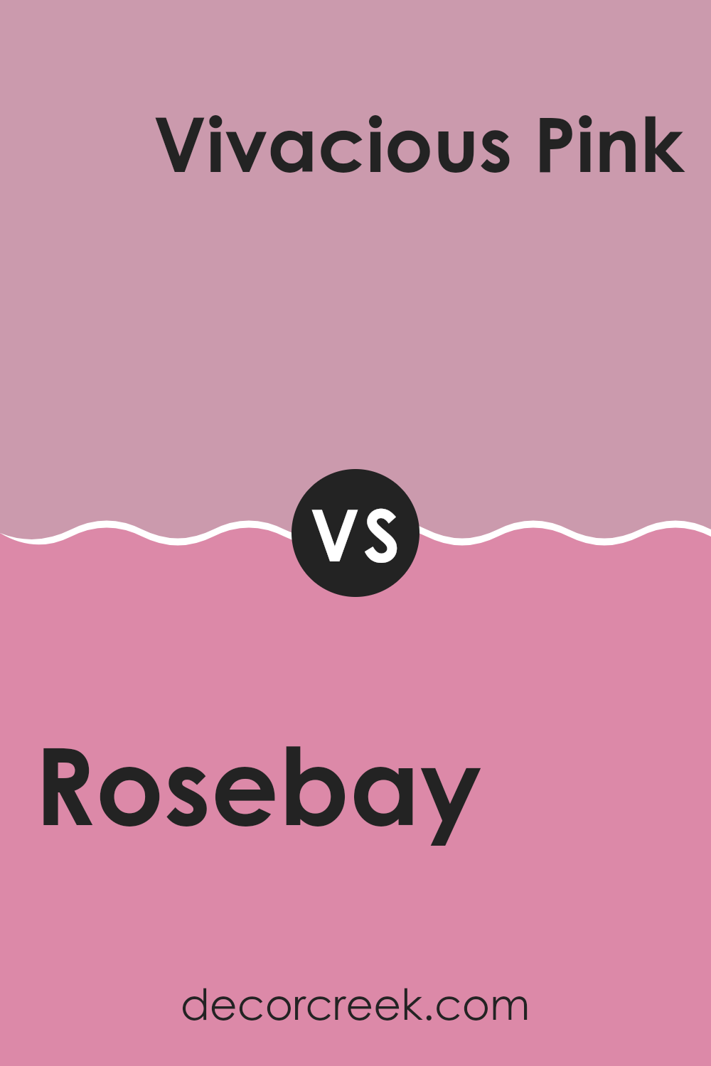
Rosebay SW 6563 by Sherwin Williams vs Vivacious Pink SW 6850 by Sherwin Williams
Rosebay and Vivacious Pink are two eye-catching shades from Sherwin Williams. Rosebay has a gentle, muted quality, leaning subtly towards a dusty, calm pink. This shade can create a soothing and cozy atmosphere in any room, making rooms feel inviting and warm.
In contrast, Vivacious Pink is a much bolder choice. This color is bright and lively, bringing a pop of vibrant energy wherever it’s used. It’s great for making a statement or highlighting a specific area of a room with its lively, punchy hue.
While Rosebay offers a more understated and soft presence, Vivacious Pink stands out with its dynamic and energetic vibe. Each color serves different design needs: Rosebay is ideal for those wanting a subtle hint of color, and Vivacious Pink suits areas intended to inspire excitement and fun.
You can see recommended paint color below:
- SW 6850 Vivacious Pink
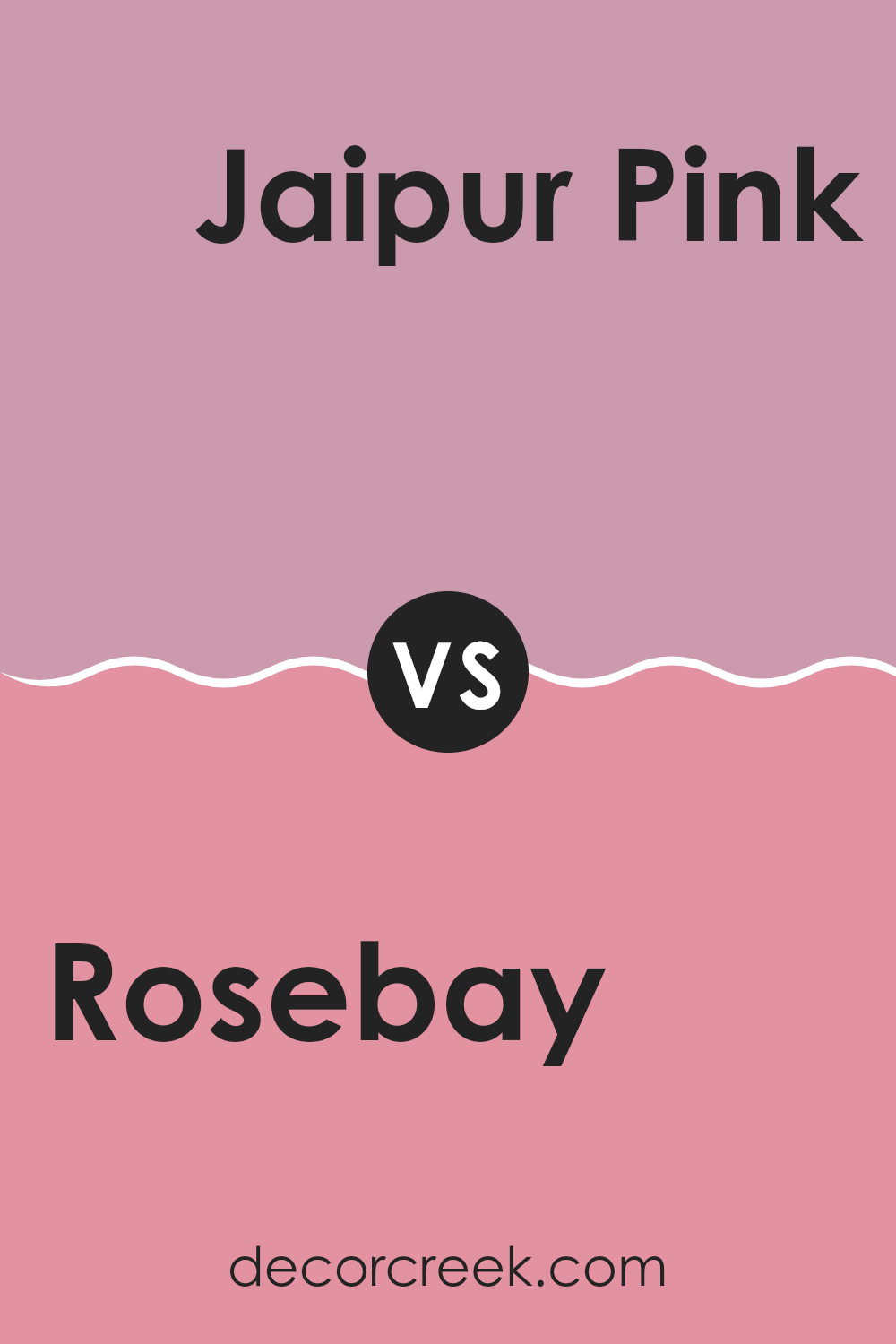
Rosebay SW 6563 by Sherwin Williams vs Jaipur Pink SW 6577 by Sherwin Williams
Rosebay and Jaipur Pink, both by Sherwin Williams, offer distinct shades suitable for different rooms and moods. Rosebay is a calm, soothing pink with a subtle softness that makes it ideal for creating a relaxed atmosphere in areas like bedrooms or bathrooms. It reflects light gently, which can make a small room feel more open and airy.
On the other hand, Jaipur Pink is a more vivid, energetic color. Its vibrant tone is great for adding a playful pop of color to areas that benefit from a more dynamic vibe, such as a home office or a kitchen. It’s bold enough to stand out, but not so strong that it dominates the senses.
Both colors are adaptable, but Rosebay leans towards creating a peaceful retreat, while Jaipur Pink is better suited for injecting life and character into a room. Choosing between them depends on the desired feel and function of the room.
You can see recommended paint color below:
- SW 6577 Jaipur Pink
Rosebay SW 6563 by Sherwin Williams vs Damsel SW 7576 by Sherwin Williams
Rosebay and Damsel, both by Sherwin Williams, offer distinct vibes for your room. Rosebay is a vibrant, cheerful shade of pink that adds a punch of personality and brightness. It’s energetic and can make a room feel welcoming and fun. This color works great for a lively living room or a cheerful child’s bedroom.
On the other hand, Damsel is a lot deeper, resembling a navy blue but with hints of purple. It has a more subdued, calming effect, making it perfect for a cozy, intimate setting. It’s an excellent choice for areas where you want to relax, like bedrooms or reading nooks.
While both colors add character to an area, Rosebay pops with vibrancy, and Damsel offers a sense of peacefulness. Depending on the mood you want to set, either could be the perfect pick for painting your walls.
You can see recommended paint color below:
- SW 7576 Damsel
Rosebay SW 6563 by Sherwin Williams vs Haute Pink SW 6570 by Sherwin Williams
Rosebay and Haute Pink, both by Sherwin Williams, are vivid and energetic colors, but they have distinct tones that set them apart. Rosebay is a softer shade of pink, offering a gentler and more subdued appearance, making it perfect for creating a calming yet cheerful room. It has a touch of warmth that makes it very inviting.
On the other hand, Haute Pink is bolder and deeper, packed with a punch of vividness that can instantly brighten up a room. This shade is ideal for making a strong statement or adding a focal point because of its intensity and brightness. It works well in areas intended to energize and enthuse.
In comparison, while both are variations of pink, Rosebay leans towards a soothing effect, whereas Haute Pink tends towards a more striking and lively impact. These differences make each color suitable for unique purposes depending on the vibe you want to achieve in your area.
You can see recommended paint color below:
- SW 6570 Haute Pink
Rosebay SW 6563 by Sherwin Williams vs Prominent Pink SW 6846 by Sherwin Williams
Rosebay and Prominent Pink, both by Sherwin Williams, offer distinct takes on pink hues that can set very different moods in a room. Rosebay is a softer, more subdued pink. It gives off a gentle and soothing vibe, making it great for creating a relaxing atmosphere in areas like bedrooms or bathrooms.
On the other hand, Prominent Pink is a much bolder, vibrant shade. It stands out more and brings a lively energy to any room. This makes it perfect for areas where you want to add a splash of cheer, like a playroom or a kitchen accent wall.
While Rosebay whispers with a gentle tone, Prominent Pink shouts with joy. Both colors are adaptable in their own right but serve different purposes depending on the feeling you want to achieve in your decor.
You can see recommended paint color below:
- SW 6846 Prominent Pink
Rosebay SW 6563 by Sherwin Williams vs Rose Embroidery SW 6297 by Sherwin Williams
Rosebay and Rose Embroidery by Sherwin Williams are distinct yet harmonious shades of pink. Rosebay presents a vibrant and energetic feel, making it perfect for areas meant to stimulate activity and liveliness. Its boldness can really light up a room and works well where a cheerful and inviting ambiance is desired.
On the other hand, Rose Embroidery offers a much softer and subtler pink tone. It’s gentler on the eyes and lends a more relaxed and soothing vibe to interiors. This color is great for bedrooms, bathrooms, or any area where a calm and peaceful atmosphere is preferred.
Both colors reflect variations of pink, but their impacts and uses in interior rooms can be quite different. Rosebay’s bright punch suits areas for interaction and energy, whereas Rose Embroidery is ideal for creating a quieter, more restful environment.
You can see recommended paint color below:
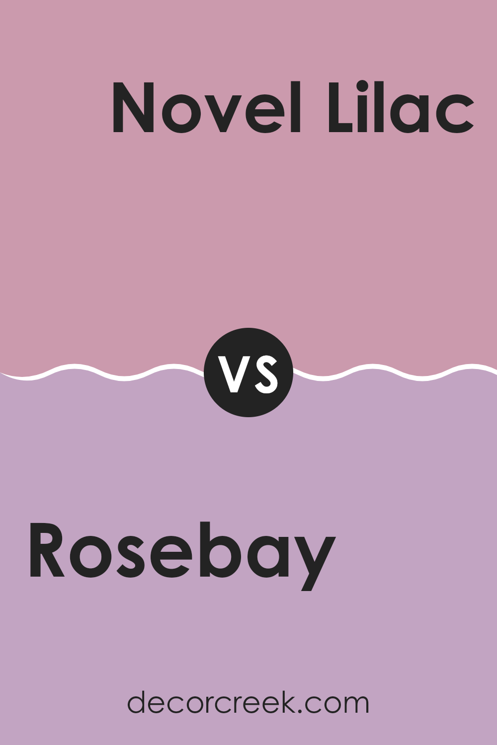
Rosebay SW 6563 by Sherwin Williams vs Novel Lilac SW 6836 by Sherwin Williams
Rosebay and Novel Lilac are both unique and beautiful colors from Sherwin Williams, but they have distinct tones that set them apart. Rosebay is a vibrant, deep pink with a hint of raspberry, making it a bold choice for walls or accents in a room that needs a pop of color.
On the other hand, Novel Lilac is a softer, more understated purple with a subtle blue undertone, giving it a cooler, more gentle appearance. This color works well in areas where you want to add a touch of calm without overpowering the senses.
While Rosebay brings energy and a lively feel to interiors, Novel Lilac offers a more relaxed and soothing vibe, making it ideal for bedrooms or quiet areas. Both colors offer their charm, whether you’re looking to make a statement or create a peaceful retreat.
You can see recommended paint color below:
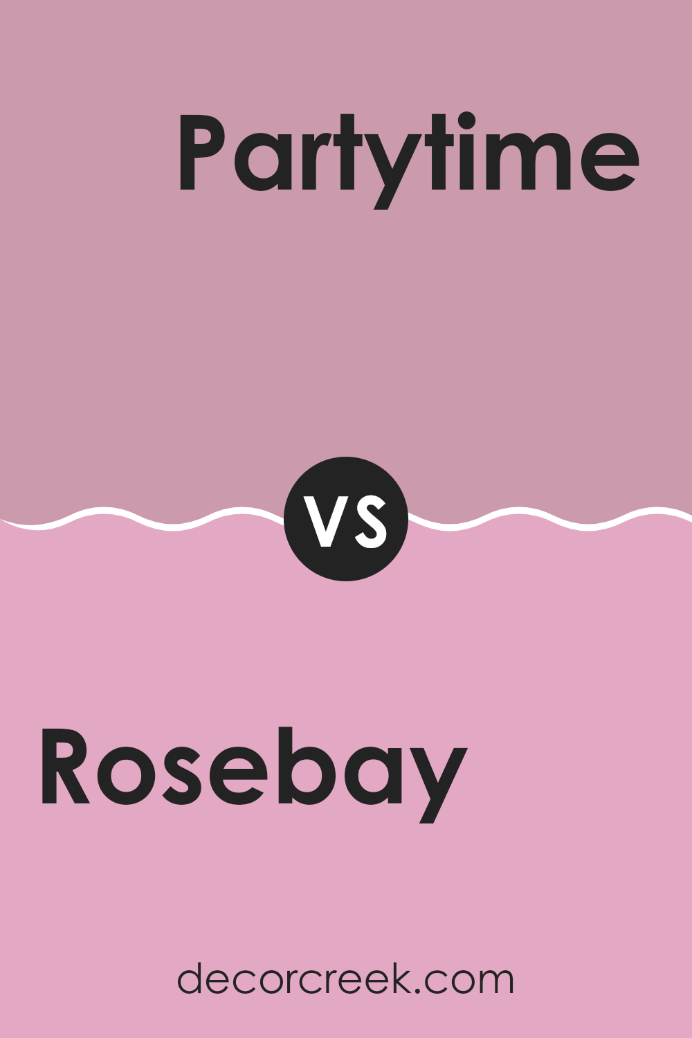
Rosebay SW 6563 by Sherwin Williams vs Partytime SW 6849 by Sherwin Williams
Rosebay and Partytime by Sherwin Williams are two distinct shades that cater to different aesthetic preferences. Rosebay is a soft, muted pink with a soothing effect that makes it ideal for areas where a calm and peaceful atmosphere is desired, such as bedrooms or bathrooms. It has a subtle elegance that infuses a room with warmth without overpowering it with color.
On the other hand, Partytime is a vibrant, energetic pink that stands out due to its brightness. This color works well in areas where you want to add a splash of fun or invigorate the room with a lively vibe. It’s perfect for accent walls or places that are meant for socializing and enjoyment, like a playroom or a creative workspace.
Overall, while both colors are shades of pink, Rosebay offers a gentle touch of color, and Partytime brings an upbeat, bold presence, reflecting their suitability for different environments and moods. Each color has its unique charm, depending on what you want to achieve in a room.
You can see recommended paint color below:
- SW 6849 Partytime
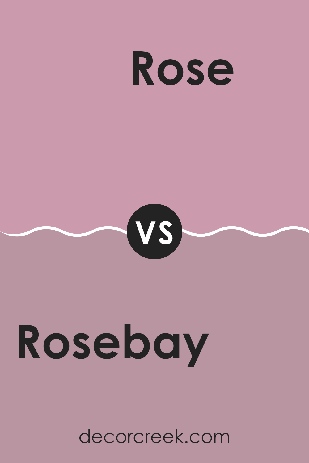
Rosebay SW 6563 by Sherwin Williams vs Rose SW 6290 by Sherwin Williams
Rosebay SW 6563 and Rose SW 6290, both by Sherwin Williams, are two distinct shades that cater to different tastes in color palettes. Rosebay stands out with its vibrant and lively pink hue. It has a deeper, more pronounced pink that can make a bold statement in a room, perfect for adding a cheerful and energetic ambiance.
On the other hand, Rose is a softer, subtler pink. This color lends a gentle and calming touch to interiors, ideal for creating a relaxing and peaceful environment. It’s lighter, making it great for small areas or places where you want to maintain a light and airy feel.
Both colors can work beautifully in a variety of settings, from bedrooms to living areas, depending on the mood you’re aiming to achieve. Rosebay, with its deeper tone, suits active, vibrant rooms, while Rose fits well in quiet, restful areas.
You can see recommended paint color below:
- SW 6290 Rose
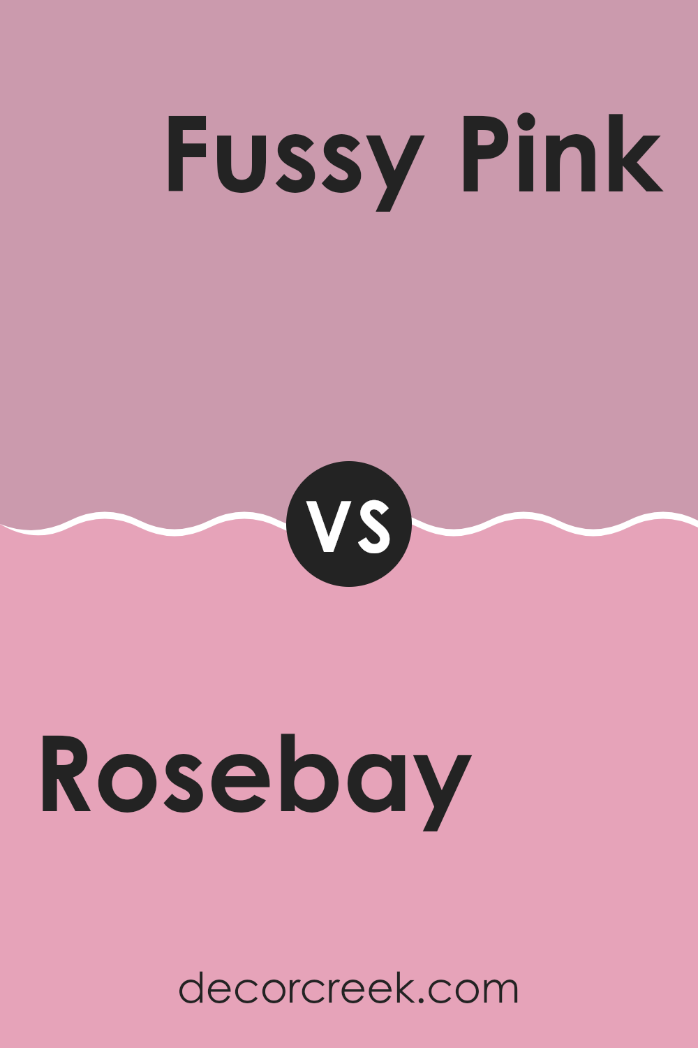
Rosebay SW 6563 by Sherwin Williams vs Fussy Pink SW 6853 by Sherwin Williams
Rosebay and Fussy Pink, both by Sherwin Williams, each present a unique shade of pink. Rosebay has a deeper, more muted tone that brings warmth and softness to a room without dominating it. It’s perfect for creating a cozy atmosphere and can work well as an accent or a main wall color.
On the other hand, Fussy Pink is much brighter and bolder. It’s a playful color that stands out and adds a lively, cheerful touch to any area. Fussy Pink is ideal for areas that aim to be fun and energetic, such as a child’s room or a creative corner.
Both colors can enhance the mood of a room, but Rosebay leans towards a subtle elegance, while Fussy Pink offers a vibrant punch.
You can see recommended paint color below:
- SW 6853 Fussy Pink
After learning all about SW 6563 Rosebay by Sherwin Williams, I feel like I know just how special this paint color is. It’s soft and gentle, almost like the pink you see in a beautiful sunrise. This color isn’t just for any room; it’s perfect for places where you want to feel peaceful and calm, like bedrooms or quiet reading corners.
Rosebay has a unique way of making a room feel warm and cozy without being too bold or bright. It works well with lots of other colors, so you can use it with greens, grays, and even some blues to create a lovely look. It’s not just the color that’s great but also the quality of the paint, which covers the walls smoothly and lasts a long time.
So, for anyone thinking about giving their room a new look, Rosebay could be a perfect choice. It adds just the right touch of color and comfort, making any room feel like a cozy, sweet spot in your home. Plus, it’s a choice you’ll likely be happy with for years because it has an enduring feel that won’t go out of style.
Choosing Rosebay is a decision that will bring a lot of warmth and joy to your home.
Ever wished paint sampling was as easy as sticking a sticker? Guess what? Now it is! Discover Samplize's unique Peel & Stick samples.
Get paint samples

