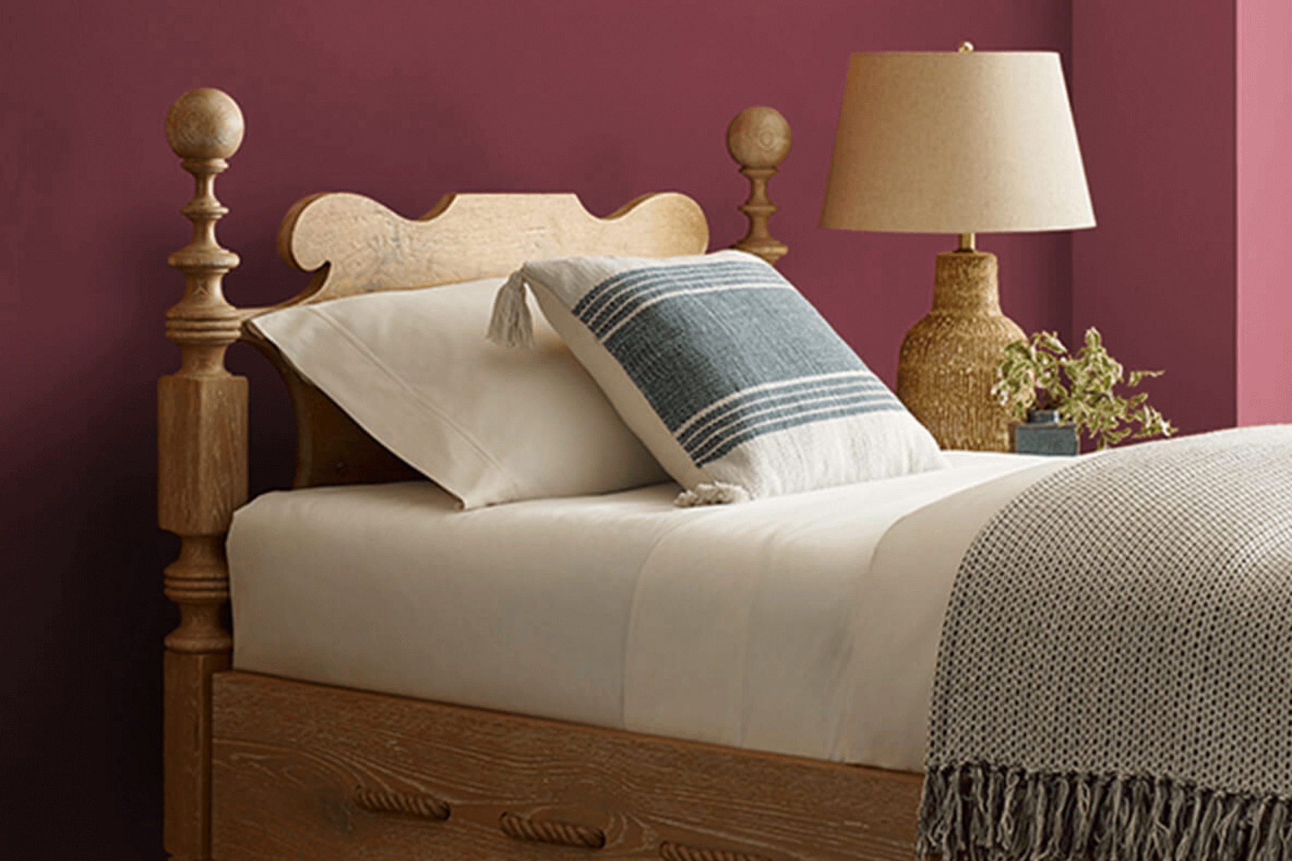
I recently had the opportunity to work with the color SW 6307 Fine Wine by Sherwin Williams, and I have to say, it’s a choice that can truly enrich any room. As someone who appreciates the depth and warmth that the right shade can bring to a room, I found Fine Wine to be a perfect fit for creating an inviting atmosphere. This rich, deep burgundy has a classic elegance and offers a comforting yet polished vibe.
When you’re thinking about refreshing your living room or adding a touch of drama to your dining area, the deep tones of Fine Wine provide a flexible backdrop that pairs wonderfully with both bold and neutral accents. Whether it’s paired with soft creams for a cozy feel or vibrant teals for a bit more vibrancy, this color holds its own beautifully.
Using SW 6307 Fine Wine can help you create a focal point or lend a subtler, refined touch to a room that could use a bit of character.
So, if you’re looking to enhance your home with a color that’s both enduring and expressive, Fine Wine might just be the direction you want to go.
It has definitely made a significant difference in my projects, and I am excited to share how it could do the same for yours.
What Color Is Fine Wine SW 6307 by Sherwin Williams?
Fine Wine by Sherwin Williams is a rich, deep red hue that brings to mind the shadows found in a glass of its namesake. This color boasts a warm undertone that makes it perfect for creating a cozy and welcoming atmosphere in any room. Ideal for adding a touch of drama and intimacy, it works exceptionally well in living rooms, dining rooms, or bedrooms where its depth can be showcased in full effect.
In terms of interior styles, Fine Wine is incredibly adaptable but shines particularly in traditional, rustic, or contemporary themes. It pairs beautifully with natural materials such as wood and leather, enhancing their organic qualities with its robust charm. When matched with metals like brass or gold, Fine Wine can lend a touch of luxury, while with matte black or dark gray, it provides a more modern feel.
Textures also play a crucial role when working with Fine Wine. Soft velvets or rich silks complement its lushness, creating layers of refinement. Rough textures like burlap or linen provide an interesting contrast, making the room more dynamic. Whether used as an accent wall, for textile decorations, or throughout the room, Fine Wine can create a lasting impression that warms the heart and enriches the senses.
Is Fine Wine SW 6307 by Sherwin Williams Warm or Cool color?
Fine Wine SW 6307 by Sherwin Williams is a deep, rich red color that brings a cozy and inviting atmosphere to any room. This shade is perfect for creating a warm, welcoming feeling, especially in living rooms and dining areas. When used on a feature wall, it can make a room feel more intimate and cozy, which is great for areas where you entertain guests or spend time with family.
This color also works well in smaller doses, such as on trim or in accessories, to add a touch of warmth without feeling too strong. Fine Wine has a classic appeal that pairs nicely with neutral shades like whites and grays, which helps balance its intensity. It’s also a great choice for a bedroom, where it adds a romantic touch.
Keep in mind that because it is a dark color, it can make a room appear smaller, so it’s best used in well-lit or larger areas to avoid feeling cramped. When decorating, adding contrasting colors through decor items can enhance its beauty while keeping the room bright and lively.
Undertones of Fine Wine SW 6307 by Sherwin Williams
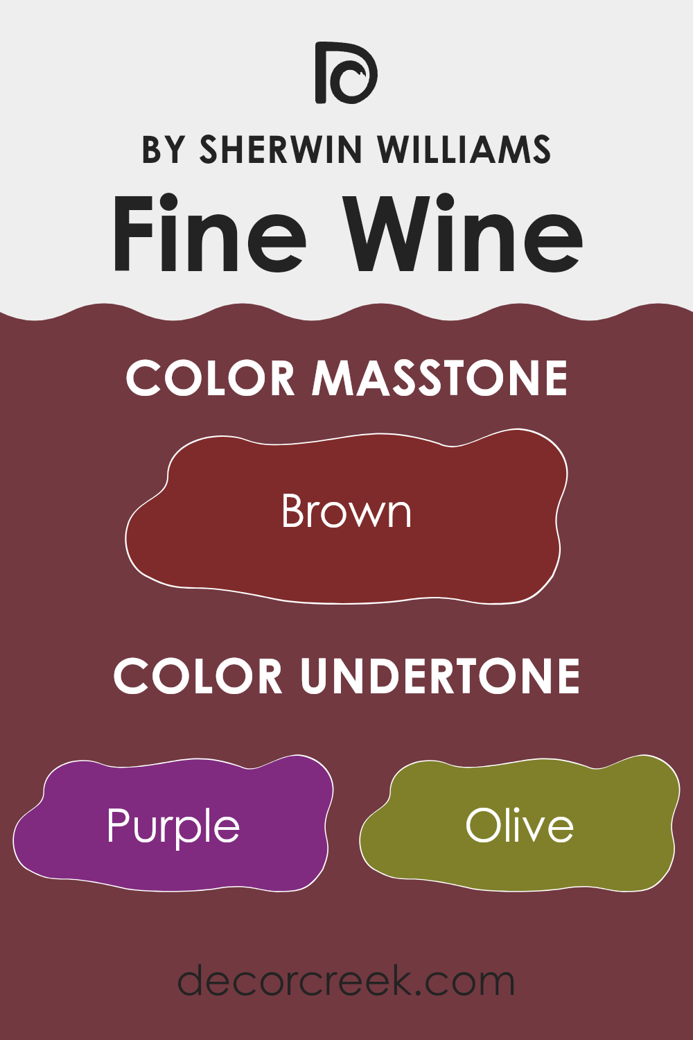
Fine Wine is a rich and deep color that can truly make a statement on interior walls. The complexity of its undertones plays a significant role in how this color is perceived and can influence the mood of a room.
When discussing undertones, we refer to the subtle colors that lie beneath the primary color, affecting how it looks under different lighting conditions. For Fine Wine, undertones such as purple, olive, navy, and dark green add a layer of depth that brings warmth and vibrancy to the paint. For instance, the purple undertone enriches the base with a hint of lushness, perfect for creating an inviting and cozy atmosphere.
Other undertones like dark grey and red contribute to the paint’s dynamic range, allowing Fine Wine to adapt smoothly from a bold statement in a well-lit dining room to a more muted backdrop in a dimly lit study. Moreover, undertones like orange and pink infuse a subtle energy, preventing the color from feeling too harsh or too intense.
Grey and dark turquoise provide a balancing effect, ensuring the color remains grounded and adaptable enough to match a variety of decors and styles. This makes Fine Wine an excellent choice for interior walls, as it can complement both modern and traditional rooms, enhancing furnishings and other room elements.
By understanding these undertones, one can better predict how the color will perform in their specific setting, ensuring that the paint not only looks beautiful but also creates the desired effect in the room.
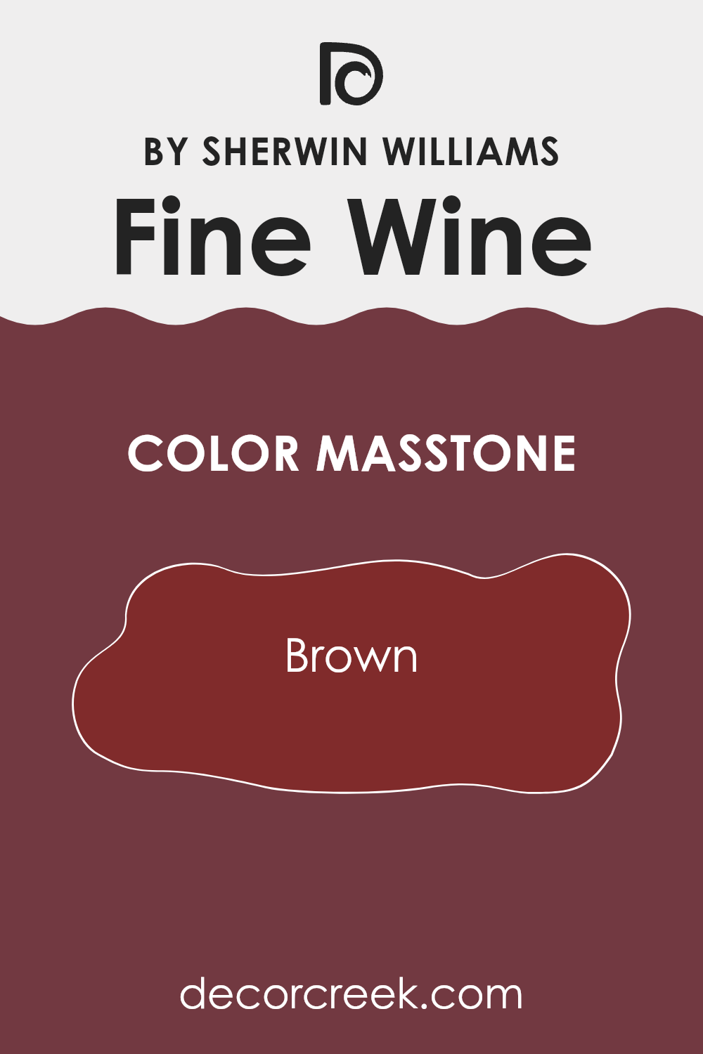
What is the Masstone of the Fine Wine SW 6307 by Sherwin Williams?
Fine Wine SW 6307 by Sherwin Williams has a masstone of Brown (#802B2B), creating a rich and inviting atmosphere in any room. This deep, warm brown has a cozy vibe that works well in living areas and bedrooms where comfort is key.
When used on walls, it adds depth and warmth, making large rooms feel more intimate and small rooms appear snug and welcoming. This color pairs well with soft lighting, enhancing its cozy effect, and contrasts beautifully with bright whites or lighter, neutral tones in trim or furnishings.
It’s especially effective in homes that have natural wood features, as it complements the earthy elements. Opting for this color can help create a relaxing environment that feels safe and grounded, ideal for places where people gather and relax.
How Does Lighting Affect Fine Wine SW 6307 by Sherwin Williams?
Lighting has a significant impact on how we perceive colors, as different light sources can alter how colors look in a room. This happens because different types of light have varying color temperatures and intensities, which can change how a color appears on walls or objects.
For example, Fine Wine is a rich, deep red color that can vary in appearance when exposed to different lighting conditions. In artificial light, such as incandescent bulbs that emit a warmer, yellow-toned glow, Fine Wine may look more vibrant and show a warmer tone. This makes it an appealing choice for rooms used during the evening or areas where there is a desire to create a cozy, welcoming feel.
Conversely, in natural daylight, which is generally cooler and bluer, Fine Wine may appear slightly darker and less saturated. This more accurate appearance under natural light highlights the color’s depth and richness, making it suitable for rooms that receive plenty of sunlight.
In rooms that face different directions, the appearance of Fine Wine changes throughout the day:
- North-Faced Rooms: These rooms often receive even but cooler light throughout the day. Here, Fine Wine may appear more muted and less vibrant, giving the room a calm and softened feeling.
- South-Faced Rooms: With plenty of bright, warm sunlight, the color shows its richness and depth most clearly in these rooms, keeping its vibrancy throughout the day.
- East-Faced Rooms: In east-facing rooms, the morning light can make Fine Wine look bright and fresh. As the day goes on and the light fades, the color may lose some of its intensity.
- West-Faced Rooms: In these rooms, the color often starts the day looking more subdued but becomes bolder and more lively as it catches the strong afternoon sunlight.
Understanding how lighting affects Fine Wine helps when choosing the right room and coordinating decor to highlight its beauty. This awareness ensures the chosen paint color performs well under changing lighting conditions while maintaining the desired mood in a room.
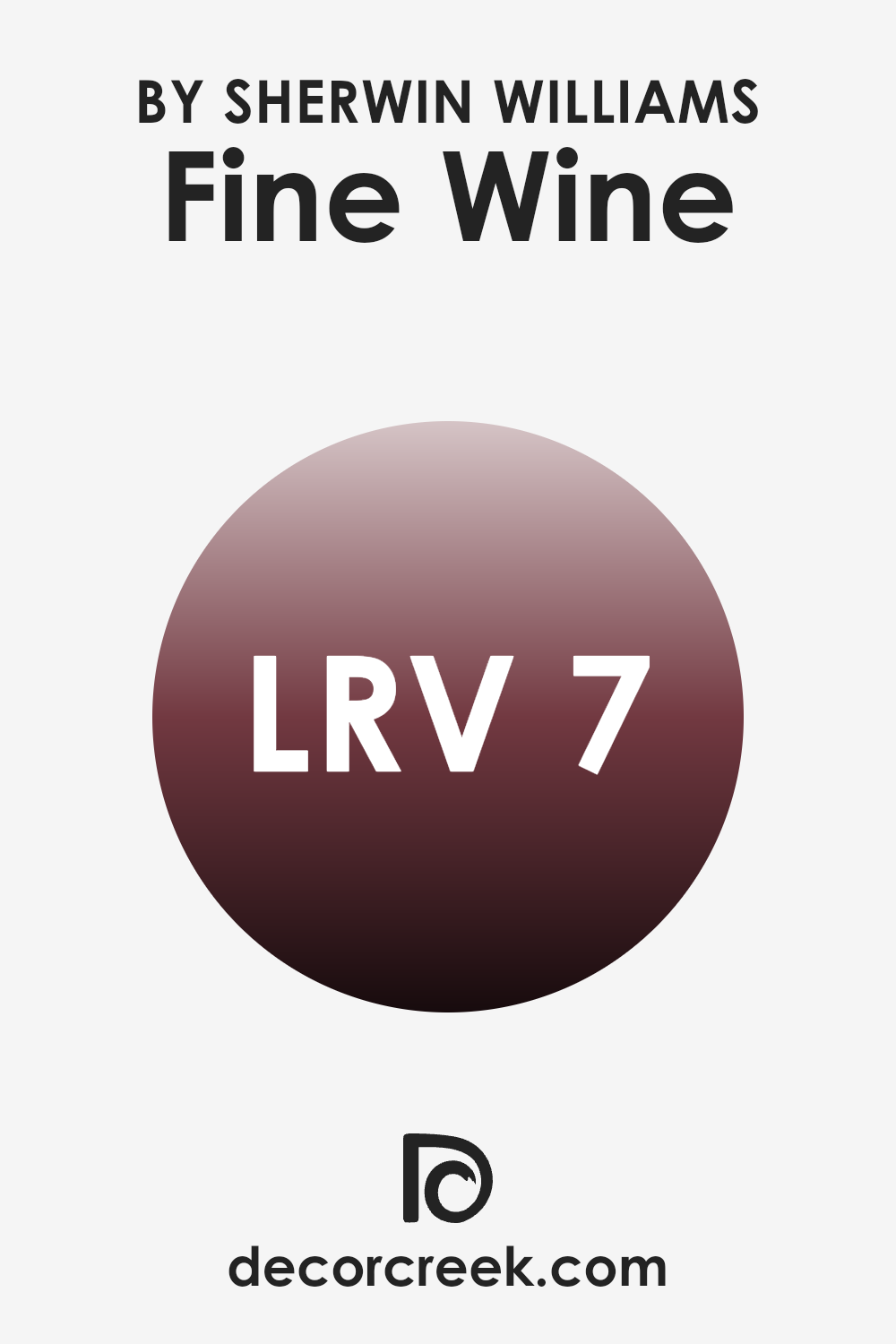
What is the LRV of Fine Wine SW 6307 by Sherwin Williams?
LRV stands for Light Reflectance Value, which shows how much light a paint color reflects or absorbs when applied to a surface. Basically, the LRV scale ranges from 1 to 99, where lower numbers mean the color absorbs more light and appears darker, while higher numbers mean the color reflects more light and appears brighter.
This value matters when choosing paint colors because it helps you understand how the color will look in your specific lighting conditions. For example, a low LRV paint can make a room feel cozier but smaller, while a high LRV paint can make a room feel more open and airy.
In the case of this particular deep red color with an LRV of 6.93, it sits on the lower end of the scale, meaning it absorbs a large amount of light rather than reflecting it. This quality makes the color rich and intense but can also cause a room painted in this shade to feel smaller and darker.
When used in a room, it is ideal for creating an intimate atmosphere, perfect for areas where a dramatic or cozy mood is desired. However, lighting is important to consider. In rooms with limited natural light, this color may feel too dark, while in well-lit areas, the depth and richness of the color can truly stand out in a beautiful way.
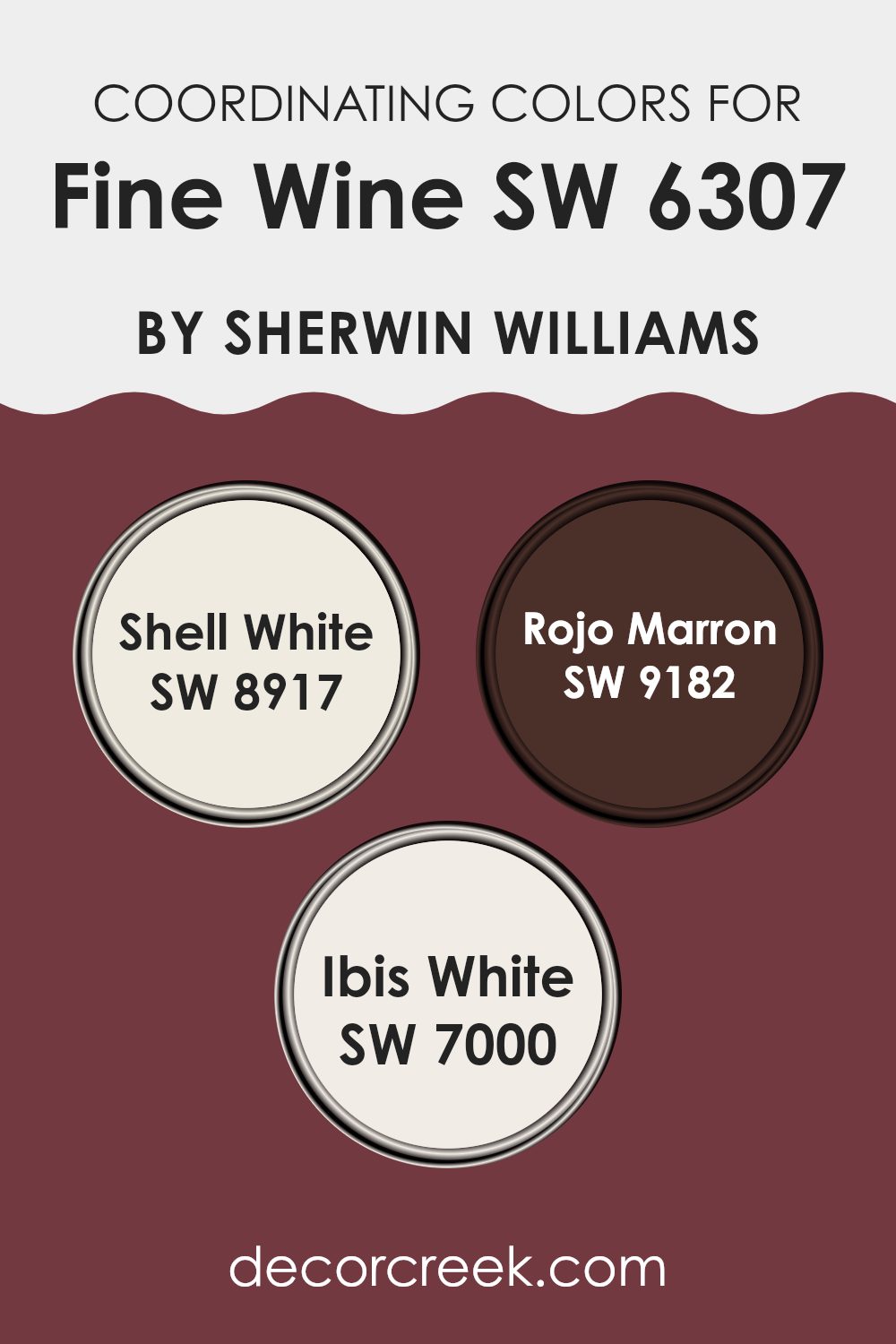
Coordinating Colors of Fine Wine SW 6307 by Sherwin Williams
Coordinating colors are those that complement and improve the look of a primary color, such as Fine Wine by Sherwin Williams. When used together in a design or decor scheme, these coordinating hues can create a harmonious and appealing visual experience. The idea is to select colors that either contrast with or are similar to the main color, in a way that they balance each other effectively. This helps in achieving a more cohesive and aesthetically pleasing ambiance in any room.
For example, Shell White is a soft, creamy white that offers a subtle contrast to the rich depth of Fine Wine. It is perfect for trim, ceilings, or as a neutral backdrop that allows darker colors to stand out. Rojo Marron, on the other hand, is a darker, earthy red that shares a color connection with Fine Wine, but with a more muted, brownish tone that complements without competing.
Lastly, Ibis White, another variant of white, has a clean and crisp tone that works wonderfully to brighten rooms and bring a fresh look when paired with the robust Fine Wine. When these colors are used together, they offer a balanced and visually pleasing palette.
You can see recommended paint colors below:
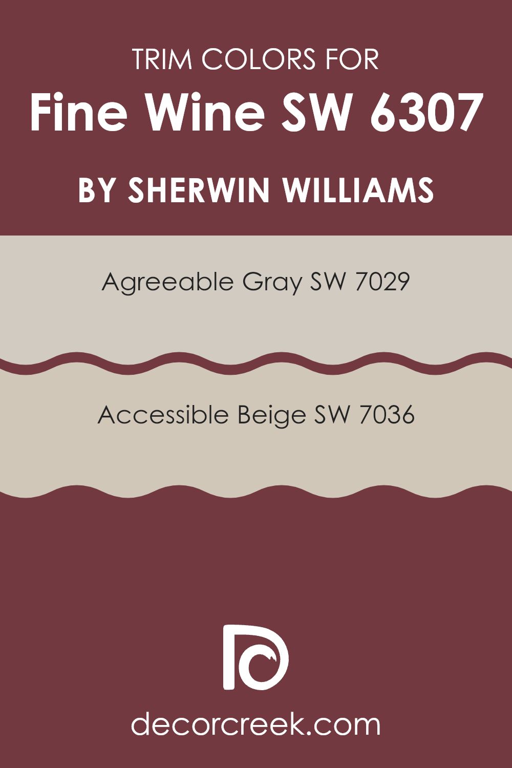
What are the Trim colors of Fine Wine SW 6307 by Sherwin Williams?
Trim colors play a crucial role in defining the rooms within a home and enhancing the main wall colors. For example, when using a rich hue like Fine Wine SW 6307 by Sherwin-Williams as the primary color in a room, selecting the right trim colors is essential for creating a cohesive look.
Trim colors such as Agreeable Gray SW 7029 and Accessible Beige SW 7036 are excellent choices as they provide a subtle contrast that can highlight the depth and warmth of Fine Wine. These lighter, neutral trim colors not only frame and emphasize the walls but also help break up the boldness of the darker shades, making the room feel balanced and inviting.
Agreeable Gray SW 7029 is a flexible and warm gray shade that has just the right mix of gray and beige. This color is particularly useful in rooms where you want to soften the impact of stronger colors without feeling too heavy. Accessible Beige SW 7036, on the other hand, is a soft beige that leans toward the warmer side, providing a soothing backdrop that complements richer, darker tones like Fine Wine. By using these colors as trim, you can effectively outline various architectural features and elements in the room, enhancing both the structure and the overall visual appeal.
You can see recommended paint colors below:
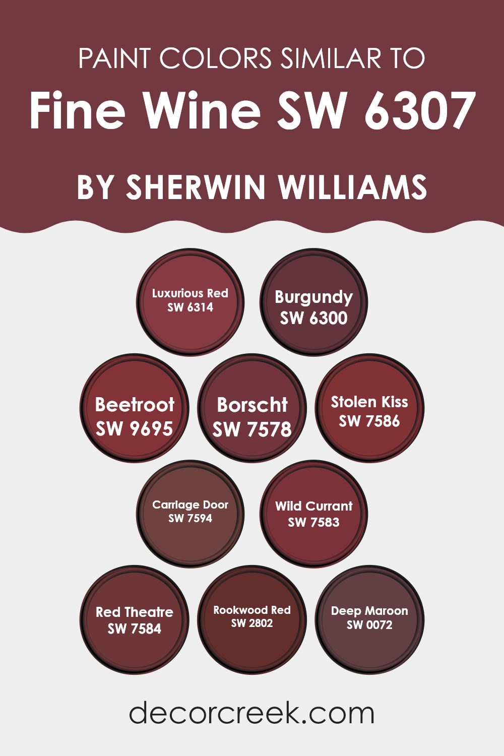
Colors Similar to Fine Wine SW 6307 by Sherwin Williams
Similar colors play a crucial role in design because they create harmony and a seamless visual experience. When colors such as Luxurious Red, Burgundy, Beetroot, and other variations around Fine Wine are used together, they create a cohesive palette that enhances the visual appeal of a room. These hues, which share the same color base, can unify an interior with subtle elegance without overpowering it with contrast.
Luxurious Red offers a vibrant yet cozy atmosphere, enriching rooms with its lively depths. Burgundy, a deep and muted hue, brings a classic warm tone that never feels dated. Beetroot adds a playful twist with its slightly brighter, earthy appeal inspired by the vibrant vegetable. Borscht, though similar, leans into a deeper area, lending almost a whisper of mystery to interiors. Stolen Kiss is lighter, adding a hint of romance and softness to the spectrum.
Carriage Door, with its enduring depth, blends well within rustic or traditional settings. Wild Currant and Red Theatre, both deep and intense, give off a dramatic flair, making bold statements that still feel welcoming. Rookwood Red draws from historic influences, providing a grounded and strong presence, while Deep Maroon rounds out the options with its rich, saturated tones, perfect for adding a touch of formality and depth to rooms.
You can see recommended paint colors below:
- SW 6314 Luxurious Red
- SW 6300 Burgundy
- SW 9695 Beetroot
- SW 7578 Borscht
- SW 7586 Stolen Kiss
- SW 7594 Carriage Door
- SW 7583 Wild Currant
- SW 7584 Red Theatre
- SW 2802 Rookwood Red
- SW 0072 Deep Maroon
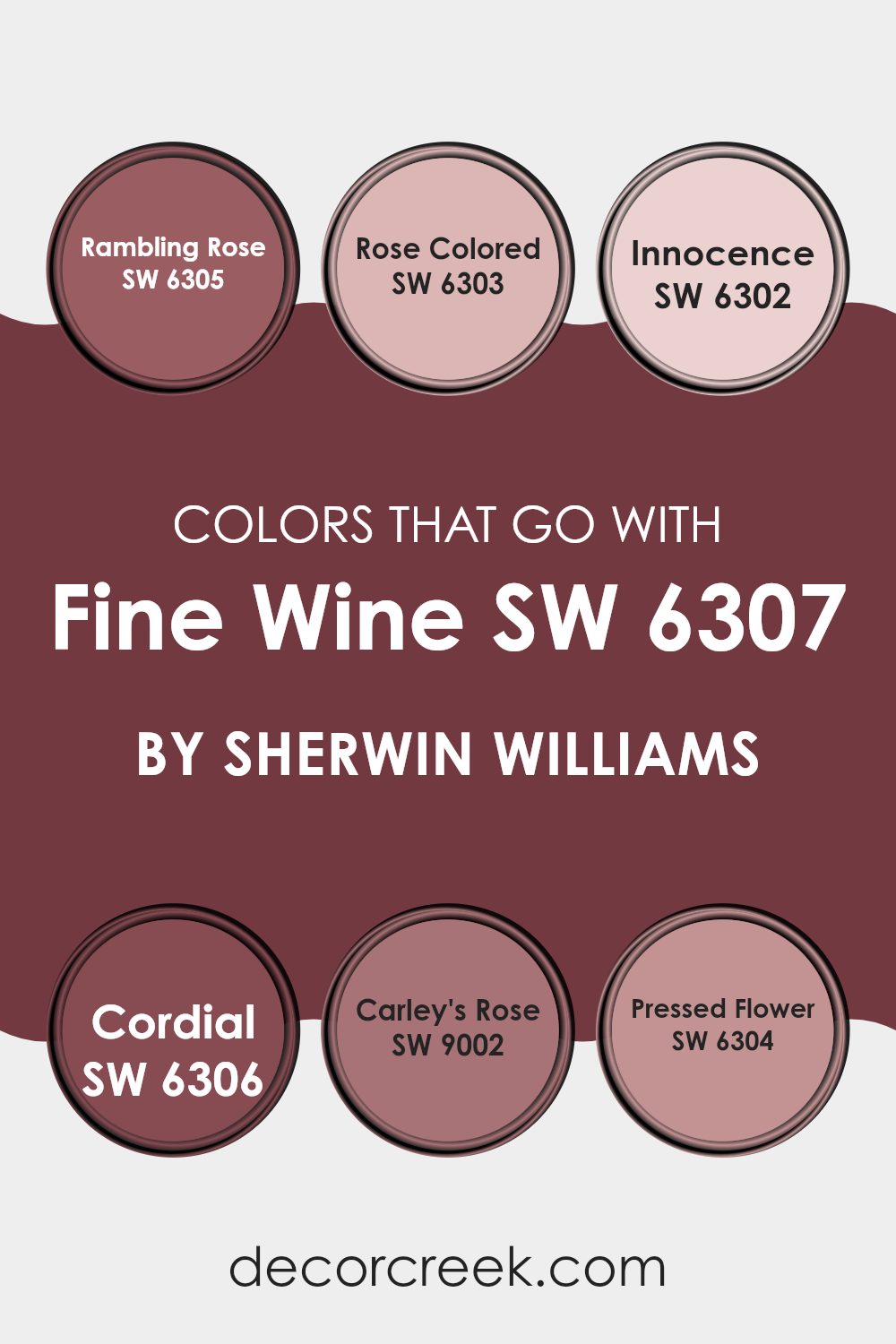
Colors that Go With Fine Wine SW 6307 by Sherwin Williams
Choosing the right colors to pair with Fine Wine SW 6307 by Sherwin Williams is crucial for creating a harmonious and visually pleasing room. Colors like Rambling Rose, Rose Colored, Innocence, Cordial, Carley’s Rose, and Pressed Flower offer a palette that works well with the deep, rich tones of Fine Wine, improving the overall look of any room.
These complementary colors work well together because they share similar undertones, making the transition between colors smooth and visually connected. They can also help highlight architectural features or define different areas within a room when used thoughtfully.
Rambling Rose SW 6305 is a soft, muted pink that adds a touch of warmth to the surroundings, making it perfect for cozy, intimate rooms. Rose Colored SW 6303 has a slightly deeper pink hue that gives a room a welcoming feel without being too intense. Innocence SW 6302 is a gentle blush pink that can brighten up a room while keeping a soft mood.
Cordial SW 6306 offers a darker pink that works well to ground lighter tones and add depth. Carley’s Rose SW 9002 is an elegant, understated pink that pairs beautifully with darker shades for a rich contrast. Lastly, Pressed Flower SW 6304 features a dusty rose color that balances the boldness of Fine Wine, helping the room feel well-balanced and carefully planned. Together, these colors create a cohesive look that improves the visual impact of Fine Wine.
You can see recommended paint colors below:
- SW 6305 Rambling Rose
- SW 6303 Rose Colored
- SW 6302 Innocence
- SW 6306 Cordial
- SW 9002 Carley’s Rose
- SW 6304 Pressed Flower
How to Use Fine Wine SW 6307 by Sherwin Williams In Your Home?
Fine Wine SW 6307 by Sherwin Williams is a rich, deep red paint color that can warm up any room in your home. It’s perfect for creating a cozy and welcoming atmosphere.
You can use this lively shade to paint an accent wall in your living room or dining room, which can make the room feel more comfortable and inviting. It also works well in a bedroom, adding a touch of romance and warmth that can make it easier to relax and unwind at the end of the day.
In addition to walls, Fine Wine can be used on furniture or cabinets for a pop of color. It pairs beautifully with neutral colors like whites, beiges, and grays, as well as with darker hues like navy or rich browns. Consider adding some accessories in matching shades or with floral patterns to tie the room’s look together. Whether you’re painting a whole room or just adding a few accents, Fine Wine can add a lot of character and warmth to your home.
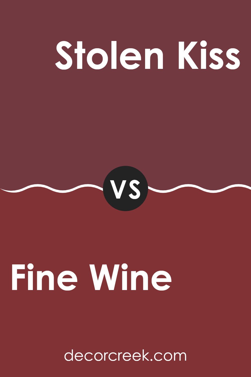
Fine Wine SW 6307 by Sherwin Williams vs Stolen Kiss SW 7586 by Sherwin Williams
Fine Wine and Stolen Kiss are two distinct shades offered by Sherwin Williams. Fine Wine is a deep, rich red with a rich feel, bringing to mind the classic elegance of a well-aged wine.
It’s bold and impactful, making it an excellent choice for rooms where a strong, confident color is desired. On the other hand, Stolen Kiss is slightly softer and warmer with a more romantic and inviting undertone.
It leans more toward a muted, rosy hue, which can add a gentle touch of color to a room without feeling too strong. While both colors share a red base, Fine Wine is darker and more intense, making it ideal for a dramatic statement wall or an accent piece. Stolen Kiss is better suited for bedrooms or living areas where a cozy, welcoming atmosphere is preferred.
You can see recommended paint color below:
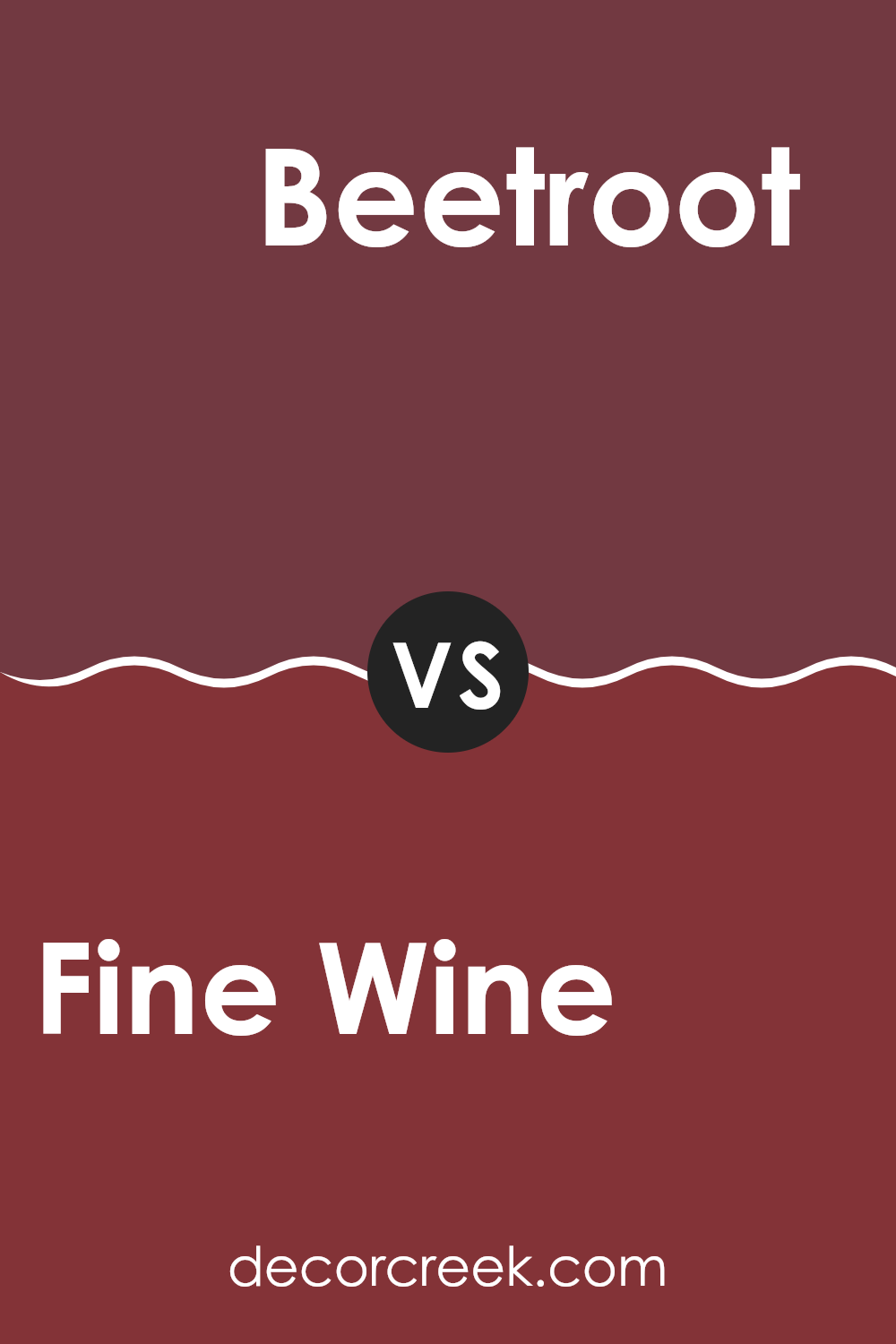
Fine Wine SW 6307 by Sherwin Williams vs Beetroot SW 9695 by Sherwin Williams
Fine Wine and Beetroot, both by Sherwin Williams, are vibrant hues rooted in the red palette, bringing distinct vibes to any room. Fine Wine, as the name suggests, resembles the rich, deep red of a vintage wine. This color provides a feeling of warmth and comfort, perfect for creating a cozy atmosphere in living rooms or dining areas.
On the other hand, Beetroot is a darker shade that leans more toward a purple-red, reminiscent of the earthy tones of a beetroot vegetable. This color is denser and can add a bold, dramatic flair to an interior, making it ideal for accent walls or decorative details that draw the eye.
While both shades share a red base, Fine Wine offers a traditional warmth that invites relaxation. Beetroot, however, adds a feeling of intrigue and drama, suitable for a modern interior where you want to make a statement. Choosing between them depends on the emotional impact you’re aiming for in your decorating project.
You can see recommended paint color below:
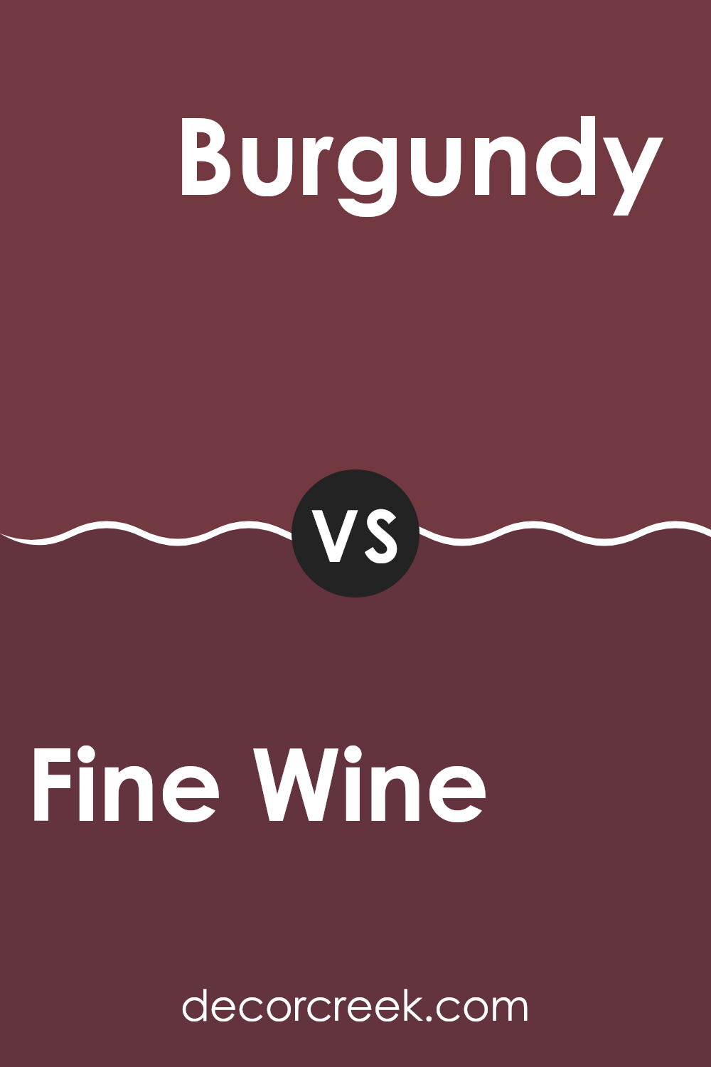
Fine Wine SW 6307 by Sherwin Williams vs Burgundy SW 6300 by Sherwin Williams
Fine Wine and Burgundy are two vibrant shades from Sherwin Williams, each offering a unique but related look for any room. Fine Wine appears as a deep, muted red with a touch of purplish undertone, giving it a calm yet bold quality.
This color works well in a room used for relaxation or entertaining, adding a cozy, inviting vibe. On the other hand, Burgundy is a richer and slightly darker shade.
It leans more toward a classic red with deeper, maroon-like qualities, making it ideal for an area that draws attention or supports a more formal mood. Both colors work beautifully in rooms that benefit from warm, rich tones, yet Burgundy feels slightly more traditional, while Fine Wine brings in a more modern touch. They can effectively set the mood in a room, depending on the feeling you want to create.
You can see recommended paint color below:
- SW 6300 Burgundy
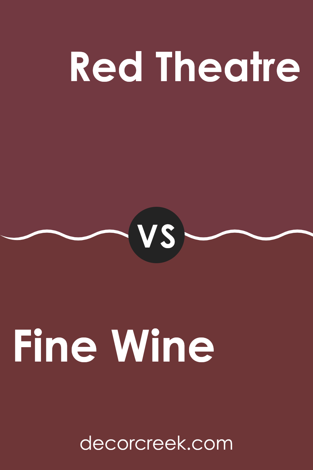
Fine Wine SW 6307 by Sherwin Williams vs Red Theatre SW 7584 by Sherwin Williams
Fine Wine and Red Theatre are two striking colors from Sherwin Williams, each with its unique appeal. Fine Wine is a deep, rich burgundy that leans toward a warm, cozy feel, making it perfect for rooms where you want a refined yet inviting atmosphere. It has an understated elegance, often favored for living rooms or dining areas where a touch of formality is desired without going too dark.
On the other hand, Red Theatre is a bold, vibrant red. It’s a color that stands out and grabs attention, ideal for a room you want to energize and make a statement. With its lively hue, Red Theatre can instantly brighten areas like kitchens or any place meant for lively gatherings and conversations.
Together, these colors can work well in complementary rooms, with Fine Wine in a more relaxed setting and Red Theatre in an area designed for activity and enthusiasm.
You can see recommended paint color below:
- SW 7584 Red Theatre
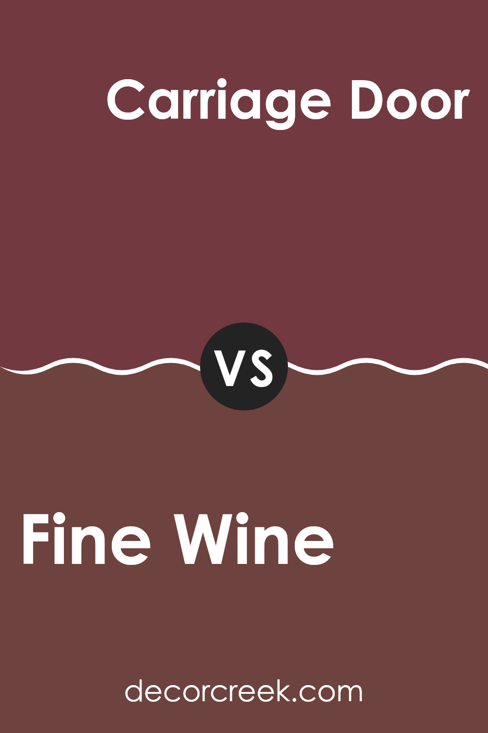
Fine Wine SW 6307 by Sherwin Williams vs Carriage Door SW 7594 by Sherwin Williams
Fine Wine is a deep, rich red that brings to mind a cozy, welcoming atmosphere. It’s the kind of color that would make a statement in a dining room or a cozy reading nook, offering warmth and a hint of romance. This bold shade can create a strong presence on a wall, drawing attention and making decorations stand out.
On the other hand, Carriage Door is a muted, earthy brown with a subtle reddish undertone. This color is adaptable and grounding, perfect for creating a calm and inviting room. It works well in many areas of a home, such as the living room or on exterior doors and trim, providing a classic look that pairs well with many other colors.
While both colors offer a sense of warmth, Fine Wine is more vibrant and energetic, and Carriage Door is more subdued and neutral. Choosing between them would depend on the mood and style you want to achieve in your room.
You can see recommended paint color below:
- SW 7594 Carriage Door
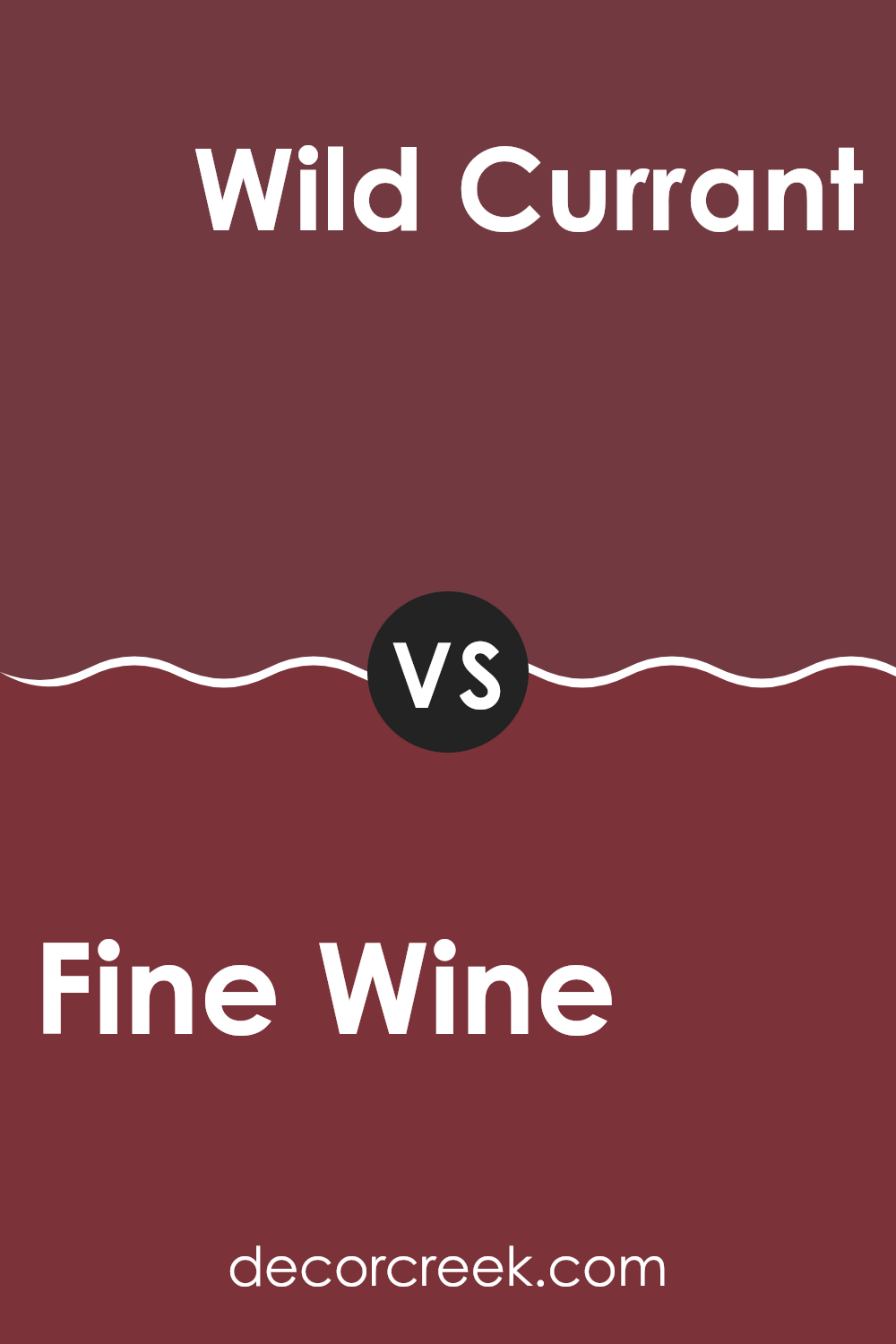
Fine Wine SW 6307 by Sherwin Williams vs Wild Currant SW 7583 by Sherwin Williams
Fine Wine and Wild Currant, both by Sherwin Williams, are two shades that provide unique vibes for any room. Fine Wine is a deep, rich red that conveys a classic and elegant feel, perfect for creating a cozy and intimate atmosphere in a room. It’s the kind of color that might remind you of a luxurious red velvet cake, adding a sense of warmth and comfort.
On the other hand, Wild Currant is also a red but with a bolder and more vivid appearance. It’s brighter than Fine Wine and tends to stand out more, making it ideal for areas where you want to make a statement or add a pop of color. This shade is very lively and can bring energy into a room.
Both colors can certainly set a mood, but your choice between the two may depend on the kind of impact you want to create; Fine Wine feels more restrained and traditional, while Wild Currant appears more striking and modern.
You can see recommended paint color below:
- SW 7583 Wild Currant
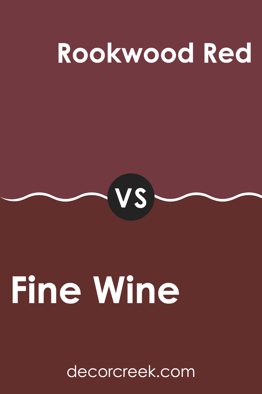
Fine Wine SW 6307 by Sherwin Williams vs Rookwood Red SW 2802 by Sherwin Williams
Fine Wine is a deep, rich color that leans heavily toward a burgundy shade. It’s warm and inviting, perfect for creating a cozy atmosphere in rooms like living rooms or bedrooms. On the other hand, Rookwood Red has a darker, more earthy tone, resembling traditional brick. This color is ideal for adding a grounded, robust feel to an area, making it popular for dining rooms or exteriors.
Both colors share a warmth that is typical of red-based shades, but their individual impacts on room vibes are distinct. Fine Wine is brighter and can make a room feel more vibrant and energetic. Contrarily, Rookwood Red’s darker, muddier red brings a more grounded, steady feel, making an interior feel more secure and sheltered.
In conclusion, while both colors offer warmth, Fine Wine’s vibrancy contrasts with Rookwood Red’s subdued and earthy qualities, providing different options depending on the atmosphere you want to achieve.
You can see recommended paint color below:
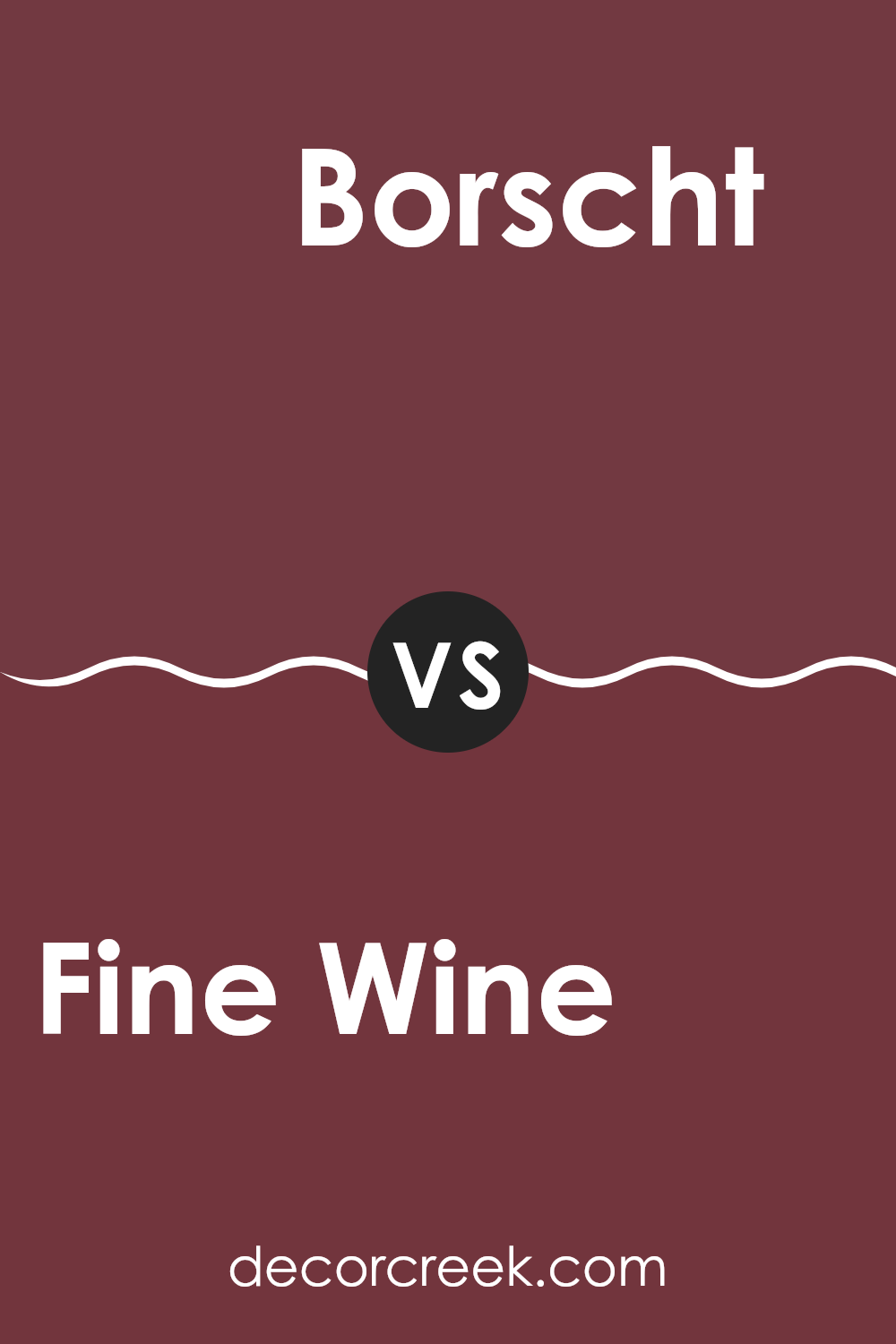
Fine Wine SW 6307 by Sherwin Williams vs Borscht SW 7578 by Sherwin Williams
Fine Wine and Borscht, both by Sherwin Williams, are unique shades that can noticeably change the mood of any room. Fine Wine has a deep, rich red that resembles classic burgundy wine, giving a feeling of warmth and comfort. It’s a color that tends to make rooms feel more intimate and cozy, perfect for living areas or bedrooms.
On the other hand, Borscht has a more muted tone, leaning toward a dustier rose. This color is less intense than Fine Wine, providing a softer, more understated look. It’s great for someone who likes the idea of bringing red into their decor but prefers a less bold approach.
Although both colors share a red base, their different tones can affect a room’s look and atmosphere. Fine Wine draws more attention and can dominate a room, whereas Borscht is more reserved, blending gently into the background. Each offers its own unique charm, depending on the vibe you’re going for.
You can see recommended paint color below:
- SW 7578 Borscht
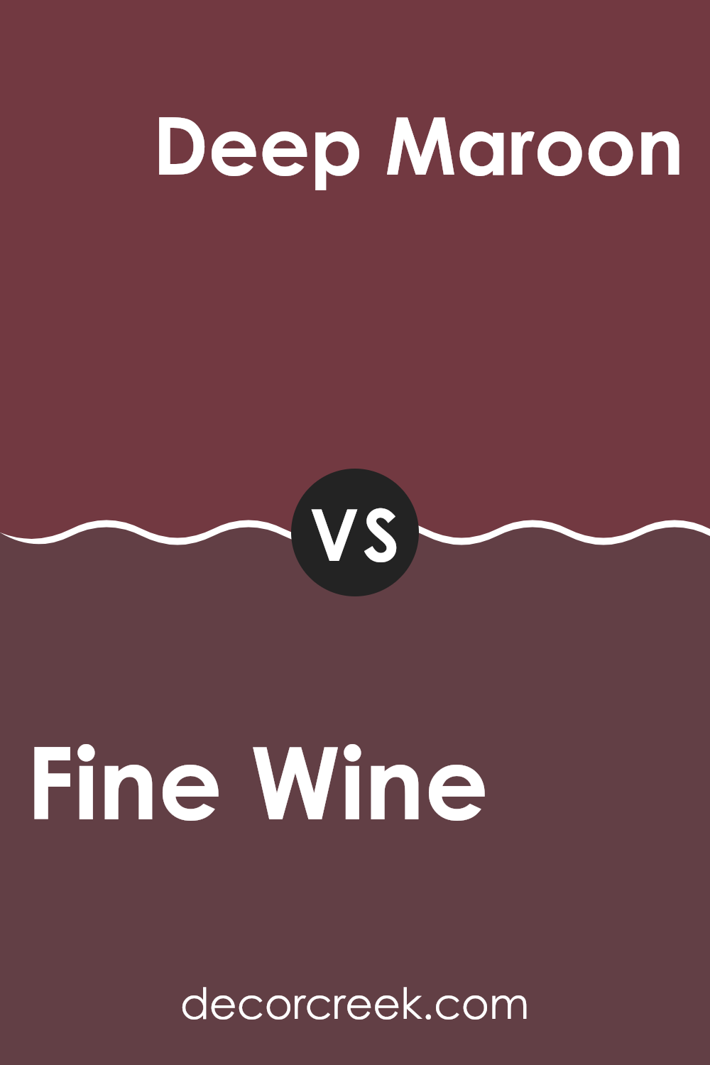
Fine Wine SW 6307 by Sherwin Williams vs Deep Maroon SW 0072 by Sherwin Williams
Fine Wine and Deep Maroon, both by Sherwin Williams, offer distinct hues that can really change the feel of a room. To start, Fine Wine is a rich, vibrant color. It leans more toward a lively red that can bring a warm and inviting mood to any area. It’s great if you’re looking to add a splash of bright color to your room without feeling too heavy.
On the other hand, Deep Maroon is a much darker shade. It moves into deeper, almost brown undertones, making it ideal for settings where you might want a more subdued or cozy feel. This color can be perfect for creating an intimate mood in personal rooms like bedrooms or studies.
In comparison, while both colors share a base in the red family, Fine Wine offers a punchier, more energetic look, whereas Deep Maroon provides a sense of grounding and warmth with its richer, darker hue. Choosing between them depends on the mood and style you wish to achieve in your room.
You can see recommended paint color below:
- SW 0072 Deep Maroon
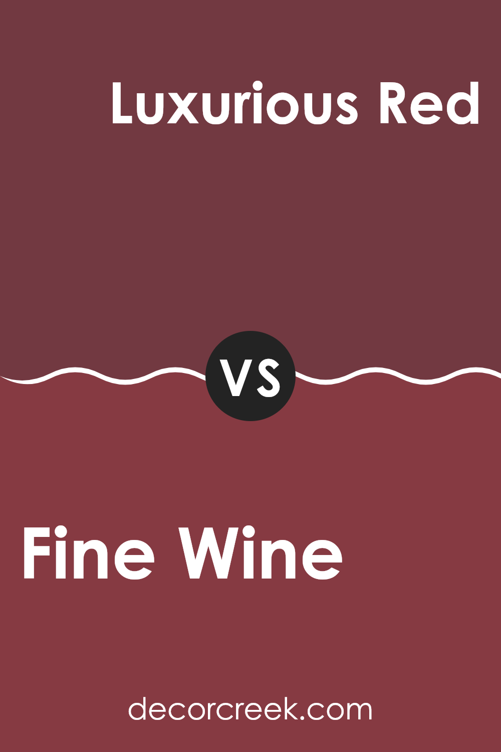
Fine Wine SW 6307 by Sherwin Williams vs Luxurious Red SW 6314 by Sherwin Williams
Fine Wine and Luxurious Red by Sherwin-Williams are both deep red shades, but they have distinctive tones that set them apart. Fine Wine is a rich, dark burgundy that can give a cozy, comfortable feel to a room. It’s a muted color that leans slightly toward purple, which helps soften its appearance and makes it quite adaptable in terms of decor.
On the other hand, Luxurious Red is a bolder, more vibrant red. It carries a strong sense of energy and warmth, making it a great choice if you’re looking to add some pop to your interior. While still rich, this shade is closer to a true red, which catches the eye more than Fine Wine.
These colors can work well together for those wanting to create a layered, red-themed interior, or used separately, they can each stand out in their own ways. Fine Wine works well in a subdued, classy setting, while Luxurious Red is ideal for more lively, dynamic rooms.
You can see recommended paint color below:
- SW 6314 Luxurious Red
In conclusion, after taking a good look at SW 6307 Fine Wine by Sherwin Williams, I’ve found that it’s a really impressive paint color. This shade of red is deep and rich, just like the fancy red juices grown-ups drink, and it definitely adds a splash of fun to any room without being too loud or in your face.
Using this color is a great choice if you want to make a room look warm and cozy, especially as the colder months roll in. It perfectly matches with lots of other colors, like soft whites or even cool blues, so you can use it in all sorts of ways, whether you want to paint a whole room or just one wall for a cool look.
It’s also worth mentioning how different it looks in various lights. During the day, it has a vibrant, bright vibe, but as it gets darker outside, it turns into a more relaxed and comforting color, which is pretty cool to see changing throughout the day.
Overall, SW 6307 Fine Wine by Sherwin Williams is a great choice if you’re looking to add some personality to your home with a color that’s both fun and cozy. It’s easy to see why many people would pick it to make their homes feel warmer and more inviting.
Ever wished paint sampling was as easy as sticking a sticker? Guess what? Now it is! Discover Samplize's unique Peel & Stick samples.
Get paint samples

