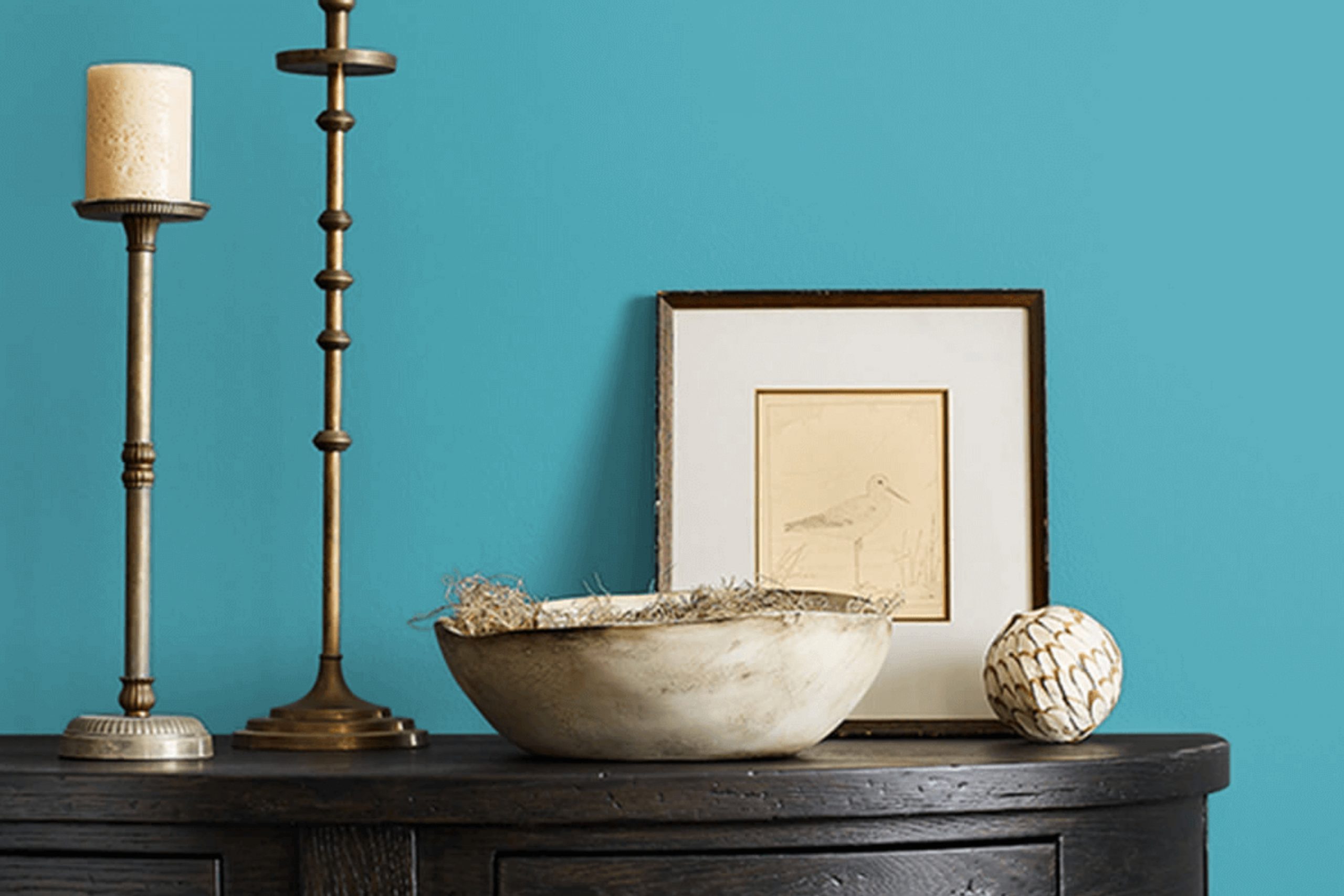
When you think about the perfect shade of blue-green, SW 6774 Freshwater by Sherwin Williams comes to mind. Imagine standing by a quiet lake, where the colors of water and sky converge. This is the feeling Freshwater brings into a room. It’s like nature’s calm wrapped into a can of paint. Not too bold, yet far from dull, this color strikes a unique balance that’s both refreshing and soothing.
Using Freshwater in your home can make waking up feel like a breath of fresh air. It works wonders in rooms where you want a touch of calm without losing vibrancy. The subtle hints of green in this hue are not just color, but a whisper of nature – suggesting growth and harmony.
Ideal for living rooms or bathrooms, it brings a sense of peace without making a room feel closed in. When combined with natural wood accents or clean whites, Freshwater truly stands out, offering a hint of elegance while keeping its grounded charm.
For someone looking to bring a bit of the outdoors inside, or just brighten up a room with a calming tone, Freshwater might be the perfect choice. It’s a color that doesn’t just sit on the wall — it interacts with the light and furnishings in a way that feels continually refreshing, like a cool breeze on a warm day.
What Color Is Freshwater SW 6774 by Sherwin Williams?
Freshwater by Sherwin Williams (SW 6774) is a lovely shade of blue that feels both vibrant and refreshing. It brings to mind the coolness of a flowing stream or the clear skies of a sunny day. This color has a lively yet calming quality that makes it suitable for many interior styles.
Freshwater works particularly well in modern and coastal interiors, where its brightness can enhance the light and airy feel typical of these styles. It also complements bohemian rooms with its cheerful vibe, adding a pop of color against neutral backdrops. In traditional interiors, Freshwater can provide a fresh twist, especially as an accent color on walls or furnishings.
Pairing materials and textures with Freshwater is fun and adaptable. For a modern touch, try it with sleek metals like chrome or stainless steel, which bring out the color’s sharpness. Natural materials like light wood, rattan, or bamboo create a smooth balance, making the room feel warm and welcoming. Soft fabrics such as linen or cotton in neutral shades, paired with Freshwater, build a cozy and laid-back vibe.
Adding glass pieces can boost the airy mood, while darker tones offer contrast and depth for a bolder look.

Is Freshwater SW 6774 by Sherwin Williams Warm or Cool color?
Freshwater SW 6774 by Sherwin Williams is a soft, refreshing shade of blue that brings a sense of calm to any room. This color works well in homes because it creates a peaceful and clean setting. It brings in a light and open feel, helping small rooms appear larger and brighter. Freshwater is flexible, fitting into many design styles from coastal to modern.
When used in living rooms or bedrooms, it encourages relaxation and comfort. In kitchens or bathrooms, Freshwater can create a crisp, clean look, especially when paired with white or light grey accents.
For those who want to bring a touch of nature indoors, this hue pairs nicely with natural elements like wood or stone. It also blends well with both warm and cool tones, making it simple to match with existing decor. Overall, Freshwater SW 6774 adds a gentle hint of color that can renew any room in the home.
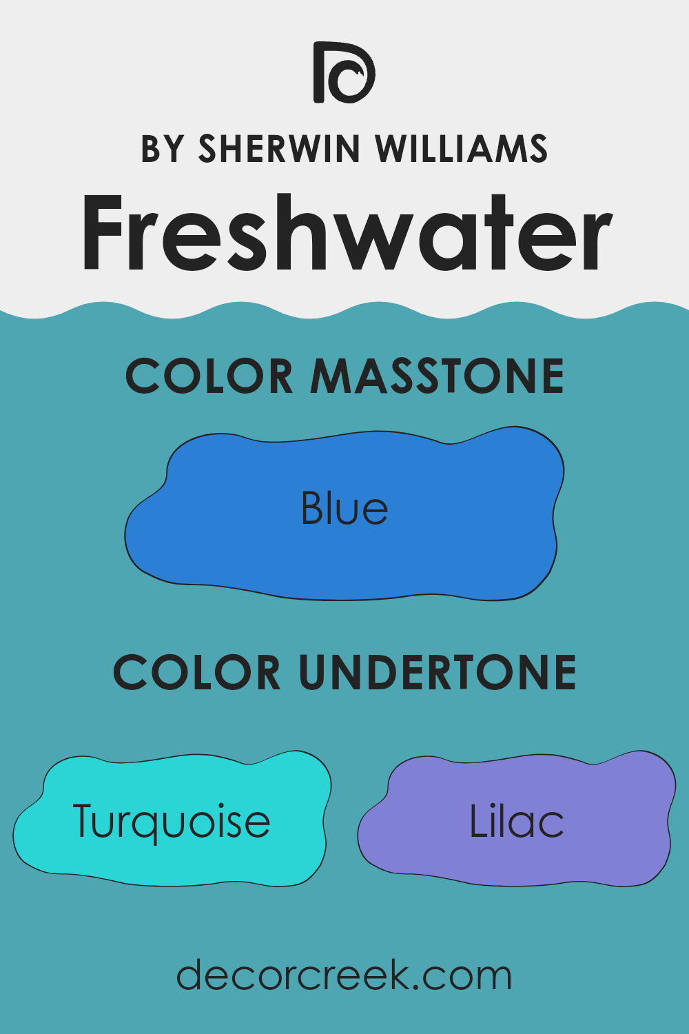
Undertones of Freshwater SW 6774 by Sherwin Williams
Freshwater SW 6774 by Sherwin Williams is a calm and refreshing paint color. It carries subtle undertones that shift depending on the room. These include hints of turquoise, lilac, and deep turquoise, adding layers and depth to the overall look.
The turquoise undertone in Freshwater brings a sense of calmness and light to the rooms, reminiscent of clear ocean waters. Lilac and light blue add depth and a hint of warmth, preventing the color from feeling too cold. The grey undertone helps balance everything, adding a touch of neutrality that makes the color adaptable.
When you paint a wall with Freshwater, these undertones blend to create a peaceful setting. In a room filled with natural light, the turquoise and light blue tones become more visible, giving the room a breezy and open feel. In dimmer areas, the lilac and grey undertones may emerge, adding a cozier and more sheltered mood.
These undertones also affect what other colors complement Freshwater. The color pairs well with soft whites, warm woods, or even bolder navy and dark blue accents, all pulled from its intricate undertone palette. The varied undertones allow Freshwater to fit seamlessly into different rooms and decor styles.
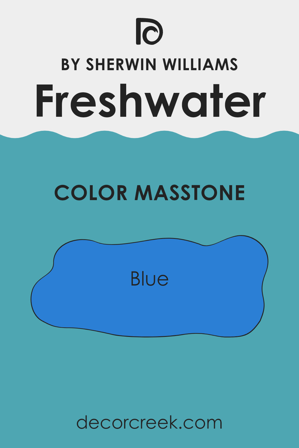
What is the Masstone of the Freshwater SW 6774 by Sherwin Williams?
Freshwater (SW 6774) by Sherwin Williams is a refreshing blue that brings a sense of calm and clarity to any room. The masstone, a vibrant blue (#2B80D5), creates a strong, clean appearance. This particular shade of blue fits nicely in homes because it has a soothing effect, making it a great choice for bedrooms or living areas where relaxation is key.
It can also make smaller rooms feel more open and airy, as the brightness of the blue reflects light. Freshwater pairs beautifully with whites and soft grays, adding a modern touch without feeling too cold or sterile.
In bathrooms or kitchens, it can be used to create a coastal vibe, evoking a sense of being near water. Overall, Freshwater’s vibrant yet calming color can cheer up any room, making it feel lively but also peaceful.
How Does Lighting Affect Freshwater SW 6774 by Sherwin Williams?
Lighting plays a crucial role in how we perceive colors. Different types and angles of light can change the appearance of a color in a room. The Sherwin Williams color Freshwater (SW 6774) is a soft, watery blue that can look different depending on the lighting conditions and room orientation.
Under artificial light, especially with warm bulbs, Freshwater can appear slightly warmer and take on a hint of green. This can make the color feel cozy and inviting. However, under cooler LED lights, the color might look more true to its natural blue state, maintaining a fresh and clean look.
In natural light, the orientation of a room significantly affects how Freshwater is perceived. In north-facing rooms, which typically receive consistent, albeit cooler and sometimes dimmer light, Freshwater might appear a bit muted and cooler. This could make the room feel more restful but could also flatten the color slightly.
In contrast, south-facing rooms receive warm, bright, natural light throughout the day. Here, Freshwater may appear brighter and more vibrant, bringing an uplifting and airy atmosphere to the room. The abundant sunlight can enhance the color’s depth and showcase its true blue tones.
East-facing rooms capture the soft morning light but tend to cool down as the day goes on. Freshwater could appear brighter and more cheerful in the early hours, but might cool and recede slightly as the light changes, possibly bringing out subtle green undertones.
In west-facing rooms, the afternoon and evening light can be warm and intense, which can enhance the warmth and depth of the color, potentially bringing out any warmer tones present in Freshwater. This makes it look particularly inviting in the late afternoon and early evening.
Overall, Freshwater is a flexible color that can adjust to various lighting conditions, but understanding how light affects it is vital for achieving the desired look and feel in your room.

What is the LRV of Freshwater SW 6774 by Sherwin Williams?
LRV, or Light Reflectance Value, measures how much light a color reflects and absorbs. It’s a number scale that runs from 0 to 100, where 0 is absolute black, reflecting no light, and 100 is pure white, reflecting all light. When you choose a paint color, LRV helps you understand how light or dark the color will appear in your room.
This is important because colors can look different depending on the amount of natural or artificial light they are subjected to. A lower LRV means the color absorbs more light, making rooms feel cozier or smaller. In contrast, a higher LRV reflects more light, which helps make a room feel lighter and larger.
For Freshwater SW 6774 by Sherwin Williams, with an LRV of 31.96, it sits in the mid-range of the scale. This means it is a medium-dark color that will take in more light than it gives back. In a room with plenty of natural light, Freshwater can offer a richer, deeper feel, balancing the brightness of the sunlight. In rooms with limited light, it might make the area feel smaller or more personal.
This LRV lets Freshwater keep its tone without taking over the room, creating a calm and cozy setting.

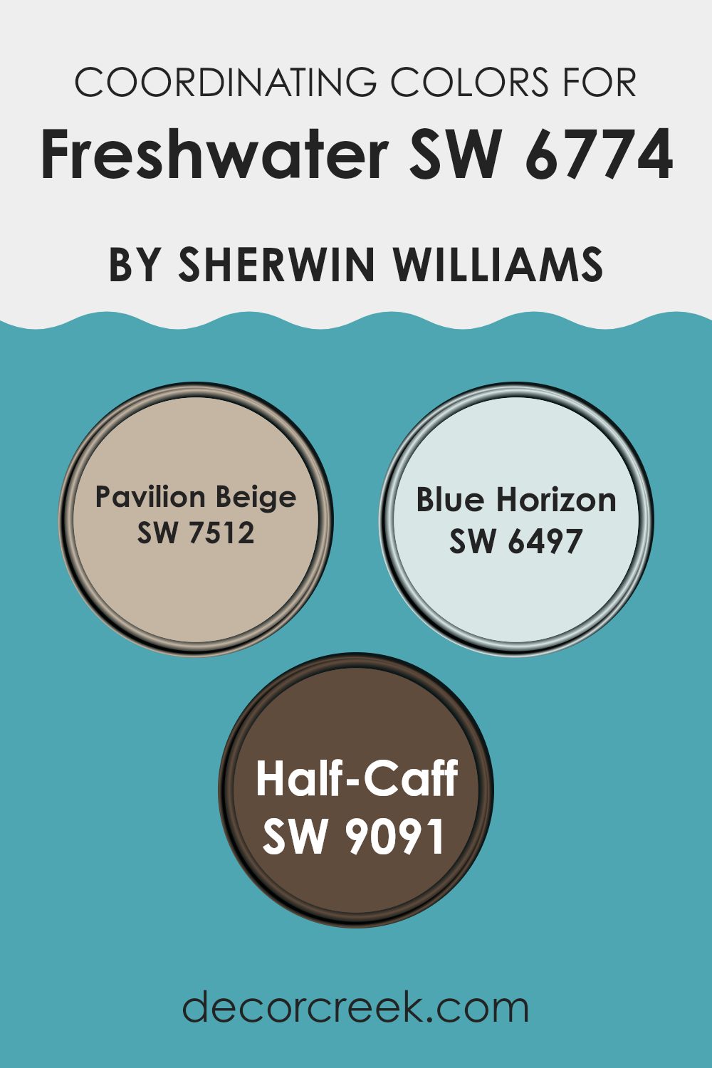
Coordinating Colors of Freshwater SW 6774 by Sherwin Williams
Coordinating colors are tones that work well together in a room, creating a balanced and unified feel. When picking shades to pair with Freshwater by Sherwin-Williams, options like Pavilion Beige, Blue Horizon, and Half-Caff blend easily to bring out its charm. Pavilion Beige is a warm, neutral tone that offers a soft, earthy contrast to Freshwater’s cool and lively hue. It anchors the palette, making the room feel welcoming and easygoing.
Blue Horizon, on the other hand, adds an airy, refreshing quality that pairs beautifully with the calming nature of Freshwater. This gentle blue is reminiscent of clear skies, enhancing a sense of openness and relaxation. Lastly, Half-Caff infuses a touch of subtle richness with its warm, coffee-inspired tone.
It adds depth and contrast to the mix without being overpowering. These colors work together to create an environment that feels both lively and soothing, perfect for rooms meant to be restful yet lively, like a living room or a bedroom. Each shade plays its part in ensuring the colors harmonize well with Freshwater, delivering a visually pleasant experience.
You can see recommended paint colors below:
- SW 7512 Pavilion Beige
- SW 6497 Blue Horizon
- SW 9091 Half-Caff
What are the Trim colors of Freshwater SW 6774 by Sherwin Williams?
Trim colors are the shades applied to the edges and borders of a room, like the baseboards, window frames, and moldings, complementing the main wall color. Choosing the right trim color can make a room feel balanced and harmonious. When it comes to pairing trim colors with Sherwin Williams Freshwater, having options like SW 7757 High Reflective White and SW 7007 Ceiling Bright White can make a significant difference in the appearance of the room.
These shades help define the architecture of the room and enhance the crisp, clean look that complements the calming blue-green of Freshwater. The contrast created by a well-picked trim can draw attention to architectural details, making the overall design more appealing.
SW 7757 High Reflective White is a bright white that offers a pure, clean backdrop and pairs nicely with many shades, including Freshwater. Its reflective quality helps spread light around the room, making areas feel more open and spacious. In contrast, SW 7007 Ceiling Bright White brings a slightly softer white with a warmer undertone, adding a bit of warmth while still keeping the room clear and bright.
Both colors are excellent choices for trims because they are neutral yet distinct, highlighting the elegance of Freshwater on the walls without competing for attention. The choice of trim color can subtly influence the room’s overall atmosphere, contributing to a cohesive and inviting environment.
You can see recommended paint colors below:

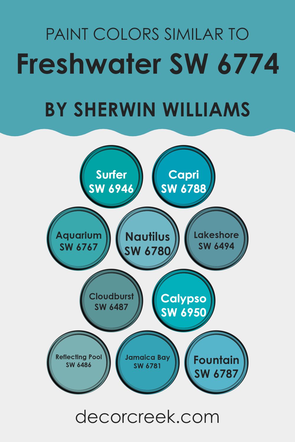
Colors Similar to Freshwater SW 6774 by Sherwin Williams
Similar colors play a vital role in design and decoration, as they can create a harmonious and balanced look. Colors like SW 6946 Surfer and SW 6788 Capri complement Freshwater because they share blue-green hues that are calming and fresh. Surfer is a vibrant aqua, full of energy, while Capri adds a playful twist with its lighter shade of turquoise.
In places where Freshwater is prominent, incorporating these hues can add depth and unity. SW 6767 Aquarium and SW 6780 Nautilus bring in a cheerful feel, with Aquarium offering a rich, deep blue and Nautilus providing a lighter, marine theme, perfect for creating a cohesive setting.
Additionally, SW 6494 Lakeshore and SW 6487 Cloudburst help enrich rooms with their soft and gentle blue tones. Lakeshore brings a quiet, muted hue, while Cloudburst offers a slightly moody yet welcoming feel. Both pair smoothly with Freshwater’s base, making them great choices for keeping a consistent look.
SW 6950 Calypso, with its teal charm, and SW 6486 Reflecting Pool, with its cool blue shade, bring versatility to any color scheme. Finally, colors like SW 6781 Jamaica Bay and SW 6787 Fountain finish the palette with their tropical and refreshing vibes, offering a dynamic yet consistent theme. Overall, these similar colors create an inviting and refreshing room when paired with Freshwater.
You can see recommended paint colors below:
- SW 6946 Surfer
- SW 6788 Capri
- SW 6767 Aquarium
- SW 6780 Nautilus
- SW 6494 Lakeshore
- SW 6487 Cloudburst
- SW 6950 Calypso
- SW 6486 Reflecting Pool
- SW 6781 Jamaica Bay
- SW 6787 Fountain
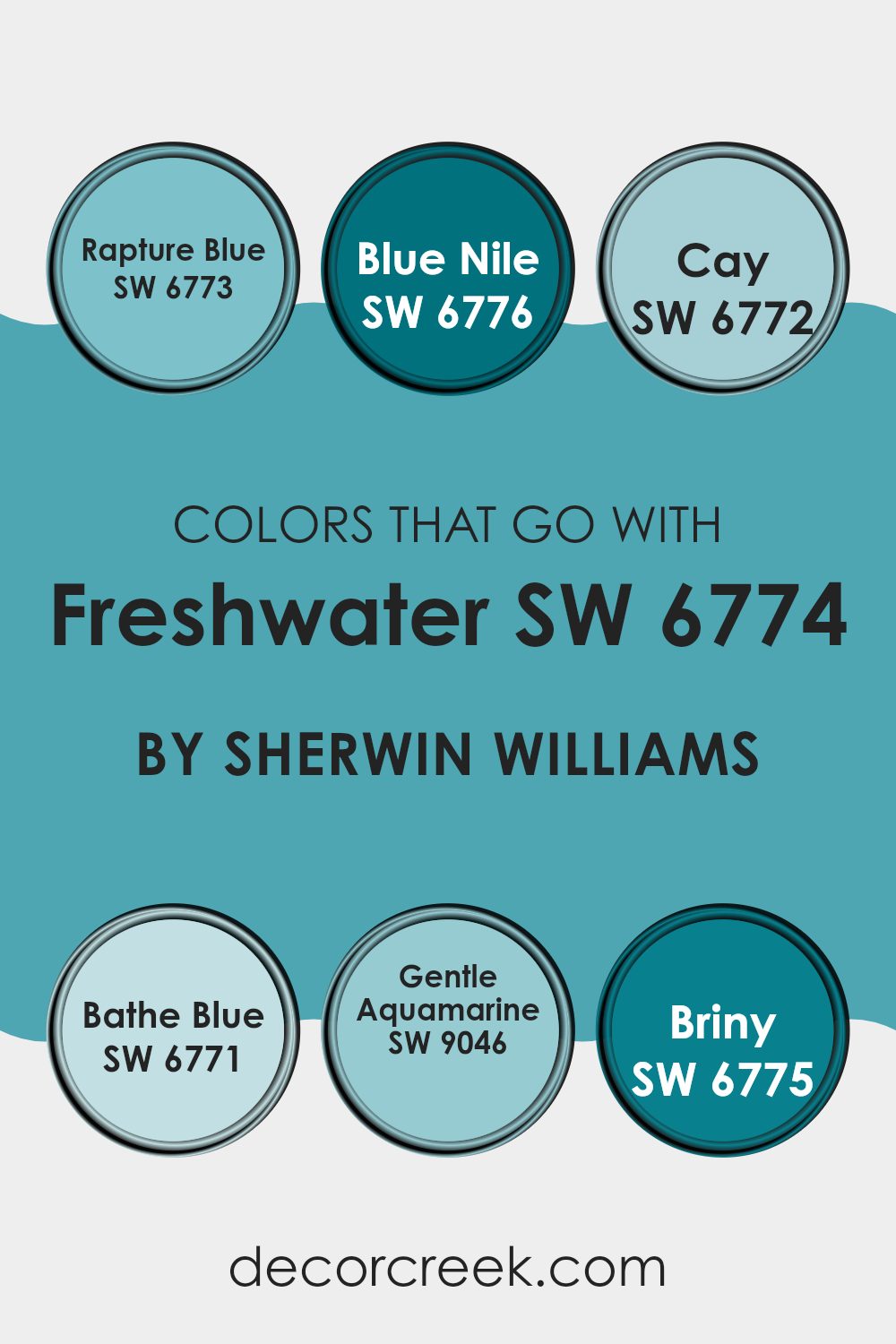
Colors that Go With Freshwater SW 6774 by Sherwin Williams
Using colors that pair well with Freshwater SW 6774 by Sherwin-Williams can make any room feel more unified and pleasant. The right mix enhances the main color, creating a balanced setting. For example, SW 6773 – Rapture Blue is a rich, deep shade that adds strong contrast, bringing depth and interest to the room.
SW 6776 – Blue Nile is a vibrant, eye-catching hue that can bring energy and a touch of drama when paired with Freshwater. These colors work together to create a harmonious and visually appealing room, each bringing its own charm without overpowering the others.
SW 6772 – Cay is a soft green-blue that pairs beautifully with Freshwater, providing a subtle and soothing contrast. SW 6771 – Bathe Blue is a light, breezy blue that complements the other shades, adding a touch of airiness and calmness. SW 9046 – Gentle Aquamarine offers a delicate, refreshing color that harmonizes well with the rest, perfect for a light and airy feel.
Finally, SW 6775 – Briny is a medium tone that grounds the palette without being too intense, offering balance and continuity. Together, these colors create an inviting and comfortable environment while highlighting the versatility of Freshwater SW 6774.
You can see recommended paint colors below:
- SW 6773 Rapture Blue
- SW 6776 Blue Nile
- SW 6772 Cay
- SW 6771 Bathe Blue
- SW 9046 Gentle Aquamarine
- SW 6775 Briny
How to Use Freshwater SW 6774 by Sherwin Williams In Your Home?
Freshwater SW 6774 by Sherwin Williams is a calming and refreshing paint color, reminiscent of a gentle stream or a peaceful lake. It’s a soft, light blue-green shade that works wonderfully in many areas of a home. In a bedroom, this color can create a soothing and restful environment, ideal for relaxation and sleep.
For a bathroom, it brings a spa-like atmosphere, making everyday routines feel more calming. Used in a living room, Freshwater can make the room feel open and airy, complementing natural light and creating an inviting area for both family and guests.
It pairs well with whites and neutrals, boosting its fresh feel. Freshwater also blends nicely with wood tones, adding a hint of nature indoors. It’s a flexible color choice that brings a soft pop of color without taking over the room, making it a great option for those who enjoy a calm touch in their home.
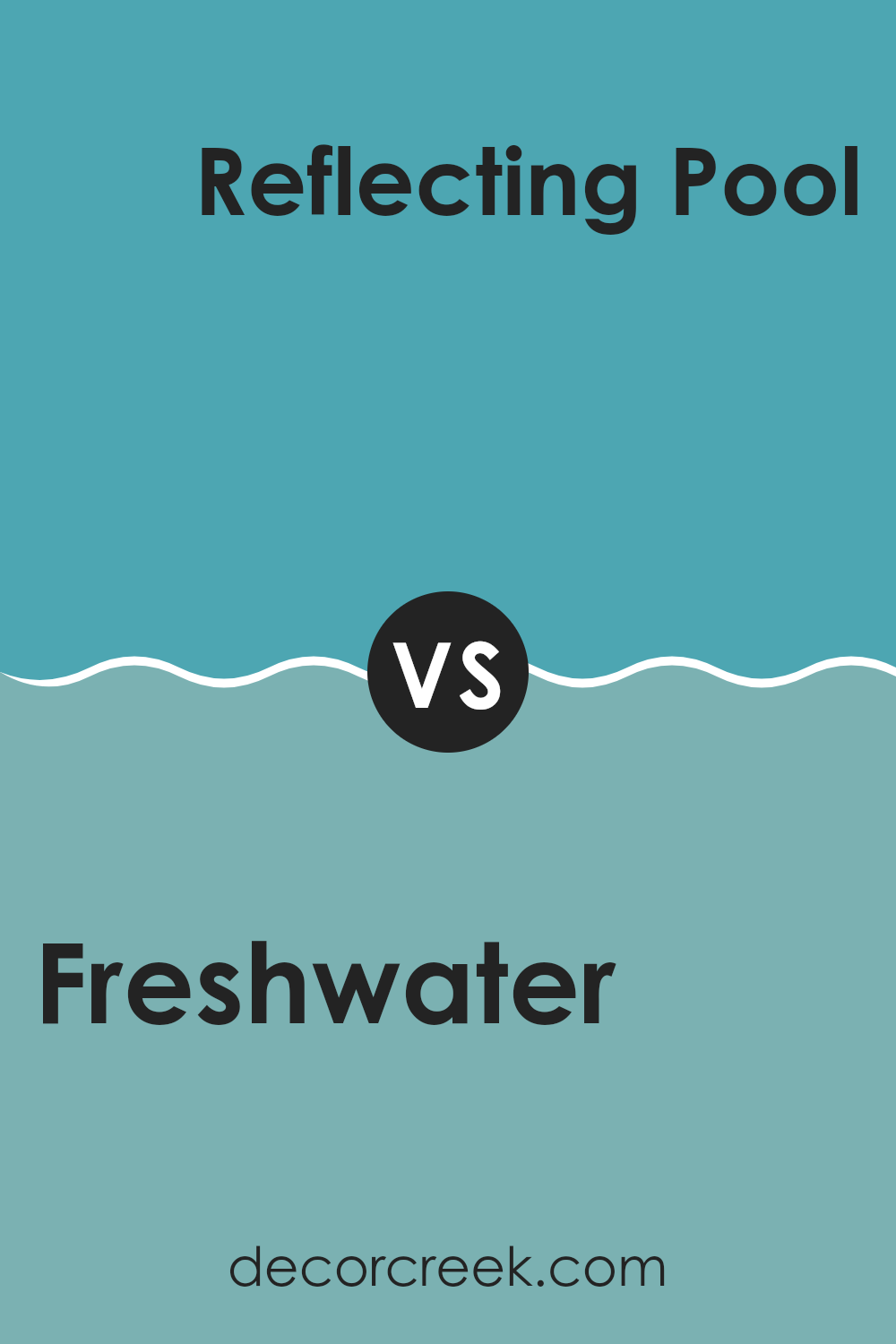
Freshwater SW 6774 by Sherwin Williams vs Reflecting Pool SW 6486 by Sherwin Williams
Freshwater SW 6774 and Reflecting Pool SW 6486 by Sherwin Williams are both soothing colors, but they each have their unique qualities. Freshwater is a soft, light blue-green that brings a sense of calm and clarity, similar to peaceful lakes and ponds. It fits well in rooms where you want a gentle and refreshing mood, like a bathroom or bedroom.
On the other hand, Reflecting Pool is a slightly darker shade with a hint of gray, making it feel a bit more pronounced and grounded. This color can add a touch of elegance and is suitable enough to be used in living rooms and kitchens.
While both colors fall within the blue-green spectrum, Freshwater brings a brighter, airy feel, whereas Reflecting Pool adds depth and a sense of stability. Choosing between these colors depends on whether you want a light and breezy vibe or a calm yet slightly more anchored ambiance.
You can see recommended paint color below:
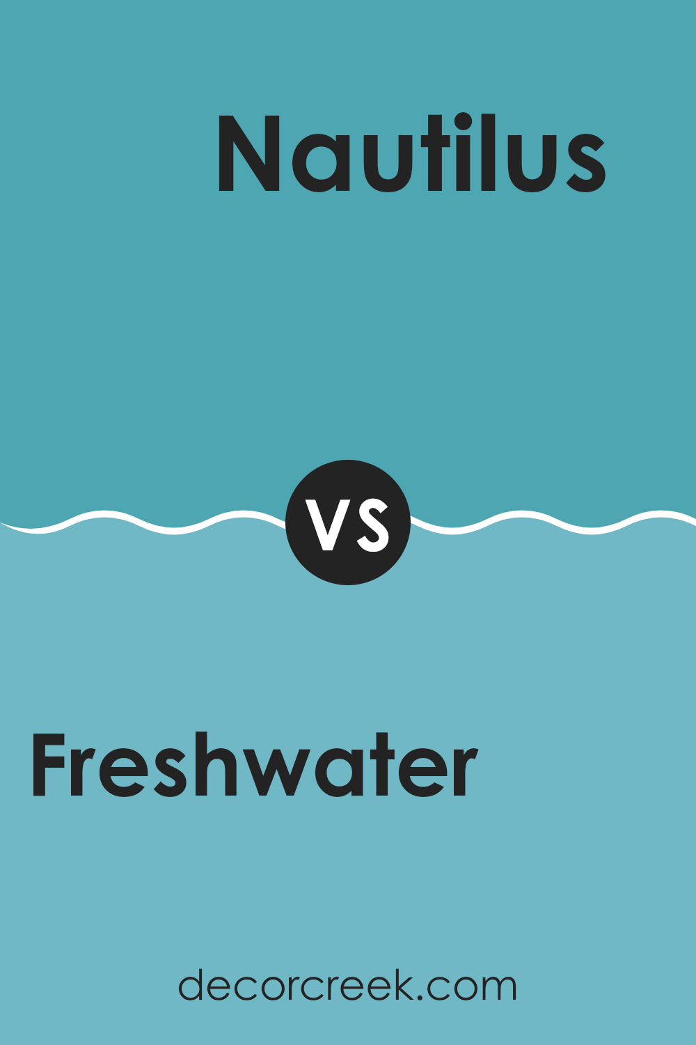
Freshwater SW 6774 by Sherwin Williams vs Nautilus SW 6780 by Sherwin Williams
Freshwater SW 6774 by Sherwin Williams is a gentle, aquatic shade with a calming and refreshing feel. It’s a pale blue-green color that evokes the peacefulness of a clear stream or a calm sea, making it ideal for rooms where relaxation is key.
On the other hand, Nautilus SW 6780 is a more vibrant blue, reminiscent of tropical waters. It’s bold and energetic, bringing a lively touch to any room. While Freshwater offers a subtle, muted tone perfect for creating a soothing atmosphere, Nautilus adds a pop of color that can energize and brighten a room.
Both colors belong to the blue-green family but offer different moods: Freshwater is more understated and tranquil, ideal for restful areas, while Nautilus is vivid and lively, suitable for areas where more energy is desired. Choosing between them depends on whether you want a calm or a dynamic vibe.
You can see recommended paint color below:
- SW 6780 Nautilus
Freshwater SW 6774 by Sherwin Williams vs Jamaica Bay SW 6781 by Sherwin Williams
Freshwater and Jamaica Bay are both beautiful shades from Sherwin Williams, but they have distinct characteristics. Freshwater is a light, calming blue-green color that gives a feeling of coolness and freshness, similar to a clear, gentle stream. It’s perfect for rooms where you want a peaceful and refreshing ambiance, like a bathroom or bedroom.
On the other hand, Jamaica Bay is a deeper blue with a stronger teal undertone. It’s richer and more vibrant than Freshwater, which makes it a great choice for areas where you want to add energy and color, without being overpowering. This color can work well in living rooms or accent walls where you want a touch of boldness.
While both colors belong to the blue-green family, Freshwater is more subdued and soothing, whereas Jamaica Bay offers a stronger, more lively presence. Choosing between them depends on whether you prefer a soft, relaxing atmosphere or a more dynamic and energetic one.
You can see recommended paint color below:
- SW 6781 Jamaica Bay
Freshwater SW 6774 by Sherwin Williams vs Lakeshore SW 6494 by Sherwin Williams
Freshwater (SW 6774) and Lakeshore (SW 6494) are two paint colors offered by Sherwin Williams, each with its distinct character. Freshwater is a soft, light blue with a touch of green. It brings a breezy, coastal feel to a room, creating an airy and fresh mood. This color can make a room feel open and wide, ideal for bathrooms or kitchens where you want a clean and uplifting tone.
In contrast, Lakeshore is a deeper blue with richer tones, reminiscent of the deep hues of a lake. It brings a more dramatic and bold look to a room compared to the light and refreshing feel of Freshwater.
Lakeshore works well in rooms where you want to create a cozy and intimate setting, such as living rooms or bedrooms. Both colors are flexible and can be paired with neutral tones or whites to balance their blue shades, making them fit a range of moods and styles.
You can see recommended paint color below:
- SW 6494 Lakeshore
Freshwater SW 6774 by Sherwin Williams vs Cloudburst SW 6487 by Sherwin Williams
Freshwater SW 6774 and Cloudburst SW 6487 are two beautiful colors by Sherwin Williams. Freshwater is a gentle aqua shade, offering a light, airy vibe that can brighten a room. It brings a refreshing and cheerful atmosphere, making the area feel open and welcoming.
Cloudburst, on the other hand, is a deeper blue with hints of gray. It has a more soothing and calming presence, creating cozy and intimate settings. This color works well in areas where you want a more subdued and relaxed feel.
While Freshwater is lively and invigorating, Cloudburst offers a more muted and comforting aura. Freshwater’s brightness can invigorate a room, while Cloudburst’s depth adds richness. These two colors can be used together for contrast or separately to achieve different moods: light and refreshing versus calm and cozy. Both can enrich your environment depending on the feel you want to create.
You can see recommended paint color below:

Freshwater SW 6774 by Sherwin Williams vs Capri SW 6788 by Sherwin Williams
Freshwater SW 6774 and Capri SW 6788 are two distinct colors by Sherwin Williams. Freshwater is a softer, more muted shade of blue-green. It has a calm and gentle feel, resembling the light tones you’d see in a quiet stream. This color fits nicely in rooms where you want a peaceful and light mood.
On the other hand, Capri is a brighter and more vivid blue. It’s closer to what you might think of when you imagine a tropical beach or a sunny, clear sky. Capri has an energetic and lively vibe, making it suitable for areas where you want to add a pop of cheerful color.
Both colors belong to the same family but offer different moods: Freshwater provides calmness and subtlety, while Capri brings energy and brightness. Choosing between them depends on the desired atmosphere of the room you’re painting.
You can see recommended paint color below:
Freshwater SW 6774 by Sherwin Williams vs Calypso SW 6950 by Sherwin Williams
Freshwater SW 6774 by Sherwin Williams is a soft, calm blue-green that brings a sense of ease and freshness to a room. It’s like a gentle wave or a clear sky, offering a light and airy feel. This color is great for rooms where you want to relax and recharge, like a bedroom or bathroom.
Calypso SW 6950, on the other hand, is a bright and vibrant blue that exudes energy and cheerfulness. It’s more playful and bold, perfect for areas where you want to inject some liveliness, such as a child’s playroom or a creative room.
While Freshwater gives you a soothing atmosphere, Calypso energizes with its lively tone. Choosing between these two colors depends on the mood you want to create. Both colors have their unique charm, with Freshwater leaning towards a peaceful vibe and Calypso embracing a more spirited, fun ambience.
You can see recommended paint color below:
- SW 6950 Calypso
Freshwater SW 6774 by Sherwin Williams vs Surfer SW 6946 by Sherwin Williams
Freshwater SW 6774 by Sherwin Williams is a gentle and calm color that brings to mind the soothing nature of clear waters and peaceful surroundings. It provides a sense of relaxation and a subtle touch to any area, making it an excellent choice for rooms meant for unwinding.
On the other hand, Surfer SW 6946 is much bolder and more energetic. This vibrant teal hue echoes the vibrant spirit and lively atmosphere of beach adventures and summer days. It grabs attention with its dynamic and cheerful character, adding a lively splash to rooms that want to inspire energy and enthusiasm.
While Freshwater offers a soothing effect, Surfer is more invigorating. The two colors contrast well, balancing stillness with energy. Using Freshwater, a room can feel like a gentle retreat, whereas incorporating Surfer can infuse areas with an upbeat and spirited vibe. Both hues bring their unique flair, making them adaptable in different settings.
You can see recommended paint color below:
- SW 6946 Surfer
Freshwater SW 6774 by Sherwin Williams vs Fountain SW 6787 by Sherwin Williams
Freshwater SW 6774 and Fountain SW 6787 by Sherwin Williams are both calming blues, but they have different vibes. Freshwater is a soft, muted blue with a hint of green, bringing to mind the gentle flow of a stream or a peaceful lake. It’s a subtle, soothing shade, perfect for creating a relaxed atmosphere in a room.
On the other hand, Fountain is a slightly more vibrant and cooler blue. It feels fresh and lively, like the splash of water from a bubbling fountain. This color brings energy and life to a room while still maintaining a calm essence.
When compared, Freshwater leans more towards a natural, earthy tone, making it ideal for rooms meant for relaxation or meditation. Fountain, with its brighter undertones, is great for areas where you want a bit more energy and freshness. Both colors are calming, but one offers peace and the other a gentle lift.
You can see recommended paint color below:
- SW 6787 Fountain
Freshwater SW 6774 by Sherwin Williams vs Aquarium SW 6767 by Sherwin Williams
Freshwater SW 6774 and Aquarium SW 6767 are two shades of blue offered by Sherwin Williams. Freshwater is a light and airy blue, reminiscent of a clear summer sky or a peaceful lake. It’s soft and subtle, creating a sense of openness and ease in a room, making it ideal for areas where relaxation is key, like bedrooms or bathrooms.
On the other hand, Aquarium SW 6767 is a stronger shade with more depth. It offers a richer and more vibrant blue, similar to the deep colors of the ocean. This shade is bolder and can add a lively and refreshing feel to any room. It’s perfect for accent walls or rooms where you want to make a statement.
In summary, while Freshwater brings a gentle and soothing atmosphere, Aquarium offers a more invigorating and striking presence. Both can be beautiful depending on the desired mood and effect in your room.
You can see recommended paint color below:
- SW 6767 Aquarium
In the end, SW 6774 Freshwater by Sherwin Williams is a color that makes rooms feel fresh and lively. It’s like a splash of clean water that brightens everything up. When I think about how this color looks on walls, it reminds me of a bright, sunny day when everything feels possible and fun. This color can make a room feel more open and full of light, like a window to the outside on a nice day. It works well in places like the kitchen or bathroom, but it can also be a happy choice for a bedroom or living room.
When I imagine walking into a room painted with Freshwater, I feel like I’m stepping into a friendly place that’s both cheerful and calming. Even if the world outside isn’t bright and sunny, this color can bring that feeling inside.
It’s amazing how a simple color choice can make such a big difference in how a room feels. So, the next time someone wants to change the mood of their home, I think SW 6774 Freshwater could be just the thing to add a splash of happiness to their walls. It’s like having a bit of sunshine indoors every day.

Ever wished paint sampling was as easy as sticking a sticker? Guess what? Now it is! Discover Samplize's unique Peel & Stick samples.
Get paint samples

