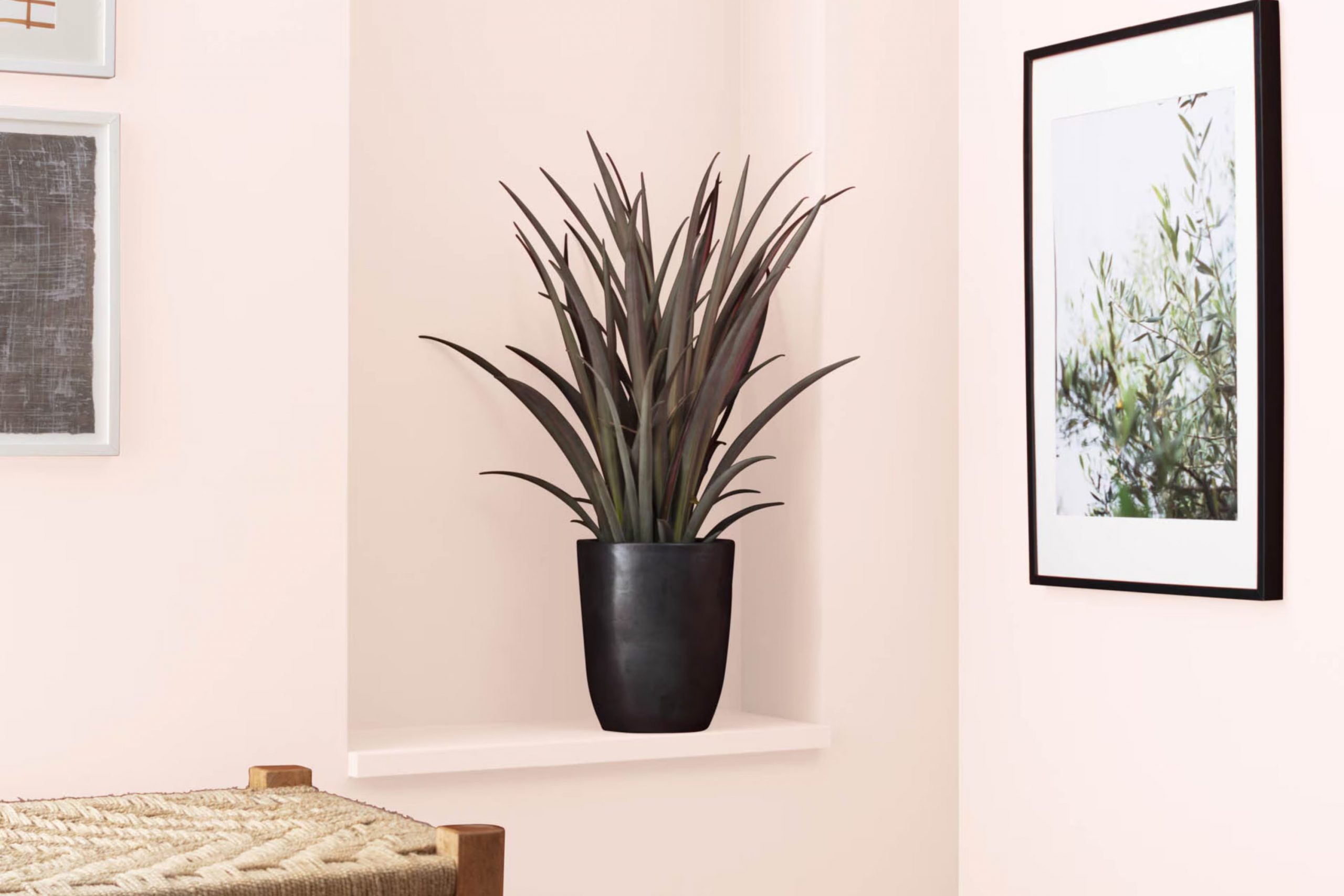
When I first came across Benjamin Moore’s 2089-70 Frosted Petal, it instantly stood out as a unique shade. This color is a soft, delicate pink that whispers calmness and elegance into any room. It possesses a subtle cool undertone, which makes it quite adaptable for pairing with various decor styles, from contemporary to classic. Using Frosted Petal can renew your room, giving it a light, airy feel that’s both inviting and uplifting.
This shade works wonders in areas that need a touch of softness to soften designs that feel too strong or where you want to create a sense of ease. It’s particularly effective in bedrooms or living areas that benefit from gentle hues to support relaxation and comfort.
Incorporating accessories or furnishings in darker or contrasting tones can set off Frosted Petal beautifully, creating a balance that allows the room to feel both cohesive and clearly layered.
Whether you’re looking to update a single room or rethink your entire area, Frosted Petal offers a gentle nudge toward a fresher, lighter palette.
What Color Is Frosted Petal 2089-70 by Benjamin Moore?
The color Frosted Petal by Benjamin Moore is a very pale pink hue that adds a gentle touch of warmth to any room. It’s a soft, subtle shade that carries a hint of cheer without being too bold. This light pink works wonderfully in rooms intended to feel inviting and cosy.
Frosted Petal is particularly effective in interior styles such as modern minimalism, shabby chic, and Scandinavian. In a minimalist setting, it adds a dash of color without feeling too strong. For shabby chic decor, it complements the style’s characteristic distressed furniture and vintage elements beautifully. In Scandinavian interiors, where the palette typically remains neutral, Frosted Petal offers a soft pop of color, maintaining the style’s love for bright, airy rooms.
This color pairs exceptionally well with materials like light woods, which emphasize its warmth. In terms of textures, natural linen, soft cotton, and even plush velvets complement Frosted Petal nicely, creating a balanced, comfortable setting. Whether it’s on a full wall, as an accent, or through decorative elements, Frosted Petal by Benjamin Moore is a flexible choice that warms up an interior without overpowering it.
Is Frosted Petal 2089-70 by Benjamin Moore Warm or Cool color?
Frosted Petal by Benjamin Moore is a soothing and gentle pink color that can add a soft glow to any room in your home. Its lightness makes it perfect for creating a cozy and welcoming atmosphere, particularly in rooms like living rooms, bedrooms, or nurseries.
Because it’s not too bold, this shade pairs well with a variety of other colors and decor styles, from modern to classic.
This shade is flexible enough to be used on all walls for a subtle, uniform look, or on a single wall as an accent to more neutral tones like grays and whites. Its light-reflective quality can also help make smaller rooms appear larger and more open. Additionally, Frosted Petal works well with natural light, enhancing the bright and airy feel of a room. It’s a color that fits easily into many home decorating plans, adding a touch of warmth without feeling too intense.
Undertones of Frosted Petal 2089-70 by Benjamin Moore
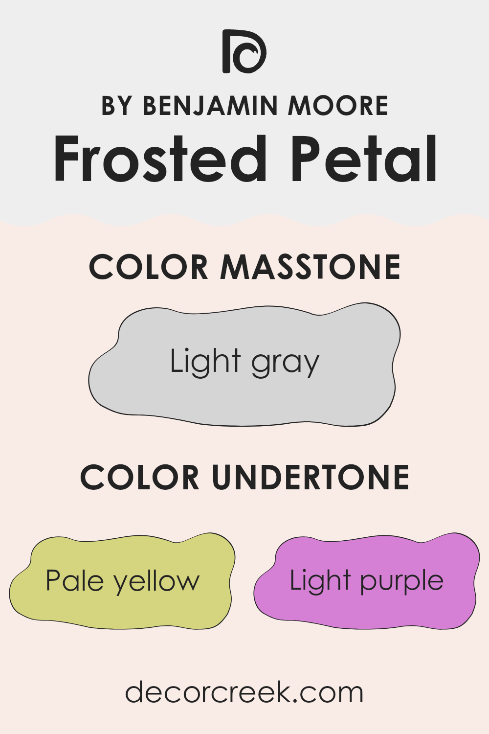
Frosted Petal is a subtle and adaptable paint color that can create a range of atmospheres depending on its undertones, which incluude pale yellow, light purple, light blue, pale pink, mint, lilac, and grey. Undertones are the underlying hues that can subtly influence how a color looks, especially under different lighting conditions.
For instance, the pale yellow undertone in Frosted Petal can give a room a warmer, more welcoming feel, making it a great choice for living rooms or kitchens where a cozy ambiance is desired. The light purple and lilac undertones can add a touch of softness to the color, perfect for creating a relaxing atmosphere in bedrooms.
When used on interior walls, the light blue and mint undertones can bring a fresh and airy quality to the room, ideal for bathrooms or small rooms that could use a hint of expansion. The pale pink undertone brings a gentle warmth that can soften the appearance of the room subtly, adding to the overall gentle nature of the color.
The grey undertone serves as a balancing agent, ensuring that the color remains neutral and flexible enough to combine well with a wide range of decor styles and colors. This makes Frosted Petal an excellent option for anyone looking to add a hint of color to their walls without feeling too strong against the room’s other design elements.
In conclusion, the different undertones in Frosted Petal make it a highly flexible color, capable of creating a variety of moods and enhancing the aesthetic appeal of any room.
What is the Masstone of the Frosted Petal 2089-70 by Benjamin Moore?
The masstone of Frosted Petal 2089-70 by Benjamin Moore is light gray, or specifically, color code #D5D5D5. This neutral and light tone makes it an ideal choice for homes, providing a subtle, calming backdrop to any room.
Being a light gray, it has the advantage of reflecting more light, which can make smaller rooms appear bigger and more open. This color easily fits into many decor styles, whether it’s modern minimalism or cozy cottage aesthetics.
Since light gray is such a flexible color, it pairs well with brighter colors for those who enjoy a spot of brightness, or darker hues for a more grounded feel. It’s also great for rooms that need to feel more airy and less cramped. Overall, the gentle gray hue of Frosted Petal helps in creating an inviting atmosphere without feeling too strong, perfect for achieving a comfortable and stylish home environment.

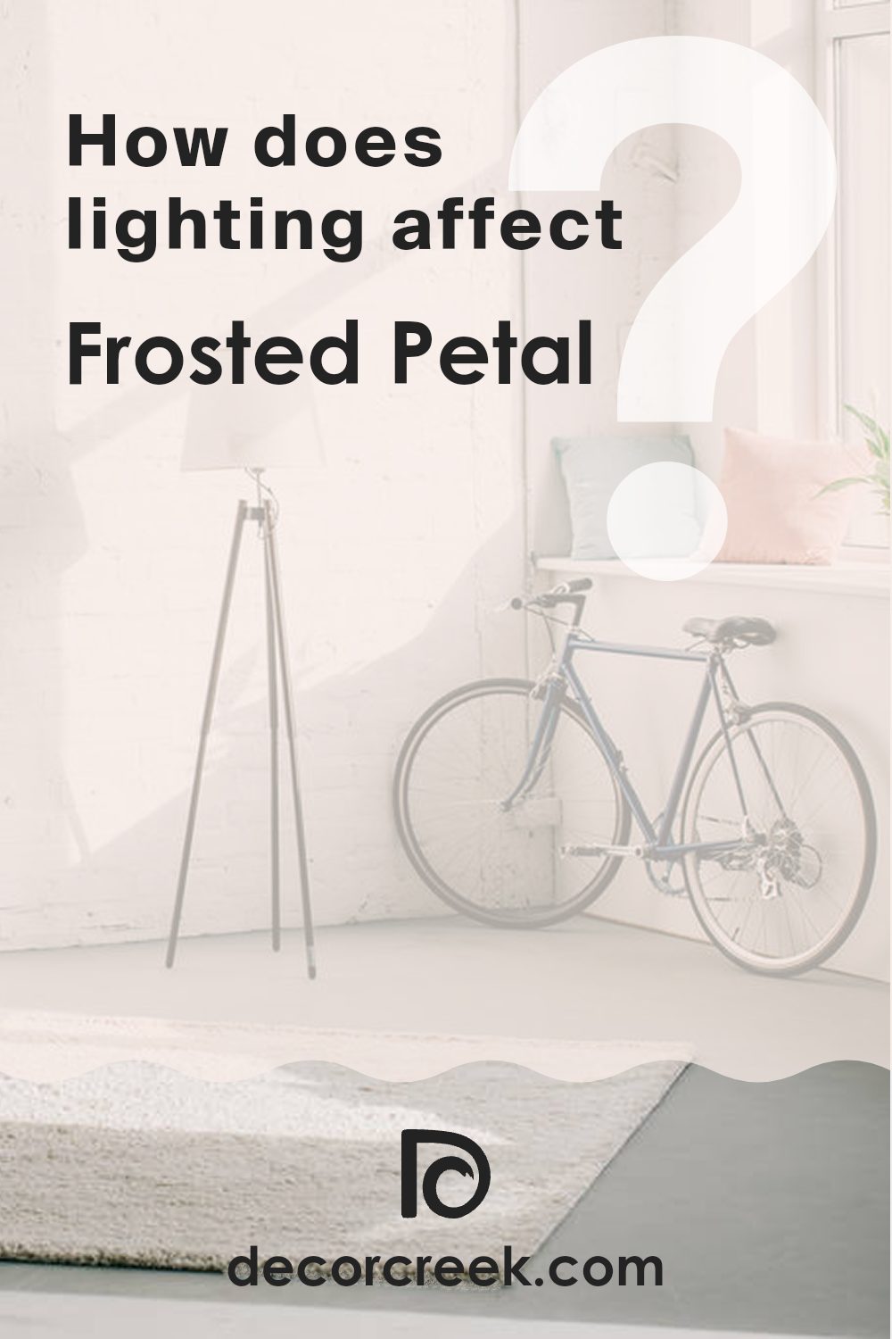
How Does Lighting Affect Frosted Petal 2089-70 by Benjamin Moore?
Lighting has a big influence on how colors appear in a room. Whether it’s natural sunlight or artificial light, the type of light can change the perception of paint colors significantly. Let’s look at how the color Frosted Petal by Benjamin Moore behaves under different lighting conditions and in rooms with different orientations.
Artificial Light: Indoor lighting can vary depending on the type of bulb used, such as LED, fluorescent, or incandescent. Under warm artificial light, Frosted Petal, which is a gentle shade of pink, can look softer and warmer, bringing a cozy feel into the room. In cooler LED or fluorescent light, the same color might lean toward a slightly crisper pink, highlighting its subtle cool undertones.
Natural Light: Natural sunlight brings out the truest hue of Frosted Petal. During the day, as the intensity and angle of the sun change, so will the nuances of this color. Morning light tends to be softer, making the color appear gentle and quiet. As the sun moves higher, the full vibrancy of the color can show through, making it more lively.
North-Facing Rooms: North-facing rooms get less direct sunlight, which can make colors appear slightly duller and cooler. In such rooms, Frosted Petal might seem more muted and subdued, losing some of its vibrancy.
South-Facing Rooms: Rooms that face south benefit from abundant light for most of the day, which can make Frosted Petal look more vivid and bright. This orientation highlights the full range of the pink, from soft and light in the morning to bright and lively during midday.
East-Facing Rooms: East-facing rooms enjoy the morning sun, which can make Frosted Petal look very soft and warm early in the day, shifting to a cooler appearance as the sunlight moves away.
West-Facing Rooms: In west-facing rooms, the color experiences the opposite effect, staying cooler in the morning when shaded and warming up in the evening with the setting sun. By understanding how lighting affects this color, you can choose the right room to paint Frosted Petal to achieve the mood and feel you prefer.
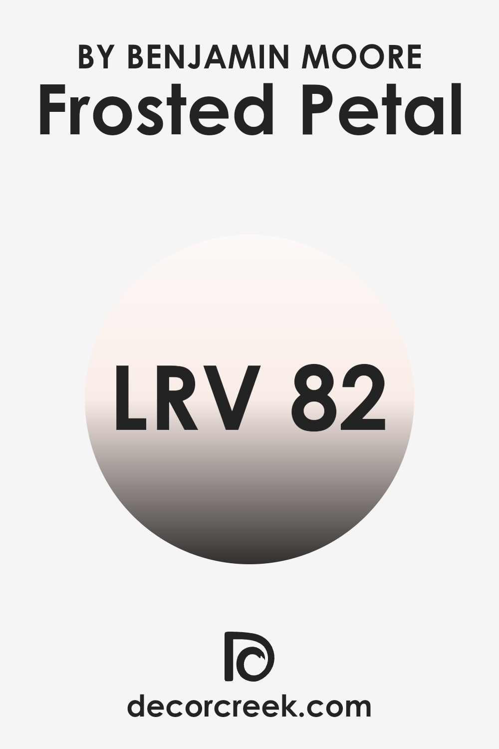
What is the LRV of Frosted Petal 2089-70 by Benjamin Moore?
LRV stands for Light Reflectance Value, a measurement used to describe the percentage of light a paint color reflects from or absorbs into a painted surface. A higher LRV means the color reflects more light, making it appear brighter to the eye.
This value is particularly useful when deciding on a paint color for a room, as it can affect the perceived size and brightness of the room. Light colors with high LRV make a room feel airier and larger, while dark colors, which have lower LRV, tend to make a room feel cozier and smaller.
With an LRV of 82.48, the color we are discussing is quite light and will reflect a considerable amount of light. This makes it a good choice for rooms that you want to appear bright and open, such as a small room or an area with limited natural light. The ability of this color to reflect light helps in keeping rooms feeling lively and, when used on walls, can help reduce the need for excessive artificial lighting. Overall, this high LRV can make the color an effective choice for creating a bright and inviting room.
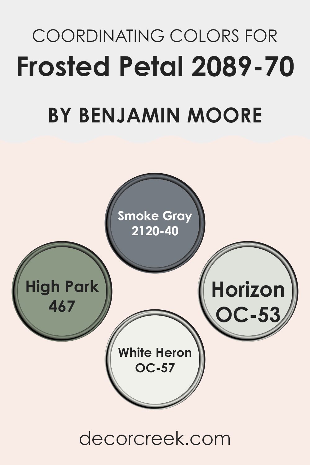
Coordinating Colors of Frosted Petal 2089-70 by Benjamin Moore
Coordinating colors are chosen to complement or enhance one another while creating a cohesive color scheme. These colors can be used together to decorate a room, emphasizing harmony and balance. Selecting these coordinating shades often depends on the mood you want to set or the aesthetic you aim to achieve. By pairing colors wisely, you can ensure that each room in your home has a continuous and fluid appearance without stark contrasts that may clash.
For instance, Smoke Gray (2120-40) is a deep, muted gray that works beautifully to ground lighter shades like Frosted Petal, adding depth to the overall palette. High Park (467) offers a rich, leafy green that introduces an element of nature and vitality, ideal for rooms that need a touch of freshness.
Horizon (OC-53) is a soft, pale gray that provides a subtle contrast to more pronounced shades, allowing for a harmonious flow from room to room. Lastly, White Heron (OC-57) is a crisp, clean white that acts as a unifying base, perfect for bringing light into rooms and highlighting more saturated colors. By using such coordinating colors, you can create an environment that feels cohesive and thoughtfully designed.
You can see recommended paint colors below:
- 2120-40 Smoke Gray
- 467 High Park
- OC-53 Horizon
- OC-57 White Heron
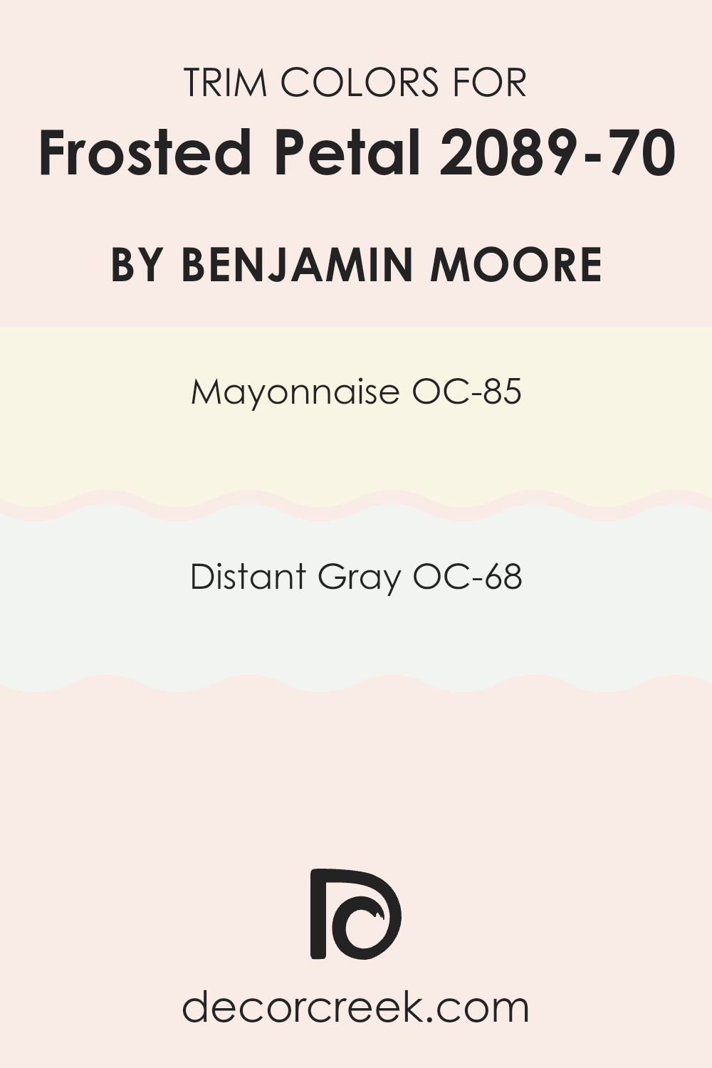
What are the Trim colors of Frosted Petal 2089-70 by Benjamin Moore?
Trim colors play a crucial role in accentuating the main color of a room, helping to outline and highlight architectural details and edges. For example, when you paint a room in a soft hue like Benjamin Moore’s Frosted Petal, selecting the right trim colors can significantly impact the overall appearance and feel of the room. Choosing lighter trim colors such as OC-85 – Mayonnaise or OC-68 – Distant Gray can complement and enhance the gentle tone of Frosted Petal by creating a clean, crisp border that defines the room subtly yet effectively.
The color OC-85 – Mayonnaise by Benjamin Moore is a creamy, almost white shade that brings a light, airy quality to the edge of the room, making the room feel more open and inviting. It works wonderfully as a trim color because it provides a subtle contrast without feeling too strong against the primary color.
On the other hand, OC-68 – Distant Gray offers a slightly sharper but still gentle contrast with its hint of gray, adding a modern touch to the room’s decor. This color is ideal for those looking to introduce a contemporary twist into their room, complementing Frosted Petal beautifully by framing it in a sleek, modern way.
You can see recommended paint colors below:
- OC-85 Mayonnaise
- OC-68 Distant Gray
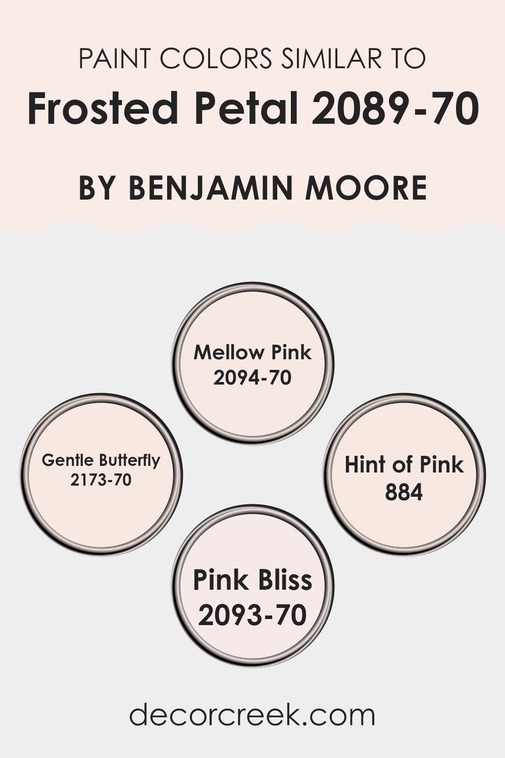
Colors Similar to Frosted Petal 2089-70 by Benjamin Moore
Using similar colors in a decor scheme can create a harmonious and soothing visual experience, as these shades blend seamlessly with each other, minimizing stark contrasts and creating a subtle, cohesive look. For instance, when decorating with a base color like a soft, pale pink such as Frosted Petal by Benjamin Moore, incorporating related hues can enhance the room without feeling too intense with color variation. The similar colors can also help accentuate architectural features or highlight specific areas without creating an overly busy atmosphere.
Mellow Pink, with its gentle whisper of softness, offers a quiet backdrop that pairs beautifully with the understated elegance of Frosted Petal. On the other hand, Gentle Butterfly provides a slightly deeper, creamy hue that adds a touch of warmth to the palette, perfect for creating a cozy nook.
Hint of Pink, the subtlest of the group, almost acts like a neutral, bringing in a light, airy feel that complements the soft nature of Frosted Petal very well. Meanwhile, Pink Bliss adds just a bit more vibrancy, introducing a fresher, lively pink that energizes the room while still maintaining the overall sense of calm. Together, these shades work beautifully, each contributing to a smooth visual story that feels both pleasing and restful.
You can see recommended paint colors below:
- 2094-70 Mellow Pink
- 2173-70 Gentle Butterfly
- 884 Hint of Pink
- 2093-70 Pink Bliss
Colors that Go With Frosted Petal 2089-70 by Benjamin Moore
Colors that complement Frosted Petal 2089-70 by Benjamin Moore can significantly impact the feel and aesthetics of a room, creating a harmonious and visually appealing interior. When colors are chosen that harmonize well with Frosted Petal, such as Iron Ore Red, Rosy Peach, Peach Kiss, Salmon Berry, Pink Mix, and Tomato Cream Sauce, they enhance the soft and gentle qualities of the base shade while adding depth and interest to the overall color scheme.
Iron Ore Red is a deep, warm red that provides a strong contrast to the lightness of Frosted Petal, offering a bold statement that can make other elements in the room stand out. Rosy Peach has a soft, cheerful glow that works well with the delicate nature of Frosted Petal, perfect for creating a feeling of gentle warmth.
Peach Kiss is a very subdued, soft peach tone that blends almost seamlessly with Frosted Petal, enhancing continuity and smoothness in decor. Salmon Berry introduces a hint of pinkish-red, enlivening rooms with a fresh and inviting vibe that’s neither too strong nor too muted.
Pink Mix is a vibrant yet light pink that can cheer up any room without feeling too heavy, making it an ideal companion for Frosted Petal in more playful or dynamic settings. Lastly, Tomato Cream Sauce is a unique blend of red and orange tones, providing a comforting warmth that can make even large, open rooms feel more intimate and cozy. By carefully selecting these complementing colors, one can create a cohesive and inviting environment that is both appealing and functional.
You can see recommended paint colors below:
- 2089-10 Iron Ore Red
- 2089-20 Rosy Peach
- 2089-60 Peach Kiss
- 2089-50 Salmon Berry
- 2089-30 Pink Mix
- 2089-40 Tomato Cream Sauce

How to Use Frosted Petal 2089-70 by Benjamin Moore In Your Home?
Frosted Petal 2089-70 by Benjamin Moore is a gentle pink color that brings a soft and welcoming vibe to any room. It’s perfect for creating a cozy atmosphere in your home. You can use this shade in many ways.
For example, painting a bedroom or bathroom with Frosted Petal can make the rooms feel warm and comforting. It’s particularly effective in rooms that don’t get a lot of natural light, as the light color can help brighten the room.
Additionally, you can use Frosted Petal for smaller projects, like painting a piece of furniture or a feature wall, to add a touch of light color without feeling too strong. Pair it with neutrals such as whites, grays, or beiges to maintain a clean and airy look. This color also pairs nicely with soft blues and greens for a slightly more colorful palette while keeping the overall feel of the room light and open.
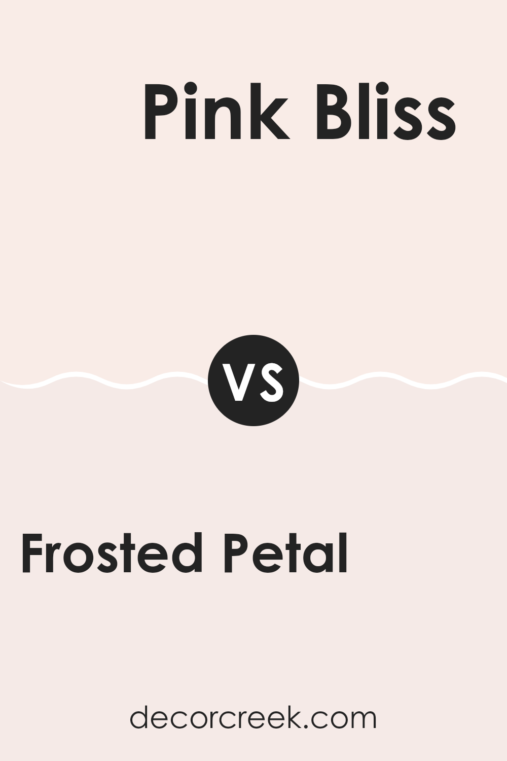
Frosted Petal 2089-70 by Benjamin Moore vs Pink Bliss 2093-70 by Benjamin Moore
Frosted Petal and Pink Bliss, both by Benjamin Moore, are soft, light hues that bring a fresh and airy quality to any room. Frosted Petal has a gentle touch of lavender, making it a cooler shade that resembles a soft floral tone.
This color is perfect for creating a calm and inviting atmosphere. In contrast, Pink Bliss has a warmer undertone, leaning towards a traditional soft pink that feels cheerful and soothing. The warmth in Pink Bliss makes it ideal for adding a bit of coziness and charm to rooms that benefit from a more nurturing color.
Both colors reflect plenty of light, making them excellent choices for small or darker rooms to appear more spacious and bright. Whether you want a hint of floral coolness or a cheerful warm glow, these colors offer subtle yet effective options for enhancing your home decor.
You can see recommended paint color below:
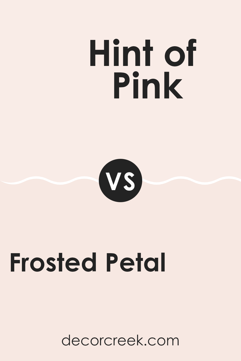
Frosted Petal 2089-70 by Benjamin Moore vs Hint of Pink 884 by Benjamin Moore
Frosted Petal and Hint of Pink, both by Benjamin Moore, are subtle but distinct in their nuances. Frosted Petal is a very soft pink that leans toward a cool, almost white hue, giving off a fresh and clean vibe. It captures the lightest tone of pink and remains neutral and muted, making it perfect for rooms that need a hint of color without feeling too intense.
On the other hand, Hint of Pink has a slightly warmer undertone, presenting itself as a delicate pink that brings a bit more warmth to the room. This color provides a cozy feeling and seems more distinctly pink compared to Frosted Petal. While both colors maintain a low profile in terms of boldness, Hint of Pink stands out a bit more due to its warmer presence.
These shades work well in different settings: Frosted Petal is ideal for modern or minimalist decor, while Hint of Pink suits comforting, welcoming rooms. Both paints ensure a gentle splash of color without taking over the room’s overall aesthetic.
You can see recommended paint color below:
- 884 Hint of Pink
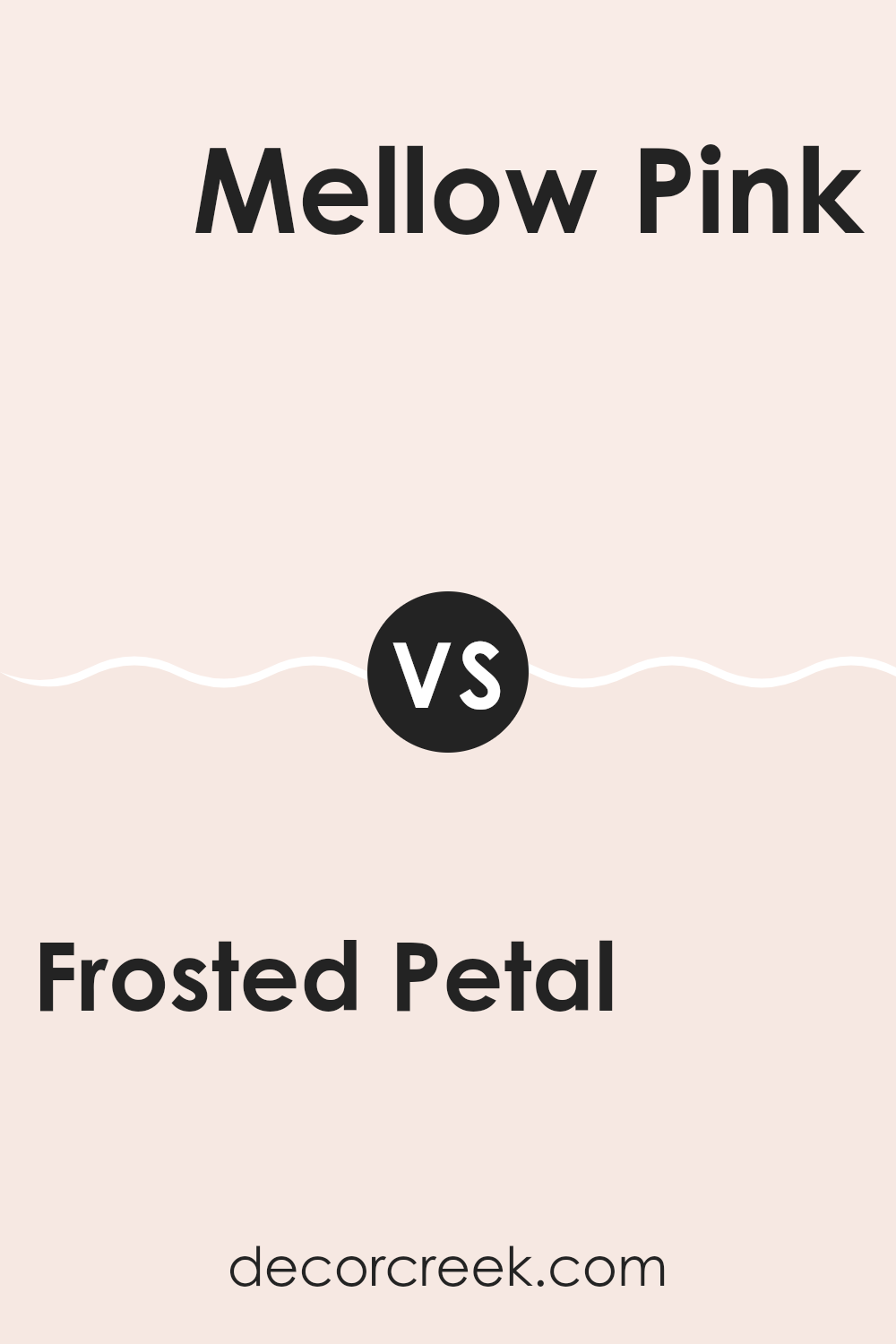
Frosted Petal 2089-70 by Benjamin Moore vs Mellow Pink 2094-70 by Benjamin Moore
“Frosted Petal” and “Mellow Pink” by Benjamin Moore are both subtle and gentle colors, but they have distinct tones that set them apart. “Frosted Petal” is a very light pink that almost appears as a soft white with just a hint of rosiness. This color is ideal for creating a light and airy feel in a room, perfect for rooms that aim for a delicate and fresh look.
On the other hand, “Mellow Pink” has a warmer tone, leaning slightly toward a peachier version of pink. This color provides a cozy glow, making it excellent for rooms where a warm and inviting atmosphere is desired. It can help make a room feel more intimate and welcoming.
Both colors are light and subtle, but “Frosted Petal” leans toward a cooler undertone, while “Mellow Pink” offers warmth. Depending on the lighting and the room’s decor, each color could provide a unique impact, either by enhancing the sense of openness or by adding a gentle warmth.
You can see recommended paint color below:
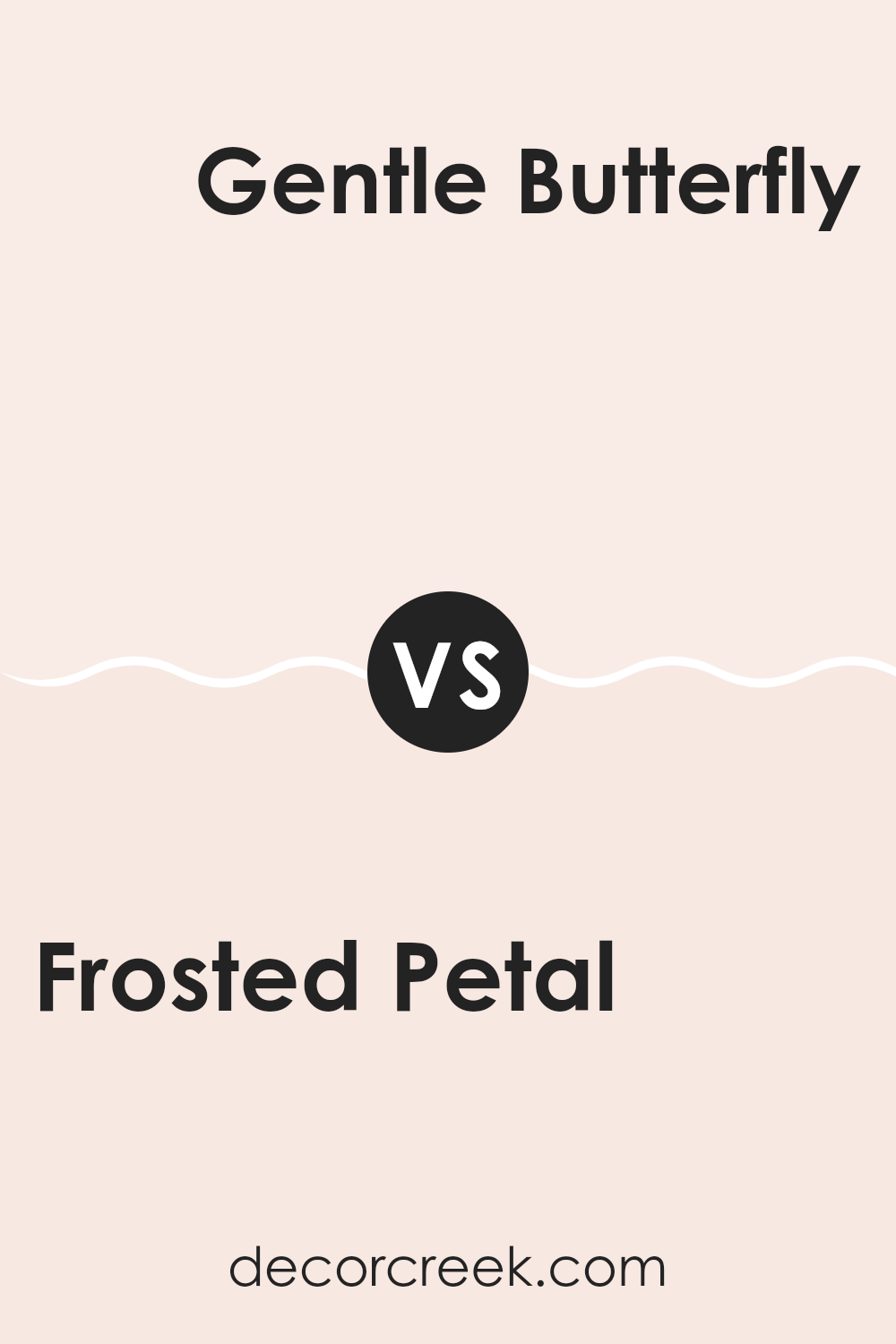
Frosted Petal 2089-70 by Benjamin Moore vs Gentle Butterfly 2173-70 by Benjamin Moore
The two colors, Frosted Petal and Gentle Butterfly by Benjamin Moore, each bring their unique tone to a room. Frosted Petal is a very soft pink hue that adds a subtle warmth to a room. It’s light and airy, giving a sense of calm without being too bold. This color works great in a room where you want a touch of color without feeling too strong.
On the other hand, Gentle Butterfly has a slightly more robust presence. It’s also a light color, but leans toward a peachy tone. This makes it a bit warmer than Frosted Petal. Gentle Butterfly is perfect for areas where you want a gentle, inviting color that still feels cozy and warm.
Both colors are quite light and can help make a small room appear bigger and brighter. They’re ideal for bedrooms or living areas where a peaceful atmosphere is desired. Their subtle differences in tone allow them to fit various decorative styles and preferences.
You can see recommended paint color below:
I just finished reading about 2089-70 Frosted Petal by Benjamin Moore, and I have to say, it sounds like a fantastic paint color! It reminds me of a gentle pink that you might see when flowers start to bloom in spring. It’s soft and has a peaceful feeling, perfect if you want to make any room feel cozy and inviting.
Benjamin Moore is known for creating paint that lasts and looks great, and Frosted Petal seems like no exception. They suggest using this color in places like bedrooms or living rooms, where you want to feel relaxed and happy. It could also be great in a bathroom for a light and airy touch.
Overall, if I were thinking about repainting some rooms in my house, I’d definitely consider Frosted Petal. It’s pretty without being too bright and should be easy to match with different furniture and decorations. So, if you like pink and want something that feels calm and happy, this color might be just what you’re looking for!
Ever wished paint sampling was as easy as sticking a sticker? Guess what? Now it is! Discover Samplize's unique Peel & Stick samples.
Get paint samples

