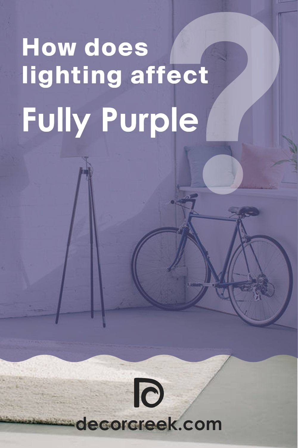
Have you ever found yourself staring at a color that just seemed to speak to your soul? That’s precisely what happens when I look at Sherwin Williams’ SW 6983 Fully Purple. It’s a shade that manages to be both bold and comforting, a color that you can’t ignore but also don’t want to leave behind. There’s something intriguing about how the richness of this purple hue can immediately change the mood of a room.
Imagine walking into a room painted in Fully Purple. The deep, luxurious tone invites a sense of calm and thoughtfulness. It’s a color that feels like a warm hug on a cold day. Whether you’re considering it for a feature wall or an entire room, SW 6983 offers versatility, setting the stage for creativity while maintaining an understated elegance.
The beauty of Fully Purple lies in its ability to harmonize with various styles and tastes. Pair it with bright whites for a fresh, modern look, or complement it with deep grays and silvers for a more elegant, classic feel. It’s remarkable how this single color can wear so many hats, fitting seamlessly into different design philosophies.
What makes Fully Purple genuinely special is how it can evoke personal memories and aspirations. It feels like more than just paint on the wall; it becomes an integral part of your living experience, an expression of your personality and style.
What Color Is Fully Purple SW 6983 by Sherwin Williams?
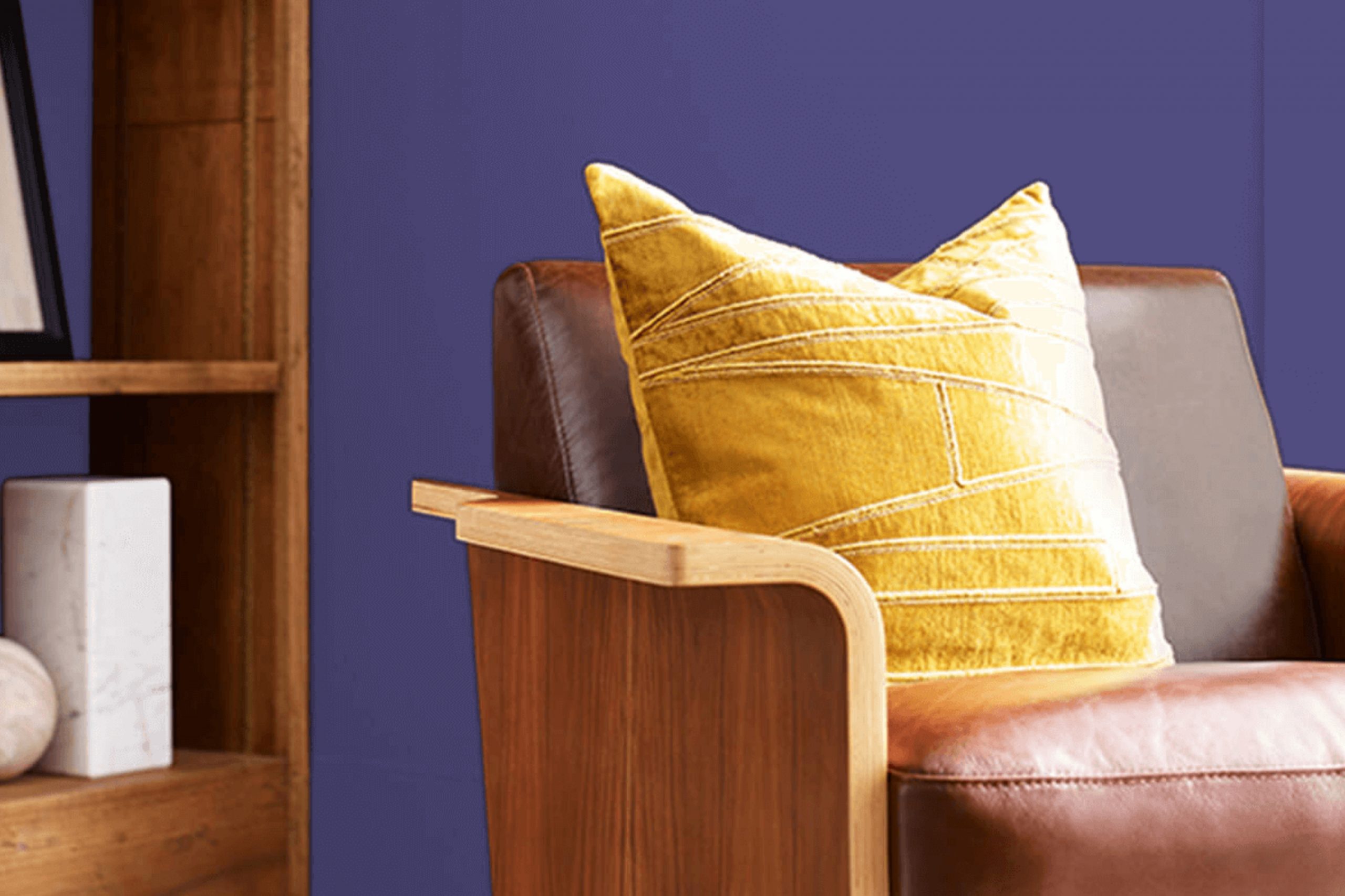
Fully Purple by Sherwin Williams, with the code SW 6983, is a vivid, deep shade of purple. It’s a strong color that can bring energy and a sense of creativity to a room. Because it is so bold, it works well as an accent color, adding a pop to otherwise neutral rooms. It pairs well with modern and eclectic interior styles, where its intensity can be balanced with more subdued elements.
In a modern setting, Fully Purple can act as a striking feature wall, drawing attention and adding character. It complements sleek materials like glass, stainless steel, and high-gloss finishes, enhancing their clean lines with its vibrant richness.
In more eclectic settings, this purple shade finds harmony with textured fabrics like velvet and silk, which help to soften its intensity. Wooden furniture and leather can also complement the color, creating a warm and balanced look.
Fully Purple matches nicely with neutral colors such as gray, beige, or white, allowing it to stand out without overpowering the room. It also pairs attractively with metallic accents, like gold or silver, which add a touch of luxury. Whether used sparingly or as a central theme, Fully Purple adds depth and interest to any room it graces.
Is Fully Purple SW 6983 by Sherwin Williams Warm or Cool color?
Fully Purple SW 6983, a vibrant hue by Sherwin Williams, can dramatically shift the feel of a room in your home. This bold color adds a sense of energy and creativity to any room. In living areas, it can inspire lively conversations and create a warm, inviting atmosphere.
In bedrooms, this shade adds a touch of coziness when used on accent walls or with complementary decor. When combined with neutral tones like grey or beige, it provides a balanced and modern look that can appeal to a wide range of tastes.
It’s a flexible color, ideal for creating a focal point or making a statement in both small and large rooms. Lighting also plays a crucial role; natural light can enhance its richness, while warm artificial lighting can soften its effect. Whether used in a child’s room or a study, this purple hue can infuse personality and energy into home design.
Undertones of Fully Purple SW 6983 by Sherwin Williams
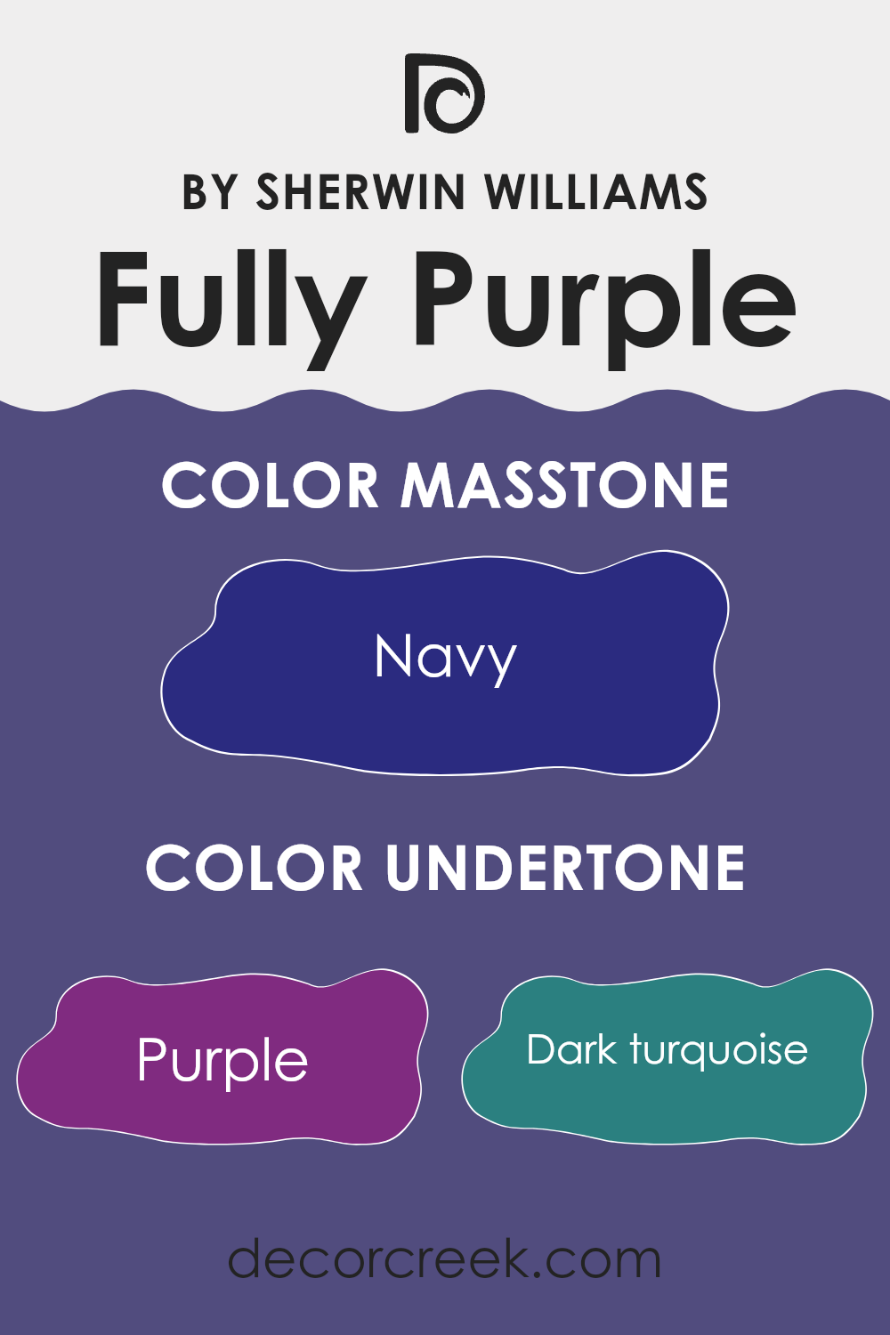
Fully Purple by Sherwin Williams is a paint color that contains a variety of undertones, including shades of purple, dark turquoise, grey, dark grey, dark blue, brown, violet, dark green, blue, olive, and lilac. These undertones can affect how we perceive the color depending on the lighting and surrounding colors.
For example, in natural daylight, you might see more of the blue and grey undertones, which can make the paint look cooler and more subdued. In contrast, under warm artificial lighting, the redder undertones like violet and brown might become more prominent, giving the paint a warmer, more inviting feel.
When used on interior walls, the presence of these diverse undertones means that Fully Purple can adapt to different environments. The grey and dark grey undertones can offer a neutral balance, while the purple, lilac, and violet provide a sense of depth and richness. The dark green and olive undertones can add an earthier feel, which helps in creating a grounded atmosphere within a room.
Overall, the mixed undertones in this purple paint allow it to change subtly throughout the day and under various lighting conditions, offering versatility while keeping the anrea interesting and dynamic.
What is the Masstone of the Fully Purple SW 6983 by Sherwin Williams?
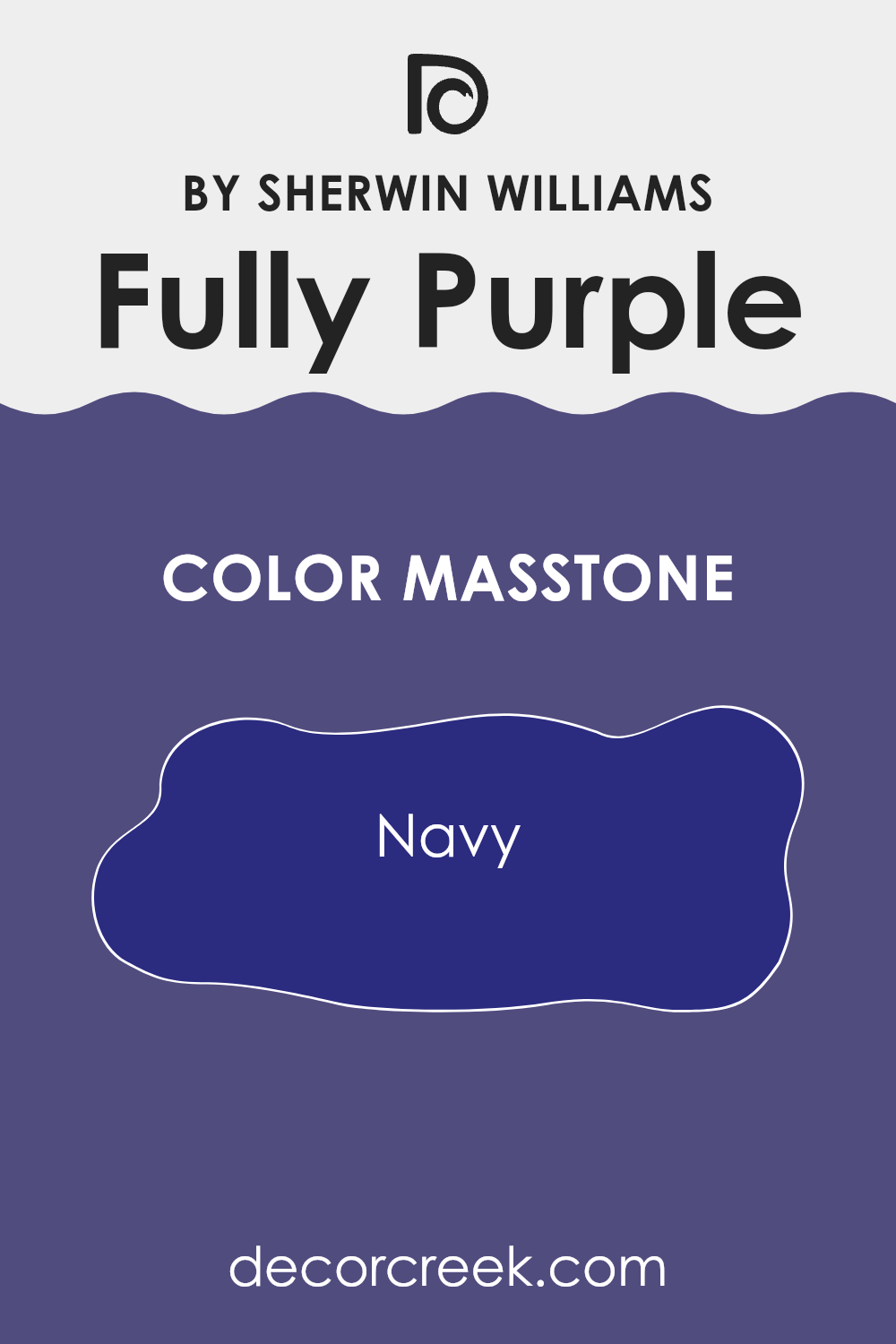
Fully Purple SW 6983 by Sherwin Williams has a masstone of navy (#2B2B80). This deep navy undertone gives the color a rich, profound quality that adds depth and character to any room. In homes, this color can create a cozy and inviting atmosphere.
It works well as an accent wall or in smaller rooms where a darker shade can add a sense of coziness and comfort. The navy masstone pairs well with light neutrals and metallic accents, providing a pleasing contrast that highlights architectural details or furnishings.
Additionally, when used in living rooms or bedrooms, it can promote a restful and calming environment. The color also works beautifully with natural light, where the navy undertones can shift slightly, offering a dynamic and interesting visual. Whether in contemporary or traditional settings, this color’s navy base lends itself to creating a stylish and comfortable interior area.
How Does Lighting Affect Fully Purple SW 6983 by Sherwin Williams?
Lighting plays a significant role in how we perceive colors. Different types of light can change the way a color looks, making it appear lighter, darker, or even slightly different in hue. Warm light, like that from incandescent bulbs, tends to add a yellow or red tint to colors, while cool light, such as fluorescent lighting, can make colors look more blue or green.
The color Fully Purple by Sherwin Williams can look quite different depending on the lighting. In natural light, it will appear in its truest form. The time of day and the direction the room faces also greatly influence how this color is perceived.
In a north-facing room, which usually has cooler and more consistent light throughout the day, Fully Purple might appear more muted and subdued. The absence of direct sunlight brings out cooler undertones in colors, which can make the purple look a bit bluer or grayer.
In a south-facing room, which gets plenty of warm and bright sunlight, Fully Purple will likely look more vibrant and lively. The warm light enhances the red undertones in the purple, making it appear richer and warmer.
In an east-facing room, which is lit by gentle morning light, Fully Purple can appear brighter and more energetic earlier in the day. As the light fades towards the afternoon, the color might start to feel softer and more muted.
In a west-facing room, where afternoon and evening light is more influential, the color could look darker or more intense as the day progresses. The warm afternoon light will bring out the red tones, especially late in the day when the light is golden.
Overall, when choosing a paint color like Fully Purple, it is essential to test it in the specific lighting conditions of your room, as it can shift noticeably based on where it is applied.
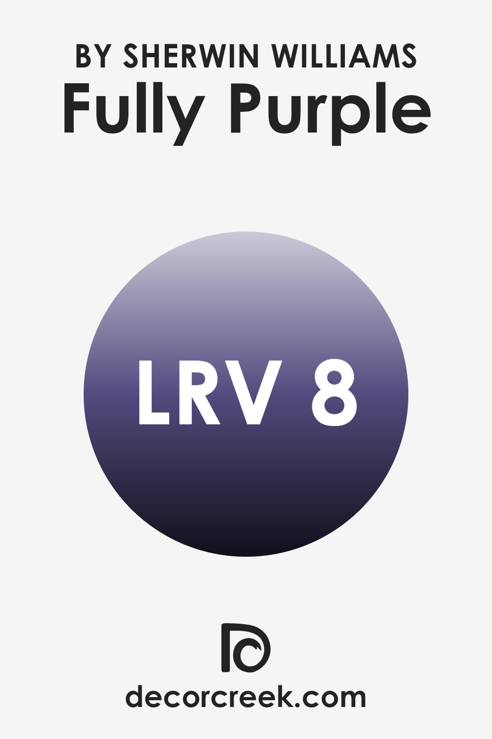
What is the LRV of Fully Purple SW 6983 by Sherwin Williams?
The Light Reflectance Value (LRV) measures how much light a color reflects or absorbs. It ranges from 0, meaning it absorbs all light (black), to 100, meaning it reflects all light (white). A color with an LRV of 8.382, like Fully Purple by Sherwin Williams, is quite dark. This means it absorbs most light, making a room feel more enclosed and intimate.
Darker colors like this reduce the amount of light bouncing around a room, which can be a great choice if you want to create a cozy and moody atmosphere. With an LRV of 8.382, Fully Purple is heavily inclined towards the darker side of the spectrum. This deep value means you’ll see the purple as rich and intense, especially in rooms with little natural light.
If used on all walls of a room, it will create a snug, cocoon-like effect, ideal for a cozy, dramatic setting. However, in rooms with a lot of natural light, it will still look deep but can take on a slightly different hue depending on the light. It’s a color choice that can ground a room and make it feel warm, but it’s important to balance it with lighter accessories and decor to prevent it from feeling too heavy or intense.
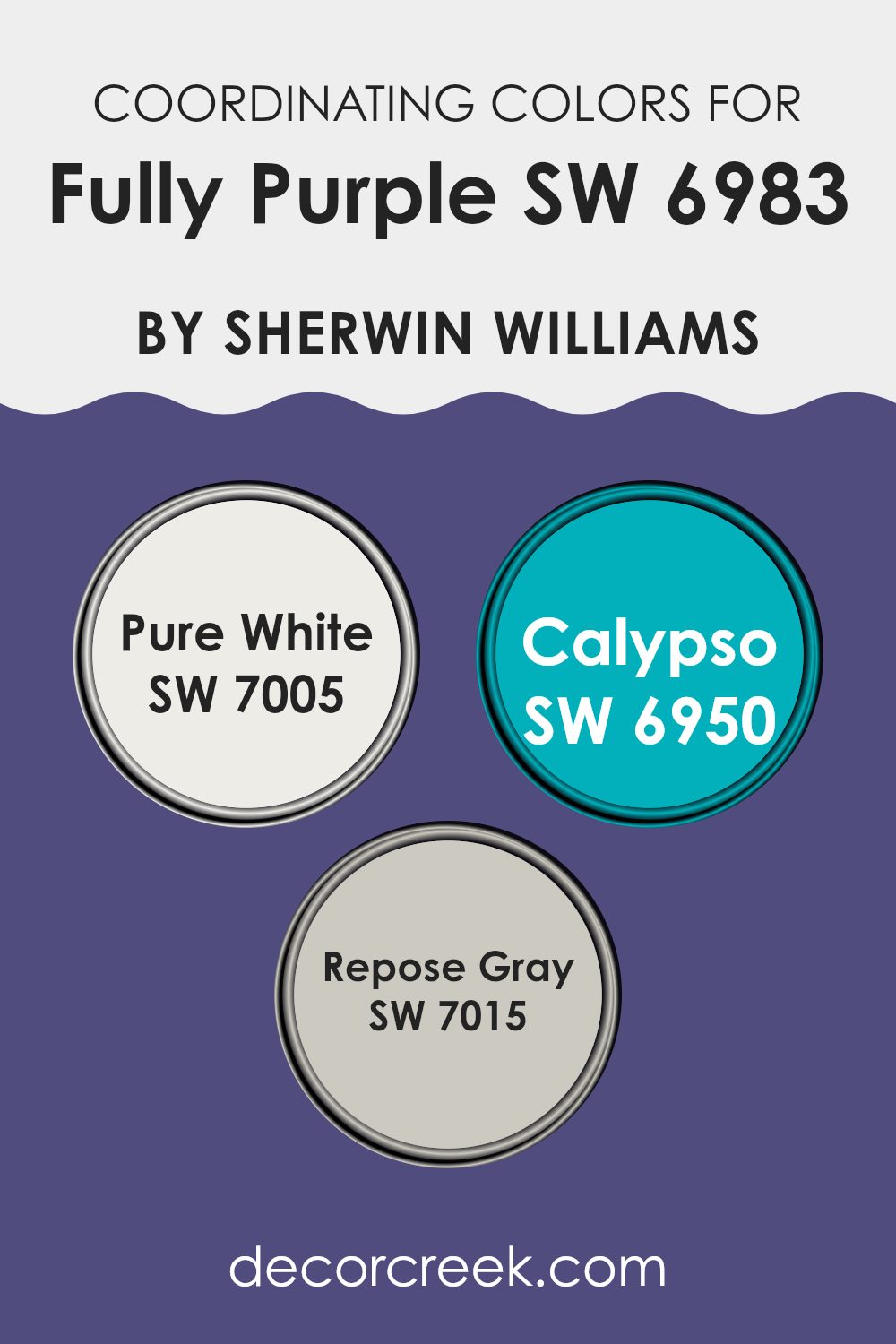
Coordinating Colors of Fully Purple SW 6983 by Sherwin Williams
Coordinating colors are colors chosen to complement or match each other well when used together in a room. They work by creating a harmonious look that is pleasing to the eye. For instance, Fully Purple by Sherwin Williams, a bold and vibrant hue, can be beautifully balanced with other shades to enhance a room’s aesthetic.
Using Pure White as a coordinating color introduces a clean and fresh element, helping to lighten the room and balance the intensity of the purple. It’s a bright white that acts as a neutral canvas, allowing the purple to stand out without overpowering the room. Calypso offers a dynamic twist with its rich, teal-blue tone that adds depth and energy to the combination.
This color pairs well with Fully Purple, creating a vibrant contrast that fills the room with a lively and inviting atmosphere. Repose Gray, on the other hand, is a calming and soft shade of gray that brings a sense of warmth and subtlety. It grounds the bolder colors and adds a soothing background, ensuring that the overall palette doesn’t feel too intense. Together, these colors create a balanced and inviting environment, highlighting the strengths of each individual color while maintaining visual appeal.
You can see recommended paint colors below:
- SW 7005 Pure White
- SW 6950 Calypso
- SW 7015 Repose Gray
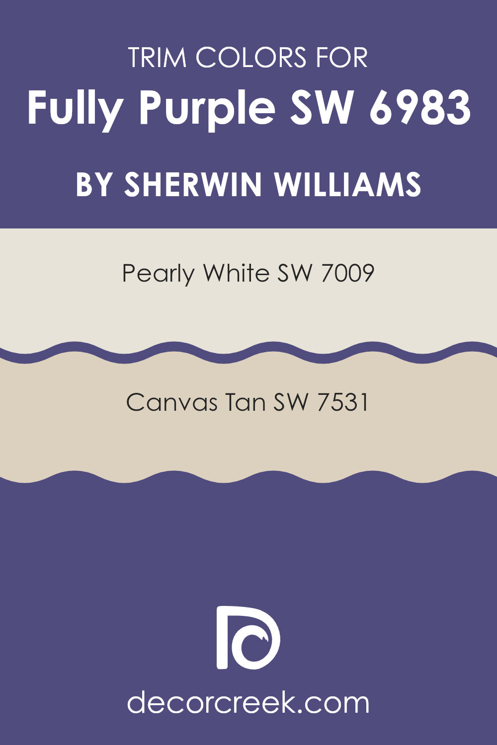
What are the Trim colors of Fully Purple SW 6983 by Sherwin Williams?
Trim colors are the shades used on the moldings, baseboards, and other decorative elements around a room’s edges. Choosing the right trim color is crucial because it frames the main color and can enhance or soften its impact. When using a bold and rich wall color like Sherwin Williams Fully Purple SW 6983, the trim color should be selected thoughtfully to complement and balance the intensity of the purple.
The trim can provide contrast, ensuring the purple stands out beautifully while maintaining a harmonious overall appearance. By working with lighter, more neutral trim colors, you create a clean edge that can make the purple color pop and give your room a cohesive and inviting feel. Sherwin Williams’ Pearly White SW 7009 is a soft, warm white that can add a clean and fresh look to the trim.
Its subtle hint of warmth blends well with intense wall colors, providing a calming contrast that highlights the boldness of Fully Purple. On the other hand, Canvas Tan SW 7531 is a more creamy, beige shade that can bring in a sense of coziness and softness when used as a trim. This color can warm up the overall room and blend nicely with the richness of the purple, creating a balanced look that makes the room feel inviting and stylish without being too intense.
You can see recommended paint colors below:
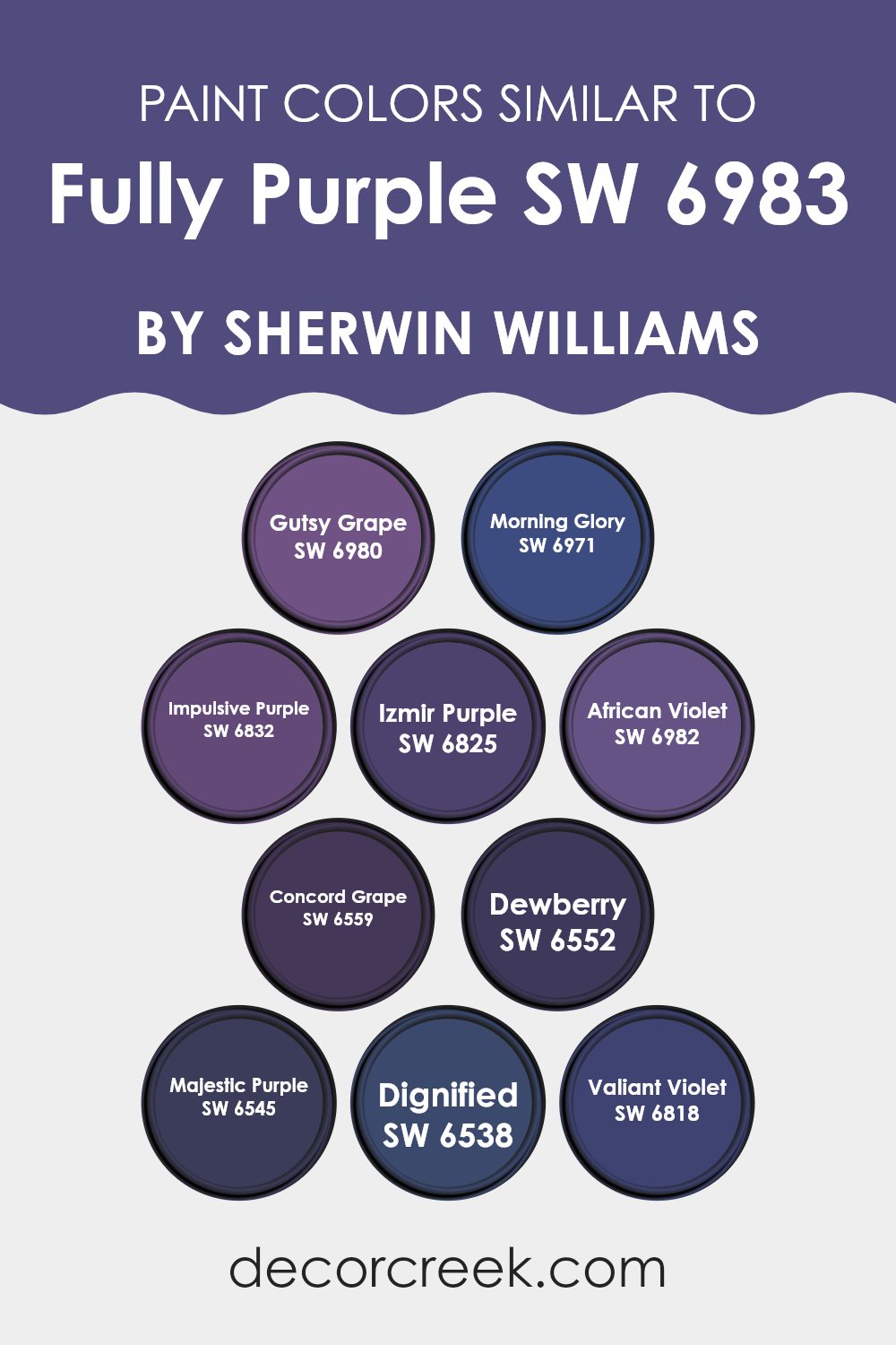
Colors Similar to Fully Purple SW 6983 by Sherwin Williams
Colors play an important role in design and decoration because they evoke emotions and create harmony in a room. When working with a bold hue like Fully Purple by Sherwin Williams, similar colors can complement or enhance the main color. Gutsy Grape offers a deep, rich hue that builds on the purple theme, adding depth.
Morning Glory, with its lighter, whimsical touch, can add a splash of brightness to balance darker tones. Impulsive Purple is full of energy and liveliness, contributing a dynamic spark. Izmir Purple offers a more muted yet vibrant alternative, providing versatility in design while maintaining a coherent look.
African Violet is a soft, warm tone that pairs gently with bolder purples. Concord Grape is a deep, classic shade that can ground the color palette. Dewberry has an earthy undertone, offering a more natural and laid-back purple. Majestic Purple brings in an elegant and regal touch with its intense vibrancy. Dignified emits a strong, confident vibe, while Valiant Violet introduces a playful yet stylish element. These similar colors to Fully Purple allow designers and homeowners to craft rooms that are visually appealing and richly layered, making any color scheme more coherent and attractive.
You can see recommended paint colors below:
- SW 6980 Gutsy Grape
- SW 6971 Morning Glory
- SW 6832 Impulsive Purple
- SW 6825 Izmir Purple
- SW 6982 African Violet
- SW 6559 Concord Grape
- SW 6552 Dewberry
- SW 6545 Majestic Purple
- SW 6538 Dignified
- SW 6818 Valiant Violet
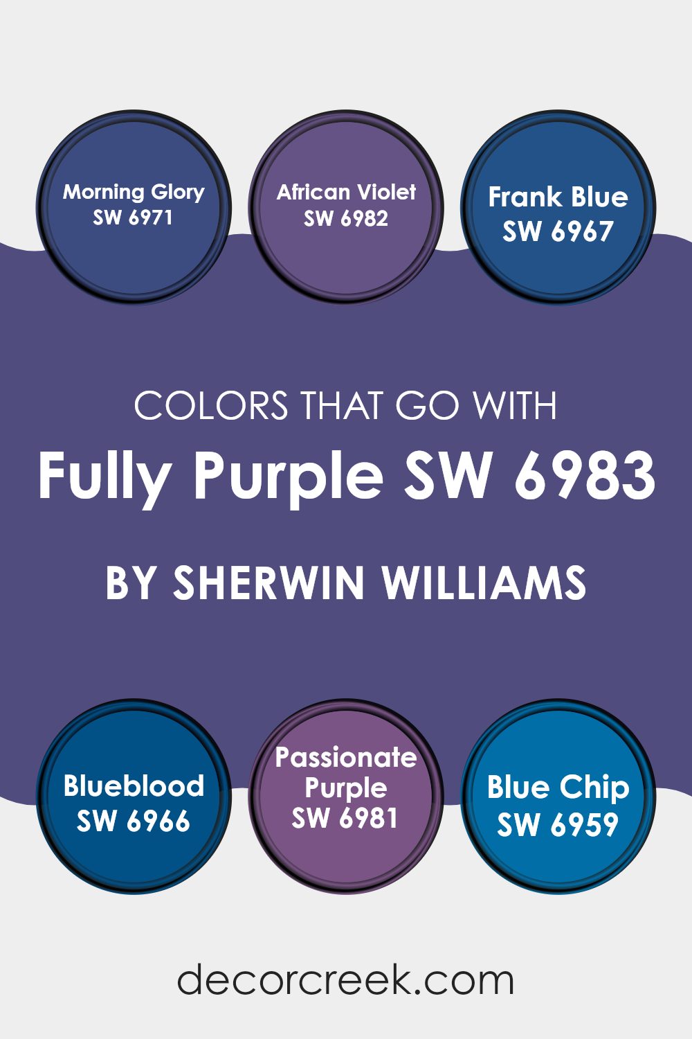
Colors that Go With Fully Purple SW 6983 by Sherwin Williams
Fully Purple SW 6983 by Sherwin Williams is a deep, rich purple that can anchor a room with a sense of boldness and creativity. Pairing it with complementary colors can enhance its beauty and create a balanced and harmonious area. Morning Glory SW 6971, a fresh and lively blue, provides a calming contrast that can lighten up the intensity of Fully Purple, while African Violet SW 6982, with its softer purple hue, creates a layered monochromatic effect that’s pleasing to the eye.
Frank Blue SW 6967 brings a touch of vibrancy with its medium blue tone, offering a lively pop against the deep purple. Then there’s Blueblood SW 6966, a darker blue that blends well with Fully Purple’s depth, creating a dramatic and moody atmosphere that’s both welcoming and intriguing.
Passionate Purple SW 6981, a rich purple with red undertones, adds warmth to the mix while staying within the same color family for a cohesive look. Blue Chip SW 6959, with its cool and classic blue shade, acts as a perfect complement, adding a refreshing touch that balances the intensity of Fully Purple.
These colors together create a dynamic and visually interesting palette, making any room feel complete and thoughtfully curated.
You can see recommended paint colors below:
- SW 6971 Morning Glory
- SW 6982 African Violet
- SW 6967 Frank Blue
- SW 6966 Blueblood
- SW 6981 Passionate Purple
- SW 6959 Blue Chip
How to Use Fully Purple SW 6983 by Sherwin Williams In Your Home?
Fully Purple (SW 6983) by Sherwin Williams is a bold, vibrant shade of purple that can add a lively touch to any home. This color works well as an accent wall in a living room or bedroom, offering a striking contrast to neutral tones like whites, grays, or beiges.
In a child’s room, it can create a playful and energetic environment when paired with bright yellows or greens. It is also flexible enough for use in a small area, such as a bathroom or hallway, where it can provide a pop of color without overpowering the room.
Combining Fully Purple with metallic accents like gold or silver can add a touch of glamor, making it suitable for rooms where you want to make a bold impression. When used thoughtfully, this shade brings a fresh and dynamic feel to the areas where families gather and spend time.
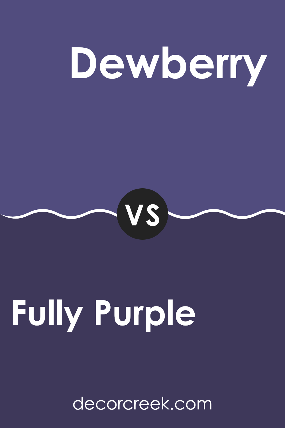
Fully Purple SW 6983 by Sherwin Williams vs Dewberry SW 6552 by Sherwin Williams
Fully Purple SW 6983 and Dewberry SW 6552 are two striking shades from Sherwin Williams that share a purple base but offer different vibes. Fully Purple is a vibrant, dynamic shade of purple. It’s bold and makes a strong statement in any room. This color can energize a room and create a lively atmosphere.
On the other hand, Dewberry is a bit darker and softer. It has a deep, rich tone that feels more subdued than Fully Purple. Dewberry can bring a cozy and warm feeling to a room, making it a great choice for a more intimate or relaxed setting.
While both colors belong to the purple family, Fully Purple is more intense and lively, whereas Dewberry is darker and more understated. Together, they could be used to create a harmonious contrast, balancing the brightness of Fully Purple with the depth of Dewberry.
You can see recommended paint color below:
- SW 6552 Dewberry
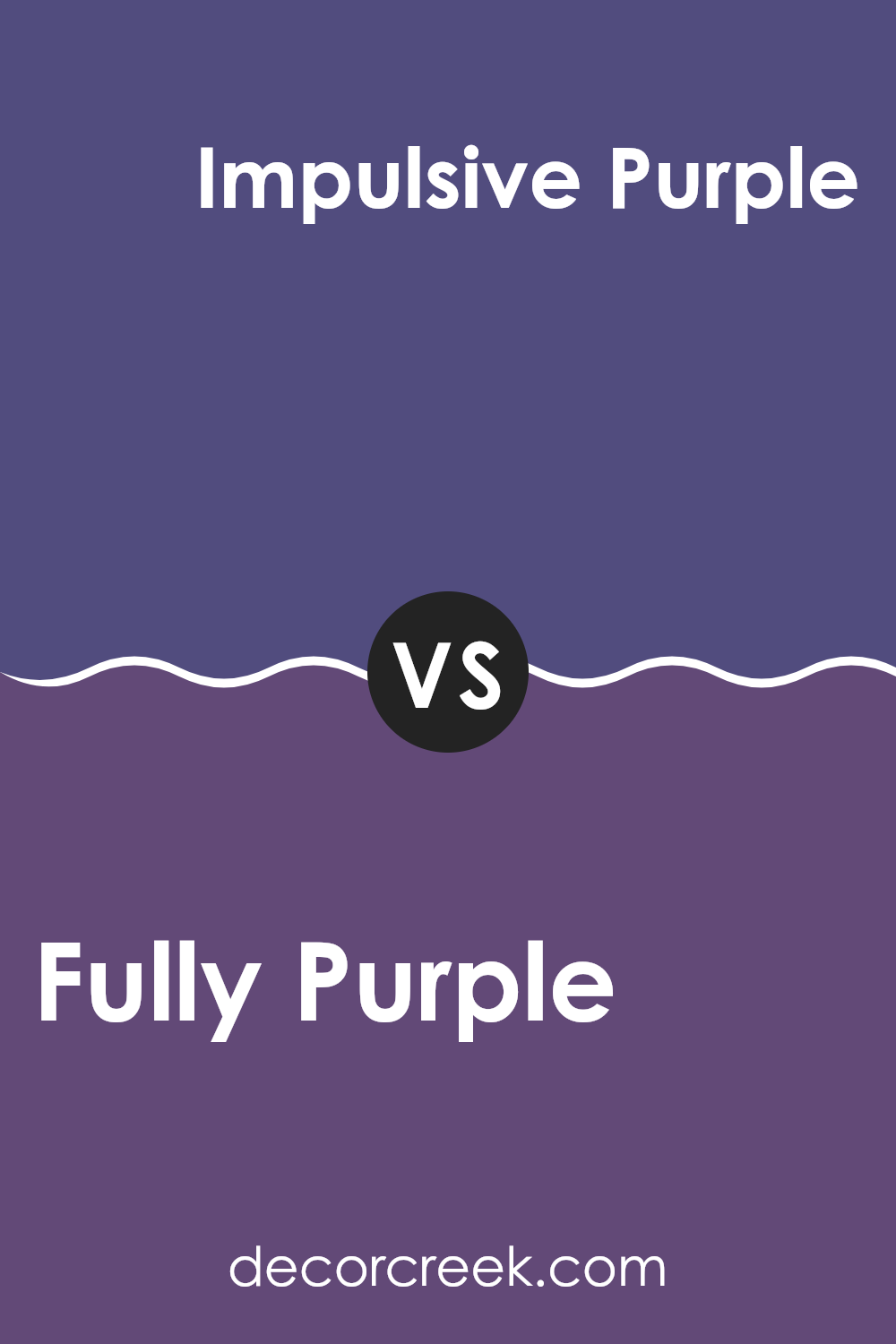
Fully Purple SW 6983 by Sherwin Williams vs Impulsive Purple SW 6832 by Sherwin Williams
Fully Purple (SW 6983) and Impulsive Purple (SW 6832) by Sherwin Williams are two distinct shades of purple that offer different vibes. Fully Purple is a rich, deep purple with a touch of calmness and stability.
It feels more muted and subdued, making it suitable for creating a cozy and comforting atmosphere in a room. In contrast, Impulsive Purple is a brighter, more energetic shade. It brings a sense of fun and liveliness, which can make a room feel more dynamic and exciting.
While Fully Purple is great for areas where you want to relax and unwind, Impulsive Purple is perfect for areas where you want to add a burst of color and energy. Both colors have their own unique appeal and can be used to set different moods depending on the environment you want to create.
You can see recommended paint color below:
Fully Purple SW 6983 by Sherwin Williams vs African Violet SW 6982 by Sherwin Williams
Fully Purple SW 6983 and African Violet SW 6982 by Sherwin Williams are two shades of purple that offer different moods and looks. Fully Purple is a deep, rich purple with a strong presence. It can be bold and dramatic, making it a great choice for creating a statement in a room. It’s perfect if you want a vibrant and energetic feel.
On the other hand, African Violet is slightly lighter and softer. It has a touch of warmth that makes it feel more calming compared to the intensity of Fully Purple. African Violet can add a gentle, elegant touch to a room, making it suitable for areas where you want a more understated and relaxed atmosphere.
Both colors share a common base, but their slight differences in tone and intensity allow them to be used to achieve distinct styles and vibes in your home.
You can see recommended paint color below:
- SW 6982 African Violet
Fully Purple SW 6983 by Sherwin Williams vs Concord Grape SW 6559 by Sherwin Williams
Fully Purple SW 6983 by Sherwin Williams is a rich and vibrant color with a deep, saturated purple hue. It has a bold presence, making it a great choice for adding a lively touch to a room. On the other hand, Concord Grape SW 6559 by Sherwin Williams is a bit softer and more muted.
While still clearly within the purple family, Concord Grape has a subtle, calming effect. It’s more understated compared to Fully Purple, making it a flexible option for creating a mellow atmosphere.
The two colors can complement each other well. Fully Purple can act as an accent color, bringing energy and focus to a room, while Concord Grape can maintain a peaceful background. When used together, they offer a balance of vivacity and subtlety. Choosing between them depends on the desired mood and effect for a room, whether you want something bold or soft.
You can see recommended paint color below:
- SW 6559 Concord Grape
Fully Purple SW 6983 by Sherwin Williams vs Dignified SW 6538 by Sherwin Williams
Fully Purple and Dignified are two rich colors by Sherwin Williams, each with its own character. Fully Purple is a deep, bold shade that commands attention. It has a vibrant intensity that can energize a room, making it stand out in any room. It’s perfect for adding a dramatic touch to interiors, especially in places you want to highlight or make a statement.
Dignified, on the other hand, is a more subdued choice. It’s a deep, muted blue that brings a sense of calm and stability. While also striking, it offers a more relaxed feel than Fully Purple. Dignified works well in areas meant for comfort and relaxation, like bedrooms or living rooms, where a soothing atmosphere is desirable.
Both colors are strong and impactful, but the main difference lies in their mood: Fully Purple excites and enlivens, while Dignified soothes and grounds.
You can see recommended paint color below:
- SW 6538 Dignified
Fully Purple SW 6983 by Sherwin Williams vs Majestic Purple SW 6545 by Sherwin Williams
Fully Purple SW 6983 and Majestic Purple SW 6545 by Sherwin Williams are two beautiful shades of purple, each with its own distinct look. Fully Purple SW 6983 is a vibrant and strong purple that stands out and creates a bold statement in any room.
It’s a lively color that adds energy and excitement. On the other hand, Majestic Purple SW 6545 is a deeper, more muted shade. It’s a rich and elegant color that brings a sense of depth and warmth to a room.
While Fully Purple is bright and eye-catching, Majestic Purple offers a more reserved and elegant feel. Both colors are flexible and can be used in different settings, but the choice between them depends on the mood you want to set. Fully Purple is great for adding a pop of color, while Majestic Purple provides a more classic and lasting look.
You can see recommended paint color below:
- SW 6545 Majestic Purple
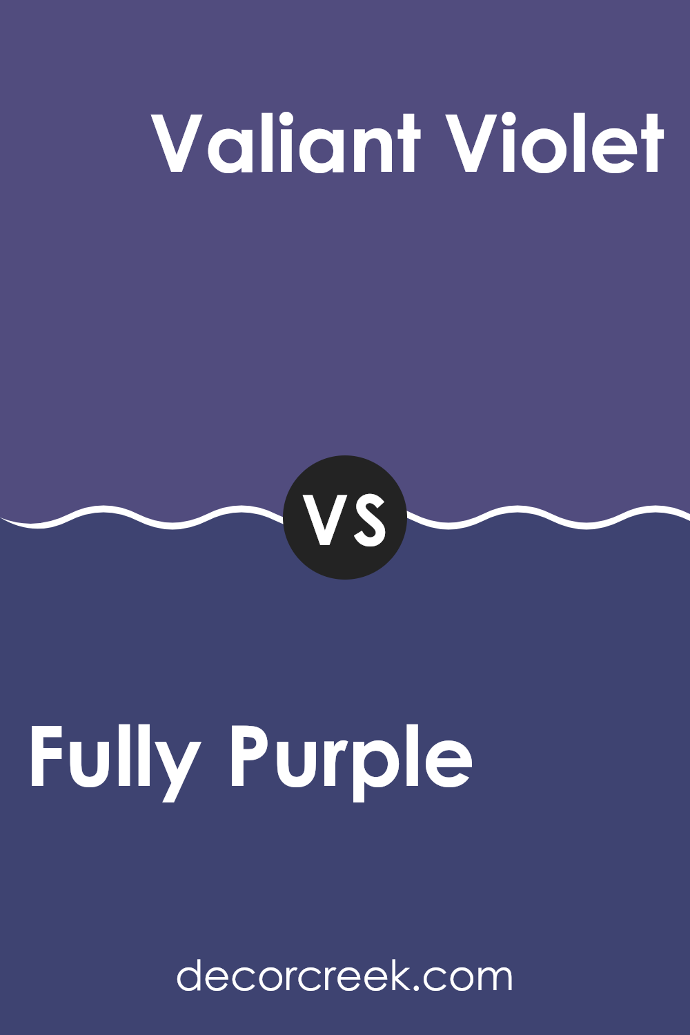
Fully Purple SW 6983 by Sherwin Williams vs Valiant Violet SW 6818 by Sherwin Williams
Fully Purple SW 6983 by Sherwin Williams is a deep, rich purple that gives a strong and energetic vibe to any room. It is great for making a bold statement and adds a touch of drama with its intense hue.
This color works well in areas where you want to create a sense of mystery or excitement, like a feature wall or a creative workspace. On the other hand, Valiant Violet SW 6818 is slightly lighter and softer.
It’s still a vibrant purple, but its tone is a bit more approachable and friendly compared to Fully Purple. Valiant Violet can add a lively and cheerful feel to a room, making it a good choice for playrooms or artistic areas. Both colors are vibrant purples, but if you want something strong and bold, go with Fully Purple. If you prefer a slightly more inviting purple, Valiant Violet is a great pick.
You can see recommended paint color below:
- SW 6818 Valiant Violet
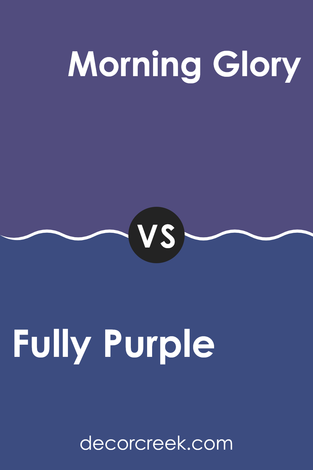
Fully Purple SW 6983 by Sherwin Williams vs Morning Glory SW 6971 by Sherwin Williams
Fully Purple (SW 6983) and Morning Glory (SW 6971) by Sherwin Williams are two distinct colors that bring different feelings and atmospheres to a room. Fully Purple is a deep, rich shade, evoking a sense of luxury, creativity, and warmth.
It works well in areas where a dramatic or cozy environment is wanted, such as a living room or bedroom. On the other hand, Morning Glory is a lighter, vibrant blue with a touch of brightness. It feels fresh and lively, perfect for areas where energy and clarity are desired, like a kitchen or bathroom.
While Fully Purple creates a moody and elegant room, Morning Glory brings a cheerful and invigorating vibe. Together, they can complement each other, with the depth of Fully Purple balancing the lightness of Morning Glory, adding both elegance and energy to a room’s design.
You can see recommended paint color below:
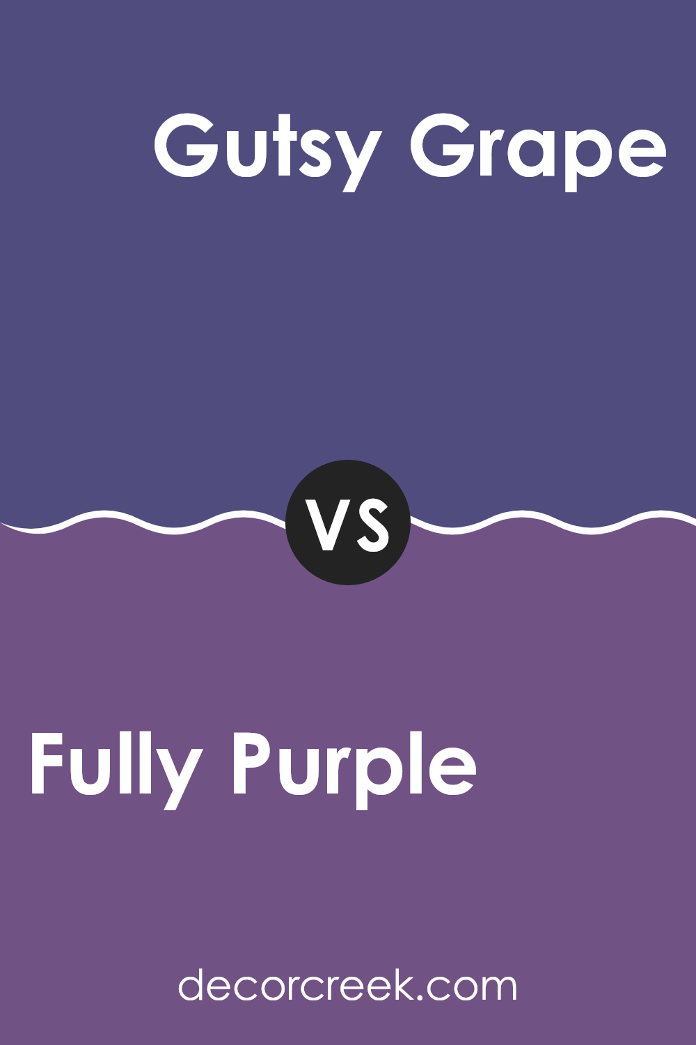
Fully Purple SW 6983 by Sherwin Williams vs Gutsy Grape SW 6980 by Sherwin Williams
Fully Purple SW 6983 and Gutsy Grape SW 6980 are both rich purples from Sherwin Williams, but they have distinct differences. Fully Purple SW 6983 is a deep, vibrant purple, offering a bold and strong presence.
It’s a color that can make a statement and bring energy to a room. On the other hand, Gutsy Grape SW 6980 is slightly darker and has a more muted tone compared to Fully Purple. It feels a bit more subdued and can create a cozy and inviting atmosphere.
While both colors share the purple family, Fully Purple leans towards a brighter pop, whereas Gutsy Grape appears more toned down and moody. Depending on the desired effect in a room, Fully Purple could be used for a lively touch, while Gutsy Grape might be chosen for a more relaxed, comforting vibe.
You can see recommended paint color below:
- SW 6980 Gutsy Grape
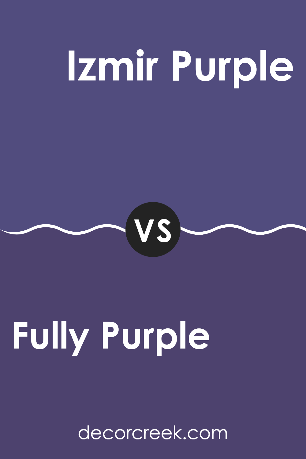
Fully Purple SW 6983 by Sherwin Williams vs Izmir Purple SW 6825 by Sherwin Williams
Fully Purple SW 6983 and Izmir Purple SW 6825 by Sherwin Williams are both shades of purple, but they have distinct differences. Fully Purple is a deep, rich purple that leans toward a darker and more intense hue. It’s bold and can make a strong statement in a room, creating a dramatic and cozy atmosphere.
On the other hand, Izmir Purple is lighter and has a brighter tone compared to Fully Purple. It adds a lively touch and can bring more energy into a room. Izmir Purple is more playful and can make a room feel more vibrant and engaging.
When choosing between these two colors, consider what kind of mood you want to set. Fully Purple is ideal for creating a more intimate and rich environment, while Izmir Purple offers a lighter, more cheerful ambiance. Both can be used effectively in different settings depending on your personal taste and the overall design goal.
You can see recommended paint color below:
- SW 6825 Izmir Purple
After learning about SW 6983 Fully Purple by Sherwin-Williams, I feel like I’ve just unlocked a whole new world of color. Fully Purple is a rich and deep shade that looks very appealing to the eyes. It’s like a royal cloak in paint form! This color can change the mood of any room in a house. It makes rooms feel cozy and inviting, like a warm hug whenever you walk in. I can imagine it making a bedroom feel snug or adding some drama to a living area.
One neat thing about Fully Purple is how it works with other colors. Pairing it with lighter tones, like whites or creams, helps it stand out even more, while using it with other dark colors can create a moody and unique feel. The color is quite flexible in its use and doesn’t limit you to just one style or look.
After reading about it, I’m excited to see where Fully Purple can be used next. It’s amazing how such a simple change, like the color of a wall, can affect the way we feel or the way we perceive area.
Fully Purple by Sherwin-Williams could be a perfect choice if you want a bold yet cozy feel at home.
Ever wished paint sampling was as easy as sticking a sticker? Guess what? Now it is! Discover Samplize's unique Peel & Stick samples.
Get paint samples

