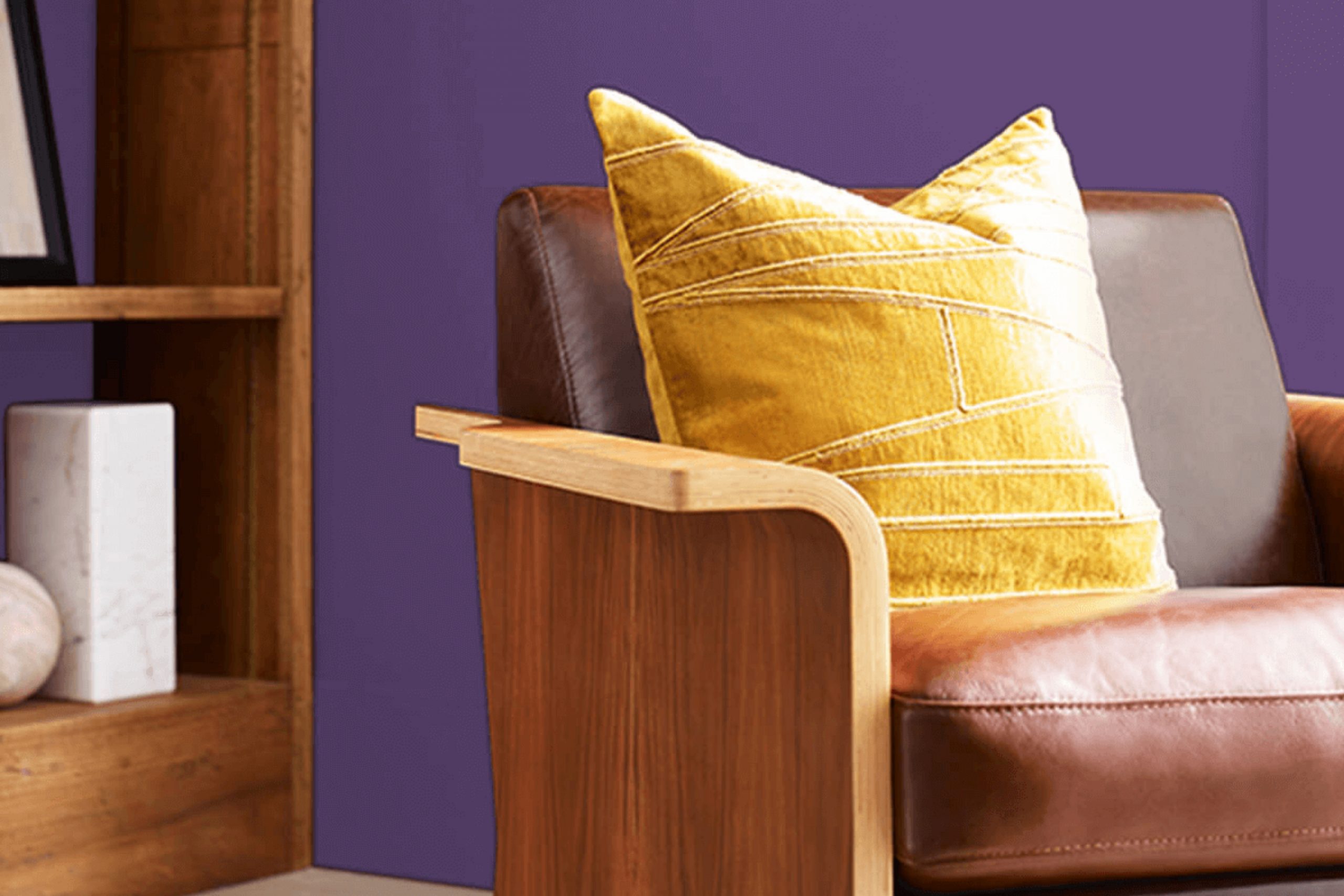
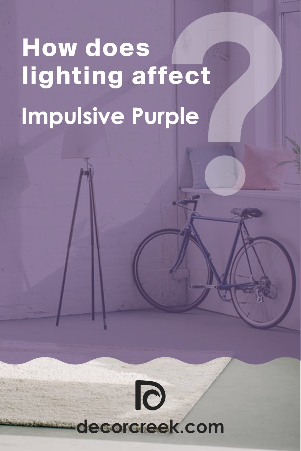
Have you ever walked into a room and immediately felt your mood lift? That’s the power of a good color. Let me introduce you to SW 6832 Impulsive Purple by Sherwin Williams, a shade that truly lives up to its name. This bold and unapologetic purple has a way of turning any room into a statement without saying a word.
Whether you’re looking to add a splash of vibrancy to an accent wall or give your entire room a fresh identity, Impulsive Purple could be the perfect choice for you. When you use Impulsive Purple in your home, you’re not just changing the color of your walls; you’re setting a new tone for the whole atmosphere of your home.
Imagine coming home to a lively, rich hue that exudes both playfulness and sophistication. This color isn’t just a backdrop; it’s an active participant in your home’s atmosphere. If purple is a color you love, or you’re simply ready to try something bold and different, think about how this particular shade could add something special to your home’s style.
Ready for a change?
Impulsive Purple might just be what your home needs to reflect your vibrant personality.
What Color Is Impulsive Purple SW 6832 by Sherwin Williams?
Impulsive Purple is a vibrant and bold hue that stands out for its depth and energy. This color can make a strong statement in any room, offering a lively splash that can invigorate the entire interior. Due to its intense nature, it works exceptionally well in creative or dynamic settings, such as studios or eclectic living rooms.
In terms of interior styles, Impulsive Purple fits perfectly within bohemian and contemporary aesthetics. Its vividness adds a playful, yet bold aspect to bohemian rooms, complemented by layered textures and rich patterns. In contemporary settings, it can act as a striking focal point against minimalist decor, creating a stylish contrast.
When it comes to pairing materials and textures, Impulsive Purple goes beautifully with metallic elements like gold or copper, which enhance its richness. Soft, plush textures in furnishings, such as velvet or silk, also complement this shade well, adding a touch of luxury and comfort. Natural wood tones can balance out its energy, providing a grounded atmosphere.
Meanwhile, using it in accessories like cushions, art, or a feature wall can make it manageable without making the room feel too intense. Overall, Impulsive Purple is a bold yet adaptable choice for those wanting to bring personality and a hint of playfulness into their home decor.
Is Impulsive Purple SW 6832 by Sherwin Williams Warm or Cool color?
Impulsive Purple by Sherwin Williams is a striking and vibrant shade of purple that can add a splash of personality to any part of the home. This deep purple hue is strong but still balanced, which makes it ideal for creating a focal point in a room without making it feel too closed in or tight.
It works well in a variety of settings, from an accent wall in a living room to add a bit of drama, to a bedroom where it can create a cozy and inviting atmosphere. Using such a bold color like Impulsive Purple can also enhance the mood of a room.
Colors often affect emotions, and purple is known to inspire creativity and calmness. That makes it a great choice for areas meant for relaxation or inspiration, like home offices or reading nooks. Furthermore, it pairs beautifully with neutral colors such as whites and grays, which can help balance its intensity and integrate it seamlessly into your overall home decor.
Undertones of Impulsive Purple SW 6832 by Sherwin Williams
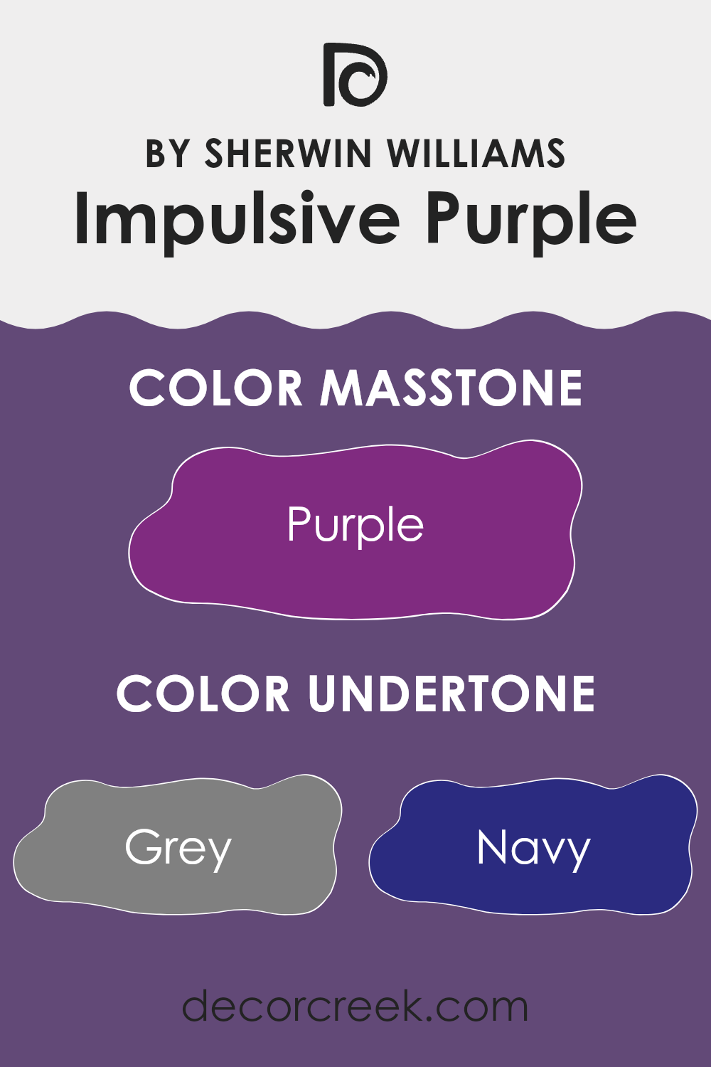
Impulsive Purple is a unique paint color with a deep, rich hue that brings a sense of creativity and boldness to any room. The primary undertones of this color include shades like grey, navy, and dark turquoise, which contribute to its cooler feel. These undertones help soften the intensity of the purple, making it easier to use in various rooms and under different lighting conditions.
Understanding undertones is crucial because they can significantly influence how a color appears once applied to your walls. Undertones can either enhance the room’s lighting or create an unexpected effect depending on the natural and artificial light.
For instance, Impulsive Purple might look more subdued and closer to grey in a dimly lit room, while in a brightly lit area, the navy and dark turquoise might become more prominent, adding a vibrant splash to the room.
Additionally, this color has undertones like brown, olive, and dark grey, which bring a touch of warmth and depth, making the walls seem richer and more inviting.
Lighter undertones like lilac, light purple, and pale pink help soften the color’s impact, making sure it doesn’t feel too strong in the room.
When applied on interior walls, Impulsive Purple can create a striking backdrop that can either be bold and dramatic or subtle and soothing, depending on the furnishing and decor. Because it works well with many styles, it’s a great choice for anyone who wants to add a bit of personality and charm to their home.
What is the Masstone of the Impulsive Purple SW 6832 by Sherwin Williams?
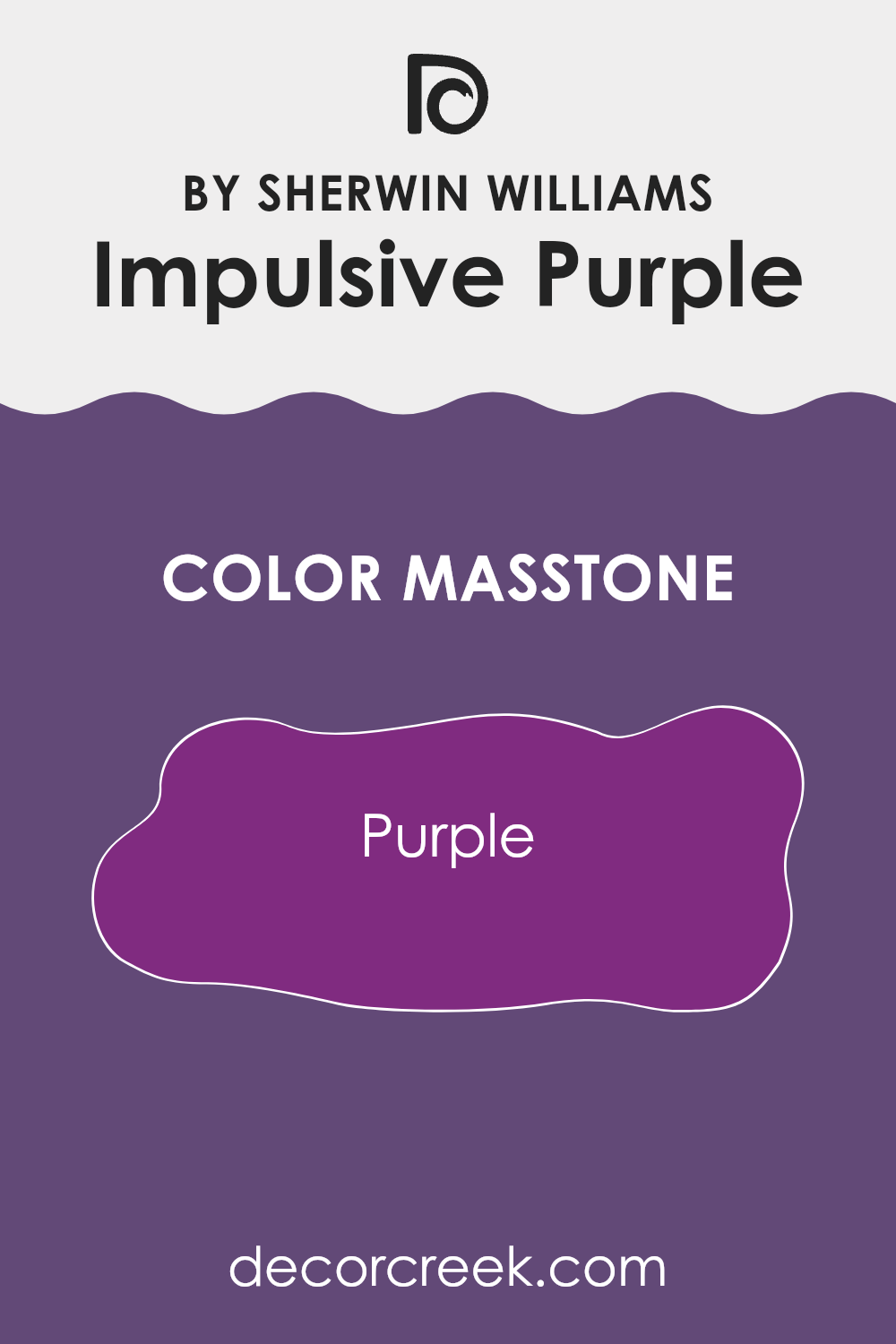
Impulsive Purple, with a masstone close to the vibrant shade Purple (#802B80), is a bold and dynamic hue that can make a strong statement in any home. This rich purple carries an energetic vibe, which means it’s perfect for creating a focal point in a room. When used on an accent wall, it can draw attention and set a certain mood, often injecting liveliness and warmth into the room.
The color works best in rooms where you want to boost creativity and inspiration — like a home office or a craft room. In living areas or bedrooms, using it in smaller doses—like for throw pillows or artwork—can add a pop of color without making the room feel too intense.
Pairing Impulsive Purple with neutral tones like grays and whites can help balance its intensity, ensuring the environment remains comfortable but visually interesting. This striking shade of purple adds a fresh and fun twist to any decorating scheme, making the room feel welcoming and full of life.
How Does Lighting Affect Impulsive Purple SW 6832 by Sherwin Williams?
Lighting significantly impacts how colors appear in a room, as it can alter the intensity and hue of a color. For instance, the color Impulsive Purple, a rich and vivid shade, changes appearance under different lighting conditions.
In artificial light, such as with LED or incandescent bulbs, Impulsive Purple often appears more vibrant and deeper. LED lights, particularly those that mimic daylight, can really bring out the depth and vibrancy of this shade, making it pop in a room. Meanwhile, softer incandescents may warm up the color slightly, giving it a cozier feel.
When exposed to natural light, Impulsive Purple can show a wide range of tones depending on the time of day and the direction of the light. In rooms facing north, which receive less direct sunlight, this color may look a bit more muted and subdued. The cooler, softer light can make the purple appear almost like a deep lavender.
In south-facing rooms, however, where light is abundant and more direct, Impulsive Purple can look particularly rich and dynamic. The ample sunlight illuminates the color’s true character, enhancing its boldness and depth. This makes it ideal for a feature wall or as a statement color in lively areas.
East-facing rooms catch the morning light, which can make Impulsive Purple look bright and fresh. As the sun rises, it casts a warm glow, which can really make this color shine gently in the morning while returning to a true deep purple as the day progresses.
Lastly, in west-facing rooms, the evening light, which tends to be warmer, can bring out a softer, more shadowy aspect of Impulsive Purple, providing a tranquil and cozy atmosphere toward the end of the day.
In summary, Impulsive Purple’s perception is heavily influenced by the lighting conditions, presenting a spectrum of shades based on the direction and intensity of light it’s exposed to.
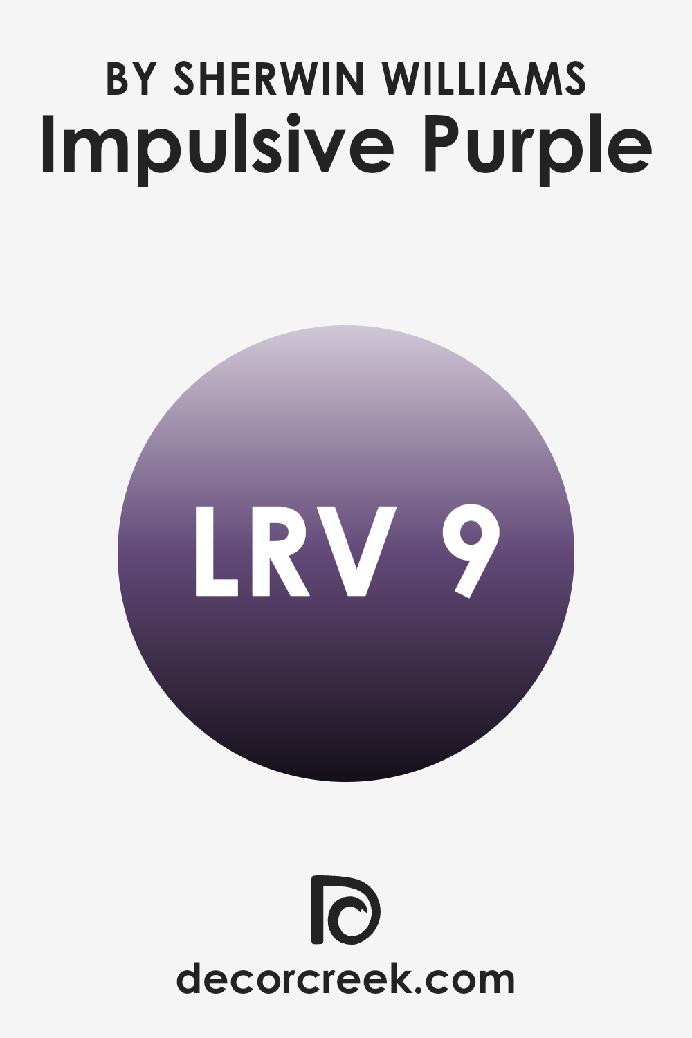
What is the LRV of Impulsive Purple SW 6832 by Sherwin Williams?
LRV stands for Light Reflectance Value, which is a measurement that indicates how much light a paint color will reflect when applied to a surface. This value is typically measured on a scale from 0 to 100, where a lower number means the color absorbs more light and a higher number means it reflects more light.
LRV is a useful tool for designers and homeowners because it helps predict how light or dark a color will appear once it’s on the walls. For instance, colors with a higher LRV can make a room feel more open and airy, while those with a lower LRV can create a cozier, more enclosed feel.
In the case of the color with an LRV of 8.687, it is on the lower end of the scale, indicating that it is a dark color that absorbs a lot of light. This means that when used on walls, it won’t reflect much light back into the room, which can make it feel smaller or more intimate. Such a low LRV can also enhance the richness and depth of the color, making it a strong statement choice for a room.
This is ideal in settings where you might want to create a dramatic effect or in rooms that get a lot of natural light and can handle a darker shade on the walls without feeling too dim.
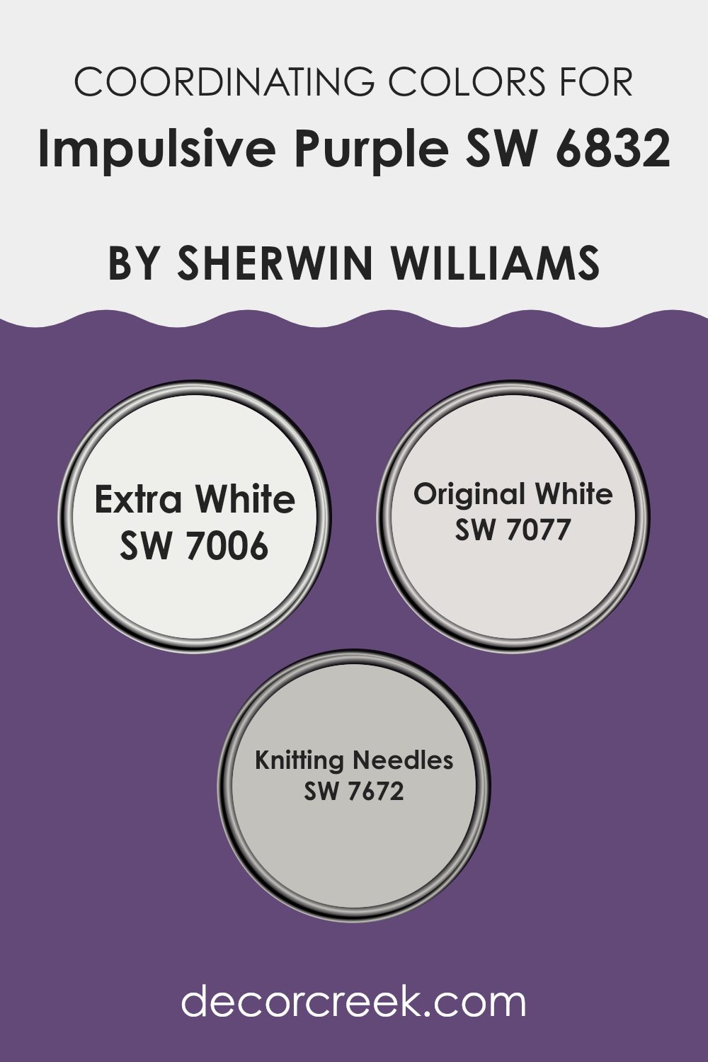
Coordinating Colors of Impulsive Purple SW 6832 by Sherwin Williams
Coordinating colors are shades that complement or enhance the primary color in a color scheme, in this case, Impulsive Purple by Sherwin Williams. To achieve a harmonious look, coordinating colors can either contrast with or subtly support the dominant hue. The choice of colors like SW 7006 – Extra White, SW 7077 – Original White, and SW 7672 – Knitting Needles are perfect examples of colors that work well alongside Impulsive Purple to either balance or accentuate its deep and vibrant tones.
Extra White is a crisp, clean shade that provides a stark contrast to the richness of Impulsive Purple, making it ideal for trim, ceilings, or even used in the flooring to offer a fresh, bright complement. Original White leans towards a warmer tone, offering a subtle creamy backdrop that can soften the intensity of a bold purple while still maintaining a neat and orderly appearance.
On a more nuanced note, Knitting Needles is a gentle gray that merges seamlessly with most colors, including deep purples, adding a touch of sophistication and a modern twist to the room without overpowering the primary color. Together, these shades work to create a balanced, inviting atmosphere that enhances the beauty of the main color.
You can see recommended paint colors below:
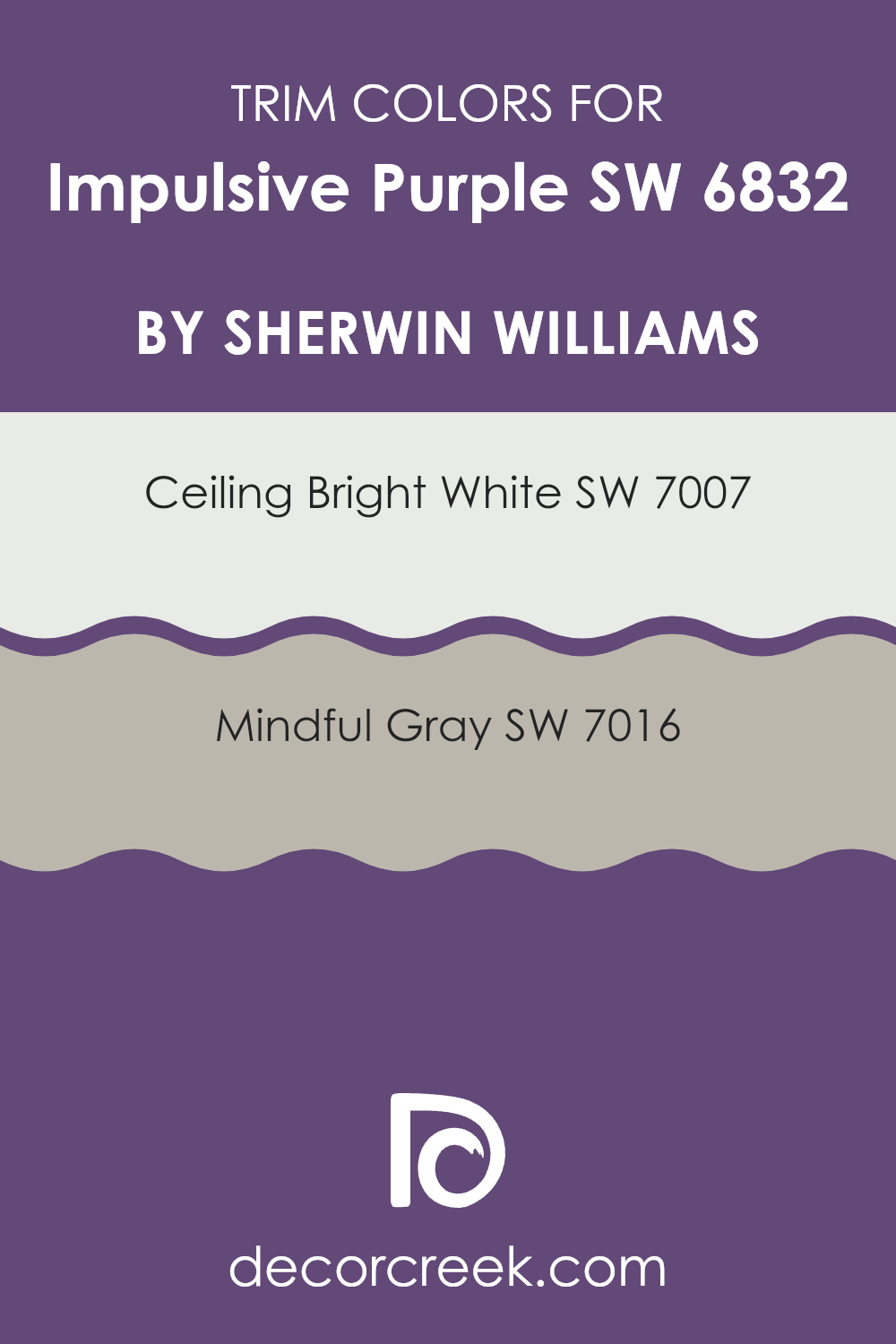
What are the Trim colors of Impulsive Purple SW 6832 by Sherwin Williams?
Trim colors play a crucial role in framing and accenting a room painted with Impulsive Purple by Sherwin Williams. When selected wisely, they can complement and enhance the vivid tones of the purple by creating a clean, defined boundary or by softening the visual impact of the bold wall color.
Using SW 7007 – Ceiling Bright White as a trim color gives a crisp contrast that makes the purple pop while helping the room feel more open and bright. On the other hand, SW 7016 – Mindful Gray offers a subtler transition from wall to trim, giving the room a balanced, modern look without creating too harsh of a contrast with the vibrant walls.
SW 7007 – Ceiling Bright White is a true, clean white that works effectively to make any color look more distinct and lively. It acts like a highlighter around the edges of a room, drawing the eye and giving a sharp outline to the whole area. Meanwhile, SW 7016 – Mindful Gray presents a soft, warm gray that merges well with cooler colors. It’s gentle enough not to clash with stronger colors yet provides enough color presence to be noticed and appreciated for its quiet elegance. Together, these trim colors offer flexible options to accommodate different tastes and designs when working with Impulsive Purple.
You can see recommended paint colors below:
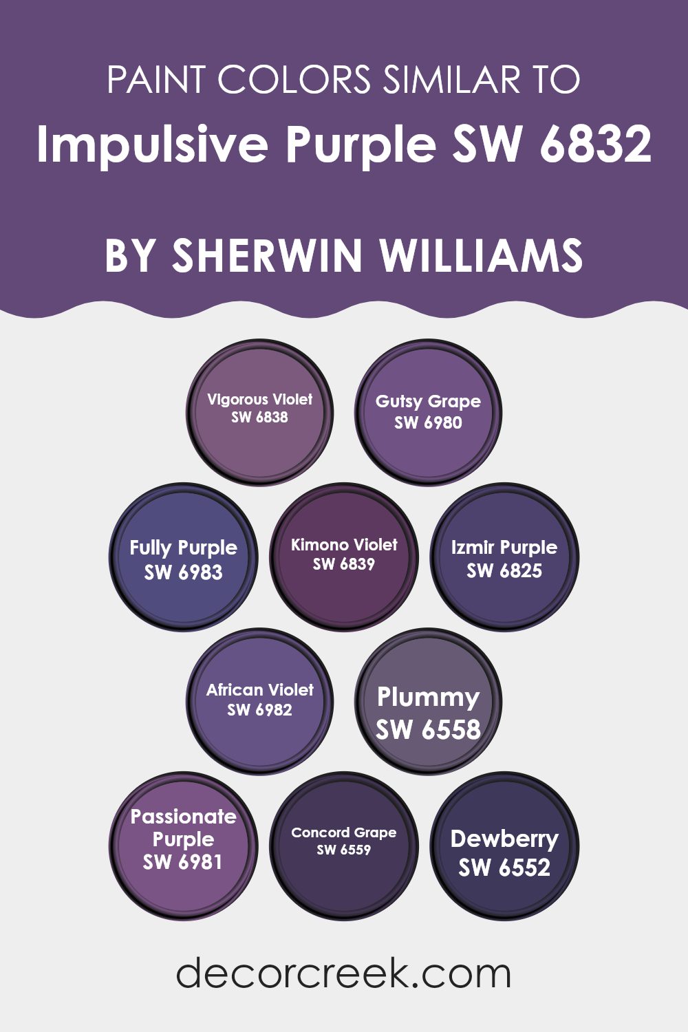
Colors Similar to Impulsive Purple SW 6832 by Sherwin Williams
When decorating a room, choosing a palette of similar colors can create a cohesive and harmonious environment. This approach is especially useful for achieving a balanced and fluent look, which can make the area feel more comfortable and visually appealing. Similar colors, such as those close to Impulsive Purple, work well together by providing subtle variations that add depth and interest without making the room feel too intense. For instance, by using different shades of purple, you can craft a refined and engaging ambiance that remains unified but dynamic.
Vigorous Violet has a vibrant, lively feel to it, offering a slightly brighter option that adds a touch of energy to a room. Gutsy Grape is bold and slightly deeper, perfect for making a confident statement. Fully Purple, as the name suggests, is rich and deep, providing a strong presence and full-bodied color that anchors the room.
Kimono Violet brings a softer, more muted tone which resonates well in a calm setting. Izmir Purple has an exotic flair that can give a unique twist to traditional rooms. African Violet is understated and elegant, ideal for creating subtle distinctions between different parts of the home. Plummy leans towards a warmer, cozier hue, excellent for more intimate areas.
Passionate Purple radiates with intensity and can act as a focal point. Concord Grape has a dusky feel, wonderful for adding sophistication without going too dark. Lastly, Dewberry offers a gentle and soothing touch, great for parts of the home that benefit from a soft yet colorful presence. By using any combination of these, you can create a home that feels connected and thoughtfully arranged.
You can see recommended paint colors below:
- SW 6838 Vigorous Violet
- SW 6980 Gutsy Grape
- SW 6983 Fully Purple
- SW 6839 Kimono Violet
- SW 6825 Izmir Purple
- SW 6982 African Violet
- SW 6558 Plummy
- SW 6981 Passionate Purple
- SW 6559 Concord Grape
- SW 6552 Dewberry
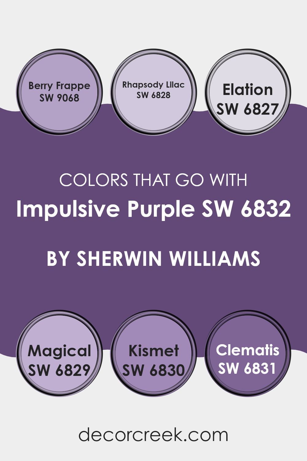
Colors that Go With Impulsive Purple SW 6832 by Sherwin Williams
Choosing complementary colors for Impulsive Purple SW 6832 by Sherwin-Williams can greatly enhance the overall look and feel of the room. Colors that harmonize with it create a balanced and pleasing visual impact, helping to establish a mood or theme in your interiors.
For example, pairing it with Berry Frappe SW 9068 adds a gentle, earthy contrast. This muted violet tone works nicely as a refined backdrop or accent, blending well without taking attention away from the main color. This can make smaller rooms feel more connected or help big parts of the home feel warmer and more inviting.
Rhapsody Lilac SW 6828 also pairs nicely with Impulsive Purple, offering a lighter lavender shade that reflects calmness and light, perfect for soothing environments like bedrooms or bathrooms. Elation SW 6827 is a soft, pale pink that injects a gentle warmth into the mix, keeping the overall palette fresh and lively.Magical SW 6829, with its deep, rich plum shade, adds depth and drama — perfect for creating a focal point or highlighting part of the room.Kismet SW 6830 provides a coral pink touch that adds character and liveliness, contrasting well with deeper purples.
Lastly, Clematis SW 6831, with its vibrant purple-blue tone, injects energy and playfulness, adding a dynamic flair to more creative or eclectic interiors. Integrating these colors with Impulsive Purple can truly bring out the character of your home, making each area feel more engaging and enjoyable.
You can see recommended paint colors below:
- SW 9068 Berry Frappe
- SW 6828 Rhapsody Lilac
- SW 6827 Elation
- SW 6829 Magical
- SW 6830 Kismet
- SW 6831 Clematis
How to Use Impulsive Purple SW 6832 by Sherwin Williams In Your Home?
Impulsive Purple SW 6832 by Sherwin Williams is a bold and lively shade of purple that can add a vibrant touch to any home. This particular color works well in areas meant for creativity and energy, like a home office, playroom, or an artistic corner.
Because of its dynamic nature, using it as an accent wall can instantly make a room feel more lively without adding too much color. When paired with neutral shades like soft grays or creamy whites, Impulsive Purple can really stand out and give a room a modern and cheerful look.
It’s also effective in adding depth to smaller areas like a powder room or a hallway. For a more cohesive look, consider matching this paint with accessories or furnishings that include hints of purple to tie the room together. Whether used in large areas or small touches, this color can make any home feel more lively and welcoming.
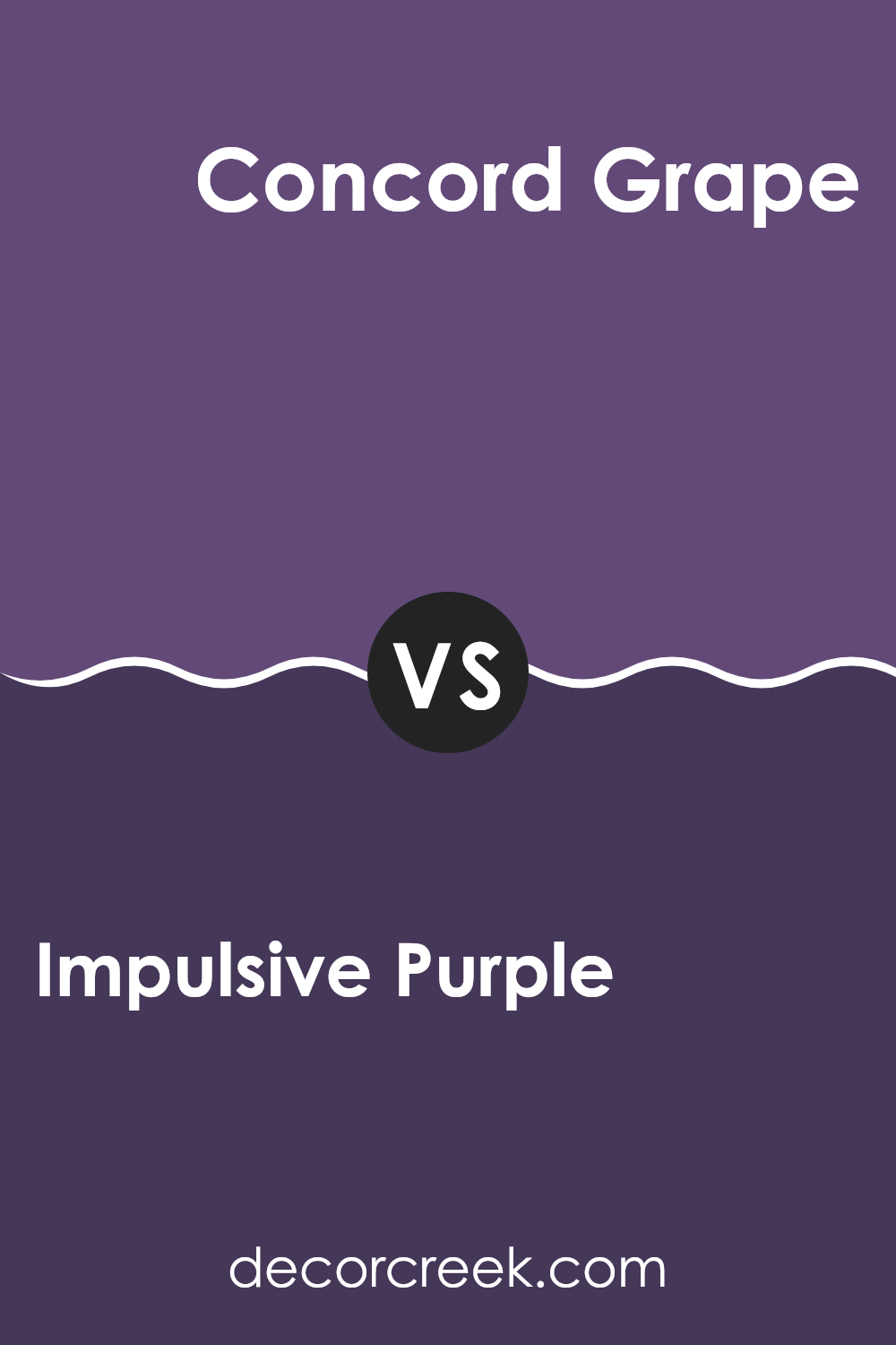
Impulsive Purple SW 6832 by Sherwin Williams vs Concord Grape SW 6559 by Sherwin Williams
Impulsive Purple and Concord Grape are both rich, striking colors from Sherwin Williams. Impulsive Purple leans towards a vibrant, energetic shade of purple. It’s bold and slightly lighter, making it a great choice for areas where you want to add a lively, playful touch. On the other hand, Concord Grape is a deeper, darker purple.
This color has more of a classic, mature feel, suitable for creating a cozy and inviting atmosphere.
It’s perfect for accent walls or rooms where a more subdued yet impactful color is desired. Both colors have their unique appeal and can dramatically affect the look and feel of a room depending on how they are used.
You can see recommended paint color below:
- SW 6559 Concord Grape
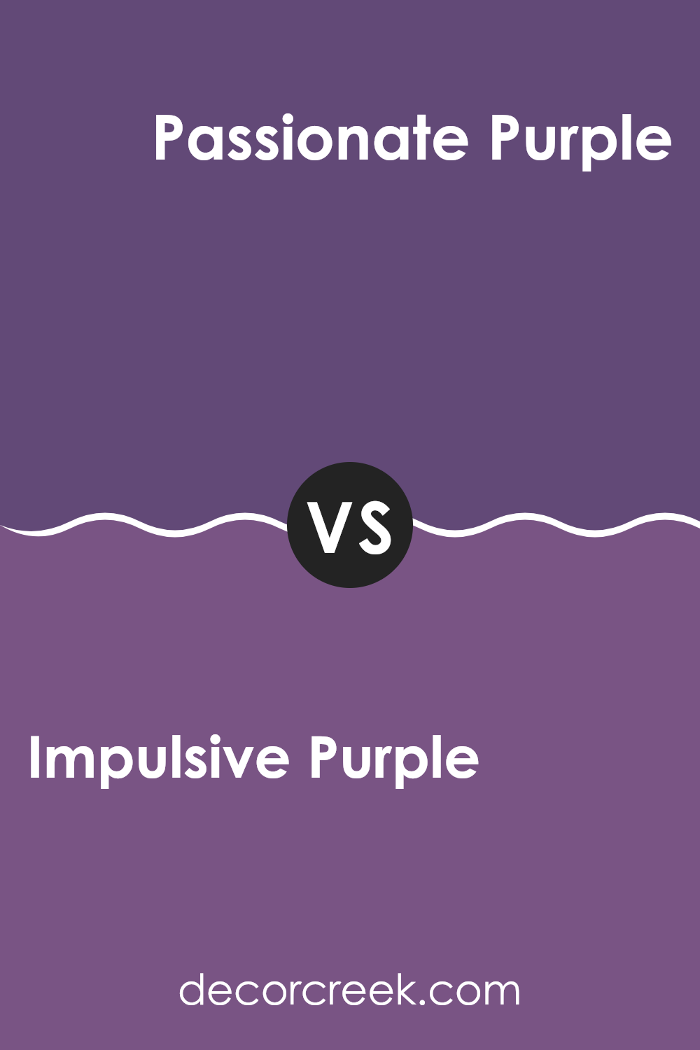
Impulsive Purple SW 6832 by Sherwin Williams vs Passionate Purple SW 6981 by Sherwin Williams
Impulsive Purple and Passionate Purple by Sherwin Williams are both vibrant shades, but they present unique tones that could serve different decorative purposes. Impulsive Purple has a more subdued, softer quality, which could make it excellent for a bedroom or reading area where you want a calm yet colorful atmosphere.
Meanwhile, Passionate Purple is bolder and brighter, making it a perfect choice for areas where you want more color and energy, like a playroom or a creative room.
Despite their similar names, Impulsive tends to lean slightly more towards a gentle lavender, whereas Passionate packs a stronger, more vivid punch reminiscent of a rich violet. Each color provides its distinctive vibe, depending on what feeling you want to bring into a room.
You can see recommended paint color below:
- SW 6981 Passionate Purple
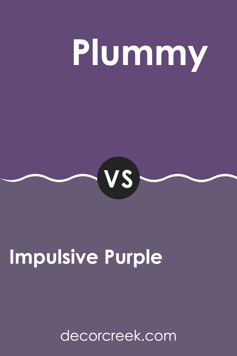
Impulsive Purple SW 6832 by Sherwin Williams vs Plummy SW 6558 by Sherwin Williams
Impulsive Purple and Plummy by Sherwin Williams are both unique shades of purple, but they set different moods and suit different parts of the home. Impulsive Purple is a bright and bold purple. It stands out and adds a sense of energy and fun to a room. It’s perfect for areas where you want to make a statement or add a splash of vibrancy.
On the other hand, Plummy is a deeper, more subdued shade. It leans towards a richer, almost berry-like tone. This color creates a cozy and warm feeling, making it ideal for intimate areas like bedrooms or reading nooks where you want a more relaxed atmosphere.
Both colors would work well in a creative room, but your choice depends on the vibe you’re aiming for: bright and lively with Impulsive Purple or subdued and cozy with Plummy.
You can see recommended paint color below:
- SW 6558 Plummy
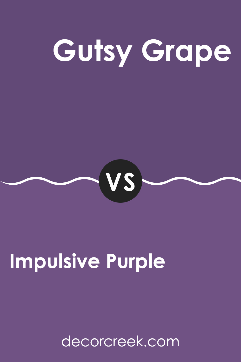
Impulsive Purple SW 6832 by Sherwin Williams vs Gutsy Grape SW 6980 by Sherwin Williams
Impulsive Purple and Gutsy Grape are both vibrant hues by Sherwin Williams, yet they offer distinctly different visual experiences. Impulsive Purple has a vividness that brings energy to a room without being too much.
This shade leans slightly more toward a true purple, so it works well in both active gathering spots and quiet corners for rest. On the other hand, Gutsy Grape is a deeper, bolder purple. This color has more intensity, which can create a strong statement in a room.
It works well in creative rooms or on an accent wall, where its rich tone can bring depth and draw attention. Overall, Impulsive Purple offers more flexibility in various lighting conditions and decorative styles, while Gutsy Grape demands attention and suits specific tastes or design needs.
You can see recommended paint color below:
- SW 6980 Gutsy Grape
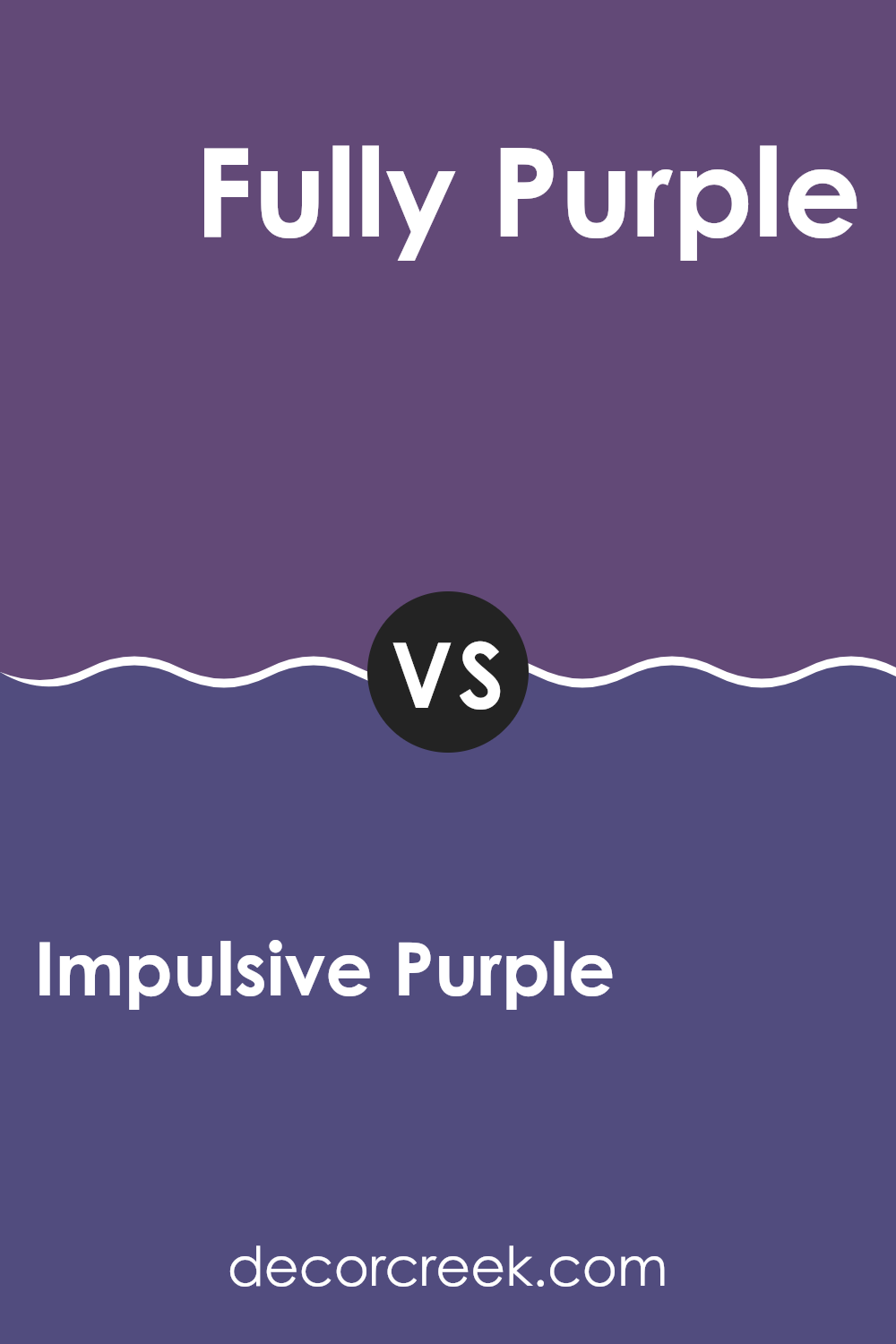
Impulsive Purple SW 6832 by Sherwin Williams vs Fully Purple SW 6983 by Sherwin Williams
Impulsive Purple and Fully Purple, both by Sherwin Williams, offer distinct shades that can bring a different feel to any room. Impulsive Purple is a vibrant, deep purple that brings a bold and energizing feel to rooms, ideal for creating a strong statement wall or for accent features. It has a richness that can make bigger rooms feel more intimate and cozy.
On the other hand, Fully Purple takes a step towards a lighter, brighter hue. This color is lively and playful, perfect for areas where you want a cheerful and inviting feel, like a child’s bedroom or a creative corner. It’s less intense than Impulsive Purple, making it easier to use in larger areas without making the room feel too heavy or overstimulating.
Both colors offer distinct personality traits but share the ability to add character and depth to interior designs. Choosing between them depends on the desired impact and the specific room characteristics.
You can see recommended paint color below:
- SW 6983 Fully Purple
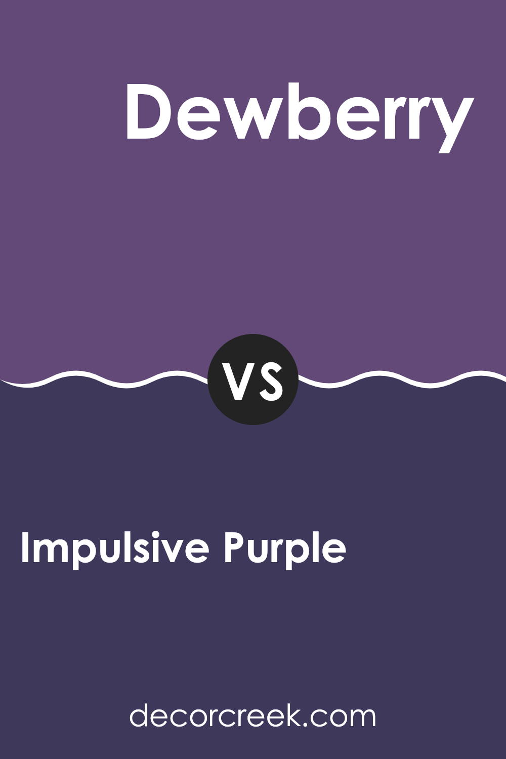
Impulsive Purple SW 6832 by Sherwin Williams vs Dewberry SW 6552 by Sherwin Williams
Impulsive Purple and Dewberry are two vibrant hues by Sherwin Williams that both bring a unique touch to any room, though they create different moods and impressions. Impulsive Purple is a bold, deep purple shade that adds a strong, energetic vibe to rooms.
It’s great for creating a focal point or adding drama to an area. On the other hand, Dewberry is a subtler, muted purple with more of a gray undertone. This color fits well in rooms where you want a relaxed mood but still a bit of color.
Dewberry is softer and blends easily into designs, making it a good choice for bigger rooms where you want color that doesn’t take over. Together, these two colors can work well if you’re looking to mix bright pops with neutral tones in your decorating scheme.
You can see recommended paint color below:
- SW 6552 Dewberry
Impulsive Purple SW 6832 by Sherwin Williams vs Vigorous Violet SW 6838 by Sherwin Williams
Impulsive Purple and Vigorous Violet are two distinct paint colors from Sherwin Williams. Impulsive Purple has a deeper, rich tone that gives it a bold presence in any room. This shade could be perfect for accent walls or to add depth to a room.
On the other hand, Vigorous Violet leans towards a brighter, more vivid hue. It’s a color that stands out and brings a playful and energetic vibe to interiors. While both colors share a purple base, Impulsive Purple tends to feel more reserved due to its darker and richer quality.
In contrast, Vigorous Violet is livelier and can make a room feel more vibrant and inviting. Choosing between the two depends on the mood you want to create—an energizing atmosphere with Vigorous Violet or a more grounded and profound feel with Impulsive Purple.
You can see recommended paint color below:
Impulsive Purple SW 6832 by Sherwin Williams vs Izmir Purple SW 6825 by Sherwin Williams
Impulsive Purple and Izmir Purple by Sherwin Williams are both vibrant shades of purple, but they each have unique tones that set them apart. Impulsive Purple is a deep, bold purple with a dramatic flair. It’s the kind of color that really stands out on a wall, making it perfect for creating a statement in a room.
In contrast, Izmir Purple is slightly lighter and carries a bluish tinge, giving it a cooler appearance. This shade is great for those who prefer their purple a bit more subdued but still want a noticeable color.
Both colors are great choices depending on what kind of feeling you want to bring into the room. If you want something that catches the eye and makes the room pop, Impulsive Purple is the way to go. For a cooler and slightly softer purple tone, Izmir Purple would be a better fit. Each color would work well in creative rooms or as an accent wall that adds a splash of personality.
You can see recommended paint color below:
- SW 6825 Izmir Purple
Impulsive Purple SW 6832 by Sherwin Williams vs African Violet SW 6982 by Sherwin Williams
Impulsive Purple and African Violet are both vibrant colors produced by Sherwin Williams, but they have distinct tones and moods. Impulsive Purple is a bold, deep purple that has a strong presence. It adds a punch of energy to any room, making it ideal for accent walls or decor items that you want to stand out.
On the other hand, African Violet leans towards a slightly softer and lighter shade of purple. This color has a floral feel to it, reminiscent of the actual African Violet plant, offering a more gentle and inviting vibe.
It’s great for creating a pleasant and welcoming atmosphere in areas like living rooms or bedrooms. Although both purples, Impulsive Purple strikes with intensity, while African Violet provides a lighter, soothing feel, making each suitable for different rooms and preferences.
You can see recommended paint color below:
- SW 6982 African Violet
Impulsive Purple SW 6832 by Sherwin Williams vs Kimono Violet SW 6839 by Sherwin Williams
Impulsive Purple and Kimono Violet, both by Sherwin Williams, offer unique takes on purple for different parts of the home. Impulsive Purple stands out because of its bold and vivid tone. It’s a richer, deeper shade often suitable for creating eye-catching accent walls or for areas that benefit from a strong splash of color.
On the other hand, Kimono Violet is slightly more subdued and leans towards a softer, more subdued lavender-like hue. This color is excellent for bedrooms or other areas where a calming, yet still colorful atmosphere is desired. Kimono Violet is less intense than Impulsive Purple, making it easier to pair with a wide range of decor styles and colors.
Both colors can bring life to a room, and each suits different moods—your choice depends on the atmosphere you want to create. Impulsive Purple works well in energetic, dynamic rooms, while Kimono Violet is better suited for softer, more relaxing settings.
You can see recommended paint color below:
As I wrap up my thoughts on SW 6832 Impulsive Purple by Sherwin Williams, I’m impressed by how much this paint can change a room. This shade of purple isn’t just any purple; it’s lively and can make any room feel happy and full of energy. It’s perfect if you want to add a splash of color to your bedroom or even make your living room stand out.
Using this paint can also make old furniture or a boring room look new and exciting again. It’s really cool how a single can of paint can do so much! Plus, I learned that because it’s a deeper purple, it can hide scuffs and marks, which can be really handy.
Impulsive Purple is not just great because it looks good, it’s also easy to use and goes well with a lot of other colors. Whether you match it with light colors like soft yellows or creams, or bold ones like bright greens, it works well and helps create a happy vibe.
Lastly, thinking about all the different rooms and ways I can use this paint makes me excited to start painting. If you’re looking to brighten up your room or just want a change, Impulsive Purple might just be the right choice for you. It’s fun to think about all the possibilities!
Ever wished paint sampling was as easy as sticking a sticker? Guess what? Now it is! Discover Samplize's unique Peel & Stick samples.
Get paint samples

