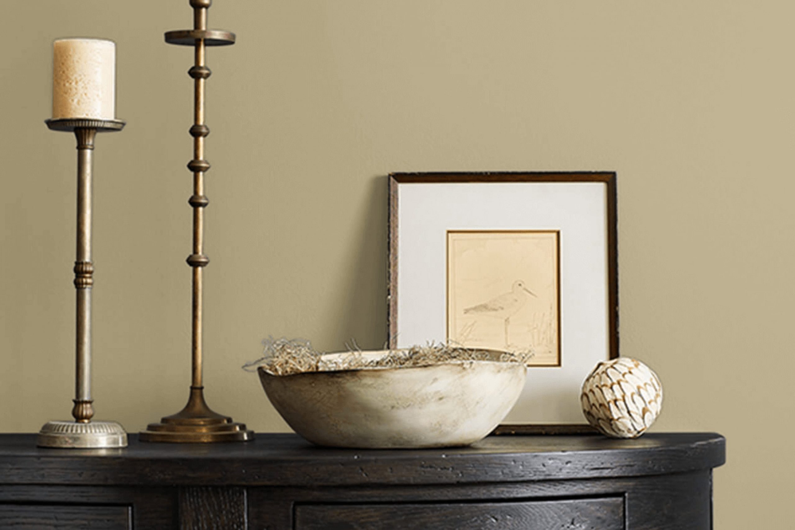
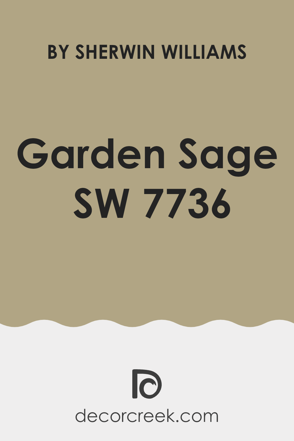
As you consider refreshing your interior, you might want to consider SW 7736 Garden Sage by Sherwin Williams. This soothing green hue has the unique ability to refresh any room, making it feel both renewed and relaxing. Whether you’re looking to update your living room, bedroom, or even your kitchen, Garden Sage offers a flexible palette that pairs well with both light and dark accents.
Choosing the right paint color can sometimes feel confusing given the plethora of options available, but Garden Sage brings a muted elegance that is easy to work with. This color works beautifully in various lighting conditions, maintaining its charm whether basked in natural sunlight or illuminated by indoor lighting.
If you’re striving for an interior that feels calm and grounded, this shade might be the perfect fit for your decorating goals. It’s a color that helps create a calm environment, perfect for unwinding after a long day.
If you’re interested in seeing how Garden Sage can refresh your interior, it’s worth giving it a try on a small area to witness how it interacts with your existing décor and lighting. This approach can help you commit to a complete repaint with more confidence, knowing it complements your home’s aesthetic and ambiance.
What Color Is Garden Sage SW 7736 by Sherwin Williams?
Garden Sage by Sherwin Williams is a warm, muted green hue that brings a sense of calm and earthiness to any interior. It has a somewhat gray undertone, which makes it flexible and easy to incorporate into various interior design styles. This color works exceptionally well in rustic and traditional decor, providing a backdrop that complements natural wood elements and rich textures. Garden Sage is also ideal for a farmhouse style, where its soft, herbal qualities can enhance the cozy, welcoming atmosphere of the home.
When it comes to pairing materials and textures with this subtle green, think of natural, raw materials. Linen, burlap, and rough-spun wool textiles look fantastic against Garden Sage, as do furniture pieces in unfinished wood or with a weathered finish. For a bit of contrast, incorporating elements like copper or brass can add a warm glow that nicely offsets the coolness of the green.
In rooms where relaxation is key, such as bedrooms or reading nooks, Garden Sage works beautifully to create a calm, grounded environment. Its understated elegance also makes it suitable for living rooms and kitchens, where it can help to create a friendly and inviting interior.
Is Garden Sage SW 7736 by Sherwin Williams Warm or Cool color?
Garden Sage by Sherwin Williams is a soothing and natural green hue that offers a fresh and vibrant look to any room in a home. This color is soft enough to act as a neutral tone, making it easy to pair with various decor styles and colors.
Its natural vibe brings a sense of the outdoors inside, creating a cozy and welcoming atmosphere. Garden Sage works wonderfully in living rooms and bedrooms where a calming influence is desirable. It also looks great in kitchens with natural wood elements or white cabinets for a clean and fresh aesthetic.
The flexibility of this color allows it to adapt to both modern and rustic interiors effortlessly. Additionally, its gentle nature doesn’t confuse interiors but instead complements existing furnishings and artwork, making Garden Sage a practical choice for those looking to refresh their home without undertaking a major redesign.
Undertones of Garden Sage SW 7736 by Sherwin Williams
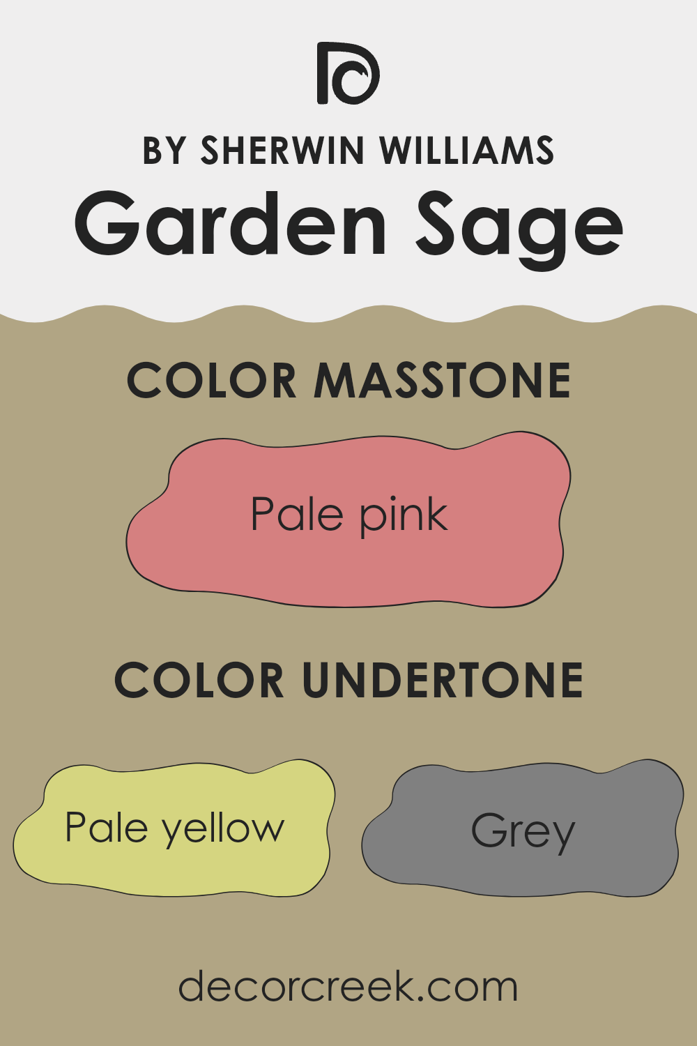
Garden Sage by Sherwin Williams is a flexible and soft green paint color that brings a calm, refreshing feel to any room. The unique aspect of this color lies in its varied undertones, which can significantly influence how it appears in different lighting conditions and settings. These undertones include pale yellow, grey, mint, and several other hues like light purple, light gray, and lilac.
The presence of undertones like pale yellow and mint give Garden Sage a slightly warmer and inviting feel, making it especially suitable for living interiors or bedrooms where a cozy atmosphere is desired. Grey and light gray undertones add a neutral balance, ensuring that the color doesn’t lean too warm or cold. This makes it highly adaptable and easy to match with various decor styles and color palettes.
When used on interior walls, Garden Sage has the ability to react dynamically with the light in the room. For instance, in a room with ample natural light, the yellow and mint undertones might become more pronounced, creating a lively and fresh environment. In artificial light, the grey and lilac undertones could become more visible, giving the room a more subdued and calm feel.
Overall, the complexity of Garden Sage’s undertones allows it to offer flexibility and suitability for a variety of interior designs, ensuring it can complement various furnishings and finishes without confusing the interior. This makes it a practical choice for those looking to refresh their walls with a color that adapts well to different settings and decorations.
What is the Masstone of the Garden Sage SW 7736 by Sherwin Williams?
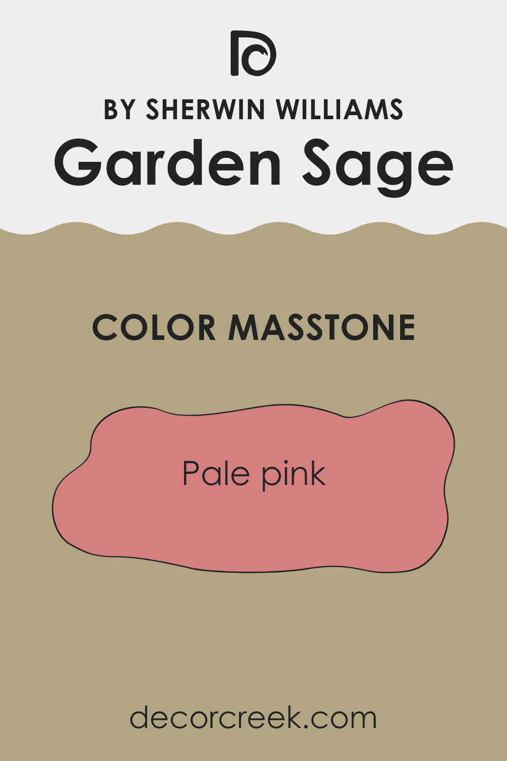
Garden Sage SW 7736 by Sherwin Williams has a masstone of Pale Pink (#D58080), which is a soft and subtle shade. This color brings a gentle warmth to any room, making it feel cozy and welcoming. Pale pink works well in interiors where you want to add a touch of softness without confusing the area with bright colors. It’s especially good in bedrooms and living rooms where a calm atmosphere is desired.
When used on walls, this color pairs beautifully with creams, whites, and soft grays, creating a harmonious and balanced look. It’s also flexible enough to work in various home styles, from modern to traditional. In smaller rooms, like bathrooms, using this pale pink can make the interior appear larger and more open because of its light-reflecting qualities.
Overall, this shade is a great choice if you want to give your home a fresh and airy feel without going too bold. It’s easy to live with and can be complemented by a range of different colors and textures.
How Does Lighting Affect Garden Sage SW 7736 by Sherwin Williams?
Lighting has a strong effect on how colors appear in an interior. The type of light—whether natural or artificial—can change the perception of colors, making them look different at various times of the day or under different lighting conditions.
Taking the color Garden Sage as an example, it’s a gentle, soothing green shade that can vary in appearance based on the lighting. In artificial light, such as LED or fluorescent bulbs, Garden Sage tends toward a slightly more muted green.
This is because artificial lights can either enhance or soften the natural undertones in the paint, depending on the type of bulb. Warm lights might make it appear softer and more welcoming, while cool lights can bring out more of the greenish tones.
In natural light, Garden Sage behaves differently as the sunlight transitions from dawn to dusk. Natural light usually shows the truest color, so during the day, when sunlight is at its brightest, Garden Sage might appear more vibrant and lively.
The orientation of the room also affects how Garden Sage looks:
- North-facing rooms – These rooms get less direct sunlight, which can make colors appear slightly cooler and more subdued. Garden Sage might look more shadowy and reserved in a north-facing room.
- South-facing rooms – These rooms are flooded with warm, bright light for most of the day. Here, Garden Sage will look lighter and more distinctly green, possibly bringing out subtle, warm undertones.
- East-facing rooms – Morning light is warm and bright in these rooms. Garden Sage would look very lively and fresh in the morning but might turn to a softer, more muted shade as the day progresses.
- West-facing rooms – Evening light in these rooms means the color can look different as the day ends. Garden Sage may appear more intensely green and vibrant in the golden afternoon light but becomes cooler in tone as the sun sets.
Overall, the appearance of Garden Sage, like any color, can shift noticeably based on the interplay of light and room orientation, showing the dynamic nature of using color in interior design.
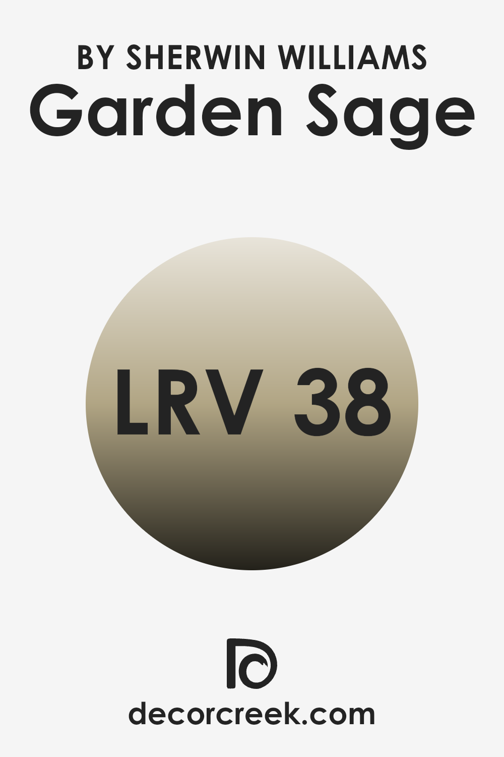
What is the LRV of Garden Sage SW 7736 by Sherwin Williams?
LRV, or Light Reflectance Value, is a measurement that indicates how much light a paint color can reflect. It is expressed as a percentage, telling us how light or dark a color will appear once applied to a wall. The value ranges from zero, which absorbs all light (think of the darkest black), to the highest possible number near one hundred, which reflects all light (similar to pure white).
LRV is particularly useful when you want to determine how a color will affect the ambiance of a room. A higher LRV can make a room feel more open and airy as more light bounces around, while a lower LRV can make an interior feel cozier and more enclosed because it absorbs more light.
With an LRV of 37.917, Garden Sage falls into the medium range of light reflectance. It means that this color does not reflect a large amount of light, but neither does it absorb it all. In practical terms, this can affect the visual spaciousness of a room. When used on walls, Garden Sage could make the room feel moderately lively and contained without making it feel too cramped. This level of LRV is flexible as it provides a substantial depth of color that brings warmth and character to an interior, while still helping maintain some level of brightness, especially when complemented with lighter colors or good lighting.
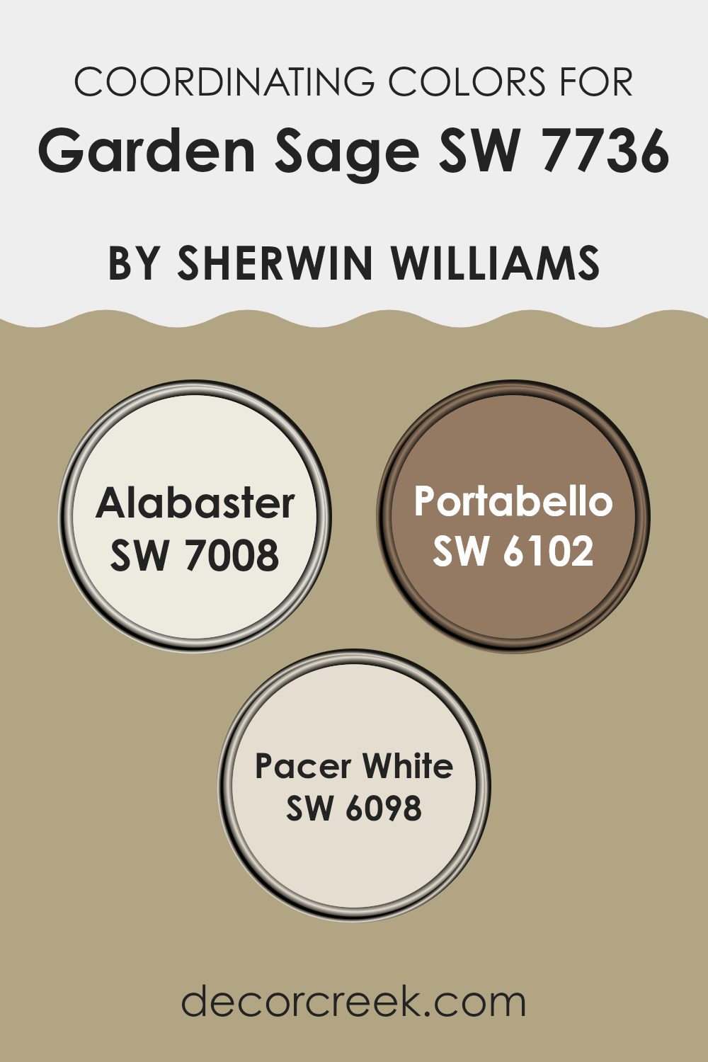
Coordinating Colors of Garden Sage SW 7736 by Sherwin Williams
Coordinating colors are hues that complement each other well and bring harmony to an interior when used together. For instance, the paint color Garden Sage can be beautifully complemented by coordinating colors that provide balance and enhance the overall aesthetic of a room. These colors work together to create a cohesive look, each adding its own unique but harmonious element to the design.
One of these coordinating colors is Alabaster, a warm and welcoming off-white shade. This color is soft enough not to overpower Garden Sage but has enough presence to stand on its own, making it perfect for trim or accent areas. Portabello is another coordinating color, offering a rich, deep tan that works well to ground lighter tones like Garden Sage and Alabaster.
It adds a touch of earthiness and elegance without confusing the lighter shades. Lastly, Pacer White provides a slightly different take on an off-white, with subtle hints of gray that help connect the other colors, providing a smooth transition across different elements of a room’s decor. By combining these colors, one can create a visually appealing and coherent interior that feels connected and thoughtfully designed.
You can see recommended paint colors below:
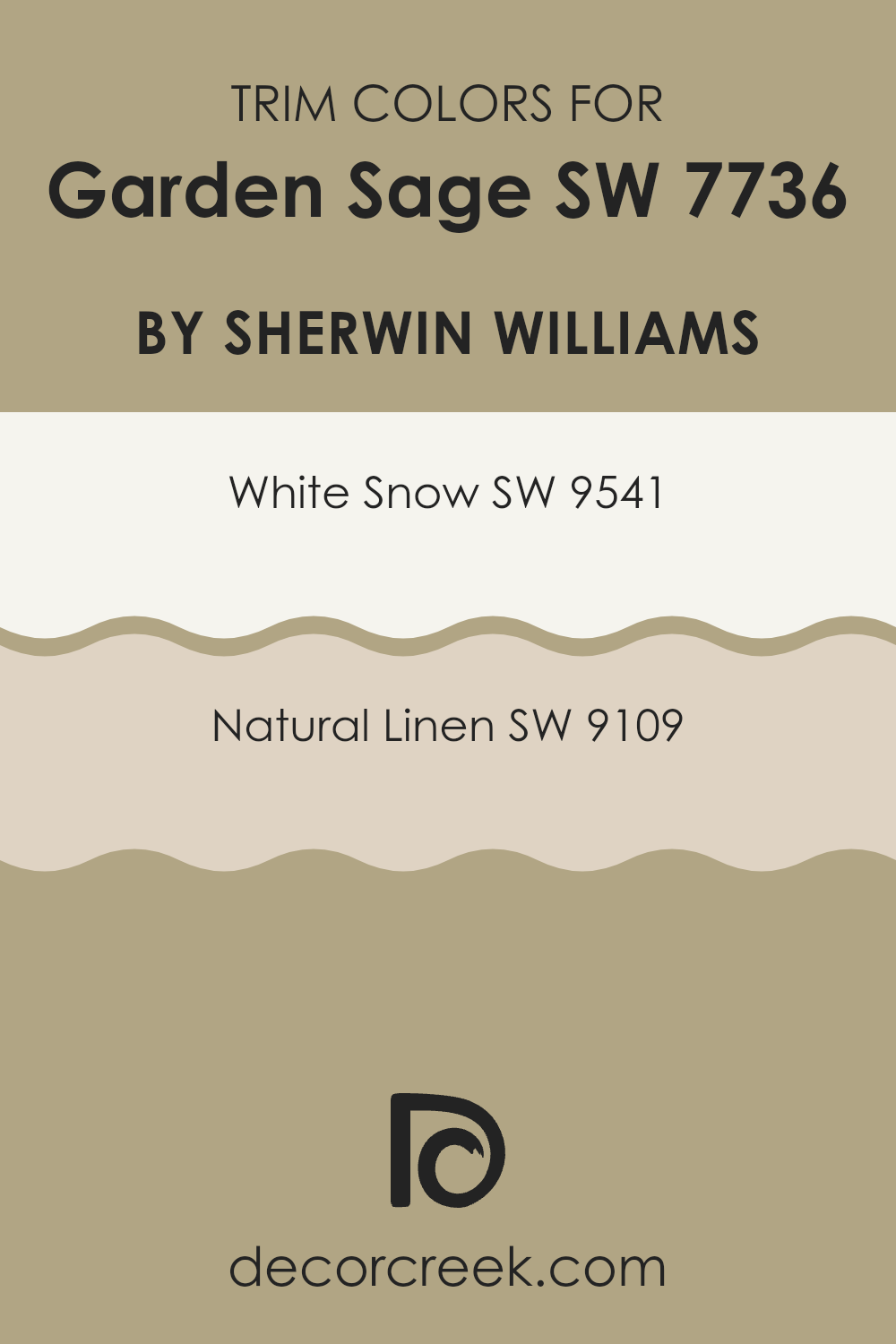
What are the Trim colors of Garden Sage SW 7736 by Sherwin Williams?
Trim colors are selected to complement or contrast the main color used on walls, enhancing the overall aesthetic appeal of a room. For Garden Sage, a muted green hue by Sherwin Williams, choosing the right trim colors can highlight its earthy qualities and add a clean, polished look to the interior.
White Snow (SW 9541) and Natural Linen (SW 9109) are excellent choices for trim colors as they offer a subtle contrast that can make the green stand out without confusing it, ensuring that the room maintains a balanced and inviting atmosphere.
White Snow is a crisp and clear white that brings a fresh and airy feel to any interior. It effectively highlights the depth of Garden Sage by creating a sharp delineation between the trim and wall, making the color pop and giving the room a more structured appearance. On the other hand, Natural Linen offers a softer, beige tone that echoes the earthiness of Garden Sage, lending a warm and cohesive look to the décor. This color works well in rooms aiming for a more blended and harmonious aesthetic, allowing for a gentle transition from the walls to the trim.
You can see recommended paint colors below:
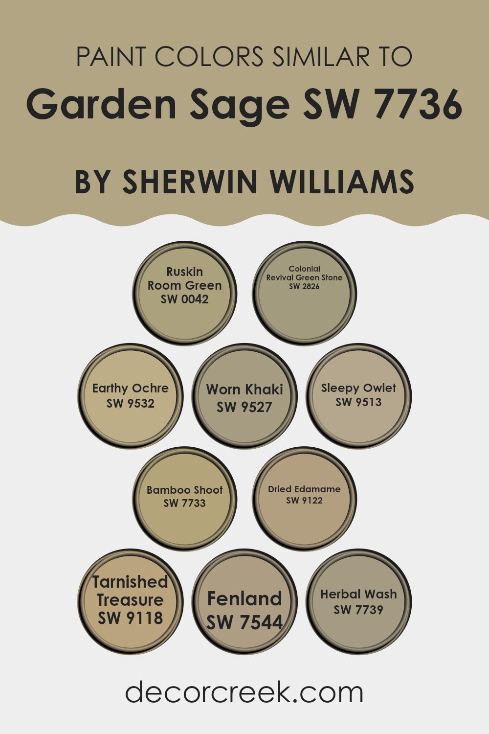
Colors Similar to Garden Sage SW 7736 by Sherwin Williams
Similar colors play a crucial role in design because they create a harmonious and cohesive look, smoothly blending with one another to offer a calming visual experience. When colors are similar, they can help to enhance the aesthetic appeal of an interior by making it appear more unified.
For instance, colors like Ruskin Room Green and Colonial Revival Green Stone have subtle variations but share enough common hues to support each other, leading to a well-balanced appearance. These shades of green are soft and calming, easily complemented by neighboring colors.
Earthy Ochre, Worn Khaki, and Sleepy Owlet are reminiscent of natural elements, giving a room a grounded feel. Their muted tones work well together, providing a low contrast, visually appealing palette. Bamboo Shoot and Dried Edamame bring hints of lively freshness without confusing, making them perfect for adding a touch of nature to an interior.
Tarnished Treasure and Fenland can be used to add depth and interest, as their darker tones contrast subtly with lighter greens. Lastly, Herbal Wash provides a slightly vibrant touch, while still fitting beautifully within the range of calming greens, completing a palette that is easy on the eyes and pleasant for creating inviting interiors.
You can see recommended paint colors below:
- SW 0042 Ruskin Room Green
- SW 2826 Colonial Revival Green Stone
- SW 9532 Earthy Ochre
- SW 9527 Worn Khaki
- SW 9513 Sleepy Owlet
- SW 7733 Bamboo Shoot
- SW 9122 Dried Edamame
- SW 9118 Tarnished Treasure
- SW 7544 Fenland
- SW 7739 Herbal Wash
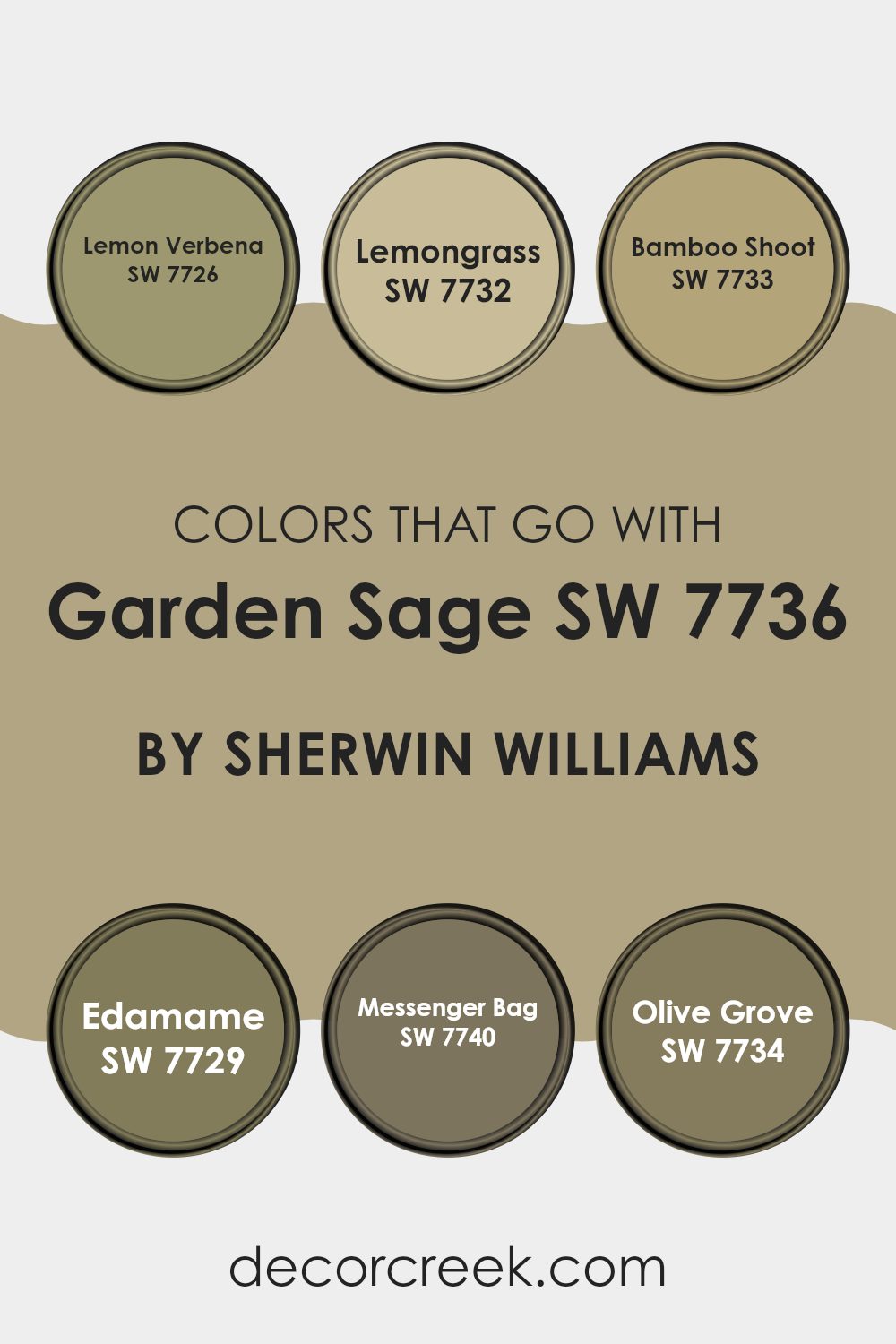
Colors that Go With Garden Sage SW 7736 by Sherwin Williams
Garden Sage SW 7736 by Sherwin Williams is a flexible and understated green hue that serves as a perfect backdrop for various interior styles, from rustic to modern. Choosing the right colors to accompany Garden Sage can significantly enhance the ambiance and aesthetic coherence of any interior. Colors like Lemon Verbena, Lemongrass, Bamboo Shoot, Edamame, Messenger Bag, and Olive Grove are specifically harmonious with Garden Sage, each contributing its unique character while maintaining a smooth flow throughout the environment.
Lemon Verbena SW 7726 is a light, refreshing yellow-green that adds a cheerful brightness to rooms, balancing the deeper tones of Garden Sage with a splash of vibrancy. Lemongrass SW 7732, slightly deeper than Lemon Verbena, offers a hint of earthiness that complements natural wood elements and organic textures perfectly.
Bamboo Shoot SW 7733 brings a subtle, yellow undertone that warms up interiors, working well in areas that receive less natural light. Edamame SW 7729, a muted green, blends cleanly with Garden Sage, providing a continuity of green shades that are calming to the eye.
Messenger Bag SW 7740 introduces a touch of elegance with its darker, olive-brown tone, great for creating depth and contrast. Finally, Olive Grove SW 7734 is a rich, deep green that resonates well with the lushness of Garden Sage, ideal for accent walls or furniture pieces, reinforcing a connection to nature.
You can see recommended paint colors below:
- SW 7726 Lemon Verbena
- SW 7732 Lemongrass
- SW 7733 Bamboo Shoot
- SW 7729 Edamame
- SW 7740 Messenger Bag
- SW 7734 Olive Grove
How to Use Garden Sage SW 7736 by Sherwin Williams In Your Home?
Garden Sage by Sherwin Williams is a flexible and calming paint color that fits well in various spots around the home. Known for its earthy green hue, it brings a natural feel to any room, offering a calm and cozy atmosphere that’s perfect for interiors where you relax or gather with loved ones.
It works exceptionally in living rooms, creating a refreshing backdrop for furniture and decor. In the kitchen, Garden Sage pairs beautifully with both wood and white cabinets, enhancing the warmth of the interior.
This color is also a great choice for bedrooms, where its gentle tones help to create a restful environment. For those looking to add a touch of nature to their bathroom, Garden Sage can be combined with light tiles or fixtures for a clean and inviting look. Whether you’re giving a fresh coat of paint to a single room or redoing your entire home, Garden Sage offers a calm and welcoming vibe.
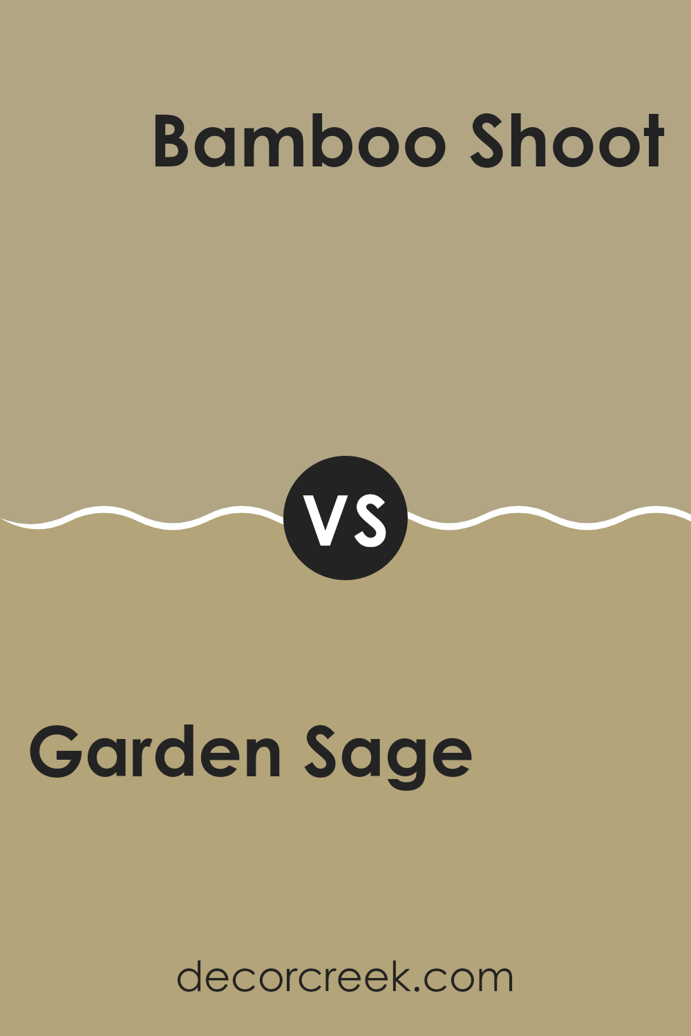
Garden Sage SW 7736 by Sherwin Williams vs Bamboo Shoot SW 7733 by Sherwin Williams
Garden Sage and Bamboo Shoot, both by Sherwin Williams, offer unique takes on natural, earthy tones. Garden Sage presents as a muted green with a hint of gray, making it a cozy and calming choice for any interior. It’s a flexible color that fits well in bedrooms, living rooms, or offices, adding a subtle touch of nature.
On the other hand, Bamboo Shoot has a lighter, more yellow-green hue that brings brightness and a fresh feel to rooms. It’s particularly good for interiors where you want to add energy without confusing with color. Think of using it in kitchens or bathrooms for a clean, refreshing look.
Both colors reflect elements of nature but in different ways. Garden Sage leans towards a shadowy, forest-like feel, while Bamboo Shoot suggests the liveliness of new leaves and grass. Depending on the atmosphere you want to create, either color offers a beautiful backdrop that complements natural materials like wood or stone.
You can see recommended paint color below:
- SW 7733 Bamboo Shoot
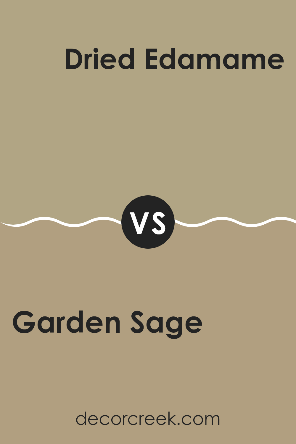
Garden Sage SW 7736 by Sherwin Williams vs Dried Edamame SW 9122 by Sherwin Williams
Garden Sage and Dried Edamame, both by Sherwin Williams, are unique colors with subtle differences. Garden Sage is a calming, muted green with a grayish undertone that gives a calm, refreshing feel to any interior.
It’s light enough to make a room feel more open but still adds a distinct color. On the other hand, Dried Edamame is a darker, earthier tone. It resembles the natural color of dried soybeans, leaning towards an olive green which can make a room feel cozy and grounded.
While Garden Sage is great for bringing a gentle pop of color to small interiors, Dried Edamame works well in larger interiors or as an accent wall, providing depth and warmth. Both colors are flexible and can harmonize with natural materials like wood or stone. Choosing between them depends on the desired mood and the room’s purpose.
You can see recommended paint color below:
- SW 9122 Dried Edamame
Garden Sage SW 7736 by Sherwin Williams vs Tarnished Treasure SW 9118 by Sherwin Williams
Garden Sage and Tarnished Treasure are two distinct paint colors by Sherwin Williams. Garden Sage is a muted green with soft gray undertones, giving it a natural, earthy vibe that is calming and subtle.
Its lightness makes it easy to use in any room without confusing the interior, perfect for creating a gentle background. On the other hand, Tarnished Treasure is a deeper, bronzed gold color that feels warm and inviting.
This color has a rich depth to it that can add a cozy and inviting element to interiors, making it ideal for areas where a touch of elegance is desired without becoming too bold. When comparing these two, Garden Sage lends a fresher, more subdued look, while Tarnished Treasure offers a warm richness, both providing unique atmospheres depending on the mood and style you want to achieve.
You can see recommended paint color below:
- SW 9118 Tarnished Treasure
Garden Sage SW 7736 by Sherwin Williams vs Fenland SW 7544 by Sherwin Williams
Garden Sage and Fenland, both Sherwin Williams paints, offer subtle yet distinct tones perfect for creating a cozy atmosphere. Garden Sage is a gentle green with a hint of gray, making it a refreshing choice that still manages to keep things soft and understated. It works well in interiors where you want a touch of nature without confusing the senses.
On the other hand, Fenland is a deeper beige with green undertones. This color is slightly richer and warmer compared to Garden Sage. Fenland is ideal when you want to add a bit more depth to your room but still maintain a calm and welcoming environment.
Both colors are flexible and pair well with natural materials like wood and stone. Whether you choose Garden Sage for its light and airy feel or Fenland for its cozy warmth, both bring their unique vibe to an interior, making it feel grounded and connected to the outdoors.
You can see recommended paint color below:
- SW 7544 Fenland
Garden Sage SW 7736 by Sherwin Williams vs Herbal Wash SW 7739 by Sherwin Williams
Garden Sage and Herbal Wash are two green shades by Sherwin Williams that bring their distinct vibes to an interior. Garden Sage is a muted, soft green with a touch of gray, making it a flexible backdrop for any room. It’s very calming and blends well with natural materials like wood and stone.
On the other hand, Herbal Wash is slightly brighter and has a bit more vitality to its green. This color leans towards a fresher, herbal green which can add a lively touch to interiors needing a dash of energy without confusing the senses.
Both these colors are great for someone looking to bring the outdoors inside. Garden Sage works well in areas where you want a more subtle, calming feel, whereas Herbal Wash is perfect when you need a splash of freshness. They pair well with neutral colors, but their effect is distinctly different – calming for Garden Sage and refreshing for Herbal Wash.
You can see recommended paint color below:
- SW 7739 Herbal Wash
Garden Sage SW 7736 by Sherwin Williams vs Ruskin Room Green SW 0042 by Sherwin Williams
Garden Sage and Ruskin Room Green, both from Sherwin Williams, present two very different shades of green. Garden Sage is a lighter, more muted green that carries a gentle and soft appearance, making it ideal for creating a calm and relaxed atmosphere in interiors like living rooms or bedrooms. It’s a flexible color that pairs well with a range of other tones, adding a subtle touch of nature to the environment.
On the other hand, Ruskin Room Green is a deeper, richer green. It has a classic charm, reminiscent of traditional design. This color is bolder and tends to make more of a statement. It can work well in dining rooms or studies where you want to add a sense of depth and richness.
When put side by side, Garden Sage offers a light and airy feel, while Ruskin Room Green provides a strong and grounded look. Each color has its unique appeal, depending on the type of vibe you’re aiming for in your decorating project.
You can see recommended paint color below:
- SW 0042 Ruskin Room Green
Garden Sage SW 7736 by Sherwin Williams vs Sleepy Owlet SW 9513 by Sherwin Williams
Garden Sage and Sleepy Owlet, both by Sherwin Williams, are two distinct hues that each bring their own unique feel to an interior. Garden Sage is a muted green that carries a natural, earthy vibe. This color works well in interiors where you want to add a touch of nature and can help in making a room feel more grounded and calm.
On the other hand, Sleepy Owlet is a lighter, softer gray with subtle hints of blue. It’s a neutral choice that can make small interiors appear bigger and brighter, providing a fresh and airy feel to any room.
While both colors are fairly subdued, Garden Sage leans towards adding warmth and depth, and Sleepy Owlet offers a clean, refreshing look. Choosing between the two would depend on the atmosphere you’re aiming to create, whether it’s the warm feel of nature or a clean, airy look.
You can see recommended paint color below:
Garden Sage SW 7736 by Sherwin Williams vs Earthy Ochre SW 9532 by Sherwin Williams
Garden Sage and Earthy Ochre are two distinct colors by Sherwin Williams that offer different vibes for room decor. Garden Sage is a soft, muted green with gray undertones, providing a subtle backdrop that’s easy on the eyes.
It works well in interiors where you want a touch of nature without confusing green tones. On the other hand, Earthy Ochre is a warm, muted yellow with hints of brown. This color brings a cozy and welcoming feel to any room, making it ideal for interiors where comfort is key, such as living rooms or bedrooms.
Both colors pair well with natural materials like wood and stone, but while Garden Sage leans towards a fresher, cooler look, Earthy Ochre gives off a warm, enveloping vibe. Each color can create a unique atmosphere: Garden Sage offers a calming effect, whereas Earthy Ochre makes a room feel homely and snug.
You can see recommended paint color below:
Garden Sage SW 7736 by Sherwin Williams vs Colonial Revival Green Stone SW 2826 by Sherwin Williams
Garden Sage by Sherwin Williams is a soft, muted green that creates a calm and welcoming feel in any interior. It’s a flexible color that pairs well with both dark and light furnishings, making it ideal for living rooms, kitchens, and bedrooms.
On the other hand, Colonial Revival Green Stone by Sherwin Williams is a deeper green with a subtle earthy tone. This color lends a more traditional look, perfect for interiors where you want to add a touch of elegance without going too bold. It works excellently in dining rooms or studies where a more formal atmosphere is desired.
Both colors bring a touch of nature indoors but in distinctly different ways: Garden Sage offers a lighter, airier feel, while Colonial Revival Green Stone goes for depth and a hint of gravity. Each can help shape the mood of a room depending on what atmosphere you want to create.
You can see recommended paint color below:
- SW 2826 Colonial Revival Green Stone
Garden Sage SW 7736 by Sherwin Williams vs Worn Khaki SW 9527 by Sherwin Williams
Garden Sage is a muted green that creates a calm and welcoming atmosphere. It pairs well with natural materials such as wood and stone, making it an excellent choice for living rooms and bedrooms. Its earthy tones offer a subtle connection to the outdoors, giving a room a fresh feel without confusing other elements in the decor.
Worn Khaki, on the other hand, is a softer, more neutral color. It is a beige with slight green undertones, which make it flexible for various interiors. This color works beautifully in areas where you want to maintain a light, airy feeling, such as kitchens and bathrooms. It’s particularly effective in interiors that don’t receive a lot of natural sunlight, as it helps brighten the room.
Both colors are quite subdued, yet each brings its own unique vibe to an interior. Garden Sage adds a hint of nature, while Worn Khaki provides a clean, subtle backdrop that complements other design features. When deciding between the two, consider the overall feel you want to achieve and the functional aspects of the room.
You can see recommended paint color below:
As I wrap up all my thoughts about SW 7736 Garden Sage by Sherwin Williams, I must say it’s a pretty cool paint color! Garden Sage is not too loud and not too soft, which makes it just right for people who like things natural and comfy. It reminds me a lot of calm gardens and peaceful, leafy trees. This color works well in lots of different places in a home. You can use it in the bedroom to create a cozy spot, in the living room to make a welcoming area for family and friends, or even in the kitchen to add a touch of the outdoors.
Also, Garden Sage goes well with many other colors. Whether you pair it with bright colors like sunny yellows or with calm colors like soft whites, it looks good. It’s also really practical because it hides little marks and smudges, which is super helpful especially in busy homes.
All in all, I think Garden Sage is a great choice if you’re looking to give your room a fresh but calm look. It’s like bringing a little bit of the outside, inside. So if you’re thinking about giving your room a new look, Garden Sage might just be the perfect pick for you!

Ever wished paint sampling was as easy as sticking a sticker? Guess what? Now it is! Discover Samplize's unique Peel & Stick samples.
Get paint samples

