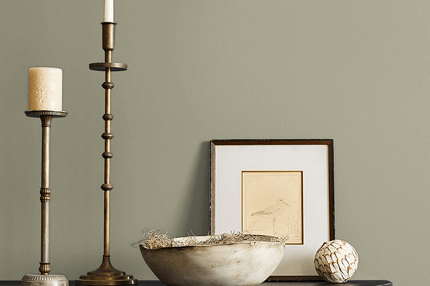
Looking for the perfect shade of green for your home? Look no further than SW 7748, or Green Earth, by Sherwin Williams. This subtle, soothing green brings a touch of nature indoors, creating a calming and refreshing atmosphere in any room. Whether you’re aiming to freshen up your living room, bedroom, or even your kitchen, Green Earth offers a versatile backdrop that complements a wide range of decor styles and color schemes.
Choosing the right paint color can sometimes feel overwhelming, but Green Earth makes it easy. Its understated elegance works beautifully with both light and dark furnishings, making it a go-to choice for anyone looking to update their space. Plus, its natural vibe promotes a sense of well-being and connection to the outdoors, perfect for those looking to create a peaceful and inviting home environment.
Not only is this shade visually appealing, but it’s also practical. Produced by Sherwin Williams, a company known for its high-quality paints, Green Earth promises excellent coverage, durability, and resistance to fading. Whether you’re a first-time painter or a seasoned pro, this paint is user-friendly and delivers professional-looking results.
In summary, SW 7748 Green Earth by Sherwin Williams is more than just a can of paint—it’s a straightforward way to transform your space into a serene sanctuary. Its natural elegance and quality make it an ideal choice for anyone looking to give their home a fresh, new look.
What Color Is Green Earth SW 7748 by Sherwin Williams?
Green Earth by Sherwin Williams is a soothing and organic color, much like the name suggests. It finds its roots in the hues of natural landscapes, offering a blend of subtle green with earthy undertones. This color communicates calmness and brings an essence of the outdoors into any space. It has a muted, almost sage-like quality, making it versatile for various interior designs without overpowering the senses.
This color works beautifully in styles that lean towards natural and understated elegance. Think Scandinavian minimalism, where simplicity and functionality are key, or modern farmhouse, where rustic meets contemporary. It’s also a perfect fit for bohemian interiors, adding a soft, earthy backdrop to eclectic textures and patterns.
When it comes to pairing with materials and textures, Green Earth is quite accommodating. It pairs effortlessly with natural wood, from light oak to rich walnut, highlighting the warmth and grain of the wood. Metals like brushed brass or copper can add a touch of luxury, while matte black brings a modern edge. In terms of textures, linen, wool, and jute complement this color well, enhancing its organic vibe. Soft, plush fabrics in neutral tones or natural leather also work nicely, creating a cozy, grounded space that feels inviting and serene.

Is Green Earth SW 7748 by Sherwin Williams Warm or Cool color?
Green Earth by Sherwin Williams is a rich, inviting color that breathes life into any home. Its earthy tones help create a feeling of warmth and comfort, making it perfect for spaces where relaxation and togetherness are key. This versatile shade can be paired with a wide range of colors, from soft neutrals to bold accents, offering endless possibilities for personalized decor. It’s particularly effective in living rooms and bedrooms, where its soothing nature promotes a sense of calm and tranquility.
When used in well-lit areas, Green Earth has a vibrant, lively quality, while in spaces with less natural light, it takes on a cozier, more intimate feel. This adaptability means it works well in various home styles, from modern to rustic. It also complements natural materials like wood and stone beautifully, enhancing their textures and bringing an outdoor element inside. Whether you’re looking to create a grounding sanctuary or update your home with a touch of nature, this color offers a solid foundation to build upon, inviting creativity and personal expression into your space.
Undertones of Green Earth SW 7748 by Sherwin Williams
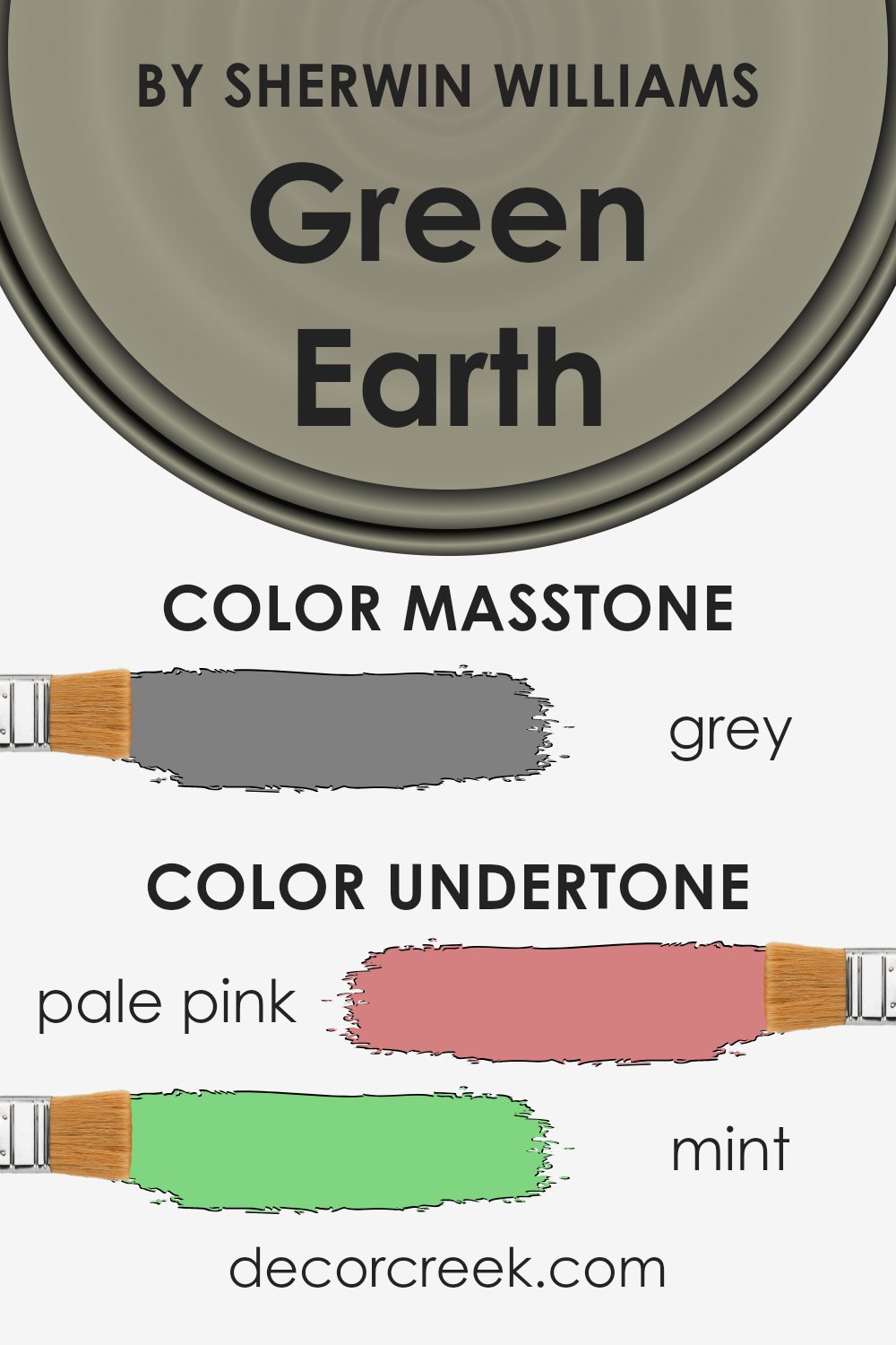
The color Green Earth has a unique charm because of its undertones. Imagine undertones as hidden colors that influence how we see the main color. They can make a color look warmer, cooler, or change how it feels in different light or settings.
Green Earth, a beautiful shade, carries a mix of undertones that add depth and complexity. These undertones include soft hues like pale pink, creating a gentle warmth; mint, which injects a fresh, lively vibe; and pale yellow, adding a sunny touch. Together, these undertones make Green Earth versatile and inviting, ideal for creating a cozy atmosphere in a room.
When Green Earth is painted on interior walls, its undertones play with the light and the room’s other colors. During the day, natural light might highlight its mint or pale yellow undertones, making the room feel bright and airy. In artificial lighting, the pink or lilac undertones may become more noticeable, adding a soothing, relaxed feel.
Other undertones like olive, light green, and dark green enrich the main green shade, grounding the color and connecting it with nature. This makes Green Earth perfect for spaces where you want to create a sense of calm and tranquility, like bedrooms or studies.
The more subtle undertones, such as light gray or dark grey, help balance the color, ensuring it doesn’t overwhelm a space but instead complements it, making the room feel more spacious and open.
Understanding the undertones in Green Earth is key to using it effectively in your home. It helps you choose decor and accents that harmonize with the paint, creating a cohesive and inviting interior.
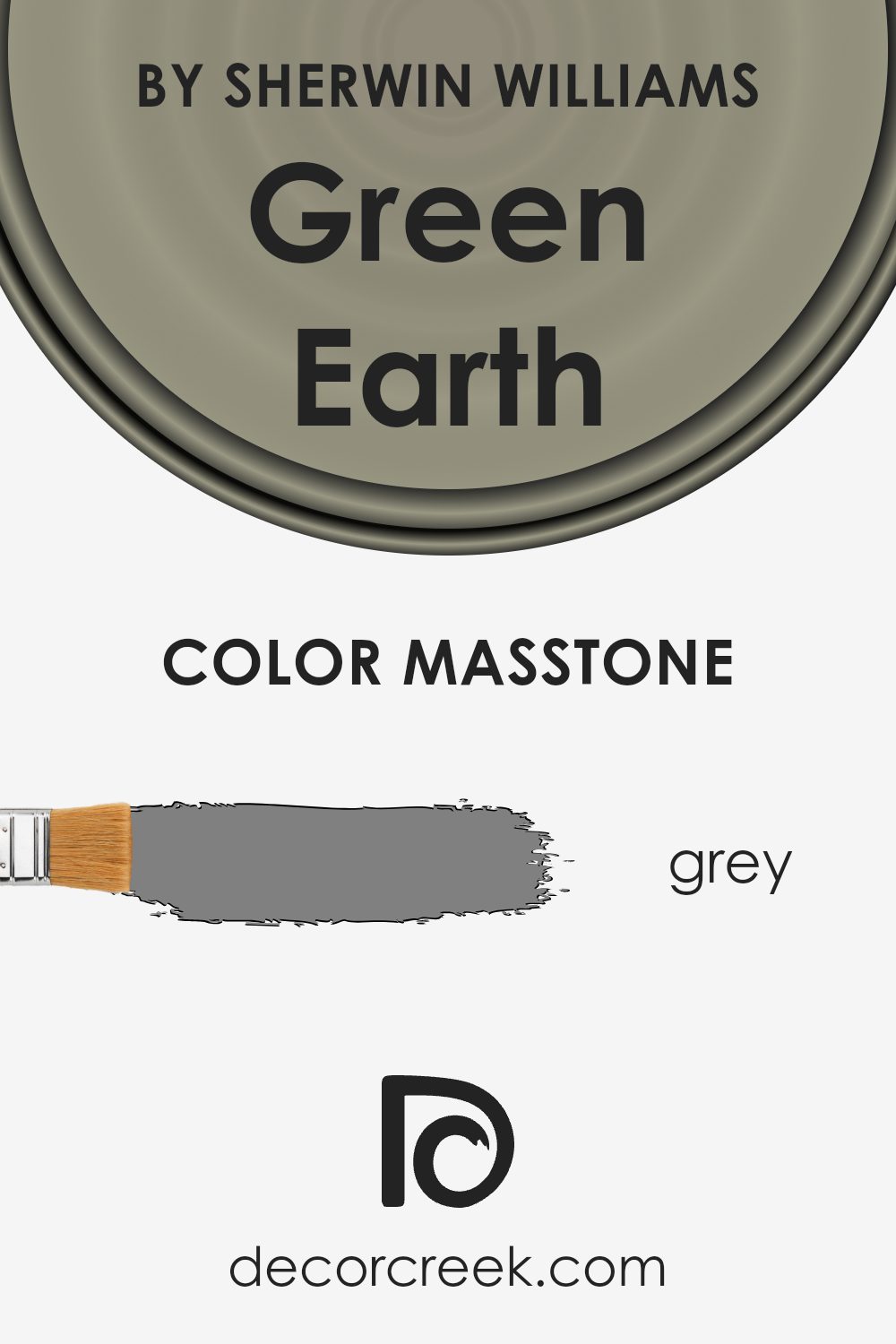
What is the Masstone of the Green Earth SW 7748 by Sherwin Williams?
Green Earth, coded as SW 7748, is a unique color crafted by Sherwin Williams. Its foundation or masstone is a solid Grey (#808080), which plays a vital role in its overall charm and usability in home decorations. This foundational grey gives the color a neutral backbone, making it incredibly versatile for any space. Since grey is a balanced shade, it does not overpower a room but rather complements various design styles and other colors.
This characteristic means the color can easily blend with different materials, textures, and furnishings. Whether your home has a modern, minimalist, rustic, or eclectic style, Green Earth can fit seamlessly into the decor. Its grey base ensures that it remains subtle yet present, providing a calming and grounding effect.
Moreover, the neutrality of Grey allows for more adventurous accents and decorations without the risk of clashing. It’s perfect for walls, cabinets, or even accents, helping to create spaces that feel both sophisticated and welcoming. Its adaptability makes it suitable for any room, from living areas and kitchens to bedrooms and bathrooms, enhancing the home’s aesthetic appeal and comfort.
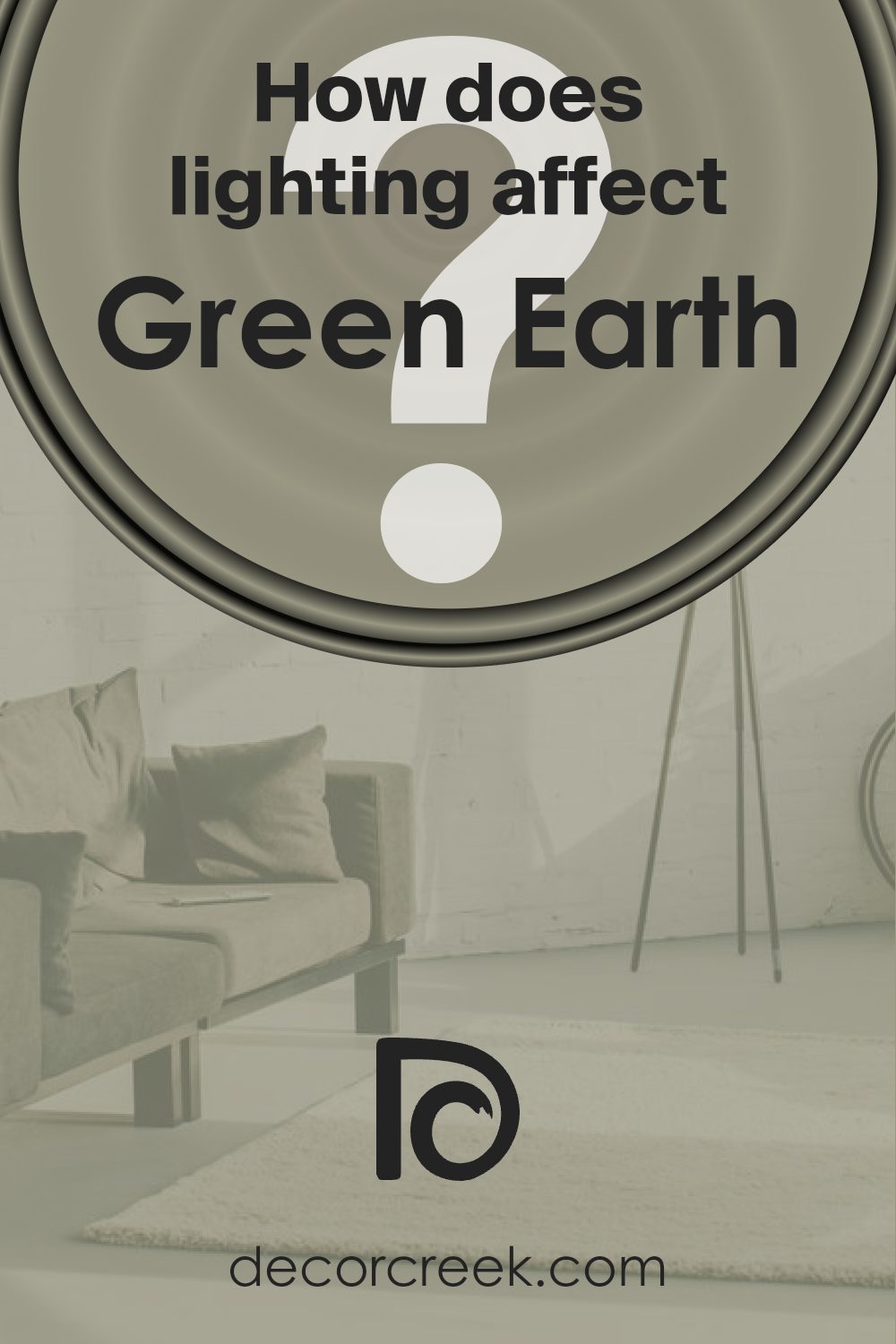
How Does Lighting Affect Green Earth SW 7748 by Sherwin Williams?
Lighting plays a crucial role in how we perceive colors, making them appear different under various light sources. This phenomenon is particularly noticeable with paint colors on our walls, such as Green Earth by Sherwin Williams. This specific shade of green can transform dramatically depending on the type of light it’s exposed to, whether it’s artificial or natural light.
- Under artificial light, such as LED or incandescent bulbs, Green Earth might appear either brighter or slightly muted. LEDs, with a cooler, bluer light, may make the color seem sharper and more vibrant. In contrast, warm incandescent bulbs could soften the green, making it cozier and more subdued, ideal for relaxed settings.
- Natural light brings its dynamics to Green Earth, altering its appearance throughout the day and depending on the room’s orientation. North-facing rooms receive less direct sunlight, often casting a cooler, more consistent light. In these rooms, Green Earth might lean towards a more subtle, soothing green, maintaining a steady appearance throughout the day.
- South-facing rooms bathe in abundant sunlight, which can make colors like Green Earth burst with vibrancy and warmth during the day. This natural brightness can make the color appear lively and radiant, providing a fresh and invigorating atmosphere.
- East-facing rooms enjoy the morning sunlight, which is warm and golden. This early light can make Green Earth look soft and welcoming in the morning, gradually shifting to a cooler tone as the day proceeds and the direct sunlight moves away.
- West-facing rooms receive the evening light, which tends to be warmer. This setting can cause Green Earth to glow warmly in the late afternoon and evening, offering a cozy, comforting presence that winds down as the sun sets.
In conclusion, Green Earth’s appearance shifts with different lighting conditions, demonstrating the dynamic nature of colors. Whether in artificial or natural light, its tone can change from vibrant and lively to soft and subdued, making it a versatile choice for any space.
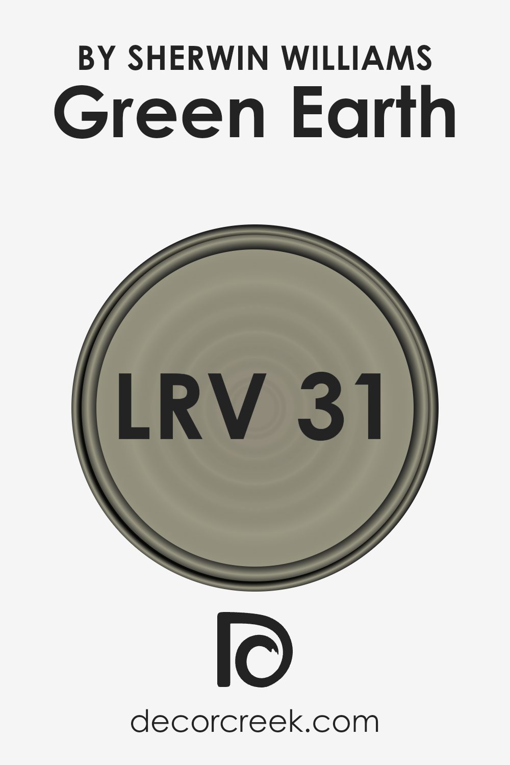
What is the LRV of Green Earth SW 7748 by Sherwin Williams?
For Green Earth with an LRV of 31.104, this means the color is on the darker side, absorbing more light than it reflects. In a practical sense, this color could make a large, brightly lit room feel more grounded and smaller spaces feel more enclosed and intimate.
Since it doesn’t reflect a lot of light, it might not be the best choice for a small, dimly lit room unless you’re aiming for a very cozy or moody ambiance. The specific LRV of Green Earth suggests that it can bring warmth and depth to a space, making it ideal for areas where you want to add character and a touch of nature-inspired hues without overwhelming the room with darkness.
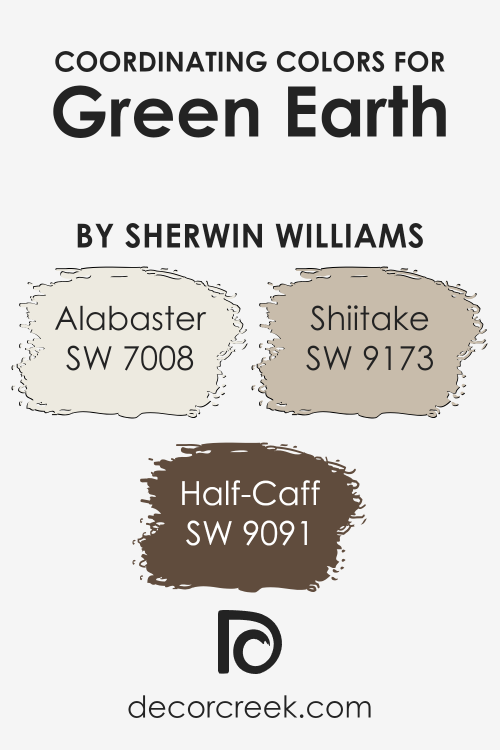
Coordinating Colors of Green Earth SW 7748 by Sherwin Williams
Coordinating colors are hues that complement each other when used together in a space, creating a balanced and pleasing visual experience. The concept plays a significant role in design, helping to establish a cohesive look that can enhance the overall aesthetic of a room. By selecting colors that coordinate well with a primary color, in this case, Green Earth by Sherwin Williams, you create a harmonious color scheme that effortlessly ties your decor together. Coordinating colors can be used for wall paints, furniture, accessories, and more, providing a guideline for creating aesthetically pleasing and cohesive spaces.
For Green Earth by Sherwin Williams, a soft, nurturing green hue, the coordinating colors include Alabaster, Half-Caff, and Shiitake, each bringing its own unique contribution to the palette. Alabaster is a warm, creamy white that offers a subtle contrast to Green Earth, brightening spaces without overwhelming them.
It works perfectly as a neutral backdrop or as serene accents throughout a room. Half-Caff adds a richer, deeper tone to the mix, a medium brown that grounds the scheme and provides warmth, ideal for creating cozy corners or accent walls. Lastly, Shiitake, a soft, earthy taupe, bridges the gap between the warmth of Half-Caff and the lightness of Alabaster, complementing Green Earth by adding depth and sophistication to the overall look. Together, these coordinating colors facilitate a versatile color scheme that can adapt to various decorative styles and preferences, making any space feel connected and intentionally designed.
You can see recommended paint colors below:
- SW 7008 Alabaster
- SW 9091 Half-Caff
- SW 9173 Shiitake
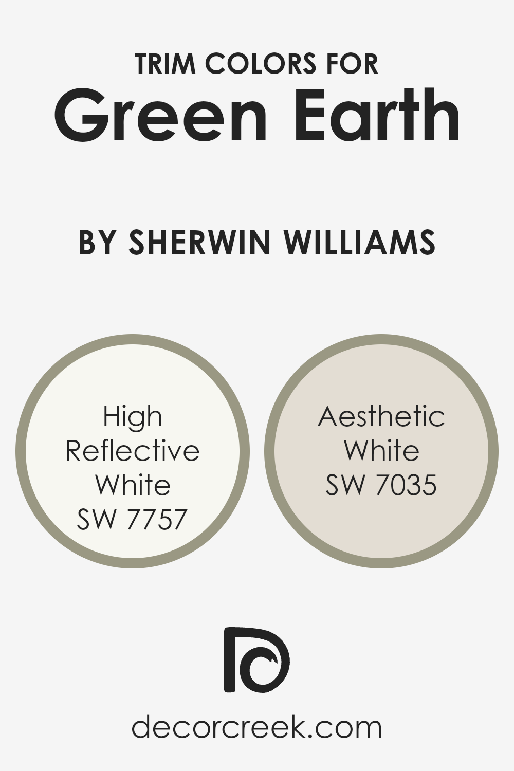
What are the Trim colors of Green Earth SW 7748 by Sherwin Williams?
Trim colors are essentially the hues selected for the edges and borders of rooms, such as door trims, window frames, skirting, and crown moldings. They play a crucial role in defining and accentuating the overall look of a space, acting as a contrast or complement to the primary wall color. When Green Earth by Sherwin Williams, a deep, rich tone inspired by nature, is used on walls, choosing the right trim color becomes essential to enhance its beauty and balance the room’s aesthetics. A well-chosen trim color can highlight the architectural features of a room, create visual interest, and make the wall color stand out even more.
High Reflective White, as its name suggests, is a very bright, pure white. It’s especially useful for making the deep tones of Green Earth stand out, bringing freshness and a sense of openness to the space. Aesthetic White, on the other hand, is a soft, warm white with a hint of beige, offering a subtle contrast that softens the boldness of Green Earth, contributing to a more relaxed and inviting atmosphere. Both colors, by adding their unique characters, enrich the environment and ensure that the richness of Green Earth is showcased in a balanced and harmonious way, making the choice of trim colors a key element in room design.
You can see recommended paint colors below:
- SW 7757 High Reflective White
- SW 7035 Aesthetic White
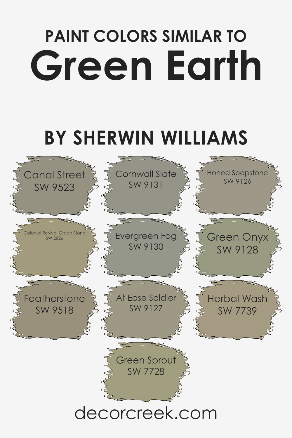
Colors Similar to Green Earth SW 7748 by Sherwin Williams
Choosing similar colors is crucial in design because they create a sense of harmony and balance, making spaces feel more cohesive and visually appealing. When we look at colors similar to Green Earth by Sherwin Williams, we see a palette that draws inspiration from the natural world, offering a range of greens that evoke a sense of calm and tranquility. These colors, while distinct, share underlying tones that make them work well together, allowing for a seamless transition from one shade to another in any space.
- Canal Street is a soft, muted green that brings a whisper of serene elegance to any room, quite like the gentle sway of trees in a light breeze.
- Colonial Revival Green Stone, on the other hand, offers a deeper, more historic vibe reminiscent of stately, ivy-covered walls, providing depth and sophistication.
- Featherstone has a light, airy quality, perfect for creating a bright and uplifting environment.
- Green Sprout injects a vivid burst of freshness, reminiscent of new leaves in spring, while Cornwall Slate introduces a dusky, more mysterious green, great for adding a touch of mystery.
- Evergreen Fog serves as a modern neutral, a mid-tone green with gray undertones, ideal for contemporary spaces.
- At Ease Soldier, a muted olive, brings a sense of calm strength and stability. Honed Soapstone is darker, exuding an earthy, grounded feel.
- Green Onyx offers a unique twist, with a slightly aquatic vibe that’s both refreshing and serene.
- Lastly, Herbal Wash captures the essence of a sunlit herb garden, vibrant and full of life.
These shades, each with their own character, provide a versatile spectrum for design, from revitalizing a living space to crafting the perfect atmosphere in a professional setting. The right combination can enhance the mood, aesthetic appeal, and overall feel of a room, making similar colors an essential element of interior design.
You can see recommended paint colors below:
- SW 9523 Canal Street
- SW 2826 Colonial Revival Green Stone
- SW 9518 Featherstone
- SW 7728 Green Sprout
- SW 9131 Cornwall Slate
- SW 9130 Evergreen Fog
- SW 9127 At Ease Soldier
- SW 9126 Honed Soapstone
- SW 9128 Green Onyx
- SW 7739 Herbal Wash
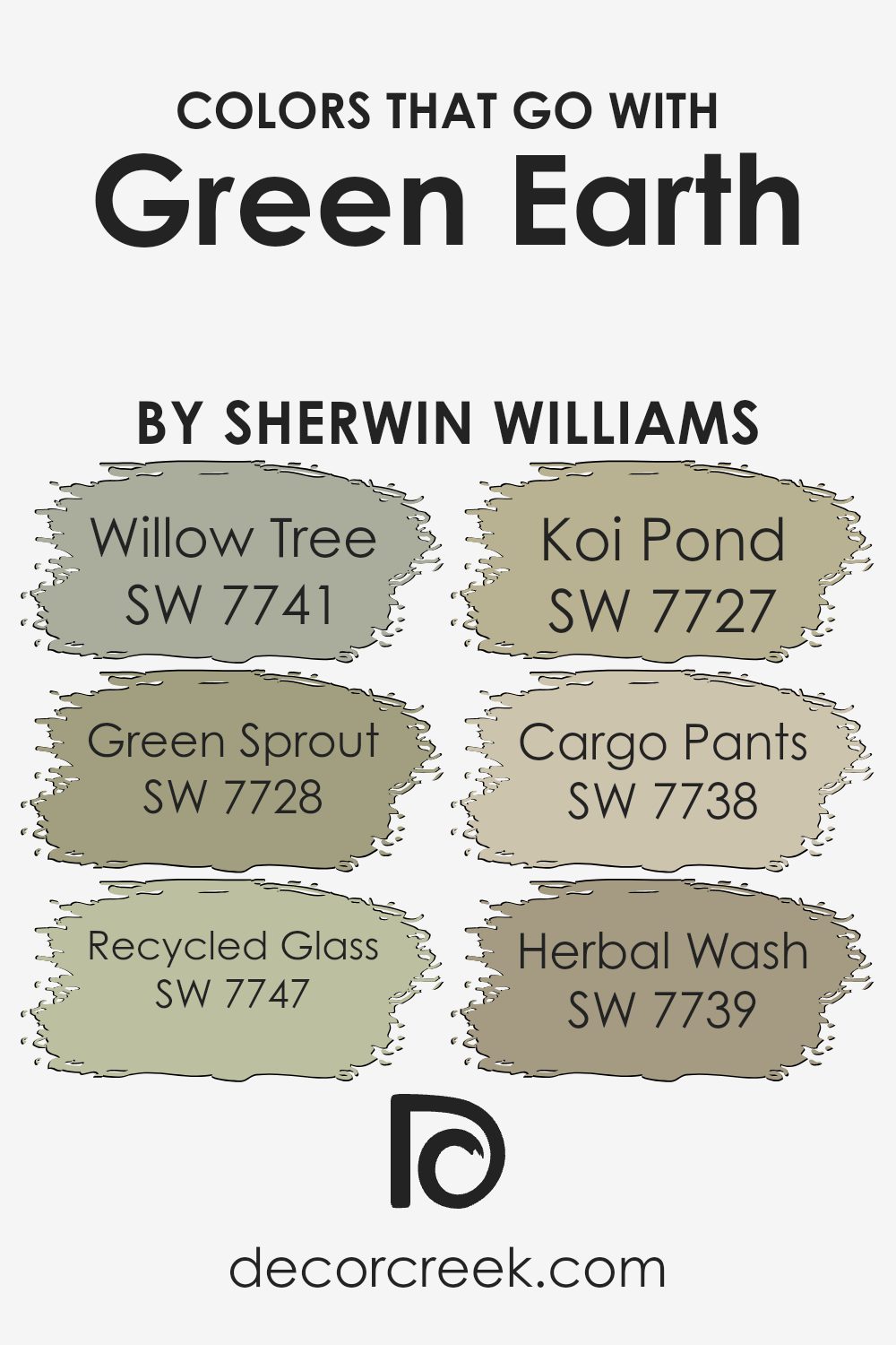
Colors that Go With Green Earth SW 7748 by Sherwin Williams
Colors that match well with Green Earth SW 7748 by Sherwin Williams play a pivotal role in design and home decor, offering a harmonious palette that enhances the aesthetic appeal of any space. These complementary colors, ranging from natural greens to soothing neutrals, work together to create a balanced and inviting atmosphere.
- Starting with the soft green of Willow Tree, this color brings a sense of calm and serenity, mimicking the peacefulness of a shaded forest clearing.
- Meanwhile, Green Sprout adds a livelier touch with its light, almost vibrant hue that injects freshness into spaces.
- Recycled Glass offers a subtle, muted tone that echoes the tranquility of sea glass, providing a perfect backdrop for more intense or vivid accents.
- Koi Pond, with its deeper, more reflective green, draws inspiration from the serene waters of a garden pond, adding depth and sophistication.
- Cargo Pants shifts away from the green spectrum into a more neutral territory, offering a sturdy, earthy tone that grounds the color scheme.
- Finally, Herbal Wash, with its hint of gray, offers a soft, washed-out green that complements the stronger tones of Green Earth.
Together, these colors contribute to a cohesive look that is both calming and visually appealing, demonstrating the importance of a well-thought-out color pairing to enhance the overall ambiance of a room.
You can see recommended paint colors below:
- SW 7741 Willow Tree
- SW 7728 Green Sprout
- SW 7747 Recycled Glass
- SW 7727 Koi Pond
- SW 7738 Cargo Pants
- SW 7739 Herbal Wash
How to Use Green Earth SW 7748 by Sherwin Williams In Your Home?
Green Earth SW 7748 by Sherwin Williams is a beautiful paint color that offers a touch of nature’s calm and balance to any home. Its earthy tones are perfect for creating a soothing atmosphere in various spaces, from the living room to the bedroom. Because of its versatile shade, it works well with many decor styles, whether you’re aiming for a modern look or a more traditional vibe.
Using this color in your home can be simple and enjoyable. For example, painting a feature wall in your living area with Green Earth can add depth and interest without overwhelming the space. It pairs nicely with light woods, natural fibers, and plant elements, enhancing a serene, natural aesthetic. In the bedroom, using this color on the walls can transform the room into a peaceful retreat, conducive to relaxation and restful sleep.
Consider combining it with neutral tones like creams or light grays for a subtle, earthy palette, or add pops of vibrant colors like mustard yellow or deep blue for a dynamic contrast. Green Earth is not just about the look; it’s about creating a feeling, a tranquil space where you can unwind and recharge.
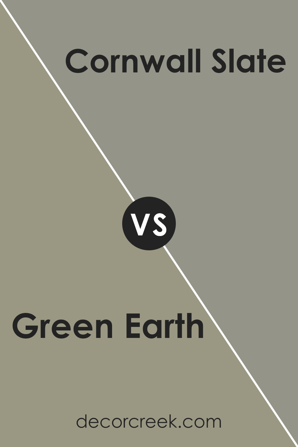
Green Earth SW 7748 by Sherwin Williams vs Cornwall Slate SW 9131 by Sherwin Williams
Green Earth (SW 7748) and Cornwall Slate (SW 9131) by Sherwin Williams are both unique colors, yet they have distinct characteristics. Green Earth is a natural, muted green that brings to mind the calmness of nature and lush landscapes. It has a softer, more organic feel which makes it perfect for creating a serene and grounding atmosphere in any space. On the other hand, Cornwall Slate is a deeper, gray-influenced color resembling the classic look of slate rock.
This color leans more towards a sophisticated and elegant palette, offering a strong and solid appearance that can make a statement in any room. While Green Earth can add a refreshing and revitalizing touch, Cornwall Slate offers a sense of stability and refined elegance. The choice between them depends on the mood and style you want to achieve: calming and nature-inspired with Green Earth or bold and stately with Cornwall Slate.
You can see recommended paint color below:
- SW 9131 Cornwall Slate
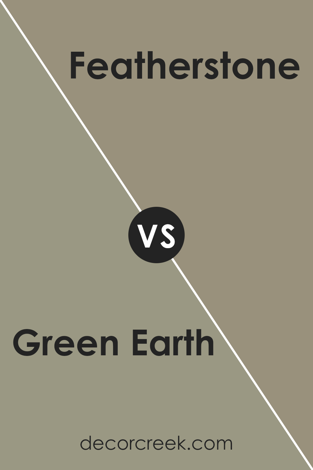
Green Earth SW 7748 by Sherwin Williams vs Featherstone SW 9518 by Sherwin Williams
Green Earth and Featherstone by Sherwin Williams offer distinct vibes for any space. Green Earth comes across as a rich, natural green that’s somewhat muted, pulling in elements of the outdoors to create a soothing, grounded atmosphere. Think of walking through a lush forest; this color embodies that serene, earthy quality. It’s perfect for places where you want a touch of nature’s calmness without going too bold.
On the other hand, Featherstone steps into the scene with a much lighter, airier feel. It’s almost like comparing the dense foliage of the forest floor (Green Earth) to a gentle sky at dawn (Featherstone). This color brings with it a sense of freshness, making rooms appear more open and spacious. Its subtle, light tone works beautifully in areas where you aim to enhance natural light or add an understated elegance.
Both colors offer unique appeals—Green Earth grounding spaces with its deep, natural tones, and Featherstone lighting up rooms with its soft, welcoming glow. Depending on the atmosphere you want to create, each has its place in home decor.
You can see recommended paint color below:
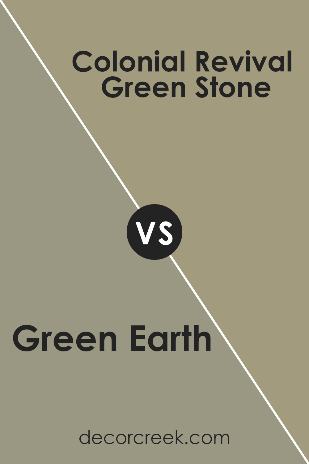
Green Earth SW 7748 by Sherwin Williams vs Colonial Revival Green Stone SW 2826 by Sherwin Williams
Green Earth and Colonial Revival Green Stone, both from Sherwin Williams, are distinct yet harmonious green shades. Green Earth is a muted, earthy color that evokes the sense of calmness found in a dense, tranquil forest. It’s the kind of green that blends seamlessly into spaces, promoting a grounding environment. On the other hand, Colonial Revival Green Stone has a slightly more traditional vibe with its richer and darker green hue.
This color might remind you of the elegant green found on antique furniture or in historic homes. It’s a bit more pronounced than Green Earth, standing out a bit more when applied to walls or accents. Both colors offer a touch of nature’s serenity but in different intensities and moods. While Green Earth provides a soft, whisper-like presence, Colonial Revival Green Stone makes a bolder statement without overwhelming, perfect for those looking to add depth and sophistication to their space.
You can see recommended paint color below:
- SW 2826 Colonial Revival Green Stone
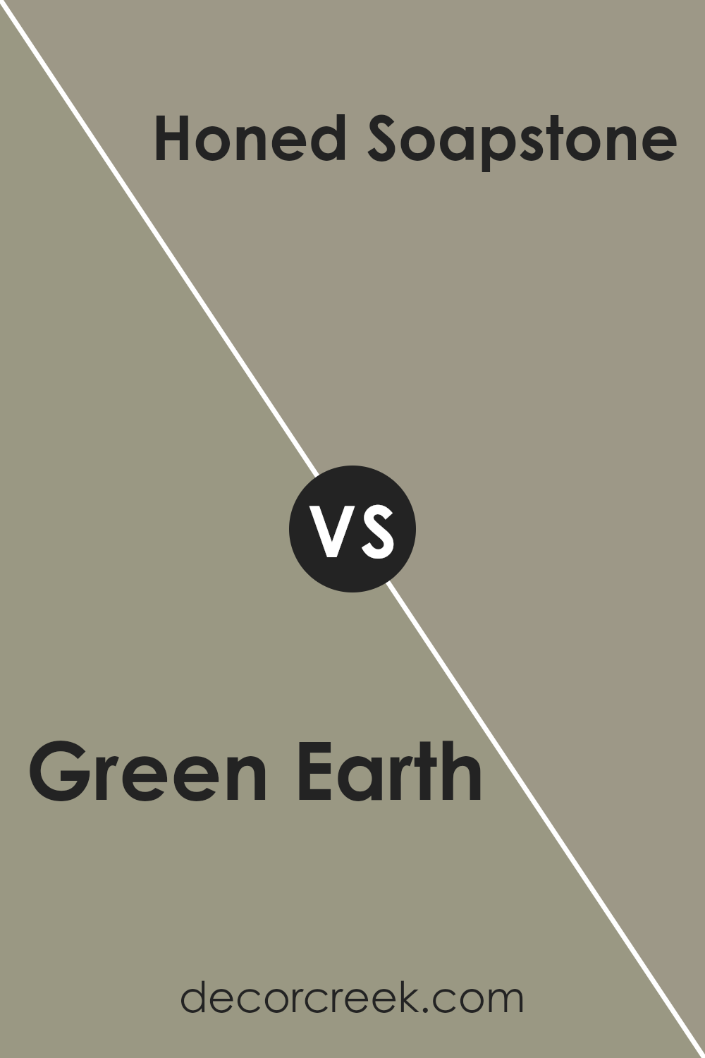
Green Earth SW 7748 by Sherwin Williams vs Honed Soapstone SW 9126 by Sherwin Williams
Green Earth and Honed Soapstone by Sherwin Williams are two distinctive colors, offering unique vibes for any space. Green Earth is like a breath of fresh air in a forest, providing a sense of natural calm and grounding. It gives a room a touch of the outdoors, with its earthy, muted green hues that are both soothing and refreshing.
On the other hand, Honed Soapstone leans towards a softer, more subtle aesthetic. This color is more neutral, with gray undertones that offer a sleek, modern look. It’s the kind of color that blends seamlessly into any decor, adding a touch of elegance without overwhelming the space.
While Green Earth brings life and a touch of nature indoors, Honed Soapstone offers a quiet sophistication. Both are great choices, but they serve different moods and themes. Whether you’re looking for something to ground your space or a sleek backdrop, these colors have you covered.
You can see recommended paint color below:
- SW 9126 Honed Soapstone
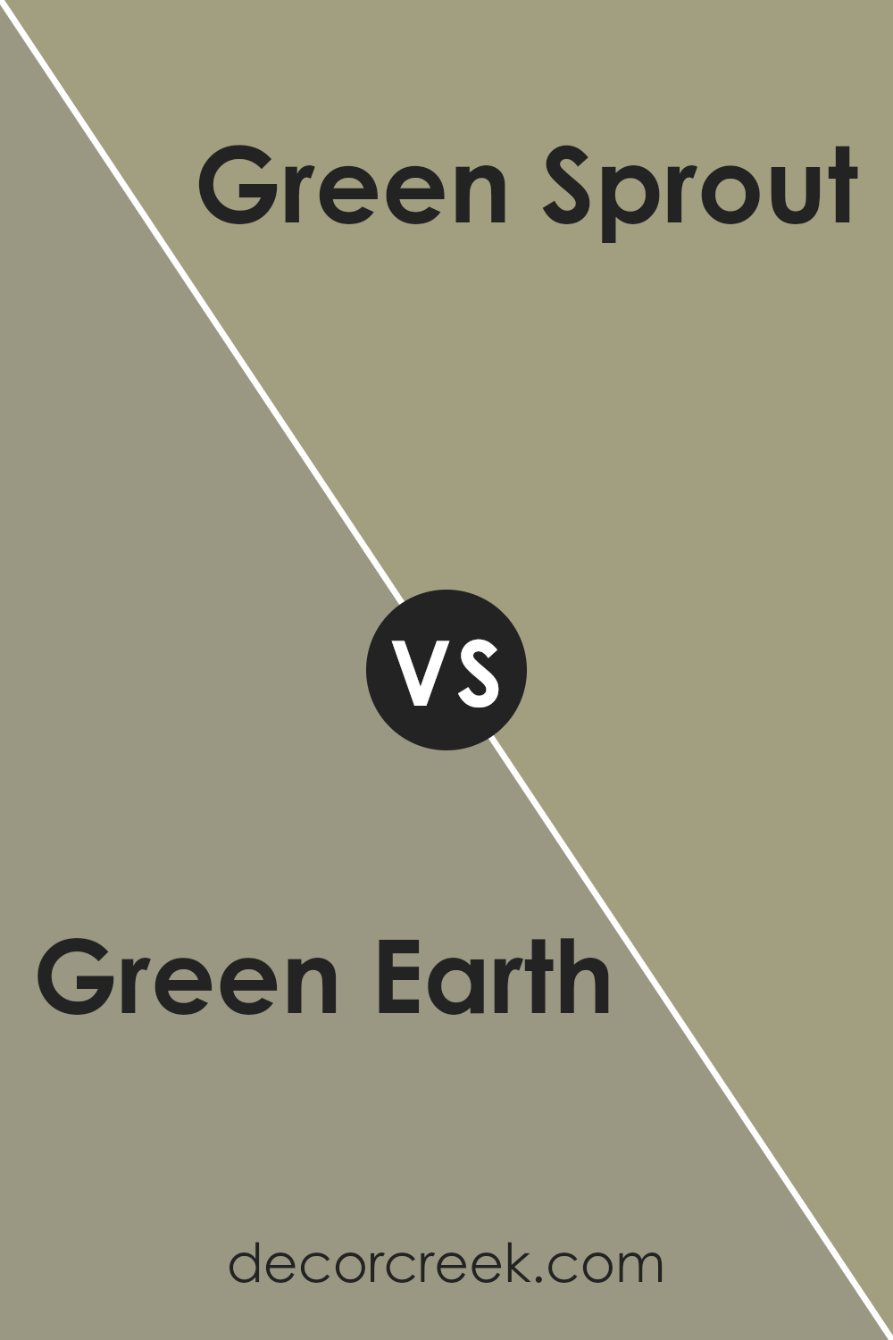
Green Earth SW 7748 by Sherwin Williams vs Green Sprout SW 7728 by Sherwin Williams
Green Earth and Green Sprout, both by Sherwin Williams, offer unique takes on green, each with its own character. Green Earth presents a deeper, more muted tone, resembling the lush shades of a dense forest floor. It’s a color that grounds a space, bringing in a sense of nature and calmness. Its richness makes it a great choice for creating a cozy, inviting atmosphere in rooms.
On the other hand, Green Sprout carries a lighter, fresher vibe. It’s reminiscent of the early shoots of spring, offering a brighter and more vibrant feel. This color can really open up a space, making it feel airy and full of life. It’s particularly well-suited for areas where you want to introduce a lively, refreshing touch without overwhelming the senses.
When comparing the two, Green Earth leans more towards a mature, earthy aesthetic, while Green Sprout brings in an energetic, youthful flair. Depending on the mood you’re going for, each color has its advantages.
You can see recommended paint color below:
- SW 7728 Green Sprout
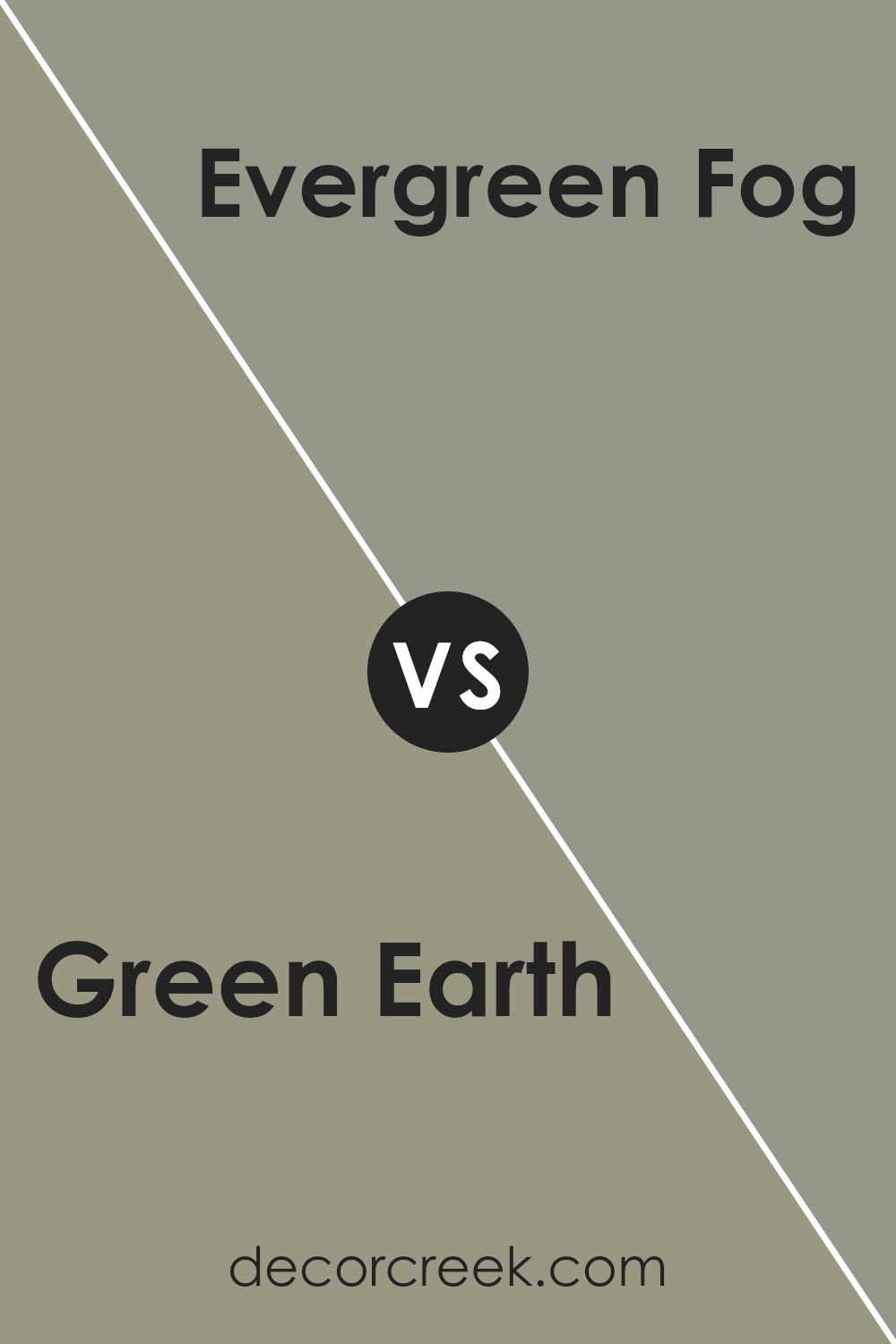
Green Earth SW 7748 by Sherwin Williams vs Evergreen Fog SW 9130 by Sherwin Williams
Green Earth and Evergreen Fog, both by Sherwin Williams, offer unique shades of green for your space. Green Earth is a deeper, more subdued color with a hint of olive, providing a natural and grounding feel. It’s like looking at a dense forest from afar; rich and full of earthy tones. This color works well in spaces where you want a touch of nature without overwhelming brightness.
On the other hand, Evergreen Fog has a cooler, more muted appearance. It brings to mind the early morning mist in a forest clearing, combining green and gray for a softer, sophisticated look. This shade is perfect for creating a calm, serene environment, making it ideal for bedrooms or quiet sitting areas.
In simple terms, if you’re going for a cozier, more intimate feel, Green Earth is your go-to. For a lighter, airier vibe, Evergreen Fog might just be what you’re looking for. Both colors celebrate the versatility of green in distinct ways, allowing you to create a range of atmospheres in your home.
You can see recommended paint color below:
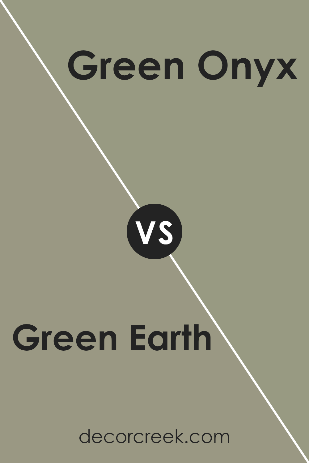
Green Earth SW 7748 by Sherwin Williams vs Green Onyx SW 9128 by Sherwin Williams
The two colors, Green Earth and Green Onyx from Sherwin Williams, offer unique tones that could greatly influence the ambiance of any room. Green Earth is a more subdued, natural color, resembling the hues you might find on a peaceful forest floor. It’s a color that can make a room feel grounded and brings a sense of calmness, making it perfect for spaces where relaxation is key.
On the other hand, Green Onyx has a brighter, more vibrant quality. It’s a lively color that brings energy into a room. This shade is reminiscent of the vibrant green you might see in certain precious stones or a lush, well-cared-for garden. It’s ideal for spaces that aim to stimulate creativity and vibrancy.
Both colors, while sharing a green base, cater to different moods and settings. Green Earth offers a more muted, earthy backdrop, suited for creating a tranquil space. Green Onyx, with its brighter tone, lends itself to more dynamic, energetic environments. Choosing between them depends on the atmosphere you want to achieve.
You can see recommended paint color below:
Green Earth SW 7748 by Sherwin Williams vs At Ease Soldier SW 9127 by Sherwin Williams
Green Earth and At Ease Soldier, both from Sherwin Williams, offer distinct vibes for any space. Green Earth is a muted, natural green that feels like a gentle walk in a lush forest. It’s soft yet rich, creating a soothing and grounding atmosphere. This color is perfect for someone looking to bring a touch of nature indoors without overwhelming the senses.
On the other hand, At Ease Soldier is a deeper, more subdued green with gray undertones. It leans towards a more sophisticated and contemporary look, ideal for creating a calm, collected ambiance in a room. This color can make a statement in a minimalist setting or complement a more eclectic decor without overpowering.
While both colors share a green base, Green Earth offers a fresher, lighter feel, promoting relaxation and tranquility. At Ease Soldier, however, brings an element of modern elegance and a sense of serenity and sophistication. Choosing between them depends on the mood you want to set: refreshing and natural with Green Earth or refined and cool with At Ease Soldier.
You can see recommended paint color below:
- SW 9127 At Ease Soldier
Green Earth SW 7748 by Sherwin Williams vs Herbal Wash SW 7739 by Sherwin Williams
Green Earth (SW 7748) and Herbal Wash (SW 7739) from Sherwin Williams are two unique shades of green, each with its own personality. Green Earth is like a deep breath of forest air; it’s a darker, grounded hue that brings a sense of calm and stability to a space. Think of the rich, fertile earth beneath your feet in a dense woodland. On the other hand, Herbal Wash has a lighter, fresher vibe, reminiscent of soft, young leaves or the gentle touch of sage. It’s the kind of color that brightens a room, offering a more uplifting and rejuvenating feel.
When comparing them, it’s clear that Green Earth sets a moodier, more serene tone, perfect for creating a cozy, enveloping space. Herbal Wash, however, injects energy and light, making it ideal for areas where you want to encourage vibrancy and a connection to the outdoors. Both colors work beautifully with nature-inspired decor but serve different moods and aesthetics within a home.
You can see recommended paint color below:
- SW 7739 Herbal Wash
Green Earth SW 7748 by Sherwin Williams vs Canal Street SW 9523 by Sherwin Williams
Green Earth SW 7748 and Canal Street SW 9523 by Sherwin Williams are two distinct colors that offer different vibes to a space. Green Earth is like a walk in a lush forest. Its earthy tones bring a sense of grounding and calmness, making it perfect for creating a cozy and serene environment. It’s a deep green that reminds you of nature’s tranquility.
On the other hand, Canal Street is a lighter, softer green with a hint of gray. This color is gentle and soothing, giving rooms a fresh and airy feel. It’s like the first breath of spring that rejuvenates and brings new life. Canal Street works well in spaces where you want to add a touch of brightness without overwhelming the senses.
While both colors share a green base, Green Earth provides depth and warmth, evoking a feeling of being surrounded by nature. Canal Street, however, offers a subtler, more uplifting vibe. It’s excellent for making small spaces appear bigger and brighter. Choosing between them depends on the atmosphere you want to create: cozy and rooted with Green Earth or light and refreshing with Canal Street.
You can see recommended paint color below:
Conclusion
Green Earth is a versatile color that offers a natural and calming atmosphere, making it an ideal choice for those looking to bring a touch of serenity into their living spaces. As a product by Sherwin Williams, it reflects the company’s commitment to providing high-quality paints that can transform any room. Its earthy tones can easily complement a wide range of decor styles, from rustic to contemporary, allowing homeowners to create cozy, inviting spaces that feel both modern and timeless.
The use of Green Earth in home interiors has steadily gained popularity due to its adaptability and the tranquil vibe it brings. It works exceptionally well in areas that could benefit from a connection to the outdoors, such as living rooms, bedrooms, and even home offices. This color not only enhances the aesthetic appeal of a room but also contributes to a more relaxed and focused environment. Whether looking to update a single room or considering a more extensive renovation, Green Earth offers a balanced and refreshing option that can help achieve a look that is both sophisticated and welcoming.
Ever wished paint sampling was as easy as sticking a sticker? Guess what? Now it is! Discover Samplize's unique Peel & Stick samples.
Get paint samples

