Sherwin Williams SW 7064 Passive is a popular paint color known for its understated elegance and versatility. This shade is part of the Sherwin Williams collection and has gained a lot of attention for its ability to bring a calm and serene atmosphere to any space. Passive is a light gray color that strikes a perfect balance between warm and cool tones, making it a great choice for various decorating styles and preferences.
Whether you’re looking to refresh your living room, bedroom, or any other area of your home, SW 7064 Passive offers a neutral backdrop that can complement a wide range of furniture and decor.
What sets Passive apart from other gray shades is its subtle undertone that works well in different lighting conditions, seamlessly adapting and adding a sophisticated touch to the environment.
It’s an ideal pick for those looking to create a minimalist aesthetic or for anyone wanting to add a sense of spaciousness and airiness to their home. Homeowners and interior designers alike appreciate this shade for its ability to blend effortlessly with other colors, providing a solid foundation for creating welcoming and comfortable spaces.
Choosing the right paint color is crucial in defining the look and feel of your home, and Sherwin Williams SW 7064 Passive is a choice that offers both style and flexibility. Its popularity is a testament to its timeless appeal and practicality in contemporary home design.
What Color Is Passive SW 7064 by Sherwin Williams?
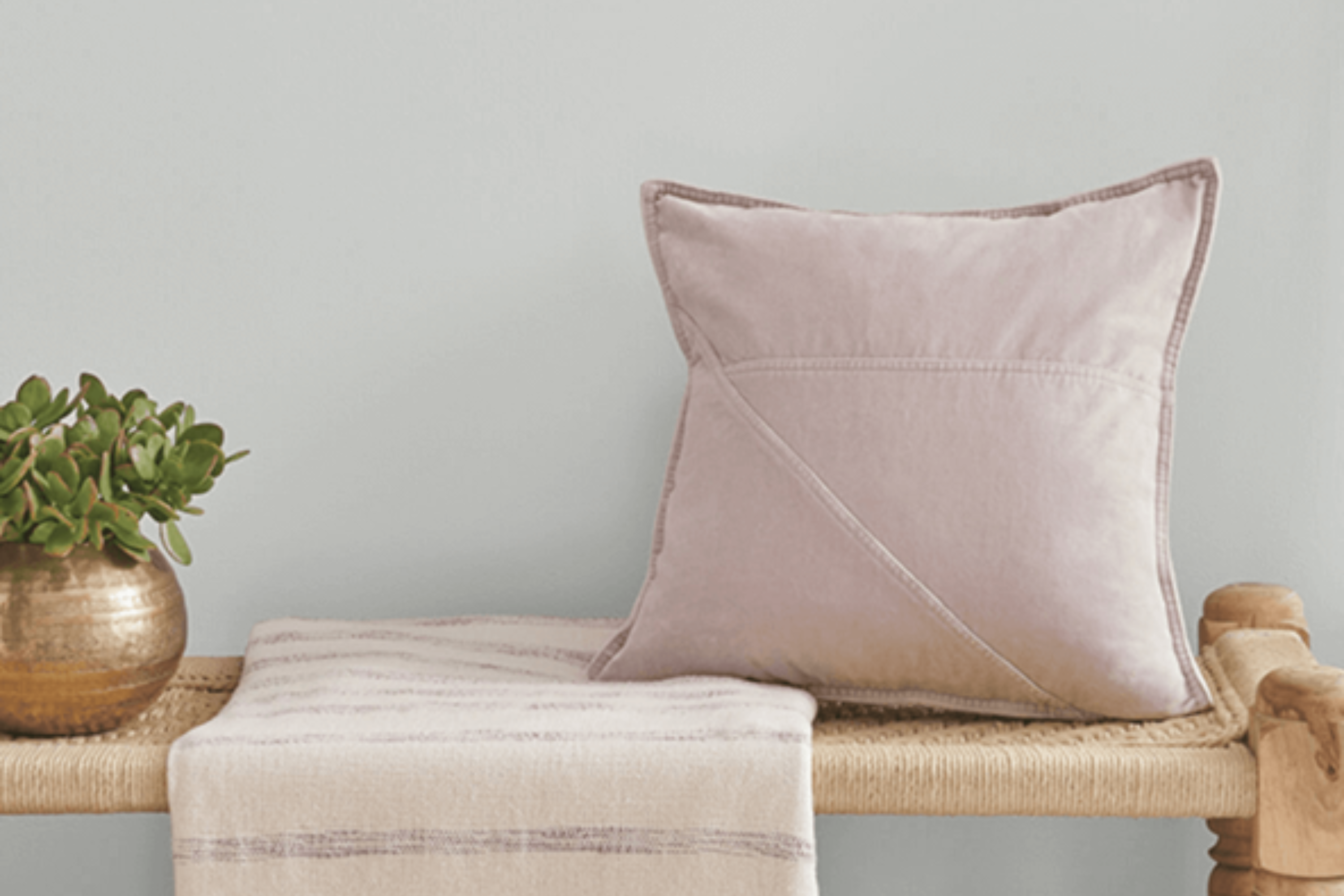
Passive by Sherwin Williams is a cool, soothing gray color that brings a serene atmosphere to any space. This color has a balanced tone that’s not too dark or too light, making it a versatile choice for various interior styles, especially modern, minimalist, Scandinavian, and coastal designs. Its subtle blue undertones offer a fresh and airy feel, perfect for creating a calm and welcoming environment.
Passive works exceptionally well with natural materials and textures. Pair it with light woods for a warm, organic look or with metal finishes like brushed nickel and chrome for a sleek, contemporary vibe.
In rooms with plenty of natural light, this color takes on an almost ethereal quality, making spaces feel more open and airy. Meanwhile, in spaces with less natural light, it adds depth and sophistication.
When it comes to textiles, this color complements soft, plush fabrics as well as smooth, sleek surfaces. Think soft wool throws, cotton linens, and satin pillows for a touch of luxury that feels inviting. It’s also the perfect backdrop for vibrant pops of color through accessories like vases, artwork, and decorative pillows, allowing for personalization in your decor.
Moreover, Passive is a beautiful choice for creating a peaceful retreat in bedrooms, living rooms, and bathrooms, where its calming effect is most appreciated. It’s a color that adapts to your style, making your home feel both modern and timeless.
Ever wished paint sampling was as easy as sticking a sticker? Guess what? Now it is! Discover Samplize's unique Peel & Stick samples.
Get paint samples

Is Passive SW 7064 by Sherwin Williams Warm or Cool color?
Passive, coded as SW 7064, is a unique paint color by Sherwin Williams that has a special way of transforming homes. This color is a soft, light gray that is incredibly versatile. It has the ability to create a sense of calm and sophistication in any room. Because of its subtle nature, it pairs well with a wide range of decor styles, from modern to traditional, making it an excellent choice for those looking to refresh their home without committing to a bold color scheme.
One of the best things about Passive is how it adapts to different lighting conditions. In rooms with plenty of natural light, it looks brighter and can make the space feel airy and open. In spaces with less light, it brings a cozy warmth without darkening the room.
This quality makes it an ideal choice for almost any room in the house, whether it’s a sunny living room or a smaller bathroom with limited light.
Homeowners appreciate Passive for its ability to blend with other colors. It works seamlessly with whites and neutrals for a clean, minimalist look, but it can also support pops of color in accessories or furniture, providing a balanced backdrop that lets other colors shine. Its versatility and understated elegance make it a popular choice for those looking to create a peaceful and inviting home environment.
Undertones of Passive SW 7064 by Sherwin Williams
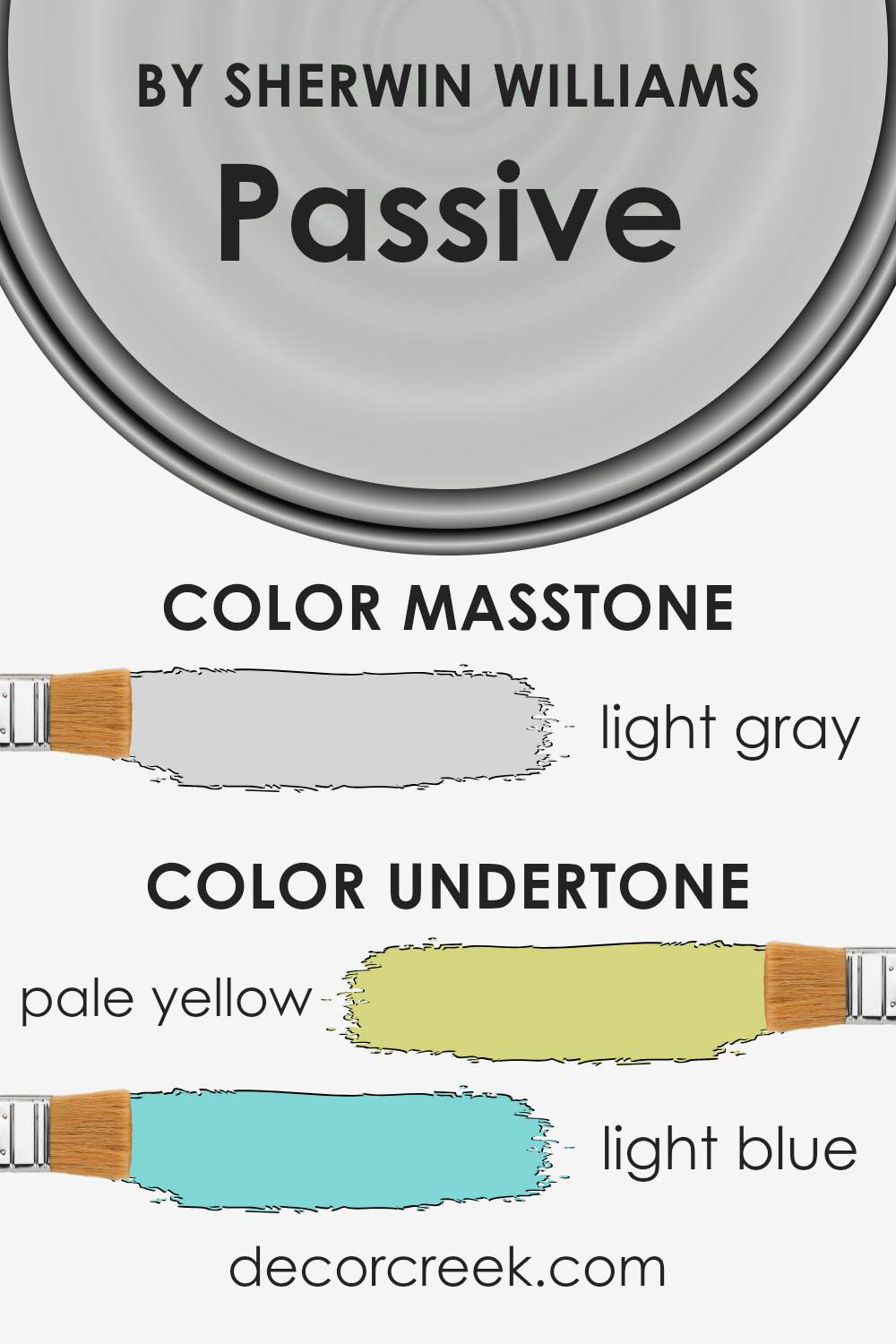
Passive, a popular paint color by Sherwin Williams, is known for its calming and neutral appearance. However, the beauty of this color lies in its subtle undertones of pale yellow and light blue, which can significantly influence the way it’s perceived on interior walls.
Undertones are the underlying hues that can either warm up or cool down a primary color. In the case of this specific paint, the pale yellow undertone adds a hint of warmth, making spaces feel more inviting without overwhelming the senses with boldness.
On the other hand, the light blue undertone brings a cool, serene vibe, which is perfect for creating a peaceful and refreshing environment.
How these undertones affect the color’s appearance on interior walls depends largely on the room’s lighting and surrounding colors. In a well-lit space with plenty of natural sunlight, the pale yellow undertone might become more pronounced, giving the walls a subtly warmer look.
Conversely, in a room with less natural light or with cooler artificial light, the light blue undertone might stand out more, lending a fresher, more tranquil feel to the space.
Hence, the interplay of these undertones with environmental factors means that the paint can offer a dynamic range of experiences, adapting subtly to different settings. Its versatility makes it an excellent choice for those looking to create a space that feels balanced and harmonious, with just enough complexity to keep the aesthetic interesting, yet not overly complicated.
What is the Masstone of the Passive SW 7064 by Sherwin Williams?
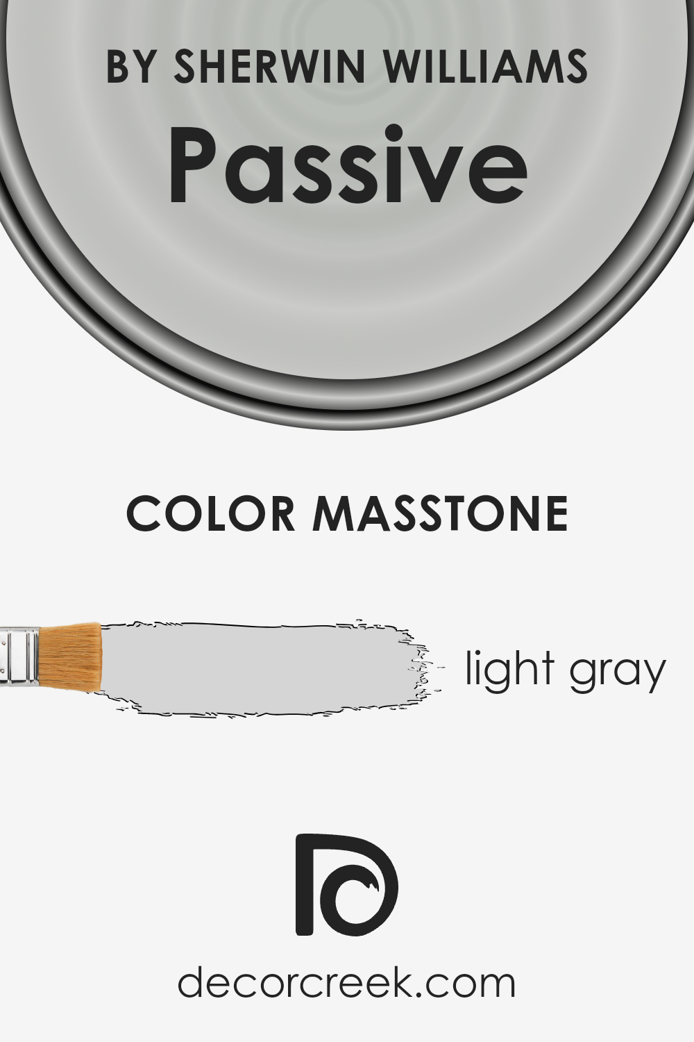
The color known as Passive, with a code of 7064 from Sherwin Williams, has a masstone of light gray, represented by the color code #D5D5D5. This particular shade of gray is quite versatile and has a unique way of working in home environments. Being a light gray, it carries an airy and subtle feel, making spaces look more open and expansive. It’s soft enough not to overpower a room but still adds a definite touch of sophistication and calmness.
When used in homes, this light gray color can act as a neutral backdrop, allowing for a wide range of decor styles and colors to stand out. Whether it’s bright accents or darker furnishings, everything seems to pop more against this gentle gray.
It’s great for living areas, bedrooms, and even kitchens, providing a clean, modern look without feeling cold or industrial. Its adaptability means it can easily fit into various themes, from minimalist to cozy cottage vibes, making it a popular choice for those looking to refresh their living spaces without committing to a bold color.
How Does Lighting Affect Passive SW 7064 by Sherwin Williams?
Lighting plays a crucial role in how we perceive colors around us. Whether a wall is bathed in the glow of a sunset or illuminated by a bright LED bulb, the same shade can appear differently. When considering how a color looks, it’s important to understand the types of light it will be exposed to, such as natural daylight from the sun or artificial lights from bulbs and lamps.
Take, for example, a specific gray shade from Sherwin Williams. In artificial light, this color can take on various tones depending on the light bulb’s temperature. Warm bulbs may make the color appear slightly more inviting and cozy, with a softer, warmer undertone. Conversely, cool-toned bulbs can enhance the gray’s crispness, giving it a more stark and modern look.
- Natural light, however, involves a dynamic play of changes throughout the day. In rooms facing north, light tends to be cooler and more even, meaning this particular gray might seem more consistent but slightly cooler. Such rooms won’t have the intense beams of sunlight that can significantly warm or alter the perception of color, making this tone appear steadier.
- South-facing rooms are drenched in light for the majority of the day, which can make the gray seem lighter and slightly warmer, especially during the midday when the sun is brightest. This direction benefits from a sunny glow, enhancing the warmth in the color.
- East-facing rooms see the most change with this color, as the morning light is warm and bright, softening the gray significantly. However, as the day progresses, the intensity of the sunlight diminishes, returning the color closer to its true shade by the evening.
- West-facing rooms will experience somewhat the reverse of east-facing ones. The color will start off true to its shade in the morning but will warm up and lighten as the sun sets, casting a golden hue that can alter the perception of the color.
Understanding how lighting affects colors can considerably impact design choices, making it crucial to consider the direction of windows and types of artificial lights when decorating a space.
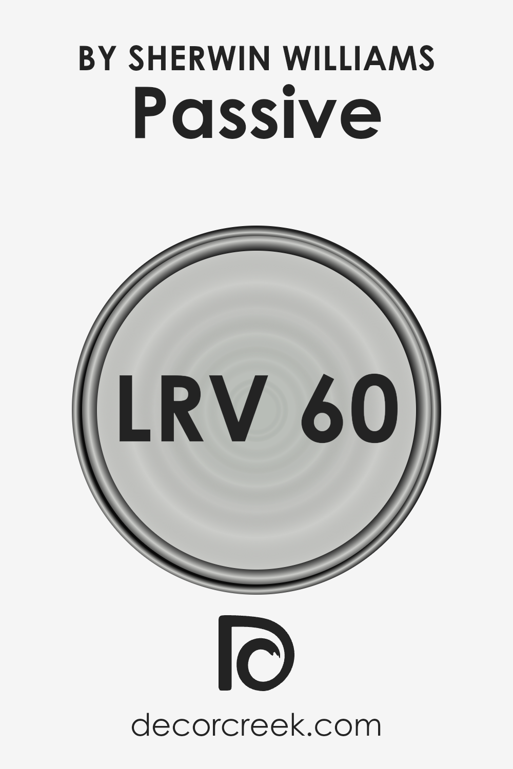
What is the LRV of Passive SW 7064 by Sherwin Williams?
LRV stands for Light Reflectance Value, which is a measure of how much light a color reflects or absorbs. Basically, it’s a number on a scale from 0 to 100, where 0 means the color is totally black and absorbs all light, and 100 means it’s totally white and reflects all the light back. This number helps you understand how light or dark a color will look on your walls once you paint them.
For example, a color with a high LRV will make a room feel brighter because it reflects more light around the space, while a color with a low LRV might make the room feel cozier or smaller because it absorbs more light.
For the specific color in question, with an LRV of 59.885, it sits in the middle of the scale, meaning it has a good balance of reflecting and absorbing light. This makes it a versatile color that can work well in a variety of spaces and lighting conditions. In a room with plenty of natural light, this color will appear lighter and more vibrant, enhancing the sense of openness and airiness.
On the other hand, in a space with less natural light, it will retain a bit of depth, adding a cozy, welcoming feel without making the room feel closed in. This makes it a great option for achieving a balanced and inviting atmosphere in your home.
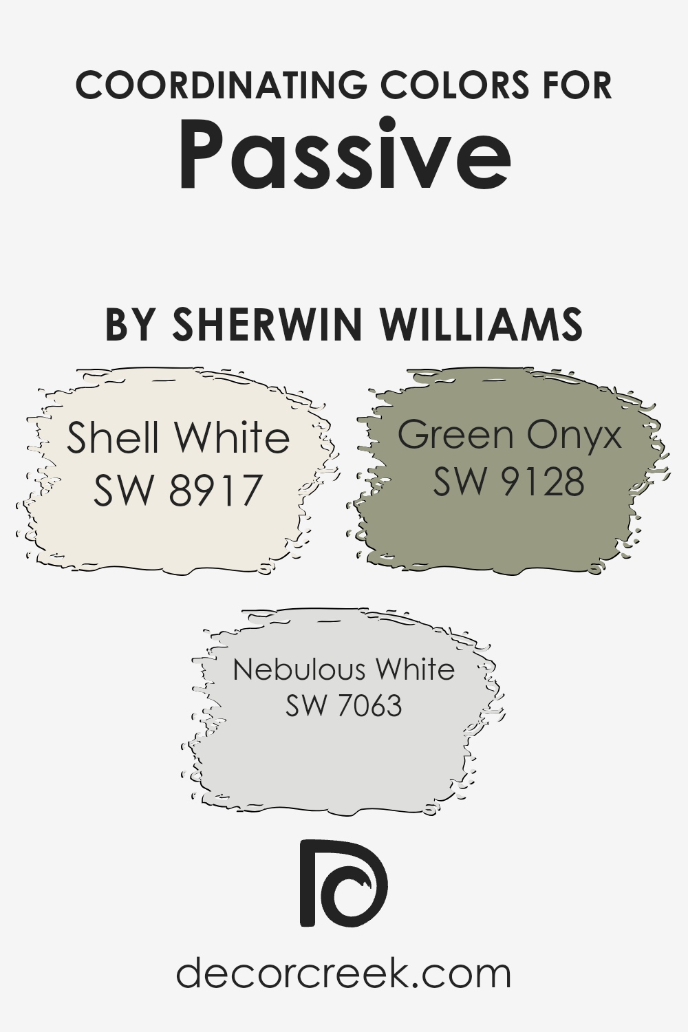
Coordinating Colors of Passive SW 7064 by Sherwin Williams
Coordinating colors are shades that complement each other beautifully when used together in a space. These colors help create a harmonious and balanced look, enhancing the overall aesthetic of a room. Typically, coordinating colors are chosen to accompany a main color, allowing for a cohesive design that adds depth and character to decor.
By selecting coordinating colors, you can achieve a visually appealing palette that ties different elements of a room together.
For the color Passive by Sherwin Williams, a soft and soothing grey, several coordinating colors have been identified to complement its serene vibe. Shell White is an off-white with a warm undertone that brings a subtle brightness to the space, making it feel airy and light.
It works wonderfully with Passive by offering a gentle contrast that’s neither too stark nor too blending, making the space feel inviting.
Nebulous White, another coordinating color, leans towards a grayish-white, echoing the coolness of Passive but with a lighter touch, adding a layer of freshness without overwhelming the senses. Lastly, Green Onyx offers a touch of natural elegance with its muted, soft green that pulls in an earthy element.
This shade works to add a hint of color in a sophisticated manner, ensuring the space feels balanced and thoughtfully designed. Each of these coordinating colors harmonizes with Passive, allowing for a versatile and appealing color scheme in any room.
You can see recommended paint colors below:
What are the Trim colors of Passive SW 7064 by Sherwin Williams?
Trim colors are specific shades used to accentuate or complement the main color of a wall, often used around windows, doors, skirting boards, and cornices. The choice of trim color can significantly affect the overall look of a room, enhancing architectural details, defining lines, and creating visual harmony.
For a versatile hue like Passive by Sherwin Williams, the selection of trim colors like SW 7757 – High Reflective White and SW 6148 – Wool Skein plays an essential role in achieving a polished and cohesive design.
These trim colors can either brighten the space by reflecting light or add a subtle contrast, grounding the airy nature of Passive, and thus, their importance should not be underestimated in interior design.
High Reflective White is a crisp, clean shade offering a stark contrast that can make the main wall color pop and clarify a room’s proportions. It’s particularly effective in bringing out the depth of Passive, making it appear more vibrant while maintaining a fresh and open atmosphere. On the other hand, Wool Skein, with its soft, warm undertone, introduces a more nuanced approach.
This color aims to enhance the coziness of a space, subtly blending with Passive to create a seamless transition from the walls to the trim. This careful balance of warmth and light enables a soothing ambiance, crucial for spaces aiming for a serene and inviting feel.
You can see recommended paint colors below:
- SW 7757 High Reflective White
- SW 6148 Wool Skein

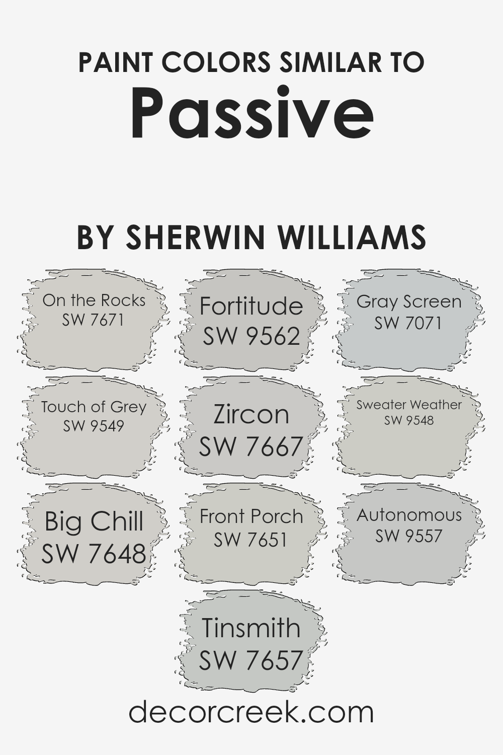
Colors Similar to Passive SW 7064 by Sherwin Williams
Choosing similar colors is crucial for creating a harmonious and visually appealing space. Colors that share similarities bring a sense of balance and unity to a design, making it feel cohesive.
When we look at colors akin to Passive by Sherwin Williams, we find a palette that gently blends together, offering subtle variations that can either soothe or slightly differentiate areas within a space without causing visual disruption.
These similar shades work by having a shared base tone while introducing slight variances in hue or brightness, allowing for a layered yet coherent look.
- For instance, On the Rocks presents a light, airy feel, perfect for creating a serene backdrop, while Touch of Grey adds a slightly warmer tone, infusing spaces with a cozy atmosphere.
- Big Chill steps in with a hint of coolness, reminiscent of a gentle breeze, whereas Tinsmith offers a silvered elegance that elevates any room with a touch of sophistication.
- Fortitude brings a robust, earthy quality, grounding spaces with its solid presence.
- Zircon, with its understated coolness, offers a refreshing calm.
- Front Porch, true to its name, evokes the crisp, welcoming air of early mornings.
- Gray Screen, a bit deeper, casts a serene shadow, perfect for adding depth.
- Sweater Weather envelops rooms in a soft, comforting hug, akin to your favorite knit.
- Lastly, Autonomous stands out as a strong, independent gray that commands attention while still playing nicely with its neighbors.
Each of these colors, while similar, has its own character, allowing them to work together harmoniously, creating spaces that feel both unified and dynamic.
You can see recommended paint colors below:
- SW 7671 On the Rocks
- SW 9549 Touch of Grey
- SW 7648 Big Chill
- SW 7657 Tinsmith
- SW 9562 Fortitude
- SW 7667 Zircon
- SW 7651 Front Porch
- SW 7071 Gray Screen
- SW 9548 Sweater Weather
- SW 9557 Autonomous
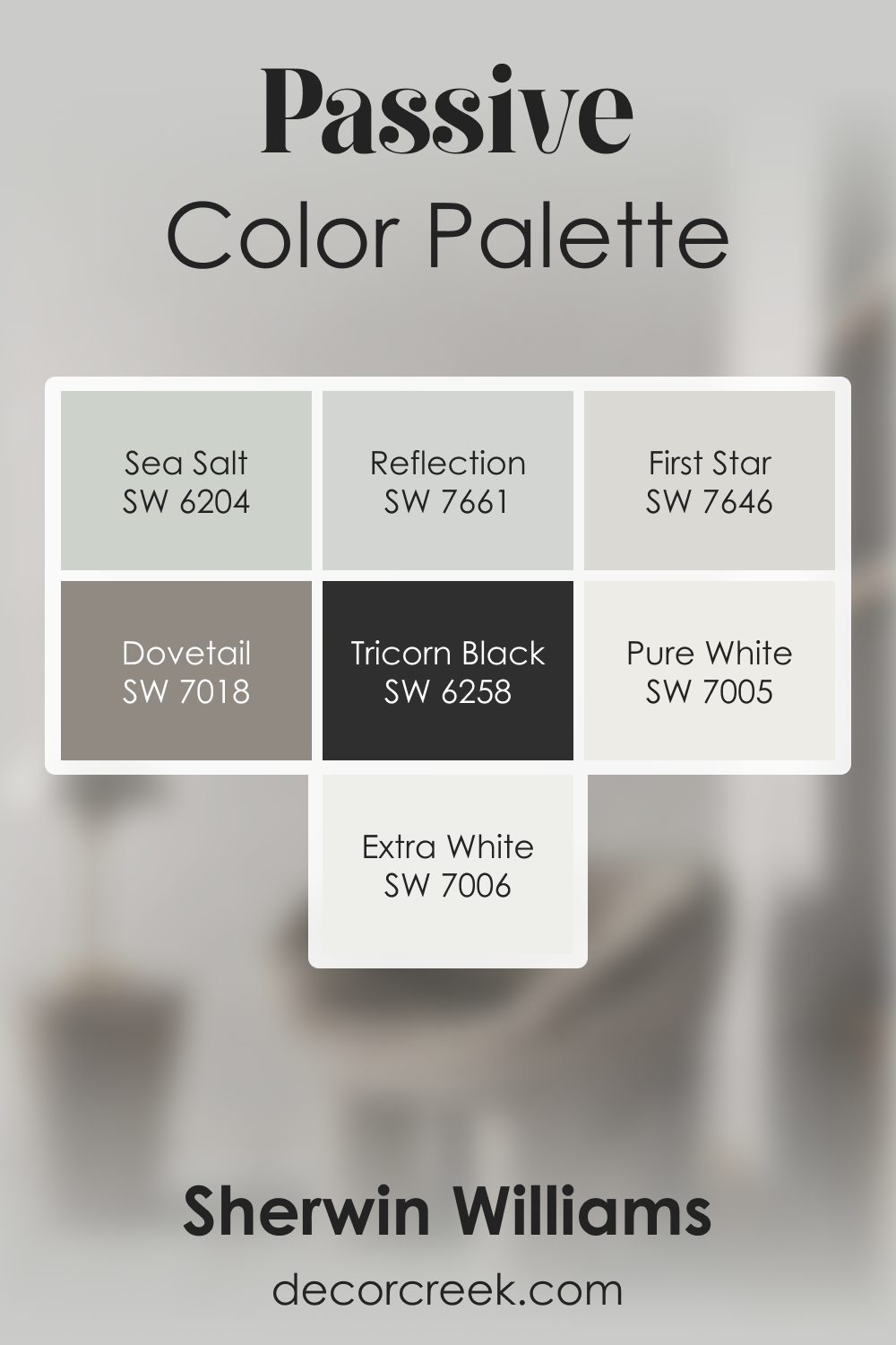
Passive SW 7064 by Sherwin Williams Color Palette
Passive always brings a cool, smooth calm that feels refreshing and light. I love pairing it with Extra White and Pure White to keep the palette bright and gentle. Reflection and First Star add soft cool layers that blend effortlessly with Passive’s tone.
For contrast, Tricorn Black adds clarity, while Dovetail gives the palette deeper structure. Sea Salt brings a subtle touch of color that keeps everything feeling breezy and light.
This palette feels fresh, clean, and modern, with Passive creating a soft, easy balance.
How to Use Passive SW 7064 by Sherwin Williams In Your Home?
Passive SW 7064 by Sherwin Williams is a beautiful gray paint color that brings a calm and soothing atmosphere to any room in your home. It’s a versatile shade that pairs well with various decor styles, from modern to traditional. If you’re looking to give your walls a fresh coat of paint, Passive is a great choice. Its light gray tone provides a neutral backdrop, allowing your furniture and decor to stand out.
You can use Passive in your living room to create a serene setting for relaxing and entertaining. In the bedroom, this color can help establish a peaceful and restful environment, perfect for a good night’s sleep. It’s also an excellent option for bathrooms and kitchens, adding a clean and airy feel to these spaces.
Moreover, Passive works well with both natural light and artificial lighting, making it a flexible option for any room, regardless of the lighting situation. Whether you want to freshen up a single room or give your entire home a new look, Passive can help you achieve a stylish and cohesive look.
Passive SW 7064 by Sherwin Williams vs Front Porch SW 7651 by Sherwin Williams
Passive and Front Porch are two paint colors from Sherwin Williams that share a subtle and soothing palette but have distinct tones. Passive is a cool gray with blue undertones that give a serene and calming feel to any room.
It’s light enough to make small spaces appear larger, yet has enough depth to add character. On the other hand, Front Porch is a softer, lighter gray with a hint of blue-green. Its gentle hue creates a peaceful and refreshing atmosphere, making it perfect for a cozy and inviting living space or bedroom.
While both colors are great for creating a tranquil environment, Passive leans towards a slightly more formal and modern look due to its deeper tone. Front Porch, with its airy vibe, is ideal for a more casual, relaxed setting. Whether you’re looking for a sophisticated backdrop or a laid-back ambiance, these colors offer versatile options for any home’s interior.
You can see recommended paint color below:
- SW 7651 Front Porch
Passive SW 7064 by Sherwin Williams vs Big Chill SW 7648 by Sherwin Williams
Main color, Passive, and Big Chill are two unique shades from Sherwin Williams that share a cool, neutral palette but have distinct tones and feelings. Passive is a light gray that brings a sense of calm and subtlety to spaces.
It’s a versatile color that works well in many settings, adding a serene backdrop to any decor. On the other hand, Big Chill leans closer to a true gray, providing a slightly stronger presence without overwhelming a room.
It’s cool, but with a bit more depth, making it ideal for those who want a bit of character while keeping the atmosphere relaxed and inviting.
Both colors are excellent for creating a modern, understated look, but your choice between Passive and Big Chill would depend on how light or moody you want the room to feel. Passive offers a brighter, airier feel, while Big Chill adds a touch more sophistication and grounding.
You can see recommended paint color below:
- SW 7648 Big Chill
Passive SW 7064 by Sherwin Williams vs Tinsmith SW 7657 by Sherwin Williams
Comparing Passive (SW 7064) and Tinsmith (SW 7657) by Sherwin Williams is like looking at two close relatives in the color world. Passive is a soft, warm gray that has a calming and subtle presence. It makes spaces feel cozy and inviting without being too dark or overwhelming. On the other side, we have Tinsmith, which is lighter and carries a cooler tone.
Tinsmith offers a fresh and airy feel, making it perfect for creating a bright and open space. When you put them side by side, the difference in warmth and tone becomes clearer.
Passive brings warmth to a room, perfect for a cozy vibe, while Tinsmith reflects more light, giving a room a more spacious feel. Both colors are incredibly versatile, but the choice between them depends on what kind of atmosphere you want to create.
Whether it’s the warmer, cozier feel of Passive or the lighter, breezier touch of Tinsmith, both colors have their unique charm.
You can see recommended paint color below:
- SW 7657 Tinsmith
Passive SW 7064 by Sherwin Williams vs On the Rocks SW 7671 by Sherwin Williams
Passive and On the Rocks, both from Sherwin Williams, offer subtle nuances that make each unique. Passive, a mid-tone gray, carries a balanced, soft presence in a room. It’s a versatile color, easily complementing various decor styles and palettes, creating a restful and serene atmosphere.
On the other hand, On the Rocks leans towards a lighter, almost ethereal gray, infusing spaces with a brighter, airier feel. It’s perfect for making small rooms appear more spacious or for capturing a modern, minimalist aesthetic.
Both colors share gray as their base, but their different shades offer distinct vibes. While Passive provides a more anchored, soothing backdrop, On the Rocks offers a refreshing lightness, giving a sense of expansiveness to spaces.
It’s fascinating how two grays can differ: one grounding and the other uplifting. Depending on the mood you want to set or the size of your room, both colors have their charm, bringing tranquil gray tones to any interior.
You can see recommended paint color below:
Passive SW 7064 by Sherwin Williams vs Touch of Grey SW 9549 by Sherwin Williams
Main color, Passive, is a soothing gray shade that carries a hint of blue undertones. It’s a versatile color, perfect for creating a calm and serene ambiance in any space. This color has a softness to it, making it a great choice for bedrooms or living areas where you want a peaceful vibe.
On the other hand, Touch of Grey is also a gray shade but with a lighter, almost whispery quality. It lacks the distinct blue undertones of Passive, presenting a more straightforward gray experience. It’s incredibly subtle, making it an excellent option for those seeking a near-neutral palette that still offers a hint of character without overwhelming a room.
When comparing the two, Passive offers a bit more depth and warmth due to its blue undertones, making it stand out slightly more against a variety of decor styles. Touch of Grey, however, is your go-to if you’re looking for an almost imperceptible hint of color to gently enhance a space without dictating the room’s mood. Both colors are beautiful in their own right, with Passive providing a hint of coziness and Touch of Grey offering a light, airy feel.
You can see recommended paint color below:
Passive SW 7064 by Sherwin Williams vs Zircon SW 7667 by Sherwin Williams
Passive by Sherwin Williams is a soothing gray that has a cool undertone, making it a beautiful choice for spaces where calmness and serenity are desired. It’s a versatile color that works well in various settings, lending a refined look to any room. On the other hand, Zircon by Sherwin Williams is another gray shade, but with a slight difference in its tone.
Zircon presents a lighter, almost airy feel, making it perfect for enhancing the brightness of a space. This color can easily make small rooms appear more spacious and welcoming.
While both colors share a gray base, the main distinction lies in their undertones and depth. Passive has a deeper, more pronounced gray that can add a touch of elegance and drama to a space, whereas Zircon is softer and tends to blend into the background, offering a subtle lift to the overall ambiance of a room.
Choosing between them depends on the mood you’re aiming to achieve: Passive is ideal for a cozy, sophisticated look, while Zircon is better suited for creating a light, refreshing atmosphere.
You can see recommended paint color below:
- SW 7667 Zircon
Passive SW 7064 by Sherwin Williams vs Autonomous SW 9557 by Sherwin Williams
The main color, Passive, and the second color, Autonomous, both by Sherwin Williams, offer distinct vibes to any space. Passive is a subtle gray with cool undertones, bringing a serene and calming effect. It’s versatile, fitting well in various settings like living rooms or bedrooms, where a peaceful atmosphere is desired. On the other hand, Autonomous is notably different.
Although specifics about its color qualities are not detailed here, by its name, one might infer it suggests a sense of independence or a stronger, possibly more vibrant presence.
Without the exact shade details, it’s safe to speculate it could be a color that stands out more, possibly adding energy or a dynamic feel to spaces. Whether you’re looking for a quiet, understated background or a bolder statement, choosing between
Passive or its counterpart depends on the mood you aim to create. Both colors offer unique possibilities, but where Passive offers tranquility, Autonomous might introduce a more lively or robust character to your surroundings.
You can see recommended paint color below:
- SW 9557 Autonomous
Passive SW 7064 by Sherwin Williams vs Sweater Weather SW 9548 by Sherwin Williams
Passive SW 7064 and Sweater Weather SW 9548 are two interesting colors from Sherwin Williams. Starting with Passive, it’s a cool gray that carries a subtle hint of blue. This color feels calm and soothing, making it perfect for those who want a serene and inviting atmosphere. It works well in spaces where you want to relax, like bedrooms or living rooms.
On the other hand, Sweater Weather leans more towards a cozy, warm gray. It’s like the feeling you get when wrapping yourself in a soft blanket on a chilly day. This color adds warmth to any room, making it ideal for creating a comfortable and welcoming space. It’s particularly good for areas where you spend a lot of time with family or friends.
When comparing both, Passive offers a cooler, more tranquil vibe, while Sweater Weather brings warmth and coziness. Both are versatile, but your choice might depend on whether you prefer a space that feels like a cool retreat or a warm hug.
You can see recommended paint color below:
- SW 9548 Sweater Weather
Passive SW 7064 by Sherwin Williams vs Fortitude SW 9562 by Sherwin Williams
The main color, Passive, and the second color, Fortitude, both offer unique vibes for any space. Passive is a cool, gentle gray that brings a calm and soothing atmosphere. It’s versatile, fitting in seamlessly whether in a modern living room or a cozy bedroom, offering a backdrop that’s both understated and elegant.
On the other hand, Fortitude is a much deeper, teal-inspired hue. It has a rich and vibrant character, making it perfect for creating a statement or adding a touch of drama to a space.
Unlike Passive, which leans towards a subtle, minimalist look, Fortitude brings energy and depth, ideal for an accent wall or a room that desires a bit of boldness.
When comparing these two, it’s clear that they cater to different tastes and moods. Passive is about quiet sophistication, while Fortitude suggests confidence and vibrancy. Depending on what you’re aiming for in a room, either could be a fantastic choice, with Passive providing a tranquil sanctuary and Fortitude offering a lively ambiance.
You can see recommended paint color below:
- SW 9562 Fortitude
Passive SW 7064 by Sherwin Williams vs Gray Screen SW 7071 by Sherwin Williams
The main color, known as Passive, and the second color, Gray Screen, are both beautiful options from Sherwin Williams. If you’re looking at them side by side, you’ll notice some key differences. Passive sits on the color spectrum as a calm, light gray that has a subtle cool undertone. It’s like a soft blanket of fog on an early morning, providing a serene and peaceful vibe to any space.
On the other hand, Gray Screen steps a bit further into the cool territory. It’s also a light gray but leans towards a slightly bluer hue, reminiscent of an overcast sky just before the rain. This makes it feel a tad cooler compared to Passive.
While both colors share the foundational quality of gray, their distinct undertones set them apart. Passive is perfect for those looking for a neutral background with minimal coolness, offering a versatile backdrop for various decor styles.
Gray Screen, with its cooler, more pronounced blue undertone, offers a fresher, crisper feel, ideal for creating a tranquil, airy space. Whether choosing between the two for a room makeover or a new project, each brings its own unique atmosphere to the table.
You can see recommended paint color below:
Conclusion
Passive SW 7064 by Sherwin Williams is a versatile and calming shade of gray that has gained popularity for its ability to create a serene and inviting atmosphere in any room. This particular color shines due to its adaptability, easily complementing a wide range of decor styles and color schemes. It embodies a subtle balance of cool and warm tones, making it a perfect choice for those looking to achieve a modern, yet cozy aesthetic in their living spaces.
Its understated elegance doesn’t overpower, instead, it provides a neutral backdrop that can enhance the overall look and feel of a room without being overly dominant.
The appeal of Passive lies in its simplicity and the tranquility it brings to interiors. Whether applied in a bright, sun-filled room or a more dimly lit space, this color maintains its beauty, reflecting and absorbing light in a way that can make spaces appear more spacious and airy.
Homeowners and designers alike appreciate it for its sophistication and flexibility, proving that it can work wonders across various settings – from kitchens and bathrooms to bedrooms and living rooms. In conclusion, Passive SW 7064 stands out as a go-to paint color for those seeking to create a peaceful and refined environment in their home or project.
Ever wished paint sampling was as easy as sticking a sticker? Guess what? Now it is! Discover Samplize's unique Peel & Stick samples.
Get paint samples
