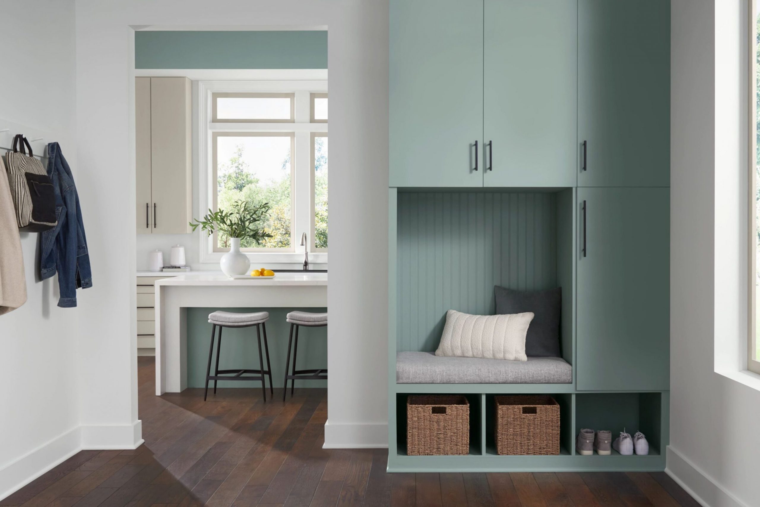
Choosing the right paint color can seem intense with so many options available. If you’re leaning towards a peaceful and refreshing shade for your room, SW 6213 Halcyon Green by Sherwin Williams is one that you might consider. Before you decide on this color, let me share some insights from my own experience with Halcyon Green. It’s a beautiful, soothing green that has a subtle adaptable quality, making it excellent for many areas of a home, from the living room to the bedroom.
Halcyon Green strikes a delightful balance; it’s not too bold yet not overly muted, and it has this ability to introduce a sense of calm and freshness into a room. Whether you have a lot of natural light or rely mostly on artificial lighting, this shade adjusts beautifully, reflecting variations in intensity throughout the day. Its adaptable nature means it works well with many décor styles and color palettes, enhancing the overall ambiance without overpowering your existing furnishings and accessories.
I’d recommend considering how this color aligns with your current décor and lighting conditions. If you’re someone who loves settings that feel refreshing and calm, Halcyon Green could be a perfect fit. However, it’s always smart to test it out in your room.
Get a sample, observe how it looks at different times of the day, and see how it makes you feel. This way, you ensure it complements your personal style and home environment.
Is Halcyon Green SW 6213 Right for My Home?
Halcyon Green is a color that feels both fresh and grounded. It’s like a mix of sea foam and soft gray, giving it a subtle, understated elegance. This shade can bring a gentle, understated energy to any room. It’s perfect for creating a calm, inviting atmosphere in places where you might want to relax or recharge, such as bedrooms or reading nooks.
The adaptable nature of Halcyon Green means it fits beautifully into various interior styles. It’s particularly lovely in coastal-inspired rooms where its soft, watery tones evoke a sense of being close to the ocean.
In modern and minimalist interiors, this color works wonders by adding depth and interest without feeling too intense in the room. It pairs exceptionally well with light woods, like beech and oak, adding warmth and natural texture. Metals, particularly brushed silver or matte gold finishes, create a subtle contrast that brings out the depth of the green.
For fabrics and textures, I love matching Halcyon Green with soft, tactile materials like linen or wool. These create a look that’s not just about color but also about comfort and feel. Light, airy curtains or a textured throw in this shade can make a room feel like a cozy haven.
decorcreek.com
What are the right undertones of Halcyon Green SW 6213 ?
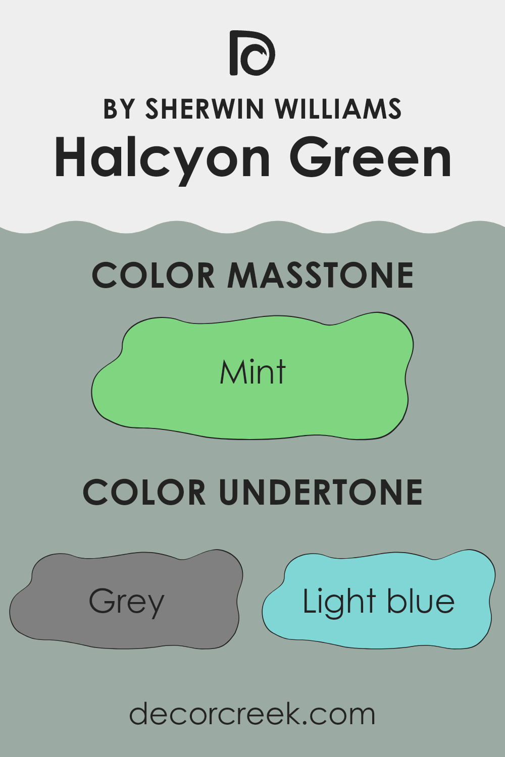
Halcyon Green by Sherwin Williams is a complex color that subtly shifts based on the lighting and surrounding colors due to its mix of undertones. This paint color encompasses shades of grey, light blue, lilac, pale yellow, pale pink, light purple, light gray, dark turquoise, light turquoise, olive, light green, blue, turquoise, orange, yellow, dark green, and green.
Undertones are minor colors that lie beneath the main visible color, influencing how the paint appears once applied to interior walls. For instance, in bright daylight, Halcyon Green might lean more towards its light blue or turquoise undertones, making a room feel fresh and lively. In less natural light, grey or light gray might become more dominant, giving the room a more muted and calm appearance.
When used on interior walls, the range of undertones in Halcyon Green allows it to adjust to various decor styles and color schemes. It can coordinate well with both vibrant and neutral furnishings, depending on which undertones are pulled forward by the room’s lighting and the colors around it. This adaptable quality makes it a good choice for rooms where the mood needs to be both flexible and inviting.
Overall, Halcyon Green’s undertones influence its adaptable nature and can subtly alter the mood of a room, ranging from cool and calming to more dynamic and inviting, depending on its environment and decor.
decorcreek.com
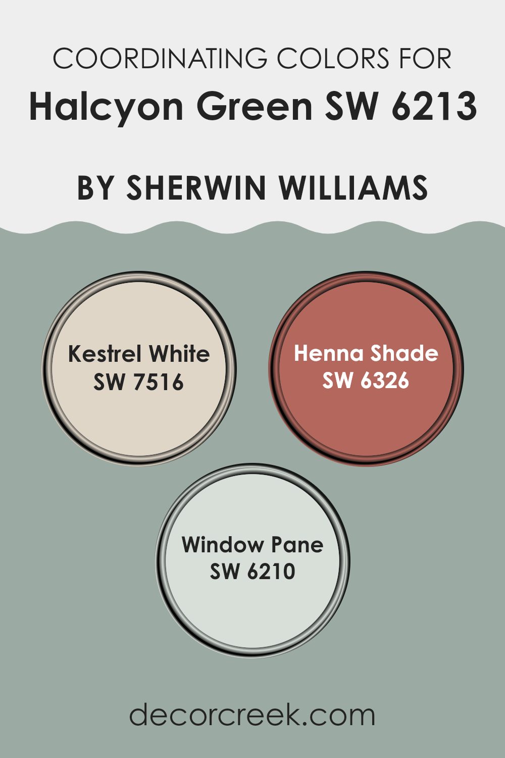
Best Coordinating Colors to use with Halcyon Green SW 6213 by Sherwin Williams this year.
Coordinating colors are hues that complement and enhance each other, providing a harmonious palette when used together in decorating. When paired correctly, these colors create balance and aesthetically pleasing environments. For Halcyon Green, a calming green hue, certain shades have been chosen to coordinate beautifully to offer a varied, yet cohesive color scheme.
Kestrel White is a soft, gentle white with a slight warmth that makes it an adaptable backdrop for Halcyon Green. It offers a clean, neutral canvas that allows the green to truly stand out, while also providing a light and airy feel to any room. Henna Shade, on the other hand, is a bold, saturated color that echoes the depths of earthy reds.
It adds a dynamic contrast to the calming qualities of Halcyon Green, injecting vitality and warmth into the room. Meanwhile, Window Pane is a delicate light blue that brings a fresh and uplifting feel. It harmonizes well with Halcyon Green, creating a natural, refreshing look that can make a room feel more open and inviting. Together, these coordinating colors support and enhance the green, making it easier to design a room that feels cohesive and thoughtfully curated.
You can see recommended paint colors below:
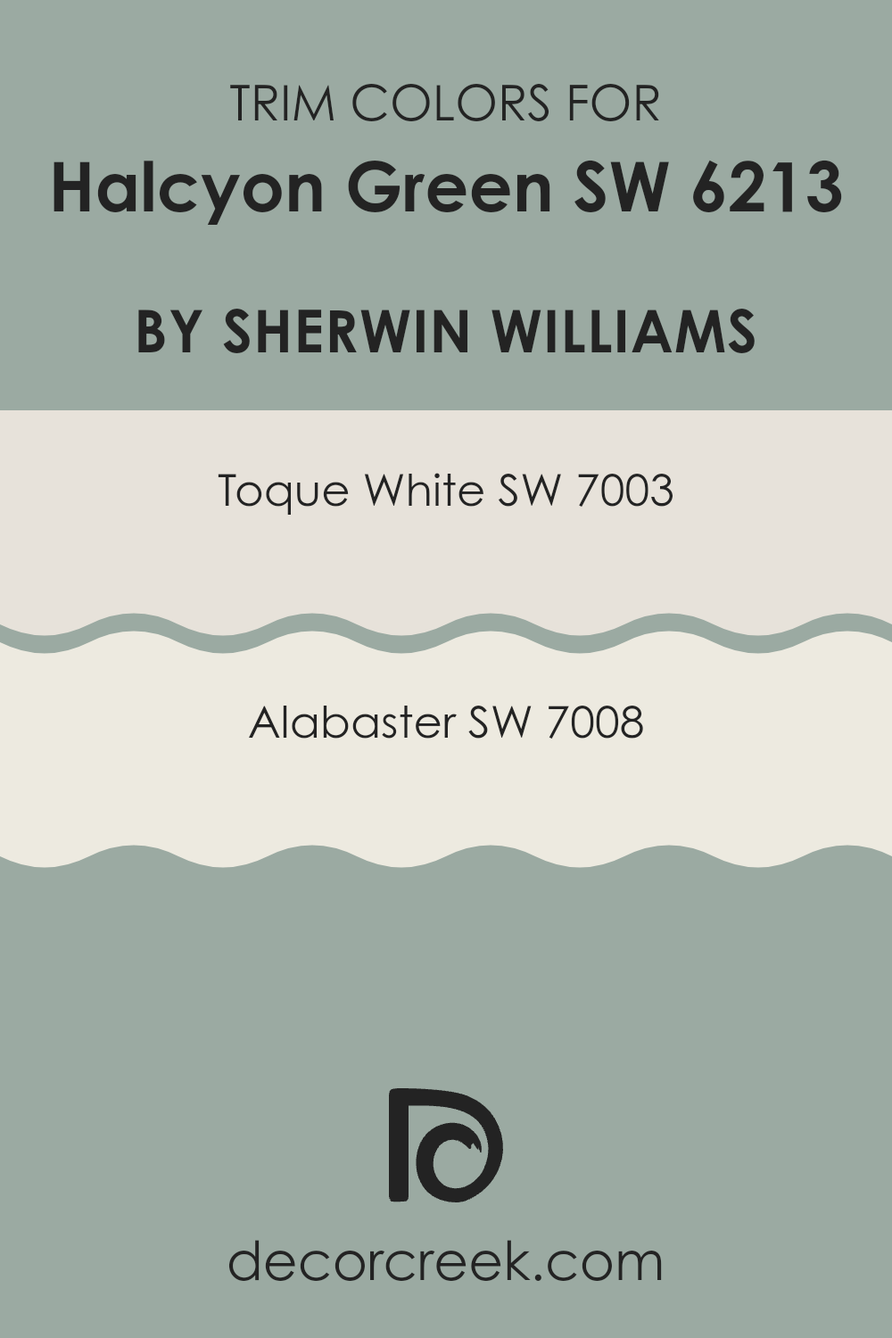
Trendy Trim Colors of Halcyon Green SW 6213 by Sherwin Williams to use this year.
Trim colors are the accents used on the edges, corners, and framing areas of architectural elements such as doors, windows, and moldings. These colors are crucial because they help define and highlight the key features of a room, adding depth and contrast.
For instance, when paired with Halcyon Green, trim colors like Toque White and Alabaster by Sherwin Williams enhance the overall appearance by creating a clean and distinct boundary. This helps the wall color stand out and gives the room a finished look, making the green more vibrant and noticeable.
Toque White SW 7003 is a gentle and understated white shade that brings a fresh and airy feel to any room, making it an excellent choice for trim. It contrasts subtly with Halcyon Green, providing a soft separation that is pleasing to the eye without overpowering the main color.
On the other hand, Alabaster SW 7008 is a slightly warmer shade of white with a creamy and inviting quality that pairs beautifully with the cooler tones of Halcyon Green. It offers a slightly more pronounced contrast than Toque White, ideal for those looking to bring a touch of warmth to their rooms while ensuring the green remains a central feature.
You can see recommended paint colors below:
- SW 7003 Toque White
- SW 7008 Alabaster
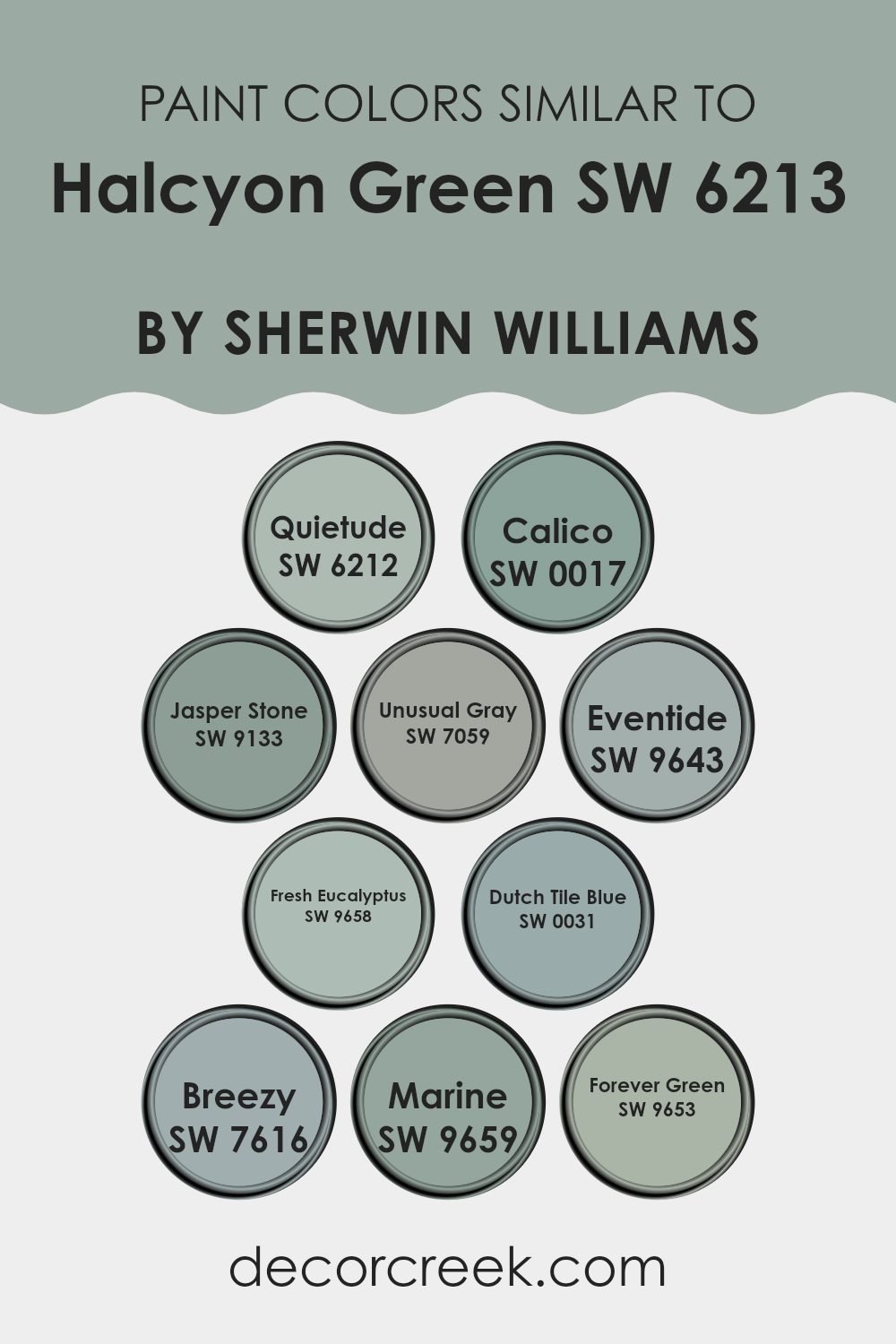
Evergreen Colors Similar to Halcyon Green SW 6213 by Sherwin Williams
Similar colors are crucial in design because they help create a cohesive and harmonious look in any room. By using shades like SW 6212 – Quietude, a subtle, restful green, alongside SW 0017 – Calico, a neutral tone that holds a hint of earthiness, designers can achieve a balanced ambiance.
Additionally, SW 9133 – Jasper Stone provides a deeper, green-blue hue that complements the main color nicely, offering a bit of depth to the overall scheme. When colors like SW 7059 – Unusual Gray are included, the palette gains a muted, adaptable backdrop which enhances other tones. SW 9643 – Eventide presents a cooler, more bluish-green which keeps the scheme vibrant yet calming.
Further enriching the palette, SW 9658 – Fresh Eucalyptus brings a lively, fresh tone that echoes the vitality of nature. SW 0031 – Dutch Tile Blue introduces a charming, slightly more animated blue that livens up rooms without feeling too intense.
The lightness of SW 7616 – Breezy adds an airy, open feel, ideal for creating a relaxed environment. On the deeper end of the spectrum, SW 9659 – Marine provides a rich, navy-like depth, anchoring the lighter shades and adding elegance. Finally, SW 9653 – Forever Green offers a lasting, deep green that ensures the color scheme remains grounded and lush, perfectly rounding out the set of similar hues.
You can see recommended paint colors below:
- SW 6212 Quietude
- SW 0017 Calico
- SW 9133 Jasper Stone
- SW 7059 Unusual Gray
- SW 9643 Eventide
- SW 9658 Fresh Eucalyptus
- SW 0031 Dutch Tile Blue
- SW 7616 Breezy
- SW 9659 Marine
- SW 9653 Forever Green
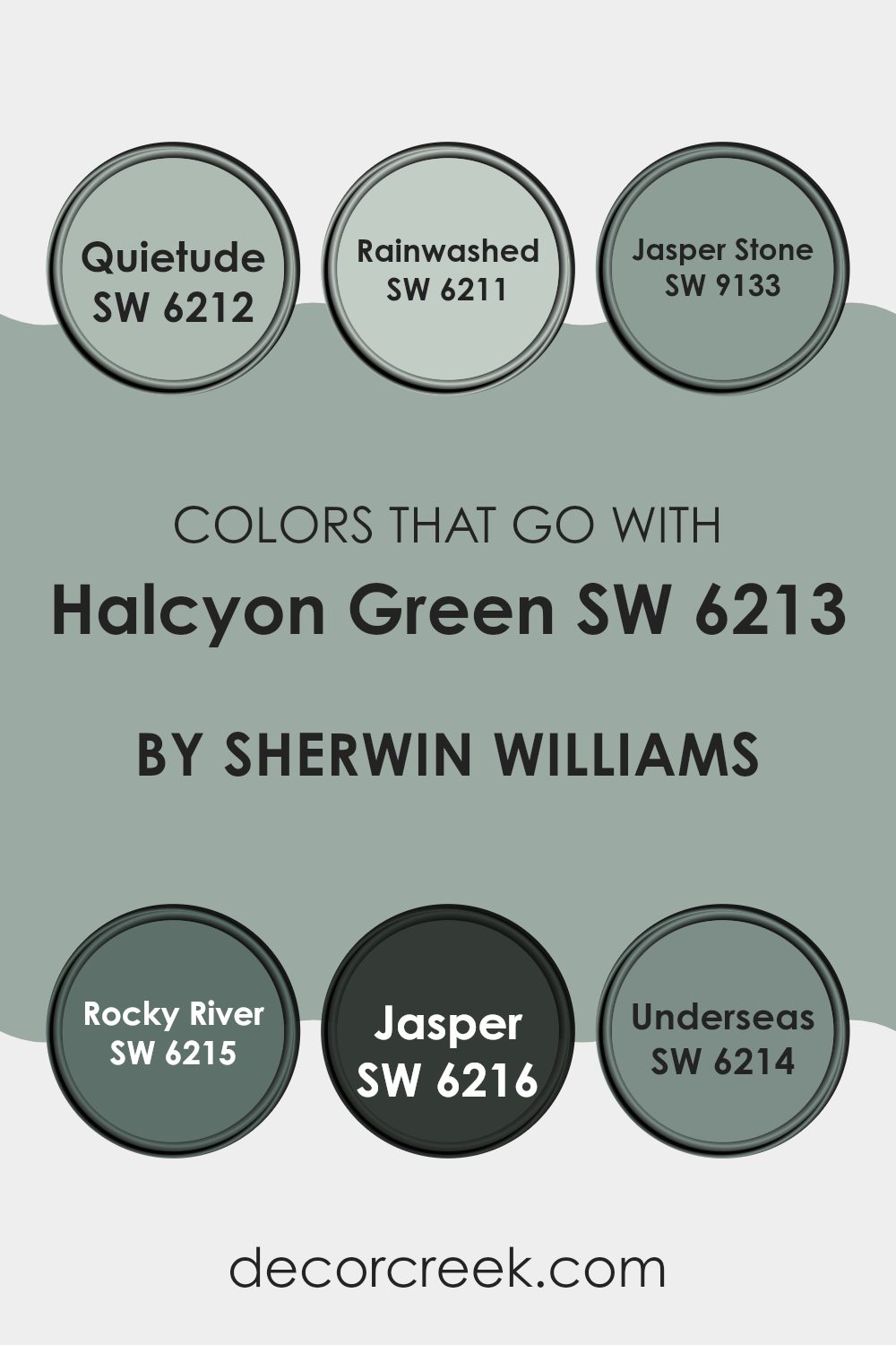
Colors that Go With Halcyon Green SW 6213 by Sherwin Williams
Choosing the right colors to pair with Halcyon Green SW 6213 by Sherwin Williams is crucial because it helps create a harmonious and pleasant atmosphere in your room. Halcyon Green itself is a soft, muted green that has a calming effect, making it an adaptable choice for any room.
When paired with complementary colors like Quietude SW 6212, a light grayish blue, the combination produces a subtle contrast that enhances the feeling of calmness. Similarly, Rainwashed SW 6211, which has a breezier hue, mixes beautifully with Halcyon Green to bring a fresh and airy feel to the environment.
On the other hand, bolder colors like Jasper Stone SW 9133, a deep teal, provide a striking balance to Halcyon Green, making the room more dynamic without feeling too intense. Pairing it with Rocky River SW 6215, a darker and more intense shade of green-blue, adds depth and character to the room.
Jasper SW 6216, a dark earthy green, offers a grounding feeling that complements the lighter tones of Halcyon Green. Lastly, Underseas SW 6214 is a unique deep green with gray tones that matches well with Halcyon Green, setting a cozy and inviting backdrop. Together, these colors work together to build a cohesive and inviting palette that enhances the natural beauty of Halcyon Green.
You can see recommended paint colors below:
- SW 6212 Quietude
- SW 6211 Rainwashed
- SW 9133 Jasper Stone
- SW 6215 Rocky River
- SW 6216 Jasper
- SW 6214 Underseas
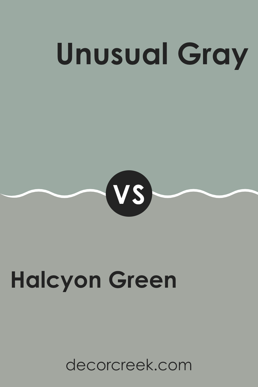
Halcyon Green SW 6213 by Sherwin Williams vs Unusual Gray SW 7059 by Sherwin Williams
Halcyon Green has a soft and gentle vibe that brings to mind the calmness of nature. It’s a blend of pale green and gray, creating a calming atmosphere. This color is great for rooms where you want to relax and unwind, like bedrooms or quiet sitting areas.
Unusual Gray is a cooler shade that leans more into gray tones, with a subtle undertone of green. It gives off a modern and understated feel, making it suitable for creating a more professional or clean look in rooms like home offices or modern living rooms.
Both colors work well in various lighting conditions and can be matched with other colors easily. However, Halcyon Green offers a warmer, more earthy touch that’s inviting, while Unusual Gray provides a crisp, neutral background that’s very adaptable.
You can see recommended paint color below:
Halcyon Green SW 6213 by Sherwin Williams vs Breezy SW 7616 by Sherwin Williams
Halcyon Green and Breezy, both from Sherwin Williams, offer distinct shades that can significantly affect the mood of a room. Halcyon Green is a soft, muted green with subtle gray undertones, giving it a gentle and calming presence ideal for rooms meant for relaxation such as bedrooms or quiet reading nooks.
On the other hand, Breezy is a light, airy blue that reflects a more open and refreshing vibe. This color works wonderfully in bathrooms, kitchens, or other areas where a clean, fresh look is desired.
While Halcyon Green leans towards a natural, earthy feel, Breezy commands a cooler tone, reminiscent of the sky on a clear day. Both colors are adaptable, yet each creates its unique aesthetic atmosphere, making them suitable for different purposes and tastes in home décor.
You can see recommended paint color below:
Halcyon Green SW 6213 by Sherwin Williams vs Calico SW 0017 by Sherwin Williams
Halcyon Green and Calico by Sherwin Williams are both beautiful colors with unique qualities. Halcyon Green is a calming, grayish-green shade that pairs well with natural tones and wood accents, creating a cozy, welcoming atmosphere.
It’s perfect for living rooms or bedrooms where a calming influence is desired. On the other hand, Calico is a soft, muted beige that offers a clean and adaptable backdrop, making it ideal for any room. It supports various decor styles and colors, acting as a neutral canvas that allows other design elements to stand out.
Both colors lend themselves well to a range of decorating styles and offer subtle, muted tones that can make rooms feel more inviting. Whether you prefer the gentle green hue of Halcyon Green or the adaptable beige of Calico, either choice provides a fresh and appealing look.
You can see recommended paint color below:
- SW 0017 Calico
Halcyon Green SW 6213 by Sherwin Williams vs Jasper Stone SW 9133 by Sherwin Williams
Halcyon Green and Jasper Stone are two distinct colors from Sherwin Williams. Halcyon Green is a soft, light green with a whisper of gray. It creates a calming and fresh atmosphere, perfect for a peaceful bedroom or a relaxing living room. It’s subtle enough to act as a neutral but carries just enough color to give a room a gentle touch of nature.
On the other hand, Jasper Stone is a deeper, more saturated color. It resembles the rich shade of a forest and evokes a sense of grounding and richness. This color is ideal for adding depth and warmth to rooms, suitable for accent walls or in areas where you want to make a strong visual impact.
Both colors offer unique atmospheric effects and could work well together for someone wanting to layer light and dark shades of green to add interest and variety to their decor. These greens suit different tastes, with Halcyon Green leaning towards understated elegance and Jasper Stone leaning towards a more pronounced, nature-inspired vibe.
You can see recommended paint color below:
- SW 9133 Jasper Stone
Halcyon Green SW 6213 by Sherwin Williams vs Eventide SW 9643 by Sherwin Williams
Halcyon Green and Eventide are two distinct paint colors from Sherwin Williams. Halcyon Green is a soft grayish-green, which lends a calming and restful quality to any room. It’s a subtle shade that pairs well with both bold and neutral palettes, making it an adaptable choice for any decorating style.
Eventide, on the other hand, is a much darker color that leans towards navy. This deep, saturated hue can bring a dramatic flair to rooms, ideal for creating a focal point or accent walls. It works especially well in areas designed for relaxation and contemplation, such as bedrooms or reading nooks.
When comparing the two, Halcyon Green offers more flexibility in terms of matching with different decors due to its lighter and more muted tone. Eventide, while offering a striking visual impact, might require more careful consideration in pairing with other colors and design elements due to its intensity. Both shades offer unique possibilities, depending on the atmosphere you want to achieve in your room.
You can see recommended paint color below:
- SW 9643 Eventide
Halcyon Green SW 6213 by Sherwin Williams vs Forever Green SW 9653 by Sherwin Williams
Halcyon Green and Forever Green are two distinct shades offered by Sherwin Williams, each bringing a unique vibe to the table. Halcyon Green is a calming, soft green with a hint of gray. This muted quality makes it adaptable and peaceful, easy to fit into many design schemes without feeling too intense in the room.
In contrast, Forever Green stands out as a deeper and more traditional green. This shade is richer and bolder, evoking the lushness of dense, leafy forests and making it ideal for areas where a strong, nature-inspired statement is desired.
While Halcyon Green is more subdued and might be preferred for a relaxed atmosphere, Forever Green offers vibrancy, adding a pop of color that can draw the eye and add a significant amount of character to a room. Each color could work beautifully depending on the mood and style you want to achieve in your room.
You can see recommended paint color below:
Halcyon Green SW 6213 by Sherwin Williams vs Marine SW 9659 by Sherwin Williams
Halcyon Green and Marine are two distinct colors by Sherwin Williams, each offering a unique vibe. Halcyon Green is a soft, calming green that leans towards a subtle grayish tone. It creates a gentle and relaxing atmosphere, making it an excellent choice for rooms where you want to feel calm, like bedrooms or bathrooms.
On the other hand, Marine is a richer, vibrant color that resembles the deep blue sea. This color is bolder and more striking, suitable for rooms where you want to add a splash of energy or a dramatic flair. It works well in areas like living rooms or dining areas where a touch of elegance can create an inviting environment.
These two colors contrast in their visual impact. While Halcyon Green sets a more subdued, cozy mood, Marine offers a livelier aura with its deeper, oceanic blue. Thus, depending on the mood you wish to set, each color serves its purpose effectively in different settings.
You can see recommended paint color below:
- SW 9659 Marine
Halcyon Green SW 6213 by Sherwin Williams vs Quietude SW 6212 by Sherwin Williams
Halcyon Green SW 6213 and Quietude SW 6212 by Sherwin Williams are two closely related shades, but they each have a distinct presence. Halcyon Green is slightly darker and carries a more pronounced green tone, giving it a lush and verdant quality that can bring a touch of nature into any room. This makes it ideal for areas where you want to create a cozy and inviting atmosphere, such as living rooms or bedrooms.
On the other hand, Quietude is a bit lighter and leans towards a softer, bluish-green hue. This subtler color is excellent for rooms that aim to have a calm and soothing vibe, making it perfect for bathrooms or a quiet reading nook. It reflects light beautifully, which can help smaller rooms appear more open and airy.
In terms of adaptable qualities, both colors work well in various decor styles and pair nicely with a wide range of furnishings and accents. Whether you prefer the deeper, richer tones of Halcyon Green or the gentle, calming effect of Quietude, each color offers its own unique charm and can beautifully enhance the aesthetic of a room.
You can see recommended paint color below:
Halcyon Green SW 6213 by Sherwin Williams vs Dutch Tile Blue SW 0031 by Sherwin Williams
Halcyon Green SW 6213 and Dutch Tile Blue SW 0031 are both paint colors offered by Sherwin Williams, each presenting a unique vibe. Halcyon Green is a calming, soft green with a hint of gray. It has an understated, gentle presence that makes it a great choice for creating a peaceful atmosphere in rooms like bedrooms and living rooms. It reflects natural elements and can blend well with various decor styles, adding a relaxing touch to any room.
On the other hand, Dutch Tile Blue is a deeper, more vibrant shade. This color is a rich blue with a slight gray undertone that gives it a muted yet impactful appearance. It’s perfect for areas where you want to add a bit of energy without feeling too intense in the room. Suitable for bathrooms or as an accent wall, it can make a room feel grounded yet lively.
Both these colors offer a way to bring nature-inspired tones into the home, though Halcyon Green leans towards subtle and soft, while Dutch Tile Blue offers a stronger, more pronounced hue.
You can see recommended paint color below:
Halcyon Green SW 6213 by Sherwin Williams vs Fresh Eucalyptus SW 9658 by Sherwin Williams
Halcyon Green and Fresh Eucalyptus are two paint colors offered by Sherwin Williams. Halcyon Green is a soft, muted green with blue undertones, creating a calm and gentle feel perfect for creating a relaxed atmosphere. It’s adaptable enough to be used in various rooms, from bedrooms to living rooms, providing a backdrop that’s both subtle and refreshing.
On the other hand, Fresh Eucalyptus is a darker, more vibrant shade of green. This color has a more lively and refreshing vibe, making it ideal for rooms where you want a bit of energy and a touch of nature. Its richer tone stands out more compared to the softer Halcyon Green, making it a great choice for accent walls or areas where you want the color to be the focal point.
In summary, while both colors share a green base, Halcyon Green leans towards a softer, more understated look, while Fresh Eucalyptus offers a brighter, bolder approach. Depending on the mood you want to set in your room, both colors have unique qualities that could enhance your home’s decor.
You can see recommended paint color below:
- SW 9658 Fresh Eucalyptus
Reflecting on my journey with SW 6213 Halcyon Green by Sherwin Williams, I am totally impressed with how much it livened up my room. Before using this color, I wasn’t sure which paint would suit my bedroom walls, but choosing Halcyon Green proved to be a great decision. This color is soft and calm, making my room feel cozy and welcoming. I find myself enjoying my time at home more because the walls have such a pleasant color.
The paint from Sherwin Williams also turned out to be of excellent quality. It went on the walls smoothly, and I only needed a couple of coats to get a perfect finish. This color works very well with both my dark and light furniture, showing just how flexible it can be to fit different styles and tastes.
In conclusion, SW 6213 Halcyon Green by Sherwin Williams is a superb choice for anyone looking to freshen up their walls with a new color that brings comfort and a fresh look to any room. Whether you are painting a bedroom, a kitchen, or a living room, this paint color might just be what you need.
I am certainly happy with my choice and would recommend it to others who are looking to make a positive change in their home’s appearance.
Ever wished paint sampling was as easy as sticking a sticker? Guess what? Now it is! Discover Samplize's unique Peel & Stick samples.
Get paint samples

