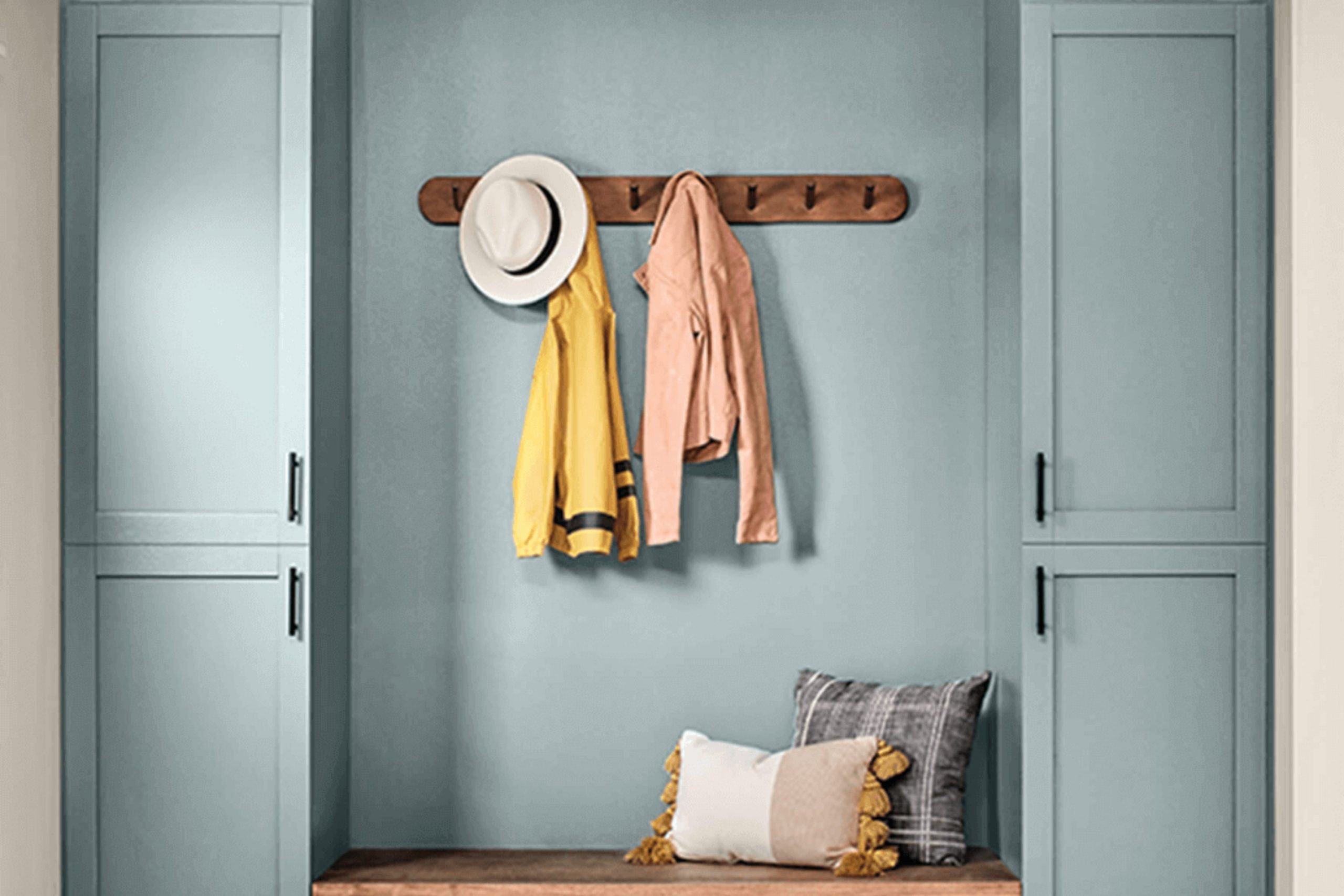
If you’re looking for a fresh color to spruce up your area, Sherwin Williams’ SW 0031 Dutch Tile Blue might just be what you need. This soothing hue has a charm that reminds me of a calm sky or a quiet corner by the sea. It has a subtle vibrancy that doesn’t overpower, making it perfect for anyone aiming to create a peaceful yet stylish environment.
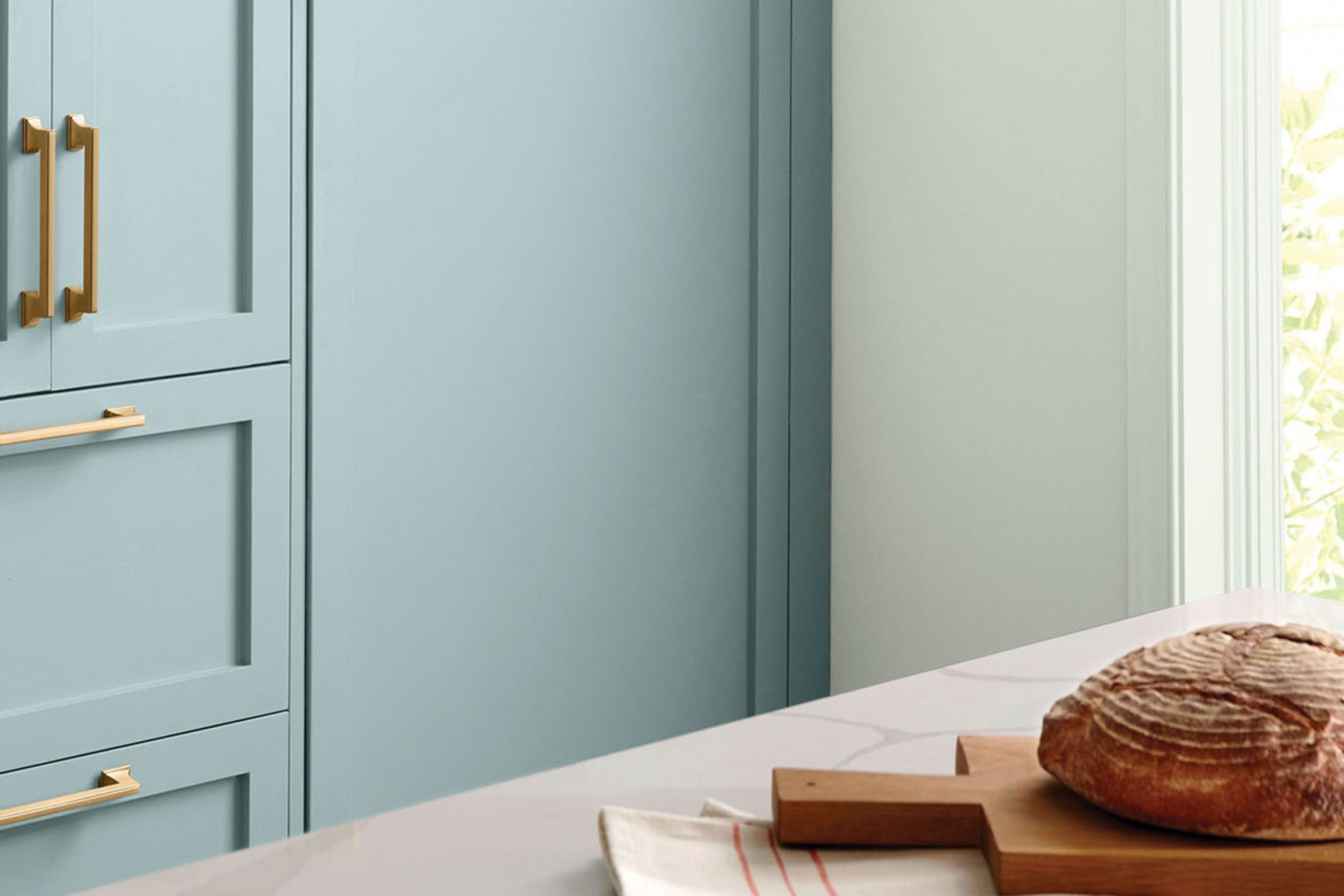
I’ve noticed that Dutch Tile Blue fits beautifully in various settings, whether it’s a cozy bedroom, a welcoming kitchen, or even an elegant bathroom. Its flexibility also extends to different decor styles, from modern minimalist to rustic country. The beauty of this color lies in its ability to pair well with both light and dark accents, offering multiple styling options depending on your taste and existing decor.
In my experience, using SW 0031 Dutch Tile Blue can help you brighten a dim room or add a touch of calmness to a busy area. It’s especially handy if you’re interested in giving your home a subtle pop of color without making drastic changes.
The comforting presence of this color could be just what your home needs to feel more inviting and refreshed.
What Color Is Dutch Tile Blue SW 0031 by Sherwin Williams?
Dutch Tile Blue by Sherwin Williams is a gentle, soothing blue that balances beautifully between a vibrant sky blue and a soft, muted hue, similar to historic ceramics found in old European architecture. It has a welcoming vibe, making it a perfect choice for creating a cozy, relaxed atmosphere in any room. This color is adaptable enough to work in various interior styles, particularly shining in country, coastal, and traditional decors.
Dutch Tile Blue pairs well with natural materials like light wooden furniture, which complements its warm undertones, and linen fabrics that add to the relaxed feel of the color. It also looks stunning when matched with crisp white trims, adding a fresh and clean contrast that brings out its depth. Incorporating elements like wicker or rattan can enhance its rustic charm, ideal for areas aiming for a more laid-back feel.
Textured accents like knitted throws or pottery pieces help ground the area, making it feel more inviting. This color is a great choice for living rooms, bedrooms, or even kitchens where you want to combine comfort with a hint of freshness. Dutch Tile Blue evokes a sense of calm, perfect for areas designed for relaxation and comfort.
Is Dutch Tile Blue SW 0031 by Sherwin Williams Warm or Cool color?
Dutch Tile Blue is a unique shade of blue offered by Sherwin Williams. This color has a calming, soft tone which makes it perfect for bedrooms and bathrooms where a relaxed atmosphere is desired.
Additionally, the muted quality of Dutch Tile Blue allows it to work well with a variety of decor styles and colors, offering flexibility in home design. It pairs beautifully with whites and grays, which can help to create a crisp, clean look in any room. Due to its understated nature, it can also be used in larger areas like living rooms without overpowering the area.
It’s particularly effective in areas that get plenty of natural light, where the color can show off its gentle, airy qualities. Dutch Tile Blue is also durable and easy to maintain, making it a practical choice for busy households. This color can help bring a sense of calm and order to any home.
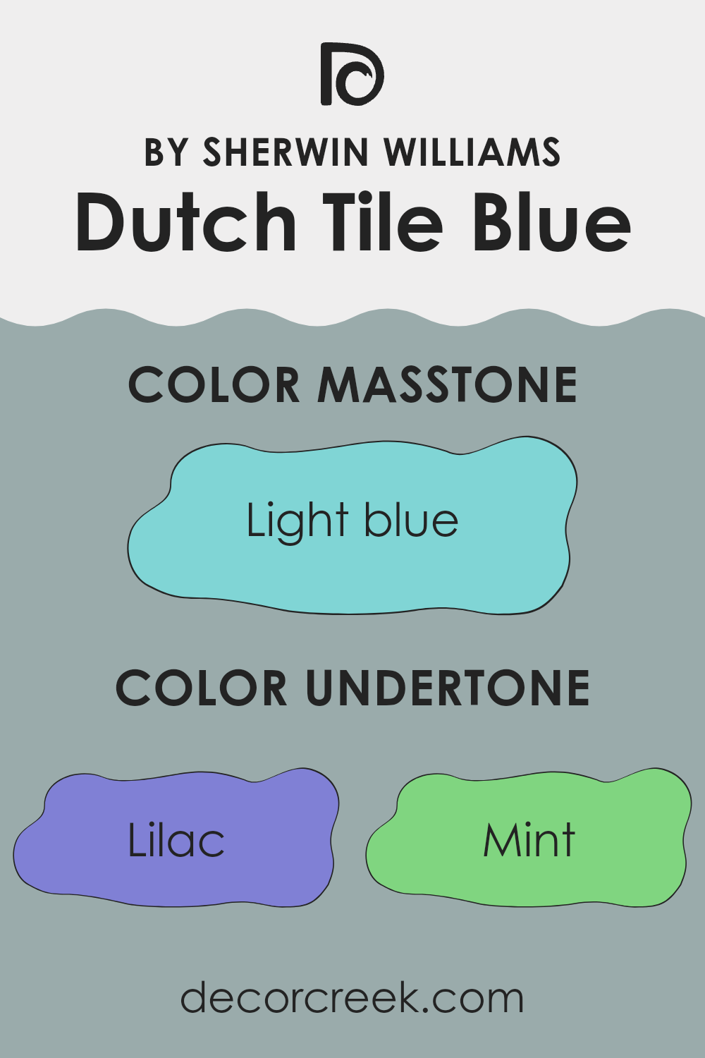
Undertones of Dutch Tile Blue SW 0031 by Sherwin Williams
Dutch Tile Blue by Sherwin Williams is a unique color because it comes with a mix of subtle undertones that can significantly affect how it looks in different settings. The undertones are variations of colors that are mixed into the primary color, which in this case is a soft blue. These undertones include shades like lilac, mint, various grays, light purple, pale yellow, pale pink, and different shades of turquoise and blue.
In painting, undertones are crucial because they can change the perception of the primary color depending on the light and surrounding colors. For instance, if a room gets a lot of natural light, the pale yellow or light gray undertones in Dutch Tile Blue might make the walls appear brighter and more vibrant. On the other hand, in a room with less light, the gray or dark turquoise undertones might make the color appear more subdued.
When used on interior walls, Dutch Tile Blue’s range of undertones gives it an adaptable quality. In a bedroom, the lilac or light purple undertones can bring out a calm and gentle ambiance, ideal for relaxing. In a living room with plenty of natural light, the mint or pale yellow undertones can make the area feel airy and fresh.
In conclusion, the different undertones in Dutch Tile Blue make it adaptable to various interior styles and lighting conditions. They contribute to the overall feel of the room by subtly influencing the primary color, enhancing the atmosphere in diverse ways.
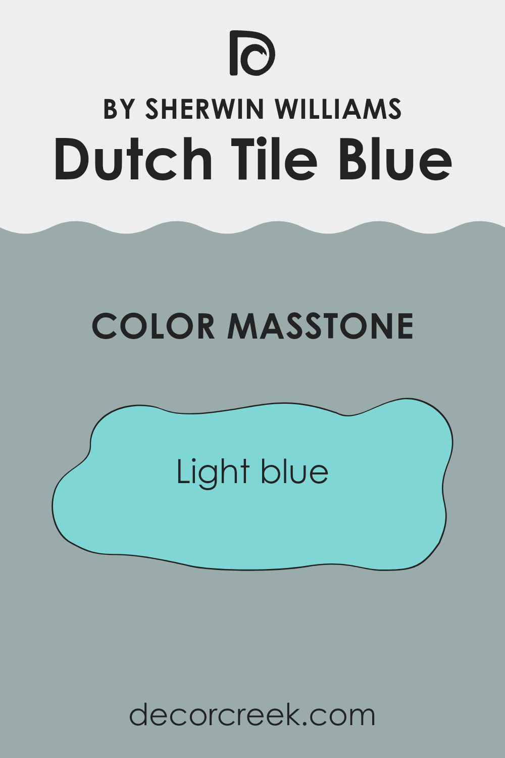
What is the Masstone of the Dutch Tile Blue SW 0031 by Sherwin Williams?
Dutch Tile Blue SW 0031 by Sherwin Williams is a soft, light blue color with a refreshing and airy feel. Its neutral undertone makes it adaptable and easy to pair with different decorating styles.
In home settings, this light blue can make areas feel larger and more open, making it ideal for small rooms or areas with limited natural light. It’s also great for creating a relaxed atmosphere, which works well in bedrooms or bathrooms where a calming effect is desired.
Additionally, this color can be used as a subtle backdrop for more vibrant accessories or furniture, allowing them to stand out. The lightness of Dutch Tile Blue provides a gentle contrast to stronger colors, offering a balanced visual experience without overpowering the senses. This color is especially helpful in achieving a breezy and fresh look in any home.
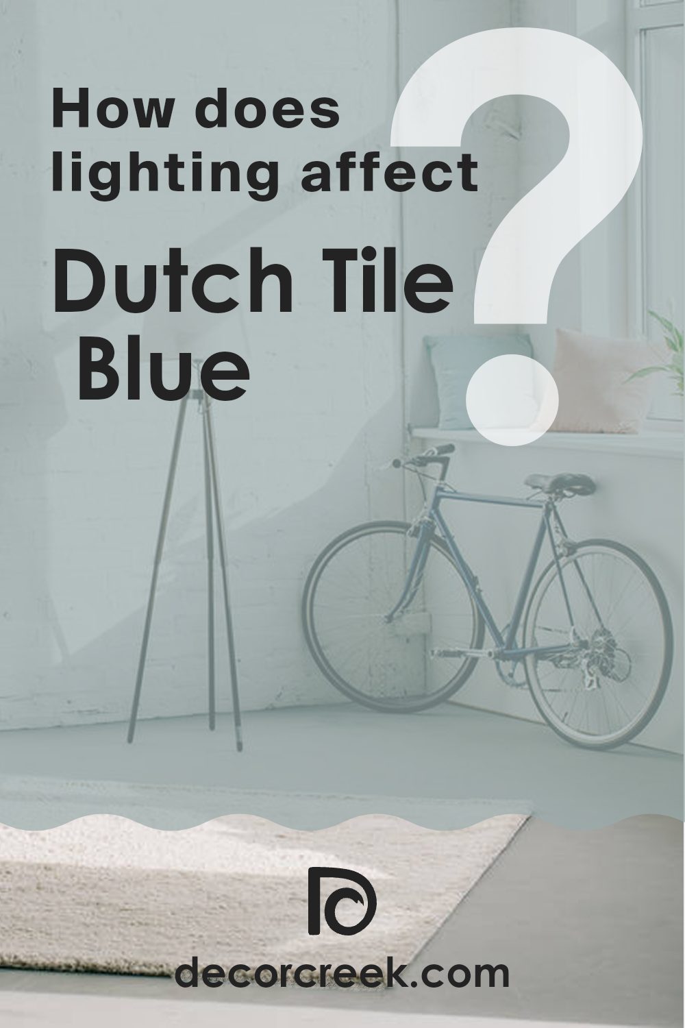
How Does Lighting Affect Dutch Tile Blue SW 0031 by Sherwin Williams?
Lighting plays a critical role in how we perceive colors. The same wall color can look different depending on the type of light it’s exposed to. This change happens due to the light’s color temperature, which can either amplify or mute the hues.
For instance, Dutch Tile Blue is a subtle shade that can look significantly different under various lighting conditions. In natural light, this color appears truer to its form. Natural sunlight provides a balance of warm and cool light, allowing Dutch Tile Blue to display its real charm without distortion. It is vibrant yet calm, making areas feel airy and fresh.
In rooms with artificial lighting, the type of bulbs used affects how Dutch Tile Blue appears. Fluorescent lights, which lean towards a cooler spectrum, can enhance the blue tones, making the color appear slightly more vibrant. On the other hand, incandescent bulbs, which emit warmer light, might soften the color, giving it a more muted presence.
Room orientation also impacts how Dutch Tile Blue looks throughout the day:
- North-facing rooms: These rooms get less direct sunlight and often have a cooler light quality. Here, Dutch Tile Blue might look a bit more shadowed and subdued, particularly during the day.
- South-facing rooms: With ample sunlight, south-facing rooms highlight the best of Dutch Tile Blue, making it look bright and lively. The consistent exposure to sunlight can vividly bring out the color’s subtle complexities.
- East-facing rooms: Mornings in east-facing rooms will showcase Dutch Tile Blue in its full glory, bathed in warm morning light. However, as the day progresses and the natural light diminishes, the color can appear cooler and more restrained.
- West-facing rooms: Opposite to the east, west-facing rooms highlight Dutch Tile Blue beautifully in the evenings when the sun sets, casting a warm glow that makes the wall color feel warmer.
Understanding these nuances can help in choosing the right paint color for a room based on its orientation and the type of artificial light it will commonly be exposed to.
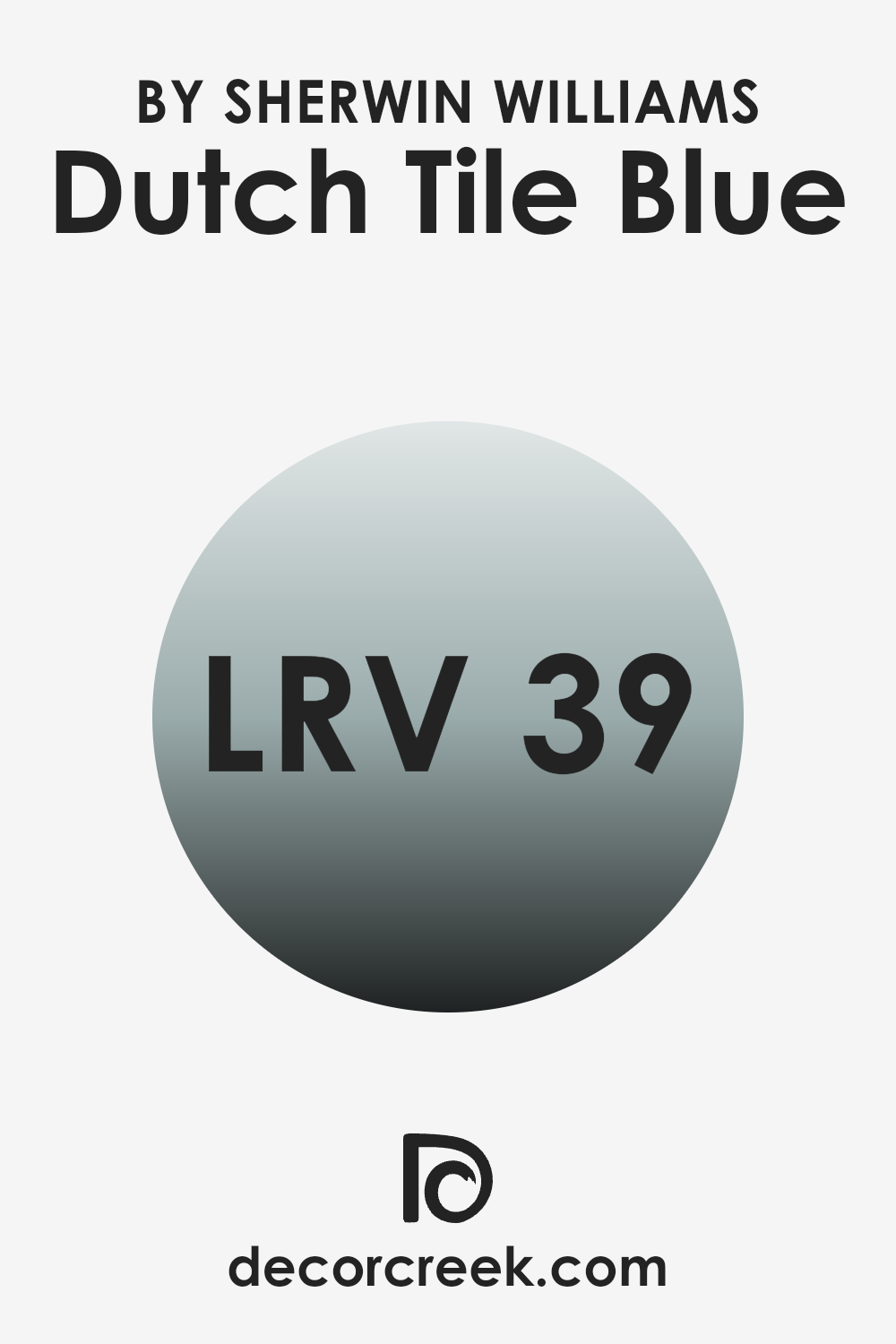
What is the LRV of Dutch Tile Blue SW 0031 by Sherwin Williams?
LRV stands for Light Reflectance Value, which is a measure that tells you how much light a color reflects back into a room. It’s expressed as a percentage, and the higher the number, the more light it reflects. This is really useful to consider when choosing paint colors because it can help you understand how bright or dark a color will look once applied to your walls.
Colors with a higher LRV make a room feel brighter and more open, while those with a lower LRV can make areas feel cozier but smaller. The LRV for the color Dutch Tile Blue is 38.952, which means it reflects almost half of the light that hits it.
This particular value suggests that this color is quite adaptable—it’s not too dark, but it’s also not exceptionally light. In practical terms, this means it can add some color to a room without making the area feel closed in. It’s a good choice if you want to add some visual interest to your room without overpowering it with a very dark hue. This shade of blue will have a moderate impact on the lighting of your room, making it a solid choice for areas where you want a balance of coziness and light.
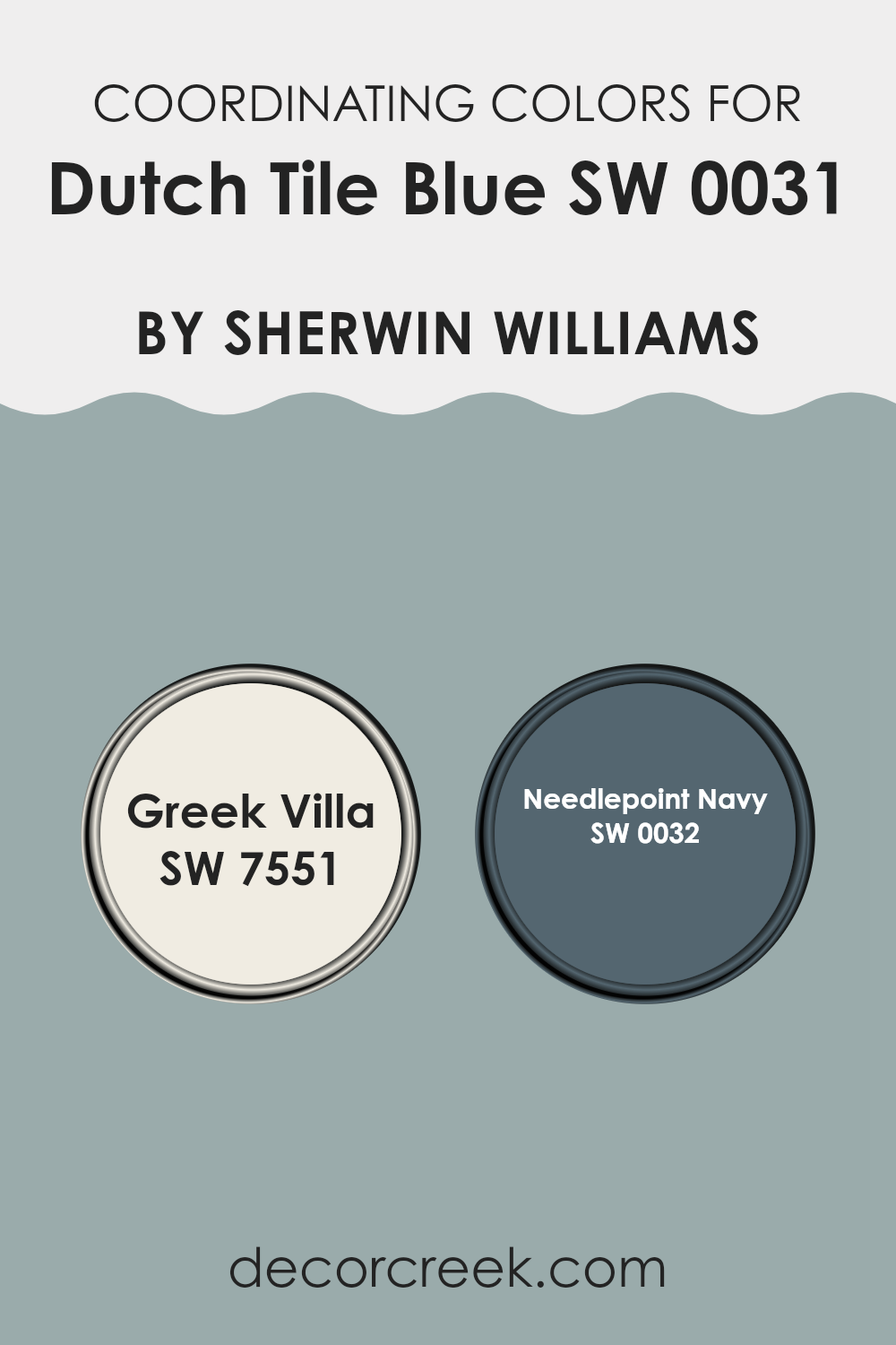
Coordinating Colors of Dutch Tile Blue SW 0031 by Sherwin Williams
Coordinating colors are hues that complement each other when used together, either by offering striking contrasts that are visually appealing or by harmoniously blending with one another to create a soothing and aesthetically pleasing palette. When dealing with a specific paint color like Dutch Tile Blue by Sherwin Williams, selecting coordinating colors such as Greek Villa and Needlepoint Navy can enhance the visual impact and balance of your area.
Greek Villa acts as a neutral buffer or a soft backdrop that can lighten the mood when paired with more intense colors. On the other hand, Needlepoint Navy can be used to bring depth and contrast, especially useful in highlighting architectural features or creating focal points in a room.
Greek Villa is a warm, off-white shade that provides a clean and inviting look. Its subtle cream undertones make it an excellent choice for creating a calm and welcoming atmosphere when used alongside stronger hues. Needlepoint Navy, as a deep blue, offers a rich complement to the lighter hues of Dutch Tile Blue, providing a classic navy look that can make a dramatic yet harmonious statement. Together, these colors work to balance each other, making them perfect for anyone looking to create a pleasing and coordinated color scheme in their decorating projects.
You can see recommended paint colors below:
- SW 7551 Greek Villa
- SW 0032 Needlepoint Navy
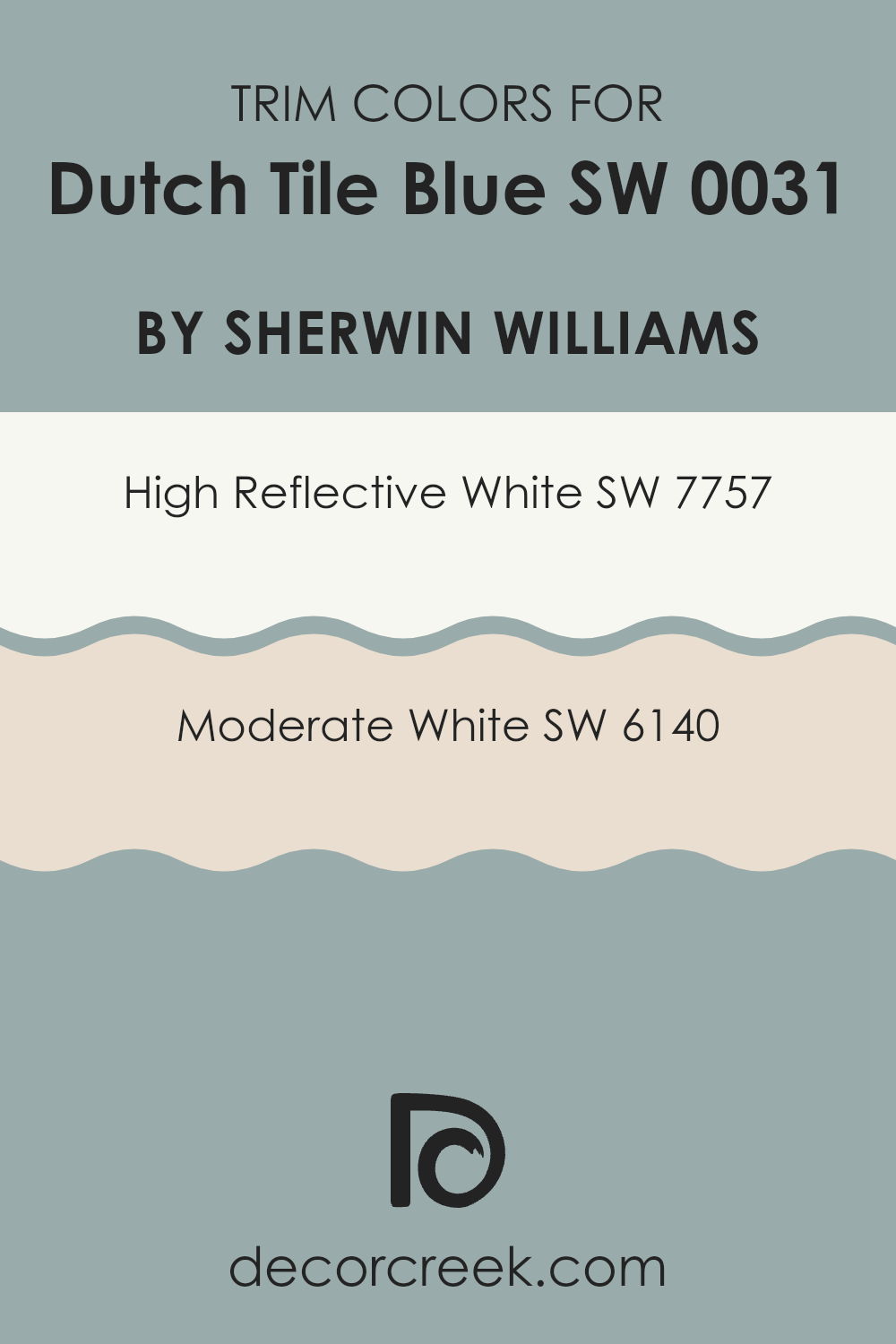
What are the Trim colors of Dutch Tile Blue SW 0031 by Sherwin Williams?
Trim colors, such as SW 7757 – High Reflective White and SW 6140 – Moderate White, are used to accent main paint shades by highlighting architectural details and borders like door frames, window sills, and baseboards. Choosing the right trim color can enhance the overall appearance of a room, making the primary color stand out while adding a clean, finished look to the area.
For example, when paired with a shade like Dutch Tile Blue, both High Reflective White and Moderate White can provide distinct levels of contrast that highlight the beautiful blue hue, ensuring it catches the eye without overpowering the senses.
High Reflective White is a very bright, pure white that brings out a crisp and clear boundary against richer tones, making it an ideal trim to use with deeper colors for a striking effect. Moderate White, on the other hand, offers a softer, warmer tone that blends smoothly with colors, providing a subtle transition that is pleasing to the eye. This helps soften the intensity of a strong primary color, creating a more gentle and inviting ambiance. Using either of these colors as a trim with Dutch Tile Blue can help define areas clearly and tastefully.
You can see recommended paint colors below:
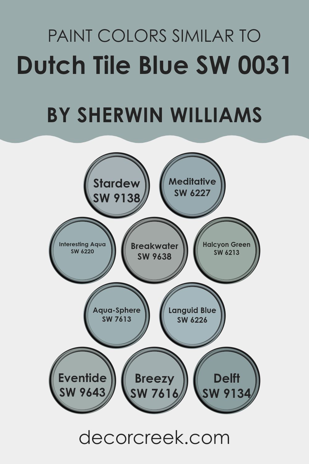
Colors Similar to Dutch Tile Blue SW 0031 by Sherwin Williams
Understanding the importance of similar colors in decorating can enhance the overall aesthetic of any area. Similar colors, like variations of “Dutch Tile Blue,” create a cohesive and harmonious look. For instance, SW 9138 – Stardew is a soft, muted gray-blue that brings a calm, soothing presence, while SW 6227 – Meditative is a deeper gray-blue, adding a touch of depth without overpowering the area. SW 6220 – Interesting Aqua introduces a hint of green to the blue, making it lively yet not too bold. SW 9638 – Breakwater offers a lighter touch, akin to the reflection of light on water, which makes it ideal for a peaceful setting.
Additionally, SW 6213 – Halcyon Green has a green-blue hue that reminds one of a quiet day by the sea, suitable for creating a relaxed environment. SW 7613 – Aqua-Sphere brings a more pronounced green-blue that’s akin to the depths of the ocean, perfect for adding a bit of mystery.
SW 6226 – Languid Blue is a fade-back blue that does not demand attention, making it perfect for softening any area. SW 9643 – Eventide darkens the mood slightly, offering an end-of-day blue that pairs well with softer tones. SW 7616 – Breezy is a light, airy blue with a refreshing vibe, and SW 9134 – Delft bears a more traditional blue, reminding one of classic blue pottery details. Using these similar colors allows for adaptability in design while maintaining a unified look.
You can see recommended paint colors below:
- SW 9138 Stardew
- SW 6227 Meditative
- SW 6220 Interesting Aqua
- SW 9638 Breakwater
- SW 6213 Halcyon Green
- SW 7613 Aqua-Sphere
- SW 6226 Languid Blue
- SW 9643 Eventide
- SW 7616 Breezy
- SW 9134 Delft
How to Use Dutch Tile Blue SW 0031 by Sherwin Williams In Your Home?
Dutch Tile Blue SW 0031 by Sherwin Williams is a soft, muted shade of blue that brings a cozy and welcoming vibe to any area. This color is ideal for creating a peaceful atmosphere in your home. Its gentle blue hue works well in rooms where you want to relax, such as bedrooms or bathrooms.
It pairs beautifully with light woods, whites, and neutral tones, adding a hint of color without overpowering the area. For those looking to refresh their living areas, Dutch Tile Blue can be used on walls to provide a subtle background that complements various decor styles.
It’s also a great choice for kitchen cabinets for a fresh, modern look. If painting an entire room seems too much, consider using it for an accent wall or inside shelving units to add a splash of color. This adaptable shade can help make your home look fresh and inviting, enhancing the overall aesthetic with its gentle charm.
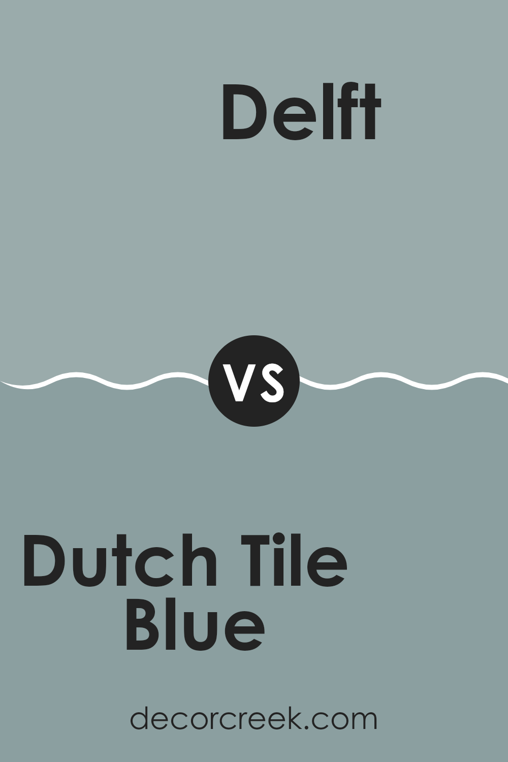
Dutch Tile Blue SW 0031 by Sherwin Williams vs Delft SW 9134 by Sherwin Williams
Dutch Tile Blue and Delft are both colors by Sherwin Williams that draw inspiration from the classic Delftware pottery. Dutch Tile Blue has a stronger, more pronounced blue tone that feels rich and vibrant. It’s the kind of color that stands out in a room, making it a great choice for an accent wall or furniture pieces.
On the other hand, Delft is a softer and lighter shade that leans slightly towards gray. This makes it more subdued and adaptable for larger areas like walls in a living room or bedroom. It provides a gentle backdrop that complements various decor styles without overpowering them.
Both colors offer a fresh and clean look but serve different purposes depending on the impact you want to create. Dutch Tile Blue is bold and eye-catching, while Delft is quiet and more flexible, blending easily with other shades and textures.
You can see recommended paint color below:
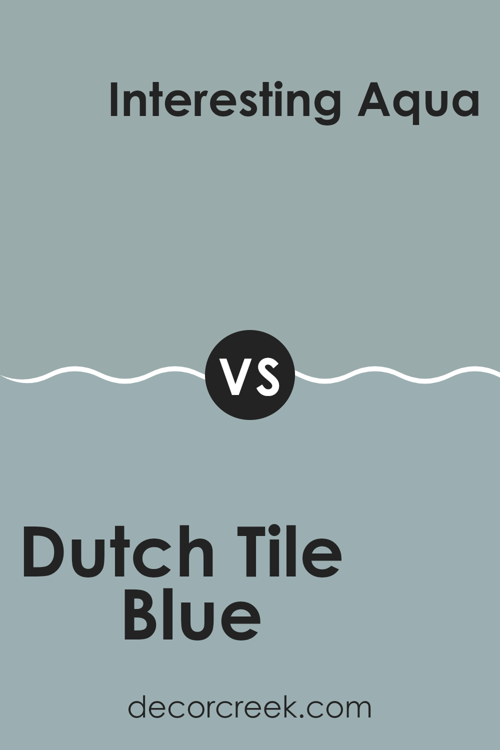
Dutch Tile Blue SW 0031 by Sherwin Williams vs Interesting Aqua SW 6220 by Sherwin Williams
Dutch Tile Blue and Interesting Aqua are two distinct colors from Sherwin Williams that offer unique vibes to any area. Dutch Tile Blue leans towards a deeper, muted blue with a subtle gray undertone, making it perfect for a classic look.
On the other hand, Interesting Aqua has a lighter, more vibrant tone, combining hints of blue and green that gives it a refreshing and lively feel. This makes Interesting Aqua ideal for areas where you’re aiming to add a touch of brightness without overpowering with color.
Both colors are quite adaptable, but while Dutch Tile Blue suggests a more reserved and traditional atmosphere, Interesting Aqua leans more towards a cheerful and inviting ambiance. Choosing between them would largely depend on the mood you’re looking to create in your room. Whether it’s the understated elegance of Dutch Tile Blue or the cheerful lightness of Interesting Aqua, both colors have their distinct charm.
You can see recommended paint color below:
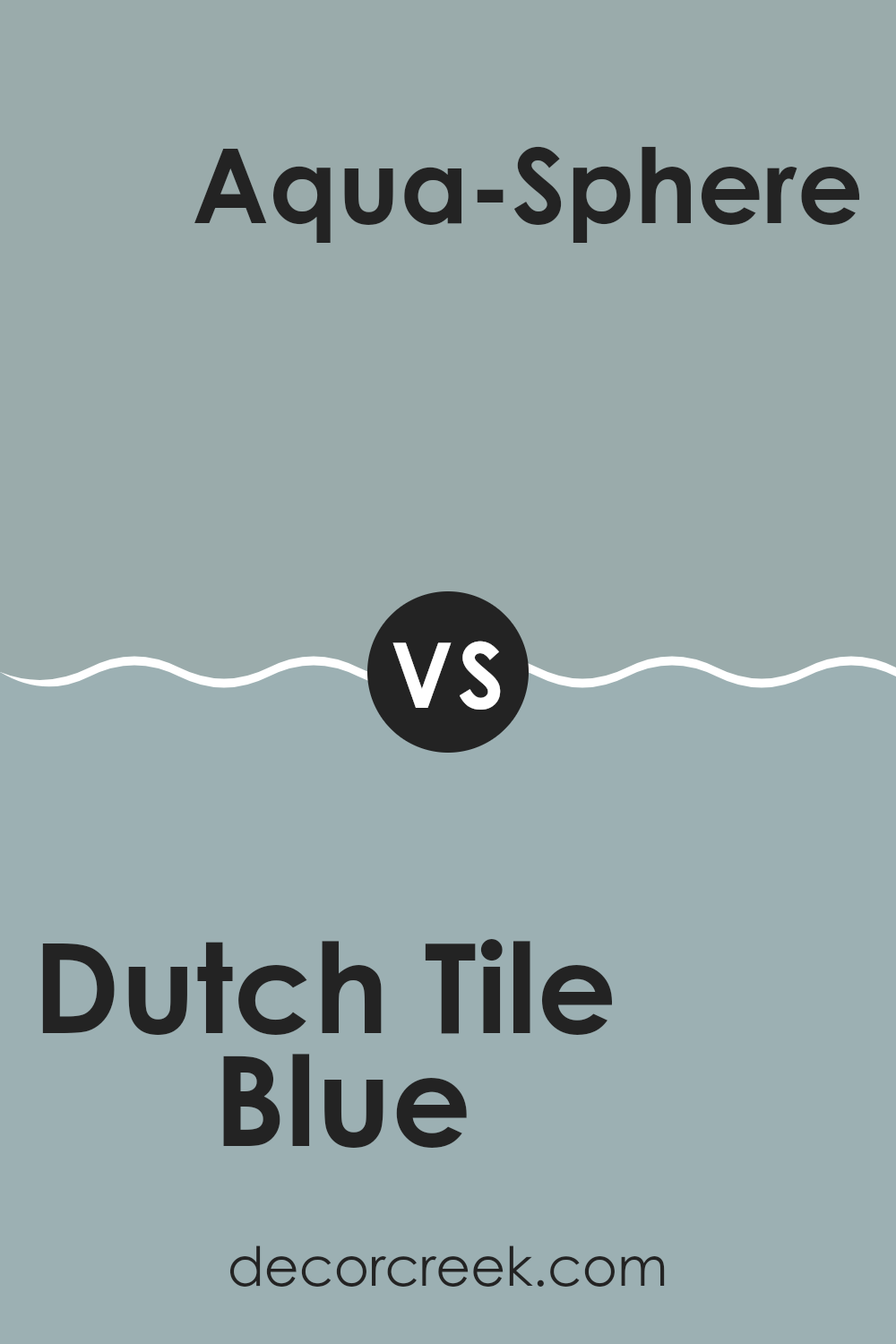
Dutch Tile Blue SW 0031 by Sherwin Williams vs Aqua-Sphere SW 7613 by Sherwin Williams
Dutch Tile Blue is a rich, deep blue that almost borders on navy. It brings a strong sense of calm and steadiness to an area and pairs beautifully with crisp whites or creamy tones for a classic look. It tends to absorb light, making it a great choice for accent walls or for rooms where a cozy, intimate feel is desired.
In contrast, Aqua-Sphere offers a lighter, more refreshing blue-green shade that provides a breezy and airy feel to interiors. This color works well in bathrooms and kitchens because it mimics the natural tones of water, giving the areas a clean and refreshing vibe. It’s also adaptable enough to be soothing, yet bright enough to energize a room.
In essence, Dutch Tile Blue gives a deeper, more traditional blue atmosphere ideal for a dramatic or grounded decor style, while Aqua-Sphere offers a lighter, cheerful touch perfect for creating a relaxed, refreshing environment.
You can see recommended paint color below:
Dutch Tile Blue SW 0031 by Sherwin Williams vs Meditative SW 6227 by Sherwin Williams
Dutch Tile Blue and Meditative, both by Sherwin Williams, are beautiful shades of blue with distinct personalities. Dutch Tile Blue is a vibrant, slightly muted blue that brings a refreshing and cheerful vibe to any area. It has a traditional feel, making it perfect for creating a welcoming atmosphere in areas like living rooms or kitchens.
On the other hand, Meditative is a softer, more subtle blue with a hint of gray. This color is ideal for those looking to achieve a calm and soothing environment. It works well in bedrooms or bathrooms where a relaxing ambiance is desired.
Both colors are adaptable, yet Dutch Tile Blue stands out more due to its brighter and more energetic tone. Meditative, being quieter and more understated, provides a backdrop that can easily blend with various decor styles. Depending on the mood you want to set in your area, either color can be a great choice.
You can see recommended paint color below:

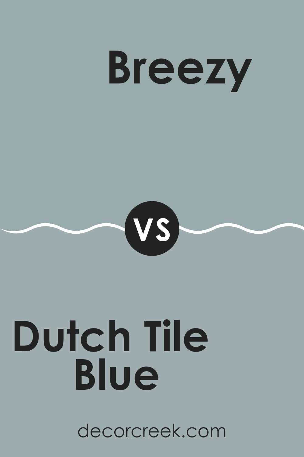
Dutch Tile Blue SW 0031 by Sherwin Williams vs Breezy SW 7616 by Sherwin Williams
Dutch Tile Blue and Breezy are two paint colors from Sherwin Williams that offer unique shades for different decorating moods. Dutch Tile Blue is a deeper, more saturated shade that leans towards a historic, classic blue. It’s ideal for creating a strong presence in an area, offering a sense of stability and grounding. This makes it a great choice for areas where you want focus and calmness, like studies or bedrooms.
On the other hand, Breezy is much lighter and airier. It has a soft, almost ethereal quality to it, making it perfect for areas that you want to feel open and fresh. It’s excellent for living rooms and bathrooms where a light, refreshing vibe is desirable.
Both colors have their own charm. If you’re looking for a color that’s more bold and commanding, Dutch Tile Blue is the way to go. If you prefer something lighter and more freeing, Breezy would be a better choice. Each brings its own unique atmosphere to a room, depending on what you’re aiming to achieve.
You can see recommended paint color below:
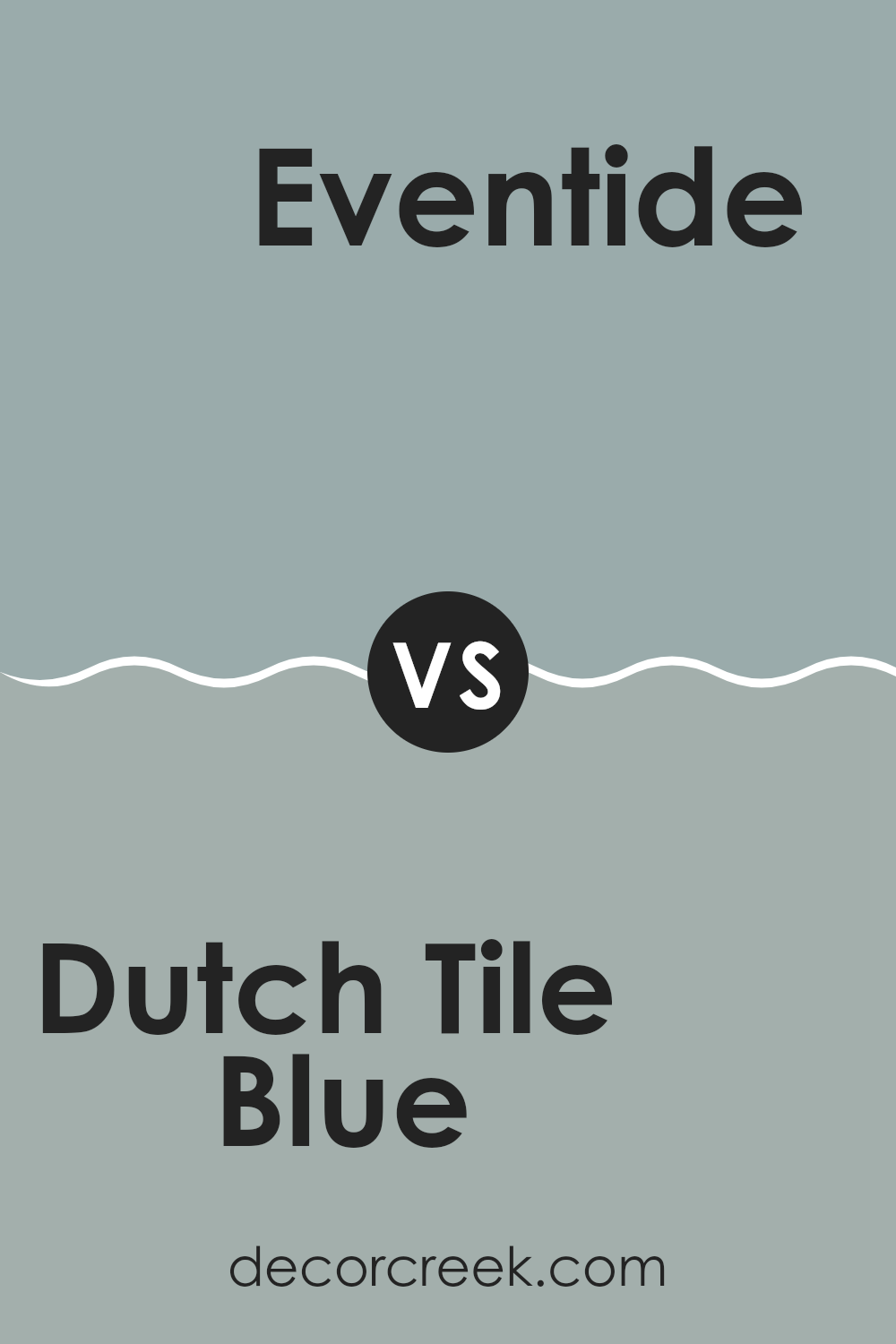
Dutch Tile Blue SW 0031 by Sherwin Williams vs Eventide SW 9643 by Sherwin Williams
Dutch Tile Blue and Eventide are both colors from Sherwin Williams, but they have distinct tones. Dutch Tile Blue is a deep, rich blue with a touch of gray that gives it a muted, almost pastel-like quality. It’s an adaptable color that creates a calm atmosphere in a room.
On the other hand, Eventide is also a peaceful color, but it leans more towards a soft green, mixing hints of blue and gray. This color is lighter compared to Dutch Tile Blue and offers a fresh, airy feel, making it great for areas where you want a subtle splash of color that isn’t overpowering.
Both colors can be used to give an area a relaxed vibe, but Dutch Tile Blue has a classic depth that works well in a traditional setting, while Eventide offers a modern twist with its greener undertones.
You can see recommended paint color below:
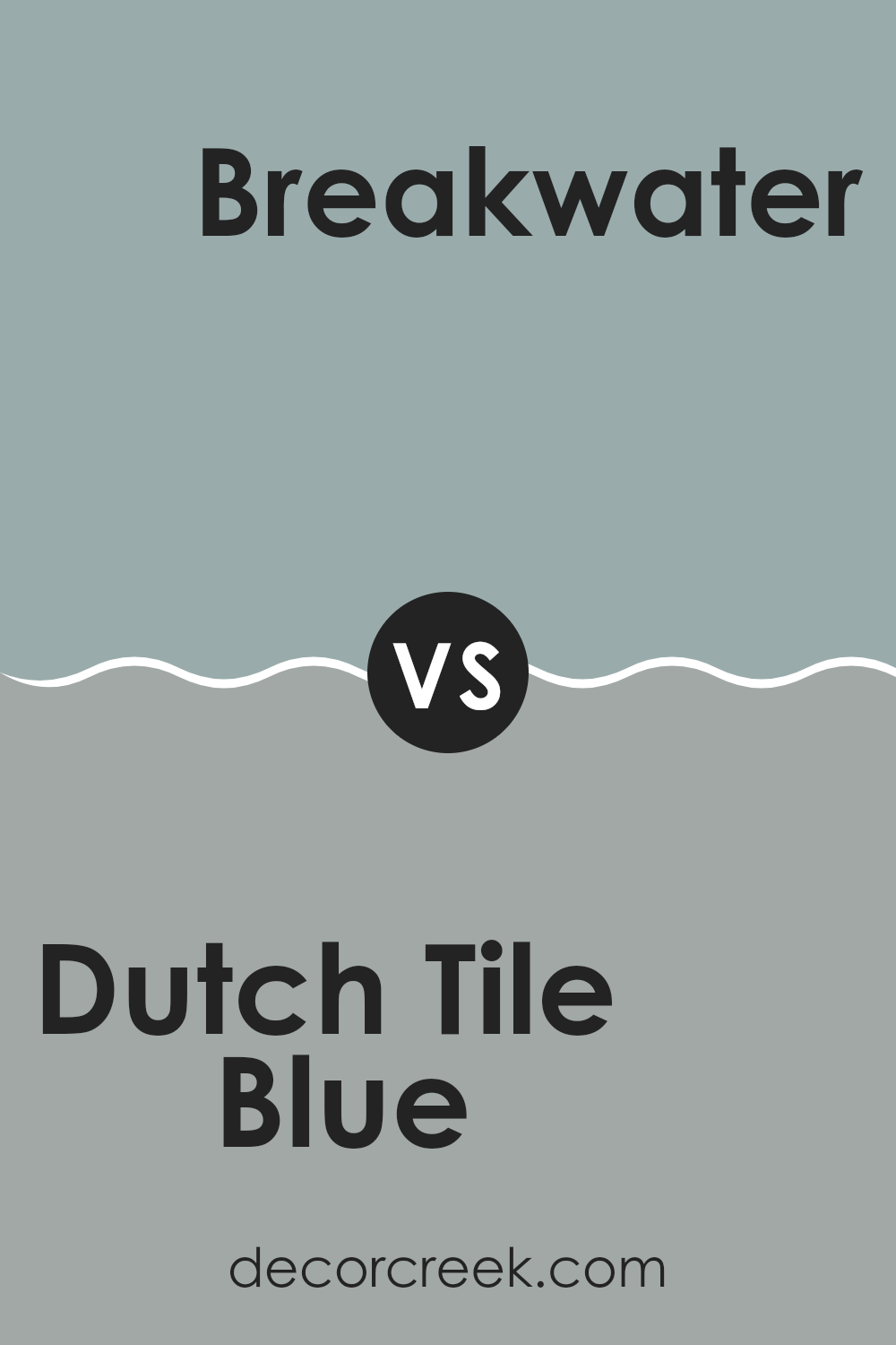
Dutch Tile Blue SW 0031 by Sherwin Williams vs Breakwater SW 9638 by Sherwin Williams
“Dutch Tile Blue” and “Breakwater” by Sherwin Williams are both soothing tones, but they have distinct vibes and uses. “Dutch Tile Blue” is a deeper shade that resembles the classic blue often seen in traditional ceramic tiles. This rich color can give a room a cozy and somewhat nostalgic feeling, making it ideal for areas where you want comfort, like living rooms or bedrooms.
On the other hand, “Breakwater” is lighter and leans towards a soft, grayish-blue. This color feels more modern and is great for creating a bright, airy feel in an area. It’s a good choice for bathrooms or small areas because the lightness of the hue helps make the area appear larger.
Overall, while both colors belong to the blue family, “Dutch Tile Blue” offers a deeper, comforting appeal, and “Breakwater” provides a fresher, crisper look. Choosing between the two depends on the mood and area you are looking to enhance.
You can see recommended paint color below:
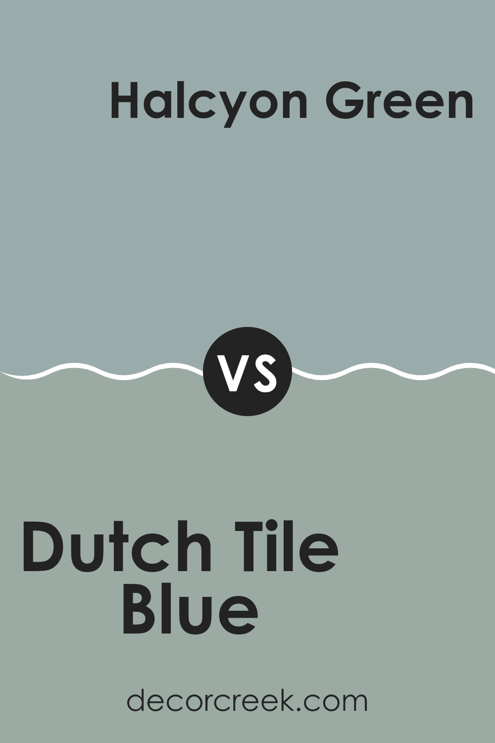
Dutch Tile Blue SW 0031 by Sherwin Williams vs Halcyon Green SW 6213 by Sherwin Williams
Dutch Tile Blue and Halcyon Green, both by Sherwin Williams, are distinct colors that offer unique vibes to any area. Dutch Tile Blue is a deeper shade, resembling a classic blue with a hint of gray. It gives a feeling of stability and calmness, great for creating a cozy, peaceful environment. It works well in bedrooms or offices where concentration and calm are valuable.
On the other hand, Halcyon Green is lighter and leans towards a refreshing green with subtleties of blue, making any area feel fresh and lively. It’s perfect for areas like kitchens or bathrooms, where a clean, invigorating atmosphere is often desired. While this color is also calming, it brings more energy to an area compared to the more reserved Dutch Tile Blue.
Both colors are adaptable and can be used in various settings, depending on the mood and function of the room. Whether one chooses the grounding Dutch Tile Blue or the energizing Halcyon Green, both shades are sure to enhance the area with their character.
You can see recommended paint color below:
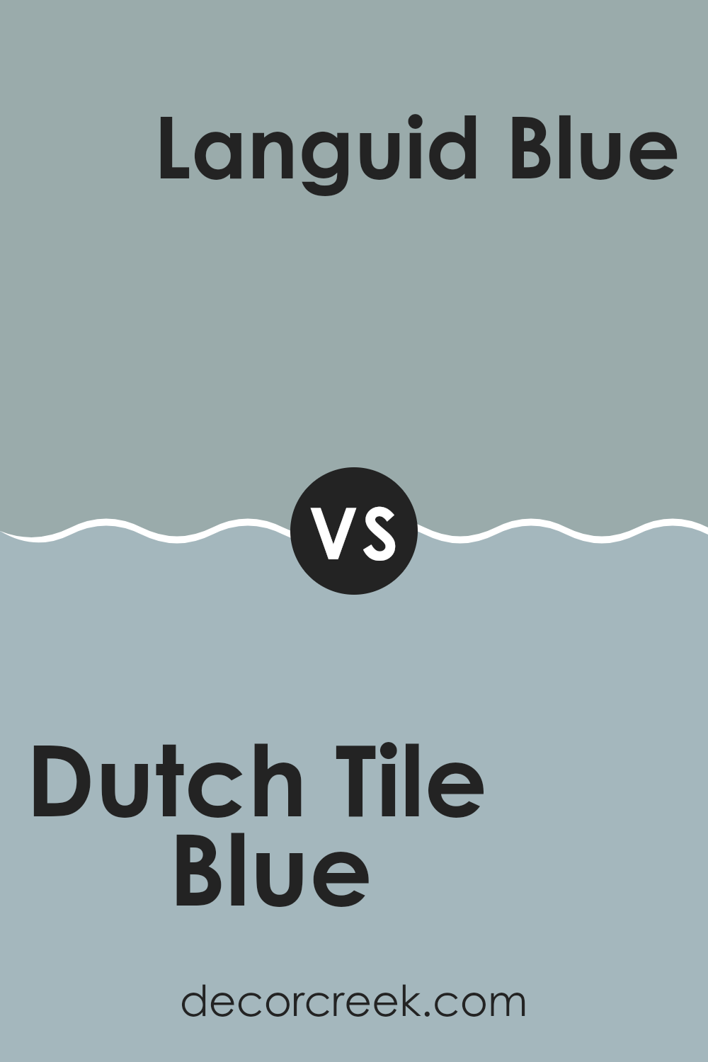
Dutch Tile Blue SW 0031 by Sherwin Williams vs Languid Blue SW 6226 by Sherwin Williams
Dutch Tile Blue and Languid Blue are two distinctive shades by Sherwin Williams. Dutch Tile Blue has a deeper, richer tone that mimics the classic look of blue tiles you might find in a traditional kitchen or bathroom. It’s a strong color that stands out and adds a solid pop of depth to any area.
On the other hand, Languid Blue is a much lighter and softer shade. It feels airy and gentle, making it perfect for creating a relaxed and inviting atmosphere in rooms like bedrooms or living areas. Its lightness can make a small area appear bigger and brighter.
Both colors share a blue base, but their impact and mood-setting abilities are quite different due to their varying intensities. Dutch Tile Blue works well in an area that commands a bolder, more pronounced look, while Languid Blue is ideal for someone looking for a subtle hint of color. Each offers a unique way to bring the cool tones of blue into a home, depending on how striking or mild you want the effect to be.
You can see recommended paint color below:
- SW 6226 Languid Blue
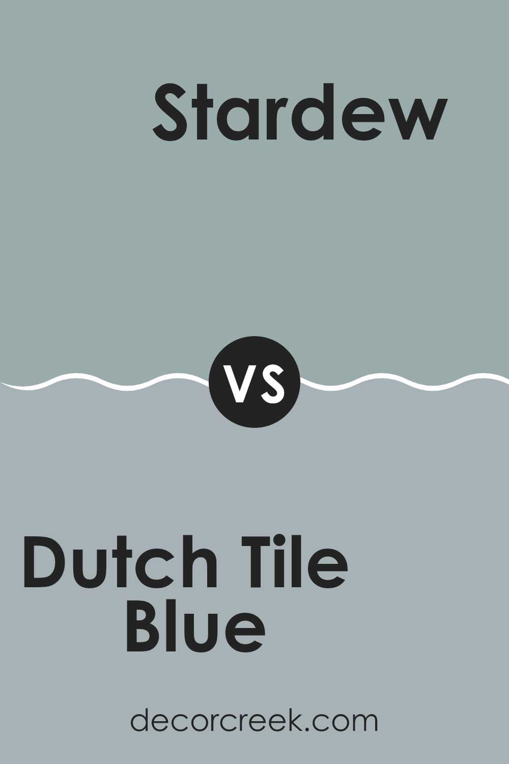
Dutch Tile Blue SW 0031 by Sherwin Williams vs Stardew SW 9138 by Sherwin Williams
Dutch Tile Blue and Stardew, both by Sherwin Williams, are soothing shades of blue but they differ in their tones and feel. Dutch Tile Blue has a deeper, more traditional blue hue, making it a solid choice for settings where a classic blue is desired, such as in bathrooms or kitchens. It pairs well with bright whites or grays, providing a sharp, clear contrast.
On the other hand, Stardew has a softer, more muted appearance, with subtle gray undertones. This makes it incredibly adaptable for different areas, lending a lighter, airier feel. It’s perfect for bedrooms or living areas where a calming influence is preferred. Stardew works well with both light and dark furniture, adding flexibility in decorating.
To summarize, if you’re looking for a stronger, more standout blue, Dutch Tile Blue is the way to go. But if a gentle, adaptable color is what you need, Stardew is the better choice.
You can see recommended paint color below:
Concluding my thoughts on SW 0031 Dutch Tile Blue by Sherwin Williams, I can happily say that this color is truly a treasure for any room looking for a calm and lovely feel. One of the main things I liked is how the color reminds me of a peaceful day under a clear sky. It gives a feeling similar to spending a warm, lazy day by the lake, gazing at the sky reflecting off the water.
This shade of blue can brighten up a room, making it feel more open and airy, which is great for smaller rooms or any place that needs a touch of lightness. Adding this color to a bedroom or a study could help in making those areas peaceful yet cheerful places for spending time. It’s not just about beauty; this color also goes well with a lot of other colors. Whether you mix it with soft whites or bold colors, it stands out without clashing.
Moreover, I found that it’s a smart choice if you’re thinking of painting your walls yourself. This particular shade covers nicely, meaning you might not need too many coats to get a solid color, which is convenient and saves a bit of effort and paint.
To wrap up, SW 0031 Dutch Tile Blue offers a lovely palette that ignites the joy of a clear, peaceful day and is as easy to apply as it is beautiful. Whether you are giving a new look to your own bedroom, living room, or just a piece of furniture, this color can certainly uplift the mood and aesthetics of your surroundings.

Ever wished paint sampling was as easy as sticking a sticker? Guess what? Now it is! Discover Samplize's unique Peel & Stick samples.
Get paint samples

