The better we choose the paint color to use in our homes the better the final results will be. However, it is difficult for many of us to figure out what paint colors to use since they are often rather complex.
Different shades and undertones, as well as the way those colors react to light and appear on the walls can make the task even more complicated.
One of such complex colors is Quietude by the Sherwin-Willaims brand. And today we are going to introduce it to you. From this article, you are going to learn what type of color it is and what undertones it has. Also, we will tell you how this color reacts to light and what light reflectance value it has.
In addition, you will learn more about the best trim color and coordinating colors of the Quietude paint. And as a bonus, we will tell you how this color will work in different rooms in your home.
What Kind Of Color Is SW Quietude?
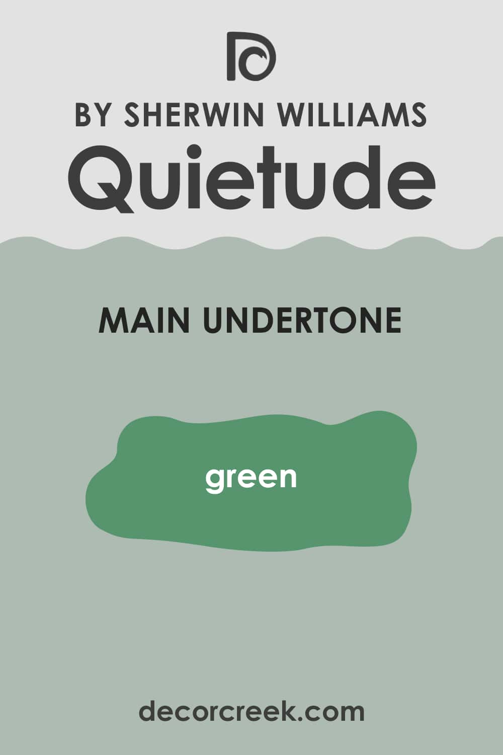
First of all, you need to know that SW Quietude can hardly be called a simple color! As Encycolorpedia says, this beautiful color is in fact a blend of green and blue with cool tones. Nevertheless, the two colors it consists of combine in one absolutely harmoniously, creating a lovely hue that reminds of the color of an ocean wave.
If you decide to use Quietude in your home, remember that it is a cool-toned color. But thanks to its particular blend, it offers a softer approach in comparison with traditional blue paint colors and many of the popular gray paint colors.
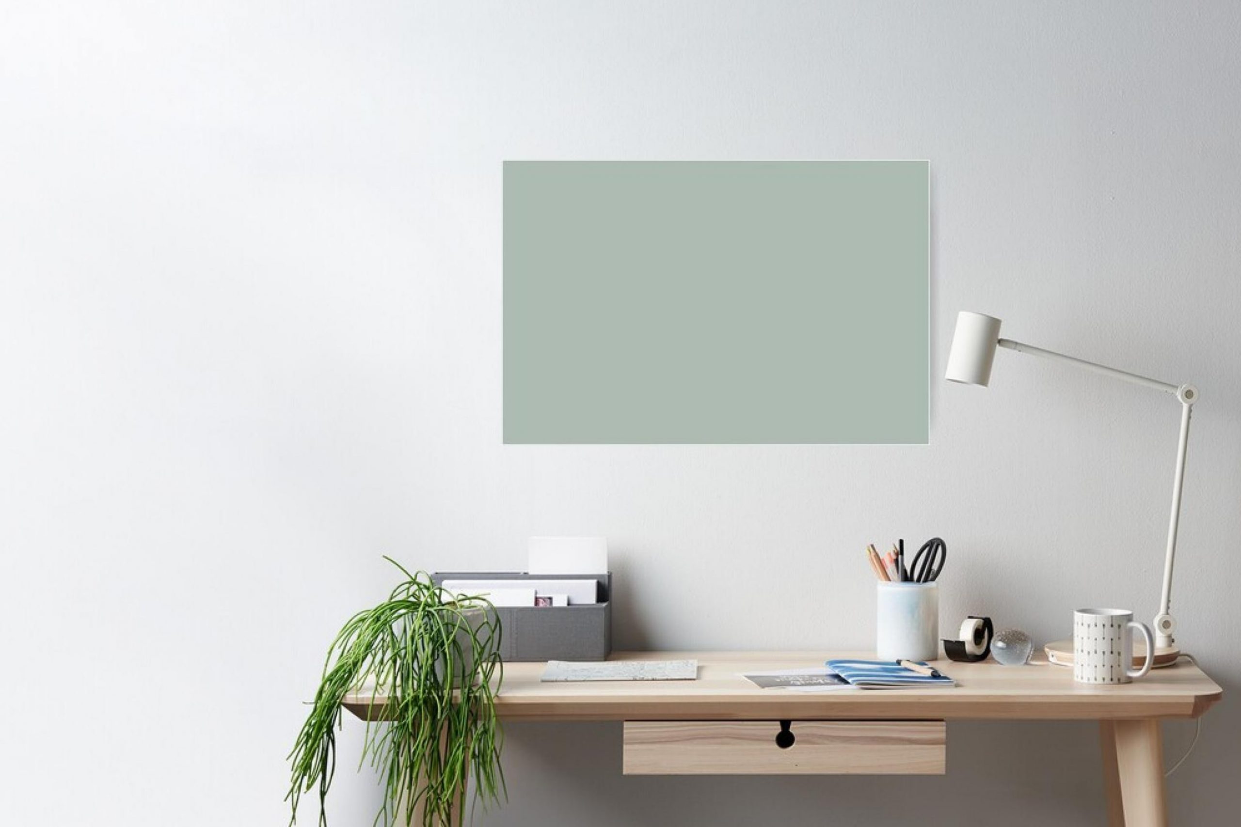
Also, thanks to its complex nature, this color can be used in many rooms and in many types of lighting. For example, Quietude can be a pretty good choice for a north-facing room. On the other hand, its cool vibe will add balance to a south-facing room or a room with western afternoon light.
Ever wished paint sampling was as easy as sticking a sticker? Guess what? Now it is! Discover Samplize's unique Peel & Stick samples.
Get paint samples

SW Quietude Undertone
Defining what undertones a certain paint color has is always tricky and complicated, especially if you are not very knowledgeable in paints. Undertone can be affected by the way the light hits the paint, as well as by the rest of the color palette and more.
This is why it often happens that paint color can look one way in a store on a paint swatch, but when you test a sample on your wall, it can turn out to be totally different!
When it comes to a color like Quietude, undertones play an especially important role since the way the color may work becomes quite unpredictable. Besides, your own perception is also essential. How come? Well, if you are too sensitive to green undertones, for example, and strongly dislike them, you might find Quietude way too green.
On the other hand, if you are looking for a green-blue blend with the green being dominant, you may find Quietude a bit too blue. Of course, blue isn’t dominant in this color blend, but it certainly plays an important part in its makeup, which is why the color may shift its away from the traditional look of green.
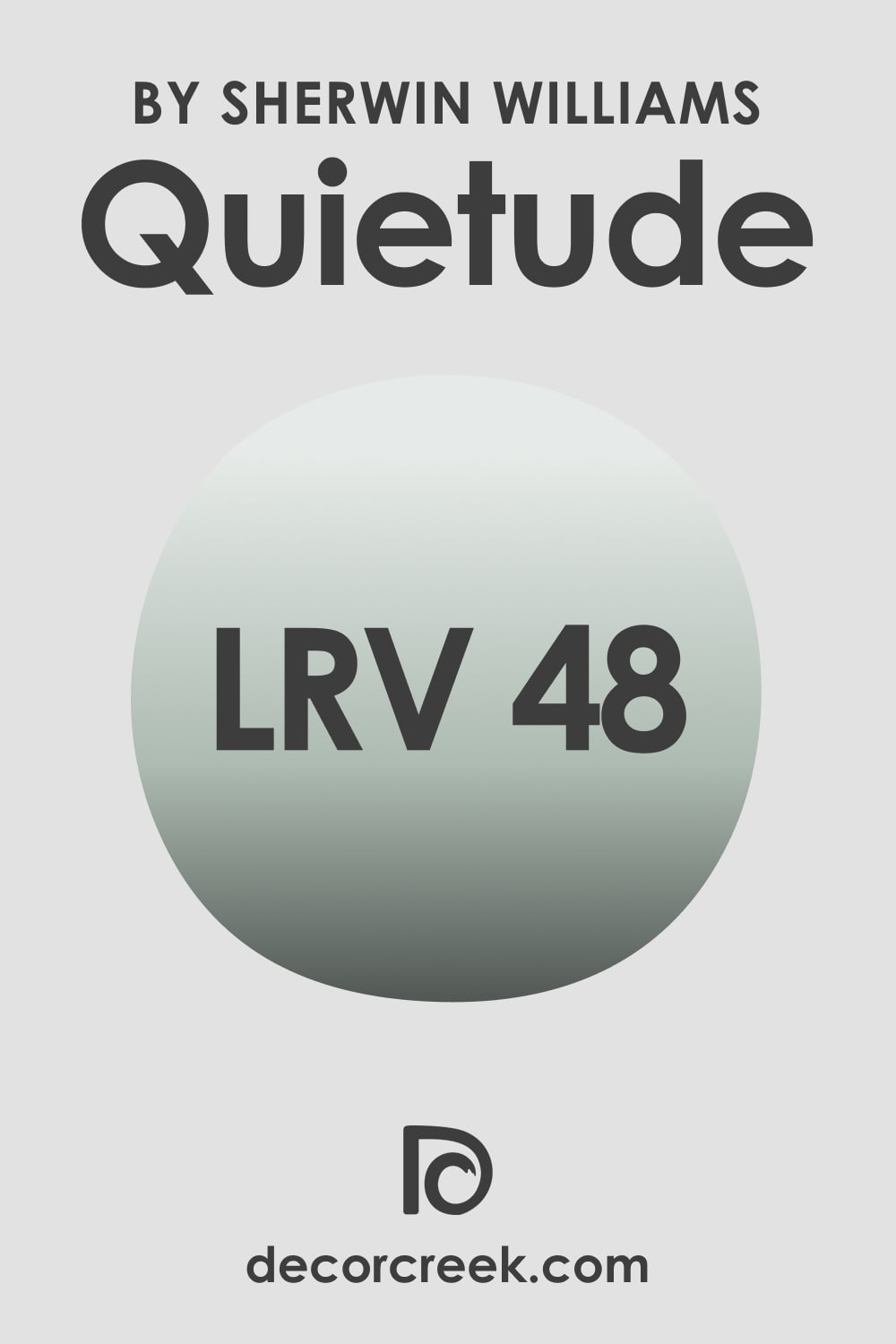
LRV of Quietude SW-6212 By Sherwin-Williams
SW Quietude has an LRV of 48, which makes it a paint color with a light-medium depth range. So if you have a dark room, thanks to the amount of color in Quietude, this paint will still read rather light on your walls.
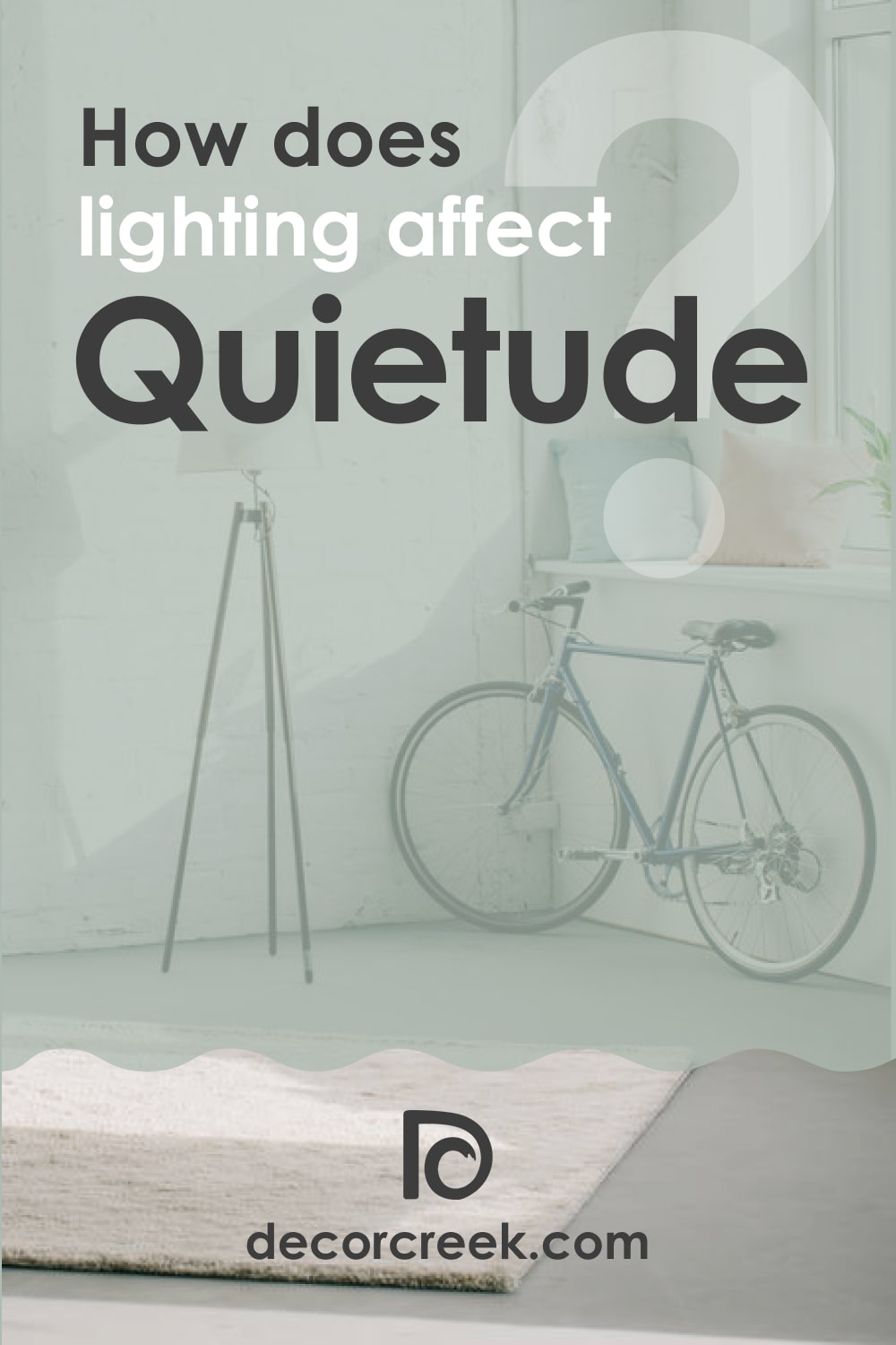
This blue-green color will add some visual weight to your room anyway even if the lighting is quite poor. If you have a very bright room, Quietude’s slightly lower LRV will help it to not wash out as much as its lighter versions.
LRV – what does it mean? Read This Before Finding Your Perfect Paint Color
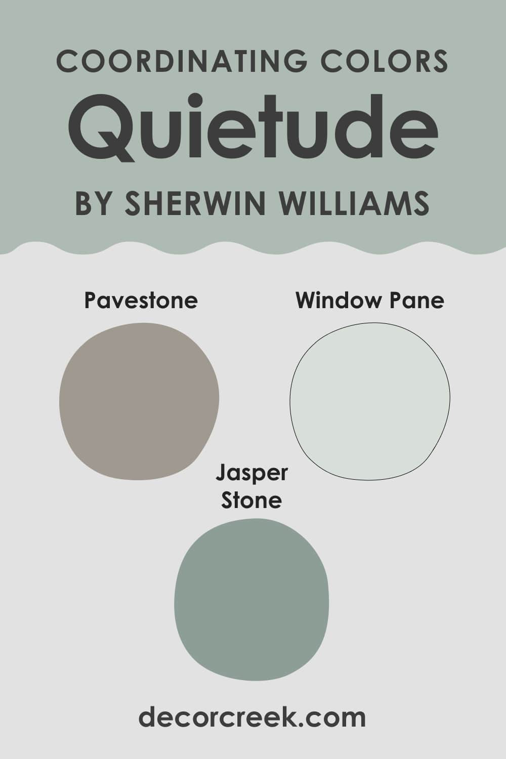
Coordinating Colors of Quietude SW-6212 Paint Color
Coordinating colors help you pick the most suitable and well-balanced color palette for your home. This is why being aware of them is so important. And since defining what colors can be used to coordinate your major color, grab a few ideas that you might find useful:
- SW Pavestone
- SW Jasper Stone
- SW Window Pane
Now you know a bit more about the basics of this beautiful blend color that contains both green and blue. But to be able to use it like a pro, you need more information.
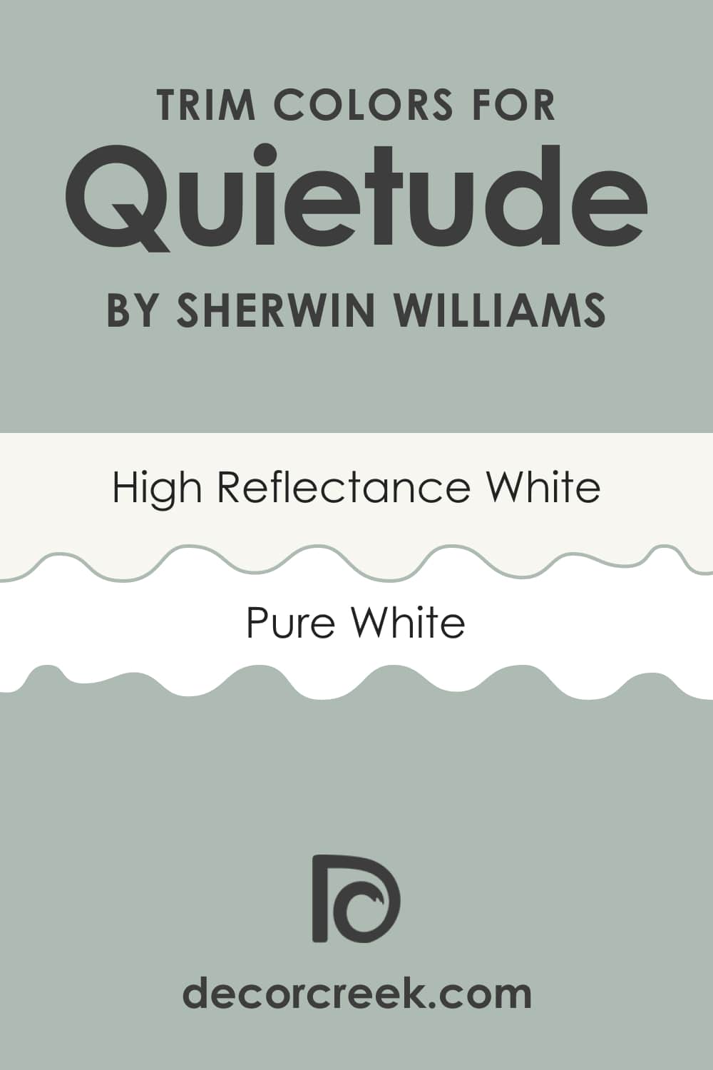
Best Trim Colors For Sherwin-Williams Quietude
Like with many other interior paint colors, for the Quietude by Sherwin-Williams, white would be the optimal and the best choice in terms of a trim color. For example, you can check out one of the best white paint matches:
- Sherwin-Williams High Reflective White
- Sherwin-Williams Pure White
And if you want to highlight Quietude’s cool tones with a warmer shade of white, you can opt for Sherwin-Williams Alabaster paint color.
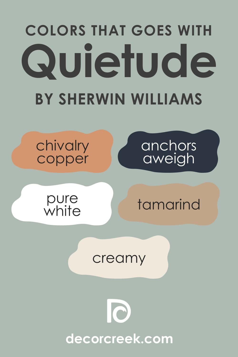
Colors That Go With Sherwin-Williams Quietude
When you choose a certain color to be used in your home, you should be aware of a few other colors that might look good along with it. Like this, you will be able to create a more harmonious color palette in your home space.
For SW Quietude, such colors can be the following ones:
- SW Chivalry Copper
- SW Pure White
- SW Creamy
- SW Anchors Aweigh
- SW Tamarind
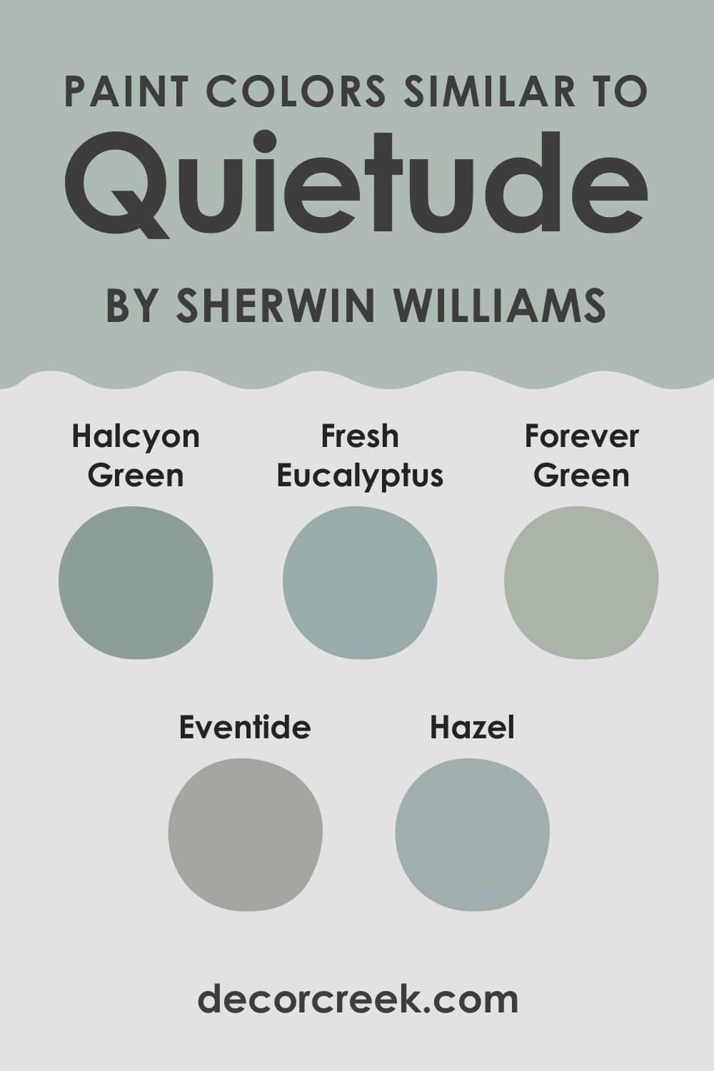
Paint Colors Similar to Quietude
Sometimes we might need to use other colors instead of the one that we considered at the beginning. With the Quietude, it might be a bit difficult so we decided to help you out a bit. Below you can find a list of paint colors that are similar to SW Quietude and they look more or less the same.
Of course, note that they are not literally the same, so you still need to choose carefully!
- SW Forever Green
- SW Halcyon Green
- SW Fresh Eucalyptus
- SW Eventide
- SW Hazel
Where Quietude SW-6212 Color Can Be Used In Your Home?
There are colors that can be used in particular rooms only whilst others can suit any space in your home. As for the Quietude, you have to be careful with this green-blue color since for some rooms, it might not be the best choice due to its tricky nature.
For example, you should not use it in very small rooms, closets, or small lavatories. Small bathrooms are also not the most suitable areas for this color. As for other rooms, this magnificent blend might work just fine!
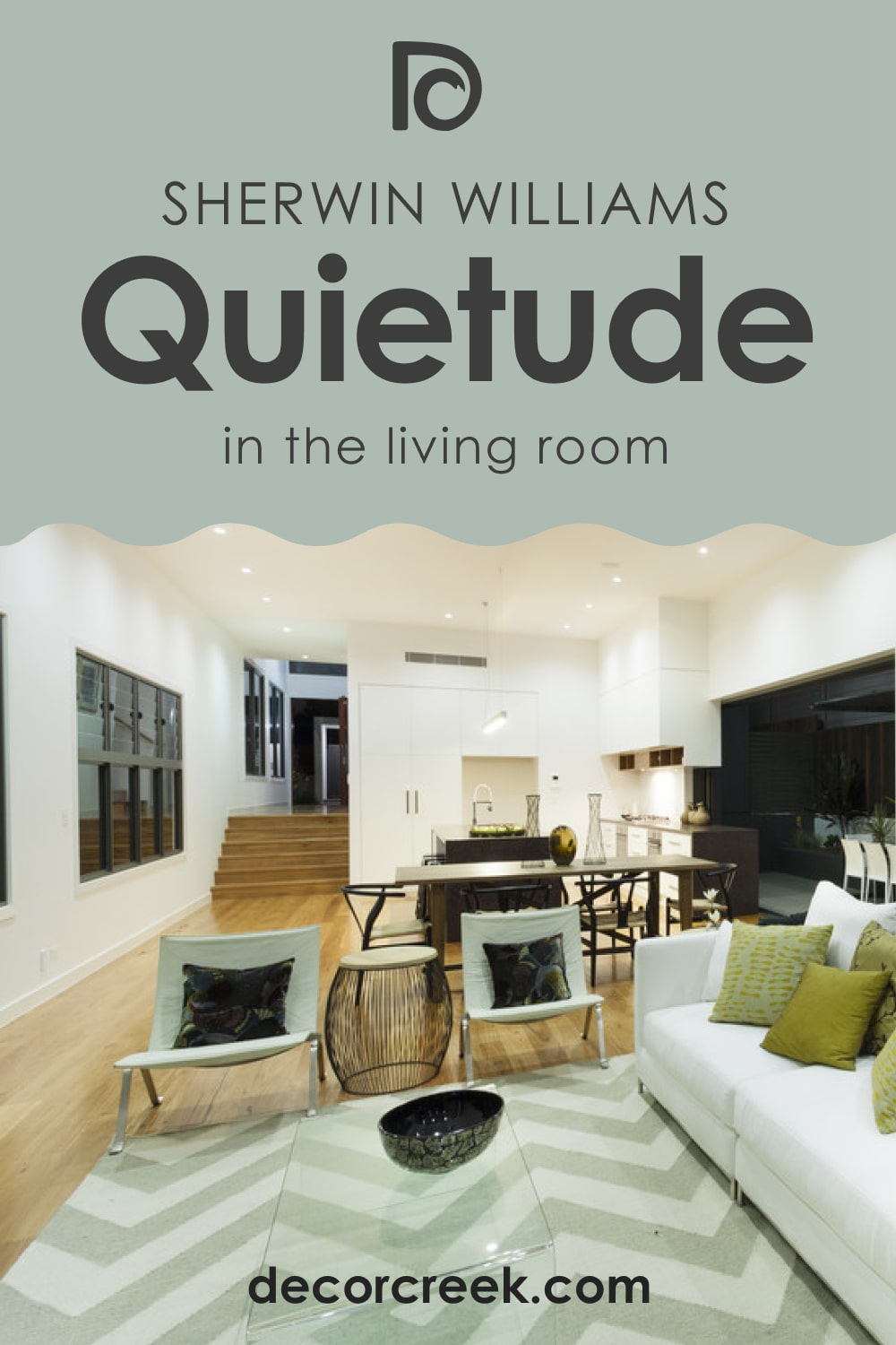
Quietude SW-6212 in the Living Room
This color is basically suitable for living rooms. You just need to consider lighting. Under different conditions, this color will read differently.
For example, if you have a dark living room with poor light, Quietude will still read rather light on your walls. If you have a very brightly lit living room, Quietude lower LRV will help it to not wash out as much as its lighter versions.
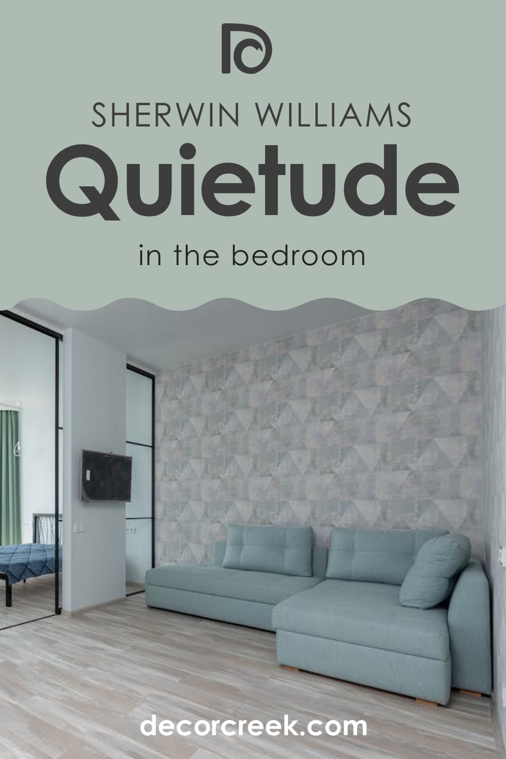
Bedroom in Quietude Paint Color
It’s quite a nice color for your bedroom if you like the cool vibe in it. In this case, Quietude will work just fine. But again, you should take the lighting into consideration if you don’t want to find unexpected undertones popping out on your walls!
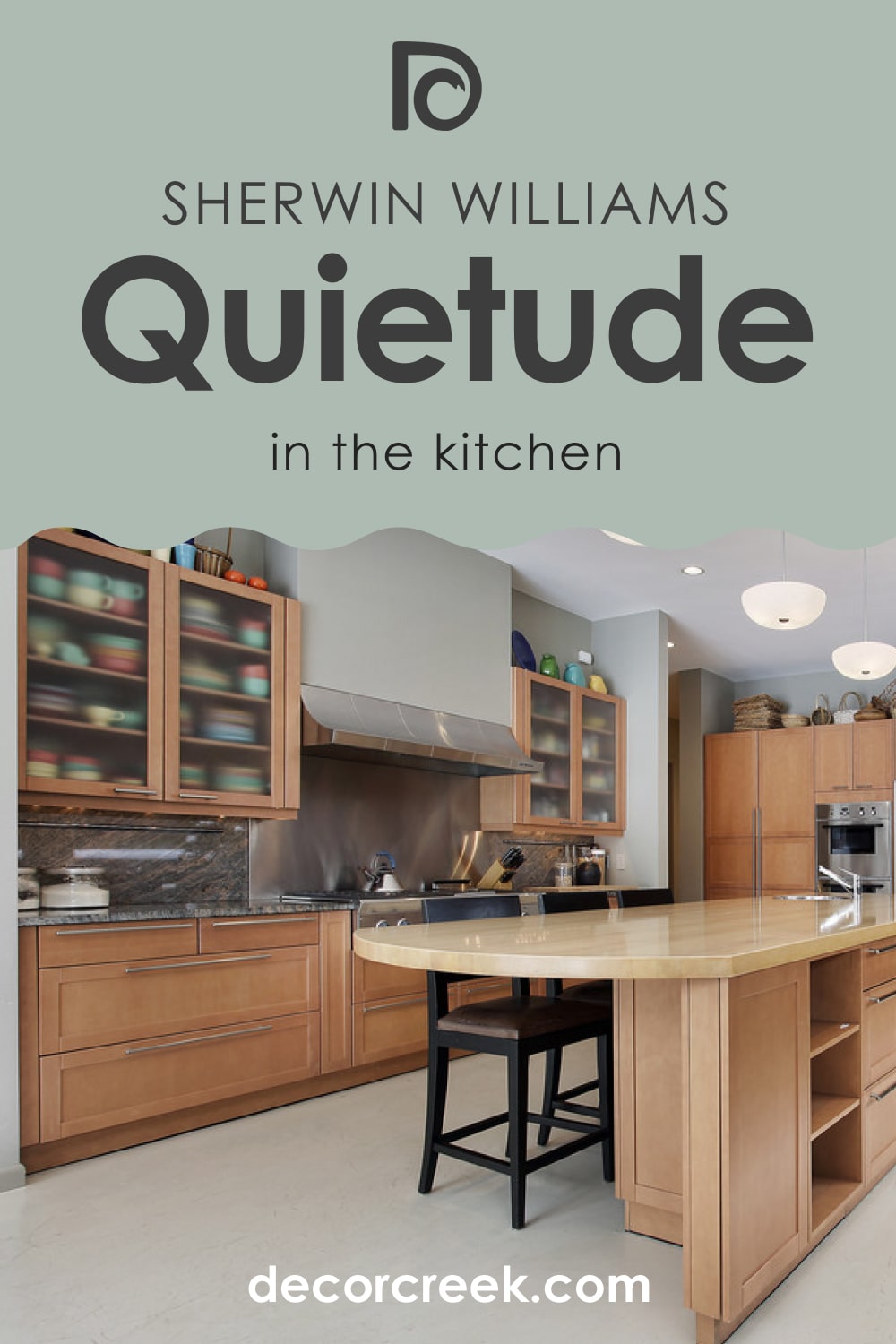
Quietude SW-6212 in the Kitchen
As for the kitchen, this color will be more suitable if you use it to paint cabinets or an accent wall. Of course, if your kitchen is very spacious and has plenty of light, you can try to paint it all with this color.
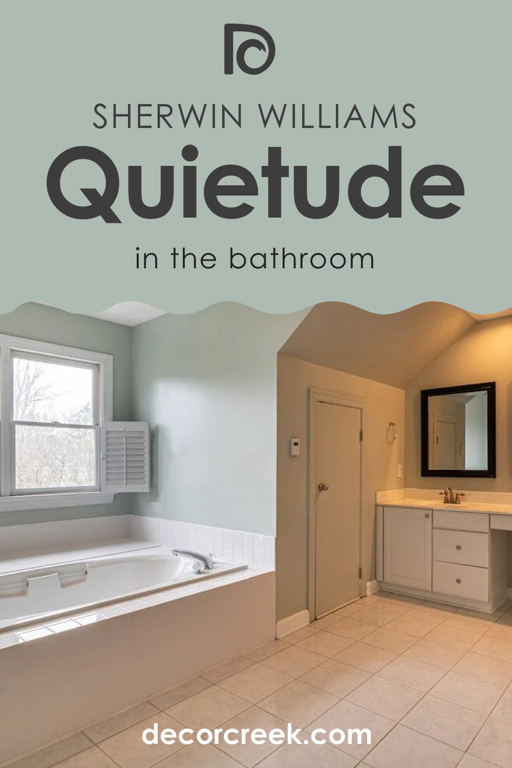
Bathroom with Quietude SW-6212 Paint Color
This color could work pretty nice in your bathroom if it has enough daylight. But even if it has, you need to remember that Quietude might read greener in artificial light! Make sure this is what you agree with and better sample this color in advance.
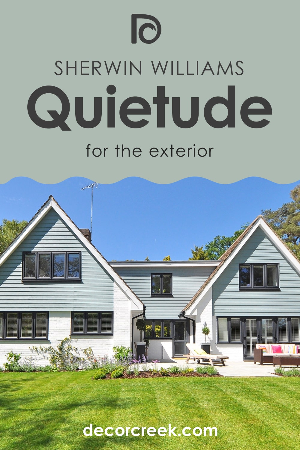
Quietude SW-6212 for the Exterior Use
This green-blue blend is surprisingly effective when used on exterior walls! It is mostly possible thanks to the amount of light it can get outdoors since even on a cloudy day, Quietude will read nicely green with a slight blue hue.
Like that, you are now aware of all the basics regarding this tricky, complex, yet very beautiful blend color! You know its undertones and LRV, you know how it reacts to light and what colors can make it look even better than it already is.
With that in mind, you will be able to use it wisely in your home.
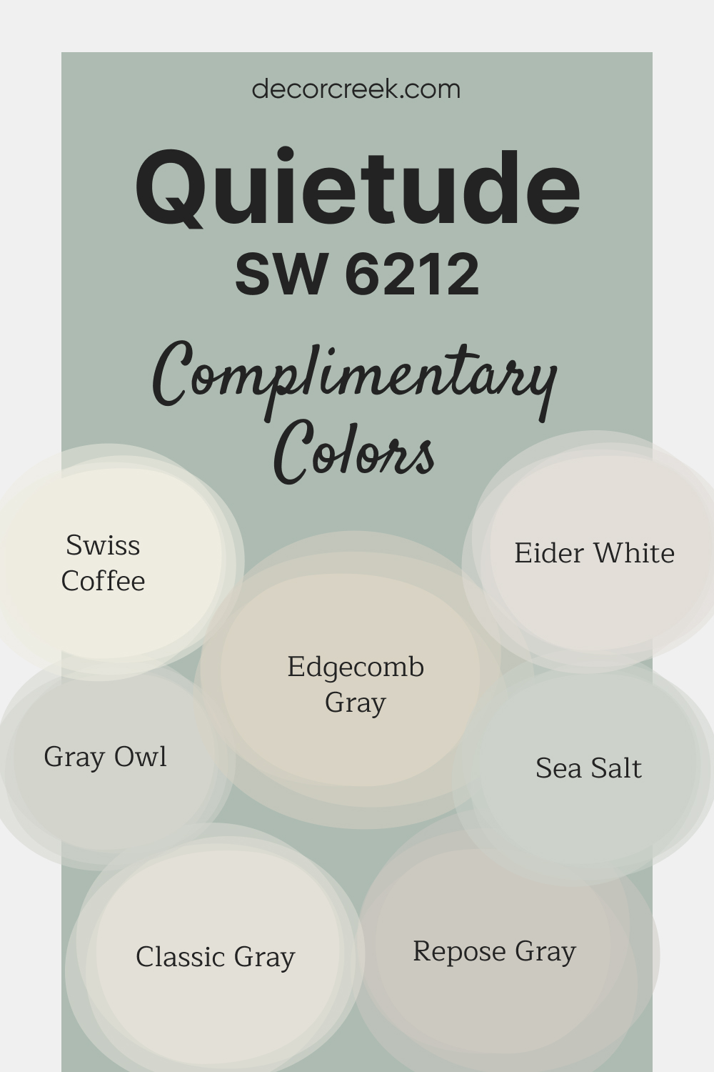
Complimentary Colors for Quietude SW-6212 Paint Color By Sherwin-Williams
Quietude SW 6212 by Sherwin-Williams is a tranquil blue-green that brings a sense of calm to any room. Its soft undertones create a relaxed and inviting environment, making it an ideal choice for bedrooms, bathrooms, or living spaces.
This shade works beautifully with both warm and cool tones, offering a versatile base for a cohesive color palette.
For a fresh, airy look, Swiss Coffee OC-45 and Eider White SW 7014 provide bright, complementary accents. Repose Gray SW 7015 and Edgecomb Gray HC-173 introduce neutral tones for balance, while Gray Owl OC-52 and Classic Gray OC-23 add subtle depth.
To enhance the calming effect, Sea Salt SW 6204 brings a soft touch of color that completes the serene palette.
Comparing Quietude to Other Colors
To better see the distinctions between this complex and tricky color, we suggest you read its comparison with other colors that are more or les alike. It will help you learn to see the smallest details and color nuances.
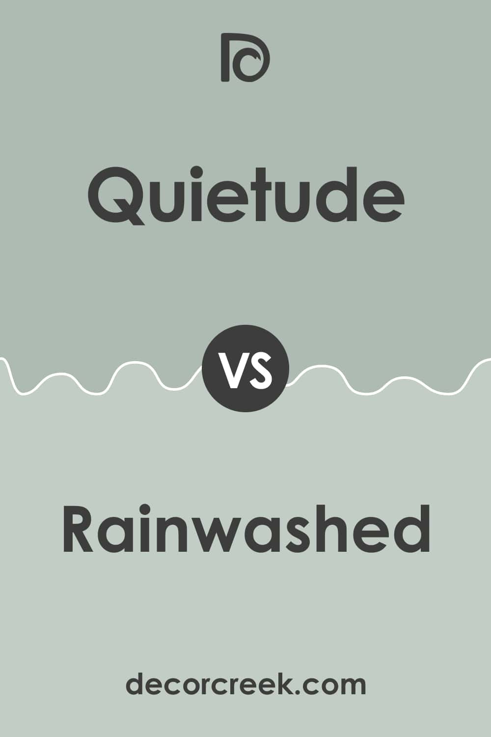
Quietude vs Rainwashed
Quietude is somewhat darker whilst Rainwashed is lighter in this pair of colors. Plus, Quietude reveals slightly more of its grayish undertones while Rainwashed shows more of its green side. However, Rainwashed can be used as a lighter alternative to Quietude.
Quietude vs Sea Salt Sherwin-Williams
Everything is vice versa in this pair of colors. Sea Salt by Sherwin-Williams reads grayer while Quietude shows its green undertones very prominently. Also, Quietude reads much darker and deeper. Nevertheless, the two look quite nice together.
Quietude vs Oyster Bay
Compared to Quietude, Oyster Bay shows more of its cool gray undertones whilst its counterpart reads much greener with a very slight hint of blue in it. These colors don’t create a distinct contrast so we would not recommend using them together.
Well, now you know more about SW Quietude paint color and its use. You learned what kind of color it is, where it is best to be used in your home, and what undertones and LRV it has.
Also, we explained how it will work with other colors and how to coordinate it with them. All this will allow you to use this rather complex color blend wisely and correctly.
Ever wished paint sampling was as easy as sticking a sticker? Guess what? Now it is! Discover Samplize's unique Peel & Stick samples.
Get paint samples
Frequently Asked Questions
⭐Is it ok to paint my entire house with Quietude?
Of course it is! It will work great in any type of light in fact if it’s used outdoors.
⭐Is Quietude a warm-toned color?
No, this color blend is cool-toned which is why you should use it only if you like a crisp vibe in your rooms.
⭐Can this color be paired with brass hardware in the kitchen?
Definitely! Quietude will pair really nicely with these warm colors.
