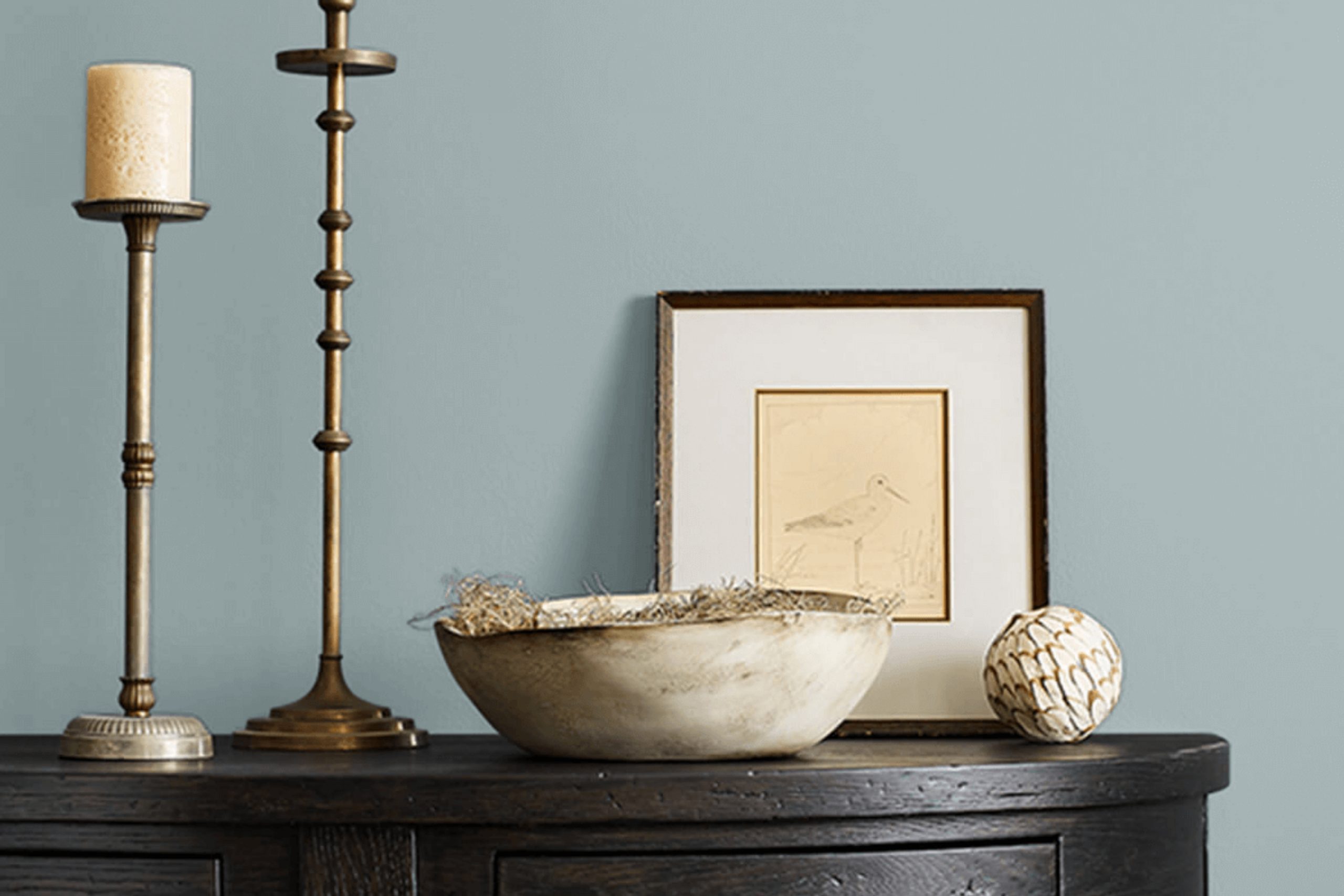
If you’re in the mood to freshen up your room, let me tell you about SW 7616 Breezy by Sherwin Williams. Imagine giving your walls a makeover that breathes a sense of calm and simplicity into every room. That’s what Breezy offers. This shade is a light, airy blue that has a subtle hint of gray, making it incredibly flexible and perfect for various rooms in your home, from the bathroom to the bedroom, or even your living room.
As someone who enjoys updating their living environment regularly, I find Breezy to be a refreshing choice. It pairs beautifully with white trim, bringing a clean and open feel to any area. Whether you prefer a modern look or lean towards classic designs, this color serves as a fantastic backdrop. It complements both bold and neutral accents, allowing you to style your room with ease.
So, if you’re looking for a paint color that adds a gentle touch of color without overpowering your décor, Breezy by Sherwin Williams might just be the answer.
It’s an effective way to create a peaceful atmosphere in your home, making every moment inside a little more relaxing.
What Color Is Breezy SW 7616 by Sherwin Williams?
The color Breezy by Sherwin Williams is a soft, subtle shade that lies comfortably between blue and gray. This flexible hue has a calming effect that makes it ideal for creating a relaxed atmosphere in any room. Its understated elegance allows it to blend seamlessly with various decor styles and color palettes.
Breezy works exceptionally well in coastal and Scandinavian interiors. Its light, airy vibe complements the natural materials commonly used in these styles, such as light woods, wicker, and linen. In a coastal setting, it pairs beautifully with sandy beiges, soft whites, and ocean-inspired blues to evoke the feel of a beachside retreat.
For a Scandinavian look, combining Breezy with minimalist furniture and accents in black or charcoal can create a clean, refreshing room.This color also suits modern and contemporary interiors. It serves as a chic backdrop for metallic finishes like brushed nickel or chrome and looks polished next to glass or mirrored surfaces.
Adding textiles like plush velvets or soft cottons in contrasting colors can introduce texture and warmth, making the room more inviting. Overall, Breezy is a flexible color choice that can help achieve a light, fresh feel in your home, making it a fantastic option for anyone looking to refresh their room.

Is Breezy SW 7616 by Sherwin Williams Warm or Cool color?
Breezy by Sherwin Williams, coded as 7616, is a gentle blue shade that can bring a fresh and airy feel to any room. This color’s light and subtle nature makes it perfect for creating a relaxed atmosphere in living rooms. Breezy is flexible enough to work well in bedrooms or bathrooms, where its softness can make small areas appear larger and more open.
It’s also an excellent choice for a nursery, providing a soothing background that’s easy on the eyes. When paired with crisp whites or natural wood finishes, this color truly shines, offering a clean, laid-back vibe.
For those looking to add a bit of a calm, coastal feel to their home, Breezy is an ideal choice, reflecting the light beautifully and helping to create a peaceful environment. Whether for a full room or an accent wall, Breezy is a fantastic option that complements various decorating styles.
Undertones of Breezy SW 7616 by Sherwin Williams
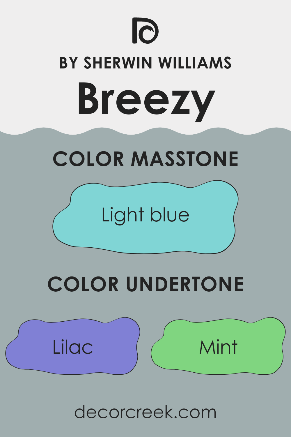
Breezy is a unique paint color that brings a dynamic sense to interior rooms due to its complex undertones. These undertones include colors like lilac, mint, various shades of gray, light purple, pale yellow, pale pink, turquoise, blue, light turquoise, and dark turquoise. Each of these shades contributes subtly to the overall perception of the color.
When you apply paint like Breezy on your walls, the undertones influence how the color appears under different lighting conditions. For example, in a well-lit room during the day, the lighter undertones such as pale yellow and light gray may make the walls seem brighter and more airy.
In contrast, during the evening or in a room with less natural light, the darker undertones like gray and dark turquoise can give the room a more grounded feel. Understand that the mix of undertones in Breezy also affects how it coordinates with furniture and decor. For instance, the lilac and light purple undertones could complement furnishings with similar cool tones, while the mint and turquoise undertones pair well with more vibrant accessories.
Essentially, the undertones in Breezy make it a flexible color that can adapt to different settings and styles, reacting to both natural and artificial light. This adaptability makes it a good choice for those looking to add both character and adaptability to their interior areas without committing to a bold, single-tone wall color.
What is the Masstone of the Breezy SW 7616 by Sherwin Williams?
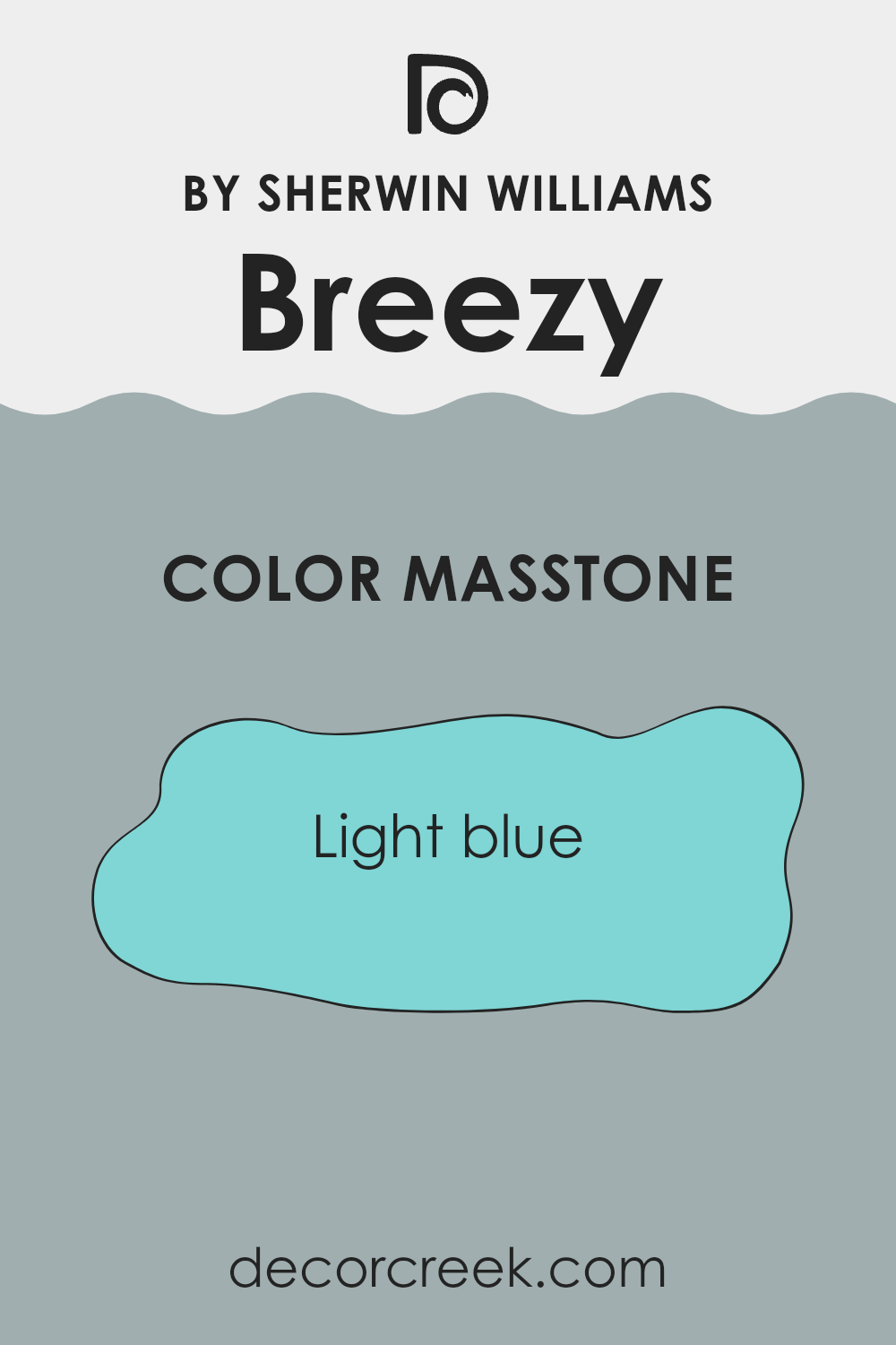
The color BreezySW 7616 by Sherwin Williams has a masstone of light blue, specifically a refreshing, pastel shade much like a clear sky on a sunny day. This particular hue has a calm and gentle appearance, making it an excellent choice for various rooms in a home.
It’s soothing to the eyes, which helps in creating a relaxing atmosphere, ideal for bedrooms and bathrooms where peace is often sought. Furthermore, the light reflective quality of this blue can make smaller rooms appear larger and more open, adding a sense of room where it might be limited.
Using this color in well-lit areas can enhance its vibrancy, keeping the room lively yet not overpowering. It pairs well with other soft colors like whites and grays for a clean, fresh look, or can be contrasted with bolder colors to make a room more dynamic. This flexibility makes it a friendly choice for many decorating styles.
How Does Lighting Affect Breezy SW 7616 by Sherwin Williams?
Lighting plays a crucial role in how we perceive colors. The same paint color can look different under various lighting conditions due to changes in light intensity and color temperature. This is something to consider when choosing paint colors for different rooms.
For example, Breezy by Sherwin Williams is a unique color that can appear quite different depending on the lighting. In artificial light, which typically has a yellowish hue, Breezy might look softer and more muted. The warm tones of the light can enhance the cozy and comforting nature of this color, making it ideal for living rooms and bedrooms where artificial light is often used.
In natural light, Breezy can look more vibrant and true to its original shade. Natural light, especially from the sun, is brighter and can reveal the true colors more accurately than most artificial lighting. This can make Breezy appear fresher and more lively, which is excellent for areas like kitchens and bathrooms where natural light is abundant.
The orientation of the room also affects how Breezy looks:
1. North-facing rooms receive less direct sunlight, which might make Breezy appear slightly cooler and more shadowed. It could give a calm and subtle vibe to the room.
2. South-facing rooms get plenty of sunlight, bringing out the brightness and vibrancy of Breezy. This can make the room feel light and airy when painted with this color.
3. East-facing rooms are bright in the morning when the sun rises, so Breezy will look very bright and cheerful in the morning but might lose some of its vibrancy in the afternoon and evening.
4. West-facing rooms will show Breezy in a different light in the evening when the sun sets. The color might look warmer and more welcoming in the afternoon and evening compared to the morning.
Considering these factors will help in deciding where and how to use this flexible color to achieve the desired effect in home decor.

What is the LRV of Breezy SW 7616 by Sherwin Williams?
LRV stands for Light Reflectance Value, a measure that indicates how much light a color reflects and how much it absorbs. LRV is expressed as a percentage, with lower values indicating that the color absorbs more light, making rooms feel smaller and more intimate, while higher values mean more light is reflected, making rooms appear larger and airier.
This measurement is crucial when choosing paint colors as it helps predict how light or dark a color will look once applied to the walls of a room, which can greatly affect the ambiance and visual dimensions of the room.
A color like Breezy SW 7616, which has an LRV of about 41, falls in the mid-range of the LRV scale. This suggests that it doesn’t reflect a lot of light but also isn’t among the darkest colors. The light it does reflect gives it a balanced flexibility: It can help maintain some brightness in an area without becoming overpowering or too stark.
For a room with limited natural light or smaller in size, this particular LRV would help in keeping the room feeling more open and moderately lit compared to a darker shade, yet it still offers enough depth to create a cozy atmosphere. This makes it a flexible choice for those wanting a color that balances between being too light and too absorbing.

Coordinating Colors of Breezy SW 7616 by Sherwin Williams
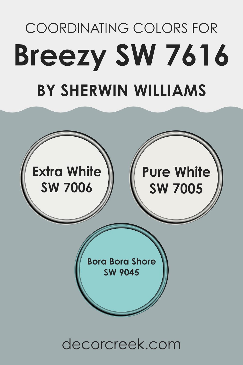
Coordinating colors are chosen to complement a main color, enhancing the overall aesthetic of a room while providing visual harmony. In the case of Breezy by Sherwin Williams, coordinating colors such as SW 7006 – Extra White, SW 7005 – Pure White, and SW 9045 – Bora Bora Shore work together to create a balanced and cohesive look. These colors have been selected to match the undertones and the intensity of Breezy, ensuring they fit seamlessly within the surrounding design without overpowering the primary hue.
The color SW 7006 – Extra White is a clean and crisp white that pairs perfectly with Breezy, offering a fresh contrast that can make any room feel airy and light. This shade is particularly useful for trim, ceilings, and woodwork, helping to define rooms clearly against colored walls.
On the other hand, SW 7005 – Pure White has a slightly warmer tone, providing a subtle yet effective difference that softens interiors without creating stark contrasts. SW 9045 – Bora Bora Shore is a delightful, light aqua that echoes the calmness of Breezy, ideal for creating a gentle, refreshing vibe in a room, especially in bathrooms and bedrooms where a touch of soft color is beneficial. These coordinating colors together ensure that the environment feels balanced and pleasing to the eye.
You can see recommended paint colors below:
- SW 7006 Extra White
- SW 7005 Pure White
- SW 9045 Bora Bora Shore
What are the Trim colors of Breezy SW 7616 by Sherwin Williams?
Trim colors are specific shades used to accentuate or complement the primary colors on walls, ceilings, doors, and window frames, enhancing the overall aesthetic and architectural features of a room. When paired with BreezySW 7616 from Sherwin Williams, trim colors like SW 7042 – Shoji White and SW 7014 – Eider White play a crucial role in defining rooms and highlighting the breezy, refreshing nature of the main color.
These trim colors help in creating a clean and cohesive look that can make the features of the room stand out, making them a vital element in interior design. Shoji White, SW 7042, is a soft, off-white shade with a slightly warm tone that offers a subtle contrast when used with lighter hues such as BreezySW 7616, making it ideal for a gentle yet distinct boundary.
On the other hand, Eider White, SW 7014, presents a cooler undertone, providing a crisper edge that can complement cooler tones in the surrounding room. Both colors are flexible choices that work well to enhance the openness and light feel imparted by BreezySW 7616, contributing to a harmonious and refreshing environment.
You can see recommended paint colors below:

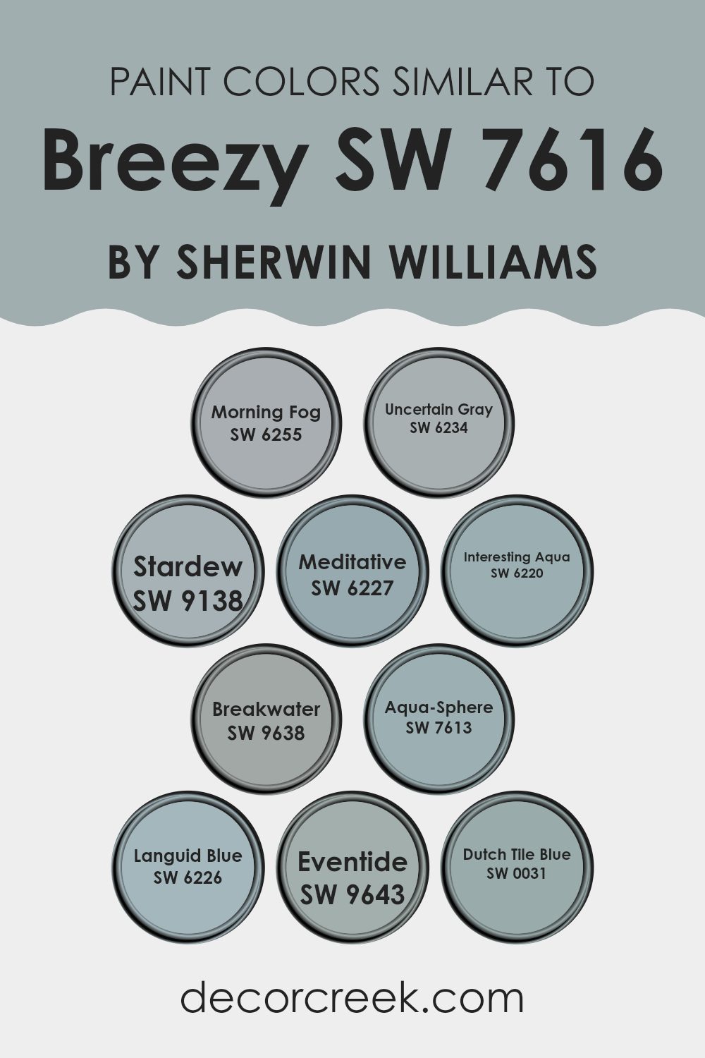
Colors Similar to Breezy SW 7616 by Sherwin Williams
Similar colors play an essential role in interior design by creating a harmonious atmosphere through subtle variations in hue and tone. These near-adjacent colors, like the ones stemming from Breezy by Sherwin Williams, can be used to craft a cohesive look in a room without stark contrasts, allowing for a soothing visual flow. These colors gently blend with each other, offering flexibility in decor, from creating a focal point with a slightly darker shade to enhancing natural light with a lighter tone.
For example, Morning Fog and Uncertain Gray each offer a muted base, providing a neutral backdrop that complements various accents and furnishings. Stardew and Meditative evoke a sense of calm, their bluish tones reflecting a gentle, airy ambiance ideal for areas like bedrooms or quiet sitting rooms.
Interesting Aqua and Breakwater add a touch of liveliness with their subtle hints of teal, giving a fresh and rejuvenating feel, perfect for bathrooms or creative rooms. Aqua-Sphere and Languid Blue bring depth and focus to a room, with their richer blue shades suggesting a cool, collected vibe.
Eventide and Dutch Tile Blue, containing deeper and more pronounced blues, serve well in creating statement areas or accent walls, offering a dynamic yet cohesive finish alongside their similar counterparts. These colors seamlessly work together to enhance the aesthetic appeal of any home, creating visually pleasing environments through their shared but unique characteristics.
You can see recommended paint colors below:
- SW 6255 Morning Fog
- SW 6234 Uncertain Gray
- SW 9138 Stardew
- SW 6227 Meditative
- SW 6220 Interesting Aqua
- SW 9638 Breakwater
- SW 7613 Aqua-Sphere
- SW 6226 Languid Blue
- SW 9643 Eventide
- SW 0031 Dutch Tile Blue
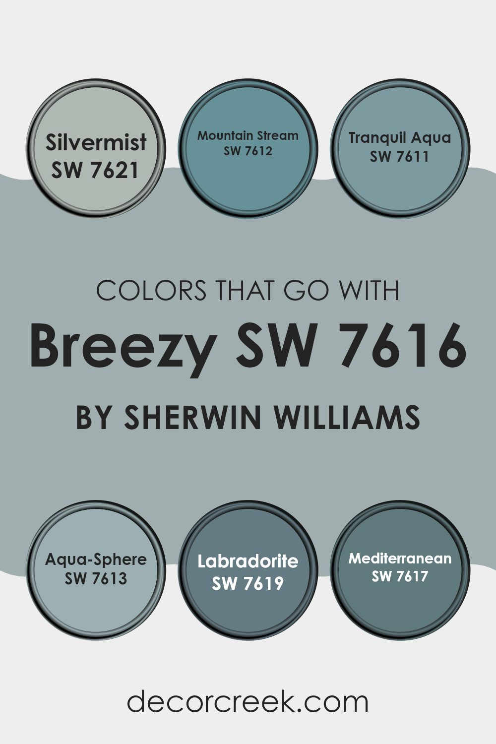
Colors that Go With Breezy SW 7616 by Sherwin Williams
Choosing the right colors to complement Breezy SW 7616 by Sherwin Williams is crucial for creating a cohesive and visually appealing room. The colors that pair well with Breezy provide a balance, enhancing the main hue without overpowering it. For instance, coordinating colors such as Silvermist.
Mountain Stream, and Tranquil Aqua offer subtle contrasts that enrich the overall atmosphere of a room. These are shades that resonate well with Breezy’s calm vibe, allowing for a pleasing flow from one area to another. Additionally, deeper tones like Aqua-Sphere, Labradorite, and Mediterranean add depth and interest, preventing interiors from feeling flat or monotonous.
Silvermist is a gentle gray with a touch of blue, providing a neutral backdrop that complements the airy feel of Breezy. Mountain Stream, on the other hand, introduces a more pronounced blue that recalls clear skies, perfect for adding a dash of color without dominating.
Tranquil Aqua is a soft and light aqua that injects a splash of freshness, ideal for bathrooms or kitchens. Moving into deeper tones, Aqua-Sphere offers a more robust blue-green that’s excellent for accent walls or furniture pieces.
Labradorite shifts towards a mysterious and moody gray-green, great for creating focal points in a room. Lastly, Mediterranean is a rich teal, brilliant for those looking to introduce a vibrant burst of color in their decor, suitable for accessories or painted doors. Each of these colors works harmoniously with Breezy to create environments that are inviting and interesting.
You can see recommended paint colors below:
- SW 7621 Silvermist
- SW 7612 Mountain Stream
- SW 7611 Tranquil Aqua
- SW 7613 Aqua-Sphere
- SW 7619 Labradorite
- SW 7617 Mediterranean
How to Use Breezy SW 7616 by Sherwin Williams In Your Home?
Breezy SW 7616 by Sherwin Williams is a light and refreshing shade of blue that can bring a calm and cheerful atmosphere to any room in your home. This color is ideal for creating a relaxed vibe in rooms where you want to unwind, like your bedroom or living room. It pairs well with soft whites and grays, making it a flexible choice for walls, especially if you’re aiming for a light, airy feel.
Applying Breezy in your bathroom can also be a great choice, as it complements natural light and promotes a clean environment. For those who enjoy DIY projects, painting old furniture with this shade can rejuvenate the piece and add a charming touch to any room.
Furthermore, if you want a pleasant but not too stark contrast, consider using Breezy on an accent wall. This can add a welcome splash of color that enhances the room’s overall aesthetic without overpowering it.
Breezy SW 7616 by Sherwin Williams vs Eventide SW 9643 by Sherwin Williams
Breezy and Eventide by Sherwin Williams are two distinct colors that bring their own unique feels to a room. Breezy is a light, airy blue that has a refreshing and clean look, perfect for creating a calm and relaxed atmosphere. It’s like looking at the sky on a clear, sunny day.
On the other hand, Eventide is a deeper, stormier blue. This color offers a more dramatic and moody vibe, making it ideal for areas where a stronger, more pronounced effect is desired. It’s reminiscent of an evening sky, just as the last light fades.
Both colors are great for adding a touch of color to a room, but while Breezy keeps things light and open, Eventide adds depth and intensity. Depending on the mood you want to set, either can work beautifully in different settings.
You can see recommended paint color below:
Breezy SW 7616 by Sherwin Williams vs Breakwater SW 9638 by Sherwin Williams
The main color, Breezy, and the second color, Breakwater, both by Sherwin Williams, offer distinct tones that contribute differently to interiors. Breezy is a soft, light grey with hints of blue, making it flexible and airy, ideal for creating a calm and welcoming atmosphere in areas like living rooms or bedrooms.
Meanwhile, Breakwater presents a deeper, more pronounced shade of teal, infusing a room with a bolder, more dynamic feel. This makes it suitable for areas where a statement is desired, such as an accent wall or a bathroom.
Both colors have their unique appeal, with Breezy leaning towards a subtle, understated charm, and Breakwater offering a stronger, more prominent presence. Choosing between them depends on the room’s purpose and the mood you wish to set.
You can see recommended paint color below:

Breezy SW 7616 by Sherwin Williams vs Interesting Aqua SW 6220 by Sherwin Williams
Breezy and Interesting Aqua are two paint colors by Sherwin Williams. Breezy is a light, airy blue with a hint of gray. It gives a calm and clean look, perfect for creating a relaxed atmosphere in rooms like bedrooms or bathrooms.
On the other hand, Interesting Aqua is deeper, combining blue and green tones. This color brings a more vibrant and playful energy into a room, making it great for areas where you want a bit of liveliness, such as kitchens or living rooms.
While both colors share a cool tone, Breezy leans towards a subtle expression, and Interesting Aqua towards a more dynamic presence. Therefore, your choice between them could depend on what mood or feel you want to achieve in your room.
You can see recommended paint color below:

Breezy SW 7616 by Sherwin Williams vs Meditative SW 6227 by Sherwin Williams
The main color, Breezy, and the second color, Meditative, are both offered by Sherwin Williams and offer their own unique appeal. Breezy is a light, airy blue that brings a fresh and clean feeling to any room. It tends to give areas a more open and relaxing vibe, perfect for creating a laid-back atmosphere.
On the other hand, Meditative is a deeper, more reserved shade of blue, with a hint of grey, adding a bit more drama and intensity to rooms. This color is great for rooms intended to have a calming, yet more focused energy.
While Breezy works well in areas like kitchens and bathrooms where a fresh feel is desirable, Meditative is better suited for areas like bedrooms and offices where a grounded, peaceful setting is preferred. Both colors can complement each other nicely in different parts of a home, based on the mood or function of each room.
You can see recommended paint color below:

Breezy SW 7616 by Sherwin Williams vs Morning Fog SW 6255 by Sherwin Williams
Breezy and Morning Fog, both colors by Sherwin Williams, have distinct vibes but share a calmness in their tones. Breezy is lighter, offering a fresh and airy feel, which makes it perfect for areas where you want to add a touch of softness without overpowering the area with color. It pairs wonderfully in places that receive plenty of natural light, enhancing a spacious and open atmosphere.
On the other hand, Morning Fog presents a slightly deeper, more muted gray. This color is ideal for those looking for a bit more depth in their design, providing a grounding effect that works well in both small and large rooms. It’s particularly effective in modern settings where a touch of understated elegance is desired.
In essence, while Breezy lifts a room with its lighter hue, Morning Fog grounds a room with its richer tone. Both colors offer unique ways to style a room, depending on the atmosphere you’re aiming to achieve. Whether you go for the lightness of Breezy or the depth of Morning Fog, each color has its charm and utility, appealing to different moods and aesthetic preferences.
You can see recommended paint color below:
Breezy SW 7616 by Sherwin Williams vs Aqua-Sphere SW 7613 by Sherwin Williams
Breezy and Aqua-Sphere, both from Sherwin Williams, offer unique shades that can distinctly influence the mood of any room. Breezy is a gentle, soft gray with subtle blue undertones, presenting a clean and airy feel that enhances openness in a room.
It works well in areas aimed for relaxation like bedrooms or living areas. On the other hand, Aqua-Sphere is a slightly deeper color with more pronounced blue-green undertones. This shade brings a dash of freshness and vibrancy, reminiscent of ocean colors, making it suitable for bathrooms or rooms where you want a touch of nature-inspired liveliness.
While both colors are cool-toned, Breezy leans towards a mildly muted hue, making it flexible for larger areas, whereas Aqua-Sphere, with its richer tint, might be chosen for focal points or accents in interior decorating.
You can see recommended paint color below:
Breezy SW 7616 by Sherwin Williams vs Dutch Tile Blue SW 0031 by Sherwin Williams
Breezy SW 7616 by Sherwin Williams is a light and airy blue shade that gives a soft and relaxed feel to any room. It’s a great choice if you want to create a calm and inviting atmosphere. This color is subtle enough to use across large areas like living room walls or a bedroom, without overpowering the room.
On the other hand, Dutch Tile Blue SW 0031 by Sherwin Williams is a deeper, more intense blue. It has a classic vibe and brings a stronger presence of color to a room. This shade is perfect for making a statement, whether it’s on an accent wall or for painting furniture.
Both colors are blues but they serve different purposes based on their intensity and depth. Breezy is lighter and airier, making it ideal for a gentle and peaceful setting. Dutch Tile Blue is richer and can add dramatic flair or act as a central focus in a design scheme.
You can see recommended paint color below:
- SW 0031 Dutch Tile Blue
Breezy SW 7616 by Sherwin Williams vs Stardew SW 9138 by Sherwin Williams
Breezy and Stardew by Sherwin Williams are two distinct colors that have unique characteristics. Breezy is a lighter, airy blue with a subtle gray undertone, giving it a fresh and clean look. This color is great for creating a relaxed vibe in a room, making rooms feel open and bright. It works well in bedrooms and bathrooms where a calm atmosphere is desired.
On the other hand, Stardew is a deeper, more muted shade that straddles the line between blue and gray. This color has a calm, understated presence, making it perfect for areas that require a touch of elegance without overpowering brightness. It’s especially fitting for living areas and kitchens where a more grounded, cozy feel is needed.
Both colors offer a sense of calm, but Breezy leans towards a lighter, more refreshing tone, while Stardew provides a stronger sense of grounding and subtlety. Depending on the mood you want to set in your room, each color has its advantageous setting.
You can see recommended paint color below:
Breezy SW 7616 by Sherwin Williams vs Languid Blue SW 6226 by Sherwin Williams
Breezy SW 7616 and Languid Blue SW 6226 are two distinct colors from Sherwin Williams. Breezy is a soft, pastel blue with a slightly gray undertone, giving it a gentle and calm appearance. It’s quite light, which makes it a great choice for creating a relaxed, airy feel in a room. This color brings freshness like a gentle wind on a warm day and pairs well with both bright or muted tones.
On the other hand, Languid Blue is a deeper, more saturated blue. It stands out more in a room compared to Breezy and has a soothing depth to it that presents a feeling of steadiness and comfort. Being darker, it’s ideal for adding a touch of drama without overpowering a room.
Both colors work well in bedrooms or bathrooms where you want a peaceful, pleasant atmosphere. However, Breezy, being lighter, could make small areas appear bigger, whereas Languid Blue, providing richer coloring, might be better suited for a feature wall or a larger room.
You can see recommended paint color below:
- SW 6226 Languid Blue
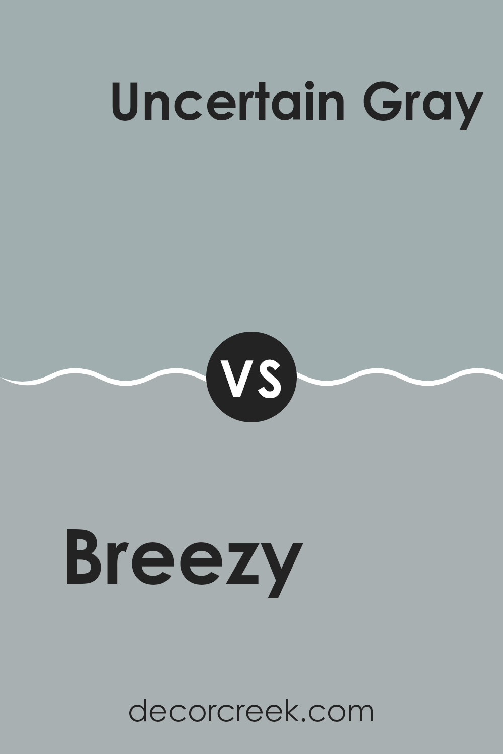
Breezy SW 7616 by Sherwin Williams vs Uncertain Gray SW 6234 by Sherwin Williams
The main color, Breezy, and the second color, Uncertain Gray, both offered by Sherwin Williams, present unique tones that suit different decorative styles. Breezy is a light and airy blue that offers a refreshing vibe to any room, perfect for creating a bright and welcoming environment. It easily complements a variety of décor elements, making it flexible for use in living rooms, kitchens, or bedrooms.
On the other hand, Uncertain Gray is a subtle, muted gray with a hint of blue undertone that gives it a unique character compared to other grays. This color is ideal for those looking to achieve a more understated yet distinct aesthetic. It works well in areas where a calm and neutral backdrop is desired, such as in modern living rooms or offices.
Both colors reflect light differently, with Breezy reflecting more light, making a room feel more open, whereas Uncertain Gray absorbs light slightly, offering a cozier feel. When choosing between the two, consider the mood and functional use of your room to determine which would be more suitable.
You can see recommended paint color below:
Writing about SW 7616 Breezy by Sherwin Williams has been interesting! This paint color is like a gentle wind on a spring day. It’s a soft blue that reminds you of a clear sky. Many people love using it in their homes because it makes rooms feel light and fresh.
If you’re thinking about adding a new touch to your room, this color might be perfect. It works really well in bedrooms and bathrooms where you want to relax. Also, it’s great for small places because it makes them look a little bigger and brighter.
When choosing what goes with Breezy, white trim is a good pick because it keeps everything looking clean and simple. Furniture in light woods or white complements it nicely too. To sum up, Breezy by Sherwin Williams is a wonderful choice if you want to freshen up your home.
It has a calming effect and fits in many different rooms. It’s like bringing a bit of the sky inside your house, making every day a little brighter. Whether you are redoing one room or several, think about this color; it could make your home look lovely!

Ever wished paint sampling was as easy as sticking a sticker? Guess what? Now it is! Discover Samplize's unique Peel & Stick samples.
Get paint samples

