When you’re searching for a paint color that brings a sense of freshness and clarity to your space, you might want to consider SW 7516 Kestrel White by Sherwin Williams. This color is a favorite for those who prefer a clean and airy atmosphere in their homes or offices.
Its soft white hue carries a subtle warmth, making it an excellent choice for creating a welcoming and soothing environment without feeling stark or too bold.
Choosing the right white paint can sometimes feel overwhelming due to the myriad of shades available. However, Kestrel White stands out with its versatility. It pairs beautifully with various decor styles and colors, enhancing other elements in a room rather than overpowering them.
Whether you want to refresh your living room, brighten up a kitchen, or create a relaxing bedroom retreat, Kestrel White has the potential to transform your space in a very gentle, yet effective way.
If you’re considering giving your walls a new look, Kestrel White offers that perfect balance of warmth and brightness, adapting to different lighting conditions with ease. Its neutral tone works well with both modern and traditional settings, ensuring that you feel right at home.
Remember, the right paint color can significantly impact your mood and the overall vibe of your space, and Kestrel White is a choice that you won’t regret.

What Color Is Kestrel White SW 7516 by Sherwin Williams?
Kestrel White by Sherwin Williams is a warm, creamy white that offers a cozy and inviting feel to any room. Its slightly off-white tone makes it a perfect choice for those who want a classic look without the starkness of pure white. This color has a soft versatility that easily complements various decor styles and adds a gentle touch of warmth.
This shade works beautifully in traditional, modern, and farmhouse interior styles. Its understated elegance is ideal for creating a calming atmosphere in living spaces, bedrooms, and kitchens.
Kestrel White pairs well with natural materials such as wood, enhancing its grain and texture. It also looks great with stone elements, adding a rustic charm to fireplaces or accent walls.
For a more refined look, combining Kestrel White with metals like brushed nickel or aged brass can create an attractive contrast. Textures such as linen, wool, and cotton in soft neutrals or pastels complement this color well, adding to the overall cozy feel of the space.
Overall, Kestrel White is a versatile color choice that can help bring a light and airy feel to a home while maintaining a sense of warmth and comfort. It’s a go-to paint color for those looking to create a welcoming space with timeless appeal.

Is Kestrel White SW 7516 by Sherwin Williams Warm or Cool color?
Kestrel White SW 7516 by Sherwin Williams is a unique paint color that brings a fresh and clean look to any room in a home. This shade is a soft white with a hint of gray, making it perfect for those who want a neutral backdrop that is not too stark or cold.
The subtle gray undertone helps in softening the overall feel of the space, making it more inviting and comfortable.
This color is versatile and can work well in various rooms, whether it’s a bustling kitchen or a peaceful bedroom. Kestrel White is great at reflecting light, which helps to make small spaces appear larger and more open.
It pairs beautifully with a wide range of decor styles and colors, from bold and bright hues to more muted tones, offering flexibility in design choices.
Using Kestrel White in your home can help create a clean and cohesive look across different areas, providing a consistent aesthetic that is pleasing to the eye. It’s an ideal choice for anyone looking to refresh their space with a modern and polished look without going too dramatic.
Undertones of Kestrel White SW 7516 by Sherwin Williams
Kestrel White is a versatile hue with a hidden complexity, primarily due to its varied undertones. Undertones are subtle colors lurking beneath the surface of every paint color, influencing how the color appears in different lighting conditions and settings.
They can make a paint color look cooler or warmer, depending on the lighting and colors around them. For Kestrel White, these undertones include pale yellow, light purple, light blue, pale pink, mint, lilac, and grey.
The mix of these undertones means that Kestrel White can change its appearance throughout the day. For example, the pale yellow undertone can make a room feel warmer in natural daylight, while the grey undertone might become more noticeable in artificial lighting, giving the room a more neutral feel. The hints of mint and lilac can add a refreshing touch, making the space feel lively and cozy.
When used on interior walls, Kestrel White can create a base that adapts to various decors and styles, making it ideal for various room settings.
Whether you want to set up a soft, relaxed environment or a brighter, more cheerful space, this color can adjust subtly to meet your aesthetics, thanks to its rich undertone composition. This adaptiveness makes Kestrel White a practical choice for anyone looking to add a fresh coat of paint to their walls.
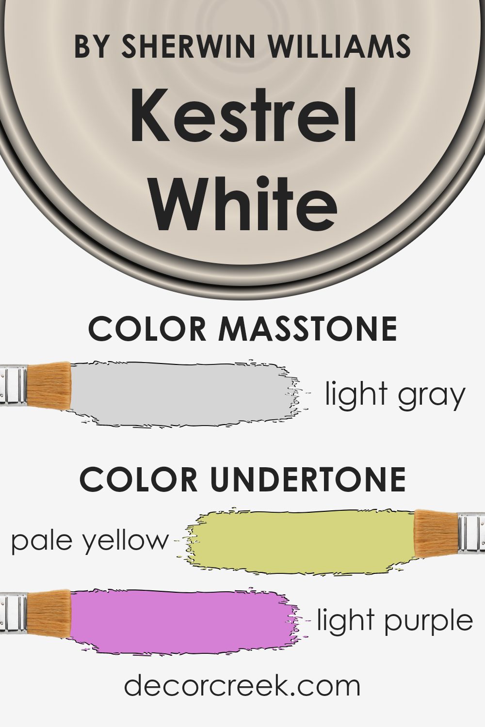
What is the Masstone of the Kestrel White SW 7516 by Sherwin Williams?
Kestrel WhiteSW 7516 has a masstone that is a light gray, resembling the calm, neutral shade you see on a cloudy day. This color is versatile, making it a great choice for almost any room in a home. Because it’s so light, it helps make spaces look bigger and brighter.
This is especially useful in smaller rooms or areas with limited natural light.
The neutral quality of this light gray means it can pair well with many other colors, from bold and bright to soft and subtle, allowing for a variety of decorating styles. Whether used on walls, cabinets, or trim, it provides a clean, fresh look without being overpowering.
Overall, its ability to act as a backdrop or complement to other features makes it a practical and popular paint choice, helping to create a pleasant and welcoming environment in any home.
How Does Lighting Affect Kestrel White SW 7516 by Sherwin Williams?
Lighting plays a crucial role in how we perceive colors in a space. Different light sources can dramatically affect the appearance of a paint color on your walls.
Kestrel White is a versatile shade from Sherwin Williams that offers a subtle warmth and can shift its tone depending on the lighting. Under artificial lighting, such as LED or incandescent light bulbs, Kestrel White tends to exhibit a more creamy and warm tone.
This makes it excellent for creating a cozy and welcoming atmosphere in interior spaces like living rooms and bedrooms.
In natural light, the color behaves differently throughout the day. The quality and angle of sunlight can change how Kestrel White looks. In north-facing rooms, which receive less direct sunlight and often have a cooler, bluer light, Kestrel White may appear slightly more muted and cooler. This can help make a small room feel larger and more open.
In south-facing rooms, abundant direct sunlight can bring out the creaminess in Kestrel White, making the room feel warm and lively. This is great for spaces where you spend a lot of time during the day, such as kitchens or main living areas.
For east-facing rooms, the morning light can make Kestrel White look very soft and warm, perfect for starting the day in a gentle way. As the day progresses, the intensity of the light decreases, leading to a neutral and steady appearance of the color.
In west-facing rooms, the paint color can appear warmer and more dynamic in the afternoon and evening as the sunlight becomes redder. This enhances the cozy atmosphere, making it ideal for dining rooms or spaces used mostly in the evening.
In conclusion, Kestrel White’s interaction with both artificial and natural light makes it a flexible choice, adapting uniquely to different settings and lighting conditions.

What is the LRV of Kestrel White SW 7516 by Sherwin Williams?
Light Reflectance Value (LRV) measures the percentage of light a paint color reflects back into a room compared to how much it absorbs. It’s a handy metric for deciding how dark or light a color will appear once applied to the walls.
Higher LRV values indicate that the color reflects more light, brightening a room and making it feel more spacious. Conversely, colors with lower LRV values absorb more light, which can make spaces appear smaller and cozier.
The LRV of Kestrel White is 68.102, meaning it reflects a good amount of light without being overly bright. This makes it a versatile choice for rooms needing a balance between brightness and a soft, welcoming feel. Walls painted with this color will look lively in well-lit conditions and maintain a light, airy feel even when the lighting is not as strong.
The fairly high LRV makes it an excellent option for spaces intended to feel open and relaxed without the starkness that can come from using a color with a much higher LRV.

Coordinating Colors of Kestrel White SW 7516 by Sherwin Williams
Coordinating colors are essential when creating a harmonious color scheme for home interiors. They are specifically chosen to complement a main color, enhancing the overall aesthetic appeal without overwhelming it.
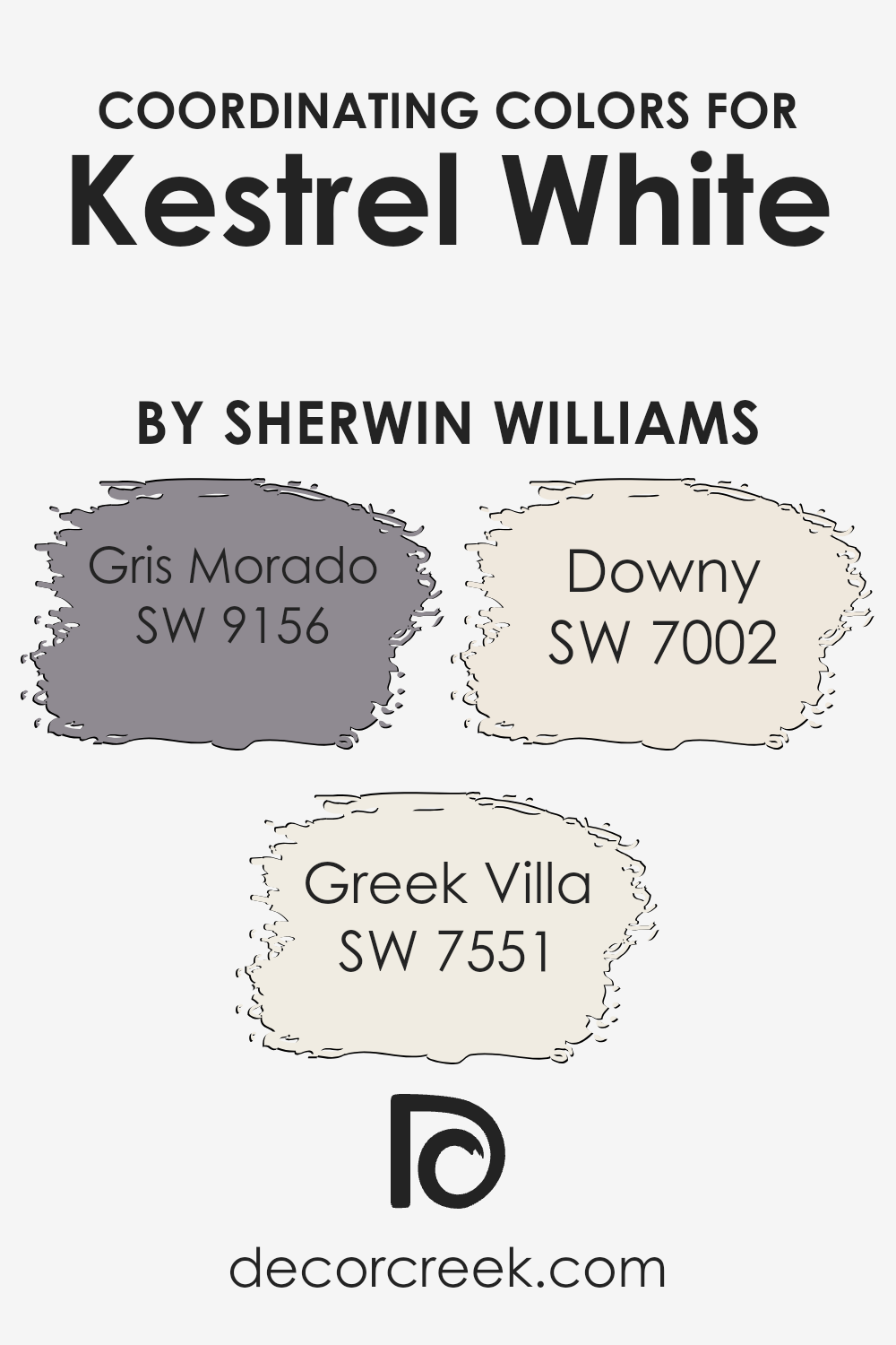
For instance, consider the color Kestrel White by Sherwin Williams, a soft, inviting white shade. To enrich this base color, one might integrate shades like Gris Morado, Greek Villa, and Downy as coordinating colors, each offering a unique contribution to the overall palette.
Gris Morado is a subdued, grayish purple that adds a touch of depth and personality, making it a great choice for adding some intrigue to spaces primarily painted in Kestrel White. It works well in accent areas or for furnishing elements that aim to stand out subtly.
Greek Villa, on the other hand, is a slight off-white, warmer and creamier than Kestrel White. This shade is excellent for creating a smooth transition between more pronounced colors and the primary white, ensuring that spaces feel light and airy.
Lastly, Downy is a soft, pale gray that acts almost like a shadow, gently enhancing the primary white while maintaining a light and effortless vibe in the room. By using these coordinating colors, one can achieve a balanced and visually pleasing environment.
You can see recommended paint colors below:
- SW 9156 Gris Morado (CHECK A SAMPLE)
- SW 7551 Greek Villa (CHECK A SAMPLE)
- SW 7002 Downy (CHECK A SAMPLE)
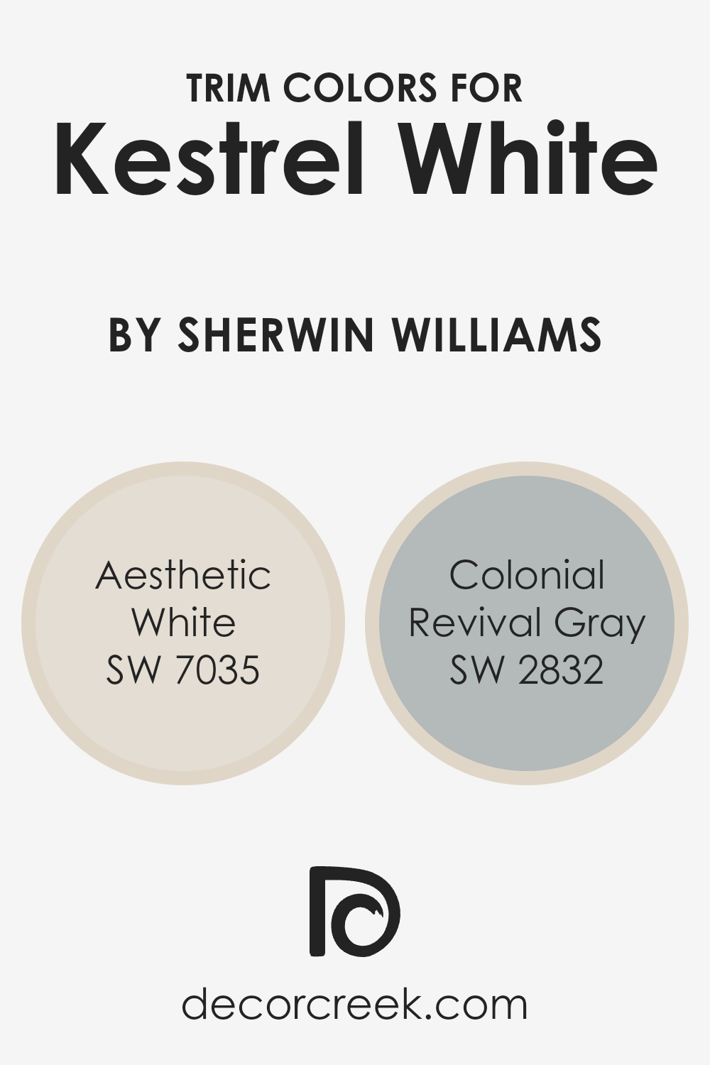
What are the Trim colors of Kestrel White SW 7516 by Sherwin Williams?
Trim colors play an essential role in enhancing the overall look of a paint job, particularly when used thoughtfully with a base color like Kestrel White SW 7516 by Sherwin Williams. Selecting the right trim colors can define and highlight architectural features, create subtle contrasts that add depth to your space, or bring harmony between different design elements.
For instance, using Aesthetic White SW 7035 or Colonial Revival Gray SW 2832 as trim colors with Kestrel White can provide a clean, polished finish, or add a touch of historical charm, respectively.
Aesthetic White SW 7035 is a soft, subtle off-white with a hint of warmth that keeps spaces feeling cozy yet bright. This color offers a gentle contrast when used with Kestrel White, helping to subtly define edges and spaces without harsh lines.
On the other hand, Colonial Revival Gray SW 2832 offers a stronger contrast with its medium gray tone that can accentuate the trim more prominently, giving a room more visible structure and an understated yet classy look.
By choosing one of these colors for the trim, it helps in creating a polished finish that complements the main wall color while adding visual interest and a touch of individuality to the interiors.
You can see recommended paint colors below:
- SW 7035 Aesthetic White (CHECK A SAMPLE)
- SW 2832 Colonial Revival Gray
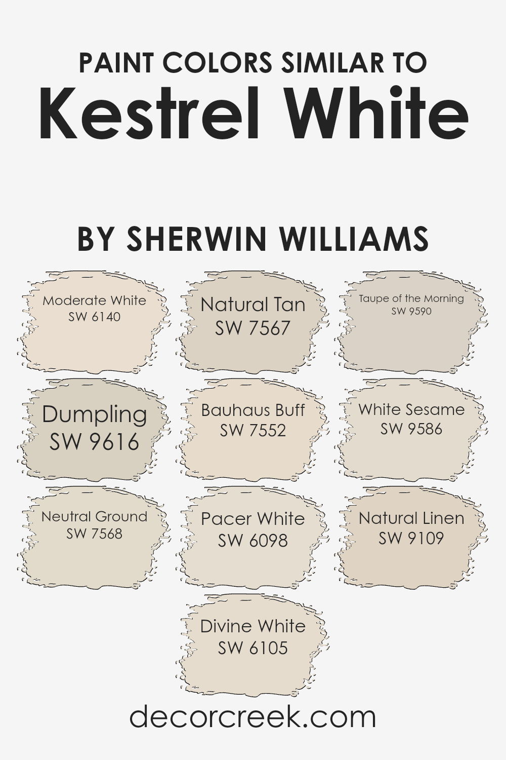
Colors Similar to Kestrel White SW 7516 by Sherwin Williams
Similar colors play a crucial role in creating a harmonious and appealing aesthetic in any space. They work by providing subtle variations in hue that blend well together, allowing for a cohesive look without stark contrasts that might disrupt the peaceful flow of a design.
Colors like Moderate White SW 6140 offer a warm and cozy feel, with just the right amount of lightness to brighten up a room without overpowering it. Dumpling SW 9616, meanwhile, adds a touch of softness and warmth, making spaces feel welcoming and lived-in.
For those looking to create a soothing backdrop that still offers some depth, Neutral Ground SW 7568 is an excellent choice with its slightly earthy tone. Divine White SW 6105, on the other hand, is a gentle beige that reflects light beautifully, enhancing the sense of space.
Natural Tan SW 7567 provides a richer, more grounded feel, perfect for areas where a sense of stability is desired. Bauhaus Buff SW 7552 gives a subtle hint of color that complements natural materials like wood or stone beautifully.
Pacer White SW 6098 is another versatile option, slightly cooler and ideal for modern spaces. Taupe of the Morning SW 9590 offers a unique blend, merging gray with hints of brown for a distinctive yet neutral appearance. White Sesame SW 9586 has a clean and fresh look that can help in making small spaces appear larger.
Finally, Natural Linen SW 9109 brings a touch of organic elegance, its lightly textured appearance echoing the softness of well-worn fabric. These similar colors work together to create layered and inviting spaces, each adding its own character while maintaining a cohesive and balanced palette.
You can see recommended paint colors below:
- SW 6140 Moderate White (CHECK A SAMPLE)
- SW 9616 Dumpling (CHECK A SAMPLE)
- SW 7568 Neutral Ground (CHECK A SAMPLE)
- SW 6105 Divine White (CHECK A SAMPLE)
- SW 7567 Natural Tan (CHECK A SAMPLE)
- SW 7552 Bauhaus Buff (CHECK A SAMPLE)
- SW 6098 Pacer White (CHECK A SAMPLE)
- SW 9590 Taupe of the Morning (CHECK A SAMPLE)
- SW 9586 White Sesame (CHECK A SAMPLE)
- SW 9109 Natural Linen (CHECK A SAMPLE)
Colors that Go With Kestrel White SW 7516 by Sherwin Williams
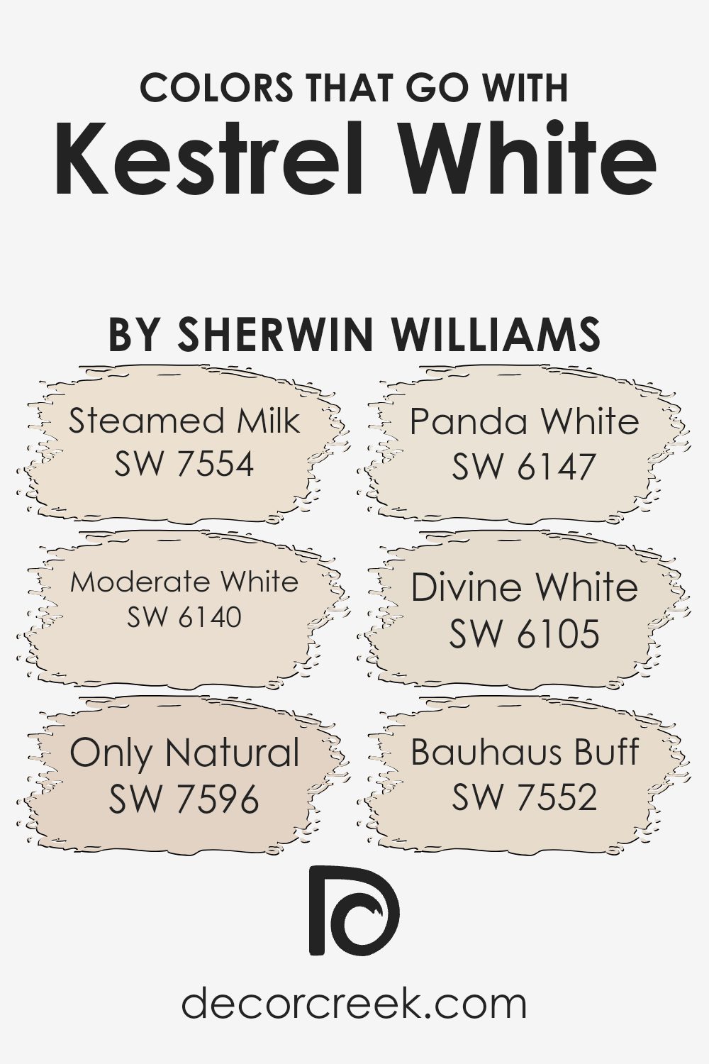
Choosing the right colors to complement Kestrel White SW 7516 by Sherwin Williams is important because it helps create a harmonious and inviting space. Colors that pair well with Kestrel White, such as Steamed Milk, Moderate White, Only Natural, Panda White, Divine White, and Bauhaus Buff, each bring their unique essence to a room while maintaining an aesthetic balance.
These compatible colors can enhance the overall look by adding subtle variations that enrich the visual appeal without overwhelming the senses.
Steamed Milk SW 7554 is a warm, creamy color that gives a soft backdrop, perfect for living spaces where comfort is key. Moderate White SW 6140, slightly lighter than Steamed Milk, offers a fresh and clean look, ideal for a modern minimalist decor.
Only Natural SW 7596 lends an earthy, sandy feel to a room, providing a gentle contrast to Kestrel White. Panda White SW 6147 has a hint of gray, making it a great choice for those who prefer a cooler palette.
Divine White SW 6105 offers a touch of beige, warming up spaces without darkening them, great for areas with less natural light. Lastly, Bauhaus Buff SW 7552 provides a muted, peachy tone that pairs well with both dark and light accents, versatile for any room needing a touch of softness.
Using these colors in combination with Kestrel White can successfully set the mood and style of a space, ensuring a pleasing visual flow.
You can see recommended paint colors below:
- SW 7554 Steamed Milk (CHECK A SAMPLE)
- SW 6140 Moderate White (CHECK A SAMPLE)
- SW 7596 Only Natural (CHECK A SAMPLE)
- SW 6147 Panda White (CHECK A SAMPLE)
- SW 6105 Divine White (CHECK A SAMPLE)
- SW 7552 Bauhaus Buff (CHECK A SAMPLE)
How to Use Kestrel White SW 7516 by Sherwin Williams In Your Home?
Kestrel White SW 7516 by Sherwin Williams is a versatile paint color that brings a fresh and clean look to any room in your home. Its subtle warm tones make it perfect for creating a cozy atmosphere without feeling too stark or cold.
Because it’s a neutral shade, it pairs beautifully with a wide range of other colors. Whether you want to refresh your living room, bedroom, or even the kitchen, Kestrel White provides a solid base that can complement bold accents like blues and greens or more muted tones like tans and grays.
Using this color on walls can make your furniture and decor stand out, enhancing the overall appearance of your home. It’s also an excellent choice for ceilings and trim, helping to brighten spaces and give them a more open feel.
If you’re looking for a simple way to refresh your home’s look, painting with Kestrel White is an easy and effective way to do it, making your living spaces more inviting and pleasant.
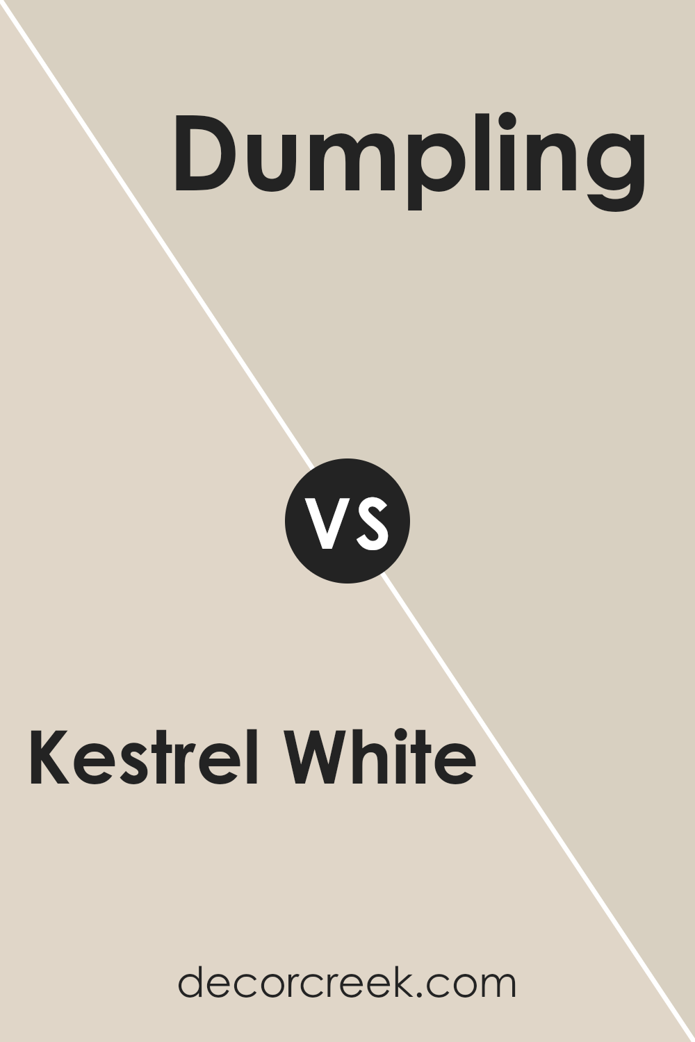
Kestrel White SW 7516 by Sherwin Williams vs Dumpling SW 9616 by Sherwin Williams
Kestrel White and Dumpling are two subtle shades from Sherwin Williams that both offer a unique touch to any space. Kestrel White has a soft, creamy undertone that provides a warm and welcoming feel to rooms. It’s particularly good at making small spaces appear larger and brighter without being too stark or cold.
On the other hand, Dumpling leans more towards a beige color with a hint of yellow, creating a cozy and comfortable vibe. This color is perfect for creating a relaxed, homely atmosphere that feels inviting.
Both colors are versatile and can be used in a variety of decorating styles, from modern to traditional. However, while Kestrel White reflects more light, making it ideal for a light and airy feel, Dumpling offers a richer warmth, suitable for spaces where a more comforting presence is desired.
Whether you choose the light and airy Kestrel White or the warm and cozy Dumpling likely depends on the atmosphere you want to achieve in your space.
You can see recommended paint color below:
- SW 9616 Dumpling (CHECK A SAMPLE)
Kestrel White SW 7516 by Sherwin Williams vs Bauhaus Buff SW 7552 by Sherwin Williams
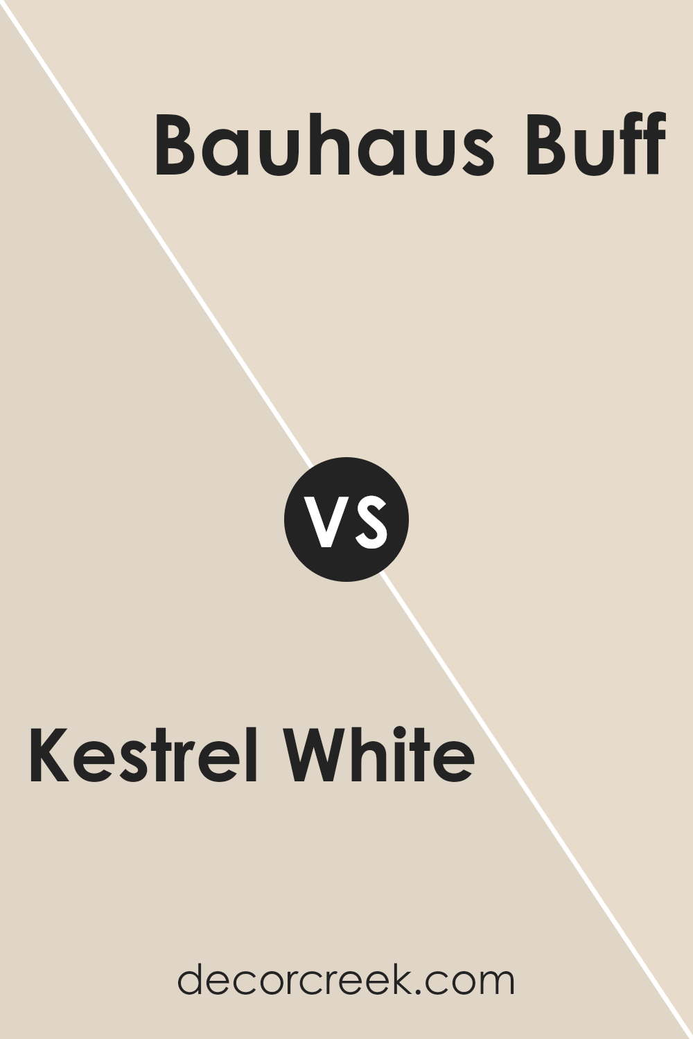
Kestrel White and Bauhaus Buff are both neutral paint colors from Sherwin Williams, but they bring different vibes to a space. Kestrel White is a very light grey with a hint of warmth, making it an excellent choice for creating a bright and airy feel in a room. It helps make smaller rooms look bigger and reflects natural light beautifully, which can add an inviting quality to your spaces.
Bauhaus Buff, on the other hand, is a warmer hue that leans towards beige. It’s darker than Kestrel White, providing a cozy and welcoming atmosphere that works well in spaces where you want a soothing feel.
Bauhaus Buff is great for common areas like living rooms or hallways where its rich tone can make the area feel more connected.
Overall, if you prefer cooler tones that give off a clean and open feel, Kestrel White might be the go-to. If warmer tones that offer a sense of comfort are more your style, Bauhaus Buff would be ideal.
You can see recommended paint color below:
- SW 7552 Bauhaus Buff (CHECK A SAMPLE)
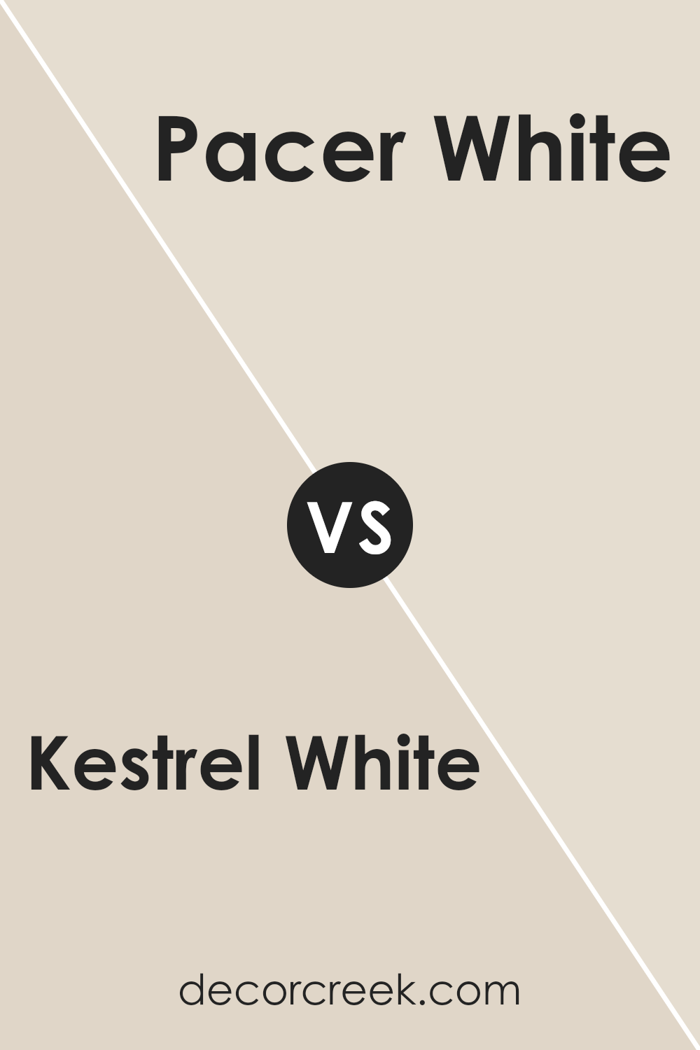
Kestrel White SW 7516 by Sherwin Williams vs Pacer White SW 6098 by Sherwin Williams
Kestrel White and Pacer White from Sherwin Williams are both popular paint choices, suitable for creating a light and airy atmosphere in any space. Kestrel White has a slightly cooler undertone, which can give a crisp, clean look to a room.
It pairs well with contemporary settings due to its subtle gray tones. On the other hand, Pacer White leans warmer with a beige undertone that provides a cozy, inviting feel. It works especially well in spaces that aim for a classic or traditional aesthetic.
Depending on the lighting and surrounding colors, both Kestrel White and Pacer White can either stand out or blend in beautifully with the decor, making them versatile options for various decorating styles.
You can see recommended paint color below:
- SW 6098 Pacer White (CHECK A SAMPLE)
Kestrel White SW 7516 by Sherwin Williams vs Natural Linen SW 9109 by Sherwin Williams
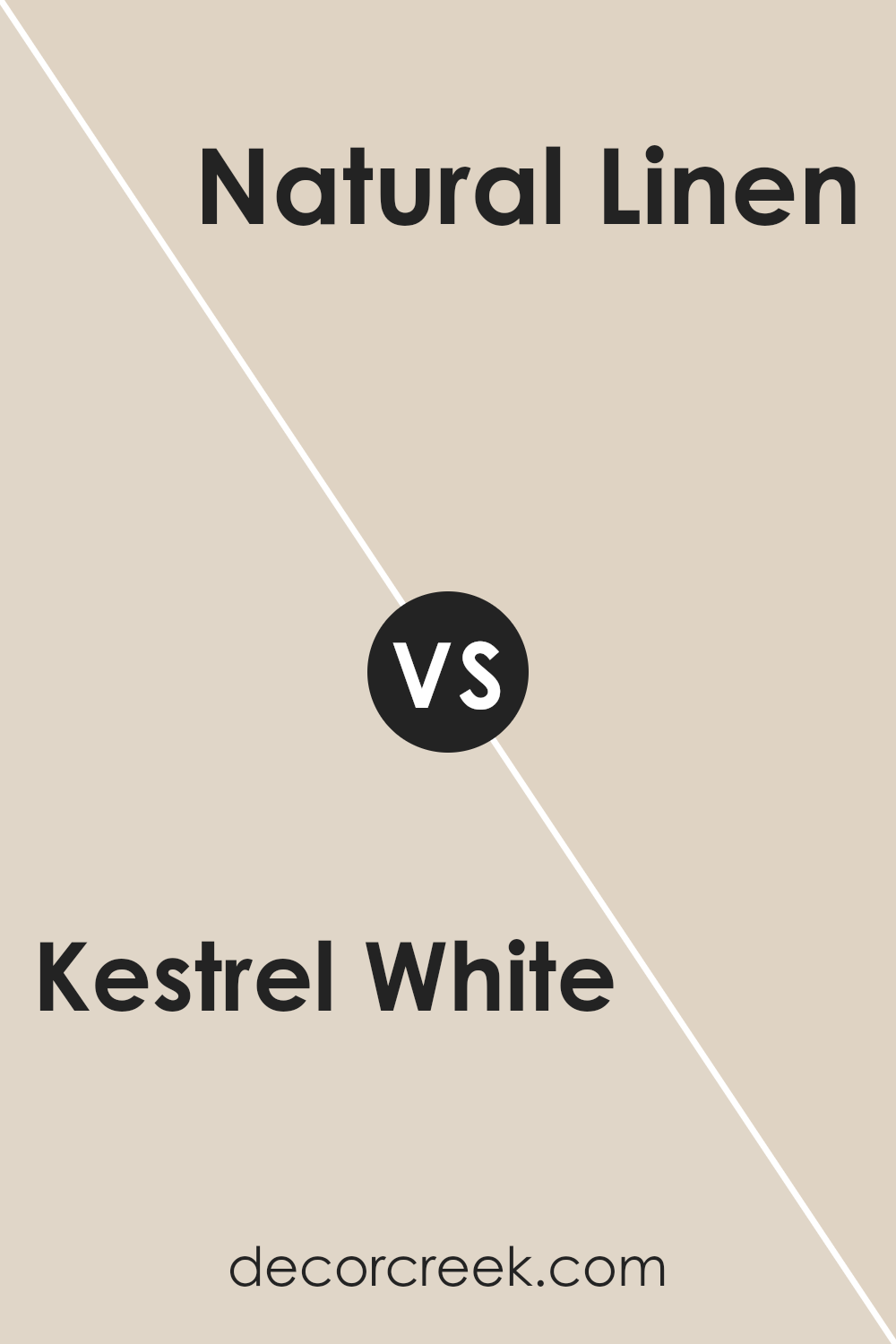
Kestrel White and Natural Linen are two paint colors from Sherwin Williams that bring a soft and warm feel to any room. Kestrel White is more of a light gray with a hint of warmth, making it a versatile choice to use in various spaces.
It reflects light beautifully, helping to make small rooms appear larger. Natural Linen, on the other hand, has a warmer tone, resembling the color of unbleached linen. It offers a cozy and inviting feel, perfect for creating a relaxing atmosphere in living rooms or bedrooms.
When compared, Kestrel White serves as a neutral backdrop, potentially making it easier to match with different decor styles and colors. Natural Linen gives a bit more color presence, which can add a touch of warmth to spaces that may feel too stark with paler colors. Both colors work well for creating a calm and welcoming environment.
You can see recommended paint color below:
Kestrel White SW 7516 by Sherwin Williams vs Moderate White SW 6140 by Sherwin Williams
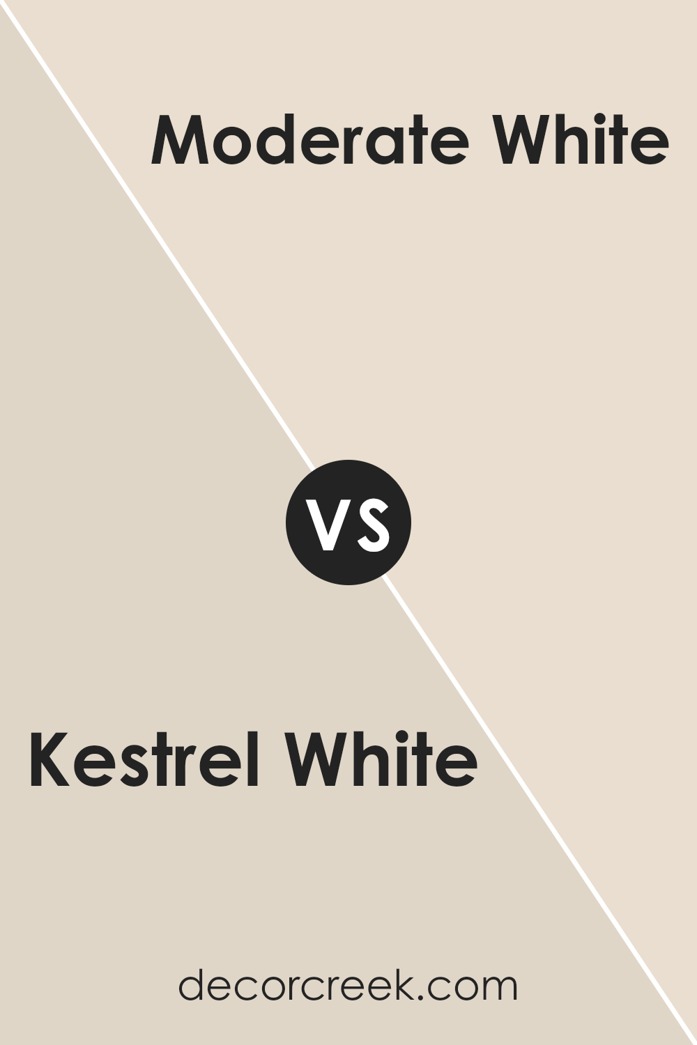
Kestrel White and Moderate White are two shades by Sherwin Williams that offer subtle differences for home painting projects. Kestrel White has a gentle warmth to it, making it a cozy option for spaces where you want a hint of comfort without overpowering brightness.
This color leans slightly towards a soft beige under certain lighting, giving it a welcoming feel.
On the other hand, Moderate White is closer to a true neutral. This shade is softer and less warm compared to Kestrel White, providing a cleaner look. Its neutrality makes it versatile for various spaces, easily pairing with different décor styles and colors.
When deciding between the two, consider the mood you want to create. Kestrel White works well for a homey, warm atmosphere, while Moderate White is ideal for creating a straightforward and fresh space.
Both colors are quiet and understated, helping to create a pleasant backdrop in any room.
You can see recommended paint color below:
- SW 6140 Moderate White (CHECK A SAMPLE)
Kestrel White SW 7516 by Sherwin Williams vs Taupe of the Morning SW 9590 by Sherwin Williams
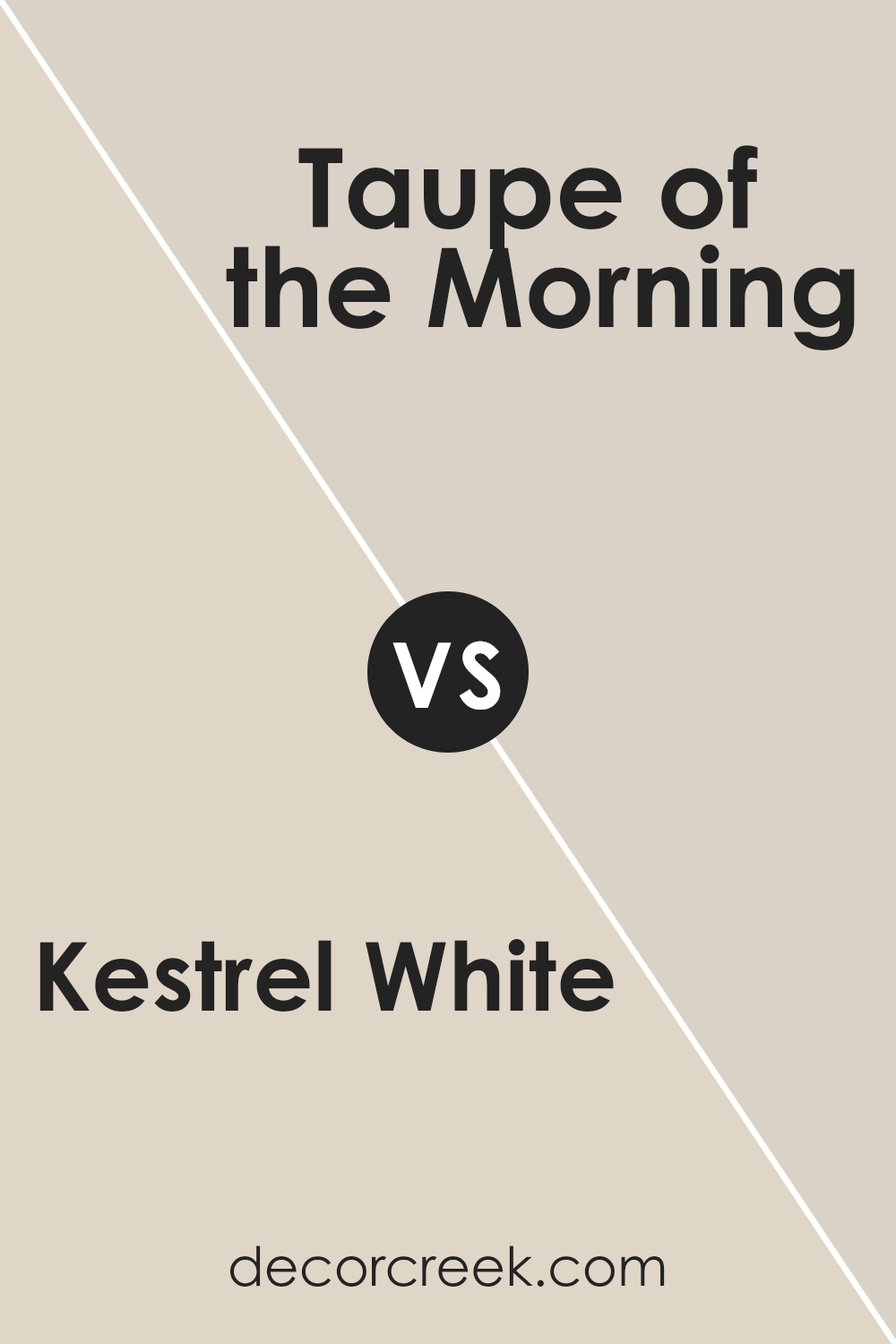
Kestrel White and Taupe of the Morning are both paint colors from Sherwin Williams, but they bring different tones to a space. Kestrel White is a soft, warm white that has a cozy, welcoming feel. It’s perfect for making rooms feel brighter and more spacious.
On the other hand, Taupe of the Morning is a deeper color, offering a richer hue that combines elements of brown and gray.
This color is great for adding a bit of warmth and depth to a space, making it ideal for those who want something more than just plain white but still looking for neutrality.
When choosing between these two, consider how much natural light your room gets. Kestrel White works well in lots of light, while Taupe of the Morning can enrich a dimmer, cozier area. Overall, both colors provide a polished look to any interior but fulfill slightly different design needs.
You can see recommended paint color below:
- SW 9590 Taupe of the Morning (CHECK A SAMPLE)
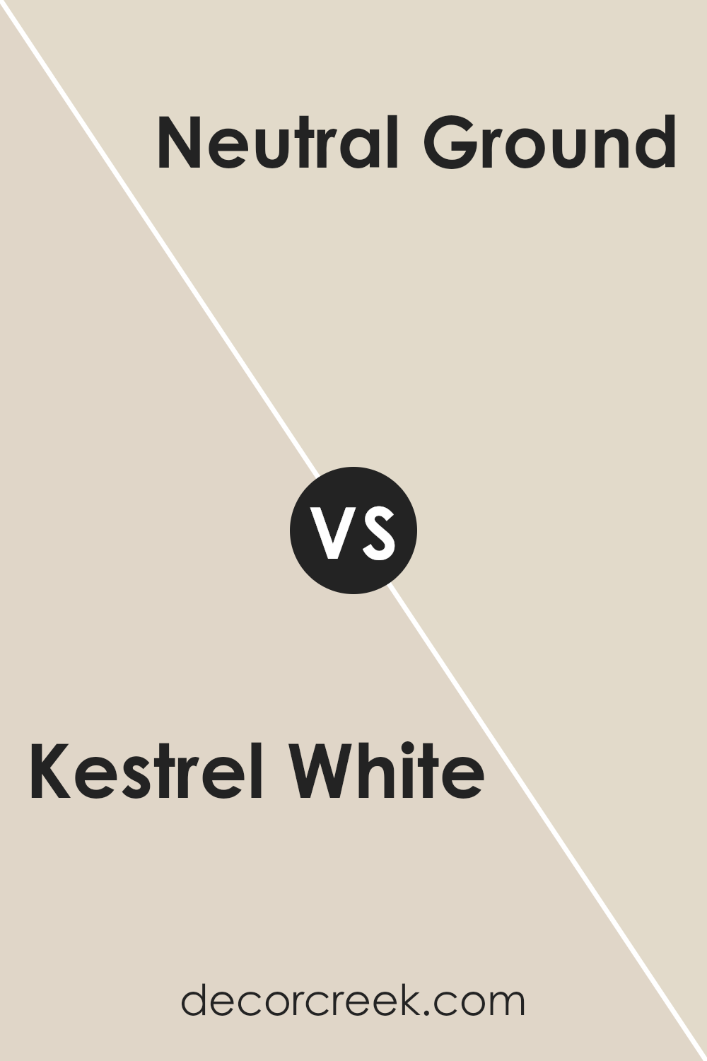
Kestrel White SW 7516 by Sherwin Williams vs Neutral Ground SW 7568 by Sherwin Williams
Kestrel White and Neutral Ground, both by Sherwin Williams, offer subtle variations in tone that could influence the mood and feel of a room. Kestrel White has a soft, slightly warm hue, making it an excellent choice for creating a cozy and welcoming space.
It pairs well with a variety of decor styles and adds a gentle brightness to rooms without being too stark.
On the other hand, Neutral Ground stands out as a bit darker compared to Kestrel White, presenting a hint more beige and warmth. This color is great for those looking to add a touch of warmth to their interiors while maintaining a light and airy feel.
It’s particularly effective in spaces that aim for a more grounded or earthy ambiance without darkening the room too much.
Both colors are versatile and can work beautifully in many different areas of a home, from living rooms to bedrooms, depending on the atmosphere you want to achieve.
Neutral Ground might be better for those preferring a warmer, more enveloping feel, while Kestrel White could be better for someone seeking a brighter space.
You can see recommended paint color below:
Kestrel White SW 7516 by Sherwin Williams vs Natural Tan SW 7567 by Sherwin Williams
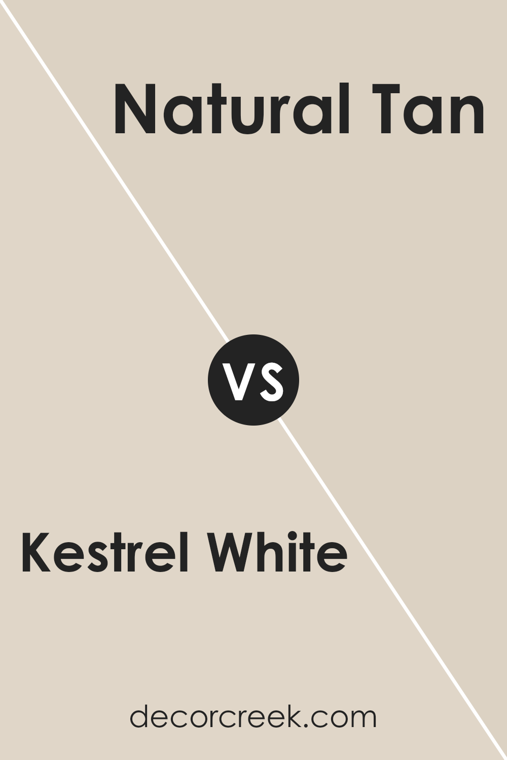
Kestrel White and Natural Tan, both by Sherwin Williams, present subtle yet distinct tones suitable for versatile interior designs. Kestrel White is a soft, warm white with a touch of gray that gives it a muted, calming appearance.
This color is perfect for creating a gentle and inviting backdrop in any room, making spaces feel larger and brighter.
Natural Tan, on the other hand, is a warmer, beige color that brings a cozy, earthy feel to environments. It’s darker than Kestrel White and provides a solid, neutral base that complements a wide array of other colors, from bold hues to more understated tones.
Both colors work well in various settings, from modern to classic, and can be used interchangeably as either primary or accent colors depending on the desired ambiance.
Kestrel White is ideal for those who prefer a crisp, clean look, while Natural Tan suits those looking for a bit more warmth and natural depth in their color scheme.
You can see recommended paint color below:
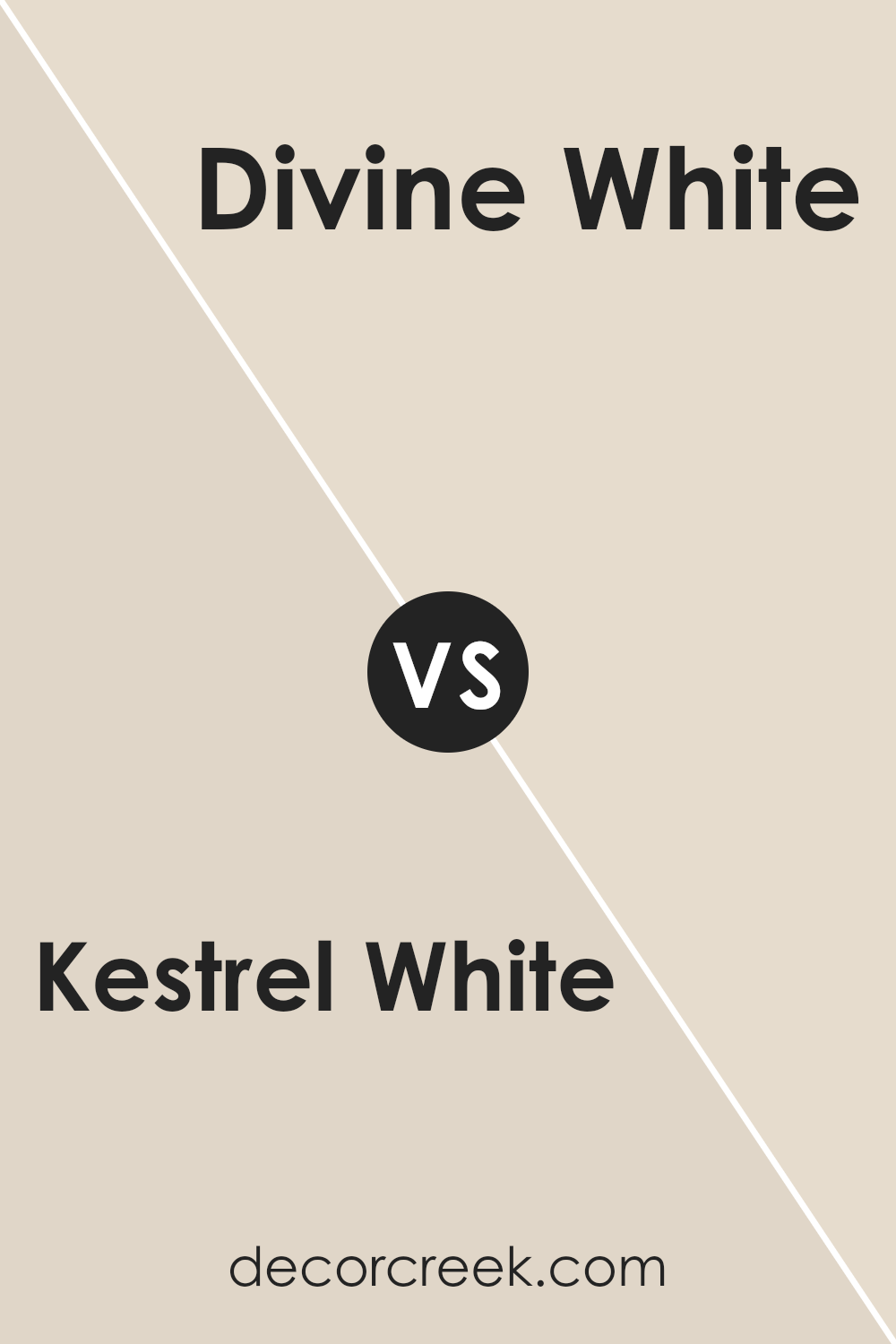
Kestrel White SW 7516 by Sherwin Williams vs Divine White SW 6105 by Sherwin Williams
Kestrel White and Divine White are both popular colors from Sherwin Williams, each with its unique appeal depending on your decorating needs. Kestrel White is a subdued, gray-toned white that offers a cool, minimalist vibe.
This color works well in spaces with a modern or contemporary style, providing a clean and crisp background that complements various decor elements.
On the other hand, Divine White carries a warmer undertone, leaning towards a creamy, soft beige. It’s perfect for creating a cozy and inviting atmosphere in rooms where comfort is a priority, such as living rooms and bedrooms. This warmth makes it ideal for traditional or rustic styles, as it adds a gentle, nurturing feel to the walls.
While both colors are versatile, your choice between Kestrel White and Divine White would largely depend on the mood and style you aim to achieve in your space, as well as the existing elements like lighting and furniture.
Overall, whether you prefer the cooler shades of Kestrel White or the warmer tones of Divine White, both options offer a beautiful backdrop that can enhance the aesthetic of your home.
You can see recommended paint color below:
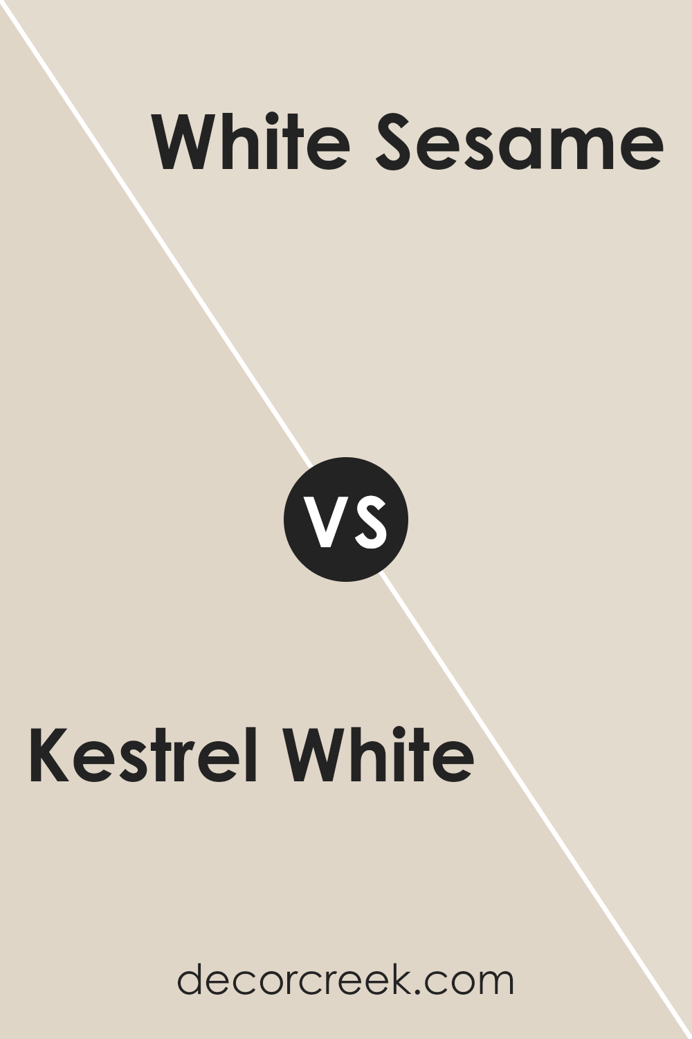
Kestrel White SW 7516 by Sherwin Williams vs White Sesame SW 9586 by Sherwin Williams
Kestrel White and White Sesame are both paint colors offered by Sherwin Williams, each providing a unique shade of white. Kestrel White has a warm undertone that makes it very welcoming and cozy. It’s a great choice for living spaces or bedrooms where you want a soothing atmosphere. This color can help make a room feel more intimate and comfortable.
On the other hand, White Sesame carries a cooler tone, which gives it a fresher and cleaner look. This color is perfect for kitchens, bathrooms, or any area where you seek a crisp, clean appearance.
It reflects light well, making spaces appear brighter and more open.
In terms of compatibility, Kestrel White works well in rooms that have natural wood finishes or earthy colors because of its warmth. White Sesame is better suited for modern spaces or with bold color accents due to its cooler and neutral base.
Both are versatile, but your choice might depend on the mood you want to set and the other colors in your room.
You can see recommended paint color below:
- SW 9586 White Sesame (CHECK A SAMPLE)
Conclusion
In conclusion, SW 7516 Kestrel White by Sherwin Williams is a great choice if you’re looking for a paint color that is calm and clean. This color is like the first page of your drawing book, ready and waiting for any idea. It works well in all kinds of rooms, whether it’s your bedroom, living room, or even the kitchen.
It’s like a quiet friend that matches well with almost everything, from your comfy old sofa to your brand new curtains.
It can make small rooms look bigger and bright rooms feel even brighter. So, if you want a fresh start or just a change, Kestrel White might be the perfect color to help you make your home look lovely.

Ever wished paint sampling was as easy as sticking a sticker? Guess what? Now it is! Discover Samplize's unique Peel & Stick samples.
Get paint samples


