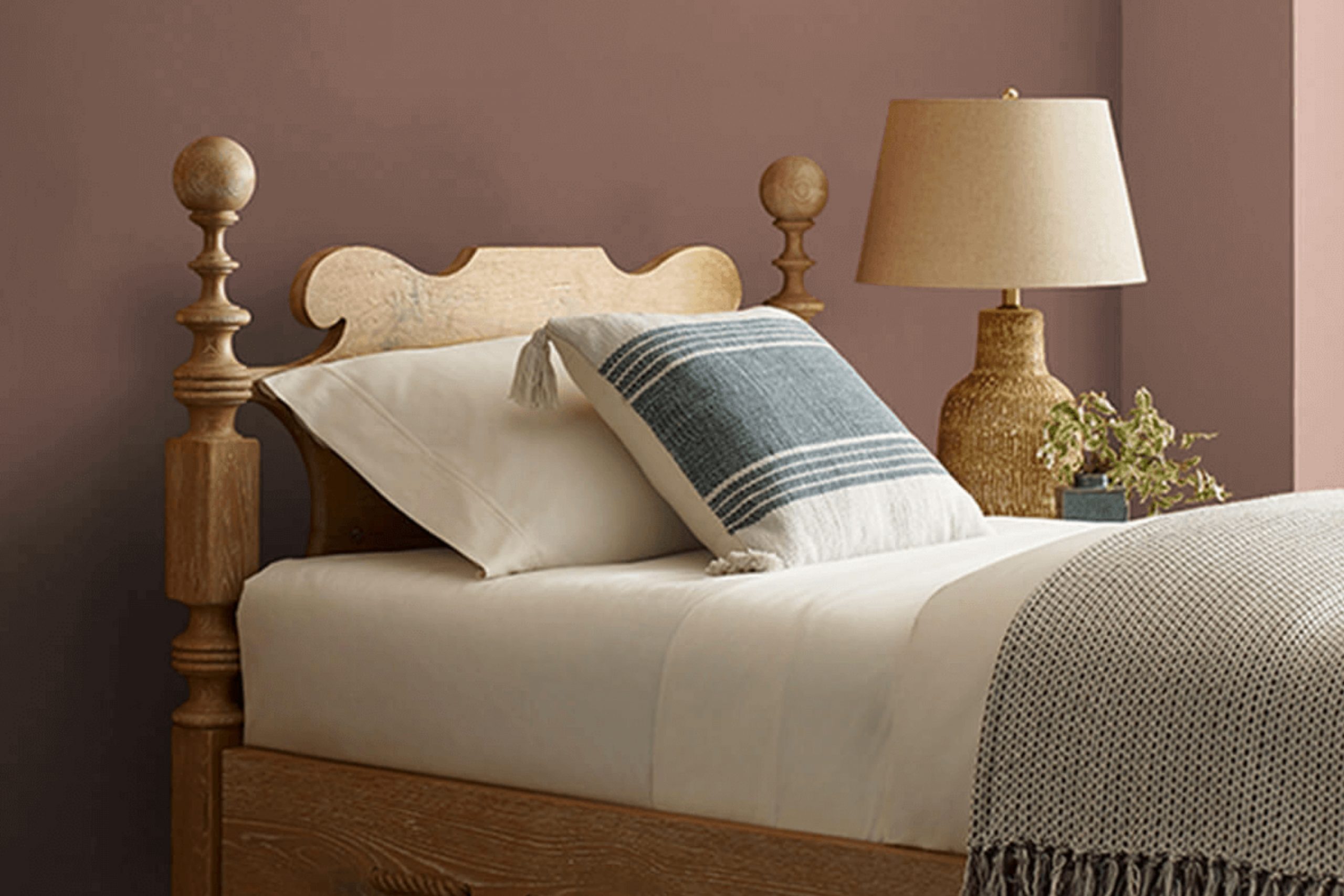
While working on a project, I stumbled upon SW 6047 Hot Cocoa by Sherwin Williams, and I was struck by its rich, warm hue. Reminiscent of a comforting cup of hot cocoa on a chilly evening, this color exudes a cozy vibe that seems perfect for creating inviting rooms. As I learned more about this paint color, I found that its deep chocolate tone works beautifully in various settings, from living rooms to bedrooms, adding a touch of warmth wherever it’s applied.
What stood out to me about Hot Cocoa is its adaptability. Whether you are looking to craft a rustic feel or aiming for a more refined look, this color has the potential to blend seamlessly with different styles and decors. I noticed that it pairs particularly well with soft creams, rich burgundies, or even subtle greens, offering numerous decorating possibilities.
In considering a new color for a room refresh, the depth and warmth of SW 6047 Hot Cocoa could be just what you need to create a welcoming and homely atmosphere.
Its chocolatey shade seems like it could help in making a room feel more grounded and enclosed, providing a perfect backdrop for both relaxation and social gatherings.
What Color Is Hot Cocoa SW 6047 by Sherwin Williams?
Hot Cocoa by Sherwin Williams is a rich, warm brown shade that offers a cozy and welcoming feel, making it an ideal choice for creating a comfortable home environment. Its depth and mellowness work particularly well in living rooms, bedrooms, or any room where relaxation is a priority. This color can beautifully anchor a room while pairing well with both light and dark hues, allowing for flexible design options.
In terms of interior styles, Hot Cocoa fits seamlessly into rustic and traditional designs, where its earthy quality complements natural materials like wood, leather, and wool. In a rustic setting, consider it on walls with exposed stone or brick for a hearty, homey feel. In traditional room, it works well with detailed trims and rich textiles, adding depth to the décor.
Hot Cocoa also pairs splendidly with metallic accents, such as brass or gold, which add a touch of warmth and luxury without overpowering the room. For a modern twist, matching it with matte black or navy brings in a contemporary edge, while still keeping the atmosphere grounded and inviting.
The color’s versatility and warm undertones make it a solid base for various textiles, from smooth silks to coarse linens, enhancing the sensory experience of the room. Whether used in large areas or as an accent shade, Hot Cocoa creates a cozy backdrop for daily life.
Is Hot Cocoa SW 6047 by Sherwin Williams Warm or Cool color?
Hot Cocoa SW 6047 by Sherwin Williams is a warm, rich brown that brings a cozy feel to any room. This color is perfect if you’re looking to create a comforting and inviting atmosphere. It works well in living areas and bedrooms, where you might want to feel relaxed and at ease.
The deep brown shade is adaptable and pairs nicely with many different colors, from bold hues to more neutral tones. Using Hot Cocoa SW 6047 can make small rooms feel more intimate and snug, while in larger rooms, it adds a sense of warmth.
It’s especially effective in rooms with natural light, as the color appears lively and vibrant when the sunlight hits it. Additionally, this shade can help hide marks or smudges, which is beneficial for homes with kids or pets. Overall, Hot Cocoa SW 6047 offers a simple way to add depth and warmth to your home.
Undertones of Hot Cocoa SW 6047 by Sherwin Williams
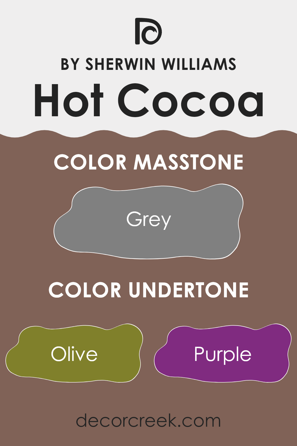
Hot Cocoa is a unique paint color that subtly incorporates a surprising range of undertones, making it incredibly adaptable for home decor. With undertones ranging from olive to dark grey, this color can adopt different hues based on lighting and surrounding elements. These undertones are subtle colors that lie beneath the primary color shade, affecting the overall perception and feel of the color when applied on walls.
For example, in a room with ample sunlight, the pale yellow, and light turquoise undertones of Hot Cocoa might become more pronounced, giving the walls a warmer and more welcoming feel. In contrast, in a room with less natural light, the darker undertones such as dark grey and navy might be more dominant, providing a richer and cozier atmosphere.
This range of undertones affects how Hot Cocoa interacts with different interior elements. Furniture and decor in shades of mint, lilac, or light gray can bring out the lighter, softer sides of Hot Cocoa, making a room feel more open and airy. Darker accents like navy or dark green pieces might highlight the depth of the color, adding a grounding and calming effect to the room.
Because of its complex undertone structure, Hot Cocoa is a great choice for those looking to add depth and character to their rooms. Whether aiming for a lighter, refreshing look or a darker, more intimate ambiance, this color can achieve various moods and styles, adapting beautifully to different interior designs.
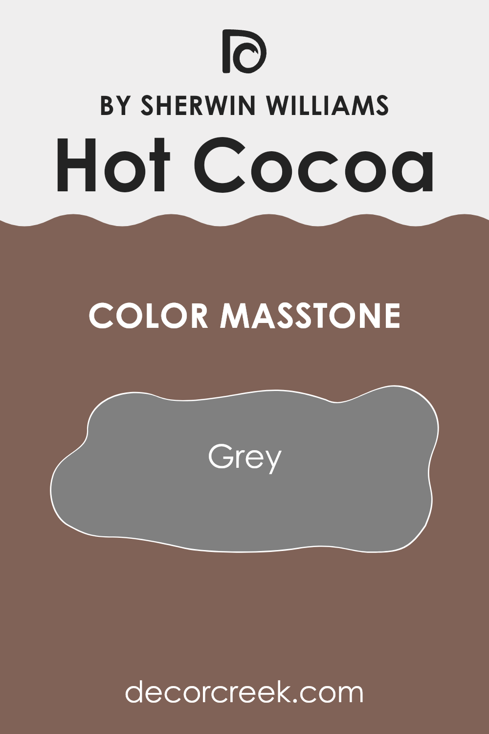
What is the Masstone of the Hot Cocoa SW 6047 by Sherwin Williams?
Hot Cocoa SW 6047 by Sherwin Williams has a masstone of grey, which makes it an adaptable color for home interiors. This neutral shade can work well in various rooms, including living rooms, kitchens, and bedrooms. Grey, like the one in Hot Cocoa, offers a balanced backdrop that complements a wide range of decor styles, from modern to rustic.
It is an excellent choice for those who prefer a subtle and classic look in their rooms. The grey masstone in Hot Cocoa also helps in creating a calm atmosphere, making it a good option for areas where you want to relax.
It can pair easily with brighter colors, such as blues or yellows, to add a touch of liveliness without overpowering the room. Additionally, this color can help in making small rooms appear larger and more open, as its neutral tone doesn’t crowd the visual room. This makes Hot Cocoa a practical and stylish choice for enhancing the aesthetic of a home.
How Does Lighting Affect Hot Cocoa SW 6047 by Sherwin Williams?
Lighting can significantly affect how we perceive colors in our surroundings. Colors can appear differently depending on whether they are viewed under natural sunlight or artificial light, and even the orientation of the room can impact how a color looks throughout the day.
Taking “Hot Cocoa” by Sherwin Williams as an example, this color is a warm, inviting shade that reacts uniquely to various lighting conditions. In natural light, this color tends to reveal its rich, chocolaty tones more vividly. Under the generous rays of the sun, especially in well-lit rooms, “Hot Cocoa” can display a deep, sumptuous quality that makes rooms feel cozy and welcoming.
Under artificial lighting, such as LED or incandescent bulbs, “Hot Cocoa” might lean towards a slightly different appearance. LED lights, often cooler in tone, could make the color appear a bit lighter or muted, whereas warmer incandescent bulbs can enhance its depth, bringing out reddish undertones.
The orientation of the room also plays a crucial role in how “Hot Cocoa” is perceived:
- North-Faced Rooms: These rooms get less sunlight, which can make the color appear darker and more consistent throughout the day. “Hot Cocoa” can provide a grounded, stable feel in north-facing rooms, making them appear more enclosed but cozy.
- South-Faced Rooms: Here, with abundant sunlight, “Hot Cocoa” will look lighter and warmer, especially during the day. The color can create a luminous, warm atmosphere that’s very welcoming.
- East-Faced Rooms: Morning light can make “Hot Cocoa” look especially radiant in the morning but dimmer in the afternoon. It’s perfect for rooms where you spend your mornings, like kitchens or breakfast nooks.
- West-Faced Rooms: In rooms facing west, the color will change from subdued in the morning to vibrant in the evening as the sun sets. This can make living rooms or dining rooms feel dynamic and adaptable from day to night.
Each lighting condition and room orientation brings out a different side of “Hot Cocoa,” allowing the color to adapt and shift in character dependably. This versatility makes it a fascinating color choice across various design applications.
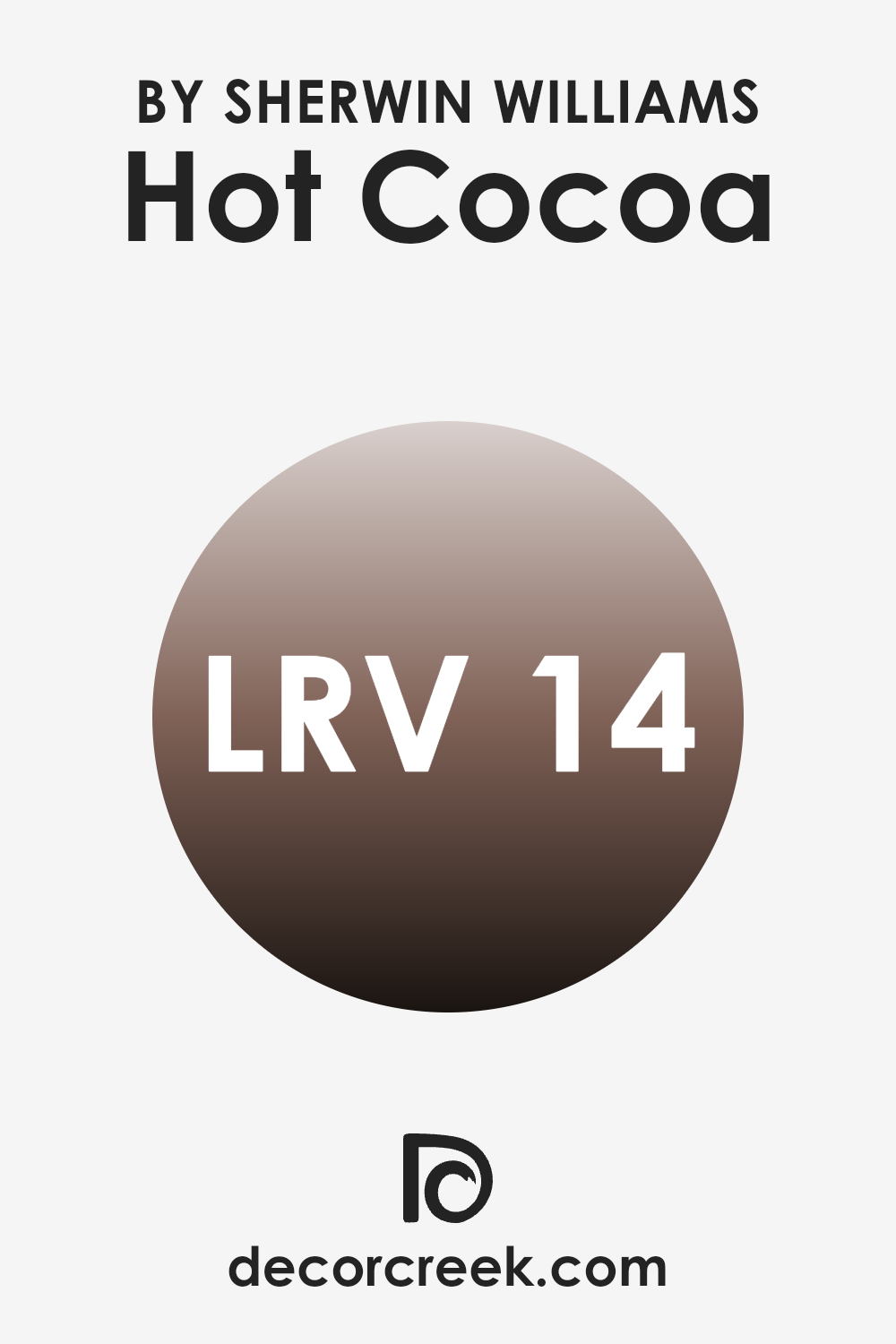
What is the LRV of Hot Cocoa SW 6047 by Sherwin Williams?
LRV stands for Light Reflectance Value, which is a measurement used to describe the amount of visible and usable light that a paint color reflects or absorbs when it’s applied to walls or other surfaces. Basically, this value helps show how light or dark a color might look once it’s up on your wall.
The scale for LRV runs from 1, which is very dark, to 99, which is very bright. Colors with a higher LRV reflect more light, making them feel lighter and can make a rooms seem larger, while lower LRVs absorb more light and typically make a room feel more enclosed or cozy.
The LRV of the paint color mentioned, which is 14, means it’s fairly dark. This richness means it absorbs a lot of light, rather than reflecting it. When used on walls, this color can create an intimate and warm room, working well in areas meant for relaxation such as a bedroom or a cozy reading nook.
However, it’s important to ensure there is ample lighting in rooms where such dark colors are used, to avoid making the room feel too small or too dark. Lights, window treatments, and even the furnishings can all play an important role in balancing out this dark tone to keep the room comfortable and inviting.
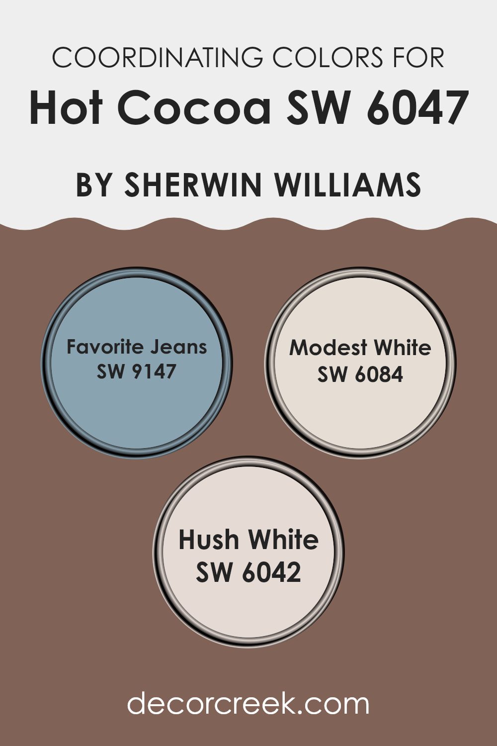
Coordinating Colors of Hot Cocoa SW 6047 by Sherwin Williams
Coordinating colors are hues that complement each other when used together in decor or design, creating an aesthetically pleasing schema. When selecting paint like Hot Cocoa, finding colors that coordinate well enhances the overall appearance and harmony of a room. It’s not just about choosing colors that match; it’s about choosing colors that balance each other, making a room feel well put together without one color overpowering another.
For instance, Favorite Jeans provides a delightful contrast to the warm tone of Hot Cocoa, offering a rich, deep blue that can anchor a room and provide a striking balance. Modest White and Hush White, on the other hand, offer lighter options that can brighten areas and make them seem more spacious.
Modest White has a subtle warmth that complements the earthiness of Hot Cocoa, providing a soft background that allows darker furniture or decor pieces to stand out. Hush White is slightly cooler and less intense, which can add a refreshing lift to a room that utilizes the cozy depth of brown hues. These coordinating colors are essential tools to achieve a harmonious design palette that enhances the foundation color of a room.
You can see recommended paint colors below:
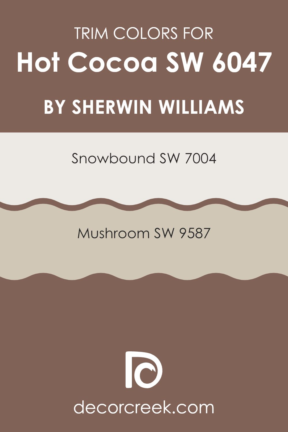
What are the Trim colors of Hot Cocoa SW 6047 by Sherwin Williams?
Trim colors, like SW 7004 – Snowbound and SW 9587 – Mushroom, play a crucial role in complementing the main paint color on walls or exteriors; in this case, Hot Cocoa by Sherwin Williams. By selecting the right trim colors, you can highlight architectural details and frame the primary color, enhancing overall aesthetic appeal.
Properly chosen trim colors can also create a visual boundary that makes the main color stand out more distinctly, giving the room a clean and finished look. SW 7004 – Snowbound is a gentle off-white color that offers a fresh and bright contrast when used as a trim, highlighting the darker tones of Hot Cocoa with a subtle distinction without overpowering the room’s warmth.
On the other hand, SW 9587 – Mushroom provides a warmer, beige-like shade that complements Hot Cocoa with a softer, more fluid transition, making the room feel cohesive and gently defined. Both colors support Hot Cocoa in making the area feel welcoming and well put together.
You can see recommended paint colors below:
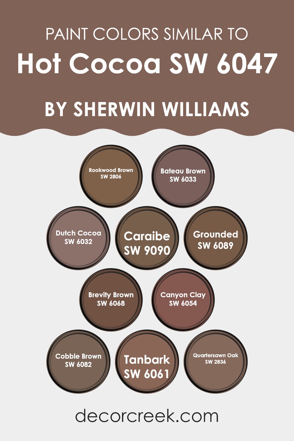
Colors Similar to Hot Cocoa SW 6047 by Sherwin Williams
Similar colors play a key role in creating a harmonious and aesthetically pleasing palette for any room. When colors like Hot Cocoa and its similar variants are used together, they create a cohesive look that can enhance the overall ambiance without overpowering the senses. These hues share common undertones and intensities that allow them to blend smoothly, providing a subtle variation that adds depth and interest to interiors or exteriors.
For instance, Rookwood Brown is a rich, deep brown that brings a warm, earthy touch to any room, much like lounging in a cozy, antique library. Bateau Brown offers a slightly lighter, nutty hue, reminiscent of vintage wooden furniture that has gracefully aged over the years. Dutch Cocoa adds a dusty cocoa touch, ideal for a refined, yet inviting room.
Caraibe introduces a hint of muted teal undertones, suggesting a distant seaside view cloaked in fog. Grounded, as the name suggests, anchors rooms with its solid, deep earth tone, perfect for accentuating areas without stealing the show. Brevity Brown is a lighter, sandier shade that whispers hints of rich soil. Canyon Clay provides a subtle reddish tint, like the shades you’d find in a southwestern canyon at sunset. Cobble Brown has a soft, smooth stone gray-brown shade, echoing the quiet streets of a historic town.
Tanbark features a muted, grayish-brown reminiscent of the weathered bark of seaside trees. Lastly, Quartersawn Oak offers a golden-brown that glows softly, much like morning light filtering through an open window. These colors, all similar yet distinct, work together to create environments that feel complete and connected.
You can see recommended paint colors below:
- SW 2806 Rookwood Brown
- SW 6033 Bateau Brown
- SW 6032 Dutch Cocoa
- SW 9090 Caraibe
- SW 6089 Grounded
- SW 6068 Brevity Brown
- SW 6054 Canyon Clay
- SW 6082 Cobble Brown
- SW 6061 Tanbark
- SW 2836 Quartersawn Oak
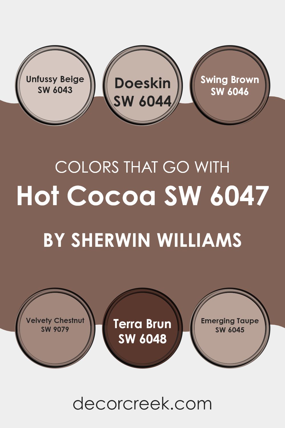
Colors that Go With Hot Cocoa SW 6047 by Sherwin Williams
Selecting the right colors to complement Hot Cocoa SW 6047 by Sherwin Williams is essential for crafting a cohesive and appealing look in any room. Hot Cocoa is a rich, warm brown shade that evokes welcoming comfort, serving as a flexible base for many color palettes. Compatible colors like Unfussy Beige, Doeskin, Swing Brown, Velvety Chestnut, Terra Brun, and Emerging Taupe enhance this warmth and add depth to interior design.
Unfussy Beige is a soft, neutral beige that provides a light contrast to the deeper tones of Hot Cocoa, ideal for creating a balanced look. Doeskin, a slightly richer and creamier shade of beige, offers a subtle, soothing complement to the more intense brown.
On the darker end, Swing Brown adds a robust, earthy quality that pairs nicely with Hot Cocoa, perfect for creating a cozy, enveloping feel in a room. Velvety Chestnut, with its deeper, reddish-brown hue, brings a touch of elegance without overpowering the primary color.
Terra Brun, a gray-infused brown, introduces a modern twist, lending a contemporary edge to traditional color schemes. Finally, Emerging Taupe is a greyish taupe that blends beautifully with Hot Cocoa, providing a smooth transition across color tones, ideal for unifying a room with a modern yet warm palette.
These coordinating colors help in achieving a harmonious interior that is both welcoming and stylish.
You can see recommended paint colors below:
- SW 6043 Unfussy Beige
- SW 6044 Doeskin
- SW 6046 Swing Brown
- SW 9079 Velvety Chestnut
- SW 6048 Terra Brun
- SW 6045 Emerging Taupe
How to Use Hot Cocoa SW 6047 by Sherwin Williams In Your Home?
Hot Cocoa SW 6047 by Sherwin Williams is a rich, warm brown paint color that can add a cozy and inviting touch to any room in your home. It’s perfect for creating a homey and comfortable atmosphere wherever it’s applied.
You can use it in your living room to make the room feel welcoming to guests or in your bedroom to create a snug and relaxed environment that helps you unwind after a long day. The color works well on all walls and can be balanced with lighter shades like creams or soft blues for a nice contrast that doesn’t feel overpowering.
If you’re not ready to commit to painting all the walls, consider using Hot Cocoa as an accent color for a single wall or on trim and doors. It pairs well with natural wood furniture and elements, making it ideal for a rustic or traditional style decor.
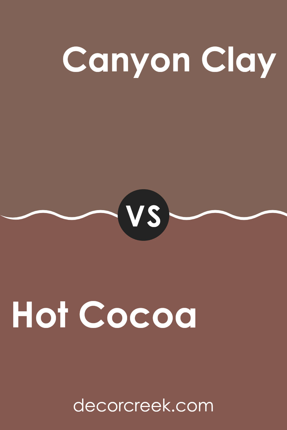
Hot Cocoa SW 6047 by Sherwin Williams vs Canyon Clay SW 6054 by Sherwin Williams
Hot Cocoa and Canyon Clay, both from Sherwin Williams, offer a warm and inviting palette for any room. Hot Cocoa is a rich brown with a cozy, comforting feel, resembling a delicious drink on a chilly day.
It’s perfect for creating a snug atmosphere in rooms where relaxation is key, such as living rooms or bedrooms. On the other hand, Canyon Clay has a more pronounced reddish tone, reminiscent of natural earth elements. This color adds a rustic touch, bringing warmth and a slightly bolder look than Hot Cocoa.
It works well in rooms where you want to add some character without overpowering the eye. Both colors provide a homey vibe but in subtly different ways: Hot Cocoa leans toward a soft, deep coziness, while Canyon Clay offers a hint of nature-inspired vibrancy. They can effectively complement each other or stand alone, depending on the mood you want to set in your room.
You can see recommended paint color below:
- SW 6054 Canyon Clay
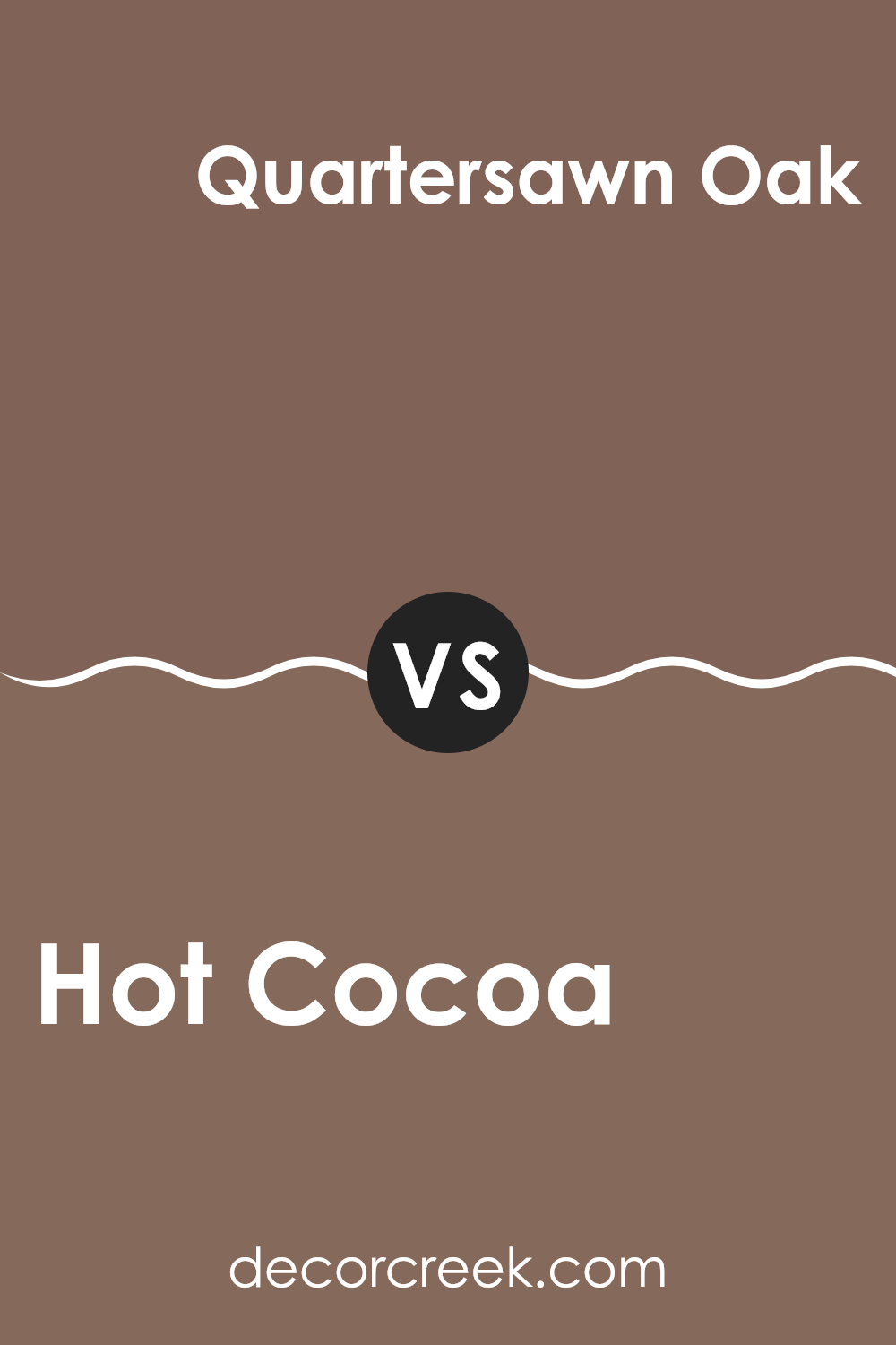
Hot Cocoa SW 6047 by Sherwin Williams vs Quartersawn Oak SW 2836 by Sherwin Williams
The main color, Hot Cocoa, is a rich, warm brown that resembles a comforting mug of its namesake drink. It has a cozy, inviting vibe that makes it perfect for rooms where you want a feeling of warmth, like living rooms or bedrooms. This color pairs well with both bright accents and subtle neutrals, making it quite adaptable.
In contrast, Quartersawn Oak is a lighter, softer tan shade. It’s more understated than Hot Cocoa, providing a gentle, neutral backdrop that complements a wide range of décor styles. This color is ideal for areas where you want to keep the mood light and airy, such as kitchens or bathrooms.
While both colors share a warm undertone, Hot Cocoa is deeper and more pronounced, offering a bolder statement. Quartersawn Oak, on the other hand, is perfect for creating a subtle, soothing environment. Depending on the feel you want in a room, each color has its unique advantages.
You can see recommended paint color below:
- SW 2836 Quartersawn Oak
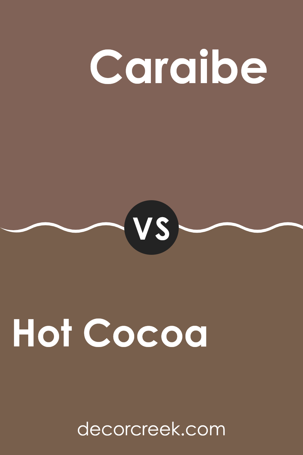
Hot Cocoa SW 6047 by Sherwin Williams vs Caraibe SW 9090 by Sherwin Williams
Hot Cocoa is a warm, rich brown that brings a cozy and inviting feeling to any room. It’s similar to the color of a delicious mug of hot chocolate, making it ideal for living rooms or bedrooms where comfort is key. This color pairs well with creams and deep greens, creating a natural, earthy vibe.
On the other hand, Caraibe is a deep, vibrant teal with a lively personality. It has a touch of tropical flair and can make a bold statement in an interior room. Whether used on an accent wall or throughout a room, Caraibe can add a fresh, dynamic look. It works wonderfully with bright whites and grays, offering a modern contrast that’s both striking and pleasing.
Both Hot Cocoa and Caraibe bring their own unique mood to a room, with Hot Cocoa leaning more toward a cozy, warm welcome and Caraibe offering a splash of energy and freshness. Depending on the atmosphere you want to create, each has its distinct charm
You can see recommended paint color below:
- SW 9090 Caraibe
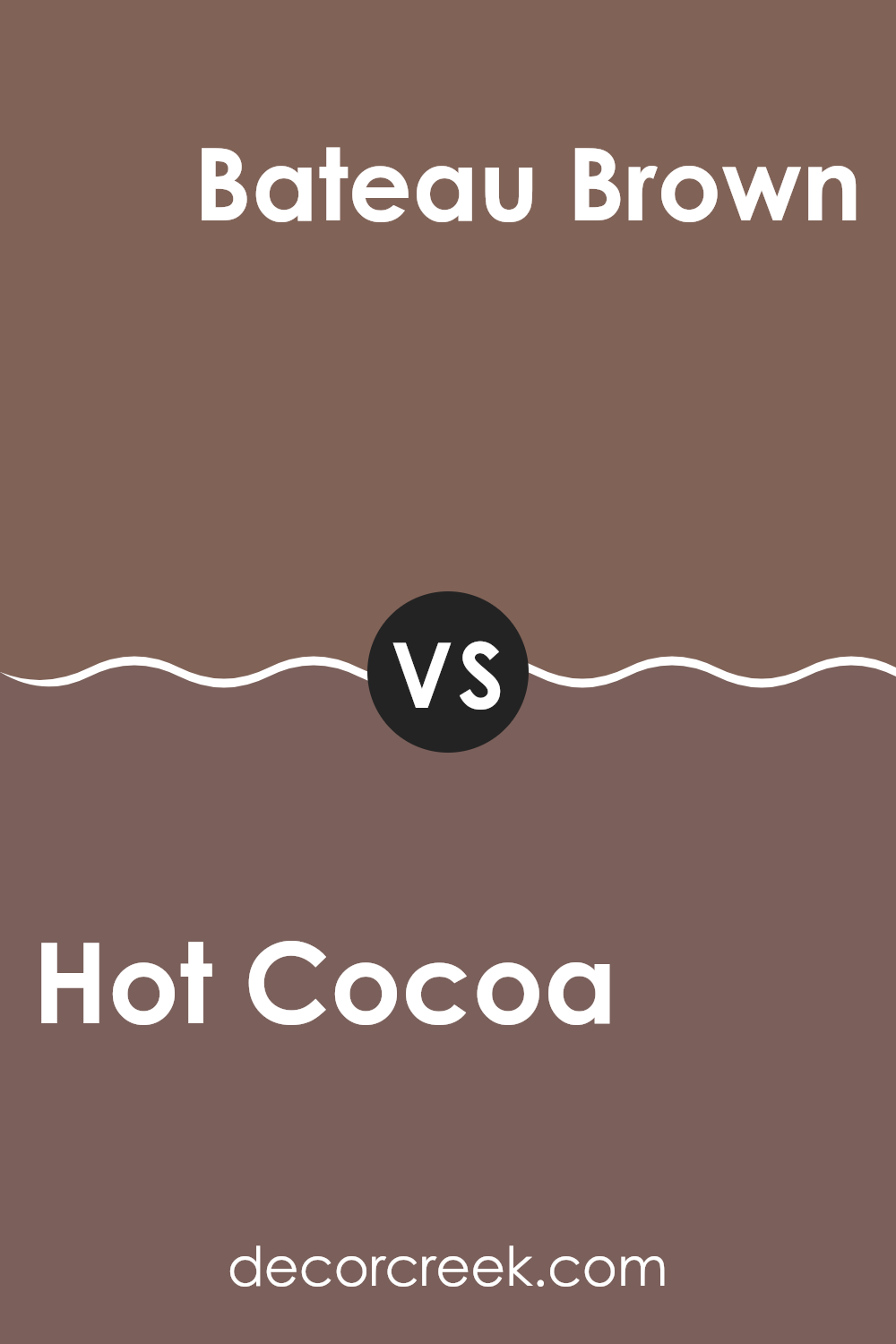
Hot Cocoa SW 6047 by Sherwin Williams vs Bateau Brown SW 6033 by Sherwin Williams
Hot Cocoa and Bateau Brown, both from Sherwin Williams, are warm and inviting colors but have distinct undertones that set them apart. Hot Cocoa is a rich, deep brown with a cozy warmth that mimics the comforting drink it’s named after. This color works well in rooms where you want to create a snug and secure feel, making it perfect for living rooms or bedrooms.
On the other hand, Bateau Brown is slightly lighter with a more muted, earthy quality. It has a subtle sandy undertone, making it adaptable for various decor styles and rooms. Bateau Brown is great for those looking for a brown that’s not too dark but still provides a strong sense of warmth and nature.
In choosing between the two, consider the light in your room and the mood you want to set. Hot Cocoa tends to make a bold statement with its darker tone, while Bateau Brown offers a softer approach that blends easily with other colors.
You can see recommended paint color below:
- SW 6033 Bateau Brown
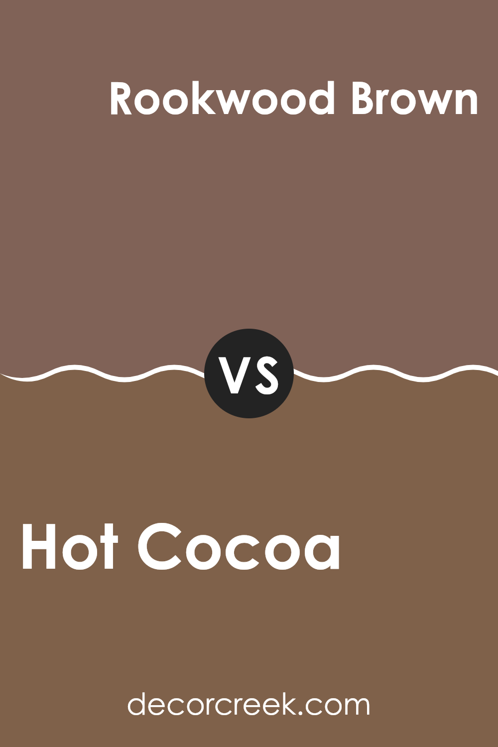
Hot Cocoa SW 6047 by Sherwin Williams vs Rookwood Brown SW 2806 by Sherwin Williams
Hot Cocoa and Rookwood Brown, both by Sherwin Williams, each bring their unique shade of brown to the table. Hot Cocoa is akin to the warm, inviting color of a delicious mug of hot chocolate. It has a creamy, rich, and comforting tone that feels cozy, making it perfect for living areas or bedrooms seeking a snug atmosphere.
On the other hand, Rookwood Brown is a deeper, more intense shade, reminiscent of dark chocolate or the rich soil of a well-tended garden. Its depth gives it a strong presence, which works well in formal rooms or areas where you want to make a statement with color. It adds warmth but with a boldness that differs from the gentler nature of Hot Cocoa.
While both colors share a base in earthy tones, Hot Cocoa offers a lighter, softer feel, whereas Rookwood Brown brings more impact and depth. These colors could complement each other in a room that values both comfort and striking design elements.
You can see recommended paint color below:
- SW 2806 Rookwood Brown
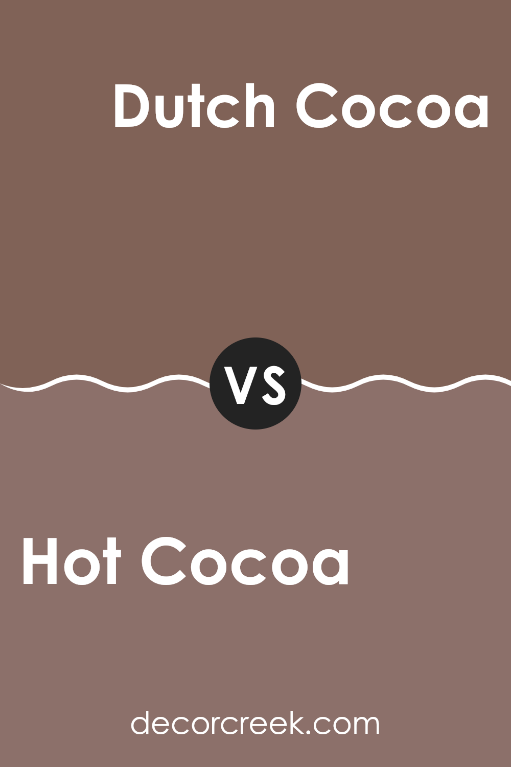
Hot Cocoa SW 6047 by Sherwin Williams vs Dutch Cocoa SW 6032 by Sherwin Williams
Hot Cocoa and Dutch Cocoa are two warm, inviting shades from Sherwin Williams, each bringing a cozy feeling to any room. Hot Cocoa is a deeper, richer brown, giving a feeling of comfort and shelter, ideal for rooms where you want to create a snug, secure vibe. This color works well in living rooms or bedrooms where you want a calm, grounded atmosphere.
On the other hand, Dutch Cocoa is slightly lighter and has a softer presence, making it perfect for adding warmth without overpowering a room. This color is suitable for smaller areas or rooms that get a lot of natural light, as it won’t make the room feel too closed in.
Both colors pair well with creamy whites or soft greys for a balanced look. Whether you choose Hot Cocoa for its depth or Dutch Cocoa for its gentle warmth, both colors are great for creating a cozy retreat in your home.
You can see recommended paint color below:
- SW 6032 Dutch Cocoa
Hot Cocoa SW 6047 by Sherwin Williams vs Grounded SW 6089 by Sherwin Williams
Hot Cocoa is a warm, inviting hue with deep, chocolate brown tones that create a cozy feeling in any room. Its rich depth makes it ideal for accent walls or for rooms aiming for a comforting, snug ambiance. On the other hand, Grounded stands a bit lighter.
This earthy brown has a grounded, natural feel that is adaptable and balanced, making it perfect for larger areas or whole-room painting where a more neutral tone is desired. Both colors provide a sense of warmth, but Hot Cocoa offers a darker, more intense experience compared to the softer, more subtle appearance of Grounded.
This contrast allows for varied uses in home decor, with Hot Cocoa fitting well in intimate, dimly lit rooms and Grounded serving well in open, bright areas.
You can see recommended paint color below:
- SW 6089 Grounded
Hot Cocoa SW 6047 by Sherwin Williams vs Cobble Brown SW 6082 by Sherwin Williams
Hot Cocoa and Cobble Brown are two warm, earthy tones from Sherwin Williams that offer different vibes to interiors. Hot Cocoa has a rich, creamy feel similar to that of a delectable warm drink. This color provides a cozy and inviting atmosphere, ideal for rooms where comfort is key. It has a deep, soothing quality without becoming too heavy.
On the other hand, Cobble Brown carries a slightly lighter and less intense tone. It leans more toward a soft, subtle essence, making it adaptable for blending with other colors. Although it’s still warm, Cobble Brown offers a gentle backdrop that can lighten up rooms that need a less saturated hue without losing warmth.
Both colors create warm rooms, but Hot Cocoa tends to make a stronger statement with its darker, richer tone, whereas Cobble Brown is a better choice for those seeking a milder, understated warmth. Each color can effectively warm up a room but in distinctly different intensities and vibes.
You can see recommended paint color below:
- SW 6082 Cobble Brown
Hot Cocoa SW 6047 by Sherwin Williams vs Tanbark SW 6061 by Sherwin Williams
Hot Cocoa and Tanbark by Sherwin Williams are both warm, welcoming shades but have distinct differences in their tones and visual impact. Hot Cocoa is a rich, deep brown with a comforting, chocolatey vibe, ideal for creating a cozy atmosphere in a room. It often gives rooms a more enclosed, snug feel, which works beautifully in bedrooms or areas where you want a sense of intimacy.
On the other hand, Tanbark has a lighter, more muted brown tone. It carries a subtle hint of gray, making it adaptable and neutral. This color is excellent for rooms where you want to maintain a warm feeling without making the room feel too tight or dark.
It’s particularly effective in living rooms and dining areas where you might want a softer backdrop that complements a range of furnishings and decor styles.Overall, while both colors share a warm base, Hot Cocoa feels more invigorating and enclosed, whereas Tanbark offers a gentler, more open atmosphere.
You can see recommended paint color below:
- SW 6061 Tanbark
Hot Cocoa SW 6047 by Sherwin Williams vs Brevity Brown SW 6068 by Sherwin Williams
Hot Cocoa and Brevity Brown are two warm and inviting brown shades from Sherwin Williams, each bringing its own unique ambiance to a room. Hot Cocoa is a rich, deep brown with a comforting, chocolatey vibe that makes any room feel cozy and welcoming. It’s an excellent choice for living areas and bedrooms where a sense of warmth and relaxation is desired.
On the other hand, Brevity Brown has a lighter, more subdued tone compared to Hot Cocoa. It leans slightly toward a softer, more neutral brown, making it incredibly adaptable for various decorating styles. Brevity Brown works well in rooms where you want a hint of warmth without the color becoming too overpowering or dominant.
Both colors can create a cozy atmosphere, but the choice between them depends on how deep or subtle you want the warmth to be. Hot Cocoa adds depth and richness, while Brevity Brown offers a gentler touch of warmth.
You can see recommended paint color below:
- SW 6068 Brevity Brown
In conclusion, SW 6047 Hot Cocoa by Sherwin Williams is a paint color that I find both warm and comforting. It reminds me of a cozy cup of hot chocolate on a cold day.
This shade of brown brings a feeling of comfort and warmth to any room, making it a perfect choice for a living room or bedroom. It’s a soft, welcoming color that isn’t too dark or too light, which makes it easy to match with different furniture and accessories.
Hot Cocoa sets a friendly and relaxing mood, ideal for places where you want to chill out or have friendly chats. If you’re thinking about repainting a room and want to make it feel cozy and inviting, SW 6047 Hot Cocoa could be a great choice to consider.

Ever wished paint sampling was as easy as sticking a sticker? Guess what? Now it is! Discover Samplize's unique Peel & Stick samples.
Get paint samples

