If you’re looking for a versatile and timeless paint color for your home, let me introduce you to SW 9147 Favorite Jeans by Sherwin Williams. Picture the most comfortable pair of denim jeans you own – the ones that go with everything and only get better with time. This color embodies that same sense of comfort and reliability.
SW 9147 Favorite Jeans is not just another shade of blue; it’s a sophisticated, muted hue that can create a calming atmosphere in any room. Whether you want to freshen up your living room, give your bedroom a new look, or add some character to your kitchen, this color offers endless possibilities.
The beauty of SW 9147 lies in its adaptability, easily complementing various decor styles and other colors.
As a color enthusiast, I’ve tested and seen many shades, but Favorite Jeans stands out with its unique ability to bring a subtle yet impactful presence to a space.
It works equally well in bright natural light or in rooms with limited sunlight, maintaining its depth and richness throughout different times of the day.
Plus, I love how it pairs beautifully with natural wood, metallic finishes, and soft textiles, making it a designer’s dream for creating inviting, stylish spaces.
What Color Is Favorite Jeans SW 9147 by Sherwin Williams?
The color Favorite Jeans by Sherwin Williams is a rich, deep blue with a comforting and inviting tone. This versatile blue hue strikes a perfect balance between bold and relaxed, making it an excellent choice for various interior design styles. It fits exceptionally well in casual, cozy settings such as a farmhouse or rustic style with its down-to-earth vibe but also adds a chic, contemporary edge that’s perfect for modern and minimalist spaces.
This color works superbly with natural materials and textures. Imagine Favorite Jeans paired with soft, light-colored woods, which help the blue stand out and create a warm, inviting atmosphere. The color also harmonizes beautifully with exposed brick or stone to offer a more textured contrast.
Fabrics like linen or cotton in neutral shades like white, beige, or light gray make great companions for throw pillows or upholstery, providing a soft, airy feel against the depth of the blue. Metals like brushed nickel or aged copper fixtures add a touch of rustic charm that complements this color well.
Likewise, incorporating elements like woven baskets and pottery in earthy tones will enhance the cozy, lived-in feel of this shade.
Overall, Favorite Jeans is remarkably adaptable and is sure to bring a rich, cozy layer to any space.

Is Favorite Jeans SW 9147 by Sherwin Williams Warm or Cool color?
Favorite Jeans by Sherwin Williams is a unique shade of blue that brings a cozy and relaxed feel to any room in the house. This color is like the perfect pair of worn-in jeans—it pairs well with a variety of decor styles and adds a touch of comfort without being overpowering. Whether you paint it on the walls of a bedroom, a kitchen, or a living room, it offers a fresh and inviting atmosphere.
The versatility of Favorite Jeans makes it easy to match with different colors and textures. It looks great with white trim for a classic look, or paired with softer shades for a subtle, layered style.
In homes, this color works well because it provides a soothing backdrop that makes spaces feel more open and airy. It’s especially useful in small rooms or spaces without much natural light, as it can make them appear brighter and more welcoming. This color truly works like magic to create a friendly and comfortable home environment.
Undertones of Favorite Jeans SW 9147 by Sherwin Williams
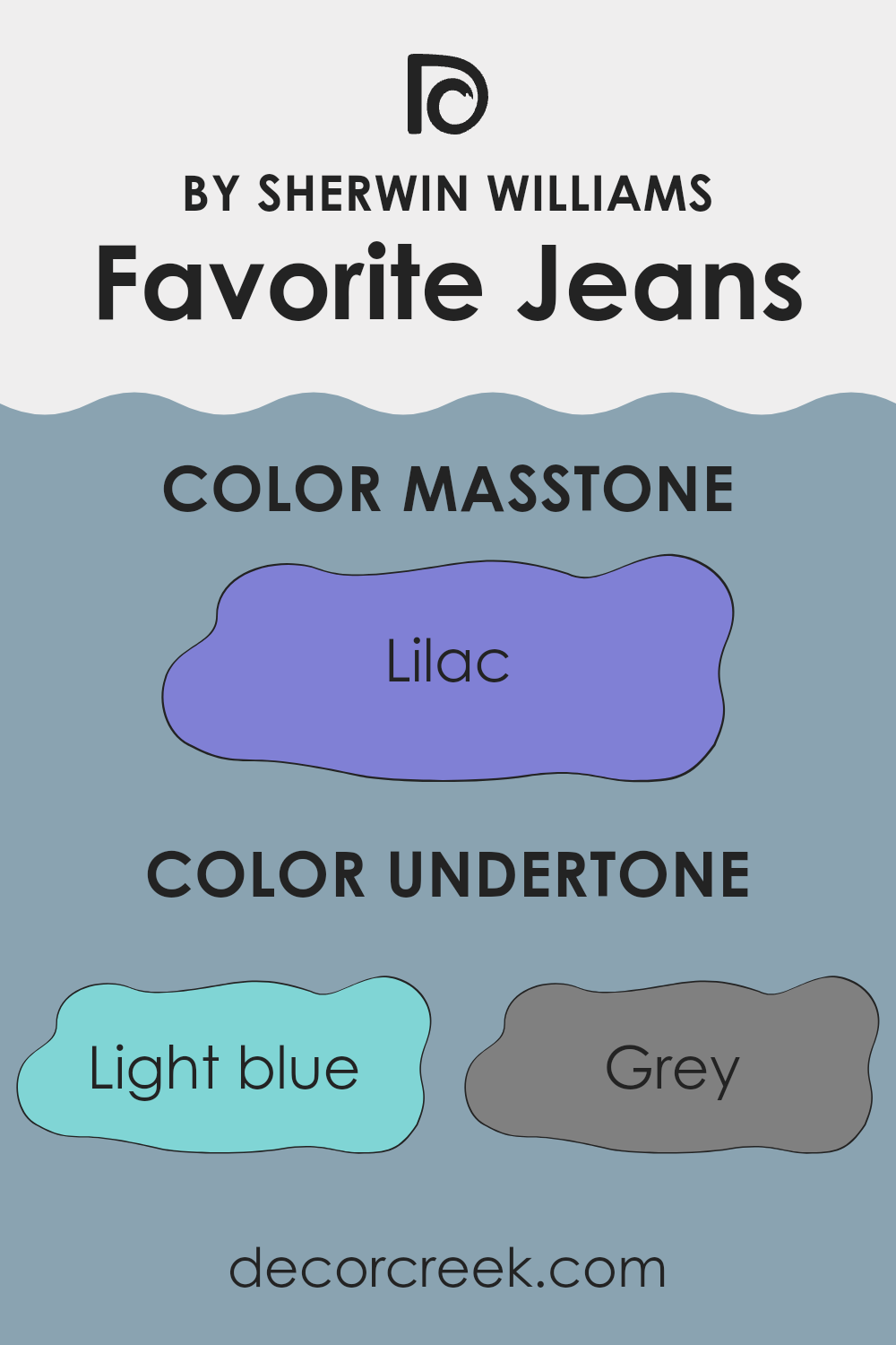
Favorite Jeans is a versatile paint color with a rich blend of undertones that influence how it looks in different lighting and settings. This color contains hints of light blue, grey, and mint, which contribute to its cool, calming effect. These undertones make it an ideal choice for creating a soothing atmosphere in rooms like bedrooms and bathrooms.
Additionally, Favorite Jeans includes traces of light purple and pale pink, adding a subtle warmth while maintaining a gentle and inviting feel. These softer undertones can help soften the look of a space, making it feel more welcoming.
Light gray and pale yellow undertones also play a role in how this color adapts throughout the day, shifting from a crisp blue in bright light to a more muted blue with yellowish or grayish hints in dimmer light. When used on interior walls, the range of undertones in Favorite Jeans makes it highly adaptable across various decor styles and pairings. This color can effectively balance out darker furniture or floors, and it complements natural wood and metal finishes well.
The presence of blue, dark turquoise, and turquoise undertones provides a refreshing splash of color that isn’t overwhelming, ensuring that the walls remain a complementary backdrop rather than the focal point. Overall, the undertones of Favorite Jeans make it a dynamic and flexible color choice that can enhance the aesthetic of any room, creating a gentle yet engaging visual space.
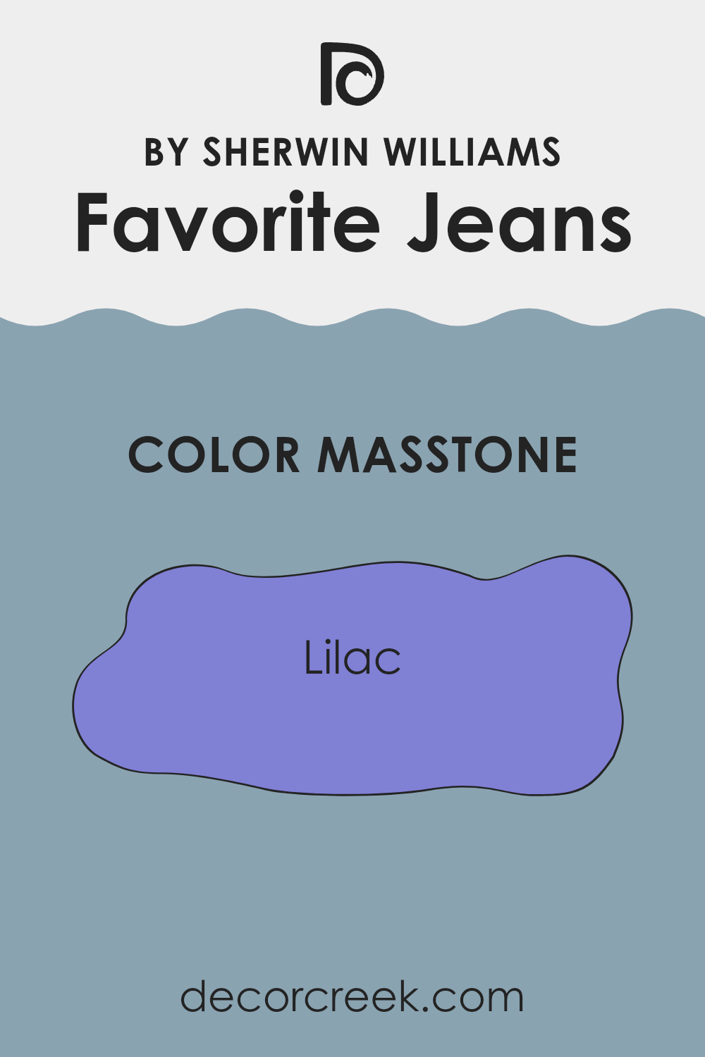
What is the Masstone of the Favorite Jeans SW 9147 by Sherwin Williams?
Favorite JeansSW 9147 by Sherwin Williams is a unique lilac shade (#8080D5), creating a fresh and inviting atmosphere in any room. This color offers a subtle yet lively feel, making it an excellent choice for spaces like bedrooms or cozy reading nooks.
Its gentle purple hue leans toward a soothing vibe without being too bold, striking a perfect balance that’s easy on the eyes. This makes it fantastic for pairing with softer whites or even bold colors for a bit of contrast.
In homes, this particular shade works well in areas that get plenty of natural light, enhancing the lilac tones and bringing an airy feel to the space. Whether you opt to paint an entire room or just an accent wall, Favorite JeansSW 9147 adds a fresh and light touch, bringing life to home decor without overwhelming the senses.
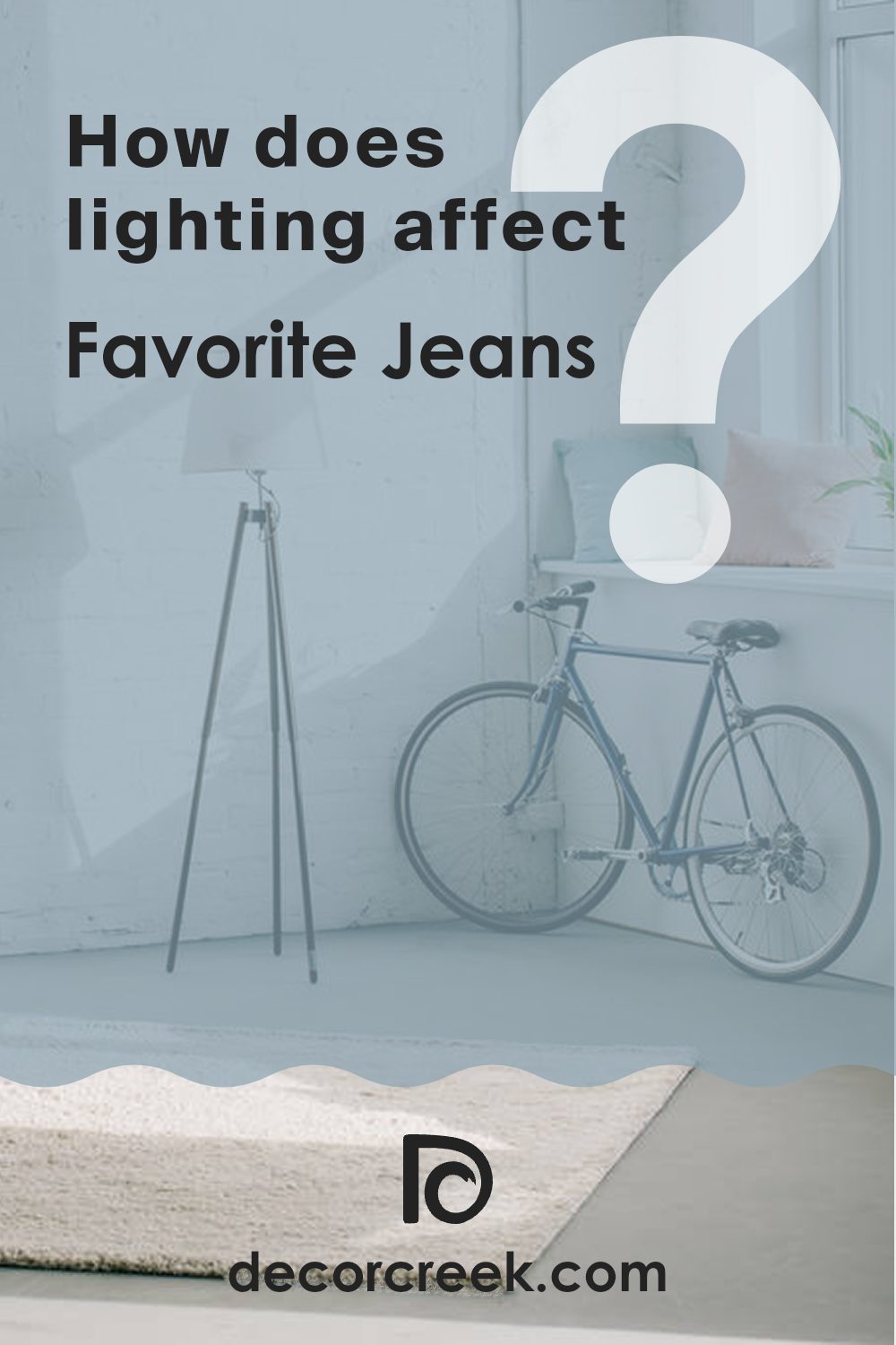
How Does Lighting Affect Favorite Jeans SW 9147 by Sherwin Williams?
Lighting has a significant impact on the way colors appear in a room, influencing mood and aesthetic appeal. Different types of light, whether natural or artificial, can change how colors look. A color like Favorite Jeans by Sherwin Williams is no exception.
Artificial Light: In the presence of artificial lighting, such as LED or incandescent bulbs, Favorite Jeans tends to appear slightly different depending on the type of bulb.
LED lights, which often emit a cooler, bluish tone, might make the color appear sharper and more vigorous. In contrast, incandescent bulbs, which produce a warmer glow, might make it look more muted and cozy.
Natural Light: In natural light, the appearance of Favorite Jeans can vary significantly throughout the day.
During the morning when the light is softer, the color may look gentle and subdued. As the day progresses and sunlight becomes brighter, the color can look more vibrant and pronounced.
When it comes to rooms facing different directions, the variation in light exposure further influences how Favorite Jeans looksNorth-Faced Rooms: These rooms usually receive less direct sunlight, often rendering the color cooler and more shadowy. Favorite Jeans might look more subtle and understated in a north-facing room.
South-Faced Rooms: With more direct and often warmer sunlight, south-facing rooms can make Favorite Jeans look brighter and more lively. This can be great for creating a vibrant and cheerful atmosphere.
East-Faced Rooms: These rooms get plenty of light in the morning when the sun rises, making Favorite Jeans appear light and fresh during the early hours. However, the color might fade into a softer tone as the day progresses and the sunlight diminishes.
West-Faced Rooms: In rooms facing west, the color will start off more muted in the morning but gain intensity during the afternoon and evening as sunlight fills the room. This can create a dynamic change in the mood of the space throughout the day.
Overall, Favorite Jeans can look beautiful in any light, but its appearance will shift based on the kind, direction, and amount of light it receives. By considering these factors, you can better decide where to use this color in your home to achieve the desired effect.
What is the LRV of Favorite Jeans SW 9147 by Sherwin Williams?
LRV stands for Light Reflectance Value, a measurement that tells you how much light a paint color reflects or absorbs. This value is expressed as a percentage from 0 to 100 where lower numbers mean the color absorbs more light, making it appear darker, and higher numbers indicate it reflects more light, making it appear lighter.
Knowing the LRV of a color can help you understand how it will look in your space under different lighting conditions. If a room doesn’t get a lot of natural light, choosing a paint color with a higher LRV can make the room feel brighter and more open.
The LRV of Favorite Jeans, which is 34.615, means it is on the darker side since it absorbs more light than it reflects. In practical terms, this means that when used on walls, it might make a room feel more cozy and intimate but could also make a small space appear a bit smaller.
The color will show its true tone more effectively in well-lit areas, either by natural light or good indoor lighting. In dimly lit rooms, it might appear even darker, so it’s important to consider the amount of light a room receives before deciding on this particular shade.

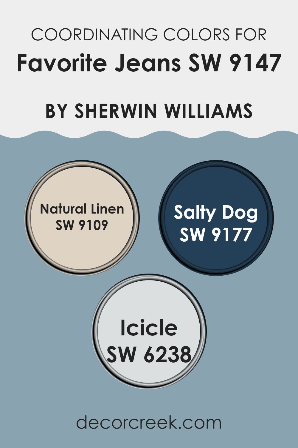
Coordinating Colors of Favorite Jeans SW 9147 by Sherwin Williams
Coordinating colors are those hues that complement one another on the color spectrum, often used together to create harmonious and visually appealing decor themes. When a primary paint color is chosen, such as a deep blue shade, coordinating colors are selected to enhance and balance this shade, ensuring the room feels cohesive rather than overwhelming. These complementary colors can be used for accents like trim, doors, furniture, or even as contrasting wall colors to add depth and interest to a space.
For example, Natural Linen SW 9109 is a soft, warm neutral that works beautifully with bolder colors by providing a calm background that allows other colors to stand out. It’s like a gentle backdrop that makes everything else in the room look better.
Salty Dog SW 9177, on the other hand, is a rich navy blue that adds a striking contrast when used alongside lighter blues. It’s perfect for making a statement without overpowering the room. Lastly, Icicle SW 6238 is a crisp, clean light blue that brings a fresh and airy feeling to any space.
It’s particularly effective in bringing a sense of lightness to areas that feature darker or more saturated colors. By using these coordinating colors, you can create a balanced and inviting space that complements the central color theme effectively.
You can see recommended paint colors below:
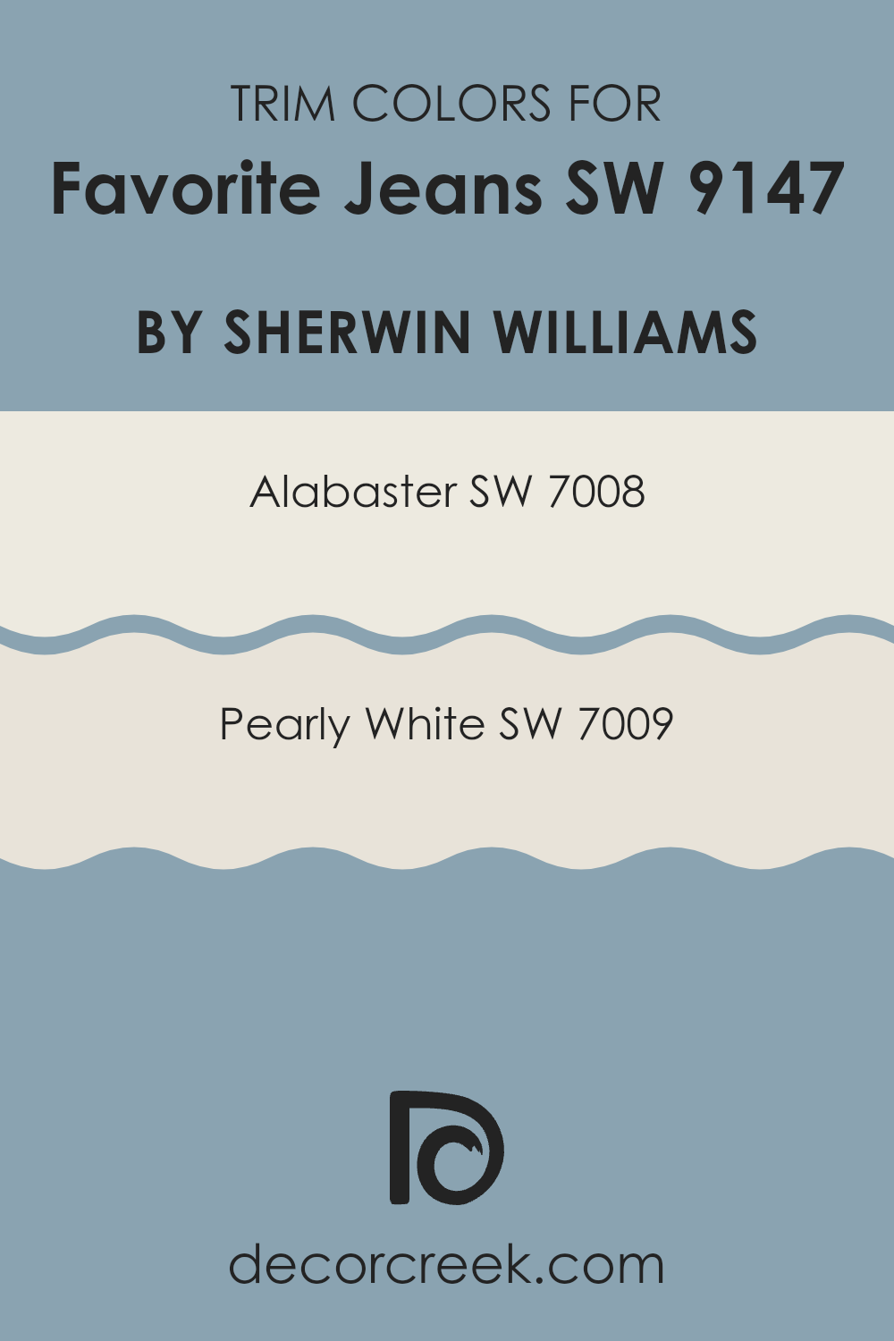
What are the Trim colors of Favorite Jeans SW 9147 by Sherwin Williams?
Trim colors are specific shades used to highlight or accentuate the architectural details and edges like door frames, window frames, baseboards, and moldings in a home. When paired with a primary wall color, like the blue hue of Favorite Jeans by Sherwin Williams, choosing the right trim color can enhance the overall aesthetic, create visual interest, and define spaces cleanly and crisply.
Alabaster SW 7008 and Pearly White SW 7009 are excellent choices for trim colors as they provide a bright, contrasting look that can help make the blue tones appear even more vibrant and fresh.
Alabaster SW 7008 is a soft, creamy white that offers a subtle warmth, making it an ideal complement to the cooler blue of Favorite Jeans. It helps in creating a welcoming and relaxed atmosphere, as its gentle tone doesn’t clash but rather softly defines the transitions between wall color and trim. On the other hand, Pearly White SW 7009 has a hint of gray, giving it a slightly cooler undertone compared to Alabaster.
This color is perfect for adding a clean and subtle distinction to areas, encouraging a neat and tidy appearance that enhances the modern feel of a room while keeping the atmosphere light and airy. Both colors work harmoniously with Favorite Jeans to produce a pleasing balance that’s pleasing to the eye.
You can see recommended paint colors below:
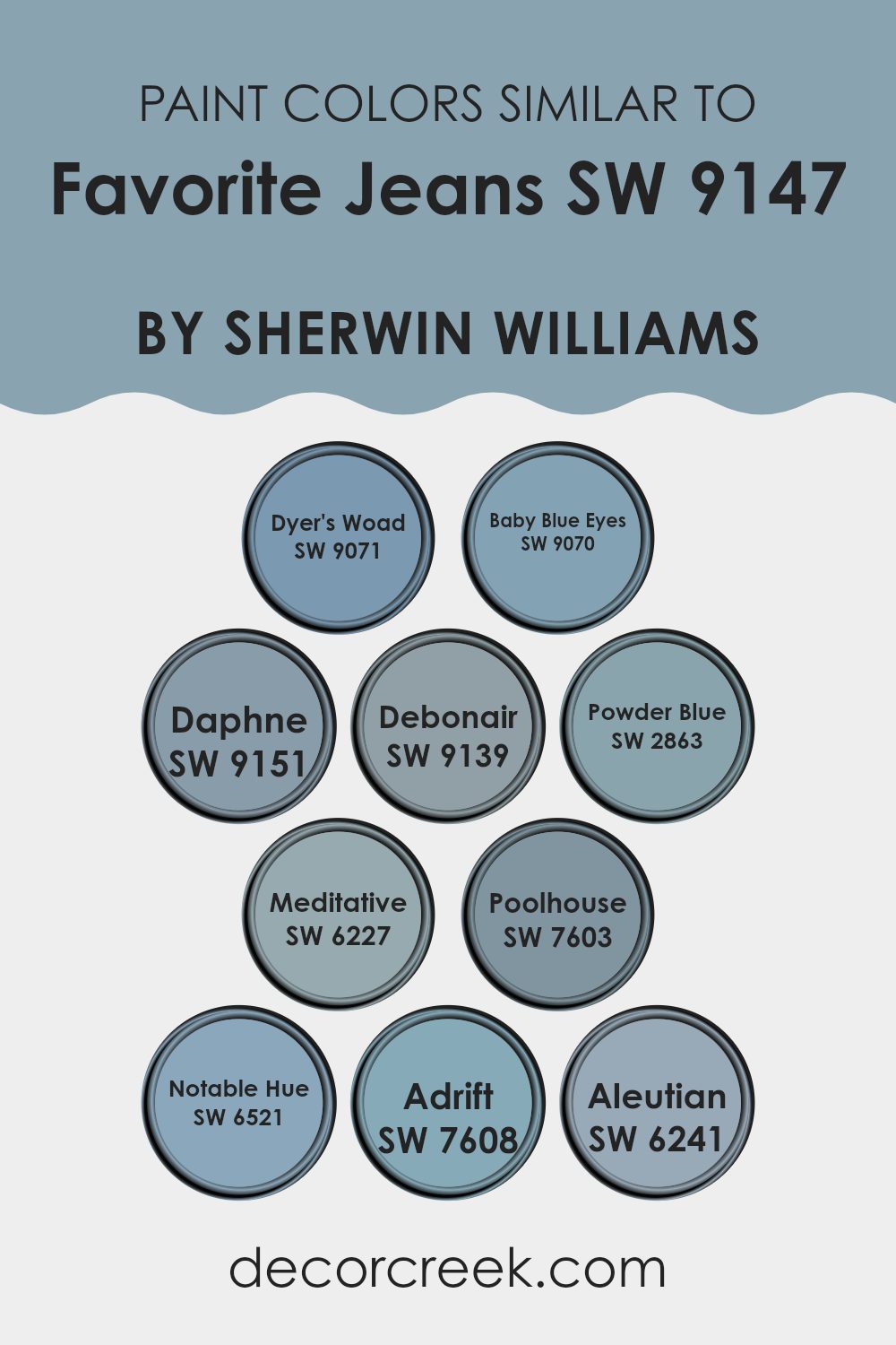
Colors Similar to Favorite Jeans SW 9147 by Sherwin Williams
Similar colors play a crucial role in interior design by creating a cohesive and harmonious environment. By using shades that are closely related on the color spectrum, you achieve a subtle yet effective blending that enhances the ambiance of a space without too much contrast, which can sometimes become overwhelming.
For instance, using a palette of similar hues allows for a smooth visual flow from one area to another, facilitating a unified look throughout the home. It’s particularly important when you want to maintain a thematic color scheme, as it helps in achieving a consistent style and mood throughout different rooms.
One can consider soft and gentle colors like Dyer’s Woad and Baby Blue Eyes that work seamlessly to set a calm, yet cheerful atmosphere. Daphne offers a dustier hue, bringing a touch of grace and gentility to spaces, while Debonair provides a slightly deeper, almost mystical blue which adds depth. Powder Blue is another wonderful option with its airy and light feel that opens up smaller spaces.
Meditative is subtle and soothing, perfect for creating a relaxed space. Poolhouse and Notable Hue are verdant choices, reflecting sophistication and freshness, ideal for lively spaces. Adrift brings with it a sense of the ocean, refreshing and invigorating.
Lastly, Aleutian carries a unique blend of blue and gray tones, excellent for those looking for something that bridges classic and contemporary looks. These similar colors not only assist in creating a visual link but also in reflecting personal style and taste through a well-coordinated color scheme.
You can see recommended paint colors below:
- SW 9071 Dyer’s Woad
- SW 9070 Baby Blue Eyes
- SW 9151 Daphne
- SW 9139 Debonair
- SW 2863 Powder Blue
- SW 6227 Meditative
- SW 7603 Poolhouse
- SW 6521 Notable Hue
- SW 7608 Adrift
- SW 6241 Aleutian
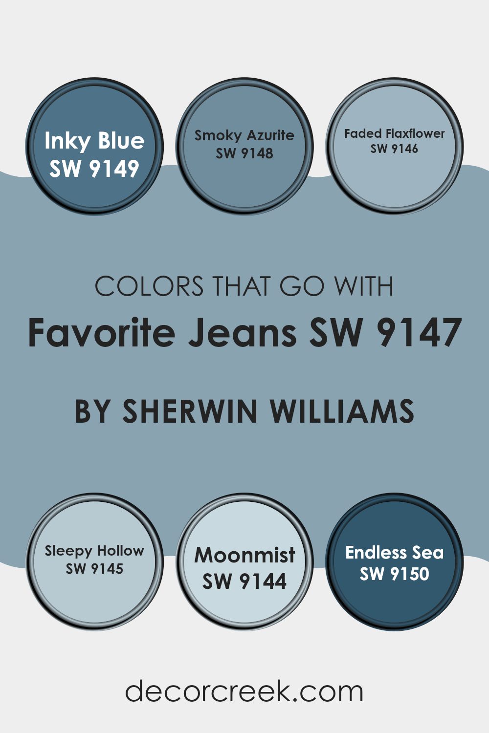
Colors that Go With Favorite Jeans SW 9147 by Sherwin Williams
Choosing the right colors to complement Favorite Jeans SW 9147 by Sherwin Williams is crucial for creating a harmonious look in any space. These colors help balance the boldness of Favorite Jeans, a vibrant denim-like blue, by either enhancing its depth or offering a gentle contrast. Colors like Inky Blue and Endless Sea add depth to an interior, making it appear more cozy and inviting. They are darker, richer tones that create a solid grounding effect, perfect for accent walls or furniture pieces.
On the other hand, lighter shades such as Smoky Azurite, Faded Flaxflower, Sleepy Hollow, and Moonmist offer a refreshing contrast to Favorite Jeans. Smoky Azurite is a subtle, lighter blue that brightens spaces without overwhelming them with color.
Faded Flaxflower, a kind of soft lavender-blue, introduces a gentle, uplifting vibe, which is great for bedrooms or bathrooms where a calm atmosphere is desired. Sleepy Hollow, a gray-blue, works well in areas that require a neutral yet distinctly colored background, blending seamlessly with various decor styles.
Moonmist, the lightest among these options, provides a muted, almost ethereal quality, excellent for creating a relaxed and airy environment. By balancing these complementary colors, one can achieve a desired aesthetic and mood in any room.
You can see recommended paint colors below:
- SW 9149 Inky Blue
- SW 9148 Smoky Azurite
- SW 9146 Faded Flaxflower
- SW 9145 Sleepy Hollow
- SW 9144 Moonmist
- SW 9150 Endless Sea
How to Use Favorite Jeans SW 9147 by Sherwin Williams In Your Home?
Favorite Jeans SW 9147 by Sherwin Williams is a beautiful and versatile shade of blue that can be a great choice for adding a fresh look to any home. It’s a soothing color that pairs well with many different decorating styles and other colors.
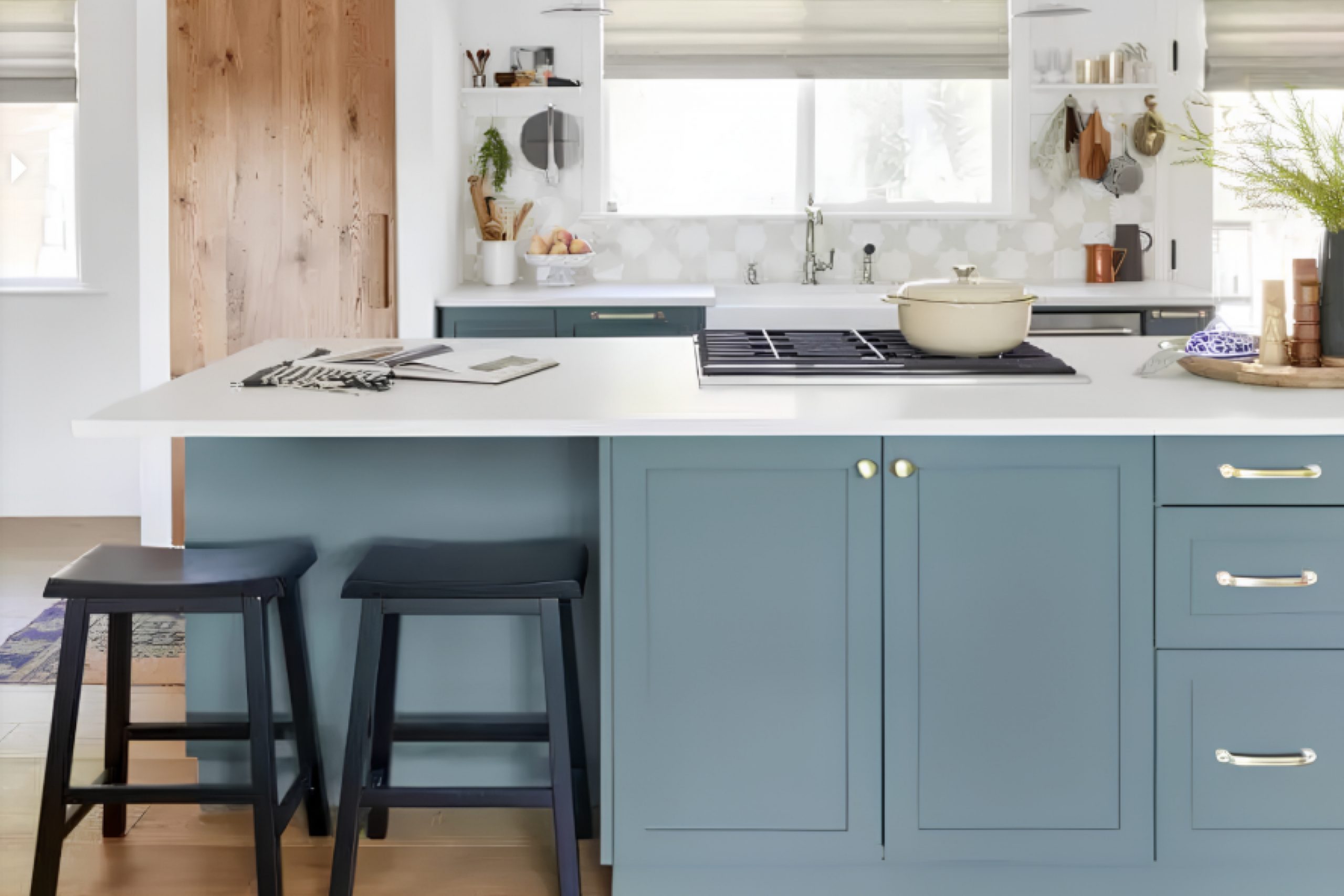
For those looking to refresh their living room, applying Favorite Jeans on a feature wall can create a cozy and inviting atmosphere. In the kitchen, this color can be used on cabinets for a chic, modern twist, or on walls to enhance natural light. The color is also perfect for bedrooms, providing a calm backdrop that promotes relaxation and comfort.
Pair it with crisp white bed linens and natural wood accents for a balanced and refreshing feel. Because of its universal appeal, Favorite Jeans works beautifully in small spaces like bathrooms too, giving them a more open and airy feel. Overall, this color is an excellent choice for anyone looking to update their home with a stylish and practical look.
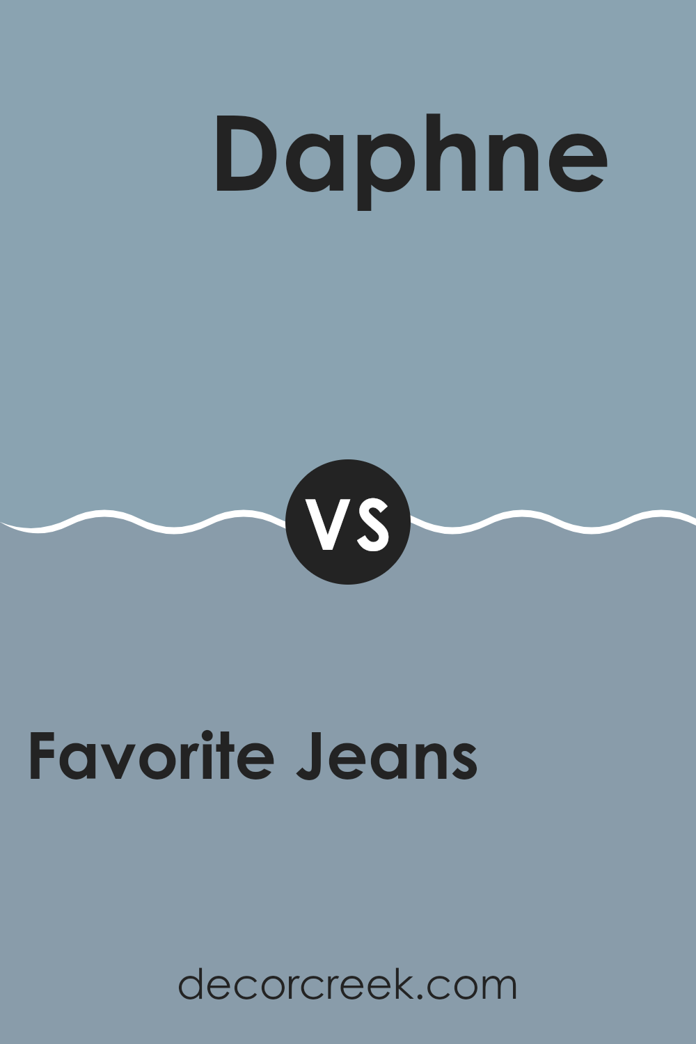
Favorite Jeans SW 9147 by Sherwin Williams vs Daphne SW 9151 by Sherwin Williams
Favorite Jeans and Daphne, both by Sherwin Williams, are distinct shades that can create very different moods in a space. Favorite Jeans is a soft, muted blue that has a relaxed and cozy feel to it. It’s a versatile color that works well in bedrooms or living areas as it promotes a calming atmosphere.
On the other hand, Daphne is a deeper shade, leaning towards teal. It’s bolder and more dramatic, making it a great choice for an accent wall or for rooms where a touch of elegance is desired.
While Favorite Jeans is more understated and pairs easily with many colors, Daphane stands out and may dictate a more thoughtful approach to color pairing to maintain balance. Each color offers a unique vibe and could be used separately or together depending on the desired effect in the room.
You can see recommended paint color below:
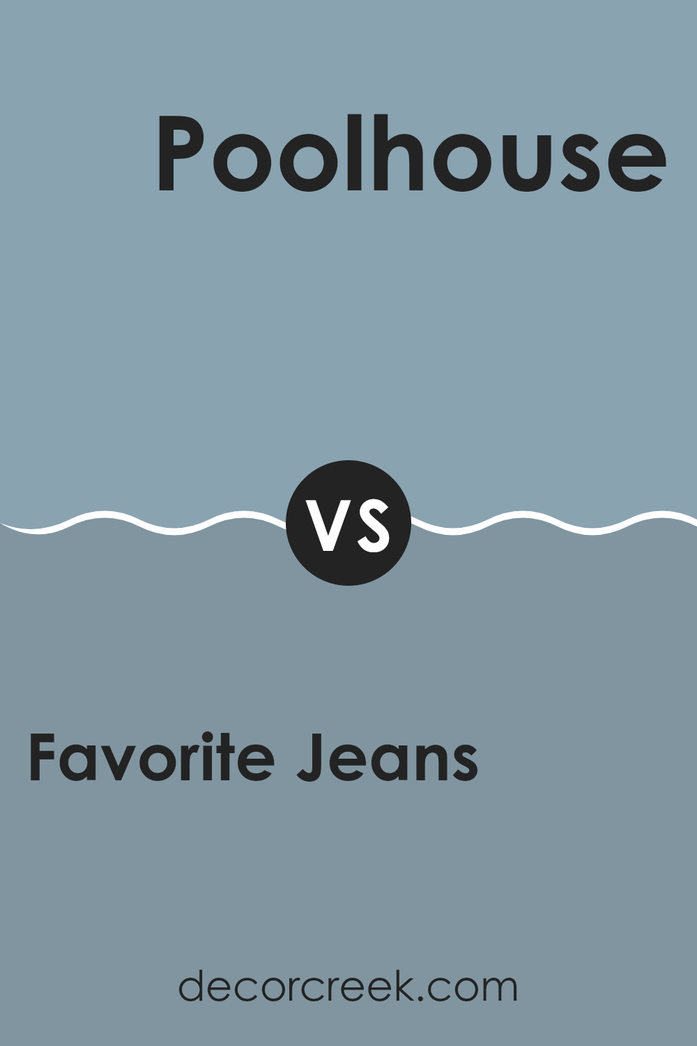
Favorite Jeans SW 9147 by Sherwin Williams vs Poolhouse SW 7603 by Sherwin Williams
Favorite Jeans and Poolhouse are two unique shades by Sherwin Williams. Favorite Jeans is a deep, comforting blue that resembles the classic color of well-worn denim. It has a rich, understated vibe that makes it perfect for creating a cozy and welcoming space. It works especially well in bedrooms or studies where a calm, focused atmosphere is desired.
On the other hand, Poolhouse is a lighter, more vibrant shade. This color is reminiscent of clear blue skies or a refreshing swimming pool, lending a breezy and airy feel to any room. It’s great for bathrooms, kitchens, or any area that benefits from a splash of cheerfulness and light.
When you place these two colors side by side, Favorite Jeans gives a more grounded and traditional feel, while Poolhouse adds a punch of brightness and energy. Choosing between them depends on the mood and function you want for your space.
You can see recommended paint color below:
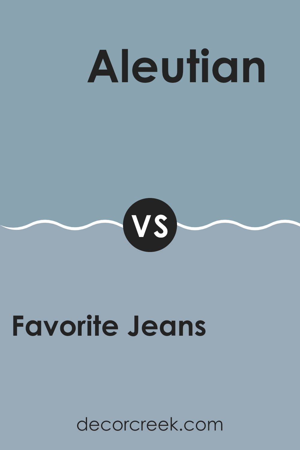
Favorite Jeans SW 9147 by Sherwin Williams vs Aleutian SW 6241 by Sherwin Williams
The two colors Favorite Jeans and Aleutian from Sherwin Williams offer distinctly different moods and atmospheres when used in decor. Favorite Jeans has a dusty blue tone that reminds you of denim, making it feel comfortable and relaxed. This color would work well in casual spaces where you want a touch of coziness without overwhelming the room with darkness.
Aleutian, on the other hand, leans towards a softer, more muted shade of blue with hints of grey. It’s a lighter color that can make a room feel airy and open. This hue works beautifully in areas where you want a calm and gentle background, like in bedrooms or bathrooms.
While both colors share a blue base, Favorite Jeans is darker and more grounded, suitable for social spaces like living rooms or dens. Aleutian, with its lighter, almost pastel quality, is better for creating a peaceful and relaxing environment. The choice between them would depend on the type of ambiance you want to establish in your space.
You can see recommended paint color below:
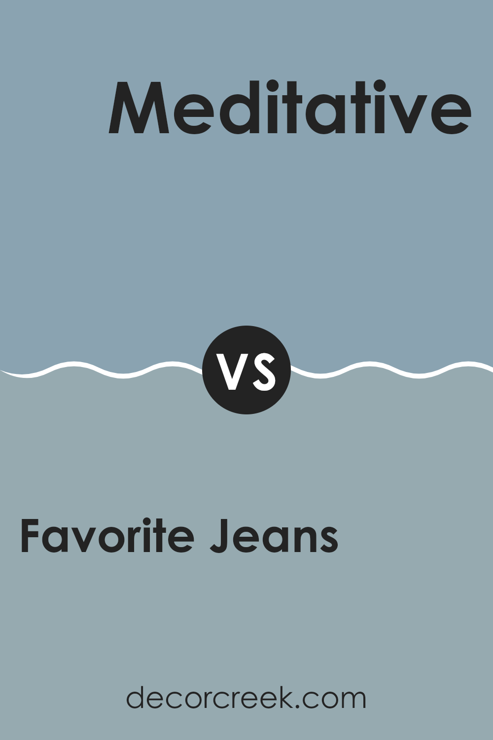
Favorite Jeans SW 9147 by Sherwin Williams vs Meditative SW 6227 by Sherwin Williams
The color Favorite Jeans is a calm mid-tone blue that resembles a well-worn pair of denim. It brings a cozy and comfortable feel, making it great for casual and relaxed spaces such as bedrooms or living rooms. This color has a soothing and familiar vibe, which makes it easy to pair with various decor styles and colors.
On the other hand, Meditative is a slightly darker blue with a hint of gray, giving it a more muted and subtle appearance. This color leans towards a more mature and understated feel, making it suitable for spaces where you want a touch of calmness without the brightness of a more vibrant blue. It works well in areas like bathrooms or offices where a gentle, calming atmosphere is desired.
Both colors offer a sense of calm and relaxation, with Favorite Jeans bringing a more cheerful and bright feel, while Meditative offers a more reserved and quiet mood. They can be used together to create a pleasing layered effect of blues in a home.
You can see recommended paint color below:
Favorite Jeans SW 9147 by Sherwin Williams vs Adrift SW 7608 by Sherwin Williams
Favorite Jeans and Adrift by Sherwin-Williams are two appealing colors that can greatly enhance a room’s atmosphere. Favorite Jeans is a rich, deep blue reminiscent of a well-worn pair of denim jeans. It’s comfortable and familiar, making it perfect for a cozy, relaxed setting. This color can work well in bedrooms or living areas where you want a sense of calm and comfort.
On the other hand, Adrift is a lighter, soft gray-blue that gives off a fresh and airy feel. It’s a more subtle color that brings to mind the open skies or a gentle ocean breeze. Adrift works well in spaces where you want to create a light, refreshing vibe, such as bathrooms or small offices.
While both colors share a blue base, Favorite Jeans offers a deeper, more comforting hue, suitable for creating a space where relaxation is key. Adrift, being lighter and softer, tends to open up a space more, offering a gentle touch to any room. Selecting between the two would depend on your desired atmosphere and the specific function of the room.
You can see recommended paint color below:

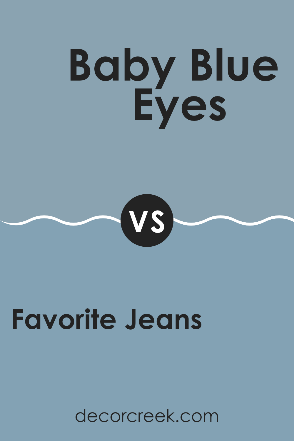
Favorite Jeans SW 9147 by Sherwin Williams vs Baby Blue Eyes SW 9070 by Sherwin Williams
Favorite Jeans is a rich, deeper blue that carries a sense of calmness and familiarity, similar to the comfort of slipping into your well-worn denim jeans. It’s darker and has a muted, understated vibe, making it a solid choice for spaces where a cozy, relaxed atmosphere is desired.
On the other hand, Baby Blue Eyes is a much lighter and softer shade of blue. It leans towards a pastel, airy feel, giving rooms a fresh and open appearance. This color is especially good for creating a light and inviting space that feels casual and easy-going.
Both colors offer unique vibes: Favorite Jeans provides a cozy, deeper backdrop for a room, suitable for a more grounded or mature look. Baby Blue Eyes, conversely, adds a cheerful, light touch, perfect for brightening up a space. They could work well together in different rooms of a house based on the mood you want to set.
You can see recommended paint color below:
- SW 9070 Baby Blue Eyes
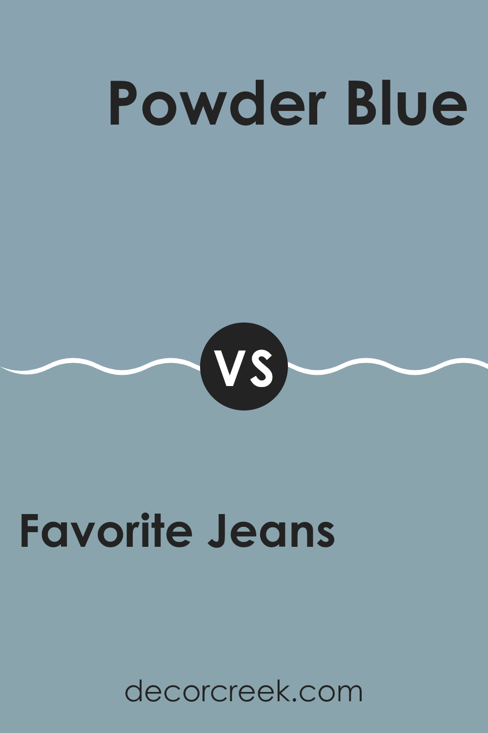
Favorite Jeans SW 9147 by Sherwin Williams vs Powder Blue SW 2863 by Sherwin Williams
The main color, Favorite Jeans, and the second color, Powder Blue, both by Sherwin Williams, are both soft and soothing hues, but they offer distinctly different vibes for room decor. Favorite Jeans is a deeper, more subdued blue with a grayish tint, making it perfect for creating a cozy, comfortable feeling in a space. It’s a color that mimics the familiar feel of worn denim, providing a comforting sense of familiarity and relaxation.
On the other hand, Powder Blue is lighter and airier. This color has a gentle, calming effect and is closer to a sky blue, which can make a small room feel more spacious and open. It’s ideal for creating a light and refreshing atmosphere, suitable for bathrooms or nurseries where a touch of gentleness is desired.
Both colors support various decorating styles, but Favorite Jeans works well in a more mature or sophisticated setting while Powder Blue fits effortlessly into a soft, playful room theme.
You can see recommended paint color below:
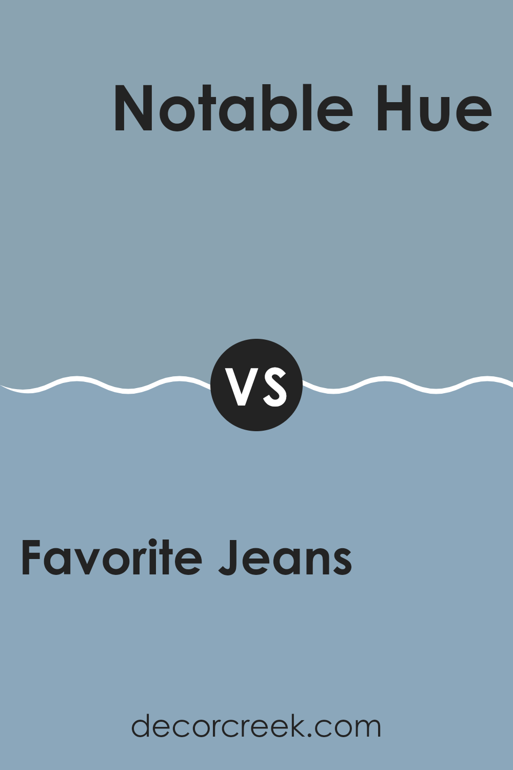
Favorite Jeans SW 9147 by Sherwin Williams vs Notable Hue SW 6521 by Sherwin Williams
“Favorite Jeans” by Sherwin Williams is a soft, muted blue that mimics the comfortable and familiar feel of worn denim. It has a casual appeal, making it perfect for creating a cozy, relaxed atmosphere in places like living rooms or bedrooms. This color combines well with both bright accents and neutral tones, offering versatility in home decor.
On the other hand, “Notable Hue” is a more vibrant and crisp shade of blue. It has a sharper, more invigorating appearance which can add a lively and fresh touch to spaces. This color is great for energizing a room, such as a kitchen or bathroom, where you want freshness and vibrancy.
While both colors come from a similar blue family, “Favorite Jeans” brings a softer, more worn-in vibe which is great for comfort and relaxation. “Notable Hue” stands out as the brighter and more energizing option, suited for areas in the home that benefit from a dynamic and refreshing color.
You can see recommended paint color below:
- SW 6521 Notable Hue
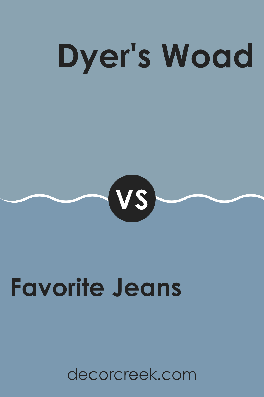
Favorite Jeans SW 9147 by Sherwin Williams vs Dyer’s Woad SW 9071 by Sherwin Williams
Favorite Jeans and Dyer’s Woad, both by Sherwin Williams, showcase distinct blue hues suited for different tastes and spaces. Favorite Jeans is a deeper, softer blue with a cozy, welcoming vibe. It mirrors the comfort and casual feel of a well-worn pair of denim jeans, making it perfect for creating a relaxed atmosphere in spaces like bedrooms or living rooms.
In contrast, Dyer’s Woad is a lighter, more vibrant blue. It carries a fresher, more energetic feel, almost reminiscent of a clear sky on a sunny day. This makes it excellent for areas where you want to inject life and energy, such as kitchens, bathrooms, or even a child’s playroom.
While both colors share a base in blue, Favorite Jeans leans towards a more muted, understated look, whereas Dyer’s Woad offers a brighter, cheerier presentation. This contrast allows them to cater to different styles and functionalities within a home, picking the right one depending on the ambiance you want to set.
You can see recommended paint color below:
- SW 9071 Dyer’s Woad
Favorite Jeans SW 9147 by Sherwin Williams vs Debonair SW 9139 by Sherwin Williams
The color “Favorite Jeans” by Sherwin Williams is a soft, muted blue that brings to mind the comfortable feel of worn denim. It has a cozy and familiar vibe, perfect for spaces where you want to relax and feel at ease. This color pairs beautifully with a variety of decor styles, from rustic to modern.
On the other hand, “Debonair” is a slightly richer and deeper blue that holds a bit more formality and gravity. While still in the blue family, it leans towards a more classic and timeless appearance. Debonair works well in areas that could use a little drama or a bold statement, such as dining rooms or entryways.
Both colors are versatile, but while Favorite Jeans offers a more laid-back and comforting atmosphere, Debonair provides a stronger, more assertive backdrop. Depending on the mood you want to create, each color has its unique charm and application benefits.
You can see recommended paint color below:
In conclusion, the paint color SW 9147 Favorite Jeans by Sherwin Williams is really great for anyone looking to make their room feel cooler and more relaxed. It’s like throwing on your comfy jeans at the end of a long day. This shade of blue is not just any blue; it has a dusty tone which makes rooms feel calming without being too dark or too light.
For a bedroom, playroom, or even a living room, this color works magic by making the walls soothing to look at, which can help you relax. Because it’s such a gentle blue, it can easily match with different kinds of furniture and decorations, whether they are light like whites and grays or even some darker colors.
If you want a color that isn’t too loud but still brings a cozy and fresh look to your room, Favorite Jeans is a choice worth considering. It stands out in a soft way, and it can make your room look neat and well put together. It’s a color that kids and adults both can like a lot!
So, if you or your family are thinking about changing up a room, Favorite Jeans might just be the perfect pick. It’s easy to like, easy to use, and can make any room feel just right.

Ever wished paint sampling was as easy as sticking a sticker? Guess what? Now it is! Discover Samplize's unique Peel & Stick samples.
Get paint samples

