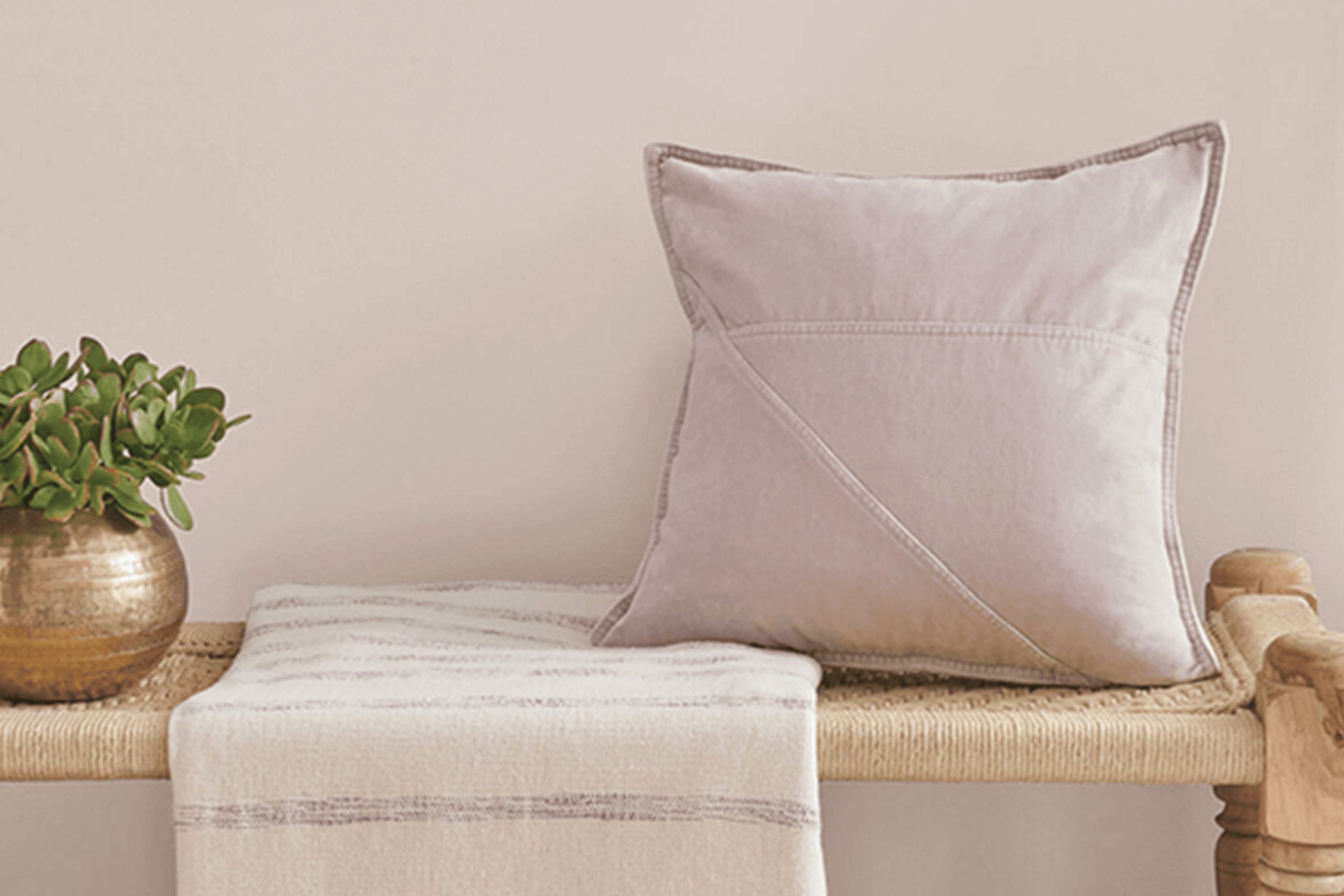
When you hear the name SW 6043 Unfussy Beige by Sherwin Williams, what comes to mind? This color isn’t just a simple beige; it’s a subtle yet remarkable hue that holds a soothing presence in any space. It’s perfect as a backdrop for both vibrant and muted decor, making it incredibly versatile. Whether you are looking to revamp your living room or simply add a hint of warmth to your bedroom, Unfussy Beige offers a fresh and inviting palette without overpowering the elements already in place.
In using Unfussy Beige, you’ll notice how it complements different textures and lighting, adjusting subtly to enhance the room’s natural features. This color works seamlessly with natural wood, soft fabrics, and metallic finishes, creating a cohesive look that feels both sophisticated and cozy.
This adaptability makes it an excellent choice for anyone hoping to achieve a balanced, neutral aesthetic in their interiors.
So, if you’re planning a makeover or just a slight update to your home, consider Unfussy Beige for a look that is effortlessly stylish yet undeniably comforting.
What Color Is Unfussy Beige SW 6043 by Sherwin Williams?
Unfussy Beige by Sherwin Williams is a warm, inviting color that brings a cozy feel to any room. Its soft beige hue has a soothing presence, making it perfect for creating a relaxed and welcoming atmosphere. This versatile color works especially well in interior styles such as traditional, modern farmhouse, and rustic because it offers a clean, neutral backdrop that complements various textures and materials.
You can pair Unfussy Beige with a wide range of materials to enhance its warmth. In a room with hardwood floors, it harmonizes beautifully, highlighting the natural grains of the wood. When matched with soft textiles like cotton throws or linen curtains, it adds a layer of softness that makes the space feel more homey.
It also looks great with leather, adding a touch of luxury without overpowering the room’s decor.
For those who love a bit of contrast, Unfussy Beige pairs well with darker colors like navy or forest green. This combination can be used in accessories like cushions, vases, or artwork to add pops of color.
Its flexibility makes it a smart choice for multiple spaces in a home, from living rooms and bedrooms to kitchens and bathrooms, offering a timeless canvas that is both practical and stylish.
Is Unfussy Beige SW 6043 by Sherwin Williams Warm or Cool color?
Unfussy Beige by Sherwin Williams is a warm and welcoming paint color that brings a cozy and comfortable feel to any room in the home. This shade of beige is versatile and can work wonderfully as a main color for walls or as an accent to complement other colors.
Its simplicity helps to create a relaxed atmosphere, making it perfect for living areas, bedrooms, and even kitchens where you want a soft and inviting vibe. The beauty of Unfussy Beige lies in its ability to blend seamlessly with a variety of decor styles and color schemes.
Whether your home features modern furniture, rustic wood elements, or colorful textiles, this color provides a neutral backdrop that enhances other features without overpowering them. It also does a great job at hiding imperfections on walls due to its subtle depth. Overall, Unfussy Beige is a great choice for anyone looking to give their home a clean and gentle look.
Undertones of Unfussy Beige SW 6043 by Sherwin Williams
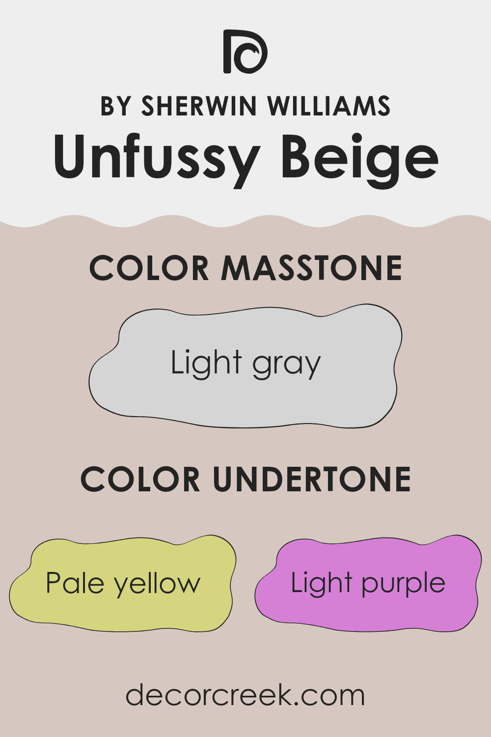
Unfussy Beige is a complex paint color that might seem straightforward at first glance but reveals a mix of underlying tones upon closer inspection. The undertones in a paint color can drastically affect how it looks in different lighting conditions and environments. For Unfussy Beige, these undertones include pale yellow, light purple, light blue, pale pink, mint, lilac, and grey.
These varied undertones make Unfussy Beige versatile yet subtle. Pale yellow gives a warmth that makes spaces feel welcoming, while light blue adds a hint of freshness. The light purple and lilac contribute a gentle, almost imperceptible depth that prevents the color from feeling flat.
Pale pink brings a soft, nurturing feel to the color, enhancing its naturalness. Mint offers a touch of vibrancy, and the grey undertone ensures that the overall hue remains neutral and adaptable to various decor styles and color palettes.
When applied to interior walls, Unfussy Beige adapts to its surroundings due to these undertones. In a room with ample natural light, the warmer yellow and pink tones might become more pronounced, creating a cozy, inviting atmosphere. In spaces with less light, the grey and blue undertones could dominate, making the room feel cooler and more subdued.
This adaptability makes Unfussy Beige a good choice for different rooms and settings, easily harmonizing with a wide range of furniture and accents.
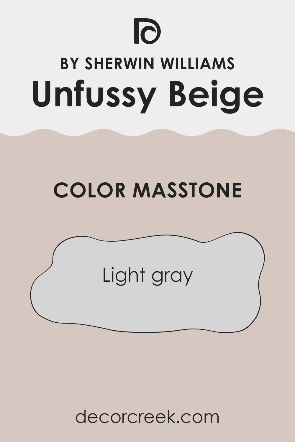
What is the Masstone of the Unfussy Beige SW 6043 by Sherwin Williams?
Unfussy BeigeSW 6043 by Sherwin Williams, despite its name, presents a masstone of light gray, specifically matching the shade #D5D5D5. This color is quite versatile, easily fitting into various home styles and spaces.
Its light gray tone provides a soft backdrop that doesn’t overpower room elements, making it ideal for those looking to maintain a subtle and neutral theme throughout their living spaces. This particular shade works well in rooms that benefit from a calming, understated look, which often makes spaces appear larger and more open.
The light gray hue of Unfussy Beige helps in reflecting natural light, brightening rooms naturally without the need for vibrant or darker colors. It pairs well with a wide range of decor items and furniture styles, from modern to traditional, making it a practical choice for many homeowners looking for a reliable and easy-to-match wall color.
How Does Lighting Affect Unfussy Beige SW 6043 by Sherwin Williams?
Lighting has a significant impact on how colors appear in a room. Different types of light can change how we perceive a color, making it look different at various times of the day or in different settings.
Let’s discuss a specific color, Unfussy Beige by Sherwin Williams, and how it behaves under various lighting conditions. In general, beige is a versatile and warm color that can either appear lighter or darker, depending on the lighting.
Artificial Light: Under artificial lighting, such as LED or incandescent bulbs, Unfussy Beige tends to look warmer.
Incandescent lighting brings out yellows and reds in beige, making the room feel cozy and inviting. LED lights, especially if they have a warmer temperature, can have a similar effect but slightly less pronounced.
Natural Light: In natural light, Unfussy Beige shows its true color, which is a soft and neutral beige. On a sunny day, it can look brighter and more vibrant, while on a cloudy day, it might appear a bit muted.
Room Orientation:
– North-Facing Rooms: These rooms get less direct sunlight, which can make them appear cooler. In north-facing rooms, Unfussy Beige may look more subdued and slightly grayish.
– South-Faced Rooms: These rooms receive abundant sunlight throughout the day, making them bright and warm. Here, Unfussy Beige will appear lighter and more lively, enhancing the warmth of the color.
– East-Faced Rooms: Morning light in these rooms is bright and warm but turns cooler as the day goes on. Unfussy Beige will look warm and welcoming in the morning but may lose some of its vibrancy by the afternoon.
– West-Faced Rooms: With evening light that is warm and golden, Unfussy Beige will reveal a cozy, inviting look late in the day while possibly appearing duller in the morning when the light is cooler.
Understanding how Unfussy Beige reacts to different lights and directions can help in deciding where to use this color to its best advantage in home decorating. Whether it’s creating a warm feel in a living room with south-facing windows or a muted tone in a north-facing study, lighting is key to making the most of this color.
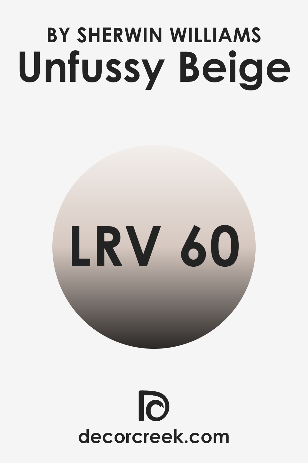
What is the LRV of Unfussy Beige SW 6043 by Sherwin Williams?
LRV stands for Light Reflectance Value, which measures the percentage of light a paint color can reflect. Think of it like this: the higher the LRV number, the lighter the color appears because it reflects more light back into the room. Conversely, a lower LRV means the color is darker and absorbs more light.
This value impacts how we perceive the color in different spaces and lighting conditions. When you choose paint, knowing the LRV can help you understand how the color will look once it’s on your walls, especially in relation to how much natural or artificial light your room gets.
For the color in question with an LRV of around 59.7, it’s near the middle of the scale but leans towards the lighter side, meaning it will moderately reflect light. This makes it a flexible choice for spaces that may not have a lot of natural light, as it can help make the area feel brighter and more open without being overwhelming.
In well-lit spaces, this level of LRV will ensure that the color remains fairly true to its appearance without looking too washed out or losing its warmth and depth. This balance makes it a great option for achieving a cozy yet light atmosphere in a room.
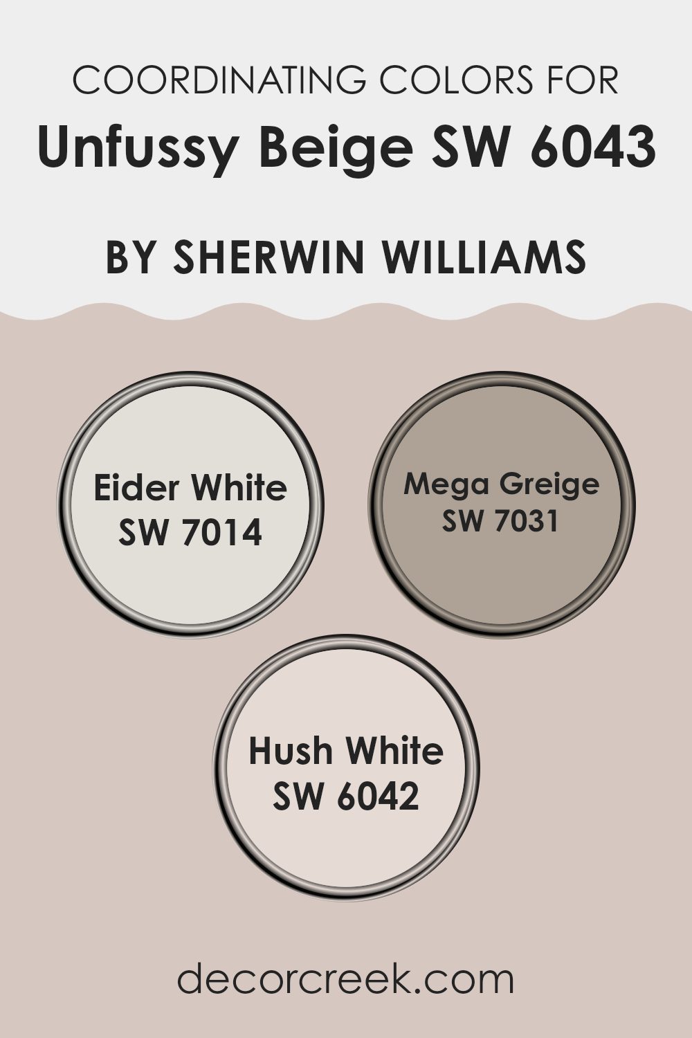
Coordinating Colors of Unfussy Beige SW 6043 by Sherwin Williams
Coordinating colors are chosen to create a harmonious color scheme and enhance the aesthetic appeal of a space. These colors typically complement or contrast with a primary color, helping to balance the visual impact of an interior. For example, Unfussy Beige, a warm and inviting shade, can be beautifully paired with a selection of coordinating colors to enrich its natural tones and create a cohesive look.
One such coordinating color is Eider White (SW 7014), a soft, pale gray that offers a fresh contrast to the warmer notes of beige, providing a clean and airy feel to any room. It’s like a gentle whisper against a slightly darker backdrop, lifting and lightening spaces. Another perfect companion is Mega Greige (SW 7031), a deeper shade that straddles the line between gray and beige.
This color adds depth and interest, ensuring that interior spaces feel grounded without overwhelming the soothing nature of Unfussy Beige. Lastly, Hush White (SW 6042) is a subtle off-white with warm undertones that complements Unfussy Beige by creating a soft, cohesive look. It’s an ideal choice for trims and ceilings, rounding out the warm palette elegantly. Together, these colors work in harmony to produce a welcoming and balanced aesthetic.
You can see recommended paint colors below:
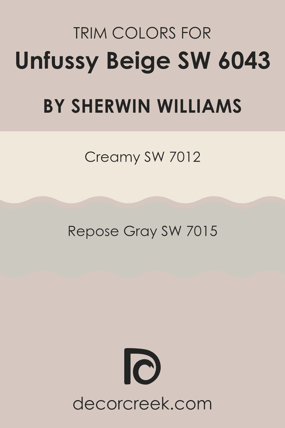
What are the Trim colors of Unfussy Beige SW 6043 by Sherwin Williams?
Trim colors, like SW 7012 – Creamy and SW 7015 – Repose Gray, play a crucial role in enhancing and defining the visual impact of primary wall colors. In the case of a neutral shade like Unfussy Beige by Sherwin Williams, choosing the right trim colors can add a subtle contrast that highlights architectural features without overwhelming the space.
Creamy, as a soft and warm white, provides a gentle boundary that blends smoothly with Unfussy Beige, giving a cohesive look. This is particularly effective in spaces that aim for a harmonious and inviting atmosphere.
On the other hand, Repose Gray offers a slightly stronger contrast with its cool and light gray tones, which can add a bit more definition to the edges and corners, making Unfussy Beige stand out in a more pronounced way.
Both Creamy and Repose Gray are versatile enough to complement Unfussy Beige, yet distinct in their characters.
Creamy radiates warmth and is an excellent choice for creating a friendly and welcoming vibe. It works well in both natural and artificial lighting, ensuring the space retains a consistent look throughout the day.
Repose Gray, with its understated and neutral gray palette, is perfect for adding a touch of modernity without overcomplicating the color scheme. This color is particularly useful in modern interiors where a clean and subtle distinction is desired.
Together, these trim colors ensure that spaces painted with Unfussy Beige achieve just the right amount of definition and style, enhancing the overall aesthetic in a simple yet effective manner.
You can see recommended paint colors below:
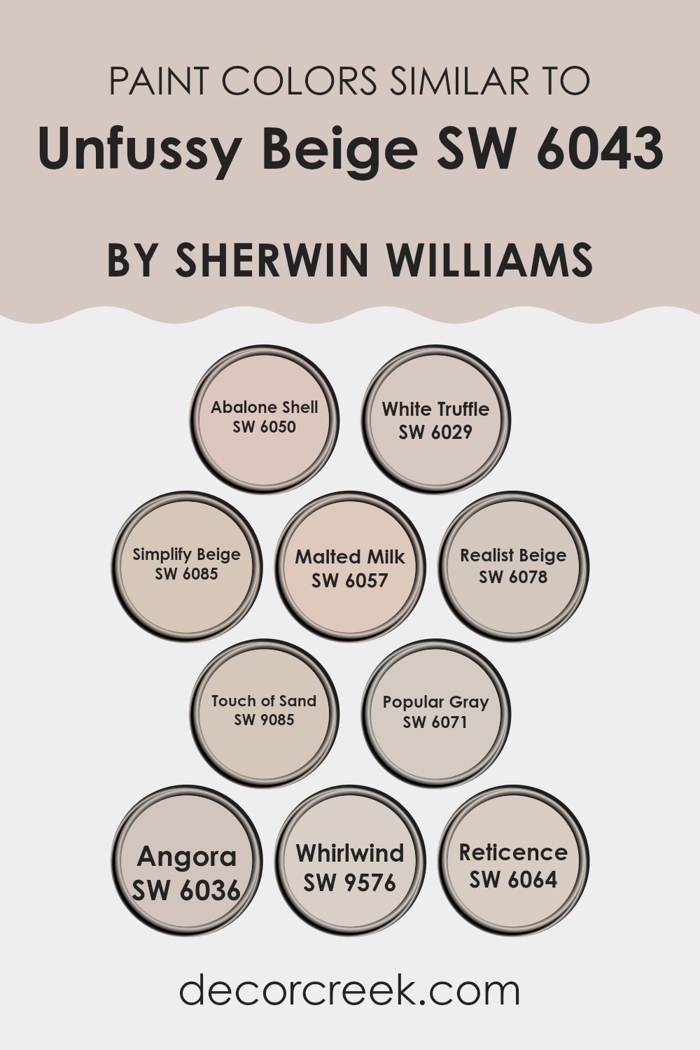
Colors Similar to Unfussy Beige SW 6043 by Sherwin Williams
In interior design, using similar colors helps create a cohesive and harmonious look that can subtly enhance the atmosphere of a space without overwhelming it. Colors like the ones related to Unfussy Beige by Sherwin Williams offer a range of hues that blend easily with different decor styles and contribute to a relaxed and inviting environment.
For example, Abalone Shell is a lighter shade with a hint of gray that adds a soft touch to any room, working well in spaces that aim for a gentle and understated elegance. White Truffle is another tone, offering a slightly richer depth that pairs nicely with darker woods or white trims for a clean look.
Simplify Beige and Malted Milk are close in spectrum, making them perfect for those who enjoy neutrals with a subtle difference; Simplify Beige leaning slightly more towards a sandy tone, while Malted Milk brings in a touch of milky softness, ideal for restful areas.
Realist Beige strikes a balance between warm and cool, making it versatile for various accessories and furniture selections. Touch of Sand is reminiscent of a light, sandy beach and works wonders in spaces that aim for a soft, natural feel. Popular Gray introduces a mix of beige and gray that is often used to modernize a space without losing warmth.
Angora provides a touch of sophistication with its understated yet noticeable presence, perfect for creating a focal point. Whirlwind and Reticence introduce slightly cooler tones into the palette, with Whirlwind showing a hint of blue, ideal for a contemporary touch, while Reticence offers a muted green that works well in spaces with plenty of natural elements. Each of these colors supports the others in creating a seamless aesthetic flow, maintaining a tranquil and cohesive atmosphere that enhances the overall appeal of a room.
You can see recommended paint colors below:
- SW 6050 Abalone Shell
- SW 6029 White Truffle
- SW 6085 Simplify Beige
- SW 6057 Malted Milk
- SW 6078 Realist Beige
- SW 9085 Touch of Sand
- SW 6071 Popular Gray
- SW 6036 Angora
- SW 9576 Whirlwind
- SW 6064 Reticence
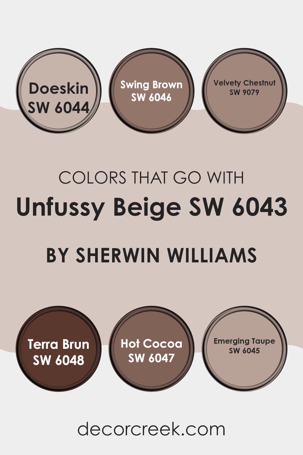
Colors that Go With Unfussy Beige SW 6043 by Sherwin Williams
Choosing the right colors to complement Unfussy Beige SW 6043 by Sherwin Williams is crucial because they help in creating a cohesive and harmonious look in your room. Complementary colors like SW 6044 – Doeskin, SW 6046 – Swing Brown, and others work together to enhance the subtle warmth of Unfussy Beige, providing a balanced and inviting atmosphere. These colors can highlight architectural features, bring depth to the space, and allow for a comforting yet distinct feel throughout an area.
Starting with SW 6044 – Doeskin, a gentle grey-brown shade, it adds a soft contrast to Unfussy Beige, maintaining a light and airy feel. Swing Brown, marked as SW 6046, is deeper, adding a robust character to the palette, ideal for emphasizing cozy corners or furniture pieces.
Next, SW 9079 – Velvety Chestnut and SW 6048 – Terra Brun bring richness and depth, their darker tones grounding the lighter beige beautifully. SW 6047 – Hot Cocoa, slightly lighter than Swing Brown, provides a warm, inviting chocolate hue, wonderful for creating a snug ambiance. Lastly, SW 6045 – Emerging Taupe offers a bridge between the darker and lighter tones, perfect for blending the various elements of a room together. These colors, when used thoughtfully, ensure a well-rounded and pleasant environment in homes or commercial spaces.
You can see recommended paint colors below:
- SW 6044 Doeskin
- SW 6046 Swing Brown
- SW 9079 Velvety Chestnut
- SW 6048 Terra Brun
- SW 6047 Hot Cocoa
- SW 6045 Emerging Taupe
How to Use Unfussy Beige SW 6043 by Sherwin Williams In Your Home?
Unfussy Beige by Sherwin Williams is a warm and welcoming paint color that can make any home feel cozy and comfortable. This shade of beige is very versatile, making it easy for you to use it in any room. Whether you’re painting your living room, bedroom, or kitchen, Unfussy Beige creates a soft backdrop that pairs well with various decor styles and colors.
One great way to use this color is in your living room. It provides a neutral base that lets your furniture and decor stand out. You could also paint your kitchen walls with Unfussy Beige to give the space a clean and inviting look. Adding it to a bedroom can help make the area feel calm and restful, perfect for relaxing after a long day.
Additionally, this color works well in smaller spaces like bathrooms or hallways, as it helps to open up the area and reflect light, making the space appear larger. Whether you’re updating one room or your entire home, Unfussy Beige is a practical choice that adds warmth and simplicity to any interior.
Unfussy Beige SW 6043 by Sherwin Williams vs Realist Beige SW 6078 by Sherwin Williams
Unfussy Beige and Realist Beige by Sherwin Williams are two neutral paint colors, each offering a unique take on beige. Unfussy Beige has a soft and warm tone, providing a cozy and inviting atmosphere in any room. This color works well in spaces where a calm and gentle backdrop is desired, making it ideal for living rooms and bedrooms.
On the other hand, Realist Beige leans slightly towards a greyer tone, giving it a cooler presence. This shade is excellent for areas that receive a lot of natural light, as it helps balance the brightness while maintaining a fresh and clean look.
When comparing the two, Unfussy Beige brings more warmth to a space, whereas Realist Beige offers a more neutral and balanced backdrop, potentially making it easier to match with a variety of furniture colors and styles. Both colors are versatile and can effectively complement different decor elements.
You can see recommended paint color below:

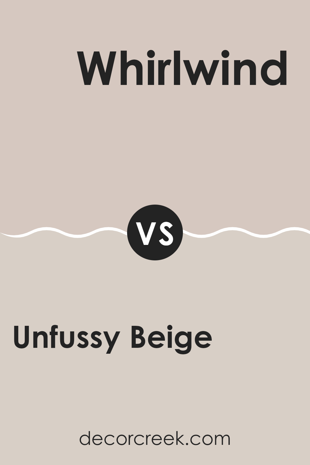
Unfussy Beige SW 6043 by Sherwin Williams vs Whirlwind SW 9576 by Sherwin Williams
Unfussy Beige is a warm, soft beige color that gives a cozy and welcoming feel to any room. It’s perfect for creating a relaxed and comfortable atmosphere. The color is quite neutral, making it versatile enough to pair with many other shades and decor styles. It’s particularly well-suited for living rooms, bedrooms, and entryways where you want a gentle, inviting ambiance.
Whirlwind, on the other hand, is a much cooler, light gray color with blue undertones. It presents a clean and crisp look, making it ideal for modern, minimalist spaces. This color works well in kitchens, bathrooms, or any space that benefits from a fresh, clean appearance. It can help brighten areas that don’t get much natural light, yet it’s subtle enough not to overwhelm a space.
Comparing the two, Unfussy Beige offers warmth and coziness, ideal for relaxed and inviting spaces, while Whirlwind provides a clean and fresh look, perfect for a modern and bright feel.
You can see recommended paint color below:
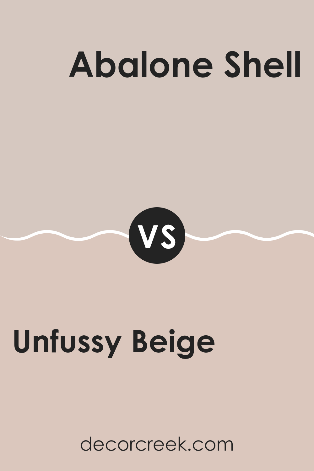
Unfussy Beige SW 6043 by Sherwin Williams vs Abalone Shell SW 6050 by Sherwin Williams
Unfussy Beige and Abalone Shell are two distinct colors by Sherwin Williams, each offering a unique look for interior spaces. Unfussy Beige is a warm, inviting tone that gives a soft, cozy feel to any room. It is versatile and works well in living areas or bedrooms, creating a welcoming atmosphere.
On the other hand, Abalone Shell has a cooler vibe, leaning slightly towards gray while retaining a touch of warmth from its beige undertones. This color is excellent for spaces that you want to feel calm and relaxed but still maintain a modern edge.
While Unfussy Beige provides a classic, homely appeal, Abalone Shell offers a slightly more contemporary and fresh look, making it suitable for bathrooms or kitchens. Both colors are neutral, so they can easily pair with various decor styles and furniture colors, giving you flexibility in designing your space.
You can see recommended paint color below:
- SW 6050 Abalone Shell
Unfussy Beige SW 6043 by Sherwin Williams vs Reticence SW 6064 by Sherwin Williams
Unfussy Beige and Reticence, both by Sherwin Williams, offer subtle differences that can affect the mood and style of a room. Unfussy Beige is a warm, welcoming neutral with a soft, creamy appearance that makes spaces feel cozy and inviting. It pairs well with a variety of decor styles and adds a touch of warmth to rooms that receive less natural light.
On the other hand, Reticence has a cooler tone, leaning towards a grayish taupe. This color gives a more reserved, understated look, providing a modern twist to spaces that aim for a contemporary edge. It works well in areas that already have ample sunlight, as its cooler undertone balances the brightness.
When deciding between these two, consider the amount of natural light your room receives and the atmosphere you want to create. Unfussy Beige is better for a traditional, warm feel, while Reticence suits modern, minimalistic themes. Both colors offer a neutral palette, allowing for flexibility in decorating with different styles and color accents.
You can see recommended paint color below:
- SW 6064 Reticence
Unfussy Beige SW 6043 by Sherwin Williams vs White Truffle SW 6029 by Sherwin Williams
Unfussy Beige and White Truffle, both by Sherwin Williams, are warm-toned neutral colors that offer subtle yet distinct differences. Unfussy Beige presents a richer earthy tone, making it a cozy choice for any room looking to create a welcoming ambiance, especially in spaces with ample natural light to enhance its soothing nature.
On the other hand, White Truffle leans closer to an off-white with undertones that suggest a very soft beige or light gray. This color tends to offer more versatility across various lighting situations, maintaining its warm, gentle vibe regardless of the room’s exposure.
White Truffle is great for making small rooms feel larger and brighter, while Unfussy Beige is ideal for adding depth and warmth, making large spaces feel more intimate. Both colors work well together for a chic, minimalist aesthetic, but their individual characteristics will stand out depending on the room’s function and the desired atmosphere.
You can see recommended paint color below:
- SW 6029 White Truffle
Unfussy Beige SW 6043 by Sherwin Williams vs Simplify Beige SW 6085 by Sherwin Williams
Unfussy Beige and Simplify Beige are both soothing neutral paint colors from Sherwin Williams that create a welcoming atmosphere in any room. However, there are slight differences between them. Unfussy Beige has a lighter and slightly cooler tone, giving it a fresher appearance. This makes it an excellent choice for spaces that you want to appear more open and airy.
On the other hand, Simplify Beige leans towards a warmer, somewhat darker shade. This quality makes it ideal for adding a hint of coziness to a room, perfect for spaces where you want to promote a comfortable and inviting feel.
When choosing between the two, consider the amount of natural light your room receives and the kind of mood you’re aiming to achieve. Unfussy Beige works well in bright, naturally lit areas, while Simplify Beige is better suited for spaces where a warmer, more intimate atmosphere is desired. Both colors pair well with a wide range of decor styles and accents.
You can see recommended paint color below:
- SW 6085 Simplify Beige
Unfussy Beige SW 6043 by Sherwin Williams vs Popular Gray SW 6071 by Sherwin Williams
Unfussy Beige and Popular Gray, both from Sherwin Williams, offer subtle yet distinct tones for coloring walls. Unfussy Beige is a warm, welcoming color with a creamy, soft tone that gives rooms a cozy feel.
It pairs well with various decor styles, enhancing spaces without overpowering them. On the other hand, Popular Gray is a neutral gray with a hint of warmth, making it incredibly versatile for any room. Despite its name, it stands out by offering a clean, muted backdrop that complements both modern and traditional furnishings.
While both colors are understated, Unfussy Beige adds a touch of warmth ideal for creating a relaxing environment, while Popular Gray provides a slightly more neutral base, perfect for highlighting other design elements in the space.
You can see recommended paint color below:
Unfussy Beige SW 6043 by Sherwin Williams vs Angora SW 6036 by Sherwin Williams
Unfussy Beige and Angora, both by Sherwin Williams, are tones that bring warmth and coziness to spaces. Unfussy Beige is a light, creamy color that provides a subtle, soft background suitable for almost any room. It’s versatile and can easily be paired with bright colors or other neutrals.
On the other hand, Angora is a slightly darker shade. This color is more of a soft tan with a hint of pink, adding a touch of warmth to spaces that might otherwise feel cooler. Angora works well in areas where you want a bit more depth on the walls without going too dark.
In comparison, Unfussy Beige is more neutral and subdued, making it a better choice for those who prefer a lighter, airier feel. Angora, with its richer hue, offers a cozy, inviting atmosphere, making it ideal for living rooms or bedrooms where a sense of comfort is desired.
You can see recommended paint color below:
- SW 6036 Angora
Unfussy Beige SW 6043 by Sherwin Williams vs Malted Milk SW 6057 by Sherwin Williams
Unfussy Beige and Malted Milk, both from Sherwin Williams, are warm neutrals, but they have different tones and uses. Unfussy Beige is a soft, sandy color that gives a cozy, inviting feel to a room. It’s versatile and works well in spaces like living rooms or bedrooms where you want a calm, gentle backdrop.
On the other hand, Malted Milk has a slightly lighter and creamier tone, which makes it perfect for creating a bright and airy feel. It’s great for smaller or darker spaces, as it can help to make them appear more open and light-filled.
Both colors pair well with a variety of decor styles, but Malted Milk might be the better choice if you’re aiming to make a compact area seem larger. In contrast, Unfussy Beige works best if you’re going for a warm, comforting atmosphere in a more spacious room.
You can see recommended paint color below:
Unfussy Beige SW 6043 by Sherwin Williams vs Touch of Sand SW 9085 by Sherwin Williams
Unfussy Beige and Touch of Sand, both by Sherwin Williams, are similar yet distinct neutral colors ideal for creating a cozy atmosphere in any room. Unfussy Beige has a warm, welcoming tone that leans towards a soft brown. It pairs well with various decor styles and brings a comforting presence. On the other hand, Touch of Sand is slightly lighter, echoing the subtle hues of a sandy beach. This color is great for making small spaces appear larger due to its gentle and light quality.
While both colors provide a clean and understated backdrop, Unfussy Beige offers a bit more warmth, making it ideal for living areas or bedrooms where a soothing feel is desired. Touch of Sand, with its airy vibe, is perfect for kitchens, bathrooms, or smaller nooks that benefit from a brighter appearance.
Choosing between the two depends on your room’s desired mood and size. Both are versatile, but the choice hinges on whether you want the richer warmth of Unfussy Beige or the light, fresh feel of Touch of Sand.
You can see recommended paint color below:
It works well in places with a lot of sunlight and also in darker areas, because it has a warm undertone that makes spaces feel more inviting. This color also goes well with many other colors. For example, you can pair it with blues, greens, or even darker shades like brown, and it will still look great.
One of the biggest perks of Unfussy Beige is that it isn’t too bold or too faint—it’s just right. This means you won’t get tired of seeing it on your walls. It’s perfect for anyone who wants a beautiful home without fuss.
Overall, SW 6043 Unfussy Beige by Sherwin Williams is a fantastic choice for anyone looking to repaint their home or office. It’s calm, cozy, and easy to match with other colors, which makes it a winner in my book. If you’re thinking about a new color for your walls, consider giving Unfussy Beige a try!
Ever wished paint sampling was as easy as sticking a sticker? Guess what? Now it is! Discover Samplize's unique Peel & Stick samples.
Get paint samples

