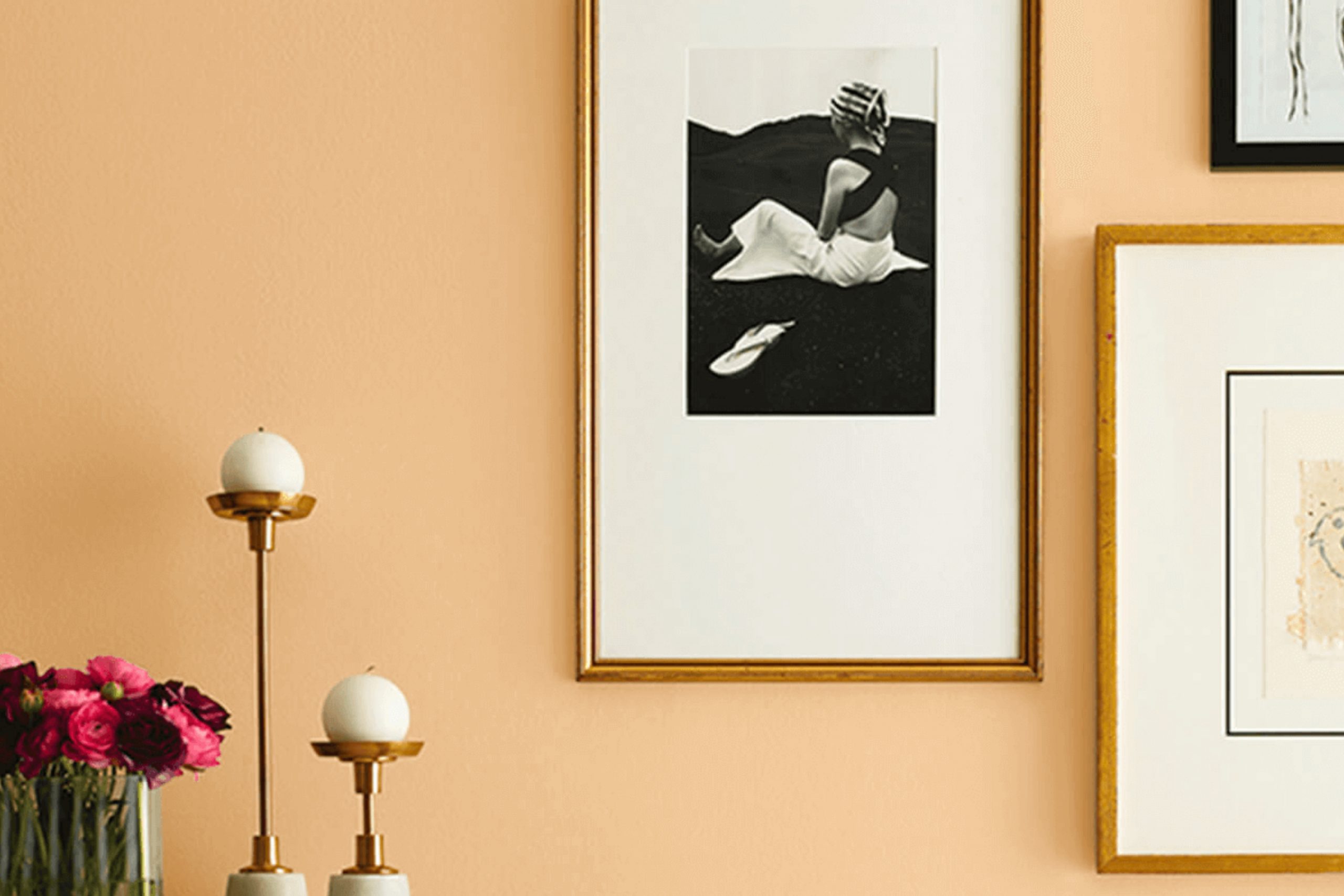
Hubbard Squash by Sherwin Williams caught my attention right away. The warm, earthy tones of this color create a cozy and inviting atmosphere. It’s like bringing a touch of the harvest season into your home all year round. I found myself drawn to its rich, golden hue, which feels both comforting and refined.
Thinking about where to use Hubbard Squash, I imagined it in a living room or kitchen, where it can bring a sense of warmth and cheerfulness. Pairing it with natural materials like wood or neutral accents can enhance its charm, making any room feel more homely. It’s adaptable enough to complement various styles, from traditional to modern.
The name itself—Hubbard Squash—evokes a sense of nostalgia and the simple joys of nature. It resonates with those who appreciate the subtle elegance of natural colors.
There’s a certain enduring quality about this shade that makes it an ideal choice for those wanting a touch of warmth and friendliness in their surroundings.
What Color Is Hubbard Squash SW 0044 by Sherwin Williams?
Hubbard Squash by Sherwin Williams is a warm, inviting color that brings a cozy feel to any room. It is a soft, earthy yellow with hints of orange, reminiscent of fall harvests and the comforting presence of nature. Its warmth makes it a great choice for rooms where you want a welcoming and cheerful atmosphere.
This color works especially well in rustic, farmhouse, and country-style interiors, where its earthy tones complement natural materials. It pairs beautifully with wooden furniture, whether polished or with a weathered finish. Light oak or deep walnut finishes both harmonize well with this hue.
In addition to wood, Hubbard Squash is also a perfect match for natural textiles. Think of woven linen curtains, chunky wool throws, or cotton cushions to create a snug area. Adding in textures like burlap or soft leathers can enrich the room further, adding layers of comfort.
In terms of contrasts, pairing this color with soft whites or creams can keep the room light, while dark greens or deep browns can add depth and interest. This makes Hubbard Squash an adaptable choice for kitchens, living rooms, or any area meant for relaxation and gathering.
Is Hubbard Squash SW 0044 by Sherwin Williams Warm or Cool color?
Hubbard Squash by Sherwin Williams is a warm, inviting color that’s perfect for adding comfort to a home. It’s a soft shade of yellow reminiscent of autumn leaves or the inside of a butternut squash. This color can make rooms feel cozy and welcoming, a great choice for areas where people gather, like living rooms or kitchens.
When used on walls, it creates a sunny and cheerful atmosphere, which can be comforting during colder months. The warmth of Hubbard Squash pairs well with neutral tones like whites, beiges, or browns, allowing for a balanced and gentle look.
It can also be accented with darker greens or deep reds for a more rustic feel. Because it’s not too bright or overpowering, it works well in various rooms and with different styles, making it adaptable. This color can make everyday areas more pleasant and inviting, enhancing the overall mood of your home.
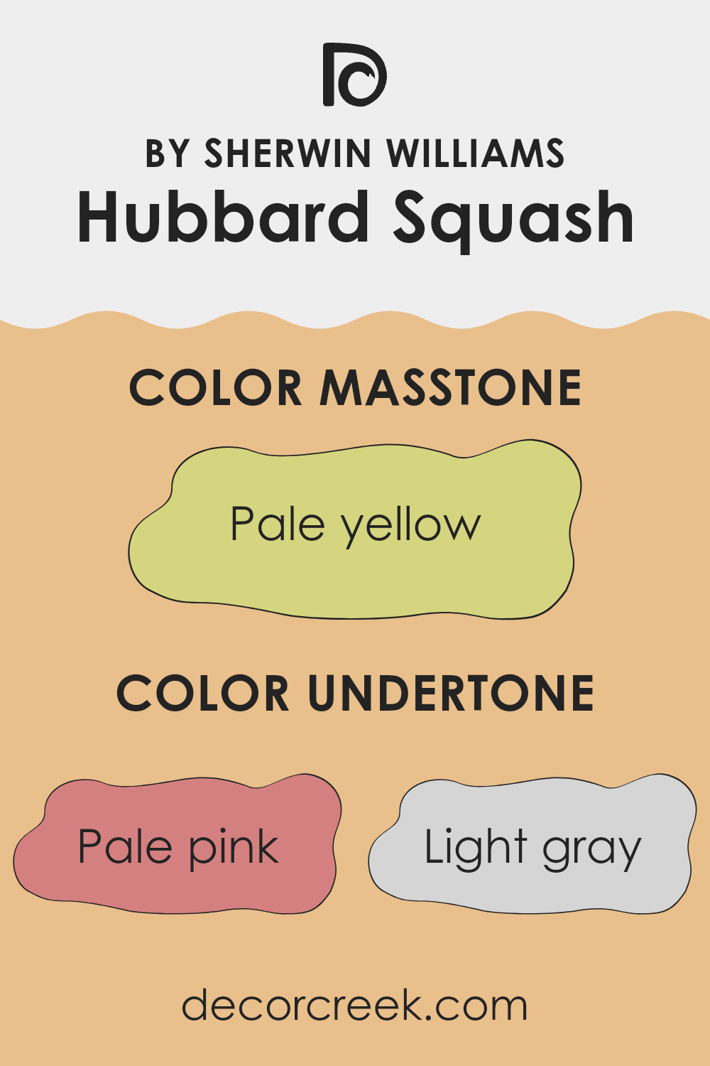
Undertones of Hubbard Squash SW 0044 by Sherwin Williams
Hubbard Squash by Sherwin Williams is a paint color that presents a warm, earthy tone with a soothing feel. It has several subtle undertones which affect how we perceive the color. The undertones include a variety of hues like pale pink, light gray, light purple, yellow, mint, orange, grey, light blue, lilac, light green, and olive.
These undertones play a significant role in how the color appears in different settings and lighting conditions. For instance, the presence of pale pink and light purple can add a soft, inviting warmth to the room. This might make the color appear more cozy and comforting. The yellow and orange undertones enhance the vibrancy of the color, giving energy and brightness, which can make a room feel more lively.
Alternatively, the light gray and grey provide a neutral balance, toning down the brighter undertones and adding depth. Mint and light blue undertones can create a fresh and airy feel, making areas feel more open. The olive and light green add an element of nature and peace, which can introduce a more relaxed atmosphere.
When applying this paint on interior walls, these varied undertones allow Hubbard Squash to adapt easily, creating a dynamic yet harmonious appearance that can change subtly throughout the day depending on the natural and artificial lighting.
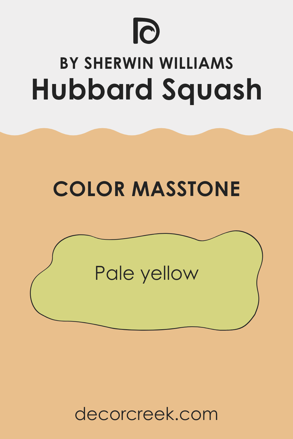
What is the Masstone of the Hubbard Squash SW 0044 by Sherwin Williams?
Hubbard Squash by Sherwin Williams is a soft, pale yellow hue (Hex: #D5D580), offering a gentle warmth that enhances the ambiance in homes. Its light tone brings a sense of openness and airiness, making rooms feel brighter and more inviting.
This color works beautifully in kitchens, living rooms, or entryways, where natural light can amplify its sunny essence. It pairs well with neutral tones like whites and grays or with complementary colors like soft blues and greens for a balanced and refreshing look.
The welcoming nature of Hubbard Squash is perfect for creating cozy rooms without overpowering the senses. Its adaptability allows it to fit various styles, from traditional to modern. As a backdrop, it can highlight furnishings and decor, providing a harmonious canvas that adapts to the surrounding elements. Overall, this cheerful shade brings warmth and comfort, enhancing the overall mood of any room.
How Does Lighting Affect Hubbard Squash SW 0044 by Sherwin Williams?
Lighting plays a significant role in how we perceive colors. It can change the appearance of a color, making it look different depending on whether it’s in natural or artificial light. Hubbard Squash, SW 0044 by Sherwin Williams, is a warm and earthy color, resembling a shade of soft orange or golden squash. How this color appears can vary greatly with different lighting conditions.
In natural light, colors generally look more true to their actual shade. However, the direction of the light can affect the color’s appearance. In north-facing rooms, which usually get cooler and more diffused light, Hubbard Squash can appear slightly muted or toned down. The cooler light may make the color seem a bit less warm and more subdued.
Conversely, in south-facing rooms, where the light is warm and consistent throughout the day, Hubbard Squash will look vibrant and bright. The natural sunlight enhances its warmth, making the room feel inviting and cozy.
In east-facing rooms, the light is warm in the morning and cooler in the afternoon. Hubbard Squash will look warm and radiant in the morning hours, showcasing its lively tone. As the day progresses and the light shifts, the color might take on a softer and slightly muted appearance.
In west-facing rooms, the lighting is cooler in the morning, often resulting in a more muted and subtle tone of Hubbard Squash, but as the sun moves west, the afternoon and evening light will bring out the richness and depth of the color.
Under artificial light, the effect on Hubbard Squash depends on the bulbs used. Incandescent bulbs, which cast a warm yellow light, will enhance its warmth, while fluorescent lighting may make it look cooler and less vibrant. LEDs vary widely but can be chosen to complement the warm tones of the color effectively.
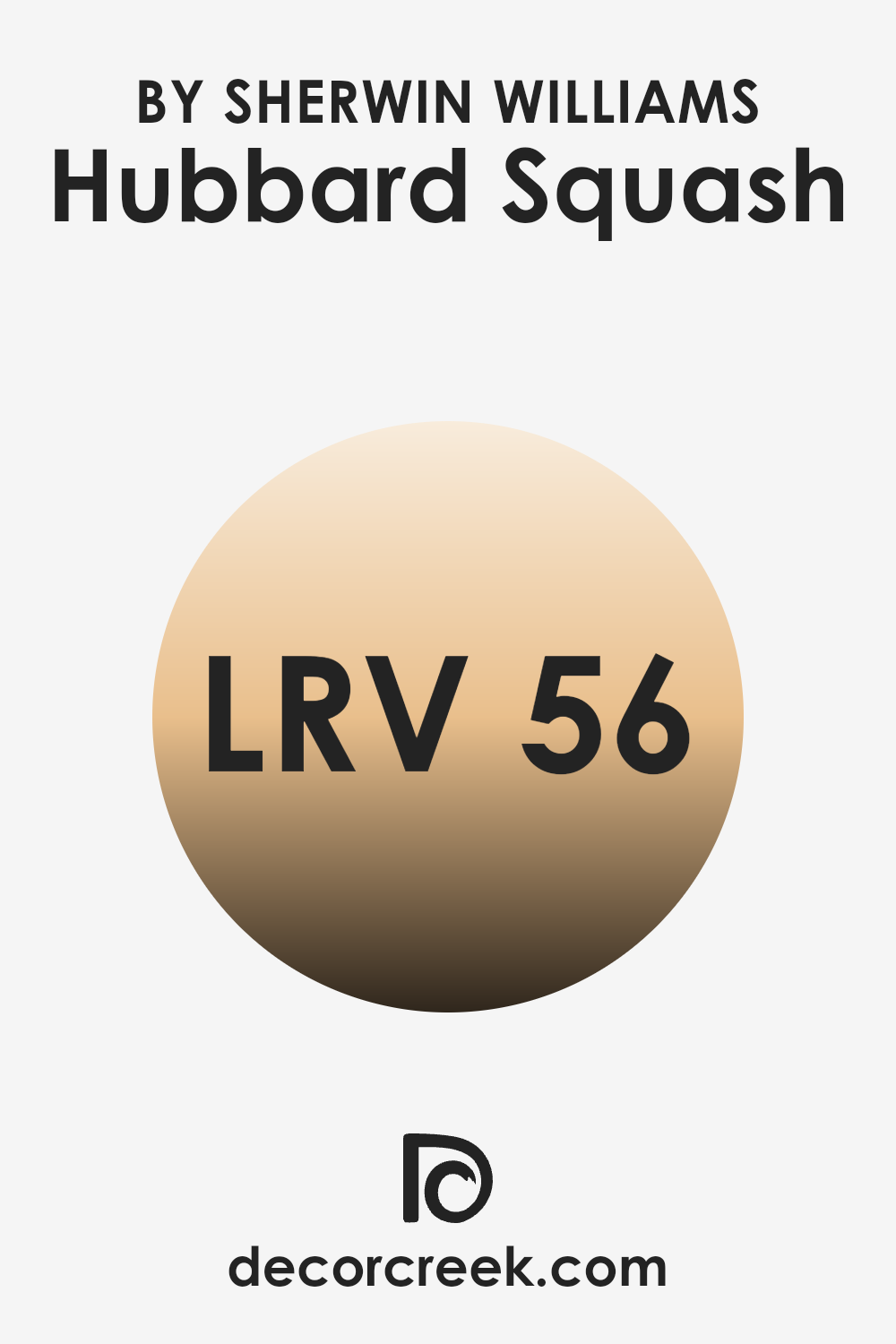
What is the LRV of Hubbard Squash SW 0044 by Sherwin Williams?
LRV stands for Light Reflectance Value, which is a measure of how much light a paint color reflects or absorbs. It is expressed on a scale from 0 to 100, where 0 means the color absorbs all light and is completely black, and 100 means the color reflects all light and is completely white. In the context of interior design, the LRV is important because it helps determine how a color will look in different lighting conditions.
A higher LRV means a color will reflect more light, making it appear brighter and lighter. Conversely, a lower LRV means more light will be absorbed, making the color appear darker and more intense. Understanding LRV can help you choose the right color for a room based on the amount of natural or artificial light it receives.
For the color Hubbard Squash by Sherwin Williams, which has an LRV of 56.456, this information tells us that it is a mid-range color in terms of lightness and darkness. Since its LRV is just above the mid-point, Hubbard Squash will reflect a decent amount of light, giving it a warm and moderately bright appearance on the walls.
This moderate LRV balance makes it adaptable for different rooms and lighting conditions. It will hold its color well in various settings without appearing too dark in low-light areas or too washed out in bright rooms. Overall, the LRV of 56.456 suggests Hubbard Squash can be a great option if you’re looking for a color that provides warmth and light, without being overly bright or too subdued.
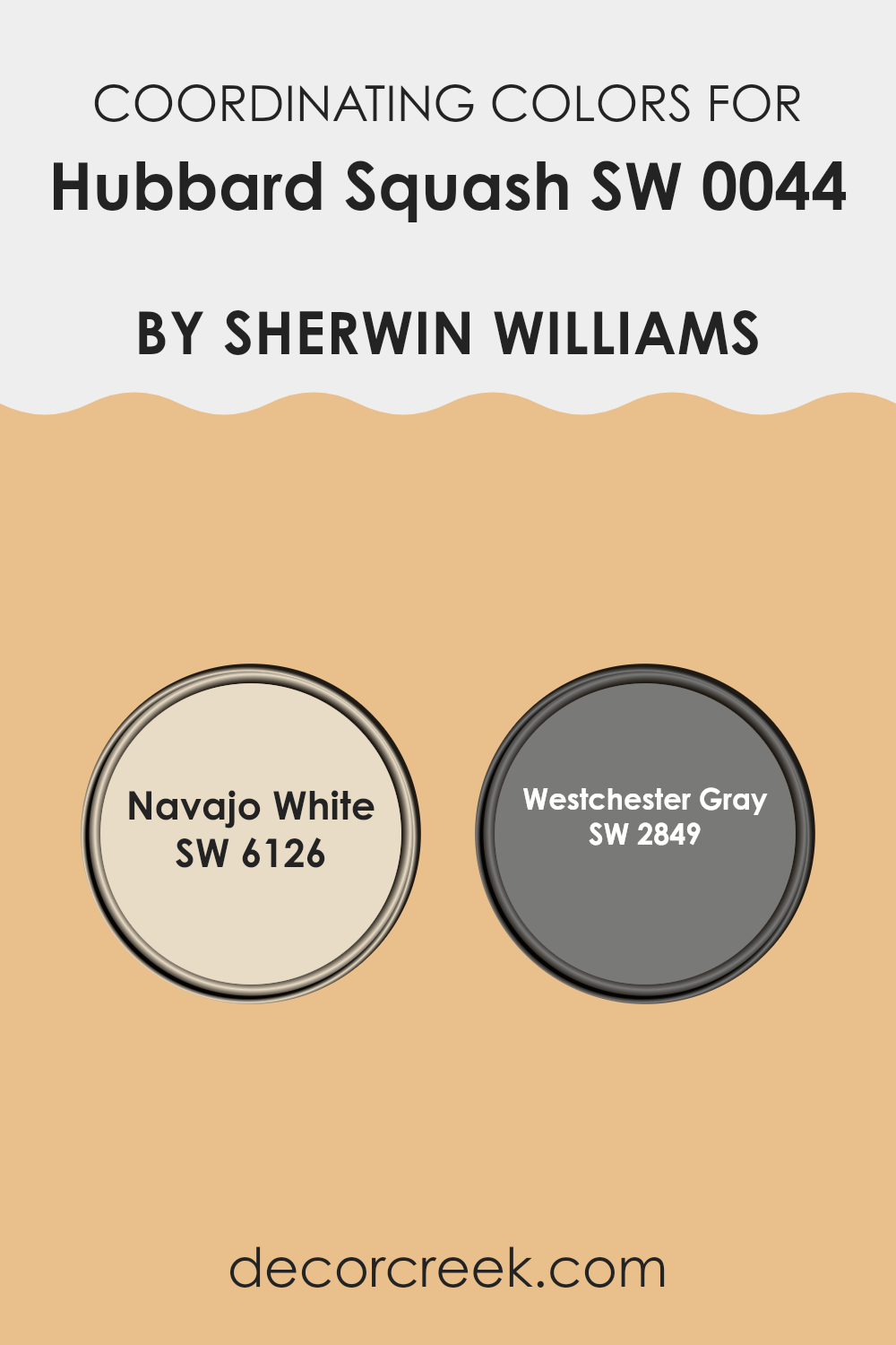
Coordinating Colors of Hubbard Squash SW 0044 by Sherwin Williams
Coordinating colors are colors that work well together to create a pleasing and balanced look. They complement each other, either by providing contrast or by harmonizing the overall palette. When using coordinating colors, like those that go well with Hubbard Squash by Sherwin Williams, you can enhance the beauty of a room by carefully choosing colors that either balance its warm tones or provide a calming contrast.
Navajo White (SW 6126) is a warm, creamy shade that pairs nicely with brighter colors. It brings a touch of softness and light, creating an inviting and comfortable ambiance. Westchester Gray (SW 2849), on the other hand, is a rich, deep gray that adds depth and sophistication in contrast to the warmth of Hubbard Squash, offering a solid, grounding effect.
In a room painted with Hubbard Squash, Navajo White can be used on trim or ceilings to create a bright and airy feel, making the room feel open and cheerful. Westchester Gray can be used on accent walls or in decor elements to provide a sense of depth and stability. When balanced correctly, these coordinating colors can enhance each other and contribute to an overall harmonious environment that feels both comforting and stylish.
You can see recommended paint colors below:
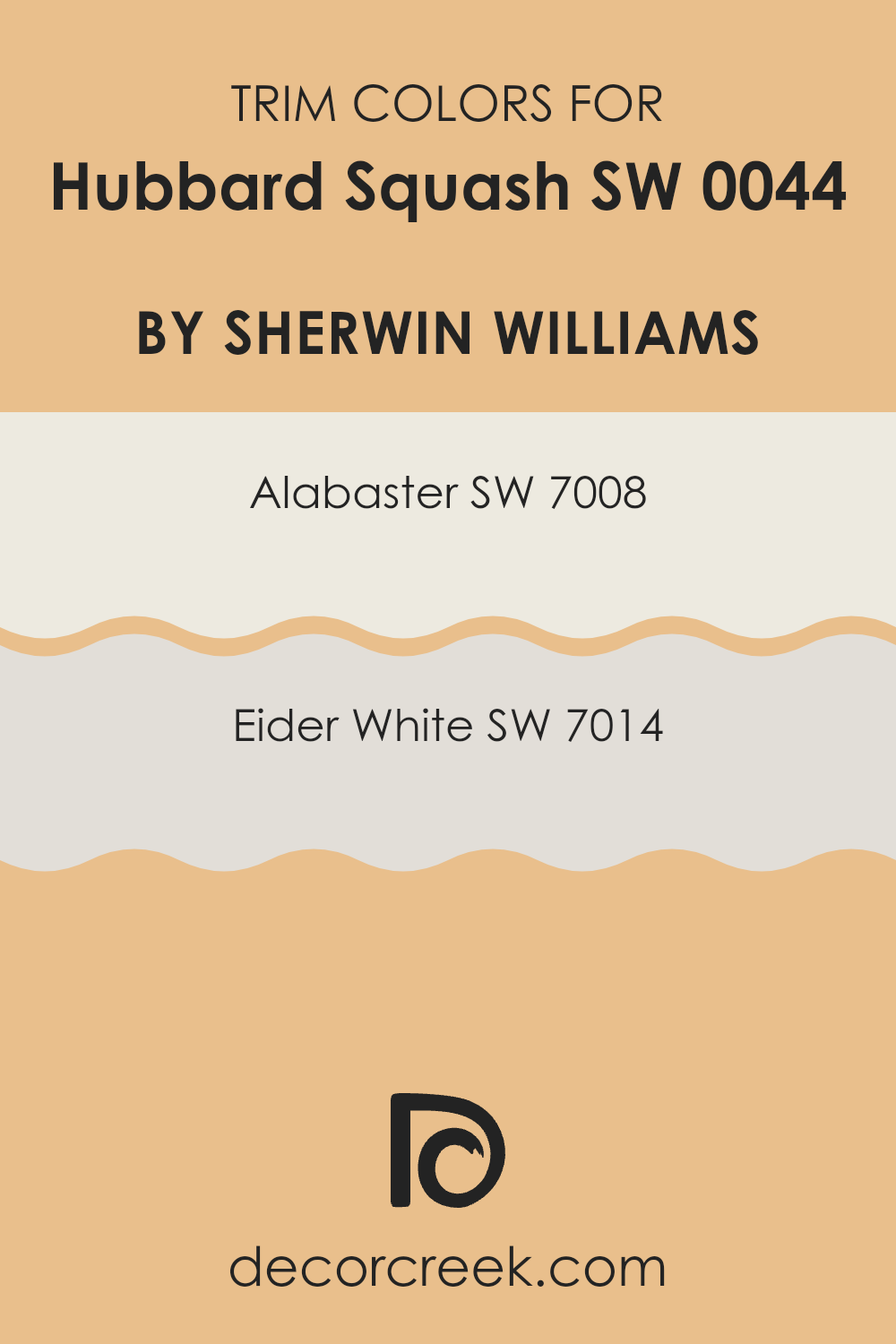
What are the Trim colors of Hubbard Squash SW 0044 by Sherwin Williams?
Trim colors are often the secondary shades used to highlight or frame a room, particularly around edges like skirting boards, door frames, and window sills. They provide contrast, harmony, or subtle emphasis, adding to the overall balance and aesthetic of the room.
When you choose a main wall color like Hubbard Squash, a warm and inviting hue from Sherwin Williams, selecting the right trim color enhances and complements the primary shade. SW 7008 – Alabaster and SW 7014 – Eider White offer great options as trim colors. They can bring out the richness of warmer tones like Hubbard Squash while maintaining a fresh, clean look.
SW 7008 – Alabaster is a soft, creamy white that exudes warmth and clarity, without being too stark or cool. It’s adaptable and pairs well with a variety of colors, making it an excellent choice for trim when you want a gentle contrast that isn’t too striking.
On the other hand, SW 7014 – Eider White is a cooler, more muted shade with subtle gray undertones. It brings a touch of sophistication to any room, providing a contemporary and refined edge. Both these trim colors enhance the visual appeal of a room painted in Hubbard Squash, making it feel bright and inviting.
You can see recommended paint colors below:
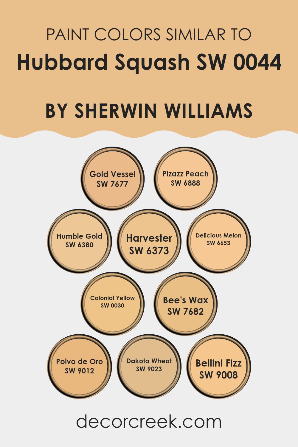
Colors Similar to Hubbard Squash SW 0044 by Sherwin Williams
Colors that are similar to Hubbard Squash offer a cohesive and harmonious aesthetic, making them essential for design. These colors enhance rooms by creating warmth, balance, and visual interest without being overpowering. They can shift the feel of a room, making it more inviting and comfortable.
For example, Gold Vessel provides a bright and sunny vibe, while Pizazz Peach offers a playful and fresh tone. Humble Gold brings a subtle richness, perfect for adding depth to a room. Harvester is a comforting color, reminiscent of fields during the harvest season, offering a sense of calm and relaxation.
Delicious Melon introduces a softer, more delicate hue that can evoke feelings of joy. Colonial Yellow is a classic color with an enduring touch that brightens and energizes any room. Bee’s Wax adds a cozy, waxy depth, reminiscent of natural materials, creating a warm and inviting environment. Polvo de Oro has a touch of earthiness, making it an excellent choice for creating grounded areas.
Dakota Wheat delivers a soft, golden hue, which is both comforting and familiar. Lastly, Bellini Fizz brings a sparkling, invigorating feel that can stimulate creativity. In combination, these colors work together to promote a cohesive, lively, and welcoming atmosphere.
You can see recommended paint colors below:
- SW 7677 Gold Vessel
- SW 6888 Pizazz Peach
- SW 6380 Humble Gold
- SW 6373 Harvester
- SW 6653 Delicious Melon
- SW 0030 Colonial Yellow
- SW 7682 Bee’s Wax
- SW 9012 Polvo de Oro
- SW 9023 Dakota Wheat
- SW 9008 Bellini Fizz
How to Use Hubbard Squash SW 0044 by Sherwin Williams In Your Home?
Hubbard Squash SW 0044 by Sherwin Williams is a warm, inviting shade that brings a cozy feeling to any room. This color bridges the gap between yellow and orange, creating a cheerful environment that’s also calming.
In a living room, Hubbard Squash can add comfort and make the room feel more welcoming. Pair it with soft whites or light grays for a balanced look. In the kitchen, this hue can brighten the area and work wonderfully with natural wood accents or white cabinets. When used in a bedroom, it provides a warm backdrop that makes the room feel snug and relaxing.
Even in a hallway or entryway, Hubbard Squash can set a pleasant tone for the entire home. Its sunny disposition is perfect for adding a touch of warmth in small areas like bathrooms or powder rooms. This adaptable shade works well with various decor styles, from traditional to modern.
Hubbard Squash SW 0044 by Sherwin Williams vs Pizazz Peach SW 6888 by Sherwin Williams
Hubbard Squash SW 0044 is a warm and soft color with earthy undertones. It draws inspiration from nature, resembling the muted orange tones of a squash or pumpkin. This color offers a subtle and cozy feel, making it ideal for areas that aim for a welcoming and relaxed atmosphere. It’s an adaptable shade that pairs well with both neutrals and deeper hues.
On the other hand, Pizazz Peach SW 6888 is a vibrant and lively peach color. It’s much brighter and bolder compared to Hubbard Squash. This color brings an energetic and cheerful vibe to any room. Pizazz Peach can be a great choice for accent walls or rooms meant to feel fun and uplifting.
While Hubbard Squash brings a calm warmth, Pizazz Peach delivers a punch of energy. Together, they provide an interesting contrast: one for coziness and the other for invigorating brightness.
You can see recommended paint color below:
- SW 6888 Pizazz Peach

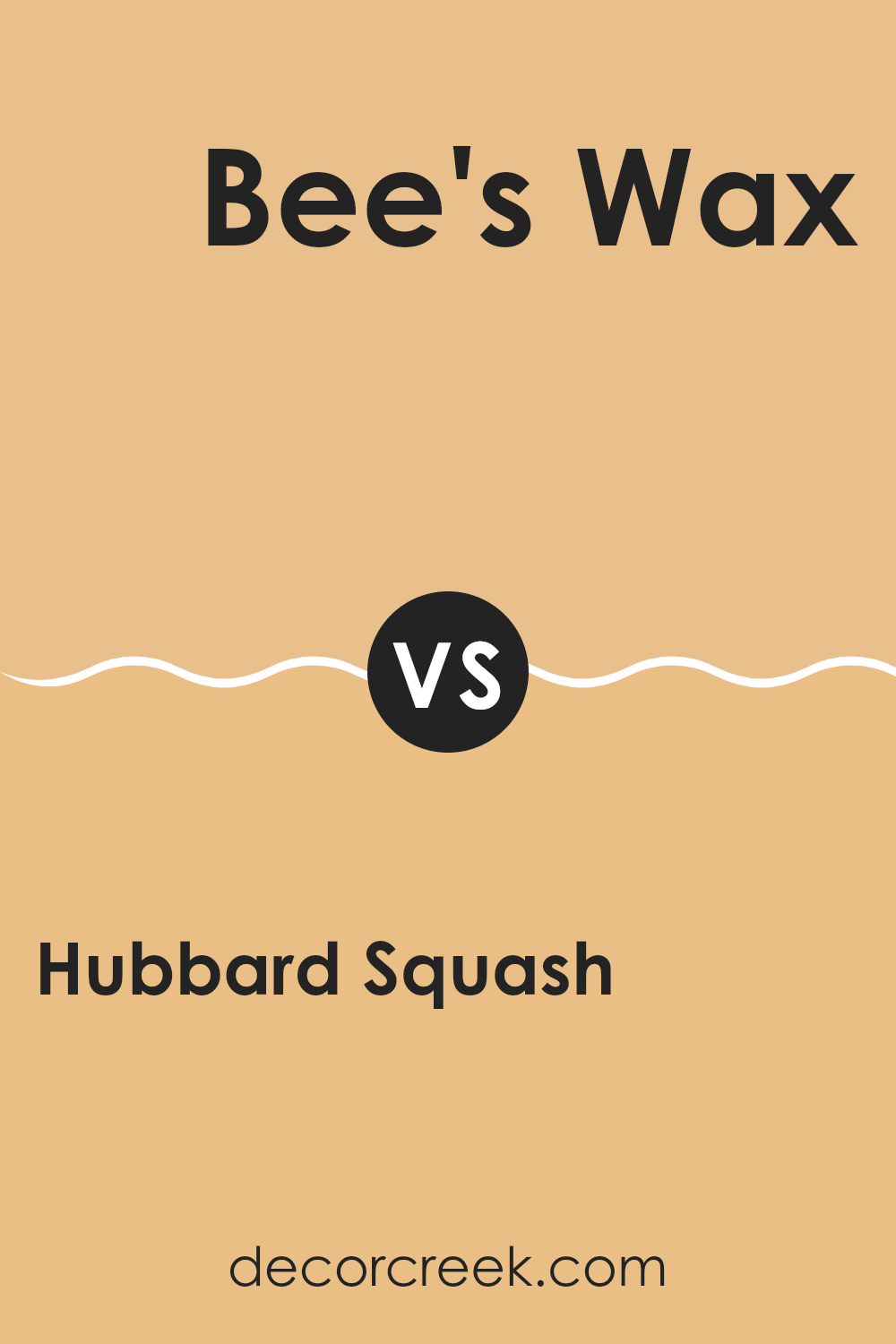
Hubbard Squash SW 0044 by Sherwin Williams vs Bee’s Wax SW 7682 by Sherwin Williams
Hubbard Squash SW 0044 by Sherwin Williams is a warm, earthy hue that brings to mind autumn leaves and pumpkin patches. It’s a cozy, muted orange with a slight hint of brown, which makes it feel grounded and natural. This color can add a touch of warmth to any room, making it perfect for living rooms or kitchens where a welcoming feel is desired.
On the other hand, Bee’s Wax SW 7682 is more of a soft gold with sunny undertones. It’s brighter and cheerier than Hubbard Squash, reminiscent of honey and sunshine. This color can brighten up a room, making it feel joyful and inviting. It’s suitable for areas where you want to create a lively atmosphere, like a breakfast nook or a child’s playroom.
While Hubbard Squash provides a warm and cozy backdrop, Bee’s Wax brings in more energy and brightness. Both colors can add warmth in their way, but Bee’s Wax takes it up a notch with its vibrant tones.
You can see recommended paint color below:
- SW 7682 Bee’s Wax
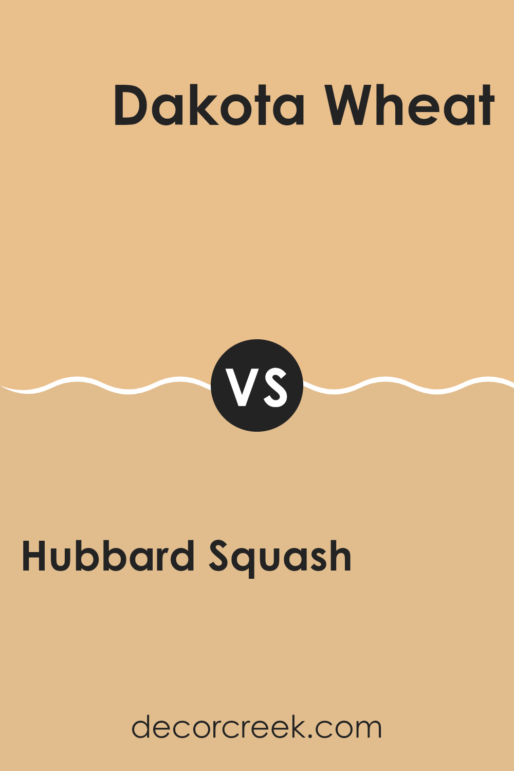
Hubbard Squash SW 0044 by Sherwin Williams vs Dakota Wheat SW 9023 by Sherwin Williams
Hubbard Squash SW 0044 and Dakota Wheat SW 9023 are two warm colors by Sherwin Williams that evoke different moods. Hubbard Squash is a richer, earthier shade, reminiscent of autumn leaves or pumpkins. It adds a cozy and welcoming feel to a room, making it ideal for living rooms or kitchens where an inviting atmosphere is desired. Its deep, warm tone can create a sense of comfort and homeliness.
On the other hand, Dakota Wheat is a lighter, more subdued shade. It leans towards a soft beige or tan, suggesting the color of harvested wheat fields. This color is adaptable and works well in various rooms, lending a sense of calm and neutrality. It complements both modern and traditional decor styles and can be a great choice for bedrooms or hallways.
In summary, Hubbard Squash is bold and warm, while Dakota Wheat is light and calming. Both offer unique qualities to enhance your rooms, depending on the mood you want to create.
You can see recommended paint color below:
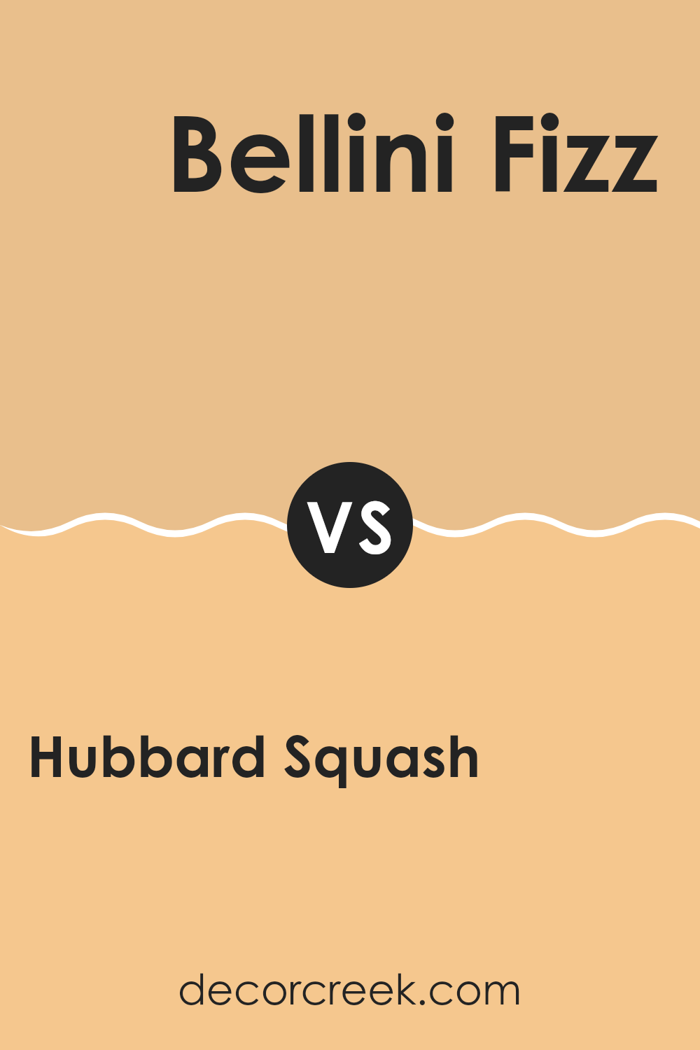
Hubbard Squash SW 0044 by Sherwin Williams vs Bellini Fizz SW 9008 by Sherwin Williams
Hubbard Squash SW 0044 and Bellini Fizz SW 9008 by Sherwin Williams bring unique vibes to a room. Hubbard Squash is a warm, earthy orange with a hint of brown, reminiscent of autumn leaves or a cozy pumpkin pie.
It creates a comfortable and inviting atmosphere, perfect for living rooms or areas where you want to feel cozy. On the other hand, Bellini Fizz is a bright, playful peachy pink. It’s lively and fun, bringing a sense of cheer and lightheartedness to a room.
This color might be perfect for a lively kitchen or a vibrant child’s playroom. While Hubbard Squash is more subdued and grounding, Bellini Fizz adds a splash of energy and joy. Both colors can make a room feel welcoming, but they do so in very different ways — one with warmth, the other with a touch of brightness.
You can see recommended paint color below:
- SW 9008 Bellini Fizz
Hubbard Squash SW 0044 by Sherwin Williams vs Delicious Melon SW 6653 by Sherwin Williams
Hubbard Squash SW 0044 and Delicious Melon SW 6653 are both warm and inviting colors, each bringing its own unique feel to a room. Hubbard Squash is a muted, earthy orange with a hint of brown. It creates a cozy and calming atmosphere, reminiscent of autumn leaves or a sunset. This color works well in living rooms and bedrooms where you want to feel relaxed and grounded.
On the other hand, Delicious Melon is a brighter, more cheerful peachy tone. It adds a sense of freshness and can energize a room, making it ideal for kitchens or playrooms. It’s a more vibrant and lively choice compared to the subdued nature of Hubbard Squash.
Both colors can complement each other nicely, with Delicious Melon bringing in energy and brightness, while Hubbard Squash adds warmth and depth. The combination of these colors can create a dynamic yet harmonious environment.
You can see recommended paint color below:
- SW 6653 Delicious Melon
Hubbard Squash SW 0044 by Sherwin Williams vs Gold Vessel SW 7677 by Sherwin Williams
Hubbard Squash SW 0044 by Sherwin Williams is a warm, earthy tone that is reminiscent of the soft orange hue of squashes. It radiates a cozy and inviting feel, making it a great choice for rooms where you want to feel relaxed and comfortable. This color is ideal for areas that aim to create a homey and welcoming atmosphere.
On the other hand, Gold Vessel SW 7677 is a rich, golden color that brings a touch of luxury and warmth to a room. This color has a slightly more vibrant and bold presence compared to Hubbard Squash. It works well as an accent color or in areas where you want to make a statement with a touch of opulence.
While both colors are warm, Hubbard Squash is softer and more muted, whereas Gold Vessel offers a brighter and more striking appearance. They can complement each other well, with Hubbard Squash grounding a room and Gold Vessel adding an eye-catching highlight.
You can see recommended paint color below:
Hubbard Squash SW 0044 by Sherwin Williams vs Harvester SW 6373 by Sherwin Williams
Hubbard Squash SW 0044 and Harvester SW 6373 by Sherwin Williams are two warm, earthy tones. Hubbard Squash is a muted orange with a slightly grayish undertone, giving it a soft, natural feel. It’s reminiscent of autumn leaves or the skin of a squash, making areas feel cozy and inviting.
Harvester, on the other hand, is a brighter, more vibrant yellow-orange. It feels sunny and cheerful, like a field of ripe grain on a sunny day. While Hubbard Squash is more subdued and calming, Harvester brings energy and brightness to a room.
Hubbard Squash works well in areas where you want a subtle color that doesn’t dominate, whereas Harvester is perfect for areas where you want to make a lively statement. Both colors pair well with neutral tones but can create different moods depending on their use: calming and grounded with Hubbard Squash, or lively and upbeat with Harvester.
You can see recommended paint color below:
Hubbard Squash SW 0044 by Sherwin Williams vs Colonial Yellow SW 0030 by Sherwin Williams
Hubbard Squash SW 0044 and Colonial Yellow SW 0030 by Sherwin Williams are both warm colors, but they have different vibes. Hubbard Squash is a muted, earthy tone that has a strong grayish undertone, giving it a slightly subdued and grounded feel.
It resembles the color of an autumn squash, which is both comforting and natural. This makes it a great choice for areas where you want a feeling of coziness and warmth without being too bold. On the other hand, Colonial Yellow is a brighter, more cheerful color.
It has a golden hue that can add a sense of light and energy to a room. Colonial Yellow is reminiscent of classic, historic homes and brings a sense of warmth and welcome. While both are warm, Hubbard Squash is more earthy and subtle, while Colonial Yellow is brighter and more vibrant. They can each add a different kind of warmth to a room, depending on the mood you want.
You can see recommended paint color below:
- SW 0030 Colonial Yellow
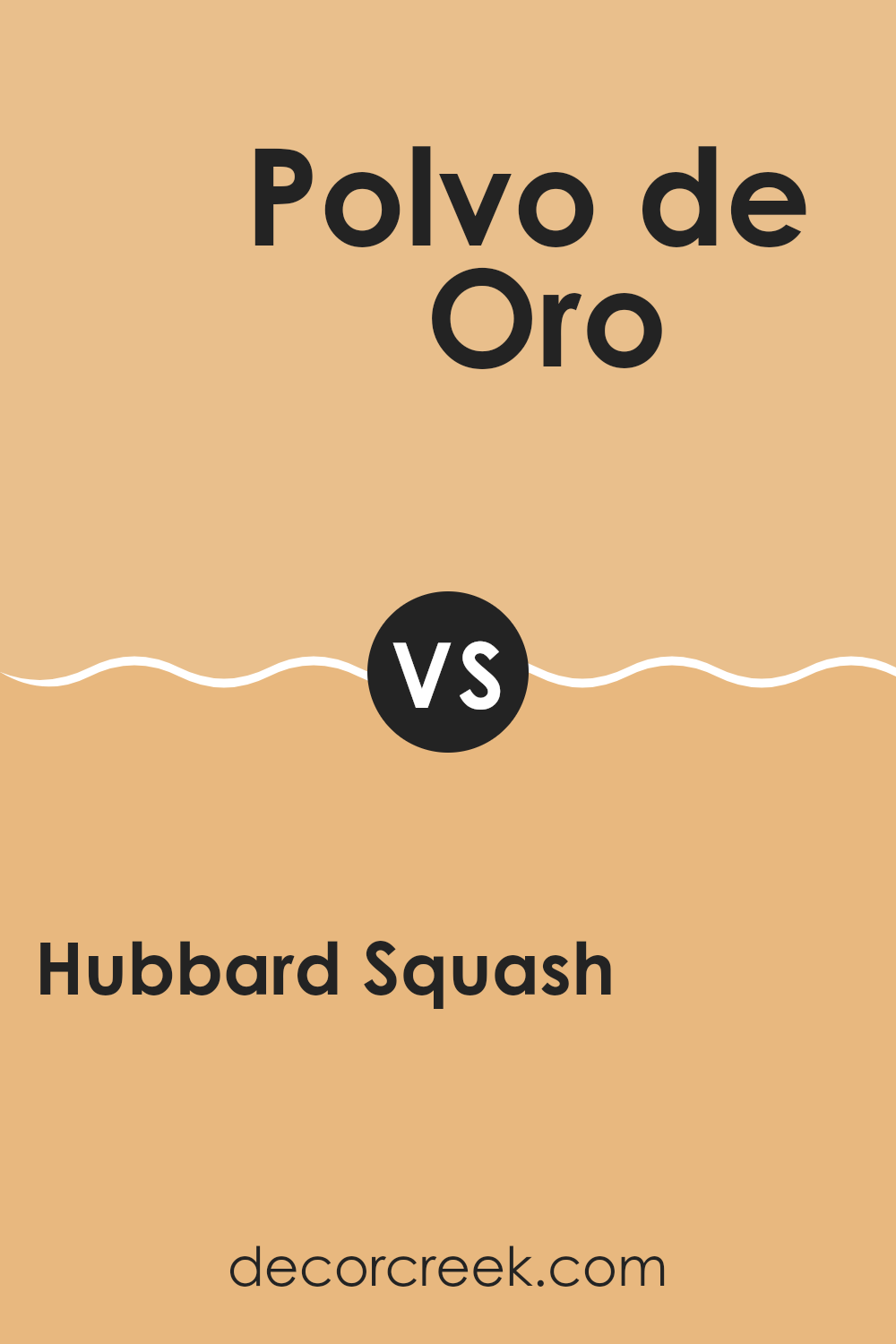
Hubbard Squash SW 0044 by Sherwin Williams vs Polvo de Oro SW 9012 by Sherwin Williams
Hubbard Squash SW 0044 and Polvo de Oro SW 9012 are both warm shades by Sherwin Williams but differ significantly in tone and mood. Hubbard Squash is a muted, earthy orange with a subtle hint of brown, evoking the feel of autumn leaves or a cozy pumpkin pie. It offers a warm and inviting atmosphere, making it ideal for living areas or kitchens.
On the other hand, Polvo de Oro is a light, golden yellow. Its gentle brightness can add a cheerful and welcoming ambiance to a room, reminiscent of sunny days and warmth. Suitable for areas where light and joy are desired, like a child’s room or a sunlit living area, it contrasts with the deeper, more mature tone of Hubbard Squash.
Both colors bring warmth but in different ways: Hubbard Squash offers depth and earthiness, while Polvo de Oro provides lightness and cheer.
You can see recommended paint color below:
- SW 9012 Polvo de Oro
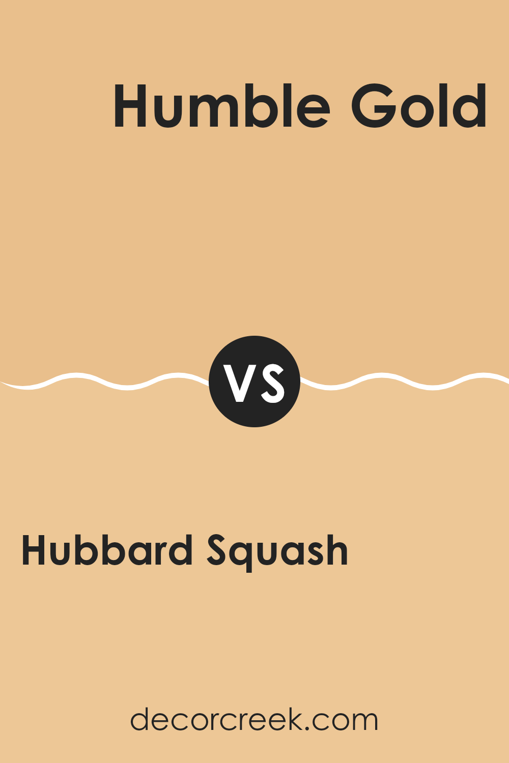
Hubbard Squash SW 0044 by Sherwin Williams vs Humble Gold SW 6380 by Sherwin Williams
Hubbard Squash SW 0044 and Humble Gold SW 6380 by Sherwin Williams are two distinct yet complementary colors. Hubbard Squash is a muted, grayish-green shade with earthy undertones, giving a grounded and calm impression. It’s like a walk in a quiet forest. It pairs well with neutrals like beige or cream for a balanced look.
On the other hand, Humble Gold is a warm, golden-yellow shade that brings a cheerful and sunny vibe to any room. This color is energetic and lively, reminiscent of a sunny day. It can brighten up a room and works well with darker tones like deep browns or greens.
When used together, Hubbard Squash’s soothing nature balances Humble Gold’s vibrancy, creating a harmonious contrast. This pairing can add depth and interest to interiors, combining the calming effect of green with the warmth of gold for a welcoming atmosphere.
You can see recommended paint color below:
After learning all about SW 0044 Hubbard Squash by Sherwin Williams, I feel like I’ve found a great paint color. When I see this shade, it reminds me of golden autumn leaves and fields of ripe pumpkins. It’s a warm, yellow-orange that makes rooms feel cozy and inviting.
I can picture this color in a kitchen, making it seem sunnier even on a cloudy day, or in a living room, where it might create a warm hug for family movie nights. It’s not too bold or too dull; it’s just right for bringing cheeriness to any room.
I think this color would be perfect with white or cream trim to make it pop, and maybe even with some wood accents that could make the room feel even more snug. It’s like painting the sun’s happiness on the walls.
Overall, Hubbard Squash seems like a fun, happy choice if you want your home to feel warm and welcoming. For anyone who wants to add some sunshine to their room, this color could be a really good pick. I can’t wait to see where I might try it out in my own home!
Ever wished paint sampling was as easy as sticking a sticker? Guess what? Now it is! Discover Samplize's unique Peel & Stick samples.
Get paint samples

