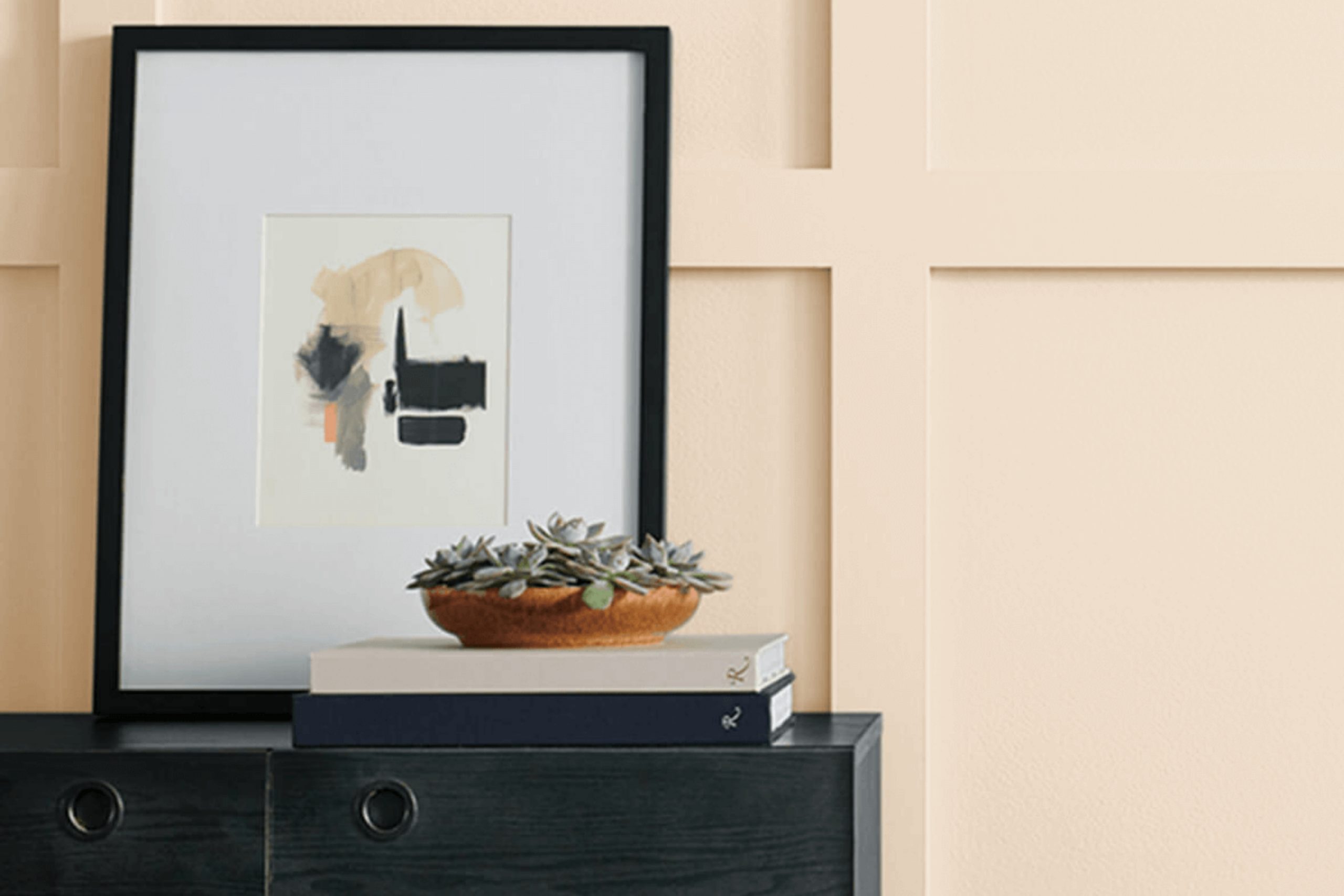
It’s a color that quietly draws you in with its subtle charm, making it a fascinating choice for any space. I could see how it instantly brightened a room without overpowering the other elements in it. It has a gentle warmth that can make a house feel more like home, offering a calm and inviting atmosphere.
Intricate Ivory has the flexibility to work in different spaces—from cozy bedrooms to lively living rooms—combining effortlessly with various styles and designs. Its soft, creamy tone adds a sense of cleanliness while maintaining a touch of sophistication. It’s the type of color that creates an inviting backdrop, allowing your furniture and décor pieces to stand out beautifully.
Choosing this shade feels like a natural decision for anyone looking to refresh their living area with a hue that offers subtle elegance and a welcoming vibe. It’s amazing how a color so understated can have such a profound impact, transforming any space into something warm and bright.
The balance of lightness and warmth makes Intricate Ivory a versatile choice, making rooms feel spacious and serene.
What Color Is Intricate Ivory SW 6350 by Sherwin Williams?
Intricate Ivory by Sherwin Williams is a warm, soft shade of ivory that offers a welcoming feel to any space. This gentle hue has subtle peachy undertones that can brighten a room without overwhelming it. It’s a versatile color that works beautifully in a variety of interior styles, making it a popular choice for homeowners.
Intricate Ivory suits a classic or traditional style beautifully, adding a touch of elegance and warmth to these settings. It also fits well in a rustic or farmhouse-style home, as it complements wood tones and other natural elements perfectly. In a modern or minimalist space, this color can soften the look, adding a layer of warmth to the otherwise cool, sleek design.
This color pairs well with natural materials like wood, stone, and wicker, enhancing the feeling of warmth and comfort. Soft fabrics like linen and cotton also complement it nicely, creating a cozy and inviting atmosphere. Additionally, metallic accents in gold or bronze can add a touch of sophistication and highlight the color’s warm undertones.
When combined with textures like woven rugs or knitted throws, Intricate Ivory creates a space that feels both comfortable and stylish, making it a great choice for living rooms, bedrooms, or any space where a calming atmosphere is desired.
Is Intricate Ivory SW 6350 by Sherwin Williams Warm or Cool color?
Intricate Ivory by Sherwin Williams is a warm, neutral paint color that works beautifully in many home settings. Its subtle undertone of beige gives it a cozy and inviting feel, making it a great choice for living rooms, bedrooms, or kitchens where a soft and comfortable atmosphere is desired.
This color pairs well with both light and dark furniture and accents, allowing for versatility in decorating. It can also serve as a perfect backdrop for vibrant artwork or bold fabric patterns.
In well-lit rooms, Intricate Ivory helps reflect natural light, adding a gentle glow to the space. Meanwhile, in dimmer areas, it maintains a comforting ambiance without feeling too heavy or dark. Its versatility extends to blending with a variety of styles, from traditional to modern. Overall, this shade helps create a balanced and cohesive look that complements a wide range of personal tastes and home designs.
Undertones of Intricate Ivory SW 6350 by Sherwin Williams
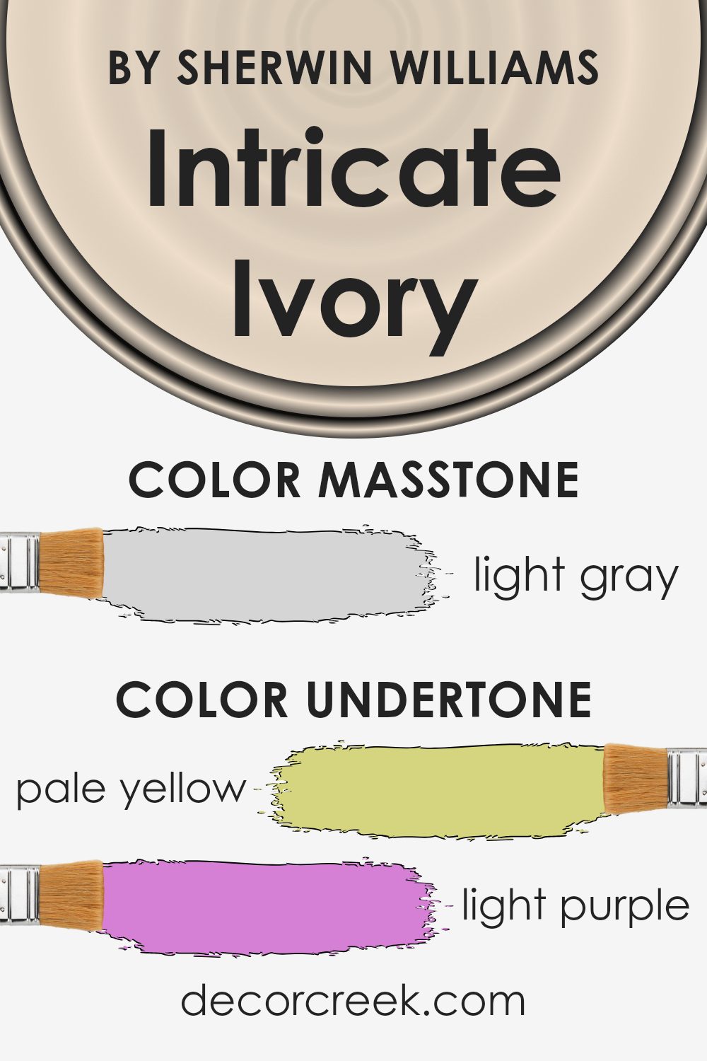
Intricate Ivory by Sherwin Williams is a complex color with a range of subtle undertones. At first glance, it appears to be a soft, warm ivory, but its undertones give it unique characteristics. The pale yellow adds warmth, making spaces feel cozy and inviting. Light purple and lilac undertones can add a sense of calm and sophistication, subtly altering the room’s vibe depending on the lighting.
Light blue contributes a fresh, airy feel, which can open up a space and make it feel larger. Pale pink introduces a gentle, soft touch, adding warmth and a slight blush to the walls. The mint undertone injects a hint of freshness and vitality, making the color feel lively yet balanced. Grey undertones bring a sense of neutrality and balance, anchoring the color so it doesn’t feel overly warm or cool.
These undertones influence how Intricate Ivory appears in different lighting conditions. In a room with natural light, the yellow and mint might become more noticeable, whereas in artificial lighting, the pink or lilac might come forward. Overall, Intricate Ivory can create a dynamic backdrop that changes with the light, making it versatile for different rooms and moods.
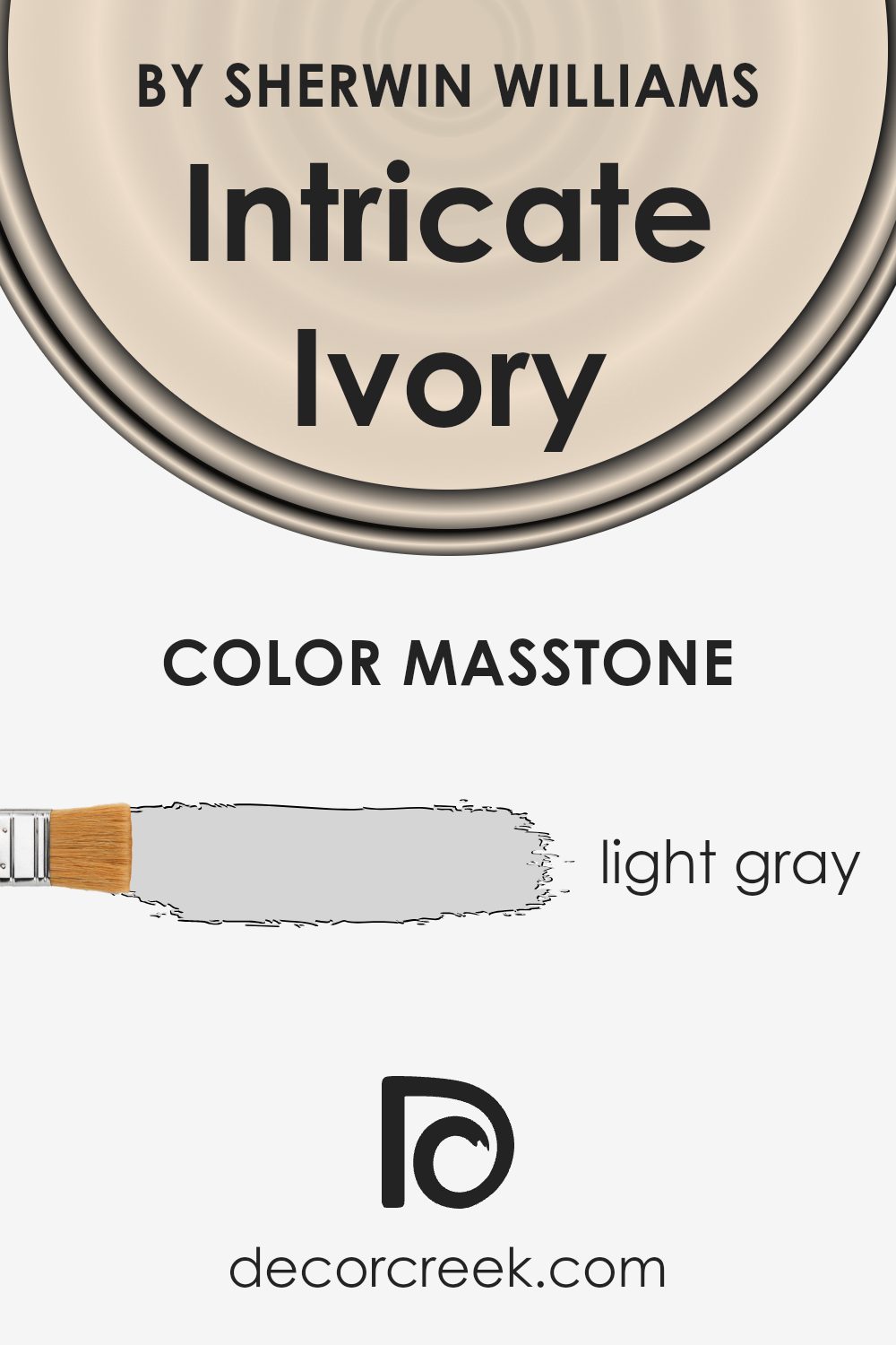
What is the Masstone of the Intricate Ivory SW 6350 by Sherwin Williams?
Intricate Ivory by Sherwin Williams is a subtle light gray color, specifically noted as #D5D5D5. This color is appealing in homes due to its versatility and soft presence. It provides a neutral backdrop that can seamlessly complement a variety of design styles, from modern to traditional.
When used on walls, it creates a calm and airy atmosphere, making spaces feel larger and more open. The lightness of Intricate Ivory helps to reflect natural light, enhancing the overall brightness of a room. This quality makes it an excellent choice for small rooms or areas with limited sunlight.
Intricate Ivory pairs well with warm wood tones, soft textiles, and muted colors, making it easy to coordinate with different furniture and decor. It is an ideal choice for anyone looking to create a peaceful and harmonious environment while maintaining a sense of elegance and simplicity throughout their living spaces.
How Does Lighting Affect Intricate Ivory SW 6350 by Sherwin Williams?
Lighting plays a crucial role in how we perceive colors. Different types of light can change the appearance of colors in a room. For example, natural daylight tends to show colors in their most true form, while artificial light can alter colors to appear warmer or cooler depending on the light bulb used.
Let’s look at how the color “Intricate Ivory” by Sherwin Williams can appear under different lighting conditions. This color is a soft, warm ivory with yellow undertones, and its appearance changes with different lighting.
In natural light, “Intricate Ivory” shows its true warm tone. In north-facing rooms, the light is cooler and can make the color look slightly muted and less warm. This is because north-facing rooms have less direct sunlight and more indirect light throughout the day. Therefore, the yellow undertones in the ivory might be less pronounced.
In south-facing rooms, where the light is warmer and more direct, “Intricate Ivory” appears at its warmest. The yellow tones become more noticeable, making the room feel cozy and inviting.
East-facing rooms receive bright light in the morning and less light in the afternoon. In the morning, “Intricate Ivory” can seem brighter and carry more warmth. As the day progresses and the lighting diminishes, it might appear softer and more neutral.
West-facing rooms have the opposite light pattern: softer light in the morning and a warm, golden light in the afternoon and evening. The warm afternoon light enhances the yellow tones of “Intricate Ivory,” giving the room a glowing appearance as the sun sets.
When using artificial light, keep in mind that incandescent bulbs bring out the warm tones in “Intricate Ivory,” making it appear warmer. LED or fluorescent lighting can add cooler tones, which may soften the warmth of the color.
Adjusting your bulbs allows you to customize how “Intricate Ivory” will look, whether that’s enhancing its warmth or keeping it more neutral.

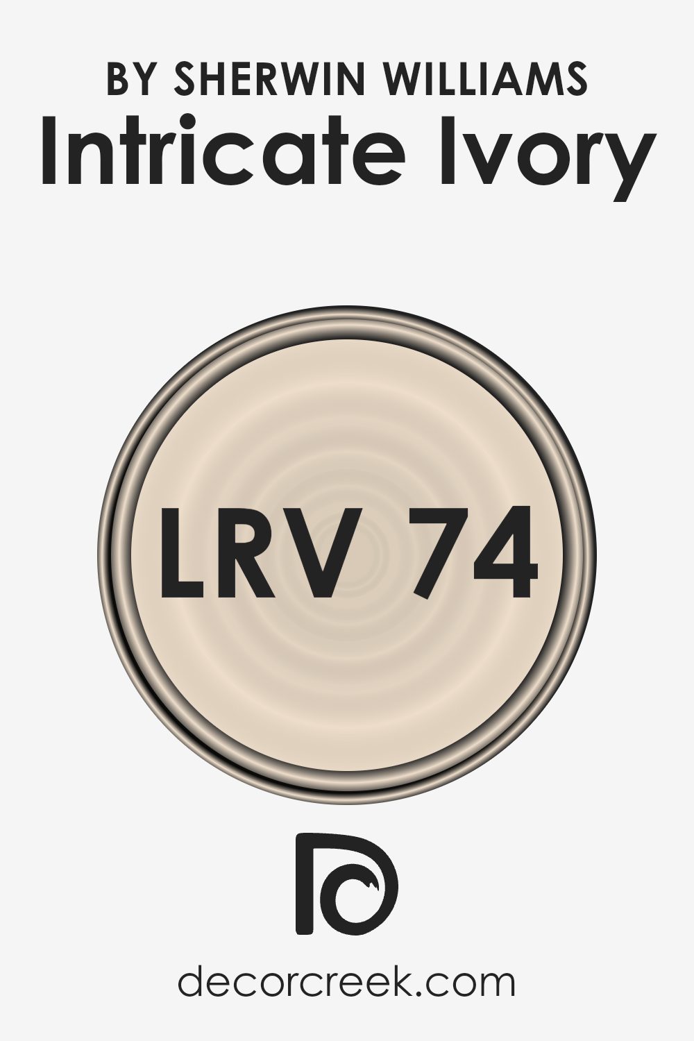
What is the LRV of Intricate Ivory SW 6350 by Sherwin Williams?
LRV stands for Light Reflectance Value, which is a measurement used to indicate how much light a color will reflect or absorb. The scale goes from 0 to 100, where 0 means the color absorbs all light and 100 means it reflects all light. Colors with a high LRV will reflect more light and can make a room feel brighter and more open, as they are less likely to absorb the light.
Intricate Ivory, with its LRV of 74.203, falls on the higher end of the spectrum, suggesting that it reflects a lot of light. This makes it a good choice for rooms where you want to enhance the brightness, such as smaller spaces or areas with limited natural light.
Because Intricate Ivory has a high LRV, it will likely make your walls appear lighter and more spacious. This color will enhance natural and artificial light, making the room feel more airy. It might be a good choice for areas where you want a gentle and soft backdrop, allowing other colors in the room, like those of your furniture or accents, to stand out.
Given its high LRV, Intricate Ivory can also help balance the light in a room, preventing it from feeling too dark or closed in. Whether you’re painting a living room, a bedroom, or a hallway, this color’s high reflective quality can make the space feel more open and inviting.
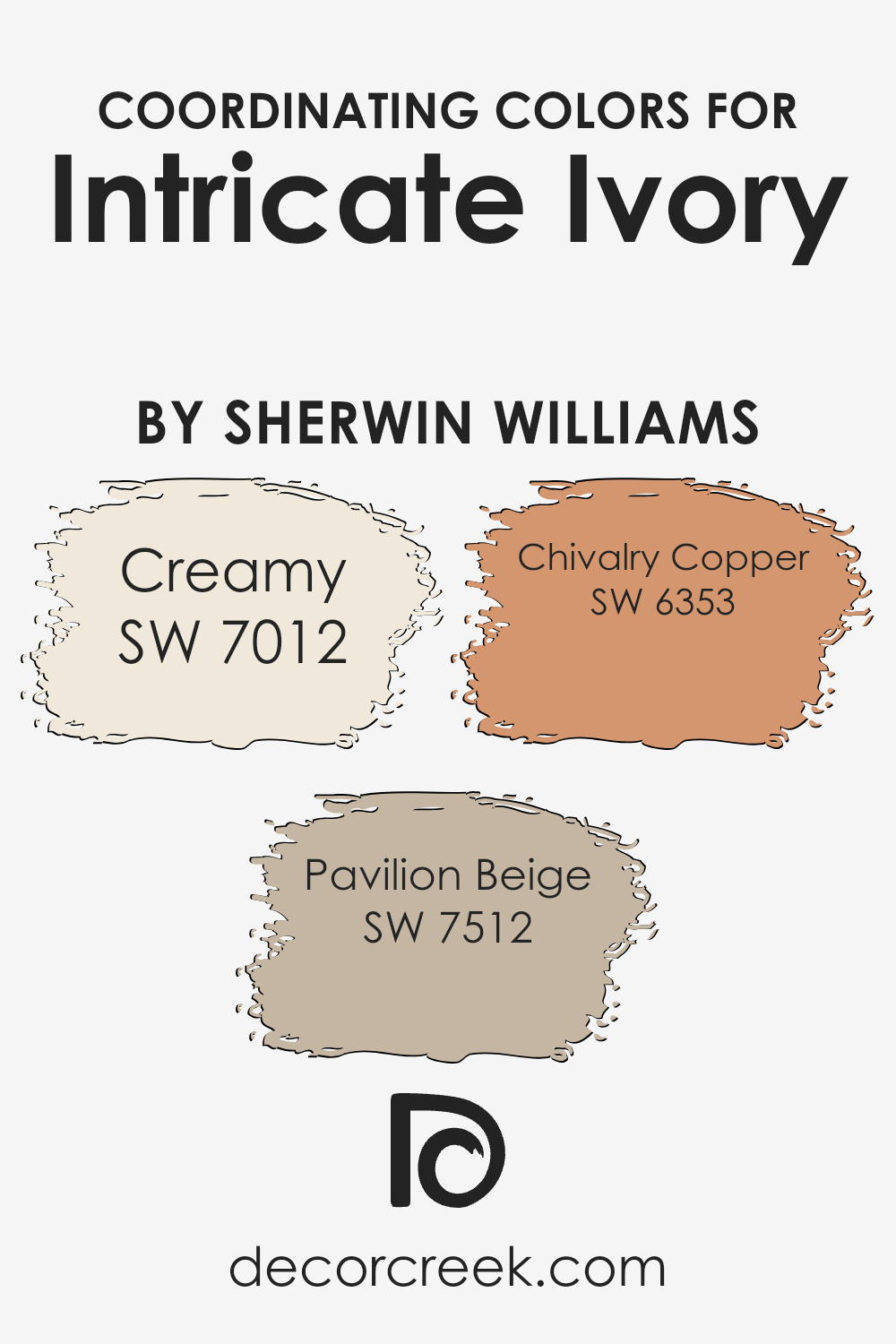
Coordinating Colors of Intricate Ivory SW 6350 by Sherwin Williams
Coordinating colors are hues that work well together, creating harmony and balance in a space. They do not have to match exactly but should complement one another, enhancing the overall look and feel of a room.
When choosing coordinating colors for a particular shade, such as Intricate Ivory by Sherwin Williams, it’s essential to select tones that bring out its subtle qualities without overpowering. For instance, Creamy (SW 7012) is a soft, warm off-white that pairs beautifully with Intricate Ivory. It adds a gentle brightness to any space, making it feel open and inviting.
Another coordinating color, Pavilion Beige (SW 7512), offers a warm, neutral base with its muted earthy tone. It provides a sense of groundedness and matches well with the delicate undertones of Intricate Ivory. For a touch of stronger contrast, Chivalry Copper (SW 6353) can be used.
This rich, earthy color adds depth and interest, creating a cozy and welcoming environment. Together, these colors create a cohesive palette that enhances the beauty of each shade, providing flexibility in design while ensuring the space feels unified and aesthetically pleasing.
You can see recommended paint colors below:
- SW 7012 Creamy
- SW 7512 Pavilion Beige
- SW 6353 Chivalry Copper
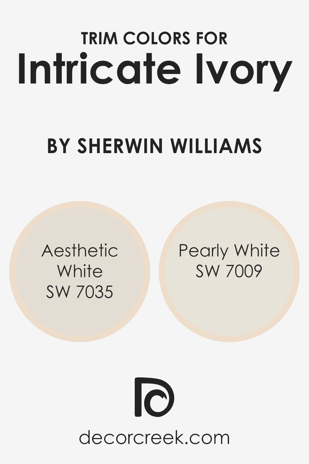
What are the Trim colors of Intricate Ivory SW 6350 by Sherwin Williams?
Trim colors play a crucial role in enhancing and defining the main color of any room, providing contrast and balance to the overall color scheme. For a warm and inviting hue like Intricate Ivory by Sherwin Williams, choosing the right trim colors can make a significant difference in highlighting its rich undertones and elegance. Aesthetic White and Pearly White are excellent trim choices for Intricate Ivory. Aesthetic White (SW 7035) offers a subtle blend of warm and cool tones.
It works well as a trim color by providing a gentle contrast that doesn’t overpower the main color. On the other hand, Pearly White (SW 7009) has a slightly more refined brightness, which pairs beautifully with Intricate Ivory, offering a crisp and clean finish.
Each of these trim colors has unique characteristics that make them suitable as partners for Intricate Ivory. Aesthetic White has a soft warmth that complements the muted yellow undertones of Intricate Ivory, creating an inviting and harmonious space. Its understated nature makes it a versatile choice, able to blend seamlessly without taking the spotlight.
Meanwhile, Pearly White is slightly brighter and can add a refreshing touch, allowing spaces painted with Intricate Ivory to feel light and airy while maintaining a cohesive look. The combination of these trims with Intricate Ivory enhances the overall aesthetic of the room, adding depth and dimension to the interior environment.
You can see recommended paint colors below:
Colors Similar to Intricate Ivory SW 6350 by Sherwin Williams
Colors that are similar to Intricate Ivory have a special way of creating harmony and balance in a space. They offer a gentle transition from one shade to another, making rooms feel cozy and inviting. For example, Eggwhite is a light and warm ivory that adds a touch of softness. Choice Cream is a slightly richer hue, adding depth while maintaining a subtle feel.
Alluring White, as the name suggests, provides a bright and clean appearance, perfect for making spaces feel larger and more open. These colors work beautifully together by providing a range of warm neutrals that blend seamlessly.
Biscuit adds a hint of beige to the mix, offering a more grounded tone, while Champagne brings a soft, almost golden warmth that can brighten any corner. Lotus Pod is a muted beige with a light hint of pink, ideal for adding warmth without overwhelming. Corallite is a slightly more adventurous choice, with a delicate coral undertone that can add a splash of interest.
Fragile Beauty and Bauhaus Buff both offer subtle sandy hues, each with their unique charm, and Warm Beige rounds out the palette with its cozy and inviting tones. Together, these similar colors create a cohesive and balanced look in any space.
You can see recommended paint colors below:
- SW 6364 Eggwhite
- SW 6357 Choice Cream
- SW 6343 Alluring White
- SW 6112 Biscuit
- SW 6644 Champagne
- SW 7572 Lotus Pod
- SW 9698 Corallite
- SW 7553 Fragile Beauty
- SW 7552 Bauhaus Buff
- SW 0035 Warm Beige

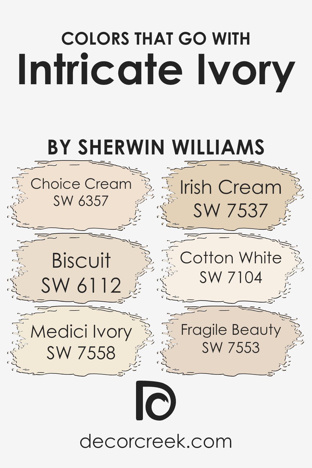
Colors that Go With Intricate Ivory SW 6350 by Sherwin Williams
Colors that go well with Sherwin Williams Intricate Ivory SW 6350 are essential because they create a cohesive and harmonious space. Pairing colors with Intricate Ivory adds depth and character to any room, allowing each shade to complement and enhance the others. SW 6357 – Choice Cream is a gentle, warm yellow that brings a cheerful and welcoming vibe.
It brightens up a room without being overwhelming. SW 6112 – Biscuit offers a soft, beige tone that serves as an excellent neutral base, providing balance and steadiness to your color scheme.
SW 7558 – Medici Ivory introduces a rich, creamy hue that adds a subtle elegance and warmth. It’s perfect for adding a touch of sophistication. On the other hand, SW 7537 – Irish Cream is a medium-toned beige that provides a grounded, comforting feel, ideal for spaces where you want to relax and unwind. SW 7104 – Cotton White is a crisp white with just a hint of warmth, giving you a clean, fresh backdrop that pairs naturally with Intricate Ivory.
Lastly, SW 7553 – Fragile Beauty is a delicate, soft pink that infuses a gentle romantic touch, bringing a subtle yet noticeable charm. These complementary colors work together to create a well-rounded and inviting atmosphere.
You can see recommended paint colors below:
- SW 6357 Choice Cream
- SW 6112 Biscuit
- SW 7558 Medici Ivory
- SW 7537 Irish Cream
- SW 7104 Cotton White
- SW 7553 Fragile Beauty
How to Use Intricate Ivory SW 6350 by Sherwin Williams In Your Home?
Intricate Ivory SW 6350 by Sherwin Williams is a warm and inviting color that can add charm to any room in your home. This gentle ivory hue has a hint of beige, making it a versatile choice that blends nicely with different styles and decor.
It works well as a wall color in living rooms or bedrooms, creating a cozy and comfortable atmosphere. In the kitchen, it can pair beautifully with wooden cabinets or a backsplash to create a welcoming cooking space. For those who prefer neutral tones, Intricate Ivory can serve as a great backdrop that complements bolder colors in furniture or artwork.
It’s also ideal for open spaces, as it can make rooms feel larger and brighter. Whether used on walls, trims, or even cabinetry, this color brings warmth and light into your home without being overpowering, making it an ideal choice for various spaces.
Intricate Ivory SW 6350 by Sherwin Williams vs Warm Beige SW 0035 by Sherwin Williams
Intricate Ivory (SW 6350) and Warm Beige (SW 0035) by Sherwin Williams are both neutral colors, but they offer different vibes for your space. Intricate Ivory is a soft, creamy off-white with a hint of warmth. It provides a light, airy feel, making rooms look bigger and more open. It’s a versatile color that pairs well with many other shades.
On the other hand, Warm Beige is deeper and richer. It has more of a classic beige tone, which can add a cozy and inviting atmosphere to a room. It’s a great choice if you want something warmer than a typical white but still neutral enough to match various decors.
While Intricate Ivory can brighten a space, Warm Beige brings in more warmth and can make a room feel more grounded and comfortable. Both colors can set a calm, soothing ambiance but do so in slightly different ways.
You can see recommended paint color below:
- SW 0035 Warm Beige
Intricate Ivory SW 6350 by Sherwin Williams vs Eggwhite SW 6364 by Sherwin Williams
Intricate Ivory and Eggwhite, both from Sherwin Williams, are soft and neutral colors, but they have some differences.
Intricate Ivory is a warm, creamy beige with a subtle hint of yellow. It’s a versatile color that can create a cozy and inviting atmosphere. It works well in living rooms or bedrooms where a little warmth is desired. The color adds a touch of brightness without being overpowering, making it ideal for both modern and traditional settings.
On the other hand, Eggwhite is a lighter, more neutral shade. It has a subtle creaminess but leans more towards white with just a tiny bit of warmth. Eggwhite is great for spaces that need a clean and fresh look. It can make a room feel larger and is often used in kitchens and bathrooms.
Overall, while both colors are warm and welcoming, Intricate Ivory is richer and more saturated, while Eggwhite offers a lighter, airy feel.
You can see recommended paint color below:
Intricate Ivory SW 6350 by Sherwin Williams vs Corallite SW 9698 by Sherwin Williams
Intricate Ivory (SW 6350) and Corallite (SW 9698) are two distinct shades from Sherwin Williams that offer different vibes. Intricate Ivory is a soft, creamy neutral that adds a warm and inviting feel to any space.
It’s versatile and works well within a variety of styles, providing a subtle backdrop that doesn’t overpower a room. This color is particularly good for creating cozy, soothing environments.
On the other hand, Corallite is a vibrant coral hue that brings energy and life into any area. It’s perfect for making a statement or highlighting an accent wall. This lively color can be playful and is great for spaces that need a pop of excitement or warmth.
Overall, while Intricate Ivory provides a calm and neutral environment, Corallite offers a bold, cheerful splash of color. Used together, they can create a dynamic balance of energy and calmness in a room.
You can see recommended paint color below:
- SW 9698 Corallite
Intricate Ivory SW 6350 by Sherwin Williams vs Biscuit SW 6112 by Sherwin Williams
Intricate Ivory SW 6350 and Biscuit SW 6112 by Sherwin Williams are both warm, neutral tones that can add a sense of calm to any room. Intricate Ivory is a soft, creamy shade with a hint of yellow, giving it a light and airy feel. It’s versatile and works well in both traditional and modern spaces, offering a gentle background that complements other colors.
On the other hand, Biscuit is a deeper, richer shade with beige and tan undertones. This color has more depth and warmth compared to Intricate Ivory, making it ideal for creating a cozy atmosphere. Biscuit can add a touch of earthiness to a space and pairs well with natural materials like wood and stone.
While both colors are soothing and neutral, Intricate Ivory is brighter and more subtle, whereas Biscuit offers a warmer and more grounded look. Both can be used to create inviting spaces but in slightly different ways.
You can see recommended paint color below:
Intricate Ivory SW 6350 by Sherwin Williams vs Bauhaus Buff SW 7552 by Sherwin Williams
Intricate Ivory SW 6350 and Bauhaus Buff SW 7552, both by Sherwin Williams, offer two distinct takes on neutral tones. Intricate Ivory is a soft, creamy off-white with warm undertones. It’s perfect for creating a cozy and welcoming space without being too overpowering. This shade works well as a versatile backdrop, allowing other colors and decor elements to pop.
On the other hand, Bauhaus Buff leans more towards a warm beige. It adds a slight depth with its earthy undertones, making it ideal for spaces where you want a bit more color while still maintaining a neutral palette. This color gives rooms a grounded feel and pairs beautifully with both darker and lighter accents.
Both colors are excellent choices for those wanting a neutral base, but if you want something lighter and brighter, Intricate Ivory is the way to go. For a bit more warmth and depth, Bauhaus Buff is perfect.
You can see recommended paint color below:
Intricate Ivory SW 6350 by Sherwin Williams vs Fragile Beauty SW 7553 by Sherwin Williams
Intricate Ivory SW 6350 and Fragile Beauty SW 7553, both by Sherwin Williams, are soft and gentle colors, each offering a unique ambiance. Intricate Ivory is a warm, creamy beige with subtle yellow undertones. It provides a cozy and inviting feel that works well in various spaces, creating a sense of warmth and comfort. This color pairs nicely with earth tones and soft pastels, making it versatile for many design styles.
Fragile Beauty, on the other hand, is a light, muted pink. It brings a touch of delicate elegance and can add a soft, romantic atmosphere to a room. The pink undertones in Fragile Beauty give it a lighthearted and charming appeal without being overly bold.
When compared, Intricate Ivory leans more towards a neutral warmth, while Fragile Beauty adds a hint of color with its gentle pink hue. Both colors complement each other, offering balance and harmony in a space.
You can see recommended paint color below:
- SW 7553 Fragile Beauty
Intricate Ivory SW 6350 by Sherwin Williams vs Champagne SW 6644 by Sherwin Williams
Intricate Ivory SW 6350 and Champagne SW 6644 by Sherwin Williams are two distinct yet complementary colors. Intricate Ivory is a soft, warm neutral with a slight hint of yellow, making it a cozy and versatile choice. It brings a gentle glow to a room, creating a welcoming atmosphere.
On the other hand, Champagne SW 6644 is a brighter, more cheerful color with noticeable warmth. It carries a peachy undertone, adding a touch of playfulness to a space. This color is lively and can add energy and vibrancy to a room.
When compared, Intricate Ivory is more subdued and calming, perfect for creating a soothing background. Champagne, meanwhile, can act as an accent or focal point, adding brightness and personality. Together, they can create a balanced look, with Intricate Ivory providing subtle elegance and Champagne injecting a fresh, lively vibe into the space.
You can see recommended paint color below:
- SW 6644 Champagne
Intricate Ivory SW 6350 by Sherwin Williams vs Choice Cream SW 6357 by Sherwin Williams
Intricate Ivory SW 6350 and Choice Cream SW 6357 by Sherwin Williams are two warm, neutral colors that can be used to create a soft, inviting space. Intricate Ivory is a light, creamy shade that leans towards a soft beige, making it versatile for various rooms and lighting conditions. It provides a cozy and refined backdrop without being stark.
Choice Cream is slightly warmer and richer than Intricate Ivory. It has a hint more yellow, giving it a gentle, creamy presence. This makes Choice Cream a good option if you want a touch more warmth and depth in a room.
Both colors are suitable for living rooms, bedrooms, and common spaces, as they promote a welcoming atmosphere. Depending on the desired effect, you can use Intricate Ivory for a lighter, more neutral look or Choice Cream for a warmer, more inviting feel. They pair well with various accent colors and furnishings.
You can see recommended paint color below:
Intricate Ivory SW 6350 by Sherwin Williams vs Lotus Pod SW 7572 by Sherwin Williams
Intricate Ivory (SW 6350) by Sherwin Williams is a soft, creamy shade of ivory with warm undertones. It feels light and airy, making it a versatile choice for various spaces. Its subtle warmth creates a welcoming and cozy atmosphere, perfect for living rooms and bedrooms. This color complements a wide range of other hues, allowing it to easily fit into different design styles.
On the other hand, Lotus Pod (SW 7572) is a deeper, earthier shade with a hint of beige. It offers a more grounded look compared to Intricate Ivory. Its natural, organic vibe brings a sense of stability and comfort to a room, making it suitable for areas where a bit more depth and contrast is desired, such as dens or study rooms.
When compared, Intricate Ivory is lighter and more airy, while Lotus Pod gives a room a richer, earthier feel. Both can be used to create warm and inviting spaces, yet their different tones yield distinct moods.
You can see recommended paint color below:
- SW 7572 Lotus Pod
Intricate Ivory SW 6350 by Sherwin Williams vs Alluring White SW 6343 by Sherwin Williams
Intricate Ivory (SW 6350) and Alluring White (SW 6343) by Sherwin Williams are two distinct colors that bring different qualities to a space. Intricate Ivory is a warm, creamy shade with subtle yellow undertones.
It adds a cozy and inviting feel, making it perfect for living areas or bedrooms where comfort is desired. Its warmth can make a room feel brighter and more open, especially when paired with natural light.
On the other hand, Alluring White is a softer and more neutral color. It is a clean, gentle white with very light beige hints. This makes it versatile and easy to match with a wide range of decor styles and color schemes. It’s an excellent choice for creating a fresh and airy atmosphere. While Intricate Ivory is more about warmth and coziness, Alluring White offers a crisp, clean backdrop that can make other colors in the room stand out.
You can see recommended paint color below:
- SW 6343 Alluring White

After writing so much about Intricate Ivory , I feel like I have a good understanding of this paint color. It’s a soft and gentle shade that can make any room feel warm and inviting. When you use Intricate Ivory on your walls, it’s like putting a cozy blanket around your room. This color is friendly and works well in many places around the house, whether it’s a bedroom where you want to relax or a living room where you hang out with family and friends.
What I really like about Intricate Ivory is how it fits with other colors. You can pair it with brighter or darker shades to make your room look stylish without being too bright or too dull. It’s similar to vanilla ice cream that goes perfectly with almost any topping. This paint color makes it easy to change things up in your room without needing to repaint everything.
Overall, Intricate Ivory by Sherwin Williams is a great choice if you’re looking for a paint color that brings a gentle, welcoming feel to your home. It’s like a warm hug from your walls every time you walk into the room. If you want a color that makes your home feel comfy and pleasant, Intricate Ivory is definitely worth considering.
Ever wished paint sampling was as easy as sticking a sticker? Guess what? Now it is! Discover Samplize's unique Peel & Stick samples.
Get paint samples

