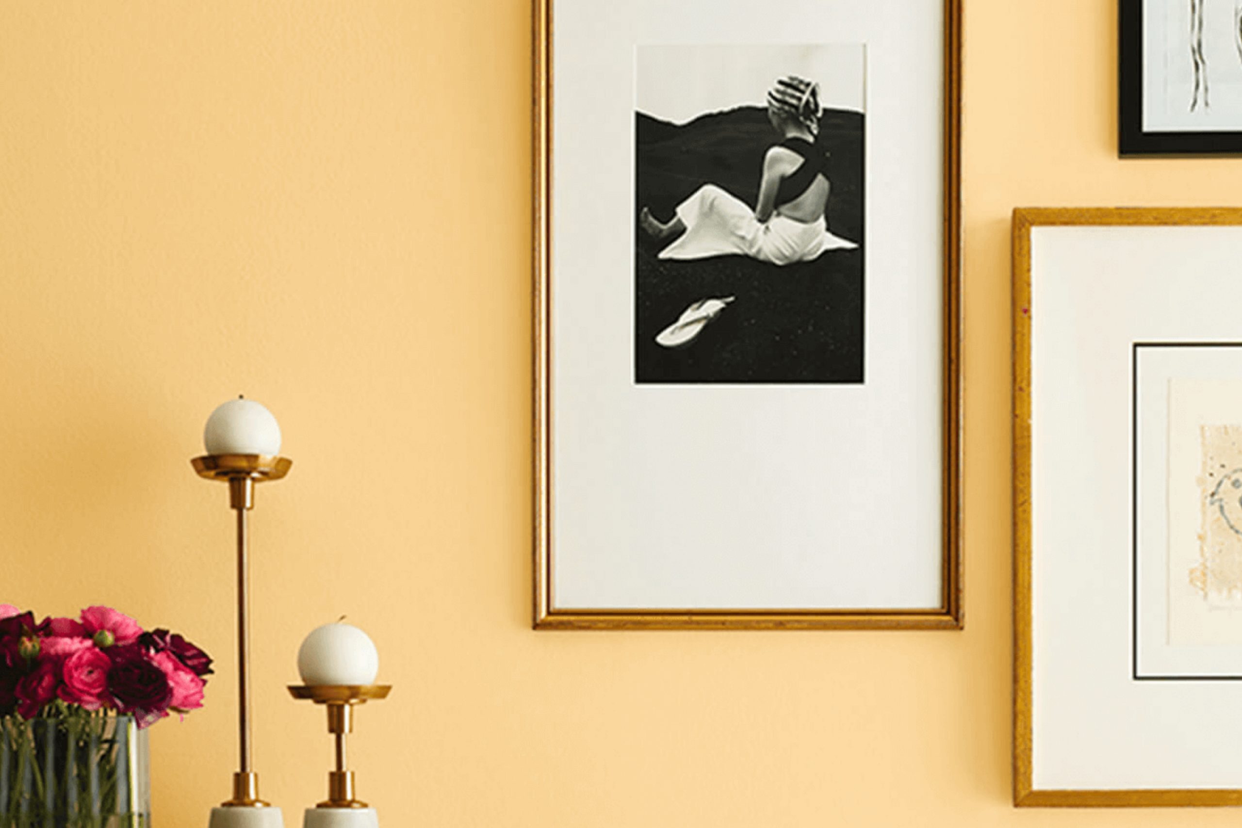
Imagine walking into a room bathed in a gentle, cheerful yellow that instantly lifts your mood. That’s the effect of SW 6674 Jonquil by Sherwin Williams, a paint color that can brighten any room with its soft, sunny hues. If you’re someone who appreciates a touch of brightness without overpowering your senses, Jonquil could be the perfect choice for your next home project. Its subtle warmth makes it ideal for creating a welcoming atmosphere in living rooms, kitchens, or even entryways where first impressions are key.
What sets Jonquil apart is its versatility. Unlike more intense yellows, this shade is mellow enough to blend harmoniously with a wide range of decor styles and color palettes. Whether you’re looking to refresh a single room or reimagine your entire home, Jonquil offers a fresh yet unobtrusive backdrop.
It pairs wonderfully with soft whites and grays for a modern look or can be matched with bold colors like blues and greens for a more dynamic aesthetic. In this piece, I’ll guide you through various applications of Jonquil, illustrating how it can be effectively utilized in different settings to achieve the desired effect.
Whether you’re aiming for a subtle enhancement or a major change, you’ll see how this inviting color transforms rooms with its cheerful yet soothing vibe.
What Color Is Jonquil SW 6674 by Sherwin Williams?
Jonquil by Sherwin Williams is a cheerful and vibrant yellow hue that radiates warmth and brightness. This particular shade is perfect for adding a burst of energy and a welcoming vibe to any room. It has a lively character that works wonderfully in areas meant for interaction, such as living rooms, kitchens, and dining areas.
This sunny color pairs seamlessly with a variety of materials and textures. When combined with natural wood elements, Jonquil brings out the rich, organic qualities of the wood, creating a grounded yet lively atmosphere. It also complements white trim or molding, offering a crisp, clean look that accentuates its vividness.
For a modern twist, pairing Jonquil with metallic accents like brushed nickel or stainless steel can add a hint of sleekness to the rooms. In terms of interior styles, Jonquil is incredibly flexible. It shines in country-style decors where it contributes to a cozy, homey feel by pairing well with rustic elements and soft textiles.
This color also fits into contemporary settings, especially when used as an accent wall or for decorative splashbacks, providing a pop of color among more neutral tones. Additionally, it’s a great choice for eclectic interiors where it can be used along with bold patterns and various textures to create a lively, visually interesting environment.

Is Jonquil SW 6674 by Sherwin Williams Warm or Cool color?
Jonquil SW 6674 by Sherwin Williams is a warm, cheerful yellow paint color, perfect for adding a sunny and welcoming vibe to any room. This shade is like a burst of sunlight, making areas feel inviting and uplifting. When used in a home, Jonquil can help make smaller rooms, like entryways or bathrooms, appear larger and brighter since light colors tend to make areas feel more open.
In areas like the kitchen or living room, this cheerful yellow brings a positive energy that encourages socializing and spending time with family. Also, for those looking to liven up their workspace, Jonquil provides a fresh, energized background that might just inspire creativity and productivity.
When paired with darker furniture or accents, Jonquil still holds its own by balancing warmth with vibrant contrast. It’s also flexible enough to complement natural elements like wooden features or plant life, integrating effortlessly into a cozy, homey aesthetic. Jonquil is truly a flexible color that works beautifully in many different home styles.
Undertones of Jonquil SW 6674 by Sherwin Williams
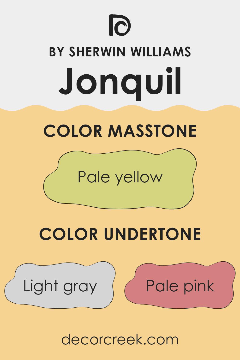
Jonquil is a vibrant color that might seem straightforward at first glance, but it has complex undertones which affect how it appears in different lights and surroundings. The undertones of a color are the subtle hues that mix together to form the main color, impacting its overall appearance. For Jonquil, these undertones include shades of light gray, pale pink, yellow, light purple, mint, orange, light blue, grey, light green, lilac, and olive. Each of these plays a role in how the color is perceived.
Undertones can make a significant difference in how a color looks on your walls depending on the room’s lighting and surrounding colors. For example, in a room with lots of natural light, the yellow and light blue undertones might make Jonquil look brighter and more cheerful. In artificial lighting, the grey or pale pink tones might become more noticeable, giving the room a slightly different feel.
When used on interior walls, Jonquil’s light green or mint undertones can create a fresh and lively atmosphere, making a room feel more spacious and airy. On the other hand, the light purple and lilac undertones might add a subtle hint of warmth and coziness to a room. Choosing furnishings and decorations that either complement or contrast these undertones cleverly can enhance the overall aesthetic of a room. The diversity in undertones allows Jonquil to adapt to various styles and tastes, making it a flexible choice for decorating.
What is the Masstone of the Jonquil SW 6674 by Sherwin Williams?
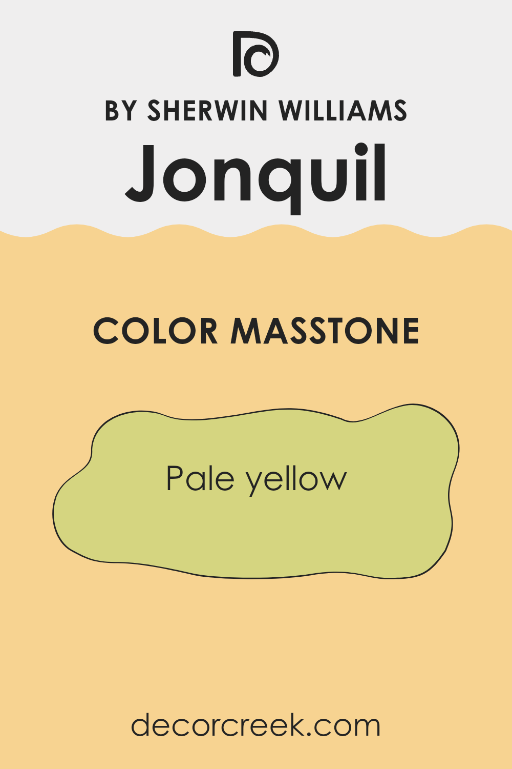
JonquilSW 6674, a pale yellow shade, brings a soft yet cheerful glow to any room. When you paint walls with this color, it creates a cozy and welcoming atmosphere. In natural light, the color brightens, adding a subtle warmth that makes areas feel larger and more open.
It’s a great choice for living rooms or kitchens where you want an uplifting vibe without using a color that’s too bold or overpowering. Since pale yellow is flexible, it pairs nicely with cream, gentle gray, or soft blue accents, letting you decorate with a variety of styles and textures.
The effect is always light and airy, perfect for creating a relaxed setting. It’s especially effective in areas with less natural light, as it helps to reflect light and eliminate shadows, making rooms feel lighter. Overall, this color works well in homes by offering a cheerful but gentle background that can suit many different decors and personal tastes.
How Does Lighting Affect Jonquil SW 6674 by Sherwin Williams?
The effect of lighting on colors is profound, as the type and quality of light can significantly alter the perception of a color. For example, consider the color Jonquil, a soft, warm yellow tone. How this color presents itself can vary drastically under different lighting conditions—be it artificial or natural light—and depending on the orientation of the room.
In artificial light, Jonquil tends to appear warmer and deeper. This is because most artificial lights, especially incandescent bulbs, cast a yellowish tone, enhancing the yellow hues in the paint. This makes the room feel cozy and inviting, especially in the evening.
Natural light, however, has a more complex interaction with Jonquil. Depending on the time of day and the room’s exposure, natural light can make this yellow either bright and cheerful or muted and subdued. In north-faced rooms, which receive less direct sunlight and tend to have cooler light, Jonquil can appear more subdued and softer. It won’t get the full strength of daylight, so the color may seem a bit more muted and gentle.
South-faced rooms get plenty of sunlight throughout the day, bringing out the best in Jonquil. Here, it can really pop and bring a sunny, vibrant energy to the room. The ample light accentuates the richness of the yellow, making the room feel lively and bright.
Rooms facing east bathe in the morning light, making Jonquil look very bright and fresh in the morning, then quieter as the day progresses. This is perfect for areas used mainly in the morning, like kitchens or breakfast nooks.
West-facing rooms receive intense afternoon sunlight, which can make Jonquil look extremely vibrant and sometimes overpowering in the afternoon while becoming warmly welcoming by sunset. Understanding how Jonquil interacts with light in these different settings can help in deciding where to use this color to match the function and feel you’re aiming for in each room.

What is the LRV of Jonquil SW 6674 by Sherwin Williams?
Light Reflectance Value (LRV) measures the percentage of light a paint color reflects. Think of it as a scale that tells you how much light bounces off the color on your walls after shining on them. Colors with higher LRVs reflect more light and generally make a room feel brighter and more open, as they are lighter shades.
On the other hand, colors with lower values reflect less light and are typically darker, giving a room a cozier and more enclosed feeling. This measurement helps in choosing the right paint color for a specific interior based on how bright or dark you want the room to feel.
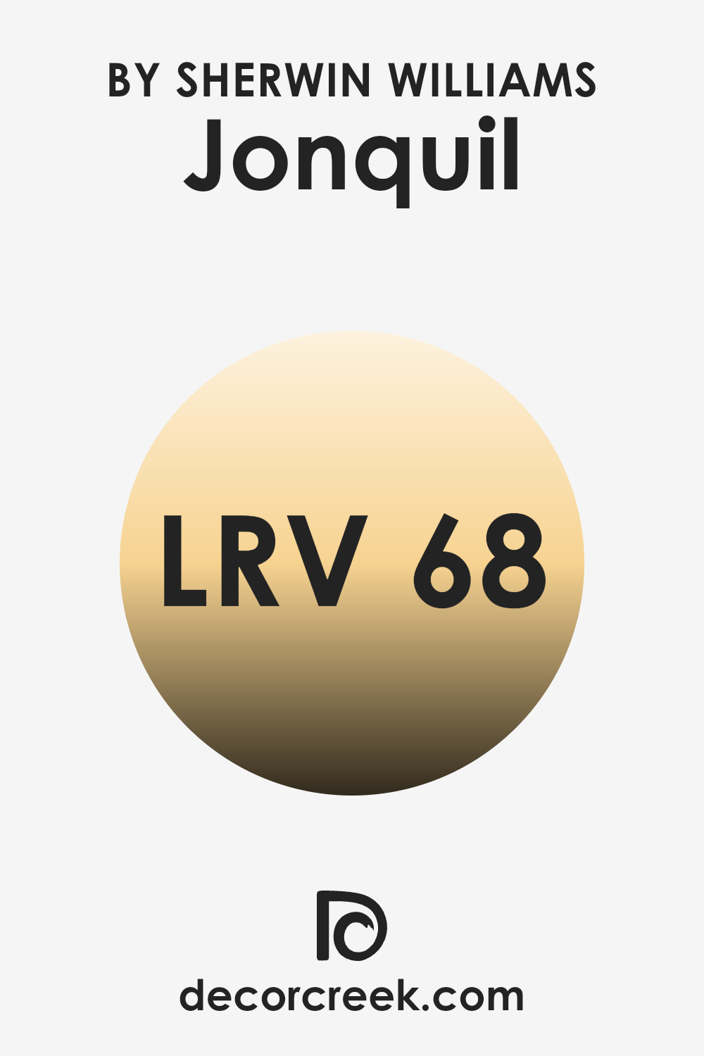
The LRV of Jonquil, which is 68.443, means it’s on the lighter end of the scale. This particular shade of yellow is bright enough to reflect a good amount of light, making rooms appear lively and airy. This quality makes it especially suitable for smaller or darker rooms where you want to create a sense of more area and light. Whether used in a bustling kitchen or a quiet nook, this light and cheerful color can help uplift the mood and perception of the room’s size.
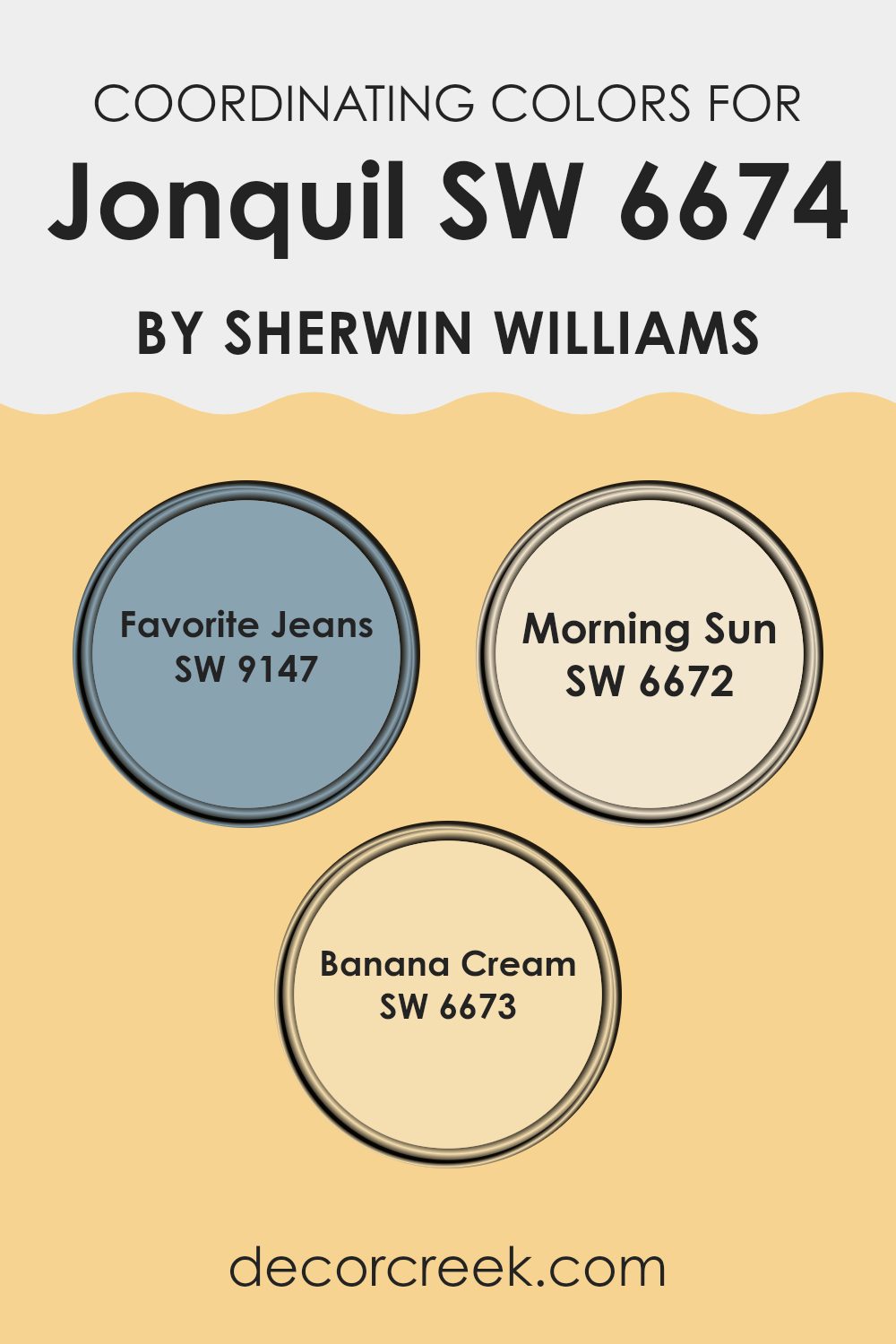
Coordinating Colors of Jonquil SW 6674 by Sherwin Williams
Coordinating colors are those that complement each other when used together in a design or decor scheme, creating a harmonious and pleasing visual experience. Essentially, they are selected from a color palette that ensures they look aesthetically balanced, whether by contrasting shades or enhancing a dominant color. For a bright and cheerful room like one painted in a vibrant shade similar to Jonquil by Sherwin Williams, choosing the right coordinating colors is key to achieving a polished look.
One such coordinating color is SW 9147 – Favorite Jeans, a calm, deep blue that mimics the comforting feel of well-worn denim. It works well to ground lighter, brighter colors, providing a sturdy visual anchor in a room.
Another coordinating shade, SW 6672 – Morning Sun, offers a soft, pale yellow that echoes the gentle warmth of early sunlight. It pairs beautifully with vibrant yellows, adding subtle variety without overpowering with brightness.
Finally, SW 6673 – Banana Cream, is a light tone that is delightfully creamy and smooth. It adds a gentle contrast when used alongside more saturated yellows, ensuring the room feels balanced and inviting, not overly stimulating. Together, these coordinating colors support and enhance each other to create a cohesive look.
You can see recommended paint colors below:
- SW 9147 Favorite Jeans
- SW 6672 Morning Sun
- SW 6673 Banana Cream
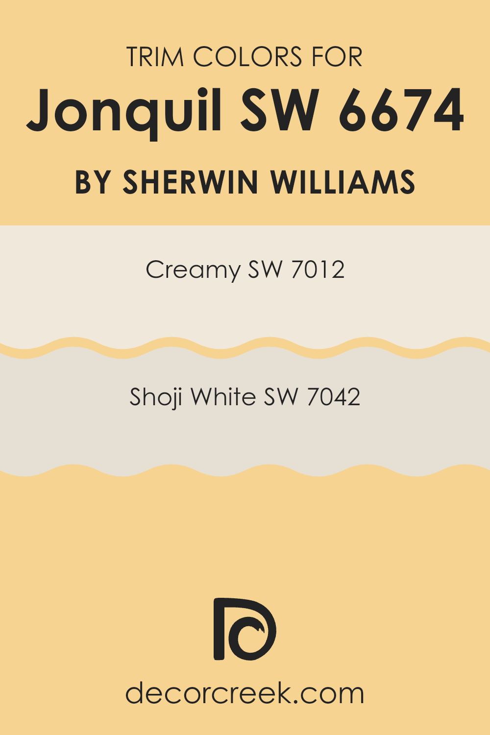
What are the Trim colors of Jonquil SW 6674 by Sherwin Williams?
Trim colors are specific hues used to accentuate or complement the main colors on walls, doors, and other surfaces, serving as a contrast that defines and finishes the look of a room. By using trim colors like SW 7012 – Creamy and SW 7042 – Shoji White with JonquilSW 6674 by Sherwin Williams, you can create a clean and pleasant visual flow.
These trim colors highlight the brighter, lively nature of JonquilSW 6674, providing a frame that makes the wall color stand out more prominently. The subtle variation between these neutral trim colors and Jonquil can make the room feel cohesive and well-thought-out.
SW 7012 – Creamy is a soft, warm white that has a comforting and welcoming appeal, making it an ideal choice for creating a gentle yet effective contrast with brighter and more vibrant wall colors. SW 7042 – Shoji White, on the other hand, offers a slightly cooler, muted white tone that pairs beautifully with vivid colors, ensuring that the wall color pops without overpowering the senses. Both colors add a polished finish to the aesthetic of a room, allowing for a professional and inviting atmosphere.
You can see recommended paint colors below:
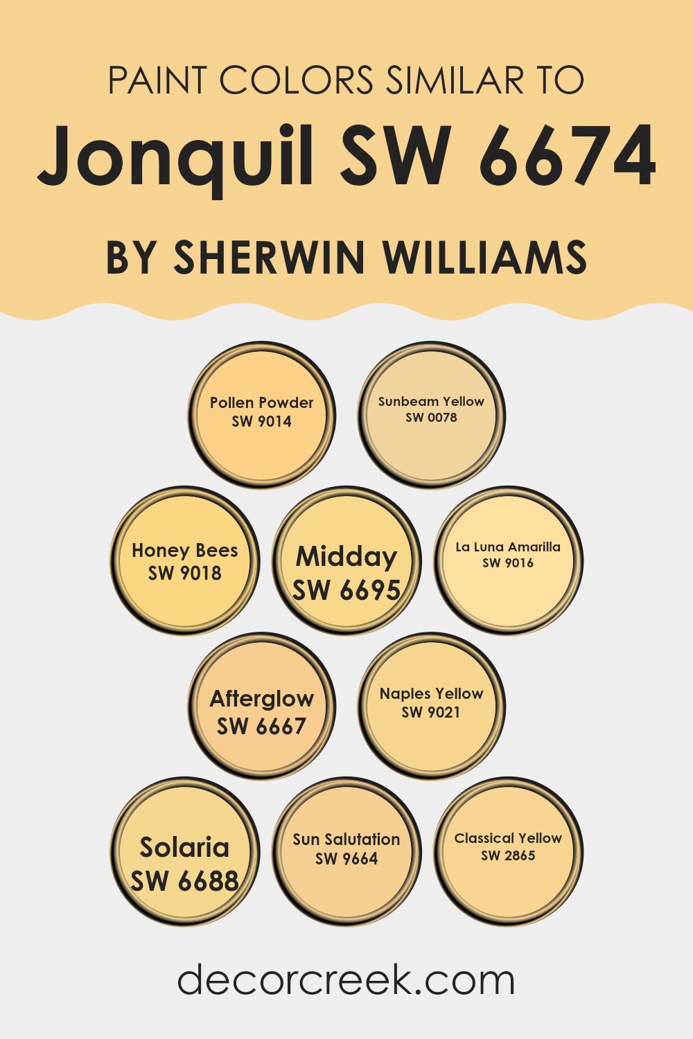
Colors Similar to Jonquil SW 6674 by Sherwin Williams
Similar colors play a significant role in creating harmonious and aesthetically pleasing visual experiences. They provide a cohesive look by blending seamlessly into each other, enhancing the overall ambiance of a room. When using colors like SW 9014 – Pollen Powder and SW 0078 – Sunbeam Yellow, which are close to Jonquil, the continuity in tone can make a room feel more expansive and cohesive.
Moreover, neighboring shades like SW 9018 – Honey Bees and SW 6695 – Midday enrich environments through subtle variations, preventing visual monotony while preserving a unified color theme. These subtle shifts in color, seen in shades like SW 9016 – La Luna Amarilla and SW 6667 – Afterglow, help in creating depth and interest, making areas more engaging.
Similarly, SW 9021 – Naples Yellow and SW 6688 – Solaria introduce slight variations that can highlight architectural features or furnishings without overpowering the senses. Adding colors like SW 9664 – Sun Salutation or SW 2865 – Classical Yellow allows for gentle contrasts and soft transitions, crafting rooms that are pleasing to the eye and easy to live with. Overall, these similar colors work together to enhance the visual flow and create a cohesive and inviting atmosphere.
You can see recommended paint colors below:
- SW 9014 Pollen Powder
- SW 0078 Sunbeam Yellow
- SW 9018 Honey Bees
- SW 6695 Midday
- SW 9016 La Luna Amarilla
- SW 6667 Afterglow
- SW 9021 Naples Yellow
- SW 6688 Solaria
- SW 9664 Sun Salutation
- SW 2865 Classical Yellow
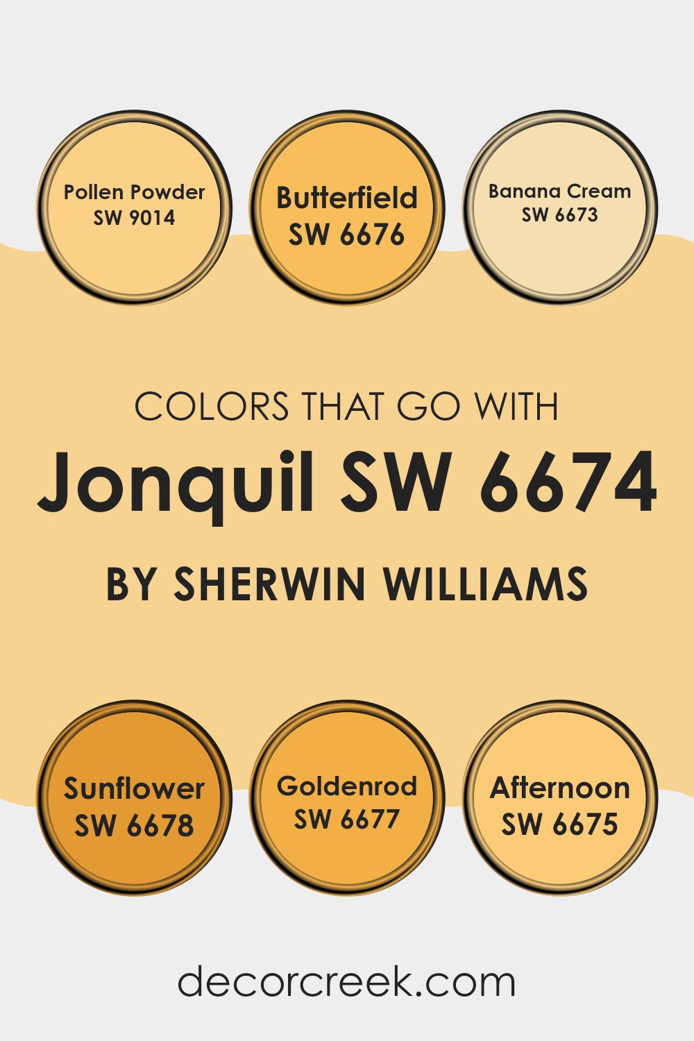
Colors that Go With Jonquil SW 6674 by Sherwin Williams
Understanding the significance of complementary colors to Jonquil SW 6674 by Sherwin Williams can enhance any interior decorating plan. These colors help create a harmonious balance, set the right mood in a room, and accentuate the beauty of the main color.
For example, matching Jonquil SW 6674 with colors like Pollen Powder or Butterfield provides a subtle contrast that can make each color pop without overpowering the senses. This kind of coordination ensures that the colors don’t clash but rather support and enrich the overall aesthetic of a room.
Pollen Powder is a mellow yellow that brings a soft glow to areas, making it ideal for creating a light and airy feel. Butterfield, slightly richer, offers a touch of depth, great for highlighting areas or as a standout feature wall.
Banana Cream, with its creamy hue, complements Jonquil to add a sense of warmth, ideal for cozy, welcoming environments. Sunflower, as lively and bright as its name suggests, injects vivacity into rooms that need a cheerful touch.
Goldenrod, a little deeper and more pronounced, is perfect for areas that require a bit more drama without overdoing it. Lastly, Afternoon is a thoughtful shade of yellow that is both soothing and refreshing, suitable for areas where calm and concentration are needed. Together, these colors work with Jonquil to create diverse yet unified rooms where each element is accentuated beautifully.
You can see recommended paint colors below:
- SW 9014 Pollen Powder
- SW 6676 Butterfield
- SW 6673 Banana Cream
- SW 6678 Sunflower
- SW 6677 Goldenrod
- SW 6675 Afternoon
How to Use Jonquil SW 6674 by Sherwin Williams In Your Home?
Jonquil SW 6674 by Sherwin Williams is a vibrant, cheerful yellow paint that brings a sense of happiness and energy to any room. This shade is perfect for adding a burst of sunshine to rooms that need a little extra brightness, like kitchens, bathrooms, or entryways. Because of its warm and inviting nature, Jonquil can make small areas feel more open and welcoming.
When using Jonquil in your home, consider pairing it with neutral colors like white, gray, or beige. This helps balance its brightness while maintaining a fresh and clean look. For those who love a bit of contrast, this yellow also works well with navy blue or rich green, which can add a dynamic flair to the decor.
Additionally, Jonquil is ideal for accent walls. Painting one wall in this cheerful yellow provides a focal point without overpowering the room. It’s also a great choice for furniture pieces or doors if you’re interested in adding a playful splash of color without committing to painting a whole room.
Jonquil SW 6674 by Sherwin Williams vs Pollen Powder SW 9014 by Sherwin Williams
Jonquil and Pollen Powder are both colors by Sherwin Williams, but they have distinct tones. Jonquil is a vibrant, cheerful yellow that brings to mind the brightness of a sunny day. It’s bold and can instantly make a room feel more lively and energetic.
On the other hand, Pollen Powder is a softer yellow. It has a more subtle and muted hue, creating a gentle and soothing atmosphere. This color is great for someone looking to add a touch of warmth without overpowering a room with too much brightness.
While Jonquil is more striking, Pollen Powder offers a quiet warmth, making it ideal for relaxed and calm environments. Both colors can brighten up a room, but the choice between them depends on how soft or bold you want the feeling to be.
You can see recommended paint color below:
Jonquil SW 6674 by Sherwin Williams vs Classical Yellow SW 2865 by Sherwin Williams
The main color, Jonquil, and the second color, Classical Yellow, both offer a bright palette, but with distinct tones and moods. Jonquil is a soft, creamy yellow that provides a gentle and soothing feel to a room, making it ideal for creating a cozy and inviting atmosphere. Its subtle warmth works well in areas like living rooms or bedrooms where a calm and peaceful environment is desired.
On the other hand, Classical Yellow has a more vibrant, traditional yellow shade that stands out more boldly. This color is perfect for areas where you want to inject energy and excitement, such as kitchens or playrooms. The brightness of Classical Yellow can make a small room feel larger and more open, bringing a cheerful vibe to the setting.
Both colors reflect light well, adding a sense of brightness to any room but in different ways. While Jonquil offers a muted glow, Classical Yellow brings a lively punch, each creating its own unique aesthetic.
You can see recommended paint color below:
- SW 2865 Classical Yellow
Jonquil SW 6674 by Sherwin Williams vs Afterglow SW 6667 by Sherwin Williams
Jonquil and Afterglow, both from Sherwin Williams, vary significantly in their color tones. Jonquil is a bright, sunny yellow that brings a cheerful vibrancy to any room. It’s like the color of daffodils in spring, ideal for energizing a room or adding a pop of brightness.
In contrast, Afterglow is a softer, more muted yellow with a gentle, warm undertone. This color is closer to a pale mustard, offering a cozy and inviting feel, suitable for creating a relaxing environment in areas like living rooms or bedrooms.
While Jonquil stands out and demands attention, Afterglow works well as a subtle backdrop that complements other decor elements. Each color has its unique appeal and can dramatically alter the mood of a room depending on its use.
You can see recommended paint color below:
Jonquil SW 6674 by Sherwin Williams vs Sunbeam Yellow SW 0078 by Sherwin Williams
Jonquil by Sherwin Williams is a soft, muted yellow with a touch of creaminess. This color has a gentle brightness that can make small areas look larger and more open without being too vivid or overpowering. It provides a warm ambiance to any room, making it feel cozy and welcoming.
On the other hand, Sunbeam Yellow by Sherwin Williams is a much brighter, more intense hue of yellow. It has a vibrant, sunny quality that brings a lot of energy to a room. This shade is more striking and can instantly brighten up a room, making a bold statement.
Both colors belong to the yellow family but serve different purposes based on their intensity and tone. Jonquil is better suited for those looking for a subtle, calm feel, while Sunbeam Yellow is ideal for areas that benefit from a lively, cheerful splash of color.
You can see recommended paint color below:
- SW 0078 Sunbeam Yellow
Jonquil SW 6674 by Sherwin Williams vs La Luna Amarilla SW 9016 by Sherwin Williams
The main color, Jonquil, and the second color, La Luna Amarilla, both by Sherwin Williams, present nuanced differences in their yellow hues. Jonquil is a vibrant, lemony shade that brings a bright and cheerful energy to any room. This color tends to stand out and is capable of making a room feel lively and sunny, even on dull days.
On the other hand, La Luna Amarilla leans towards a softer, mustard yellow. It offers a more muted tone that can create a warm, cozy atmosphere. This color is great for areas where you want to achieve a subtle yet inviting feel without the intensity of a brighter yellow.
Both colors add warmth to a room but in distinct ways. Jonquil might be better suited for a lively area like a kitchen or a children’s playroom, while La Luna Amarilla could be perfect for a calm living room or a study where a gentle ambiance is preferred. Together, these shades provide options for different tastes and rooms, allowing you to match the mood you wish to foster in each room.
You can see recommended paint color below:
- SW 9016 La Luna Amarilla
Jonquil SW 6674 by Sherwin Williams vs Midday SW 6695 by Sherwin Williams
The main color, Jonquil, is a bright and sunny yellow that feels cheerful and lively. It can brighten up any room, giving it a fresh and welcoming feel. This hue is particularly good for kitchens, sunrooms, and even living areas where you want to add a splash of optimism.
On the other hand, Midday is also a yellow shade but with a slightly richer intensity. This color has more depth than Jonquil, resembling the vivid yellow of a sunny midday. Midday suits rooms where you want a bold, happy appearance but with a hint of richness, like dining areas or entryways.
Overall, both Jonquil and Midday offer warmth and brightness, with Jonquil leaning towards a light, airy feel, and Midday giving a deep, sun-drenched look. Each has its unique appeal depending on the vibe you’re going for in your room.
You can see recommended paint color below:
- SW 6695 Midday

Jonquil SW 6674 by Sherwin Williams vs Naples Yellow SW 9021 by Sherwin Williams
Jonquil and Naples Yellow are both colors by Sherwin Williams that offer a sunny, cheerful vibe, but they have some distinct differences. Jonquil is a bright, vivid yellow. It has a strong presence and can add a lively splash of energy to a room. This makes it a great choice for areas that need a touch of brightness.
On the other hand, Naples Yellow is softer and more muted. It’s closer to a pastel, providing a more subtle and soothing effect compared to Jonquil. This color works well in areas where you want a gentle hint of color without overpowering the room.
Both colors can make rooms feel more open and airy, but Jonquil tends to draw more attention due to its brighter tone. Naples Yellow, with its softer hue, is excellent for creating a calm and inviting environment. Depending on the mood you want to set and how bold you want the room to feel, you might choose one over the other. They both bring warmth, but the intensity of their impact differs.
You can see recommended paint color below:
- SW 9021 Naples Yellow
Jonquil SW 6674 by Sherwin Williams vs Honey Bees SW 9018 by Sherwin Williams
The main color, Jonquil, is a vibrant yellow with a zesty, energizing quality, very reminiscent of springtime daffodils. It’s bright and eye-catching, often used in areas where you want to add a cheerful touch or visually make an area feel more open and lively. This color can work well in kitchens or kids’ rooms, where a fresh, happy atmosphere is usually welcomed.
On the other hand, Honey Bees, the second color, is a softer, more subdued yellow. This shade leans closer to a pastel, giving off a gentle and warm feel. It’s ideal for creating a cozy, welcoming room. Think of it being used in living rooms or bedrooms where a calming influence is desired without completely sacrificing brightness.
When comparing Jonquil and Honey Bees, Jonquil stands out with its boldness and brightness, while Honey Bees offers a softer, comforting presence. Each serves different moods and settings, depending on what feeling you want to achieve in a room.
You can see recommended paint color below:
- SW 9018 Honey Bees

Jonquil SW 6674 by Sherwin Williams vs Sun Salutation SW 9664 by Sherwin Williams
Jonquil SW 6674 and Sun Salutation SW 9664 are two appealing colors from Sherwin Williams, each embodying a cheerful spirit. Jonquil SW 6674 is a soft, soothing yellow with a gentle brightness that can make areas feel welcoming and cozy. It’s a flexible hue that works well in kitchens, living rooms, or bedrooms, lending a friendly, light-hearted vibe wherever used.
On the other hand, Sun Salutation SW 9664 is a bolder, more dynamic yellow. It has a stronger, more vivid presence that can instantly cheer up a room and make a statement. Ideal for accent walls or decor pieces, it stands out and can bring energy to an area that feels too dull.
Both colors infuse warmth into interiors but in distinct ways. Jonquil is subtler and blends smoothly with other colors, while Sun Salutation grabs more attention, making it great for those who love a bit of extra brightness.
You can see recommended paint color below:
- SW 9664 Sun Salutation
Jonquil SW 6674 by Sherwin Williams vs Solaria SW 6688 by Sherwin Williams
Jonquil and Solaria by Sherwin Williams are two distinct colors that serve very different visual moods and atmospheres. Jonquil is a soft, creamy, light yellow, offering a subtle and gentle backdrop for any room. It mimics the pale shade of early spring flowers, bringing a sense of calm brightness into a room without being overpowering. This color works well in areas meant to feel cozy and inviting.
On the other hand, Solaria stands out with its vibrant, energetic shade of yellow. It is much bolder and brighter, immediately drawing the eye and enlivening a room. This color is perfect for areas where you want to make a statement or add a burst of cheerfulness. Solaria can effectively lighten up dark areas or add excitement to a decorative accent.
Both colors have their unique appeals and can dramatically alter the feel of a room depending on what atmosphere you desire. Whether you lean towards the quiet subtlety of Jonquil or the lively boldness of Solaria, each offers a compelling choice for decorating with yellow.
You can see recommended paint color below:
- SW 6688 Solaria
After reading about SW 6674 Jonquil by Sherwin Williams, I’ve learned a lot about this pretty paint color. Jonquil is a soft yellow that makes any room feel happy and bright, like a sunny day. It’s great for kids’ rooms because it’s cheerful, or for places like living rooms where you want a cozy, welcoming vibe.
What’s interesting about Jonquil is how it can make different parts of your home look fresh and lively without being too bold or too bright. It works well with lots of other colors, so it’s easy to use when decorating. Whether you want to paint a whole room with it or just add a splash of color here and there, Jonquil can do the job nicely.
To sum it up, Jonquil by Sherwin Williams is a wonderful choice if you are looking to brighten up your home in a subtle and lovely way. It’s easy to see why this color is popular; it brings a warm, sunny touch wherever you use it, making any room more pleasant to be in.
Plus, it’s a fun color that adds just the right amount of cheeriness without being too flashy.

Ever wished paint sampling was as easy as sticking a sticker? Guess what? Now it is! Discover Samplize's unique Peel & Stick samples.
Get paint samples

