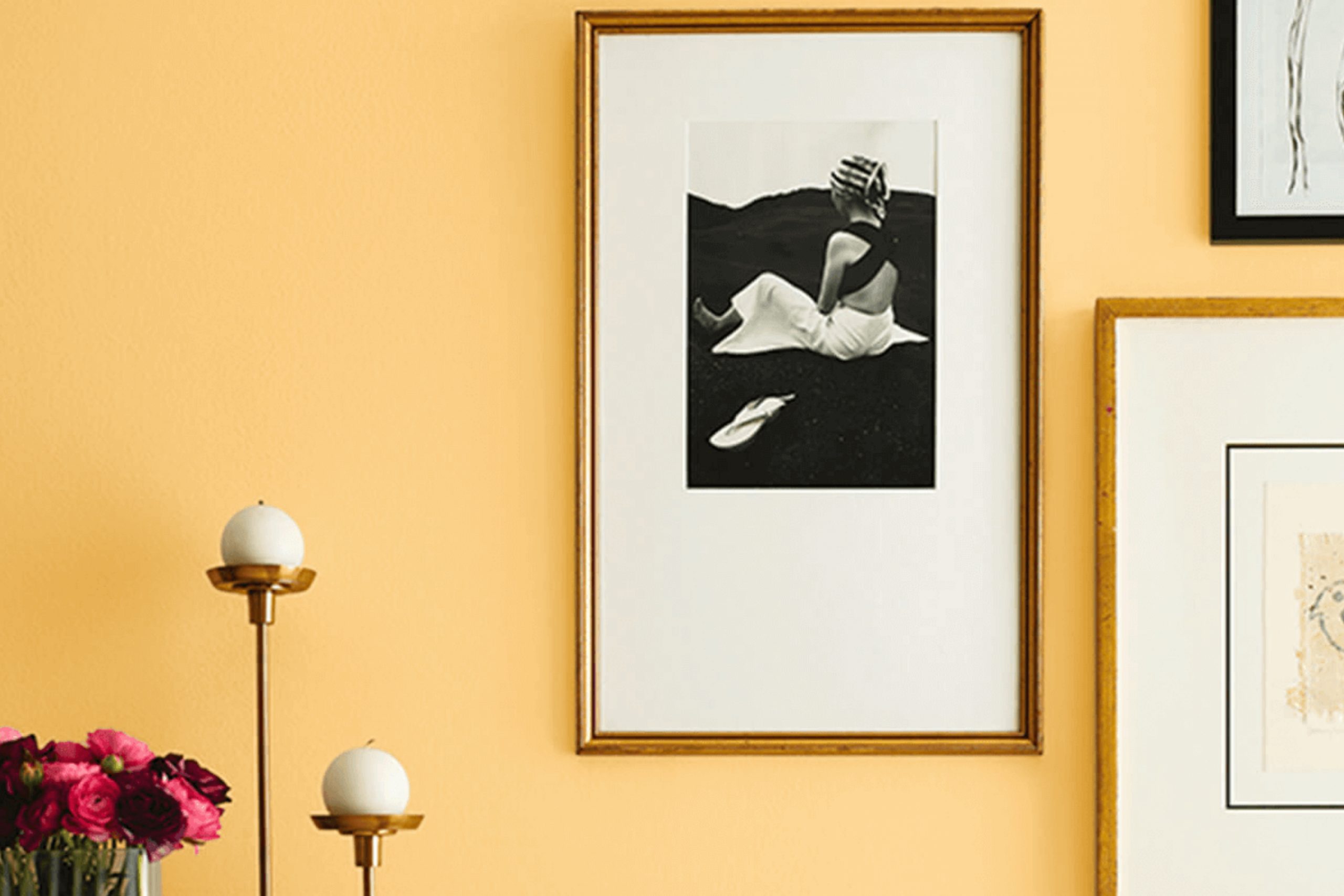
As you begin your journey into the world of interior design, consider the subtle yet impactful shade of SW 9014 Pollen Powder by Sherwin Williams. Imagine this soft, gentle color gracing the walls of your favorite room, bringing with it a sense of calm and serenity. Pollen Powder is a pale, muted yellow that captures the feeling of a sunlit afternoon, offering your space a touch of warmth without overwhelming brightness.
This color is versatile, blending beautifully with various décor styles, from modern to rustic. Whether you’re freshening up a living room, bedroom, or even a kitchen, Pollen Powder provides a neutral backdrop that enhances natural light and complements wood finishes, metals, and natural fibers.
Its understated elegance encourages creativity, allowing you to pair it with bolder colors or keep things monochromatic for a more soothing atmosphere. Utilizing Pollen Powder can also help in creating an illusion of space, making smaller rooms appear larger and more inviting.
If you’re looking for a color that offers tranquility without being too stark or cold, this might be the perfect choice for your next decorating project.
What Color Is Pollen Powder SW 9014 by Sherwin Williams?
Pollen Powder by Sherwin Williams is a warm, inviting yellow shade that lightens up any room with its cheerful presence. This soft hue has a subtle vibrancy that isn’t overwhelming, making it perfect for spaces where you want to add a touch of brightness without dominating the overall color scheme.
Pollen Powder works beautifully in interior styles that lean towards casual, cozy aesthetics such as rustic, cottage, and modern farmhouse designs. Its sunny nature brings a sense of freshness and light that complements natural materials like wood, wicker, and linen. In spaces with exposed beams or wooden floors, this color adds a delightful contrast, highlighting the earthy tones of the wood.
This color also pairs well with soft textures, enhancing the cozy feeling of a room. Think fluffy wool throws, cotton curtains, or a plush area rug. For a harmonious look, combine it with neutral tones like soft whites or greys, or for a more dynamic palette, pair it with blues or greens, which balance the warmth of Pollen Powder nicely.
Ideal for living spaces, kitchens, or bedrooms, this color ensures a welcoming atmosphere, making any room feel sunnier and more inviting.
Is Pollen Powder SW 9014 by Sherwin Williams Warm or Cool color?
Pollen Powder by Sherwin Williams is a warm and gentle yellow paint color that brings brightness and cheer to any room in a home. This shade is perfect for creating a cozy and welcoming atmosphere, making it ideal for living areas, kitchens, or even a nursery. Its softness ensures that it isn’t overwhelming, but rather gives a subtle uplift to spaces that might otherwise feel dull.
When used in small rooms, Pollen Powder can make the space appear larger and more open because of its light-reflecting qualities. For larger areas, this color adds a touch of warmth to make the room feel more inviting.
This particular shade of yellow works well with whites and grays, providing a fresh and clean look, while also pairing nicely with blues and greens for a nature-inspired palette. Applying Pollen Powder to your home can enhance natural light, especially if the room has windows facing sunlight. This makes it an excellent choice for a lively, cheerful home environment where relaxation and positivity are priorities.
Undertones of Pollen Powder SW 9014 by Sherwin Williams
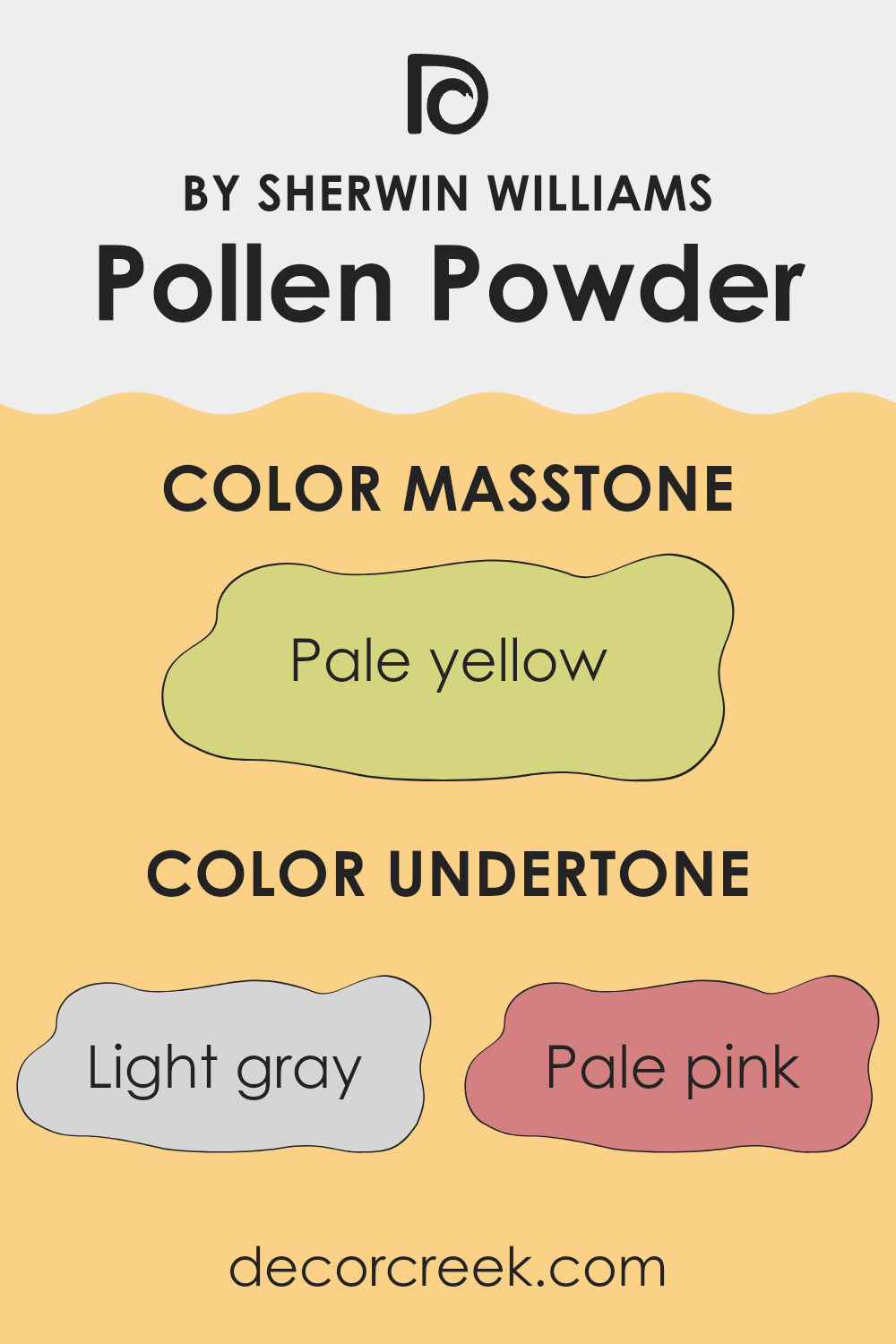
Pollen Powder is a dynamic paint color that contains a mix of undertones which influence how it appears on your walls. These undertones can subtly affect the mood and feel of a room, as well as how the color coordinates with other decor elements.
Undertones are secondary colors that lurk beneath the surface of the main color. For instance, in the case of Pollen Powder, this variety includes colors like light gray, pale pink, yellow, and more. The undertones are not always obvious at first glance but can make a significant difference in how the color looks under different lighting conditions.
The light gray undertone adds a soft, neutral background, making the color adaptable in various settings. The hint of pale pink brings a touch of warmth, creating a welcoming atmosphere. Yellow undertones keep the color bright and cheerful, perfect for spaces needing a lift.
In an interior setting, these undertones work together to give the walls a lively yet balanced look. For example, in natural light, Pollen Powder may appear more vibrant due to its yellow and light green undertones. In artificial lighting, the cooler undertones like light gray and light purple might become more pronounced, giving the room a more subdued feel.
Understanding these undertones can help in choosing decor and furnishings that complement the wall color and achieve the desired ambiance in the room.
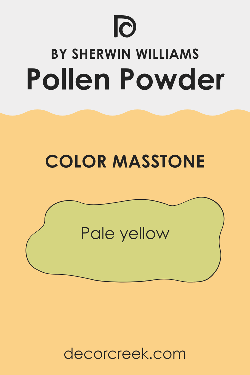
What is the Masstone of the Pollen Powder SW 9014 by Sherwin Williams?
Pollen Powder, with its masstone of pale yellow, is a soft and gentle color that brings a light and airy feel to any room. This shade, with its hint of freshness, is especially great for smaller spaces that benefit from colors that make the room seem larger.
It has a cheerful vibe without being too bold, making it easy to pair with various decor styles. Whether used on a feature wall or throughout a space, this pale yellow invites a sense of calm and happiness, perfect for living areas or kitchens where you want to create a welcoming atmosphere.
Moreover, this color is versatile; it works equally well in a modern setting as it does in a more traditional one. By reflecting natural light, Pollen Powder helps enhance the space it inhabits, making interiors feel more open and vibrant.
How Does Lighting Affect Pollen Powder SW 9014 by Sherwin Williams?
Lighting plays a crucial role in how we perceive colors. The same color can appear different under various lighting conditions due to the color temperature of the light source and the way objects absorb or reflect these light rays.
Let’s consider the color Pollen Powder by Sherwin Williams, a soft, warm hue. Under artificial light, such as incandescent bulbs that emit a warm glow, Pollen Powder tends to look more vibrant and cozy because warm lights enhance yellow and orange tones. In LED or fluorescent lights, which can have cooler tones, this color might look slightly muted, losing some of its warmth and appearing more subdued.
In natural light, Pollen Powder changes appearance throughout the day depending on the light’s angle and intensity. Morning light in east-facing rooms tends to be cooler, making Pollen Powder appear gentle and soft. As the sun rises and the light becomes brighter and warmer, the color gains a cheerful brightness, especially in south-facing rooms where sunlight is most direct – ideal for spaces intended to feel sunny and lively.
In north-facing rooms, which receive less direct sunlight and more indirect natural light, Pollen Powder might appear more consistent throughout the day but can seem a bit paler and less dynamic. This is because the cooler, softer northern light doesn’t enhance the warmer undertones of the color.
West-facing rooms present a unique situation where the color Pollen Powder can show a dramatic change. It starts off cooler in the morning and progressively warms up. By evening, as the setting sun casts a warm, reddish light, the color can look very warm and cozy, perfect for living spaces used more often in the evening.Overall, the perception of Pollen Powder adjusts significantly with different light sources and directions, affecting the mood and character of any room.
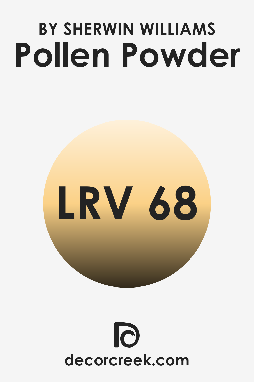
What is the LRV of Pollen Powder SW 9014 by Sherwin Williams?
LRV stands for Light Reflectance Value, which is a measurement used to indicate how much light a paint color reflects or absorbs once it’s applied to a wall. A higher LRV means the color will reflect more light, making it appear brighter in a room. Conversely, a lower LRV indicates that the color absorbs more light and will look darker.
This scale is really helpful when choosing paint colors for your spaces, considering how much natural or artificial light your room receives. Brightly lit rooms can handle colors with lower LRVs without feeling too dark, and dimly lit rooms might benefit from higher LRVs to keep them from feeling too closed in.
The LRV of the color in question, 67.776, suggests that it is quite reflective, helping to brighten spaces where it is used. This level means the paint will reflect a fair amount of light, making the room feel more illuminated even if it doesn’t have a lot of natural light coming in.
This particular shade is great for smaller, darker rooms or any area where you want to enhance the sense of space and light. Its reflective quality can make walls seem more lively and can also minimize the need for additional lighting, potentially reducing energy consumption. This balance makes it a versatile choice for many different types of spaces.
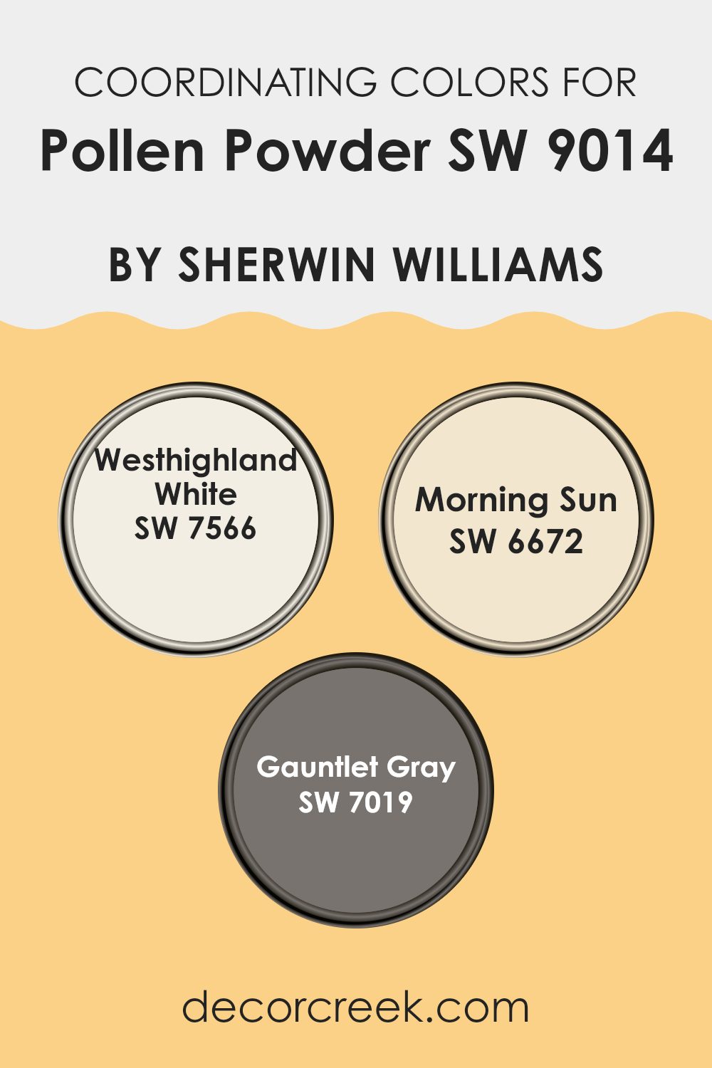
Coordinating Colors of Pollen Powder SW 9014 by Sherwin Williams
Coordinating colors are selected shades that harmonetically complement a main color, enhancing the overall aesthetic of a space. For example, using Pollen Powder as a primary color offers a warm and inviting base that can be beautifully accompanied by shades like Westhighland White, Morning Sun, and Gauntlet Gray. These coordinating colors provide balance, contrast, and diversity to design schemes, making them more dynamic and visually appealing.
Westhighland White is a clean and gentle white, offering a fresh and airy feel that can lighten and balance the depth of bolder colors. It acts as a versatile backdrop that can tie diverse elements together.
Morning Sun is a vibrant and cheerful yellow, infusing spaces with a sense of energy and brightness that pairs well with the softness of Pollen Powder for a sunny, uplifting effect. Gauntlet Gray, being a robust, deep gray, offers a strong contrast to the gentler tones of Pollen Powder, creating a grounded, modern look that can give a room a striking depth and focus. Each of these colors supports the others, allowing for a complete and well-rounded color scheme.
You can see recommended paint colors below:
- SW 7566 Westhighland White
- SW 6672 Morning Sun
- SW 7019 Gauntlet Gray
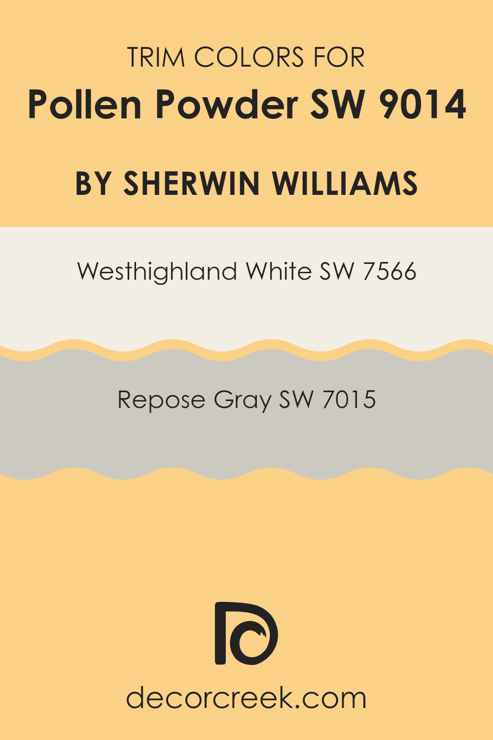
What are the Trim colors of Pollen Powder SW 9014 by Sherwin Williams?
Trim colors are specific shades used to paint the architectural details such as door frames, window frames, skirtings, and moldings of a room or exterior. Choosing the right trim color can greatly enhance the visual appeal and cohesiveness of a space.
For Pollen Powder by Sherwin Williams, which is a vibrant and lively color, trim colors like Westhighland White and Repose Gray are ideal as they provide a balanced contrast. Westhighland White is a bright, clean white. It offers a crisp border that can help make the sunny tones of Pollen Powder pop, giving a fresh and inviting look to any room.
On the other hand, Repose Gray is a subtle, warm gray that brings a soothing balance to the brightness of Pollen Powder, adding a touch of refinement without overwhelming the space. These colors not only complement Pollen Powder but also add a sense of structure and finish to the overall aesthetic.
You can see recommended paint colors below:
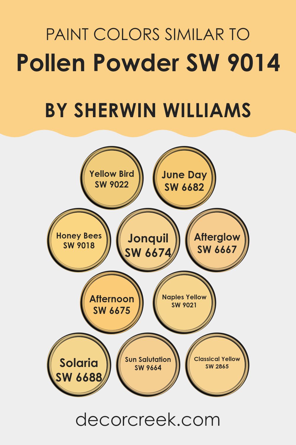
Colors Similar to Pollen Powder SW 9014 by Sherwin Williams
Choosing similar colors, such as those akin to Pollen Powder SW 9014 by Sherwin Williams, can greatly enhance the aesthetic unity and harmony in a design. When colors like Yellow Bird SW 9022 or June Day SW 6682 are used together, they provide a seamless flow from one space to another, creating a cohesive look that feels intentional and comforting. These variations of yellow range from the lightness of Honey Bees SW 9018, which offers a mellow, buttery warmth, to the vibrant zest of Afterglow SW 6667, which infuses spaces with a lively, sunny vibe.
Furthermore, colors like Jonquil SW 6674 and Afternoon SW 6675 introduce subtly different tones that can help define areas within a space while maintaining visual continuity. For a touch of softness, Naples Yellow SW 9021 gives a more subdued and gentle feel, whereas Solaria SW 6688 radiates energy and brightness, perfect for areas needing a lift.
Additionally, Sun Salutation SW 9664 and Classical Yellow SW 2865 provide depth and richness, creating focal points without overwhelming the essential character of the Pollen Powder’s cheerful hue. Using these similar colors not only simplifies color matching but also enriches the environment, making it feel more connected and aesthetically pleasing.
You can see recommended paint colors below:
- SW 9022 Yellow Bird
- SW 6682 June Day
- SW 9018 Honey Bees
- SW 6674 Jonquil
- SW 6667 Afterglow
- SW 6675 Afternoon
- SW 9021 Naples Yellow
- SW 6688 Solaria
- SW 9664 Sun Salutation
- SW 2865 Classical Yellow
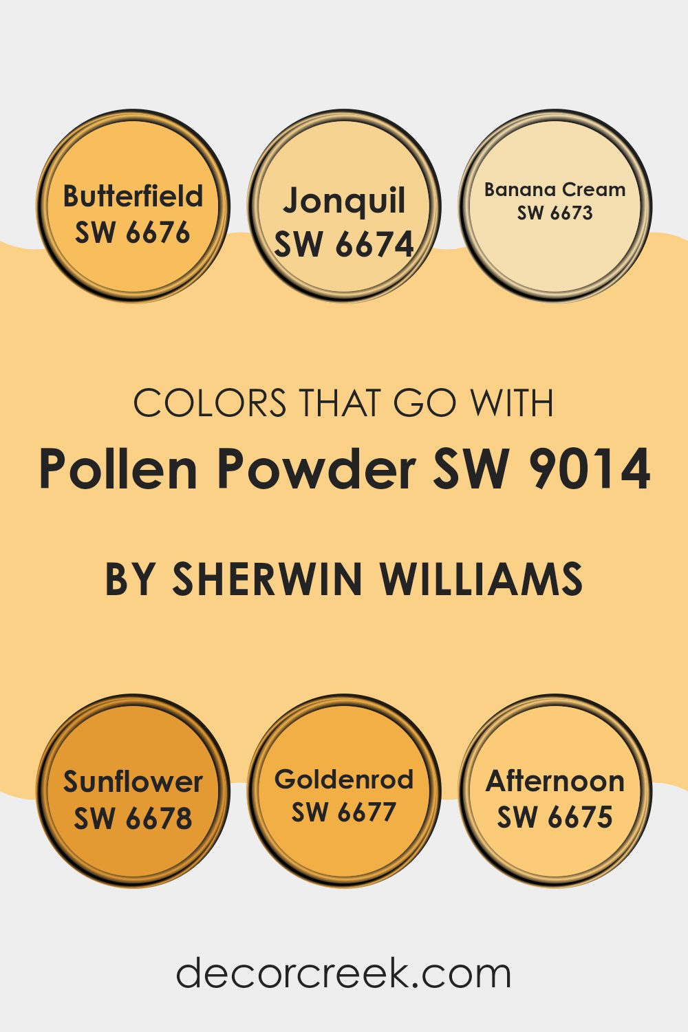
Colors that Go With Pollen Powder SW 9014 by Sherwin Williams
Choosing the right colors to complement Pollen Powder SW 9014 by Sherwin Williams is crucial for creating a harmonious and appealing space. Colors like SW 6676 – Butterfield, SW 6674 – Jonquil, SW 6673 – Banana Cream, SW 6678 – Sunflower, SW 6677 – Goldenrod, and SW 6675 – Afternoon all work well with Pollen Powder due to their warm undertones, which help in achieving a balanced and inviting atmosphere. These colors are from a similar palette, featuring cheerful and bright tones that are perfect for spaces where you want to add a touch of coziness and sunshine.
Butterfield is a rich yellow that brings a cozy, warm feeling to the room, reminding one of buttery warmth. Jonquil, slightly paler, offers a soft, light yellow hue that feels like early spring sunshine, ideal for creating a fresh look.
Banana Cream, with its creamy, light yellow tone, provides a subtle brightness, perfect for a more subdued or smaller space. Sunflower is bold and vibrant, just like the flower it is named after, perfect for making a statement or accentuating a focal point in a room.
Goldenrod is a deep, warm yellow, great for adding depth and warmth, while Afternoon has a muted, earthy yellow tone, suitable for more relaxed and cozy settings. Selecting any of these colors to go with Pollen Powder can help achieve a cohesive look that is both warm and welcoming.
You can see recommended paint colors below:
- SW 6676 Butterfield
- SW 6674 Jonquil
- SW 6673 Banana Cream
- SW 6678 Sunflower
- SW 6677 Goldenrod
- SW 6675 Afternoon
How to Use Pollen Powder SW 9014 by Sherwin Williams In Your Home?
Pollen Powder SW 9014 by Sherwin Williams is a soft, warm yellow paint color that easily adds a cheerful touch to any room. Ideal for spaces where you want to create a welcoming and bright atmosphere, this color works beautifully in kitchens or sunrooms where natural light can enhance its sunny tone. It’s also a great choice for children’s rooms or creative spaces, as it adds a playful and energetic vibe without being too overwhelming.
If you’re looking to refresh your living area, using Pollen Powder on an accent wall can add a light splash of color that pairs well with neutral tones like grays and whites. This will keep your space feeling open and airy. For a more uniform look, consider painting all the walls in a small bathroom or hallway with Pollen Powder to make the area appear larger and more inviting.
In addition to its aesthetic appeal, Pollen Powder is also practical. Its light-reflecting properties can help to brighten rooms that don’t get a lot of sunlight, making it a smart choice for darker spaces. Use it with simple decor and natural materials to create a fresh and pleasant home environment.
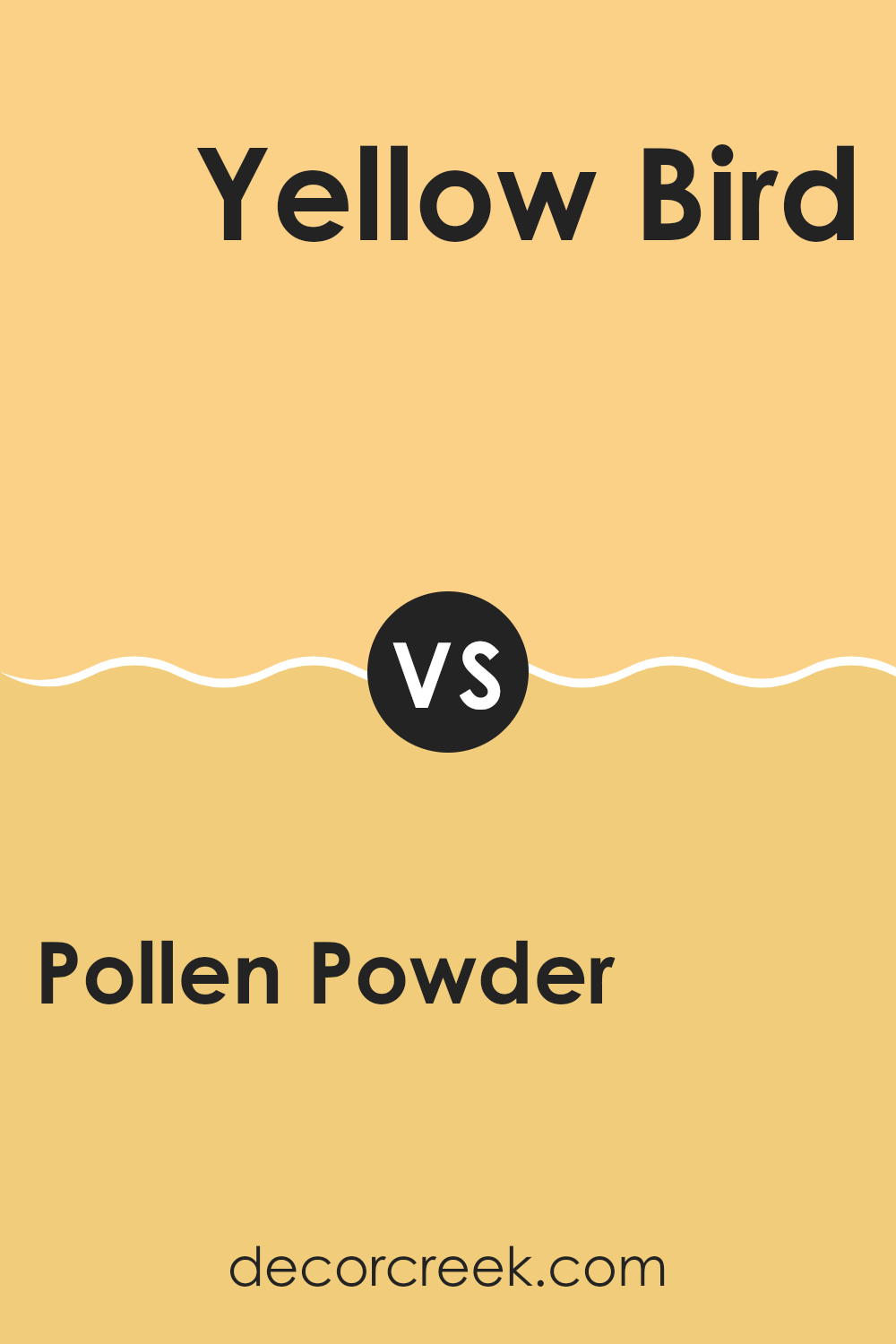
Pollen Powder SW 9014 by Sherwin Williams vs Yellow Bird SW 9022 by Sherwin Williams
Pollen Powder and Yellow Bird, both by Sherwin Williams, are two distinct shades of yellow that offer different vibes for any space. Pollen Powder is a muted, soft yellow that gives a calm, gentle feel.
It’s a versatile choice that works well in rooms where you want a touch of brightness without overwhelming the senses. On the other hand, Yellow Bird is a more vibrant, cheerful yellow. It stands out more and brings a lively, energizing atmosphere to a space.
This makes it a great option for areas where you want to add a sense of joy and activity. Both colors can brighten up a room, but the choice between them depends on how subtle or bold you want to go with the yellow in your décor.
You can see recommended paint color below:
- SW 9022 Yellow Bird
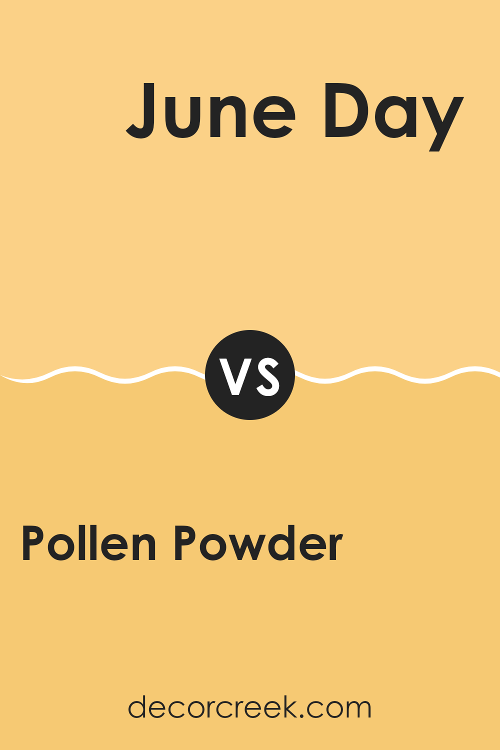
Pollen Powder SW 9014 by Sherwin Williams vs June Day SW 6682 by Sherwin Williams
The color Pollen Powder is a soft, muted yellow with a cozy, warm feeling, perfect for creating a gentle and welcoming atmosphere in any room. It’s understated and tends to blend seamlessly into spaces that aim for a subtle yet cheerful vibe.
On the other hand, June Day is a brighter, more vibrant yellow. This color stands out more and can add a lively burst of energy to your environment. It works well in areas that benefit from a sunny, energizing feel, such as kitchens or playrooms.
While Pollen Powder leans towards a softer, toned-down hue, June Day is all about making a bold statement with its brightness. Choosing between the two depends on the mood you want to set and how much you want the color to pop in your space.
You can see recommended paint color below:
- SW 6682 June Day
Pollen Powder SW 9014 by Sherwin Williams vs Naples Yellow SW 9021 by Sherwin Williams
Pollen Powder and Naples Yellow, both from Sherwin Williams, present subtle yet distinct differences in their appearance and potential uses. Pollen Powder is a gentle, muted yellow with a soothing quality that doesn’t overpower. It’s perfect for creating a calm, welcoming atmosphere in spaces like living rooms and bedrooms. Its understated tone pairs well with soft whites or light grays for a cohesive look.
On the other hand, Naples Yellow is a richer, more pronounced shade. This color has a more vivid presence, making it a good choice for areas where you might want a more cheerful, lively vibe, such as kitchens or dining areas. It can effectively brighten a space and works well with darker greens or blues to balance its brightness.
Both colors bring warmth to interiors but do so in their unique ways. Pollen Powder offers a more reserved charm, whereas Naples Yellow provides a bold burst of energy.
You can see recommended paint color below:
- SW 9021 Naples Yellow
Pollen Powder SW 9014 by Sherwin Williams vs Solaria SW 6688 by Sherwin Williams
Pollen Powder and Solaria by Sherwin Williams are two strikingly different shades. Pollen Powder is a soft, yellow hue that brings a gentle warmth to any space, making it feel welcoming and cozy. It’s a subtle color that works well in sunny rooms, creating a bright and cheerful environment.
On the other hand, Solaria is a bold, vibrant yellow that packs a punch. This color is much more intense and can make a strong statement in a space. It’s great for areas where you want to inject energy and excitement, such as a playroom or a kitchen accent wall.
While Pollen Powder is more muted and can blend easily with other colors, Solaria stands out and demands attention. Both colors can brighten up a room, but the choice between them depends on how much you want the color to take center stage.
You can see recommended paint color below:
- SW 6688 Solaria
Pollen Powder SW 9014 by Sherwin Williams vs Jonquil SW 6674 by Sherwin Williams
Pollen Powder and Jonquil are two distinct shades offered by Sherwin Williams. Pollen Powder is a soft, muted yellow with a subtle creamy feel, making it perfect for creating a cozy and inviting atmosphere in any room. It has a gentle brightness, which pairs well with neutral and earthy tones, providing a refreshing yet understated backdrop.
On the other hand, Jonquil is a more vibrant and clear yellow. This color is bolder and brighter, capable of energizing a space and drawing more attention. It suits areas that benefit from a lively vibe, such as kitchens or playrooms, where its cheerful hue can stimulate activity and happiness.
Both colors bring warmth to interiors, but while Pollen Powder offers a low-key charm, Jonquil stands out with its lively zest. Choosing between them depends on the desired impact—calm and soothing with Pollen Powder or bright and cheerful with Jonquil.
You can see recommended paint color below:
- SW 6674 Jonquil
Pollen Powder SW 9014 by Sherwin Williams vs Afternoon SW 6675 by Sherwin Williams
Pollen Powder is a soft, pale yellow that exudes a gentle warmth and brings a light, airy feel to any space. It reflects a lot of natural light, making small rooms appear more spacious and welcoming. This color works well in kitchens or living rooms where a subtle cheerfulness is desired.
On the other hand, Afternoon is a vibrant, sunny yellow. It’s much bolder and brighter than Pollen Powder, creating a strong visual impact. Afternoon can energize a room and is a great choice for areas where you want to add a punch of color to uplift the mood, such as a playroom or an entryway.
Both colors convey a sense of happiness and warmth, but Pollen Powder is more subdued, making it versatile for larger areas or entire rooms, whereas Afternoon, with its richer intensity, is better for accent walls or smaller decorative elements to draw the eye without overwhelming.
You can see recommended paint color below:
- SW 6675 Afternoon
Pollen Powder SW 9014 by Sherwin Williams vs Sun Salutation SW 9664 by Sherwin Williams
Pollen Powder and Sun Salutation are two interesting colors by Sherwin Williams that exhibit vibrant, sunny qualities. Pollen Powder is a soft, muted yellow with a touch of creaminess, making it gentle and soothing to the eye.
It is versatile, fitting well in spaces meant for relaxation or gentle activity. On the other hand, Sun Salutation is a bolder, more vivid yellow. It has an energizing effect and is more striking, which makes it suitable for areas where you want to inject vibrancy and cheerfulness.
Both colors bring warmth to any room, but Pollen Powder does so in a more understated manner compared to the brighter and more dynamic Sun Salutation. Choosing between them depends on the type of mood you want to set: a peaceful, calm feel with Pollen Powder or a more lively, upbeat atmosphere with Sun Salutation.
You can see recommended paint color below:
- SW 9664 Sun Salutation
Pollen Powder SW 9014 by Sherwin Williams vs Afterglow SW 6667 by Sherwin Williams
Pollen Powder by Sherwin Williams is a soft, gentle yellow shade that brings a light and airy feel to any space. It’s like having a hint of sunshine indoors, making it perfect for creating a bright and welcoming atmosphere. This color works well in spaces aimed at relaxation and happiness, such as kitchens and living rooms.
Afterglow by Sherwin Williams is a deeper, richer yellow. It carries more warmth and intensity compared to Pollen Powder, offering an energetic vibe. It’s a color that makes a statement and can add a sense of cheer and vibrancy to a room. This makes Afterglow great for areas where you want to inject personality and a bit of fun.
Both colors are from Sherwin Williams and they share the same base of yellow, but they serve different purposes due to their varying intensities. Pollen Powder is subtler and fits well in soft, light designs, while Afterglow is bolder and suitable for spaces that want to stand out.
You can see recommended paint color below:
Pollen Powder SW 9014 by Sherwin Williams vs Honey Bees SW 9018 by Sherwin Williams
Pollen Powder and Honey Bees are two inviting paint colors from Sherwin Williams. Pollen Powder is a soft, muted yellow that brings a gentle burst of brightness to any room. It leans towards a creamy side, making it easy to blend with other colors and decor styles. This color works well in spaces aiming for a light, airy feel.
On the other hand, Honey Bees has a richer, deeper yellow tone. This color adds a bit more warmth and cheerfulness to spaces than Pollen Powder, reminiscent of the sunny color of actual honey. It’s an excellent choice for areas where you want to create a cozy, welcoming atmosphere.
Both colors are great for adding a touch of warmth but in slightly different ways. Pollen Powder is subtler, while Honey Bees stands out more prominently. Depending on the mood you want to set and how bold you want to go with color, either could be a perfect choice.
You can see recommended paint color below:
- SW 9018 Honey Bees
Pollen Powder SW 9014 by Sherwin Williams vs Classical Yellow SW 2865 by Sherwin Williams
Pollen Powder and Classical Yellow are two distinct color choices from Sherwin Williams, each bringing its unique vibe to a space. Pollen Powder is a soft, mild yellow that offers a subtle hint of warmth, making it perfect for creating a light and airy feel in any room without being too bright or overpowering. It’s ideal for spaces where you want a touch of warmth but a calm and gentle ambiance.
On the other hand, Classical Yellow is a more vibrant and full-bodied shade. This color is a classic, cheerful yellow that radiates brightness and energy, making it a great choice for areas where you want to inject a lively, welcoming feel. It’s particularly well-suited to spaces that benefit from a splash of sunshine, such as kitchens or playrooms.
In essence, while Pollen Powder provides a gentle, understated warmth, Classical Yellow offers a bolder, more energetic approach. Each has its place depending on the atmosphere you’re aiming to achieve.
You can see recommended paint color below:
- SW 2865 Classical Yellow
Conclusion
If you’re thinking about painting your bedroom, play area, or even the living room, this color can make the place look sunny even on a rainy day. It’s a good type of yellow because it’s soft and not too flashy, which means it will look good with many other colors like white, blue, or green.
Settings like hospitals or schools could benefit from using a color like Pollen Powder because it’s soothing and can make people feel more relaxed. It’s interesting how a color can change the way a room feels, and Pollen Powder does a great job of making spaces feel welcoming.
So, if you or your mom and dad are thinking about adding a fresh coat of paint to any room, Pollen Powder is worth considering because of its warm and gentle color that makes any room feel like a sunny day.
Ever wished paint sampling was as easy as sticking a sticker? Guess what? Now it is! Discover Samplize's unique Peel & Stick samples.
Get paint samples

