If you’re interested in a fresh, lively color to spruce up your space, SW 6467 Kendal Green by Sherwin Williams might just be what you need. With its vibrant yet soothing hue, Kendal Green adds a touch of nature’s serenity to any room.
This color combines the tranquil essence of a lush forest with a modern flair, making it versatile for both traditional and contemporary spaces. Whether you’re looking to refresh your living room, bedroom, or even your kitchen, this shade provides a unique balance of warmth and energy.
As you decide on your next home improvement project, consider how Kendal Green can breathe new life into your surroundings. It harmonizes beautifully with natural elements and light-colored decor, enhancing the overall feel of size and brightness in a room.
Imagine how this color could transform your living environment into a more inviting and lively space.
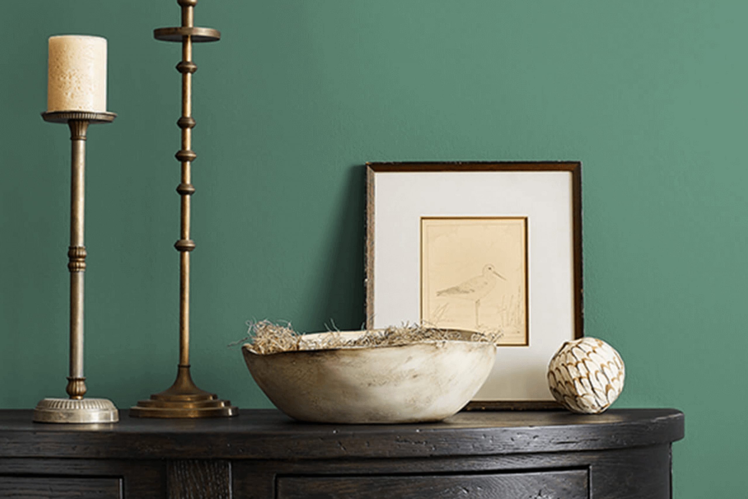
What Color Is Kendal Green SW 6467 by Sherwin Williams?
Kendal Green by Sherwin Williams is a striking shade of deep, lush green that radiates an earthy and vibrant vibe. This color has a rich intensity that makes it a great choice for creating a statement in any room. Its deep tones are reminiscent of a forest canopy, providing a natural and refreshing feeling.
This versatile hue works wonderfully in a variety of interior design styles. It’s particularly stunning in rustic themed spaces where its natural elements are complemented by rough, organic textures like wood and stone. Kendal Green is also a fantastic choice for modern and contemporary interiors where bold colors are used to create a dynamic and stylish ambiance.
In terms of pairing with materials and textures, Kendal Green goes well with a wide array. It looks exceptional with natural wood, whether it’s a dark walnut to enrich the boldness of the green or a lighter oak to contrast and brighten the space. Metals like brass or copper can add a touch of glamour to the bold green, while leather accents and furnishings bring warmth and richness to the environment.
Whether you’re looking to outfit a cozy study, design a standout feature wall in a living room, or give some character to a kitchen, Kendal Green is a strong, adaptable choice that pulls natural beauty into any space.

Is Kendal Green SW 6467 by Sherwin Williams Warm or Cool color?
Kendal Green SW 6467 by Sherwin Williams is a rich and inviting shade of green that brings a fresh, natural feel to any room in a home. This particular color draws its inspiration from the lush greenery found in nature, which can help bring an element of the outdoors into your living space.
It works well in various areas of a home, including kitchens, living rooms, and bedrooms, providing a vibrant yet harmonious backdrop. Kendal Green has a unique ability to pair well with both light and dark colors, making it versatile for interior decorating.
For instance, when paired with light wood furniture and white trim, it can make a room feel more open and airy. On the other hand, using it with darker furniture and accents can create a more grounded and cozy atmosphere. Its adaptability makes it suitable for many different styles and tastes, whether you’re going for a modern, minimalistic look or a more traditional feel.
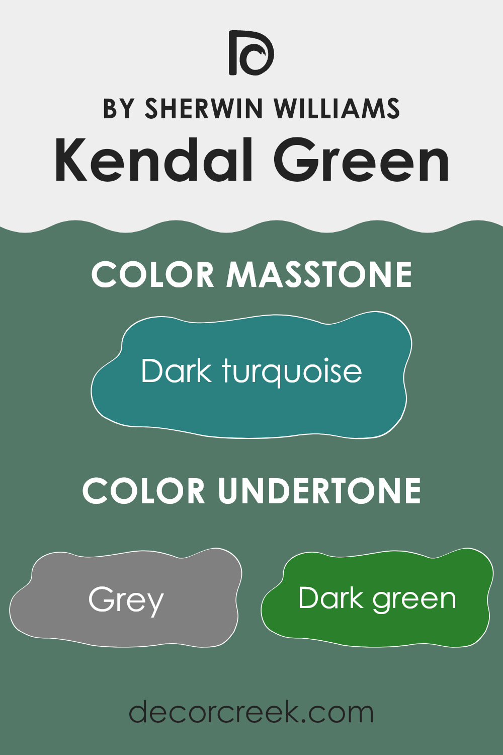
Undertones of Kendal Green SW 6467 by Sherwin Williams
Kendal Green is a unique color that can appear differently under various lighting conditions due to its complex undertones. Undertones are the colors hidden beneath the surface of the paint that influence its overall hue. For Kendal Green, these undertones include a range of colors such as grey, dark green, olive, and navy, among others.
When you paint a wall with Kendal Green, these undertones can subtly affect the perception of the space. For example, in a room with a lot of natural light, the light turquoise and mint undertones might make the wall appear brighter and more vibrant. However, in a room with less light, the darker tones like dark green and navy might be more prominent, giving the room a more enclosed feel.
Different lighting conditions can highlight different undertones, causing the color to shift throughout the day. The grey and dark grey undertones can help balance the color, preventing it from becoming too overpowering and maintaining a neutral feel that complements various decor styles and colors.
In interior design, understanding these undertones can help in selecting furniture and decorations. For instance, light-colored furnishings might draw out the lighter undertones like light green and mint, while darker furniture might enhance the darker shades in the paint.
In summary, the undertones of Kendal Green influence its overall appearance on walls and how it interacts with light and decor. This makes the color versatile and adaptable to different interior settings and styles.
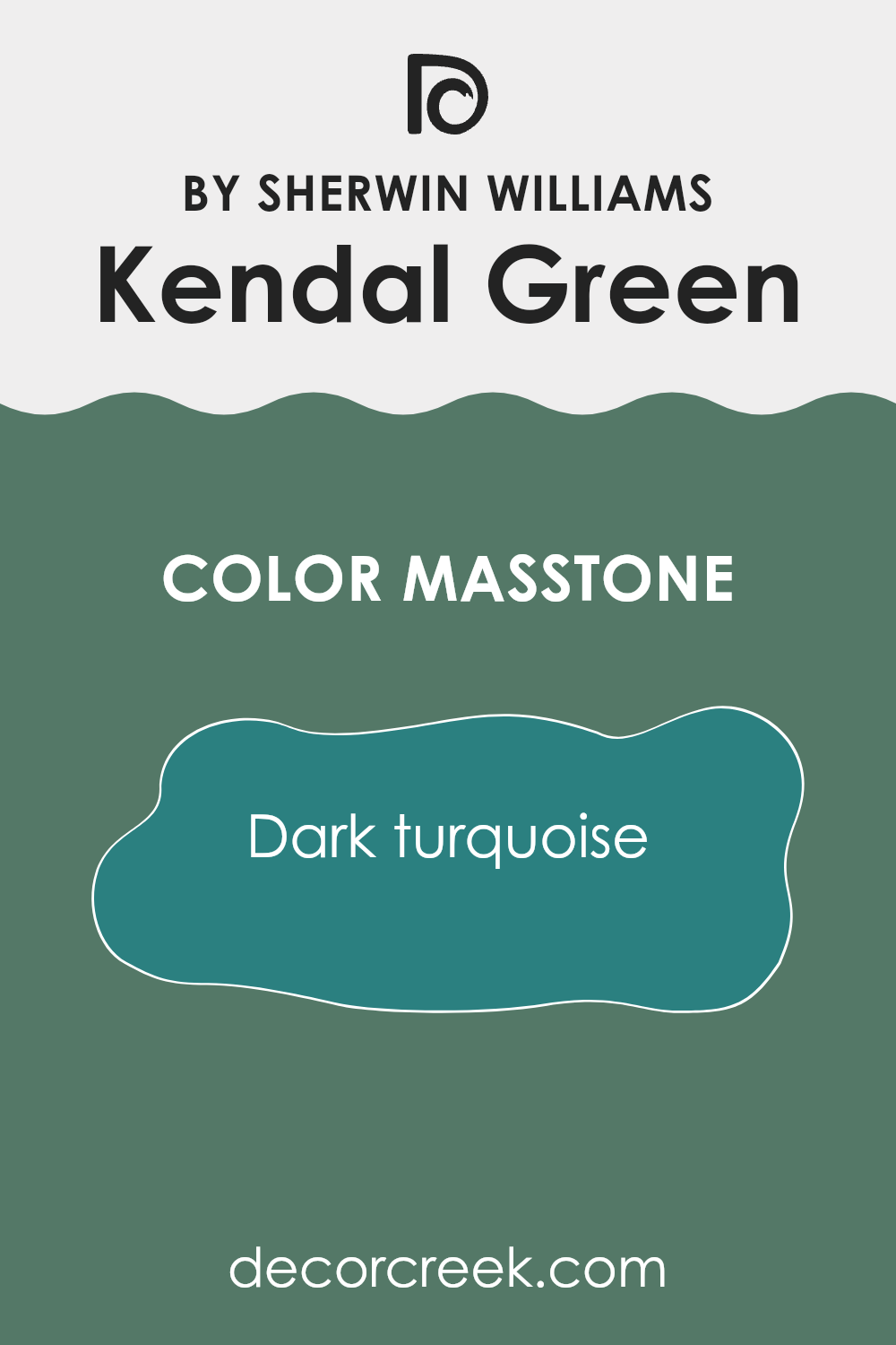
What is the Masstone of the Kendal Green SW 6467 by Sherwin Williams?
Kendal Green SW 6467 by Sherwin Williams has a masstone closely resembling dark turquoise, marked by its unique code #2B8080. This deep and rich hue brings a bold and cozy vibe to any home. It is a versatile choice that pairs well with both light and dark furniture, making it easy to integrate into a variety of decorating schemes.
In spaces with ample natural light, this color remains vibrant and engaging, whereas in rooms with less light, it adds depth and warmth. Ideal for creating a welcoming atmosphere in living rooms or bedrooms, this shade functions effectively as both an accent or a main wall color.
Furthermore, it harmonizes beautifully with natural elements like wooden furnishings or green plants, enhancing an earthy and homely feel. Kendal Green is an excellent choice for those looking to add a dash of personality without overwhelming a space.
How Does Lighting Affect Kendal Green SW 6467 by Sherwin Williams?
Lighting plays a crucial role in how we perceive colors. The type of light under which a color is viewed can significantly affect its appearance. For instance, natural daylight is generally balanced, enhancing the true vibrancy of colors. Artificial light, depending on its type (such as LED or fluorescent), can alter how colors are viewed.
Considering Kendal Green, a beautifully rich green hue, its appearance can change depending on the light it is under. In artificial light, particularly warm toned such as incandescent bulbs, Kendal Green tends to appear more muted and warmer. This makes it cozy for evening settings. In cooler artificial light, like that from some LEDs, the color may seem sharper and brighter.
Natural light impacts Kendal Green differently throughout the day and depends largely on the orientation of the room. In north-facing rooms, which often receive less direct sunlight and more shaded light, Kendal Green might appear more subdued and slightly darker. This cooler, softer light can slightly diminish the vibrancy of the green, making it a calm and soothing choice for spaces meant to relax.
In south-facing rooms, bathed in ample sunlight for most of the day, Kendal Green can look vibrant and lively. The direct sunlight intensifies the color, which may enhance its natural vibrancy, making it an energetic and refreshing choice.
In east-facing rooms, the morning light can make Kendal Green appear bright and fresh, a perfect energizing start to the day. Conversely, in west-facing rooms, the color will get a warmer glow in the evenings as the sun sets, possibly highlighting more of the yellow undertones in the green, thereby giving it a softer appearance. Each lighting scenario plays a role in setting the mood of the room with Kendal Green, making it versatile enough to fit various spaces and orientations.
What is the LRV of Kendal Green SW 6467 by Sherwin Williams?
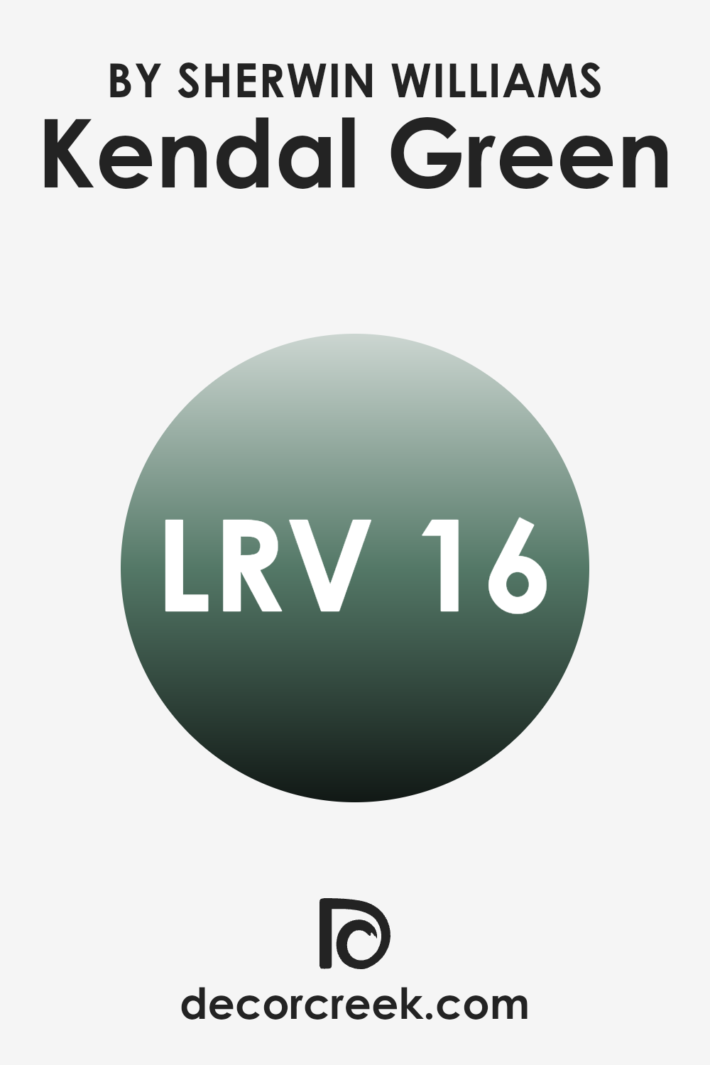
LRV stands for Light Reflectance Value, which is a measurement used to indicate how much light a paint color reflects or absorbs when applied to a wall. It is given as a number that ranges from a low value, meaning very little light is reflected, to a high value indicating a high level of light reflection.
Paints with a high LRV make a room feel brighter because they reflect more light around the room. On the other hand, colors with a low LRV absorb more light and can make a space appear cozier but darker, which might require additional lighting to brighten the area.
LRV of 16.303 for a particular shade of green shows that it is on the lower end of the LRV scale, meaning it does not reflect a lot of light. This darker, deep green will absorb more light, resulting in a rich, profound color that defines a space with a more intense and closely-felt presence. If used on walls, this color can create a denser atmosphere and may make a room appear smaller or more enclosed. Thus, it would be ideal for spaces where a dramatic and intimate ambience is desired, but may need thoughtful lighting decisions to ensure the space does not become too dark.
Coordinating Colors of Kendal Green SW 6467 by Sherwin Williams
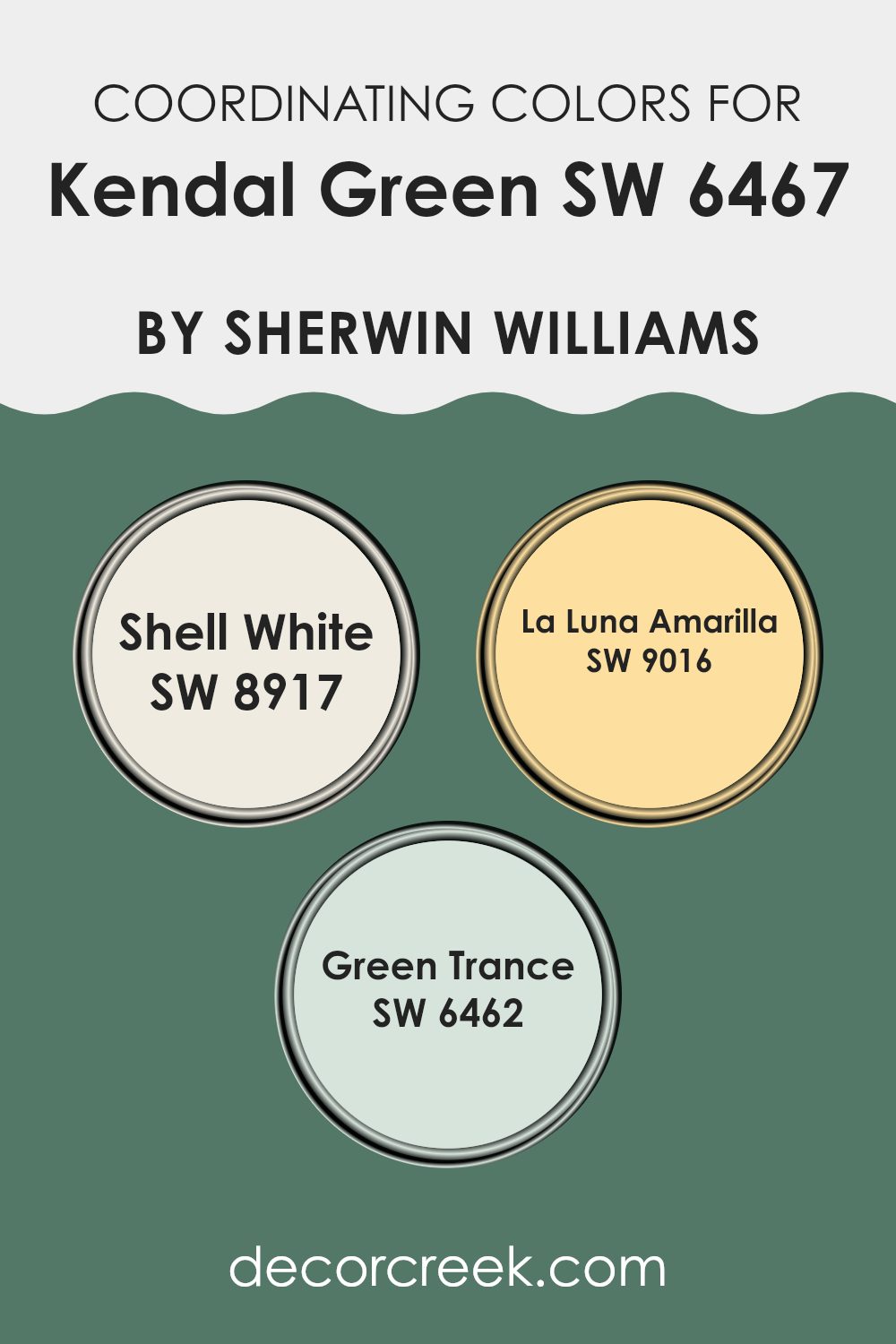
Coordinating colors are selected shades that work well together to enhance the overall aesthetic of a space. For example, Kendal Green by Sherwin Williams is a vibrant, rich green hue that can pair beautifully with other colors to create a harmonious look. When choosing coordinating colors, it’s essential to consider how different shades will complement each other to achieve a balanced and visually pleasing atmosphere.
Shell White, a pale and gentle off-white, is an excellent choice to coordinate with bolder hues like Kendal Green. Its subtle, clean appearance helps to soften stronger colors, providing a calm backdrop that makes them stand out without overwhelming the senses.
Another coordinating color, La Luna Amarilla, is a warm, muted yellow that can add a comforting glow to a room, working well with Kendal Green to bring warmth to the space without clashing. Lastly, Green Trance is a deeper green that pairs naturally with Kendal Green, enhancing the depth and richness of the green palette in a room. Together, these coordinating colors create a cohesive and inviting environment, allowing each hue to perform at its best.
You can see recommended paint colors below:
- SW 8917 Shell White (CHECK A SAMPLE)
- SW 9016 La Luna Amarilla (CHECK A SAMPLE)
- SW 6462 Green Trance (CHECK A SAMPLE)
What are the Trim colors of Kendal Green SW 6467 by Sherwin Williams?
Trim colors typically refer to the hues selected for the edges, frames, and additional detailed areas of a space, like door frames, baseboards, and window trims. These colors play a crucial role in complementing the primary wall colors and enhancing the overall aesthetic appeal of a room.
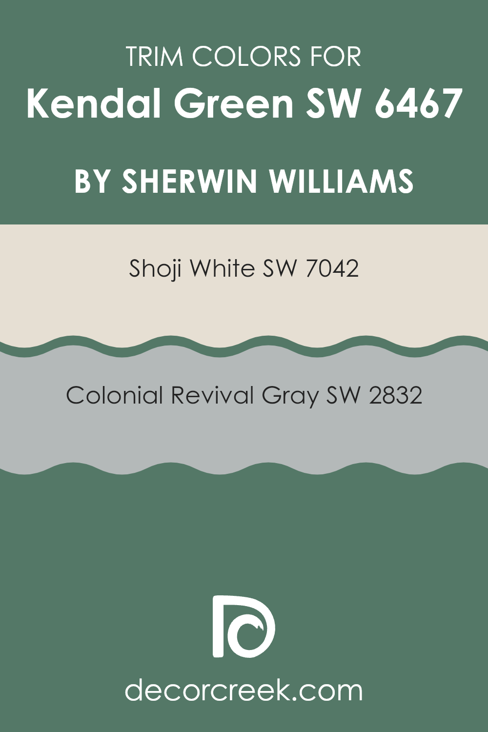
For example, using a trim color like SW 7042 – Shoji White or SW 2832 – Colonial Revival Gray with Kendal Green SW 6467 by Sherwin Williams can significantly affect the look and feel of the space. Shoji White, with its clean and bright qualities, can create a beautiful contrast that highlights the lushness of Kendal Green, making the walls pop and giving the room a fresh, open feel.
On the other hand, Colonial Revival Gray offers a subtle contrast, its muted tones providing a gentle transition that softens the boldness of Kendal Green, lending a harmonious and balanced look to the environment. Shoji White is a light, neutral white with a very slight warm undertone, perfect for making other colors stand out while also helping to reflect natural light, adding brightness to any room.
Colonial Revival Gray, a mid-tone gray with warm undertones, offers a stately appearance that complements both bold and subdued color schemes. It acts as a sophisticated backdrop that is versatile enough to enhance most primary colors without overwhelming them.
You can see recommended paint colors below:
Colors Similar to Kendal Green SW 6467 by Sherwin Williams
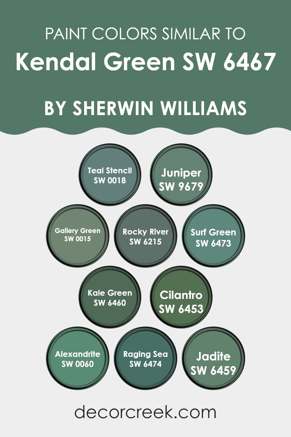
Choosing similar colors is crucial for creating a cohesive and harmonious atmosphere in any space. Similar shades allow for subtle variations that add depth and interest while maintaining a consistent theme. Colors like Teal Stencil and Juniper offer a refreshing hint of the ocean, evoking feelings of calmness and coolness. Gallery Green and Rocky River further enhance this palette by introducing earthier tones that ground the environment, providing a natural and comforting vibe.
Surf Green and Kale Green lean towards lighter and more energized green hues that brighten a room without overwhelming it. Cilantro adds a playful touch of spring green that is lively and fresh. Alexandrite brings a unique twist with its deep, mysterious undertones that create a sense of depth.
Raging Sea and Jadite contribute stronger and more prominent greens which anchor the color scheme and make it more dynamic. These colors, while similar, each hold their own character, offering a range of options for both accents and main themes in a décor setup, ensuring versatility while tying the spaces together beautifully.
You can see recommended paint colors below:
- SW 0018 Teal Stencil (CHECK A SAMPLE)
- SW 9679 Juniper (CHECK A SAMPLE)
- SW 0015 Gallery Green (CHECK A SAMPLE)
- SW 6215 Rocky River (CHECK A SAMPLE)
- SW 6473 Surf Green (CHECK A SAMPLE)
- SW 6460 Kale Green (CHECK A SAMPLE)
- SW 6453 Cilantro (CHECK A SAMPLE)
- SW 0060 Alexandrite
- SW 6474 Raging Sea (CHECK A SAMPLE)
- SW 6459 Jadite (CHECK A SAMPLE)
Colors that Go With Kendal Green SW 6467 by Sherwin Williams
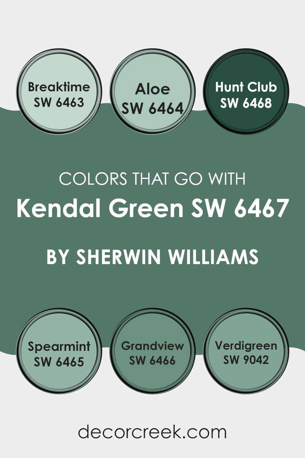
Selecting colors that complement Kendal Green SW 6467 by Sherwin Williams is crucial for achieving a harmonious interior design. These complementary colors help balance the visual energy of a room, making the space feel more cohesive and aesthetically pleasing. By pairing Kendal Green with colors such as SW 6463 – Breaktime, SW 6464 – Aloe, and others, you can enhance the overall ambiance and appeal of your decor.
SW 6463 – Breaktime is a fresh, minty green that brings a light and airy feel to any space. It works well in bathrooms and kitchens where it adds a clean, refreshing touch. SW 6464 – Aloe is a softer, more subdued green that gives off a calm and comforting vibe, making it perfect for bedrooms and living rooms.
SW 6468 – Hunt Club is a deep, rich green that provides a strong, grounding effect, ideal for accent walls or furniture to add depth and interest. SW 6465 – Spearmint offers a vibrantly crisp green, lending a lively and youthful energy, great for children’s rooms or creative spaces.
SW 6466 – Grandview is a darker green with a subtle hint of blue, adding a touch of elegance and mystery to more formal areas or studies. Lastly, SW 9042 – Verdigreen is a unique blend of green and gray, offering a modern twist that fits well in contemporary settings or as an exterior color. Pairing these colors with Kendal Green allows for a wide range of design options that can fit any taste or style.
You can see recommended paint colors below:
- SW 6463 Breaktime (CHECK A SAMPLE)
- SW 6464 Aloe (CHECK A SAMPLE)
- SW 6468 Hunt Club (CHECK A SAMPLE)
- SW 6465 Spearmint (CHECK A SAMPLE)
- SW 6466 Grandview (CHECK A SAMPLE)
- SW 9042 Verdigreen (CHECK A SAMPLE)
How to Use Kendal Green SW 6467 by Sherwin Williams In Your Home?
Kendal Green SW 6467 by Sherwin Williams is a lovely shade of green that can bring a touch of nature into your home. If you’re thinking about freshening up your living space, this color is a fantastic choice. You can paint Kendal Green in various rooms to create a cozy and welcoming atmosphere.
For example, use it in your bathroom to make it feel like a refreshing spa. In the kitchen, this shade can complement wooden cabinets and natural stone countertops, giving the room a balanced and harmonious look.
For a more creative touch, consider using Kendal Green as an accent wall in your living room or bedroom. It pairs well with light colors like soft whites or creams, which help to keep the space light and airy while adding a pop of color. Furniture and decor in earth tones or neutral shades will also look great against a Kendal Green backdrop. This color is versatile, easy to work with, and can help enliven your home with its natural, soothing look.
Kendal Green SW 6467 by Sherwin Williams vs Gallery Green SW 0015 by Sherwin Williams
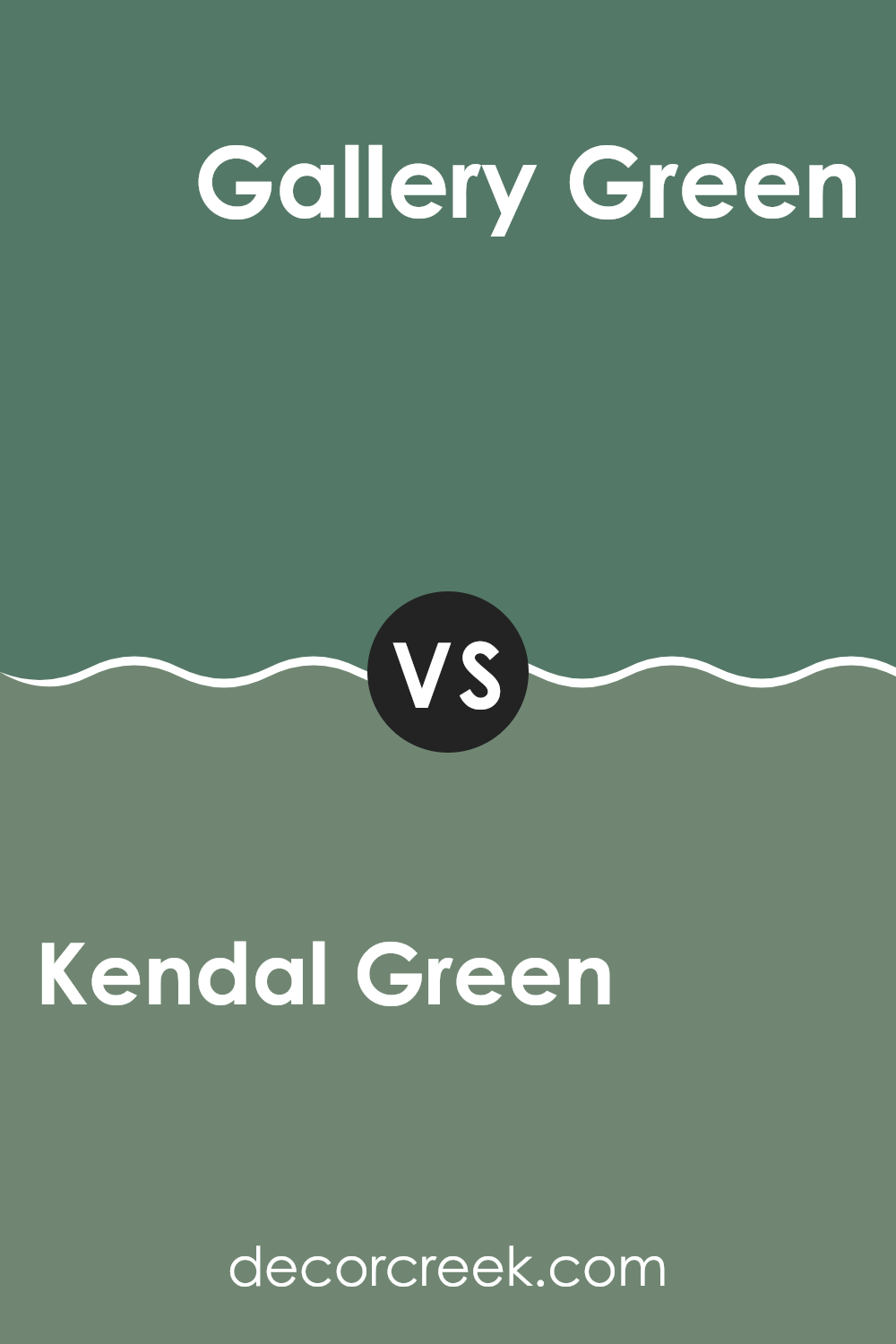
Kendal Green and Gallery Green are both colors from Sherwin Williams. Kendal Green is a vibrant, fresh shade that leans towards a lively spring feel. It’s a bit lighter and has a cheerful, grassy tone that can brighten up a space effectively.
On the other hand, Gallery Green is a deeper, more subdued green. It has hints of forest hues, making it feel more grounded and classic. This makes it a great choice for areas where you want a more traditional or refined look without being too bold.
Both colors cater to different tastes and room needs. Kendal Green works well in lively, energetic spaces, while Gallery Green fits better in areas where a subtle, mature look is desired. Their contrast in depth and mood provides versatile options for interior spaces.
You can see recommended paint color below:
- SW 0015 Gallery Green (CHECK A SAMPLE)
Kendal Green SW 6467 by Sherwin Williams vs Teal Stencil SW 0018 by Sherwin Williams
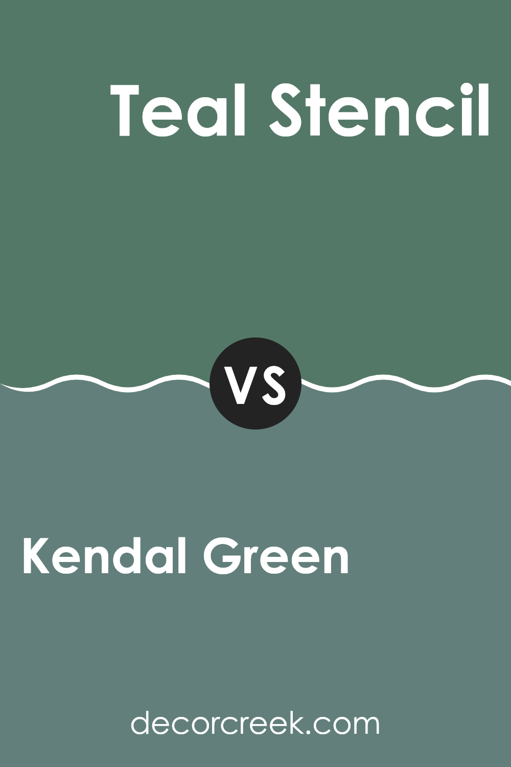
Kendal Green and Teal Stencil are both unique shades from Sherwin Williams, but they bring different vibes to a space. Kendal Green is a deep, rich green with a hint of blue that gives it a grounded, natural feel. It’s a color that makes you think of lush forests and outdoor freshness, ideal for someone looking to bring the essence of the outdoors into their home.
On the other hand, Teal Stencil is a bolder, more vibrant color. It leans more towards the blue side of teal, providing a brighter and more refreshing look. This color is perfect if you’re aiming to create a lively and energetic atmosphere in a room.
In terms of compatibility, both colors could work well together in a space that aims to be dynamic yet harmonious, with Teal Stencil adding pops of brightness against the more subdued backdrop of Kendal Green. Each brings its own unique character but maintains a balanced connection through their shared green tones.
You can see recommended paint color below:
Kendal Green SW 6467 by Sherwin Williams vs Surf Green SW 6473 by Sherwin Williams
Kendal Green and Surf Green, both by Sherwin Williams, offer unique tones that can majorly influence the mood in any room. Kendal Green is a lush, deep shade, evoking the feel of a dense forest. It’s perfect if you’re going for a rich and cozy atmosphere. It absorbs light, making it ideal for larger, well-lit spaces.
On the other hand, Surf Green is lighter and leans towards turquoise. It has a freshness to it, as it’s reminiscent of the ocean. This makes it a great choice for bathrooms or smaller spaces as it helps to brighten them up and make them feel airy.
Both colors bring a touch of nature indoors, but while Kendal Green provides depth and intimacy, Surf Green offers a breezy, open vibe. When choosing between them, consider the size of your room and the kind of mood you want to create.
You can see recommended paint color below:
- SW 6473 Surf Green (CHECK A SAMPLE)

Kendal Green SW 6467 by Sherwin Williams vs Cilantro SW 6453 by Sherwin Williams
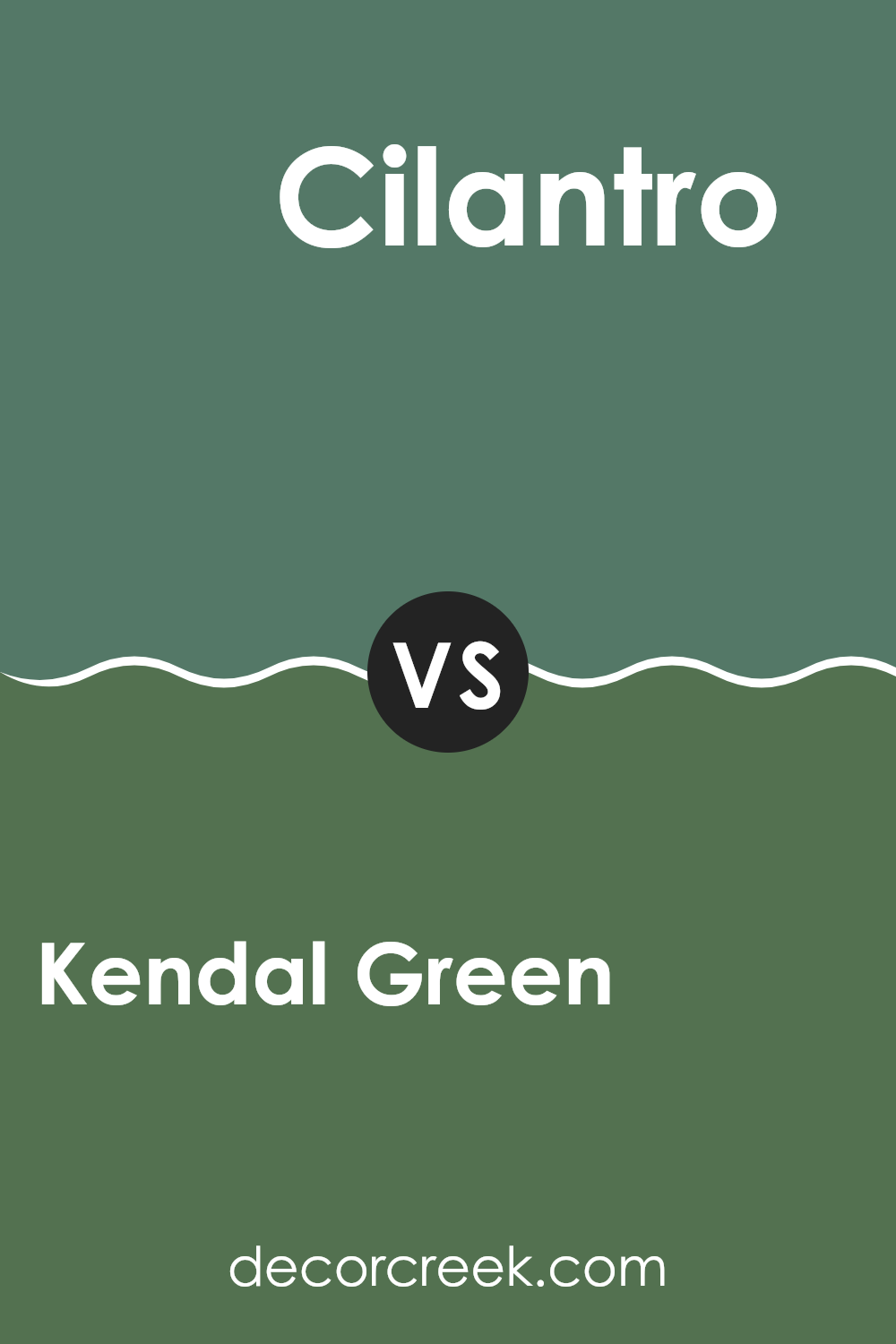
Kendal Green and Cilantro are both vibrant shades of green by Sherwin Williams that add an energetic yet balanced feel to any space. Kendal Green is a darker, more forest-like hue that brings a sense of stability and depth to rooms. It’s excellent for creating a cozy, supportive atmosphere, especially in spaces used for relaxation or concentration.
On the other hand, Cilantro offers a lighter, fresher take on green. This color is brighter and has a crisp, almost spring-like quality to it, making it ideal for kitchens, bathrooms, or any area that benefits from a lively, refreshing vibe.
When placed side by side, Kendal Green’s rich depth contrasts nicely against the lighter and brighter Cilantro. Using them together can create a harmonious yet dynamic green palette that adds character and variety to a home. Each brings its own unique mood and can beautifully complement various decor styles and textures.
You can see recommended paint color below:
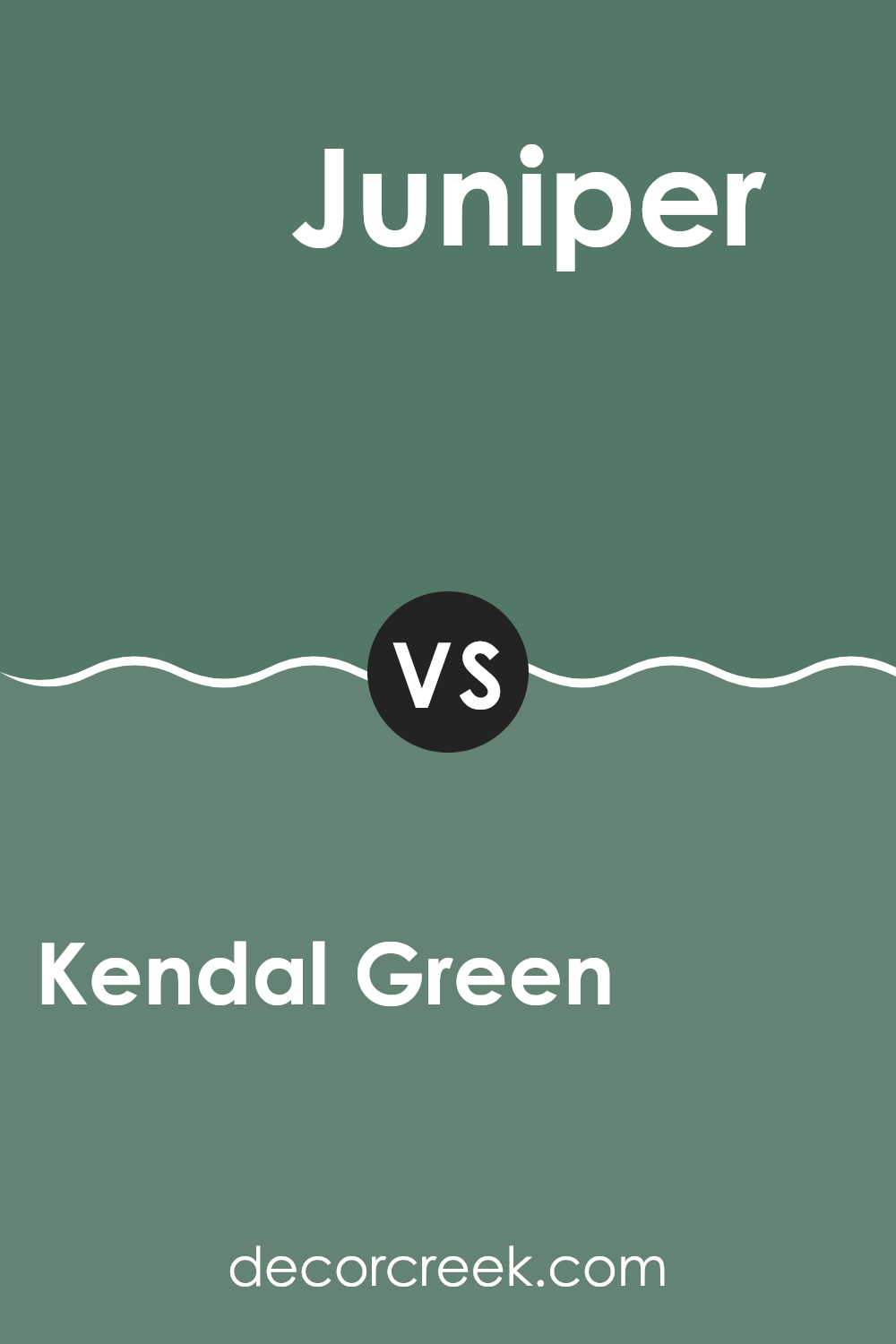
Kendal Green SW 6467 by Sherwin Williams vs Juniper SW 9679 by Sherwin Williams
Kendal Green and Juniper, both by Sherwin Williams, are distinct green shades that carry their own unique flair. Kendal Green is a vibrant and fresh green that brings a lively touch to spaces. It’s a color that stands out due to its brightness, making rooms feel energetic and cheerful.
On the other hand, Juniper is a dark, rich green, leaning towards a more subdued, stylish appearance. This shade is ideal for creating a cozy and inviting atmosphere in areas like living rooms or studies.
While Kendal Green reflects more light and adds a punch of color, Juniper absorbs light, offering a more restrained and classic look. The use of either color depends on the desired mood and setting; Kendal Green sparks vitality and enthusiasm, whereas Juniper offers a grounding and calming environment.
You can see recommended paint color below:
- SW 9679 Juniper (CHECK A SAMPLE)
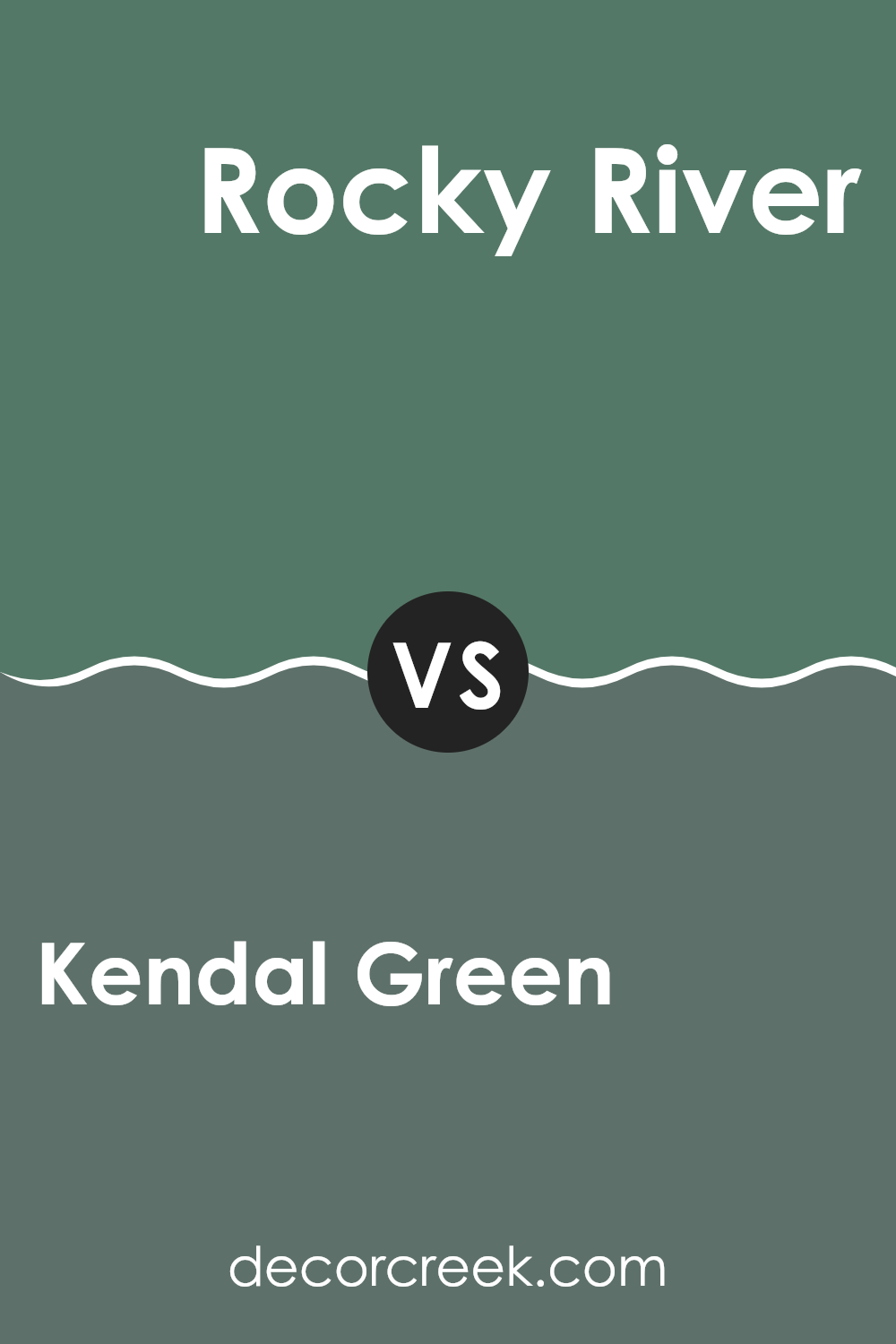
Kendal Green SW 6467 by Sherwin Williams vs Rocky River SW 6215 by Sherwin Williams
Kendal Green and Rocky River by Sherwin Williams are two distinct colors, each offering its own unique appeal. Kendal Green is a lively, fresh shade that leans towards a vibrant green with deep undertones. It’s perfect for spaces where you want to add brightness and a feel of nature’s energy.
In contrast, Rocky River is a darker, richer color, resembling a blend of blue and green with grayish tones. It suggests a more grounded, comforting feeling, making it suitable for creating cozy, inviting environments.
While Kendal Green injects vibrancy and could brighten up a kitchen or playroom, Rocky River offers a more reserved look that would be ideal for a study or bedroom. Depending on the mood you want to set or the type of room you’re decorating, each color has its advantages. Kendal is more stimulating and lively, whereas Rocky River provides a sense of calm and warmth. Both colors coordinate well with neutral tones but present quite different visual impacts based on their brightness and depth.
You can see recommended paint color below:
- SW 6215 Rocky River (CHECK A SAMPLE)
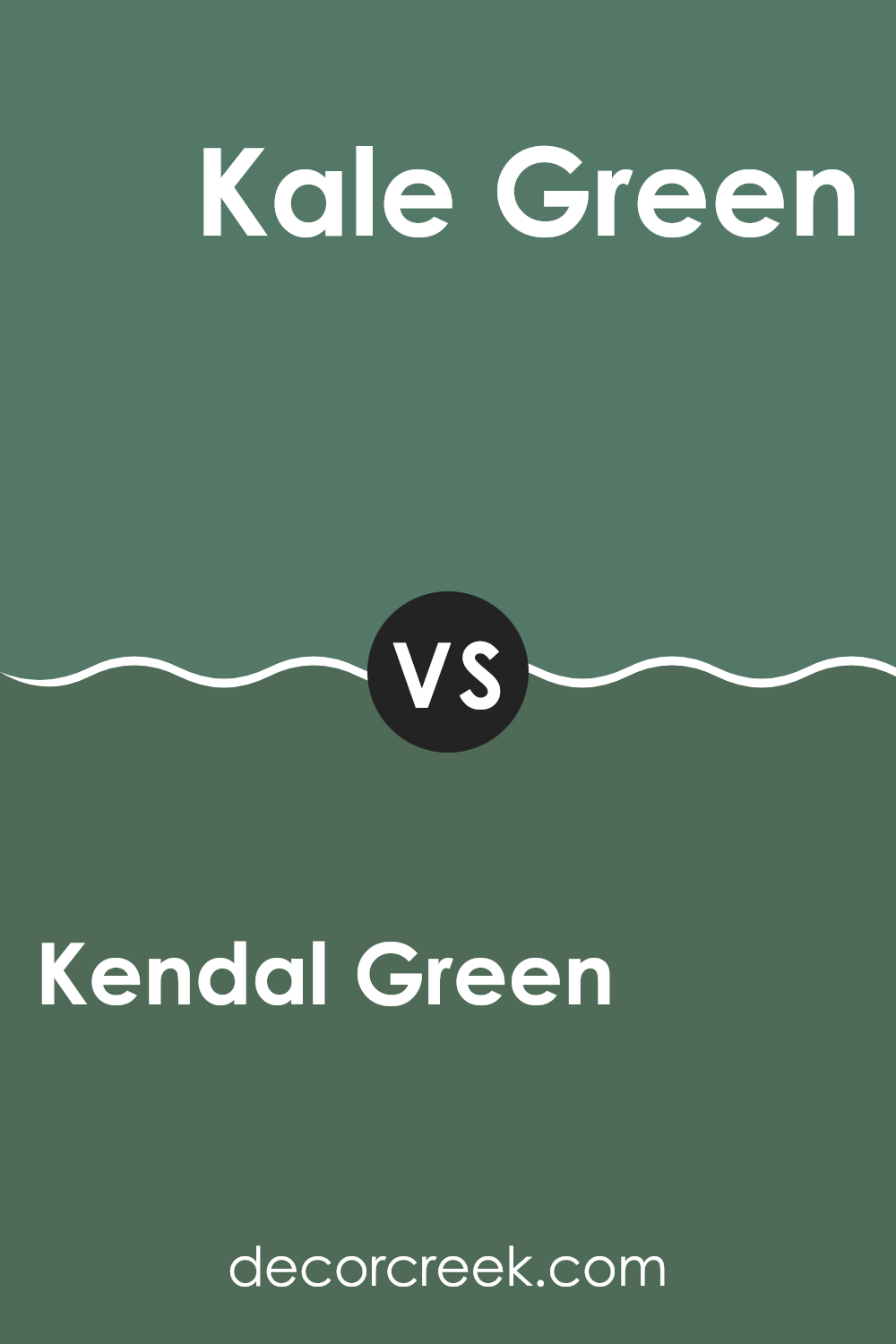
Kendal Green SW 6467 by Sherwin Williams vs Kale Green SW 6460 by Sherwin Williams
Kendal Green and Kale Green, both by Sherwin Williams, present distinct shades of green that can create different moods and styles in a space. Kendal Green is a vibrant, somewhat deep green that stands out with a lively touch. It could be perfect for spaces where you want a pop of color without overwhelming the room. It works well in living areas and kitchens where you want to add some energy.
On the other hand, Kale Green is a darker, more subdued green. This color has a more grounded, natural feel, similar to the color of leafy vegetables or dense foliage. Its muted tone makes it suitable for creating a comforting and cozy atmosphere, ideal for bedrooms or study areas where a calming influence is beneficial.
In conclusion, Kendal Green offers a brighter, more vivid option, while Kale Green provides a softer, more earthy character. Depending on the mood you want to set, each color has its unique appeal.
You can see recommended paint color below:
- SW 6460 Kale Green (CHECK A SAMPLE)
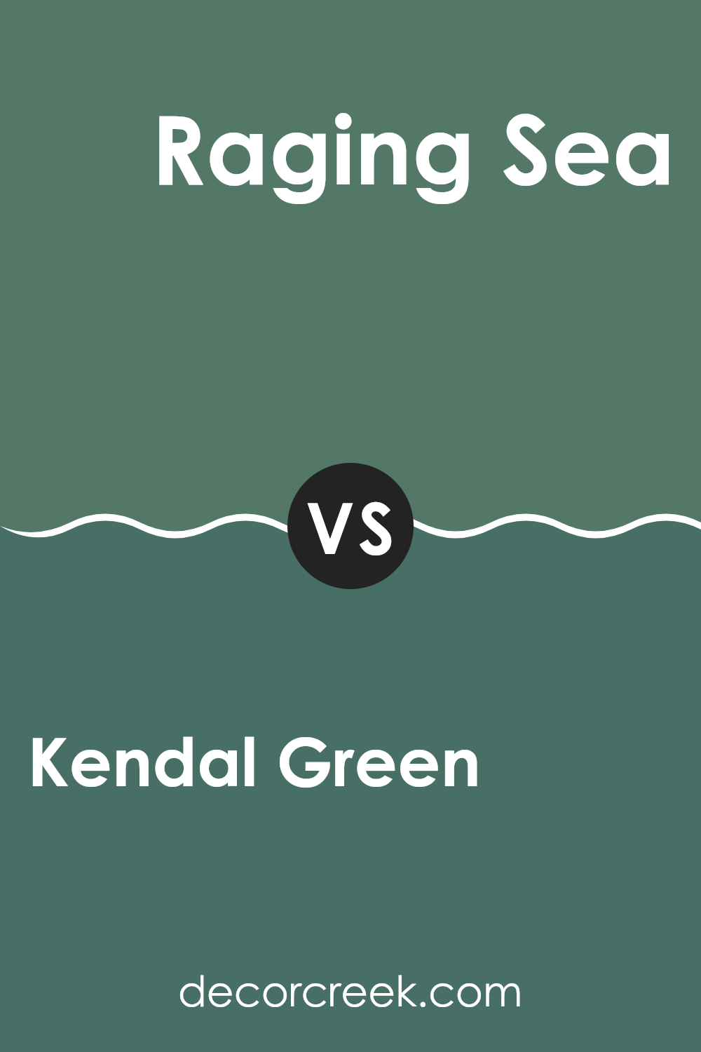
Kendal Green SW 6467 by Sherwin Williams vs Raging Sea SW 6474 by Sherwin Williams
Kendal Green and Raging Sea are two distinct colors that offer different vibes for interior spaces. Kendal Green is a vibrant, fresh shade of green with a lively and energetic feel. It can brighten up a space and give it a natural, earthy look, perfect for bringing a touch of the outdoors inside.
On the other hand, Raging Sea is a deeper, more intense color. This shade leans towards teal, combining elements of blue and green but with a darker, moodier feel. It is ideal for creating a bold statement in a room, providing a sense of depth and drama.
While Kendal Green is more about freshness and vitality, Raging Sea offers a deeper, more thoughtful aesthetic. Both colors work well in different settings, depending on what atmosphere you want to achieve. Kendal Green might be better suited for a kitchen or sunroom, whereas Raging Sea could be striking in a bedroom or office, creating a more immersive and concentrated environment.
You can see recommended paint color below:
- SW 6474 Raging Sea (CHECK A SAMPLE)
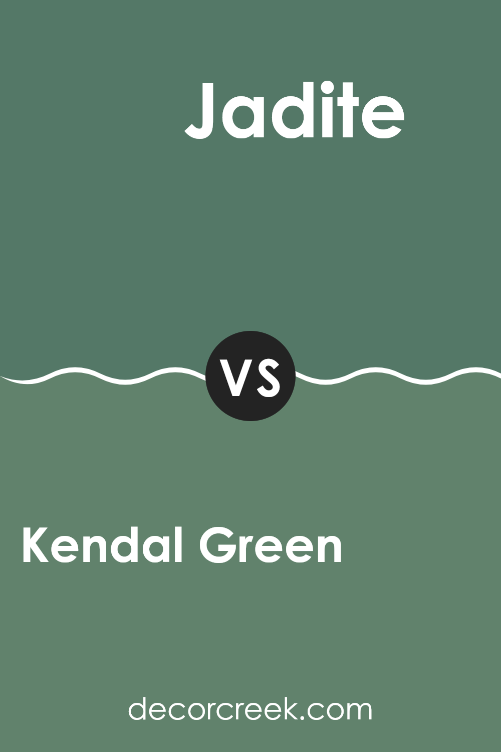
Kendal Green SW 6467 by Sherwin Williams vs Jadite SW 6459 by Sherwin Williams
Kendal Green and Jadite, both by Sherwin Williams, offer unique shades that can add charm to any space. Kendal Green is a deep, rich green with hints of blue, making it a strong, comforting presence in a room. It works well in spaces where a touch of nature-inspired robustness is desired, such as in a study or living room.
Jadite, on the other hand, is lighter and leans towards a soft, minty green. This color has a fresh and airy feel, perfect for kitchens, bathrooms, or any area you want to feel bright and open. Its gentle tone can make small spaces seem bigger and more inviting.
Both colors bring their own distinct vibe to interiors; Kendal Green is bolder and more dramatic, while Jadite offers a lighter, refreshing touch. Depending on the atmosphere you want to create, either color could be the perfect choice to enhance your decor.
You can see recommended paint color below:
- SW 6459 Jadite (CHECK A SAMPLE)
Kendal Green SW 6467 by Sherwin Williams vs Alexandrite SW 0060 by Sherwin Williams
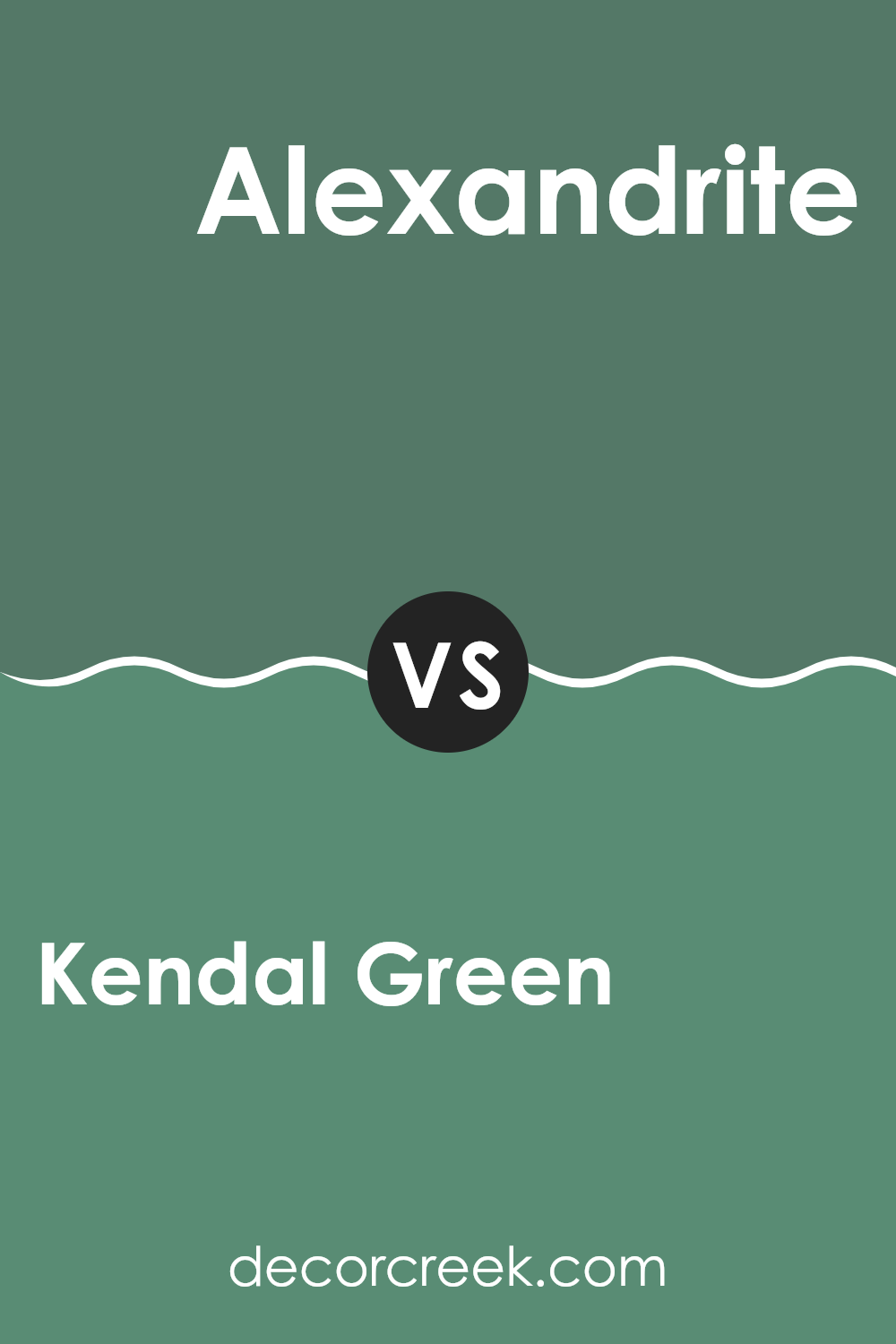
Kendal Green is a vibrant, rich green shade that brings to mind lush forests and fresh leaves. It has a very lively and energetic feel, making it great for spaces where you want to add some brightness and a touch of nature.
Alexandrite, on the other hand, is more subdued and leans towards a deep, grayish-green hue. This color is more understated than Kendal Green, offering a subtle elegance that can make any room feel cozy and well-balanced.
When comparing these two, Kendal Green is more attention-grabbing with its vivid tones, while Alexandrite offers a calmer, more grounded look. Both colors are versatile, but Kendal Green adds more energy to a space, while Alexandrite is better for creating a relaxed atmosphere.
You can see recommended paint color below:
- SW 0060 Alexandrite
Conclusion
Writing my review about SW 6467 Kendal Green by Sherwin Williams has been a fun journey! This color is not just any green; it’s unique and vibrant. It adds a beautiful splash of life wherever it’s used, whether on the walls of a bedroom or on a piece of furniture. This green can make any room look fresh and welcoming.
I learned that Kendal Green works well because it’s a true reflection of nature. If you’re thinking of giving your room a new look, this color might just be what you need. It’s like having a small piece of the forest inside your home, which is really cool if you love the outdoors.
Also, Kendal Green goes well with many other colors. Pair it with whites to keep things light and airy, or go with darker shades for a more grounded and cozy feeling. It’s amazing how a single can of paint can offer so many possibilities and help you make your space your own.
To conclude, SW 6467 Kendal Green by Sherwin Williams is definitely worth considering if you want to bring some lively green into your home. It’s more than just paint; it’s a way to make your space feel just right for you. So, if you ever want to refresh your room’s look or just try something new, think about Kendal Green. It could be the perfect choice!

Ever wished paint sampling was as easy as sticking a sticker? Guess what? Now it is! Discover Samplize's unique Peel & Stick samples.
Get paint samples


