Sherwin Williams’ SW 6463 Breaktime is a refreshing choice if you’re looking to bring a serene and airy feel to your space. This color has a soothing quality that resembles the calmness of a clear sky on a perfect spring day.
If you reinvent your office or craft a tranquil nook at home, Breaktime could be the hue you’re searching for. Its soft, subtle green shades can help to enhance concentration and provide a peaceful backdrop for reading, working, or relaxing.
Pairing it well with natural elements like wood or stone can amplify its organic vibe. I’ve found that incorporating accents in warm tones or soft whites complements Breaktime beautifully, maintaining balance without overwhelming the gentle charm of the paint.
Whether you’re aiming to update a single room or planning a larger renovation, consider how Breaktime might refresh your environment.

What Color Is Breaktime SW 6463 by Sherwin Williams?
Breaktime by Sherwin Williams is a refreshing and light teal color that brings a sense of calm and brightness to any room. With its subtle blue-green hues, it has a crisp, clean vibe that can rejuvenate the look and feel of a space.
This shade is particularly effective in coastal or minimalist interior styles, thanks to its airy and light-hearted nature. It can impart a beachy, relaxed feel when used in living areas or bedrooms, providing a backdrop that’s both uplifting and easy to match with various decor elements.
For materials, Breaktime pairs wonderfully with natural textures such as light wood, wicker, and linen. These combinations amplify its organic feel and create a harmonious visual flow. When it comes to metals, choosing brushed nickel or soft silver can keep the overall aesthetic fresh and modern.
Breaktime also works well with white trim or molding, which enhances its vibrancy and makes the color pop. In addition to being suitable for walls, this color can be used on cabinetry or furniture to introduce a playful yet grounded element to the space.
Overall, Breaktime is versatile, fresh, and inviting, making it a perfect choice for creating a pleasant and stylish environment.

Is Breaktime SW 6463 by Sherwin Williams Warm or Cool color?
Breaktime by Sherwin Williams is a fresh, crisp green color that brings a bright and airy feel to any space in a home. Often used in kitchens and bathrooms for its clean and refreshing vibe, this color can also liven up a living room or bedroom when used as an accent wall or through decorative elements like pillows and curtains.
The lightness of Breaktime makes it great for smaller rooms or spaces without a lot of natural light, as it can help make the area feel more open and spacious. Moreover, this color pairs well with both light and dark furniture, which offers flexibility in decorating.
With natural wood tones, it creates a more relaxed, earthy feel, whereas with white or light-colored furniture, the room can look more modern and bright. Combining Breaktime with other soft neutrals or pastel shades can produce a harmonious color scheme that feels cohesive and inviting. It’s a versatile shade that adapts well to various styles and preferences, making it an excellent choice for those looking to refresh their home’s look.
Undertones of Breaktime SW 6463 by Sherwin Williams
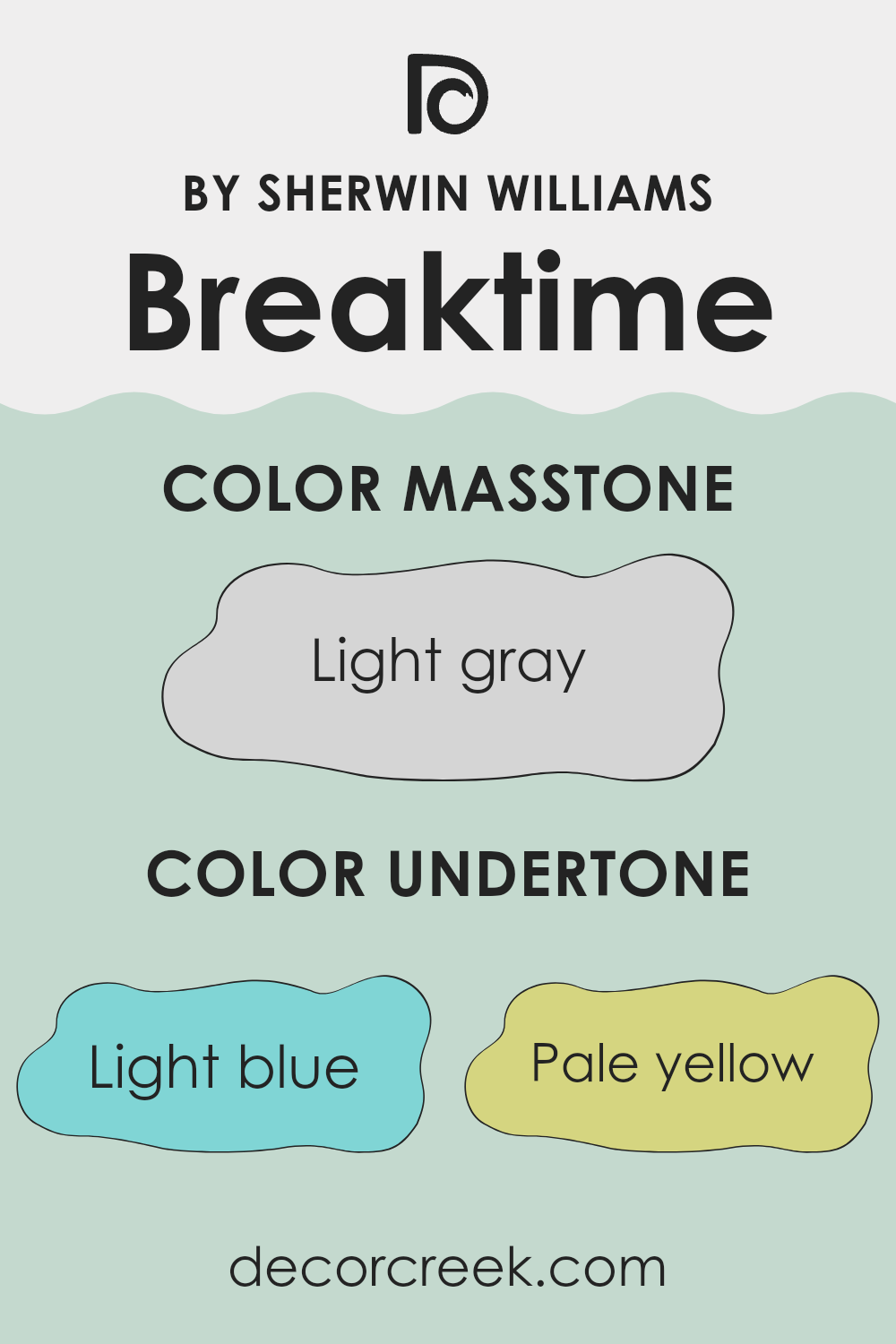
Breaktime by Sherwin Williams is a refreshingly light paint color that brightens up any room with its cheerful vibe. This color has a complex mix of undertones, including light blue, pale yellow, light purple, mint, lilac, pale pink, and grey. These undertones play a crucial role in how the color is perceived and can influence the mood and feel of a space.
Undertones are subtle hues that can be seen under the primary color when certain lighting hits them. They can make a color look slightly different depending on the light source and other colors near it.
For example, in bright, natural light, you might notice a mint or light blue undertone, giving the space a fresh and airy feel. In softer, artificial light, the pale yellow or light purple might become more apparent, adding a gentle warmth to the room.
When applied to interior walls, the variety of undertones in Breaktime makes it a versatile choice. The light blue and mint undertones can make a small room appear larger and more open, while the lilac and pale pink can give a soft, welcoming touch.
The grey undertone helps to ground the color, preventing it from becoming too bright and ensuring it pairs well with a variety of decor styles and color schemes.
Overall, this color is an excellent choice for anyone looking to add a cheerful yet gentle atmosphere to a space.
The mix of undertones ensures that the color maintains balance and adaptability, fitting well in many types of rooms.
What is the Masstone of the Breaktime SW 6463 by Sherwin Williams?
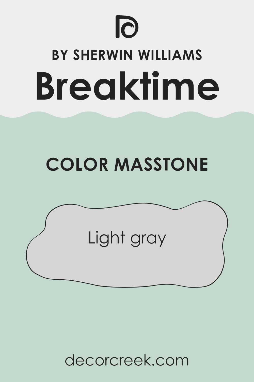
Breaktime SW 6463 by Sherwin Williams is a light gray paint color that brings a fresh and clean feel to any room. Its masstone, which is the pure color before it’s lightened or darkened, is a soft shade of gray that looks like a slightly cloudy sky.
In homes, this color works well because it is neutral and easy to match with other colors, making it a versatile choice for decorating. This light gray can make small spaces appear larger and brighter as it reflects light well.
In rooms with lots of natural light, Breaktime helps maintain a light and airy feel. Meanwhile, in spaces with less light, it prevents the room from feeling too dark. This color is great for living rooms, bedrooms, or even kitchens, providing a clean backdrop that supports a variety of decor styles, from modern to traditional. It also hides minor wall imperfections better than darker colors.
How Does Lighting Affect Breaktime SW 6463 by Sherwin Williams?
Lighting plays a crucial role in how we perceive colors. The kind of light under which a color is viewed can significantly affect how we see its hue, brightness, and saturation.
The color Breaktime is a fresh, soothing shade of green that can vary depending on the light it’s exposed to. Under artificial lighting, such as LED or incandescent bulbs, this color may appear slightly different than it does in natural daylight.
Artificial light, depending on its color temperature, can make Breaktime look brighter and more vivid or softer and more subdued. For example, in warm yellow light, it might look more subdued, while in cooler white light, the green might appear more vibrant.
In natural light, Breaktime behaves differently throughout the day and depending on the direction a room faces:
– North-facing rooms: These rooms receive less direct sunlight, which can make colors appear cooler and slightly muted. Breaktime in a north-facing room might look more like a soft, gentle green, making the room feel calm and pleasant.
– South-facing rooms: These rooms are bathed in plenty of sunlight, which can intensify colors. Breaktime in a south-facing room could look very vibrant and lively, enhancing the room with a bright, cheerful vibe.
– East-facing rooms: With sunlight in the morning, Breaktime will feel warm and inviting early in the day and tend to become softer as the day progresses. It’s a great choice for spaces used mainly in the mornings.
– West-facing rooms: Here, the color will start softer in the morning and become warmer and brighter towards the evening as the sun sets. This light shift can make the room feel dynamic and responsive to the time of day.
Understanding how lighting affects colors like Breaktime can help you choose the right paint for the intended mood and atmosphere of a space, ensuring that the color performs as desired throughout the day.

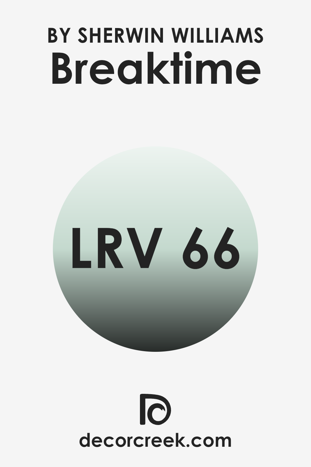
What is the LRV of Breaktime SW 6463 by Sherwin Williams?
LRV stands for Light Reflectance Value, which is a measure of how much light a color reflects back into a room. It’s given on a scale where lower values mean the color absorbs more light and appears darker, while higher values indicate that the color reflects more light, making it appear brighter.
This measurement is particularly helpful when choosing paint colors for your space as it gives you an idea of how light or dark a color will look on your walls. Colors with a higher LRV can make a room feel more open and airy by reflecting more light around the space.
The LRV for the color Breaktime is around 66 out of a maximum of one hundred, showing that it is on the lighter side of the spectrum. This means it has a good ability to reflect light, contributing to a brighter appearance in a room, especially in spaces with ample natural sunlight.
As a result, using this color on your walls can help make your room feel larger and more inviting, by effectively using the natural and artificial light available. This can be particularly useful in smaller or darker spaces where maximizing light is crucial.
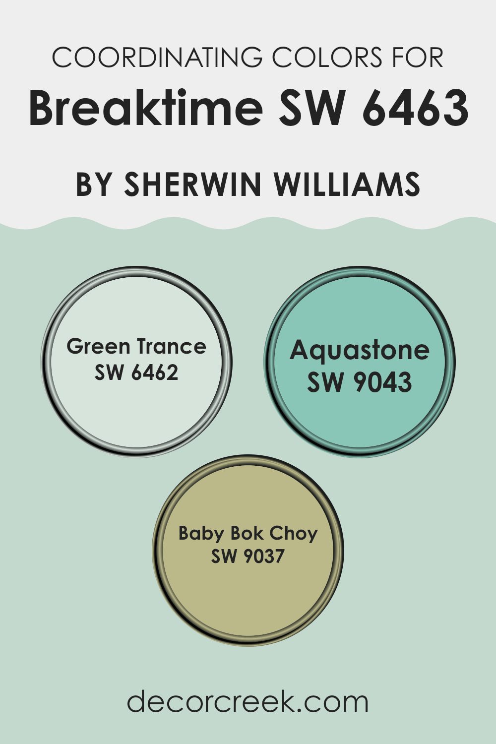
Coordinating Colors of Breaktime SW 6463 by Sherwin Williams
Coordinating colors are selected to create a harmonious color scheme that enhances the aesthetic appeal of a space while ensuring all the tones work well together. These colors complement each other and can be used in different combinations to achieve a balanced look.
For example, when working with a primary color like a certain Sherwin Williams shade, additional shades like Green Trance, Aquastone, and Baby Bok Choy can be introduced for a cohesive design. Green Trance is a vibrant, lively green that adds a fresh and energetic feel to any room.
Its vividness can invigorate a space, making it ideal for areas that benefit from a splash of brightness. On the other hand, Aquastone offers a gentle blue-green that has a soothing effect, perfect for creating a calm and welcoming environment. Its subtle tone works well in spaces meant for relaxation.
Lastly, Baby Bok Choy presents a pale, soft green that brings a light and airy quality to the palette, excellent for enhancing open, bright spaces without overwhelming them with too much color. These shades collectively provide a versatile palette that can be tailored to fit various design needs, maintaining harmony while adding individual character to each room.
You can see recommended paint colors below:
- SW 6462 Green Trance
- SW 9043 Aquastone
- SW 9037 Baby Bok Choy
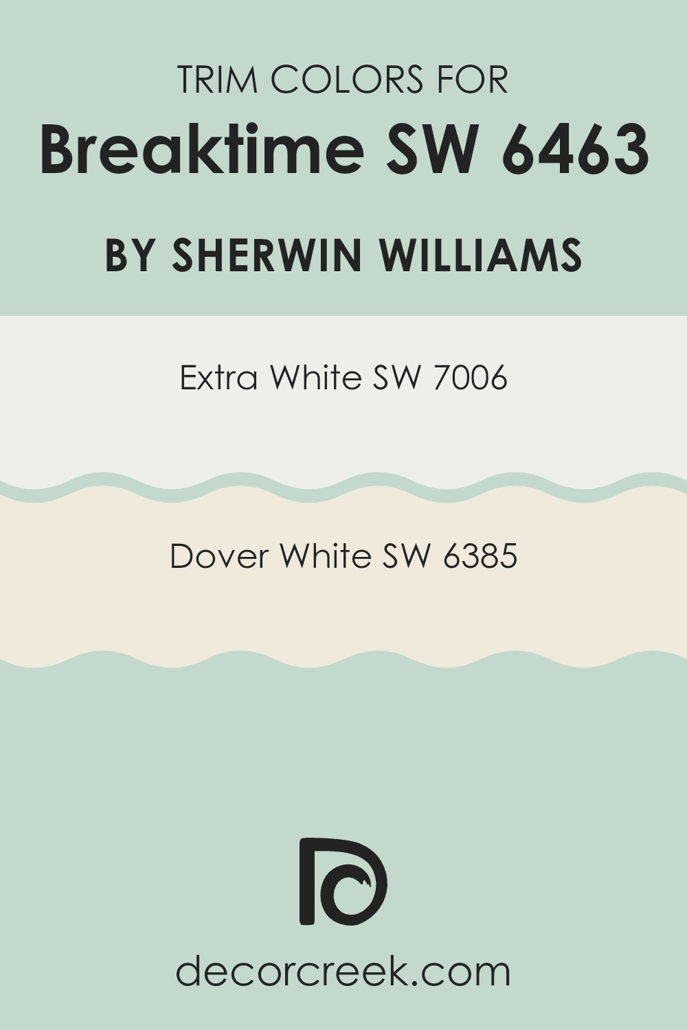
What are the Trim colors of Breaktime SW 6463 by Sherwin Williams?
Trim colors, like SW 7006 – Extra White and SW 6385 – Dover White by Sherwin Williams, play a crucial role in enhancing the visual appeal of a wall color. When paired with a vibrant shade such as Breaktime SW 6463, trim colors help to define and accentuate architectural details, frame sections of a room, and create a clean and finished look.
The choice of trim color can significantly influence the atmosphere and perception of the space, acting either to subtly complement the main color or create a striking contrast. Extra White SW 7006 is a bright and pure white color that brings a crisp and fresh look to trim, making it ideal for providing a sharp contrast that can make the walls pop.
On the other hand, Dover White SW 6385 has a creamy and soft hue, offering a gentler and warmer approach to trim, which blends harmoniously with softer wall colors like Breaktime SW 6463, while still keeping the edges of the room defined and interesting. The use of these trim colors enhances the overall aesthetic and ensures the chosen wall color stands out beautifully.
You can see recommended paint colors below:
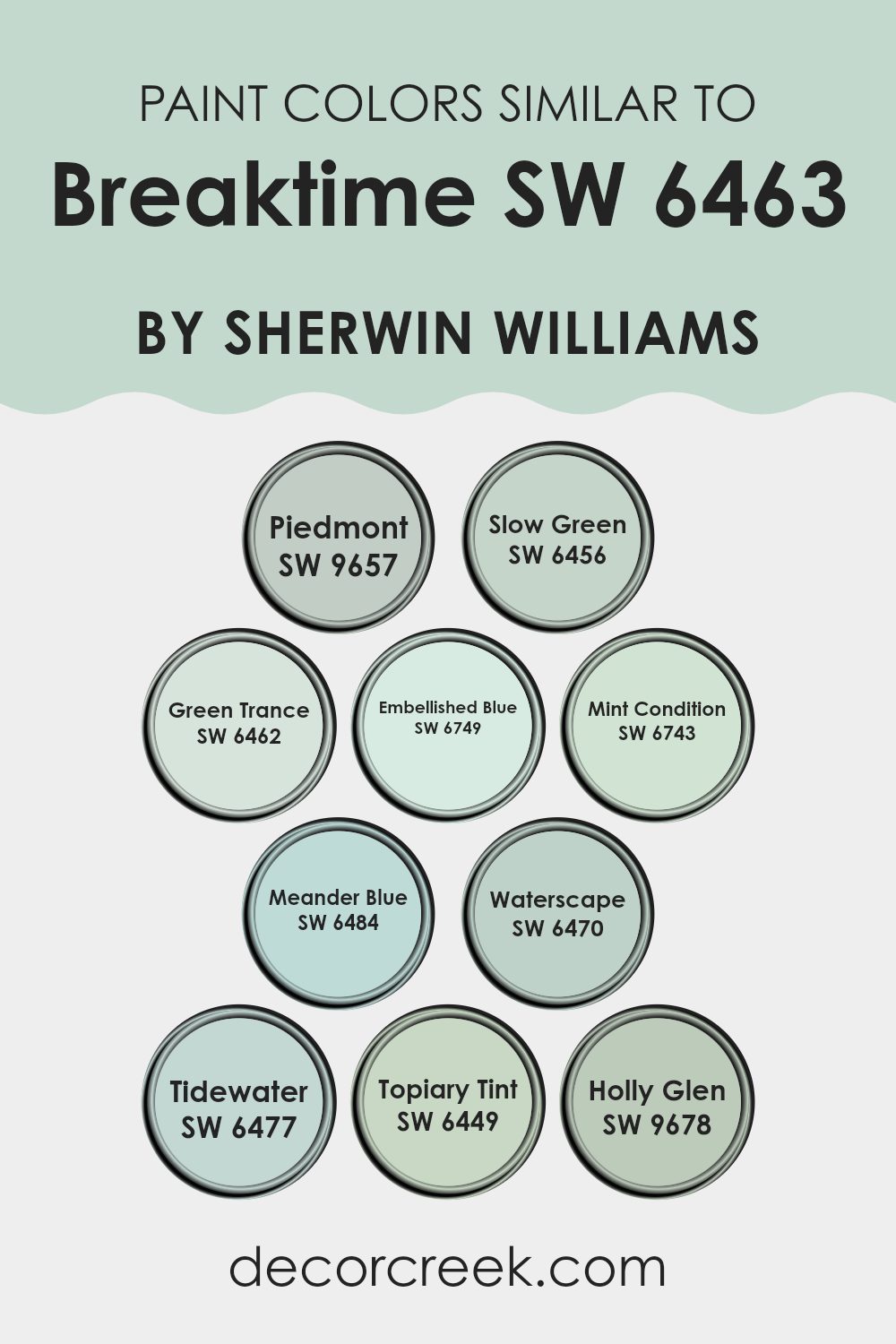
Colors Similar to Breaktime SW 6463 by Sherwin Williams
In the realm of interior design, the importance of using similar colors can’t be overstressed. It allows for a smooth visual flow and cohesiveness that makes any space feel more harmonious and pleasing to the eye. The similarity in colors like SW 9657 – Piedmont, SW 6456 – Slow Green, and SW 6462 – Green Trance adds a gentle, unified aesthetic without contrasting sharply.
These shades are versatile and work beautifully in creating a soothing backdrop that is easy on the eyes. Moreover, using close hues like SW 6749 – Embellished Blue or SW 6743 – Mint Condition brings a subtle variety that enriches the environment yet keeps a calming palette. These blues provide a cool counterbalance to warmer greens, enhancing the overall look of a decor scheme.
On another note, colors like SW 6484 – Meander Blue and SW 6470 – Waterscape offer a crisp but warm presence that feels welcoming and fresh. Similarly, SW 6477 – Tidewater and SW 6449 – Topiary Tint display a slightly more saturated tone that can make small accents pop or add depth when used on larger surfaces.
Lastly, SW 9678 – Holly Glen is a unique hue that provides a touch of earthiness, bridging the gap between the more vivid blues and subtle greens. The collaboration between these colors yields a coherent visual experience that can make any room feel more personalized and thoughtfully put together, lending a finished look that is both pleasant and stylish.
You can see recommended paint colors below:
- SW 9657 Piedmont
- SW 6456 Slow Green
- SW 6462 Green Trance
- SW 6749 Embellished Blue
- SW 6743 Mint Condition
- SW 6484 Meander Blue
- SW 6470 Waterscape
- SW 6477 Tidewater
- SW 6449 Topiary Tint
- SW 9678 Holly Glen
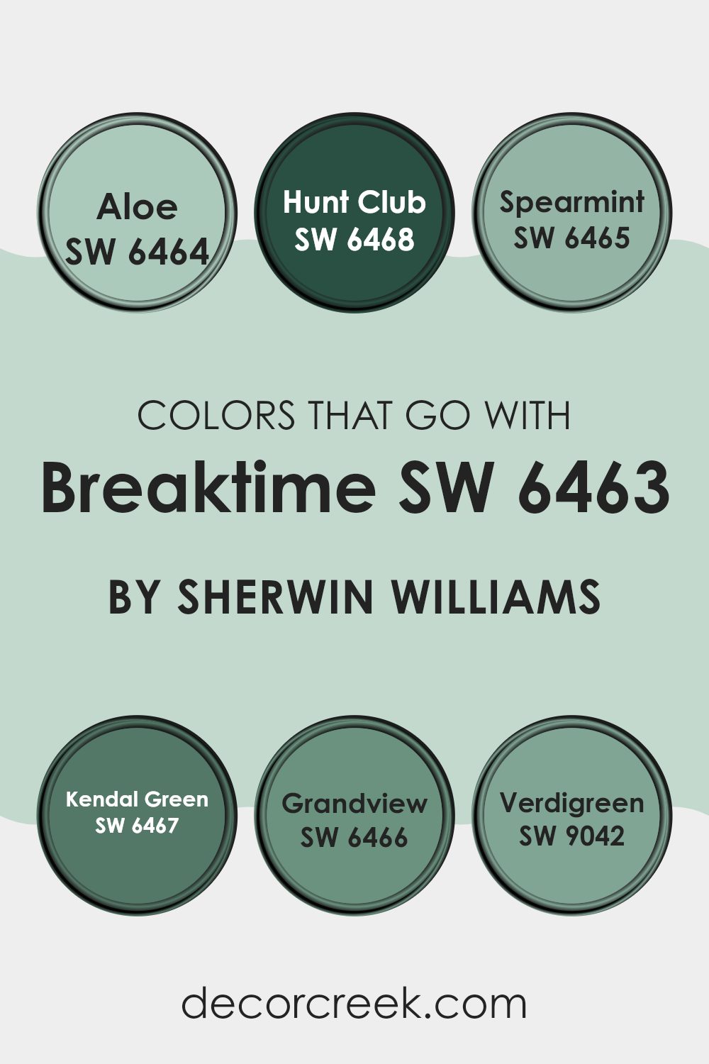
Colors that Go With Breaktime SW 6463 by Sherwin Williams
Understanding which colors coordinate well with Breaktime SW 6463 by Sherwin Williams is essential for creating harmonious and visually pleasing spaces. Breaktime is a refreshing and inviting shade of light green that can brighten up any room. When paired with compatible colors, it helps in achieving a balanced and cohesive look that enhances the ambiance of interior spaces. These colors can support the primary hue by adding depth and variety while maintaining a unified palette that is pleasing to the eye.
Among the colors that pair beautifully with Breaktime is Aloe SW 6464, a soft, soothing green that complements the lightness of Breaktime with a subtle elegance. It has a calming effect, making it perfect for living spaces or bedrooms.
Hunt Club SW 6468, on the other hand, is a deeper, richer green. This color provides a striking contrast and is ideal for accentuating key features or furniture within a room. Spearmint SW 6465 is another gentle companion to Breaktime, offering a slightly brighter and more youthful energy, great for adding a playful touch.
Kendal Green SW 6467 introduces a sense of depth with its earthy and warm tone, making it suitable for areas where a more refined visual is desired. Grandview SW 6466 is a muted teal that harmonizes well with Breaktime, bringing in a touch of sophistication without overwhelming the lighter green.
Lastly, Verdigreen SW 9042 blends a unique mix of green and blue, providing a bridge between cool and warm elements in the decor, which works excellently in spaces that aim for a modern yet inviting feel. By carefully selecting these colors, you can create stunning interiors that reflect a cohesive and attractive style.
You can see recommended paint colors below:
- SW 6464 Aloe
- SW 6468 Hunt Club
- SW 6465 Spearmint
- SW 6467 Kendal Green
- SW 6466 Grandview
- SW 9042 Verdigreen
How to Use Breaktime SW 6463 by Sherwin Williams In Your Home?
Breaktime SW 6463 is a refreshing and lively shade of green offered by Sherwin Williams. This color brings a hint of nature’s calmness and energy, making it perfect for creating a welcoming vibe in any room. It works wonderfully in spaces where you want to encourage relaxation and conversation, such as living rooms or kitchen dining areas.
Using Breaktime in a home office or study area can also be a great choice. The cheerful color helps in maintaining focus and sparking creativity, making long study or work hours a bit more pleasing. In bathrooms or small nooks, this shade can make the space feel airy and more open.
If you’re hesitant about painting an entire room, consider using Breaktime for an accent wall or pairing it with neutral colors like white or grey for balance. Furniture and decor pieces in this color can also add a subtle yet vibrant touch to minimalist or modern decor styles, enriching the overall aesthetic of your home without overwhelming it.
Breaktime SW 6463 by Sherwin Williams vs Tidewater SW 6477 by Sherwin Williams
Breaktime and Tidewater, both by Sherwin Williams, are two soothing shades of green that each bring their own unique vibe to a space. Breaktime is a vibrant, minty green that feels fresh and lively, injecting vitality into any room. It’s a bit bolder and can really make a statement, especially when used in well-lit areas or places where you want to add a sense of energy.
On the other hand, Tidewater is a softer, more subdued green with hints of blue, giving it a calming and gentle presence. This color is perfect for creating a peaceful and relaxing atmosphere, ideal for bedrooms or bathrooms where comfort is key.
While both colors promote a refreshing feel, Breaktime leans towards an energetic aura, while Tidewater offers a more relaxed and soothing environment. Choosing between them would largely depend on the mood you wish to set in your space.
You can see recommended paint color below:

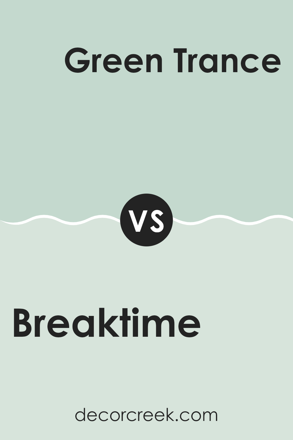
Breaktime SW 6463 by Sherwin Williams vs Green Trance SW 6462 by Sherwin Williams
Breaktime and Green Trance are two shades of green paint from Sherwin Williams, close to each other on the color spectrum but with distinct vibes. Breaktime is a vibrant, refreshing green that brings a lively and fresh feel to a room. It’s the kind of color that enlivens a space, making it perfect for areas like kitchens or bathrooms where you want a cheerful atmosphere.
On the other hand, Green Trance is slightly darker and leans towards a more muted, subtle green. This color is more understated and is great for creating a calm and gentle environment. It works well in bedrooms or living rooms where a softer and more relaxing backdrop is desired.
Both colors offer their unique appeal, with Breaktime being more energetic and bright, and Green Trance providing a more laid-back and soothing tone. Depending on the mood you want to set in your space, either color can be a great choice.
You can see recommended paint color below:
Breaktime SW 6463 by Sherwin Williams vs Holly Glen SW 9678 by Sherwin Williams
Breaktime SW 6463 and Holly Glen SW 9678 by Sherwin Williams are two distinct shades that cater to different aesthetic preferences. Breaktime is a vibrant and fresh aqua color that adds a lively and crisp feel to any space. It’s particularly suited for creating a refreshing ambiance in areas like kitchens or bathrooms, or as an accent wall in a living room. This color can make small spaces appear larger and brighter.
On the other hand, Holly Glen is a deep, rich green that leans towards a traditional look. It offers a sense of warmth and comfort, making it ideal for spaces where a cozy atmosphere is desired, such as in dens or bedrooms. Because of its darker tone, it can make a dramatic statement when used on walls or in large areas.
Together, these colors offer contrasting moods: the cheerful brightness of Breaktime complements the soothing depth of Holly Glen. They could be used in different rooms of a home to create varied environments, or within a singular space to define areas with different functions or moods.
You can see recommended paint color below:
- SW 9678 Holly Glen
Breaktime SW 6463 by Sherwin Williams vs Waterscape SW 6470 by Sherwin Williams
Breaktime and Waterscape, both by Sherwin Williams, offer unique shades of green that can liven up any space. Breaktime is a vibrant and refreshing color. It has a lively feel that can make a room feel fresh and energetic.
On the other hand, Waterscape gives a cooler and more subtle hint of green, leaning slightly towards a soft blue-green hue which can create a calm and soothing atmosphere without feeling too intense. Both colors are great for adding a touch of nature-inspired liveliness to your home, but they do so in different ways.
Breaktime works well in areas that benefit from a bright and cheerful tone, such as kitchens and playrooms. In contrast, Waterscape is more suited for spaces like bathrooms or bedrooms where a softer, more relaxed vibe is preferred. Depending on the mood you want to set and the natural lighting available in your room, either of these colors can add a lovely aesthetic touch.
You can see recommended paint color below:
Breaktime SW 6463 by Sherwin Williams vs Slow Green SW 6456 by Sherwin Williams
Breaktime and Slow Green are two paint colors by Sherwin Williams, each bringing its own unique shade to spaces. Breaktime is a vibrant and welcoming teal that adds a refreshing splash of color to any room. It’s bright enough to energize a space, yet balanced so it doesn’t overpower.
On the other hand, Slow Green is a more subdued hue, featuring soft green tones that offer a calm and gentle feel to interiors. It’s a quieter color that works well for creating a relaxed atmosphere, perfect for places where you want a touch of nature without too much intensity.
While Breaktime tends to stand out and catch the eye, Slow Green blends quietly into backgrounds, making it ideal for a subtle aesthetic appeal. These colors might serve different moods and themes depending on what you’re looking for in a room’s design.
You can see recommended paint color below:
Breaktime SW 6463 by Sherwin Williams vs Embellished Blue SW 6749 by Sherwin Williams
The main color, Breaktime, is a refreshing and clean shade of green. It carries a vibe of freshness and springtime, making it a bright choice for spaces like kitchens or sunrooms. On the other hand, Embellished Blue is a bold and vibrant blue that has a more energetic feel.
This makes it a great pick for spaces that benefit from a splash of color, like playrooms or creative spaces. While Breaktime has a soothing and natural tone, Embellished Blue stands out more and can add a lively contrast to a decor scheme.
Both colors offer their unique touch but serve different moods and settings effectively. Breaktime’s lighter and softer hue provides a calming effect, whereas Embellished Blue offers a striking and cheerful presence.
You can see recommended paint color below:
Breaktime SW 6463 by Sherwin Williams vs Piedmont SW 9657 by Sherwin Williams
The color Breaktime is a vibrant shade of teal that gives off a fresh and energetic vibe. Its brightness can liven up a space, making it feel cheerful and inviting. This color works well in areas like kitchens or bathrooms where you want a clean, revitalized look.
On the other hand, Piedmont is a much more subdued color. It’s a soft shade that leans towards a neutral palette, with hints of earthy undertones. This color suggests a gentle, relaxed atmosphere and is versatile enough to suit various rooms, particularly spaces where calmness is preferable, such as bedrooms or living areas.
Both colors offer unique aesthetics: Breaktime injects a sense of fun and vibrancy, perfect for more dynamic spaces, while Piedmont provides a calming effect, ideal for creating a peaceful retreat in any home. Choosing between them depends on the mood you’re aiming to achieve in your space.
You can see recommended paint color below:
Breaktime SW 6463 by Sherwin Williams vs Mint Condition SW 6743 by Sherwin Williams
Breaktime and Mint Condition are two vibrant shades from Sherwin Williams that both offer a fresh, clean feel to any space. Breaktime is a deeper, more subdued turquoise shade that leans slightly towards blue-green. It provides a calming effect without being too bold, making it a great choice for areas like living rooms or bathrooms where you want a relaxing but cheerful vibe.
Mint Condition, on the other hand, is a brighter, more energetic green. It has a crisper and lighter feel, perfect for spaces that need a punch of lively color. This shade is particularly good for kitchens, playrooms, or any area where you want to introduce vibrancy and freshness.
Both colors are able to refresh a room, but Breaktime tends to work better in a calming, mature environment, while Mint Condition fits well in more playful or dynamic settings. The choice between them depends on the atmosphere you’re aiming to create.
You can see recommended paint color below:
- SW 6743 Mint Condition
Breaktime SW 6463 by Sherwin Williams vs Topiary Tint SW 6449 by Sherwin Williams
Breaktime SW 6463 and Topiary Tint SW 6449 are two distinct shades from Sherwin Williams that offer different vibes and potential applications for interior spaces. Breaktime is a fresh, bright aqua color that injects energy and liveliness into a room. It’s perfect for spaces like kitchens, bathrooms, or any area where a vibrant, cheerful atmosphere is desired. This shade pairs well with whites and grays, creating a clean and refreshing look.
On the other hand, Topiary Tint is a more subdued, soft green hue. It gives off a calm and inviting feeling, making it ideal for bedrooms or living areas where a more relaxed environment is preferred. This color works nicely with wooden furniture and earth-toned decor, contributing to a warm and cozy ambiance.
Both colors stand out on their own and can dramatically affect the mood of a room, with Breaktime offering a more energetic touch and Topiary Tint providing a gentle, soothing presence. Each has their place depending on the atmosphere you want to achieve in your space.
You can see recommended paint color below:
- SW 6449 Topiary Tint
Breaktime SW 6463 by Sherwin Williams vs Meander Blue SW 6484 by Sherwin Williams
Breaktime and Meander Blue are both shades offered by Sherwin Williams that bring a fresh, lively vibe to any space, though they each have their unique characteristics. Breaktime is a vibrant, almost teal hue that leans towards a bright and refreshing green. It’s a color that can inject a sense of energy and liveliness into a room, making it particularly suitable for spaces like kitchens or creative workspaces where a boost of vivacity is welcome.
On the other hand, Meander Blue is a deeper, more subdued shade of blue with a touch of green, giving it a calm yet still cheerful appearance. This color is more reminiscent of the ocean on a clear day and is versatile enough to be used in bedrooms, bathrooms, or living rooms where a more relaxed but cheerful atmosphere is desired.
While both colors are from the blue-green spectrum, Breaktime appears more dynamic and brighter, whereas Meander Blue offers a cooler, more understated vibe. These characteristics make each color suitable for different spaces depending on the mood one aims to achieve.
You can see recommended paint color below:
- SW 6484 Meander Blue
Conclusion
It’s a type of green that looks a bit like the color you see on fresh mint leaves or in a peaceful, clear part of the ocean. This color is perfect for rooms where you want to feel relaxed and happy. It’s soft enough that it won’t make your eyes tired, but it still adds a fun splash of color to any room.
People often use this color in places like kitchens, bathrooms, and even living rooms. It’s also great for making a small space seem a bit bigger and more open because it has a light and breezy feel.
If you or your family are thinking about giving your room a new look, SW 6463 Breaktime might be a good choice. It’s like bringing a piece of the peaceful outdoors into your home. Whether you’re doing schoolwork, playing, or just chilling out, this color could help make your room a nicer place to be. So, if you love the outdoors and want to make your space fresh and lively, this color could be just right for you!

Ever wished paint sampling was as easy as sticking a sticker? Guess what? Now it is! Discover Samplize's unique Peel & Stick samples.
Get paint samples

