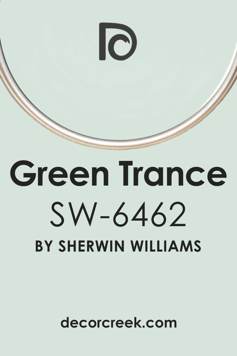
As we take a plunge into the world of colors, we encounter a captivating hue, SW 6462 Green Trance. A color that carries the serenity of nature, combined with a modern twist, is what sets SW Green Trance apart.
It’s a shade that effortlessly adapts to a multitude of spaces and is an undisputed choice for those who love a touch of tranquillity mingling with vibrancy in their décor.
What Color Is SW 6462 Green Trance? Is It a Warm Or Cool Color?
As Encycolorpedia says, SW 6462 Green Trance is a soothing yet stimulating shade of green, a color of balance, harmony, and growth. It evokes feelings of rejuvenation and restoration, resembling the deep freshness of a forest.
Given its roots in nature, SW Green Trance leans more towards a cool color, though it maintains a certain warmth due to its depth and vibrancy, allowing it to cater to a wide range of color palettes.
Ever wished paint sampling was as easy as sticking a sticker? Guess what? Now it is! Discover Samplize's unique Peel & Stick samples.
Get paint samples

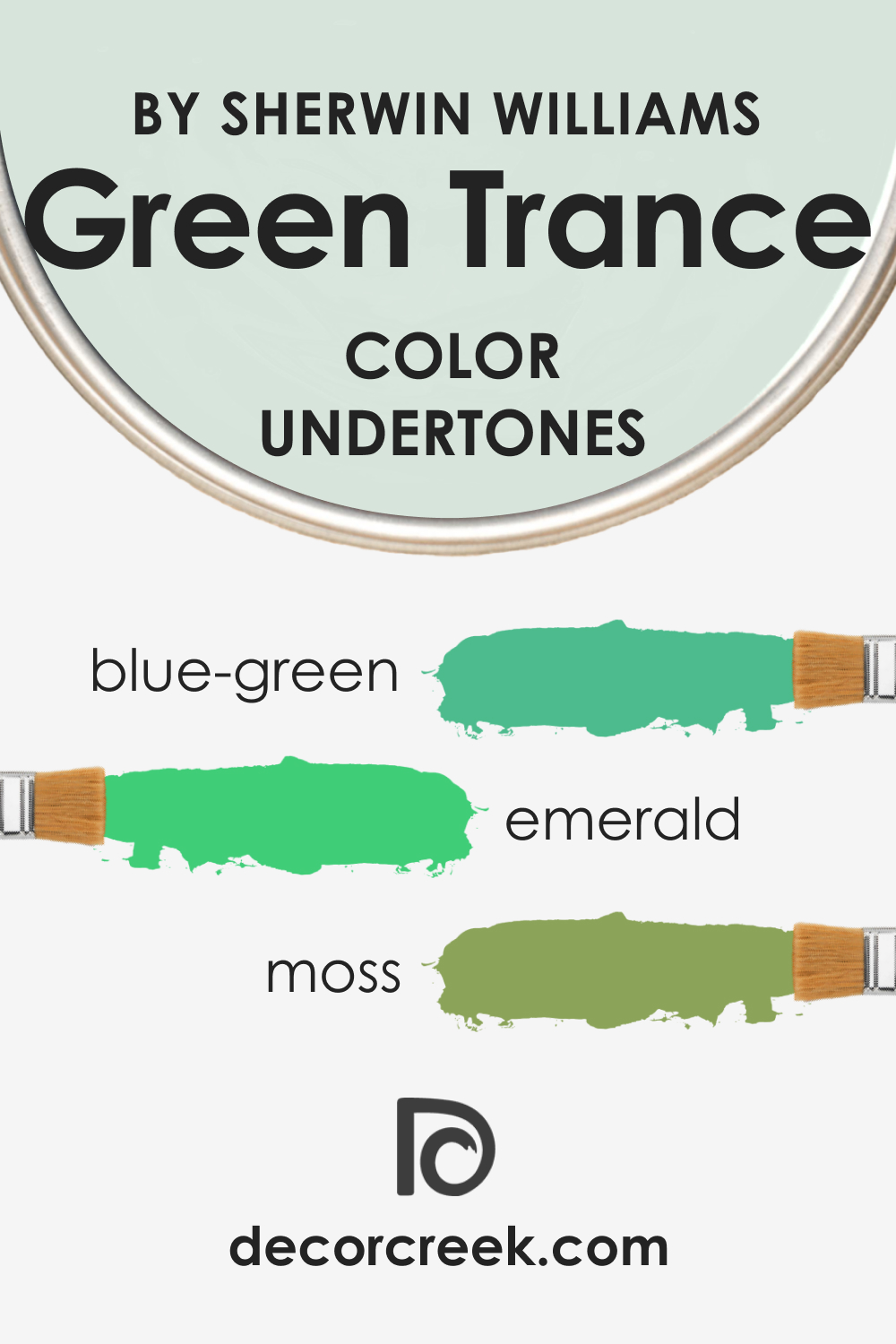
Undertones of SW 6462 Green Trance Paint Color
Understanding the undertones of color can help you see how well it pairs with other shades. As a result, your interior palette will be much better and more balanced. SW 6462 Green Trance carries several undertones, providing a versatile foundation:
- Blue-Green: This undertone enhances the cool and calming aspect of SW Green Trance, making it suitable for areas aimed at relaxation.
- Emerald: This undertone lends a sense of elegance and luxury, elevating the sophistication level of any room.
- Moss: A subtler undertone, it brings forth an earthy feel, providing a grounding element that complements the overall green hue.
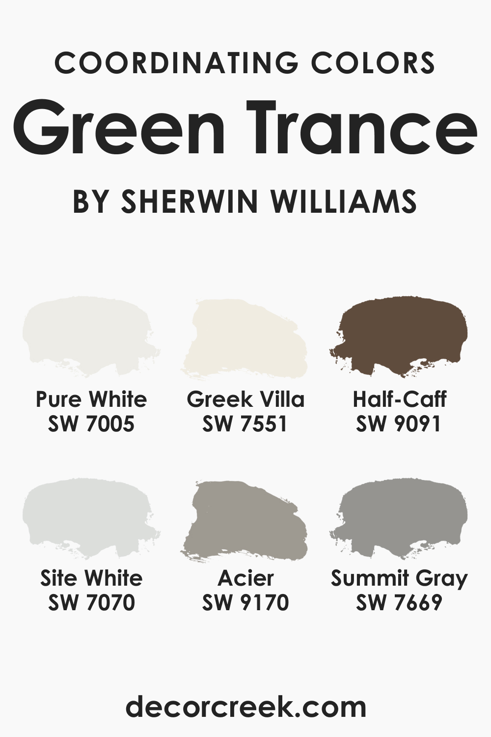
Coordinating Colors of SW 6462 Green Trance
SW Green Trance pairs well with a variety of colors, and for those who love the Sherwin-Williams spectrum, here’s how it coordinates with some notable shades:
- SW 7005 Pure White : This pristine and refreshing white brings out the vibrancy of SW Green Trance.
- SW 7551 Greek Villa : An off-white with a subtle warmth, SW Greek Villa balances the cool undertones of Green Trance.
- SW 9091 Half-Caff : A rich, earthy brown that contrasts beautifully, grounding the buoyancy of SW Green Trance.
Should you decide to extend the palette, consider these additional shades that can also coordinate SW Green Trance:
- SW 7070 Site White : A soft, warm gray, Site White offers a subtle contrast, accentuating the depth of Green Trance.
- SW 9170 Acier : This stylish gray with a cool undertone complements the tranquil vibes of Green Trance.
- SW 7669 Summit Gray : A darker gray that creates a striking contrast with Green Trance, ideal for a dramatic effect.
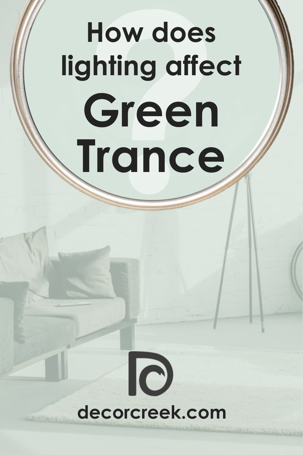
How Does Lighting Affect SW 6462 Green Trance Paint Color?
The interaction of lighting with SW Green Trance brings out its nuances in unique ways. Natural daylight reveals the color in its most authentic form, accentuating its refreshing and vibrant attributes. The blue-green undertone shines through, giving the space a cool, calm atmosphere.
In artificial light, SW Green Trance transforms subtly. Warm lighting tends to mute its cool undertones, leaning it towards a slightly warmer side and enhancing the emerald undertone.
Meanwhile, cool lighting, like LEDs, intensifies the blue-green undertone, emphasizing the color’s tranquillity.
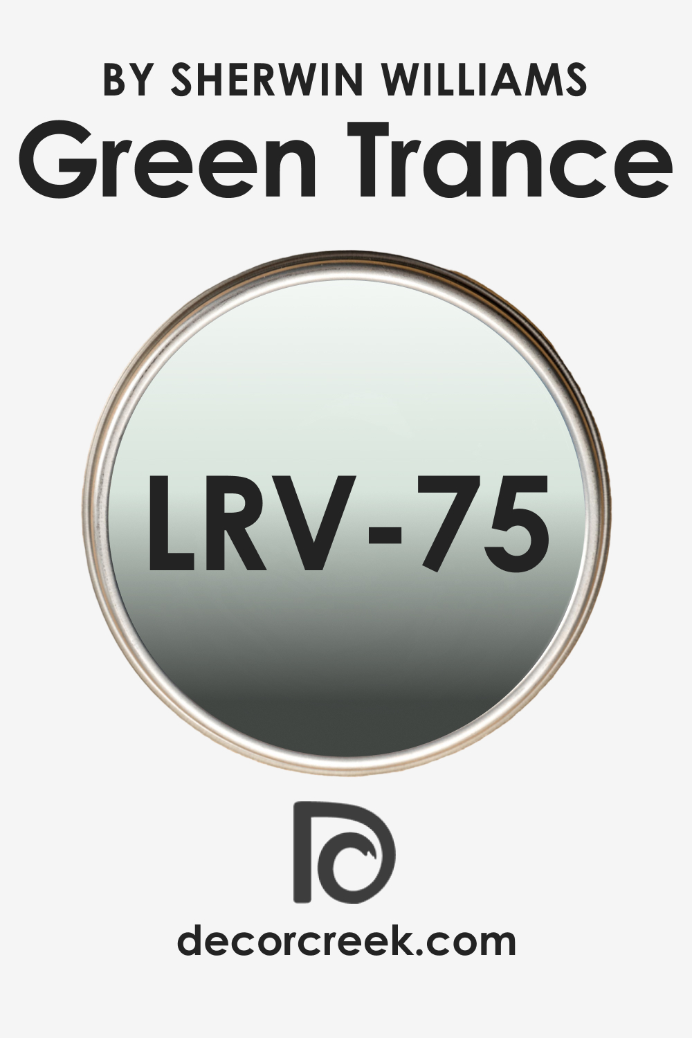
LRV of SW 6462 Green Trance Paint Color
The Light Reflectance Value (LRV) of a color refers to the percentage of light it reflects. A higher LRV means the color reflects more light and appears lighter, while a lower value results in a darker appearance. SW Green Trance has an LRV of 75, putting it on the lighter side of the spectrum.
At an LRV of 75, SW Green Trance is a bright color that is impactful without being overwhelming. It’s a suitable choice for smaller spaces, as it can make them appear larger and more open.
Additionally, the high LRV also makes it an excellent choice for rooms with less natural light, as it can make the space feel brighter and more vibrant.
However, its moderate intensity ensures that it doesn’t come off as too stark or sterile. It has enough depth to add character to a space, making it a versatile option for various room types and sizes.
LRV – what does it mean? Read This Before Finding Your Perfect Paint Color
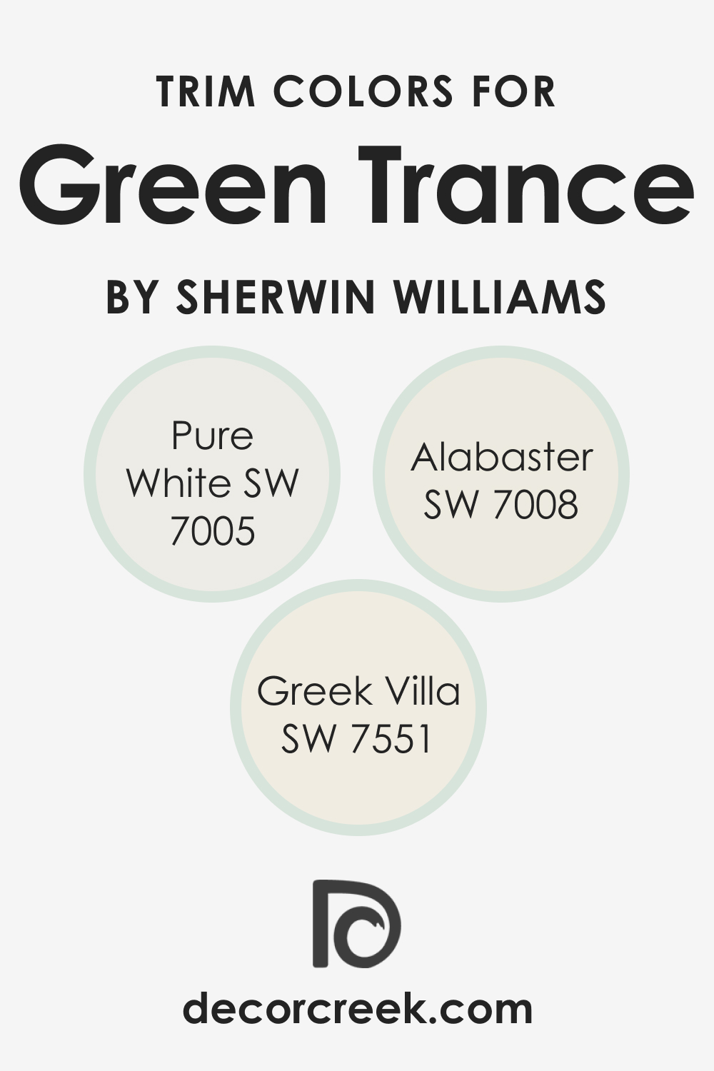
Trim Colors of SW 6462 Green Trance
For the trim colors, sticking to lighter shades within the Sherwin-Williams palette will create a visually appealing contrast:
- SW 7008 Alabaster : A warm, natural white that softens the energetic vibe of SW Green Trance.
- SW 7005 Pure White : This true white contrasts beautifully with SW Green Trance, giving your space a clean, modern look.
- SW 7551 Greek Villa : An off-white that creates a subtle, elegant contrast, harmonizing with the cool undertones of SW Green Trance.
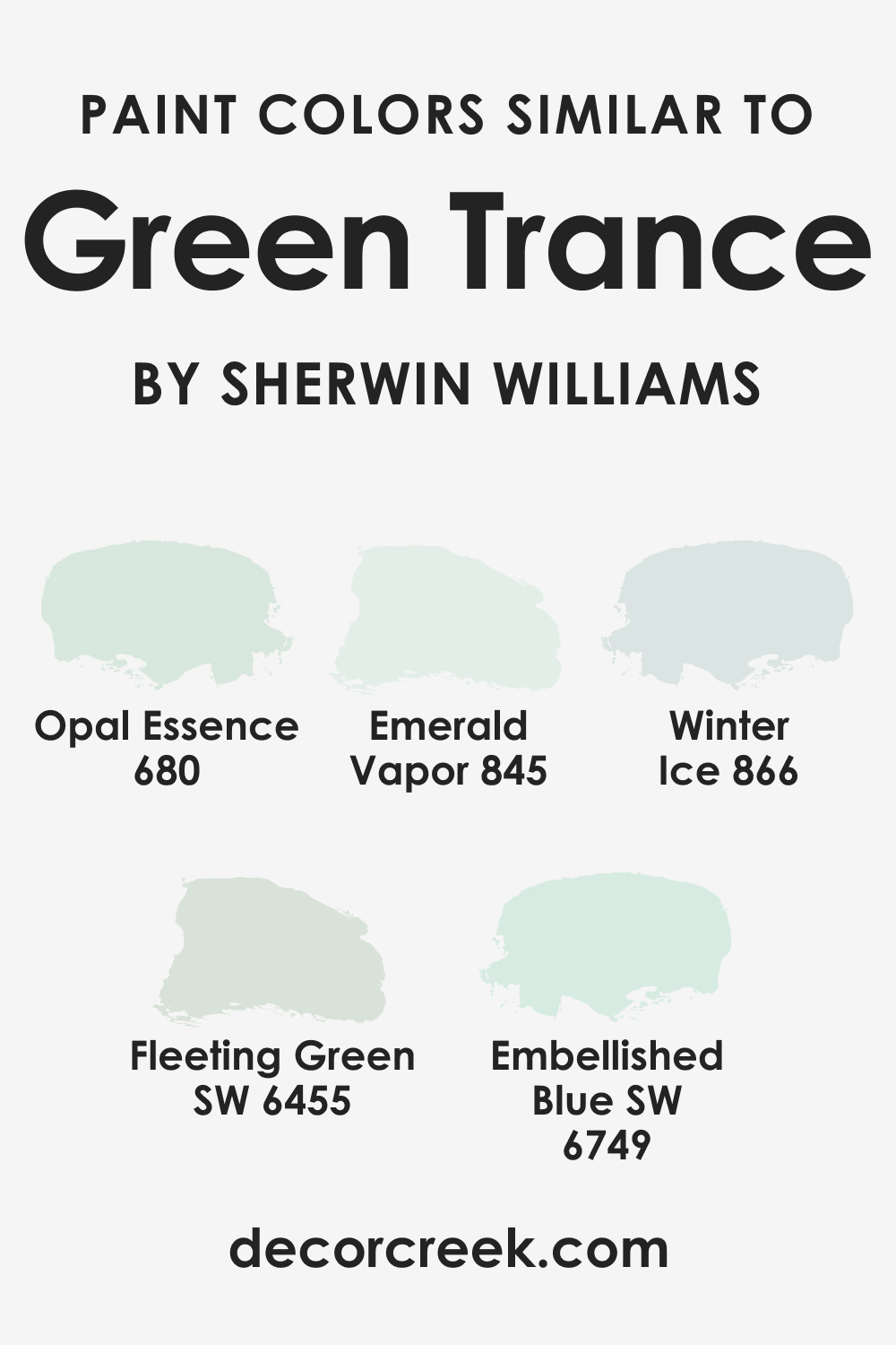
Colors Similar to SW 6462 Green Trance
If you’re looking for variations on SW Green Trance, consider these similar shades from Sherwin-Williams:
- Fleeting Green (SW 6455)
- Embellished Blue (SW 6749)
- BM 680 Opal Essence
- BM Emerald Vapor (845)
- BM Winter Ice (866)
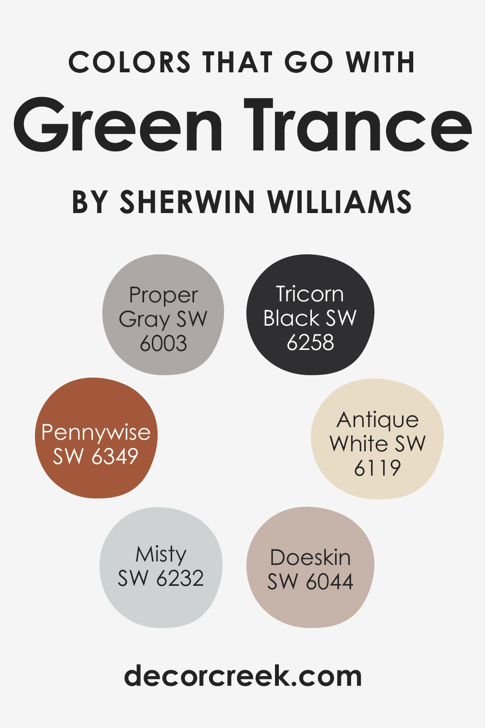
Colors That Go With SW 6462 Green Trance
Pair SW Green Trance with these colors to create a harmonious palette:
- SW 6258 Tricorn Black : For a bold, dramatic contrast.
- SW 6044 Doeskin : A rich, warm neutral that complements SW Green Trance’s vibrancy.
- SW 6003 Proper Gray : A cool gray that resonates with SW Green Trance’s blue undertones.
- SW 6119 Antique White : A warm off-white that contrasts subtly, allowing SW Green Trance to pop.
- SW 6232 Misty : A cool, breezy blue that enhances the tranquil vibes of SW Green Trance.
- SW 6349 Pennywise : A warm, inviting copper that brings out the warmth in SW Green Trance.
How to Use SW 6462 Green Trance In Your Home?
This color is pretty versatile, so you will easily find a room where SW Green Trance can display its beauty and calmness to you. Below, we describe where exactly this delicate and refreshingly soothing color can be used in your house or apartment.
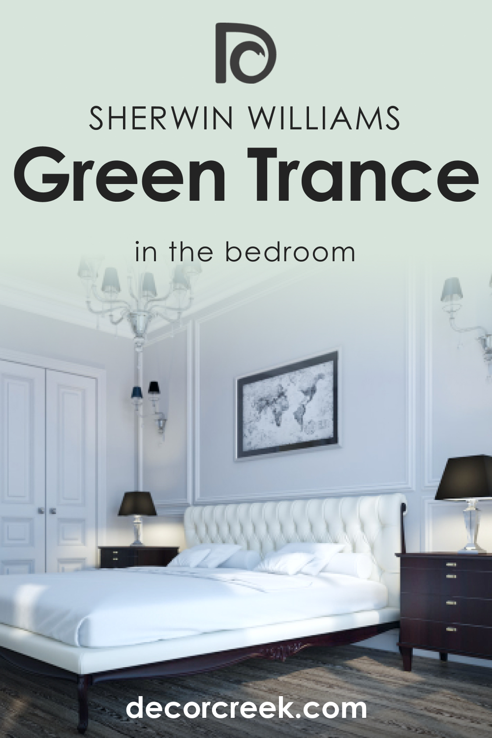
How to Use SW 6462 Green Trance in the Bedroom?
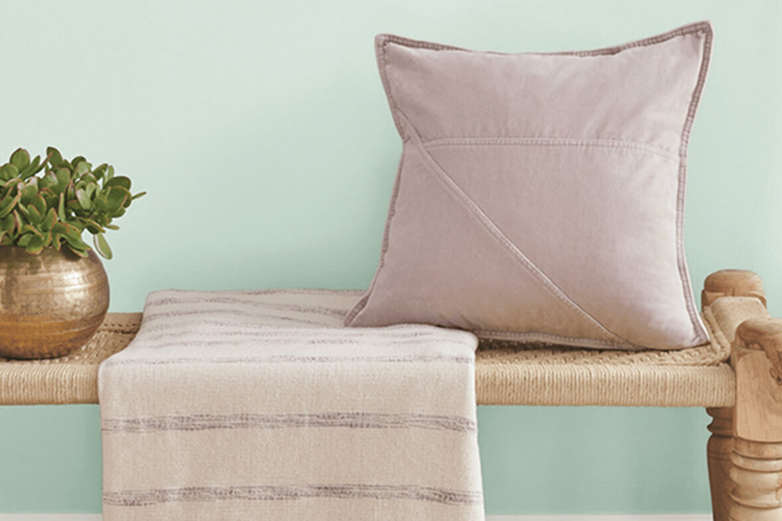
SW Green Trance can transform a bedroom into a serene sanctuary. The calming green hue, reminiscent of a forest, can help reduce stress and promote relaxation, which is ideal for a good night’s sleep.
Pair it with trim in Pure White for a crisp, clean look, and consider using softer textures like linen or velvet to complement the calming nature of the color.
A bold choice could be to paint an accent wall behind the bed in SW Green Trance, leaving the other walls a neutral white or light gray. This strategy allows the tranquil green to become the focal point without overwhelming the space.
Complement the room with natural elements like wooden furniture and plants to enhance the nature-inspired vibe.
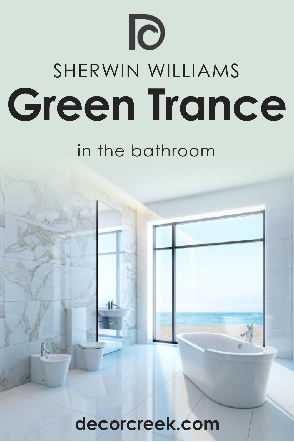
How to Use SW 6462 Green Trance in the Bathroom?
In the bathroom, Green Trance can create a spa-like ambiance. Use it on all walls to envelop the space in tranquillity or as an accent color on the vanity or bathtub wall for a pop of color. Pairing it with a Pure White trim can make the room feel clean and fresh.
Accessorize with white or natural wood elements to keep the space light and airy. A mirror with a gold frame can add a touch of elegance against the soothing green backdrop, and fluffy white towels will give a luxury spa-like feel.
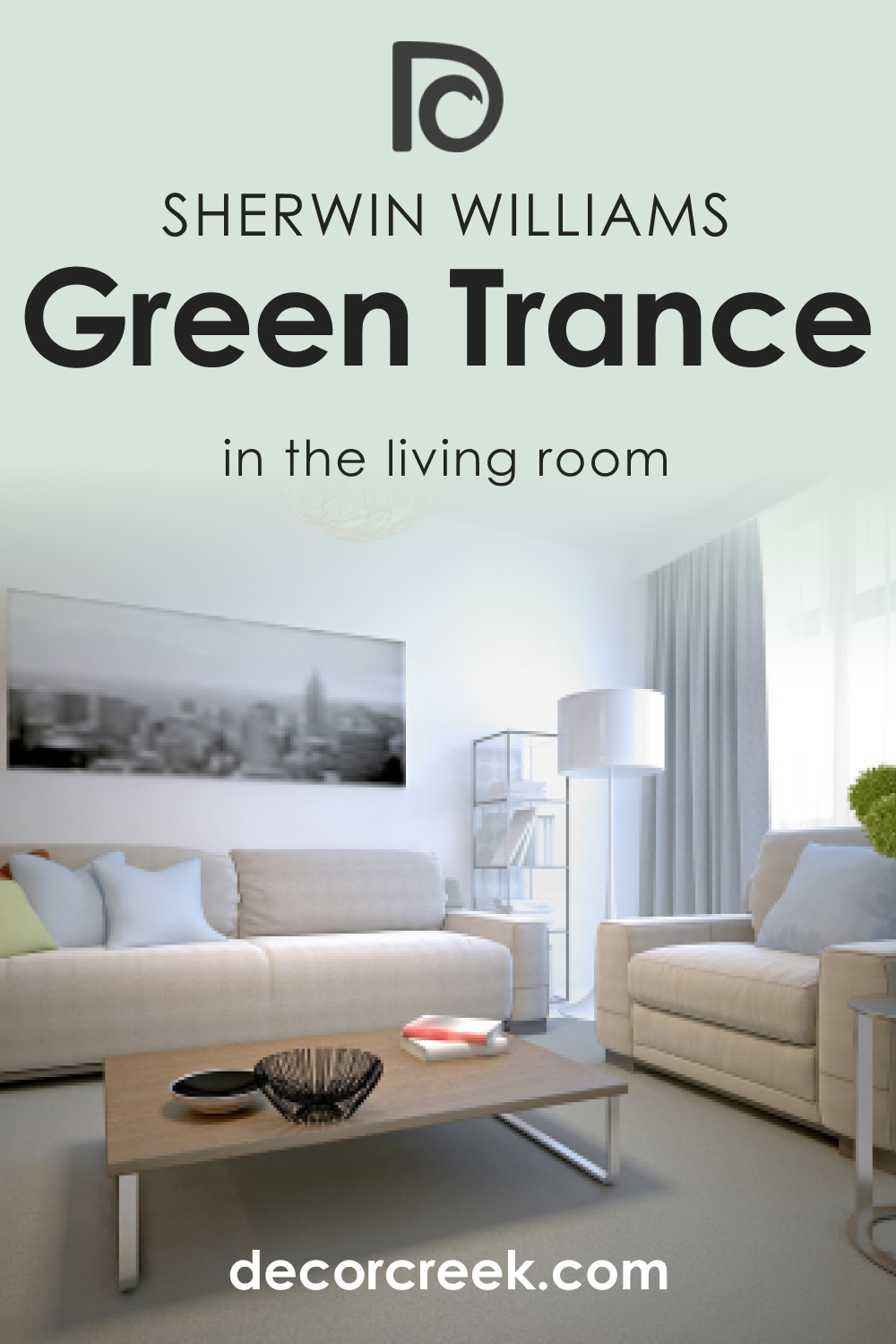
How to Use SW 6462 Green Trance in the Living Room?
In the living room, SW Green Trance works wonders to create a lively and welcoming ambiance. Paint the entire room or focus on an accent wall – perhaps the one with the largest window to tie in nature’s green outside.
Coordinate with neutrals like Half-Caff for the furniture, and throw in some earthy-toned accessories for a warm, inviting space. Accent with gold or brass elements to elevate the room’s sophistication.
For a modern touch, add some abstract art that incorporates Green Trance’s color palette.
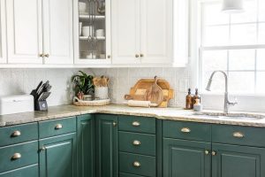
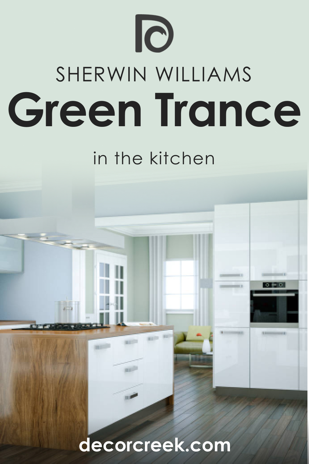
How to Use SW 6462 Green Trance in the Kitchen?
In the kitchen, SW Green Trance is a rejuvenating color that can make the space feel clean and energetic. Consider painting the cabinets Green Trance for a vibrant touch that contrasts with a lighter wall color like Greek Villa.
Pair it with wooden countertops for a warm balance, and consider white appliances for a fresh, modern look. Metallic finishes on fixtures, like gold or copper, will add a touch of elegance and pair nicely with the cool undertones of SW Green Trance.
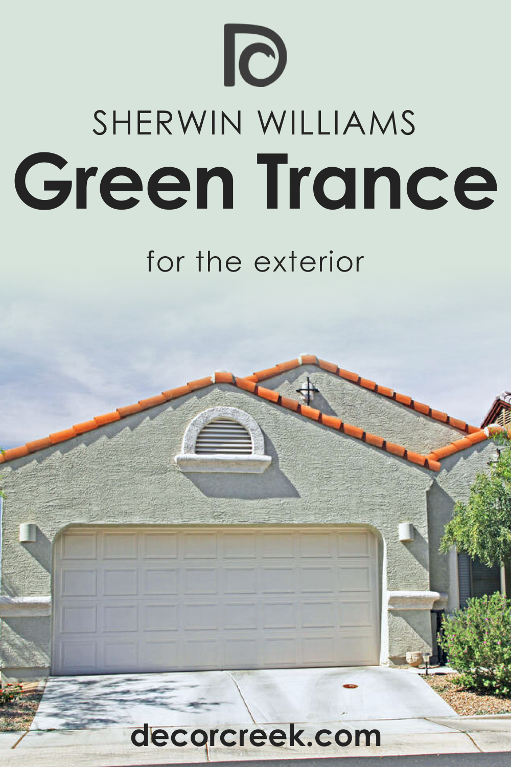
How to Use SW 6462 Green Trance for an Exterior?
For an exterior, SW Green Trance serves as a lovely bridge between your home and its natural surroundings. It’s refreshing and unique without being too bold. Use it on the main body of the house, paired with Pure White for the trim to create a classic, harmonious look.
For a modern twist, use Greek Villa for the trim, adding warmth and subtle contrast. Accessorize with natural elements, such as wooden doors and stone paths, to complete the welcoming, harmonious exterior.
Comparing SW 6462 Green Trance With Other Colors
Here you can read how SW Green Trance looks compared to other colors with a similar appearance. This will help you better understand how colors vary and how LRVs and undertones contribute to those distinctions.
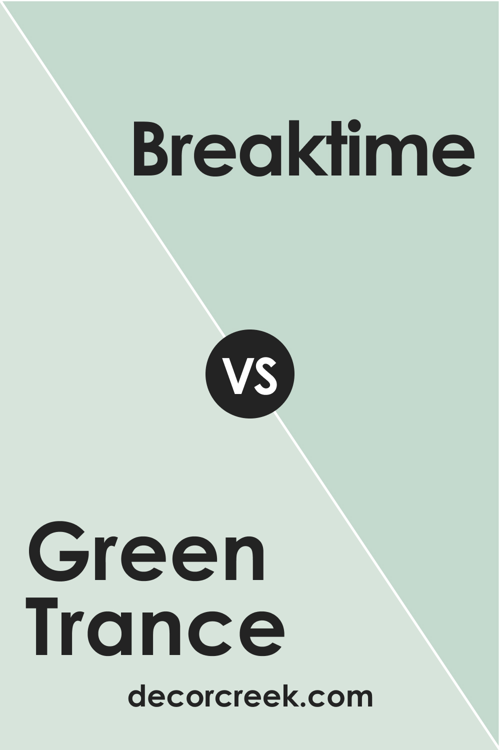
SW 6462 Green Trance vs SW 6463 Breaktime
While both are cool greens, Breaktime is noticeably lighter and cooler than SW Green Trance. It leans more towards a teal hue, giving it a distinctly coastal feel compared to the more earthy, forest-like vibe of Green Trance.
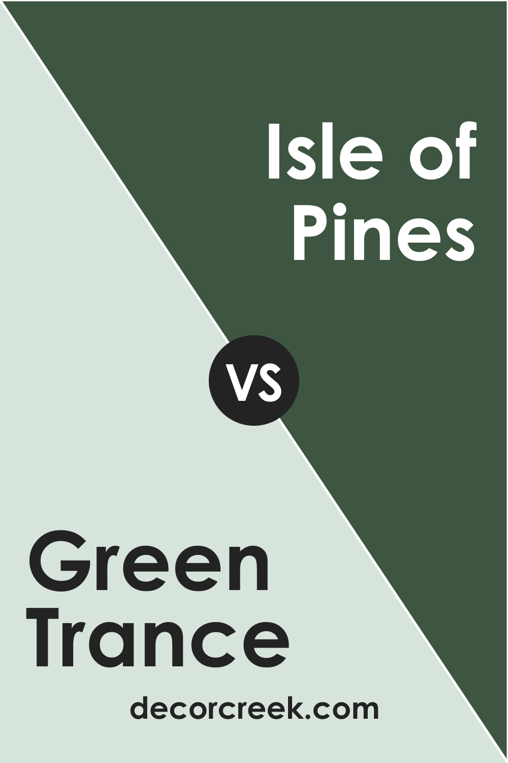
SW 6462 Green Trance vs SW 6461 Isle of Pines
Isle of Pines is a much darker and deeper green. While SW Green Trance carries a sense of freshness and vibrancy, Isle of Pines has a stronger, more robust presence that feels more traditional and grounded.
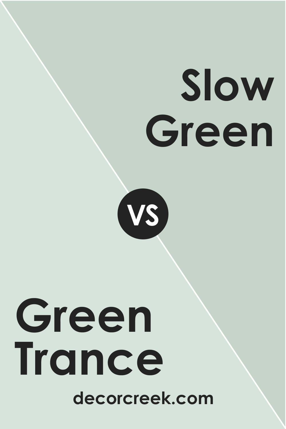
SW 6462 Green Trance vs SW 6456 Slow Green
SW Slow Green is a significantly lighter shade with a softer, muted tone. It doesn’t have the same depth and intensity as SW Green Trance, making it better suited for spaces where a more subtle hint of green is desired.
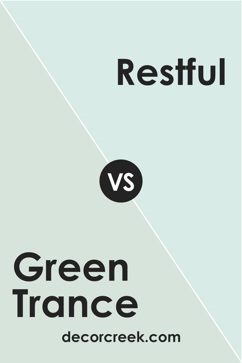
SW 6462 Green Trance vs SW 6458 Restful
SW Restful is a soothing color that carries a stronger blue undertone compared to SW Green Trance. It evokes a sense of tranquillity and calm, perfect for relaxation areas, but it lacks the energizing vibe of SW Green Trance.
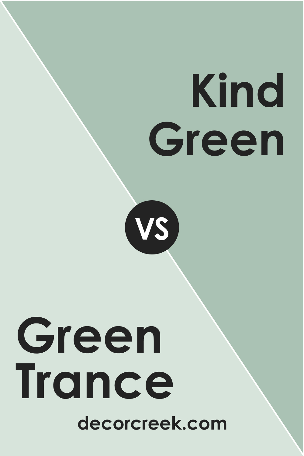
SW 6462 Green Trance vs SW 6457 Kind Green
SW Kind Green is a more muted and subtle shade than SW Green Trance. It has a softer presence, making it less invigorating but more versatile in blending with a range of other colors.
SW 6462 Green Trance vs SW 6464 Aloe
SW Aloe is a lighter, softer shade with a notable gray undertone. It has a gentle, calming effect, contrasting the more vibrant and stimulating Green Trance.
Conclusion
SW 6462 Green Trance is a versatile, energizing, and calming shade of green that can beautifully transform a space.
Its adaptability to different rooms and its compatibility with a broad range of colors make it an excellent choice for anyone wanting to bring a touch of nature and vibrancy into their décor.
Whether you desire a serene bedroom, a rejuvenating bathroom, or a lively living room, SW Green Trance is a hue that can meet and exceed your expectations.
Ever wished paint sampling was as easy as sticking a sticker? Guess what? Now it is! Discover Samplize's unique Peel & Stick samples.
Get paint samples
Frequently Asked Questions
⭐What kind of rooms is the SW 6462 Green Trance best suited for?
Green Trance is a versatile color that works well in a variety of spaces. Its calming and energizing attributes make it great for bedrooms, bathrooms, and kitchens. Additionally, its vibrant hue makes it an excellent choice for living areas or exteriors.
⭐What colors complement SW 6462 Green Trance?
Green Trance pairs beautifully with a range of colors. It coordinates well with whites and neutrals such as SW 7005 Pure White, SW 7551 Greek Villa, and SW 9091 Half-Caff. Other complementary colors include cooler grays like SW 7070 Site White and SW 9170 Acier, and warmer tones like SW 6044 Doeskin and SW 6349 Pennywise.
⭐Does the lighting affect the look of SW 6462 Green Trance?
Yes, like all colors, the appearance of Green Trance can change under different lighting conditions. In natural light, its blue-green undertone comes forward, while warm artificial lighting enhances its emerald undertone. Cool artificial lighting, like LED lights, can accentuate its cool attributes.
⭐What is the LRV of SW 6462 Green Trance, and what does it mean?
The Light Reflectance Value (LRV) of Green Trance is 75, meaning it reflects a significant amount of light and appears on the lighter side of the spectrum. This makes it a good choice for both smaller and larger spaces, as it can make a room feel brighter and more open.
⭐What are some similar colors to SW 6462 Green Trance?
Several Sherwin-Williams colors share similarities with Green Trance. These include SW 6457 Kind Green, a slightly lighter shade; SW 6458 Restful, a subdued green with a stronger blue undertone; and SW 6461 Isle of Pines, a darker, forest-like green.