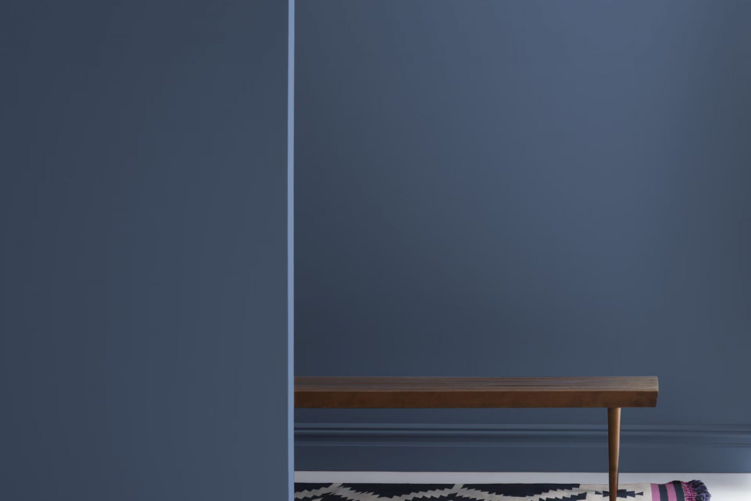
Imagine finding that perfect shade of blue that seems to reflect every comfortable, cozy emotion you cherish; that’s exactly what 840 Kensington Blue by Benjamin Moore does for me. As I began redecorating my quaint living room, a surge of colors tempted me, yet none felt quite right until I stumbled upon Kensington Blue.
The way it subtly balances a sense of calm with a lively charm caught my eye immediately. With 840 Kensington Blue, my living area has turned into an inviting hub, blending seamlessly with both modern and classic décor. Its flexibility is wonderful, allowing me to mix and match various textures and furnishings without the color ever feeling out of place or too strong.
Whether sunny and bright or dimly lit by evening lamps, the walls painted in this shade provide a consistent backdrop that is both comforting and stylish.
It’s precisely this reliability and aesthetic adaptability that has made Kensington Blue a staple in my home’s palette.
What Color Is Kensington Blue 840 by Benjamin Moore?
Kensington Blue by Benjamin Moore is a deep, rich blue with a subtle hint of gray. This shade has the perfect balance of warmth and depth, making it highly adaptable and suitable for various uses in home décor. It stands out for its ability to offer a strong, grounded presence without feeling too intense in a room.
This color works exceptionally well in styles such as coastal, traditional, and contemporary. In a coastal setting, it evokes the deep, reflective qualities of the ocean. In more traditional rooms, Kensington Blue adds a classic touch, while in modern designs, it brings a crisp, clean look that pairs beautifully with minimalist aesthetics.
Kensington Blue pairs well with a variety of materials and textures. It looks stunning when combined with natural wood, which helps to warm up the color and add a rustic charm. Metallic finishes like brass or gold create a striking contrast, bringing a touch of luxury and glamour.
For textures, Kensington Blue works well with soft textiles like velvet or linen, adding a layer of depth and interest to the décor. It also beautifully complements materials like glass and ceramics, which help to keep the look fresh and vibrant. Overall, Kensington Blue is a flexible color choice that can enhance the aesthetic of a home while maintaining a cozy, welcoming atmosphere.
Is Kensington Blue 840 by Benjamin Moore Warm or Cool color?
The Kensington Blue 840 by Benjamin Moore is a vivid and striking color choice for any home. Its vibrant blue hue adds a strong presence to any room, working well especially in areas that need a touch of brightness.
This particular shade can make smaller rooms feel larger and more open, due to its ability to reflect light nicely. It’s perfect for a feature wall in a living room or bedroom, and equally effective in bathrooms for a refreshing splash of color.
Kensington Blue can be balanced with neutral tones like white or gray, which help to soften its impact and create a harmonious look. This color also pairs well with wooden furniture and accents, bringing a natural feel to the indoors. Overall, using Kensington Blue in your home can add a lively and fresh vibe, making rooms more inviting and cheerful.
Undertones of Kensington Blue 840 by Benjamin Moore
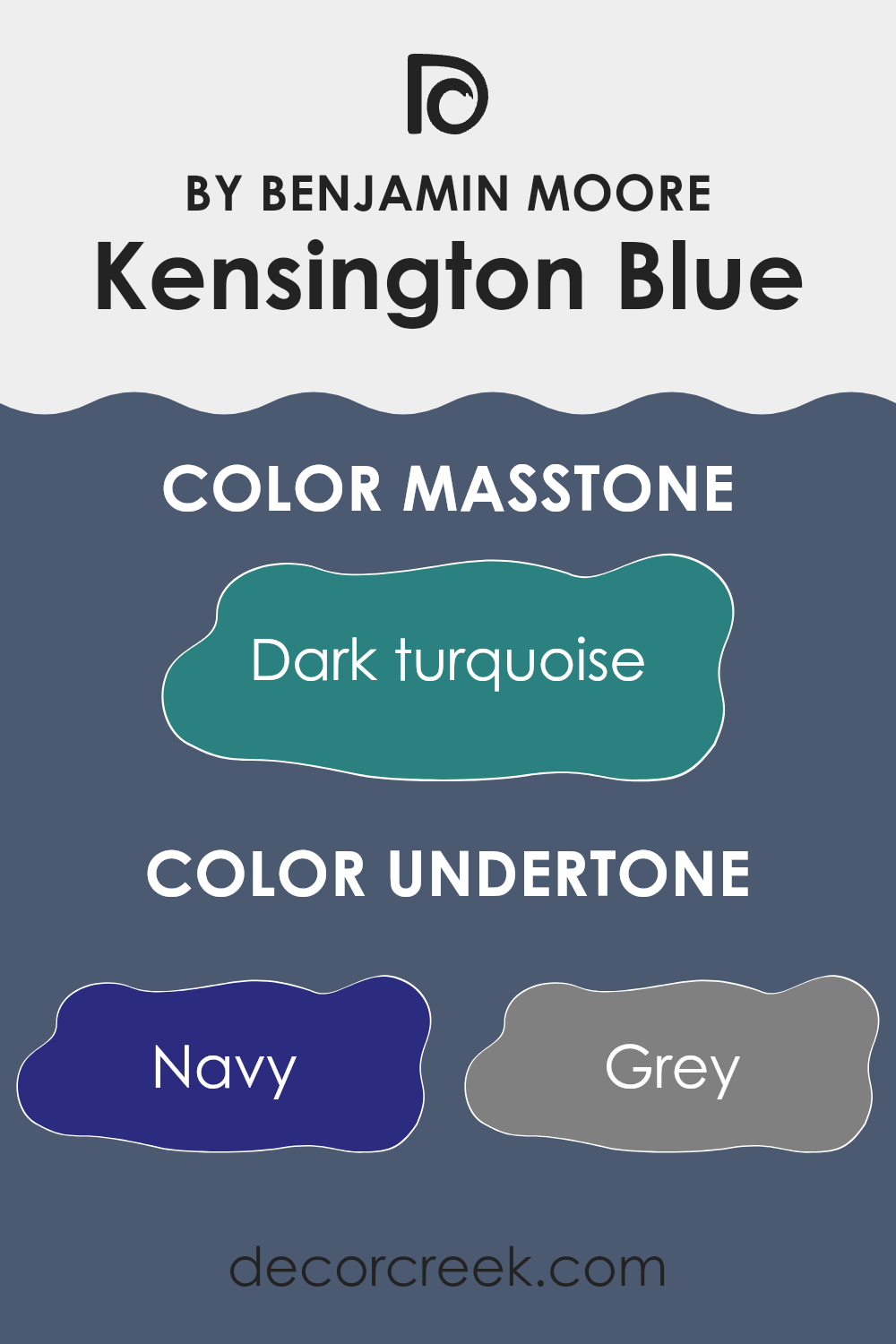
The color Kensington Blue by Benjamin Moore is a complex shade that brings a unique depth to any room. Its intricate undertones play a significant role in how the color is perceived, subtly influencing its overall appearance and the mood it creates.
Undertones are like subtle hues mixed into the main color, and they can shift based on lighting or surrounding shades. For example, a color with navy undertones might look slightly darker or richer, while grey undertones can give a cooler, more neutral vibe. In the case of Kensington Blue, its array of undertones including navy, grey, purple, and more add a dynamic and adaptable element to the paint.
When Kensington Blue is used on interior walls, these undertones become quite impactful. In natural light, light blue or lilac undertones might make the walls seem softer and more inviting. In artificial lighting, darker undertones like dark grey or navy might be more noticeable, giving the room a more grounded and secure feel. This color can adjust subtly to different settings and decorations, which makes it very practical for various rooms in a home.
The presence of green and turquoise undertones in Kensington Blue can also introduce a slight freshness to the room, reminiscent of nature, without overpowering the primary blue tone. This makes it ideal for creating an area that feels both comfortable and lively. Overall, Kensington Blue’s myriad undertones help it to blend well with different color schemes and decor styles, making it a flexible choice for many homes.
What is the Masstone of the Kensington Blue 840 by Benjamin Moore?
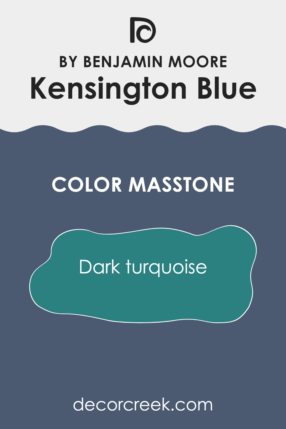
Kensington Blue 840 by Benjamin Moore has a masstone, or main tone, of dark turquoise, tagged as #2B8080. This type of color is essentially a deep blend of blue and green. When used in a home, this unique color brings a rich and cozy feel to the room.
It’s great for creating a snug and welcoming atmosphere in areas like living rooms and bedrooms. Because it’s a darker shade, it absorbs more light, which can make smaller rooms look a bit smaller. However, in a larger or well-lit area, this dark turquoise can add depth and interest, making the room feel more intimate and comforting.
This color pairs well with light neutrals like creams and light browns, which can help balance the darkness and prevent the room from feeling too closed in. Overall, Kensington Blue 840 makes for a bold yet comforting choice in home decor, allowing for a stylish and inviting environment.
How Does Lighting Affect Kensington Blue 840 by Benjamin Moore?
Lighting plays a crucial role in how we perceive the color of objects, including paint colors like Kensington Blue by Benjamin Moore. The type of light under which this color is viewed can significantly affect how it appears.
Artificial Light vs. Natural Light:Natural light shows Kensington Blue’s true color, but depending on the time of day, the intensity of the color can shift. Morning light tends to make it look bright and crisp, while during late afternoon, it may appear softer or richer. On the other hand, artificial lighting can influence the color differently. Cool LED lights might enhance the blue tones, making it look more vivid, whereas warm incandescent bulbs could make it appear darker or slightly muted.
Room Orientation:
North-Faced Rooms:
In rooms that face north, natural light is typically cooler and might not pour in as vibrantly as in south-facing rooms. Kensington Blue in a north-facing room could look a bit shadowy and more subdued. It creates a calm and somewhat gentle atmosphere due to the limited natural light.
South-Faced Rooms:Southern exposure receives the most intense light throughout the day. Kensington Blue used in south-facing rooms appears brighter and more lively, especially during midday when the light is strongest. The paint can reflect a dynamic vibrant tone, making the room feel energetic.
East-Faced Rooms:
In east-facing rooms, the morning light can make Kensington Blue look very fresh and vivid. As east-facing rooms lose direct sunlight in the afternoon, the color might appear cooler and more relaxed as the day progresses.
West-Faced Rooms:Conversely, rooms with western exposure get softer natural light in the morning, meaning the color might not show its full depth. However, in the afternoon and evening, as the sun sets, Kensington Blue can look exceptionally dynamic and rich due to the intense, warm light.
In summary, the hue of Kensington Blue can shift depending on the light source and room orientation. It’s more than just a choice of color; it’s about how the shade interacts with the light available, shaping the mood and tone of the room.
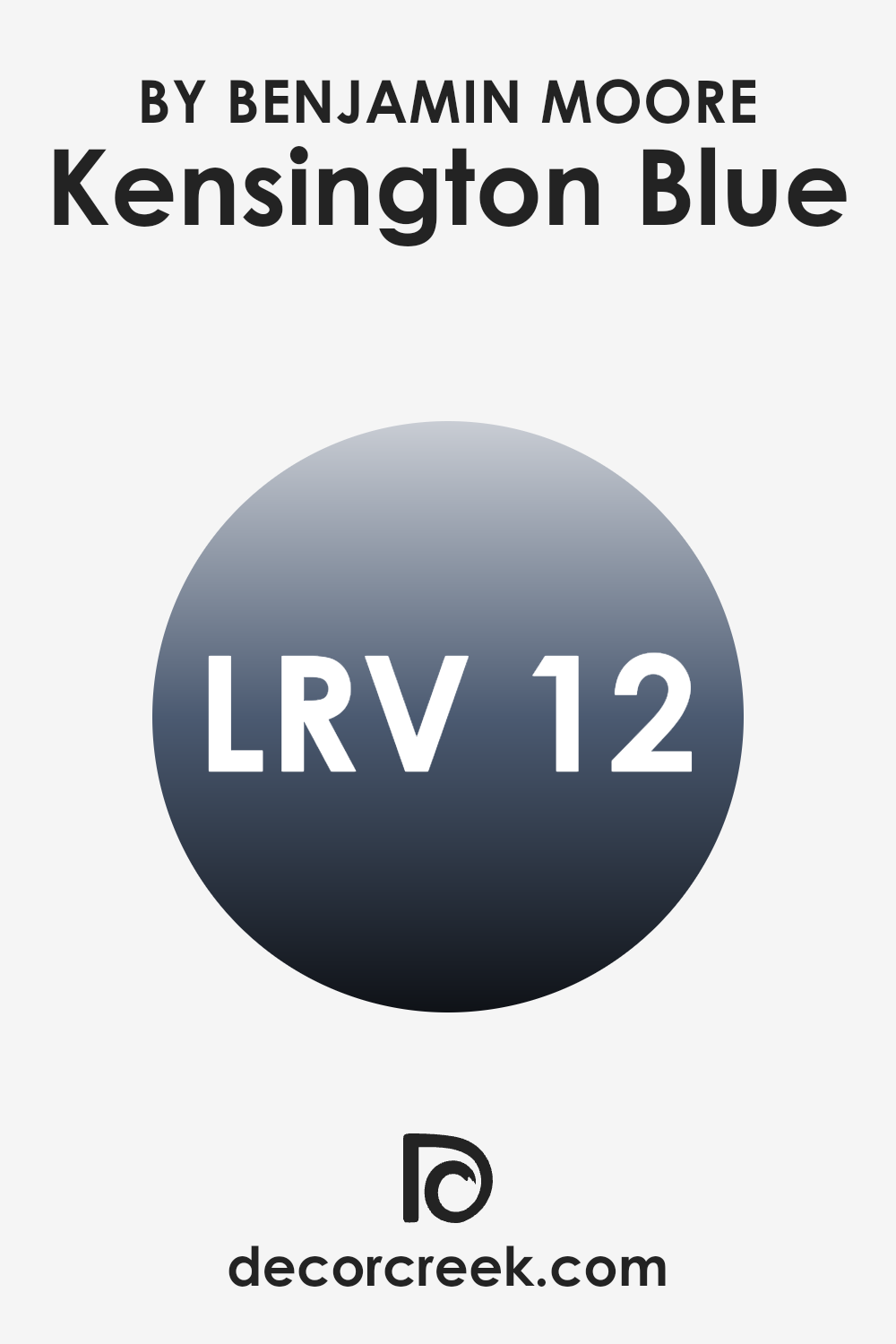
What is the LRV of Kensington Blue 840 by Benjamin Moore?
LRV stands for Light Reflectance Value, a measure that indicates how much light a paint color reflects back into the room compared to how much it absorbs. LRV ranges from very low numbers, which reflect very little light, to higher values closer to a maximum reflection rate, showing that a color is highly reflective.
This value is particularly useful when choosing paint colors for your home because it helps predict how light or dark a color will appear once it’s on your walls. A higher LRV means the color will look lighter and can make a small room feel more open and airy. Conversely, a lower LRV can make a color appear darker, which might be used to create a cozier or more enclosed feeling in a room.
In the case of Kensington Blue with an LRV of 11.97, this color falls on the lower end of the spectrum, meaning it does not reflect much light. When applied to walls, this color will absorb more light and appear quite dark, significantly shaping the mood and character of a room.
In rooms with less natural light, using a paint color with such a low LRV can make the room appear smaller and dimmer. However, in a well-lit area or an interior where a dramatic and intimate atmosphere is desired, this deep hue can add a striking impact and depth to the decor, making it a bold choice for those looking to create a more pronounced and inviting environment.
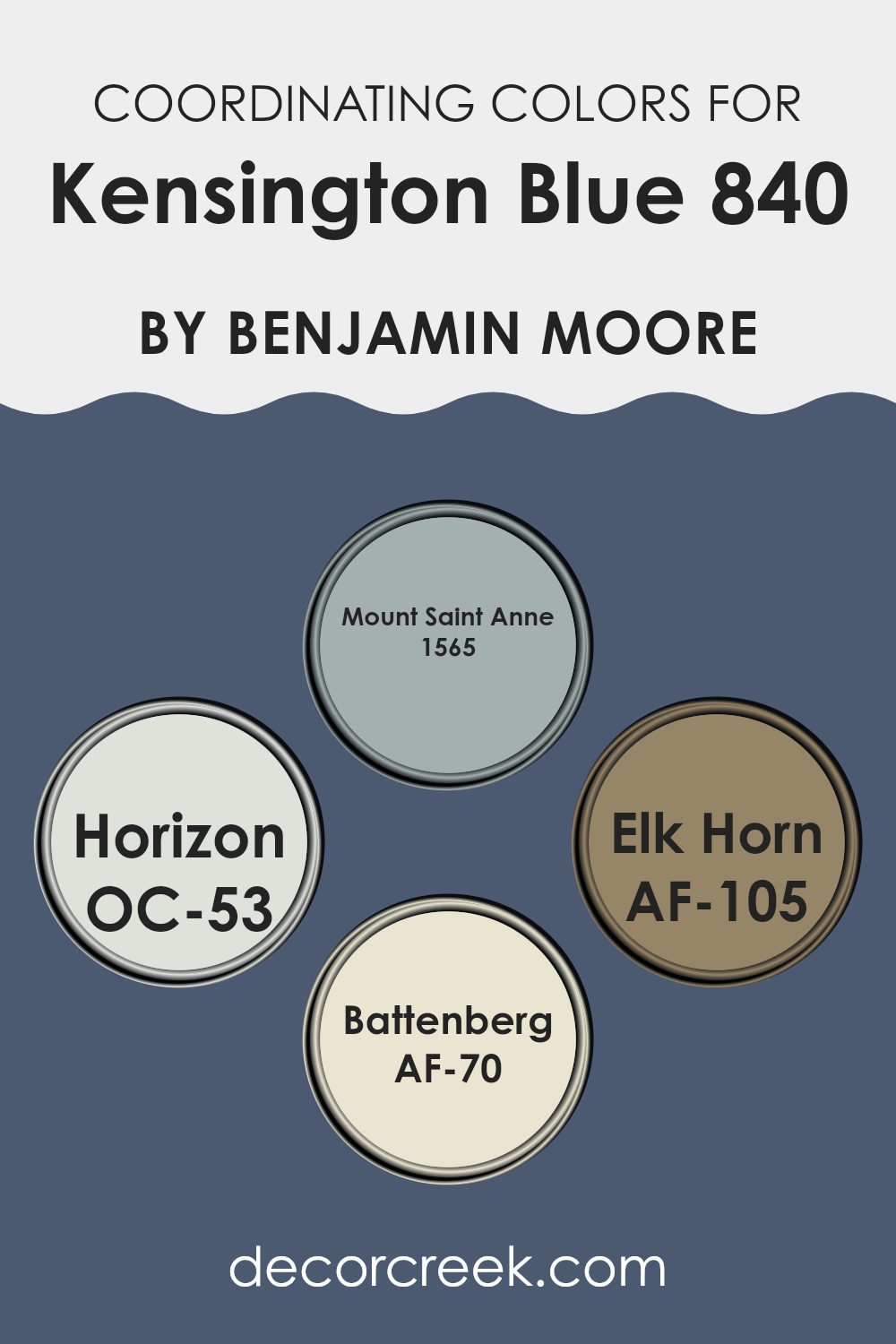
Coordinating Colors of Kensington Blue 840 by Benjamin Moore
Coordinating colors are shades that complement each other well, creating a balanced and harmonious look. When selecting coordinating colors, it’s important to pick hues that either enhance or contrast nicely with the main color. For Kensington Blue, a rich and vibrant shade, the chosen coordinating colors bring out its depth and beauty without overpowering it.
Mount Saint Anne (1565) is a soft grayish-blue that pairs beautifully with Kensington Blue, offering a subtle contrast while maintaining a calm and unified palette. This color is reminiscent of a cloudy sky and works wonderfully in areas that aim for a mild, peaceful atmosphere. Horizon (OC-53) is another coordinating color, much lighter, almost a misty gray.
It’s perfect for providing a gentle lift to the deeper tones of Kensington Blue, giving a room an airy and open feel. Elk Horn (AF-105) introduces a warm, earthy beige that complements the coolness of Kensington Blue, offering a natural, grounding effect. This color can help in creating a cozy and inviting environment.
Lastly, Battenberg (AF-70) is a light, creamy hue that acts as a delicate counterpart to the more pronounced Kensington Blue. It adds a touch of brightness to the area, making the room appear more open and fresh. Combining these colors strategically can enhance the aesthetic appeal of any room, maintaining visual interest and color balance.
You can see recommended paint colors below:
- 1565 Mount Saint Anne
- OC-53 Horizon
- AF-105 Elk Horn
- AF-70 Battenberg
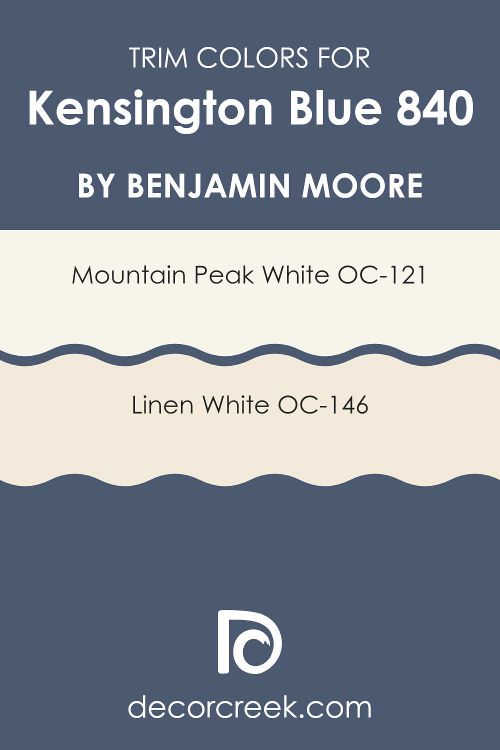
What are the Trim colors of Kensington Blue 840 by Benjamin Moore?
Trim colors are specific shades used on architectural elements like door frames, baseboards, moldings, and windowsills. These colors are crucial because they highlight and define the contours and details of a room, enhancing its overall visual appeal.
For Kensington Blue, a color like OC-121 – Mountain Peak White or OC-146 – Linen White are excellent choices, as they provide a crisp, clean contrast that can make the primary color stand out more vividly.
Mountain Peak White is a bright, uplifting shade that offers a pure and refreshing look, ensuring that it doesn’t compete with the deeper tones of Kensington Blue but rather complements it. Linen White, on the other hand, has a warmer undertone that brings a cozy and welcoming feel to the room. It pairs beautifully with Kensington Blue, creating a seamless and harmonious look that is pleasing to the eye and provides a comfortable ambiance to any area.
You can see recommended paint colors below:
- OC-121 Mountain Peak White
- OC-146 Linen White
Colors Similar to Kensington Blue 840 by Benjamin Moore
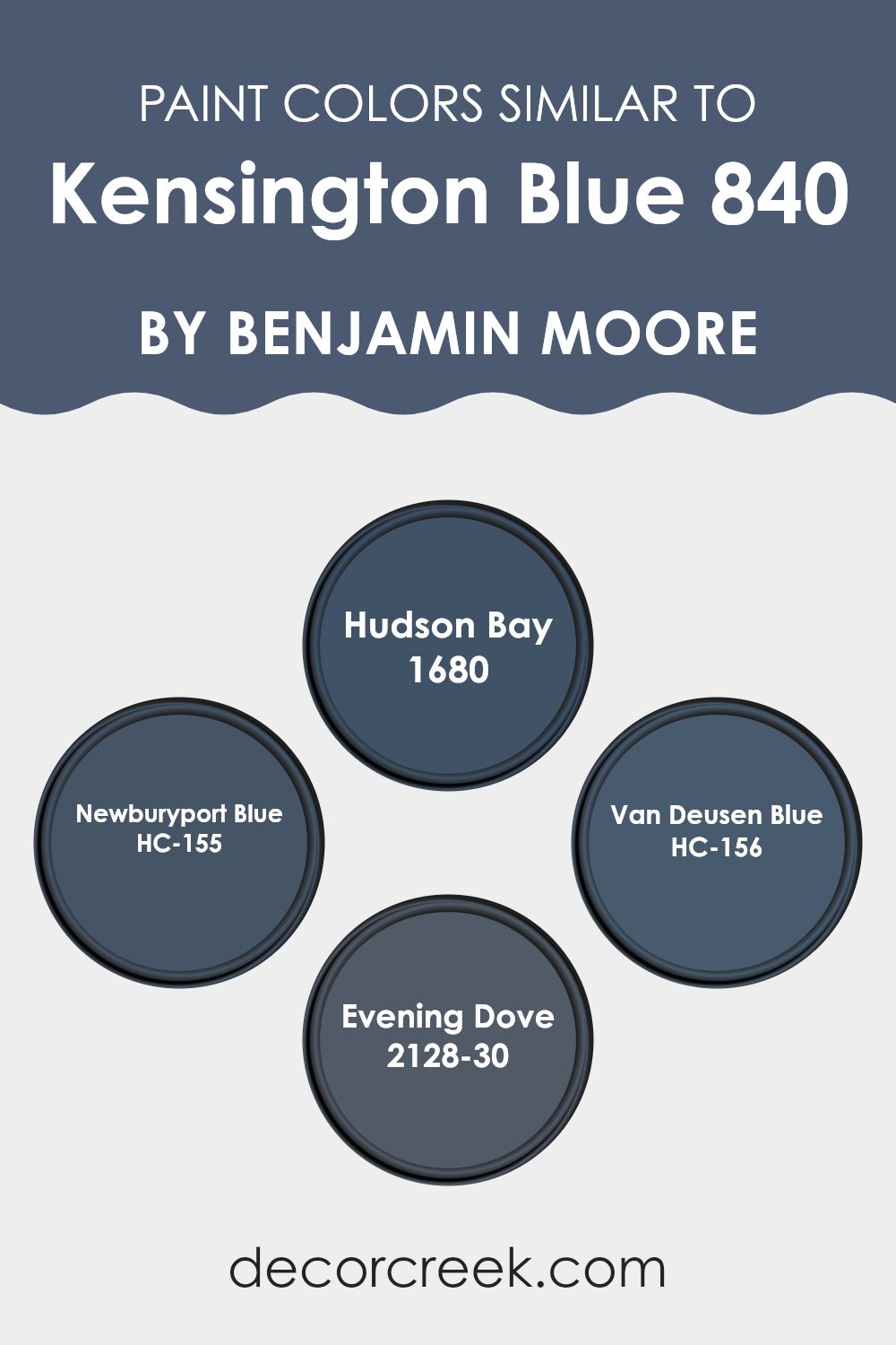
Choosing similar colors is essential when creating a cohesive and harmonious color scheme in interior design. When colors closely resemble each other, such as Kensington Blue and its similar colors, they can easily blend and work well together, creating a smooth visual flow from room to room or across a single area. This approach can make rooms feel larger and more connected, as similar hues help to unify various elements and features within a room, minimizing stark contrasts that can visually break up the area.
For instance, Hudson Bay 1680 is a crisp navy tone that offers a robust depth, making it perfect for accent walls or furniture pieces. The richness of this color works well with lighter similar shades to provide a balanced look. Newburyport Blue HC-155 is another color that leans slightly towards a marine shade, ideal for evoking a subtle nautical ambiance without feeling too strong.
Van Deusen Blue HC-156, taking a deeper and more intense approach, is perfect for creating a strong presence and drawing attention in a room. Lastly, Evening Dove 2128-30 presents a muted alternative, offering a softer approach to the deep blues that can make a room feel gentle while still maintaining a hint of drama. Collectively, these colors can be used to achieve different effects within the same color family, from bold and striking to soft and subdued, depending on the desired atmosphere and purpose of the room.
You can see recommended paint colors below:
- 1680 Hudson Bay
- HC-155 Newburyport Blue
- HC-156 Van Deusen Blue
- 2128-30 Evening Dove
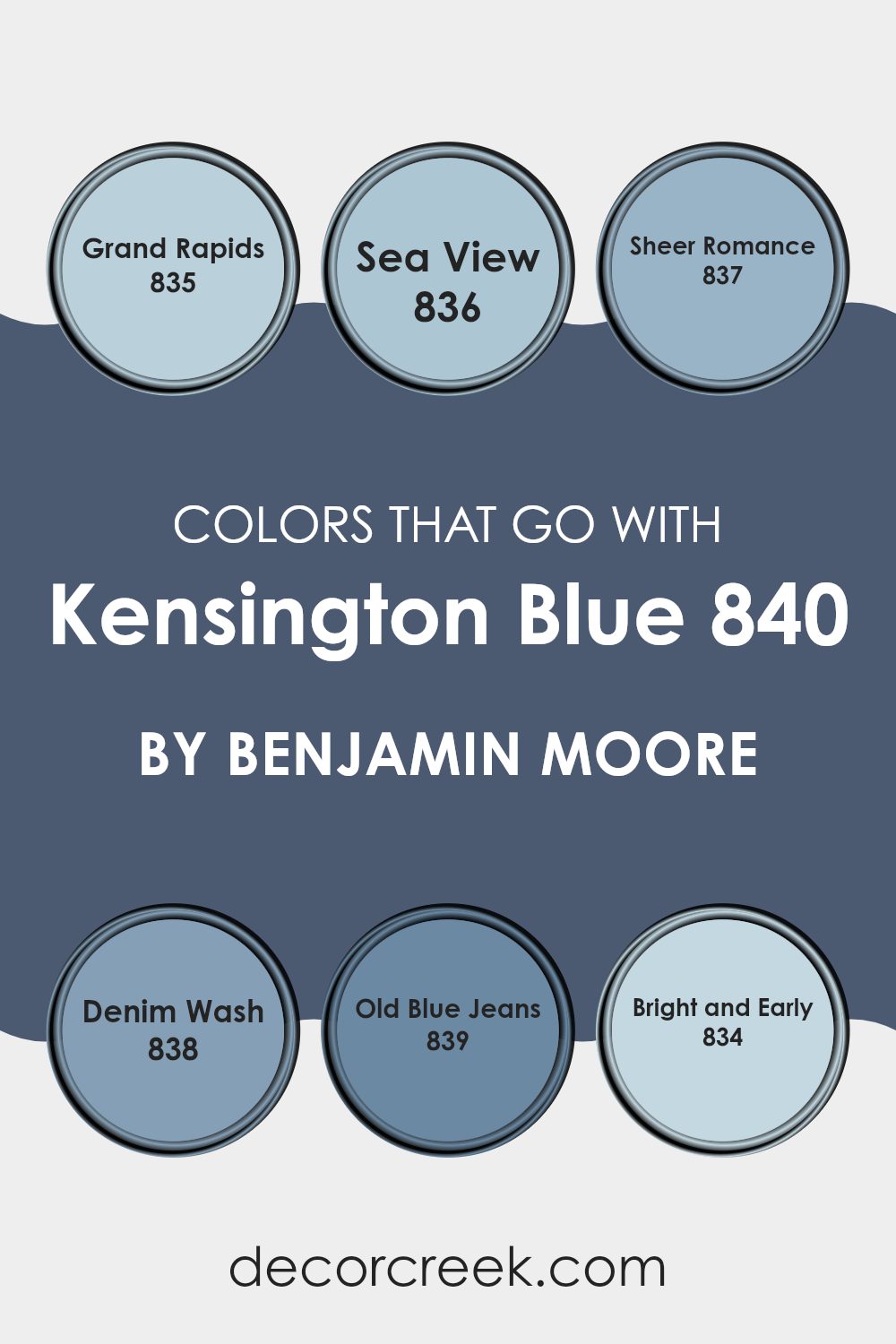
Colors that Go With Kensington Blue 840 by Benjamin Moore
Choosing the right colors to complement Kensington Blue 840 by Benjamin Moore is crucial because it ensures that the overall aesthetic of a room is cohesive and harmonious. When paired correctly, these colors can create a pleasing atmosphere that enhances the beauty of Kensington Blue, a rich and inviting hue itself. For example, Grand Rapids 835 provides a subtle contrast that is gentle yet distinct, enhancing the depth of Kensington Blue without making it feel too strong. This color has a quiet strength that lends a balanced backdrop to bolder shades.
Sea View 836 introduces a light, airy feel when combined with Kensington Blue, offering a fresh and clean appearance that reflects the openness of the seashore. This pairing is ideal for rooms aiming to achieve a relaxed and refreshing vibe. Moving to a softer mood, Sheer Romance 837 adds a touch of delicacy, its subtle tones creating a romantic whisper against the more pronounced Kensington Blue.
In a different direction, Denim Wash 838 complements Kensington Blue with its understated coolness, echoing the comfort and familiarity of well-loved jeans, while Old Blue Jeans 839 pulls in a slightly darker, more worn-in look that resonates with cozy, lived-in rooms. Lastly, Bright and Early 834 throws a splash of lightness into the mix, injecting a crisp, sunny vibe that can make any area feel more open and uplifting. Each of these colors works with Kensington Blue to shape a room that feels complete and inviting.
You can see recommended paint colors below:
- 835 Grand Rapids
- 836 Sea View
- 837 Sheer Romance
- 838 Denim Wash
- 839 Old Blue Jeans
- 834 Bright and Early
How to Use Kensington Blue 840 by Benjamin Moore In Your Home?
Kensington Blue 840 by Benjamin Moore is a vibrant and rich blue paint shade that can really make a room stand out. It’s perfect if you’re looking to add some liveliness and energy to any area. Imagine using this color in your living room or bedroom walls to create a striking look, or in smaller elements like doors or furniture for a stylish splash of color.
For those who enjoy a nautical or coastal vibe, Kensington Blue can be paired effectively with whites and creams to mimic the soothing colors of the sea and beach. Additionally, this shade works well in a child’s playroom or bedroom, inspiring creativity and brightness.
In terms of practical application, this paint is adaptable and can be used on various surfaces including walls, trim, and even cabinets. Regardless of where it’s applied, Kensington Blue has a fresh appeal that can instantly refresh an area with a cool, blue hue.
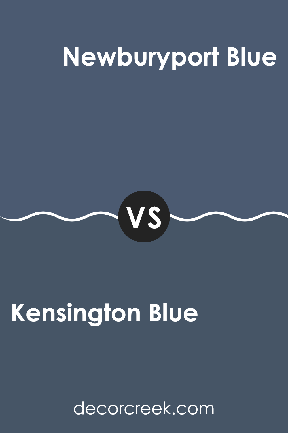
Kensington Blue 840 by Benjamin Moore vs Newburyport Blue HC-155 by Benjamin Moore
Kensington Blue and Newburyport Blue, both by Benjamin Moore, are unique shades of blue that offer distinct moods for any room. Kensington Blue is a deep, rich blue with a hint of brightness that makes it lively and refreshing.
It’s perfect for creating a strong but cheerful presence in a room. On the other hand, Newburyport Blue is a bit darker and leans towards a classic navy shade. It provides a feeling of strong tradition and has just enough depth to make rooms feel cozy and grounded without being too intense.
Both colors work well in different settings: Kensington Blue is great for livening up an area, while Newburyport Blue is ideal for adding a touch of enduring charm and warmth. Depending on your mood and the function of your room, either color could be a great choice.
You can see recommended paint color below:
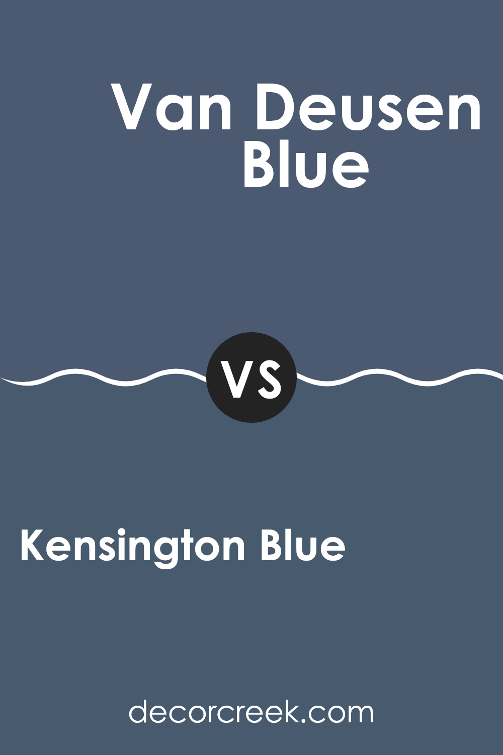
Kensington Blue 840 by Benjamin Moore vs Van Deusen Blue HC-156 by Benjamin Moore
Kensington Blue and Van Deusen Blue, both by Benjamin Moore, are two distinct shades of blue. Kensington Blue is a darker shade that tends to lean towards navy, giving it a strong presence in any room and making a bold statement. It’s a great choice if you’re looking to create a focal point or anchor an area with a rich and prominent color.
On the other hand, Van Deusen Blue is a slightly lighter shade compared to Kensington Blue. It has a vibrant quality while still maintaining some depth, offering a balance that works well in rooms that aim for a lively yet grounded feel. This color can freshen up a room without feeling too dark.
Both colors work well in a variety of decorative styles and rooms, from bedrooms to offices, adapting to contemporary or traditional settings. Depending on the mood you want to set, Kensington Blue leans more towards a formal look, whereas Van Deusen Blue offers adaptability with a touch of cheerfulness.
You can see recommended paint color below:
Kensington Blue 840 by Benjamin Moore vs Hudson Bay 1680 by Benjamin Moore
Kensington Blue is a deep, vivid blue that has a noticeable presence. It’s the kind of color that stands out in a room, providing a strong, stable background that’s perfect for contrasting with lighter tones or as a statement wall.
On the other hand, Hudson Bay is a more muted, grayish-blue color. It’s softer and more subdued, making it ideal for creating a relaxed and cozy atmosphere in areas meant for unwinding and comfort, such as bedrooms or living rooms.
While Kensington Blue brings energy and boldness to décor, Hudson Bay offers a gentle and calming effect, proving adaptable for many home styles. The contrast between these two colors lies in their intensity and the mood they set: Kensington Blue is more dynamic and eye-catching, while Hudson Bay is gentle and soothing.
You can see recommended paint color below:
- 1680 Hudson Bay
Kensington Blue 840 by Benjamin Moore vs Evening Dove 2128-30 by Benjamin Moore
Kensington Blue and Evening Dove, both by Benjamin Moore, offer unique shades for those looking to refresh their room with a touch of blue. Kensington Blue is a vibrant, almost regal blue that adds a cheerful and energetic vibe to a room.
It draws attention and could be the star in areas like living rooms or dining spaces where you want a lively atmosphere. On the other hand, Evening Dove is a much darker, more muted blue. This color has a calming effect, making it perfect for bedrooms or studies where a more relaxed environment is desired.
It’s less about standing out and more about blending in, providing a subtle, understated background that complements various decor styles. In summary, Kensington Blue brings a lively splash of color, while Evening Dove offers a soothing backdrop, making them suited for different purposes in home design.
You can see recommended paint color below:
- 2128-30 Evening Dove
After spending time getting to know 840 Kensington Blue by Benjamin Moore, I am really impressed! This paint color offers a unique blue shade that adds a special touch wherever you use it. From bedrooms to living rooms, it creates a cozy feel and makes the room look bright and welcoming.
I decided to try it out in my own living room, and the results were fantastic. This blue isn’t too dark or too light; it’s just right to make the area feel lively yet comforting. Even my friends and family noticed the change and loved how the new color enhanced the room.
For anyone looking to refresh their home with a new color, I highly recommend 840 Kensington Blue. It’s easy to pair with different furniture styles and decorations, whether your home style is modern or classic. This shade will make your home feel renewed and lively. Plus, it’s a paint that covers the walls really well, which means you might not need to use too much of it.
Overall, trying out 840 Kensington Blue by Benjamin Moore was a great decision for me. It brought a fresh and pleasant vibe to my home, and it was a smooth process from start to finish. So, if you’re thinking about a new paint color, give Kensington Blue a try; it might just be the perfect choice for you too!
decorcreek.com
Ever wished paint sampling was as easy as sticking a sticker? Guess what? Now it is! Discover Samplize's unique Peel & Stick samples.
Get paint samples

